I am excited to be featuring a post by Kenneth Newel who is a Home improvement blogger. She has been writing on Kitchen Design and Home Interior for many years.
Mixing Patterns For Maximum Visual Appeal
Have you ever been amazed when you go into Harrisburg, PA furniture stores and see how patterns and prints have been combined on the showroom floors in ways you have never dared to try? And, if you are like most people, you walk away wondering how the designers were able to do that in such a pleasing way. The secret is all in understanding how colors work together and how to balance prints and patterns in ways that compliment and not compete.
The following tips can be used in any room of your home to match patterns and prints on your walls, floors, furniture and accessories. You can always start small and then, as you become more comfortable with the ideas, move to bigger and bolder projects.
Everything In Balance
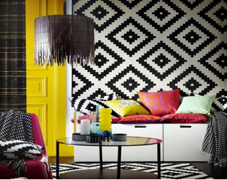
It is important to decide, in advance, which is going to be your focal pattern or print. This will be the largest amount of print or pattern in the room. It could be on a sofa, a carpet or on the walls, but it is the print or pattern that has the greatest surface area. If this is a large print, all other patterns or prints should be small. If it is a small print then the other prints or patterns in the room can be larger, but they have to be in balance with the object they are on.
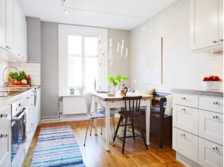
For example, if you chose a sofa with a large geometric print, you can go with a small floral print in complimentary or contrasting colors on the throw pillows that are on the couch. You would not want to pair a large geometric print with a large flower pattern or they would compete for your attention and distract from the overall design.
Break Up Patterns With Solids
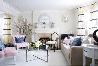
Solid colors on the walls, flooring and accent pieces will add to the patterns and prints, especially if they match the colors or compliment the colors in the patterned pieces. White or black can also be used as a solid color that can be paired with almost any print or pattern to draw the eye.
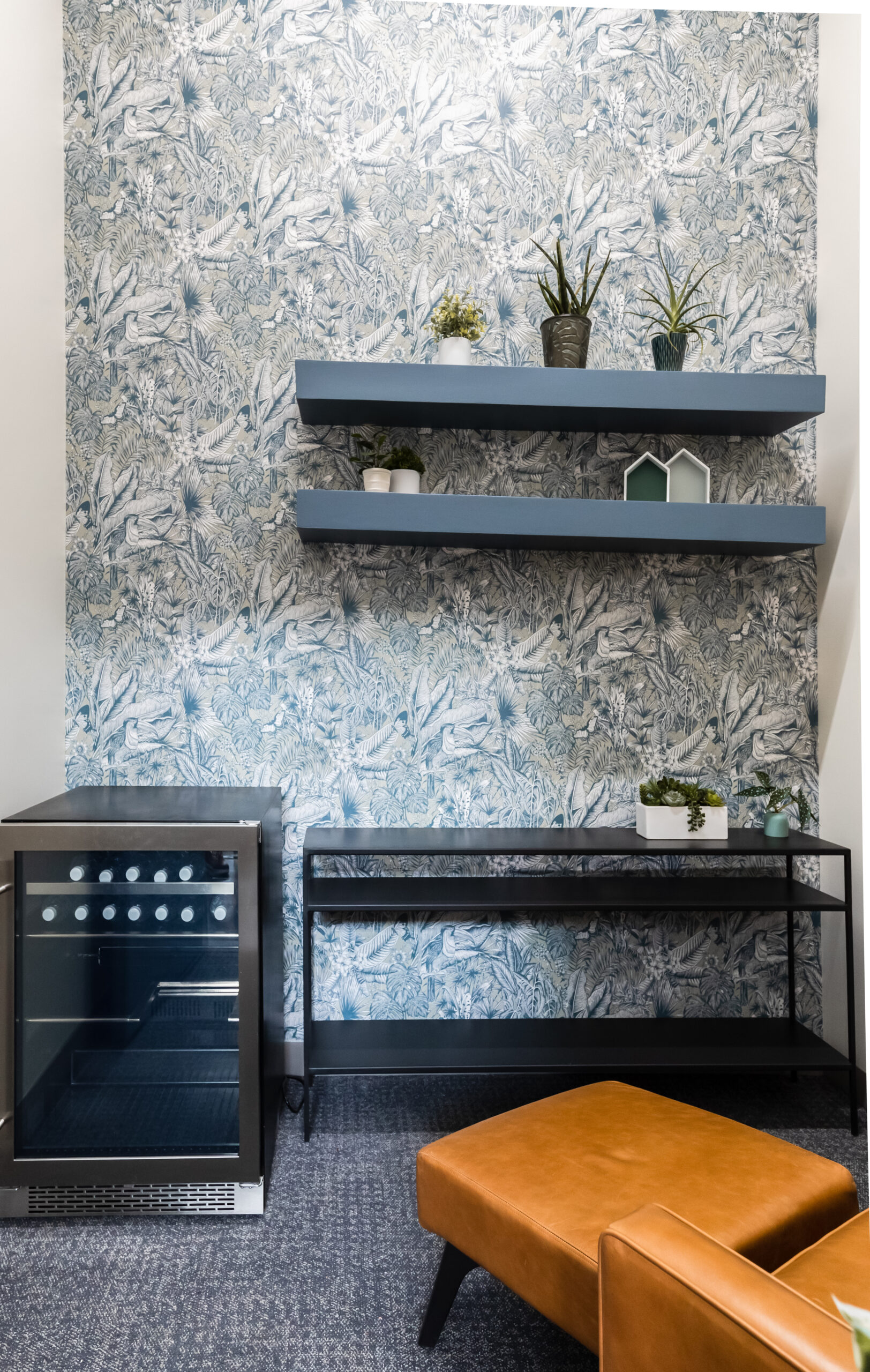
Patterns on walls and floors can be combined with solid neutral colors on window frames, molding, tables and furniture items. Textures can also be used to add to a pattern but stay with a solid color to create a visual impression of a pattern without introducing any new tones or colors.
Mix Colors
One important thing to keep in mind with patterns and prints is that you don’t want to have the same colors in all the different fabrics and on all the surfaces. Multiple reds, blues or greens detract from each other unless you throw in some complimentary colors to add some dazzle and accent. You can choose to go with the same colors in some of the patterns and prints, just don’t do it with everything in the room or break it up with contrasting or neutral furniture pieces and colors.
Look around furniture showrooms, websites and online designer blogs until you get a feel for what you like. Remember, you don’t have to be the same as anyone else and your decorating style should reflect what you like; not what someone else things is trendy.
Hey Jesse, we are not spamming at all. If you check our content, it is unique & of real good quality. In exchange of the content, we are promoting the company we work for, I don’t see any spamming here. We are not posting any fake links, too many links, content is of high quality & we are contacting the webmasters first, getting our content approved, and then after review only it is published.
I do not work at Granite Creek, but writing blogs on their behalf. I will update the photos though or use from creative commons which I agree is a mistake. Thanks for pointing it out.
Hey, just thought I’d let you know Kenneth Newel is not a real person. She is a company who stole a picture of an interior designer so that they could promote their own company. If you call Granite Creek Cabinetry (the site you link to above), they will tell you you have the wrong number. They claim not to know of any Kenneth Newel.
My company was almost spammed by her as well. Feel free to contact for follow up with me personally!