Disclosure: This post was sponsored by HANDy Paint Products. Although we were compensated to write this post, all opinions and content are our own, and we stand behind and use all brands and products we endorse on our site.
Are we ever excited for the upcoming 2019 colors for the year! There is not one color coming this next year that we don’t absolutely love.
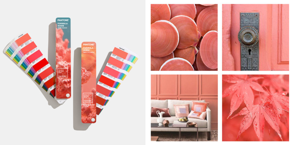
It is official, Living Coral was announced yesterday as the 2019 Pantone color of the year!
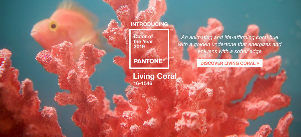
“Just as coral reefs are a source of sustenance and shelter to sea life, vibrant yet mellow, Pantone 16-1546, Living Coral embraces us with warmth and nourishment to provide comfort and buoyancy in our continually shifting environment” Pantone announced Wednesday.
If you remember in 2018, the Pantone color of the year was Ultra Violet. Even though each brand comes out with their own colors, they all play off of the main Pantone colors, such as last year’s Oceanside being Sherwin Williams’ pick.
Now moving into 2019 the colors are continuing to get more colorful and bold. If you’re not into the colors, the neutral game is also strong and we’re seeing a shift in those as well that we’re excited to see and share.
I absolutely love following patterns and watching how trends slightly shift. I think it comes from my background in Fashion Merchandising. Trend forecasting is something we looked and talked about everyday. And I love how interior shifts develop straight from the runways and fashion week.
The fall before the new year, after New York fashion week, the Pantone colors are released. Then each brand announces their color of the year, followed by their color pallets. Each slightly different but they always play nicely off of one another.
What and Who is Pantone?
If you were equally confused as me years ago as to what the Pantone Color System (PCS) was and why it’s important let me explain…
PCS is the most important color matching system in the world. Not only does it help guide us for interiors but it’s also a guide for other industries. You know those fan paint strips? Every color, tone and tint, they are the ones that have number classified each.
The Pantone Color Institute offers designers, marketers, creators and brands a chance to work together and build a strong and powerful color presence. PCS are the experts in how color affects not only design but also all consumers.
Top Paint Brands’ 2019 Color of the Year
Choosing the perfect paint color for your home is a big deal and not an easy thing to select. It always looks one way in a store and then once you buy five gallons, bring it home and start painting your walls it looks completely different.
Pick the wrong color with the wrong undertone and everything in your home looks completely different.
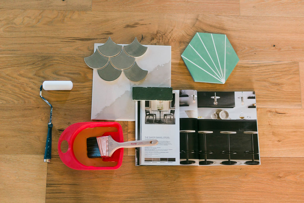
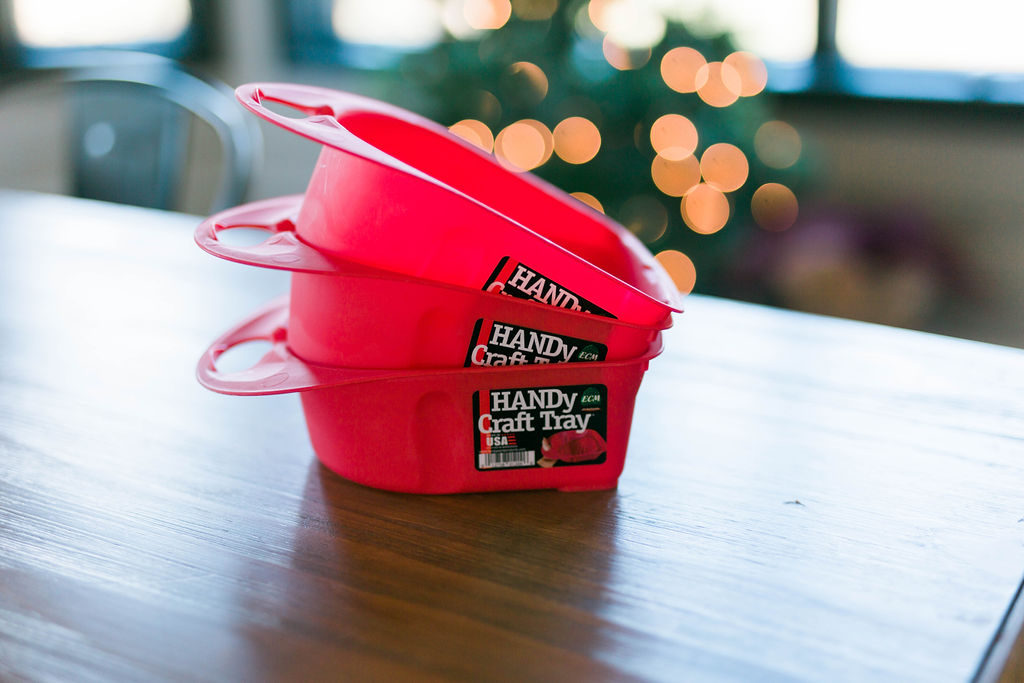
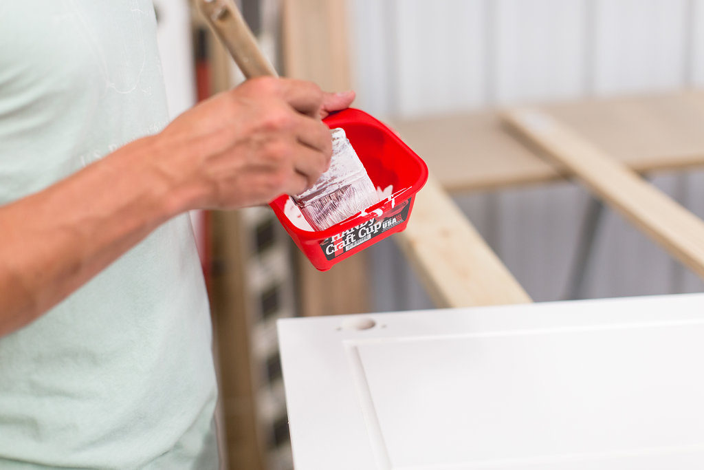
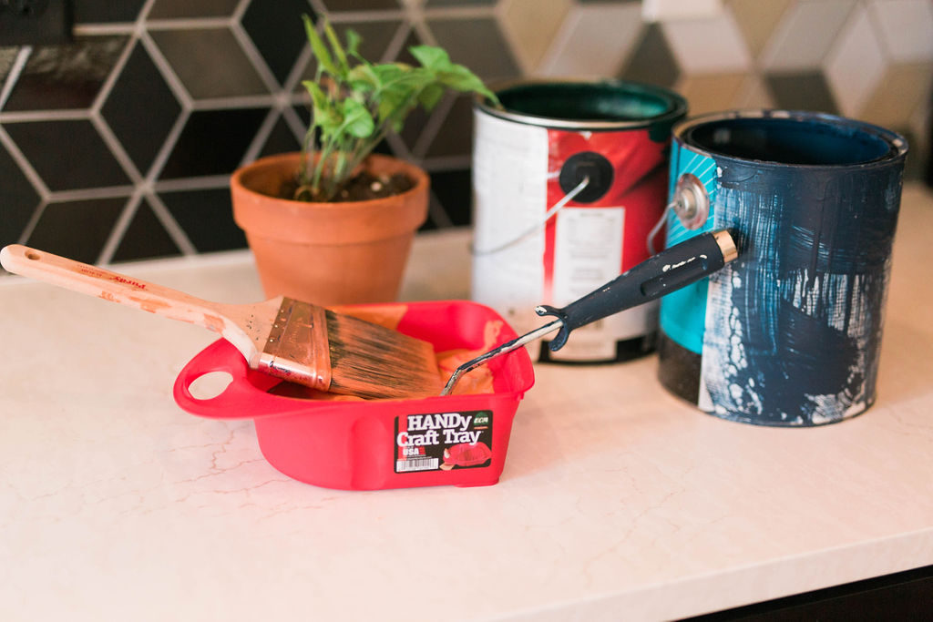
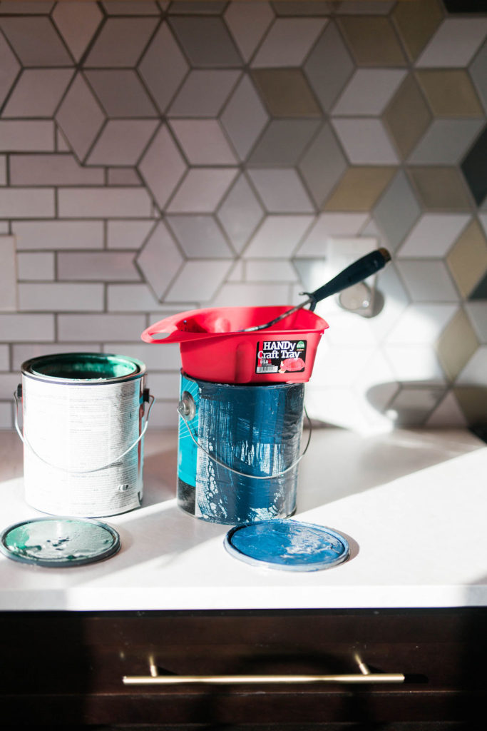
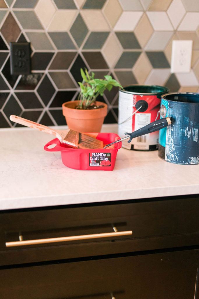
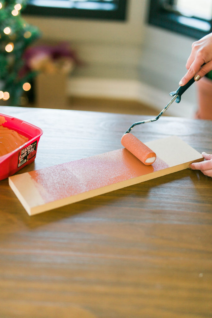
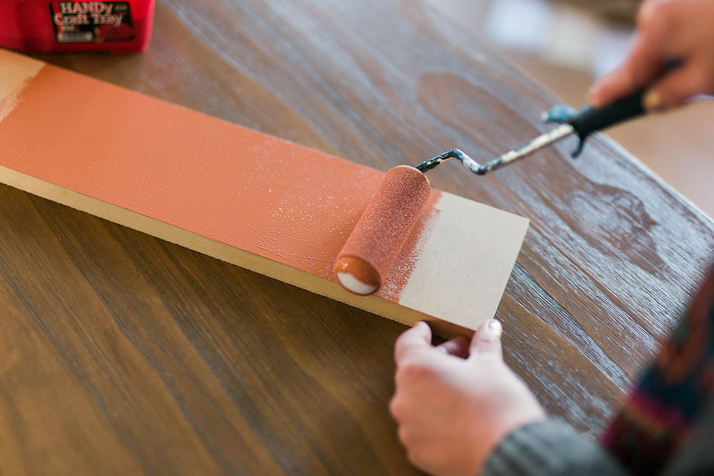
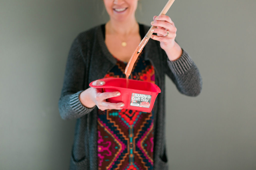
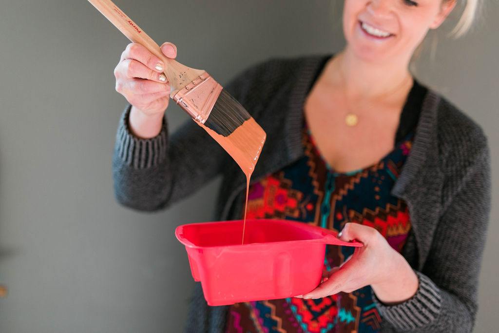
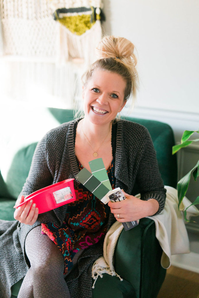
Our favorite thing about the new HANDy Craft Trays is that they are perfect to use to test out paint colors. No need to take out all of the big trays and rollers when testing paint. They hold 1/2 pint of paint and can accommodate both a brush and a 4″ mini roller. There are also the HANDy Craft Cups as well that we love to use when we’re just doing smaller projects and only need a brush.
We love our HANDy Craft Trays and use them all the time for our crafting projects that aren’t even paint related.
Did you know that there’s a psychological effect behind paint colors? That’s why picking the right color for the right space is so important. When choosing the right colors for your home, you want to consider what will strike the right emotion in the right space. Color is universal and we all know how to speak it.
These paint brands devote years and years of research not only from trends and forecasting but by watching consumers and what they gravitate to. From those years of knowledge, they come up with the perfect hues, undertones, and their one color of the year.
Colors don’t just come off the runways, that’s just right before what hits interiors. Prior to that the colors evolve from travel, cultures, nature and the streets.
Here’s some of our top paint brands, and although they come out with full collections, here’s what they’ve announced their top color of the year to be.
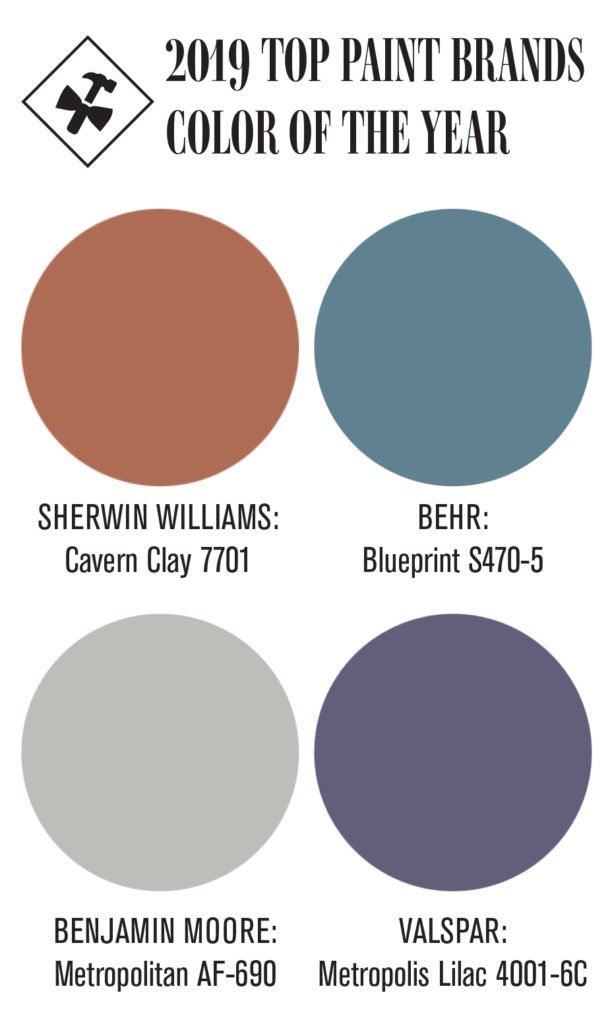
- Sherwin Williams, Cavern Clay 7701
- Behr, Blueprint S470-5
- Benjamin Moore, Metropolitan AF-690
- Valspar, Metropolis Lilac Lowe’s: 4001-6C
Five years ago they forecasted deep hues in 2018, and that’s exactly what we’re seeing now.
We’re also seeing this fun shift of instead of painting all the walls in the room the same, adding in some fun geometrical prints to incorporate a variety of different colors. Guess we were on to something with our backsplash… now we just have to bring that into paint instead of tile.
Now that we know the colors, let’s talk seasons! Because it might not be the walls in your home you’re painting but furniture or seasonal decor accents.
Spring 2019
According to Pantone, the spring colors, right from New York fashion week are very lively hues! From a festive orange red called Fiesta, to Pink Peacock, to Princess Blue there will be no shortage of fun colors this spring.
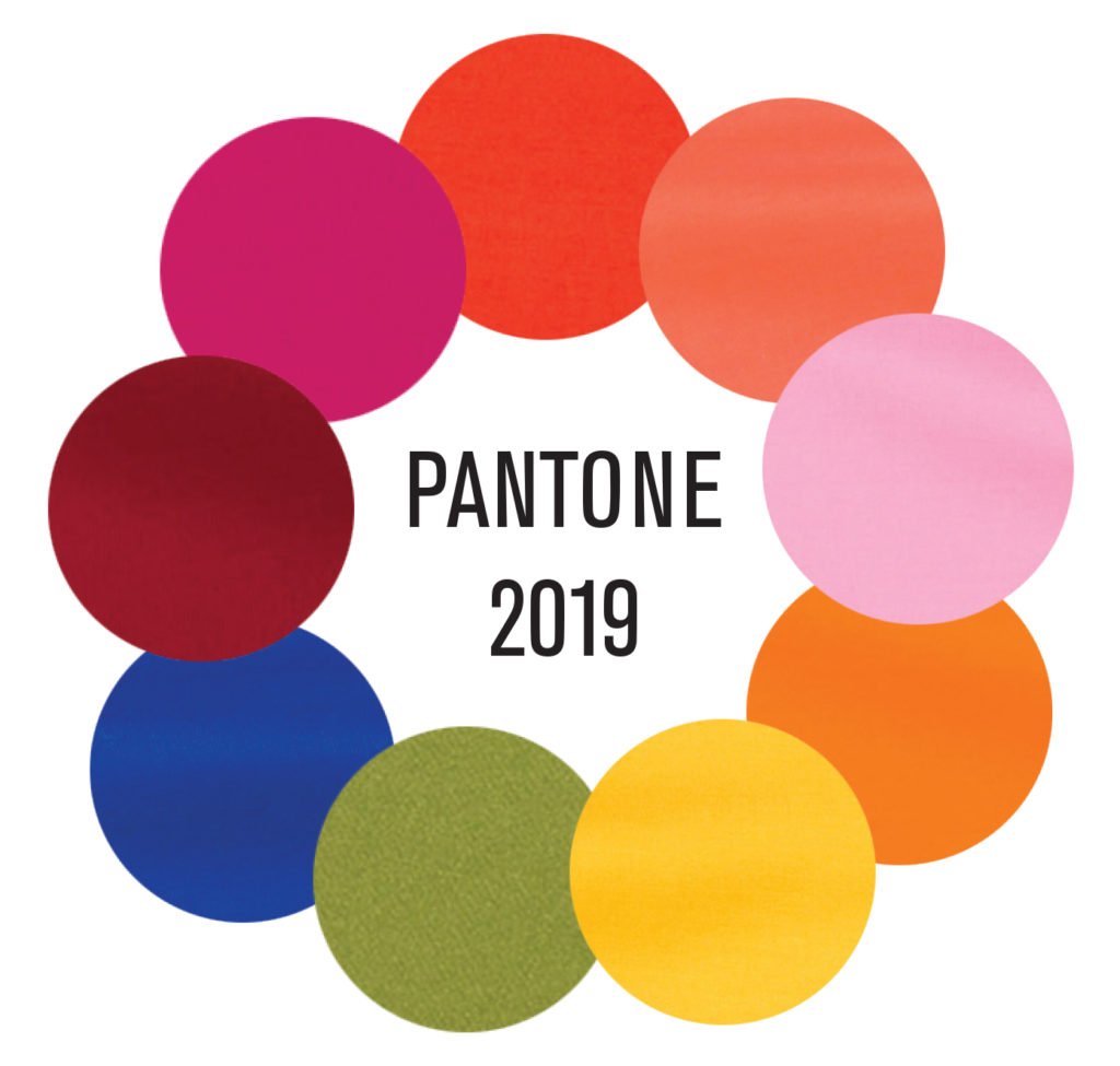
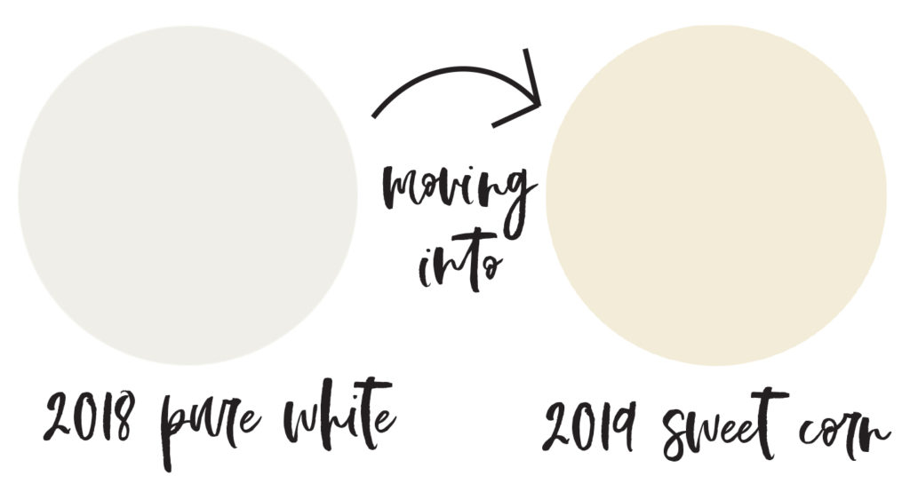
If you’re not a colorful person there are neutral colors for 2019 too. We’re already starting to see a shift from the stark white to warmer whites such as Soybean PANTONE 13-0919 and Sweet Corn PANTONE 11-0106.
It’s interesting to see the grays starting to fade away and a shift back into the brown tones. Brown Granite PANTONE 19-0805 is one of the spring and summer colors for 2019.
Summer 2019
Each brand comes out with their own color of the year but all of the come from the runways and the official pantone colors.
Behr announced their 2019 color as Blueprint S470-5. And in my opinion, it’s the perfect summer color! You know me and how I love a good blue and this selection gives a good color yet is calming and relaxing. From the paint on your walls to cabinetry, to throw pillows, and decor accents, this color will be a classic.
Fall 2019
According to Sherwin Williams, their 2019 paint color of the year is Cavern Clay, SW 7701.
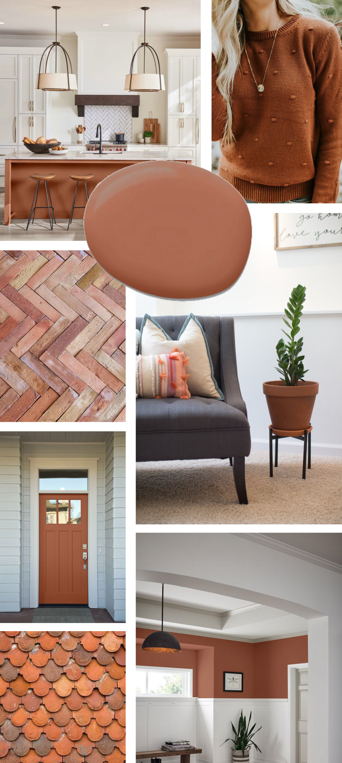
I loooove this color! And have been crushing on it for awhile, just haven’t been sure where to incorporate it into our home yet.
Throughout 2018, we were seeing a lot of terra-cotta colors from clay to brick make their way into interior designs. Within our own home, we were full force on bringing the plant filled terra-cotta pots throughout in and outside.
Even though all of these colors will last throughout the year and within any season, I love the warmth that this color will bring indoors once fall hits.
Winter 2019
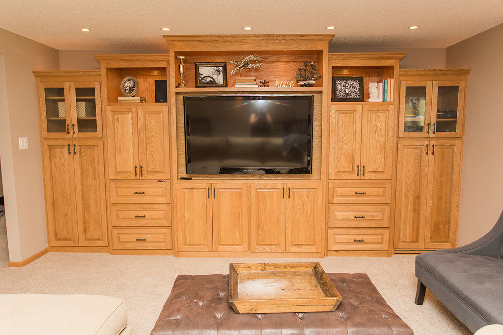
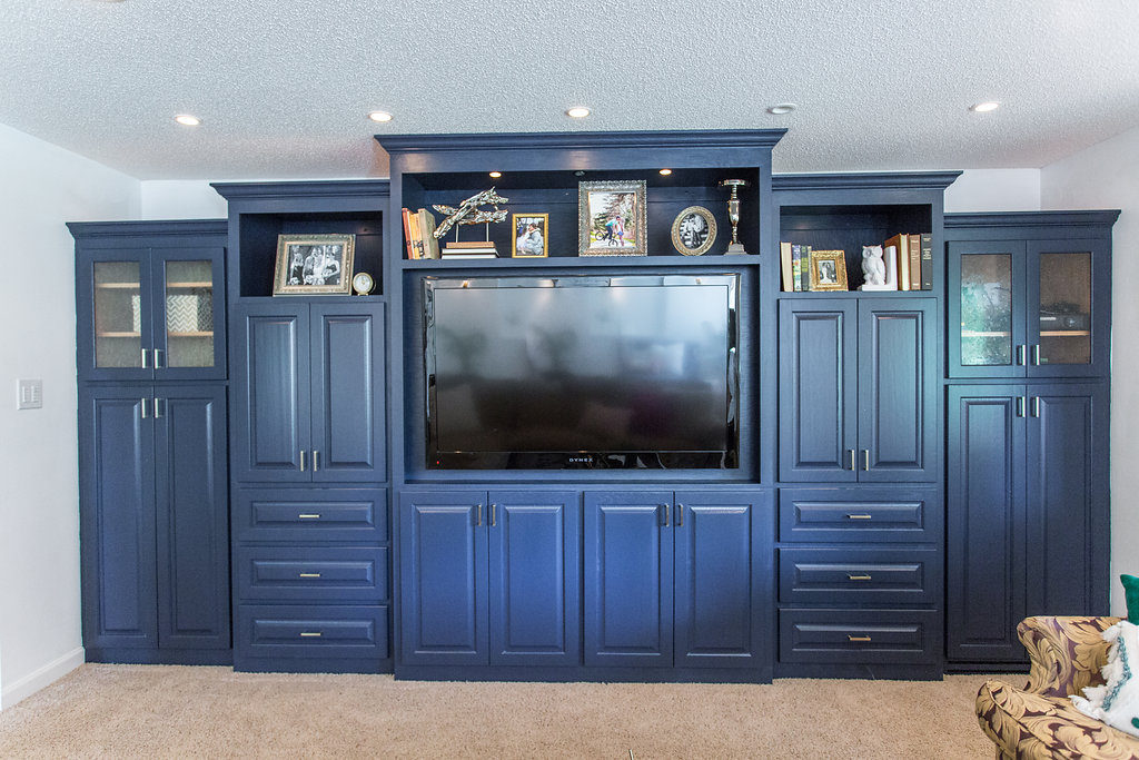
Hale Navy, HC 154 is one of Benjamin Moore’s hues for 2019 color collections and that’s exactly the color we chose for our basement built-ins.
We said goodbye to golden oak and hello hale navy!
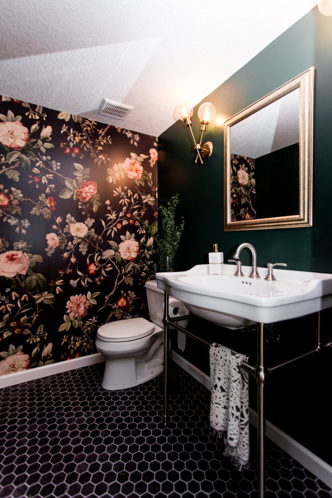
We also went with their 2019 color, Hunter Green 2040-10.
We both love how these colors play off of one another in the same space too.
Jamie now, today, mentioned he wants to paint our doors and posts in our basements of these colors too. ha! I think I’m rubbing off on him too much… that might be a colorful stretch for me.
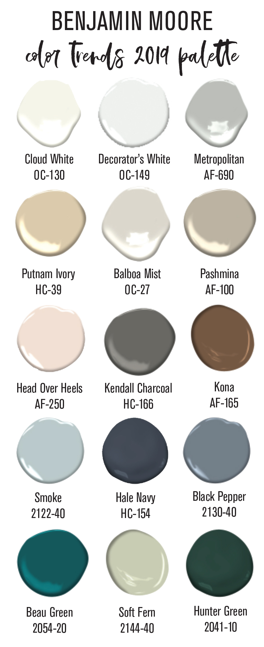
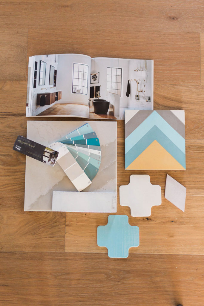
Here’s a look at the rest of Benjamin Moore’s 2019 paint palette color collection. The brown tones are making their way back into the scene and blue and green are going to be the two big colors.
Are you guys just as excited as we are about the color direction we’re moving into?! It just gets our minds turning of what new fun paint projects we can do. Painting walls, furniture or old decor to make new…. we’re ready for you 2019 colors!

Thanks for sharing! Love it!
These are some great ideas! Gray is definitely a trend on the rise. Here are some more clever ways you can utilize gray in your decoration: https://www.tishflooring.com/2018/07/get-on-board-with-gray/
Us too!! Love lots of color!
Love this! We’re really excited for to bring color in this year.
haha, oh my gosh that is hilarious! Hey, it’s not too late to bring it back into your collection! 🙂
OMG, y’all. So last year we were positioning coral as one of our primary colors for lighting, and then we decided in like November to remove it to make room for other colors. Wouldn’t you know. Boom. 2019 Pantone of the Year. Coral. LOL… guess we could always say we were ahead of the trend. :-p