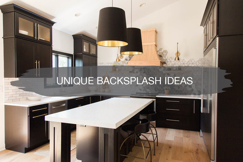
Backsplashes are one of the easiest ways to update your home and transform your kitchen. Best of all, you can DIY, and it doesn’t have to cost a fortune.
We love thinking outside the box when it comes to tile design and always try to push our clients to do something a little different. Today we wanted to share with you 15 ideas for different kitchen backsplashes for inspiration to set your kitchen apart.
1. Honeycomb
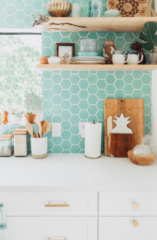
I’ve always had a love for honeycomb, hexagons, or whatever you want to call this style of tile. I like to call them honeycomb when they’re so cute and little and hexagon when they’re larger.
Put some color on them, and they’re that much better. When I came across this picture from Elana Loo’s site on a deep Google search, I stopped in my tracks.
It was the perfect color, paired with the perfect wood tones with splashes of white and gold. I find myself going back to this photo often for inspiration. Color can feel intimidating to do, but with just a little enough of everything it’ll be a safe bet and a show-stopper.
2. Dimension
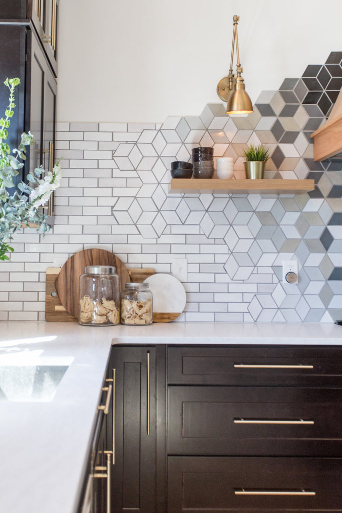
Adding dimension with tile to your backsplash will keep your eyes moving and is another fun way to set your kitchen apart. These tiles have me seeing flowers one minute, hexagons the next, and the white has you trailing up and down and side to side.
Adding dimensional tiles is an easy way to do something a little different and easy to do when the tiles simply do it for you.
3. Custom Mosaic
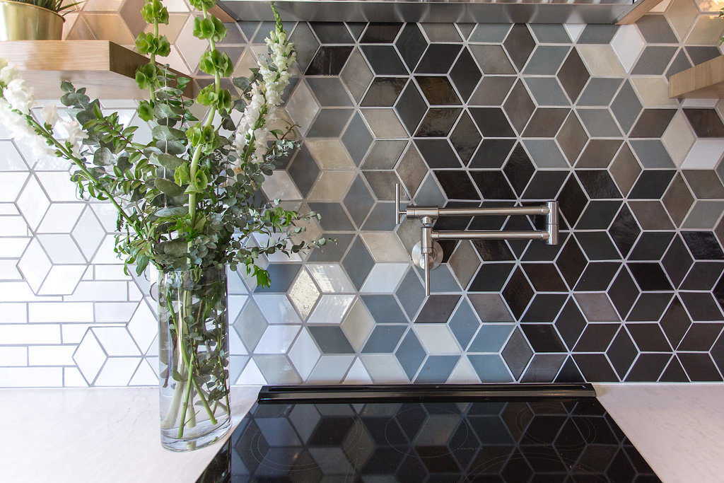
We’re all about working with Mercury Mosaics and building out a one-of-a-kind custom mosaic for backsplashes, not only for ourselves but for our clients too. We did this for our kitchen, and now we can’t stop designing them for other projects.
It was such a fun process from beginning to end working with the team at Mercury Mosaics. Any custom mosaic you design out, you’ll be sure to have a one-of-a-kind backsplash that no one else will ever have.
4. Handmade Tile
Working with Mercury Mosaics has introduced us to the power of handmade tile. Since they are all hand-cut and hand-painted, no two pieces of tile are ever alike.
Since they are hand-painted, you can have a white backsplash as we did in this kitchen, and yet the tiles still give dimension. They don’t just blend into one another and lose the shape of the tiles.
When using handmade tiles, you’ll know that even if you use the same color as your neighbor next door, it’ll still give off a different look to your home.
5. Countertop Backsplash
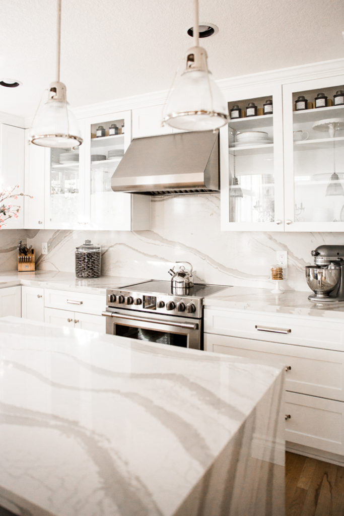
Jamie is all about the clean look of a countertop backsplash! This is a style of backsplash that you don’t see often. Not only does it look clean, but it is also clean.
With Cambria, since it’s nonporous, you never have to worry about germs and bacteria from food getting stuck in those grout lines. It’s easy to wipe down and clean.
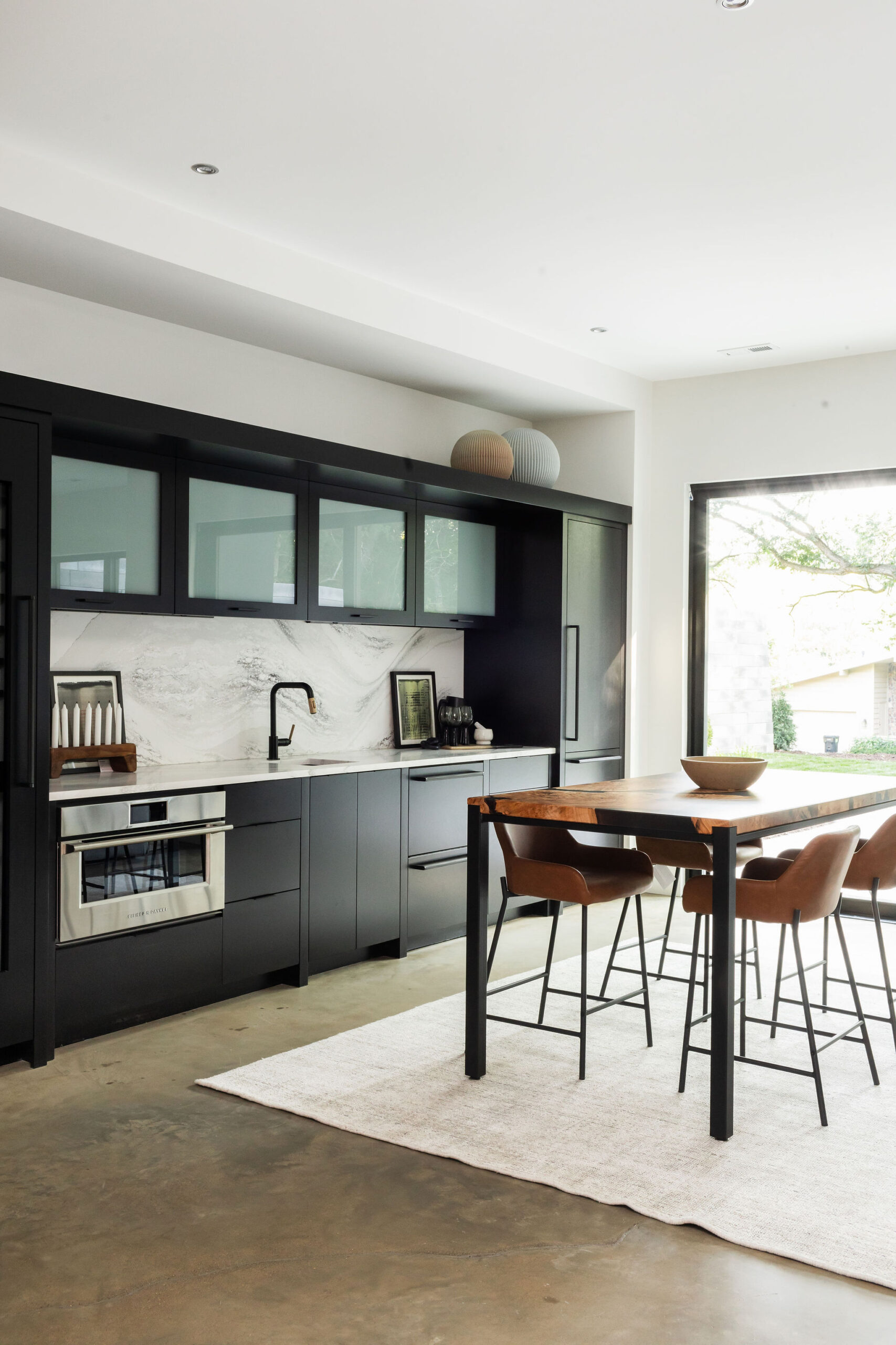
I also love how the design within the quartz carries from the backsplash down into the countertops with a waterfall edge that carries your eye right down to the floor. With a countertop backsplash, anyone that walks into your home will be wowed.
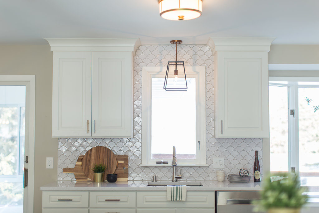
6. Moroccan Fish Scale
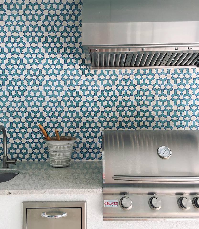
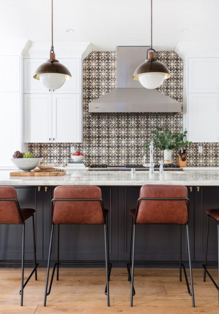
As you can tell, we’re all about the Moroccan fish scale tile design. It’s such a simple way to do something a little different without being too out there.
This is the same color we used in the Moroccan design above, and as you can see, the tiles look so different. We love the subtleness this design brings while still giving a clean and different look.
7. Full Walls
When we walked into this home that our friends over at JKath designed and remodeled, my eye immediately went over to this full wall of tile in the kitchen. They carried it under the floating shelves over to the window wall and around the door into the backyard.
Instead of ending your tile halfway up the window, like expected, carry it up and over and throughout any area of the wall you have in your home for a bolder look.
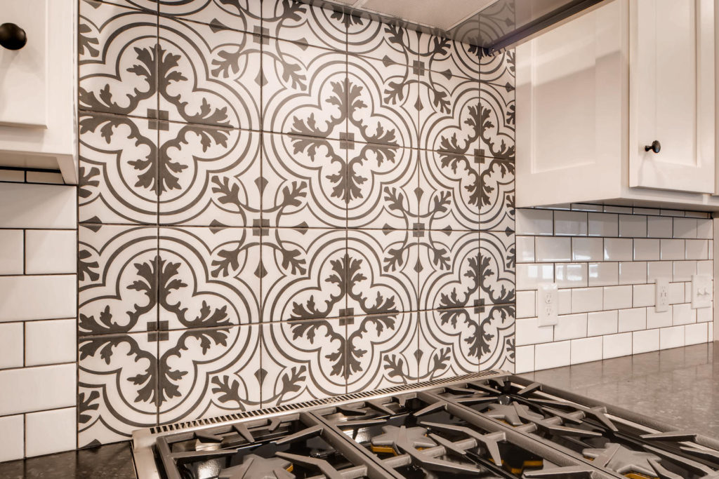
8. Accent Areas
Add in an accent area of different tile designs. Under the hood is the best go-to place to incorporate a little something fun and different.
If you ever get sick of it, it won’t be that much tile to demo out and replace.
9. Unique Shapes
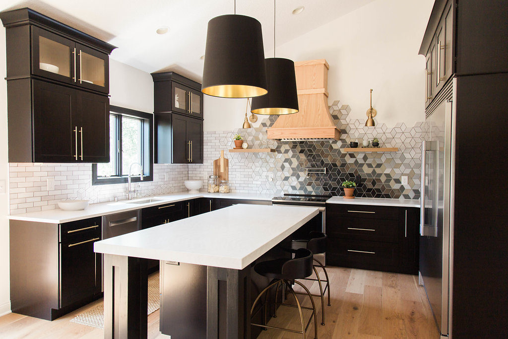
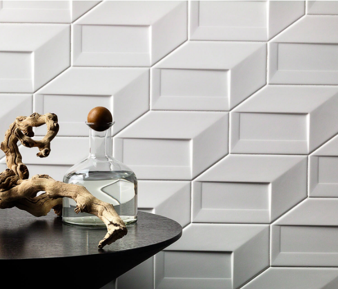
This 3-D tile is a new shape I haven’t seen! According to Tile Bar, their Paradox tile is an innovative new 3D ceramic series set to redefine architecture and design.
In this stacked cube it creates an illusion of depth with a geometric pattern. This is taking the traditional subway tile and giving it a spin and will sure to be an eye-catching accent.
10. Go Black
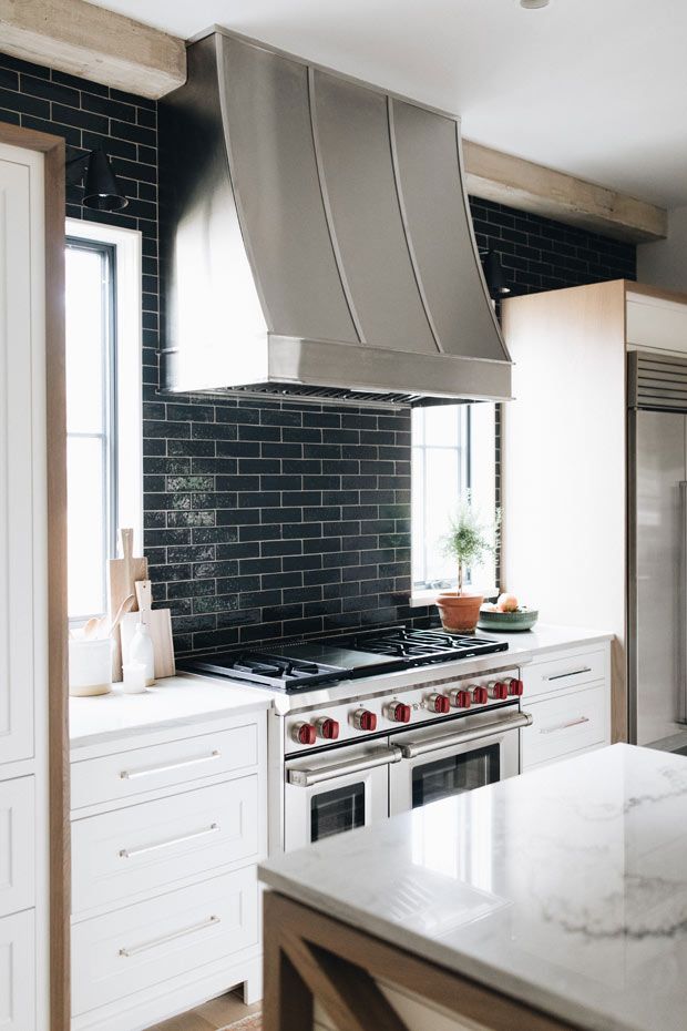
Black is back, and we love it! You probably started to notice it hitting design within decor and lighting last year, and now you see it come back into interiors in tile and even cabinetry.
Even this simple black subway tile can make such a timeless and bold statement.
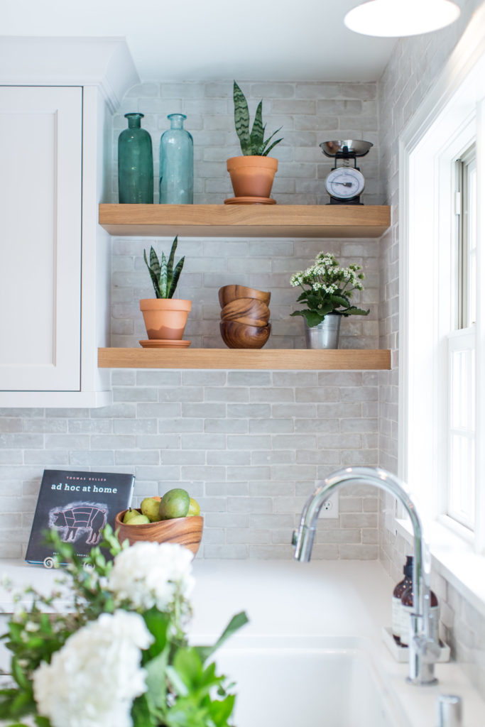
11. Textured Tiles
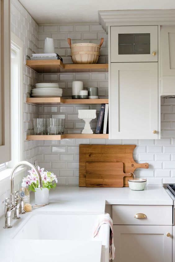
Using tile that has a beveled edge will immediately bring dimension and texture to your kitchen. We love it paired with floating shelves like below.
Consider beveled edge in a more traditional space or as an architectural element.
12. Splash of Sparkle
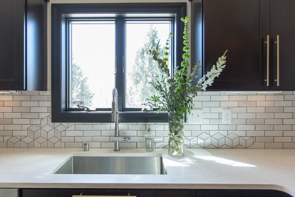
When working with Mercury Mosaics on our tile design, the one thing I told them that I didn’t want was subway tile. Not because I don’t love it, I was just so tired of seeing the same old, same old.
I wanted a one-of-a-kind statement piece and I thought the use of subway tile would make it look like every other kitchen out there.
After being educated on why subway tile is such a good direction to go from the lovely Mercedes, I knew that no matter what they designed out they would give it a new look. When I got the drawings back for the sink wall, I screamed!
They designed out just a little splash of sparkle throughout the subway tile to give it a completely different and one-of-a-kind look.
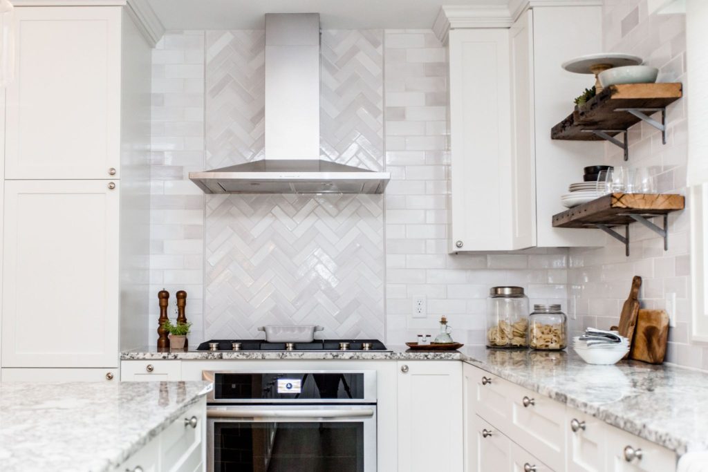
13. Different Design Layouts
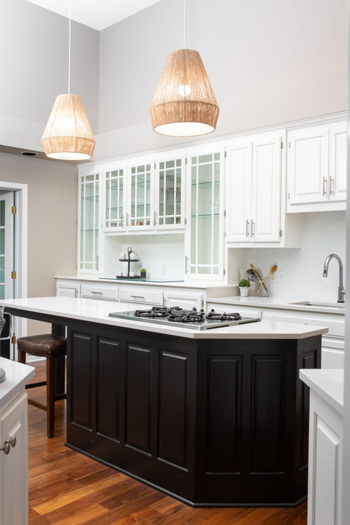
If you’re a big fan of the classic subway tile, but also want to switch it up, think about a different design layout. Below, we used Cle Tile modern brick tiles in a herringbone layout for a unique, yet timeless look.
Here are 12 different ways to lay subway tile if you want something new and fresh.
14. Add Color
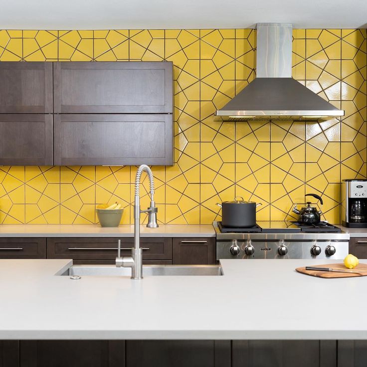
We’re ALL about color for a backsplash because it makes a statement and brings in the fun. When you run tile all the way up the wall, it also creates a statement in your kitchen.
This yellow hexagon tile from Fireclay is the perfect complement to this modern kitchen design.
15. Geometric
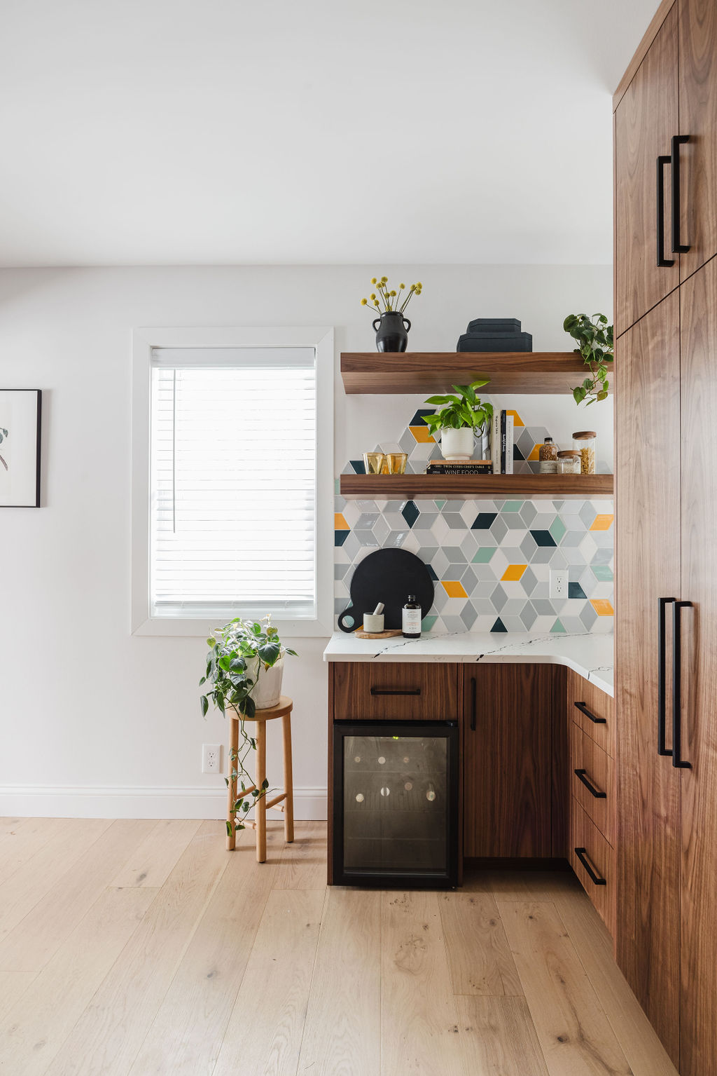
Geometric patterns are popping up everywhere, but being there are so many fun geometric tile designs out there you’re sure to have a one-of-a-kind tile design.
From diamonds to hexagons to all the variations of colors, you’ll have so much inspiration and options to choose from when deciding what tile shape to use. And you can even mix and match them!
Thank you so much!
This is very beautiful kitchen. I like the kitchen.