Pop the bubbly and raise a glass with us!![]()
We’ve been…
laughing.
crossing our eyes.
smiling.
sweating.
banging our heads on the table.
and now just staring in awe for hours at our NEW WEBSITE!
If you didn’t notice, construction2style got a major renovation.
Can we get a fist pump?! Or an AMEN?! Or THANK YOU JESUS!
…Or a smooch or a hug or a kiss. hehe.
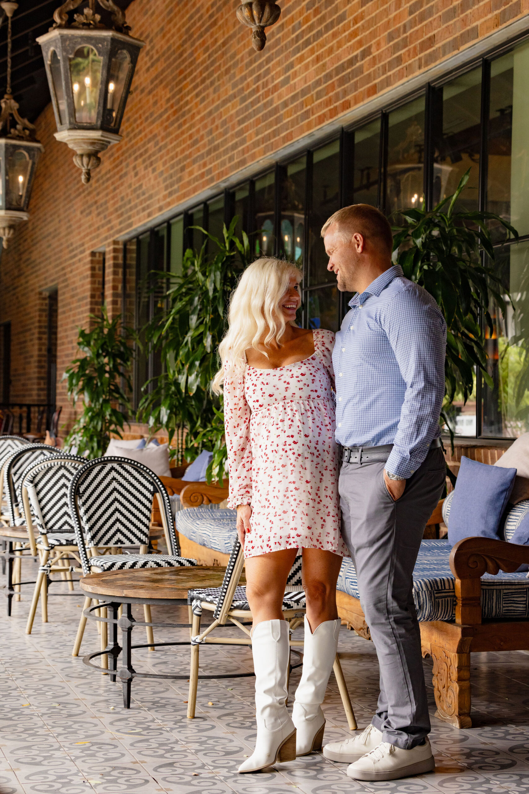
[photo credit | a.m.photography]
But of course we couldn’t have done it without our crew. Lots and lots of hugs to Snap Agency, Brenna French, Tim Brown, Noelle Campbell and Griffin Roer to help build this beauty. We love you guys. And seriously- these people are our favorite and some of the best creatives in the Twin Cities if you ask us.
And don’t judge too closely because our awesome editor, Noelle Campbell, is in the Virgin Islands and my ADD is kicking in and I can’t help but want to shout it off from the rooftops before she can get back and edit it all.
why the renovation?
We started our blog 5 years ago. We worked with the lovely Angie Makes to create our starter template. I love this chick. And she has the cutest clip art for FREE- which you can find HERE.
We started our site 5 years ago…
Jamie bought his first home to flip and I of course wanted to show his talents off to the world!
I couldn’t believe when he drove me up to the home he did. If you’re like me…I alway pictured that…I’d get married, we’d buy our first home together, make it our own…you name it. Well, Jamie had other plans, called investment properties. So long story short here we are a couple houses later, documenting our adventures away.
I started the blog, construction2style, literally as a journal. Nothing more.
5 years later, our DIY blog has transpired into a full home renovation business (which we would have never dreamed). We started thinking we should probably have a little more legit website for our home remodeling business…
new changes & new features?
- Easier Navigation
We really re-worked our homepage. We wanted our readers to know exactly what they could find on our site the second they jumped on our page. So whether you are looking for our services, projects, DIY tutorials, you can easily navigate to them from the homepage.
- Our Client Experience
Wondering what it’s like to work with us? We wanted our clients and readers to know exactly what to expect when reaching out to us for their renovation experience, step by step. Read all about it HERE.
- Gallery Fun!
We wanted to be able to showcase our work in a cleaner way. Now on the projects page, you can view only kitchens, bathrooms, etc. You can also click through to each project that we have detailed out for you so that you can see our challenges and how we go to the end result. View our projects, HERE.
- Sharing All The Services We Offer
We created a clean and easy to navigate service page so that you know exactly what you can hire us for. Read all of the services we offer, HERE.
- Weekly Newsletter
We are going to be pumping out weekly newsletters, Monday with the Molitors. Make sure to sign up in the footer of our site. You’ll be the first to know about all of our tutorials, giveaways, and fun events we’re putting on starting in August.
- WE HAVE A SHOP!
We’ve been dreaming of this day for awhile and we have officially opened our own shop, with construction2style exclusive merchandise. We have launched our fall line and there will be a lot more to come each week. You can check out the new home decor line, HERE. We’re a little pillow happy right now. hehe.
I know there’s lots more I’m forgetting…
So check it out and play around. We hope you all love our new site as much as we do! We can’t wait to hear your feedback.
We literally canNOT thank you enough for all the love, feedback, page views, support, mentions, you name it. We would never be where we are at today without our loyal readers. We love you guys.
Happy Renovating | J + M

