It’s always a happy day when we wrap up a kitchen refresh project, especially when we have such an amazing client!
We love helping people make their kitchen dreams a reality, whether that’s a complete remodel or simple updates for a kitchen refresh that makes a big difference.
For this kitchen, our client was looking to refresh her kitchen through a few simple updates.
Since the cabinets were already in good shape, the appliances worked well, and the layout of the kitchen worked with our client’s lifestyle, we suggested updating the countertops, backsplash, sink, faucet, and lighting to make the kitchen feel brand new, without a full gut and remodel.
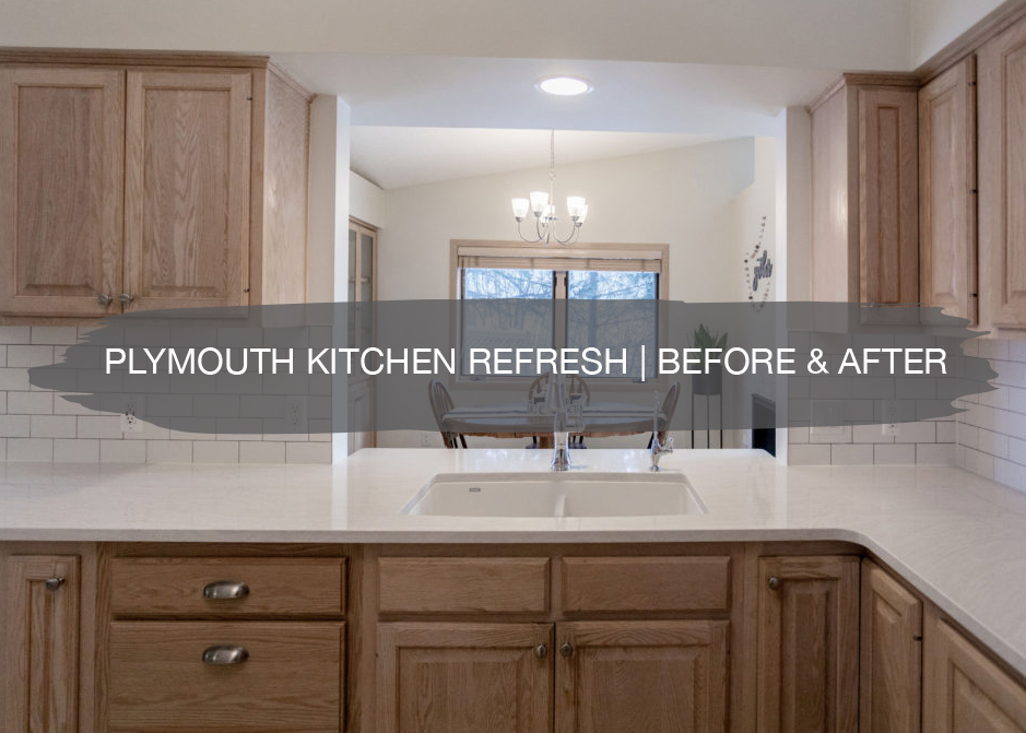
So let’s check out the before…
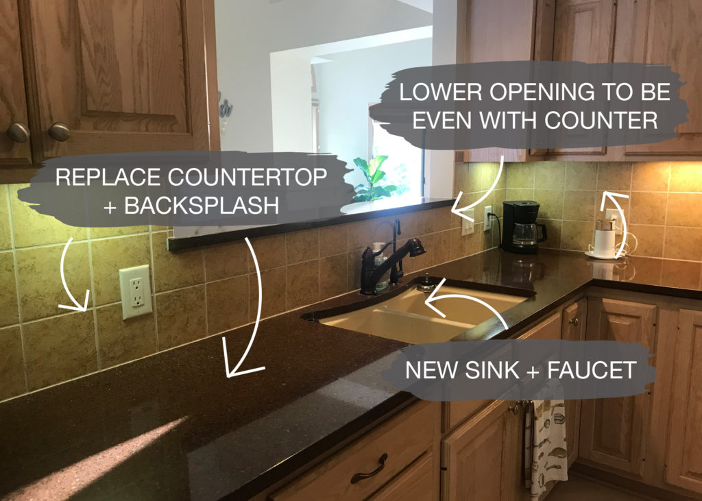
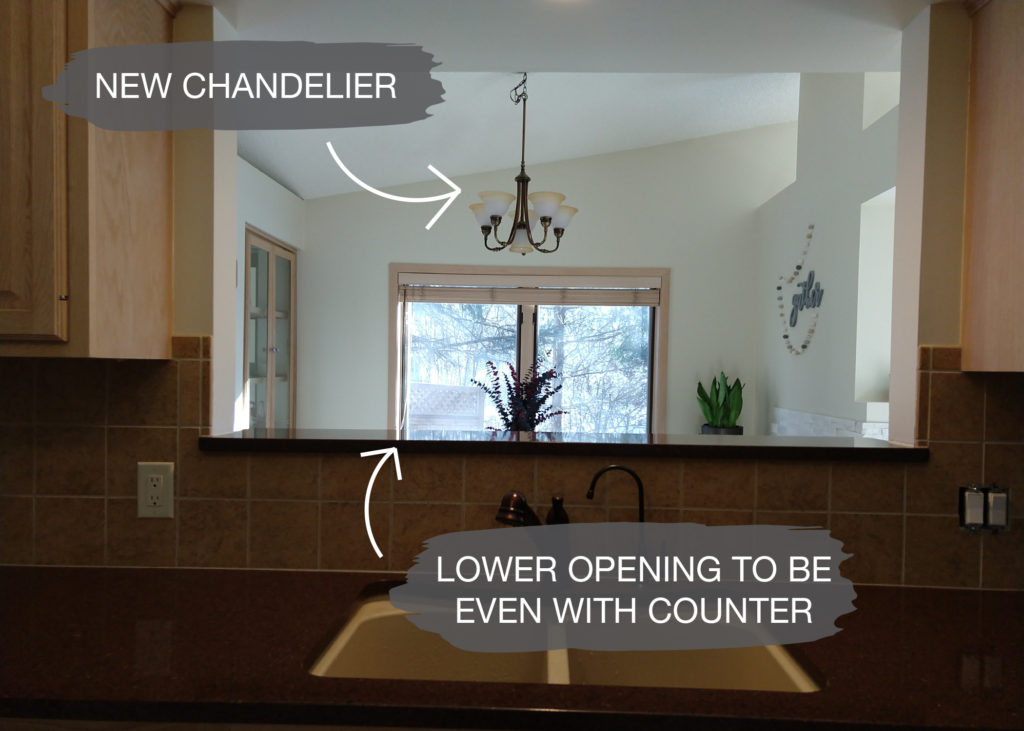
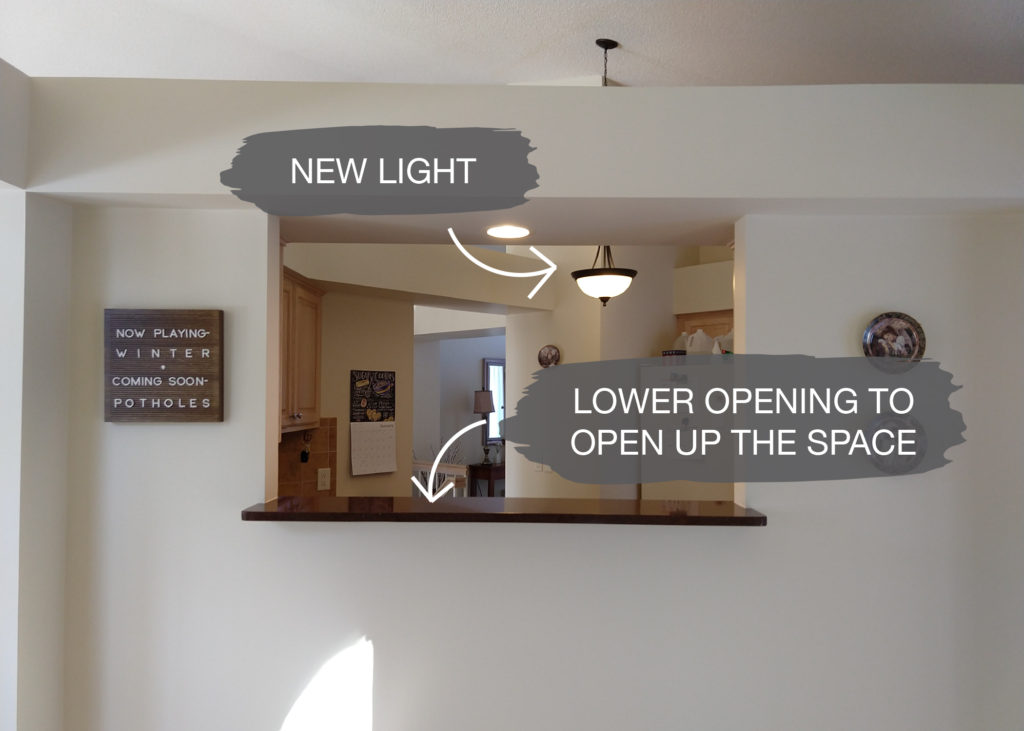
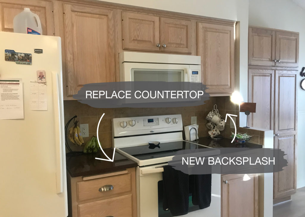
One of the challenges was fixing some gapping between the cabinets and countertops, which we updated before the new countertops went in. Behind the sink was an opening that looked into the dining room, but the space was small, and the step-up counter was blocking the view.
We suggested opening up the space and making it flush with the rest of the countertop.
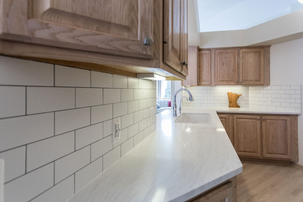
It’s incredible what replacing the countertop and adding a new backsplash can do to update the kitchen. Our client did not love the dark countertops and backsplash, so we suggested doing lighter quartz with white subway tile to brighten up the space and give it a fresh look.
Designs
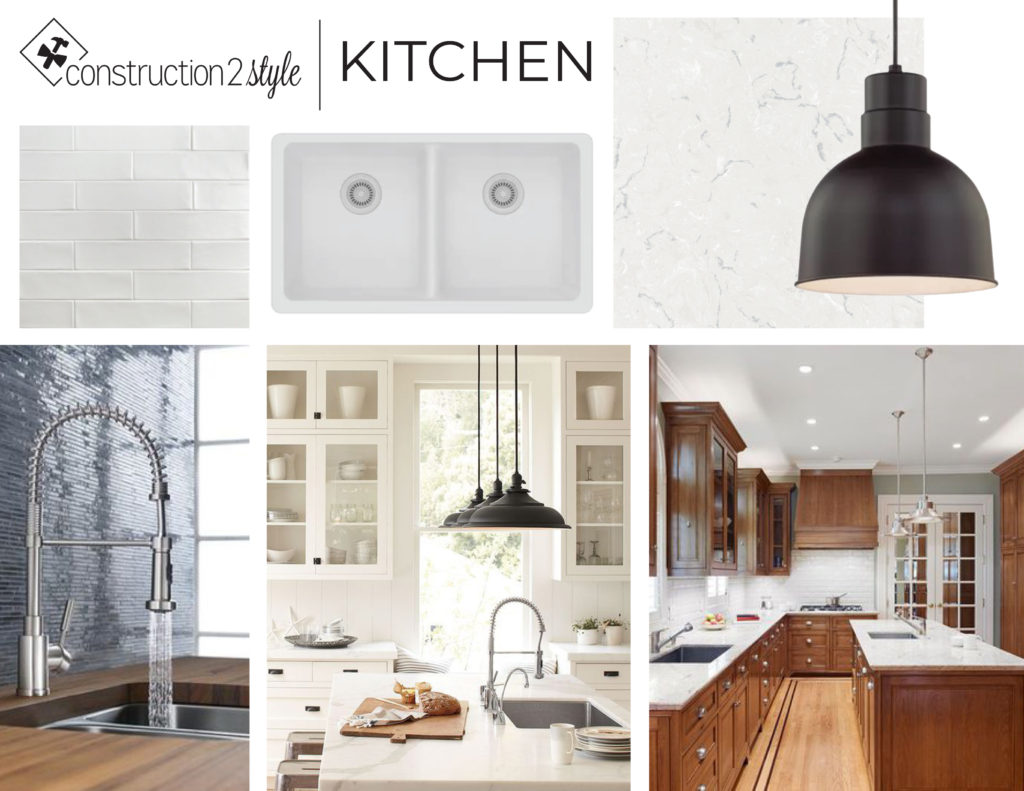
When we designed out the space, our client loved the farmhouse look but wanted her kitchen to work with the rest of her house and also be a timeless design that would work well for years to come. Updating your light fixtures is another easy and affordable upgrade for a kitchen refresh.
When you keep the lighting where it is currently wired, you’ll save money on electrical costs and then can replace the lights with a new style or design that fits the look you want. A light and bright space was essential to our client, and since we kept her current light wood cabinets, white subway tile, and creamy white countertop were the perfect fix.
…and the after
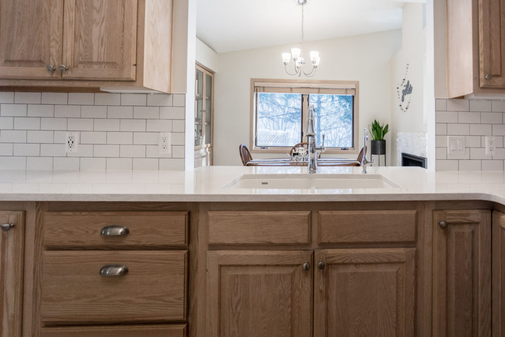
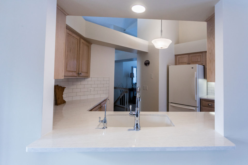
When all was said and done, this kitchen looks like a brand new space and our client loves her kitchen refresh. By lowering the opening by the sink, the kitchen feels much more open, and our client can see more into her dining room.
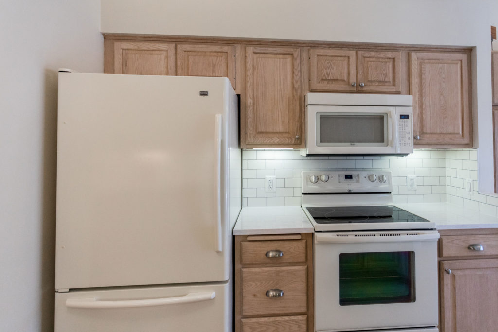
Even though we didn’t replace the cabinets, the white backsplash and countertop made the whole kitchen appear brighter, and the cabinets lost the yellow tone that was previously picked up by the dated counters and backsplash.
With the new lighter counters and backsplash, the white appliances blend well. The overall look is bright and open.
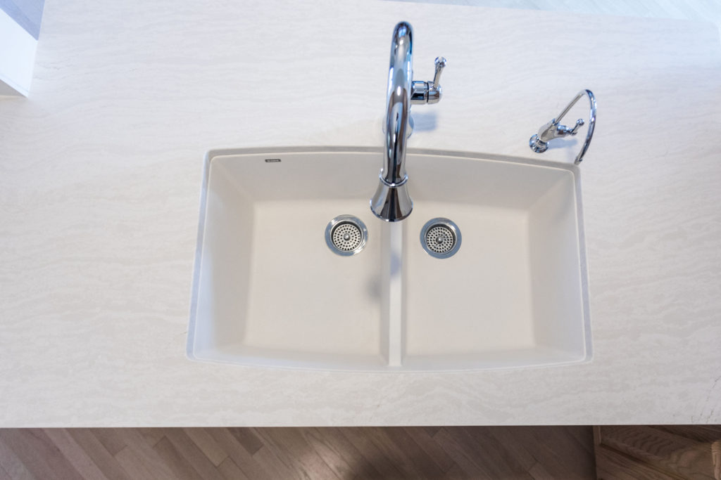
For the countertops, we recommended quartz countertops since they are non-porous and anti-microbial, so nothing gets through and nothing will stain them. They’re also low maintenance since you don’t need to seal them and worked well for our client since she wanted a durable and timeless material for her kitchen refresh.
For the countertops, we chose the Delgatie design from Cambria, since it has some movement to add interest, but doesn’t have too much pattern or color.
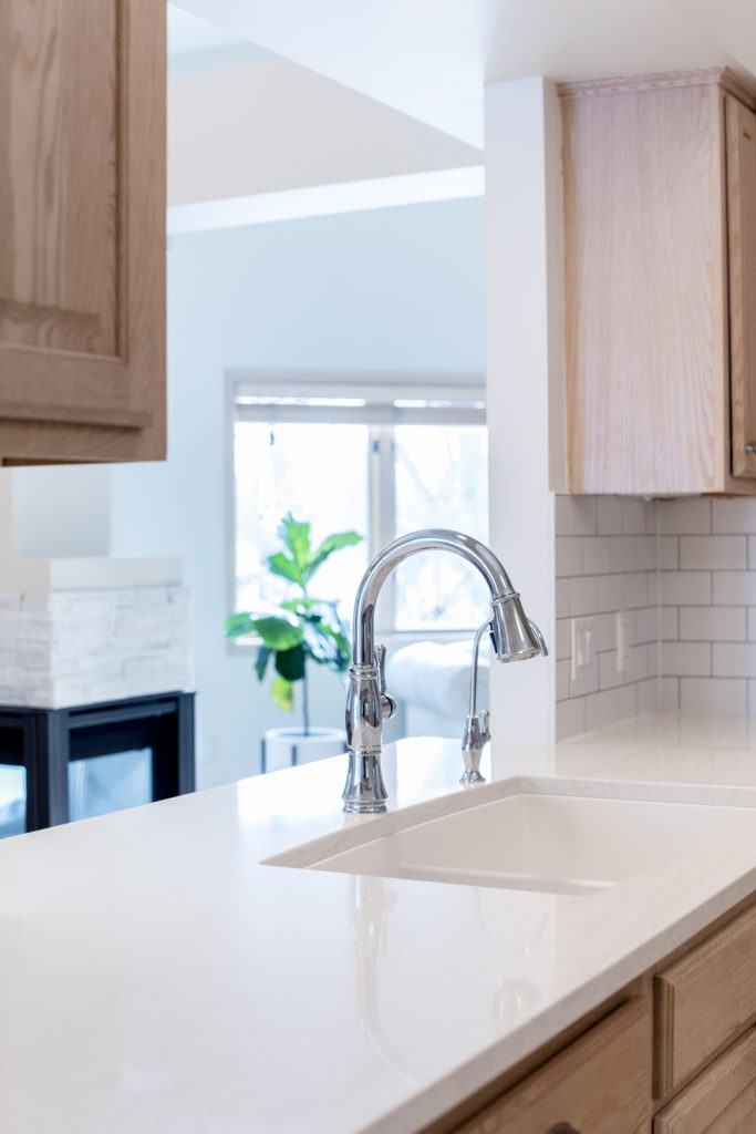
For the backsplash, our client loved the classic subway look, so we installed white subway tile from Tile Shop with white trim pieces. The white subway tile provides a neutral backdrop and a clean look in the kitchen.
Also, we installed a white Blanco sink that blends with the countertop and has lots of space for washing dishes and pots.
Another update was replacing the faucet with this beautiful chrome Delta faucet that has a pull-down option with a magnetic docking, so it always clicks back into place when you’re done with the spray feature. In addition, we added a chrome water dispenser that matched the main faucet to tie the look together.
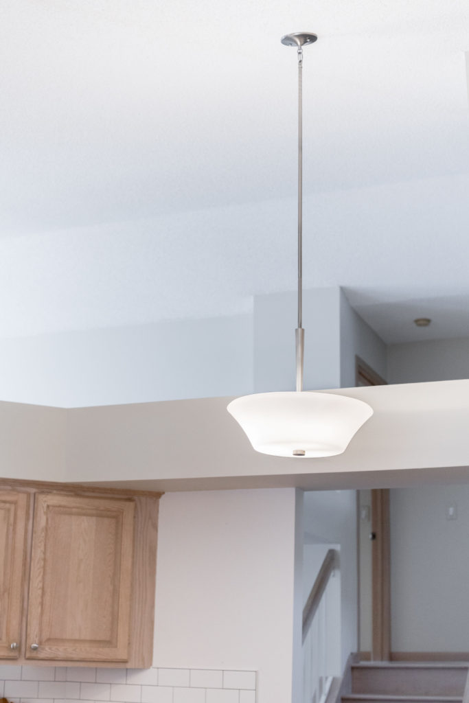
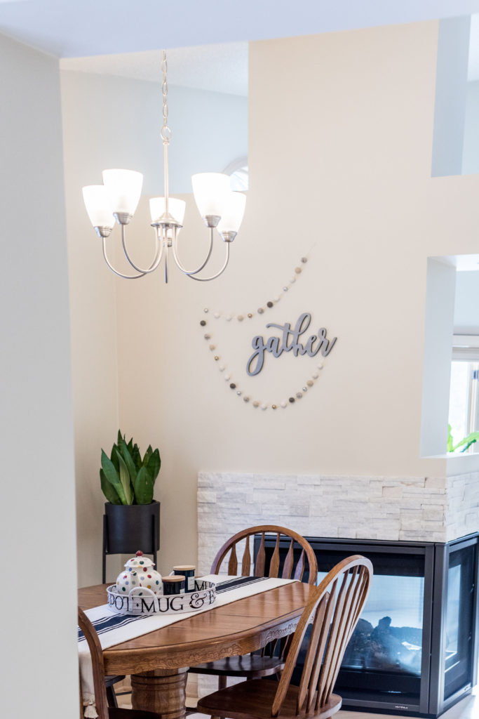
And finally, we replaced the chandelier over the dining table and the pendant in the kitchen to a simple, yet classic designs with chrome finishes that brought everything together.
The new lighting makes a world of a difference and in this kitchen, it was the perfect final touch for this kitchen refresh.
If you want to see our other kitchen projects, click here!
Countertop | Subway Tile | Sink | Faucet | Water Dispenser | 3 Light Chandelier | 5 Light Chandelier | Pendant
