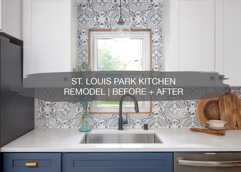
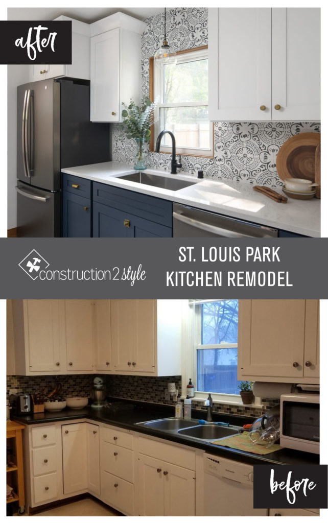
Another kitchen remodel is in the books, this time in St. Louis Park! Again, we are so thankful to have such amazing clients and this project was a fun one. Our clients bought their house a couple of years ago and have done some cosmetic updates like painting the cabinetry, painting rooms in their home, and refinishing their hardwood floors. Now, they were ready to make their kitchen more functional and reflect their style. So, let’s rewind to the beginning…
Before
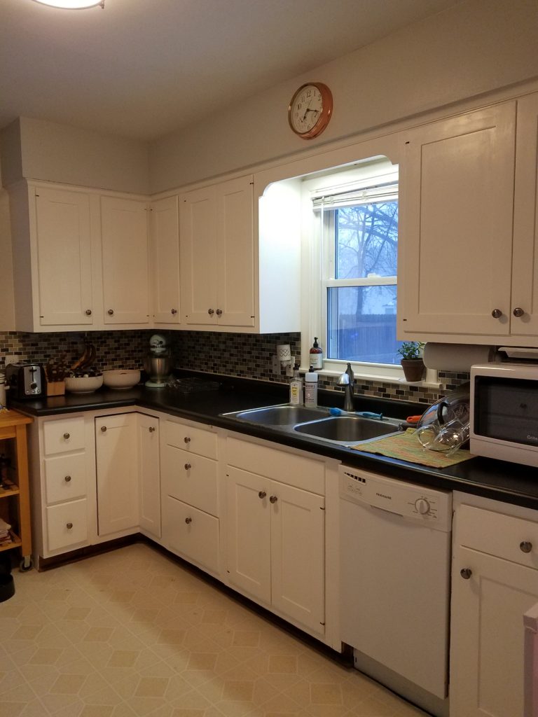
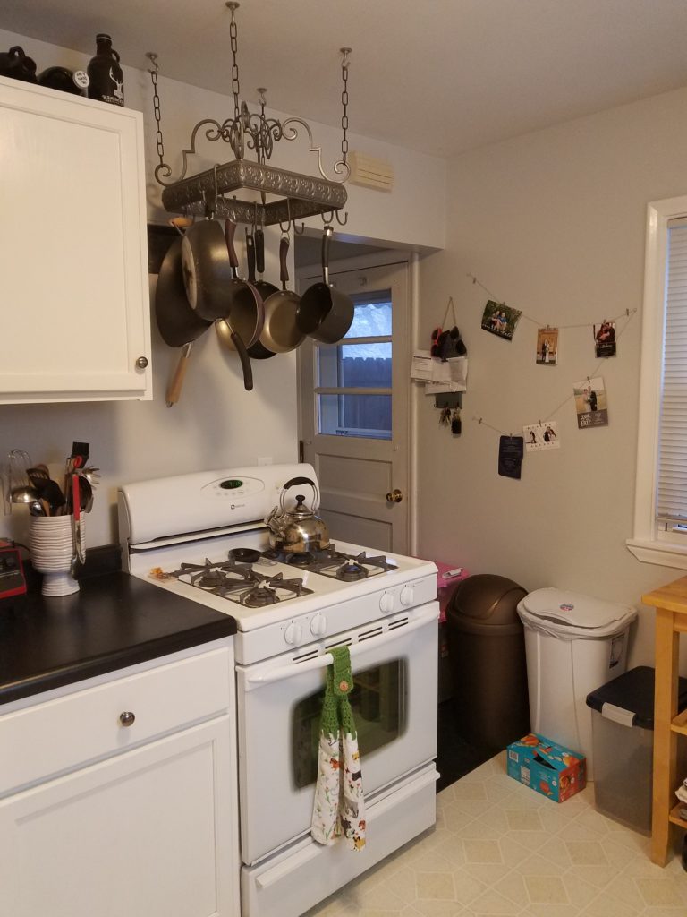
In this kitchen, our clients were limited with space. Their countertops were filled with appliances, their dishwasher was small, and the space was not working well for them. The space felt cramped and storage was lacking.
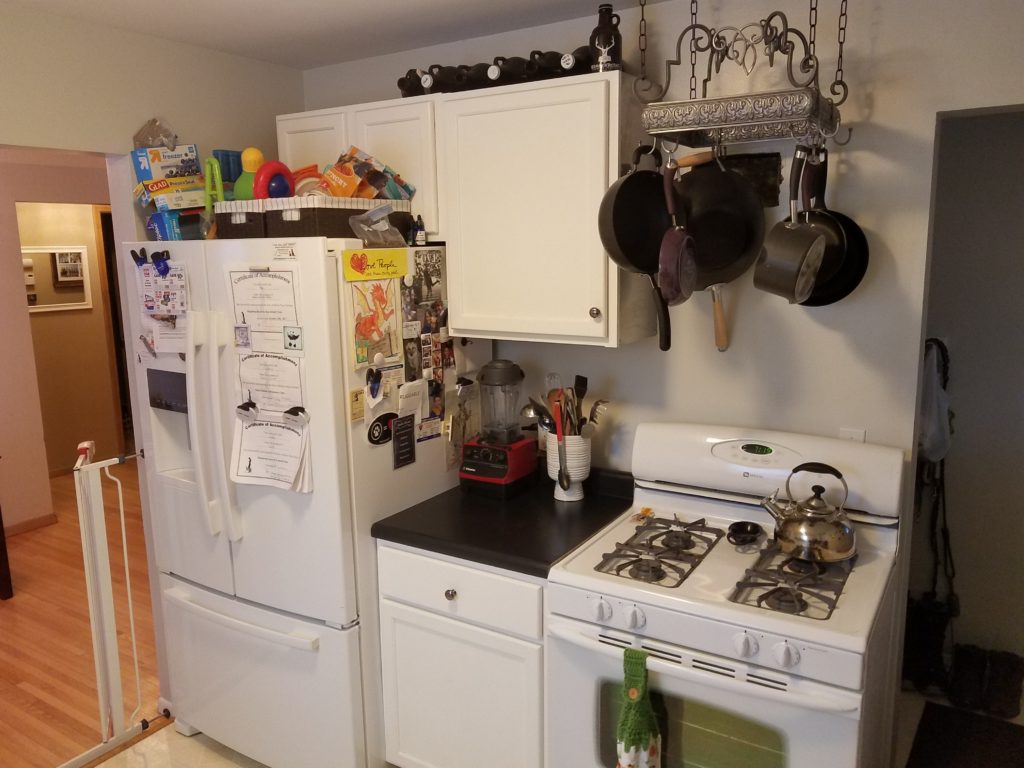
Their pots and pans were over than range, with no countertop space on the right side, which was also right by the side entry. This was not only not working well, but also a safety concern with hot items.
Inspiration
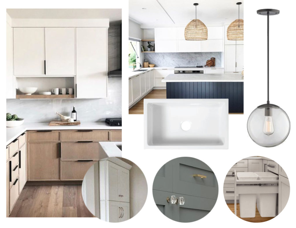
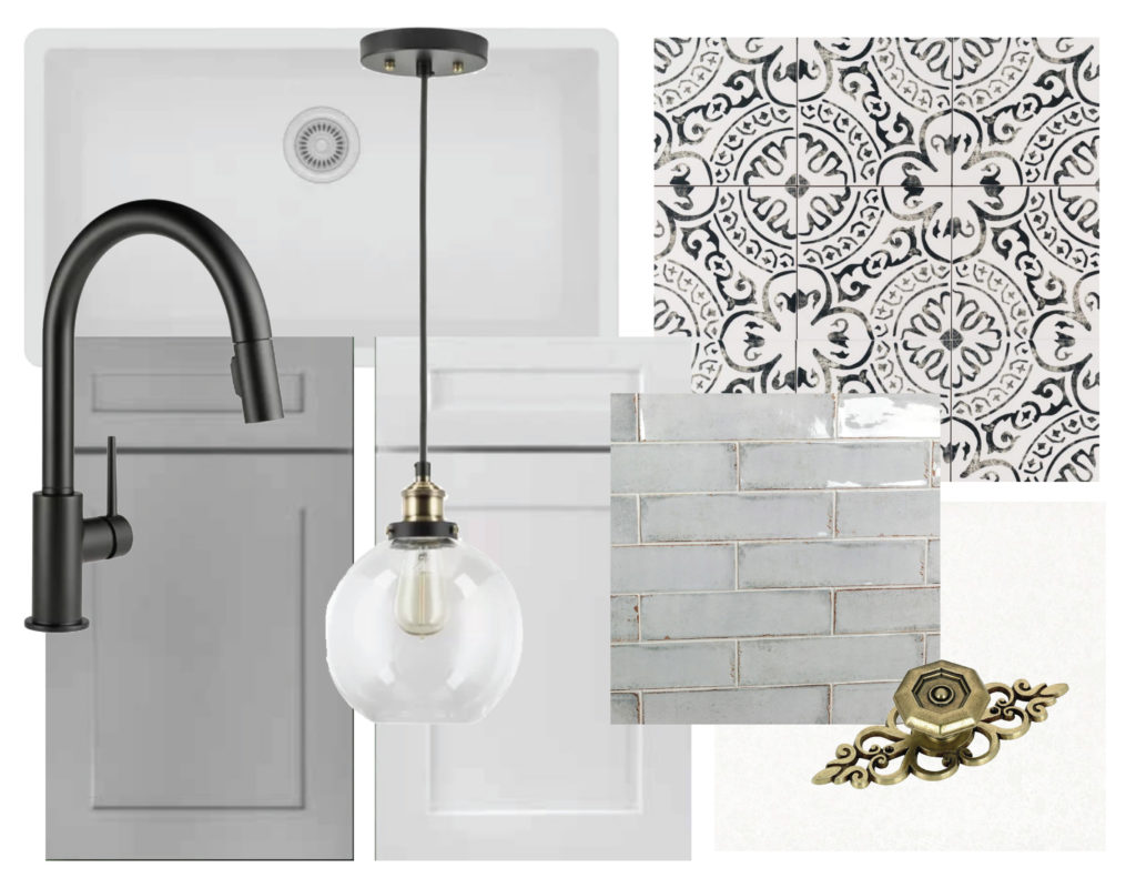
The inspiration for this kitchen was two toned cabinetry with white uppers and grey or blue on the lowers. Unique hardware, storage solutions, and fun tile were also on the list.
After
And now for the afters! We love these photos of the kitchen taken by Jordan Powers.
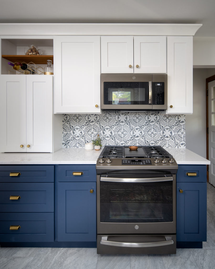
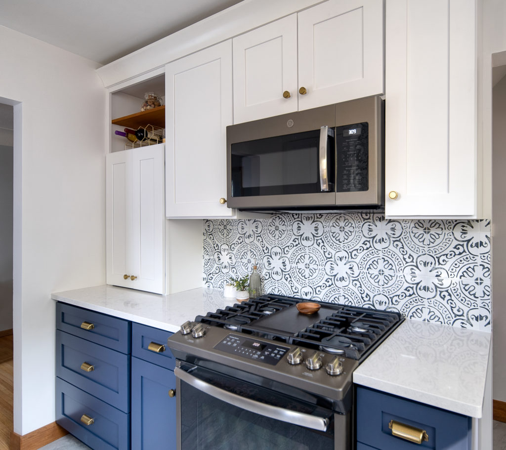
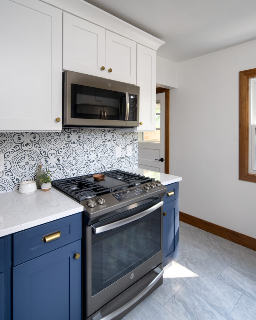
The range now has countertop space on either side of it, with the microwave above. This took the microwave off the countertop and allows for lighting and air flow above the range. On the left side is an appliance garage for small countertop appliances like a toaster and coffee maker. Since the cabinet has doors to hide away the appliances, it keeps the countertops looking clean and uncluttered.
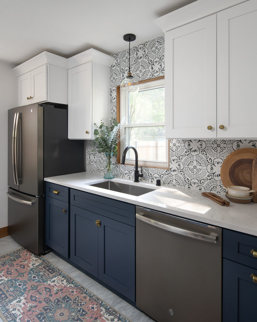
We revamped the layout of this space by moving the fridge from the range wall to over by the sink. This created a better flow when coming in from the side entry door. It also moved the fridge out of the way of the opening to the dining room, making the walkway more functional.
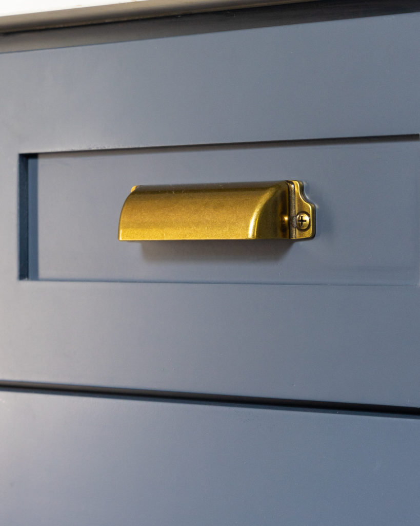
Two tone cabinets from Kona Cabinetry added personality and color to the space. The lowers are painted Hale Navy by Benjamin Moore, which adds a pop to this kitchen.
Deep drawers provide space for larger items like pots and pans. A black and white backsplash brings pattern and element of fun into this kitchen. Quartz countertops are low maintenance, easy to clean, and also brighten up the space with the light and white design.
A new coat of paint, grey porcelain tile flooring, and dark wood trim update the space and give it a fresh look.
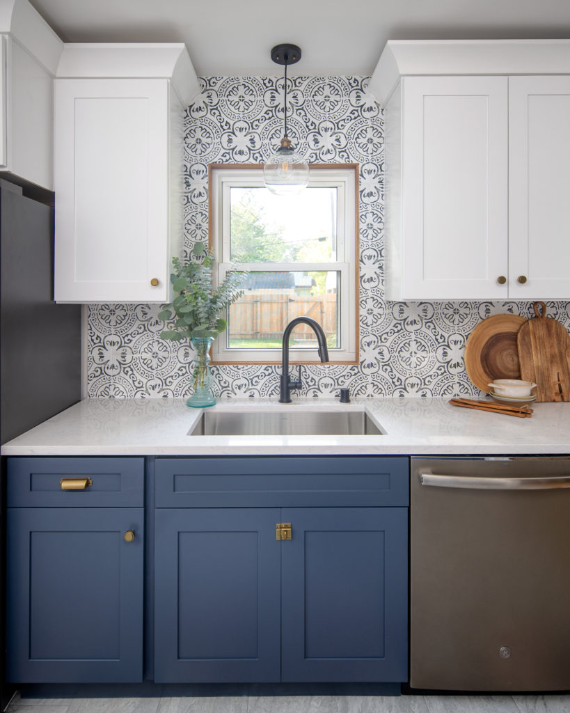
On the other side, a single pendant over the sink accents the pattern tile that goes all the way to the ceiling. It also provides task lighting and brings in a touch of gold that ties into the hardware.
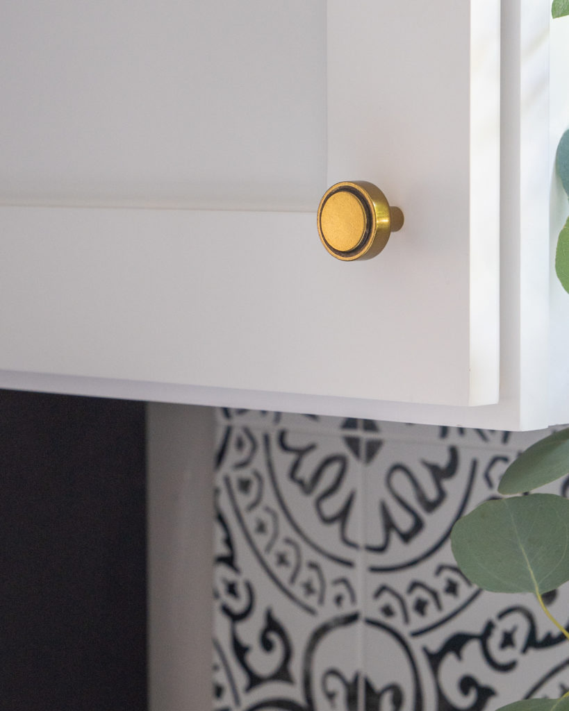
For hardware, a combination of gold knobs for the doors, cup pulls for the drawers, and a matchbox latch for the sink base cabinet shows off the cabinetry.
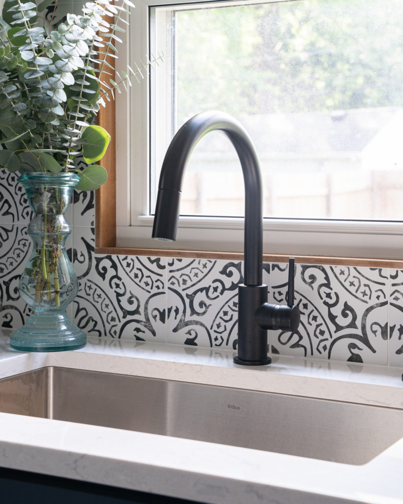
Finally, a new single basin sink and black faucet add to the functionality and sleek style of this space.
What a transformation this space is! The whole kitchen feels larger with the new layout. Now it reflects our clients’ style and they’re looking forward to hosting family and friends in this space.
The Details
Shop This Kitchen
Pattern black and white backsplash | Grey porcelain tile flooring | Black and gold pendant | Gold knobs | Gold cup pulls | Matchbox latch | Stainless steel single basin sink | Black faucet
Shoot, sorry! The clients bought this so I’m not even sure. We like to get this style of runners though from Overstock.com
Where can I find the rug/runner?
Cambria – Swanbridge
What is the brand/color of countertop?