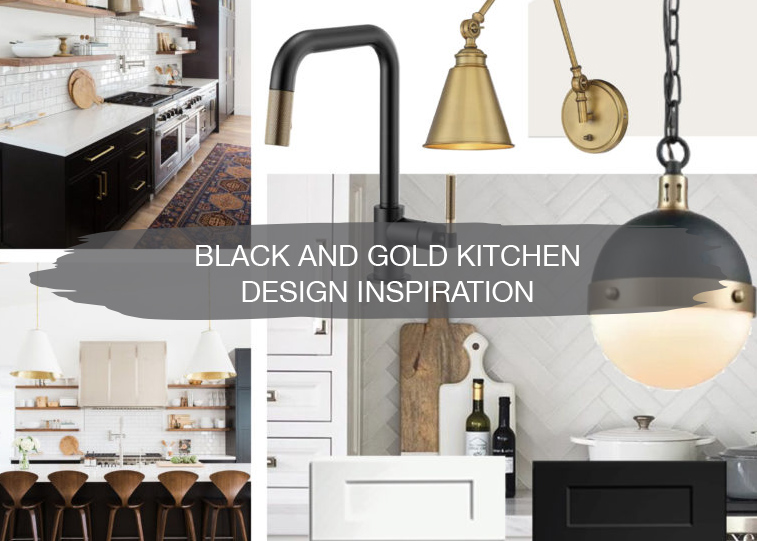
We recently wrapped up an amazing kitchen remodel, and we can’t wait to share all of the photos with you. But first, let’s rewind to the design inspiration and planning for this project.
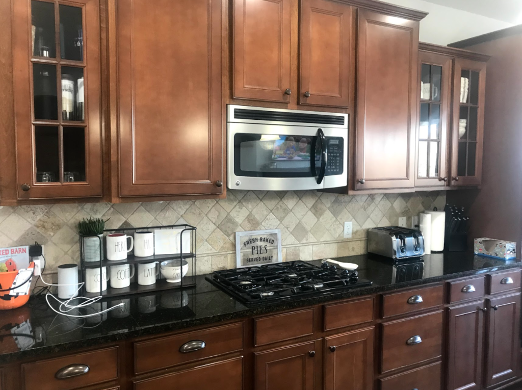
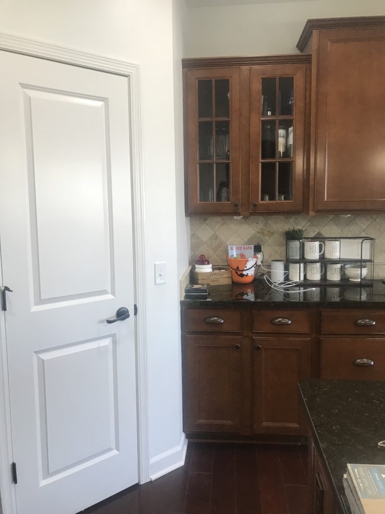
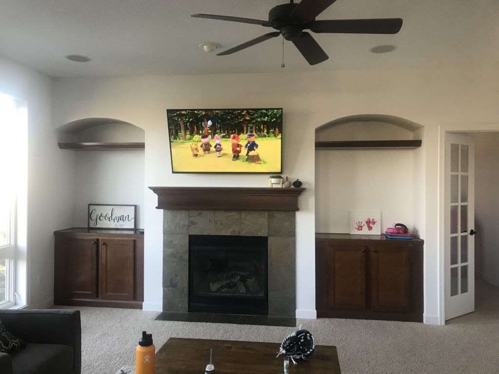
Before
The kitchen and living room connected in this open concept main level. There are large windows looking out to the backyard and a good flow to the overall layout. Our clients wanted to make their kitchen their own and incorporate a black, white, and gold design. They also wanted to update the fireplace area and create more of an opening between the kitchen and the dining room.
Before the remodel, the pantry was located in the corner of the kitchen, and while it provided space for storing food, it also took up a large portion of the kitchen space. The goal was to create a walkway between the kitchen and the dining room with a butler’s pantry for entertaining.
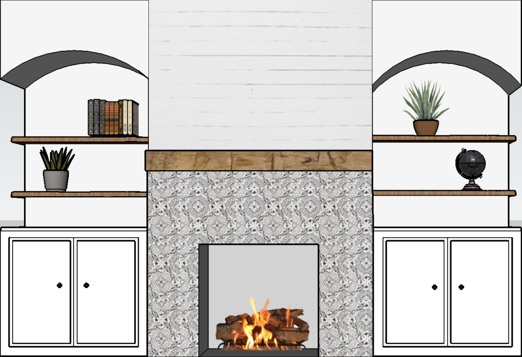
Over by the fireplace, our clients were looking to update the tile, mantle, and create more functional shelving above the built-ins.
Mood Board
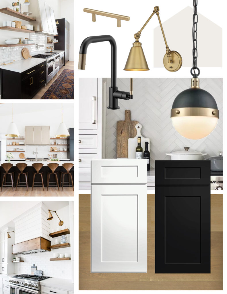
When clients come to us wanting black, white, and gold, we feel like we’ve hit the jackpot. This is totally our team’s style, and we love it when clients are willing to try something different and incorporate fun finishes. In this mood board, there are black and gold light fixtures and a faucet, mixed with wood elements, herringbone tile, and engineered flooring.
Shop This Look:
Flooring | Gold Pulls | Backsplash | Sink | Faucet | Potfiller | Hood Insert | Sconces | Pendants
Floor Plans
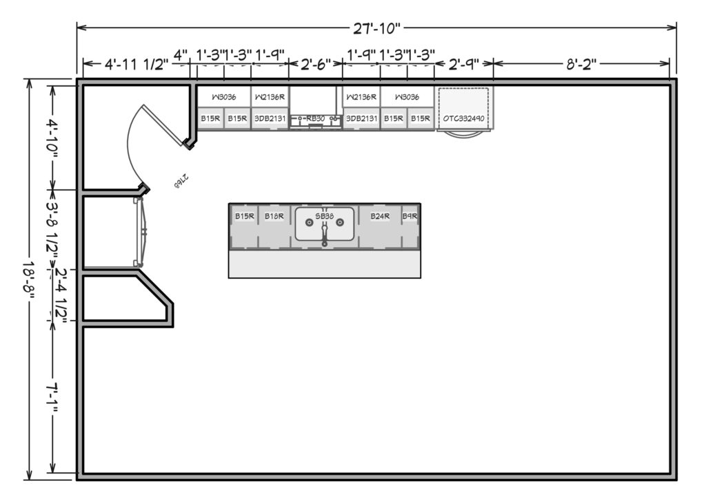
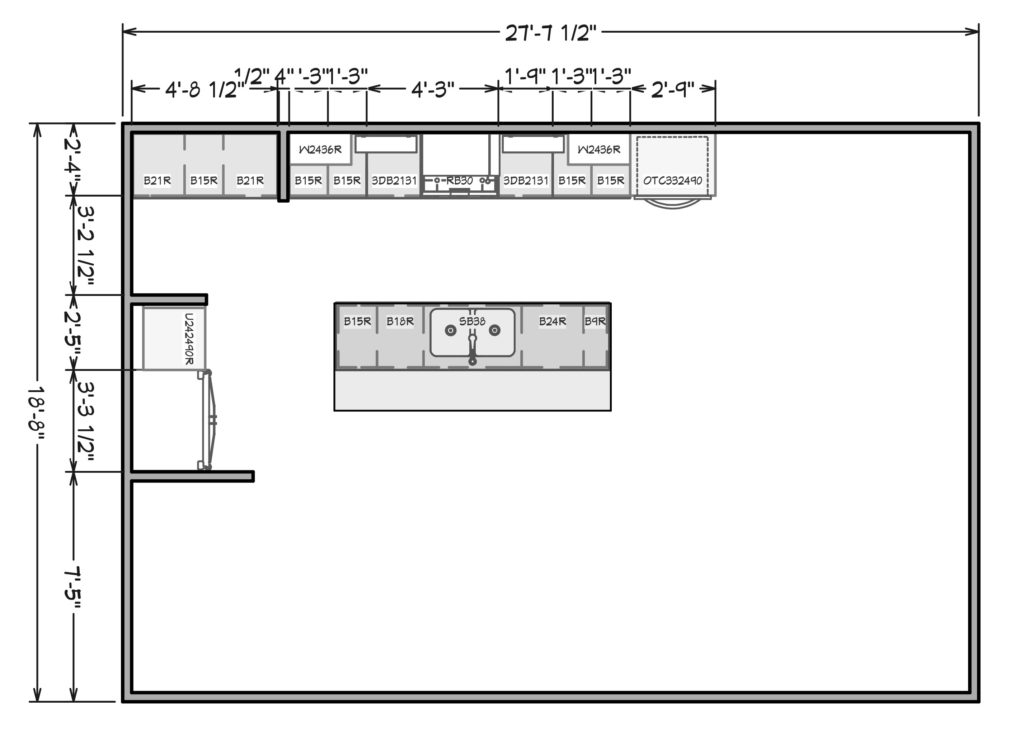
Once we got to designing out the floor plan, we realized that the overall floor plan of the kitchen was already functioning well for this family, but the pantry and the wall on the other side of the fridge took up a lot of room and didn’t allow for an open flow into the dining room.
Our suggestion was to open up the wall by the fridge and shift the fridge over to allow for a tall pantry cabinet. Since the walk-in pantry was going away, having some storage for larger food items was necessary. Creating a walkway through to the dining room opened up the space and allowed for more flow when entertaining. The goal for the walkway space was to create a coffee bar, complete with unique tile to make a statement in that area.
Renderings
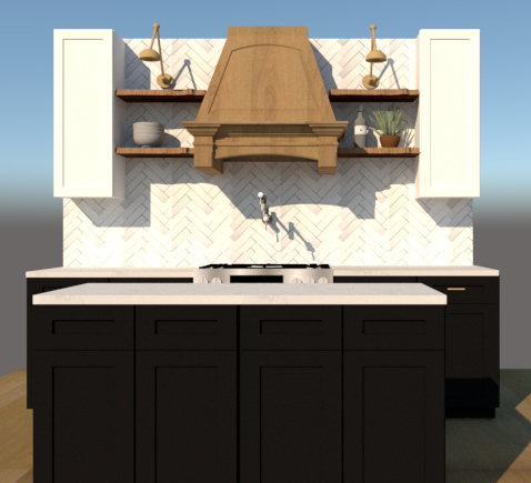
In the kitchen, the wall with all of the upper cabinets felt very heavy and dark before. Our clients were looking to incorporate floating shelves for more open storage. They also wanted to include a custom hood as a statement. Herringbone tile was also a must for our clients on the large back wall, and it turned out beautifully.
Before construction started, we went back and forth, debating on having any uppers along the back wall. In the end, we decided against it to keep the space open and allow the tile to shine. In the renderings, the options showed a wood island and all black cabinets, all white cabinets, or a combination. All black cabinets won out with wood accents in the shelving and hood.
The original intent for the fireplace was to incorporate a pattern tile, a reclaimed mantle, and shiplap above it. Then, our clients found a super cool tile they couldn’t pass up, and the plans changed a bit.
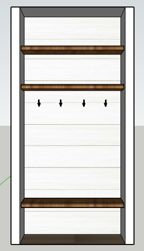
As we were working on the project, we also moved into the powder bathroom and the mudroom area. With the mudroom area being a smaller area, we wanted to make the most use of the space. Adding a bench for putting shoes on, plus some storage up above with hooks was the solution. Jamie built the bench and shelving and then added shiplap to the wall.
And there you have it! The design plans behind our most recent remodel project. Stay tuned for all the before and after pictures, plus the full details of the project.
Disclosure: construction2style has used affiliate links throughout this post. Although we are compensated for these links when purchases are made, we stand behind and use all brands and products we endorse on our site.
Thank you so much! Really appreciate it and that’s a great article about butler’s pantries. Thanks for sharing!
You really had a nice kitchen design. I am totally liking the color combination of it. It surely will never go out of style. I am also planning to renovate my kitchen and was looking in the internet for more inspo. I also encountered this site https://www.caesarstoneus.com/about-us/information-inspiration/design-to-inspire/7-tips-to-design-the-perfect-butler-s-pantry/ for more good recommendations in doing a butlers pantry.