We are cruising away on this kitchen remodel and can’t wait to show you the finished space. Before it’s completed, though, we wanted to share the before photos and inspiration for this space. Our client is a local Minnesota food blogger, Greens & Chocolate, who wanted to make her kitchen more functional for her cooking lifestyle and daily life. She is in the kitchen every day, making recipes and sharing them with her readers, so this is a very important part of her family’s home. While we were under construction, she also shared some of her tips and recipes for surviving your kitchen remodel.
Now, let’s get to the before photos…
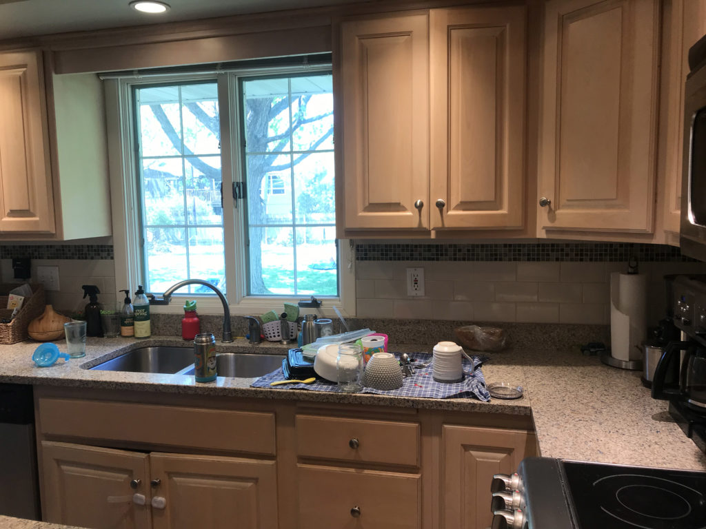
Before
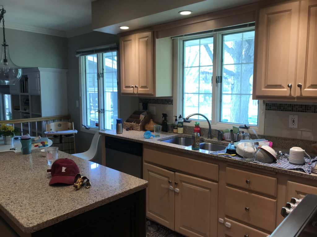
The previous kitchen was closed off from the dining room and the living room, making the space feel cramped and closed in. By knocking down the walls between the living room and dining room, it will open up the footprint for the kitchen and give the home an open concept.
With a header above the cabinets, there was storage space going to waste. The window on the left side of the picture below is becoming a patio door for easy access to the backyard. These updates will make the space feel much larger.
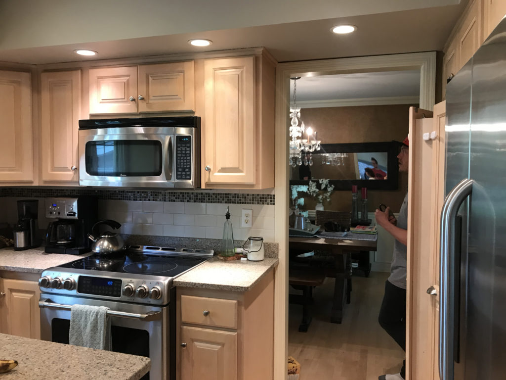
The narrow doorway into the dining room was right by the fridge and pantry, making the walkway feel crowded. Incorporating a hood rather than a microwave over the range was a big priority for our clients. Since there is a lot of cooking done in this space, they wanted proper ventilation.
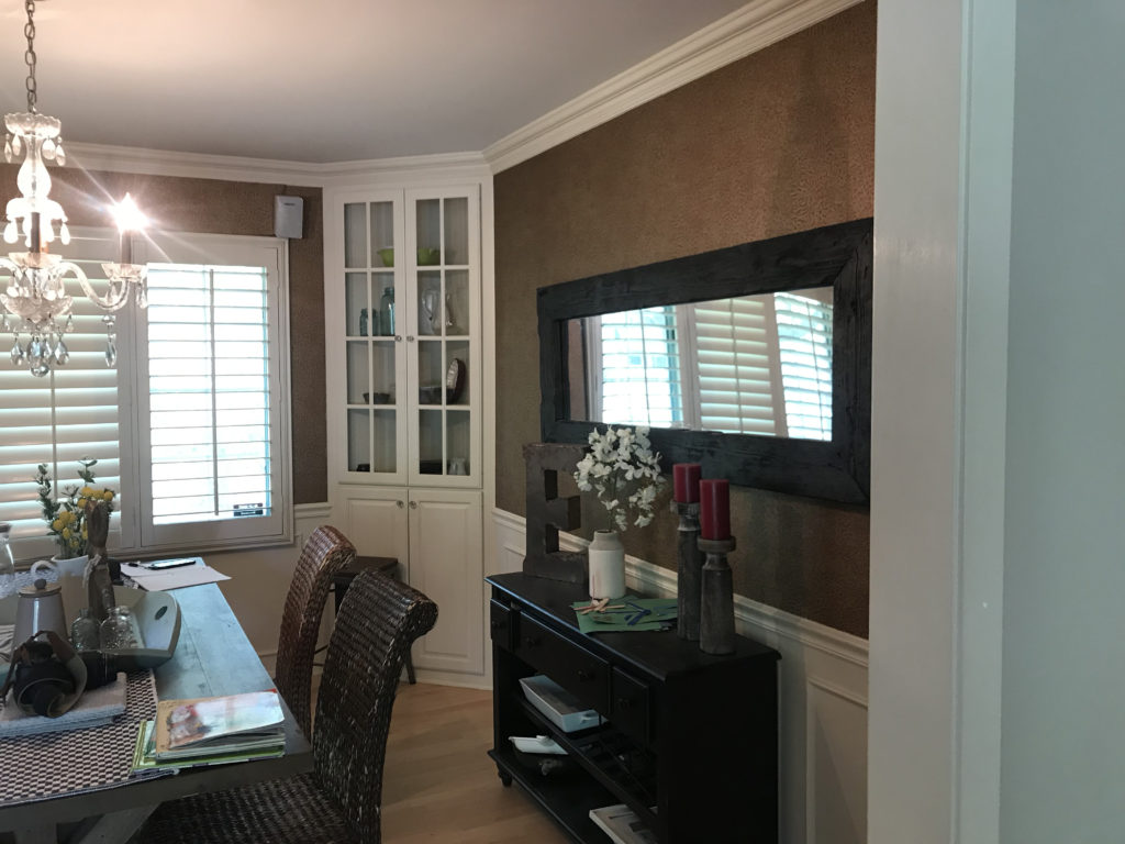
Since the family has another table in the kitchen, the dining room was not used very often. With such a large room, the space could be used much more effectively if it was open to the kitchen.
Moving the sink to under the window in the dining room meant getting a new window so that it would be above the countertop.
The window where the sink used to be will be closed up, and the space will be used for additional cabinet storage, as well as a spot for the fridge and pantry.
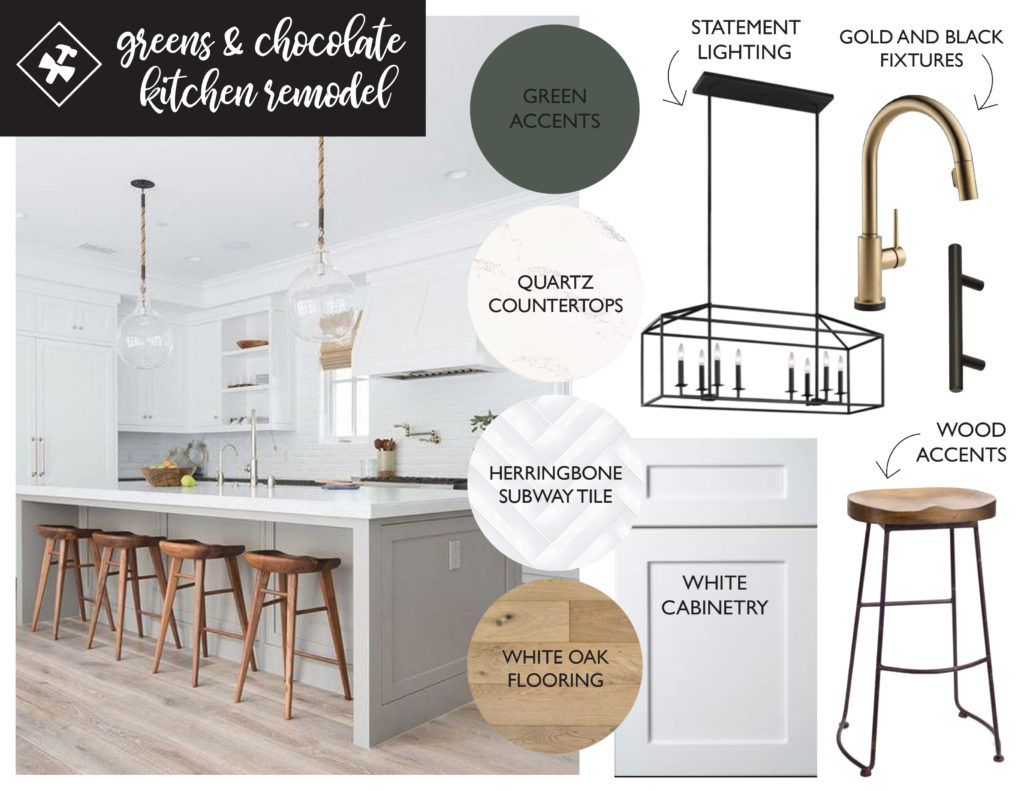
Mood Board
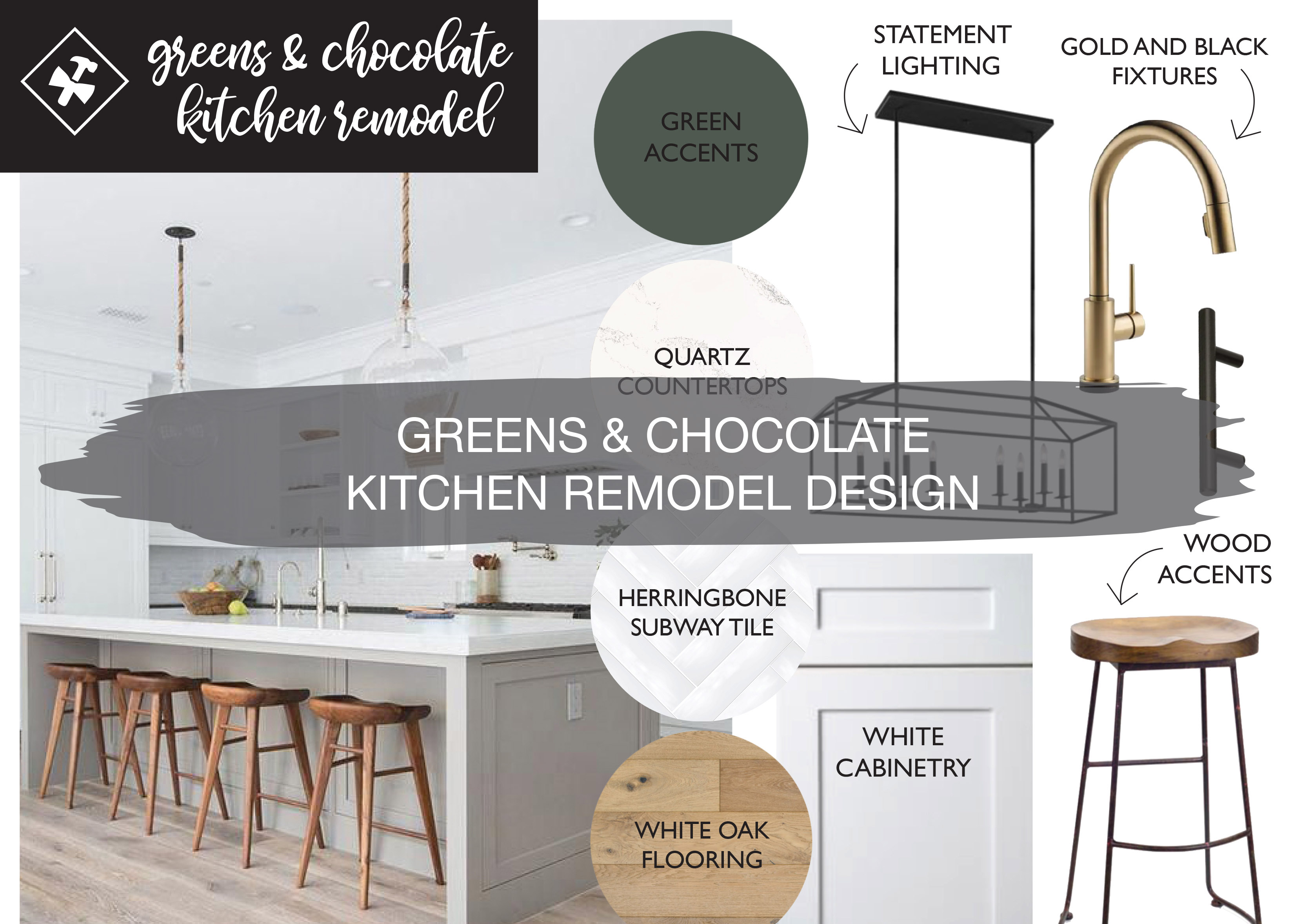
In the inspiration for this space, the biggest priority was a light, bright space. Light cabinetry with bright quartz countertops and subway tile in a herringbone pattern were top of the list. Bringing in wood elements through the floor and an accent on the hood was also important. Combining black and gold accents is a great way to mix metals and give the space a layered look.
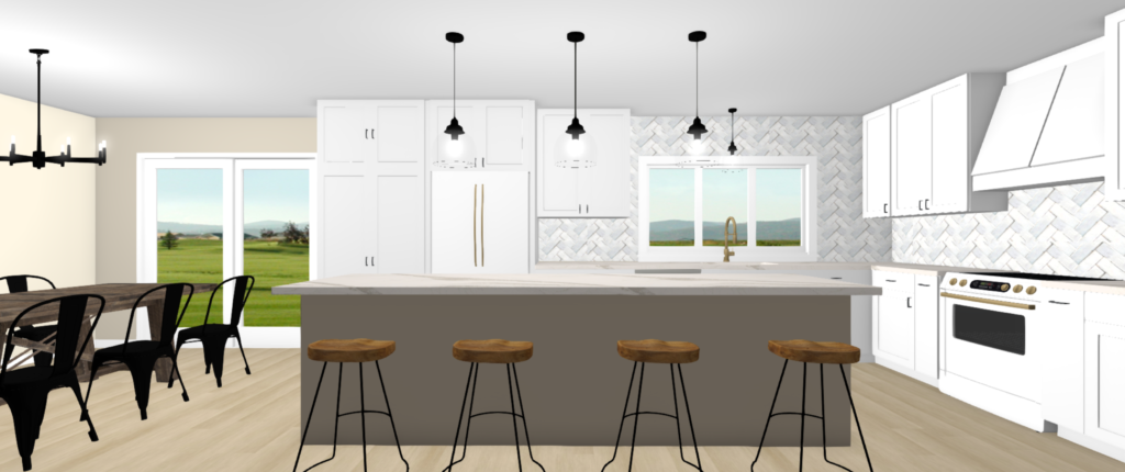
Designs
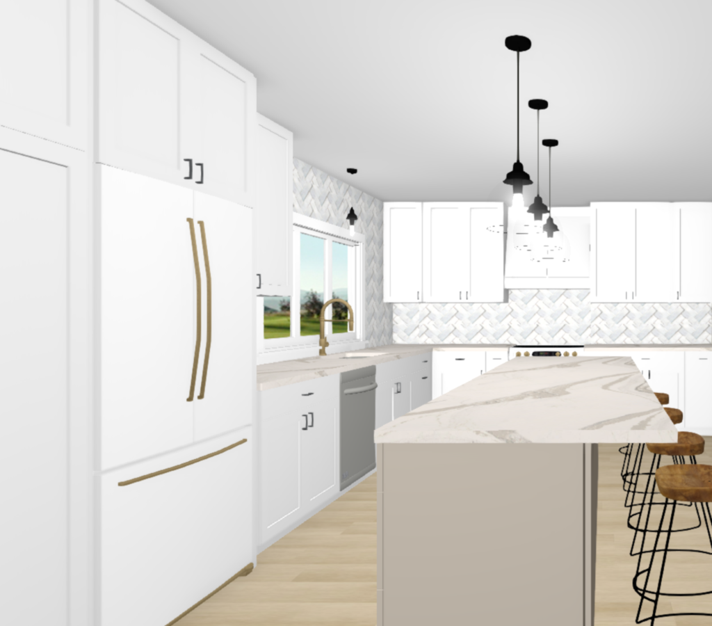
For the designs, the sink is now by the large window that used to be part of the dining room. This allows lots of natural light to stream through the space. Subway tile in a herringbone pattern adds a fun twist to the classic layout. White GE Cafe Appliances pair well with the white cabinetry. A greige island makes it stand out from the rest of the cabinetry and brings warmth to the space.
Adding pendant lighting over the sink and island provide task lighting. The gold handles on the appliances will complement the gold faucet. New wood flooring throughout the space gives it a consistent look and feel, especially with the new open concept.
We’ll wrap up this project soon and can’t wait to share it with you. Stay tuned!

One thought on “Greens & Chocolate Kitchen Remodel Design”
Comments are closed.