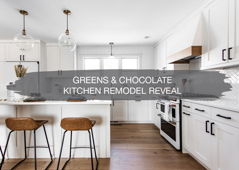
We are SOOOO excited to be revealing one of our favorite kitchen remodel projects with you all today. This was a team effort, so we’re bringing the team in together to talk through all of the details that went into this fabulous project.
Last year we started a few renovations on the lovely Taylor, from Greens & Chocolate, and her husband Marc’s home. Where there was once a guest bedroom as you entered in from the garage is now their mudroom.
Walls came down, and we moved things around. We also retiled the mudroom into the powder bath and front entryway.
With two busy boys and a little girl on the way, they were in need of more room, especially for us Minnesotans who have all the winter gear.
Fast forward to this year, and they asked us to come in and remodel their kitchen, dining room, and living room making three rooms into one. At the end of last year, we walked you through the designs, and now, we can’t wait to share the after!
But first, let’s rewind to the beginning…
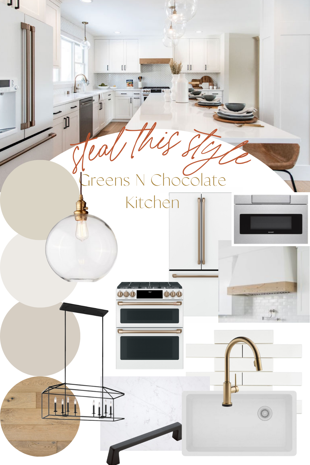
Mood Board
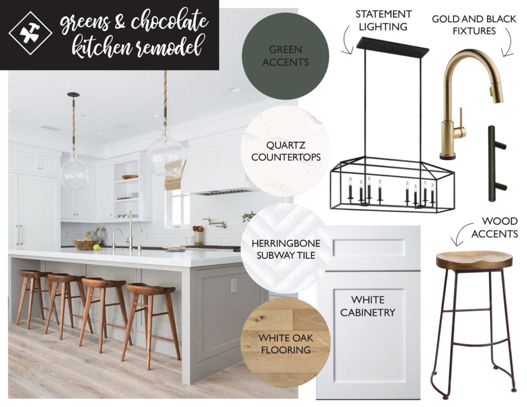
In the design for this kitchen, our clients loved the white and bright look and wanted to incorporate that into their kitchen. Other elements that were big players in this design included gold and black accents, statement lighting, and wood elements.
Renderings
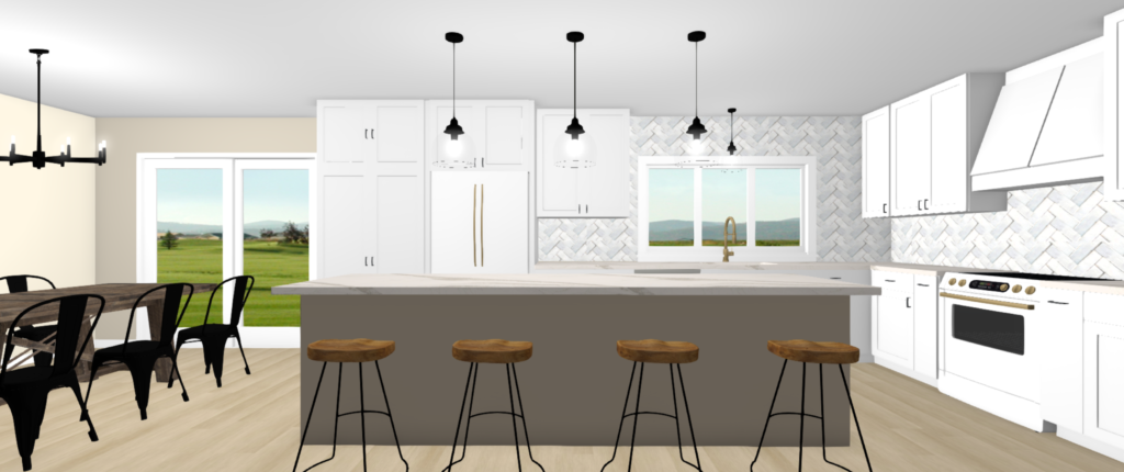
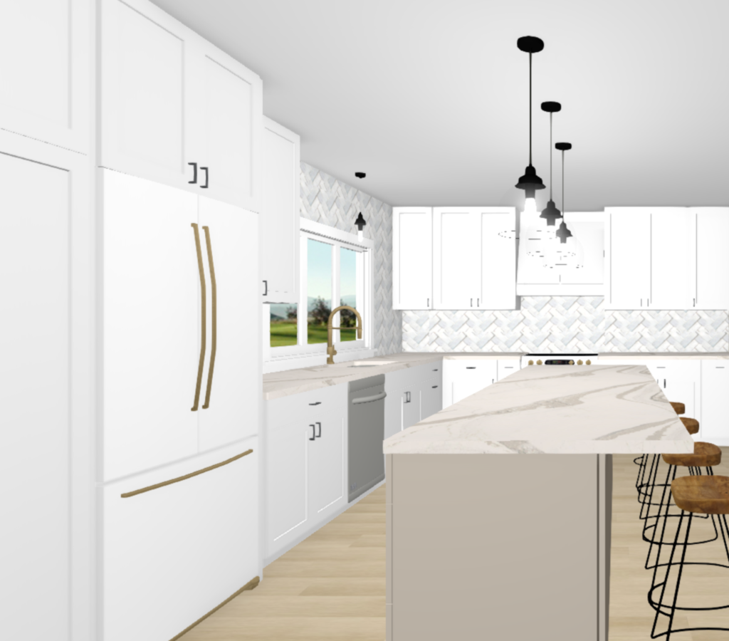
One of our favorite parts of the design process is when we get to the renderings. After the floor plan is complete and the selections chosen, we use our program to incorporate their exact selections into the space, so they can see it before demo even begins.
Here are the renderings of this kitchen…
And now for the part we’ve all been waiting for – the before and after!
Before & After
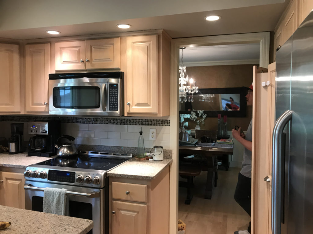
Before
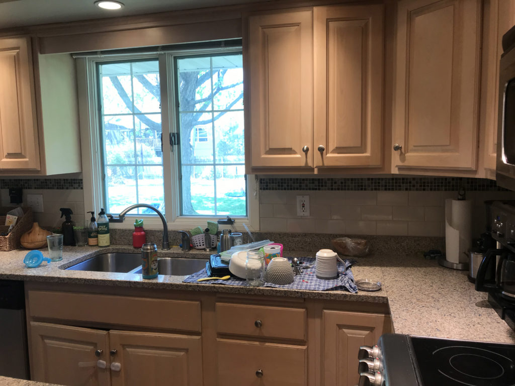
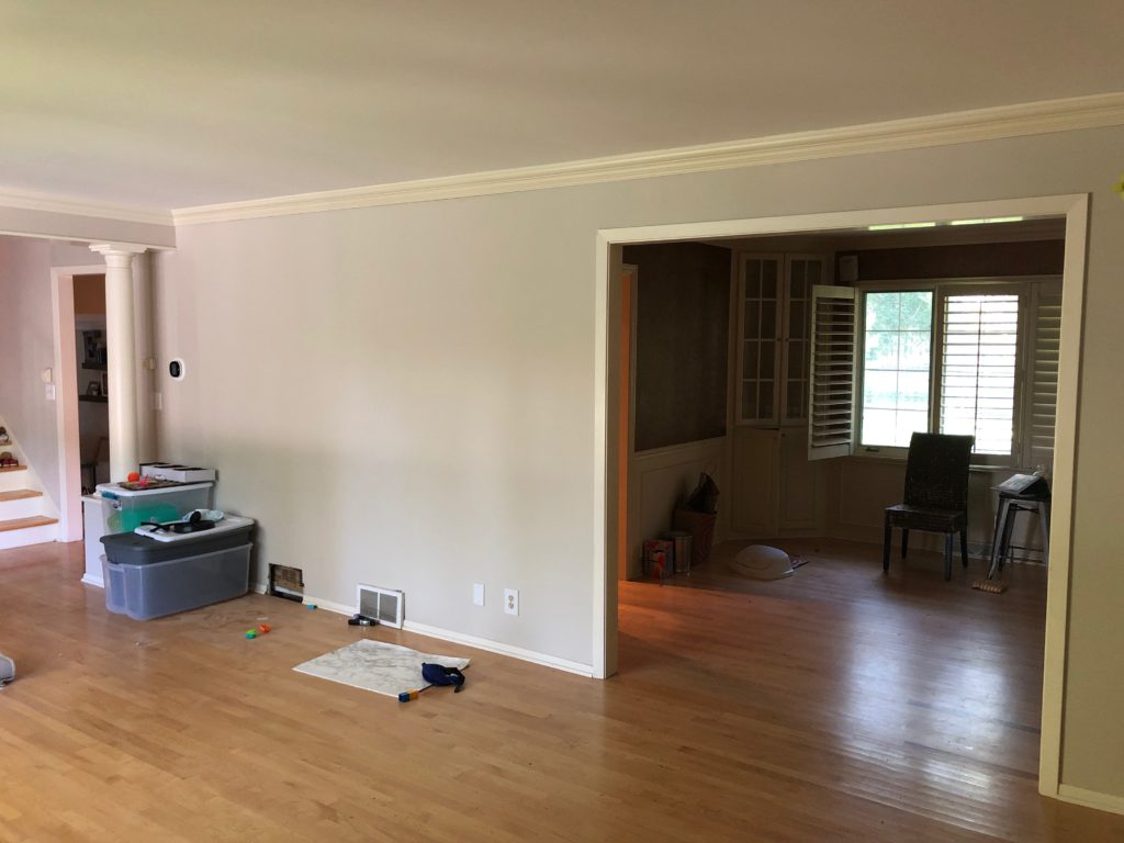
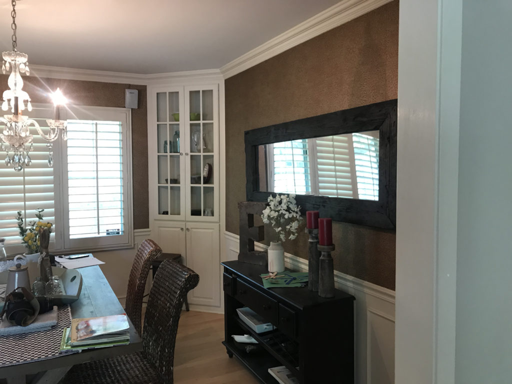
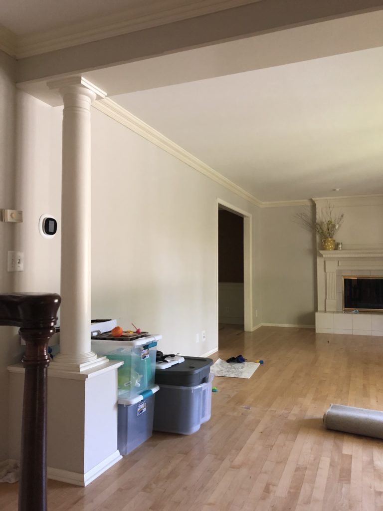
This space was once three rooms – the kitchen, dining, and living room. The goal was to open it all up into one space to give it that open concept feel and make the kitchen layout more functional.
The window above the previous sink was closed off to allow for more cabinet storage, and the sink shifted down to where the dining room used to be.
After
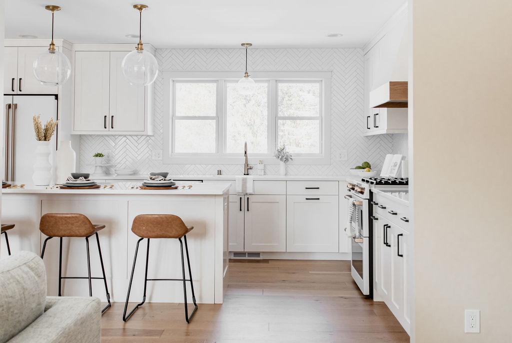
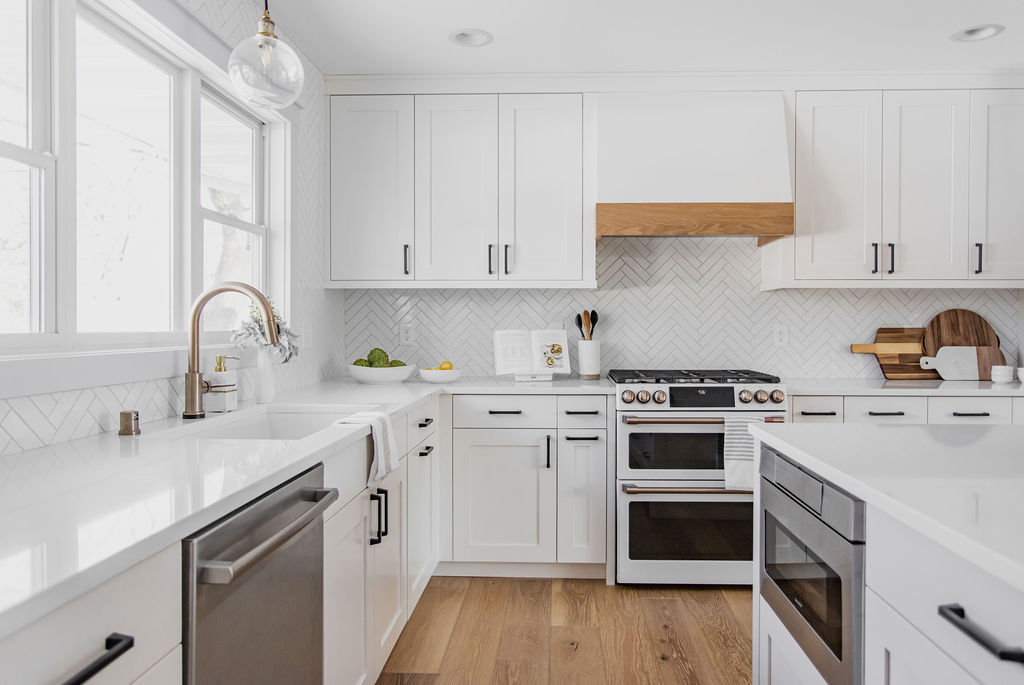
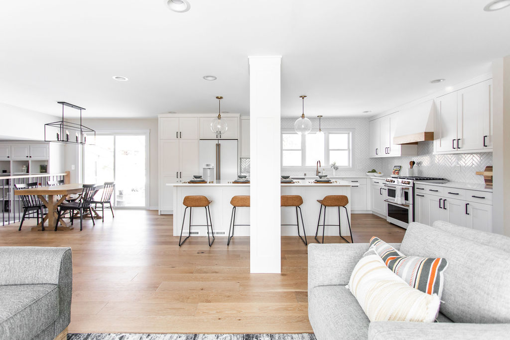
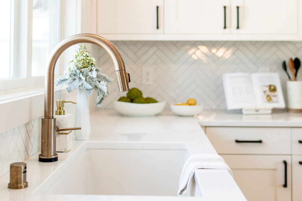
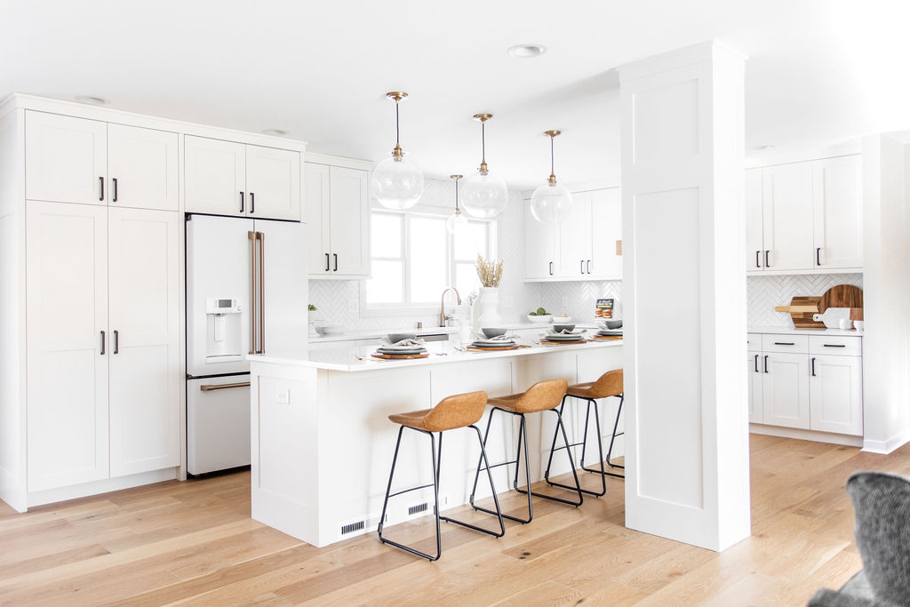
Now, these three rooms are one beautiful, open space and our clients couldn’t be happier. The long window above the sink is in the same location as the previous dining room but got changed out so it could be raised up, which allowed for countertop space below.
The sink looks out to the backyard, and the window provides so much light for the space.
Before
The wall where the range was in the previous kitchen layout got removed, and the range moved to the back dining room wall. Removing the wall opened up the space, which allowed for a more functional layout that works much better for our clients.
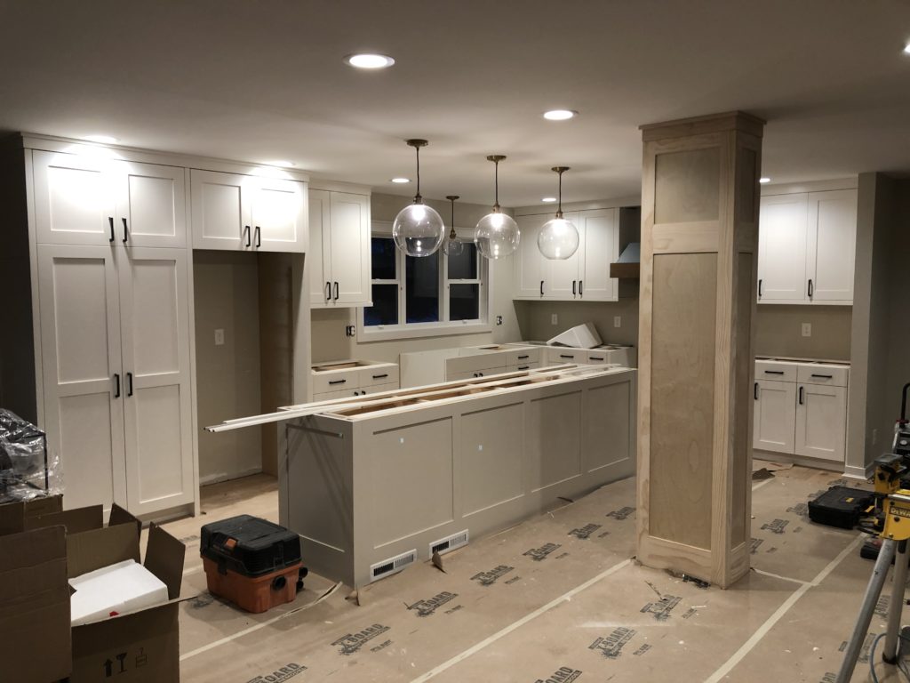
Under Construction
After
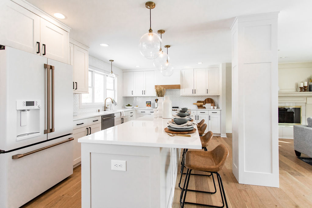
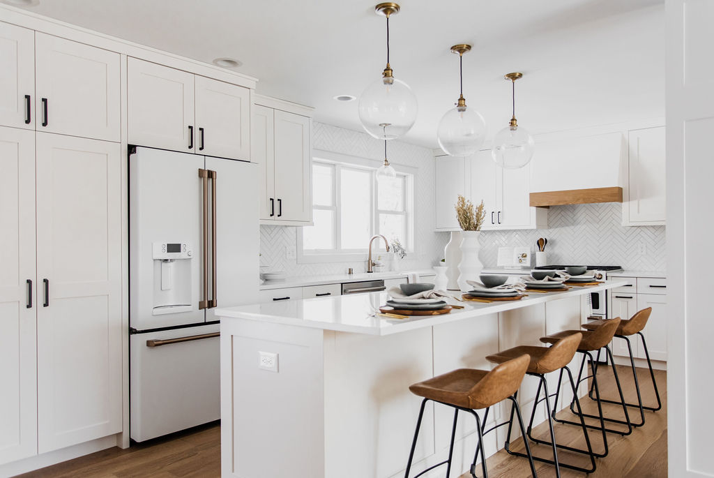
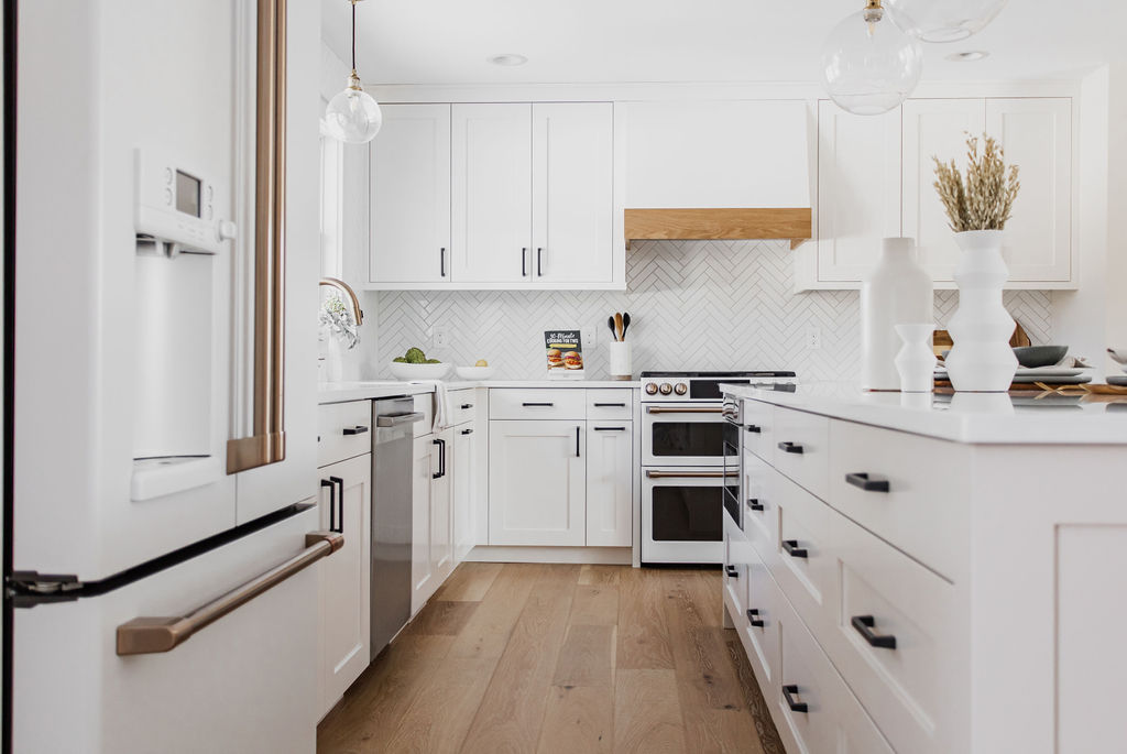
Moving the range to the back wall of the previous dining room allowed space for a large island that could house the microwave and provide more storage. Also, the large island provides a lot of countertop space for prep, hosting, and seating with stools.
Selections
Cabinetry + Hardware
With this kitchen, we loved partnering with Jkath Design Build on the custom cabinets. While custom cabinets cost more, the quality is amazing, and they look incredible.
Shaker style cabinets are painted Sherwin Williams Snowbound on the perimeter and Sherwin Williams Modern Gray on the island, which provides a slight contrast, while still maintaining a classic and timeless look.
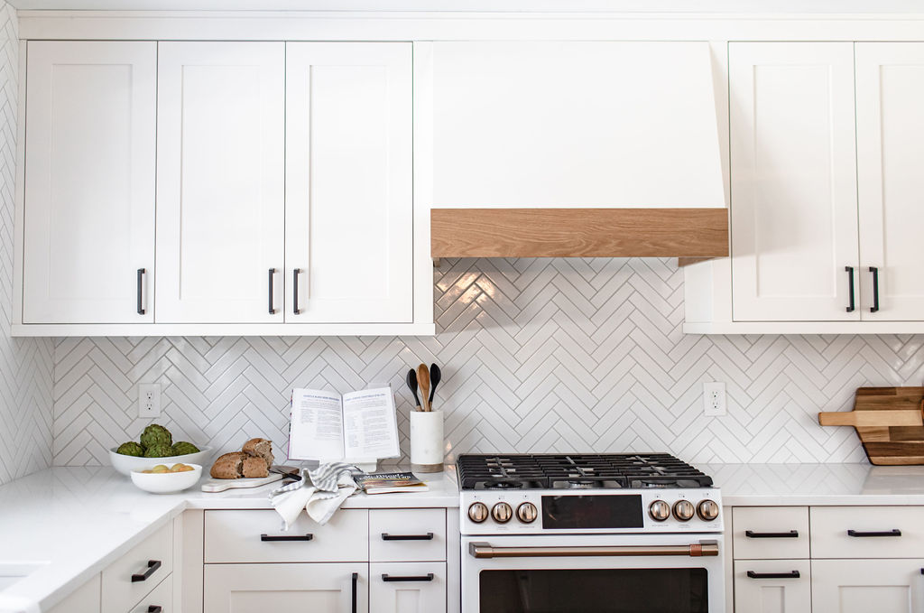
Jkath also built this custom hood with the wood accent to tie into the flooring, and it is a stunning focal point on the range wall. The black hardware is sleek and modern and compliments the cabinetry so well.
Flooring
Since walls were coming out and flooring was getting demoed out, it was time for new floors. These engineered floors from Urban Floor are a European Oak in 7.5″ wide planks. Having the same flooring throughout provides consistency and really makes it feel like one large open space.
Appliances
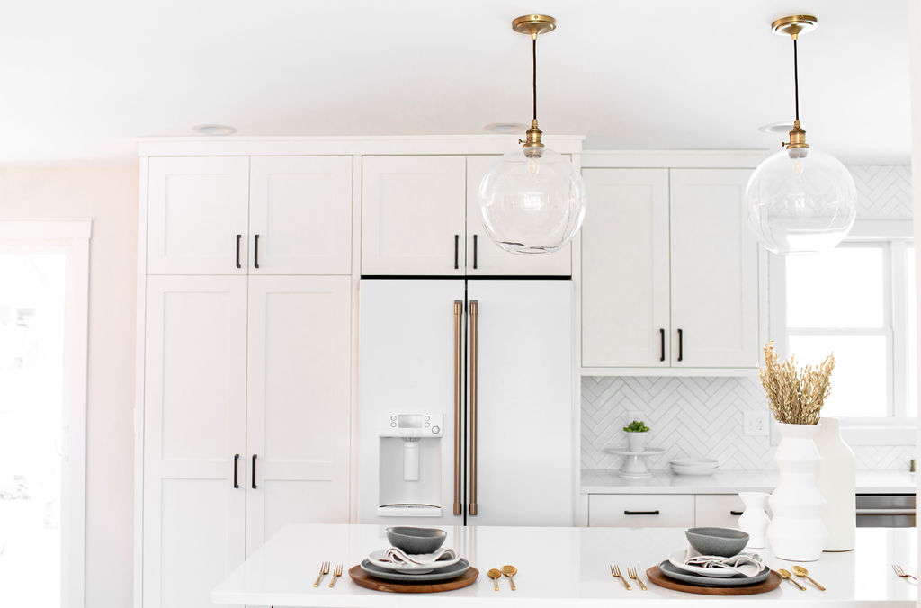
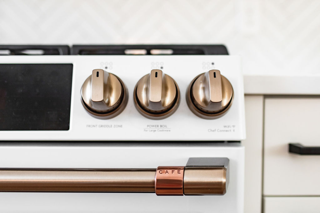
Our clients went with Cafe matte white appliances with gold handles, and we are in LOVE with them! The 36″ refrigerator works well with the tall pantry cabinet to the left of it, and the look is sleek, modern, and beautiful.
The dual-fuel range with convection not only looks good but has so many great functions for all of the cooking our clients do. It’s split into two ovens and has six burners on top as well.
By incorporating the microwave into the island, it frees up countertop and cabinet space above and allows it to easily be hidden from sight when in the living room and looking into the kitchen. The Sharp drawer microwave also makes it easy to access when at countertop height by opening and closing from a button on the top.
Backsplash
For the backsplash, our clients wanted to keep it classic and timeless, which is what this subway tile in a herringbone layout is. The white tile is accented by “Whisper Gray” grout, making the herringbone pattern stand out.
Countertops
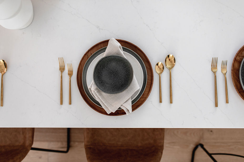
These Et Statuario Silestone countertops have the perfect amount of grey veining. They also brighten up the space, and the quartz material makes them easy to clean and maintain, which is perfect for all the cooking happening in this space.
Faucet + Sink
The Delta Trinsic faucet is one of our all-time favorites, and this gold finish is so pretty. Our clients went with the touch option, which is a game-changer in the kitchen. Once you go with a touch faucet, you’ll never go back!
Another of our favorites is the Elkay quartz composite sink. These sinks are super durable because of the material they’re made with and are scratch and stain-resistant. The single basin option is also so nice for washing larger pots and pans.
Lighting
We went back and forth with options for pendants over the island but landed on these black and gold glass pendants from Pottery Barn, and they were a perfect choice. A smaller version of the same pendant is over the sink as well to provide additional light.
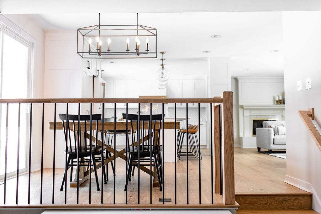
Over the small dining table, this black chandelier pendant ties in the black hardware on the cabinets and makes a statement in this spot as well.
Railing + Mudroom
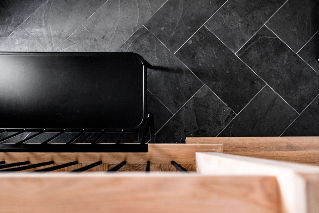
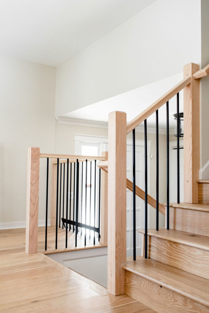
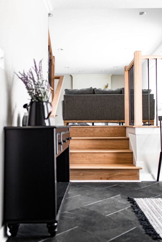
In addition to the kitchen, we also updated our clients’ entryway and mudroom last year. For the entry, slate tile in a herringbone layout was installed. With the new railings that were done during the kitchen phase, the entry got a completely new look.
Jamie built these railings to match the flooring in the living room and kitchen, and they look incredible! Our clients love the modern feel with the black balusters and wood railing and newel posts.
Styling | Shop this Kitchen
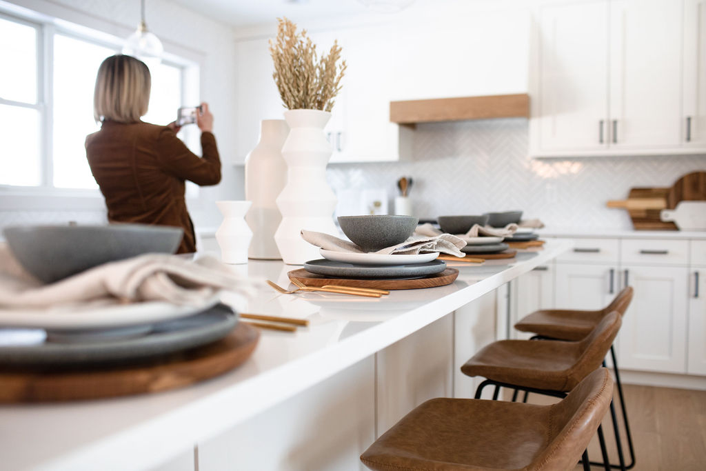
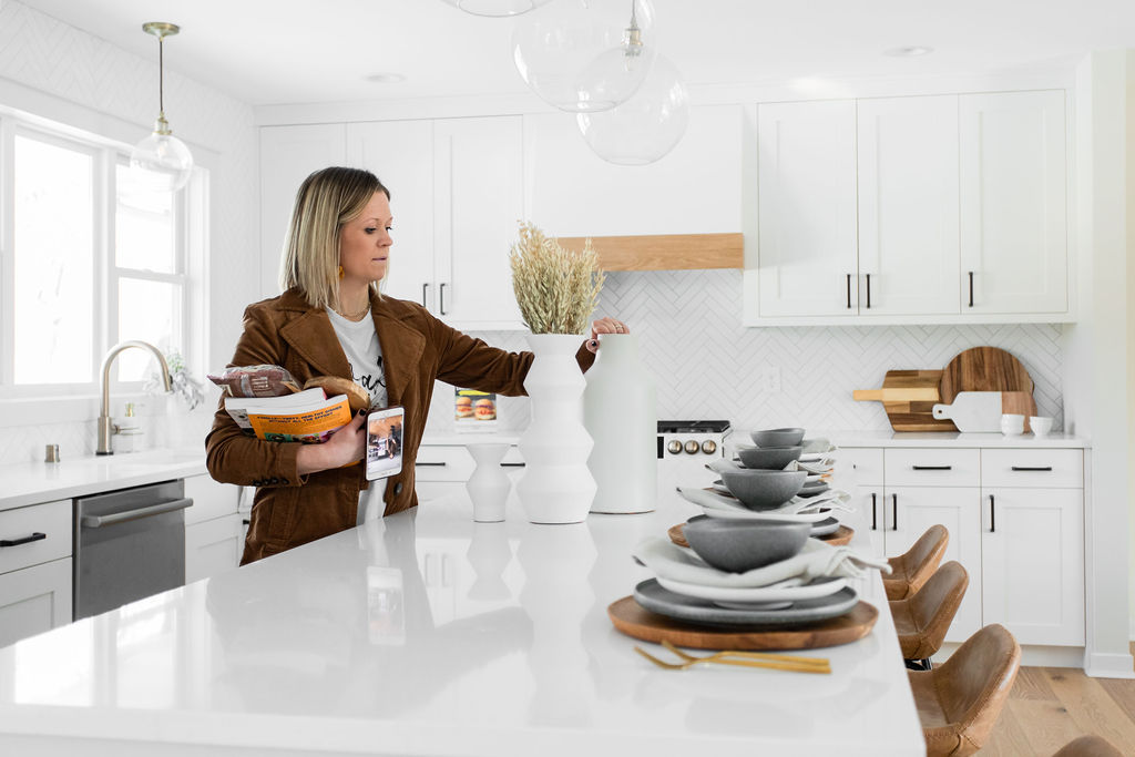
We had so much fun styling this space and getting to see the designs come to life. It was such an awesome project for our whole team, and we love seeing our clients love their space too!
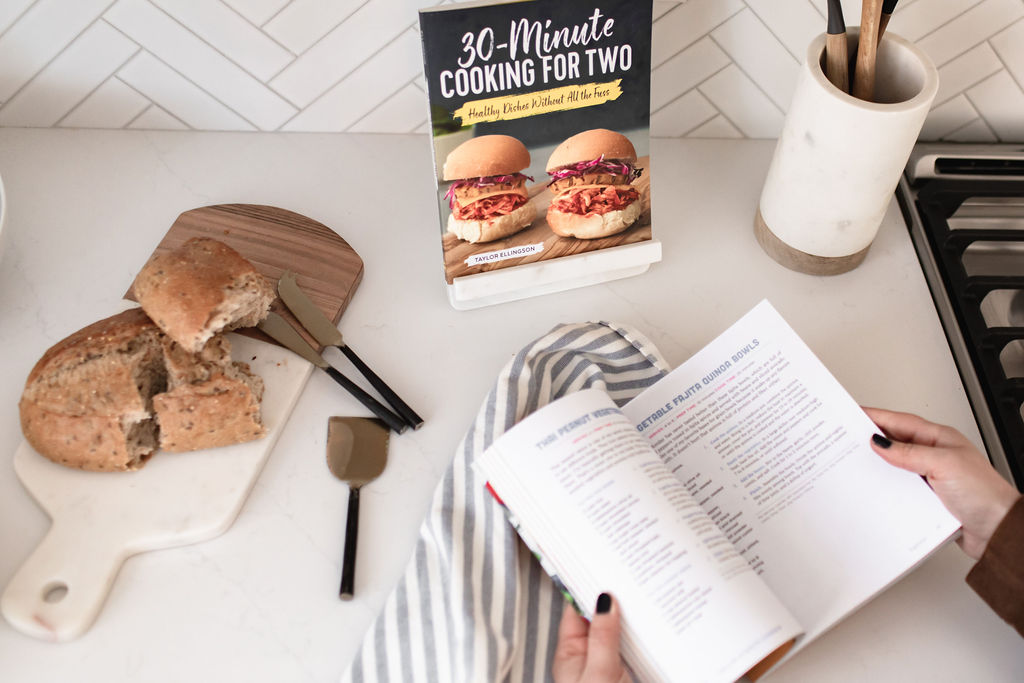
We sourced all of our styling pieces within this project from West Elm, Williams Sonoma, CB2, and Pottery Barn.
Earth tone Totem White Vase | White Pure Ceramic Vase | Gold Geometric Sculpture |White Stone Dinnerware Plates | Textured Napkin Linens | Marble Cookbook Stand | Similar Wood Chargers | Faux Potted Succulent | Dusk Kanto Dinner Plates | Dusk Kanto Bowls | Rove Metal Candles | Marble and Wood Cutting Board | Bar Stools | White Serving Bowls | Gold Silverware Set | Overzied Cutting Board
Shop this Kitchen:
Elkay white quartz composite sink | Delta Trinsic champagne bronze touch faucet | Cafe refrigerator in matte white with gold handles | Cafe dual fuel range in matte white with gold handles | Zephyr hood insert | Silestone countertops | Herringbone backsplash | Dining table light | Island pendants | Pendant over sink | Cabinet hardware | Urban Floor Lambrusco engineered flooring
Disclosure: This post contains affiliate links to our favorite products. This adds no extra cost or harm to you. Thank you for supporting our small business.
Tips, Tricks & Recipes to Surviving
Our client Greens & Chocolate is one of our favorite foodie bloggers. Her recipes are our go-to many mornings, days, and nights throughout the week. And she was so kind to do a fun video with us sharing for you all not only a few of her favorites but tips & tricks to surviving a kitchen remodel and being able to stay cooking the same. Enjoy!
A big thanks to Chelsie Lopez for capturing this space and creating this fun video for us!

3 CM! 🙂
Are the countertops 2CM or 3CM thickness?