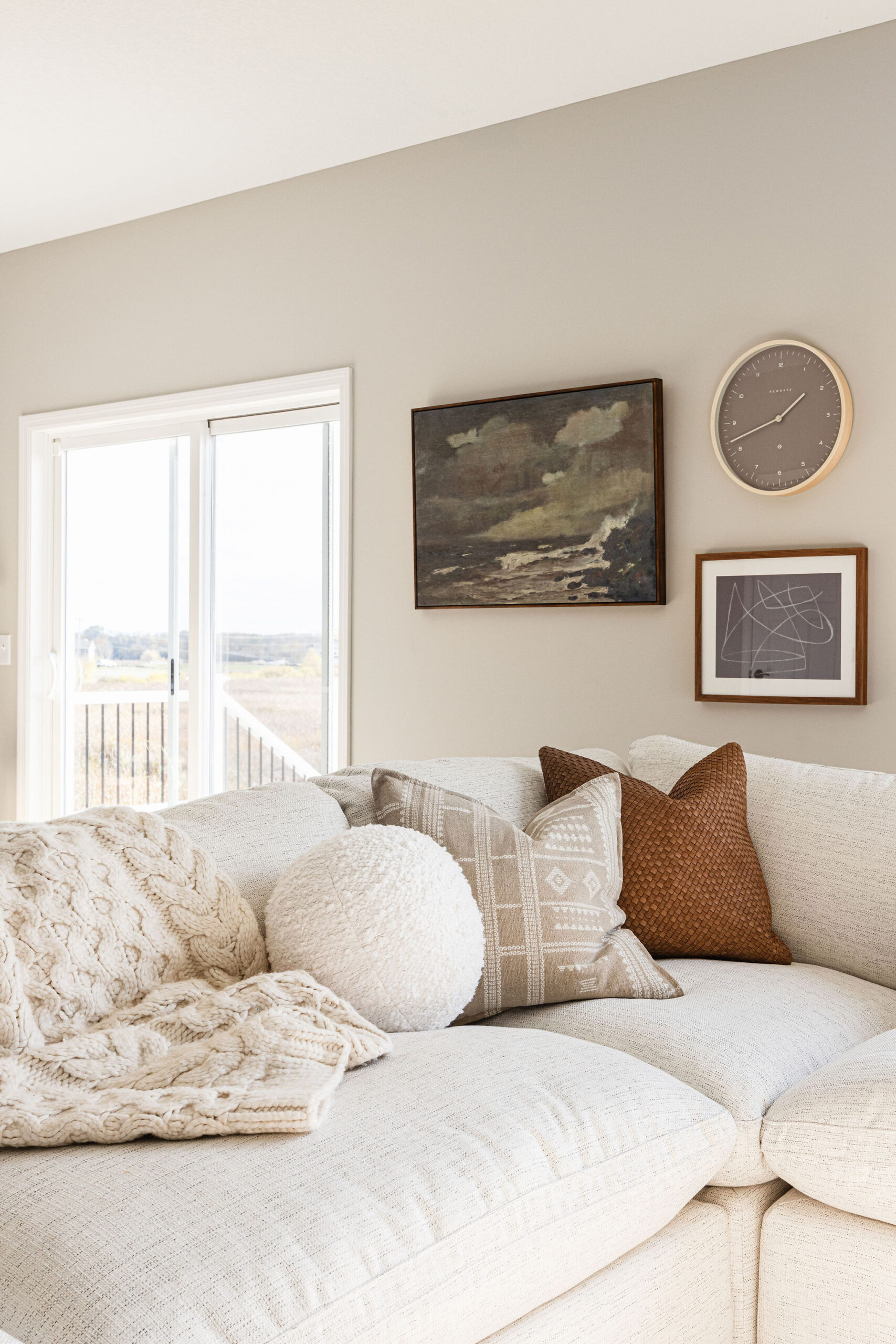
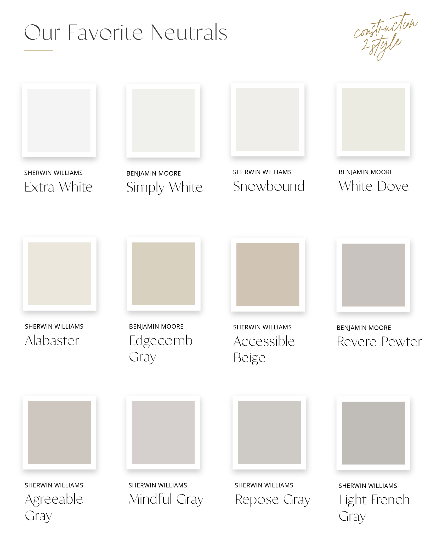
White paint and neutrals may seem simple at first glance, but choosing the perfect shade can be surprisingly tricky. The undertones can vary significantly, affecting the overall ambiance of your space. That’s why we’re here to help. We’ve carefully selected our top neutral paint colors to take the guesswork out of finding the right white and other versatile hues. These timeless shades are not only stunning on their own but also complement various design styles, making them the ideal choice for achieving a sophisticated, cohesive look in your home. So, say goodbye to the white paint confusion and explore our curated list of neutrals that will effortlessly elevate your interior decor.
1. Extra White
“Extra White” by Sherwin Williams is a pure, bright white paint color that belongs to the white color family. It’s one of the crispest and cleanest white shades you can find, with virtually no undertones or color casts. Extra White is often used to achieve a fresh, modern, and timeless look in interior spaces. It’s an excellent choice for trim, moldings, doors, and ceilings, as it provides a striking contrast against other colors. When used on walls, Extra White can create a bright and airy atmosphere, making it a popular choice for contemporary and minimalist designs. However, it’s important to note that because of its extreme brightness, it can sometimes appear harsh in rooms with a lot of natural light. It’s always a good idea to test paint samples in your specific lighting conditions before making a final decision.
2. Simply White
“Simply White” by Benjamin Moore is a versatile and popular white paint color known for its fresh and clean appearance. It is part of Benjamin Moore’s Off-White Collection and has gained widespread recognition as a go-to white shade for interior design. Simply White is celebrated for its ability to bring brightness and clarity to spaces without feeling overly stark. It has a soft warmth to it, making it suitable for various design styles, from traditional to modern.
One of the key features of Simply White is its adaptability to different lighting conditions. It can appear crisp and pure in well-lit rooms, while in spaces with less natural light, it takes on a cozy and inviting character. This flexibility makes it a great choice for walls, trim, ceilings, and cabinetry, as it complements a wide range of colors and design elements.
As with any paint color, it’s advisable to test samples in your specific environment to see how Simply White interacts with your lighting and decor, ensuring it achieves the desired look and feel for your space.
3. Snowbound
“Sherwin Williams Snowbound” is a popular white paint color from Sherwin Williams. It is well-regarded for its crisp and clean appearance. Snowbound is a pure white shade with cool undertones, which means it doesn’t have any noticeable warmth or yellowish tints. This makes it an excellent choice for achieving a bright and fresh look in interior spaces.
Snowbound is versatile and works well for a variety of applications. It is commonly used on walls, ceilings, trim, and cabinetry. It pairs nicely with both cool and warm color schemes, making it a flexible option for different design styles, from modern to traditional.
The name “Snowbound” reflects the color’s ability to evoke a sense of pristine whiteness, like freshly fallen snow. However, it’s essential to keep in mind that paint colors can appear differently in various lighting conditions, so it’s a good practice to test samples in your own space to ensure Snowbound achieves the desired effect you’re looking for.
4. White Dove
“Benjamin Moore White Dove” is a highly popular and versatile white paint color in the Benjamin Moore collection. It is known for its soft and warm undertones, making it a favorite choice for achieving a classic, timeless, and inviting look in interior spaces.
White Dove has a creamy and slightly off-white appearance, which gives it a gentle warmth without being too yellow or beige. This makes it suitable for a wide range of design styles, from traditional to contemporary. It is a versatile white that can be used on walls, ceilings, trim, cabinetry, and furniture.
One of the reasons White Dove is beloved by designers and homeowners is its ability to work well in various lighting conditions. It can adapt to both natural and artificial lighting, maintaining its pleasing and neutral character. It pairs effortlessly with other colors and materials, making it a dependable choice for creating a cohesive and elegant interior design.
As with any paint color, it’s advisable to test samples in your specific environment to see how White Dove interacts with your lighting and decor, ensuring it achieves the desired ambiance for your space.
5. Alabaster
“Sherwin Williams Alabaster” is a highly regarded and popular white paint color in the Sherwin Williams collection. It is known for its warm and creamy appearance, which gives it a soft and inviting character. Alabaster is a versatile neutral that works well with various design styles and color palettes.
Alabaster has a slightly warm undertone that adds a touch of warmth without being overly yellow or beige. This makes it an excellent choice for creating a cozy and comfortable atmosphere in interior spaces. It pairs beautifully with both warm and cool colors, making it suitable for a wide range of design aesthetics, from traditional to modern farmhouses.
One of the standout features of Alabaster is its ability to reflect light and create a bright and airy feel in rooms. It is commonly used on walls, ceilings, trim, cabinetry, and furniture. It is a popular choice for achieving a timeless and elegant look that stands the test of time.
When selecting paint colors, it’s important to consider your specific lighting conditions, as colors can appear differently in various settings. Testing paint samples in your own space can help ensure that Alabaster achieves the desired ambiance and aesthetic for your interior design project.
6. Edgecomb Gray
“Benjamin Moore Edgecomb Gray” is a soft and versatile gray paint color in the Benjamin Moore collection. It’s known for its warm undertones, which give it a gentle and inviting appearance. Edgecomb Gray is a popular choice for those seeking a neutral and timeless color that works well in a variety of interior spaces.
This gray shade has a subdued and understated quality, making it an excellent backdrop for a wide range of design styles. It pairs nicely with both warm and cool color palettes, making it adaptable to various decor schemes. Edgecomb Gray is often used on walls, ceilings, trim, and cabinetry.
One of the advantages of Edgecomb Gray is its ability to create a harmonious and balanced atmosphere in rooms. It can add depth and interest to spaces without overwhelming them. Its warm undertones can make it particularly appealing in rooms where you want to create a cozy and welcoming ambiance.
As with any paint color, it’s advisable to test samples in your specific lighting conditions to see how Edgecomb Gray interacts with your decor and furnishings. This ensures that it achieves the desired look and feel for your interior design project.
7. Accessible Beige
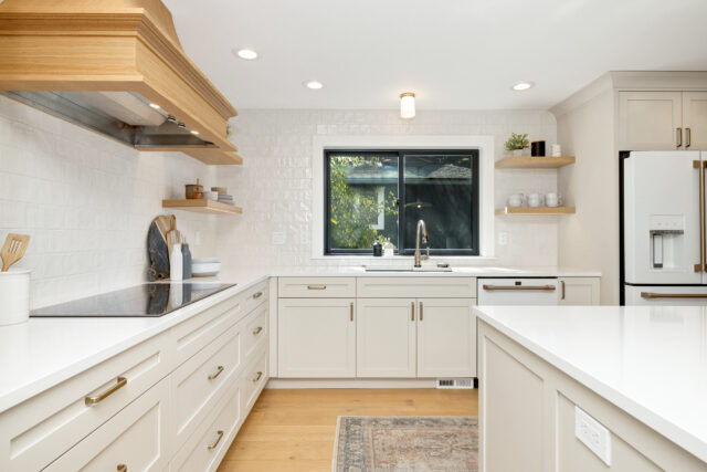
“Sherwin Williams Accessible Beige” is a versatile and popular beige paint color from Sherwin Williams. It is known for its neutral and adaptable nature, making it a favored choice for interior designers and homeowners looking for a warm and inviting color that complements various design styles.
Accessible Beige has a soft and understated appearance with warm undertones that create a sense of coziness and comfort. It’s neither too light nor too dark, making it a great choice for creating a balanced and harmonious atmosphere in living spaces. This beige shade pairs well with a wide range of colors, allowing for flexibility in design.
One of the key features of Accessible Beige is its ability to adapt to different lighting conditions. It can appear slightly lighter or darker depending on the lighting in the room, which can add depth and dimension to the space. It is commonly used on walls, ceilings, trim, and even exterior surfaces.
When choosing a paint color like Accessible Beige, it’s advisable to test samples in your own space to see how it interact with your lighting and decor. This ensures that the color achieves the desired look and ambiance for your specific interior design project.
8. Revere Pewter
“Benjamin Moore Revere Pewter” is a highly popular and versatile gray paint color in the Benjamin Moore collection. It is celebrated for its neutral and timeless qualities, making it a go-to choice for interior designers and homeowners looking for a sophisticated yet adaptable color.
Revere Pewter falls into the greige category, which means it has a subtle blend of gray and beige undertones. This creates a warm and inviting appearance without being overly cool or warm. It’s known for its chameleon-like quality, as it can shift slightly in color depending on the lighting conditions in the room.
One of the standout features of Revere Pewter is its ability to work well with a wide range of color palettes and design styles. It pairs beautifully with both warm and cool colors, making it a flexible choice for various interior spaces. It is commonly used on walls, ceilings, trim, and cabinetry.
Revere Pewter is often recommended for its ability to add depth and sophistication to rooms while maintaining a sense of balance. It is particularly popular in open-concept living spaces where it can create a cohesive and harmonious flow.
When choosing a paint color like Revere Pewter, it’s important to test samples in your specific lighting conditions to ensure it achieve the desired look and ambiance for your interior design project.
9. Agreeable Gray
“Sherwin Williams Agreeable Gray” is a popular and versatile gray paint color in the Sherwin Williams collection. It is celebrated for its neutral and adaptable qualities, making it a favored choice among interior designers and homeowners seeking a soft and inviting color.
Agreeable Gray falls into the greige category, which combines gray and beige undertones to create a balanced and warm appearance. It strikes a harmonious balance between cool and warm, making it suitable for a wide range of design styles and color palettes.
One of the advantages of Agreeable Gray is its ability to reflect and adapt to different lighting conditions. It can appear slightly lighter or darker depending on the lighting in the room, allowing it to create depth and dimension. This makes it an excellent choice for open-concept living spaces.
Agreeable Gray is often used on walls, ceilings, trim, and cabinetry. It pairs well with both warm and cool colors, offering flexibility in design. Its soft and subtle character adds a touch of elegance to interior spaces while maintaining a sense of comfort.
As with any paint color, it’s recommended to test samples in your own space to see how Agreeable Gray interacts with your lighting and decor. This ensures that the color achieves the desired look and ambiance for your specific interior design project.
10. Mindful Gray
“Sherwin Williams Mindful Gray” is a versatile and popular gray paint color from Sherwin Williams. It is known for its balanced and neutral appearance, making it a sought-after choice for interior designers and homeowners looking for a sophisticated and adaptable color. Mindful Gray falls into the greige category, which combines gray and beige undertones. This creates a warm and inviting look without being too cool or too warm. It’s a color that can work well with a variety of design styles and color palettes. One of the notable features of Mindful Gray is its ability to adapt to different lighting conditions. It can appear slightly lighter or darker depending on the lighting in the room, which adds depth and versatility to the color.
This quality makes it suitable for various interior spaces, including living rooms, bedrooms, and kitchens. Mindful Gray is often chosen for its ability to create a balanced and harmonious atmosphere in rooms. It pairs seamlessly with other colors and can serve as an excellent backdrop for artwork and furnishings. When selecting a paint color like Mindful Gray, it’s advisable to test samples in your own space to see how it interact with your lighting and decor. This ensures that the color achieves the desired look and ambiance for your specific interior design project.
Mindful Gray is what we have in our home here. Five years later, we’re very happy we went with this color throughout our home.
11. Repose Gray
“Sherwin Williams Repose Gray” is a popular and versatile gray paint color in the Sherwin Williams collection. It is known for its neutral and timeless qualities, making it a favored choice among interior designers and homeowners looking for a soft and sophisticated gray.
Repose Gray falls into the greige category, which combines gray and beige undertones to create a balanced and warm appearance. It is often described as a “true gray” because it doesn’t have strong undertones of blue, green, or purple, making it a versatile choice for a variety of design styles.
One of the standout features of Repose Gray is its ability to reflect and adapt to different lighting conditions. It can appear slightly lighter or darker depending on the lighting in the room, which adds depth and dimension to the color. This quality makes it suitable for both well-lit spaces and those with limited natural light.
Repose Gray is commonly used on walls, ceilings, trim, and cabinetry. It pairs well with a wide range of color palettes and design elements, making it a flexible choice for interior spaces. Its soft and elegant appearance adds a touch of sophistication to rooms while maintaining a sense of comfort.
As with any paint color, it’s advisable to test samples of Repose Gray in your own space to see how it interacts with your lighting and decor. This ensures that the color achieves the desired look and ambiance for your specific interior design project.
12. Light French Gray
“Sherwin Williams Light French Gray” is a versatile and elegant gray paint color from Sherwin Williams. It is known for its soft and subtle appearance, making it a popular choice among interior designers and homeowners seeking a sophisticated and understated gray.
Light French Gray is part of the greige category, which combines gray and beige undertones to create a balanced and warm look. It has a gentle and neutral character that works well in a variety of design styles, from traditional to contemporary.
One of the notable features of Light French Gray is its ability to create a serene and calming atmosphere in interior spaces. It’s a color that can easily adapt to different lighting conditions, appearing slightly lighter or darker depending on the room’s natural and artificial lighting. This versatility allows it to work well in bedrooms, living rooms, and common areas.
Light French Gray is often used on walls, ceilings, trim, and cabinetry. It pairs harmoniously with a wide range of color palettes and design elements, offering flexibility in interior design. Its subtle and timeless appearance adds a touch of sophistication to rooms while maintaining a sense of comfort and tranquility.
When selecting a paint color like Light French Gray, it’s advisable to test samples in your own space to see how it interacts with your lighting and decor. This ensures that the color achieves the desired look and ambiance for your specific interior design project.

So simple but so good!
Great post. White color seems amazing on walls.