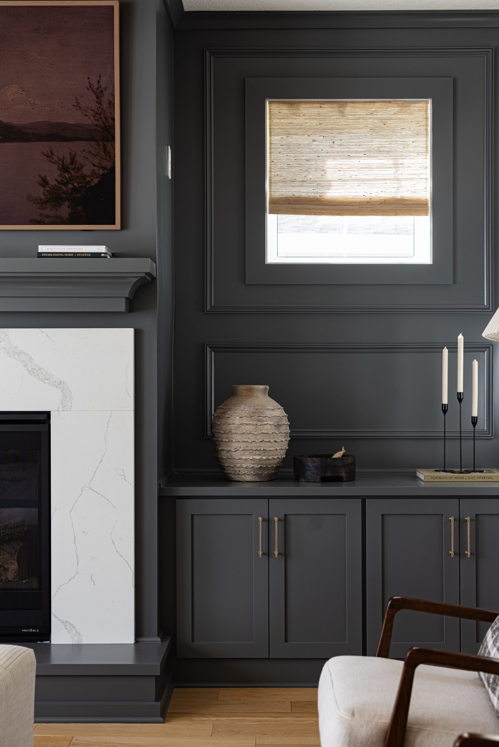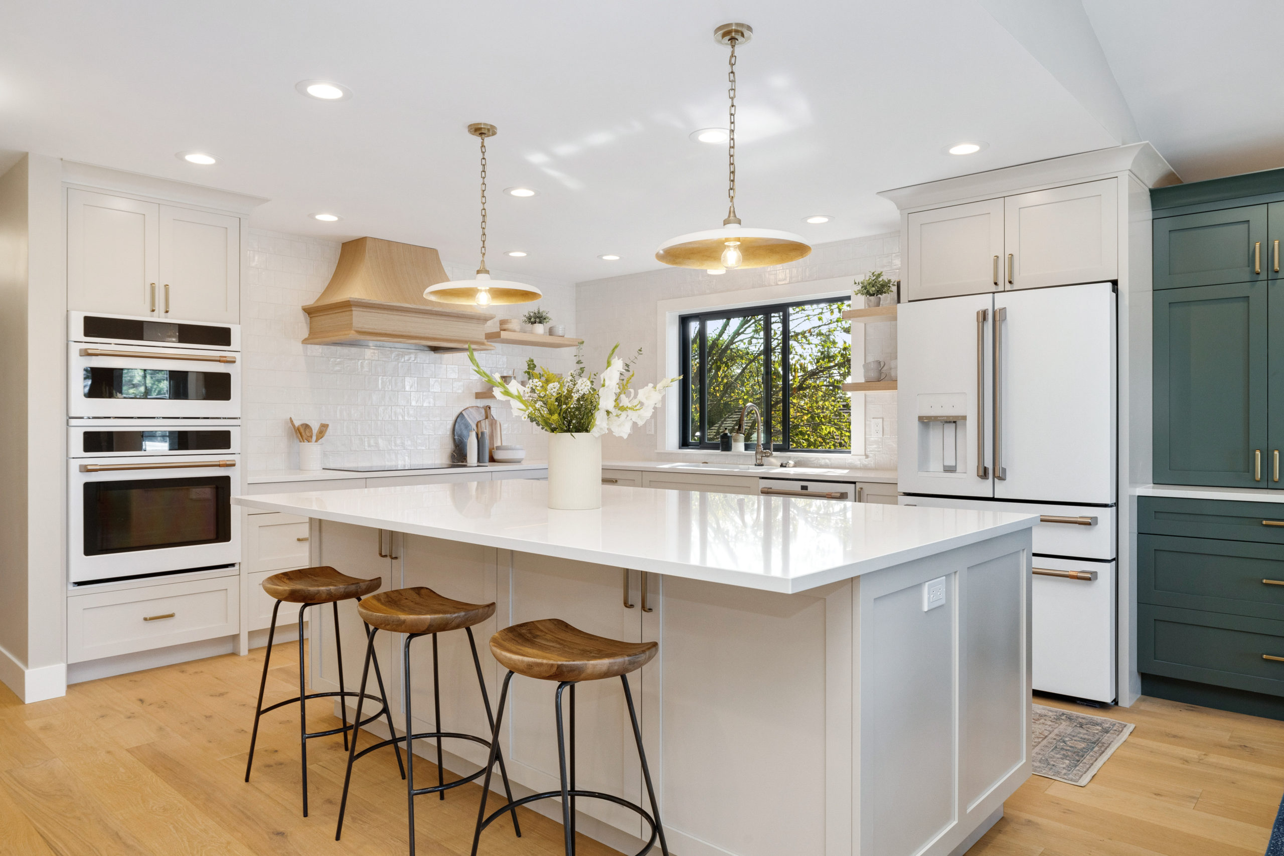
We are back with the #SeattleSunsetHill full home project reveal! A design project that we have been hard at work designing over the past year … and we’re still not done quite yet because the bar stools we ordered last summer still have yet to arrive.
Back in April, we shared the design details behind this project, however, we started working on this project back when I was pregnant with Ellie. Which feels like a lifetime ago! It’s a good thing we have loved every minute of working with this client and family, actually a bit sad for it to come to an end. They have been beyond a joy to work with from afar! They trusted our vision from the beginning which led to a very seamless process with little hiccups. Any hiccups that did come from this project were due to product delays and the supply chain. But what’s fun without a little challenge?!
We also got to help source all new furniture and decor within this home, and even better – Jamie and I flew out to Seattle to help style the home, once construction was wrapped up. After a year of working together digitally, it was so much fun to see how Eakman Construction brought the designs perfectly to life in real life!
So sit back and buckle up because this is one long blog post filled with all the before, designs, under construction, after, selections, and every itty bitty detail.
Kitchen
First up, the heart of the home, let’s start with the kitchen. When these clients contacted us, they knew they wanted a full gut and remodel of the entire home and they were open to any floor plan layouts and design suggestions we had to offer. So we did what we always do and designed it out as if it were our own home.
The biggest challenge within this home was that everything was so divided and closed off throughout the house. So we knew walls needed to come down within the main and lower level, especially within the kitchen, where a couple of walls separated the living and formal dining room.
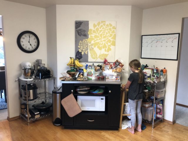
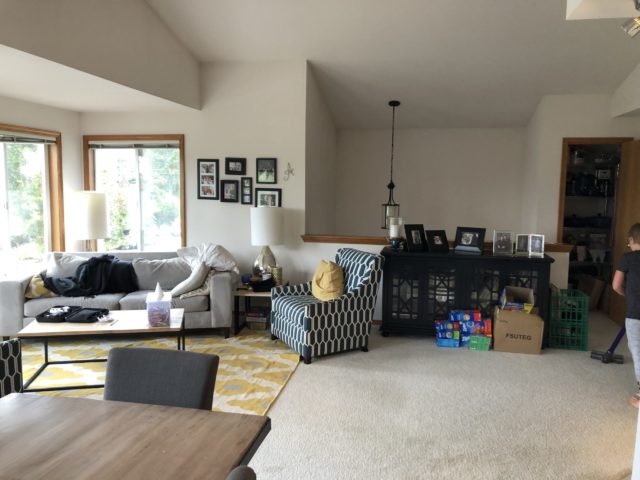
Before
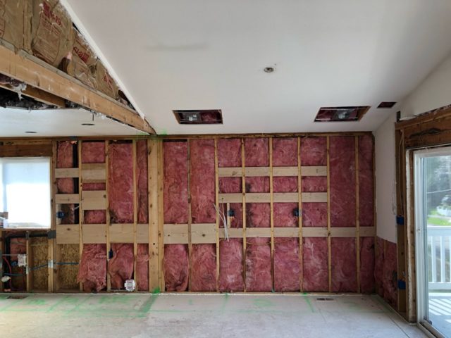
Below is the wall that separated these spaces, that came down. Now where the wall once was is an oversized island bringing these three spaces together. The challenge was the ceiling within the kitchen was lower than the living and dining room ceiling, which was vaulted. So we had to come up with a game plan on how to transition the ceiling heights without it looking off.
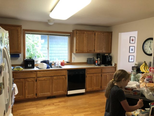
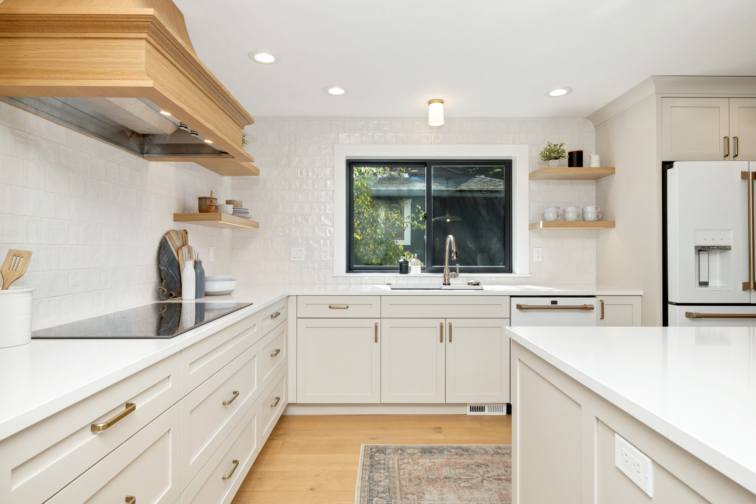
The window and sink remained in the exact same spot. So as you scroll through the before and afters, that will help you for reference.
The entire wall to the right also came down, and that’s where we put the buffet area, which doubled their kitchen space.
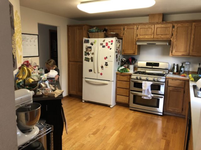
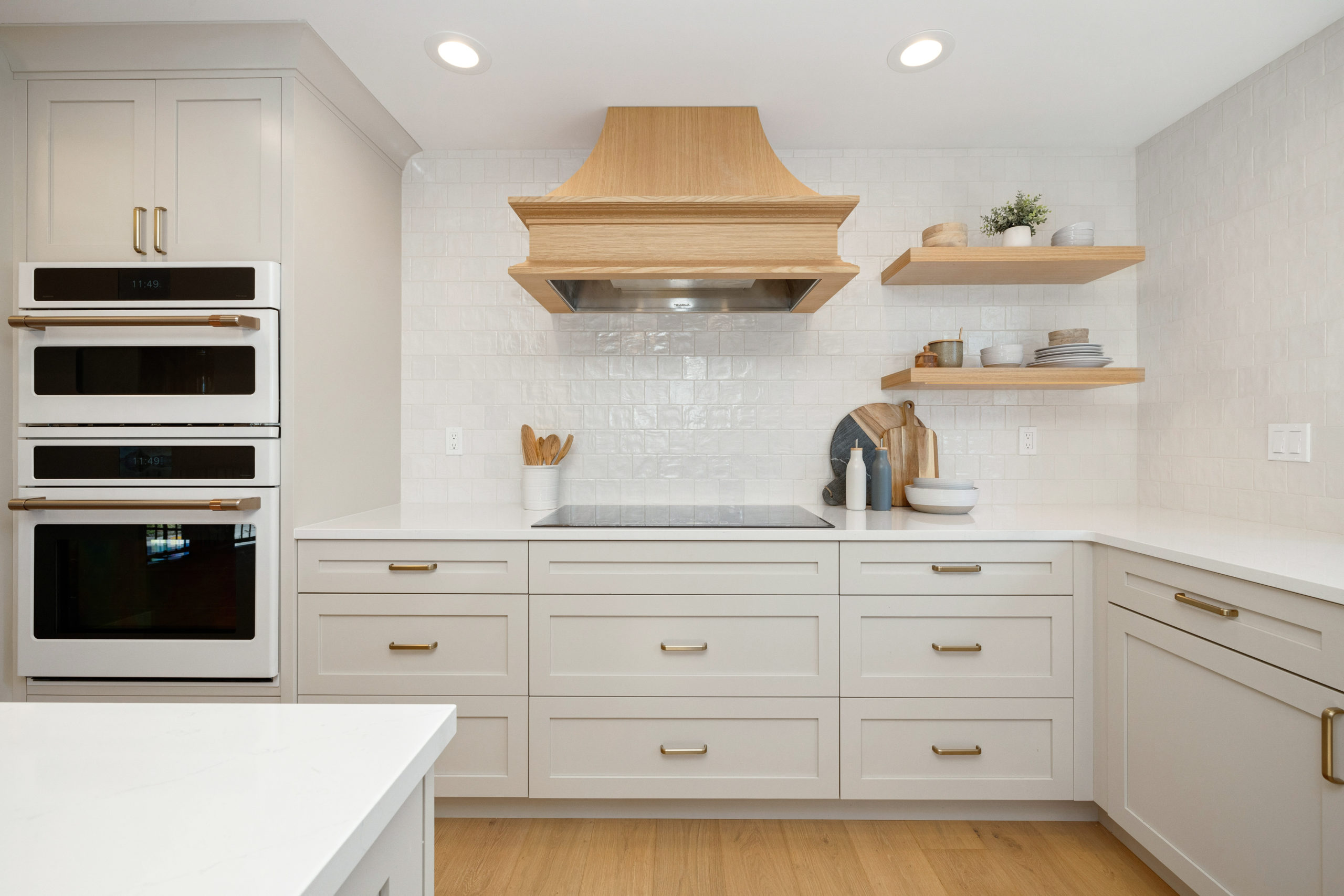
The range also remained in the same location and then we brought double ovens to the left, where the fridge is. And then moved the fridge to the right of the sink.
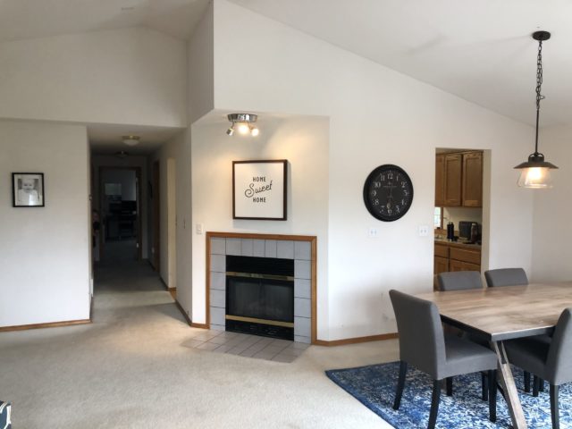
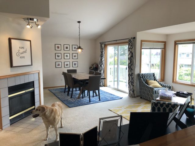
And here’s a before view from the other side of that same wall facing into the kitchen, which was removed. Our clients never used the fireplace so we decided to take it out and not replace it elsewhere within the home.
Designs & Renderings
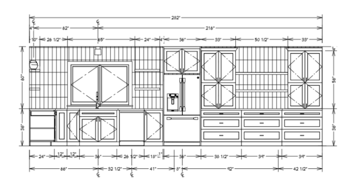
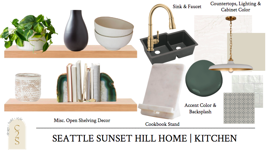
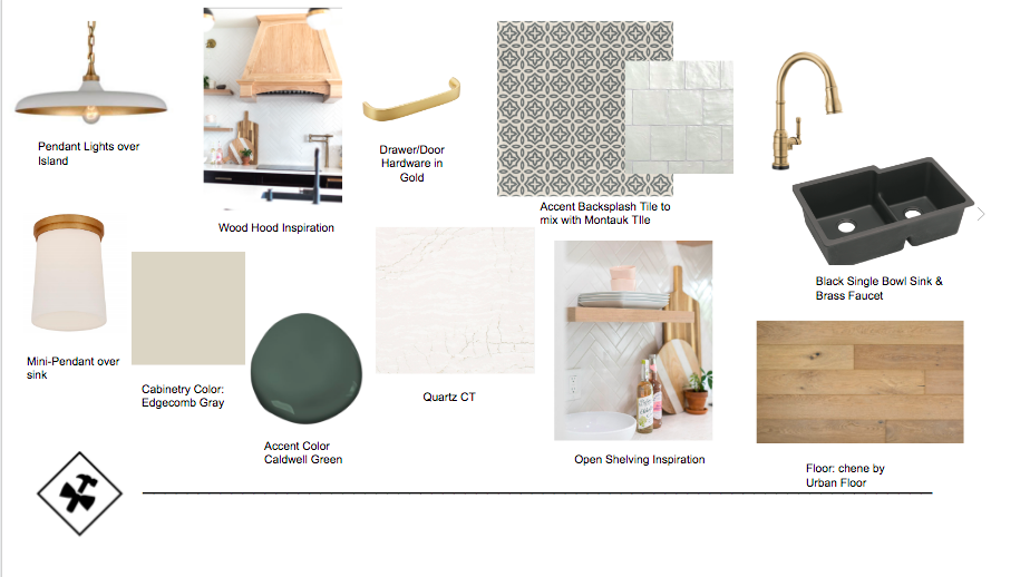
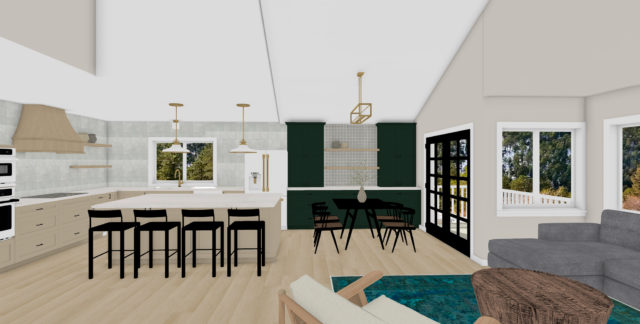
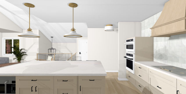
Mood boards, selection sheets, floor plans, elevations, and renderings – we did it all for this full home design project. Light and bright with warm touches was all our client wanted within the kitchen design! And that’s exactly what we delivered. Off-white cabinetry, warm wood flooring throughout with touches of wood accent pieces such as the hood and open shelving, black and gold accents with a pop of color in the buffet area.
One of the recommendations was to create this buffet area over on the right-hand side that was once the formal dining room to utilize more space, storage, and then do away with a lot of the uppers in the actual kitchen to give more of a statement! Our clients were on board with it all.
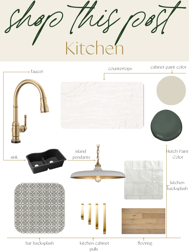
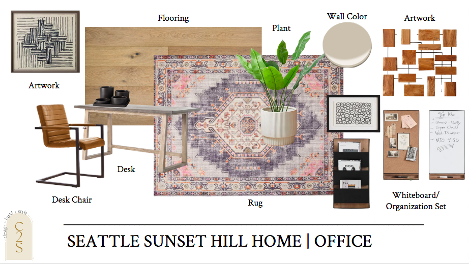
Once the floor plans were finalized, we started to rock and roll on the selections sheets and concept boards. Here’s what we ended up with!
And lastly, when it comes to our design process is the renderings. This shows our clients the exact visual with the floor plans and selections we are recommending.
You can find more design details and renderings of this design blog post here behind this project.
Under Construction
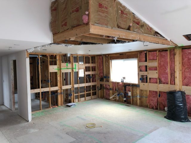
Once the mood boards floor plans, selections, concept boards, and renderings were all signed off on – it was construction time! We sent all of the designs over to Eakman Construction and they took the project over and brought everything to life perfectly. Here’s a few fun under construction pictures they grabbed.
Demo day is always my favorite day! I could already see the designs coming to life once the walls came down.
After
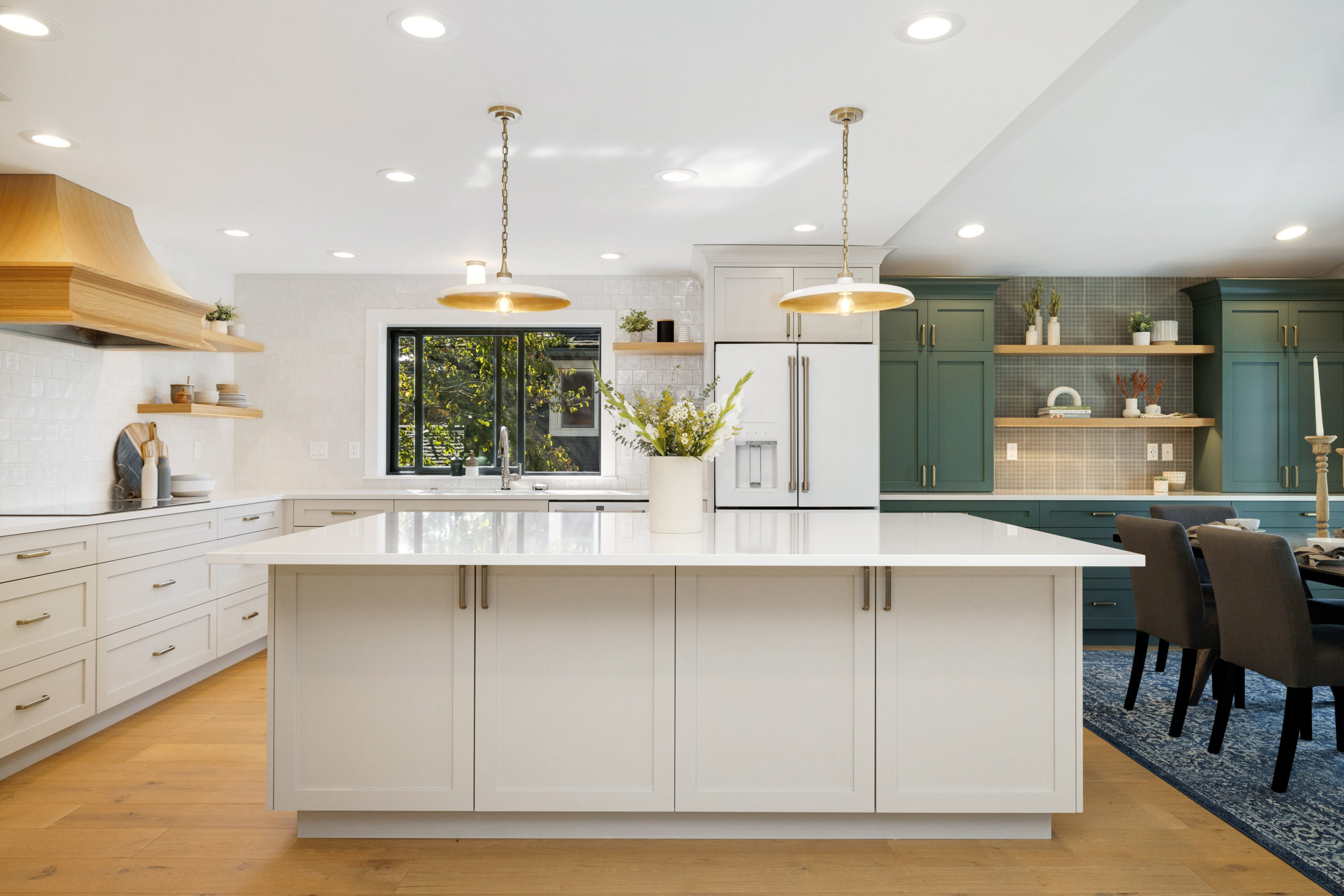
Dun, dun, dun. Same view below as the picture above. Everything came together so perfectly. Looks just like the renderings!
The only bummer was the dining room light. We had to re-spec this, which was my fault due to the slanted vaulted ceiling I wasn’t thinking about and the chain links, but in the end, we sourced a beaded chandelier and of course, it came the week after we shot the space. But it still looks perfect even without it!
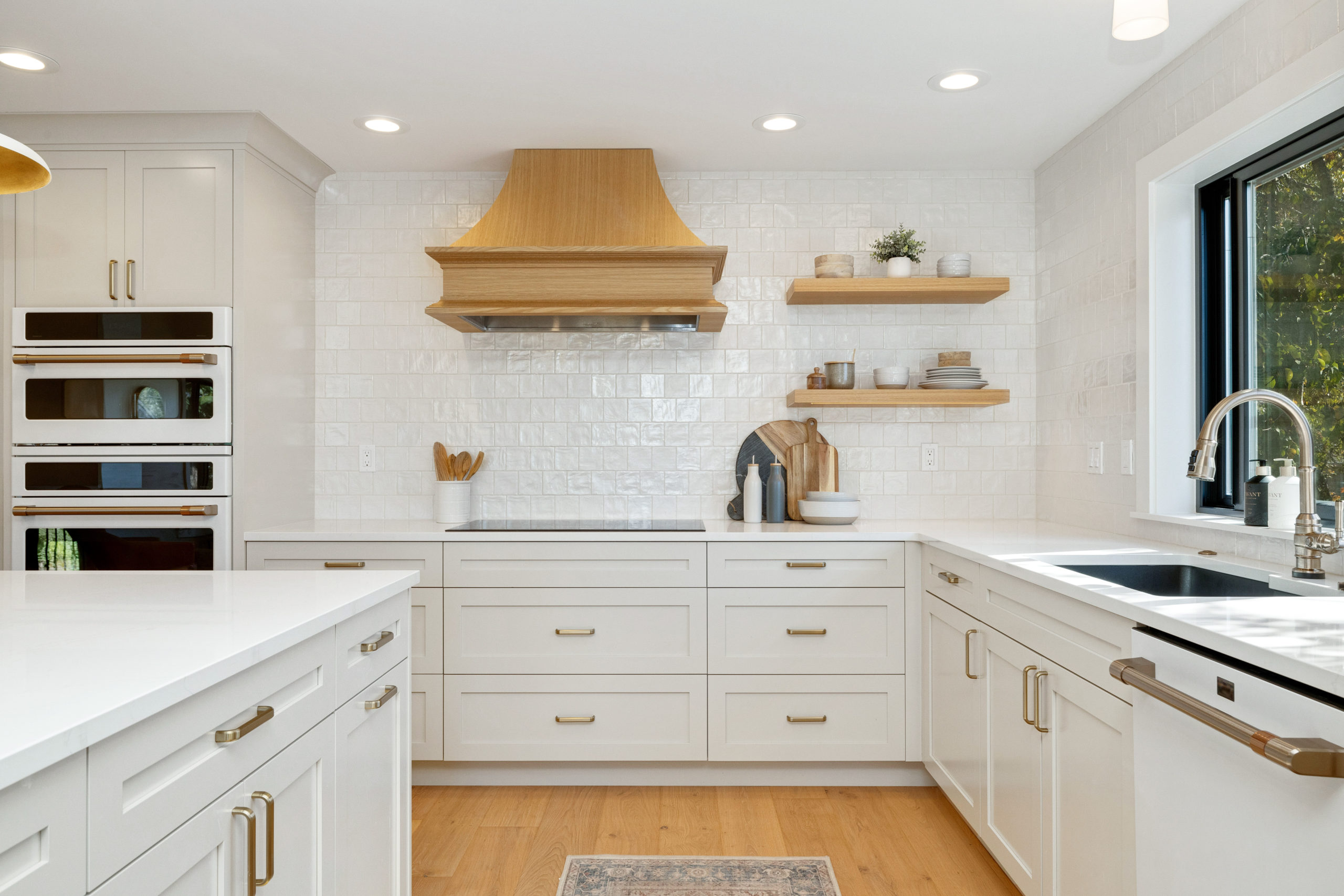
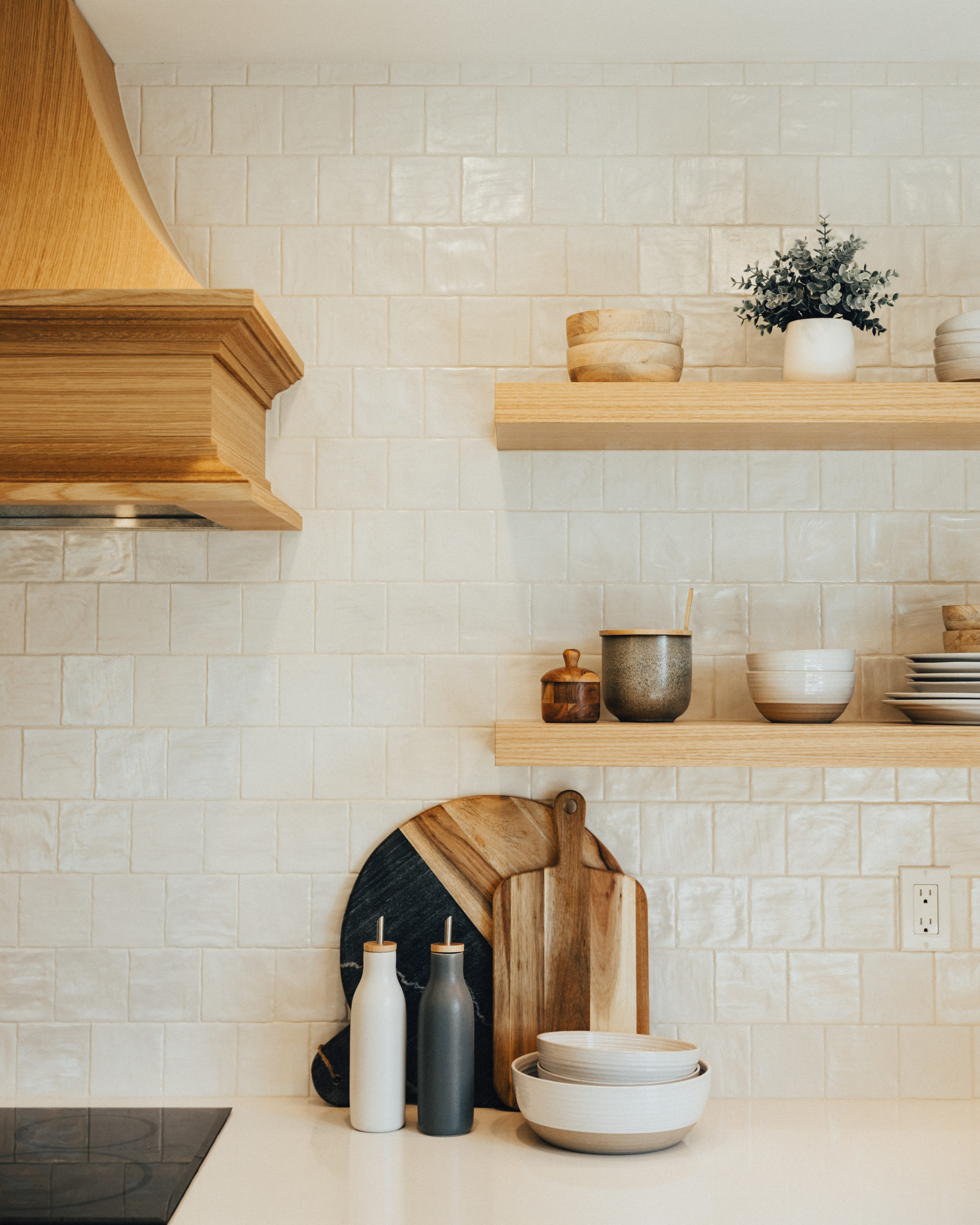
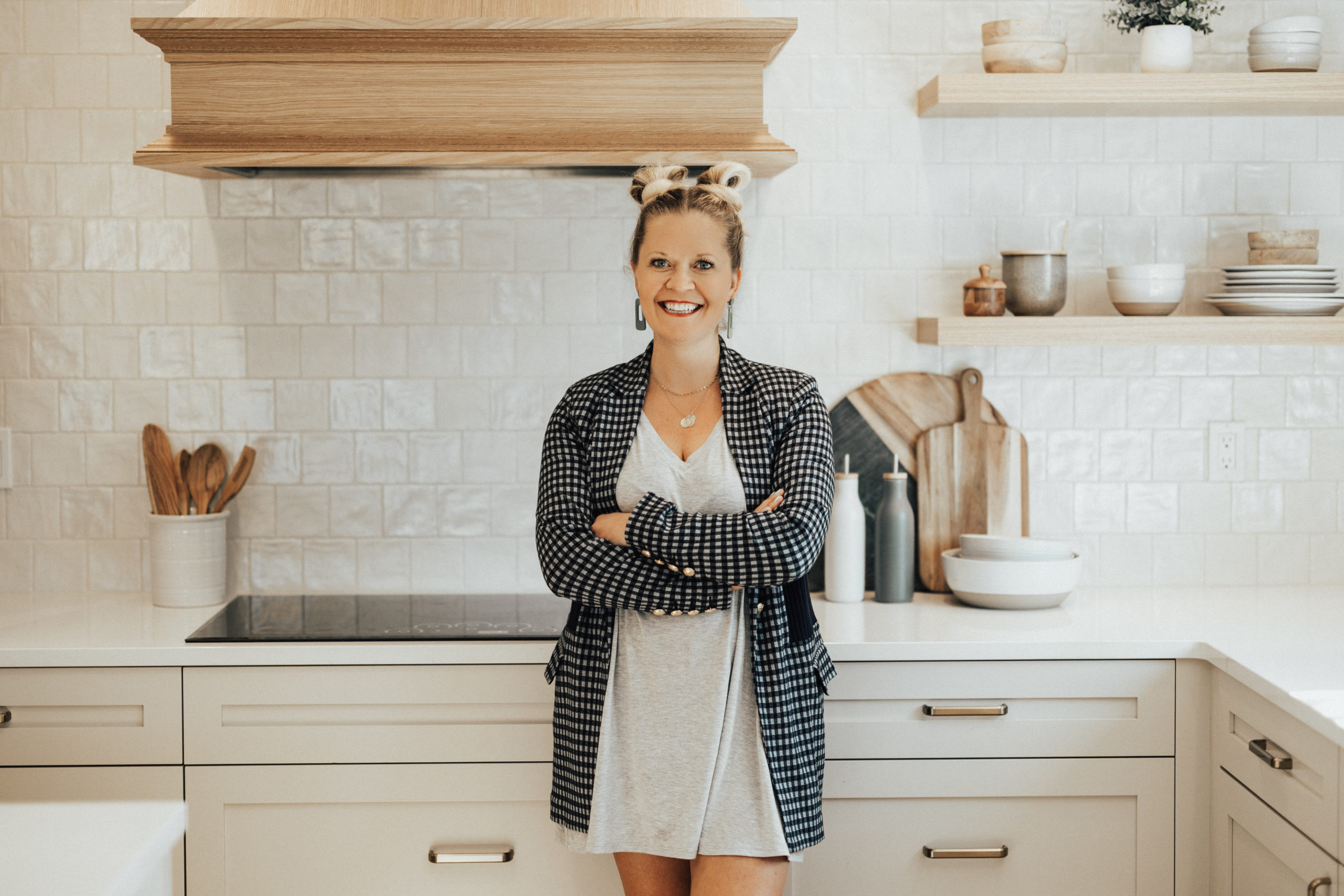
Our client wanted to maintain a bright and light look within the space so we went with Edgcomb Gray paint color for the cabinetry and complimented it with Montauk Gin 4×4 Ceramic Wall Tile. I loved how clean and simple we kept everything with no uppers and the warm wood accents.
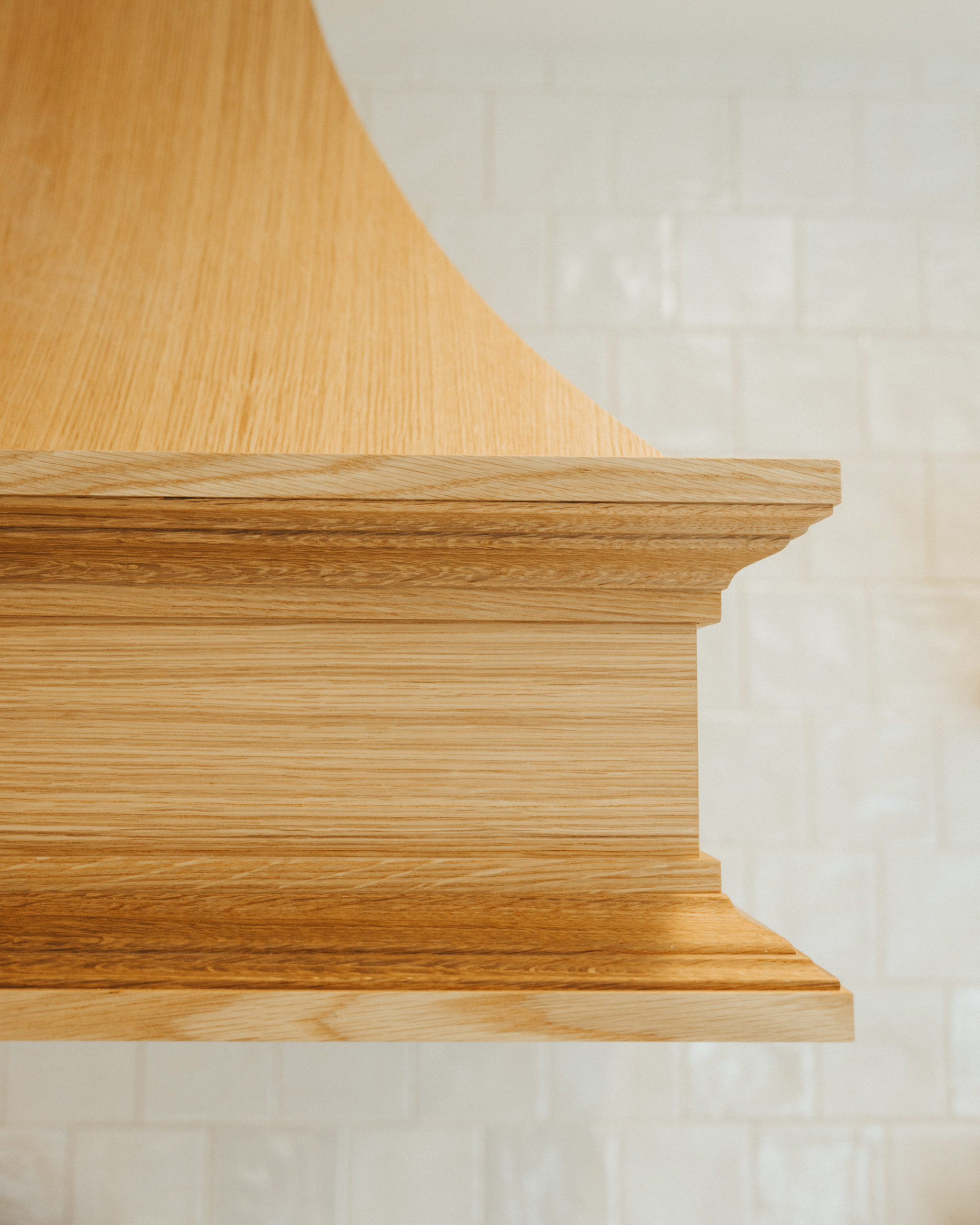
The accent custom wood hood that Eakman created tied in so perfectly with the warmth of the wood floors.
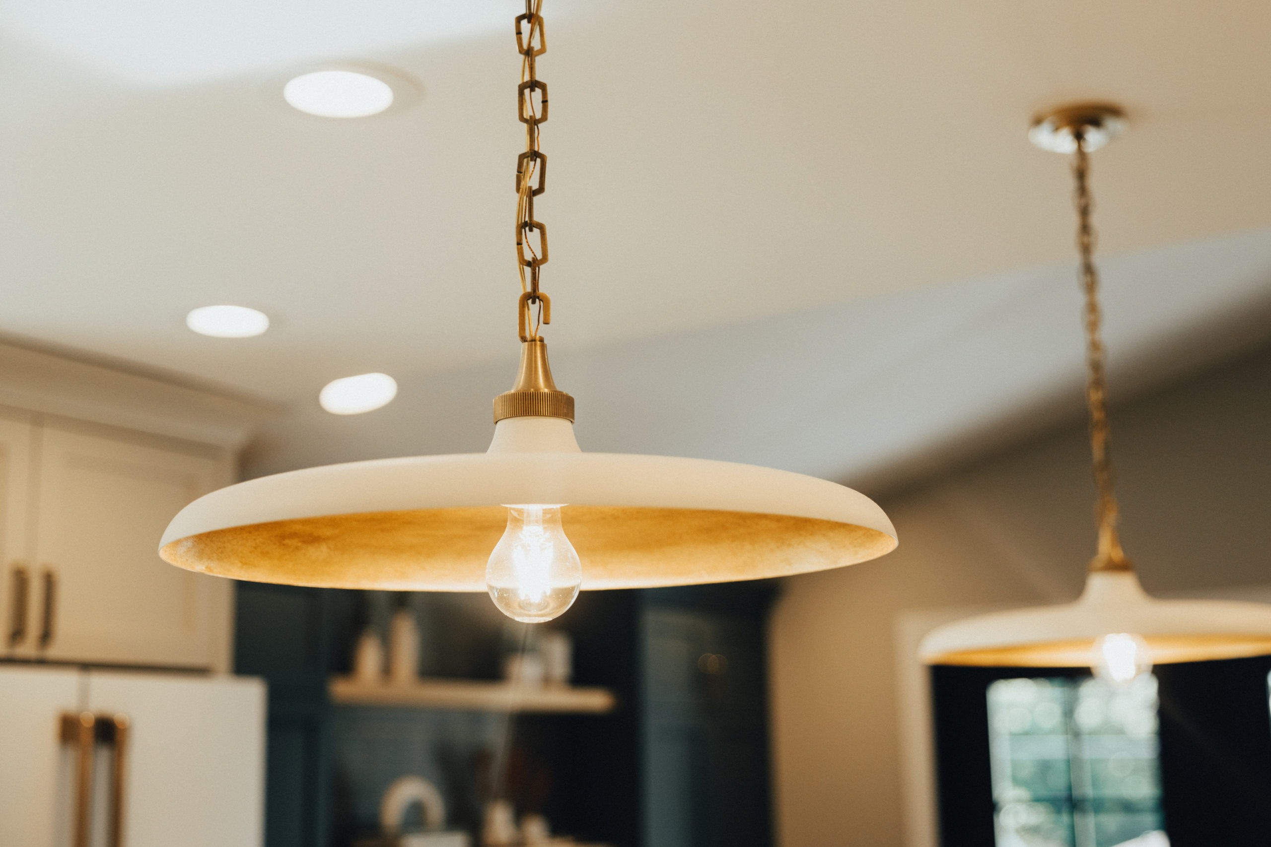
One of our new favorite lights is the – Visual Comfort Piatto 18″ Medium Pendant with Metal Shade by Thomas O’Brien. We did these same lights but in black for the Breezy Point Remodel, which you can find here.
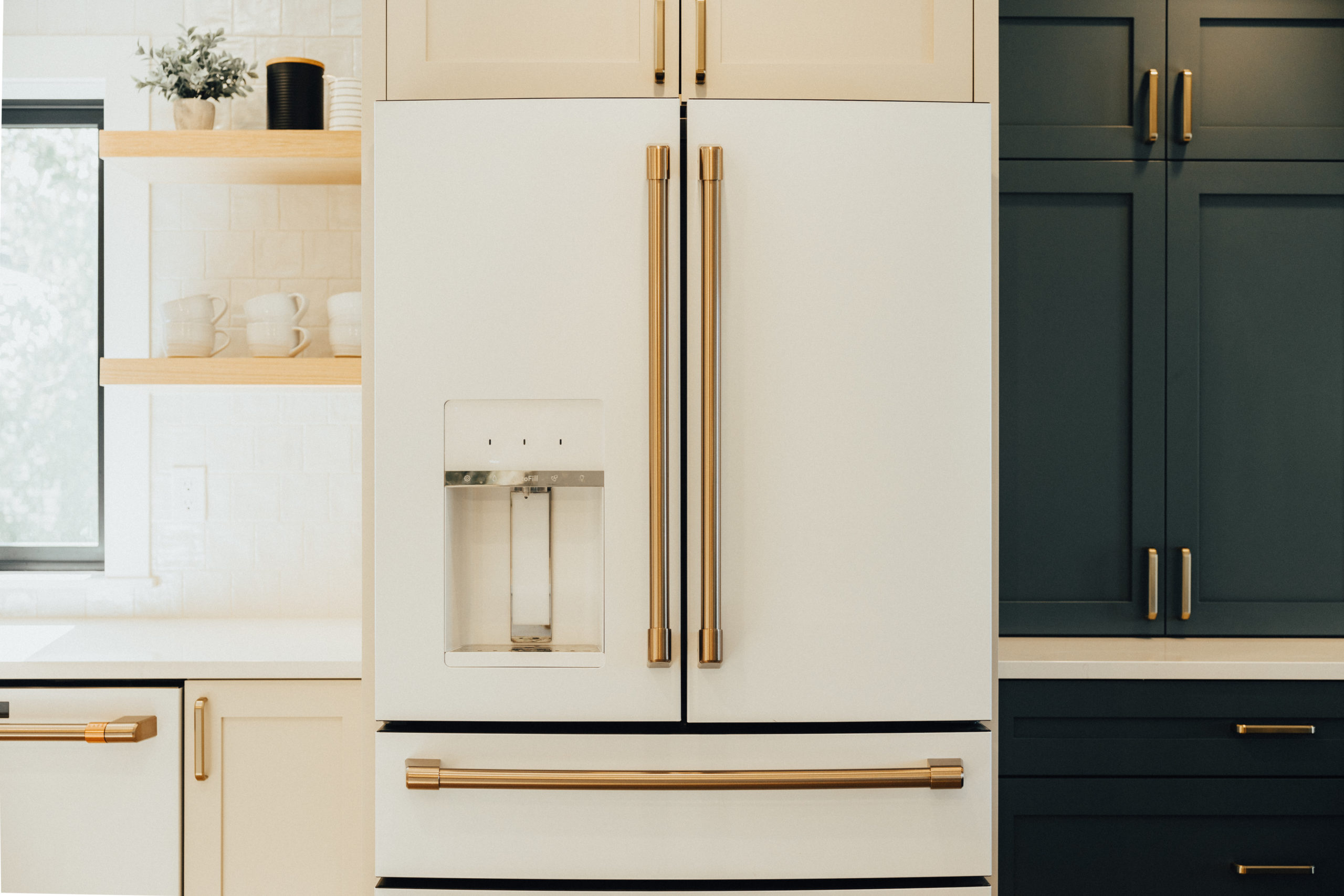
And of course, the matte white Cafe appliances with a bronze finish for the win in another project. These are on major backorder but worth the wait if you ask us.
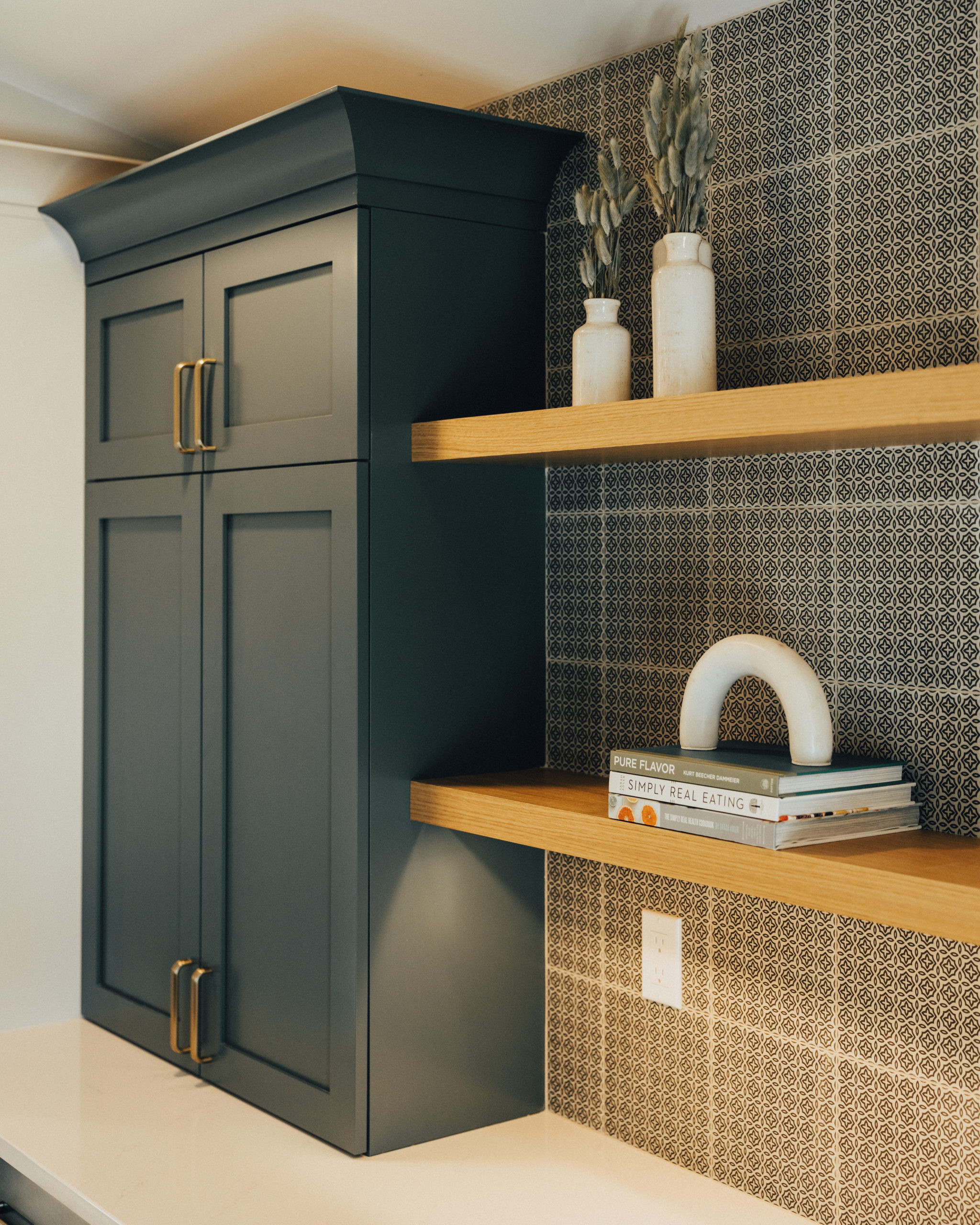
The Havana, Retro bar backsplash was another favorite of mine. It gives a wallpaper feel, but better. A perfect way to add a statement of pattern and texture.
Selections + Shop this Look
From the interior design selections to the furniture, decor, and style we got to do it all for this entire home. You can shop this space below and we’re also sharing all of our design furniture design boards we used within this space as well.
1. Faucet | 2. Pendants | 3. Hardware | 4. Cabinet Paint Color | 5. Kitchen Accent Cabinet Hutch Color | 6. Flooring | 7. Sink | 8. Countertops | 9. Backsplash | 10. Hutch Backsplash | 11. Appliances
Living + Dining Room
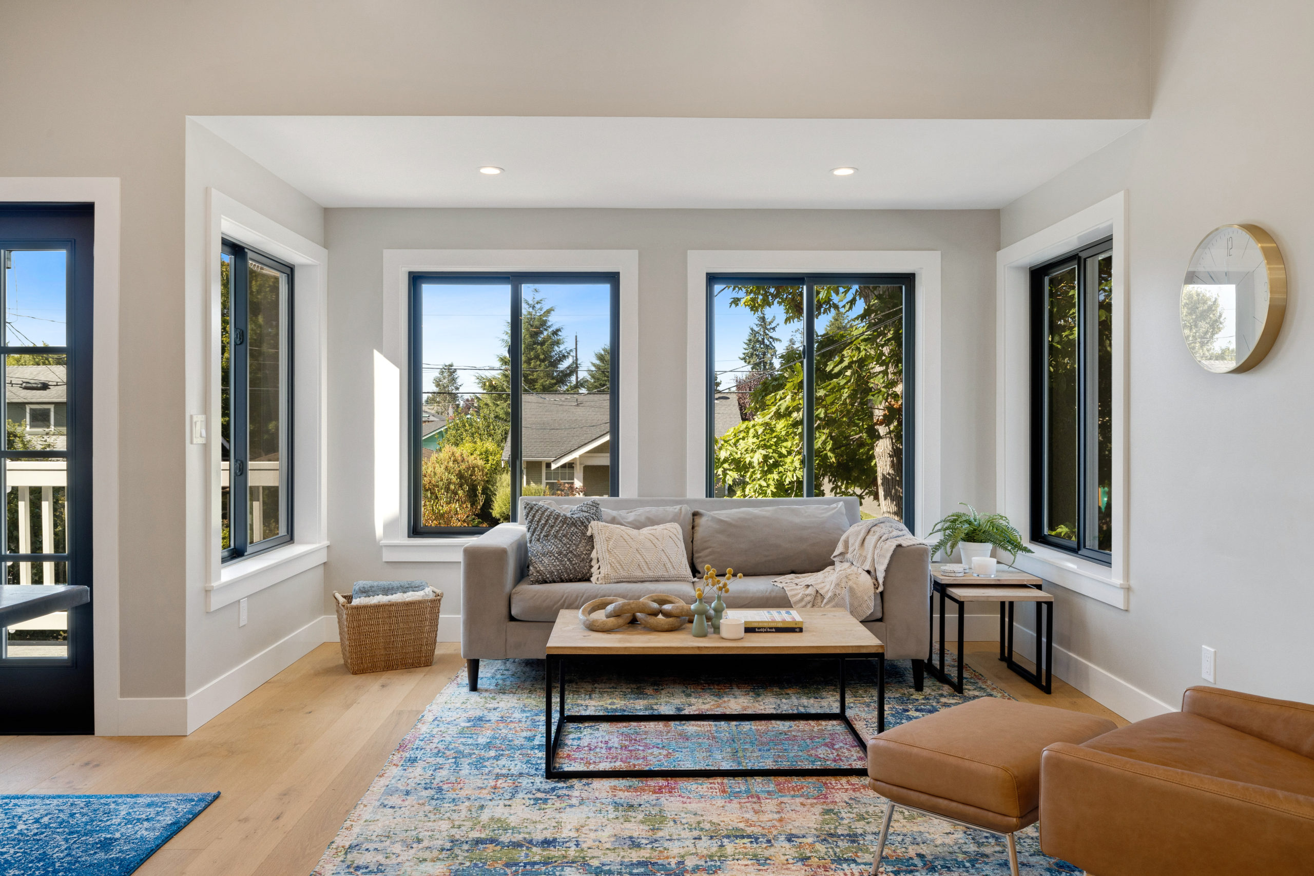
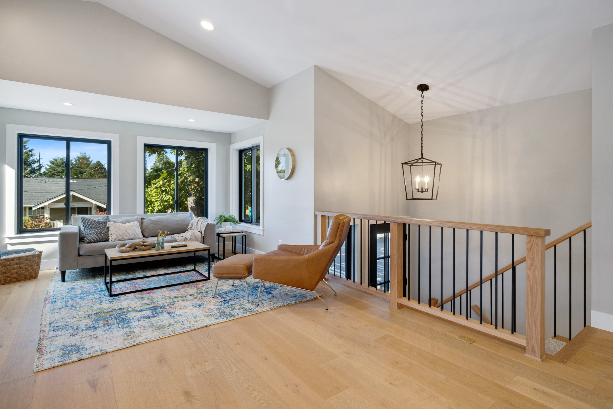
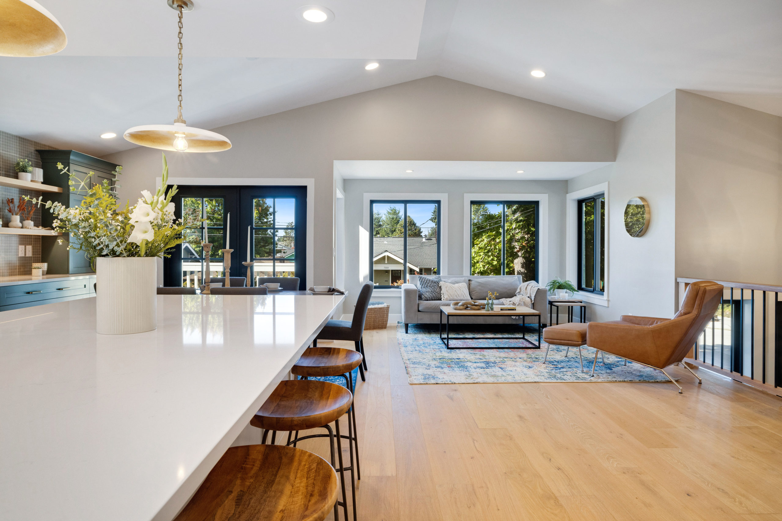
Next up, the living and dining room. The room is right off of the kitchen. One of the bigger things we did in the same as remove the wall that separated the living room from the kitchen as well as put in a stair rail where that wall and ledge were.
Before
Where the gallery wall is behind the table, is where the new full buffet wall is now. The table and rug remained the same. Our clients also replaced the sliding glass door with two new beautiful black doors that opened up into the space.
New flooring, paint, ceilings, and millwork throughout this entire space made it look like a brand new home. All of the carpet was replaced with our favorite, Lambrusco design from Urban Floor.
Both of these walls were removed along the stairs and a black and wood stair rail was replaced, which gave us such a more light and bright open feel. The Urban Floor also replaced the carpet along the stairs and landing.
Designs
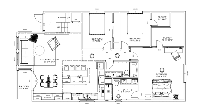
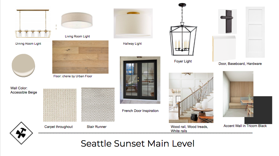
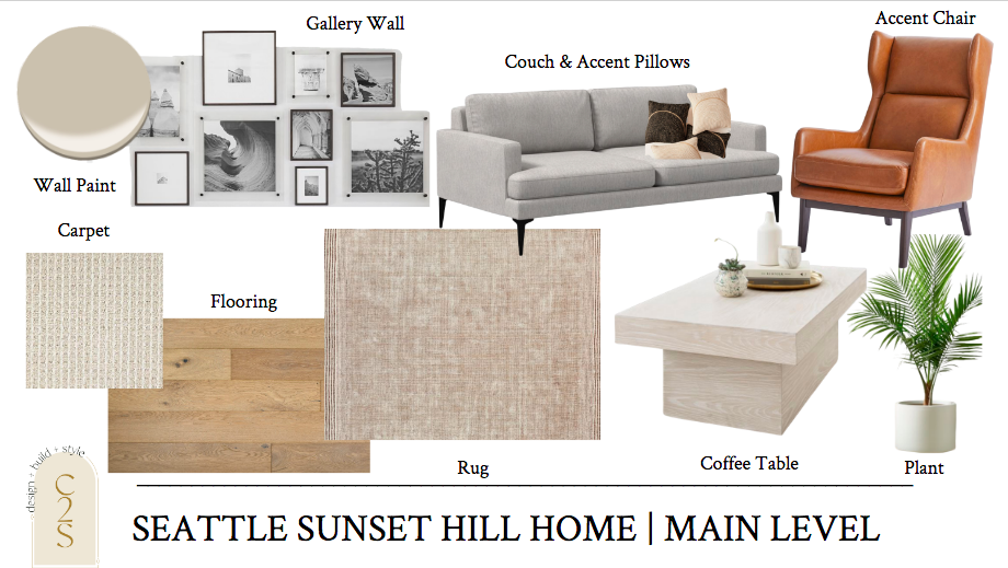
Besides the walls coming down that separated the living, kitchen, and dining room, the footprint of the home remained the same. Here are the floor plans we put together for the full main level of the home – with the concept boards for the main level.
Under Construction
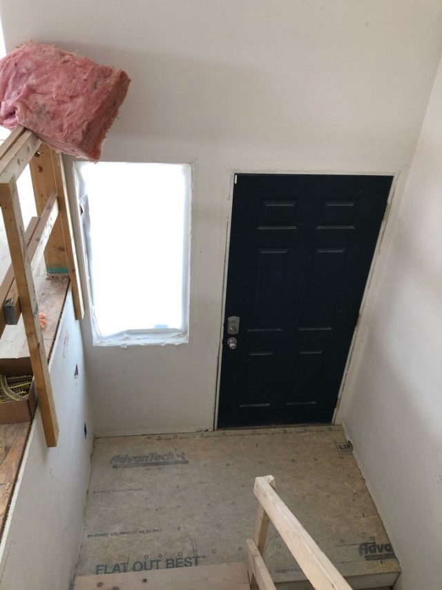
The Eakman crew, getting after it! Loved getting these updates even if we were states apart and we couldn’t see it in real life.
After
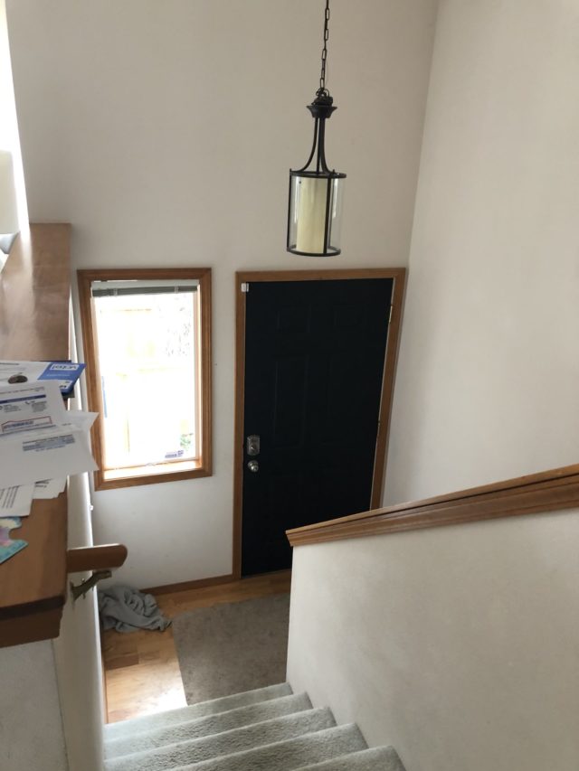
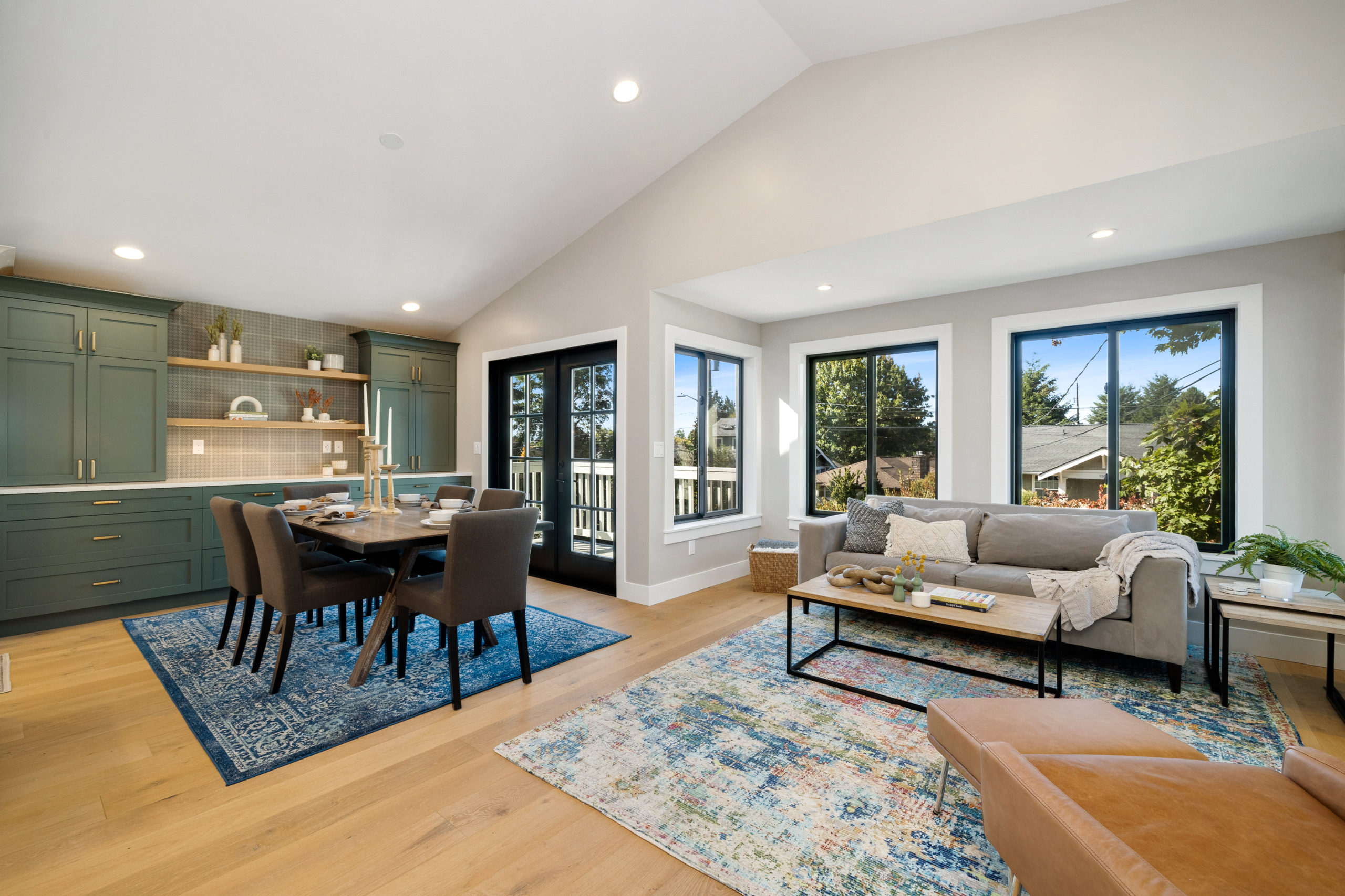
Just simply having wood floors and no longer having a wall separating the living from the main entrance made this space feel that much bigger!
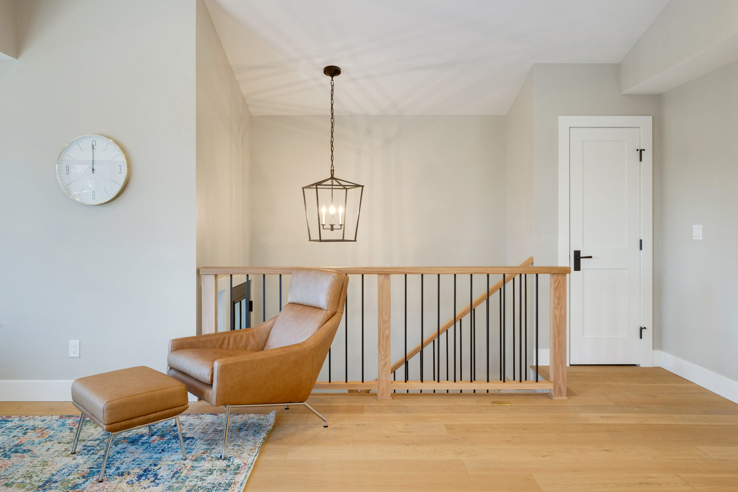
From what was a solid wall to a metal + wood railing. So much cleaner!
Our clients had ordered a new couch and of course, it showed up the day after we photographed the space. But we have it linked below! It’s a beauty. Not to mention a beaded chandelier light was added above the dining room table.
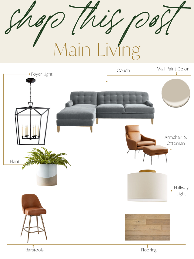
Selections + Shop this Look
Shop this look by clicking the individual links below.
1.Hallway Lighting | 2. Hardware | 3. Stair Carpet Runner | 4. Wall Paint | 5. Flooring | 6. Carpet | 7. Stair Carpet Runner | 8. Couch | 9. Armchair & Ottoman | 10. Barstools | 11. Plant
Primary Bedroom
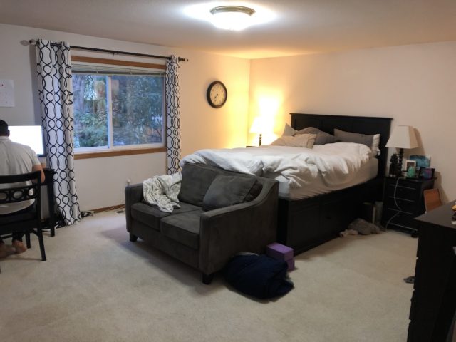
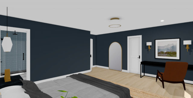
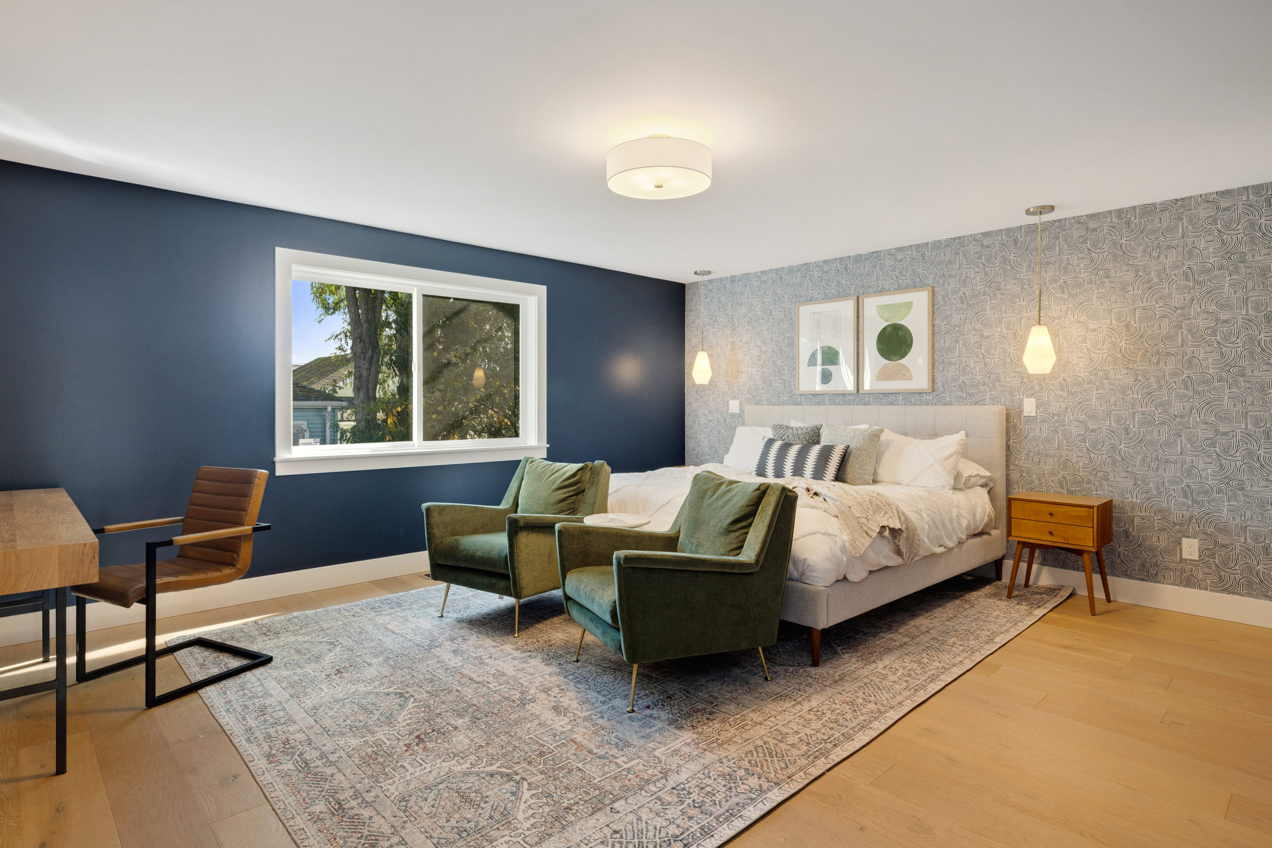
Next up, the owner’s bedroom! Hands down my favorite bedroom we’ve designed out. We wanted to go for a fun and moody vibe within this space and bring it to life. Our client was open to wallpaper, bold colors, and textures so we jumped at the chance. One of this family’s needs, since covid, was two workspaces. They only had one additional spare bedroom that was made into one office so we brought the other into the bedroom, and had to keep that in mind when designing it out.
Before
Designs
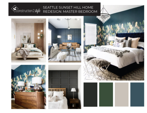
Here was the vibe we pulled together and were going for!
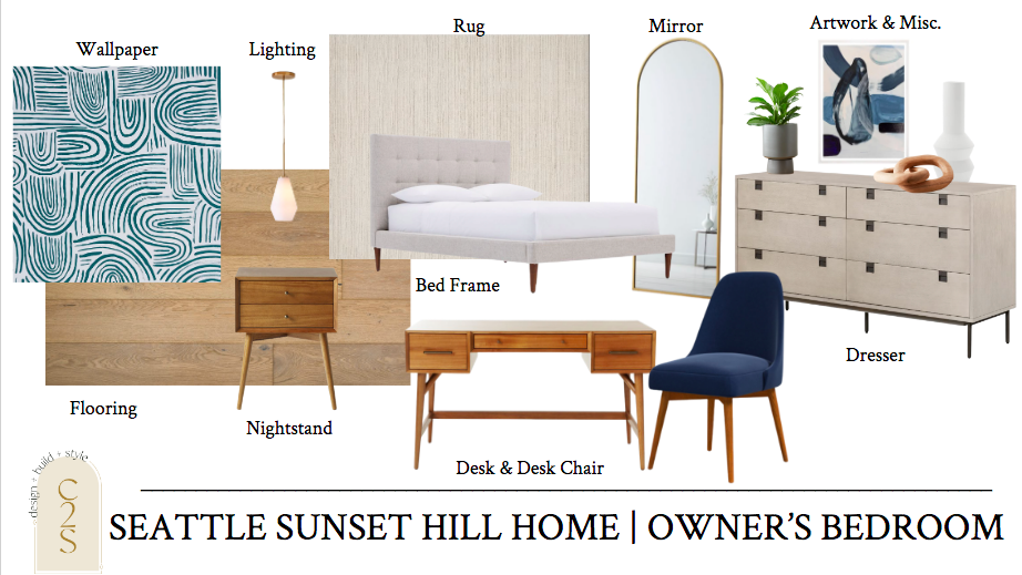
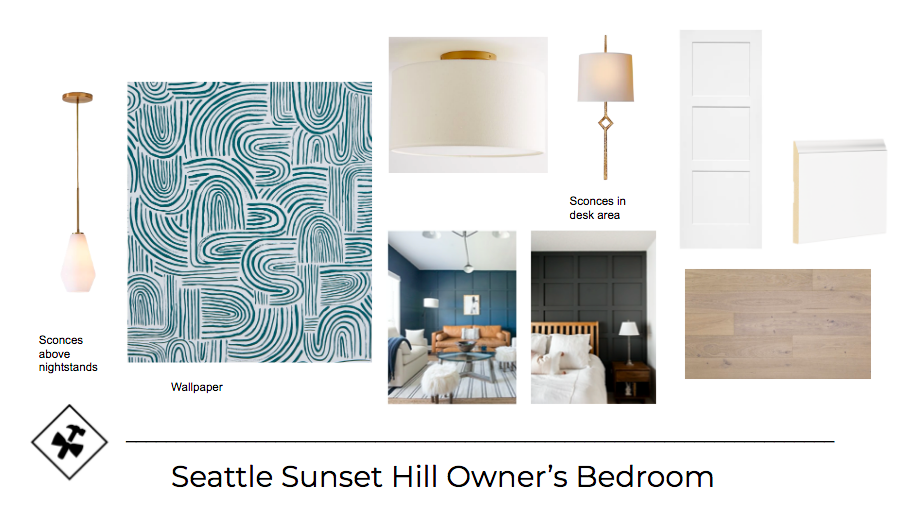
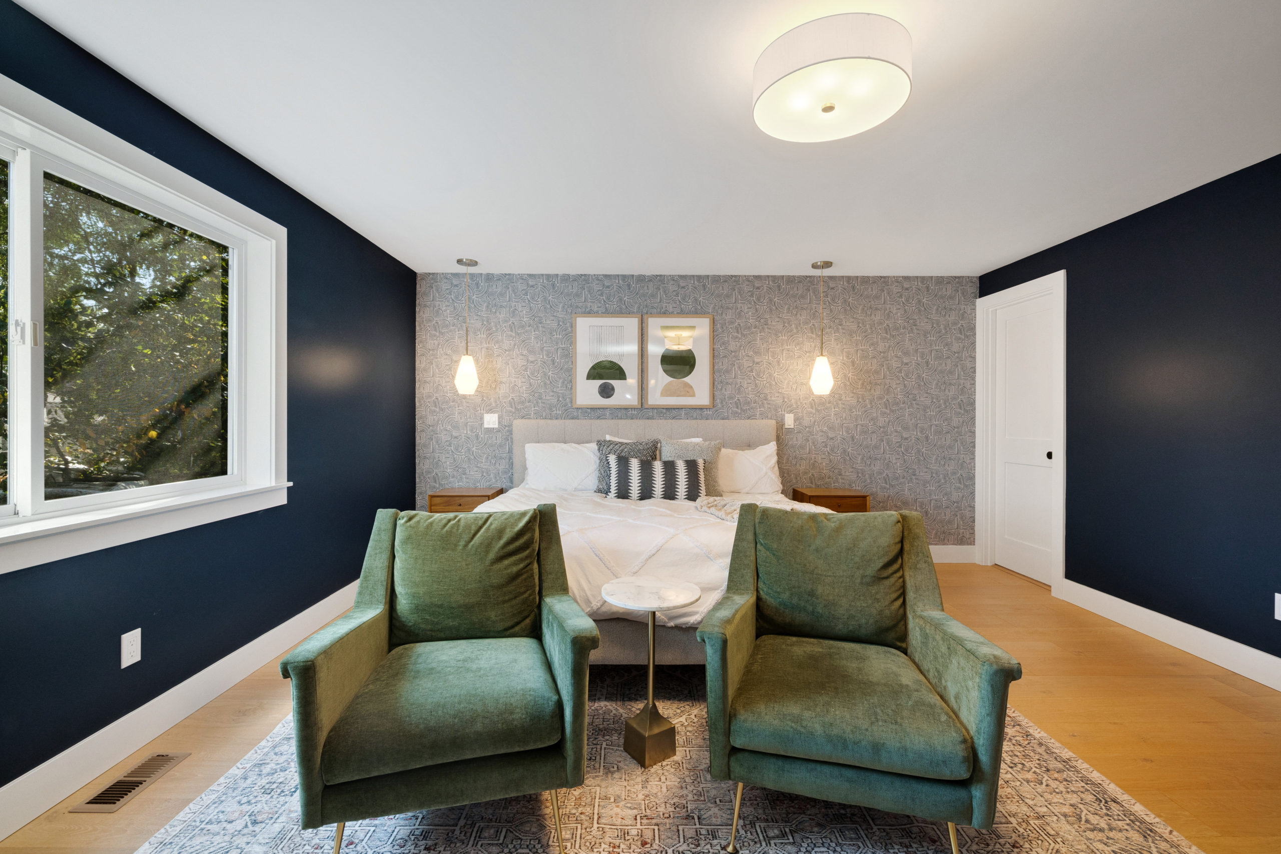
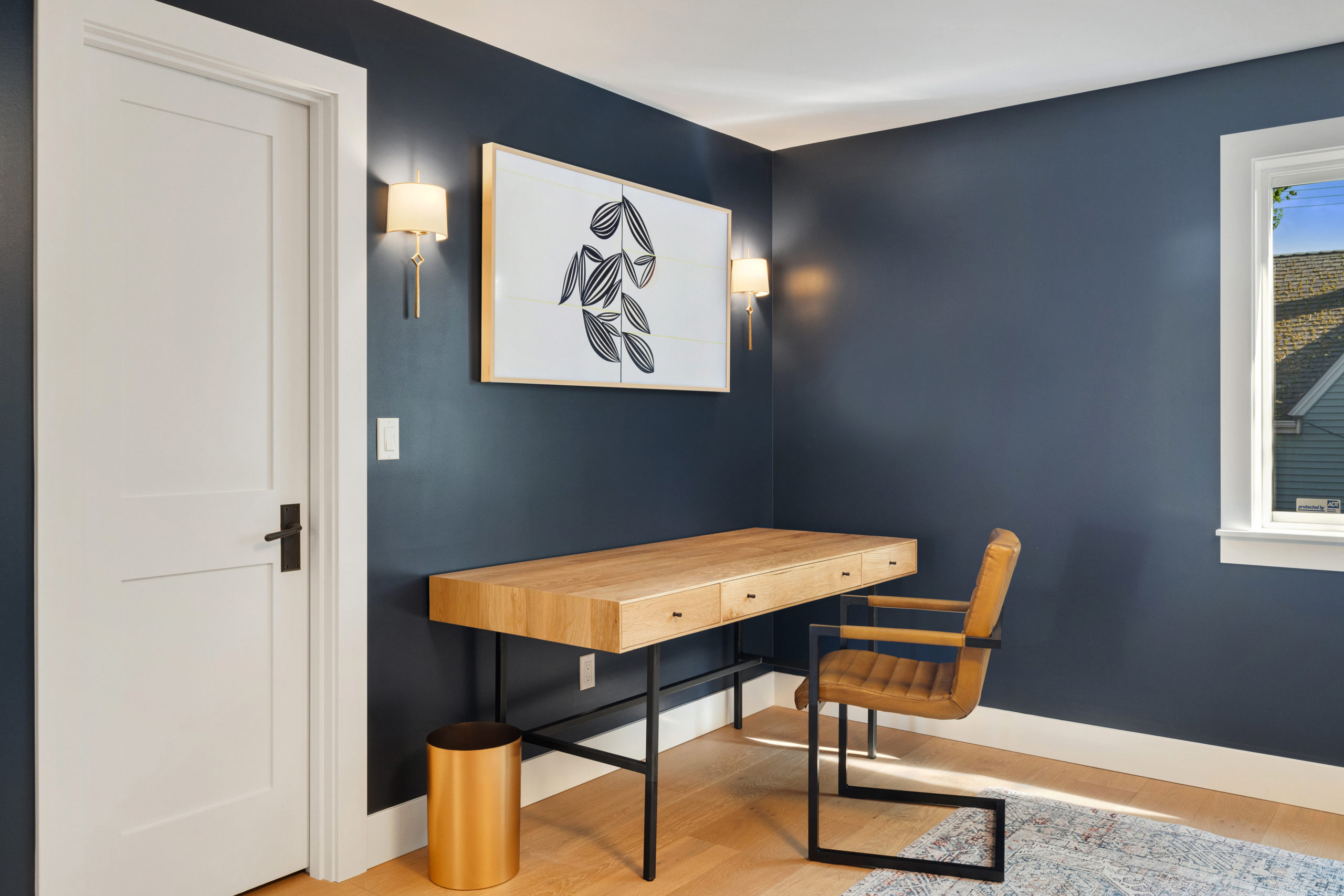
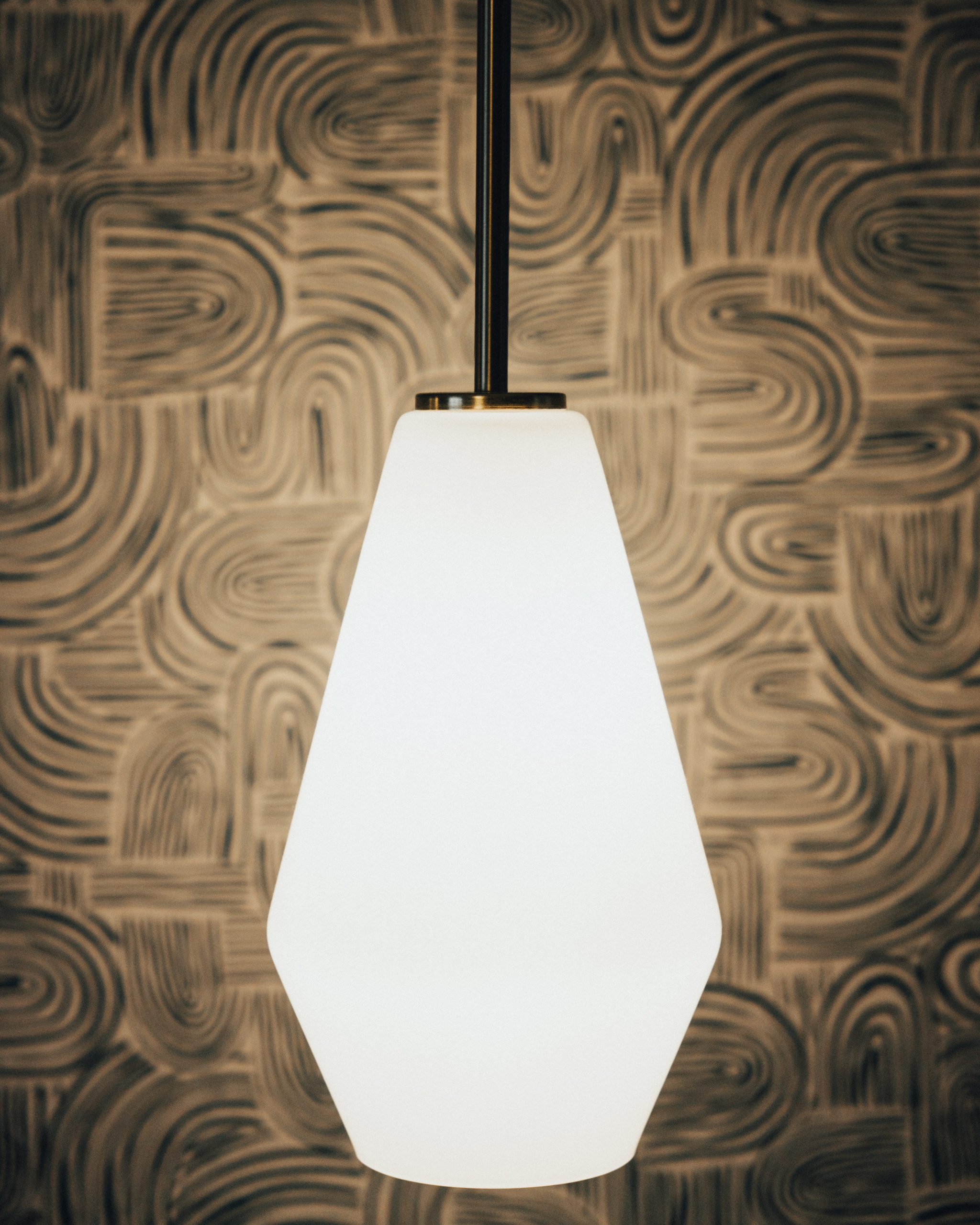
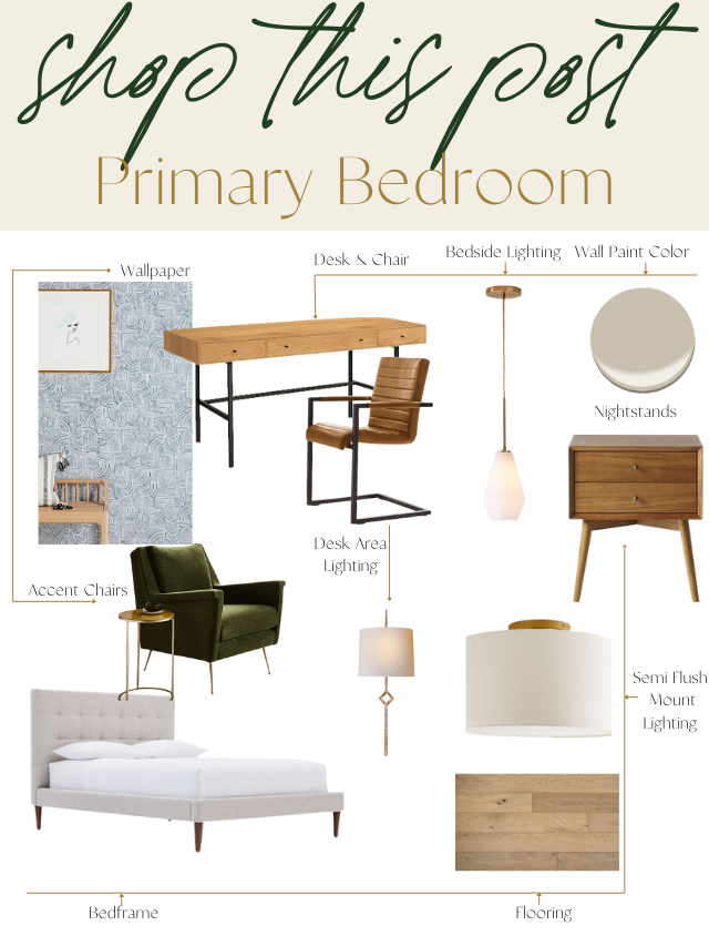
And the concept boards and what we actually ended up going for in the end. Statement wallpaper behind the bed. Pendants over the nightstands, hardwood throughout, and some fun sconce lighting next to the picture TV and over the desk area.
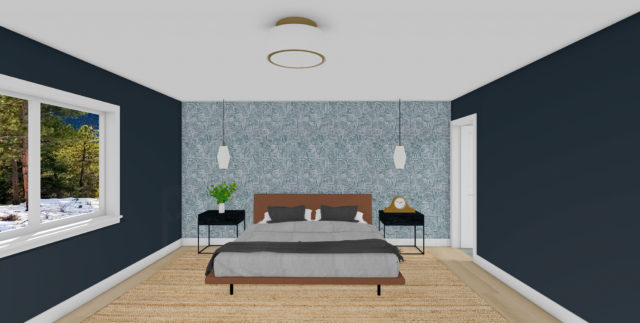
And the renderings of how we wanted to bring this space to life.
After
And the after… it was exactly how we all had envisioned it!
Here was the new desk area within the bedroom with a picture TV above. Classy yet simple, and that’s all that our client needed.
This lighting and wallpaper combo were another favorite of ours.
Selections + Shop this Look
1.Wallpaper | 2. Hardware | 3. Lighting | 4. Wall Sconces | 5. Bed Frame | 6. Nightstands | 7. Desk | 8. Desk Chair | 9. Mirror | 10. Wall Art | 11. Frames | 12. Accent Chairs
Primary Bathroom
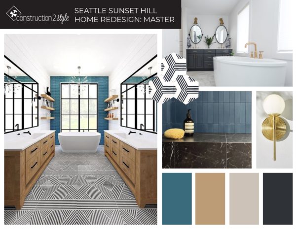
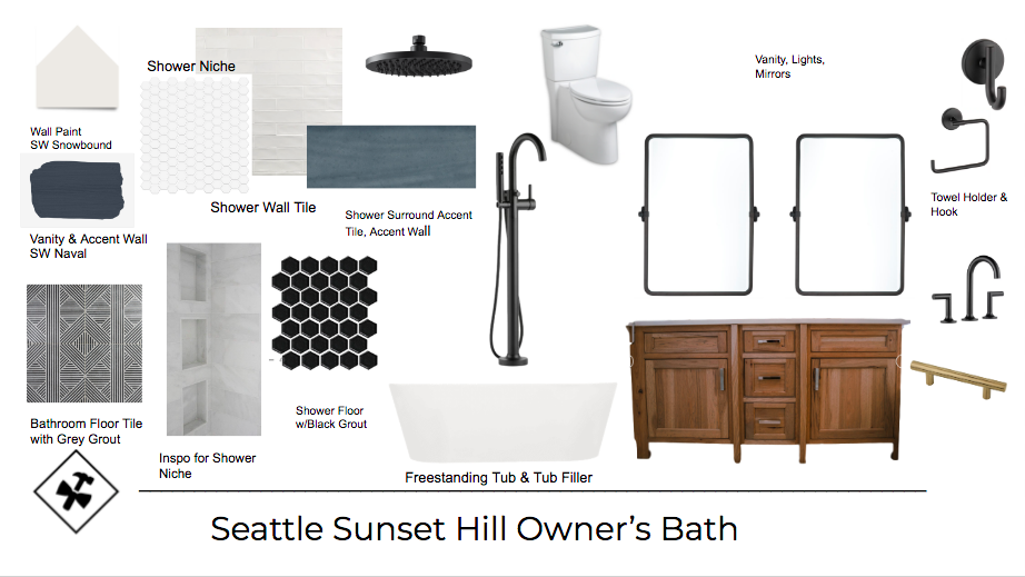
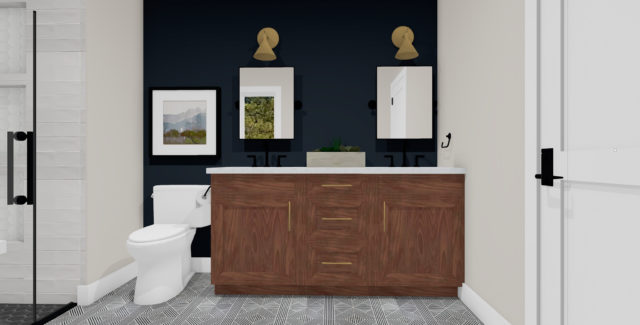
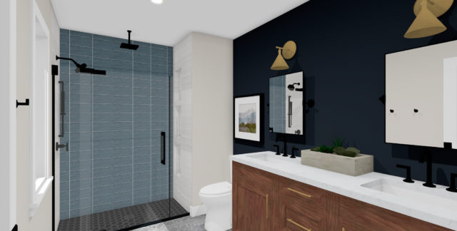
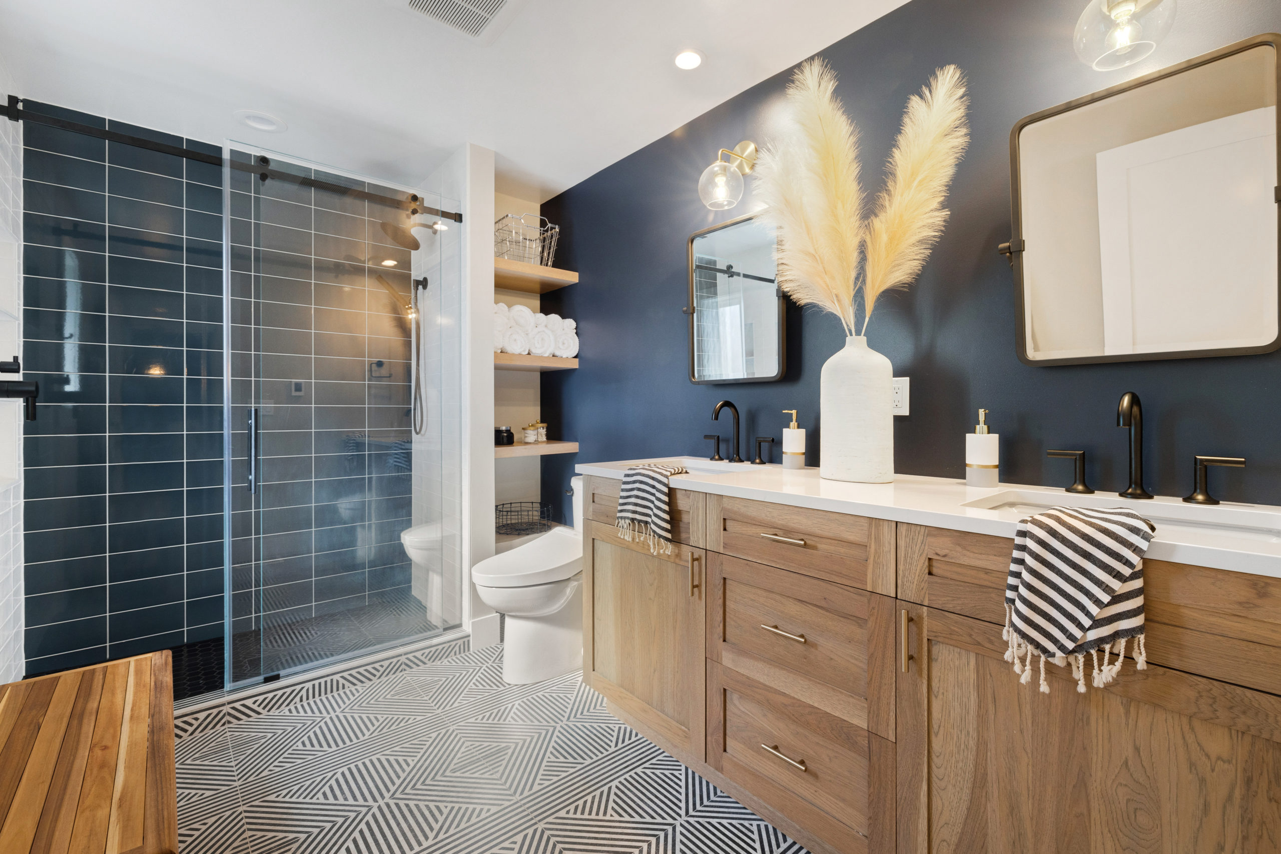
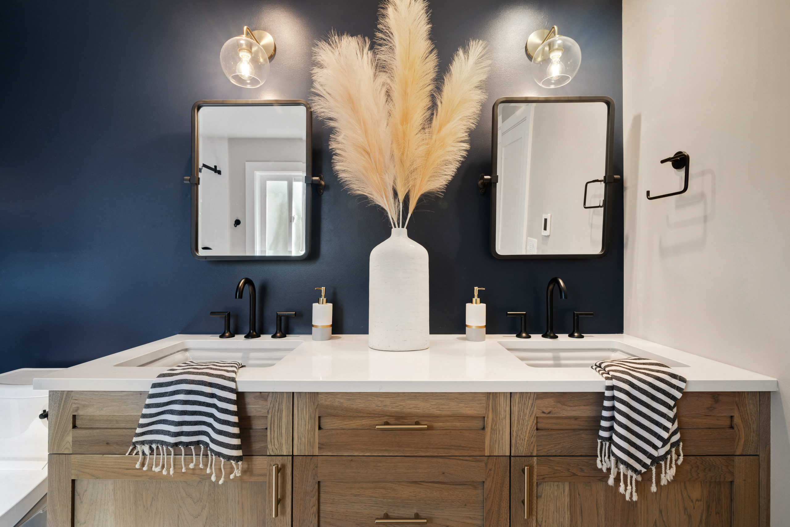
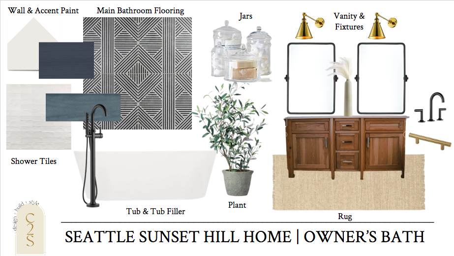
And our client’s bathroom, which is right within and off of the owner’s bedroom. This bathroom was hands down one of the rooms I was most excited about! I came across this fun black and white tile within this inspiration picture in the mood board below and after our client was all about it – I couldn’t wait to see this one come to life. Our clients gravitate towards the blue family so we also knew we were going to add some fun blue tones throughout the space as well from tile and paint color.
Before
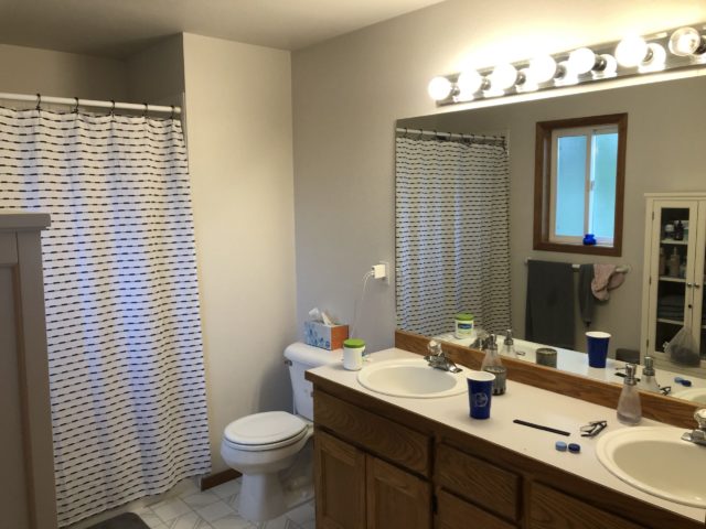
It’s hard to believe that this is what once was…
Designs
Again, the overall vibe and inspiration of what we were going for within this space.
After
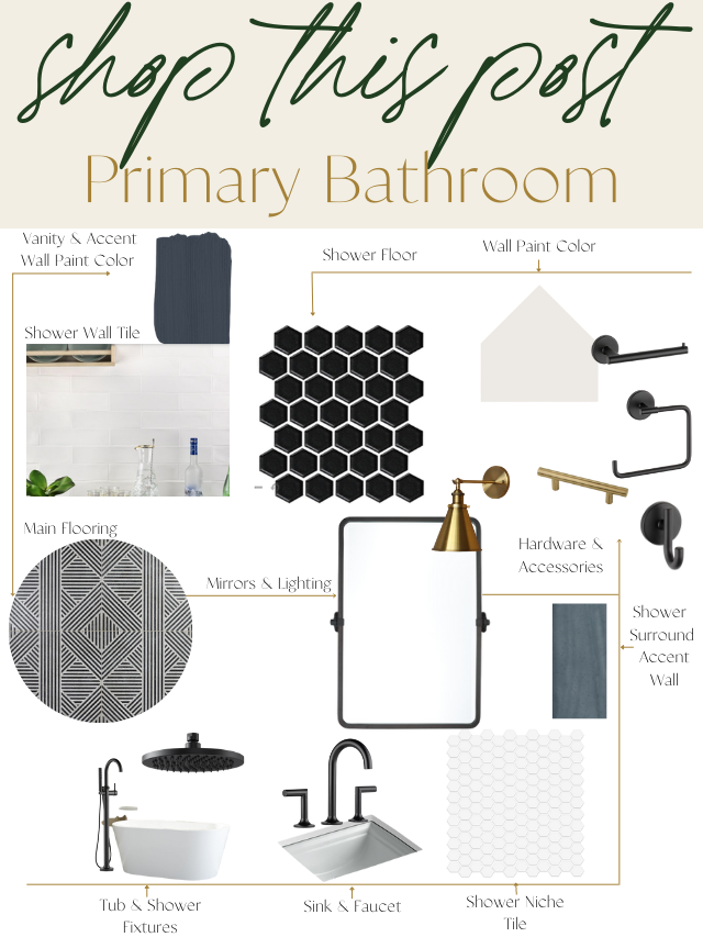
Selections + Shop this Look
Shop this look by clicking the individual links below.
1. Wall Paint | 2. Accent Wall Paint | 3. Accent Shower Surround Tile | 4. Shower Floor Tile | 5. Shower Niche Tile | 6. Main Flooring | 7. Shower Tile | 8. Sink | 9. Faucet | 10. Shower Fixtures | 11. Tub | 12. Tub Faucet | 13. Mirrors | 14. Lighting | 15. Toilet Paper Holder | 16. Hand Towel Ring | 17. Robe Hooks | 18. Vanity Hardware
Girls’ Bathroom
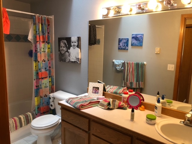
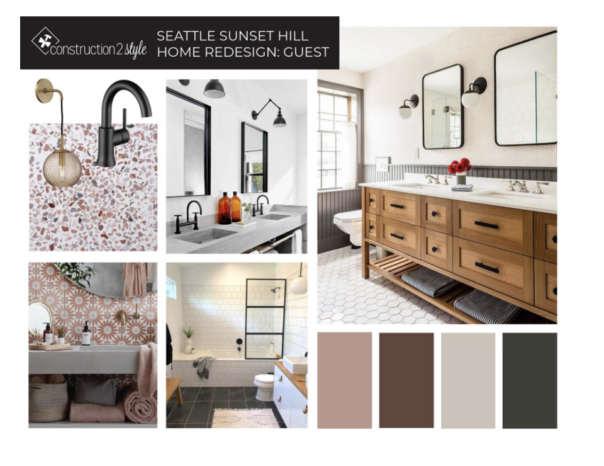
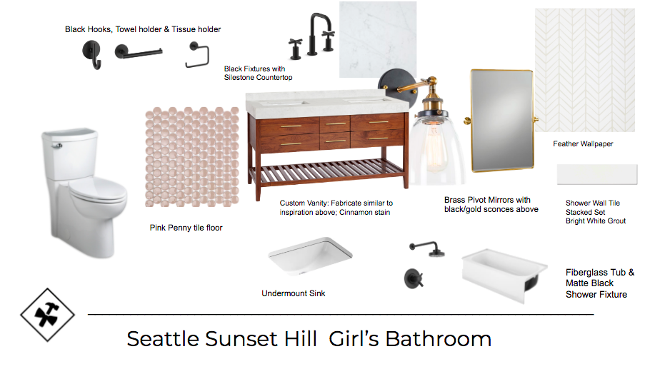
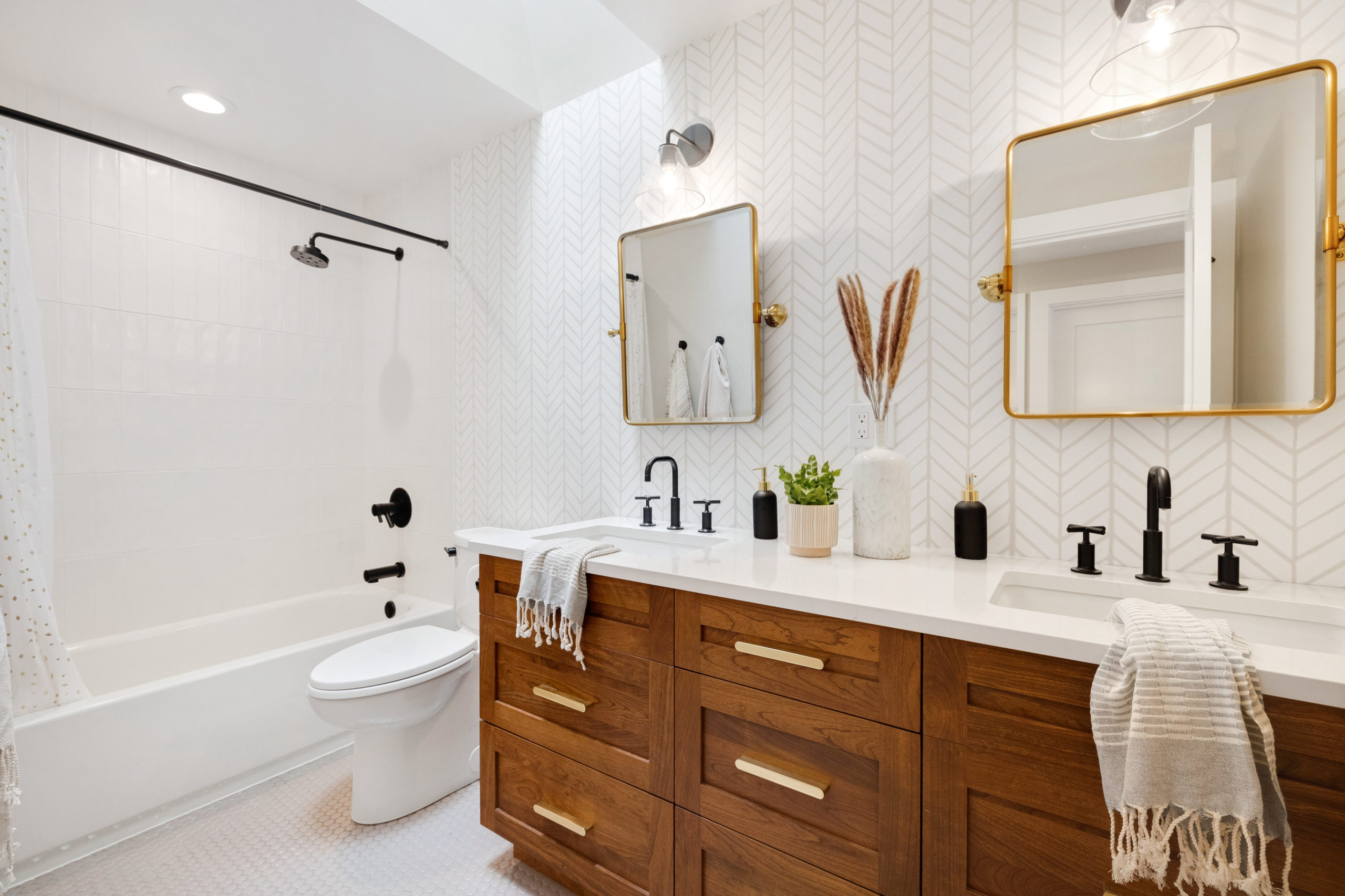
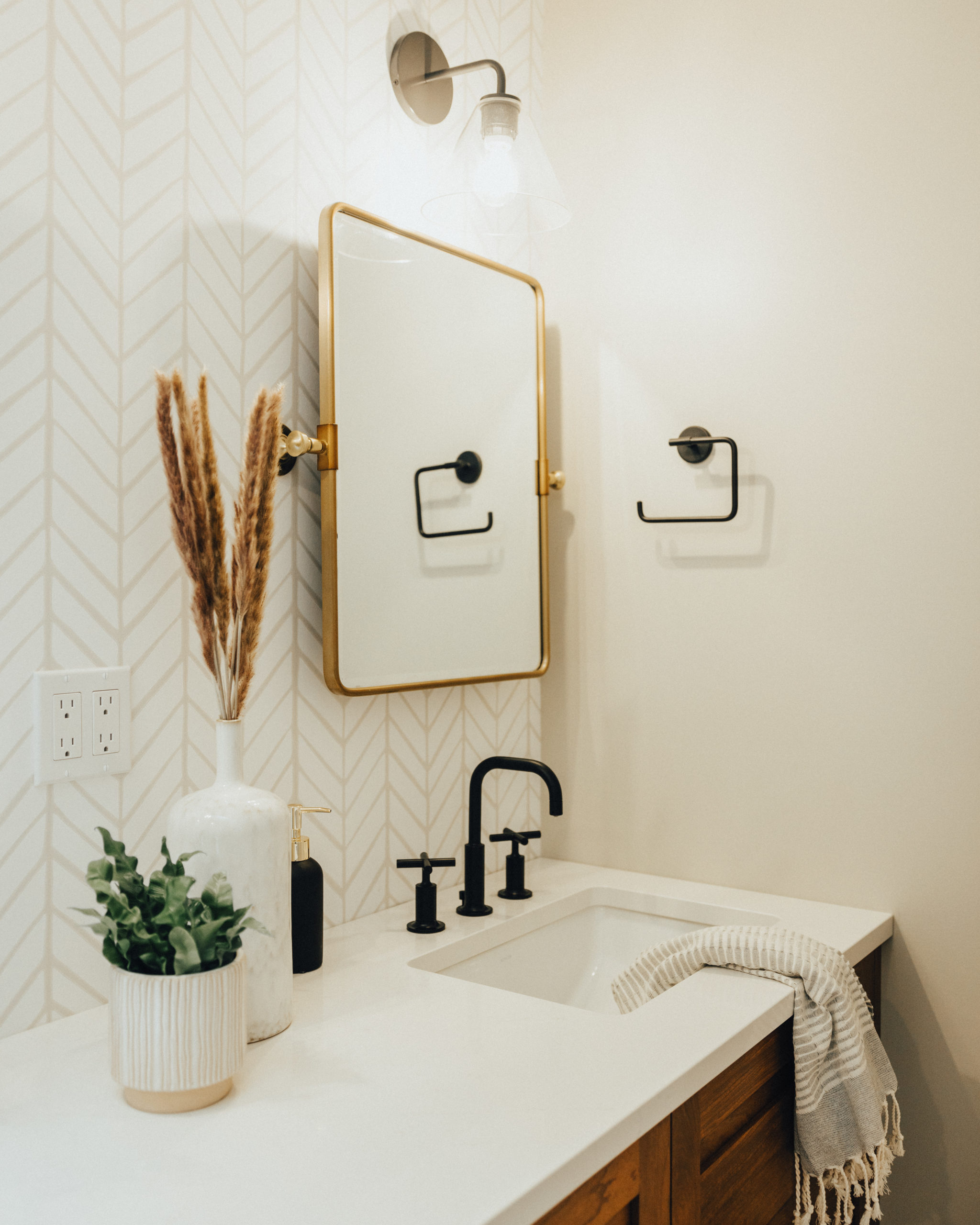
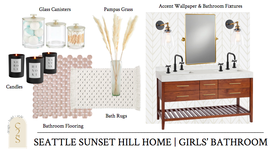
The girls’ bathroom is also the main bathroom on the main level of this home. So although we wanted to go with a bit of a feminine vibe, we also didn’t want it to be too girly-girl. We put together the following mood board and the only thing our client wasn’t about was the top left photo as it reminded our client of cafeteria lunch plates when they were young, and I had to agree! Although the terracotta look is back in full force! So we scratched that but still were able to bring in the perfect splash of subtle pink.
Before
Designs
After
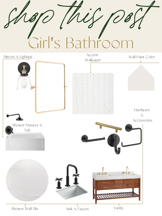
Selections + Shop this Look
1. Wallpaper | 2. Sink | 3. Sink Faucet | 4. Wall Paint | 5. Tub | 6. Mirror |7. Lighting | 8. Vanity | 9. Hardware | 10. Toilet Paper Holder, Hand Towel Ring & Hooks | 11. Bathroom Flooring | 12. Shower Head & Arm
Lower Level Living + Bar
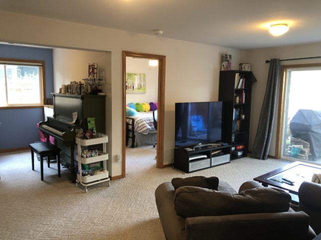
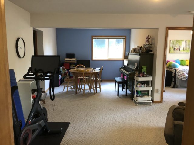
The lower level we ended up reconfiguring quite a bit, but unfortunately, I didn’t have the best before photos to show for it. There were a couple of enterances from the garage into the lower level, which wasn’t necessary. There was also unused space. One of the biggest things we did was where you can see the piano, we walled off this area and moved the laundry room over into that space.
Before
Designs
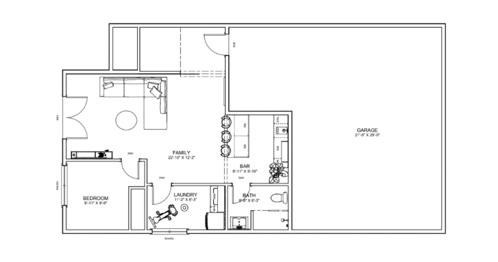
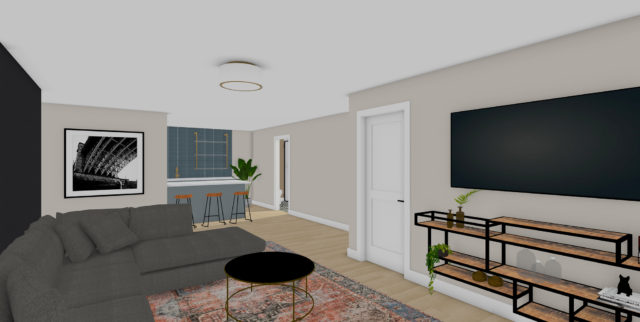
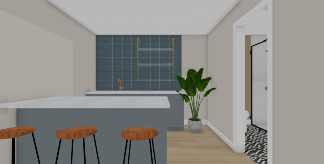
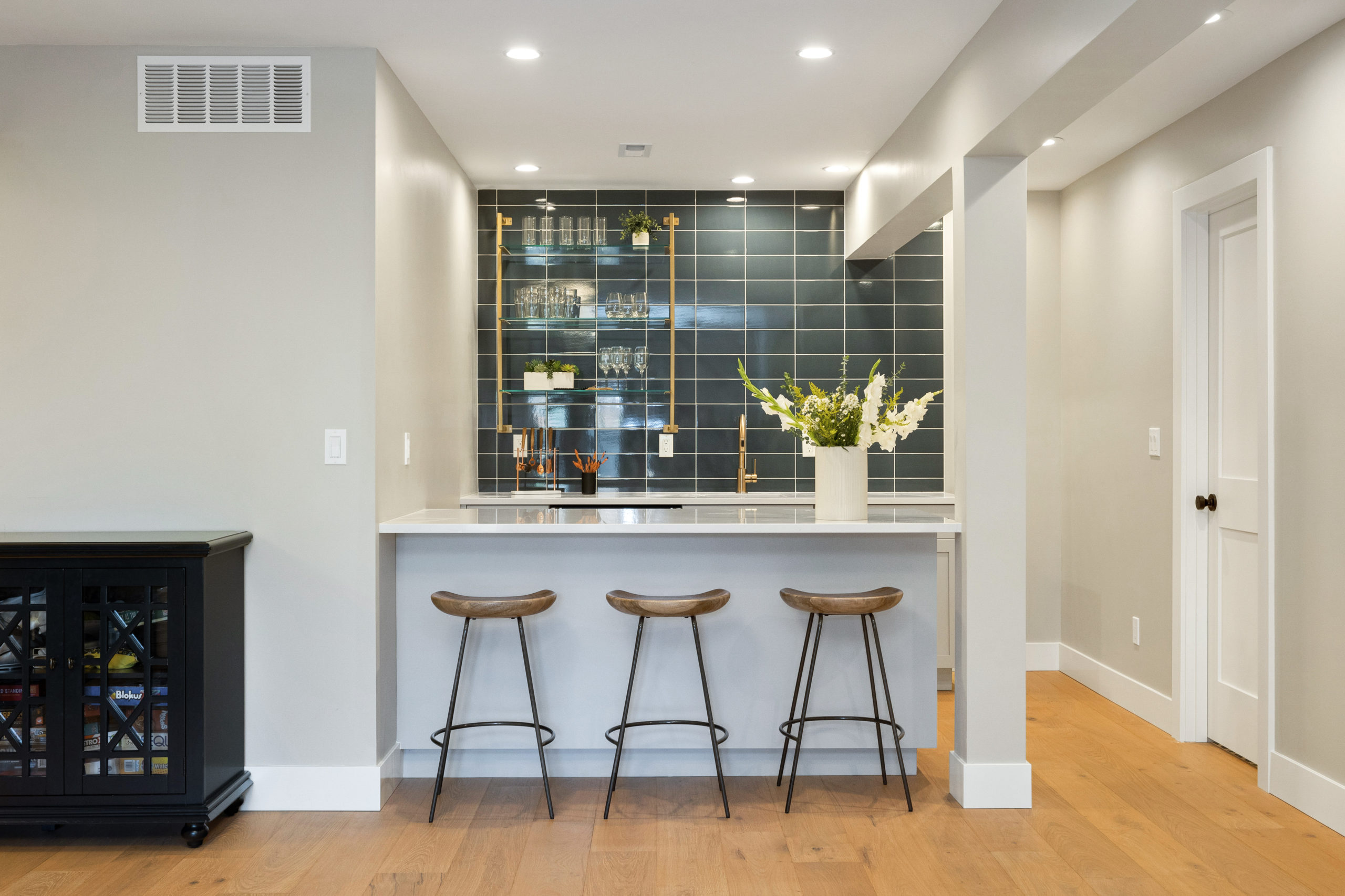
Here were the floor plans for the lower level. Where you see the bar and bathroom was once a hallway, leading into the garage. The laundry room was also tucked back over in this space. So after we were able to move the laundry room and close off one of the access points into the garage it freed up a lot of space, in which we were able to create this fun bar area.
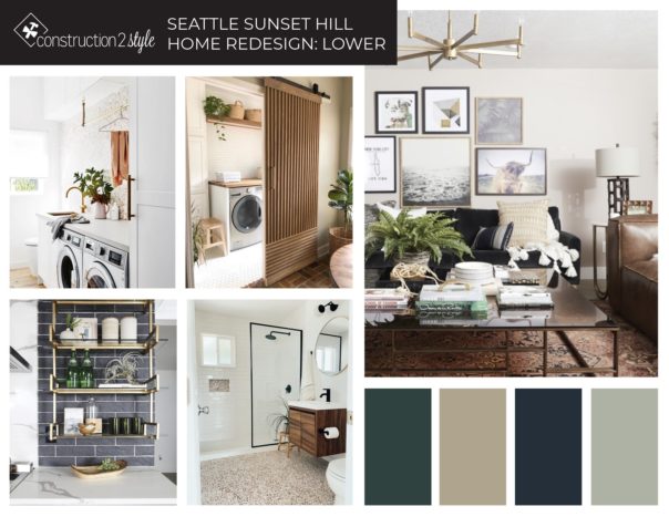
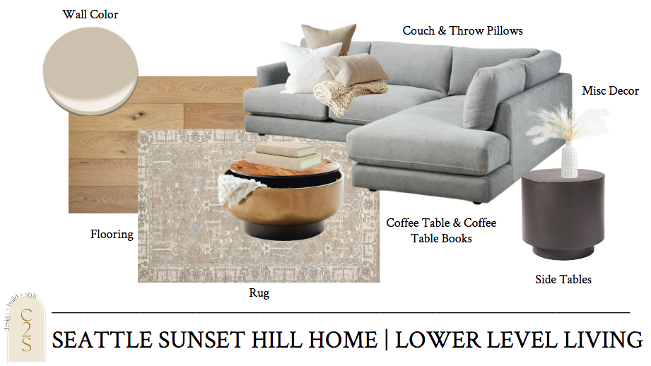
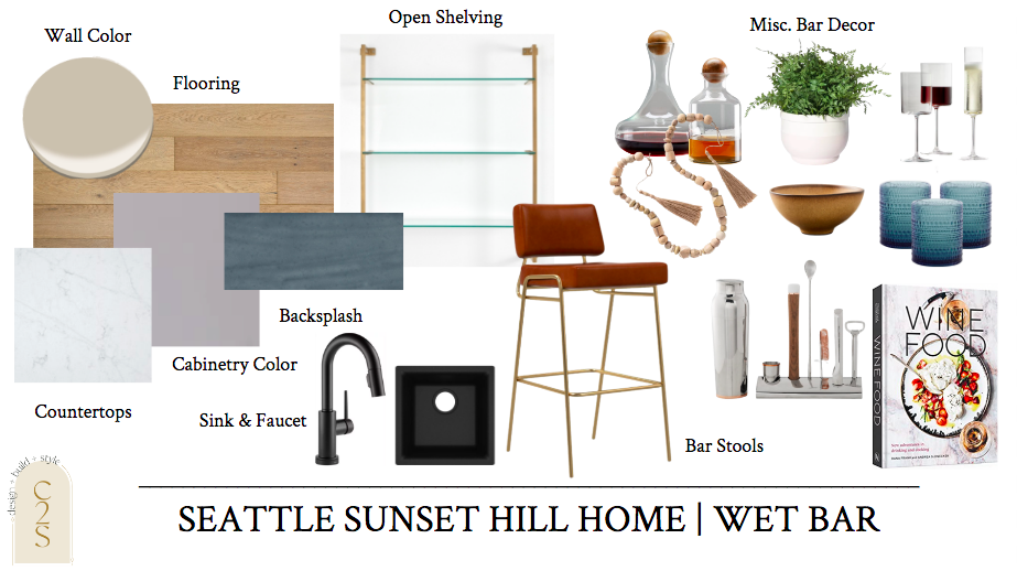
Here was the overall vibe for the lower level!
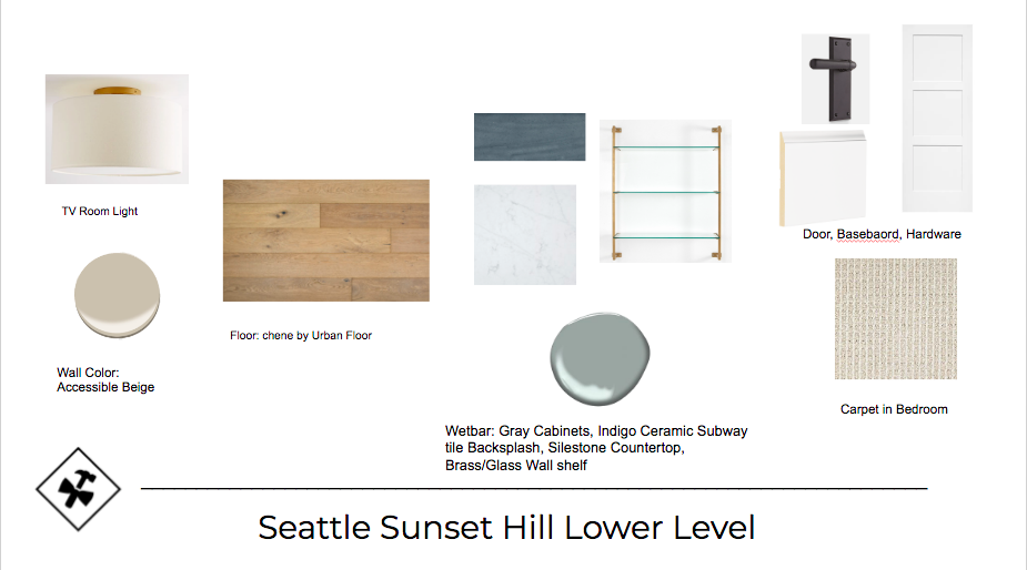
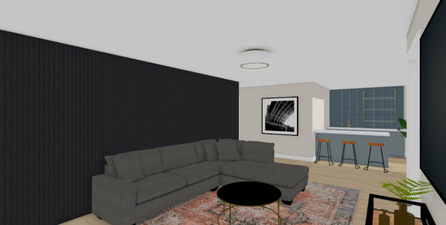
And the concept boards and renderings …
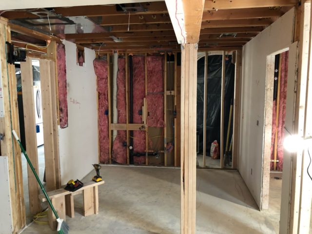
Under Construction
After
Same view below as above, under construction. Where the laundry room was once is now this.
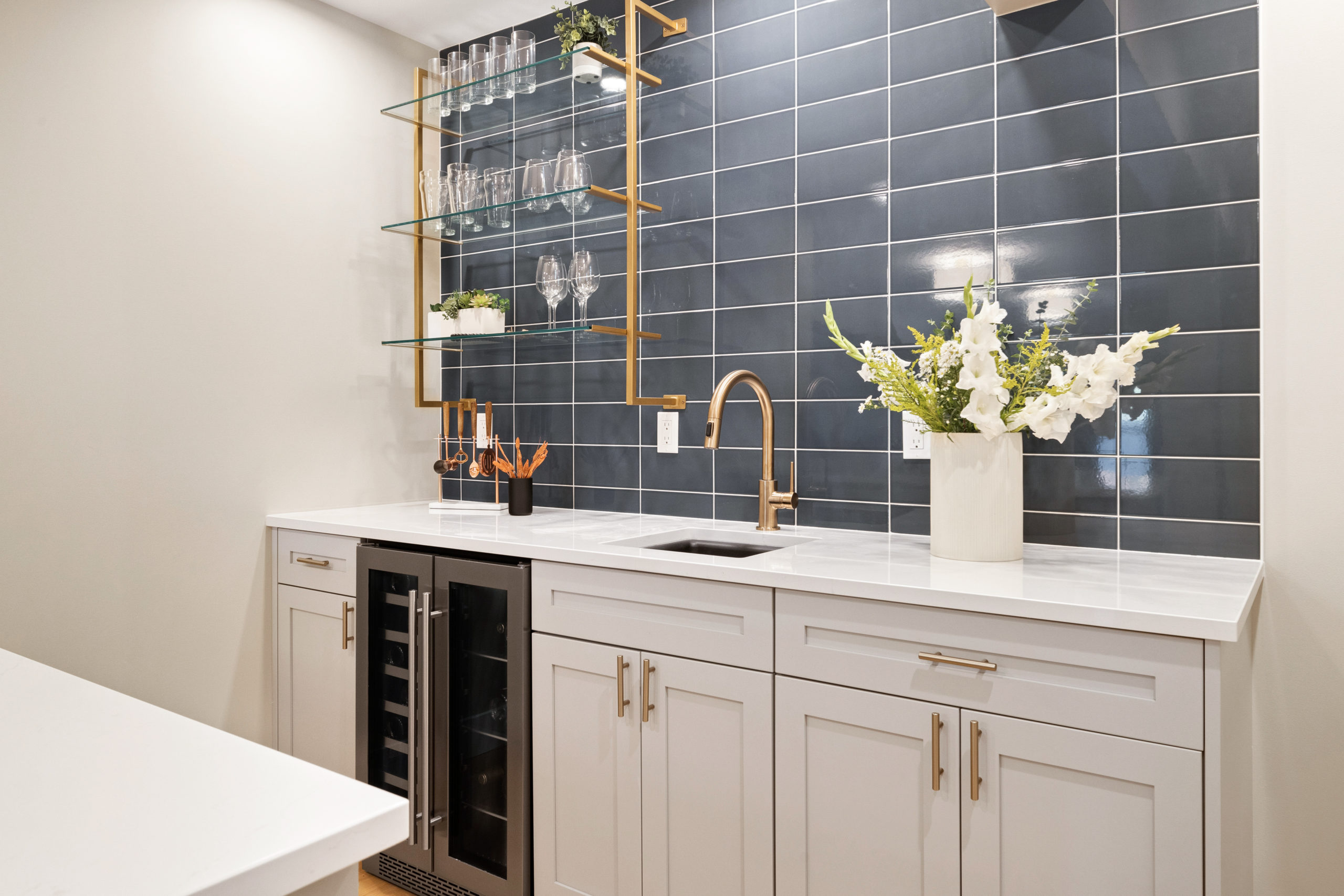
Hands down, of my new favorite bar areas. From the tile to the open shelving to the light and bright countertops.
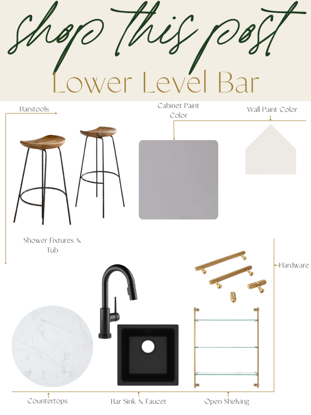
Selections + Shop this Look
1.Cabinetry Color | 2. Countertop | 3. Backsplash | 4. Hardware | 5. Open Shelving | 6. Bar Sink | 7. Bar Faucet | 8. Bar Stools
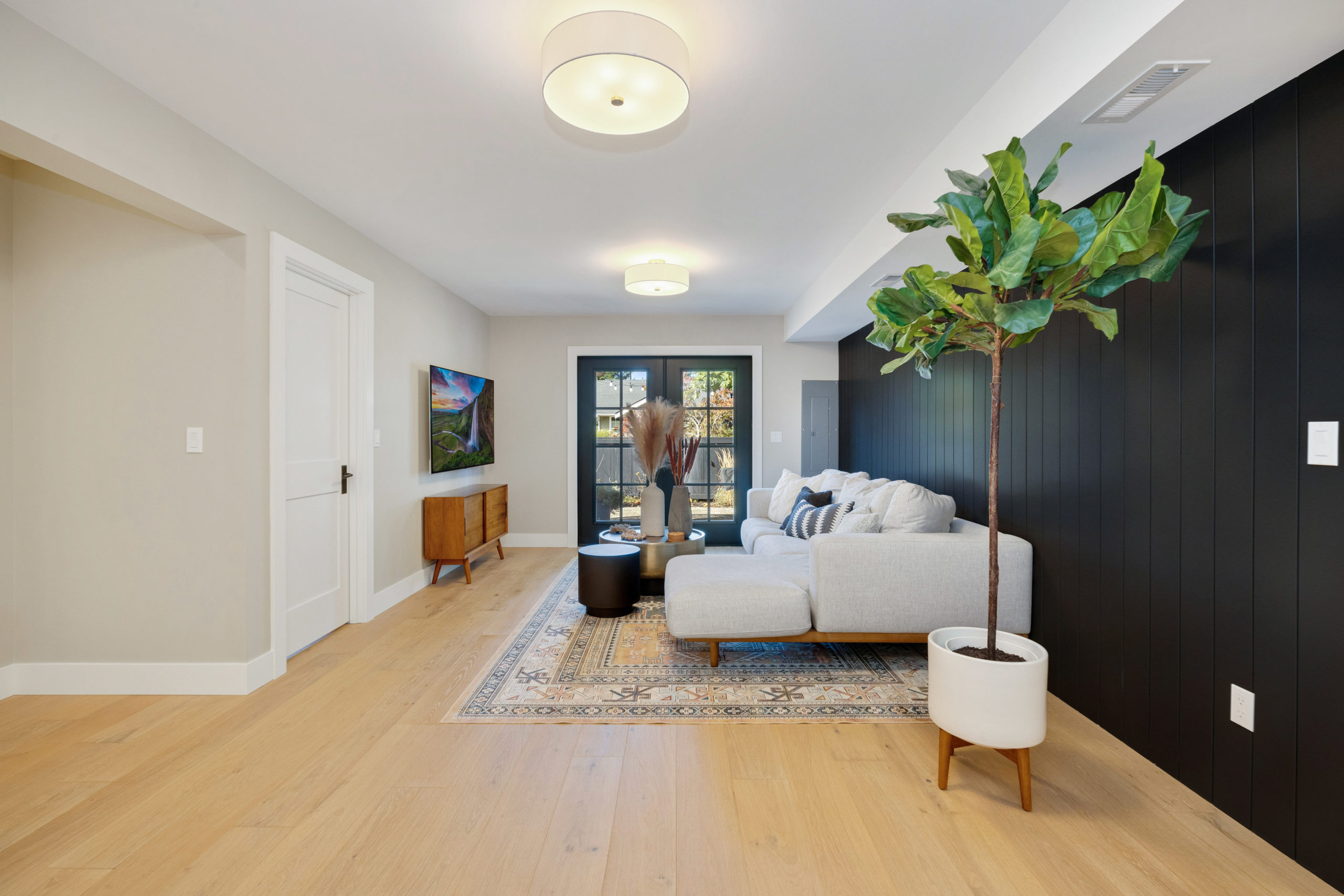
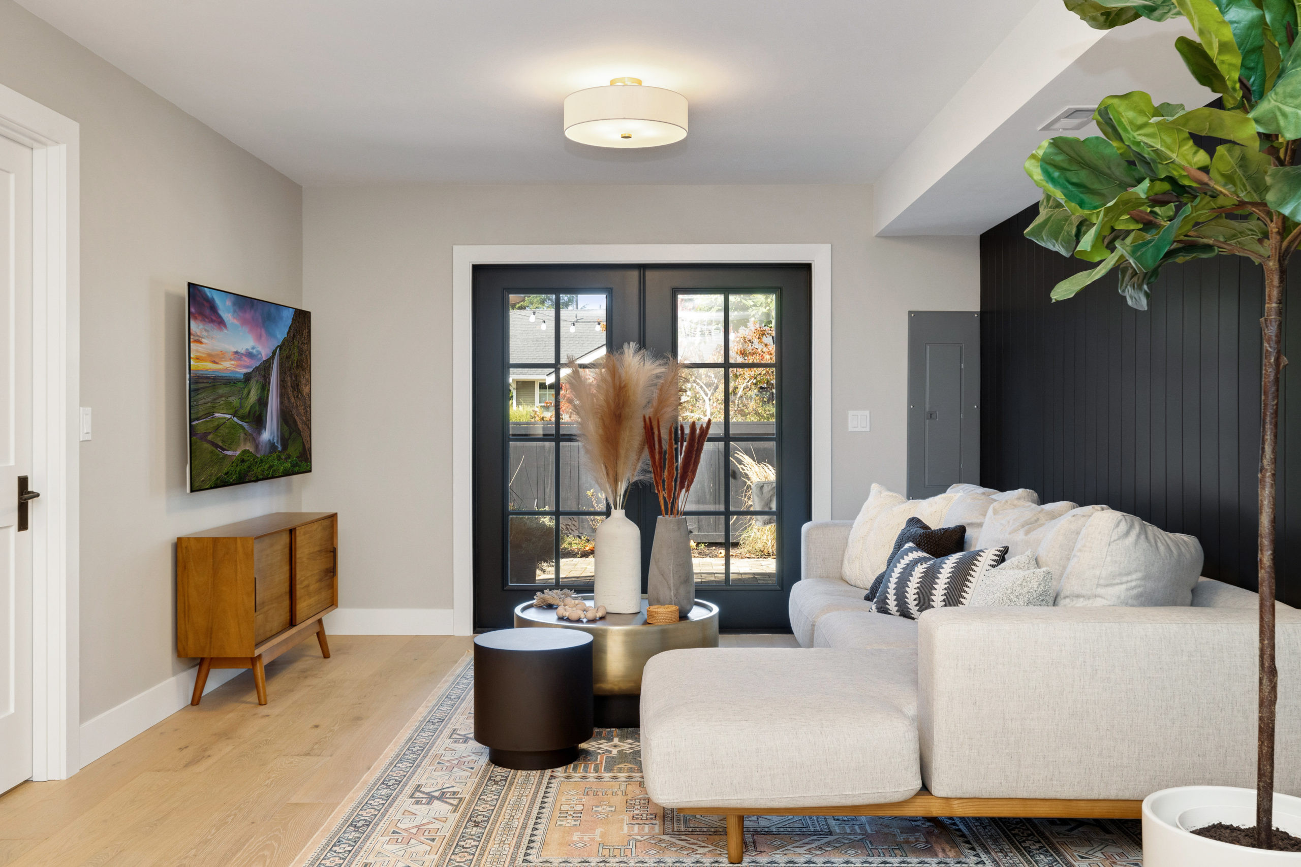
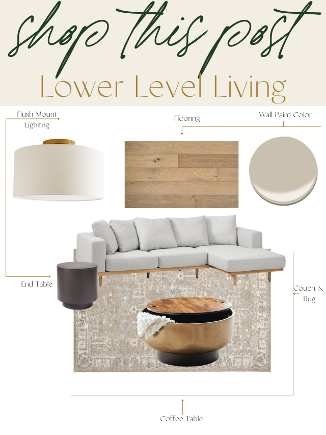
1. Wall Paint | 2. Flooring | 3. Flush Mount Lighting | 4. Couch | 5. End Table | 6. Coffee Table | 7. Entertainment Center | 8. Rug
Lower Level Bathroom
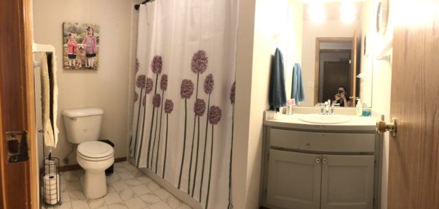
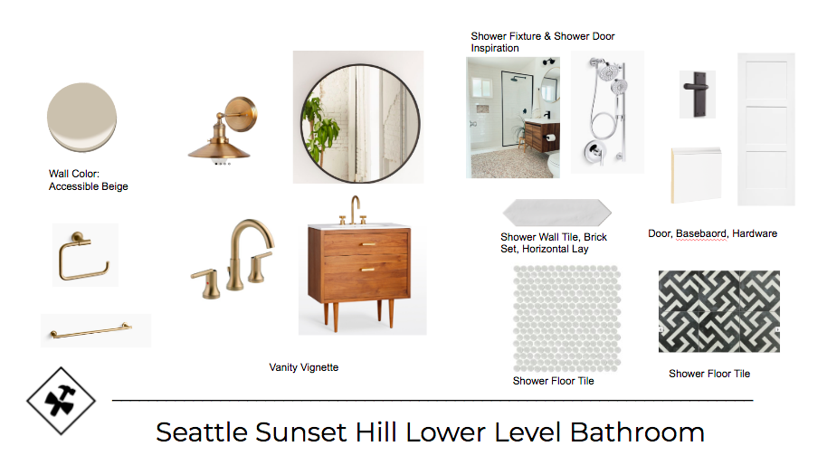
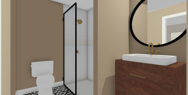
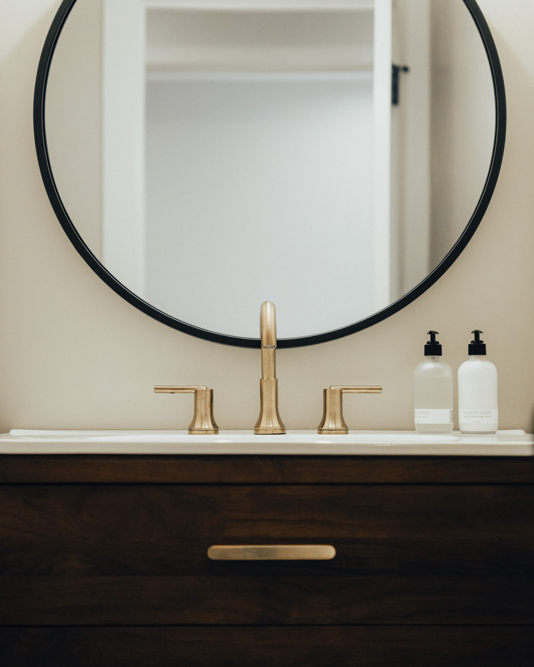
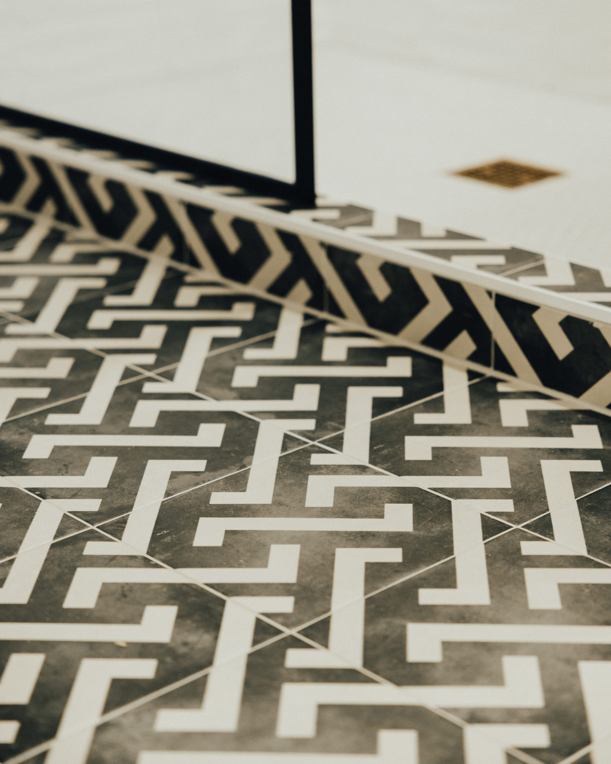
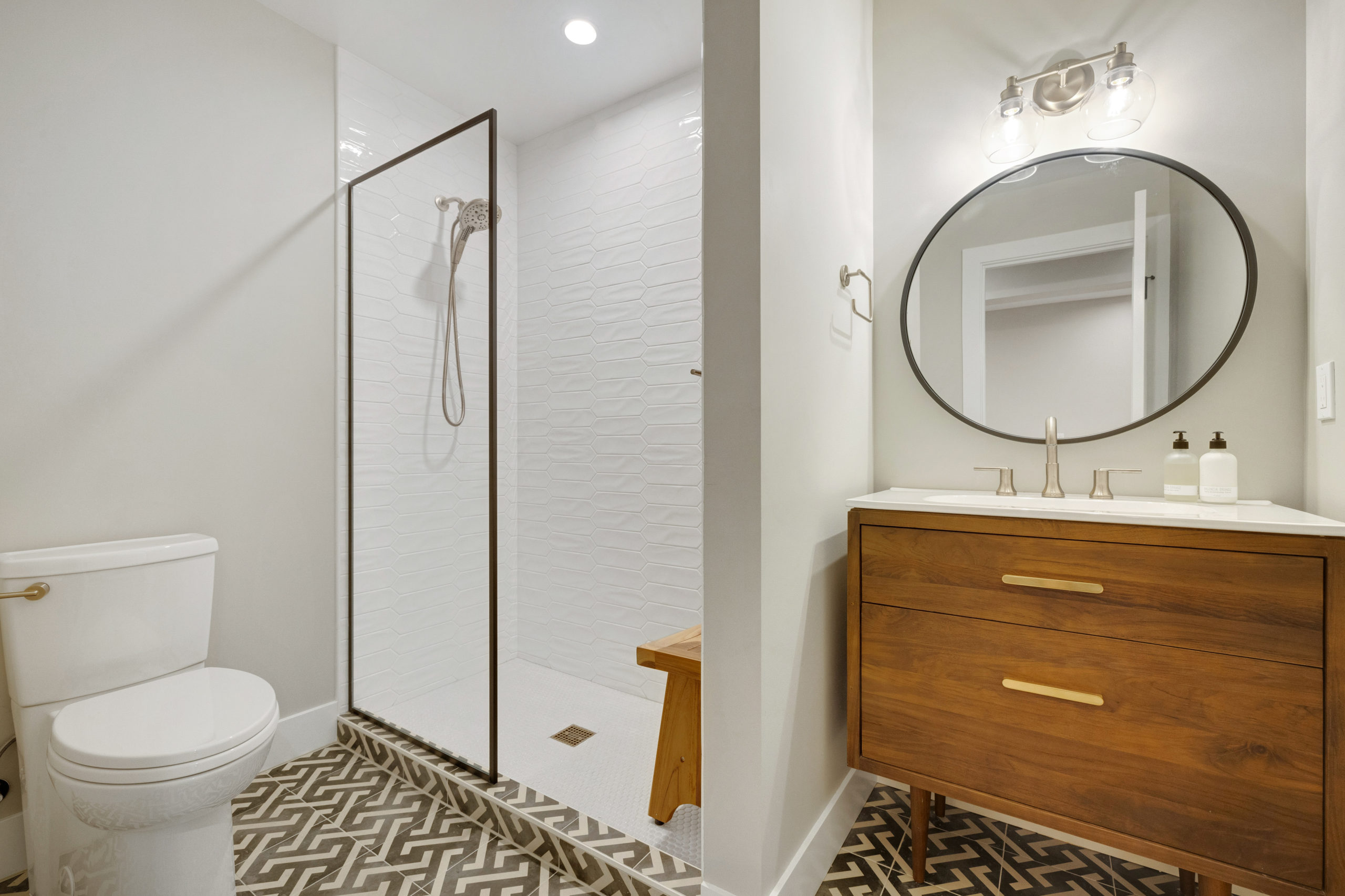
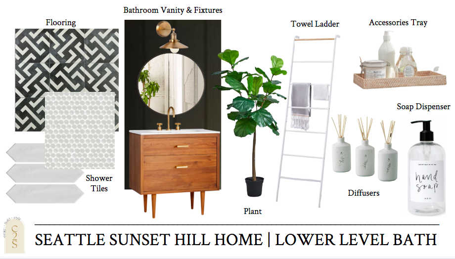
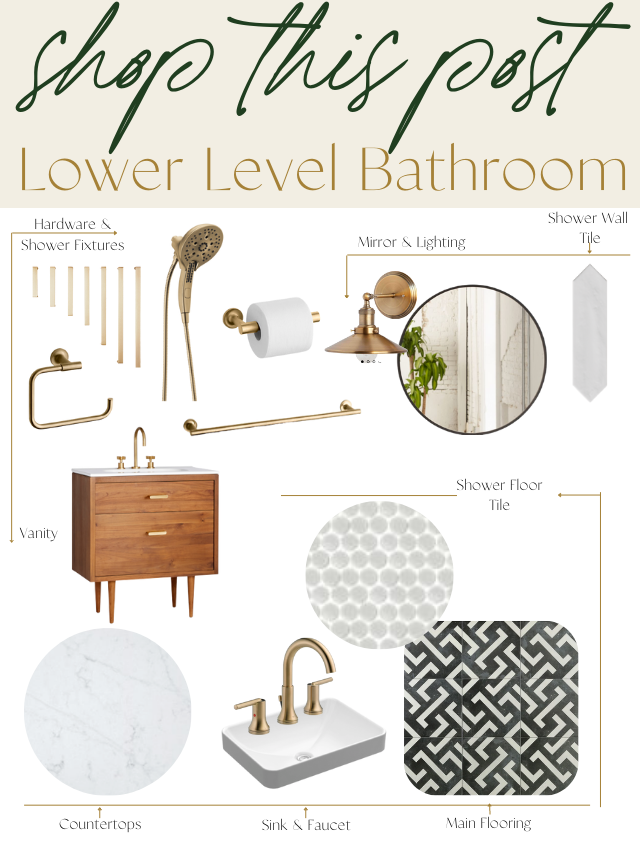
The bathroom, which is off of the bar area in this lower level. Overall, the footprint remained the same but it was a full gut and remodel just like every other room in this home. We went with a black and white feel for this space with pops of wood tones and gold.
Before
Designs
The main floor tile, I knew was going to be a favorite. And it looked better in real life.
After
Selections + Shop this Look
1. Faucet | 2. Sink | 3. Bath Flooring | 4. Lighting | 5. Mirror | 6. Vanity | 7. Countertop | 8. Hardware | 9. Shower Floor Tile | 10. Shower Wall Tile | 11. Shower Fixtures | 12. Toilet Paper Holder | 13. Hand Towel Ring | 14. Towel Bar
Lower Level Laundry Room
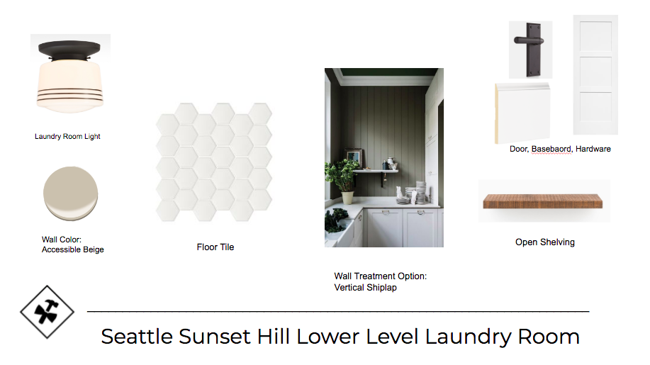
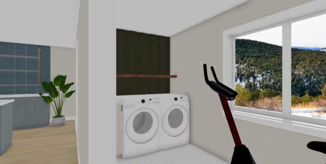
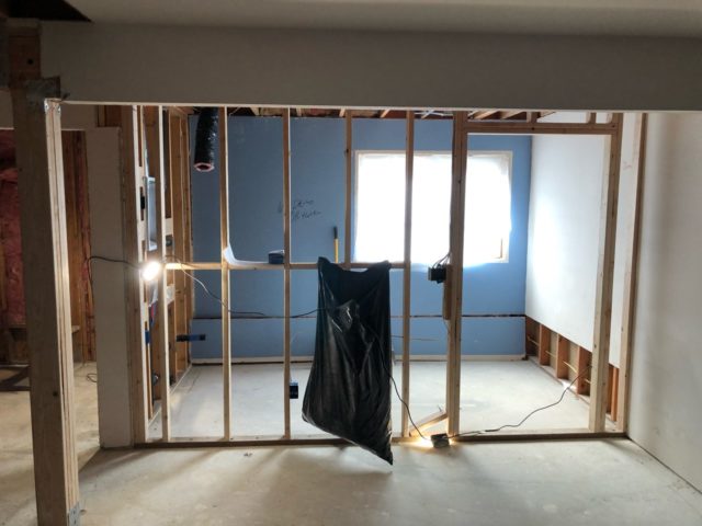
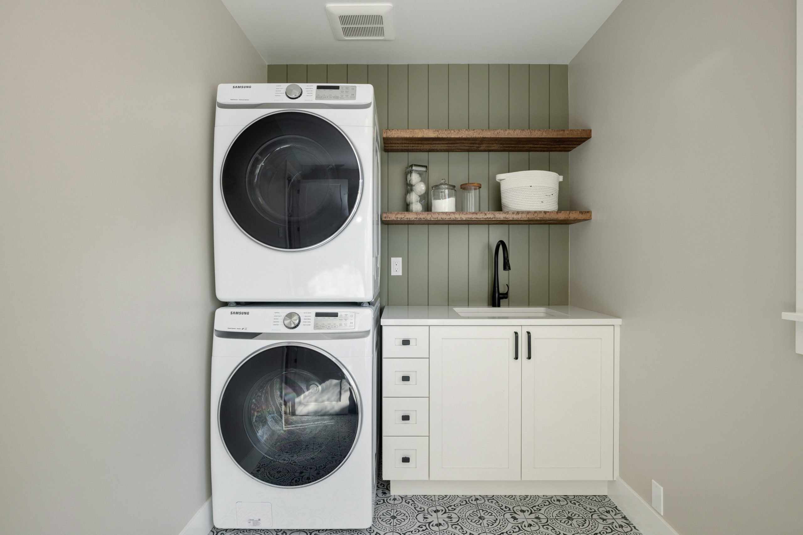
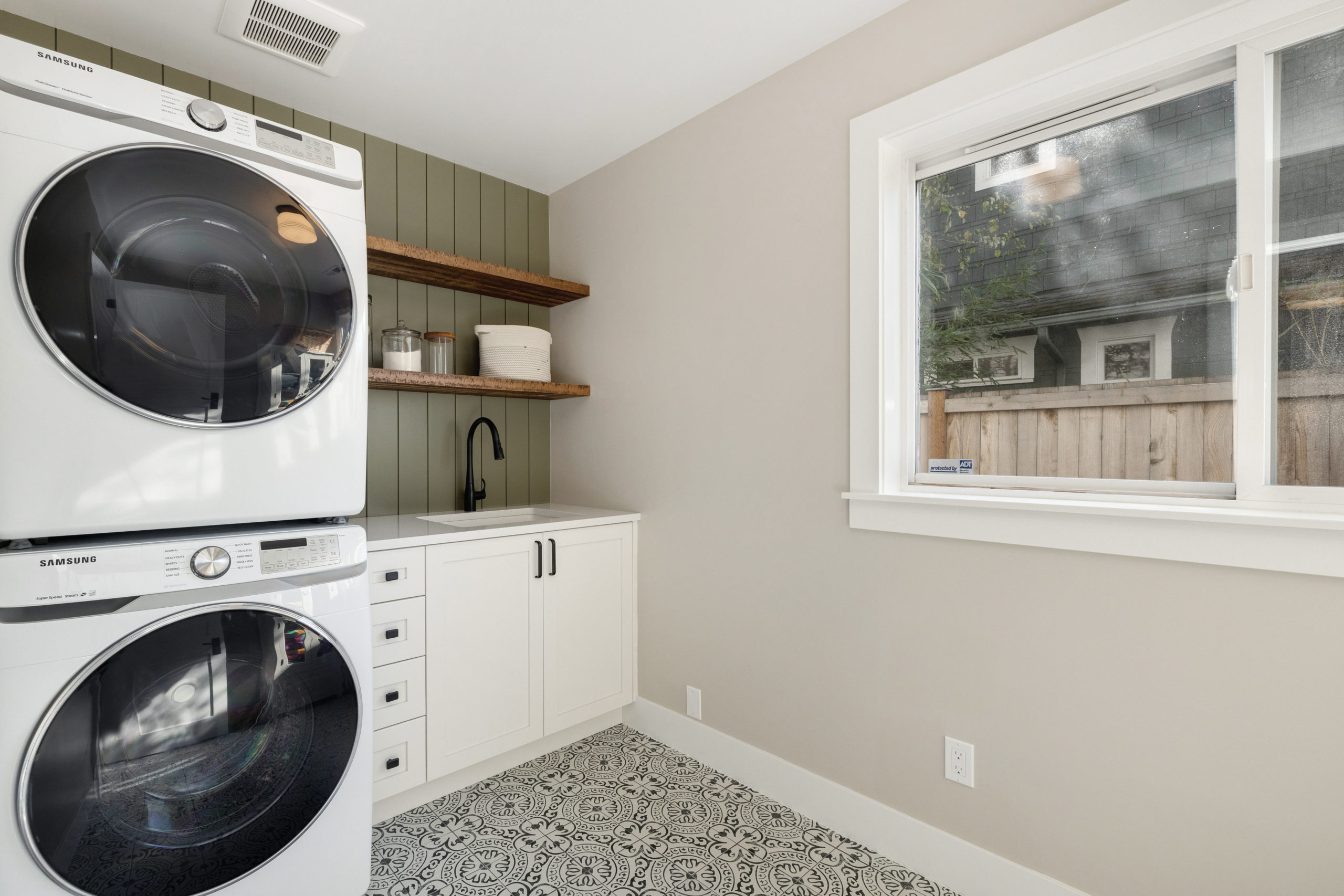
And lastly, the laundry room. Where the table and piano were, we completely walled off and moved the laundry room into this space. If you look to the left, where that doorway was – this is where the hallway was with a very small room on the left-hand side, in which was the former laundry room (where the bar is now).
Before
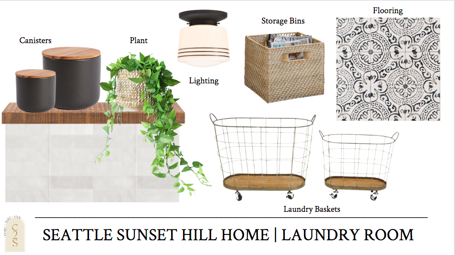
Designs
Under Construction
After
So much better! More room for this active family and a much happier space to get their laundry done.
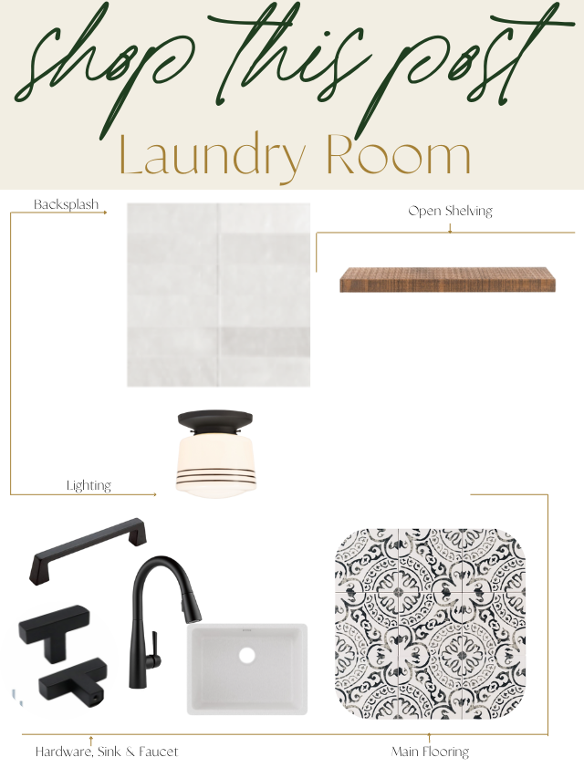
Selections + Shop this Look
1. Flooring | 2. Backsplash | 3. Hardware | 4. Ceiling Light Fixture | 5. Open Shelving | 6. Faucet | 7. Sink
construction2style Shop Items
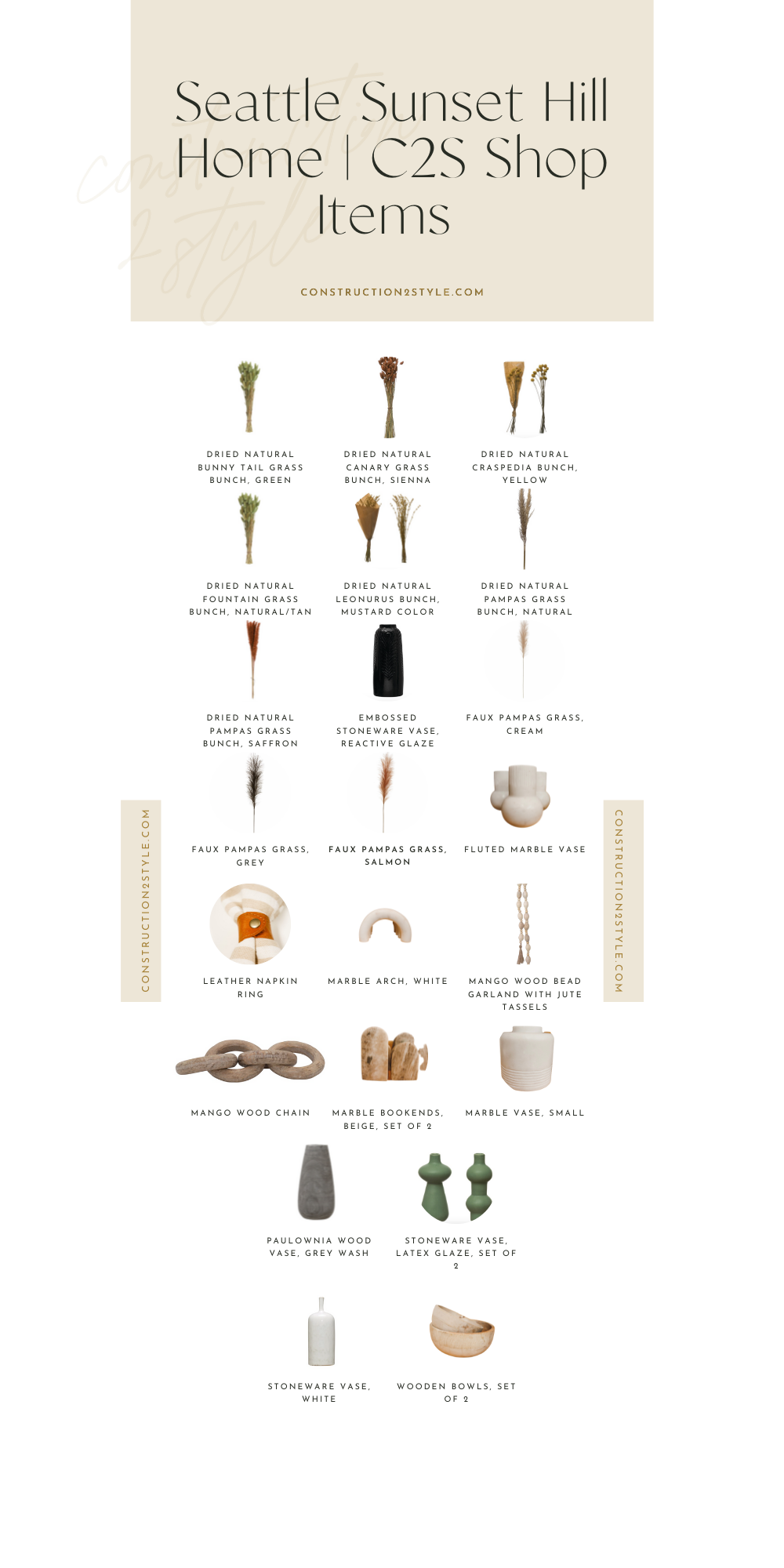
Before we flew out there, we shipped some of our shop items so we could style with them and so also our clients could keep some of the products. All products we used from the shop are listed below.
1. Dried Natural Bunny Tail Grass Bunch, Green | 2. Dried Natural Canary Grass Bunch, Sienna | 3. Dried Natural Craspedia Bunch, Yellow | 4. Dried Natural Fountain Grass Bunch, Natural/Tan | 5. Dried Natural Leonurus Bunch, Mustard Color | 6. Dried Natural Pampas Grass Bunch, Natural | 7. Dried Natural Pampas Grass Bunch, Saffron | 8. Embossed Stoneware Vase, Reactive Glaze | 9. Faux Pampas Grass, Cream | 10. Faux Pampas Grass, Grey | 11. Faux Pampas Grass, Salmon | 12. Fluted Marble Vase | 13. Leather Napkin Ring | 14. Marble Arch, White | 15. Mango Wood Bead Garland with Jute Tassels | 16. Mango Wood Chain | 17. Marble Bookends, Beige, Set of 2 | 18. Marble Vase, Small | 19. Paulownia Wood Vase, Grey Wash | 20. Stoneware Vase, Latex Glaze, Set of 2 | 21. Stoneware Vase, White | 22. Wooden Bowls, Set of 2
And there you have it, our full Seattle Sunset Hill project reveal! Hope you love the transformation as much as we and our clients do. We had such a blast designing this home out and we are so happy with the work that Eakman Construction did. Have any questions about this project? Drop them below.
