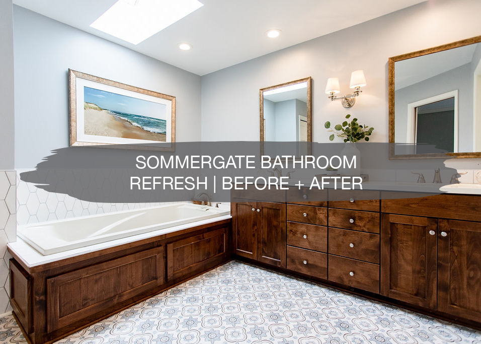
We recently wrapped up this master bathroom and guest bathroom refresh and can’t wait to show it to you!
Our clients came to us wanting to give their bathrooms a new look since they were going to put their home up for sale. They loved their home and had enjoyed many memories in it with their family, but they were ready to move into something smaller since their kids are all out of the house. For the bathrooms, the goal was to give them a fresh look and brighten them up.
Inspiration
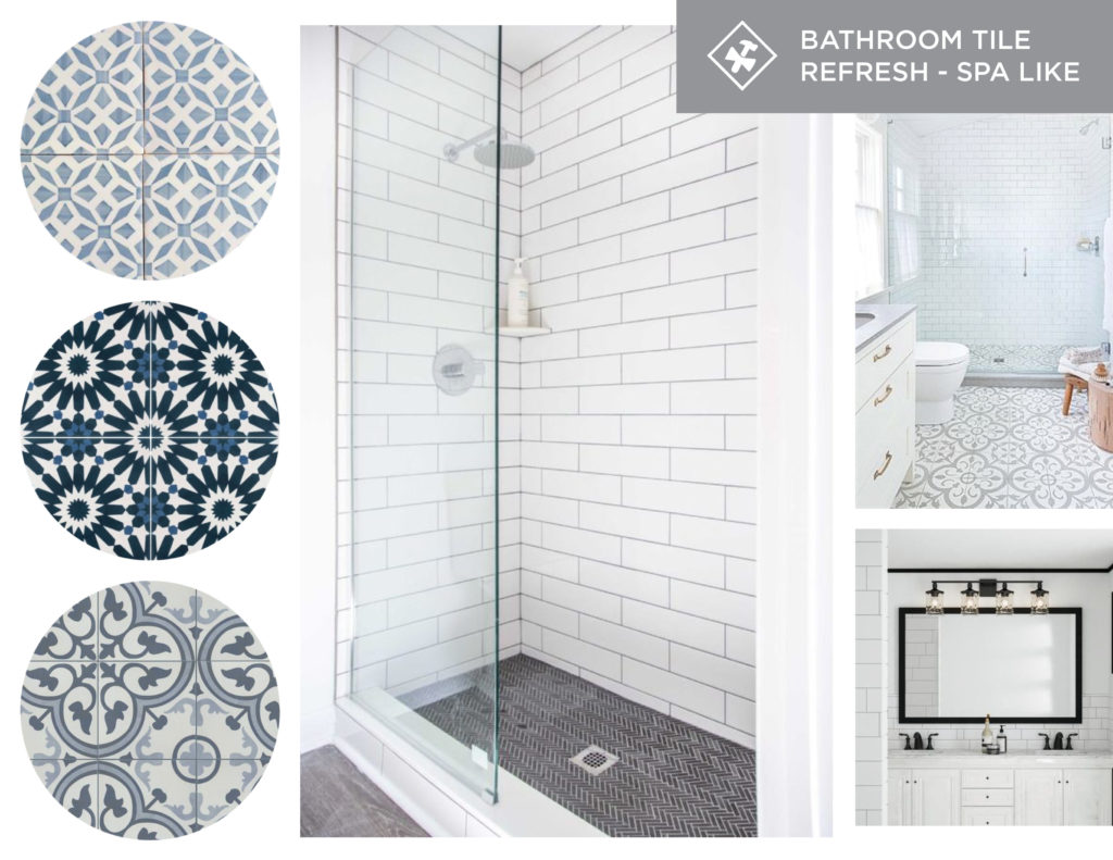
With the bathroom inspiration, our clients loved the idea of a fun pattern tile for the master bathroom floor. A tile with the color blue was a big part of the inspiration. For the shower, the goal was to take out the current surround and replace it with white tile to make it feel more open and bright. In the guest bath, the plan was to paint the space and replace the mirror and vanity to give it a new look, without breaking the bank.
Master Bathroom
Let’s check out this master bathroom before…
Before
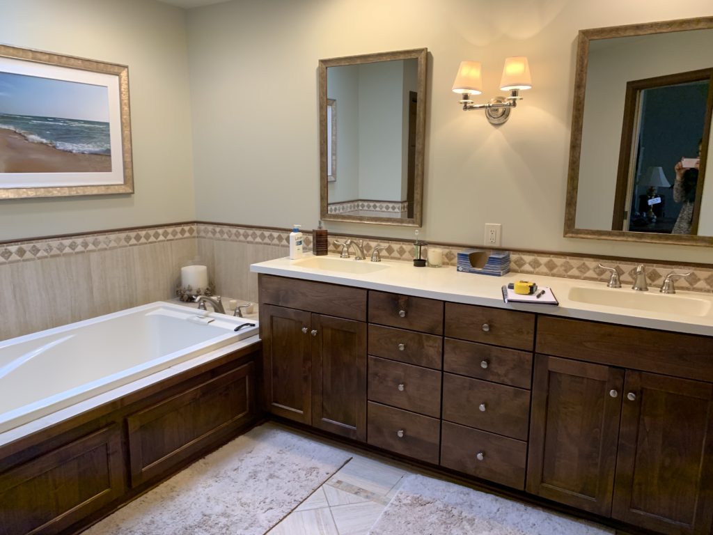
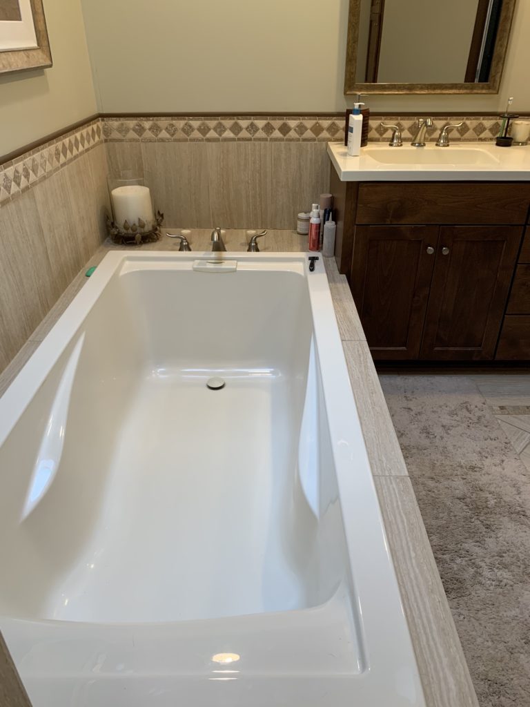
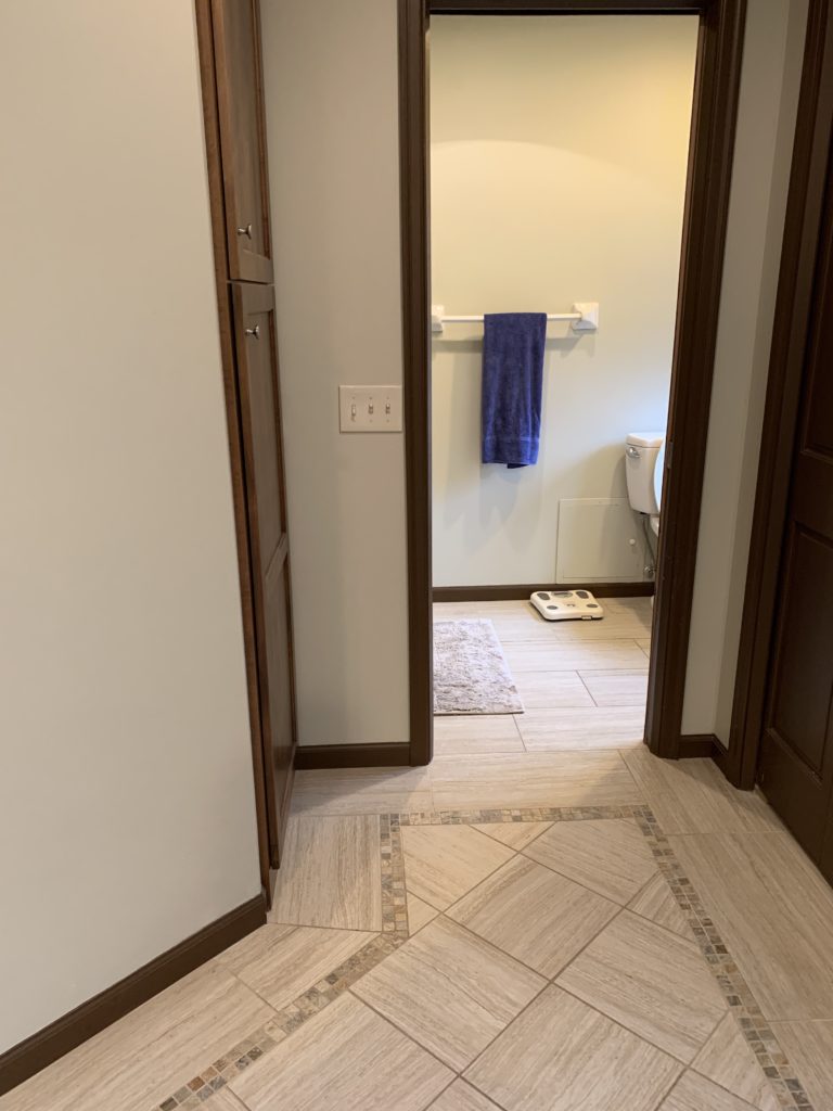
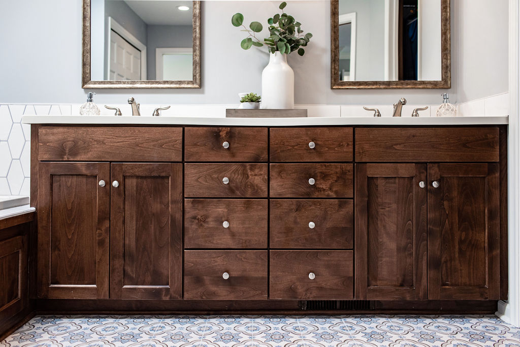
The vanity cabinets looked great and were in really good shape, so the plan was to keep them and update the tile on the walls and floor. With the tan walls and tile, it made the space feel a bit dated, and our client wanted to make the space lighter.
After
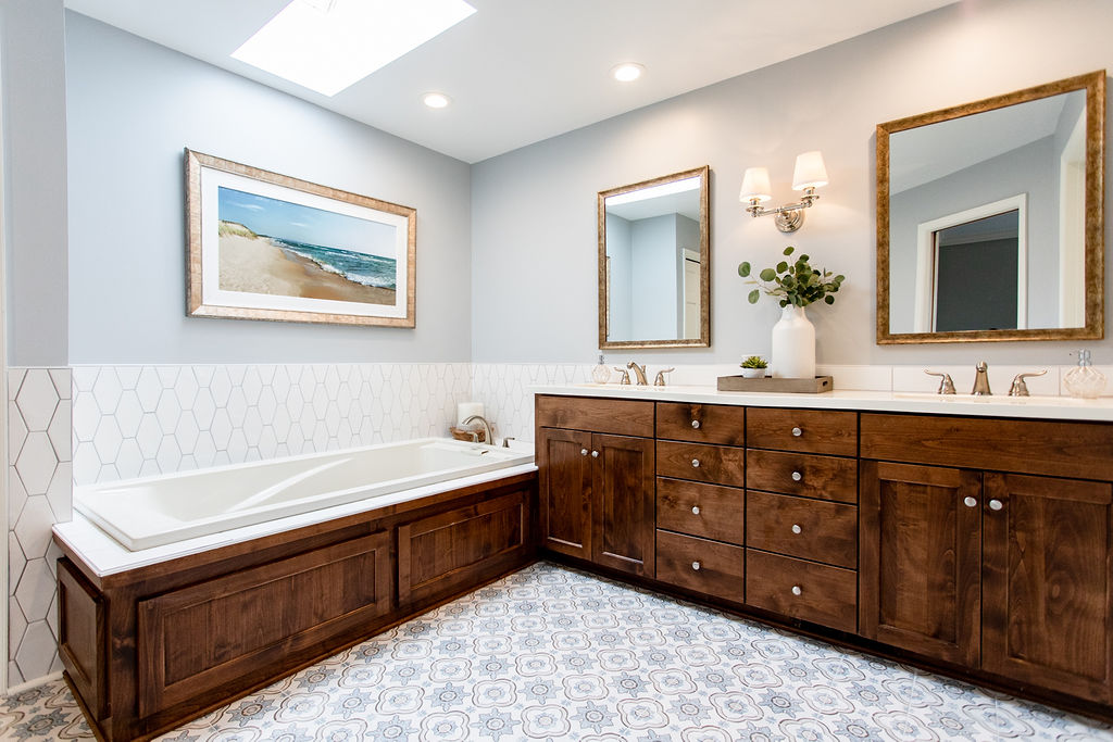
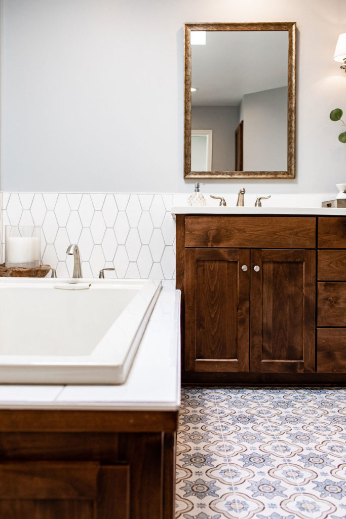
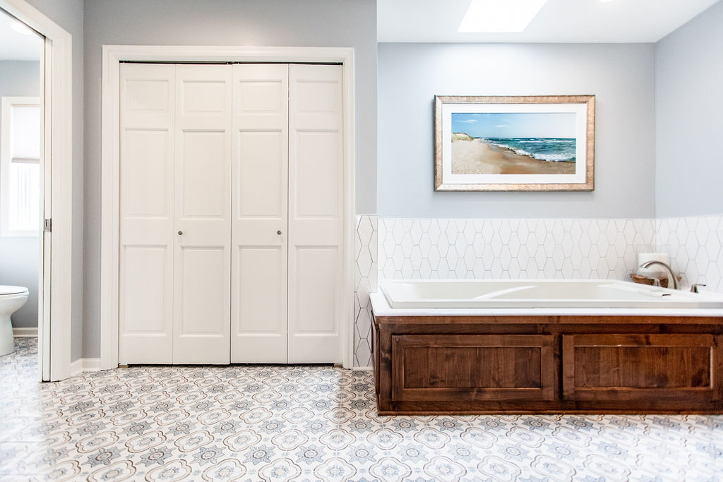
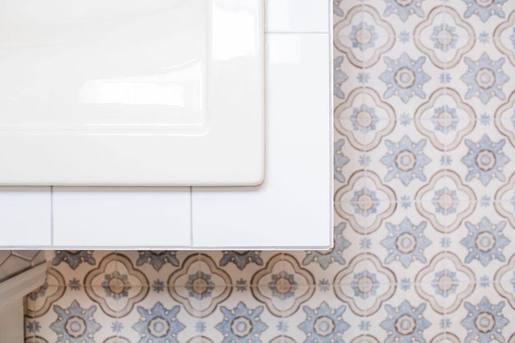
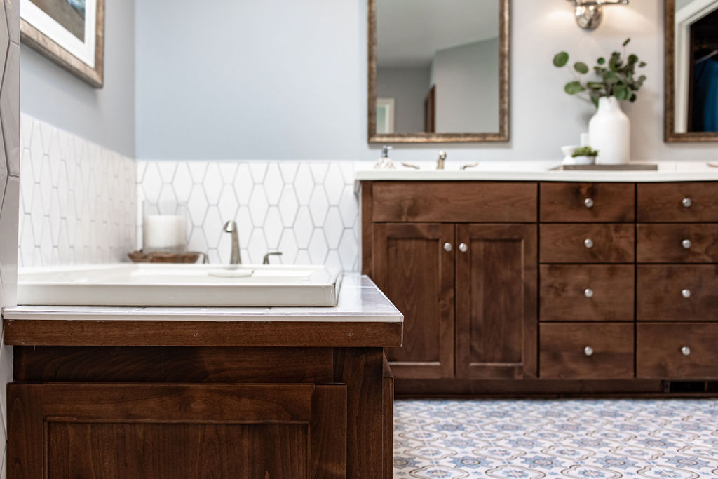
The square blue and grey tile from Tile Shop on the floor makes the space feel fun and bright. It is complemented by the wall paint color, which is Gray Screen by Sherwin Williams, which is a blueish-gray. Behind the vanity, we went with a white subway tile since there was previously tile there, and it works well with the elongated white hexagon tile behind the tub.
Before
From this…
After
…to this! So much brighter and lighter. By using the same tile behind the vanity and around the tub keeps it consistent and makes the tub feel larger as well.
Before
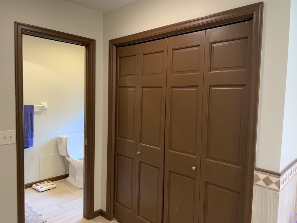
On the other side of the bathroom, the closet and trim were making the space feel darker.
After
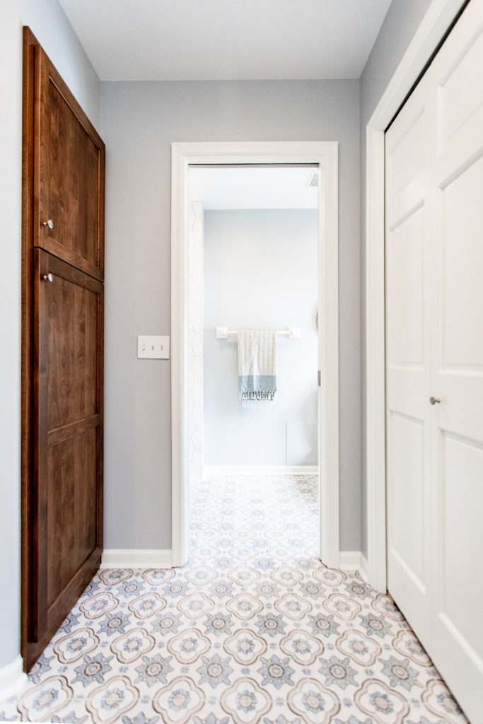
Now with a fresh coat of paint on the walls and white trim and doors, this space feels completely different.
Before
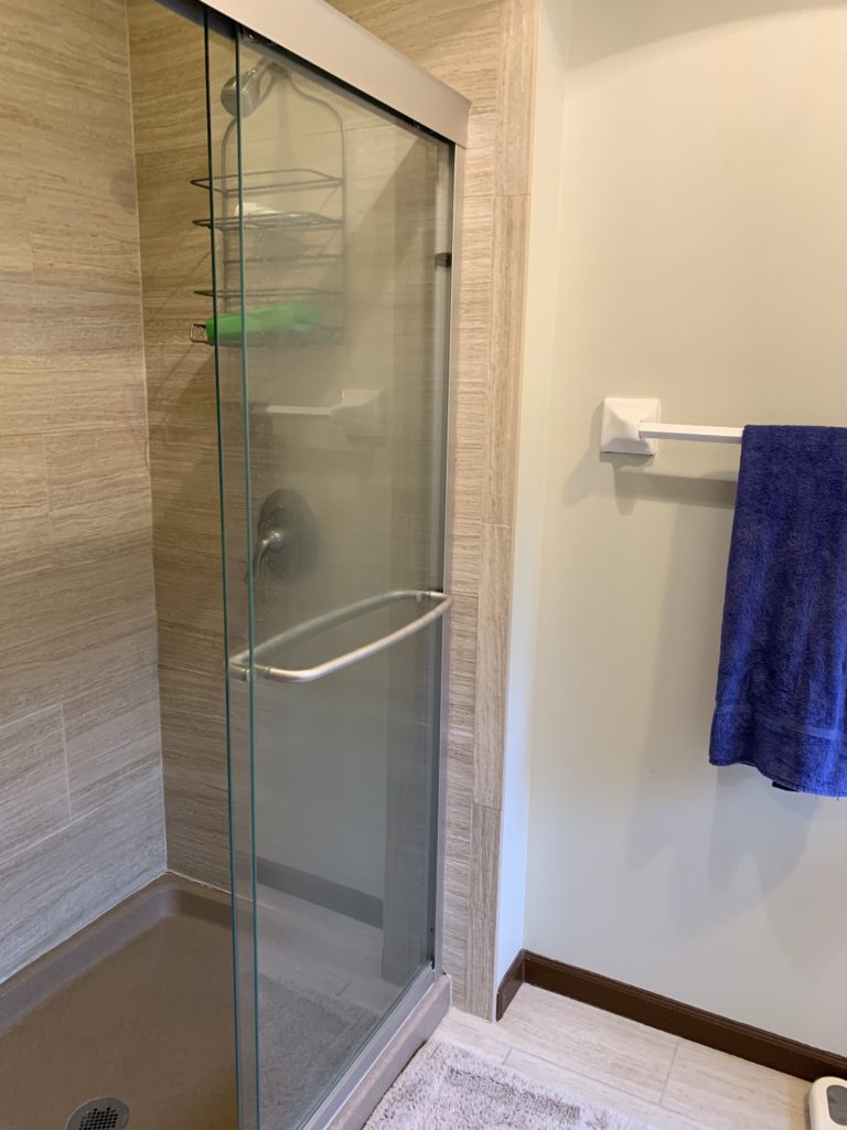
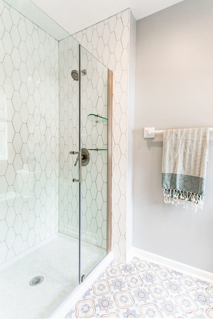
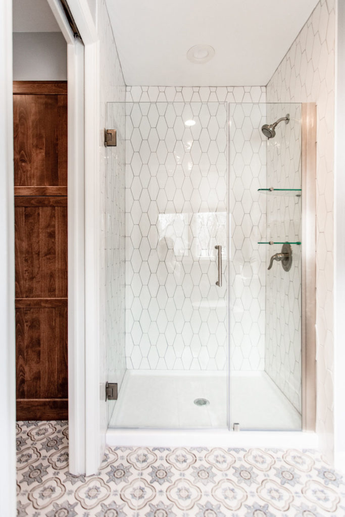
For the shower, we took out the tan surround tile and shower pan and replaced it with white.
After
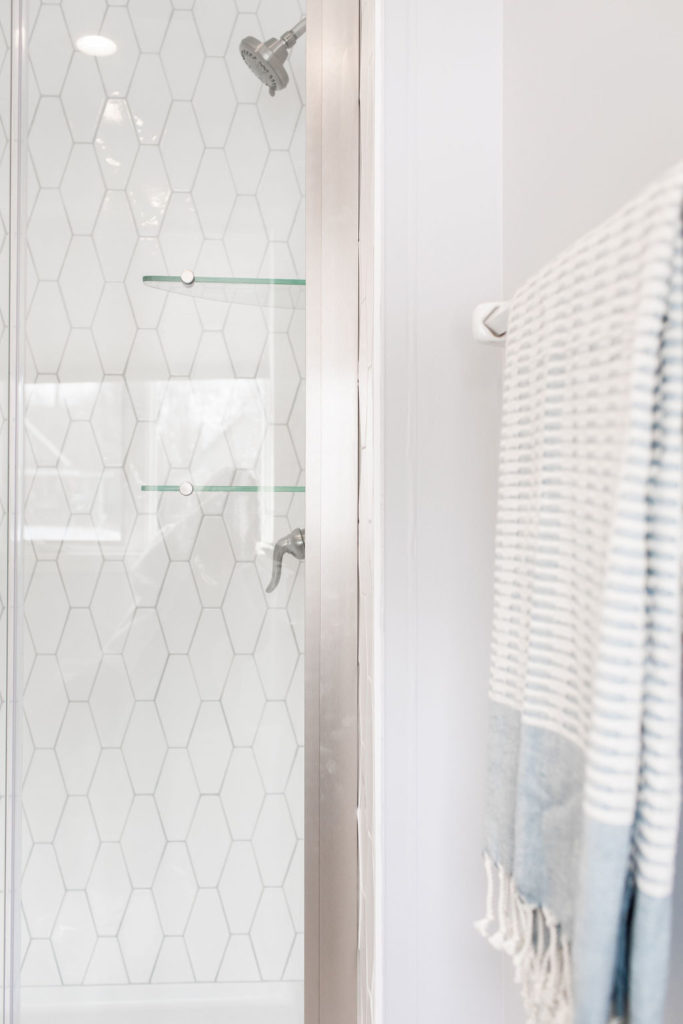
The shower feels so much bigger with this elongated hexagon tile, especially in the vertical layout, making the room feel taller and more open. A new hinged glass shower door, rather than a sliding door, give the shower a more luxurious look too. The showerhead got replaced as well to a larger one, making it a better fit for this master bath.
Before
Crazy what paint can do to a space! The closet went from this…
After
…to this! The white closet door and trim brighten up the look and make the vanity and tub exterior wood shine.
Into the Details
Shop This Bathroom
Floor Tile | Shower Surround Tile | Tile Behind Vanity | Shower Head | Shower Door
Guest Bath
In addition to the master bathroom, we also gave the guest bath a mini refresh.
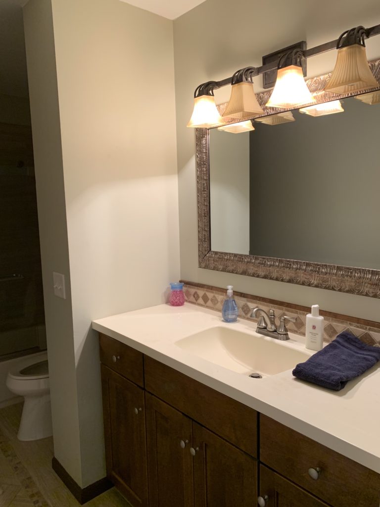
Before
The light and mirror dated this bathroom, and the paint color was not working for our clients.
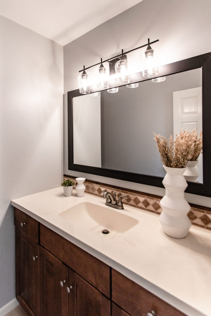
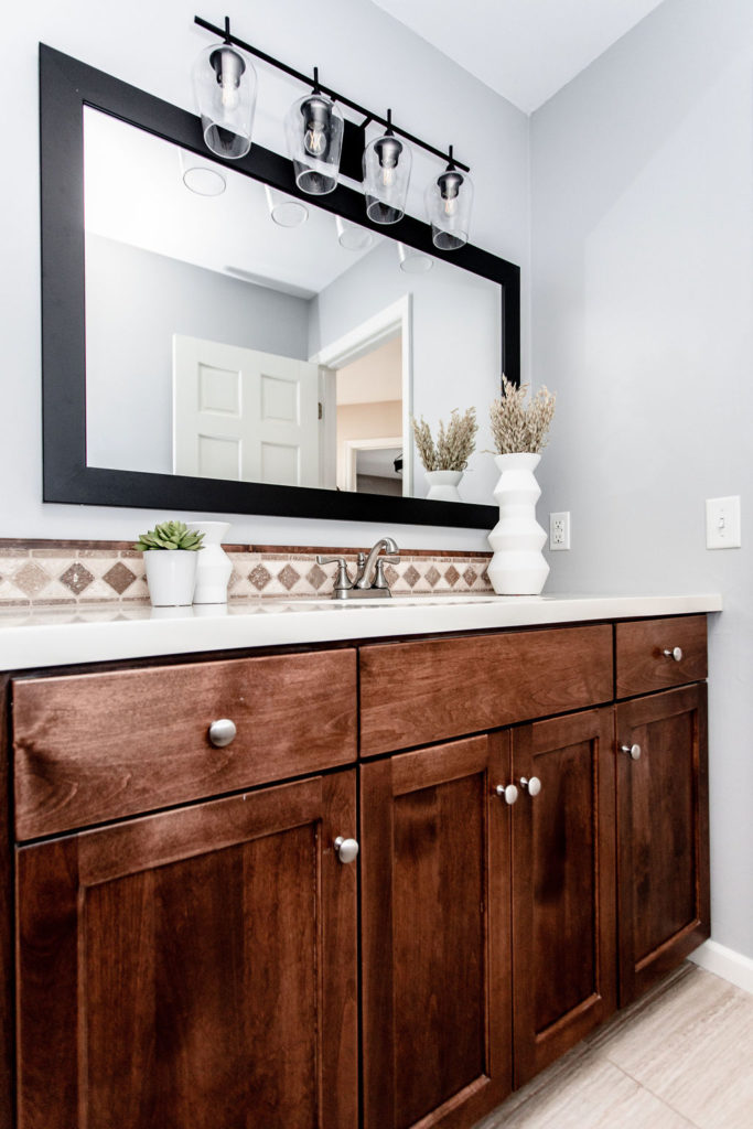
After
Now this space feels more modern with a black four-light fixture and black framed mirror! The gray walls brighten up the room and give it that fresh feel our clients wanted.
Shop This Bathroom
Mirror | Vanity Light | Paint Color
And there ya have it, a master bath and guest bath refresh that keeps the same layout and cabinetry, but feels completely new and fresh! We’re wishing our clients all the best in selling their home. We know this one will go quickly!
