Hello, beautiful friends! We have a couple of good bathroom reveals for you today.
Who was here with us for the journey behind the #CommerceCove project?? A condo in Mound, MN that we designed and remodeled when Ellie was in my belly.
Well, while we were renovating the #CommerceCove unit, our lovely clients bought a second unit in the same building, just right down the hall. And hired us to come back to design and remodel that one, just double the size!
Our clients love to entertain, they are family orientated, and the property is on the lake … so as you can imagine, their homes’ are revolving doors in the summertime, and they needed more space. This was a full condo gut and remodel, unlike the last one, and we had a blast with our clients designing it out.
Although it was a full remodel, we’re going to break the reveals out into two separate blog posts as there’s a lot to cover. First up, the primary ensuite and the guest/main bathroom.
Primary Suite
The primary suite is hands down my favorite room in the condo, as it should be! We are always telling our clients … this is where you start and end every day.
It sets the tone for the day, a place that should inspire and give you that good energy. And at the end of the day, a place to come in to relax and unwind. A safe haven both at the start and end of each day.
It should be the most important and favorite room of your home for that “me” time.
Before
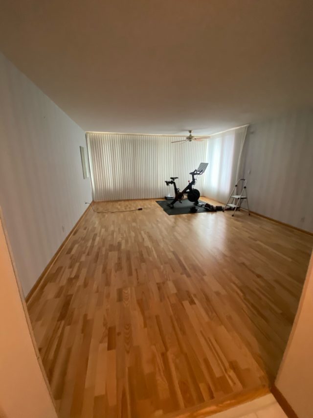
As you can see the bedroom was just fine. But a refresh wouldn’t hurt!
We replaced the wood floors with carpet to give it some warmth, as the rest of the home was hardwood. We also replaced all of the millwork, ceiling fan, and paint color.
The blinds are drawn but those windows look right out to Lake Minnetonka. What a dream to wake up to each day!
Meanwhile, the primary bathroom was in need of some updates. The shower was small and there was a lot of utilized space – too many separated small closets and more.
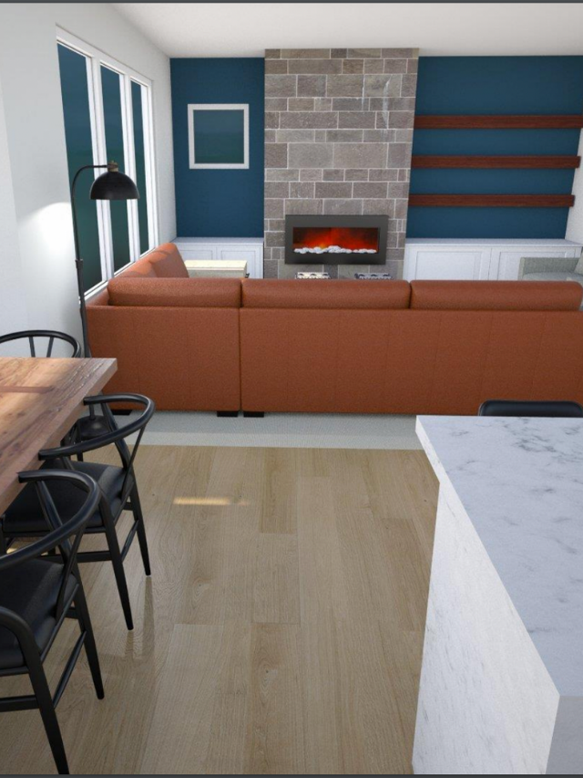
Designs + Renderings
The clients are a wife + wife team and they are a BLAST to work with. We’re just over here hoping they buy some more properties so we can keep on keeping on working with them.
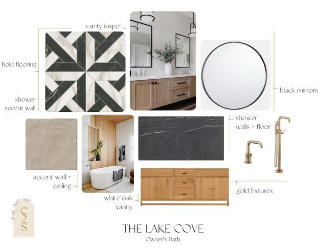
They are such intentional humans so it was refreshing to design thoughtfully alongside them. Modern, playful, and spa-like feel were the vibes we were going with.
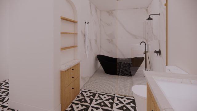
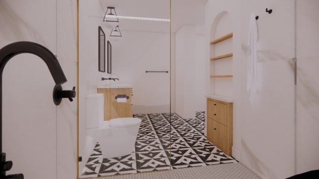
Black, and white, mixed metals, with touches of warmth. The c2s girls worked together and came up with the following options…
After
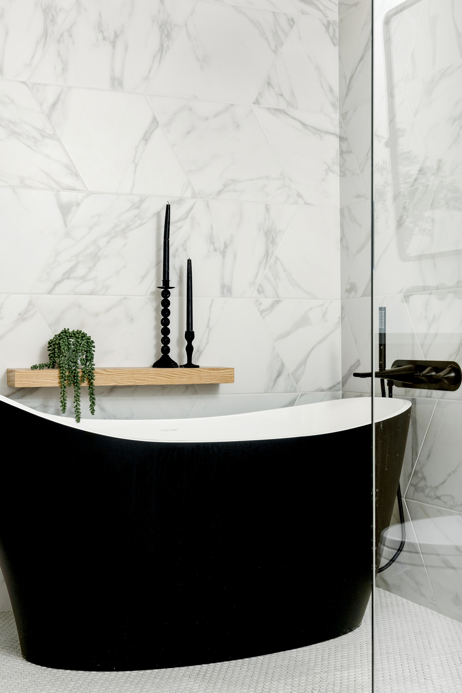
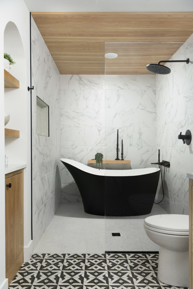
From renderings to reality… hard to tell the difference! A real dream to wake up and get ready in if you ask me.
If you’ve been here awhile you know we’re all about those wood plank ceiling panels and we have a tutorial for you, DIY Wood Plank Ceilings in 5 Steps.
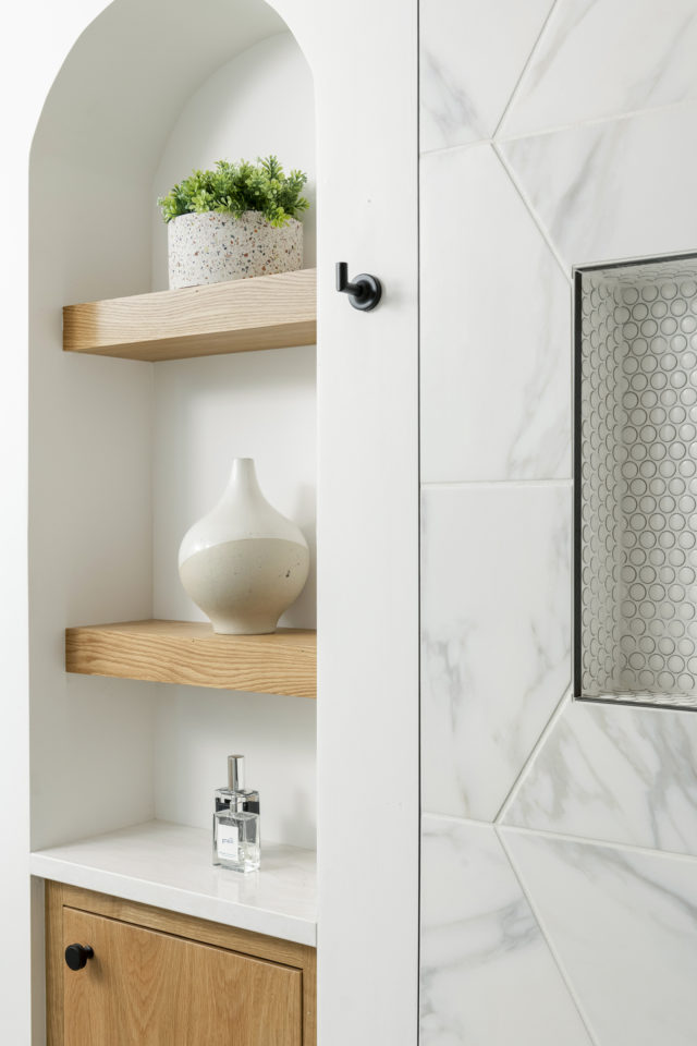
We’re also all about those wet rooms, a shower and bathroom in one. Similar to our #CohanseyHome – but with a totally different look, color palette, and vibe.
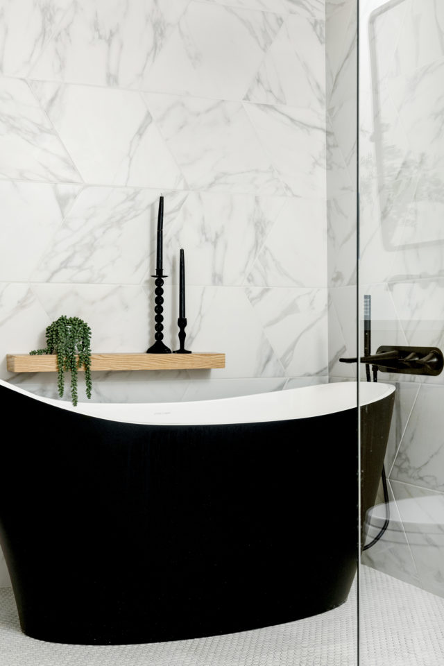
If you’re unsure of what a wet room is – it’s a totally waterproofed bathroom with a shower and bathtub area at the same level as the rest of the floor. The water drains away through a flush drain within the shower area.
The freestanding tub in black was another favorite! We’ve been wanting to do this tub for quite some time.
We get pushback of resale or it being too trendy but I very much disagree. Black is always timeless, especially if you chose the right brand, shape, and size.
Especially when you pair it with a timeless bathroom design.
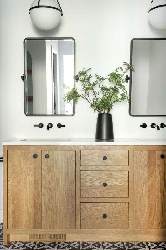
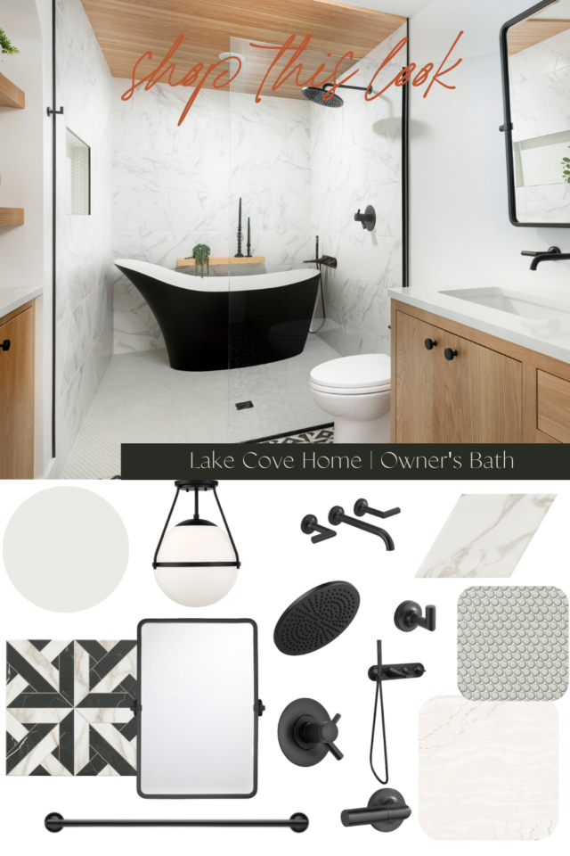
White oak, inset cabinetry, with wall-mounted black fixtures, and oversized pendants… a combination of three of our favorite things.
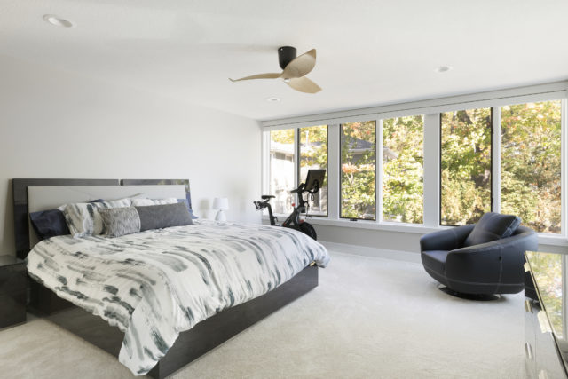
And lastly an after of the bedroom. Carpet, new paint, millwork, and ceiling fan. And while the side view makes you feel like you’re in a treehouse that bike is facing right to those Minnetonka Lake views.
Shop This Look
All the links to shop this look here.
Mirror | Wall Paint | Floor Tile | Shower Floor Tile | Shower Wall Tile | Countertop | Light Fixture | Faucet | Sink | Shower Head | Tub Filler | Bath Tub | Toilet Lever | Robe Hook | Towel Bar | Toilet Paper Holder
Guest Bathroom
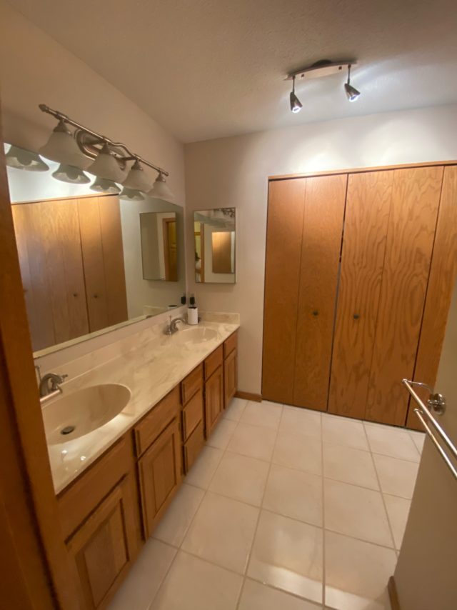
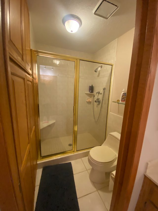
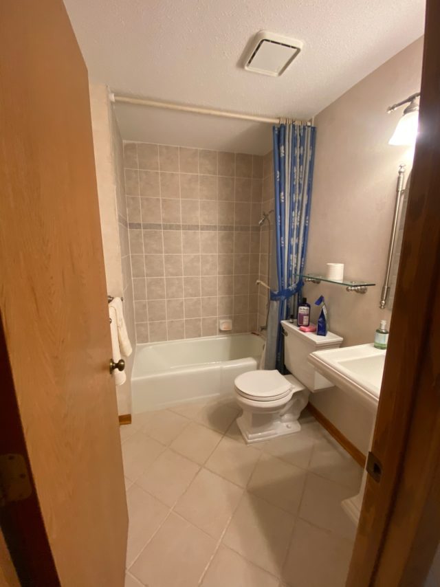
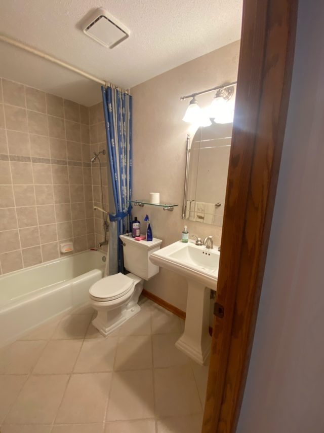
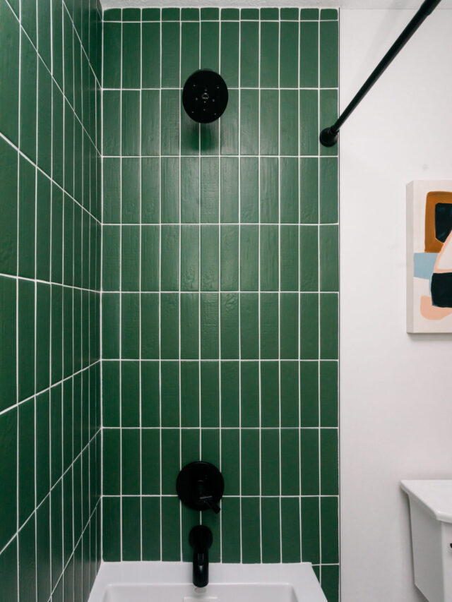
The guest bath was also in need of some updating, but the size, placement, and structure were great. So no walls were moved, and no plumbing had to be reconfigured within this space but everything else came down.
Before
Main Bathroom
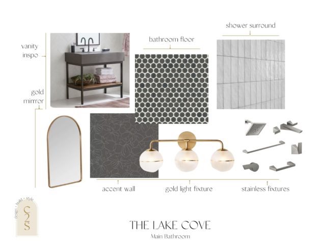
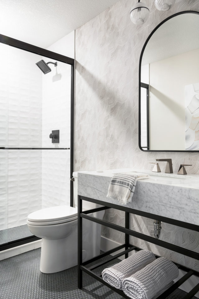
Again, going with a clean and crisp modern vibe. Blacks, grays, and whites were the jam.
Our clients were so easy to work with and for almost everything we recommended when it came to the bathroom designs – they were in.
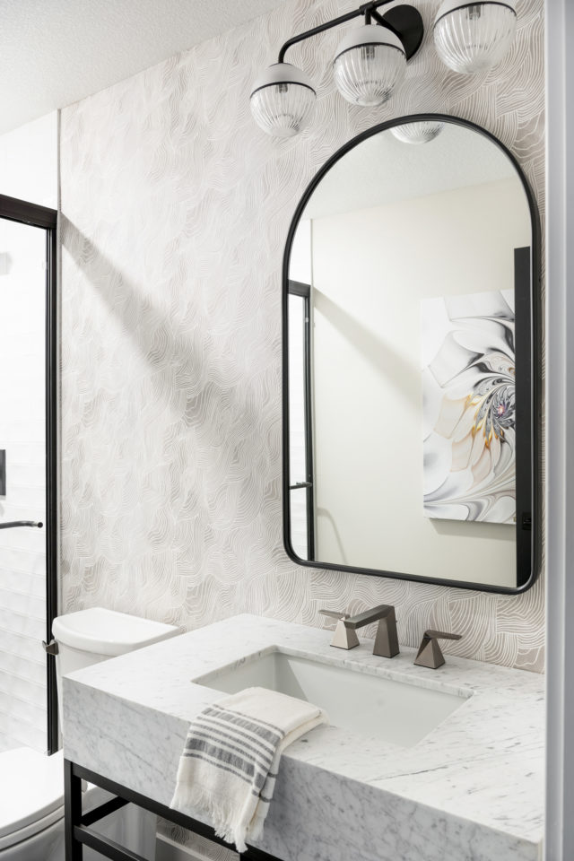
After
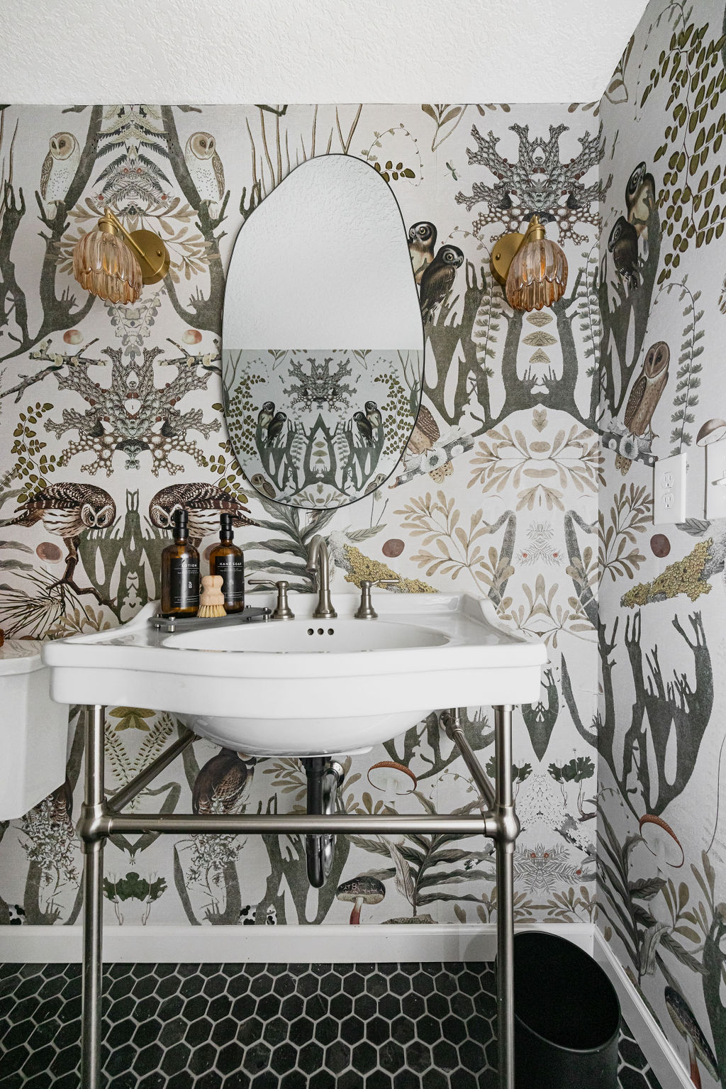
You know we always love a good wallpaper, and this neutral color palette is paired perfectly with penny round matte iron floor tile. And accented with our favorite modern Delta Trillian faucet.
A perfect oasis for any guest to retreat within!
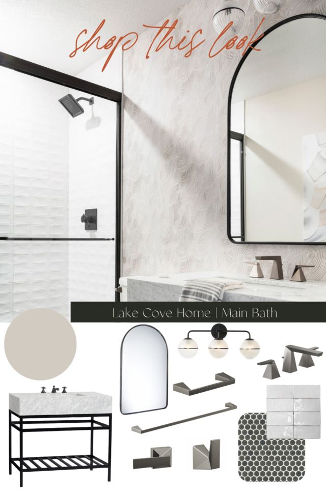
Shop This Look
Wall Paint | Vanity | Mirror | Vanity Sconce | Faucet | Towel Bar | Robe Hook | Tank Lever | Wallpaper | Shower Wall Tile | Floor Tile | Shower Head | Shower Arm | Shower Valve
Thanks for reading! And I truly hope these reveal blog posts inspire you for your home projects just as much as they re-inspire us.
Until tomorrow, with the kitchen and main level reveal of this same home, cheers!

One thought on “The Lake Cove Primary & Guest Bath Reveal”
Comments are closed.