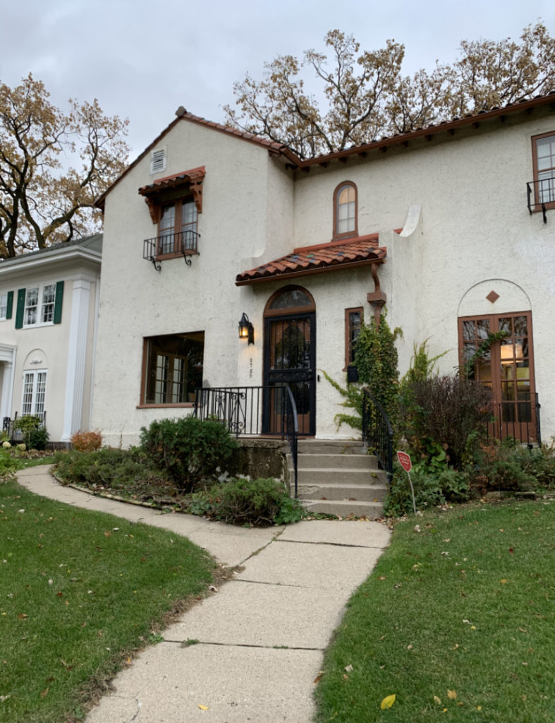
In a few weeks, we’re kicking off a new project in Minneapolis, and today we’re sharing all the designs and details behind it. This home is almost a hundred years old and in a more historic area in the city. It’s beautiful and our clients want to maintain the history of the home, while updating it to be more open, functional, and reflect their personal style.
Kitchen
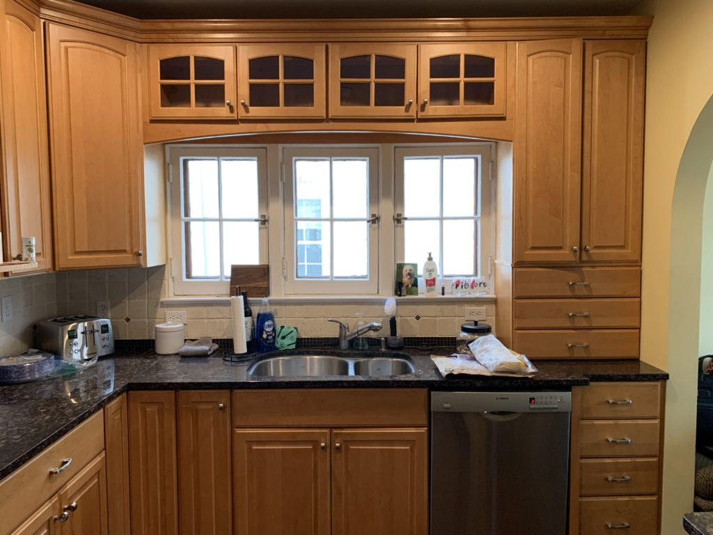
Before
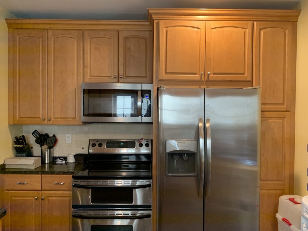
The kitchen had been updated sometime in the last 20 years, but very much did not reflect the original style of the home. With the kitchen closed off from the dining room, it makes the space feel crowded and small.
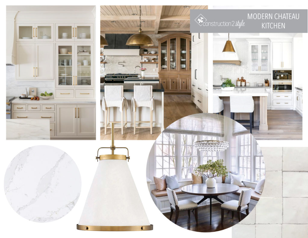
Mood Board
For the design of the kitchen, the intent was to lighten up the space with white cabinetry, gold accents, and bright quartz countertops. A modern chateau feel was the inspiration, along with glam lighting and beautiful cabinetry.
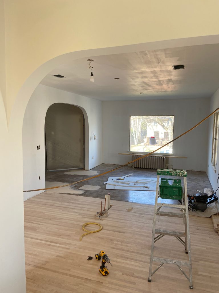
In Progress
Renderings
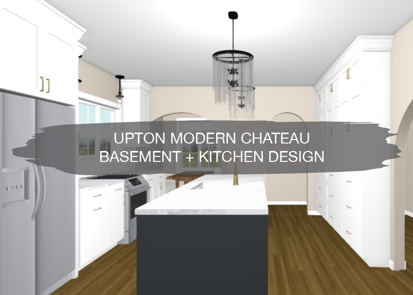
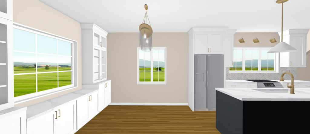
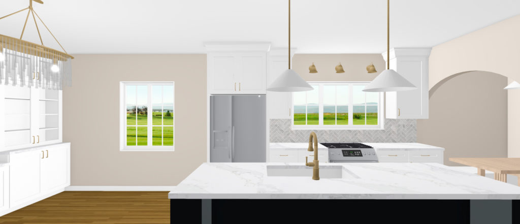
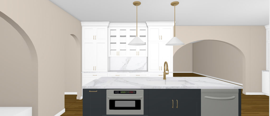
In this kitchen design, white cabinetry brightens up the entire room, while a dark navy island provides contrast. Having a hidden overhang for the island will allow stools to slip right under the countertop when not in use.
Tearing down the wall between the kitchen and dining room makes the entire space more open and more functional for entertaining and hosting. To maintain the original look of the house, all of the windows on the main level are staying, so a range with a downdraft included will be used on the back wall. Having the sink in the island will allow our clients to look out into the living room instead of the house right next door.
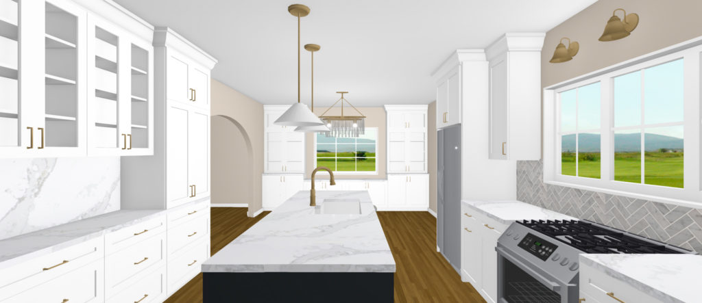
Over on the dining room side, glass upper cabinets provide storage for special dishes and glassware. Having a longer stretch of countertop will provide space for laying out food. The lower cabinets allow for additional hidden storage for everyday items as well.
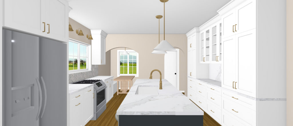
The nook at the back corner of the kitchen is getting a wider opening for easier access, along with custom benches, new lighting, and a new table. This unique little nook is a nod to the character of the home and a spot our clients wanted to keep and update.
The large curved arch between the living room and kitchen helps maintain the character of the home while creating more of a flow between the two rooms. Being able to see into the kitchen from the front entry was a priority for our clients, and this wide opening will do just that.
Since another arch leads to the back door on the left side of the kitchen, the cabinets are not as deep as standard bases, so we weren’t able to have any appliances on this wall. Even though there weren’t any appliances that could go on this wall, the tall cabinets and glass nook provides a lot of additional storage for pantry items. Using quartz backsplash and glass cabinets in the middle makes for a beautiful built-in nook look and provides space for smaller appliances as well.
Basement
The basement of this older home was somewhat finished off, but our clients were looking to open it up and make it a more usable space for their boys. For the basement, the plan is to update the bathroom to an actual functioning space, make the laundry room more finished, and create an open living room for hanging out.
Before
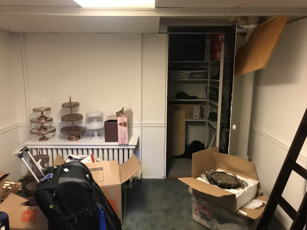
Previously, the basement was being used for storage and didn’t have much of a purpose for our clients, so they wanted to rework the layout and make it more functional.
Rendering
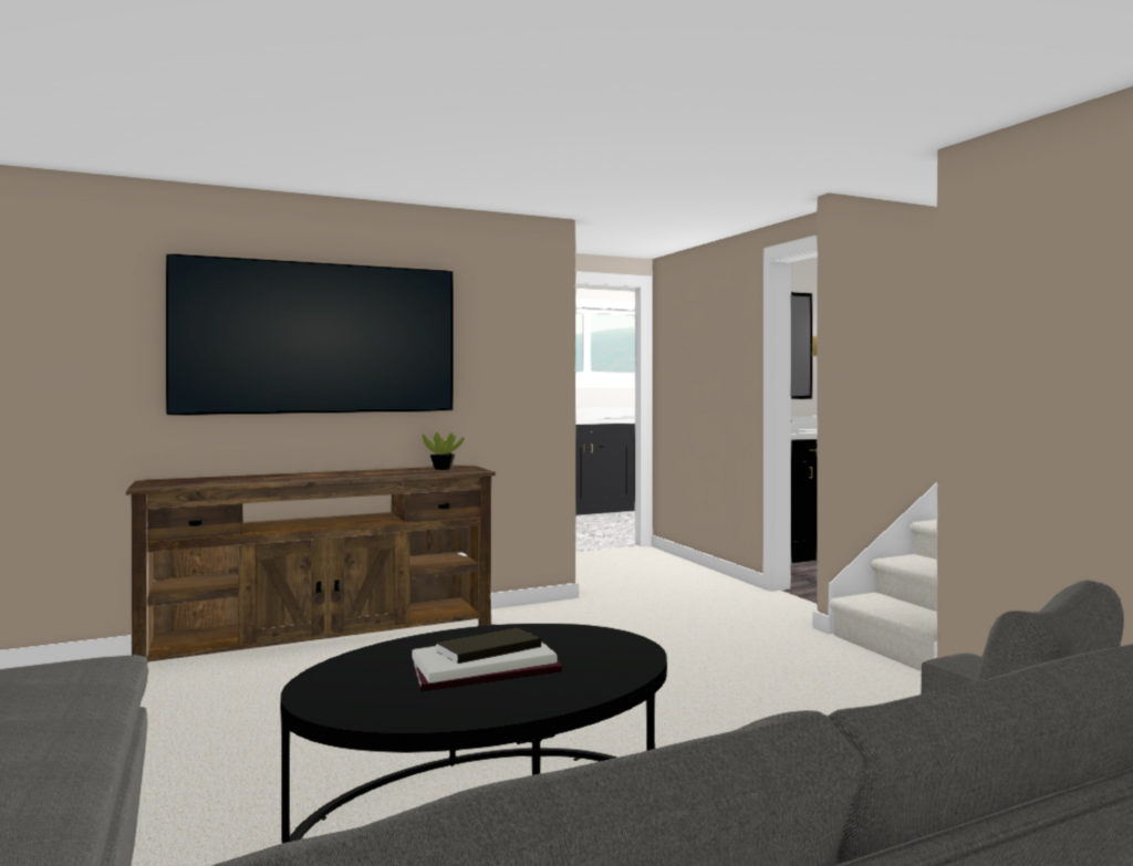
Here is the view of the new living room, which is the room you enter when walking down the stairs. The intent is for this to be a hang out space and to make it feel more cozy and warm.
Bathroom
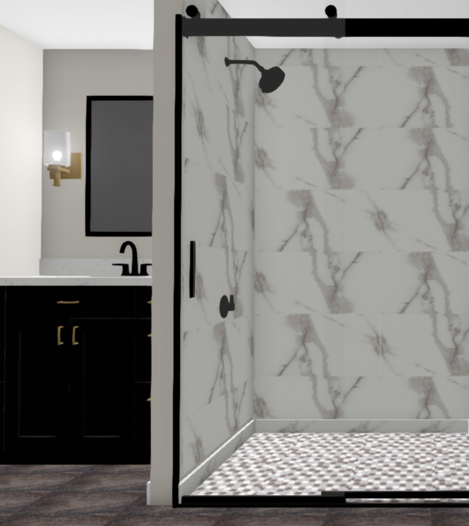
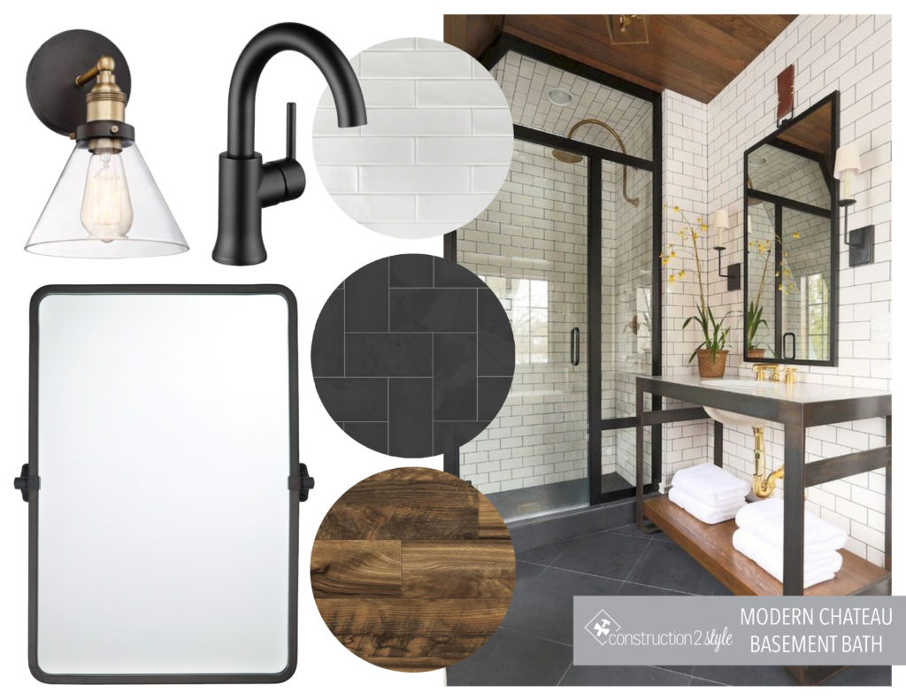
The bathroom is right off the living room, as seen in the photo above. The design of this space included black, white, and wood elements. Keeping the design simple yet classic was the goal since this will be used by their teenage sons, and they wanted it to withstand guests and kids.
Renderings
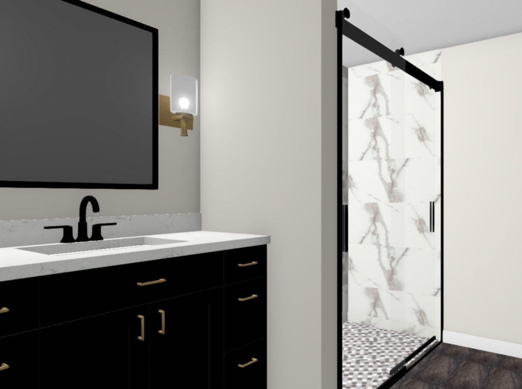
A black vanity with a quartz countertop is accented with gold pulls and light fixtures. A marble look shower tile makes the space look luxurious, but is easy to maintain and clean. Slate-look porcelain tile on the floor is also easy to maintain but brings in a warmer feel to this space.
Laundry Room
Before
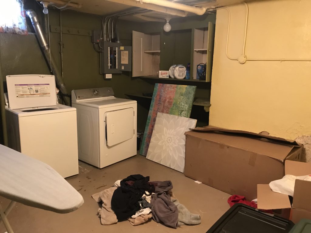
With the laundry room, our clients wanted this space to be somewhere they actually enjoyed walking into, and that was not the case with the current space.
Mood Board
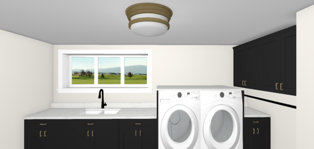
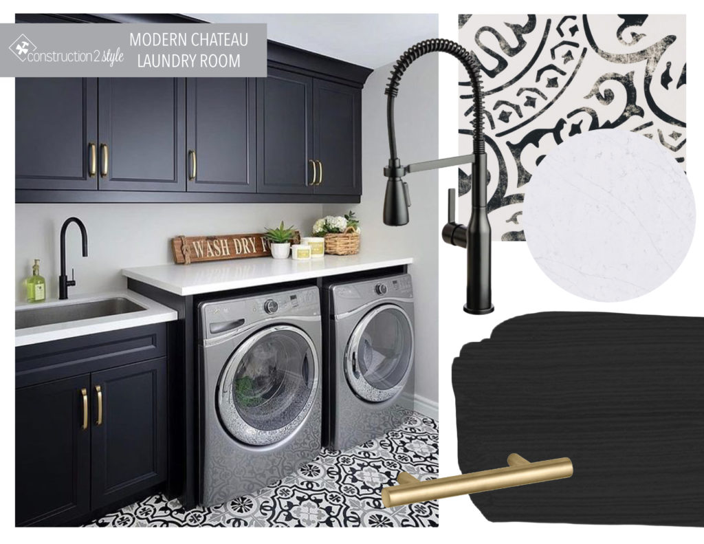
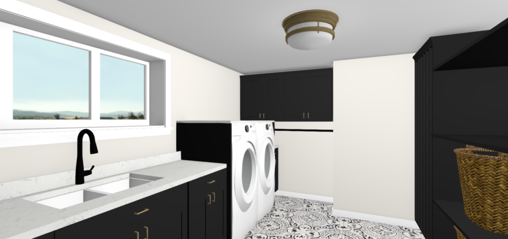
In the design of the laundry room, we wanted to keep the design timeless, yet still fun. For the floor, a black and white tile adds some pattern, while the black cabinets and white quartz countertops keep the space looking classic.
Renderings
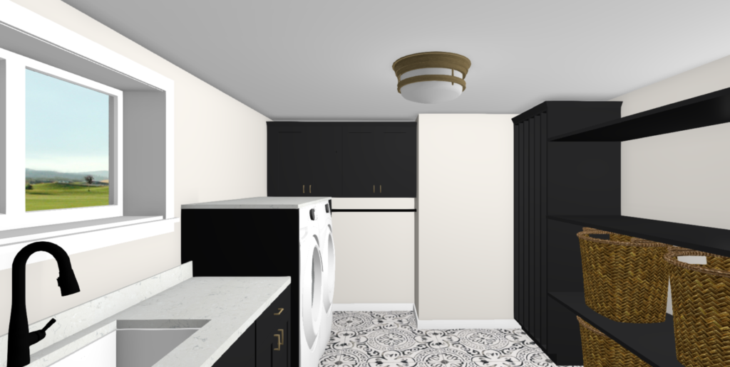
Extra storage opposite the sink provides a spot for baskets, while the rod at the back of the room is perfect for hanging clothes. The tall cabinet on the right side of the room has additional hanging space as well.
A large sink and faucet work well for giving their dogs baths and works well under the window, providing some natural light to the room.
We are so excited to get started on the construction of this project and see the designs come to life. Stay tuned as we share progress updates of this space and take you along as we transform the kitchen!
2 thoughts on “Upton Modern Chateau Basement + Kitchen Design”
Comments are closed.