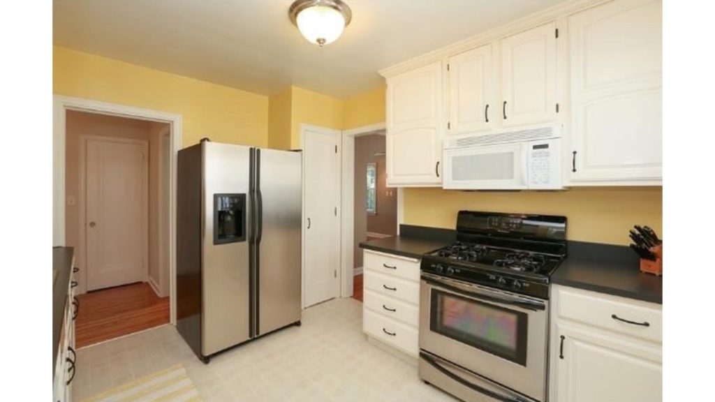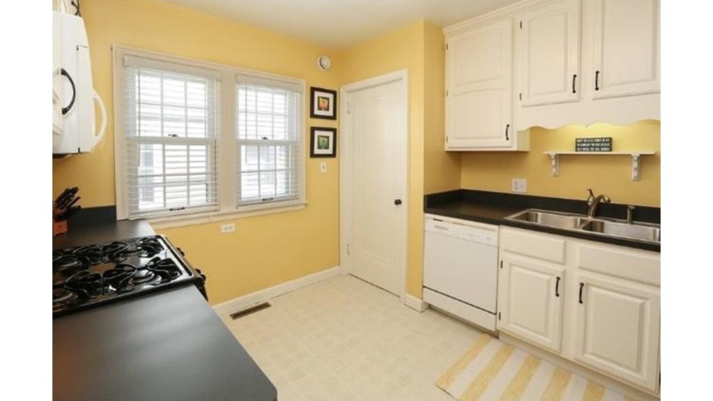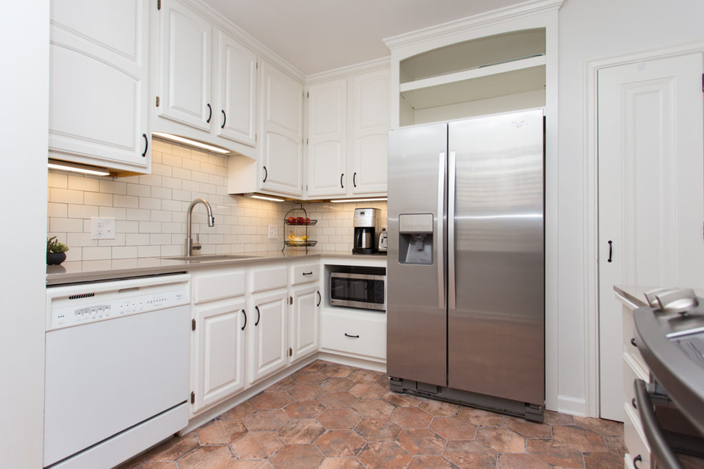
Holla! We’re so excited about this one! 90 days later we’re finally done with this kitchen remodel and 150 more after that we’re sharing all of the details.
We were pretty bad with sharing the behind the scenes and all the nitty gritty one this one with you guys. Ugh, we suck. But of course we have an excuse…we were working on two kitchen remodels at the same time, so unfortunately we weren’t working on the same projects together. And being we’re only a two person team, that means I couldn’t just be sitting there and taking photos of Jamie like I’m usually doing. Haha! We cannot be more excited to load this blog post with great information to guide you through a Southern style, open kitchen design.
But first…hold on to your pants…haha…you need to see the before…
And now the after…
For this project our client wanted a southern style feel for the look of their kitchen. What makes a Southern kitchen style design? Well pretty much just a lot of love, food, and family.
Which means an open concept is a must! Besides a lot of space for cooking and family, we have a few more tips to share with you today on how you can incorporate Southern charm into your space.
Incorporate Distressed Elements
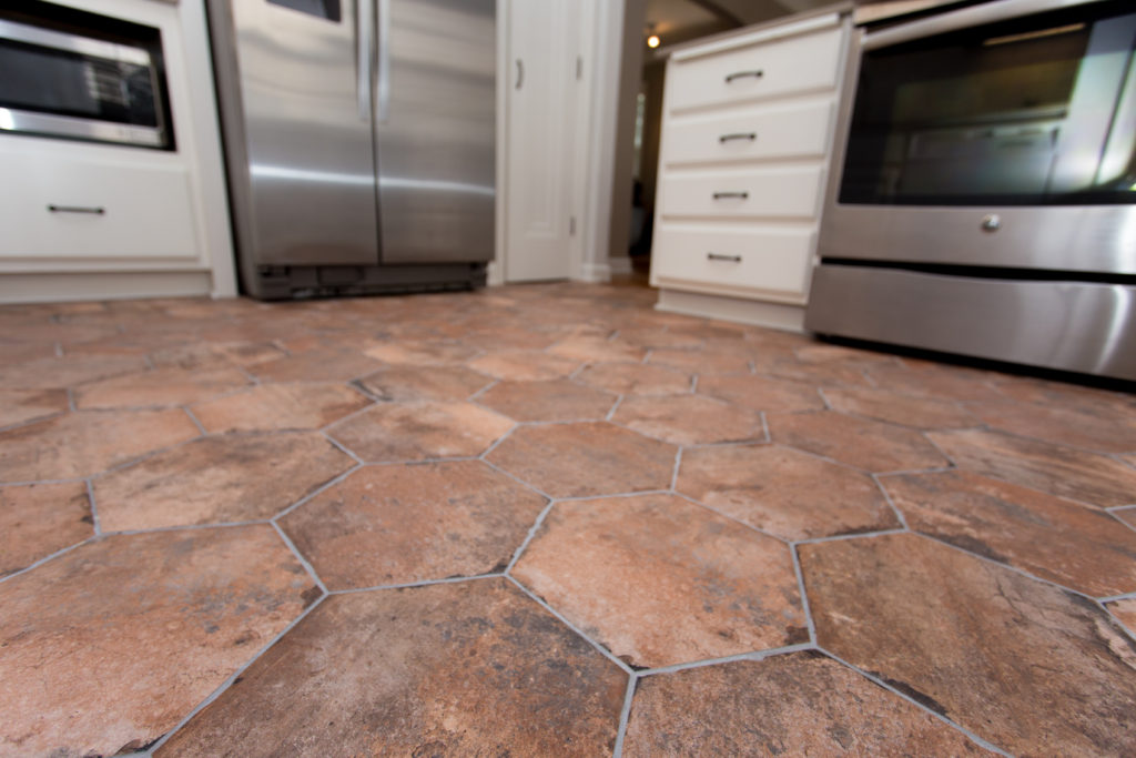
One of the easiest ways to bring in that Southern flare is to add a touch of vintage and distressed elements. You don’t have to be a designer to know how popular the distressed look is right now. From furniture to flooring to home decor – it’s one of our favorites! Whether it’s a large distressed kitchen table, molding, island, or flooring- this is the perfect way to bring in that Southern charm.
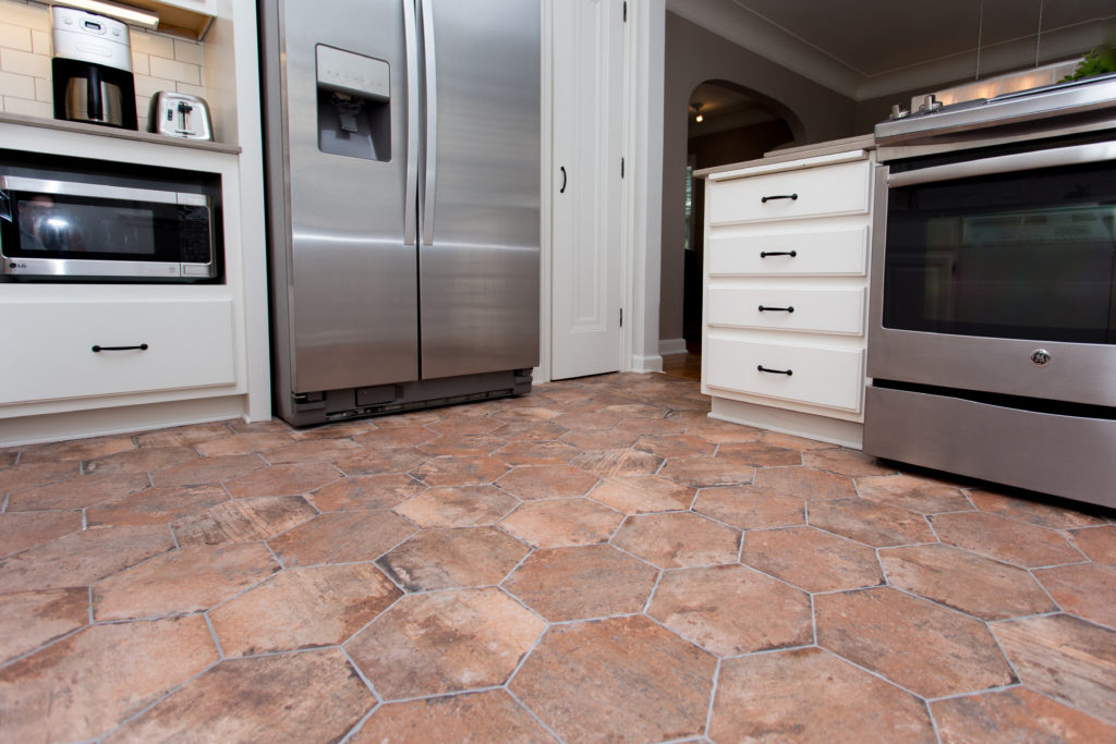
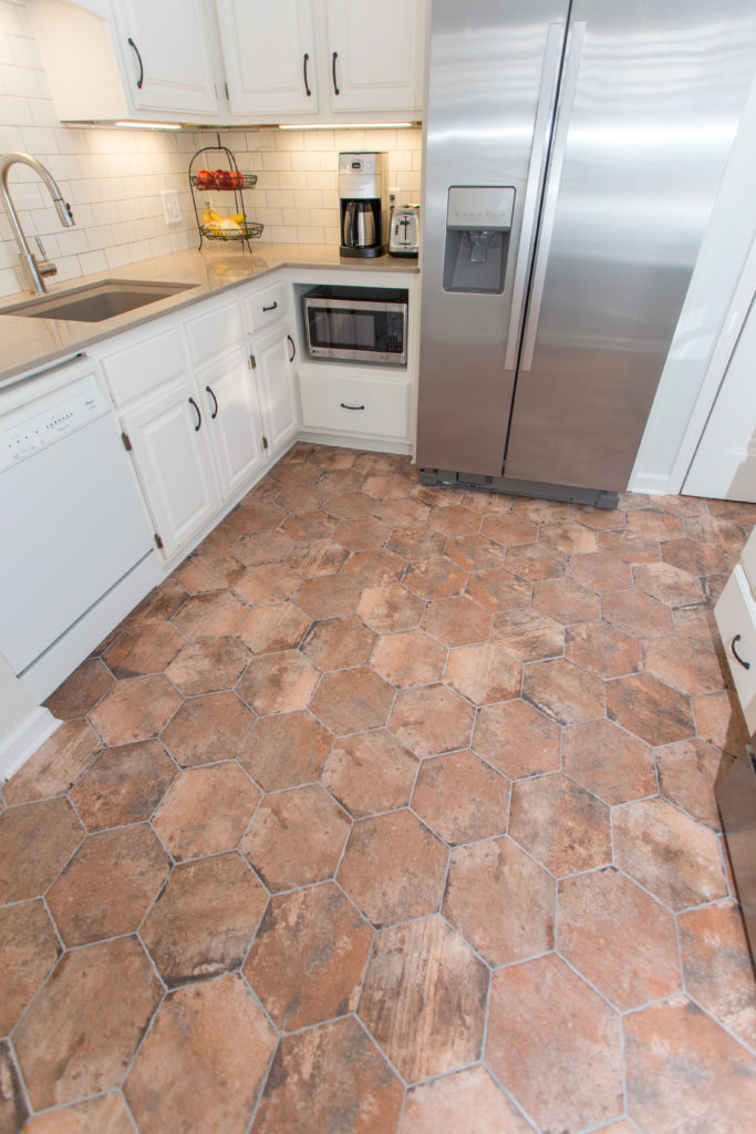
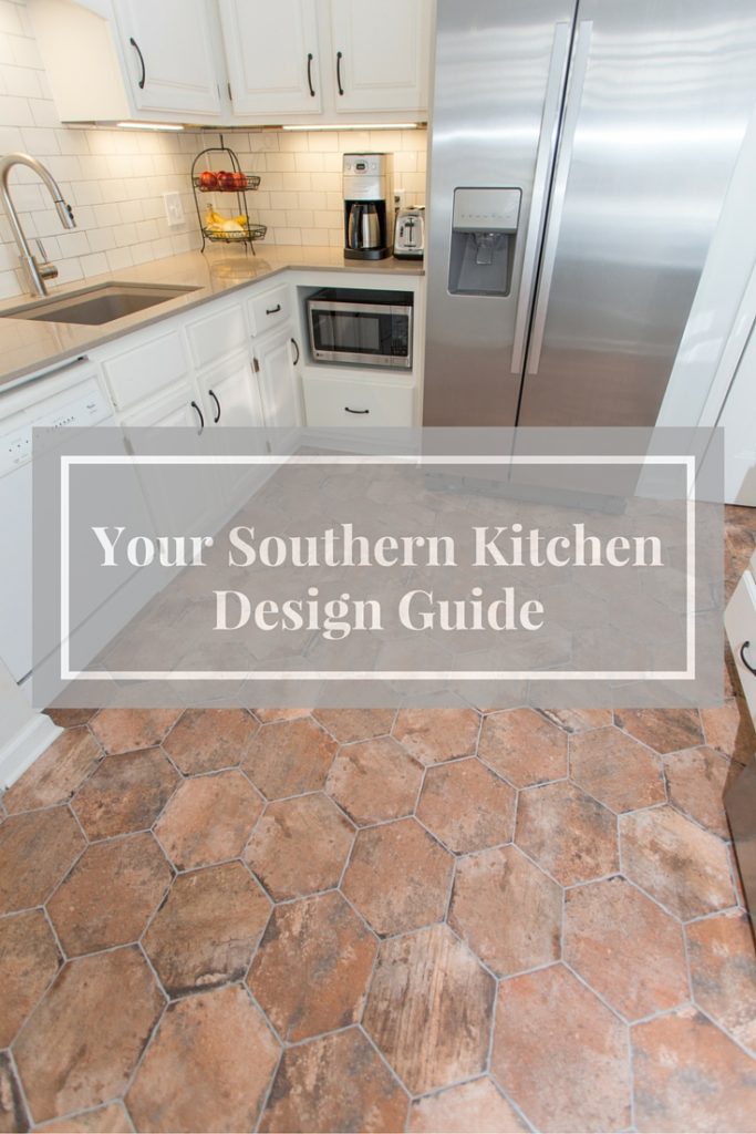
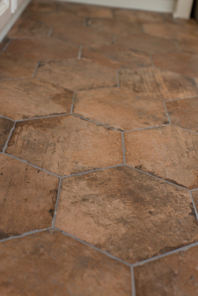
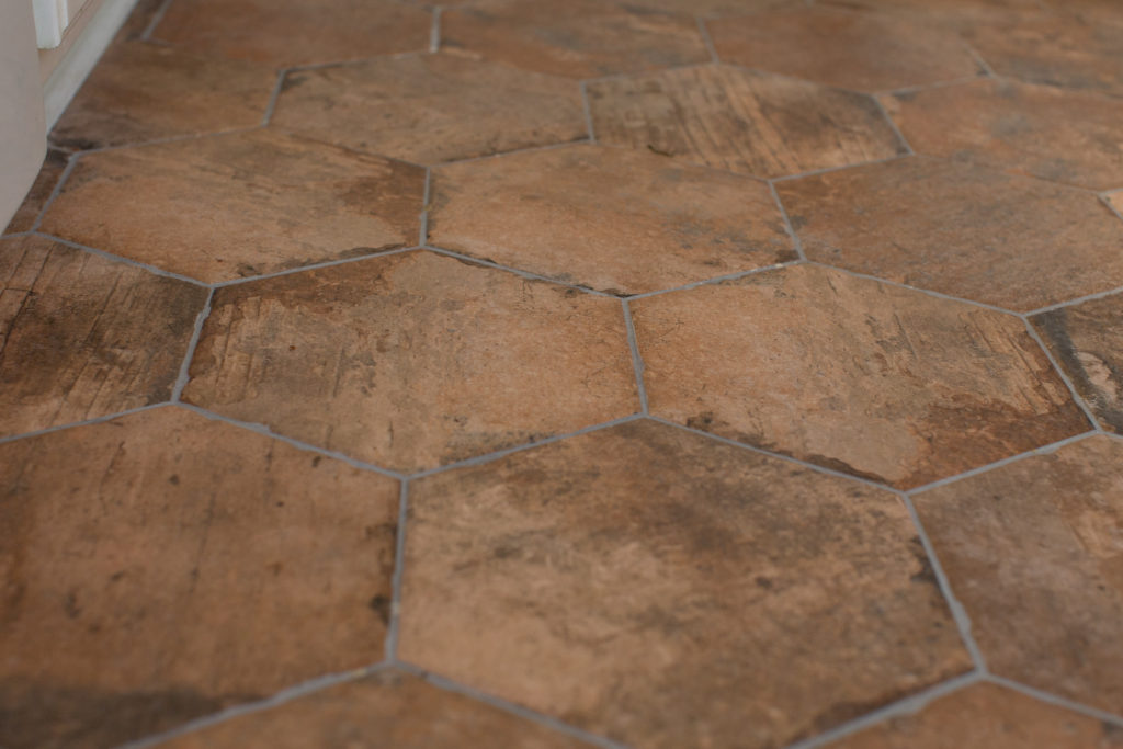
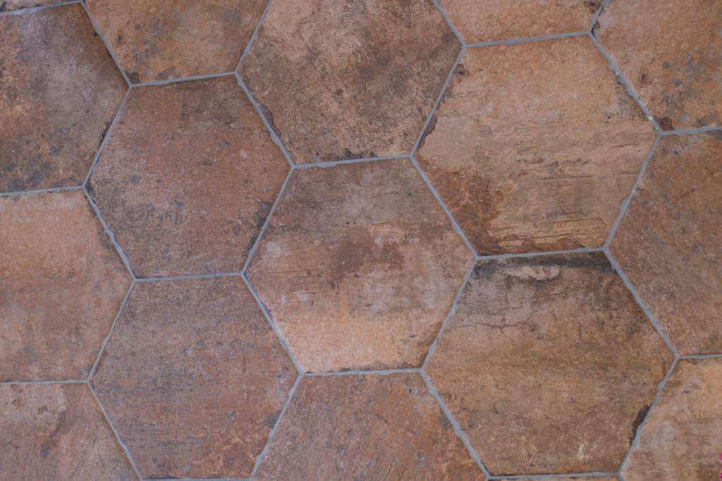
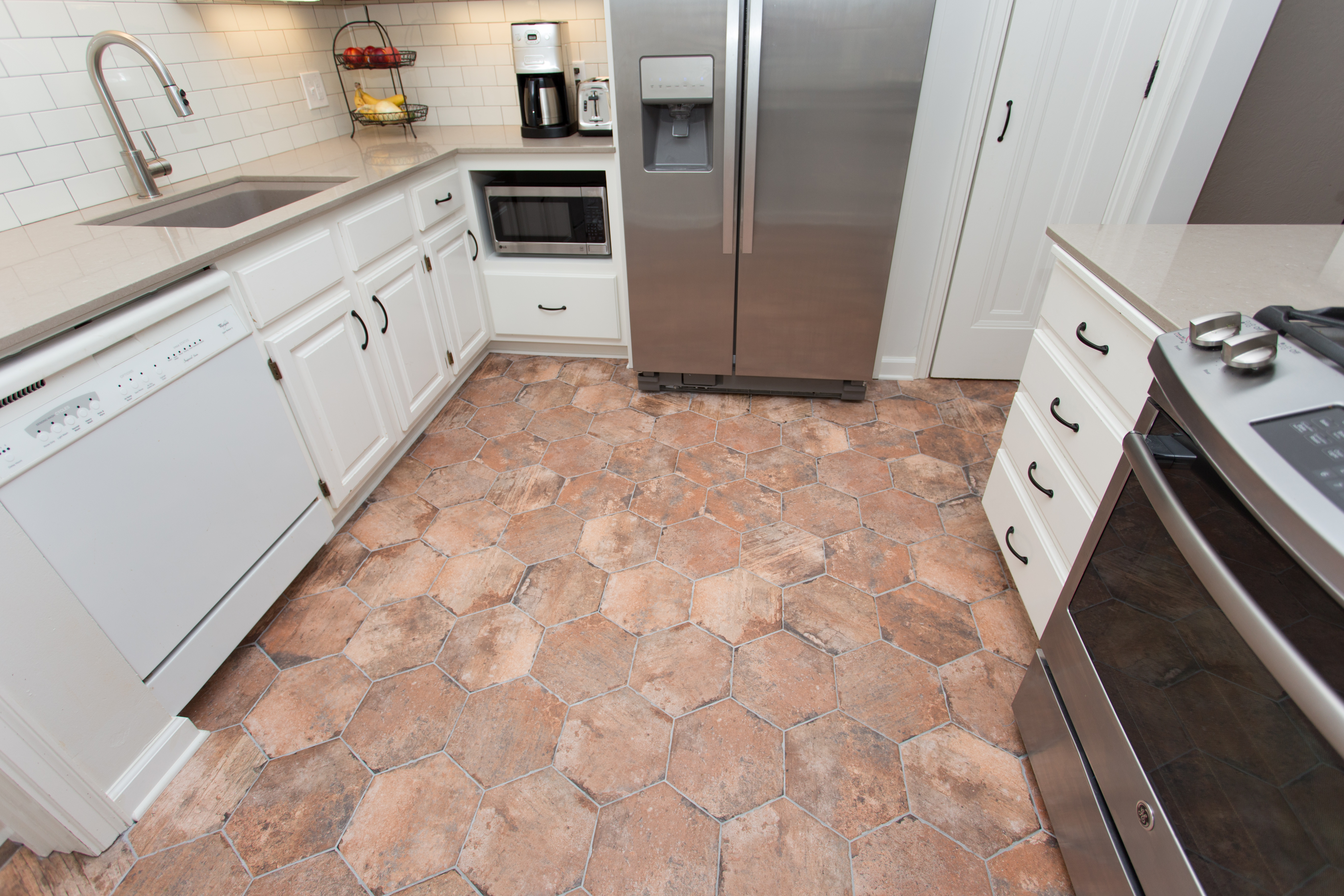
The flooring was one of our absolute favorite finishings behind this renovation.
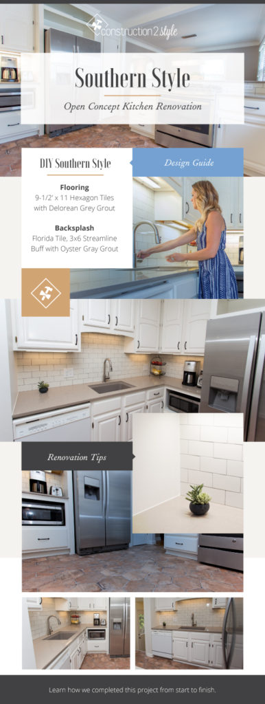
Flooring | Ser Brix Old Chicago 9‐1/2” x 11 hexagon tiles with Delorean Gray Grout
Family & Food, Open Concept Feel
As we said, when it comes to Southern style, it’s about family and food. Which means you need plenty of space!
The kitchen is the meeting place for most families, and while some modern designs seem to have forgotten that, this is the kitchen’s main purpose, Southern styles have always kept ample room for all. Think storage accessories that make room for all of your cooking materials and pantry items, and a large island or peninsula where you can seat a crowd for dinner.
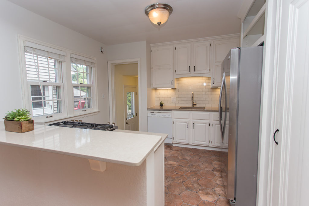
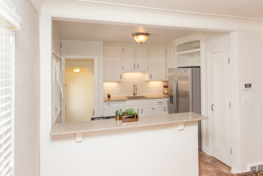
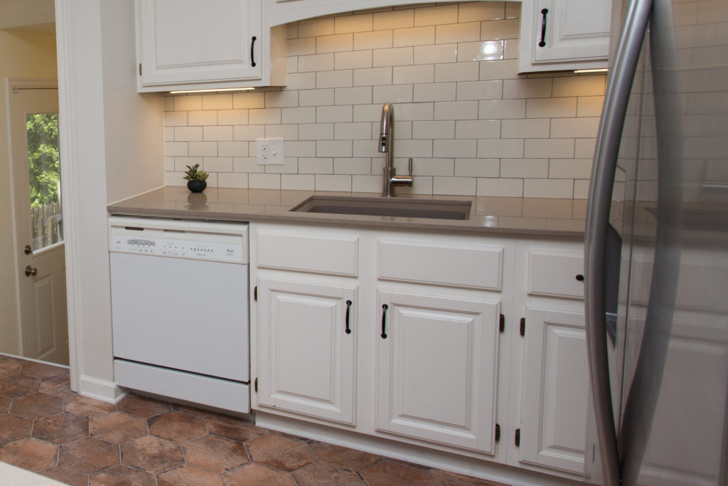
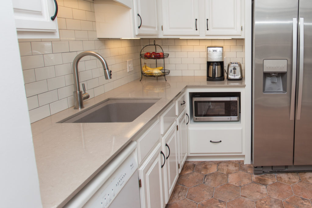
Our clients love to entertain and knew they wanted a much more open concept feel. We immediately suggested we take out the wall that separated the kitchen from the dining room space, and put a large island right in the center. Since we removed all of the upper cabinetry that was on that wall, we suggested closing off the walkway on the other wall to create more countertop and cabinetry space. This is where the microwave is now.
After going back and forth on the design plans with the client, and to save costs, we decided to keep the current lower cabinetry to create a peninsula and bar space instead of recreating the island – which would have been around $5K alone to recreate.
You can check out taking down the wall, HERE.
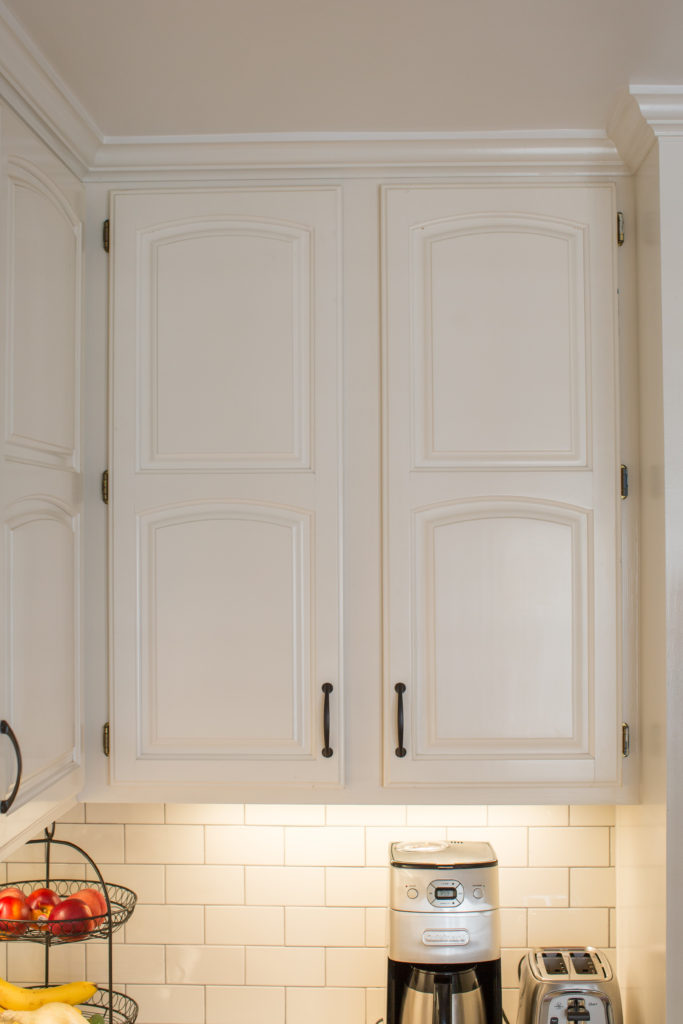
The former doorway was right there to the left of the fridge where the microwave and coffee pot are now. Since we rearranged their layout, we had to custom build new cabinetry that would compliment their existing cabinets. So we added in the storage above the fridge, and around the microwave. For the uppers, we used the cabinetry that had been on the wall we took down.
We were able to create a fun little bar space where we took out the wall. I mean, who doesn’t like to mingle and hangout in the kitchen while you’re cooking and hosting? Am I right?!
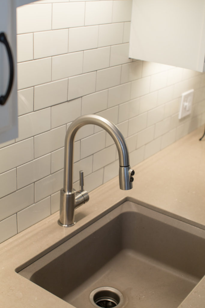
This sink is my new favorite, by the way. I can’t even explain the texture and feel it had. We worked with Mingle on ordering all of our finishing selections. It was our first experience working with them, and it was pretty slick! Not having to run to 100 places to pick up all of our orders, like we normally do, was so nice.
I’m so obsessed with this flooring! It looks just like stone, and I think it was spot on with the southern style they were going for. We will definitely be pushing our future clients to incorporate this style into their renovations.
And there you have it, our latest kitchen renovation. Make sure to check out the before HERE. It’s always so fun to look at the transformation of what a space once was, to what it evolves into by the time we’re done.
Finishing Selections
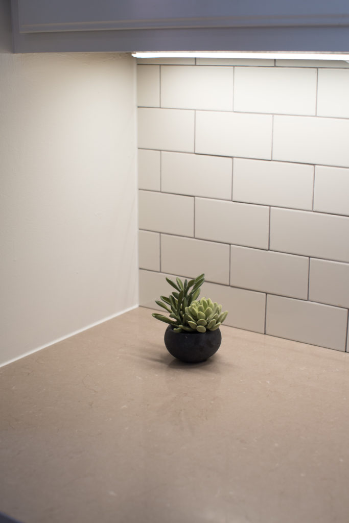
Backsplash | Florida Tile, 3×6 Streamline Buff with Oyster Gray Grout
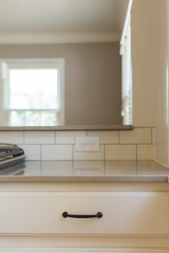
Countertops | Silestone Coral Clay Quartz
Sink | Blanco Precis 1‐3/4 Bowl Undermount, Color: Truffle
Flooring | Ser Brix Old Chicago 9‐1/2” x 11 hexagon tiles with Delorean Gray Grout
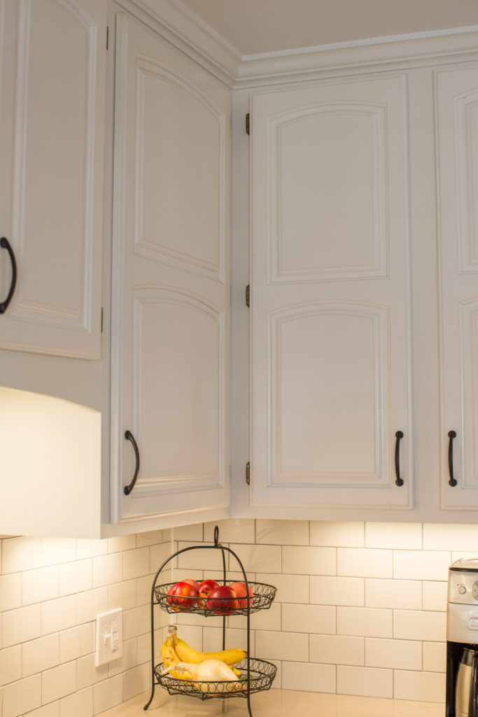
Cabinetry Paint Color | White Dove by Benjamin Moore
Photo Credit: Chelsie Lopez Marketing & Production
