Sponsored by HANDy Paint Products.
We’ve been getting a lot of questions about the paint colors in our home. So we wanted to create this painting guide for you as a reference and to let you know all about our favorites, Benjamin Moore and Restoration Hardware paints.
And what better sponsor to have for this post than our favorite team of paint products, HANDy Paint Products!
We’ve teamed up with this team before and are so happy to once again because we absolutely love all of their products. From their buckets to their trays, all their products really make painting so much more comfortable.
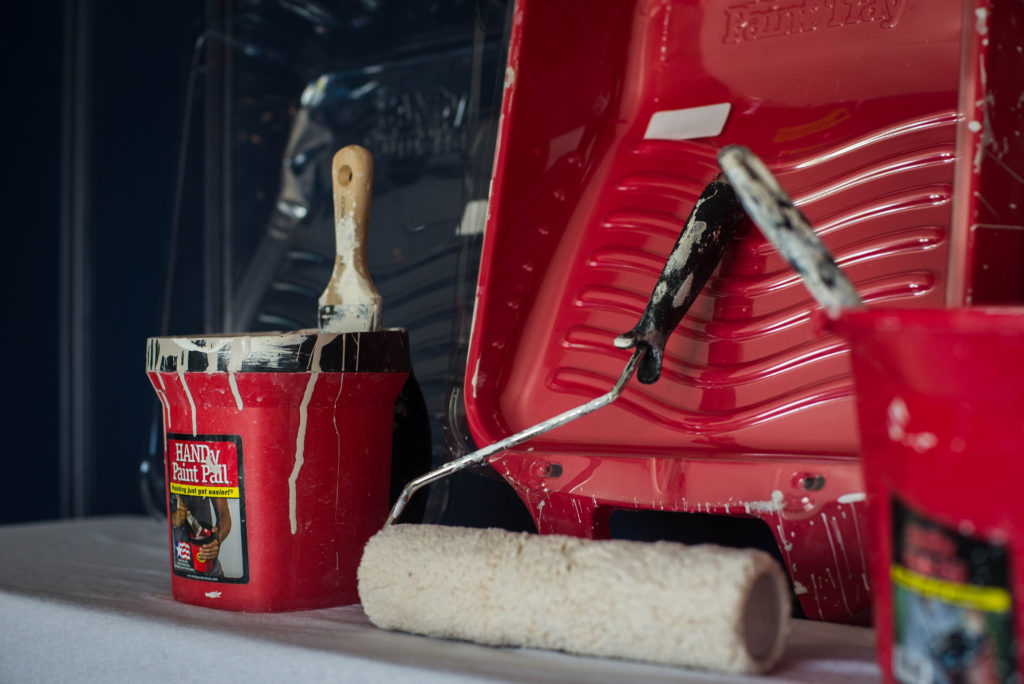
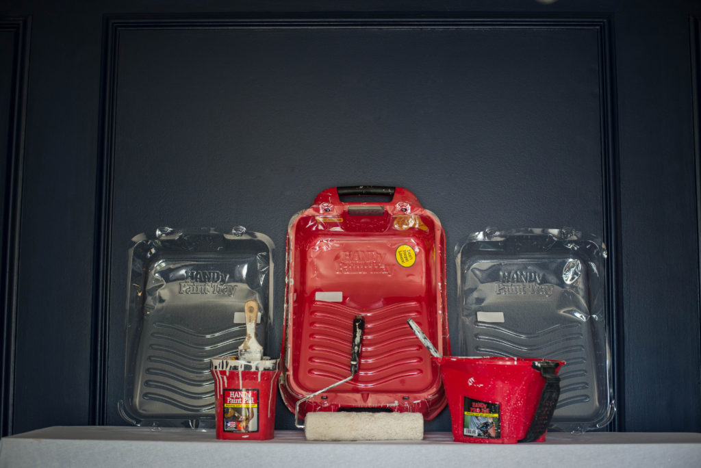
When Jamie and I are doing painting projects together, one of us always has the HANDy Paint Tray for the larger areas and the other has the HANDy Paint Pail for cutting in and going up and down the ladder.
The tray has a deep well that can hold a full gallon of paint or stain, built-in magnetic brush holder and roller grid, as well as ergonomic handles that make for convenient easy, spill-free transporting.
Now that you know what products you first need to use before you start any painting project, let’s chat about our favorite colors within our home including Restoration Hardware paint colors and Benjamin Moore paint colors.
One of the things we love about paint colors is that you can get Restoration Hardware paint colors matched to Benjamin Moore and vice versa.
1. Gravel by Restoration Hardware
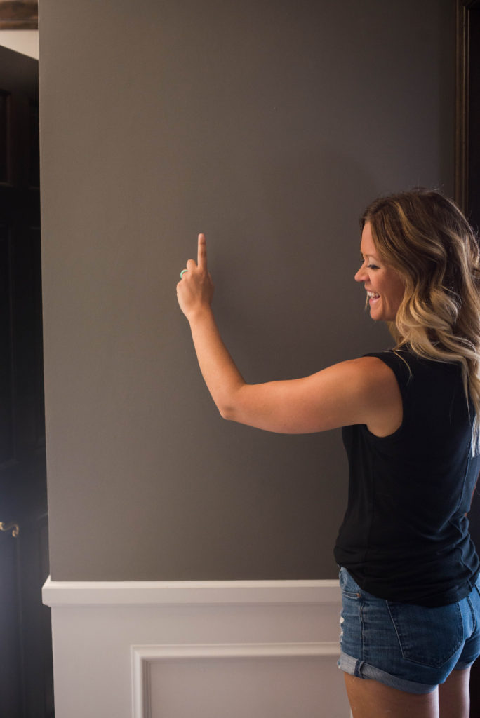
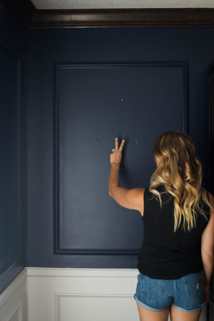
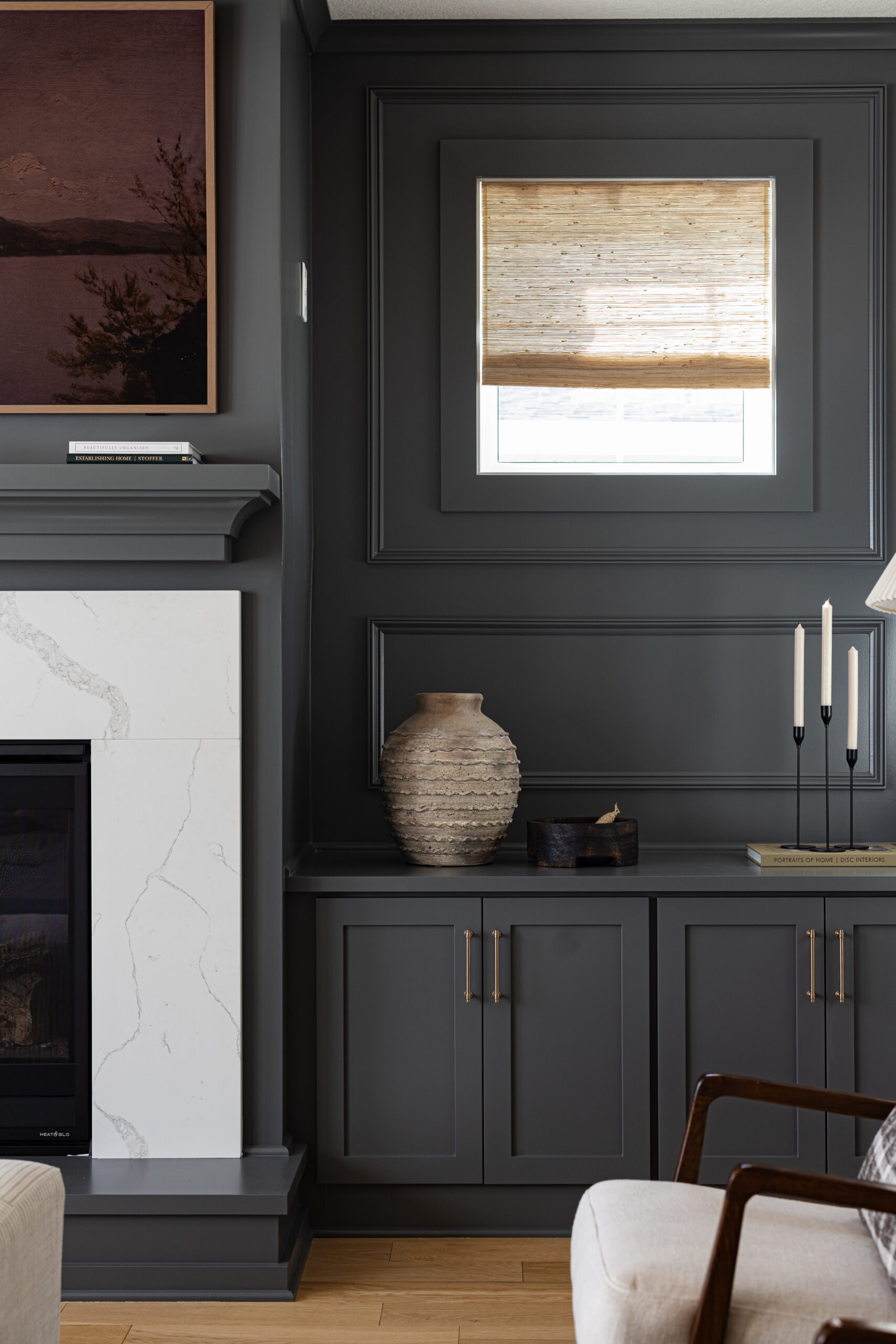
Our number one is gravel, which is hands down our favorite. It’s deep and rich and makes a bold statement.
We’ve used this color for all the interior walls in two of our renovation homes. Gravel is a part of the Flint Paint Color Collection by Restoration Hardware and is one of our favorite go-to’s.
Restoration Hardware paint colors are so beautiful and can easily be matched in whatever paint brand you like best.
Grey is a classic, elegant color for any space. We’ve used grey color schemes in both of our homes, as well as our clients’ homes since we started remodeling.
Grey compliments well with all neutrals, along with our favorite frequently used color schemes, like blues and greens.
Lighter shades of grey are good alternatives to white if you are looking for another neutral for your home. And of course, a rich dark grey can work well to make a statement.
Picking the perfect grey or paint color for any project is hard to do. There are so many undertones that can be pulled through and you never want the grey to look too purple or blue, which is easy to do.
2. Deep Royal by Benjamin Moore
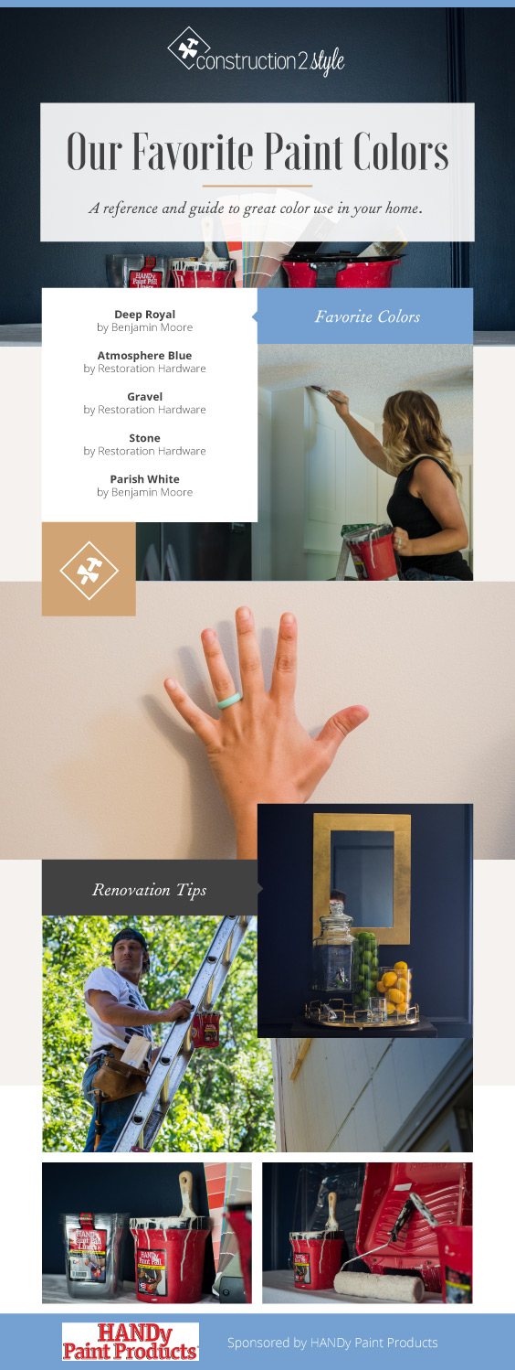
Second up is Deep Royal by Benjamin Moore, which is another of our favorites. We used this color for our formal dining room.
If you follow our blog, painting this room was a nightmare before we came across this color. We tried a handful of different blues that were way too bright before we found the perfect bold statement.
3. Atmosphere Blue By Restoration Hardware
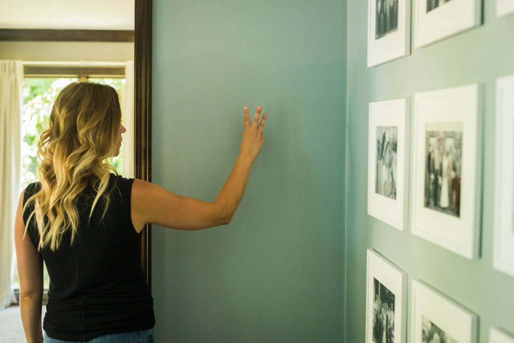
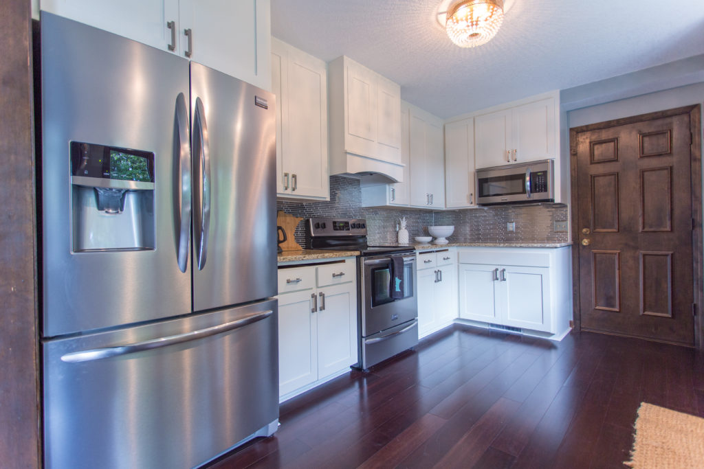
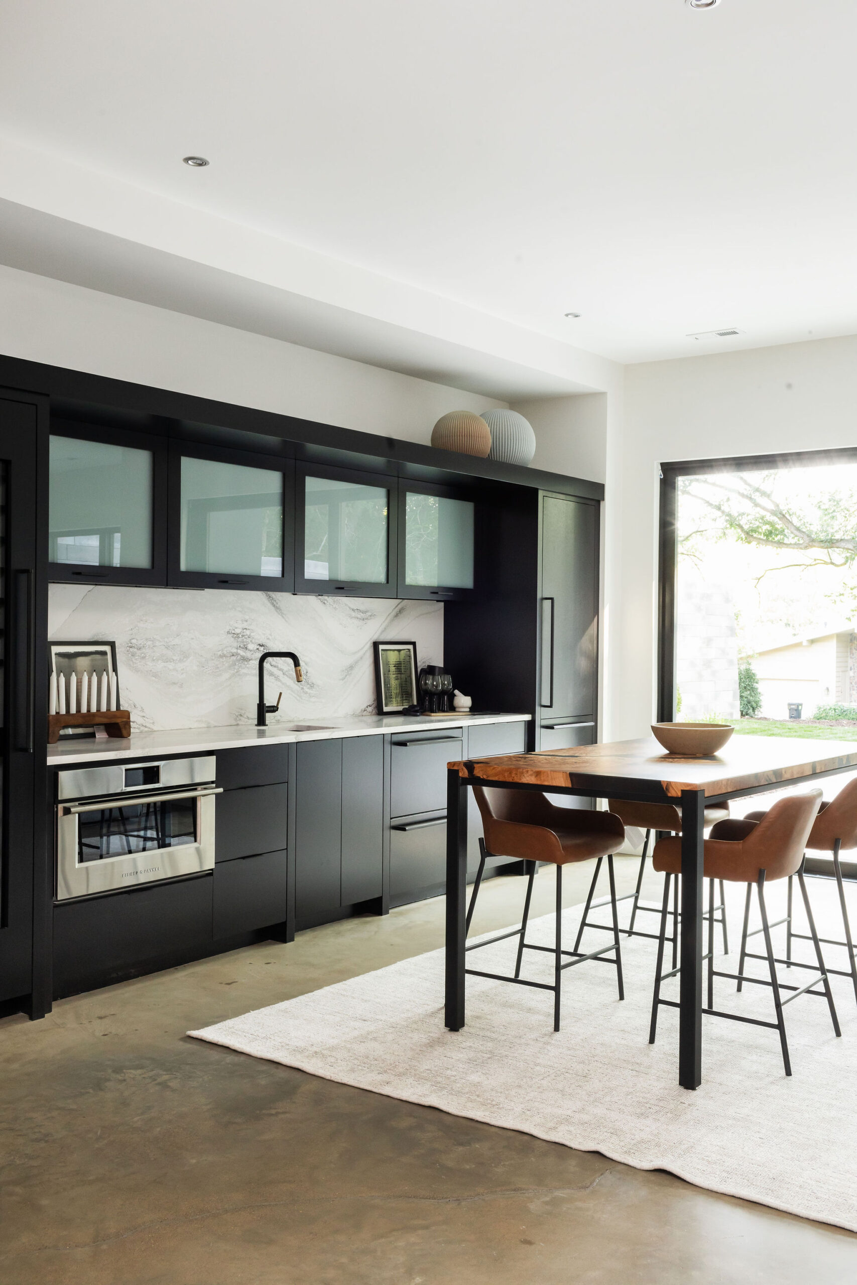
Our third favorite is Atmosphere Blue, one of the prettiest Restoration Hardware paint colors. We used this color in our kitchen area and it was the perfect color to compliment our white cabinetry, dark brown hardwood floors, and black and white, matted decor.
It’s a nice subtle color that really made our picture frames pop. We don’t have a ton of wall space in our kitchen area, so the paint added the perfect amount of color.
4. Stone By Restoration Hardware
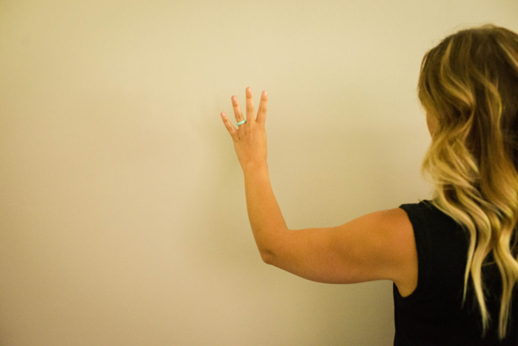
We’ve used this color a lot for our client’s homes and they’ve loved it. It’s the perfect color if you’re a brown fan and wants to get into the grey tones, but don’t want to go too far.
It really works well either brown or grey decor.
We ended up using this Restoration Hardware paint color in our basement and since our basement isn’t very big, we didn’t want to use the darker Gravel down there, or it would have felt like a lot smaller space.
5. Parish White by Benjamin Moore
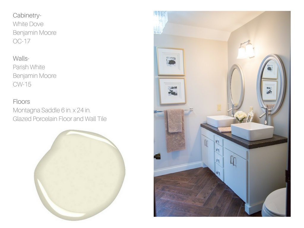
Last but not least, Parish White. This is a goodie and it really is the perfect white!
We used this color for our master bathroom and we’ve used it in a lot of our clients’ homes as well.
White was the color this year, and this was definitely one of our favorite whites to use.
There you have it, our top 5 colors. We could probably go on and on about some of the other favorites that we’ve been using, here are just a few more that are goodies:
“A light gray with warm undertones, this classic shade creates a unifying look that calms and restores. A great transitional color, it’s perfect for an open floor plan.”
“Unerring style defines this classic, softly shaded white. Light and luminous, it is a favorite choice for moldings and trims. We used White Dove on almost all of the cabinetry that we’ve painted in our homes and for clients.”
There is a lot of new information coming to light and it would be useful if you could give some updates since your opinion is so valued.
A complete solution for Painting . Very useful Post, thanks
Thank you very much for sharing about painting guide here… I really hope I can work on your tips and it works for me too, I am happy to come across your article. Great post, I must admit, keep sharing more…
Over this link you will get to know about painting guide. I loved this article. They are must read for many. This article is a good one to look at. I like how you have researched and presented these exact points so clearly. Find an incredible site hdpaintingservices.co.nz/ having lots of ideas and tips that can be handy.