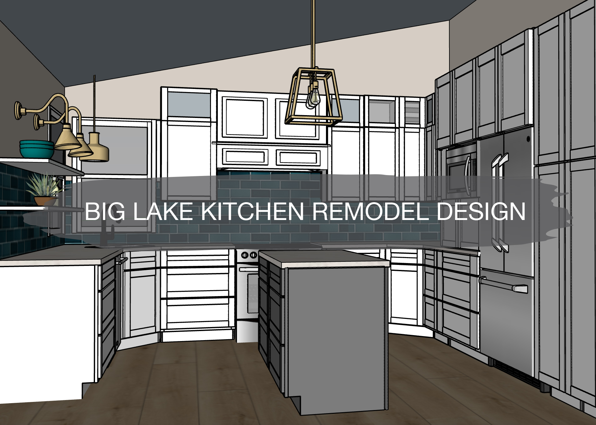
Does anyone wish they lived on a lake? We get to dream every time we visit our client’s home! They live on Big Lake and the view from their kitchen is so beautiful no matter if it’s summer, fall, winter, or spring. A few months ago, we designed out this kitchen and we’re in the final stages of finishing the remodel before the holidays. First, let’s check out the before.
Before
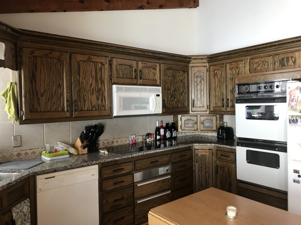
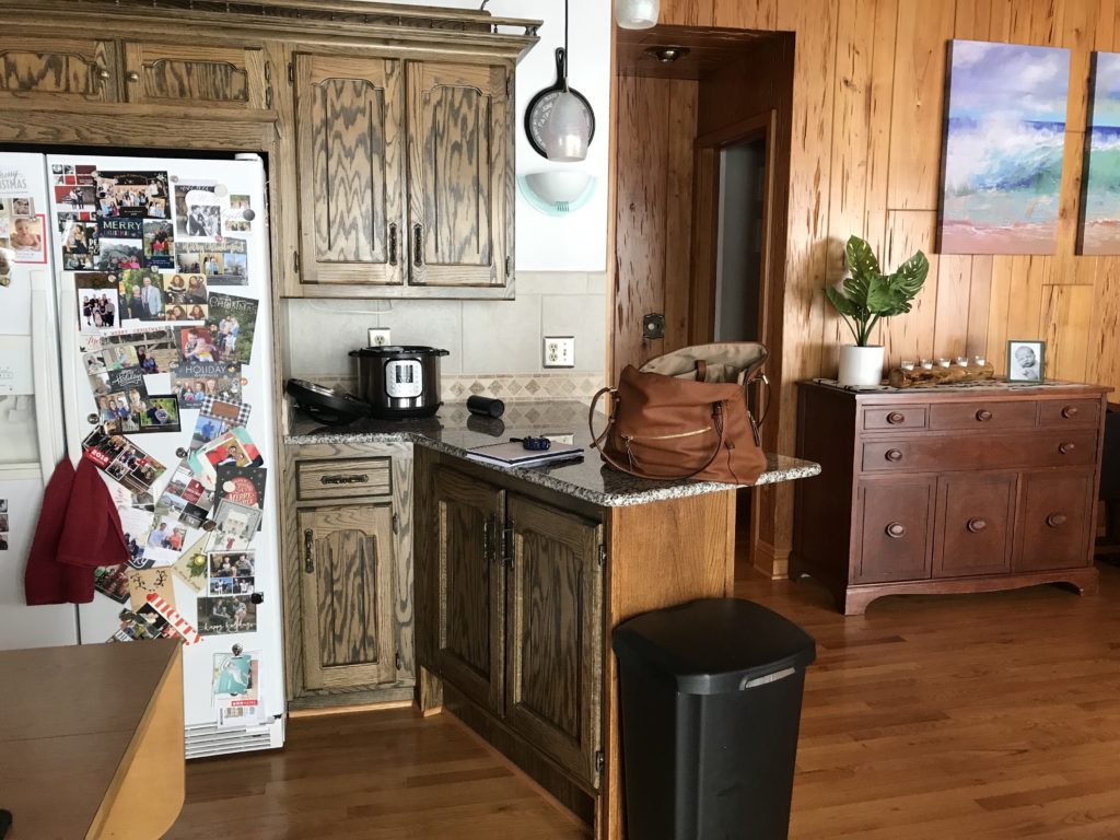
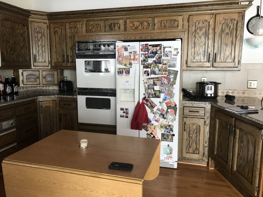
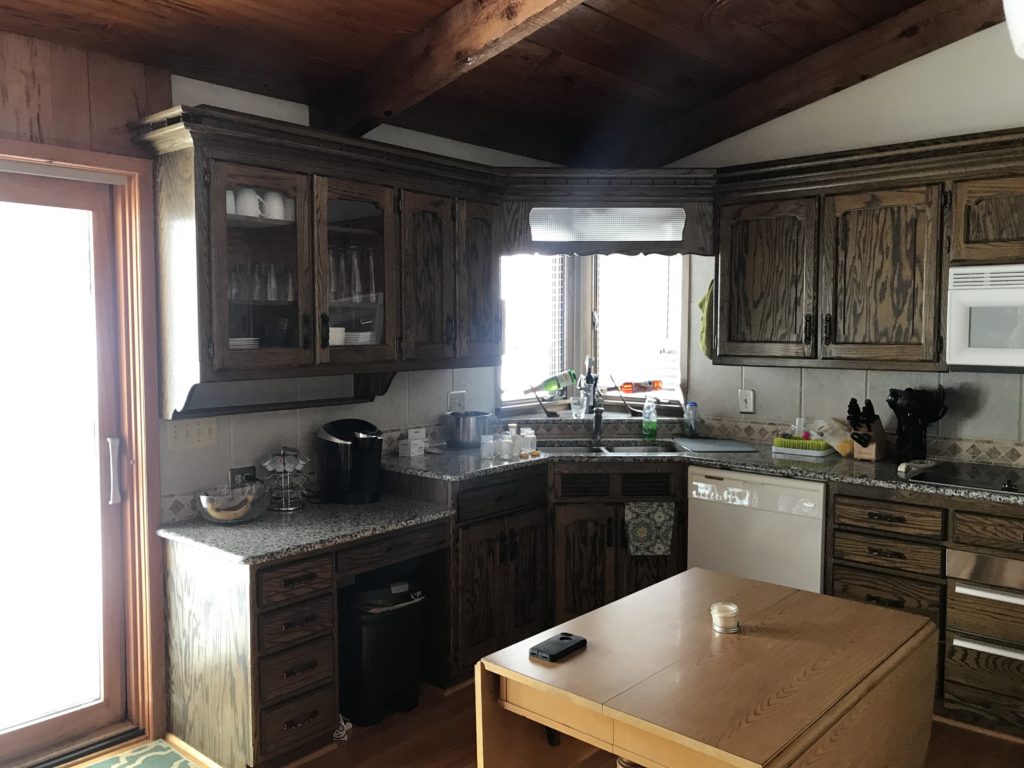
The layout of the kitchen was not working very well for our clients. A peninsula blocked off the kitchen from the dining room and living room. Without an island, our clients were using a table for extra counter space. With the dark cabinetry and busy countertops, the space felt dark and closed off.
Although our clients love the wood in the rest of the home, the kitchen cabinets did not coordinate well with the other wood tones. A light and bright kitchen is what they wanted.
The fridge and double wall oven in the middle of the wall broke up the countertop space and made the space feel tight and cramped.
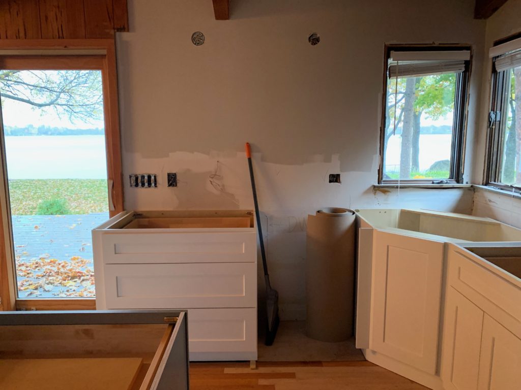
Because of the dark wood on the ceiling and dark cabinets, the space didn’t get much light, even with the patio door and windows to the lake. Our clients wanted to capitalize on the view and make the wall with the patio door a statement.
Inspiration
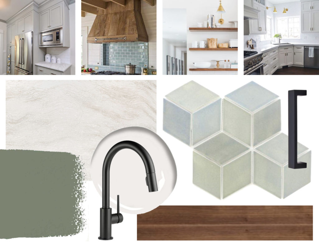
The inspiration for this kitchen was light cabinetry, blue and green tones for a lake feel, black accents, and open shelving.
Plans
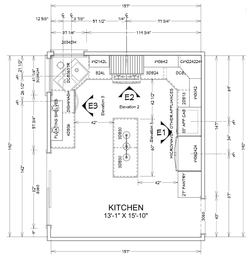
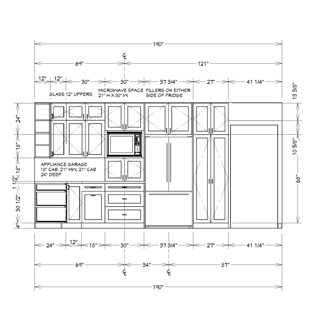
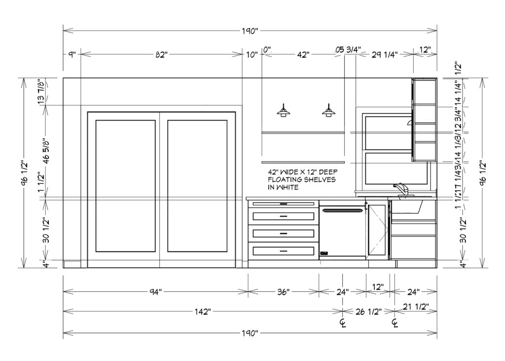
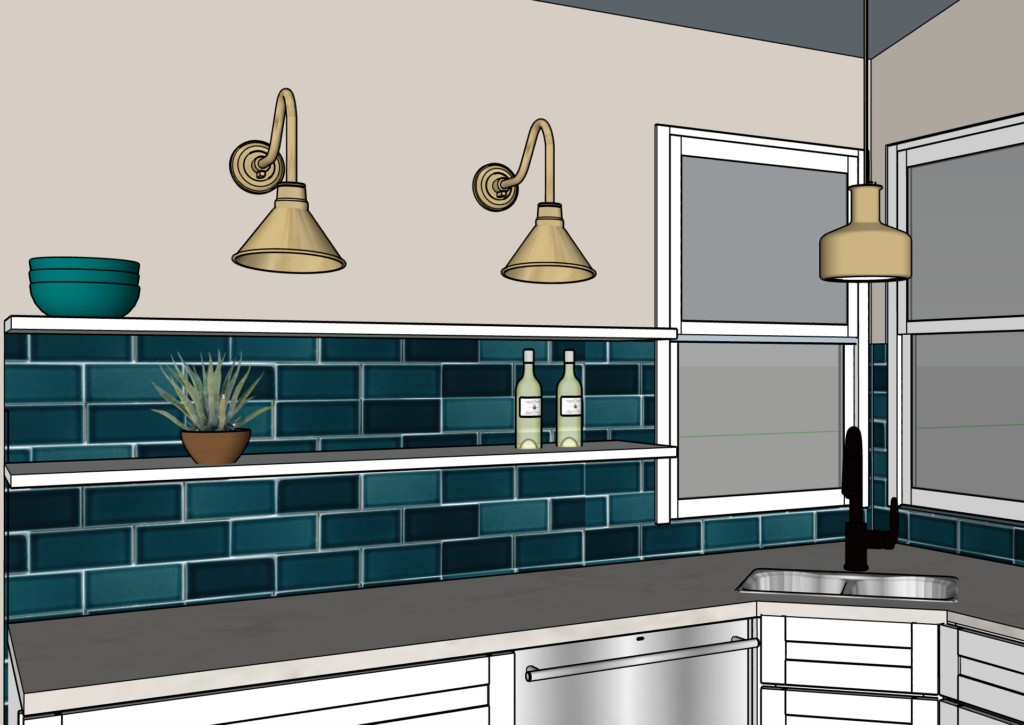
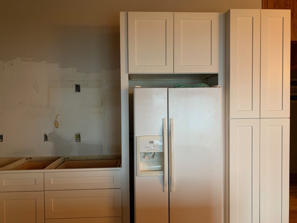
The floor plan is somewhat similar to the original but makes better use of storage and countertop space. In the corner, we kept the sink to make the most of the lake views. On the wall with the patio door, we opted for open shelving and fun tile. An appliance cabinet keeps the coffee maker, toaster, and other small appliances hidden away. Adding a pantry on the side of the fridge allows for more storage space. The large island allows for workspace and more drawer storage for utensils and other kitchen accessories.
Having the microwave above the appliance cabinet keeps it off the countertop and out of the way, while still being easily accessible. Drawers allow for pot and pan storage, while double upper cabinets with glass provide storage for dishes and fun glassware.
Sconce lighting over the shelves provides ambient lighting and will make the tile really shine.
A custom wood hood in the same white as the cabinetry brings in a statement piece.
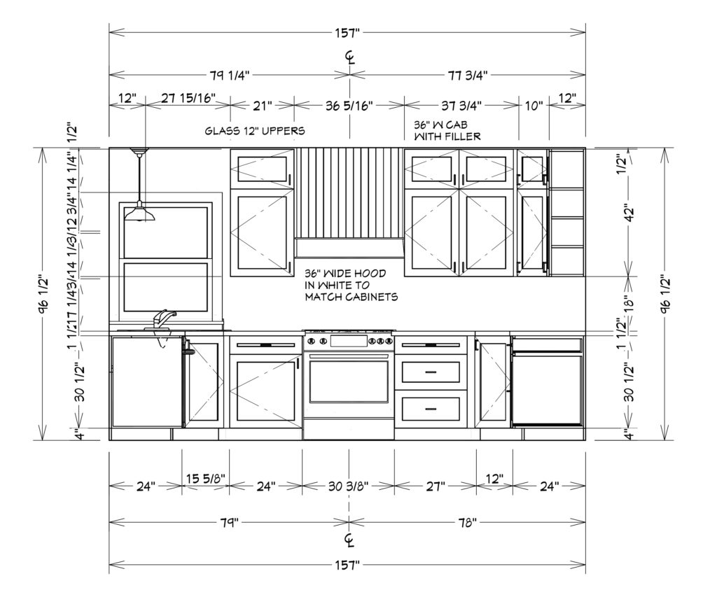
Designs
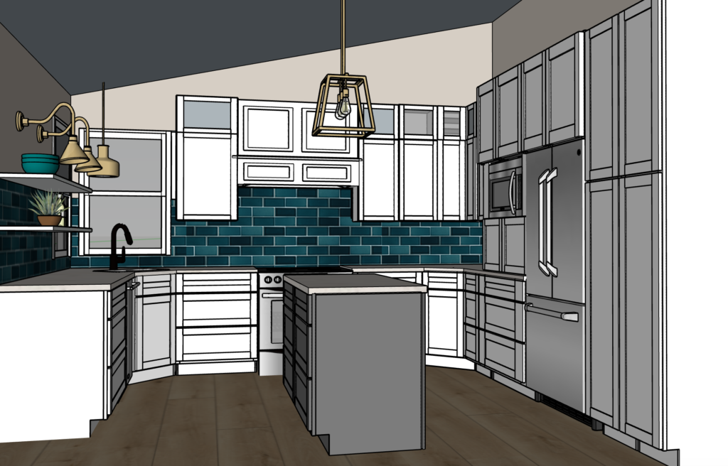
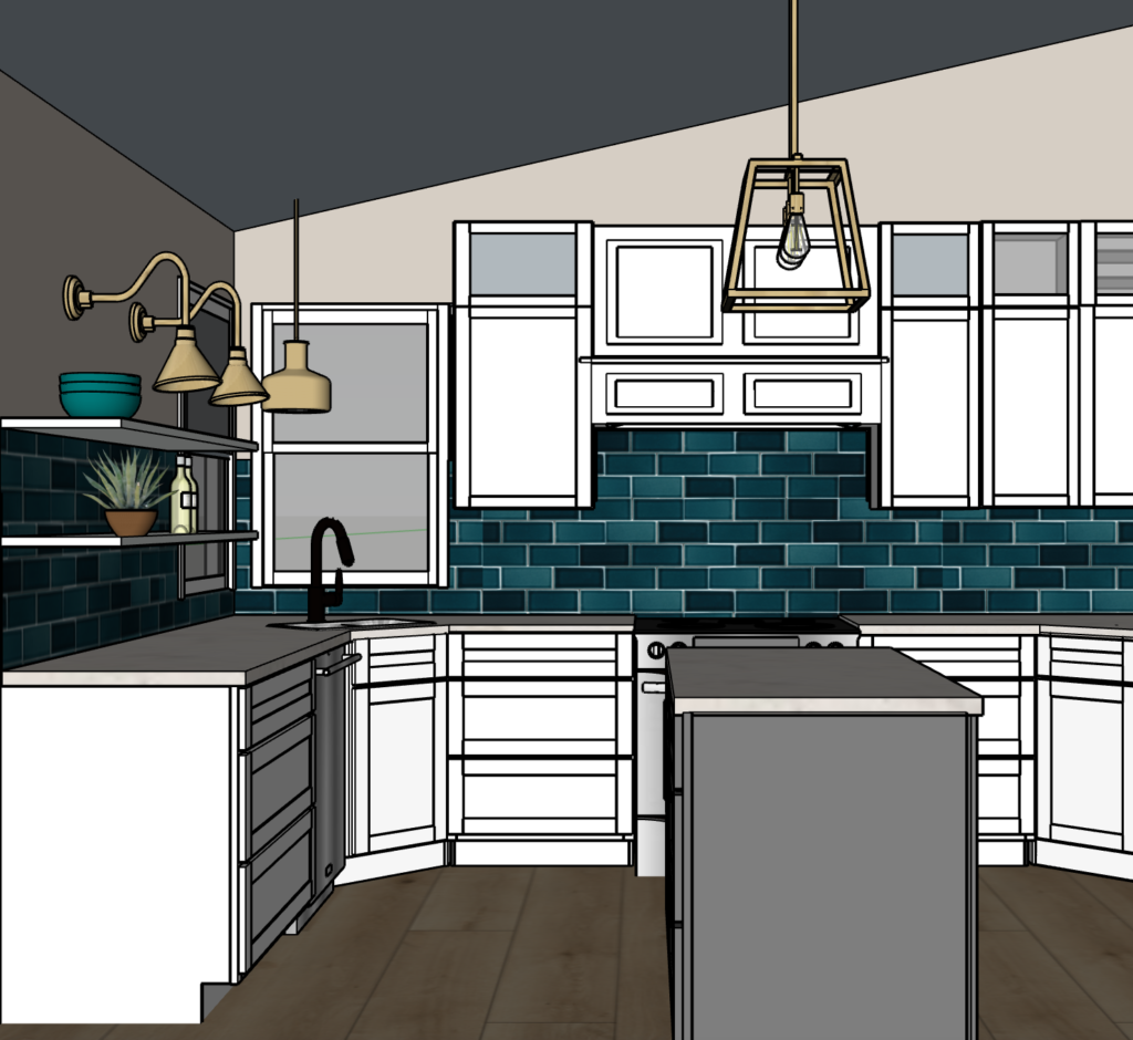
To keep the space light and bright, white cabinets for the perimeter were the main priority. Adding a different color to the island brings in a fun element. Gold lighting and black fixtures complement the blue tile.
A blue subway tile is a twist on the traditional white subway and brings in the lake feel.
In Progress
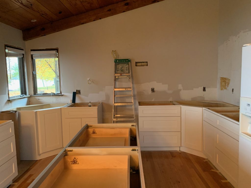
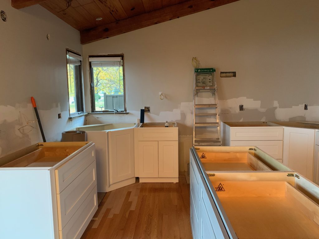
Cabinets are in and these photos were taken the day countertops got measured. Now, countertops are in, new windows are being installed by the sink, and backsplash install with start soon! We can’t wait to show you the full before and after.

Thank you Carolyn!! Much appreciated.
Love the information and details shared in this. Great post.
This article explains the process of this remodel very well. Thanks for the information.