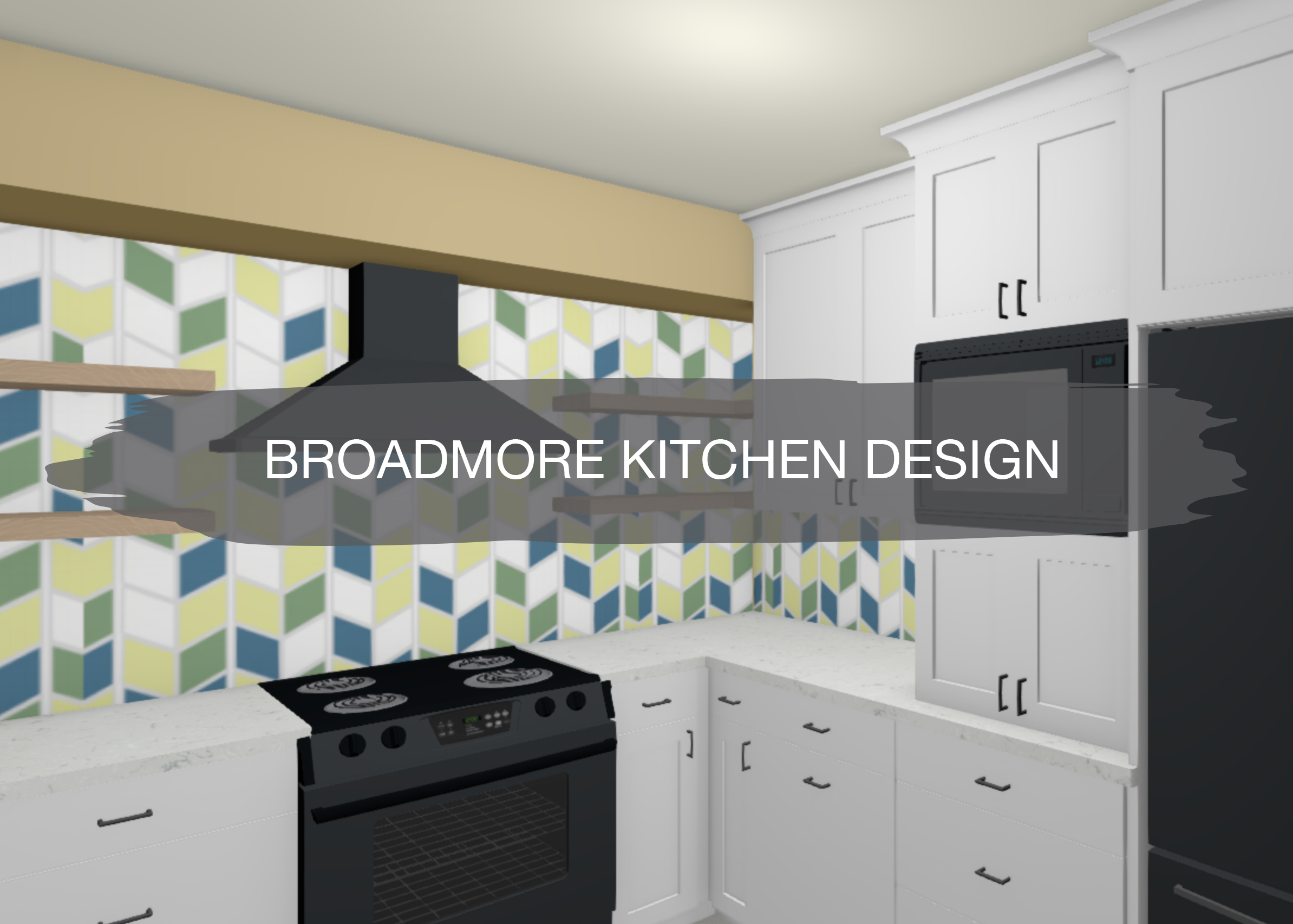
Over the last few months, we’ve been designing out and working on this kitchen remodel project. Our clients have been renovating their home room by room since they moved in. They knew the kitchen would be a bigger project, so they’ve waited until the other projects were completed. Now, it’s time for their kitchen!
Let’s check out the before of this space…
Before
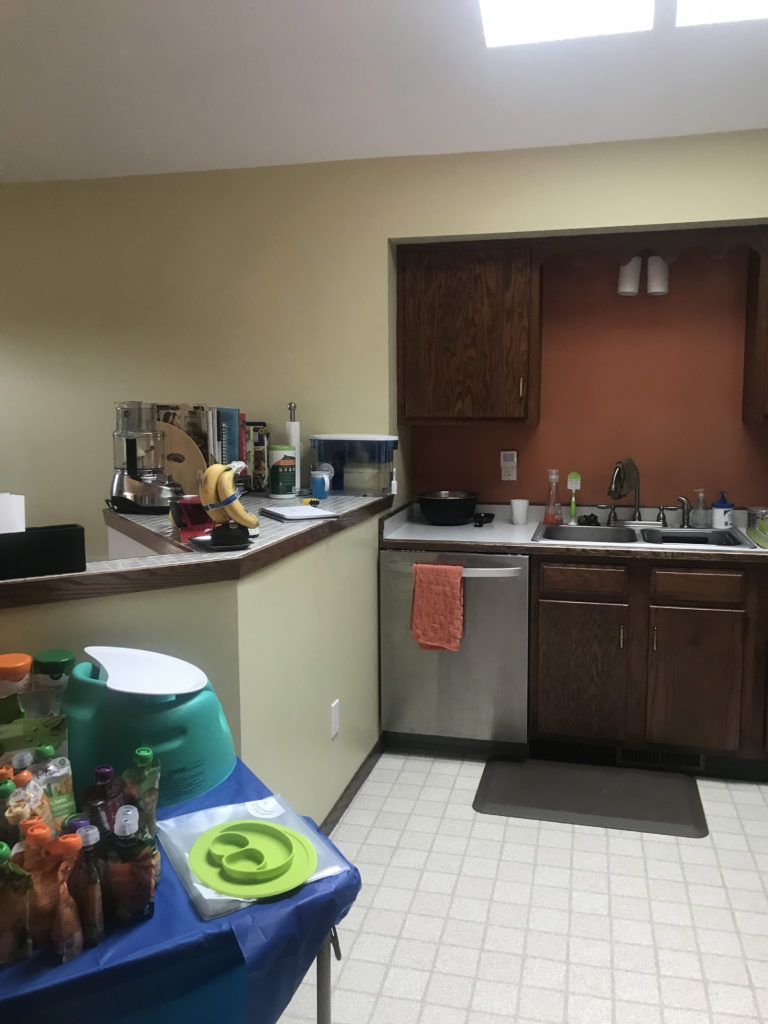
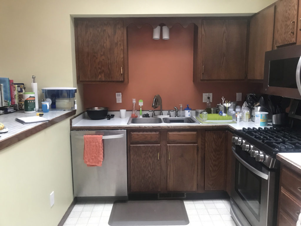
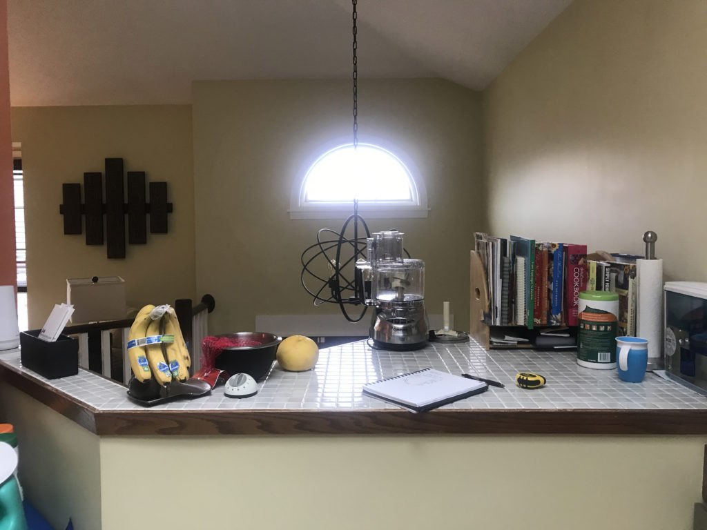
The current kitchen is small and doesn’t work very well for this family of three. With the limited countertop space and minimal cabinet storage, our clients were looking for a more functional layout, as well as an updated design.
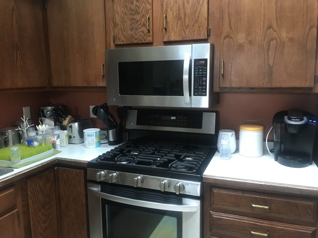
Before, the sink faced a wall, which is not our client’s favorite, especially when washing dishes. The microwave over the stove makes cooking on the range top feel crowded and hard to work on.
Since the kitchen is open to the entry below, with the entry closet under this countertop space, it makes it hard to add on to this kitchen. To make this space more functional, we are dropping the countertop down to standard height at 36″ to give our clients more working countertop space.
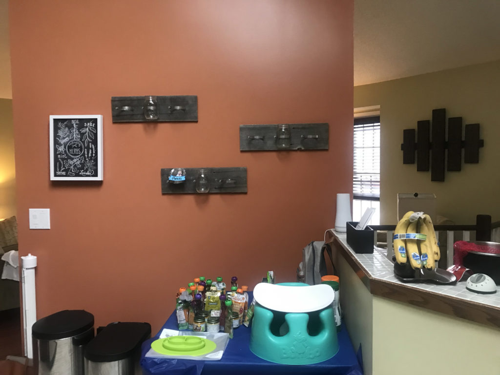
This red wall will become a half wall in order to open up the kitchen to the living room. With this angled wall going all the way up to the vaulted ceiling, it blocks off the space and makes the kitchen feel much smaller. We are also moving the sink and dishwasher to this area to create more countertop and cabinet space on the other side of the kitchen.
The stove is getting moved to where the sink currently is. This wall will become the fridge, pantry, and appliance garage wall. Rather than having the microwave over the range, we are going to move it to be over the appliance garage. Underneath the microwave will be a spot for the coffee maker, toaster, and other items typically on the countertop to be hidden away.
Mood Board
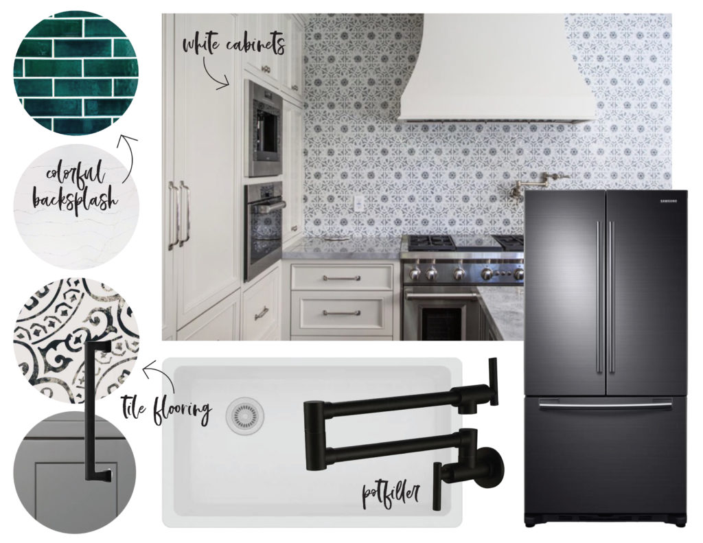
The inspiration for this project began with pattern or colorful tile. Our clients also liked the look of the dark stainless steel appliances and wanted to incorporate them into the project. In addition, black accents and white cabinetry were a contrast they liked.
Mercury Mosaics Custom Tile
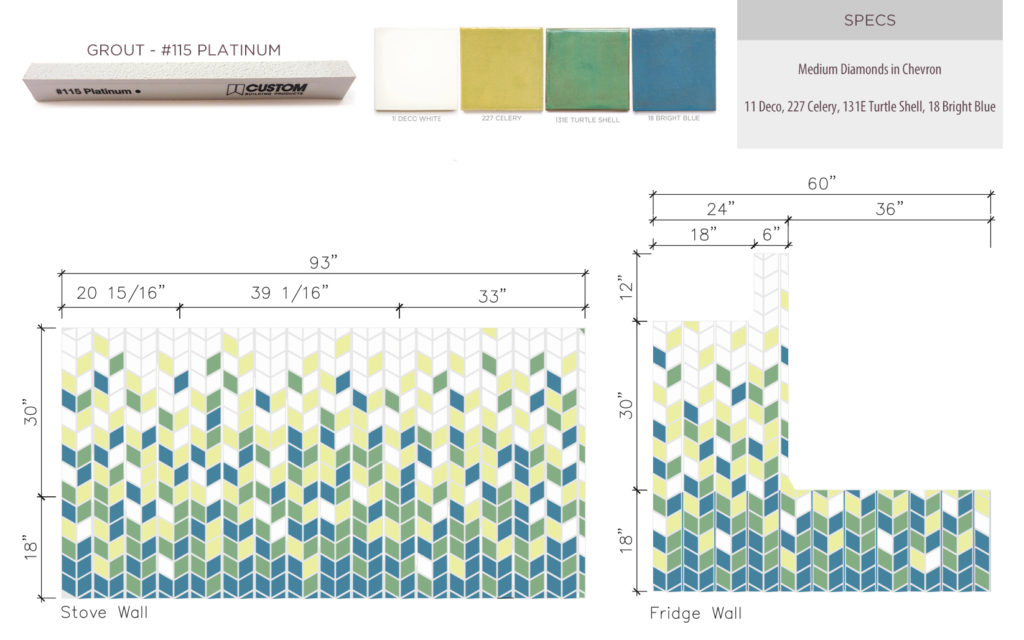
When it came down to tile, our clients loved the idea of a custom backsplash. We are so excited to be working with the talented and amazing Mercury Mosaics on this custom tile backsplash! To work with the paint color that our clients love and have throughout their home, we wanted the tile to play off the color of the walls. Our clients saw an example of this diamond-turned herringbone pattern on Instagram and loved it. We worked with Mercedes, owner of Mercury Mosaics, to tweak the design with the colors we had picked out, and they showed us this beautiful flowing pattern. Our clients loved how the colors slowly faded into white as the tile got closer to the ceiling. We can’t wait to see this design in the space!
Designs
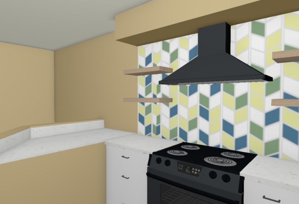
With the new layout, our clients are gaining more countertop space and have more hidden storage with the appliance garage and pantry. The custom tile looks amazing on the back wall and the white cabinets brighten up the room.
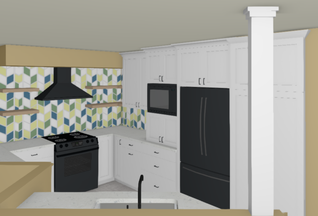
Floating shelves and a black stainless hood will accent the custom tile design by Mercury Mosaics. Dropping the countertop looking over the entry to the same height as the rest of the counters provides more workspace and continues the flow throughout the kitchen. There will be a countertop backsplash to ensure that nothing falls back into the entry space.
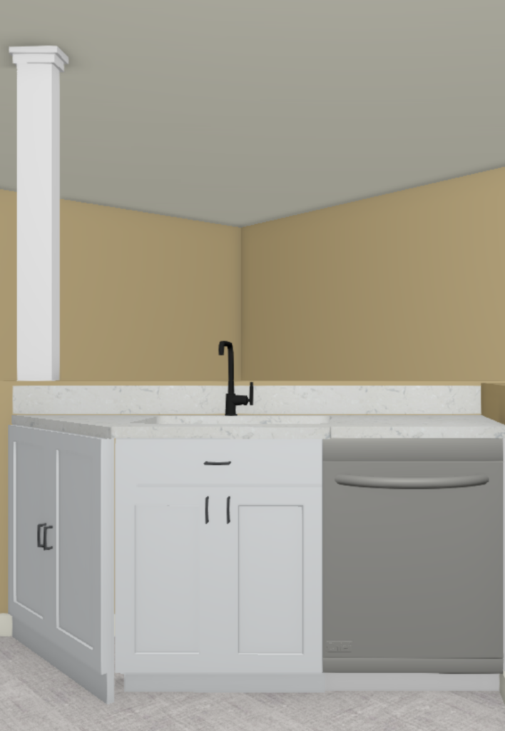
By opening up the wall, the kitchen sink will now lookout to the living room. Rather than looking at a blank wall, our clients can watch their child play in the living room while they make dinner. It also allows the flow of the home to be much more open and bright. A black faucet and hardware contrast the white cabinetry, while the grey hex textured look tile adds some fun to the floor.
Stay tuned for more updates and the reveal in the next couple of weeks!

great idea! the kitchen looks wonderful after renew.