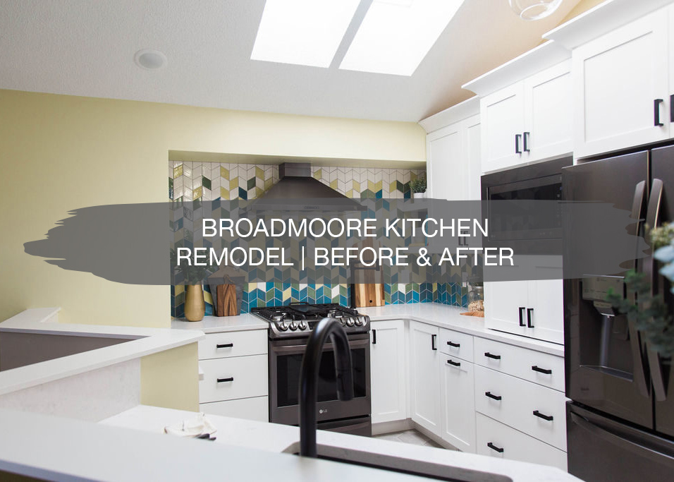
We recently wrapped up a kitchen remodel in Eden Prairie, and today, we’re sharing all the details behind it! Our clients moved into their home a few years ago and have been updating their home room by room. Once they got to the kitchen, they were ready to overhaul the space and have a brand new kitchen.
A few months back, we shared the inspiration, before shots, and designs. Now, it’s time for the before and after, and we can’t wait to show you!
Before
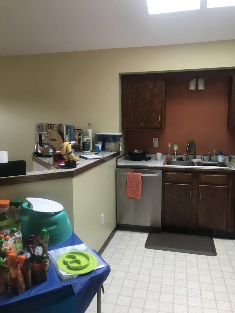
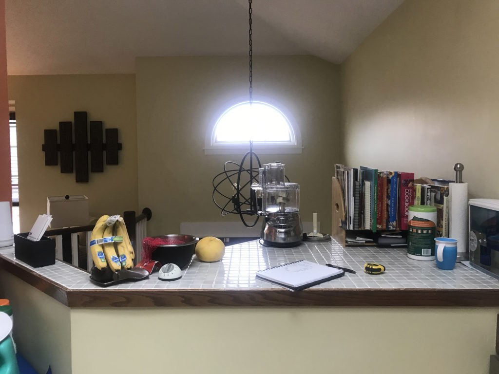
This is a smaller kitchen, and with the previous layout, it wasn’t working very well for our clients. With the limited counter space and minimal cabinet storage, they were looking for a more functional layout.
After
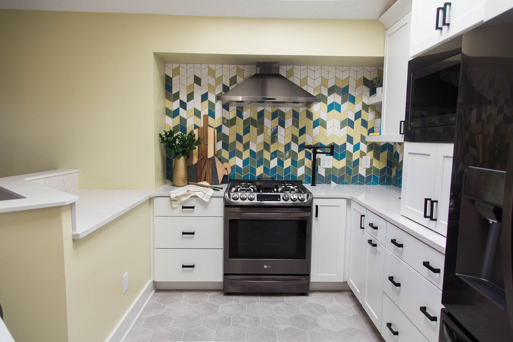
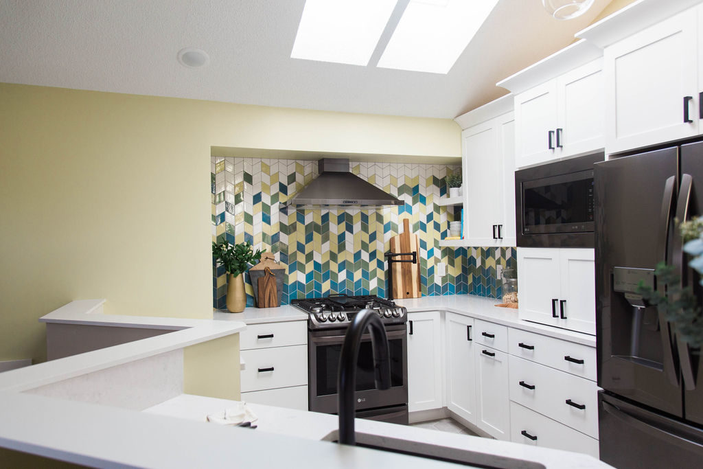
With the counter space overlooking their entryway, we brought it down to standard 36″ height so that it was much more usable. In addition, we moved the sink and replaced it with the black stainless Zephyr hood on the back wall. Now, the sink looks out into the living room, which is much more ideal than looking at a wall while washing dishes.
Before
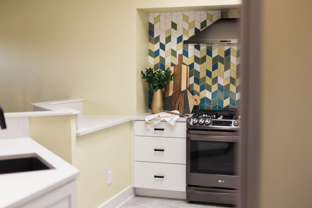
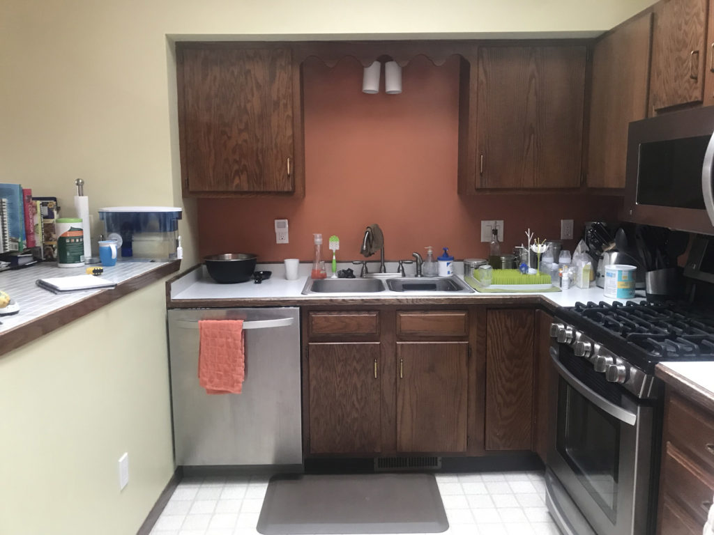
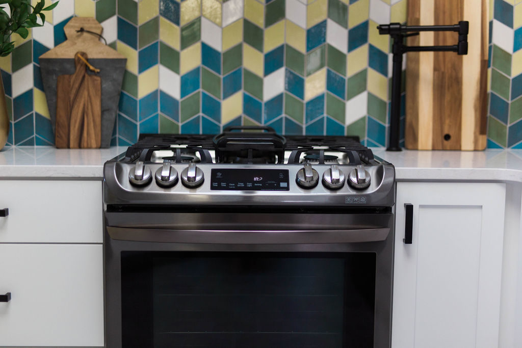
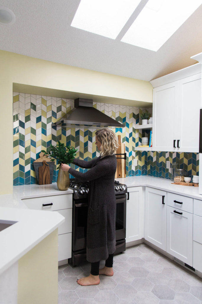
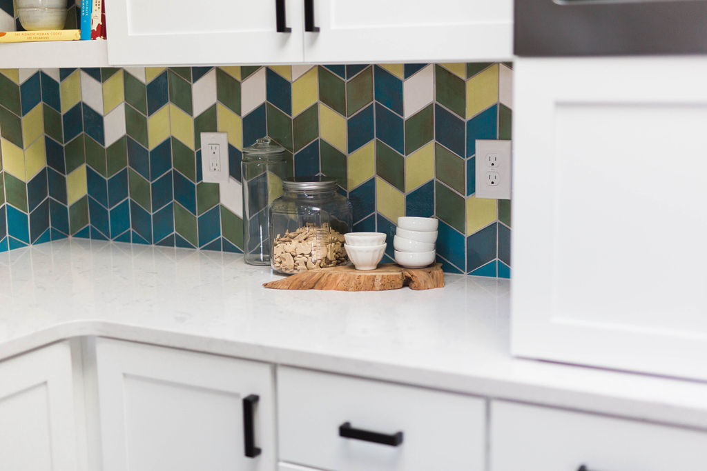
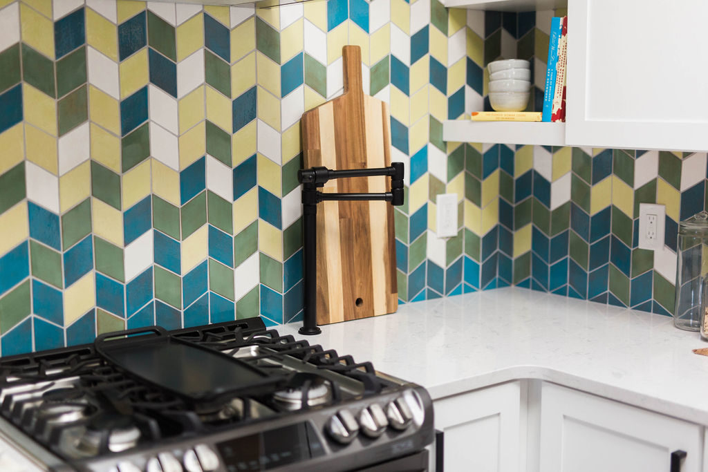
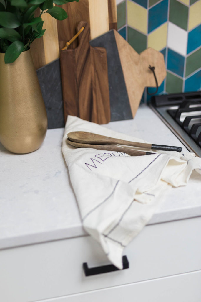
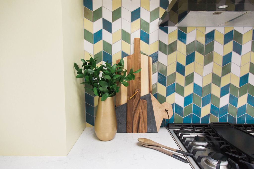
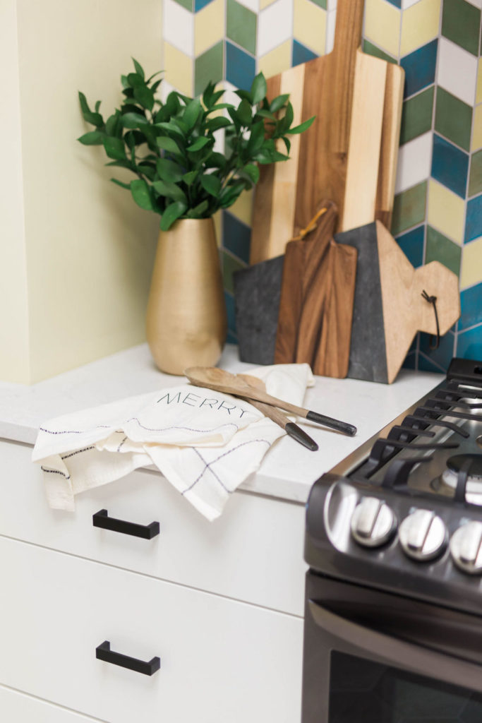
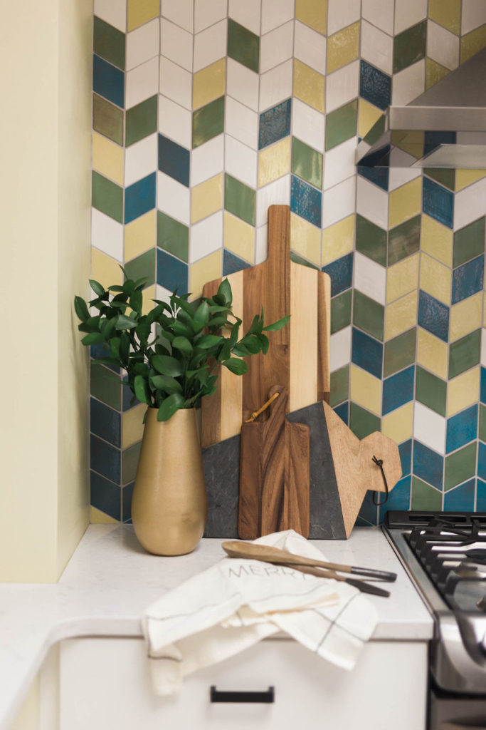
When the sink was facing the back wall, it made the space feel dark and cramped. By taking out the upper cabinets on this wall and adding a hood, along with custom tile from Mercury Mosaics, this back wall makes a statement and is so much brighter.
After
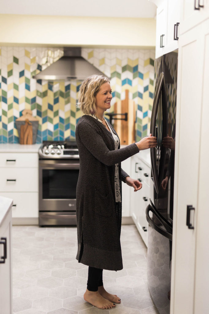
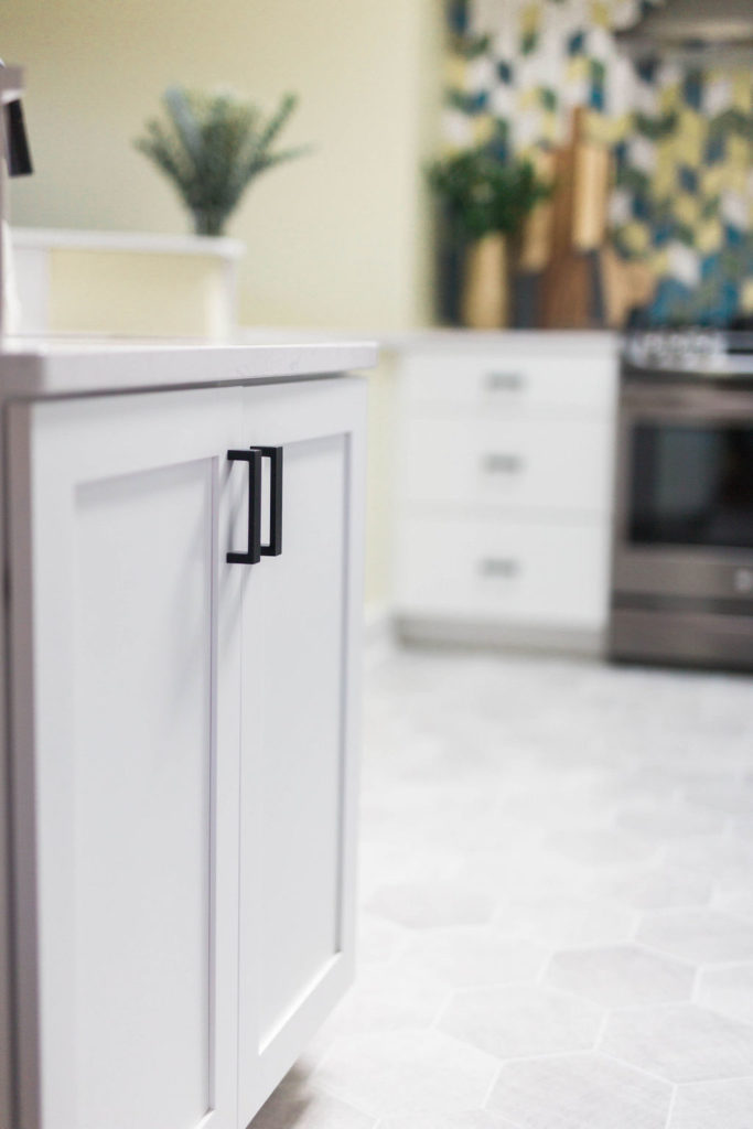
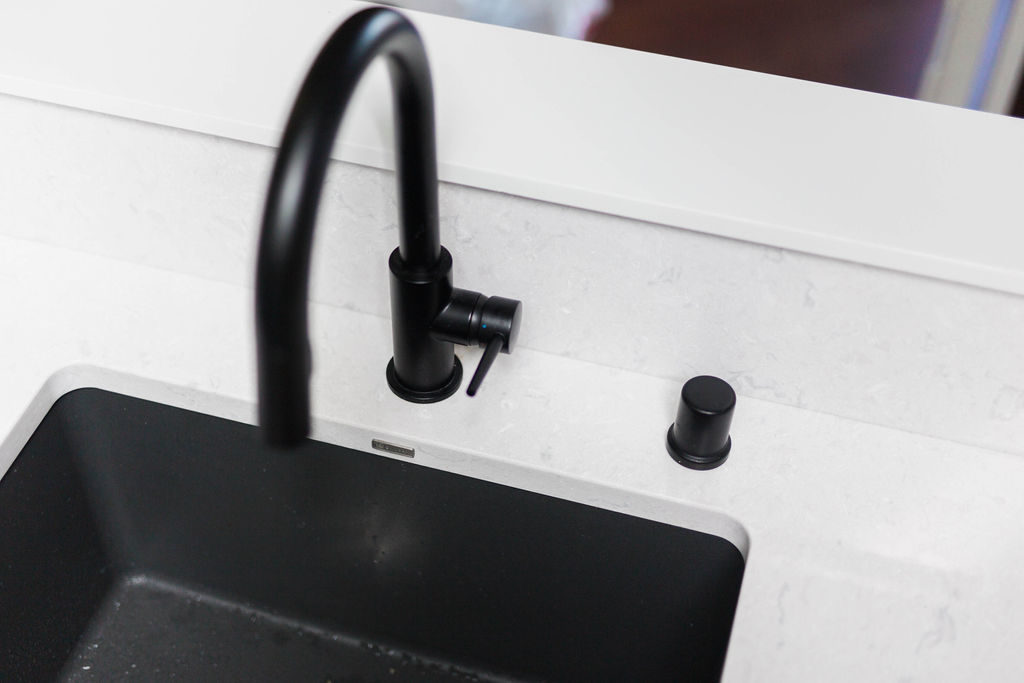
New hexagon tile flooring from The Tile Shop throughout the kitchen added a fun shape to the floor and updated the look of the room. A matte black Brizo pot filler allows for easy water access for making dinner. White cabinets from Woodland Cabinetry brighten up the room and add a crisp, clean feel.
Before
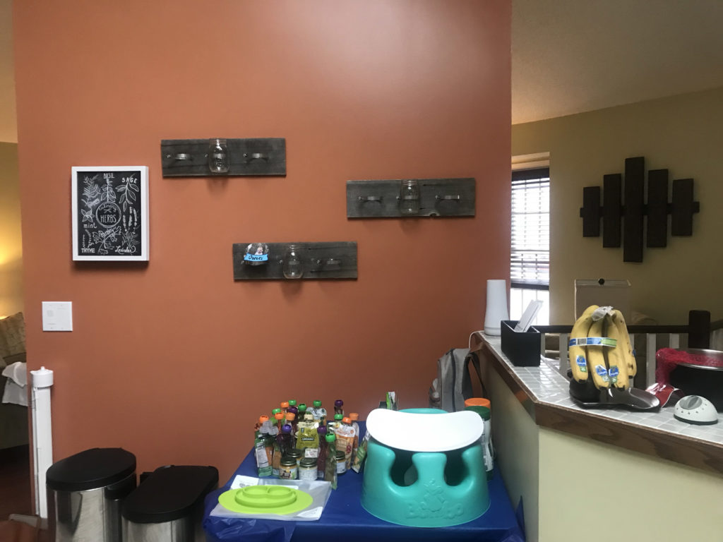
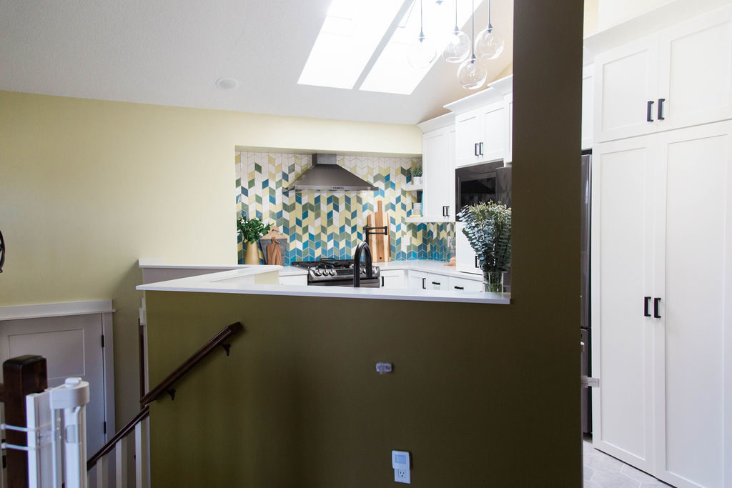
This space above the entry became a workable counter space for food prep. The red wall between the kitchen and living room was removed, which opens up the space and made it possible for the sink and dishwasher to go in its place.
After
Now, the extra counter space allows for more area for food prep and storage. Being able to look over the sink into the living room also makes entertaining and watching kids play much easier.
Before
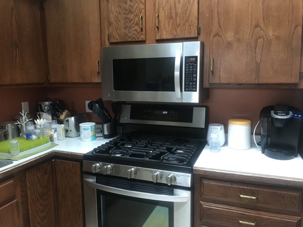
With the microwave over the range, it made cooking feel tight since there wasn’t much space above the range. By moving the range to the other wall, it allowed for more storage with the microwave and appliance garage.
After
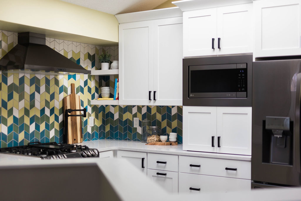
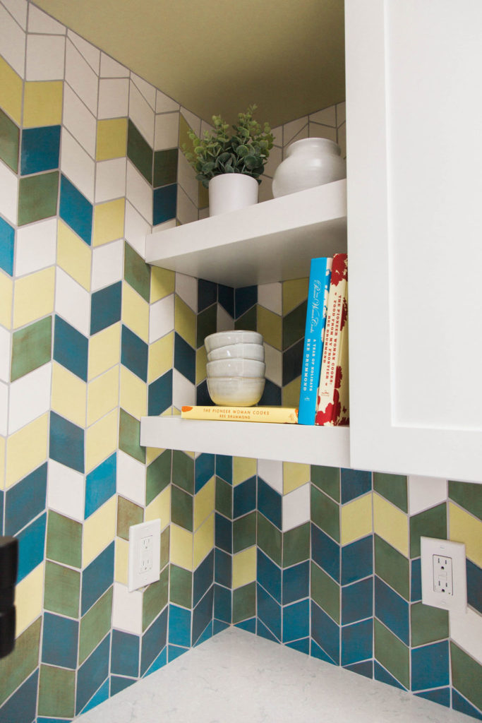
Having the microwave built-in with storage below keeps small appliances hidden away and off the counter. In addition, the open shelves add a fun place for showing off cookbooks and dishes. Black hardware accents the black fixtures and contrasts the white cabinetry.
What a transformation! Now the space has its own personality and feels much brighter and open. We love how the layout is much more functional for our clients and their lifestyle.
Shop This Kitchen
Hexagon Floor Tile | Elkay Kitchen Sink | Delta Kitchen Faucet | Brizo Pot Filler | Top Knobs Black Hardware | Zephyr Black Stainless Hood
Details
And that’s a wrap! Cheers to many great years for our clients in this kitchen!


One thought on “Broadmoore Kitchen Remodel | Before & After”
Comments are closed.