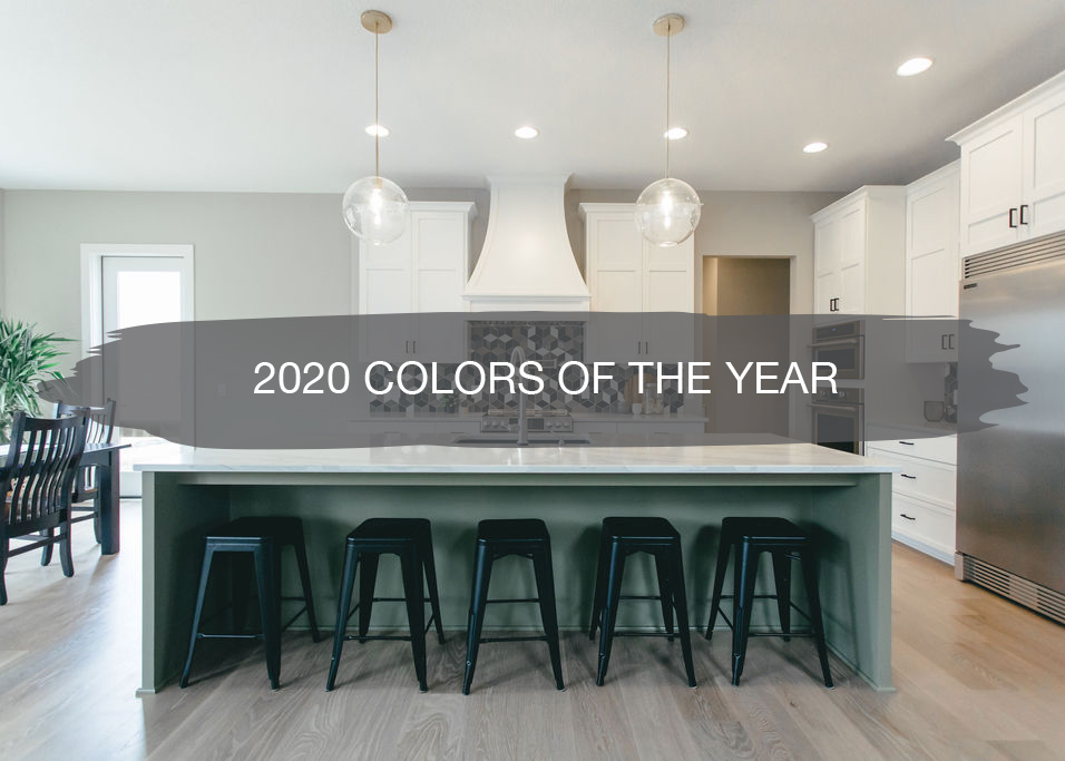
It’s that time of the year again, colors for 2020 have been released!
One of my favorite things around this time of year is when Fashion Week hits, and shortly following, brands one-by-one, start to release their upcoming colors, designs, textures, prints, new products and all of the exciting things to come from what hit the runway.
And if you know us, you know how excited we are for another year of some tasteful and fun colors.
The big shift we’re already seeing this year over last year is how all the brands are thinking beyond just the colors, but what’s important to consumers and the next generation such as the environment. And we’re going to walk you through the meaning, purpose and thought behind all of these new colorful collections of 2020 today!
Last year Living Coral was announced as the Pantone color of the year for 2019 and now we’re going to see a shift from the corals to the water and earth tones. We chatted this past spring about how the stark whites were moving into warmer whites and muted pastels were all the rage. My favorite thing about the shift we saw last year (and will carry into the new year) is the new blues and you know how we’re all about the greens, which will get more and more popular into 2020.
We have a full post on our top favorite greens of this year HERE.
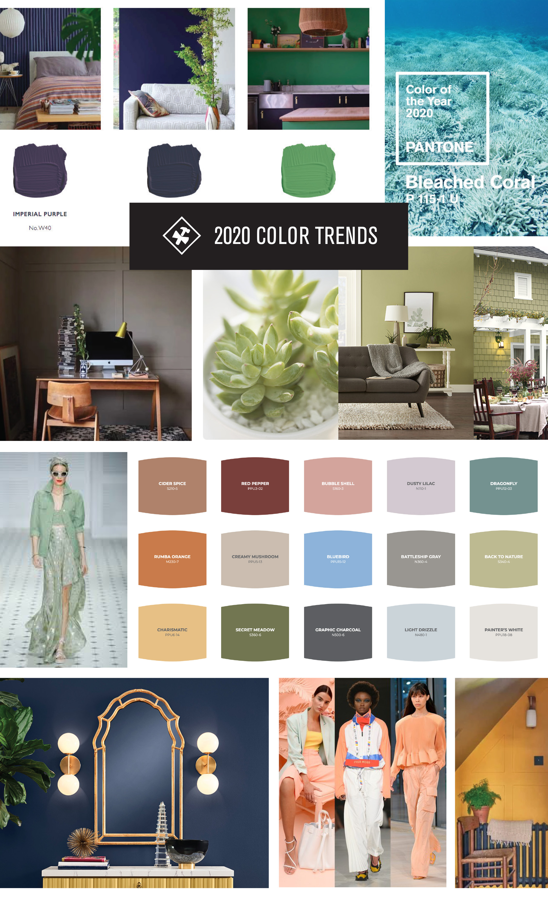
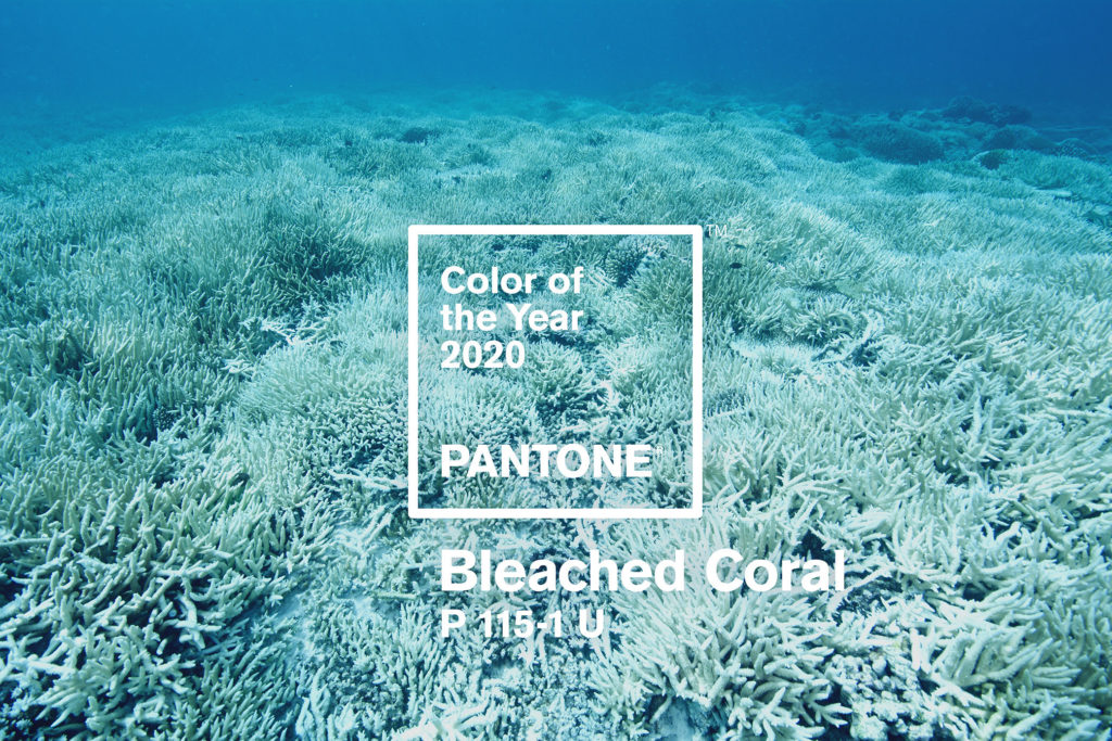
Pantone Color of the Year | Bleached Coral P 115-1U
According to Pantone Color Institute color experts, colors for Spring/Summer 2020 New York express our desire for a sense of the familiar. Friendly and relatable, a palette of colors that conveys a sense of ease. At the same time, in this era of personalized self- expression, this palette of recognized favorites uses the familiar to take some unique twists and turns highlighting elements of humor, modernity, and entertainment.
“Combining our desire for stability, creativity, and more spontaneous design approaches, the color palette for Spring/Summer 2020 infuses heritage and tradition with a colorful youthful update that creates strong multi-colored combinations as well as energizing and optimistic pairings,” said Leatrice Eiseman, Executive Director of the Pantone Color Institute.
This year’s Color of the Year picked by Pantone is Living Coral – aka Pantone 16-1546 – a warm, tranquil shade between orange and pink that draws on trends the company saw at London and New York Fashion Weeks. However, with over 45% of the coral on the Great Barrier Reef dying over the past three years, two Melbourne-based creatives have proposed a color for 2020 to highlight how much danger the world’s largest coral reef system is in.
Instead, the duo suggests the slightly off-white Pantone 115-1 U as the Colour of the Year 2020, which they’ve renamed ‘Bleached Coral,’ referring to the color coral turns when it dies. Based on the premise that Pantone’s choice of Colour of the Year influences the color choices of others – rather than merely reflecting it – they say they believe that if this color was as pervasive as Living Coral, it would lead to more efforts being put into environmental efforts for coral and in other areas.
“Imagine if the creative community at large brought Bleached Coral from the depths of the ocean, straight to the clothes we wear, the products we buy, and the media we consume,” they write. “Imagine if Pantone’s Colour of the Year was as widespread and impactful as climate change itself.”
Slowly but surely we’re seeing the top paint brands start to release their colors of the year for 2020, and we wanted to share some of our favorites with you today.
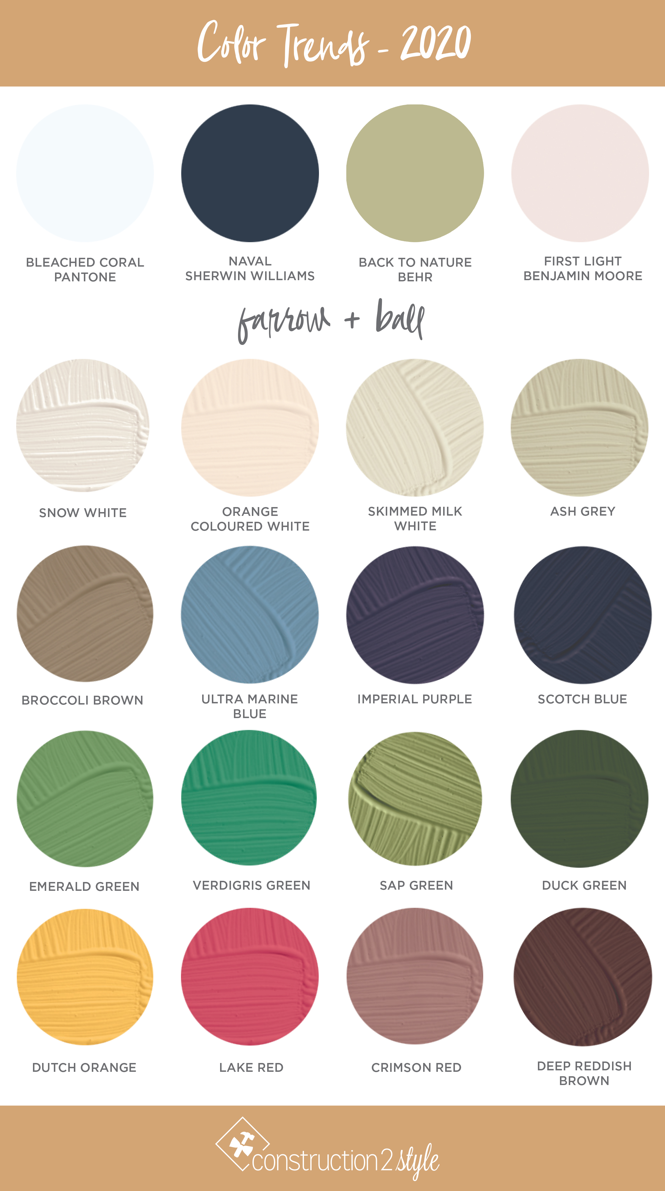
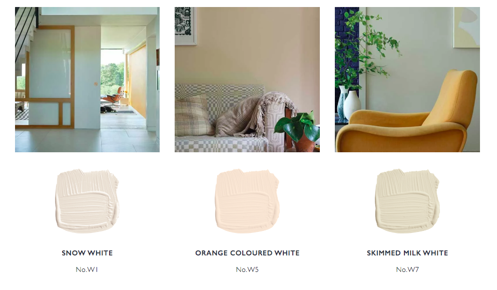
Farrow & Ball | Coulour by Nature, 16 Color Collection
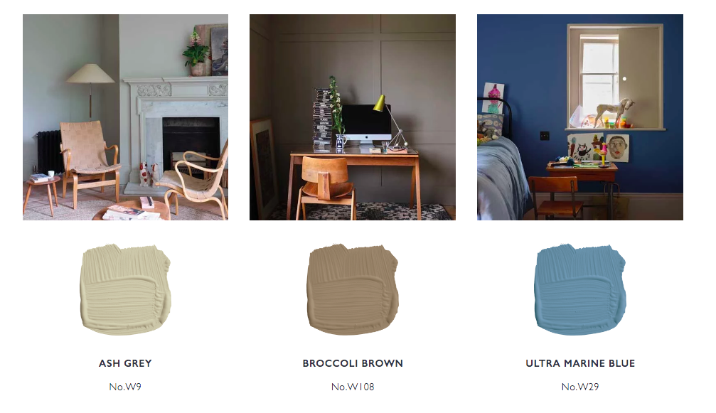
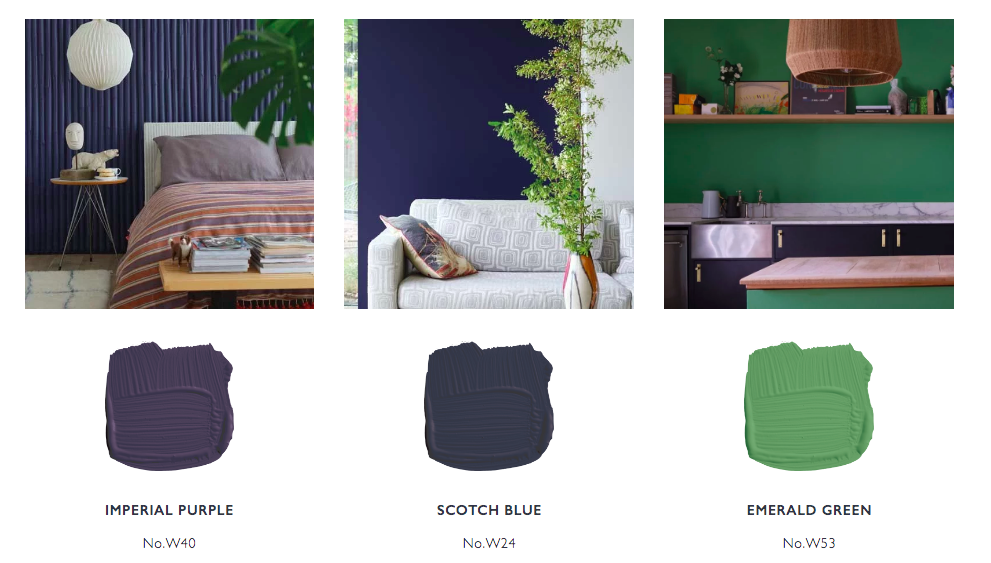
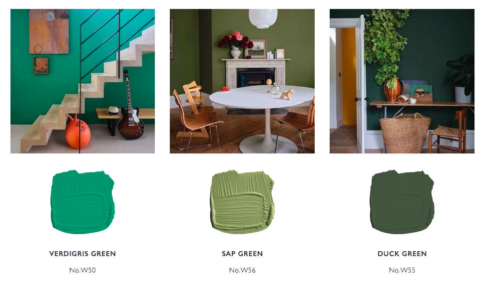
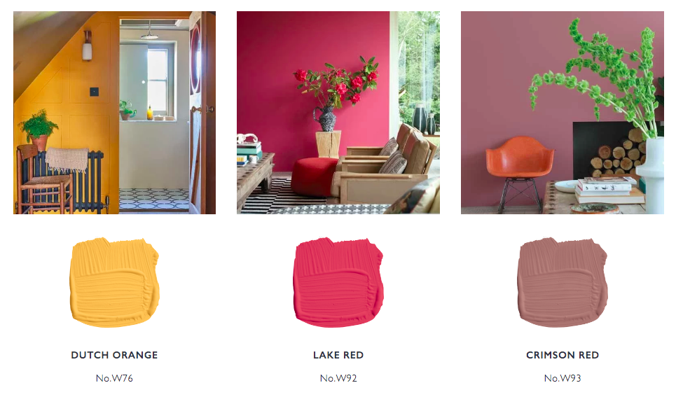
Farrow & Ball one of our paint favorites! They collaborated with London’s Natural History Museum to create a brand new palette of 16 incredible colors. There’s not one that we don’t love! As they state, they were inspired by the museum’s collection and archive of rare books, the rich hues take inspiration from the natural world, running from deep ultramarine blues, through soft neutrals, to opulent greens and uplifting reds.
Sherwin Williams | Naval SW 6244
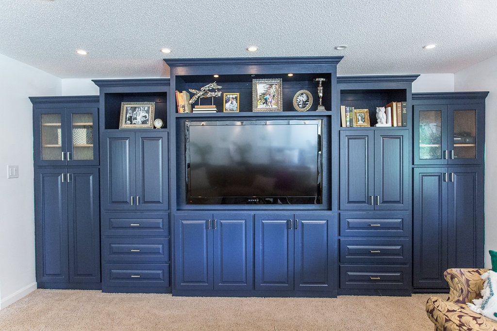
I was very excited to see that Sherwin Williams announced Naval as their 2020 color of the year. The same Naval that we painted our basement cabinetry a couple of years back and still love it to this day!
As they state, “You might think Naval has been done before, but it’s back…Navy is coming out of its comfort zone with you. 2020 is an empowering year of change that focuses on bringing your best self into the new decade. The next 10 years pave the way for the wellness of mind, body, and soul – a clean palette for self-nurturance.”
Benjamin Moore | First Light 2012-70
“We selected First Light 2102-70 as our Color of the Year 2020 to represent a new dawn of idealism, design, and living,” said Andrea Magno, Benjamin Moore’s Director of Color Marketing and Development. “First Light 2102-70 reflects a new definition of the home—a shift in mindset from the material to satisfying the core needs in life: community, comfort, security, self-expression, authenticity and ultimately, optimism.”
Alongside their First Light color of the year, they are releasing nine other additional colors that go along with this pallet. Magno also went on to say in an article and talking through how color is very powerful but also highly subjective, especially through the lens of multiple generations. These colors within their new collection can stand alone or be paired well with one another.
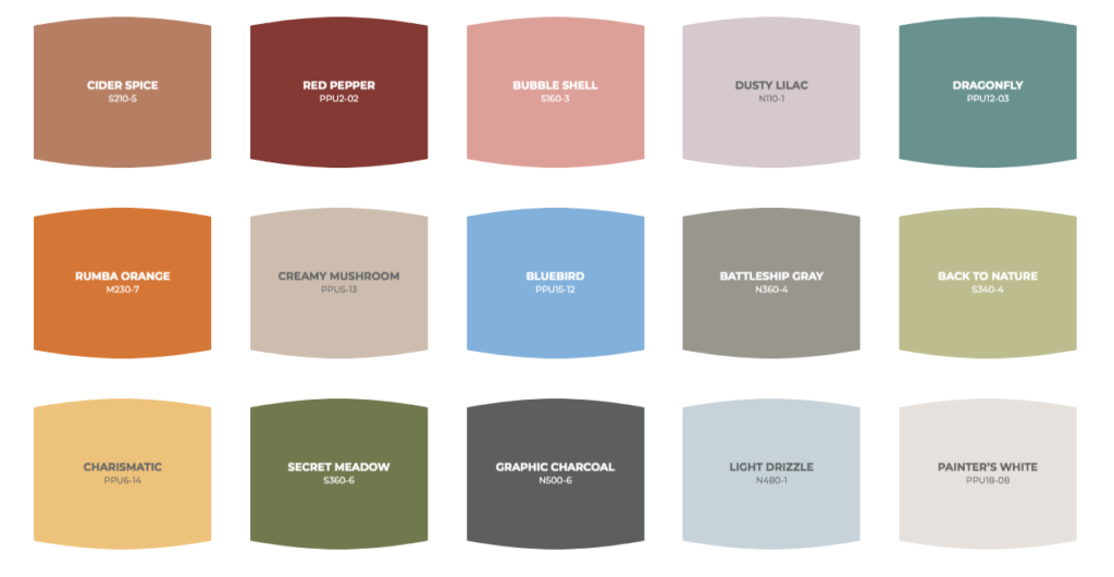
Behr | Back to Nature S 340-4
Behr Just Released Its 2020 Color of the Year, and It’s All About Tranquility. At long last, we finally know Behr’s 2020 Color of the Year! A beautiful light green called Back to Nature. The brand describes the color as “calm, gracious, and balanced,” and a way to bring the outside in.
The Behr 2020 Color Trends palette was inspired by natural elements such as sky, earth, water, and plant life. Seasonal changes and world exploration also play a role in how we relate to color. Each hue was selected to work well alone or in combination to create a unique look for your home and style
