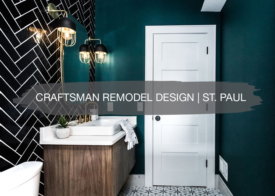
We’re back sharing another design project we recently wrapped up. Except this time it was for a remodel instead of a custom new home build where our clients took action on their own to bring our designs to life!
Back last fall in September, we shared about the inspiration for this design project in St. Paul and we can’t wait to show you the finished home here today!
These clients were beyond incredible to work with. They already had subs lined up with their remodel, but were looking for help for the design side of the project for their kitchen, main floor bathroom, master bathroom, and fireplace tile design. Once we were ready to rock and roll, we got to work sourcing lighting, plumbing, tile, paint, and more.
Inspiration
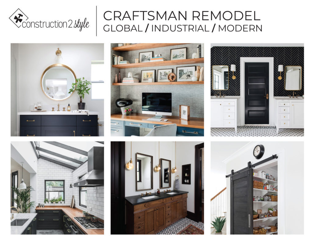
As we started talking and asking them about their design styles, they both shared a love for earthy colors like deep greens, burnt oranges, and blues. They also have a love for pieces inspired by places around the world, a desire to restore original elements of the home like the wood floors and wide trim, and also wanting to bring in a more modern vibe.
Here’s what inspired the space:
In Progress
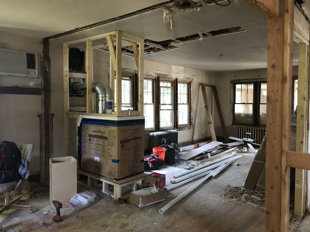
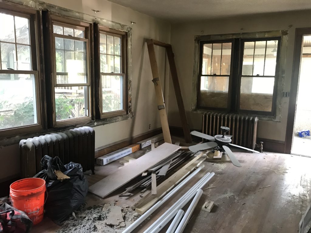
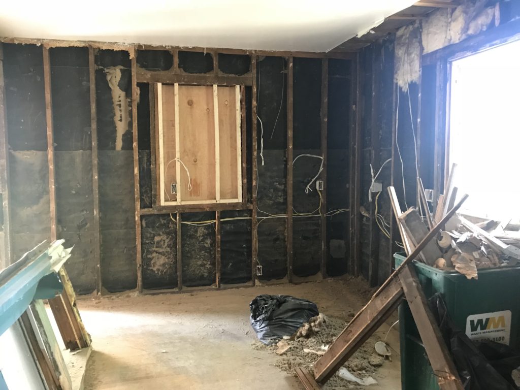
We got the chance to go check out the project during construction, which made the final reveal even more exciting! It was quite the process, since they restored the floors and trim, along with opening up the space and adding the master bathroom and bedroom upstairs.
Here’s what it looked like when we saw it:
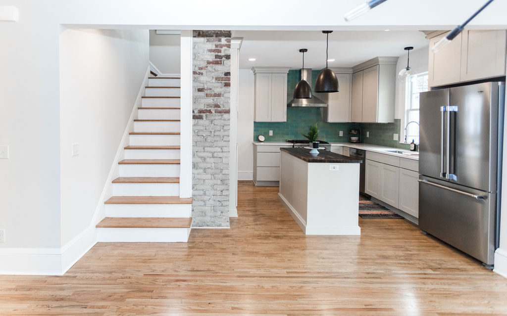
And now for the after…
Kitchen
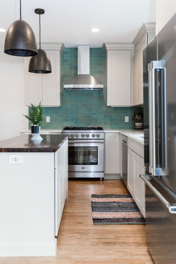
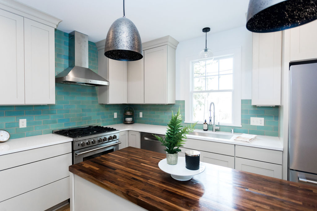
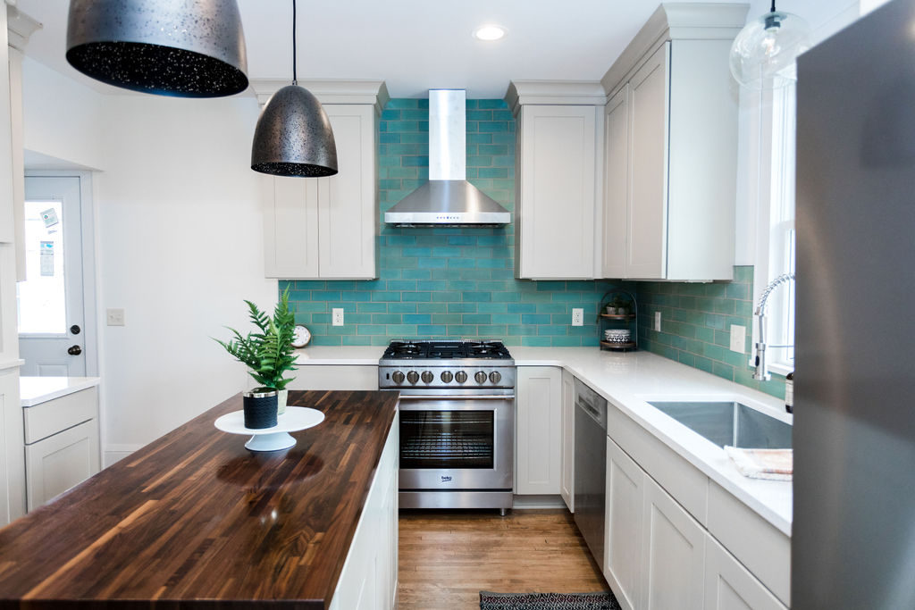
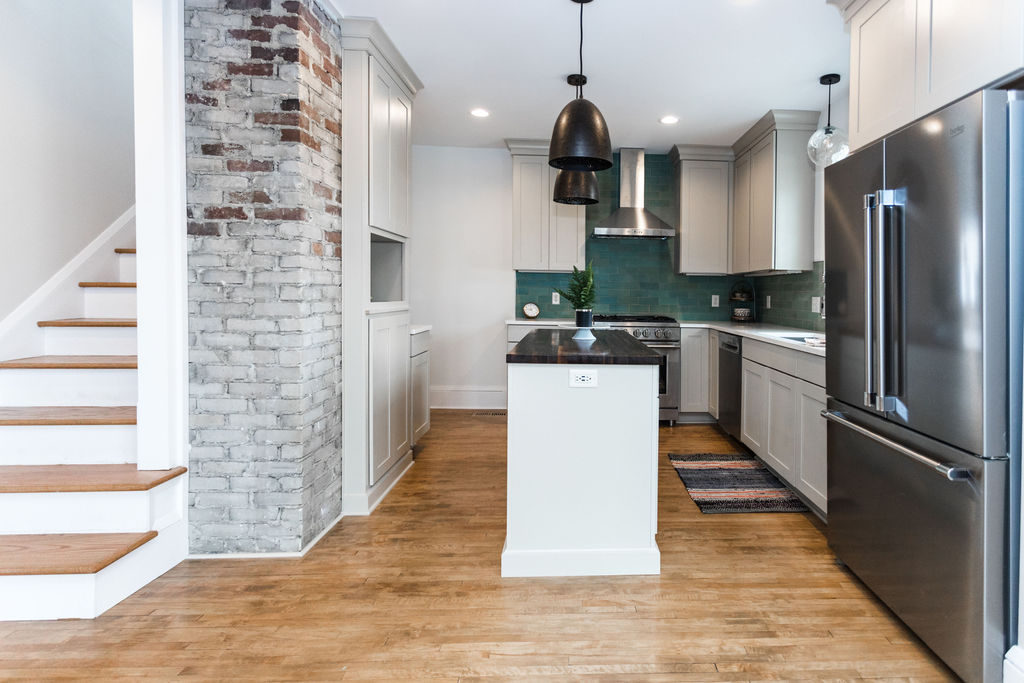
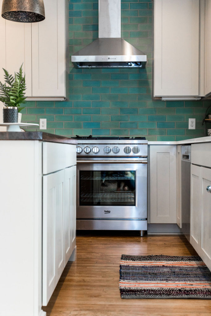
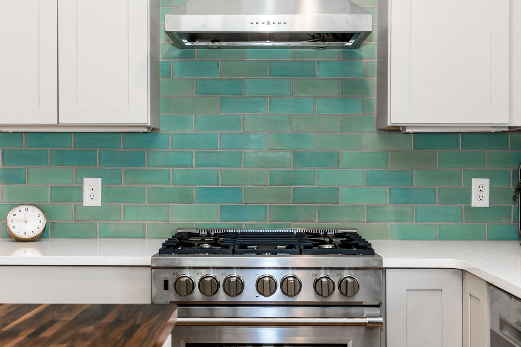
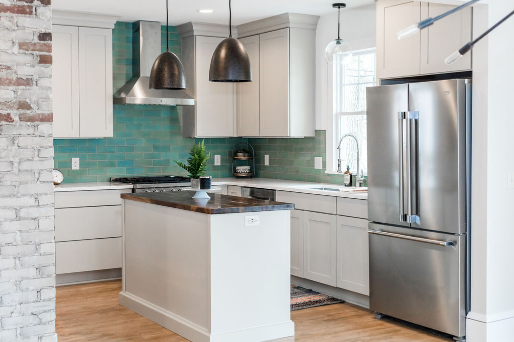
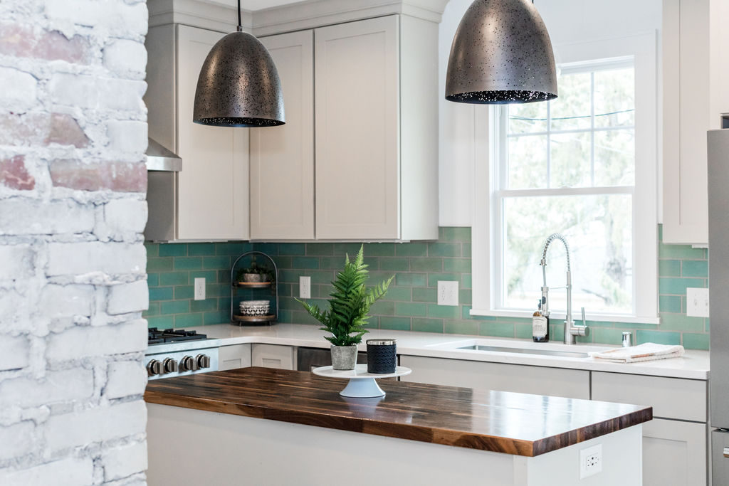
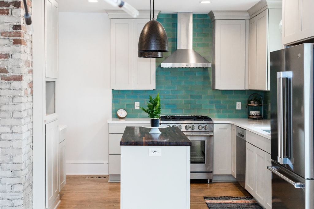
The kitchen is open to the dining room and partially open to the living room, so they wanted this space to tie into the other areas as well. Handmade green and blue subway tile truly makes a statement in this kitchen. Quartz countertops on the perimeter are accented with a butcher block countertop on the island, which ties into the original hardwood floors that were sanded and re-stained. Over the sink, a black glass globe pendant adds an accent and provides task lighting. The stainless sink coordinates with the stainless steel appliances and the industrial faucet offsets the more earthy feel of the tile and wood.
Keeping the brick wall in the kitchen exposes the character of the home and also adds that industrial modern feel to the craftsman style. Neutral cabinets keep the space feeling bright and open, while having them go all the way to the ceiling makes the room feel taller and larger.
Shop This Look
Faucet | Similar Sink | Pendant Light | Hood | Cake Stand | Wood Stand | Gold Clock | Black + White Bowls
Three Sided Fireplace
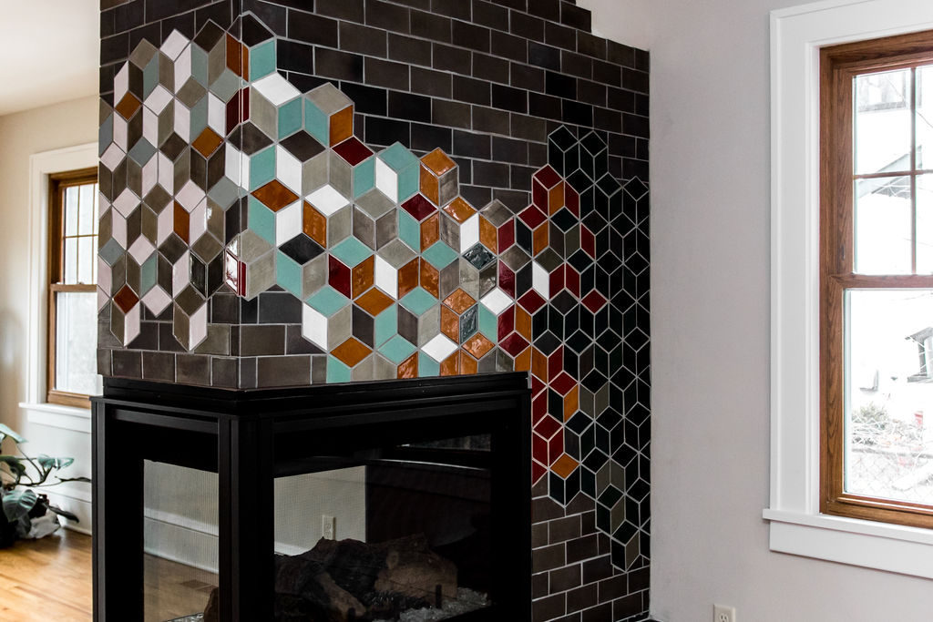
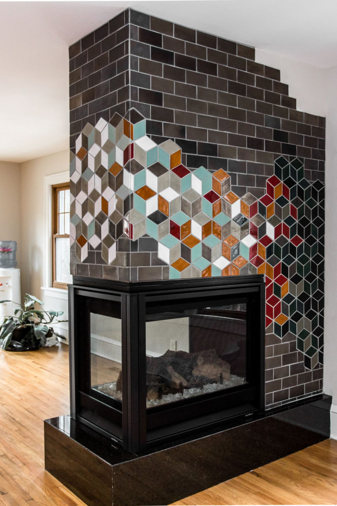
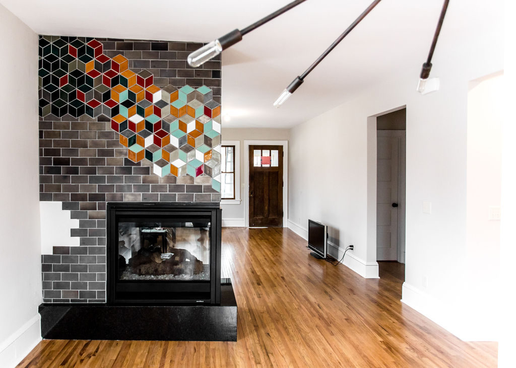
For the fireplace, we worked with the clients and Mercury Mosaics to create a truly one-of-a-kind custom mosaic with beautiful colors that tied into the rest of the home. A combination of subway tile and diamond turned hexagon tiles incorporates the geometric shapes that the clients love. The green blue tile is the same color as the subway tile installed in the kitchen, so it makes the main level feel cohesive and flow together. This fireplace truly is a statement when you walk into the home and having three sides to the fireplace allows for the clients to enjoy it whether they’re in the kitchen, dining room, or living room.
Main Floor Guest Bathroom
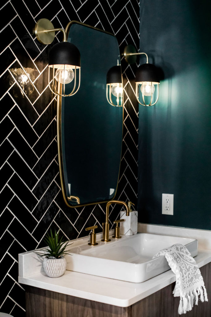
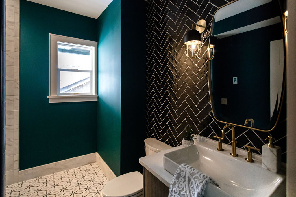
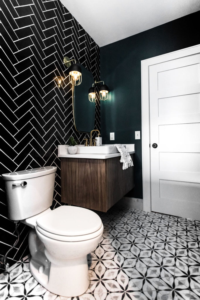
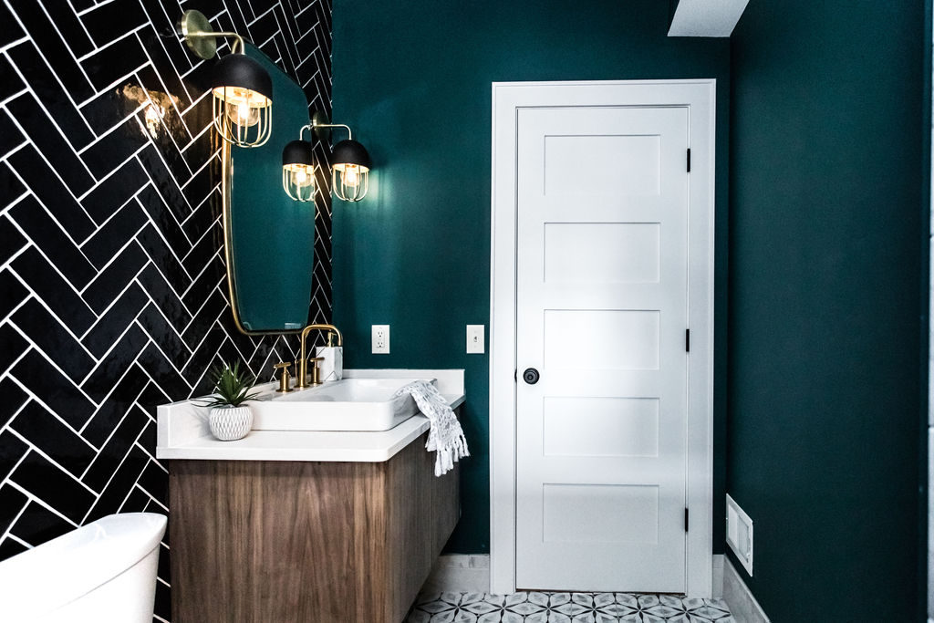
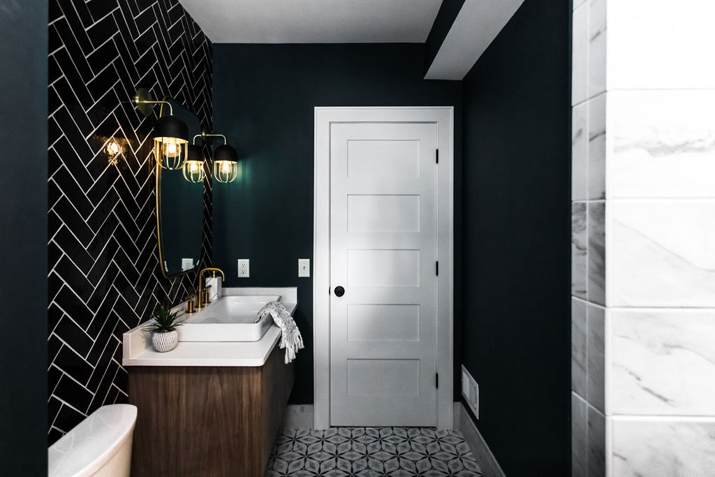
This bathroom is one of our absolute favorites! The main inspiration came from the black herringbone accent wall behind the vanity. We are all about accent walls in the bathroom and this one really makes a statement. A floating Kohler wood vanity makes the space feel more open, especially when paired with white quartz countertops and a white vessel sink. White and black patterned hexagon tile on the floor offsets the darker teal walls to keep the space from feeling too dark, since it’s a smaller bathroom.
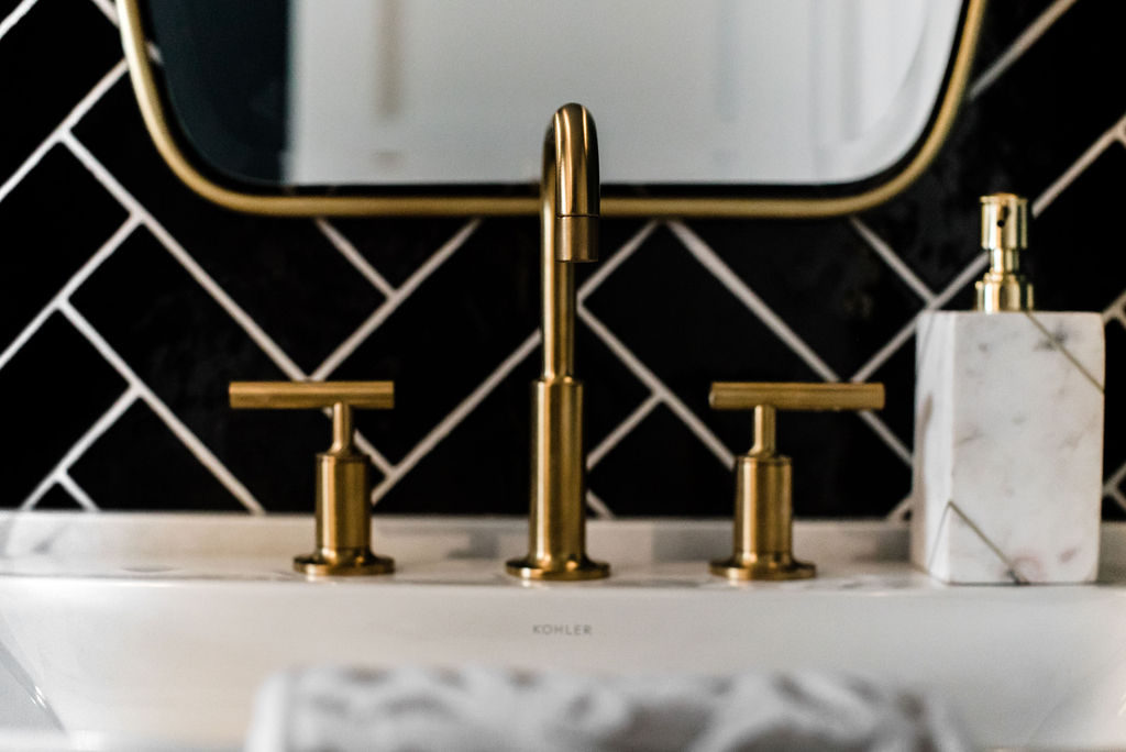
To add some shine and sparkle, a gold mirror, gold and black sconces, and gold fixtures are the perfect addition.
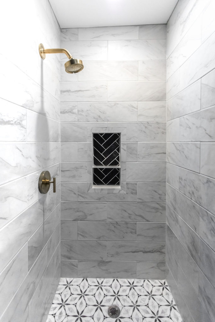
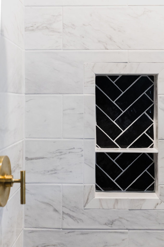
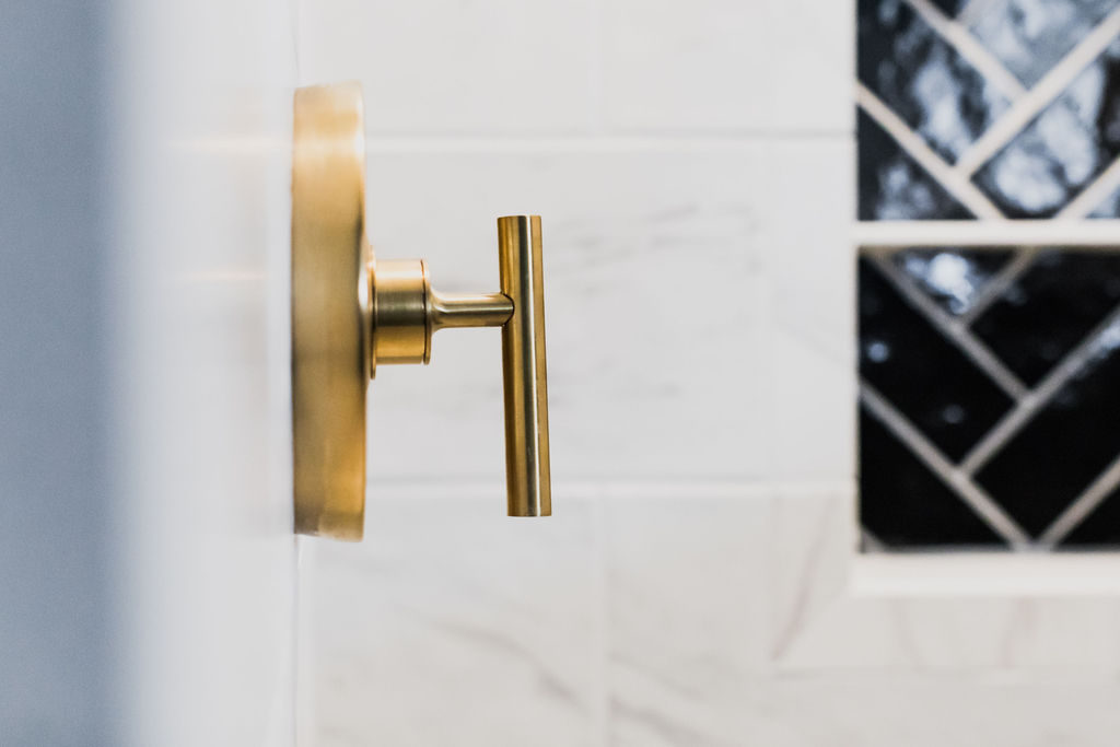
For the shower, our clients wanted a curb-less shower that would work well for aging guests, making it easier to get into the shower. Continuing the pattern hexagon floor makes this possible and using white marble-look porcelain tile for the shower surround gives it a luxurious feel without all of the maintenance. Bringing the black herringbone tile into the shower niche completes the look and keeps the design going throughout the whole space.
Shop This Look
Vanity | Hexagon Tile | Floor Tile | Faucet | Vessel Sink | Shower Faucet | Gold Mirror | Sconces | Towel | Plant
Master Bathroom
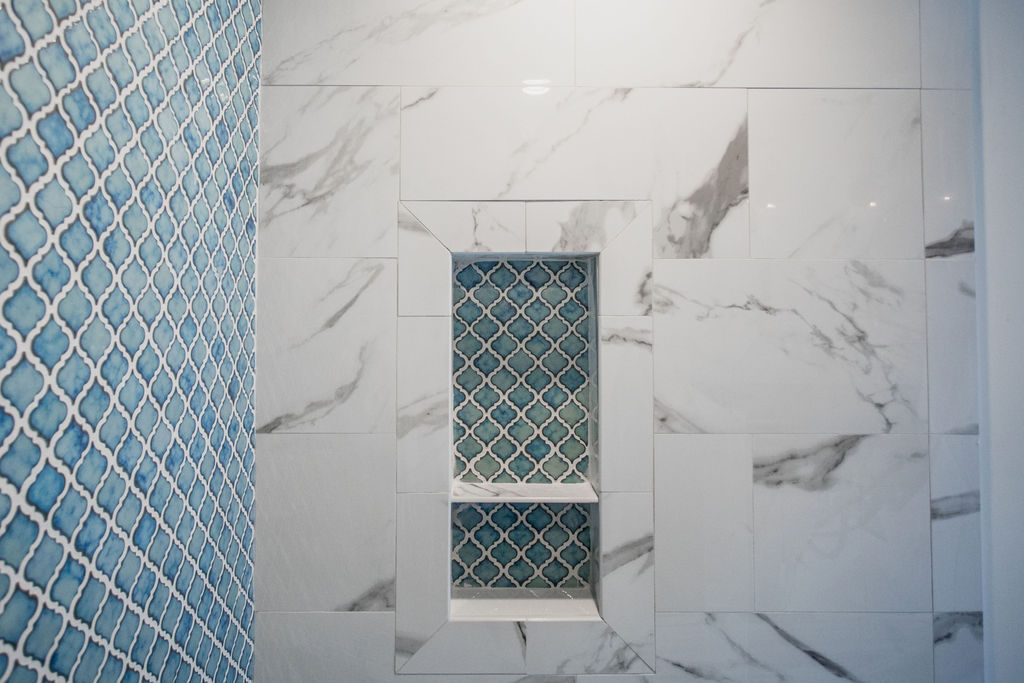
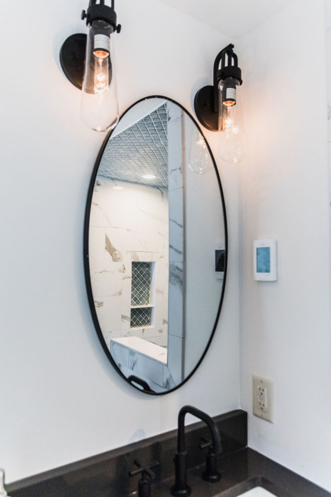
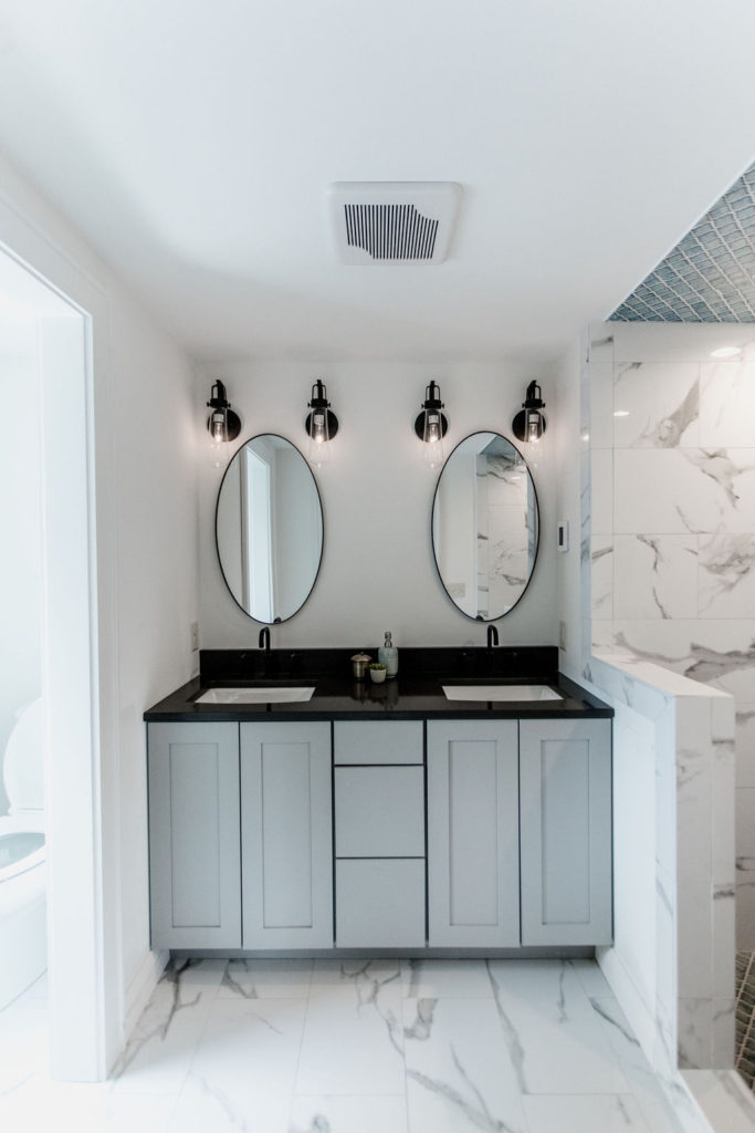
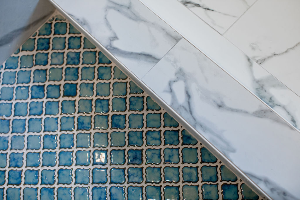
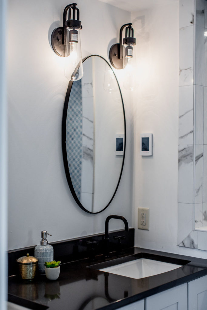
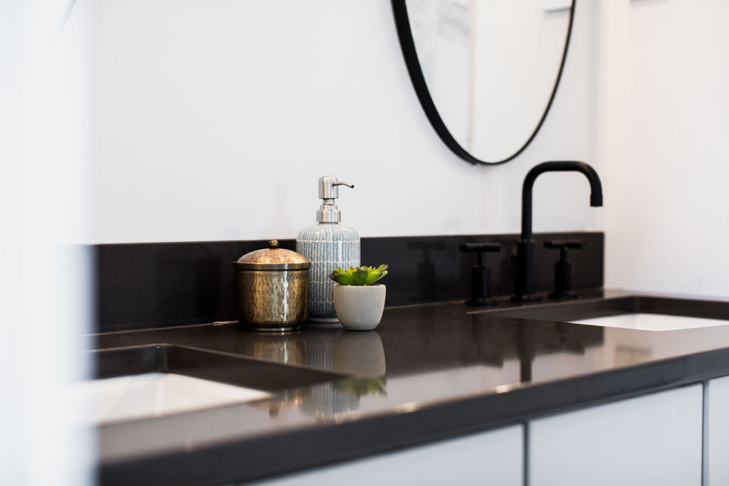
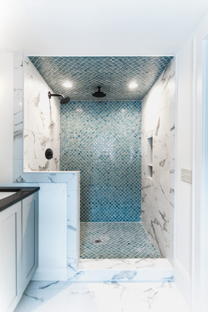
In the master bathroom, our clients wanted another tile accent wall, but this time in the shower. This blue absolique shaped tile creates a statement wall on the back of the shower and niche, while black fixtures add drama. Again, this marble-looking porcelain tile is a great way to add in that luxurious feel without the high price tag or lots of maintenance.
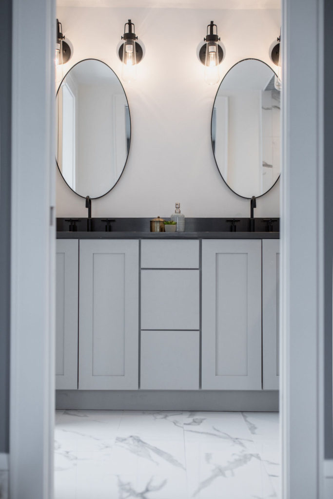
When we were taking photos, the black shower head and the glass door were the last pieces that needed to be added to the space, but the space was already looking so good. Continuing the tile up the ceiling and the floor makes the entire shower truly stand out and become the shining star in the room. Having the toilet in a separate room allows for more privacy and keeps the main bathroom open and clean.
Shop This Look
Sink | Faucet | Rain Head | Shower Head | Blue Accent Tile | Main Floor Tile | Sconces
Disclosure: This post contains affiliate links. Although we get paid a commission from these links, this causes no harm or added costs to you.
Wow this is amazing. This was my husbands home he lived in most of his childhood.
Thank you so much!! Lucky to collaborate with clients with such good taste. 🙂
This is gorgeous!!