We are starting construction on a new project and want to bring you along as we update the space! Let’s rewind and start with the before, walk through the designs, and chat about the plan for this main level refresh.
Our clients love the location of their home, and after living in the space for several years, they are ready to make it their own. They initially reached out wanting to refresh their kitchen and main level in a way that kept the oak cabinets but updated it to a more modern and fresh look. After going through the design process, they decided it was worth it to go all the way and get new cabinets, which will be a beautiful transformation for this home.
Before
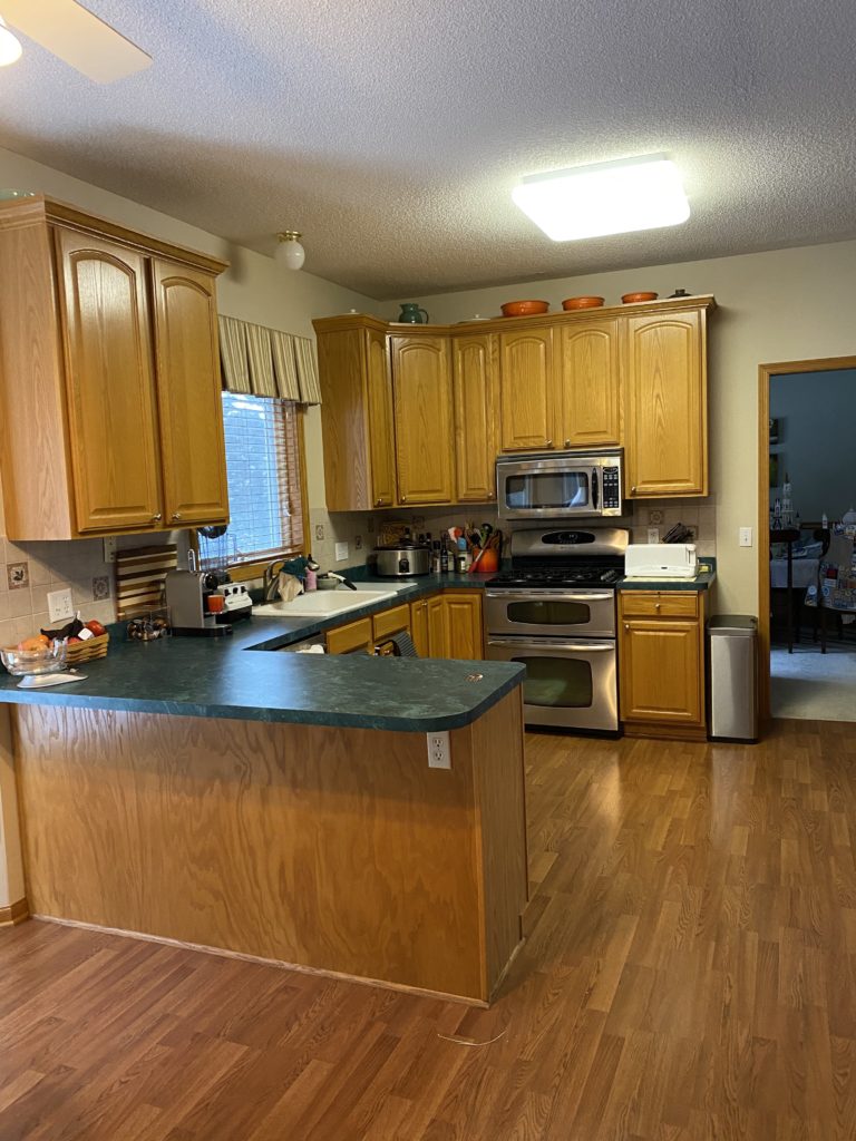
The current kitchen has a U-shape layout that works well for this family, with the ability to look out to their eat-in kitchen and living room. With the current cabinets, though, there is a lack of storage and large countertop space that the new layout addresses.
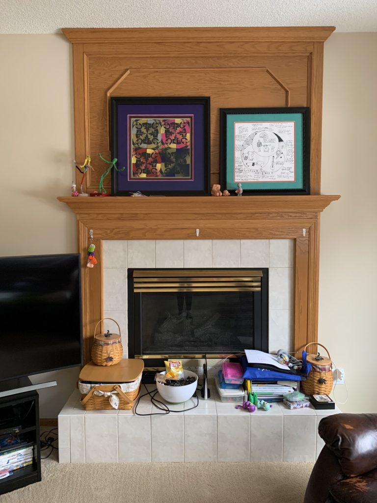
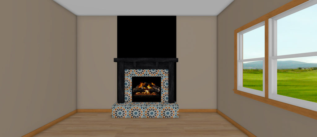
The living room is where our clients spend a lot of time hanging out and playing games and also home to this fireplace that goes to the ceiling. It’s a great focal point in the room but in need of an update. The plan for this fireplace is to paint the wood surround black for a more dramatic feel and install a new pattern tile for a bold look. We also plan to update the insert by using heat resistant black paint where there’s currently brass.
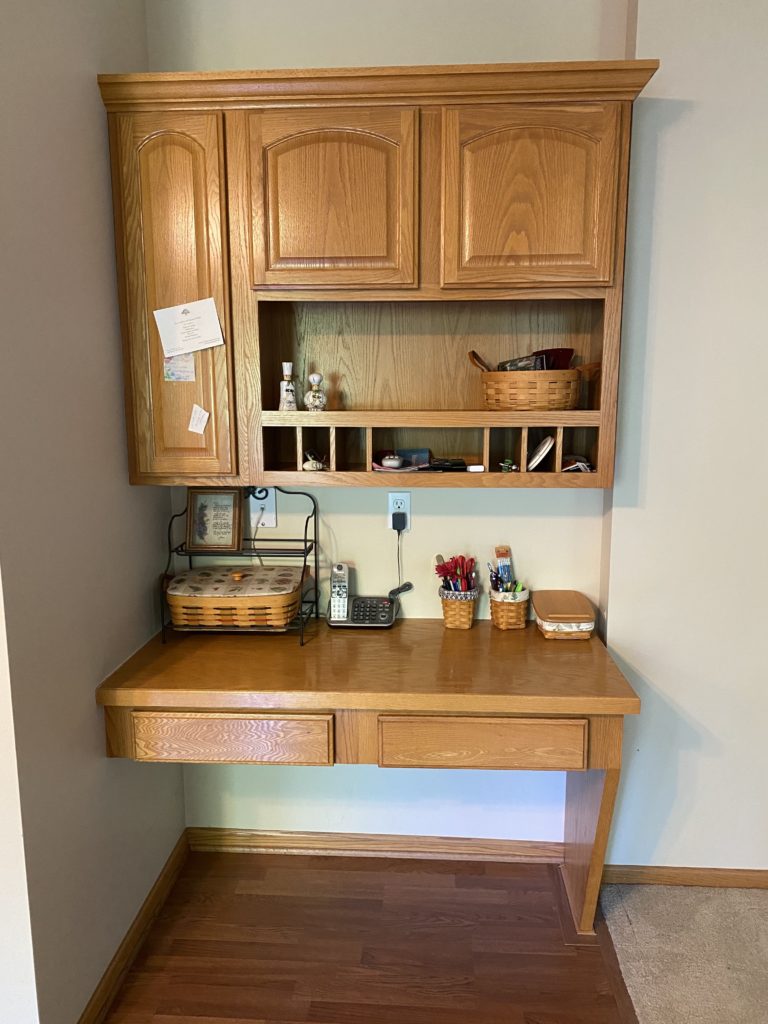
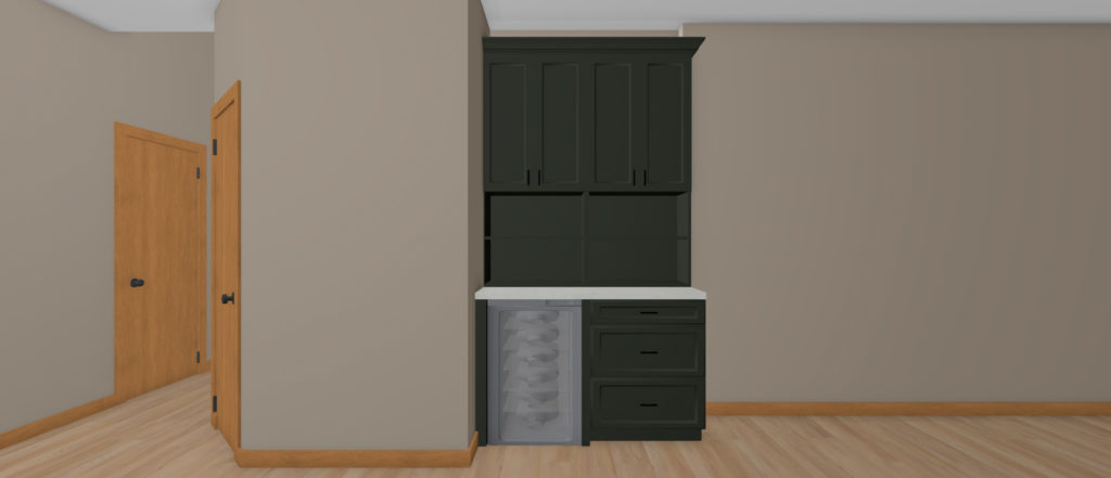
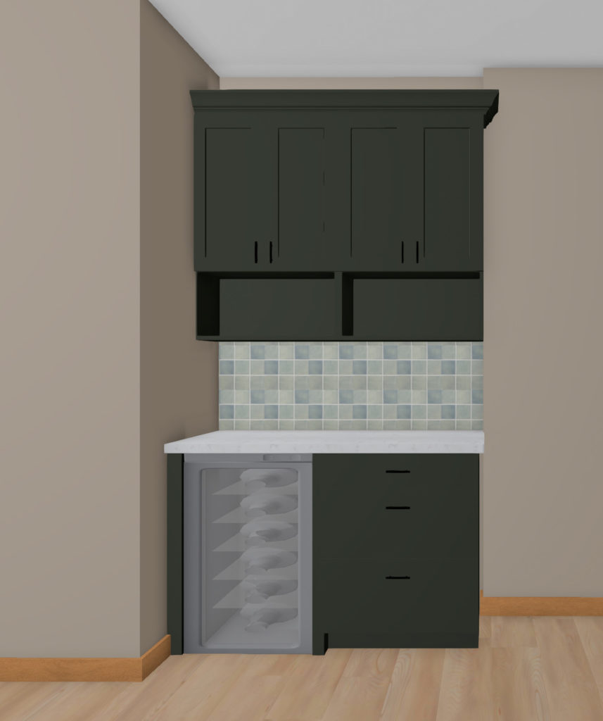
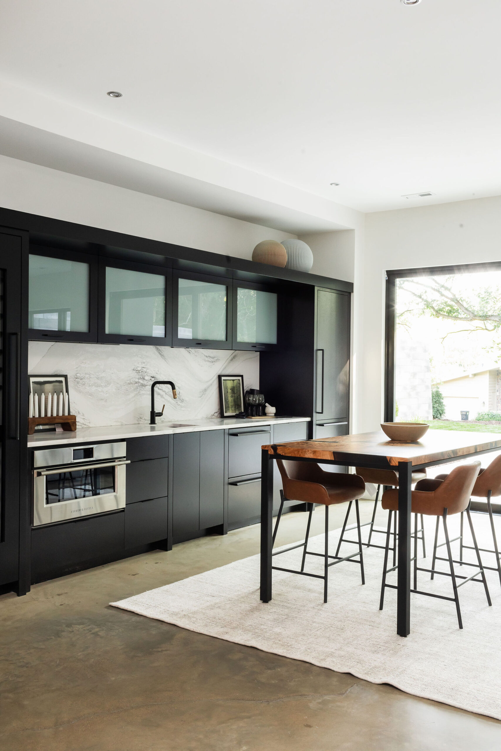
This desk area is located to the right of the walk-in pantry and a space that is lacking functionality. Since it’s not very practical for this family, we are taking it out and replacing it with more of a beverage center hutch. The new design will include an under-counter fridge, lower cabinet with drawers for storage, and uppers with open storage for displaying cookbooks and other items.
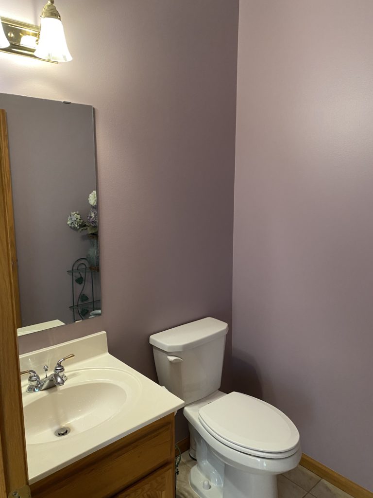
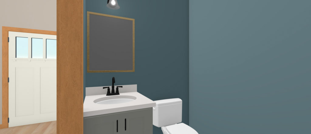
In addition to the kitchen, we will also give this powder bath a refresh with new vanity, floor, paint, lighting, and mirror.
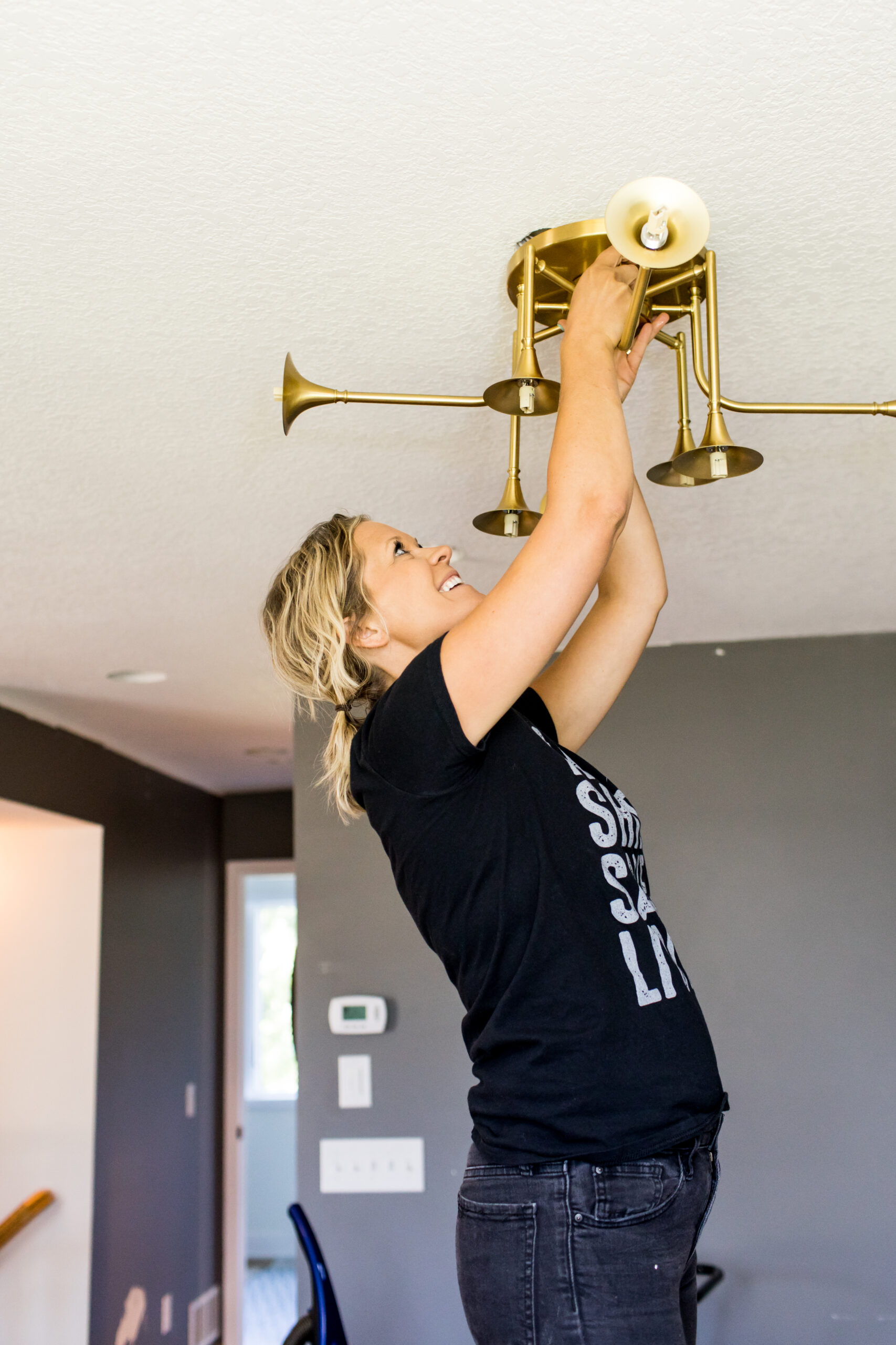
In the kitchen and the rest of the main level, the popcorn ceilings are going away and replaced with knockdown texture. To create a consistent feel on the main floor of the home, the mix of laminate, carpet, and tile is coming out, and engineered flooring will be installed throughout the whole level. New lighting and paint will also update the space to give it a fresh feel.
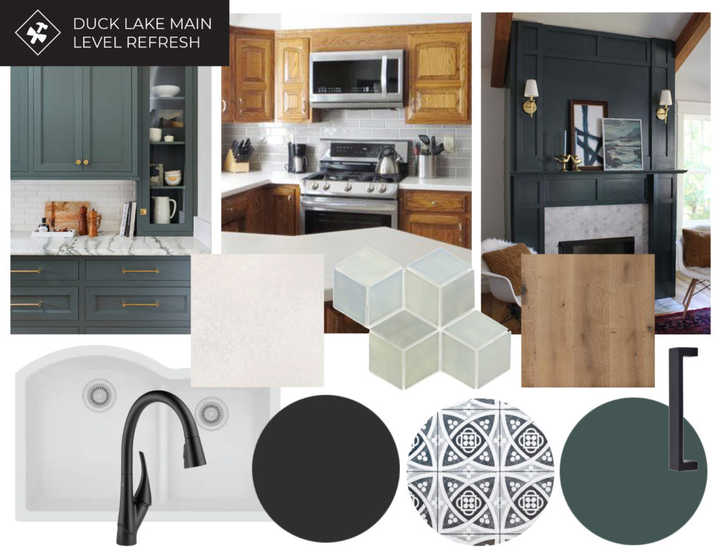
Mood Board
The inspiration for this project included green cabinetry, natural wood flooring, handmade tile with variations of blues and greens, and black accents. Like we mentioned at the beginning of the post, the original intent was to keep the oak cabinets and incorporate the deep green in the hutch area and give the kitchen a refresh with countertops and backsplash.
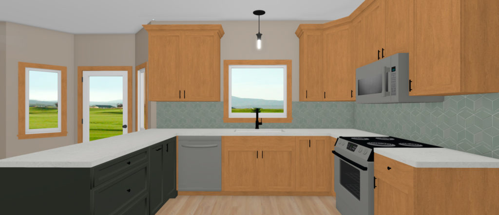
Renderings Round 1
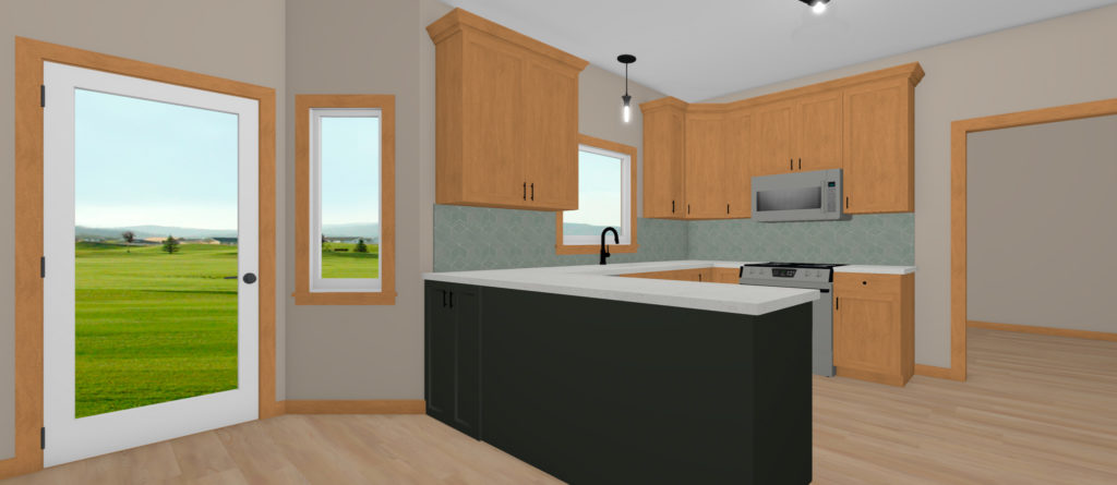
During the first round of renderings, the oak cabinets were kept in their original layout and only the peninsula was new. The current peninsula cabinets are only 18″ deep, rather than the standard 24″, so the space could be used more optimally. In this initial round, the cabinets got new hardware, lighting was updated, the hutch and peninsula were new, and countertops and cabinets were updated.
This first plan also had more open storage below the upper cabinets for cookbooks, but later updated since we recommended continuing the backsplash into this area as well to tie into the kitchen.
Renderings Round 2
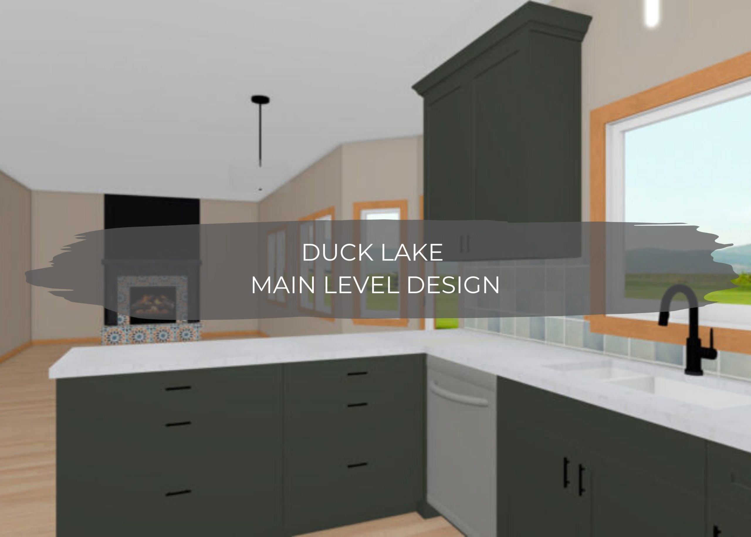
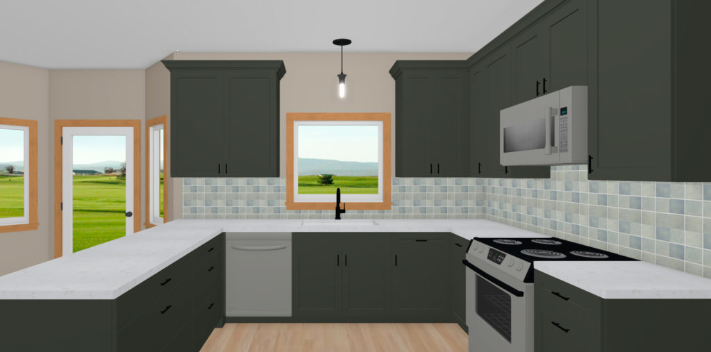
After discussing the initial plan and renderings and cost of all new cabinets, our clients decided it was worth it. Since this is a larger refresh, most of the main level will be updated, and they wanted the cabinets to reflect that change as well. After seeing the renderings with all-new deep green cabinets, our clients were in LOVE and knew they needed to go for it. All new cabinets also allowed us to rework some of the trouble spots with the current layout. When moving appliances and plumbing around in a kitchen design, the costs can quickly add up, so we are keeping the appliances and sink in the same location.
Cabinets painted in Pewter Green paint provide a beautiful base for the rest of the kitchen, while Cambria quartz countertops lighten up the space. For a black accent, the sink and hardware will both be in a matte black finish.
The new hutch design includes the same Mercury Mosaics 3×3″ Blue Opal square subway tile, which ties the two spaces together. This will become a beverage center with an under counter fridge, lower cabinet with three drawers, and open storage above for cookbooks.
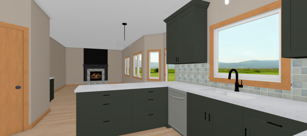
The new peninsula will have standard 24″ depth cabinets, providing 6″ more storage and countertop space. Also, two larger cabinets with three drawers provide more functional storage and lengthen the peninsula, which gives a longer stretch of countertop space, perfect for entertaining. Since there is an eat-in kitchen between the kitchen and living room, our clients are opting to go without stools to keep their table, which is often used for games and get-togethers.
The powder bath off the kitchen will have the same flooring but will be painted in a pretty blue-gray. This bath will have new vanity, faucet, mirror, and lighting as well.
The fireplace is getting a major facelift with the surround painted Tricorn Black by Sherwin Williams and new surround and hearth tile. Our clients love the look of pattern tile, and this design from Zia Tile was their absolute favorite, and we can’t wait to see it in the space!
Stay tuned for updates to come on this project as we start construction and get to work!
One thought on “Duck Lake Main Level Design”
Comments are closed.