Disclosure: This post was sponsored by Wayfair. Although we were compensated to write this post, all opinions and content are our own, and we stand behind and use all brands and products we endorse on our site.
Being we’re cozied up at home, we are getting all of the spring cleaning, organizing, and refreshing done now! One space that has been on our to-do list for quite some time is our front entryway.
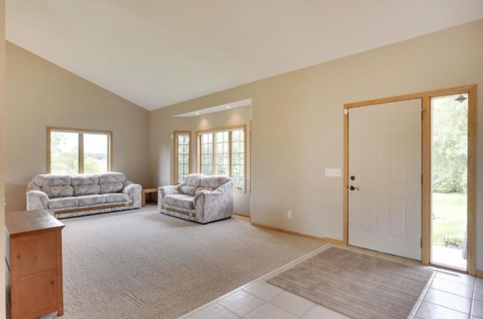
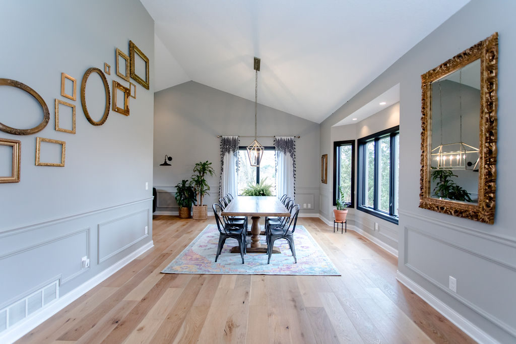
When we bought our home the front entry had its own sense of separation and sort of space. But then one of the first projects we did to the home was convert this living room space into our dining room space. Which then created an entryway that flowed right into the dining room and didn’t quite feel like its own space.
Before
After Initial Remodel
After the initial remodel, I knew the entryway needed something a bit more but wasn’t sure what that was. We initially hung an oversized macrame where the mirror is, off to the right. And then I decided a mirror would make more sense for coming and leaving a home. I always like to make sure nothing is on my face or in my teeth anyway. So we shopped our house and took this mirror out of Beckam’s room and brought it down to the living room. But then I was missing it in Beckam’s room, so we eventually brought it back to his space.
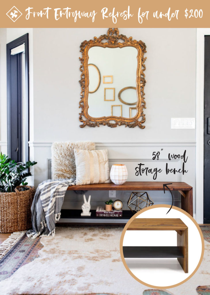
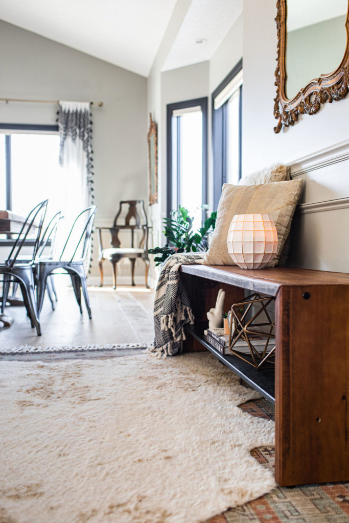
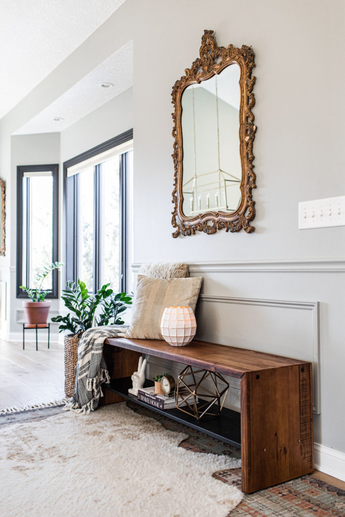
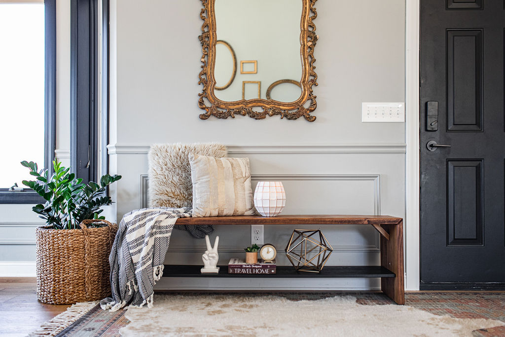
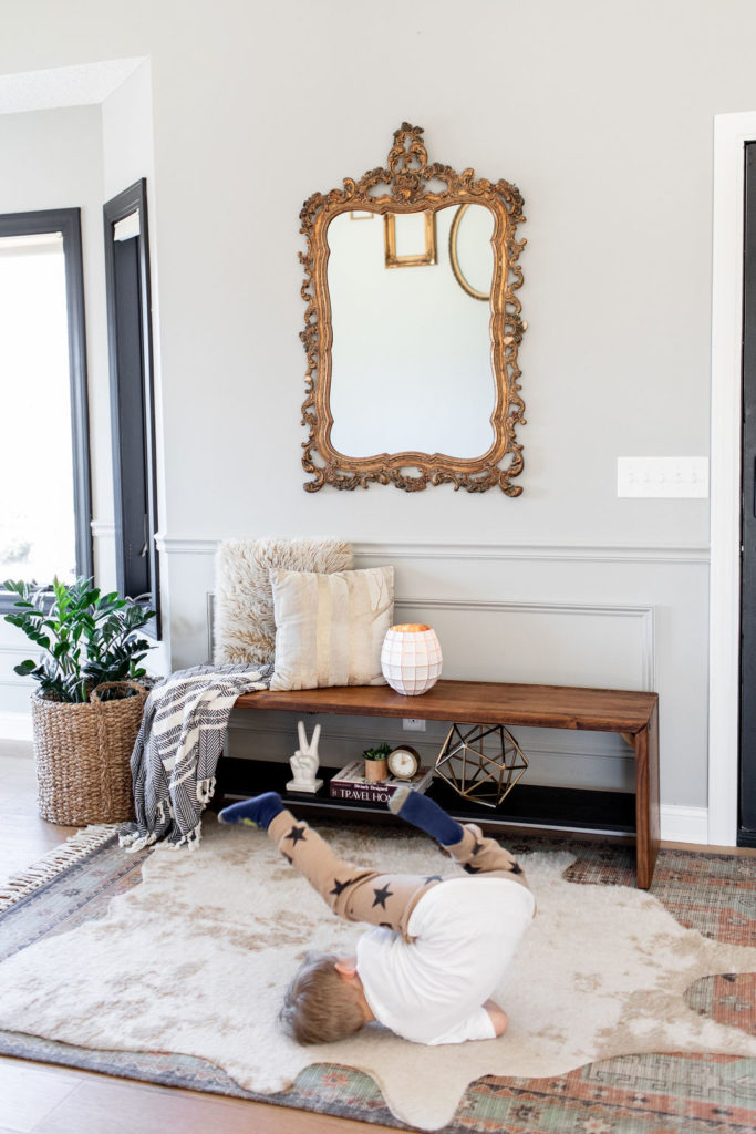
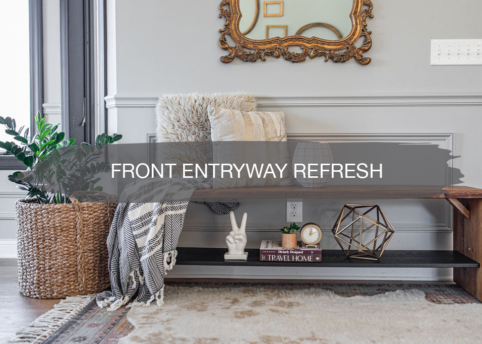
After Entryway Refresh
We kept going back and forth on if we wanted a couch, a couple of chairs, bench…and then what finish…wood, velvet, dark, light…so many options for what you would think is such a simple space.
When uncertain about what elements you want to bring to a certain area of your home, I always like to “soft” test it out with whatever you currently have that is closet. So we moved a couple of velvet chairs into this area and tested it out for a couple of weeks. But it just didn’t seem right. I felt there were already enough chairs in this space with the dining room table and 10 chairs around it. I also watched our guests come and go and most times they had stuff in their hands and while they were putting theirs or their kids’ shoes on and getting them out the door they had nowhere to put it but on the floor. So that made our decision, we were on the hunt for a bench!
But then after searching through all of the furniture options on Wayfair, I couldn’t decide if we wanted wood or fabric. I was initially leaning more towards fabric until I saw this wood storage bench off of Wayfair. I loved the idea of having either a storage shelf or a shelf used for styling! I thought how cute for in the winter, we could have baskets underneath with the boys’ hats and mittens and then in the summer, some fun decor.
I also loved that this bench was on sale!
I measured the wall and 58″ was the perfect size for this space, so I knew it was meant to be. I got the bench ordered, was delivered within a week and I was able to DIY and assemble it in under 10 minutes. And you don’t even need any fancy tools to put it together.
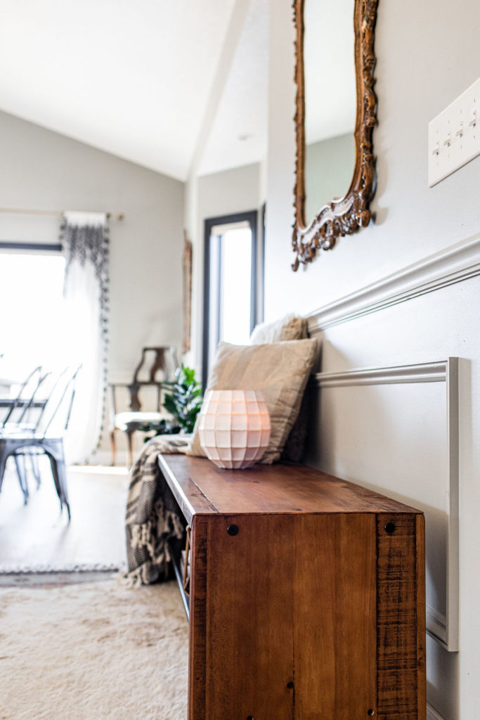
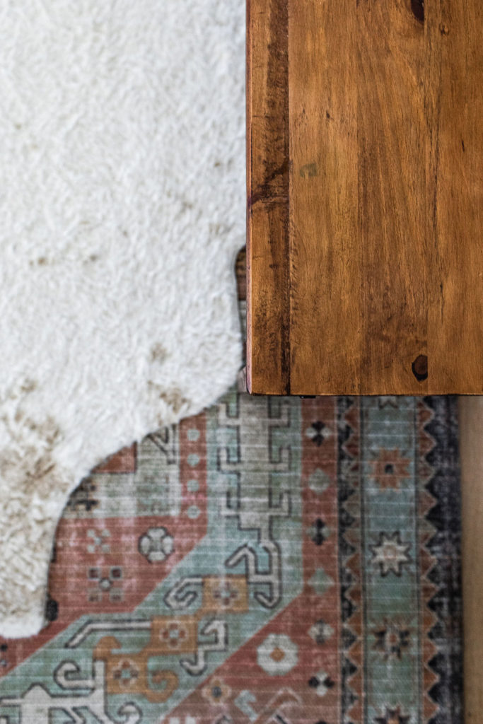
I also loved the amber color of the wood and within the grains. Brazilian pinewood they call it with a natural finish. Looks even better in real life than online. And the combination with the lower black shelf was perfect with our color scheme within our home. We have wood floors, black window millwork and front door. The perfect bench to bring all of our design elements together within our home.
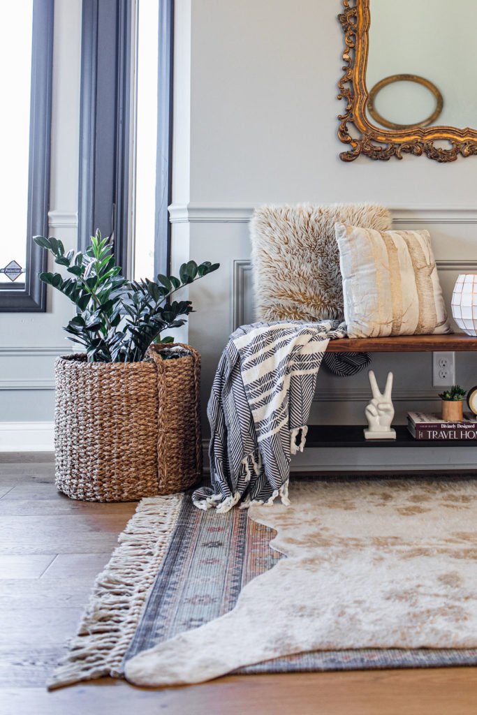
Once we had the bench, we went back to shopping our own home. Took the vintage mirror we were no longer using in our living room, pillows that were in storage, blanket that was buried in a basket, and a few pieces of decor and books that we had sprinkled around the house.
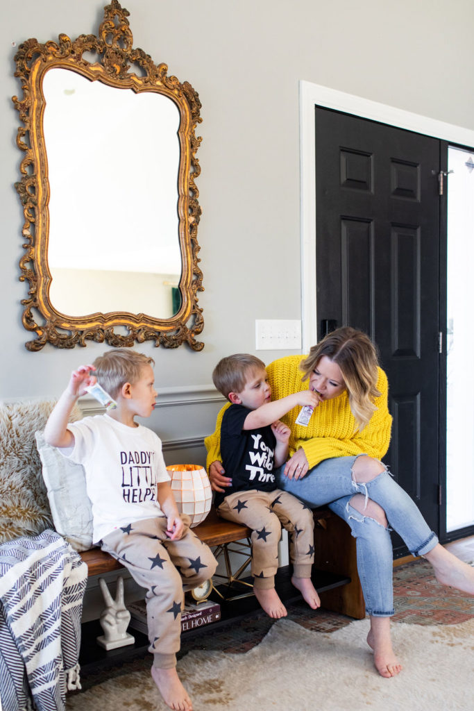
And of course anything new in our home, it immediately becomes our boys’ favorite place to hang out. Even if that is as simple as the front entryway. It’s where they like to roll around and play, watch their devices, or have some snacks.
We’re so happy with how it turned out! Such a simple update that cost us less than $200 to do.

