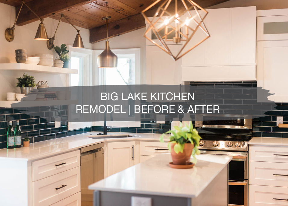
This week, we wrapped up a kitchen remodel in Big Lake and we love this one! These were repeat clients for us and such a joy to work with so we were extremely thankful that they hired us again to come into their kitchen.
Our clients also have an amazing view since they are right on the lake. As we’ve been working on this space, it’s been so fun to see the lake transform through the seasons and it’s beautiful each and every day! Hopefully they have more projects again soon.
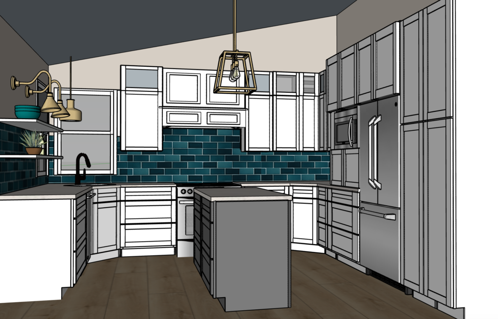
Before we get to the before and after, let’s rewind to the designs of this kitchen…
Designs
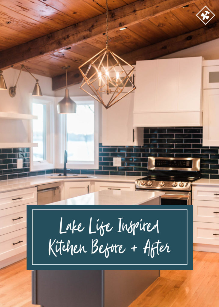
The design of this kitchen was inspired by the blue tones of the lake, along with white cabinetry to keep the space light and bright. Gold accents through lighting and black elements throughout the space were also part of the design. You can read about the designs behind this space, plus see all of the renderings HERE.
Before & After
And now, it’s time for the before and after of this brand new kitchen! It looks like a completely different space and we’re excited to share these photos with you.
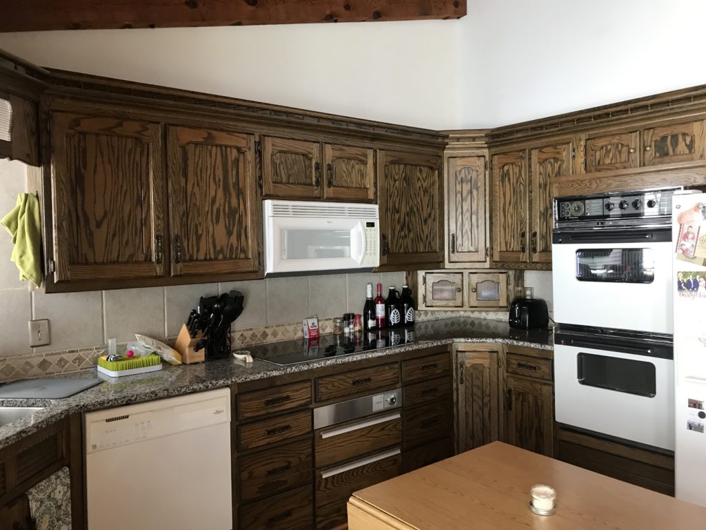
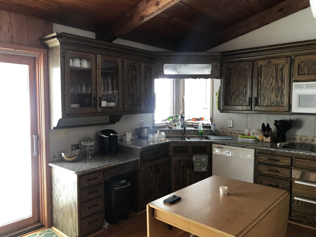
Before
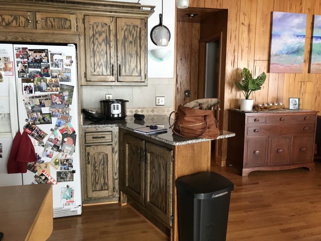
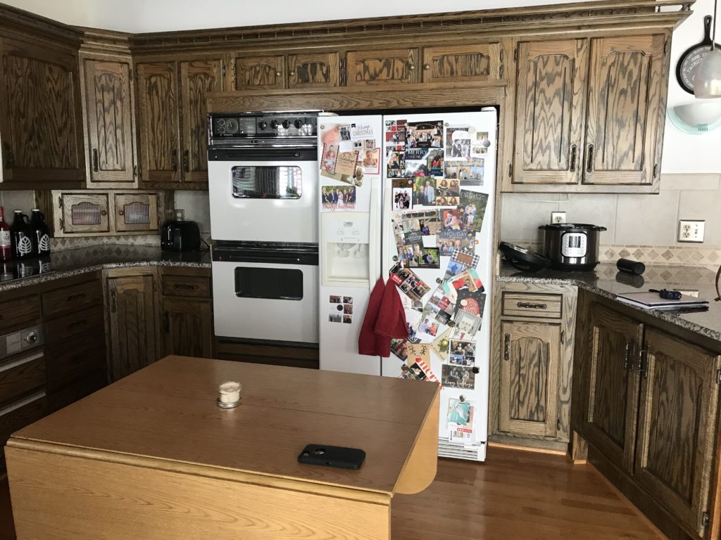
This kitchen felt dated with the dark wood cabinetry and older appliances. They wanted to make the layout more functional for their family and add an island.
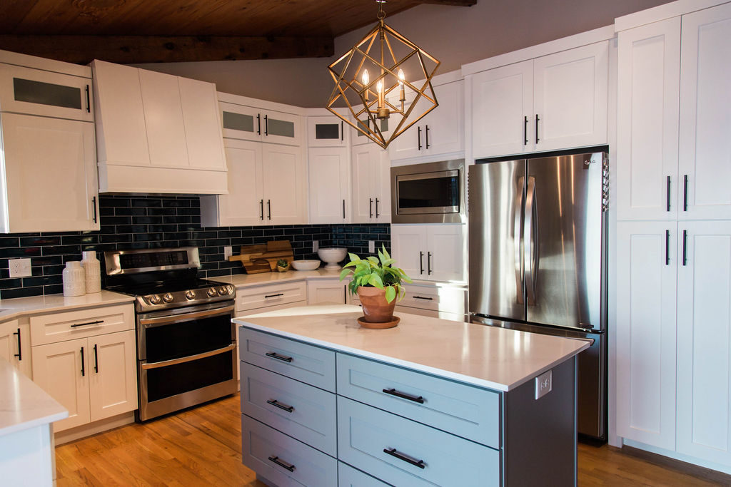
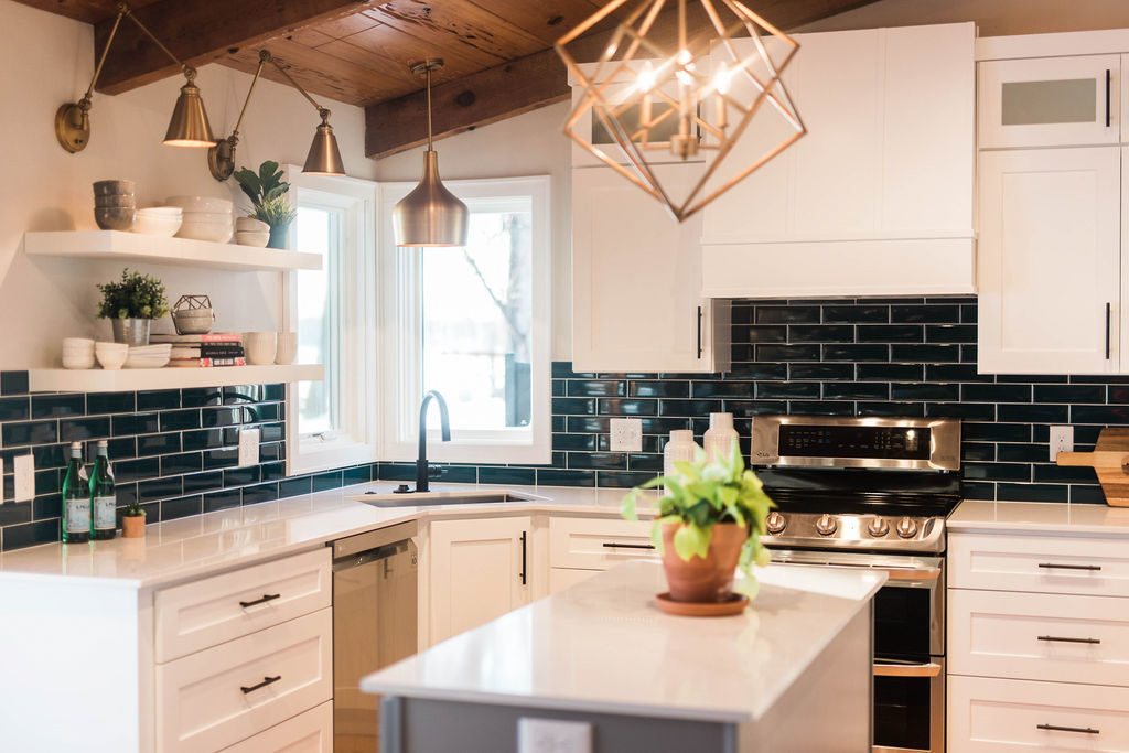
After
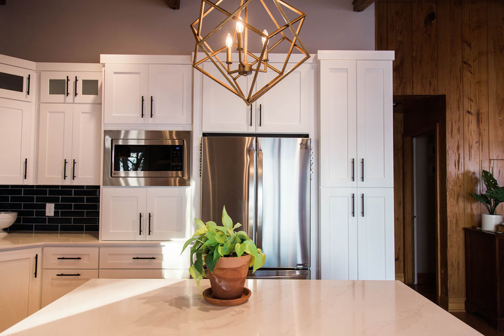
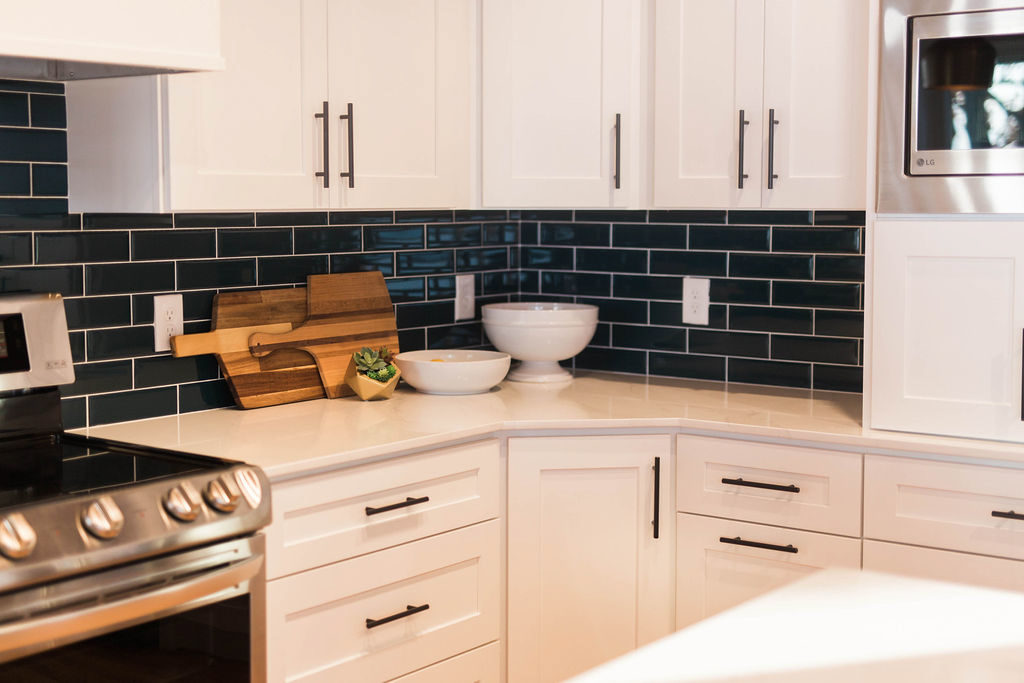
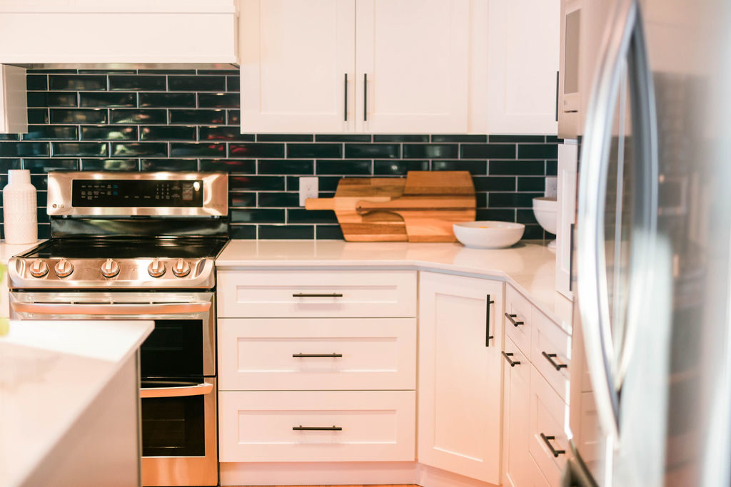
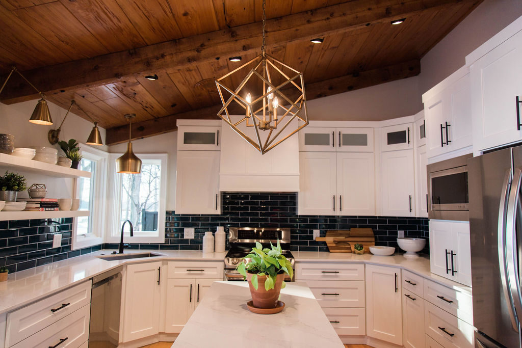
The room feels so much brighter, taller, and more open with white cabinetry, quartz countertops, and fun blue subway tile. New stainless steel appliances also modernize the space. The island provides storage for kitchen items and allows for more countertop prep space. Moving the microwave away from over the stove to by the fridge makes it possible to have a beautiful hood. A cabinet under the microwave makes space to hide away countertop appliances.
Before
Although our clients love the wood in the rest of the home, the kitchen cabinets did not coordinate well with the other wood tones. The peninsula in the old kitchen was not doing much for our clients and got in the way of the overall layout of the space.
After
Now, this side of the kitchen has a clear walkway and having all the tall appliances and cabinetry together keeps the rest of the room open.
Before
Because of the dark wood on the ceiling and dark cabinets, the space didn’t get much light, even with the patio door and windows to the lake. Our clients wanted to capitalize on the view and make the wall with the patio door a statement.
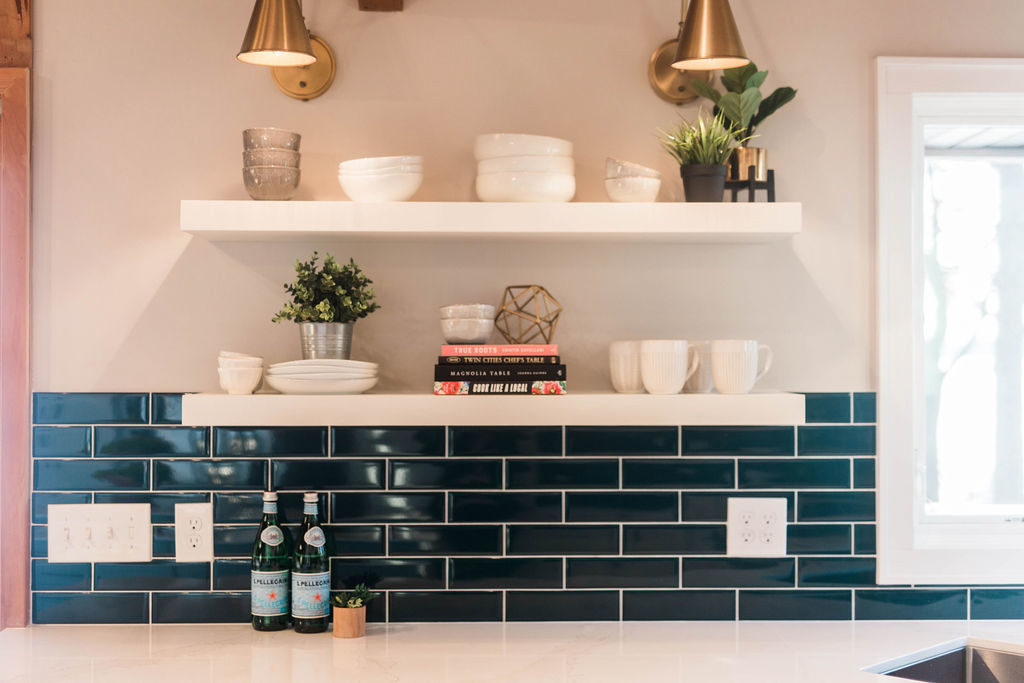
After
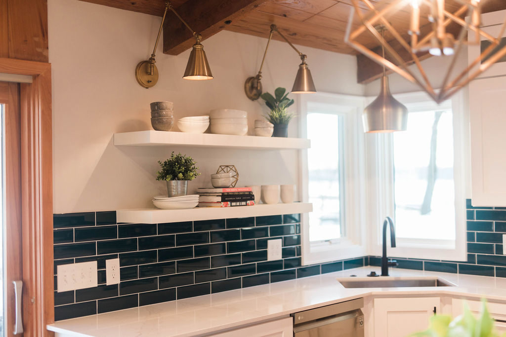
And boy does this wall make a statement! The blue subway tile, floating shelves, and new gold lighting brightened up this side of the room and makes for a great view when looking out to the lake.
We love floating shelves because they provide practical storage for everyday items in your kitchen and also allow for a spot to display cookbooks, plants, and other fun accessories.
Into the Details
The blue tile backsplash was inspired by the blues of the lake and we love how it brings in a pop of color to this kitchen. White cabinetry on the perimeter is contrasted by the gray island cabinetry and ties into the colors in Silestone’s Et Calacatta Gold quartz countertops.
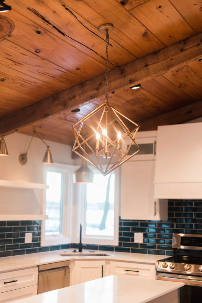
For the lighting in this space, our clients were wanting to bring in some warmer tones with gold accents. The sconces over shelves provide both task and ambient lighting. Over the sink, this gold pendant brings additional light to the area.
With the island light, we went through a couple of different options because of needing to make it work with the sloped ceiling and landed on this beautiful lantern chandelier.
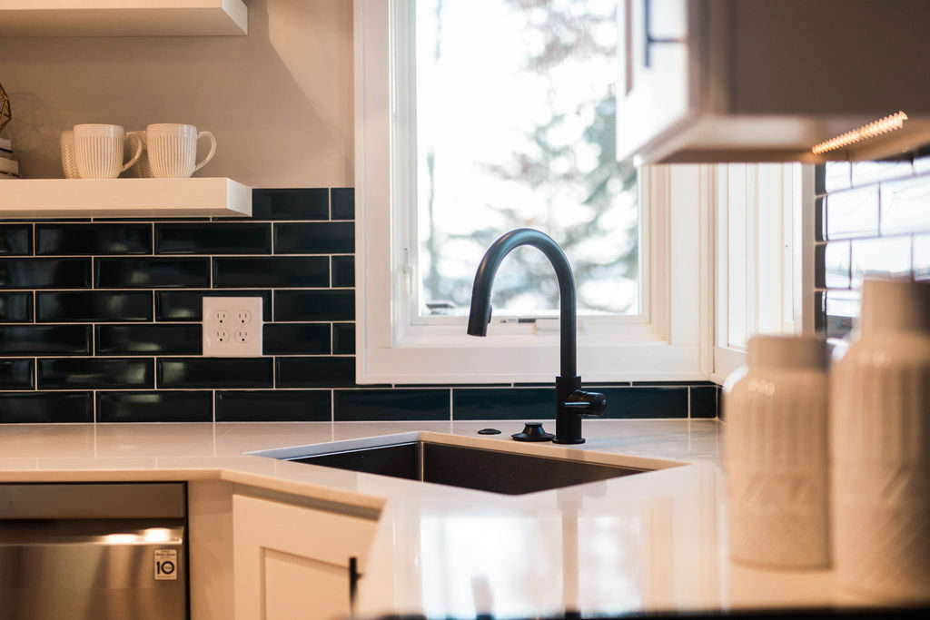
A stainless kitchen sink with Delta’s Trinsic matte black faucet makes this area of the kitchen much more functional and makes dishwashing even more fun when you can look out to the lake.
Shop This Post
blue tile backsplash | kitchen sink | faucet | island light | dining table light | countertops | cabinetry | appliances | sconces over shelves | pendant over sink | hardware

Thanks Bruce! No, unfortunately. They already came pre-painted. 🙂
Did we paint the cabinets? Love the lighting.
Did we paint the cabinets?