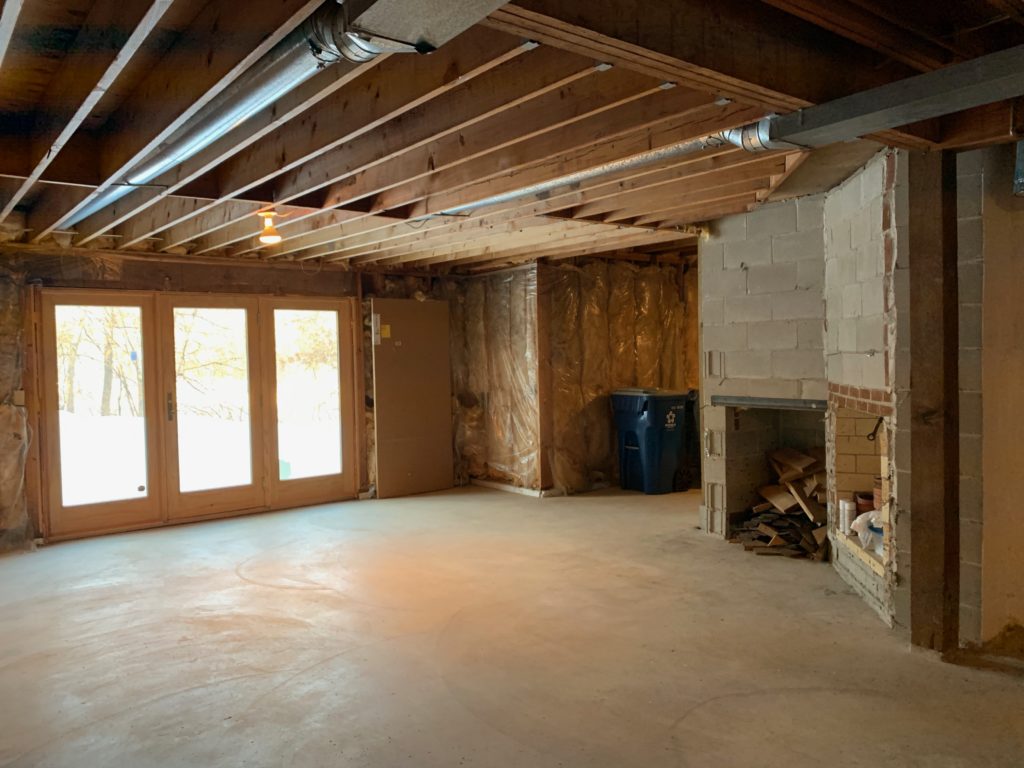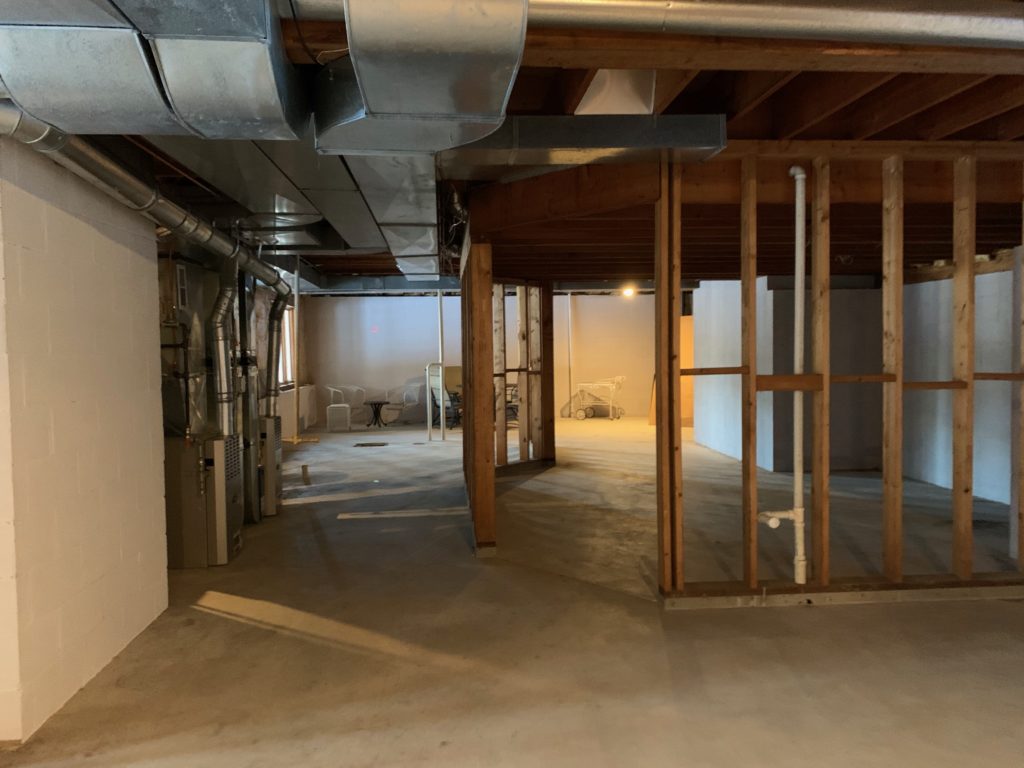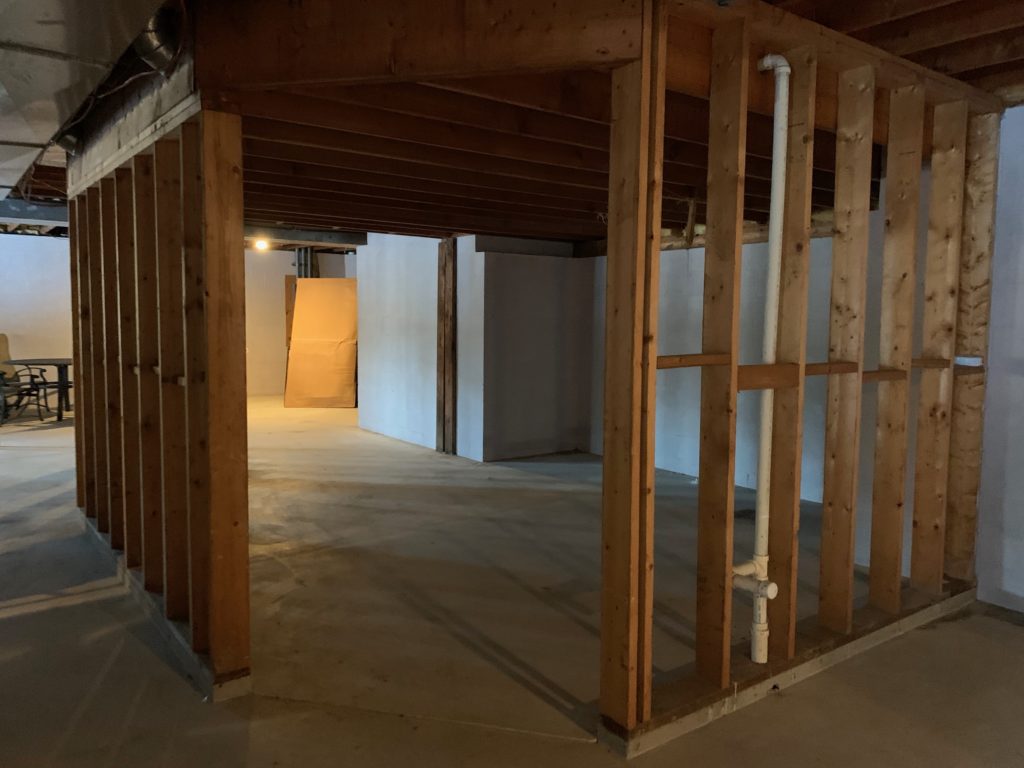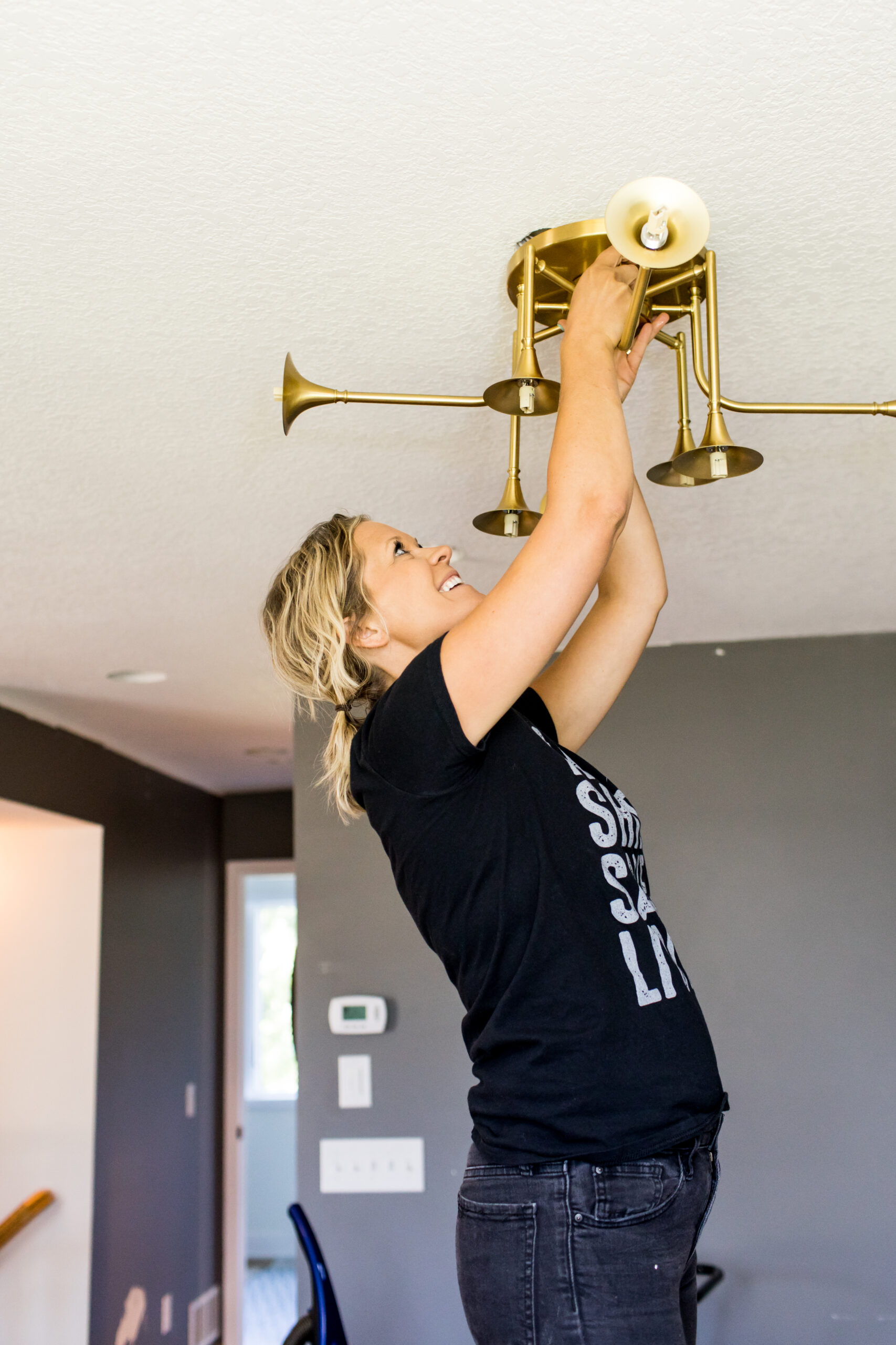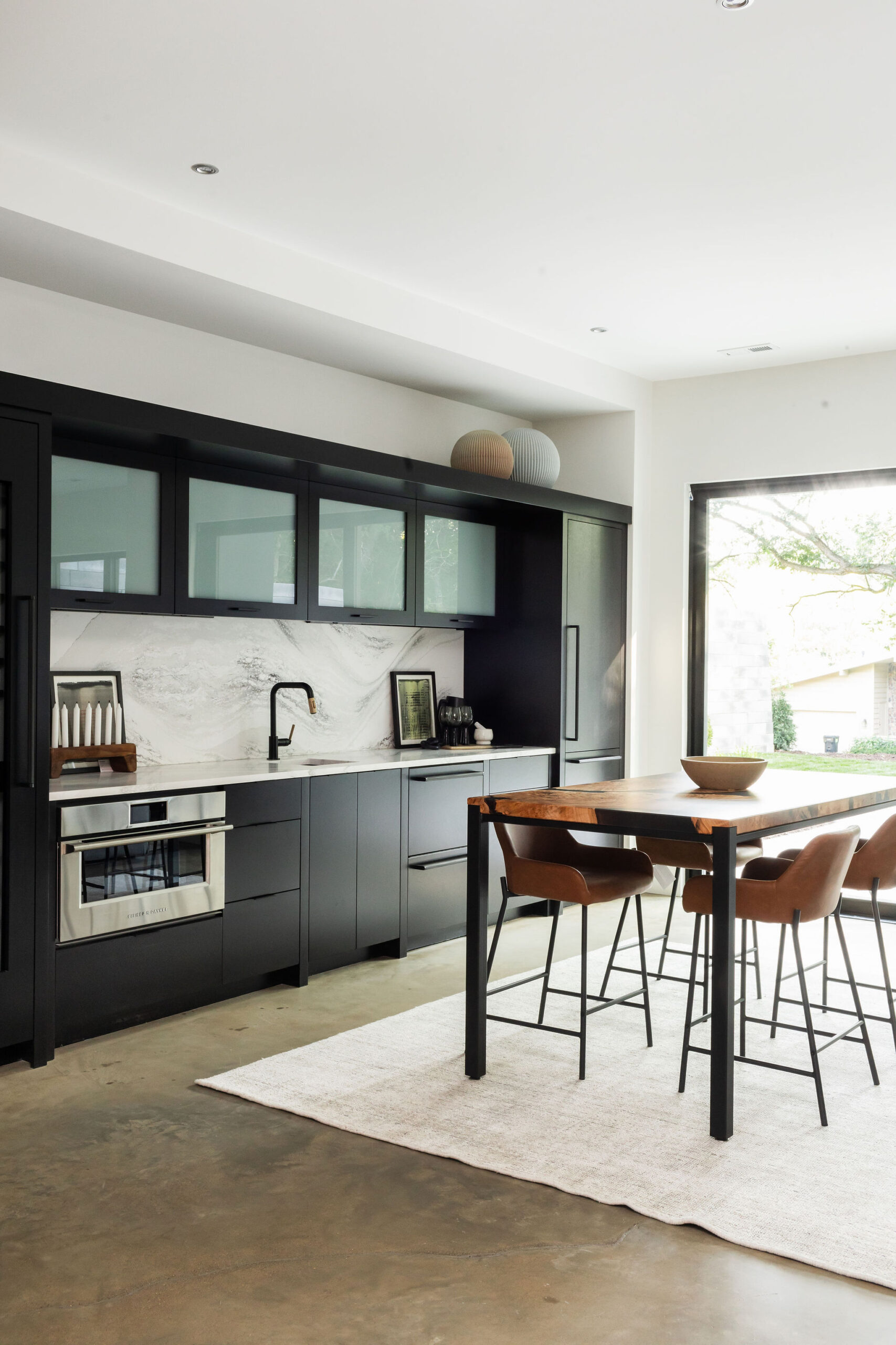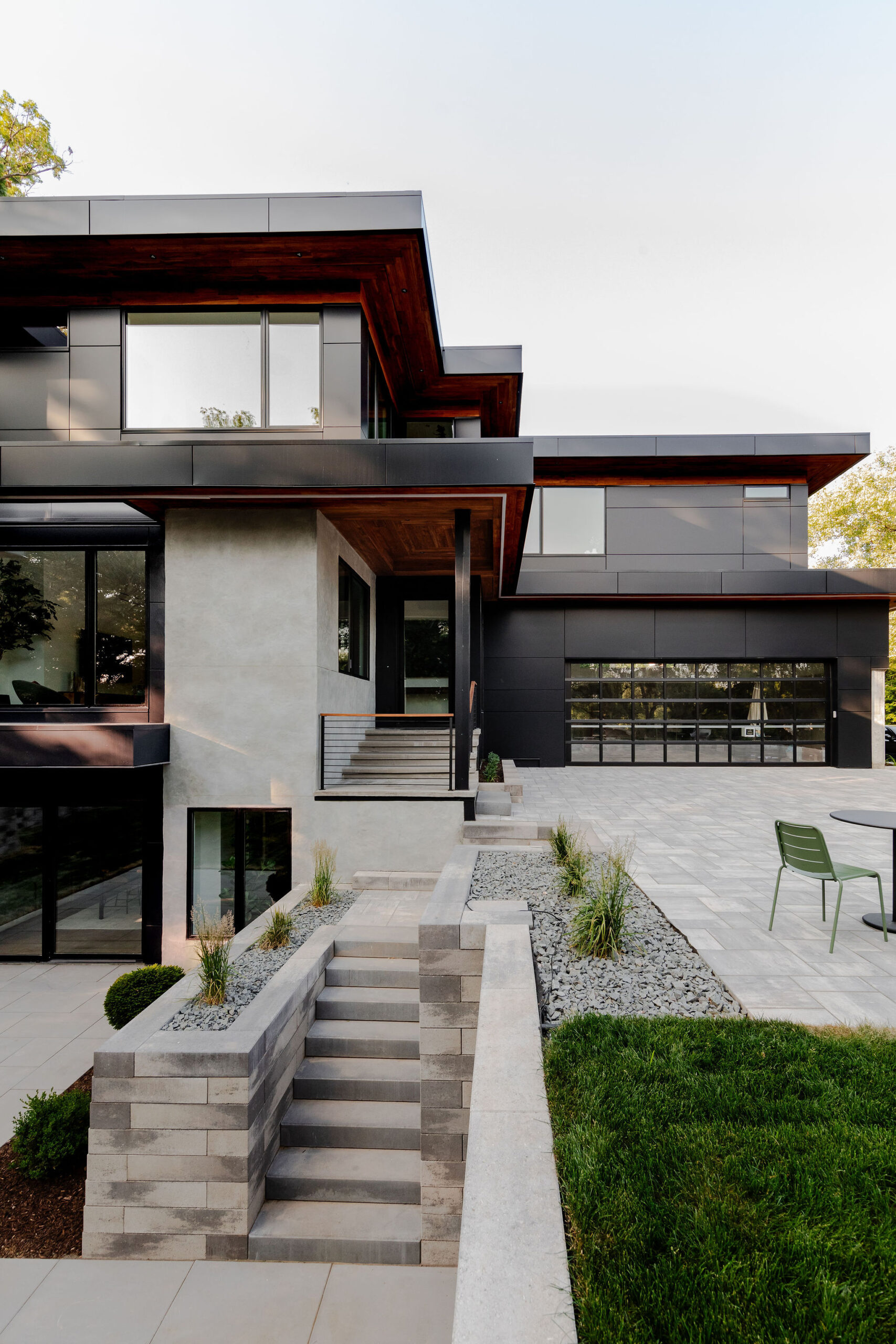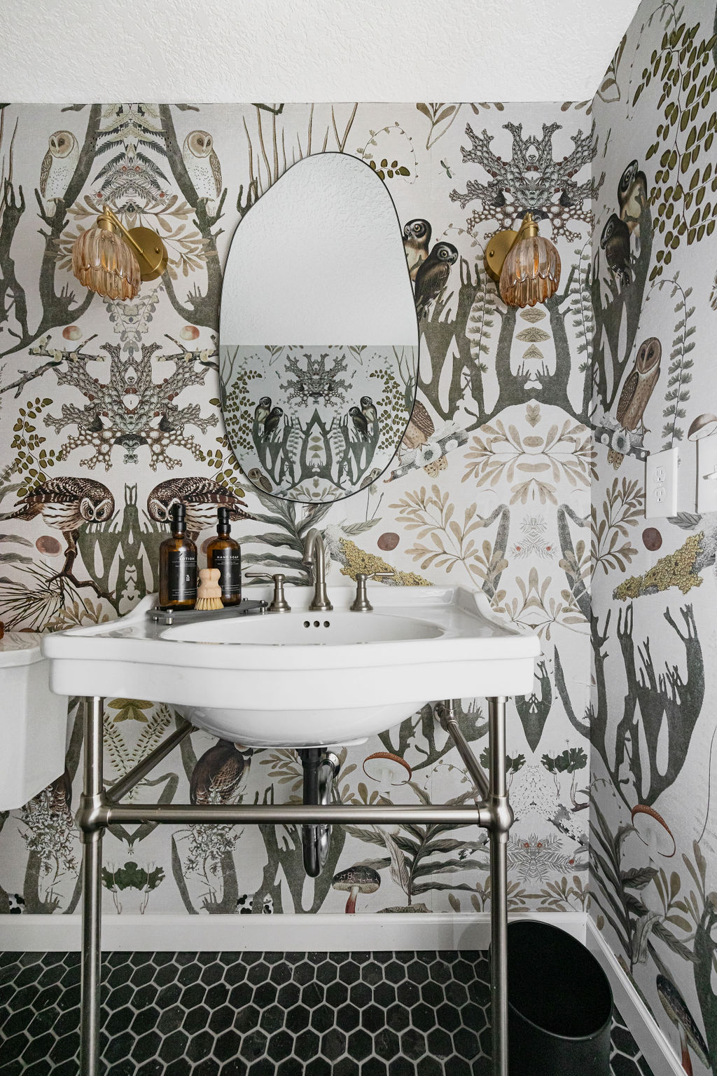
Our friends Sean and Blanca, an awesome realtor couple, introduced us to these clients that were buying a new home and wanted to complete some remodeling projects. The home has a beautiful backyard, lots of space for this family, and a large unfinished basement. We got to walk through the space with the clients and Sean while they explained their goals and dreams for their new home. The plan is to finish the basement, remodel the master bathroom, and give their kids’ bathroom a new look as well.
Let’s check out these spaces and the design plan for each of them.
Basement
The basement is unfinished but has plenty of potential. There are doors to walk out to the backyard, space for a bedroom, bathroom, large living room, and more.
Before
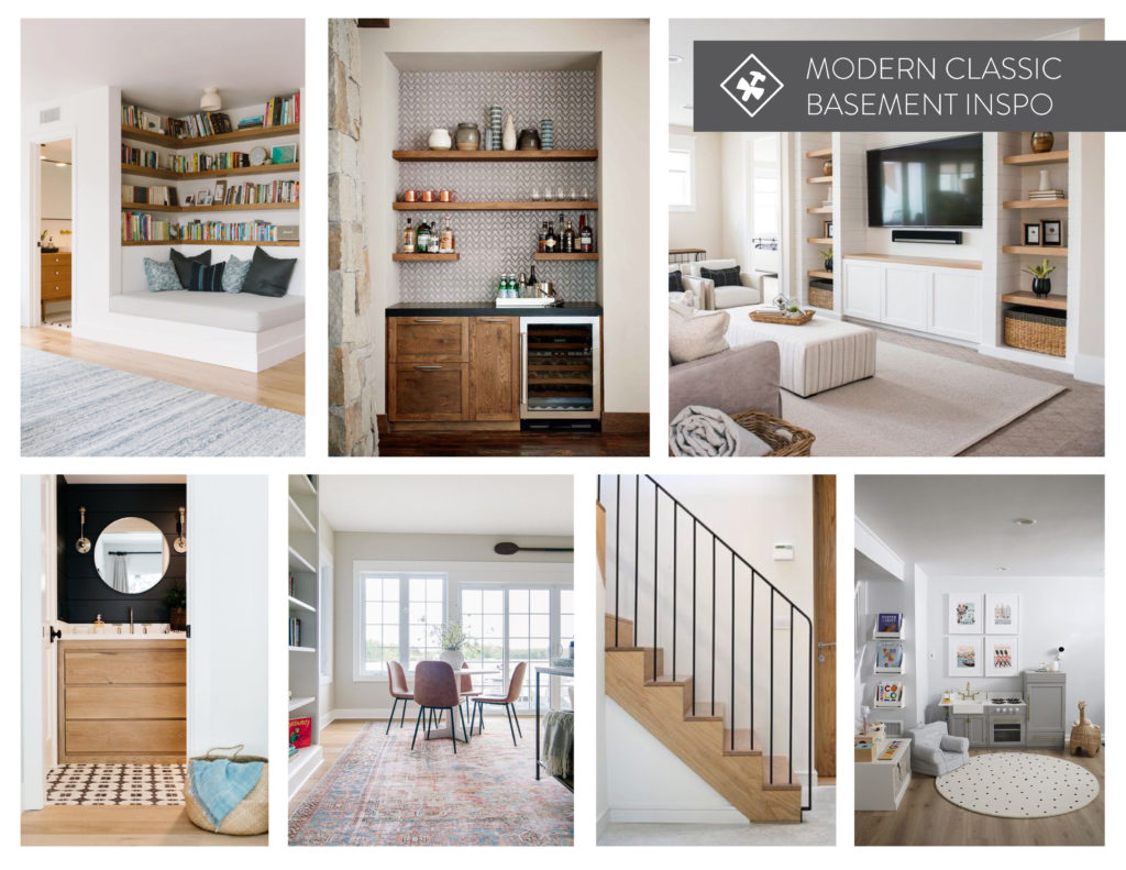
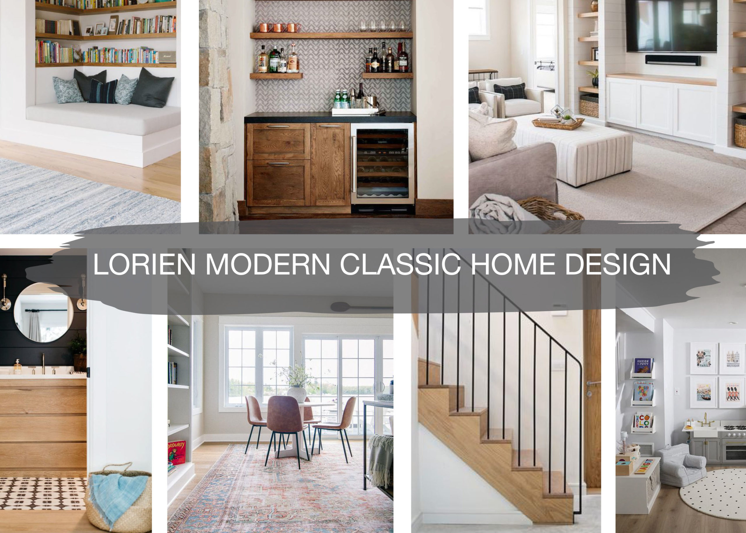
Mood Board
In the basement, the design inspiration included a reading nook for the kids, a bar for entertaining, and built-ins for a cozy family room. There is also a guest bedroom and bathroom in the basement, along with plenty of space for the kids to play. We’re calling this project “Modern Classic” as our clients love clean, modern lines with classic elements that will be timeless for years to come.
Renderings
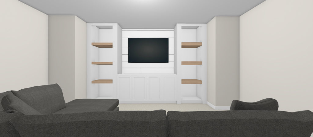
Now to the fun part…the renderings! After the floor plan is complete, we get to work on the renderings, which show our client’s selections in the space in 3D. This really helps see how the space will play out and change our selections to make a final choice.
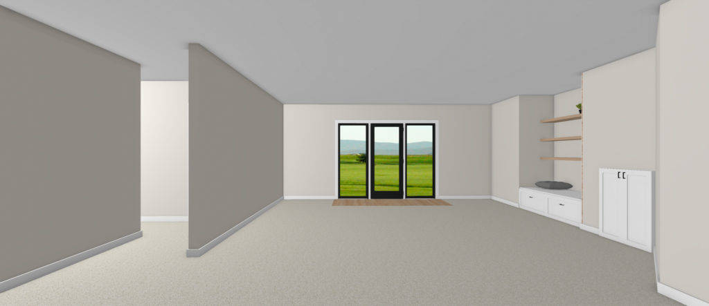
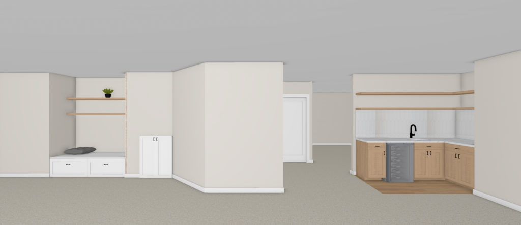
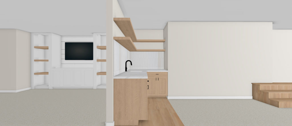
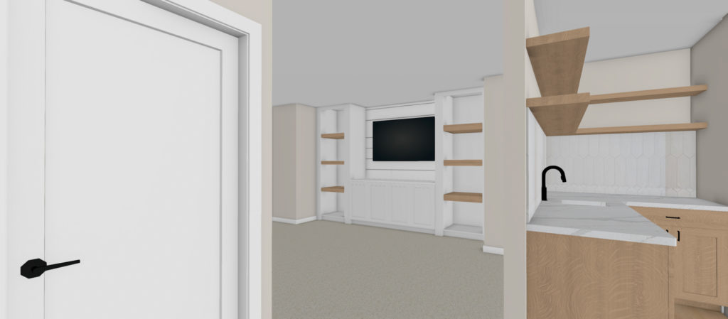
For the basement, a reading nook next to the fireplace with drawers for storage and floating shelves makes for a cozy spot. The bar has a sink, faucet, and beverage fridge, making it perfect for entertaining friends and family.
Right off the bar is a family room, complete with built-ins to store electronic and TV equipment. Keeping it open to the rest of the space provides an open concept, but also allows for multiple areas where people can hang out.
Master Bathroom
Before
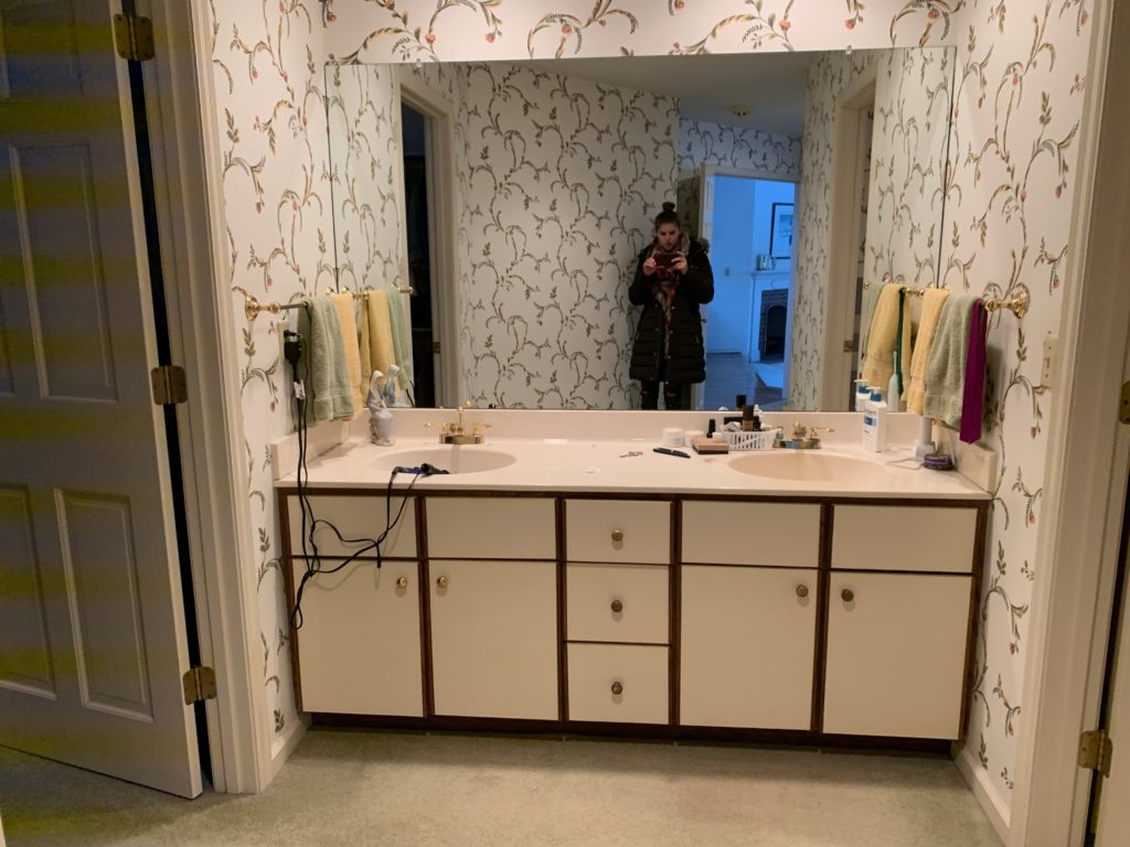
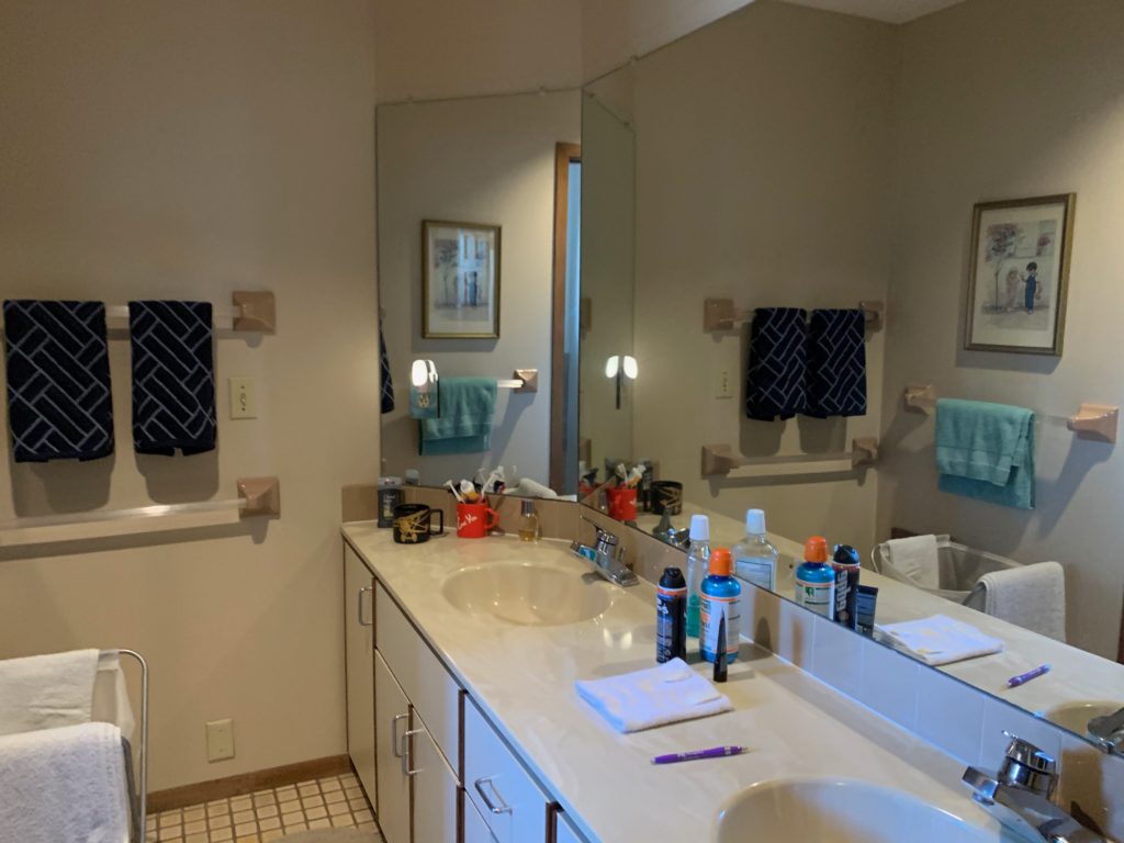
When our clients checked out this house for the first time, they knew they wanted to update the master bathroom. First thing to go will be the carpet and we’re switching the layout around to create a better flow for their lifestyle.
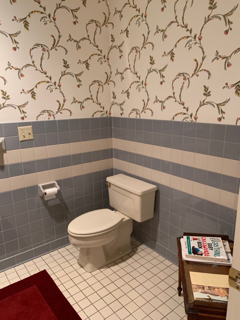
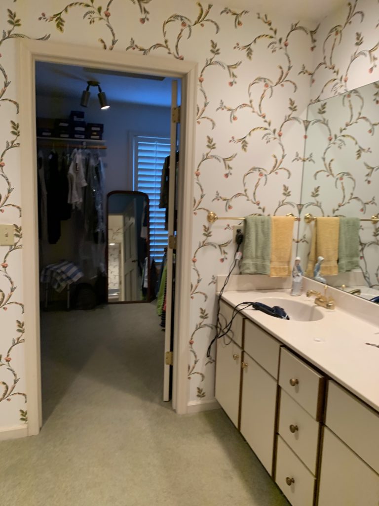
The current space has an awkward layout and the wallpaper and tiled walls don’t reflect the style our clients are looking for in their home.
With our client’s lifestyle, they want to have the closet closer to the bedroom and move the bathroom down to where the closet is now.
Mood Board
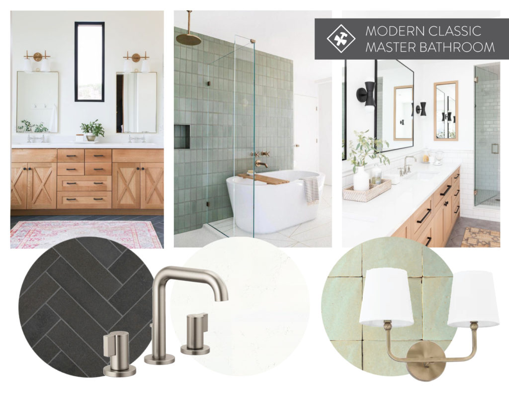
For the design of the bathroom, our clients love the lighter wood vanity, fun accent tile, darker herringbone floors, and mix of finishes.
Renderings
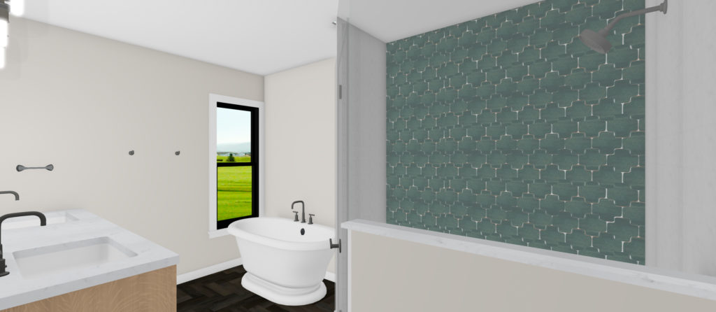
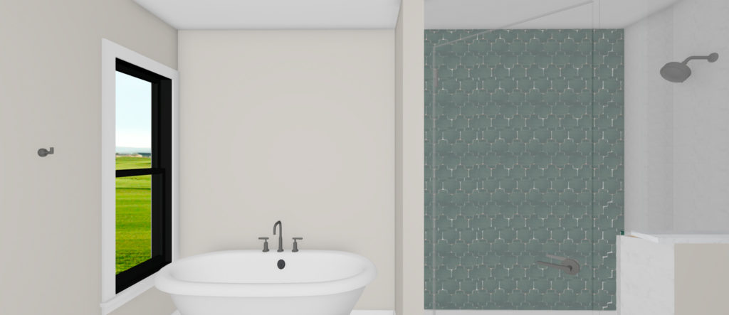
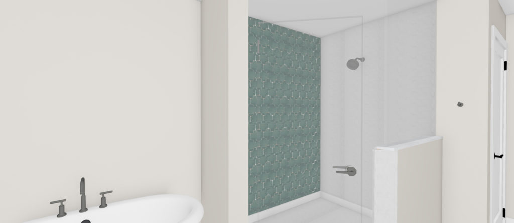
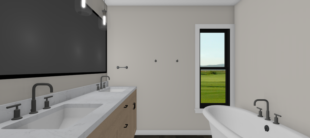
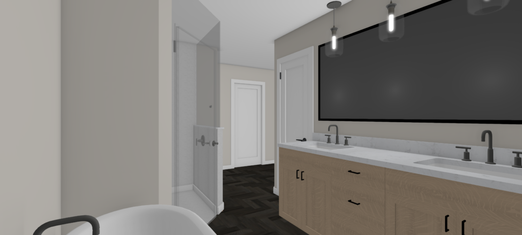
Ahh, we cannot wait to see this master bathroom come to life! Where the closet used to be is where the tub will be. A freestanding tub and large shower make the space much more functional for our clients.
In the shower, we are going to make a statement with Mercury Mosaics tile as an accent wall and subway tile on the other walls.
The vanity in a lighter wood tone has two sinks complemented by a light quartz countertop.
Instead of sconces, our clients loved the look of pendants over the mirror, so the plan is one large mirror with three pendants over it, which makes for a unique and fun look.
Kids Bathroom
Before
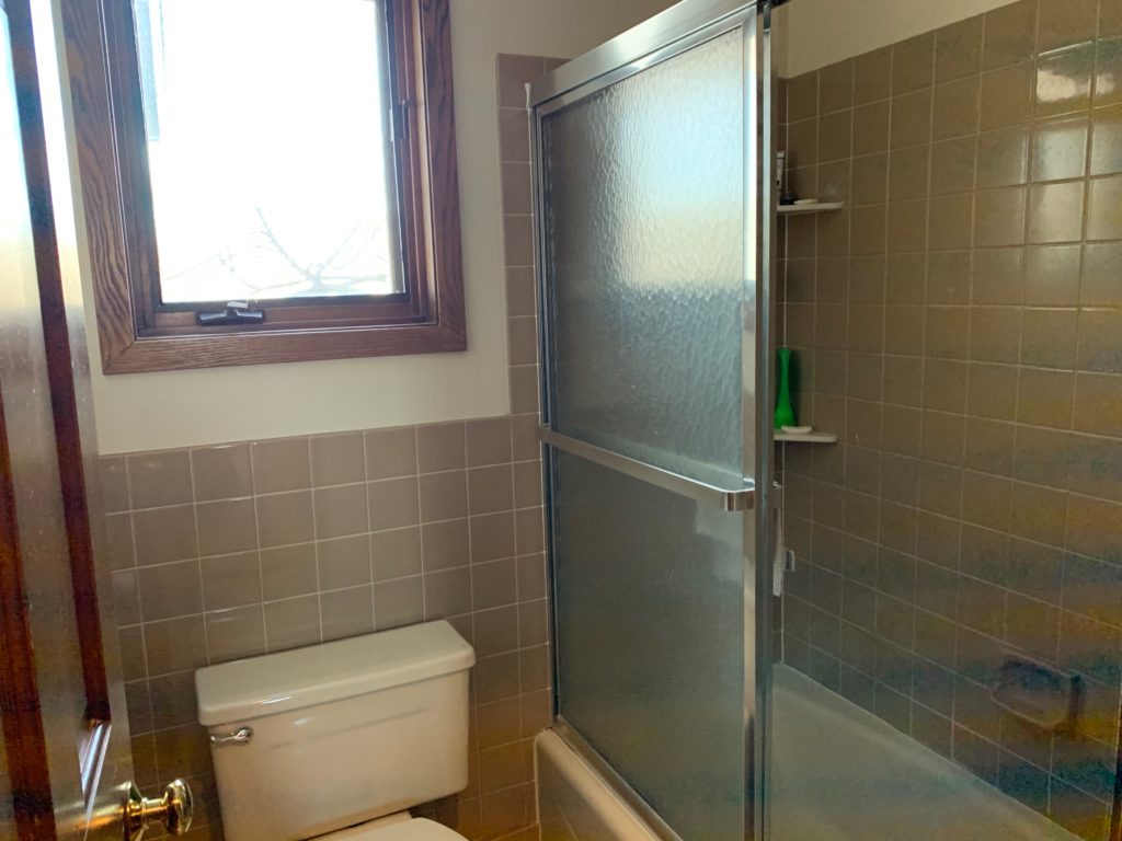
In the kids bathroom, we are keeping the layout the same, but just updating the space to brighten it up and give it some fun personality.
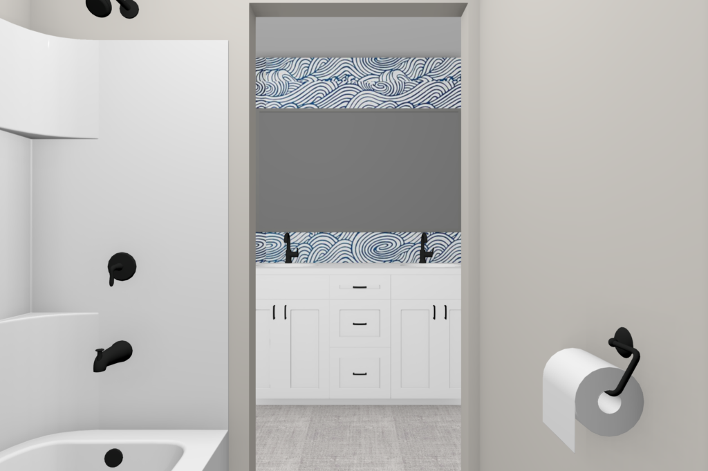
For the shower, we’re removing the glass door and replacing it with a curtain for easy access to the tub for the kids. The tile on the walls is also getting removed, and the doorway into this space will be bigger to make the bathroom feel more open.
Mood Board
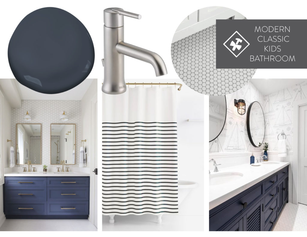
With the kids’ bathroom, accents of navy and a nod to a nautical feel were part of the design. A simple, classic, and neutral feel was important so that this space can grow with the kids and work for both the daughters and son of our clients.
Renderings
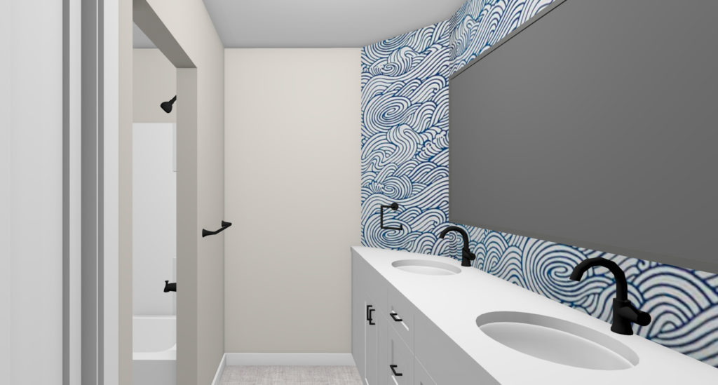
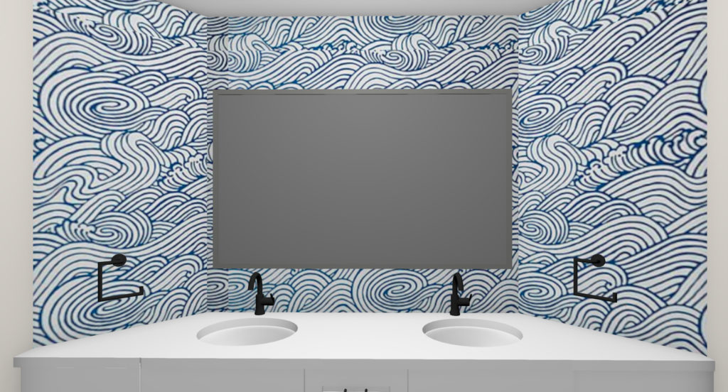
Our clients found this super fun wave wallpaper from Anthropologie, and it’s perfect for this space! With a large mirror and new white cabinetry, the space will feel brighter and more open.
In the shower, the plan is a fiberglass tub and shower surround to keep it simple and easy with the kids. Grey floor tile keeps the space neutral and allows the wallpaper to be the focal point of the space.
We’re so excited to bring you along as we make this family’s house become a home! We’ll share updates on Instagram and bring you along for the ride, so stay tuned.
