We’re starting up another bathroom project and this one’s a fun one! Our client reached out to us a while back wanting to update her master bathroom. She wanted the space to inspire her and make her want to be in the space. We started designing out some other rooms in her home with paint and furniture, before heading into the master bathroom.
Before
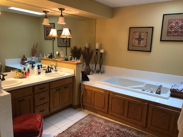
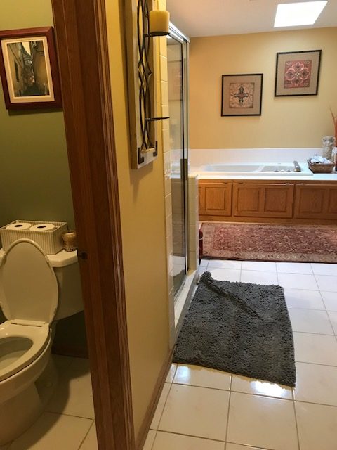
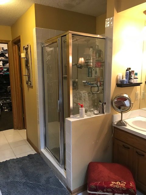
The large tub was taking up so much of this space and it wasn’t getting used very often. Having a soffit above the vanity made the ceilings feel lower and the space much smaller.
In addition, the shower on the left side of the vanity was small and outdated.
Our client wanted to freshen up the space and give it a more luxury feel and improve the layout for her lifestyle.
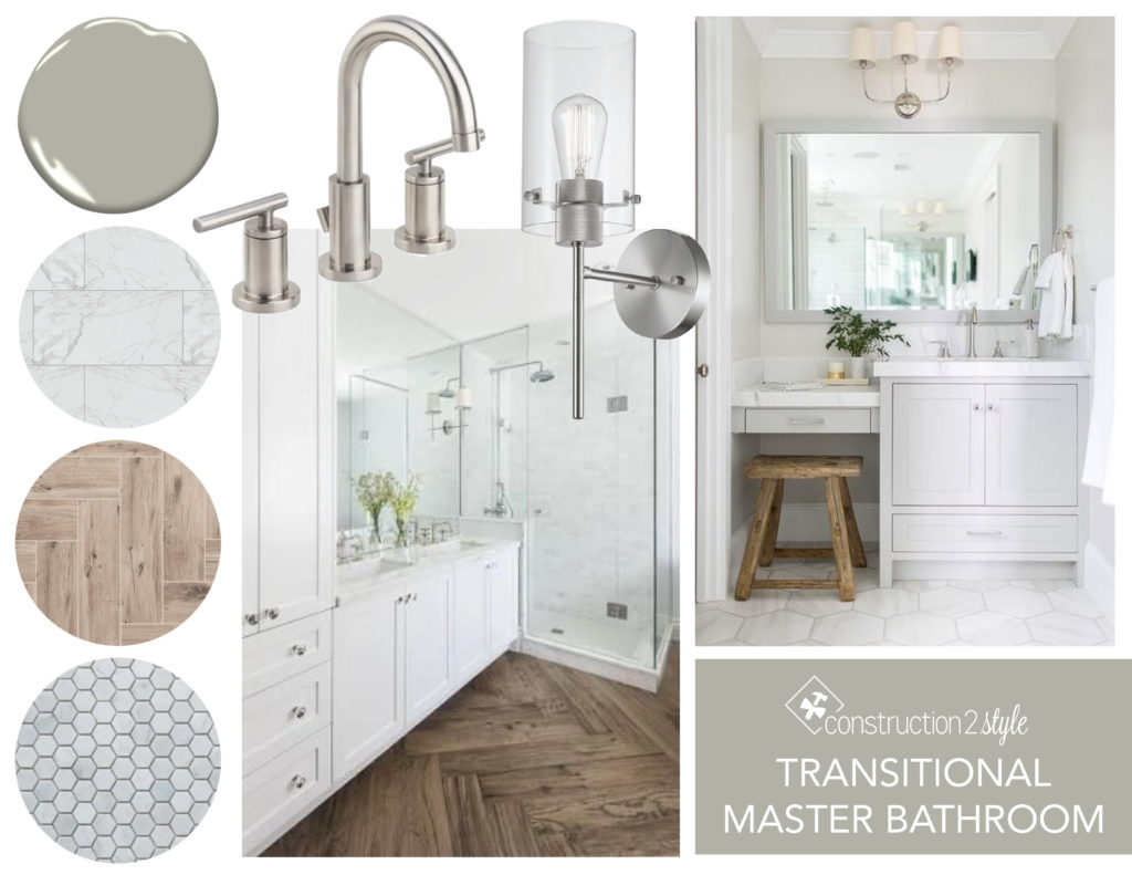
Mood Board
The overall feel for this bathroom is calming elements in a transitional style. To achieve that look, there’s some wood elements, greens tones, and mixing of metals.
Designs
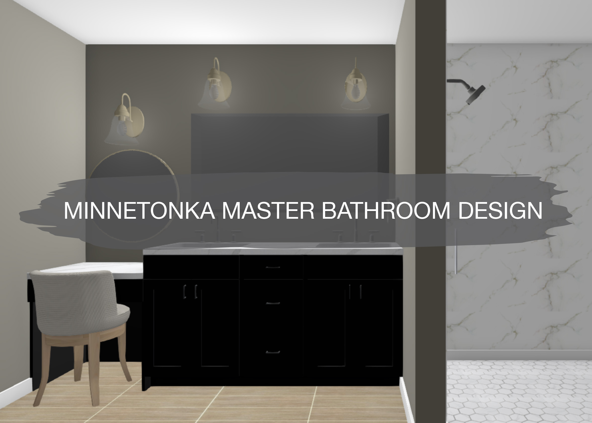
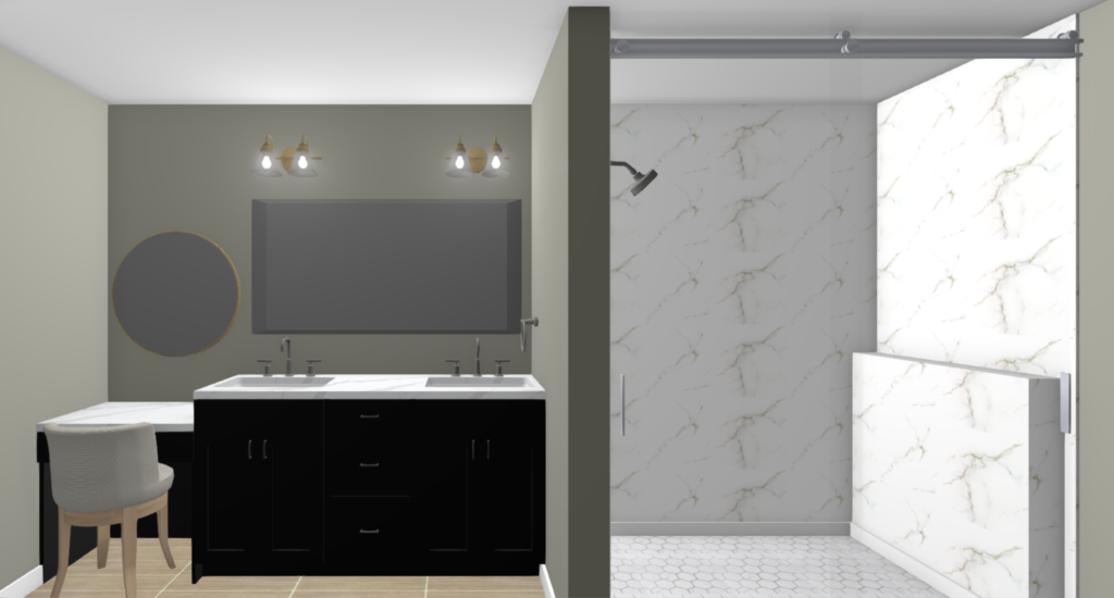
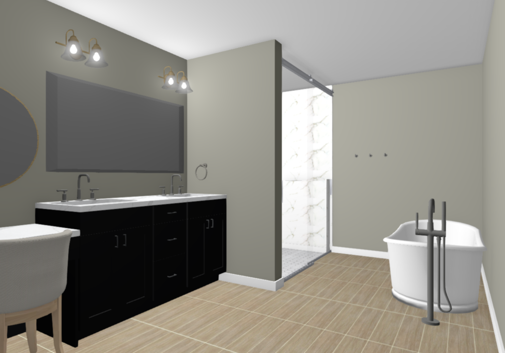
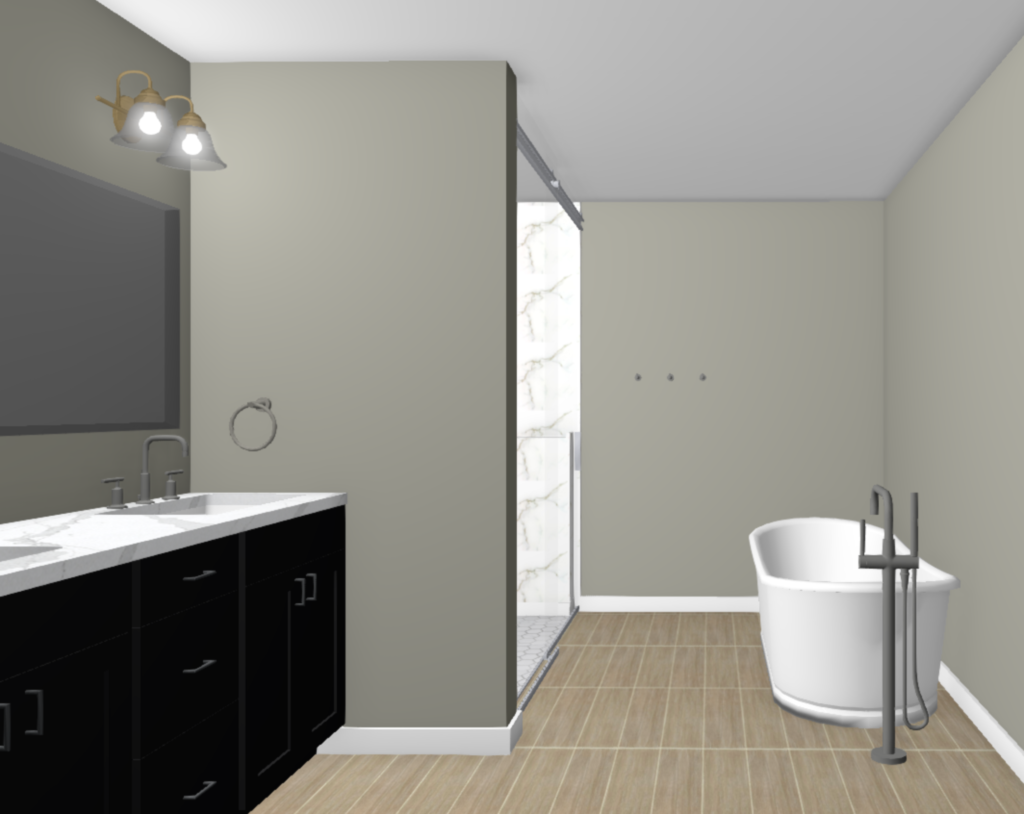
In the first iteration of designs, we had an option for a wet room concept, but narrowed it down to a large shower and free standing tub. For the vanity, we’re going with double sinks and a makeup area that has a drawer for storage.
A large mirror over the vanity makes it easy for getting ready, while the more decorative mirror by the makeup area defines the space for the makeup purpose. Sconce lights add a touch of gold and bring light to the vanity. A freestanding tub with a tub filler give a luxurious feel to the bathroom.
Having a large shower was important to our client and with white marble look porcelain tile and brushed nickel Kohler fixtures, it’s going to be beautiful. Wood-look tile flooring brings in that natural feel and grounds the space. Green-gray walls and a black vanity add contrast to the white elements and have a more down to earth feel as well.
In Progress
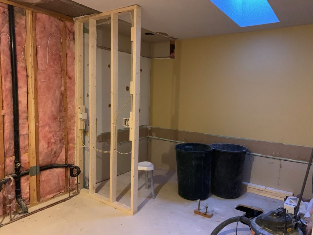
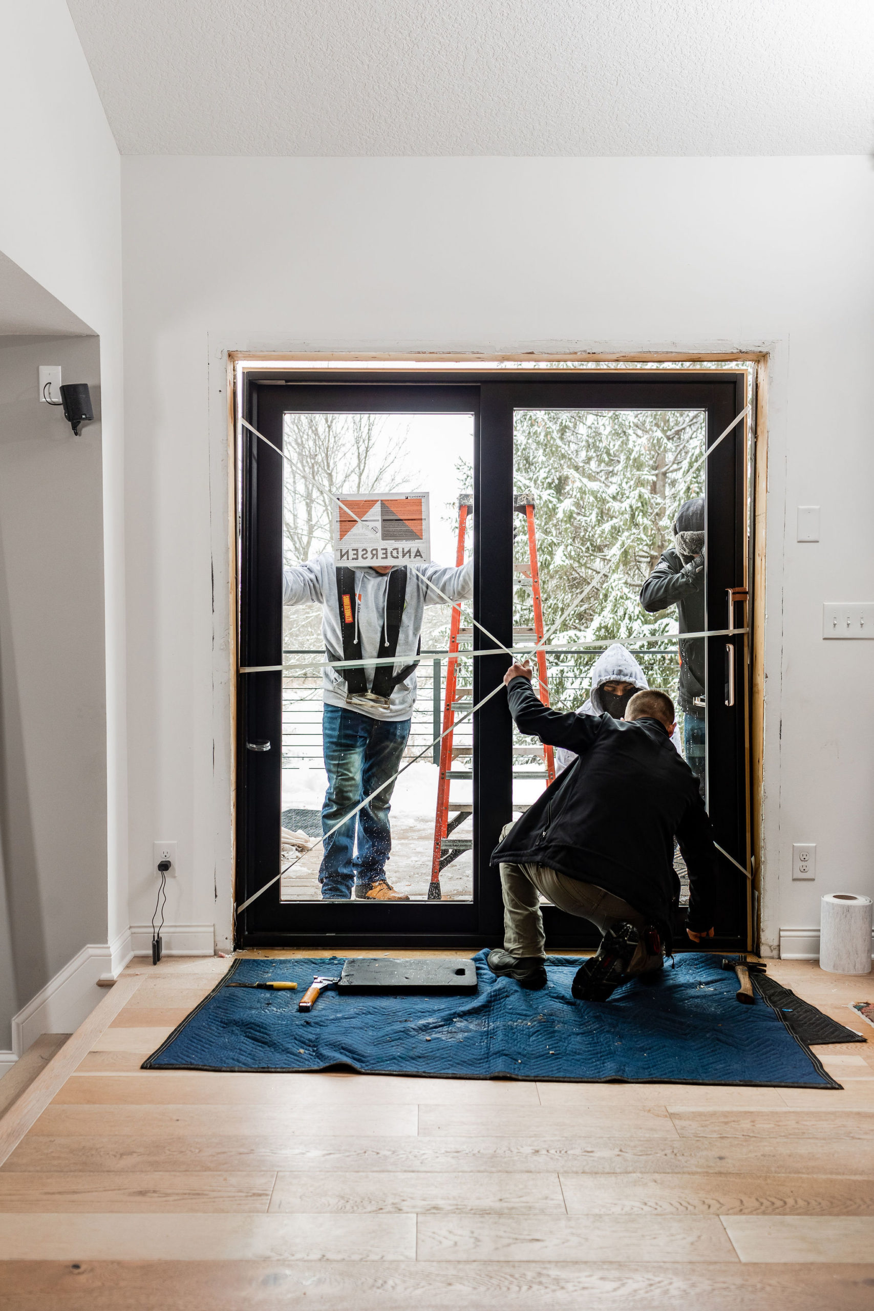
Here are some of the progress photos of this space! Exciting to see progress being made and get a feel for how the space will be laid out.
One thought on “Butternut Master & Guest Bathroom Design”
Comments are closed.