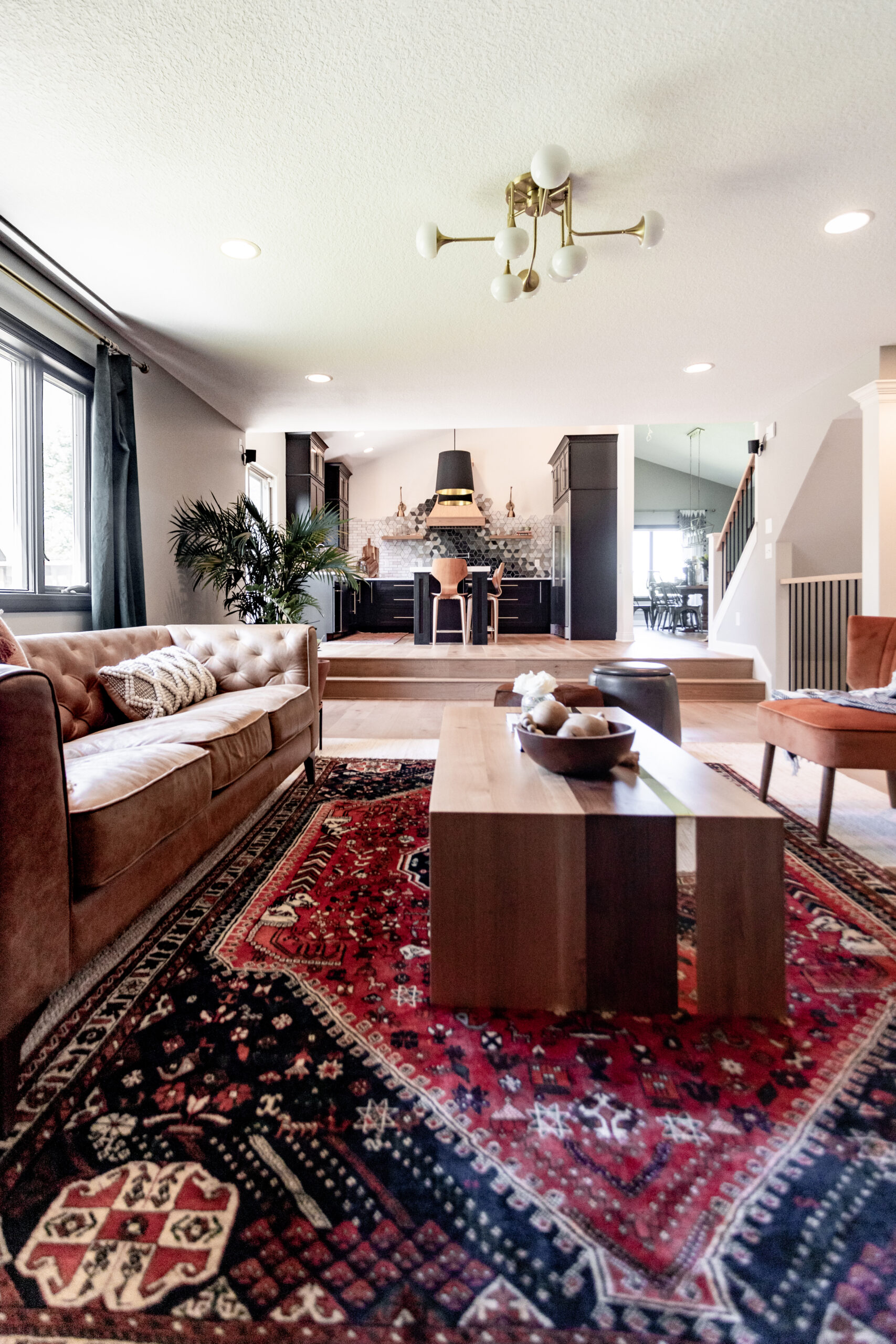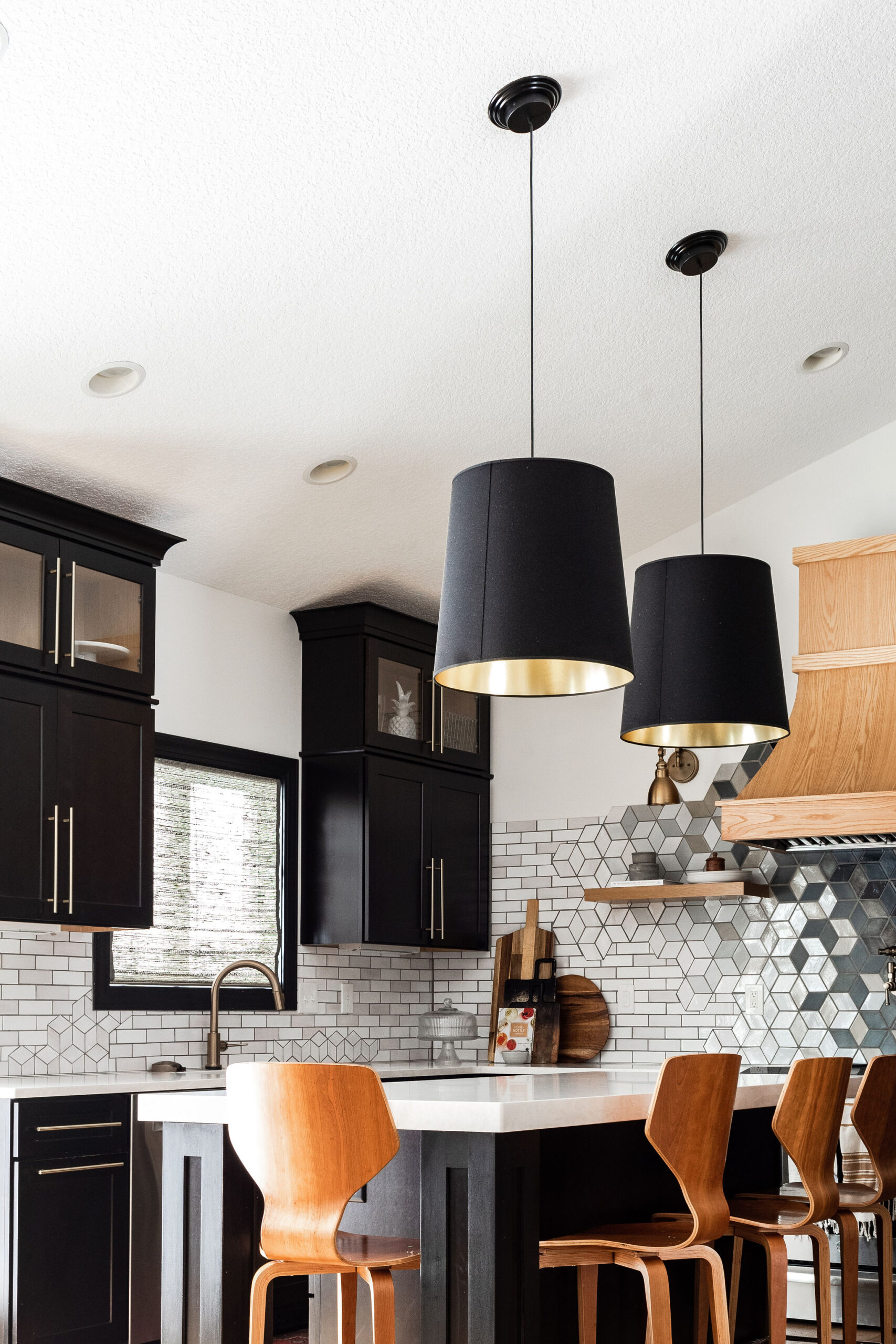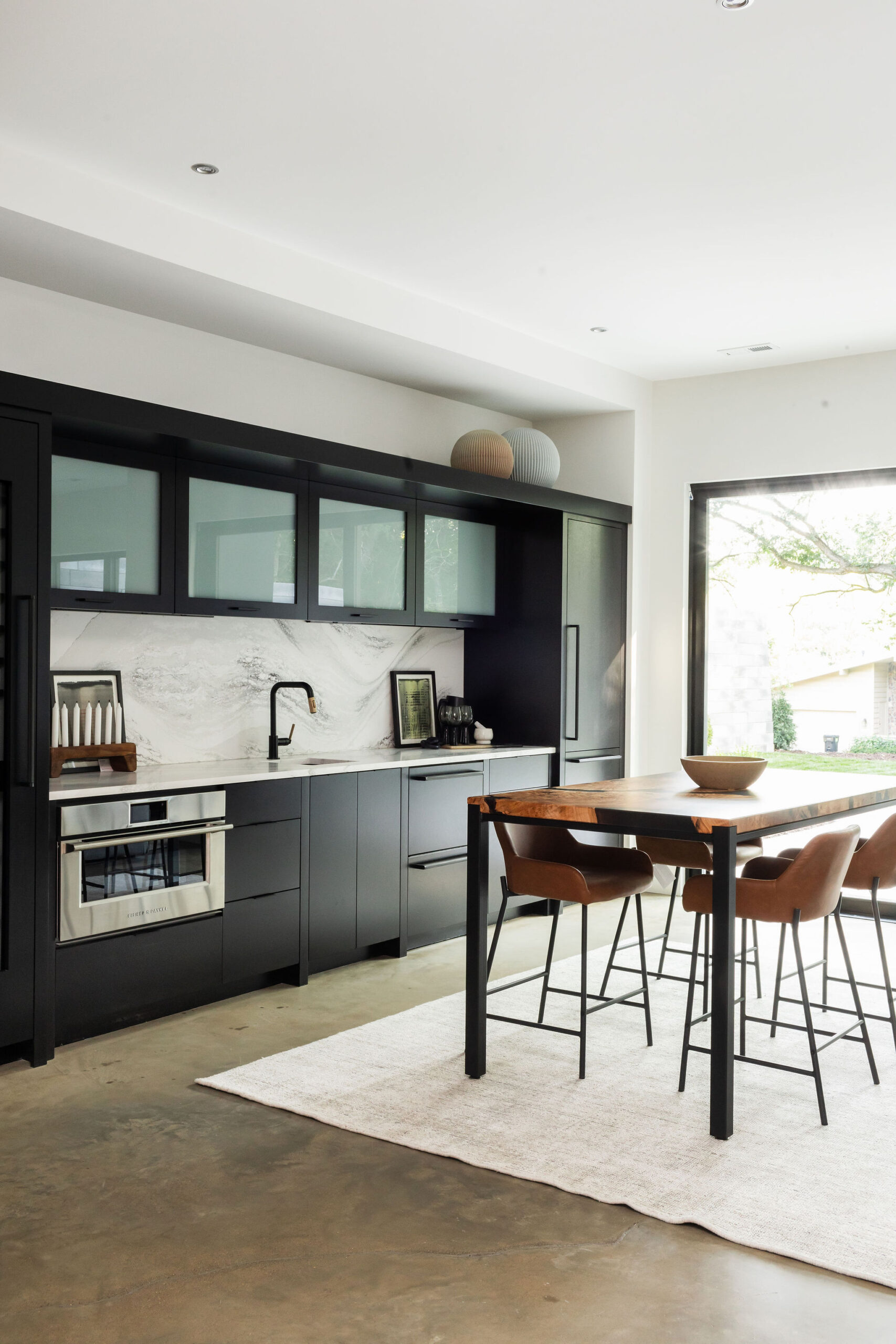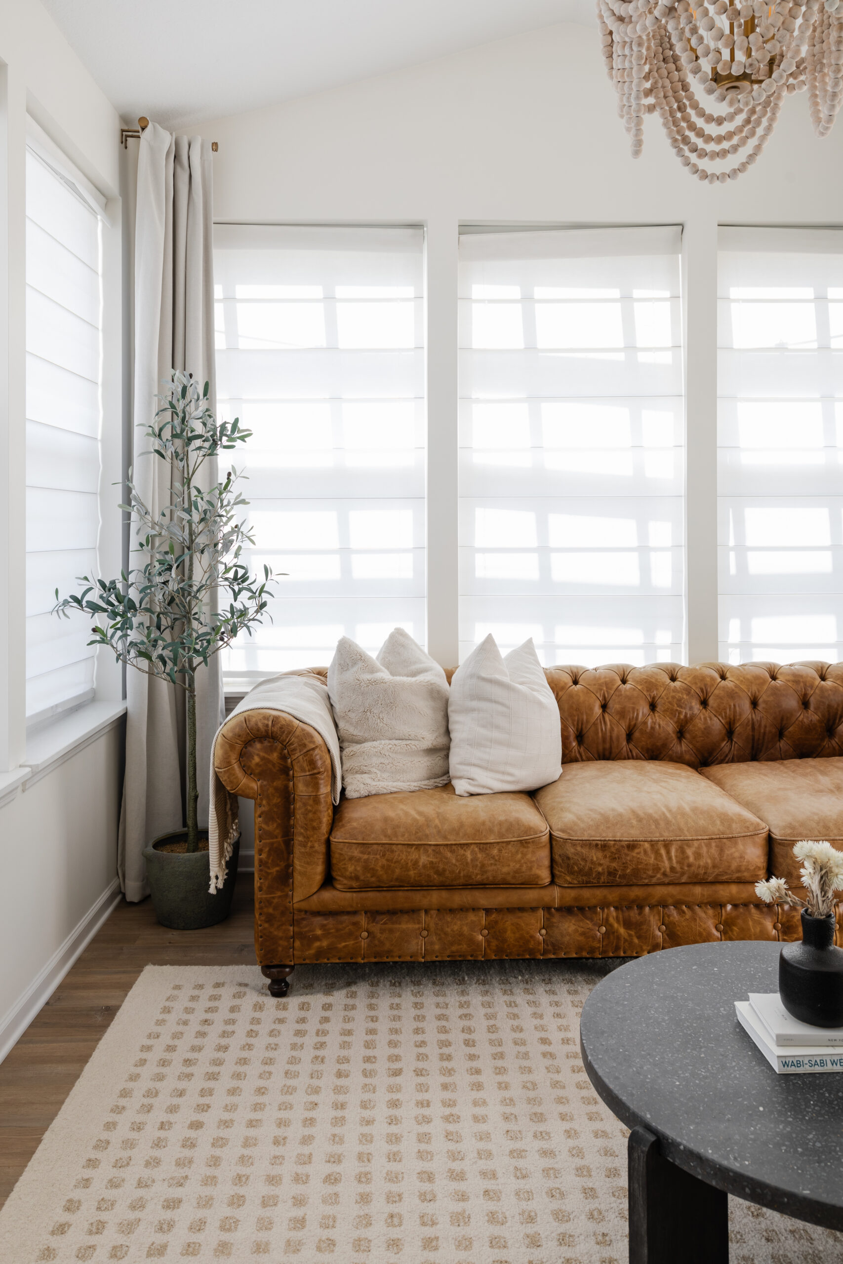
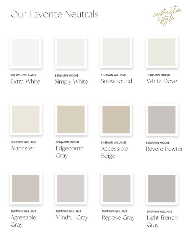
Choosing the right neutral paint color can transform your home into a serene and sophisticated space. Neutrals are versatile, timeless, and can complement any style, making them a favorite choice for interior designers and homeowners alike. Whether you’re looking to create a warm, inviting atmosphere or a crisp, modern aesthetic, our top 12 go-to neutral paint colors will help you achieve the perfect look. Let’s explore each one and discover why they are must-haves in any home.
1. Extra White
Brand: Sherwin-Williams
Extra White is the epitome of a clean and fresh white. It’s perfect for achieving a bright, airy feel in any room. This color works wonderfully as a backdrop for colorful decor or as a standalone statement in minimalist spaces. It’s ideal for modern and contemporary homes seeking a pristine look.
2. Simply White
Brand: Benjamin Moore
Simply White is a warm, soft white that brings a touch of coziness to any space. Its subtle warmth makes it versatile for various rooms, from living areas to kitchens. It’s a great choice for those who want the brightness of white without the starkness, adding a touch of comfort and elegance.
3. Snowbound
Brand: Sherwin-Williams
Snowbound is a beautiful off-white with slight gray undertones, creating a sophisticated and calming effect. It pairs well with both cool and warm tones, making it a versatile choice for any room. Snowbound is perfect for those looking to achieve a subtle, serene ambiance.
4. White Dove
Brand: Benjamin Moore
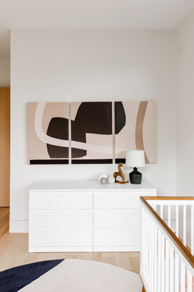
White Dove is a classic, soft white with a hint of warmth. It’s a favorite for trim, doors, and ceilings, providing a smooth, clean finish. This color is perfect for traditional and transitional homes, adding a touch of timeless elegance to any space.
5. Alabaster
Brand: Sherwin-Williams
Alabaster is a warm, inviting white that exudes comfort and tranquility. It’s an excellent choice for living rooms and bedrooms, creating a cozy and welcoming atmosphere. Alabaster’s subtle warmth makes it a versatile option for various decor styles, from farmhouse to modern.
6. Edgecomb Gray
Brand: Benjamin Moore
Edgecomb Gray is a light, warm gray with beige undertones, often referred to as “greige.” It’s perfect for creating a soft, sophisticated look in any room. This color works well in both open and intimate spaces, providing a harmonious balance between gray and beige.
7. Accessible Beige
Brand: Sherwin-Williams
Accessible Beige is a warm, neutral beige that adds a touch of coziness to any room. It’s versatile enough to complement a wide range of decor styles and color schemes. This color is ideal for living rooms, bedrooms, and any space where a welcoming feel is desired.
8. Revere Pewter
Brand: Benjamin Moore
Revere Pewter is a light gray with warm undertones, making it a versatile and popular choice for many homeowners. It’s perfect for creating a neutral backdrop that allows other colors and decor elements to shine. This color is ideal for open floor plans and rooms with ample natural light.
9. Agreeable Gray
Brand: Sherwin-Williams
Agreeable Gray is a soft, warm gray that strikes the perfect balance between gray and beige. It’s a popular choice for its versatility and ability to blend seamlessly with various decor styles. This color is great for living spaces, bedrooms, and kitchens, creating a harmonious and inviting environment.
10. Mindful Gray
Brand: Sherwin-Williams
Mindful Gray is a sophisticated, medium gray with slight warm undertones. It’s perfect for adding depth and elegance to any room. This color works well in both modern and traditional settings, offering a refined and polished look.
11. Repose Gray
Brand: Sherwin-Williams
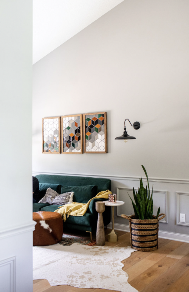
Repose Gray is a light, airy gray with subtle warm undertones. It’s a versatile neutral that can adapt to various lighting conditions and decor styles. This color is ideal for creating a calm, serene atmosphere in bedrooms, living rooms, and bathrooms.
12. Light French Gray
Brand: Sherwin-Williams
Light French Gray is a soft, cool gray that exudes sophistication and charm. It’s perfect for creating a serene and elegant ambiance in any room. This color pairs beautifully with both bold and neutral accents, making it a versatile choice for any space.
Choosing the right neutral paint color can significantly impact the look and feel of your home. Our 12 go-to neutral paint colors offer a range of options, from warm and inviting to crisp and modern, ensuring there’s a perfect shade for every style and preference. Whether you’re painting a single room or your entire home, these timeless neutrals will help you create a beautiful, cohesive space that you’ll love for years to come. Happy painting!