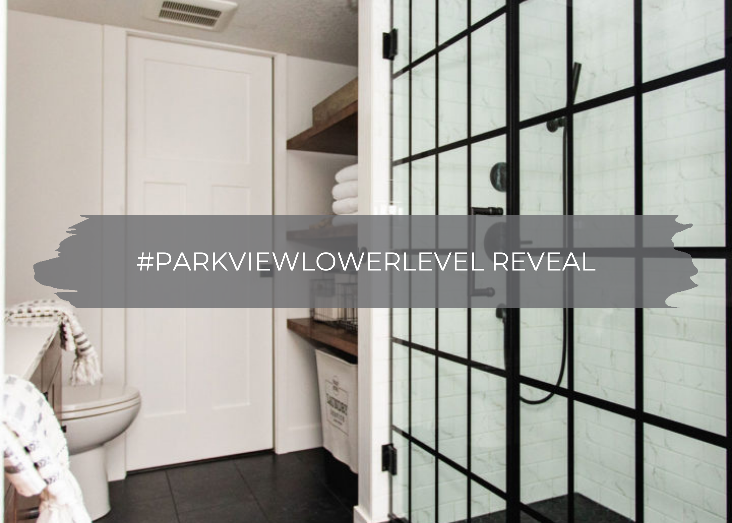
We’re back with another reveal for you all today. We shared the journey behind this #parkviewlowerlevel on social media and hope you have enjoyed following along on the journey!
It was actually one year ago this upcoming week that we stopped into this home, met the clients for the first time, and gave them a bid. I’ll never forget it…our team was flying home from KBIS, the largest national builder and designer show, and we were feeling more motivated than ever! Jamie and I jumped off the plane and drove straight to this home, and the ideas were flowing. We could see the potential right away, and we couldn’t wait to get started.
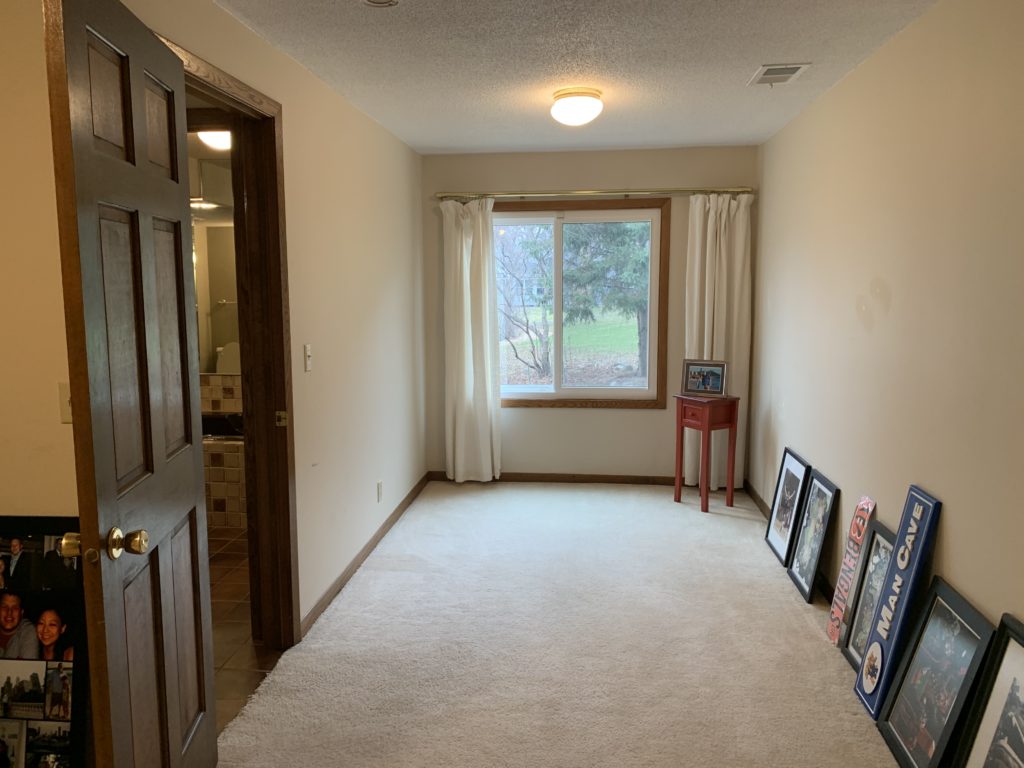
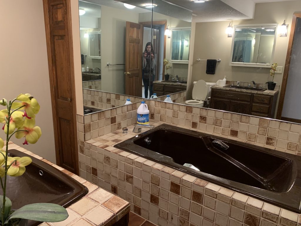
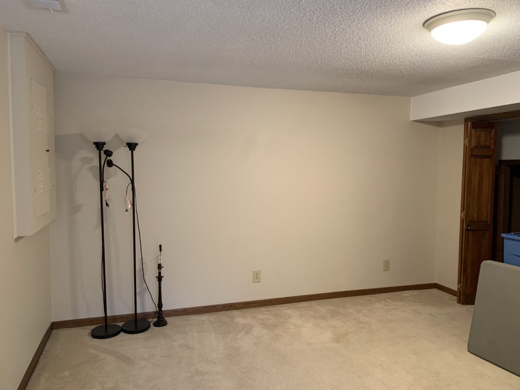
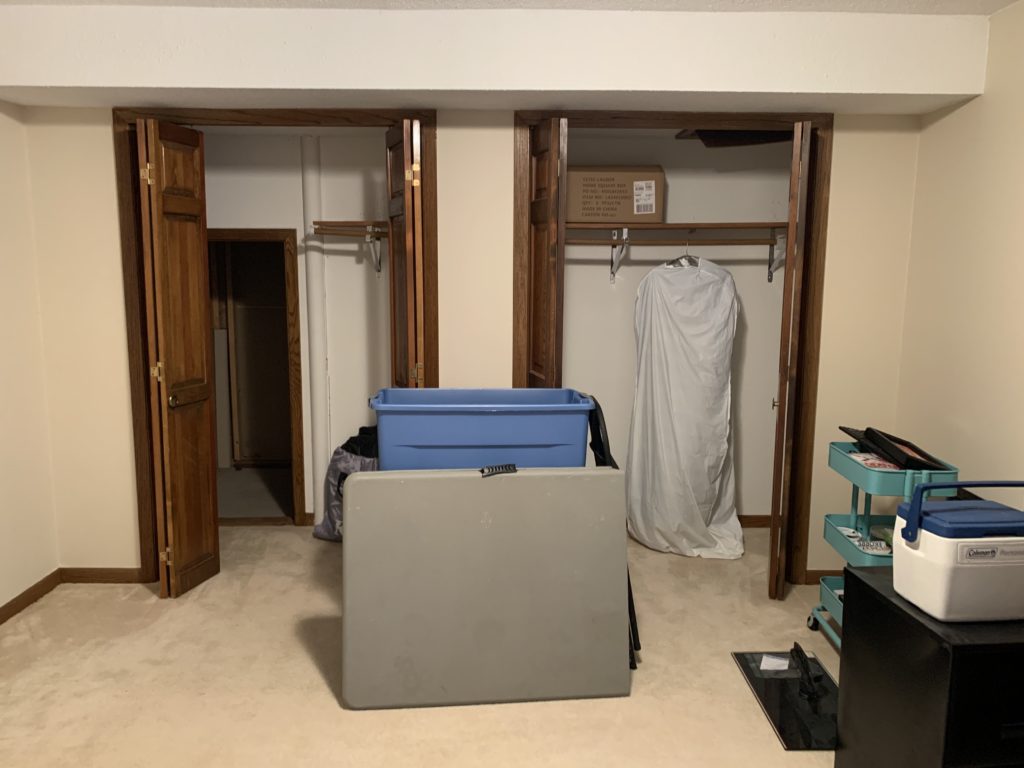
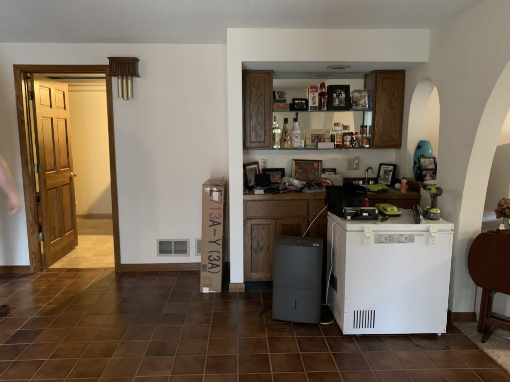
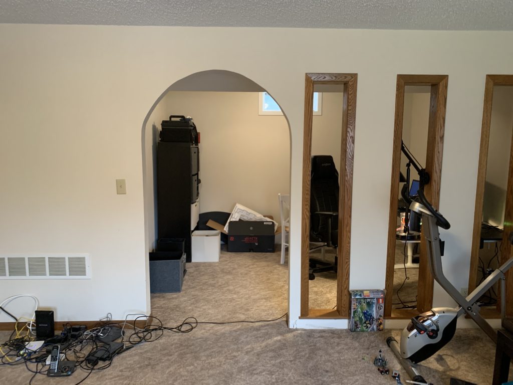
Before
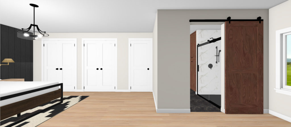
The big goal for this lower level was to create an owner’s suite. Our clients wanted to move down into this space eventually, so one of the big focuses was on the bedroom and bath. We didn’t grab the best before photos of the bathroom, but it was a smaller space. We removed a closet that was not accessible to the bathroom or bedroom, but only the main area, closed it off to the main area, and opened it up to the bathroom, creating a much larger en suite.
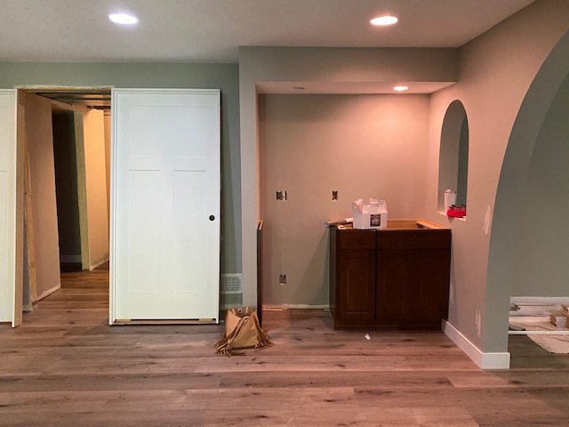
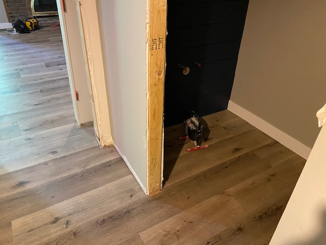
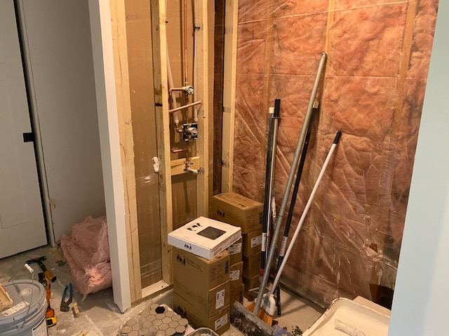
And being the only bathroom on this level would end up being part of our client’s en suite, there was a need for an additional bathroom for guests. So the next goal was to add in a bathroom, which we ended up putting just past the door in the photo below, which was the laundry/utility room.
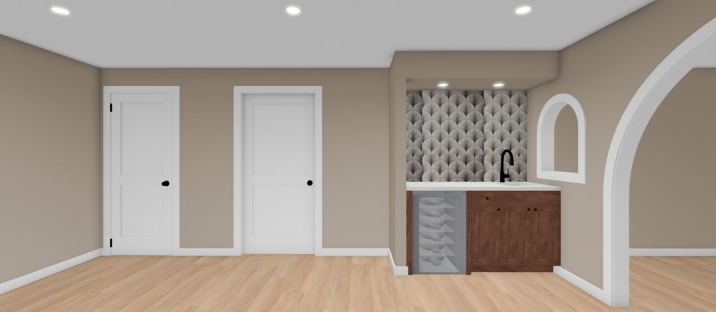
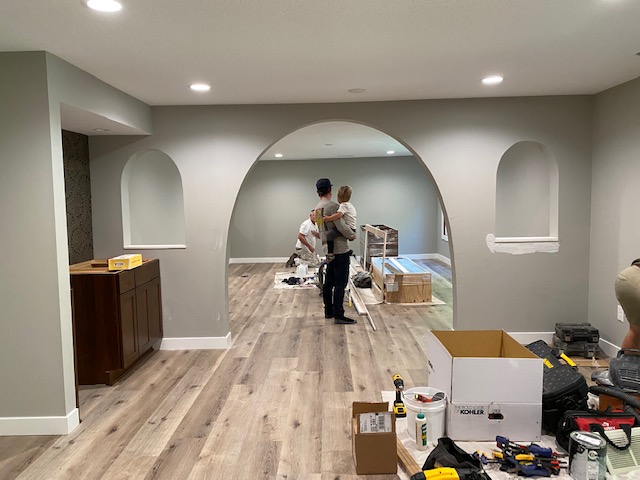
The bar/game room area below was another huge focus. As this was a family with little kids that love to game and have family and friends over to entertain, the space just needed some extra love!
The flooring was another big thing that our clients did not like. There was just a little bit of too much going on, so we refinished all the flooring to have one consistent flow throughout.
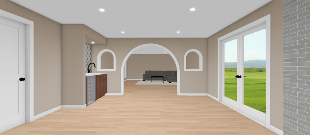
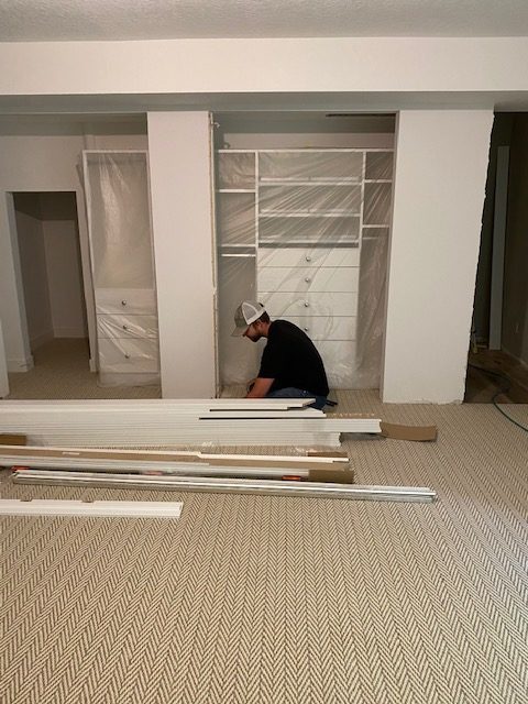
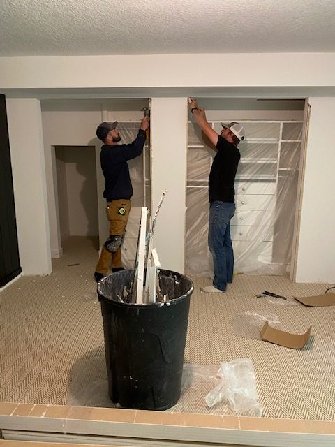
This was another awkward area in the living room space. Our clients (and so did we) loved the arch into this office space off of the living room area, but they weren’t quite sure what to do with the three rectangular openings. So we closed them off.
Designs
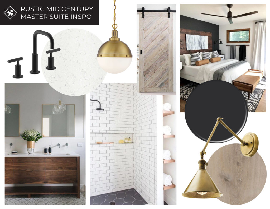
After walking through the space and providing them with an estimate, they hired us for the job, and we got to work on design planning! The overall design theme was mid-century modern with a rustic feel. Our clients loved the modern look but wanted a home that felt lived in. We were channeling the black and white with natural wood elements and a mixed metal vibe. I think we accomplished just that!
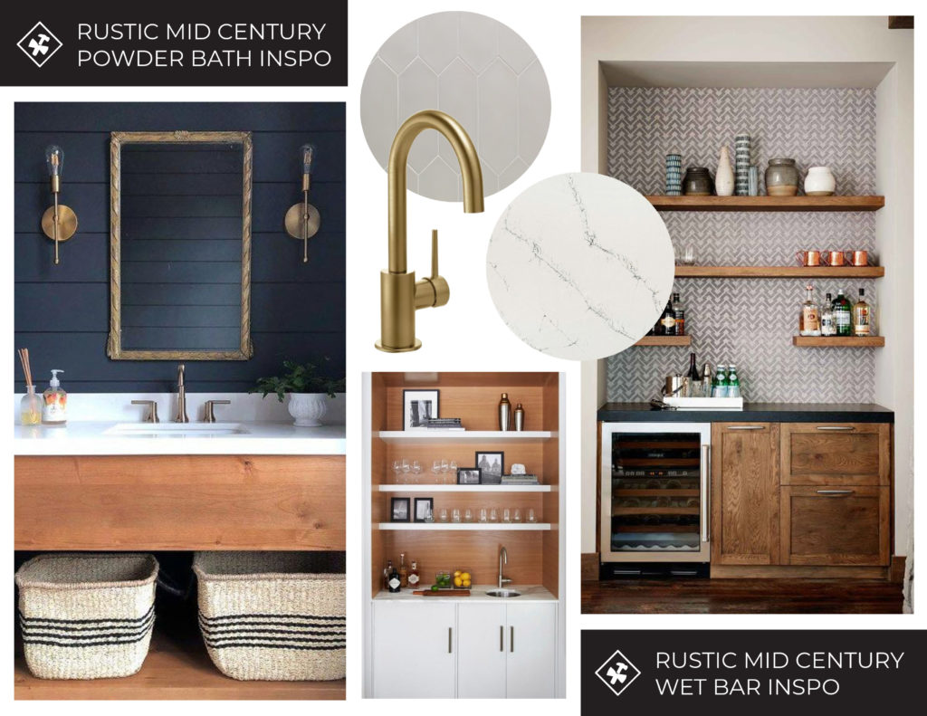
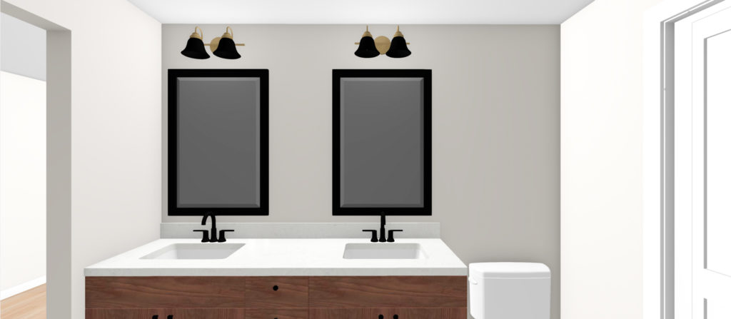
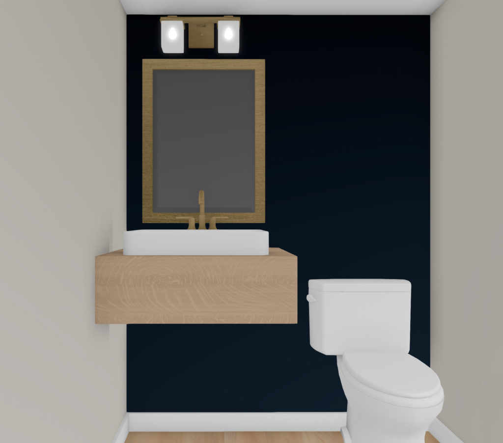
As we mentioned, being the only lower level bathroom was going to turn into the owner’s en suite, they also wanted to add in an additional bathroom. So we were able to separate the laundry room/utility room and add in a powder bathroom space there.
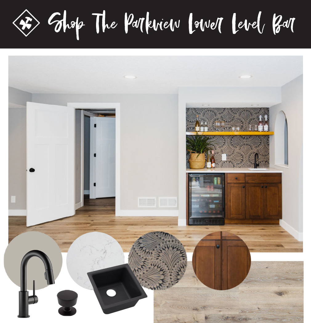
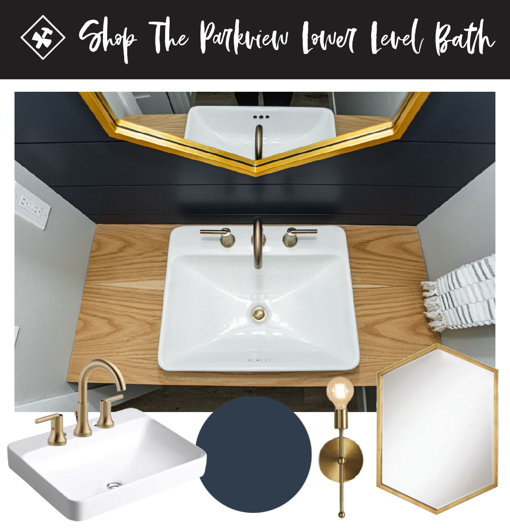
Here was the overall vibe for the powder bath and bar/gaming area.
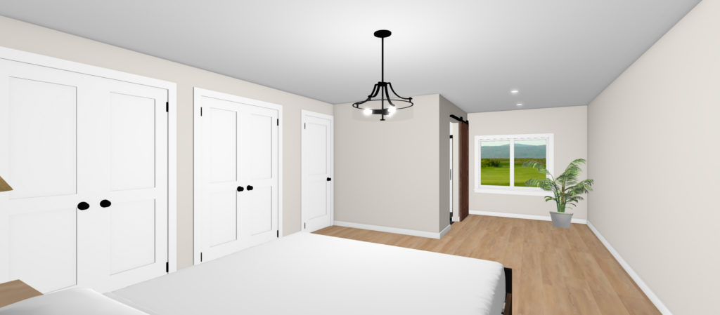
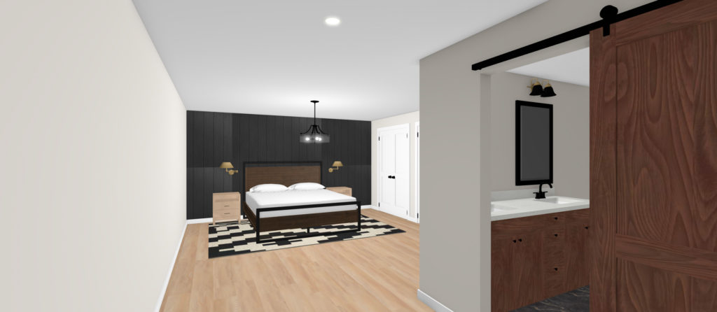
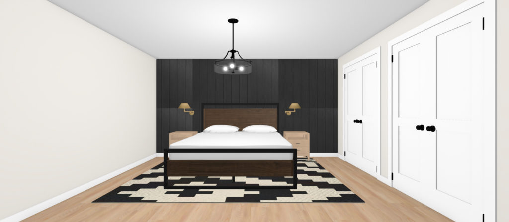
And here are some of the renderings of how we recommended bringing this space to life!
Under Construction
Once the designs were finalized and signed off on, construction was underway!
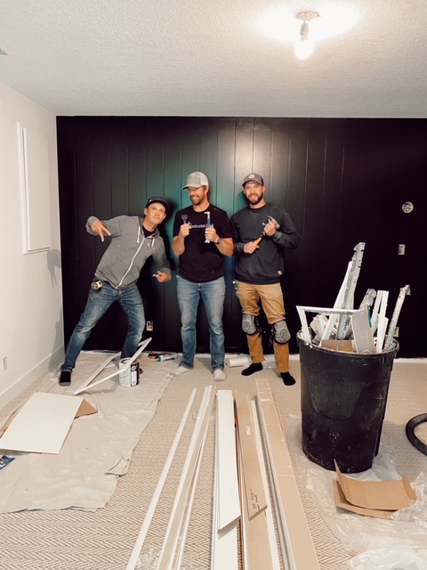
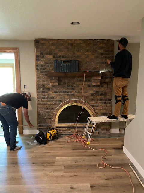
I know, I know…I say this every time, but I truly mean it…yet again, the best clients. The guys truly enjoyed working in this home every step of the way. Our clients were always so fun to be around, super chill, had good style, and trusted us every step of the way.
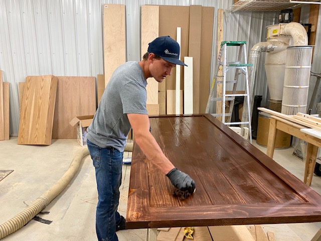
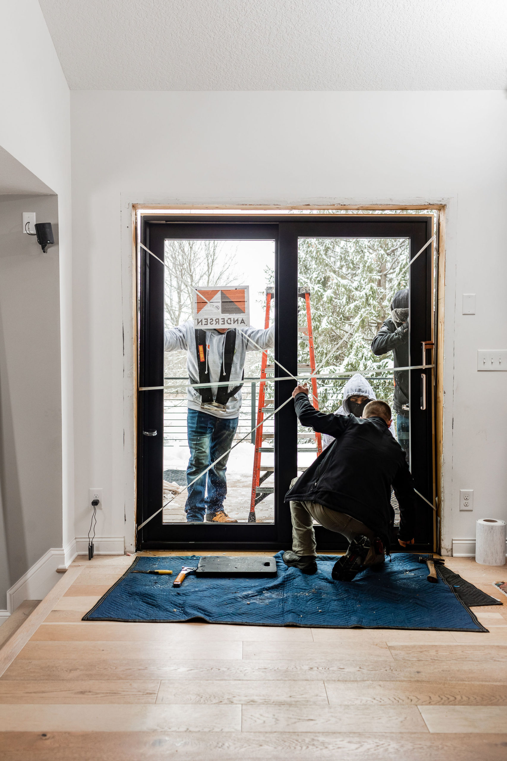
Here are just a few of the photos I grabbed of the guys bringing this space to life…
And the few times I brought Beckam to check on daddy after we left, he’d ask for days on end when he could see “his friend” again. They have two young children and let’s just say one of their boys has the best toys to play with. Haha!
After
And after months of designing, planning, planning some more, and working hard…here are the afters…
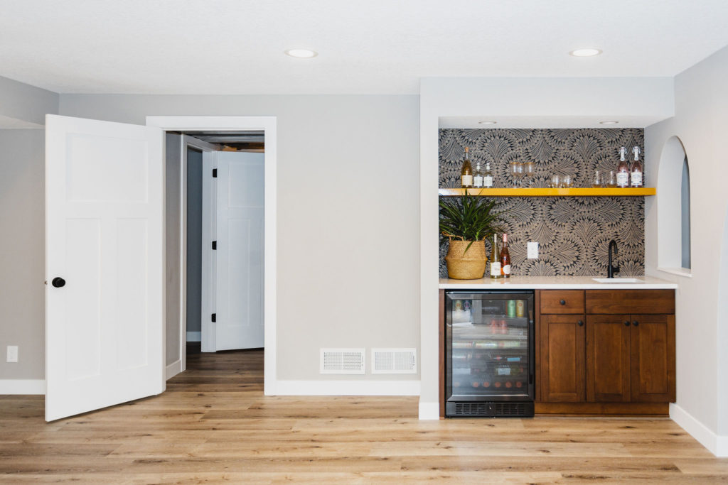
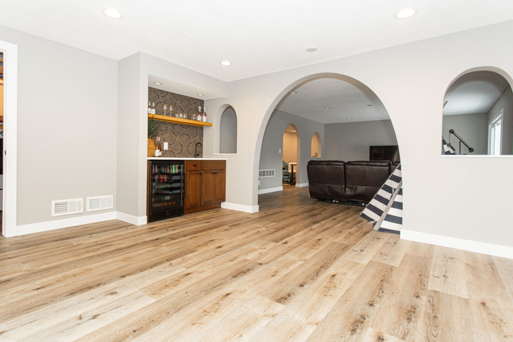
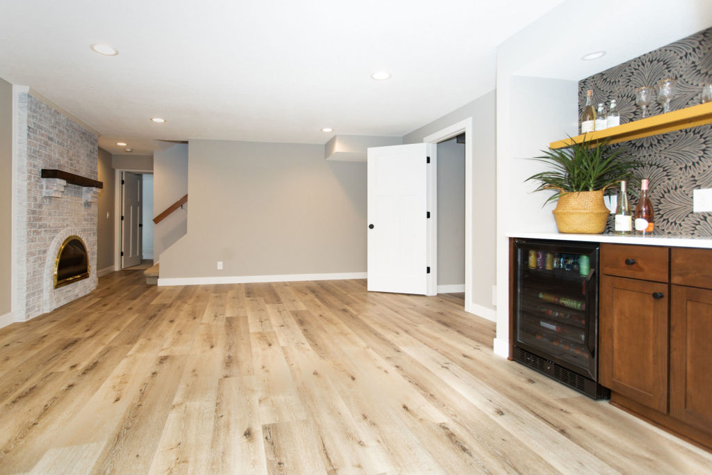
Main Living Room, Game Room & Bar
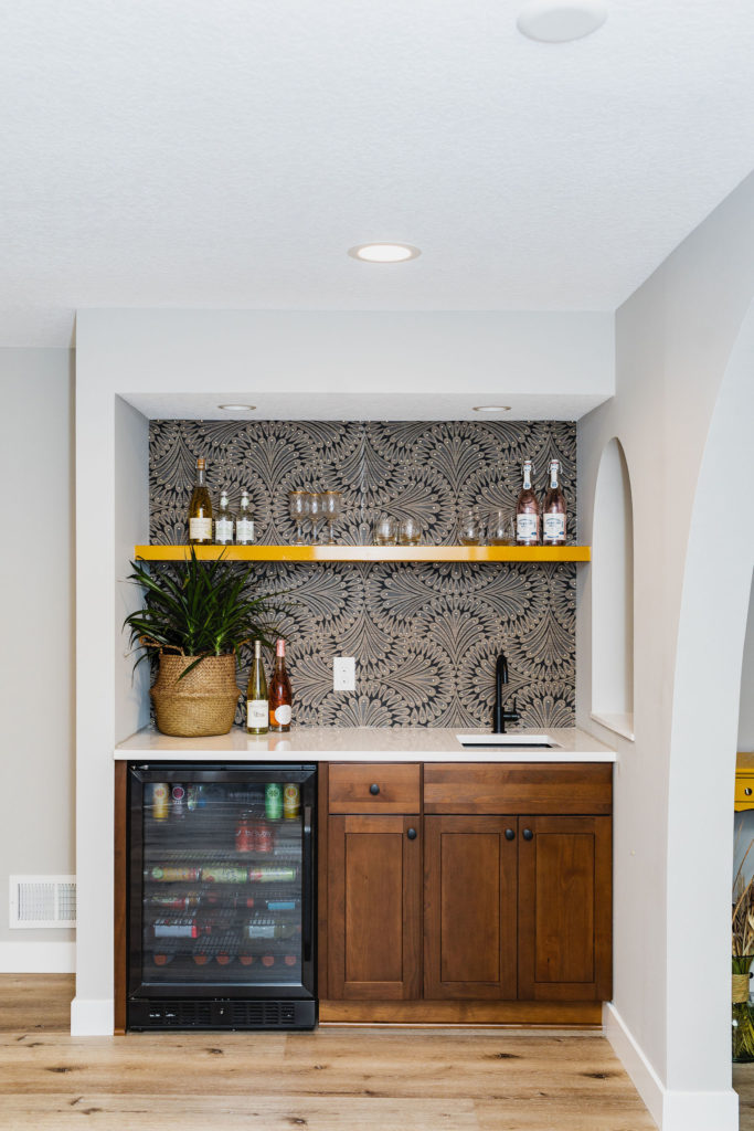
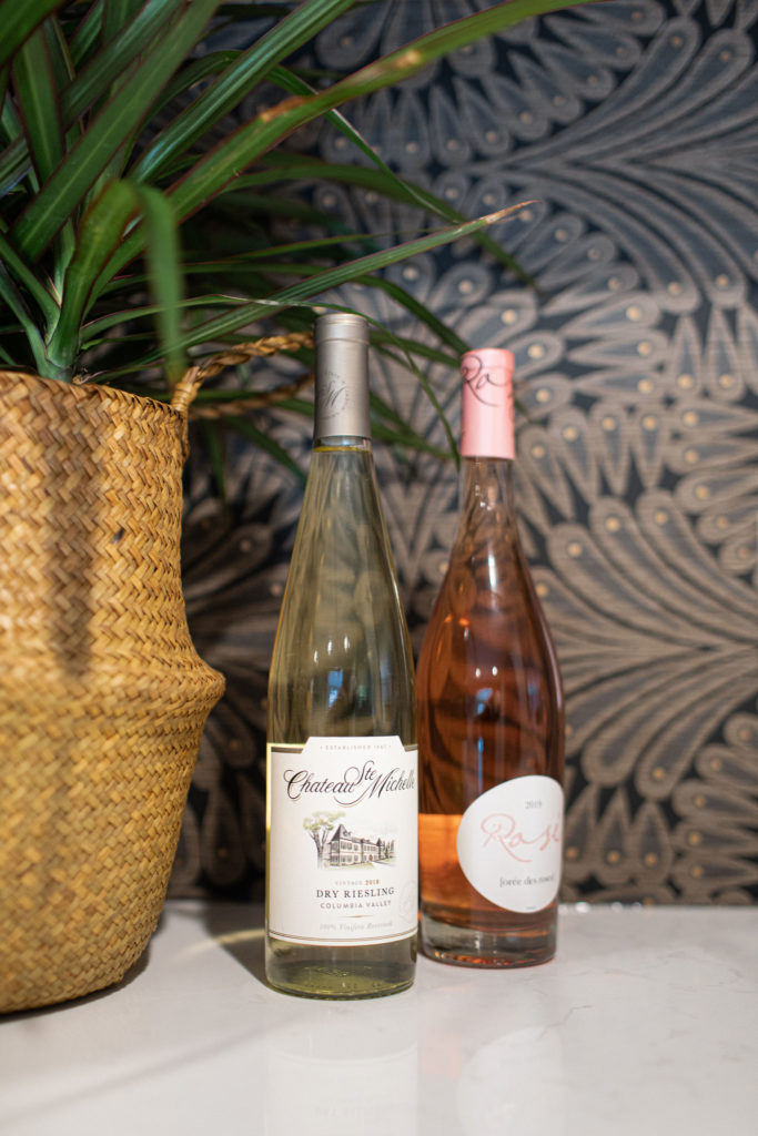
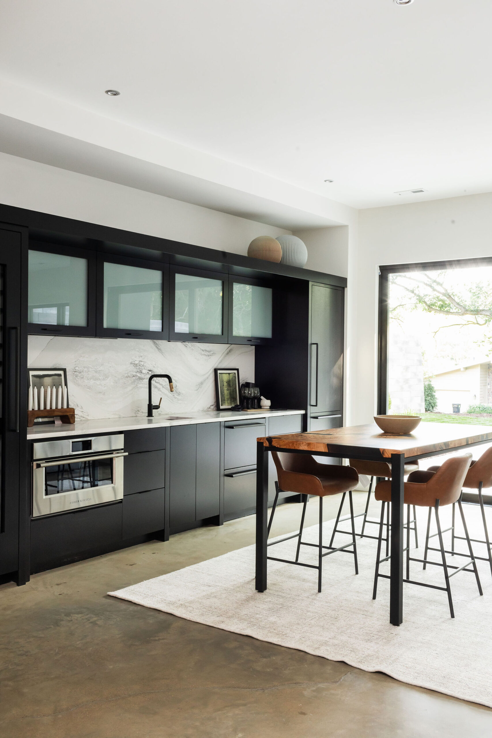
The wallpaper complemented the white countertops and cabinetry. The metal shelving was one of my favorite things about the space.
The flooring we carried throughout the space was one of our favorites from Urban Floor. The design is Cascade, but it’s an SPC, which is a form of LVT but, in our opinion, a great alternative for a basement floor. This luxury rigid core SPC floor is soft and warm for your feet, scratch-resistant, and 100% waterproof. We recommend it a lot for clients in places such as MN, where water can easily get in, and kids are active.
Eventually, right here, our clients will add in a large gaming table for the father to gather around and play!
Guest Bath
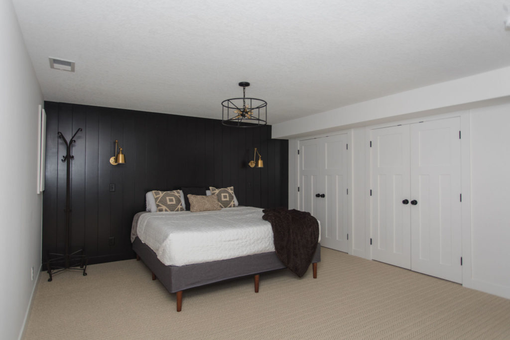
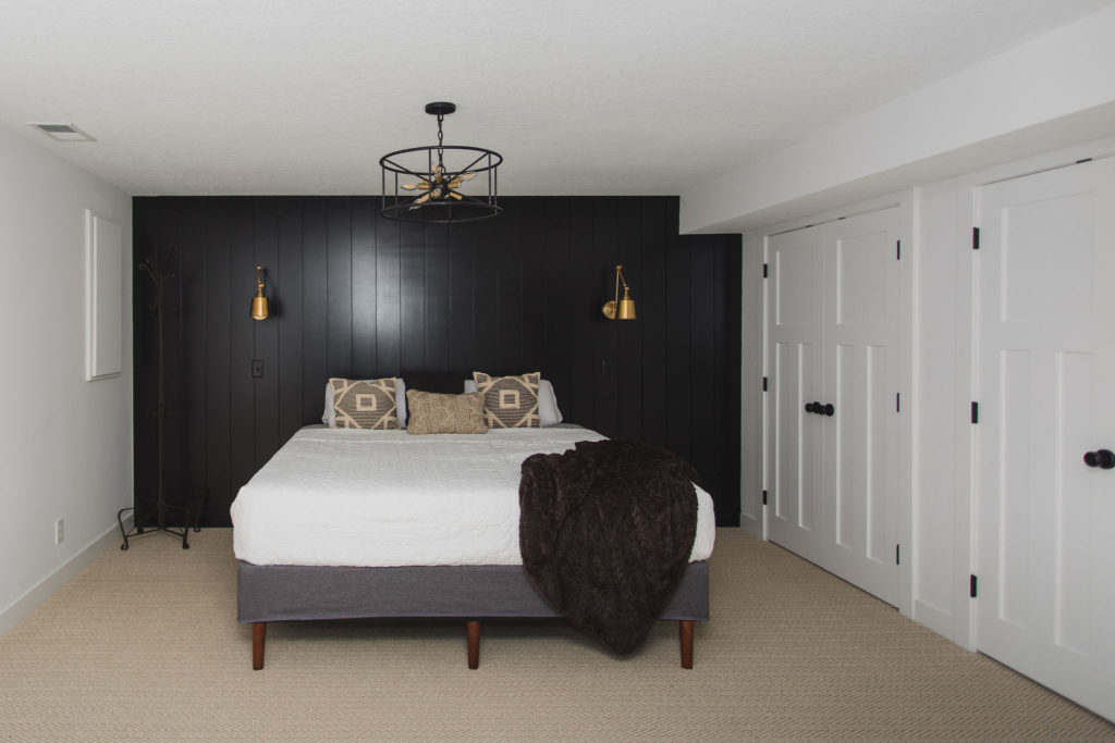
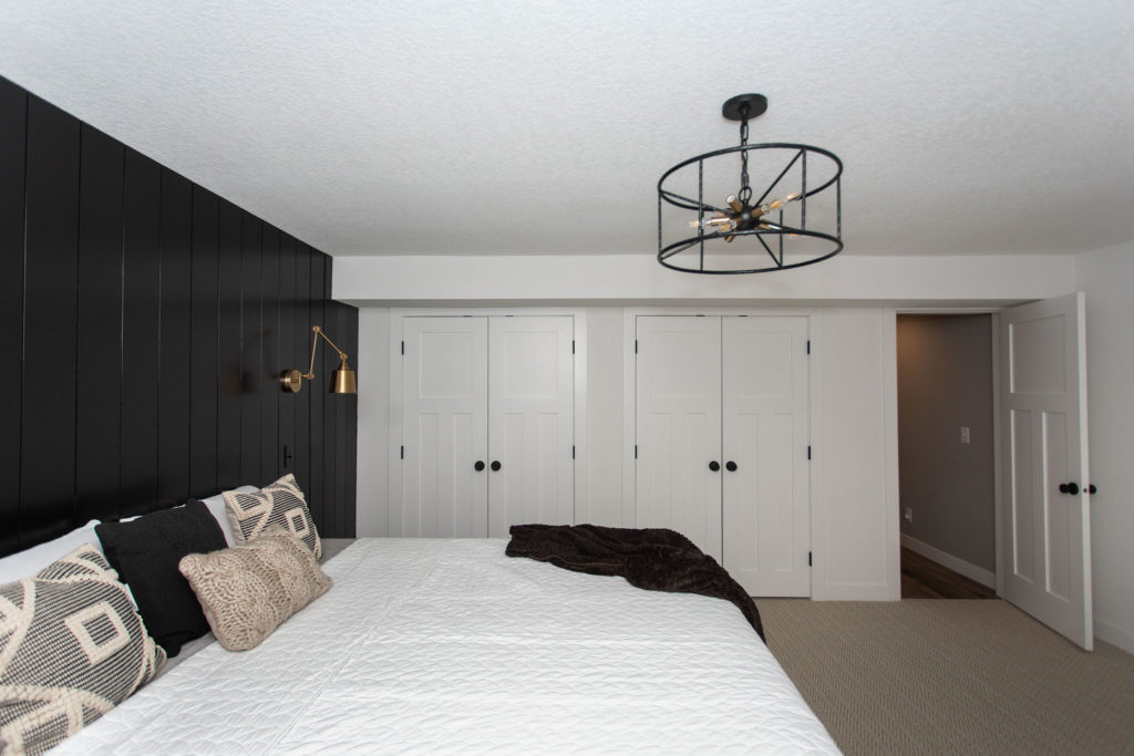
Owner’s Suite
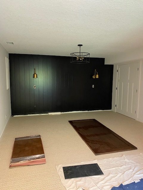
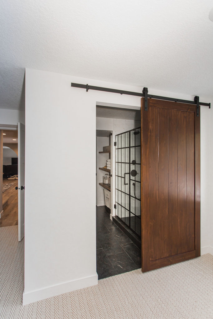
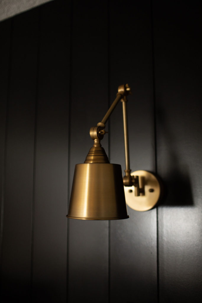
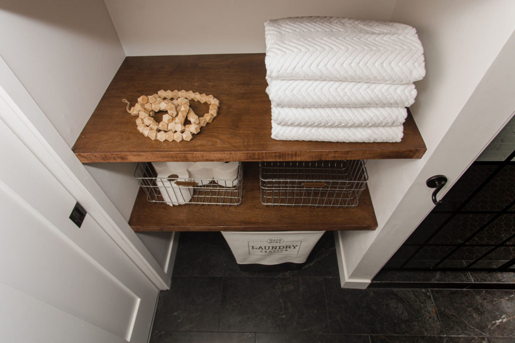
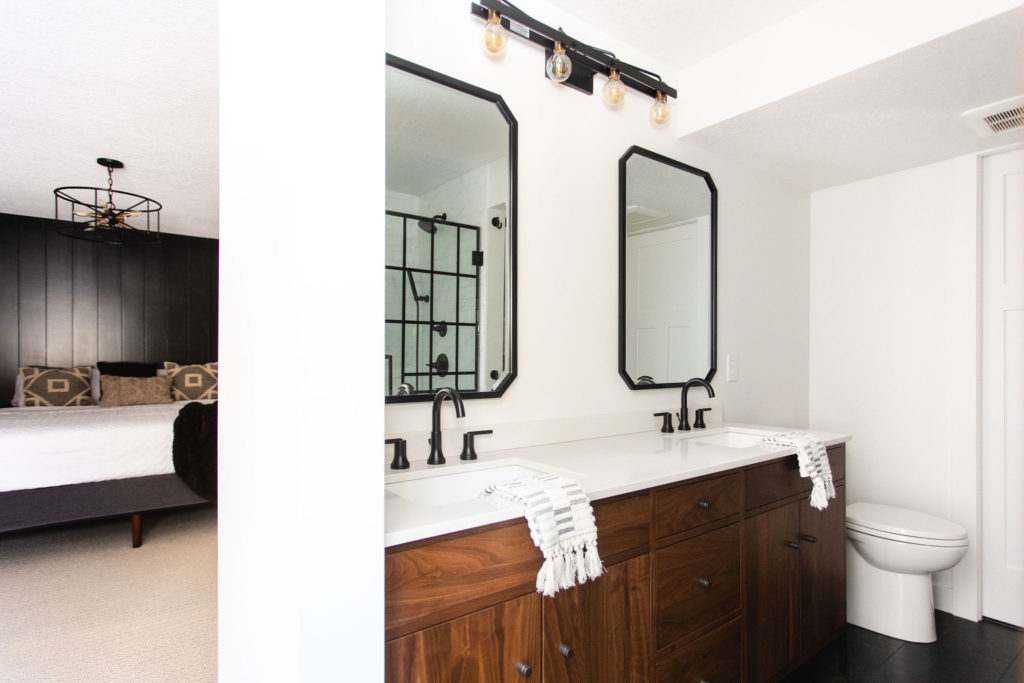
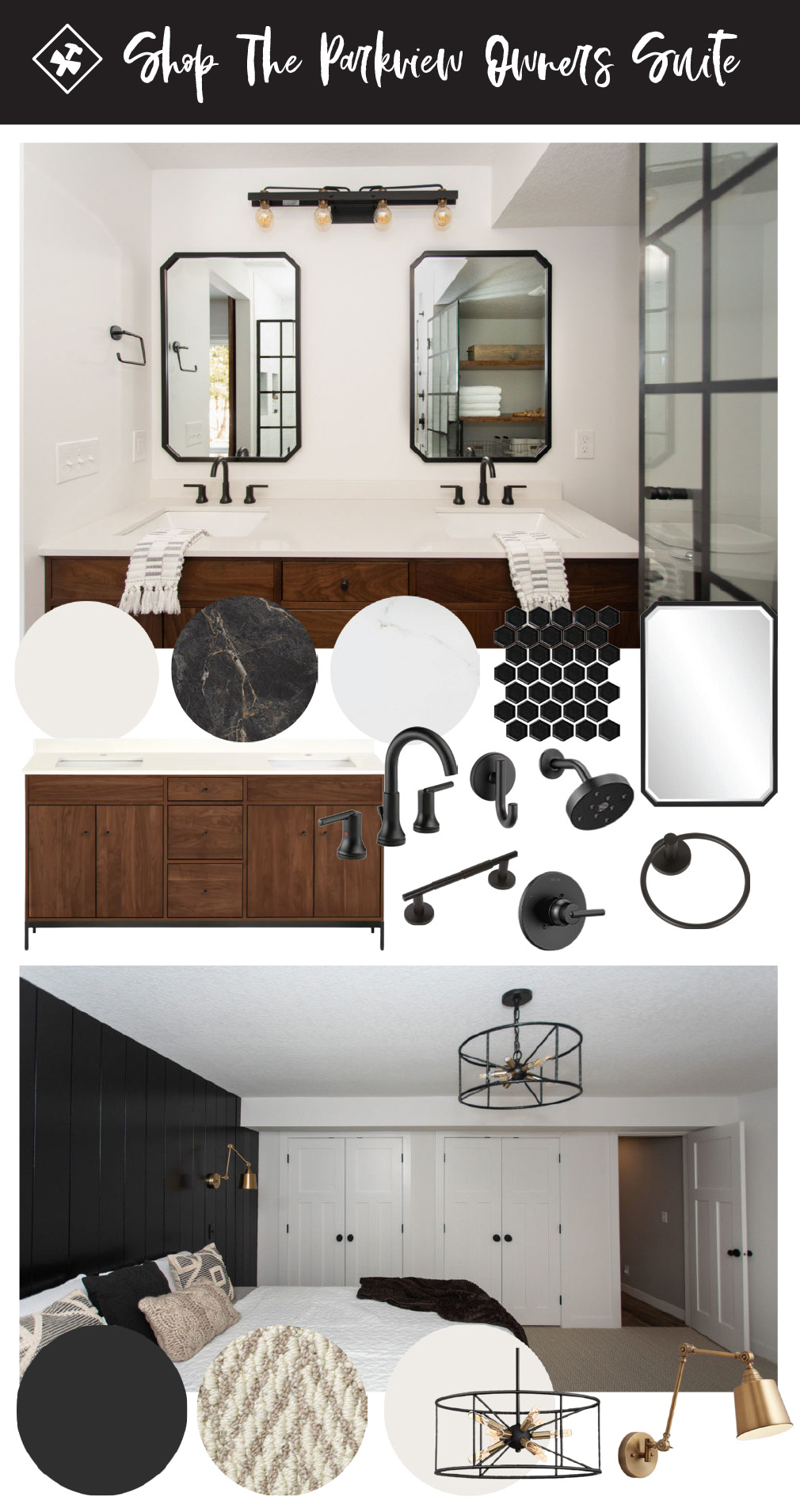
One of my favorites! Between the accent wall, sconce lighting, carpet, additional closet storage to the owner en suite bathroom. My actual favorite part was that our clients said they were going to move into the lower level when their kids were older, and they were all moved in before we even got out of there! Haha! I want to say that is the best compliment you can give us. They loved it so much they couldn’t wait another day longer. And I wouldn’t have been able to either, especially after 2020.
And also, this carpet was a hit online. I wish I would have grabbed a closer shot, shoot!
Tons of you wanted to know where it was from, and we’re linking here, but also it came from our friends at ProSource. They help us with most of our flooring needs and a lot of our cabinetry, and we’re always so thankful for them.
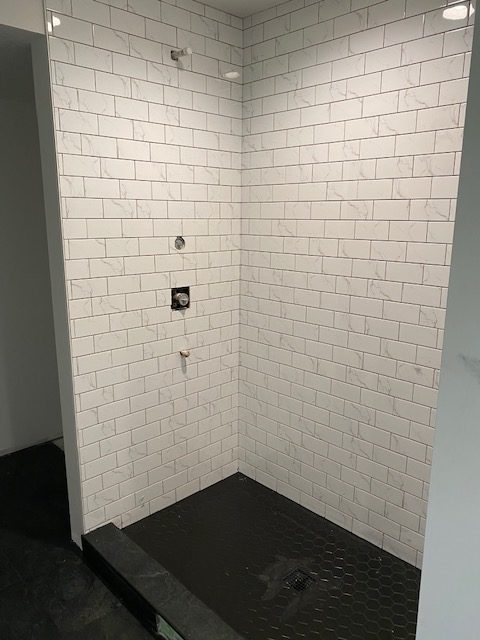
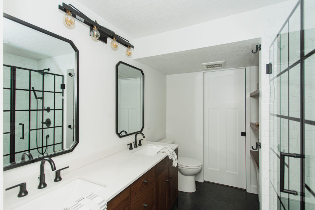
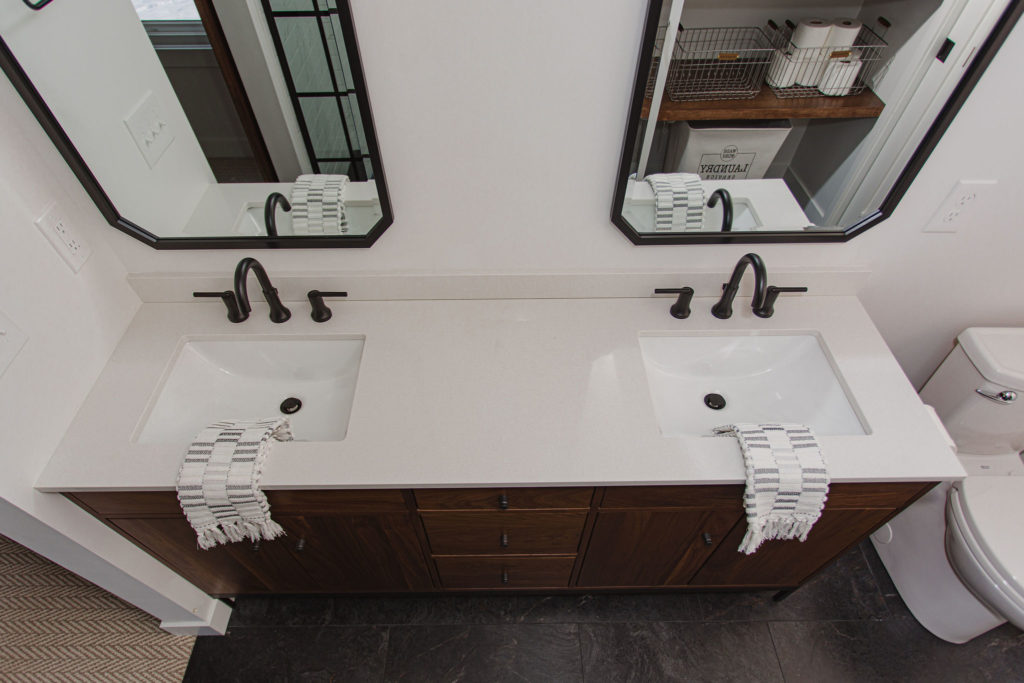
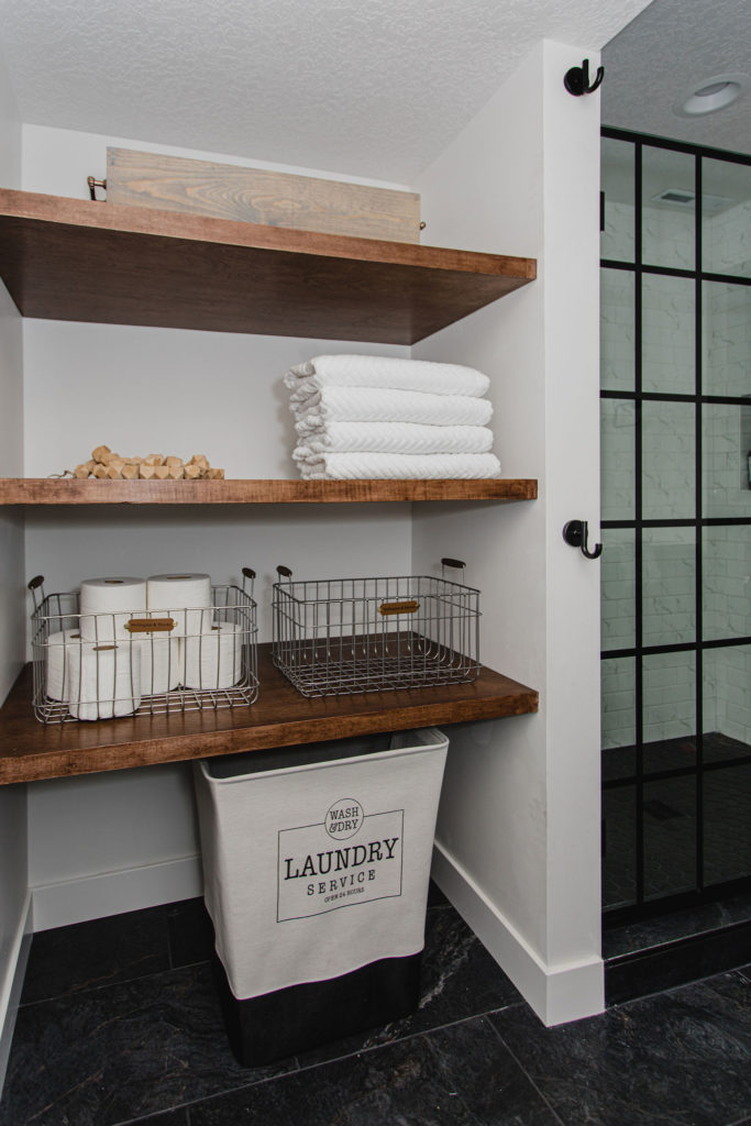
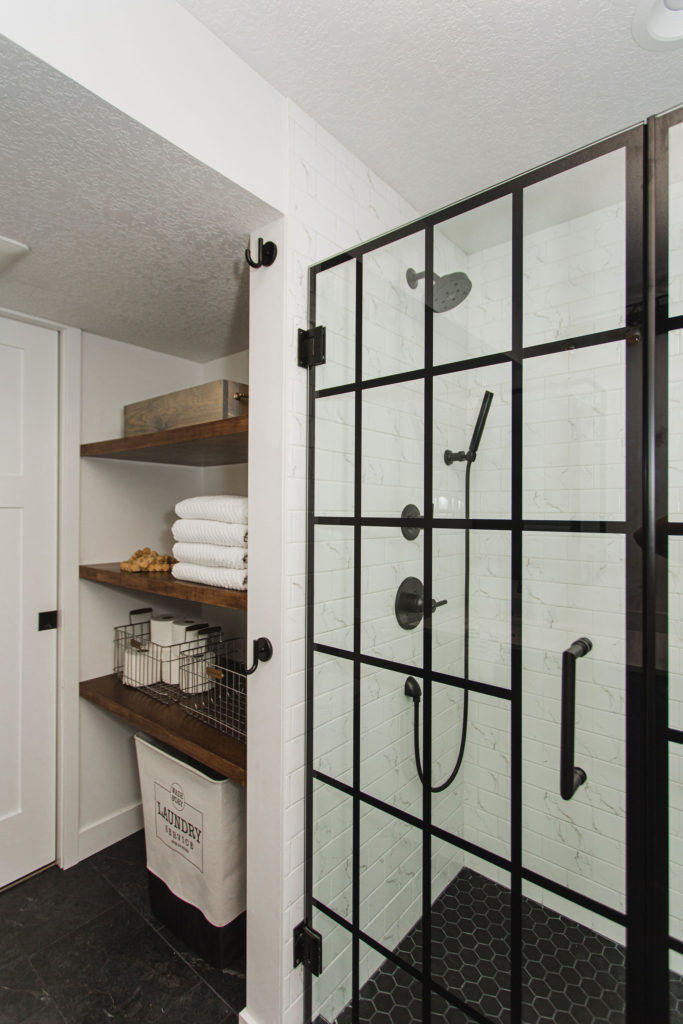
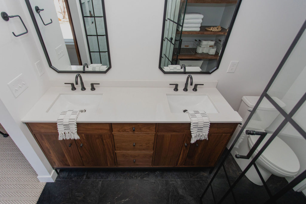
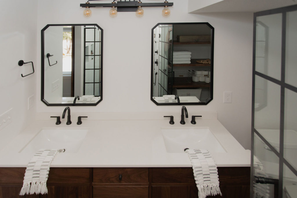
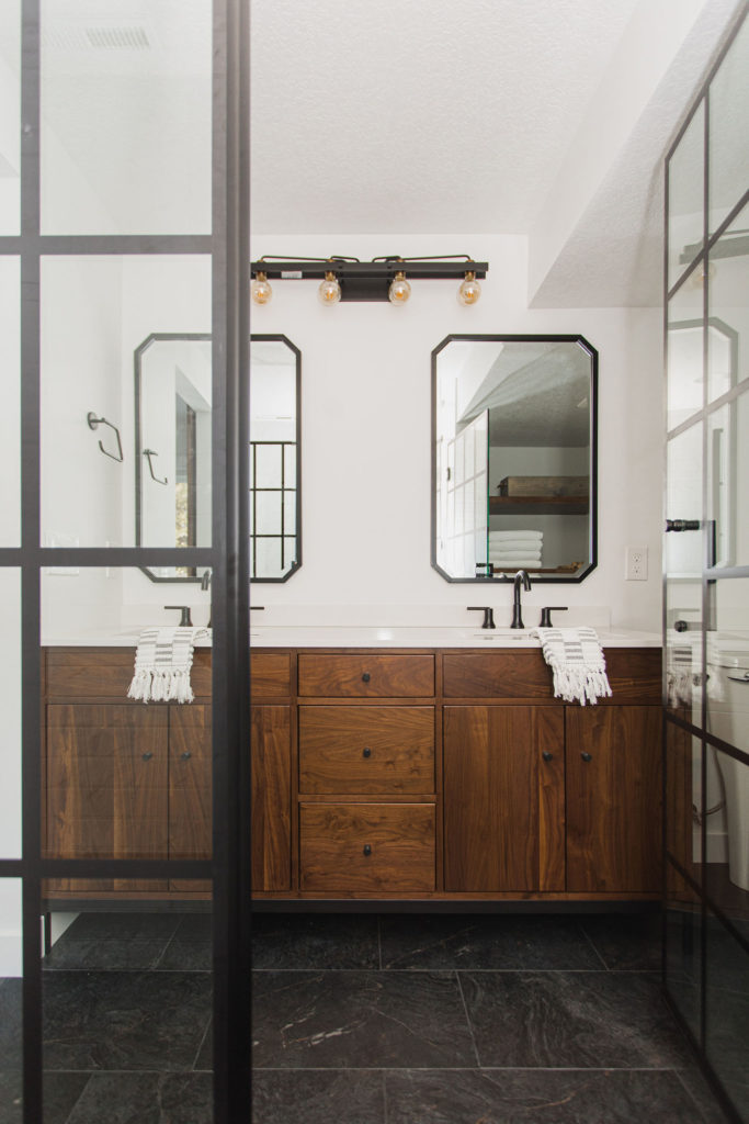
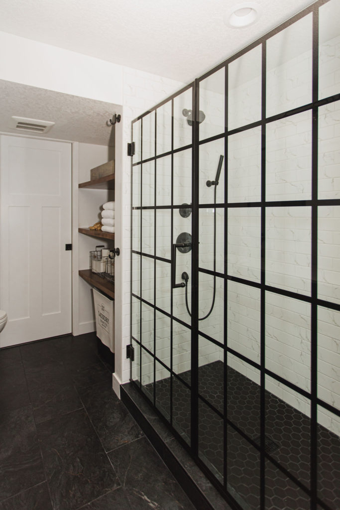
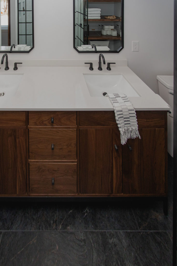
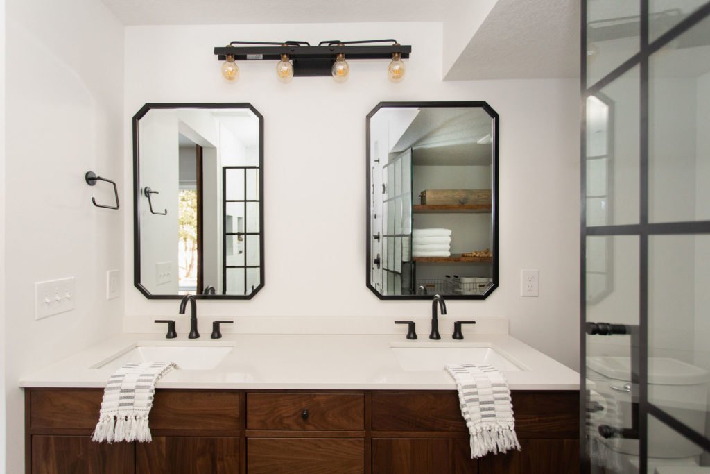
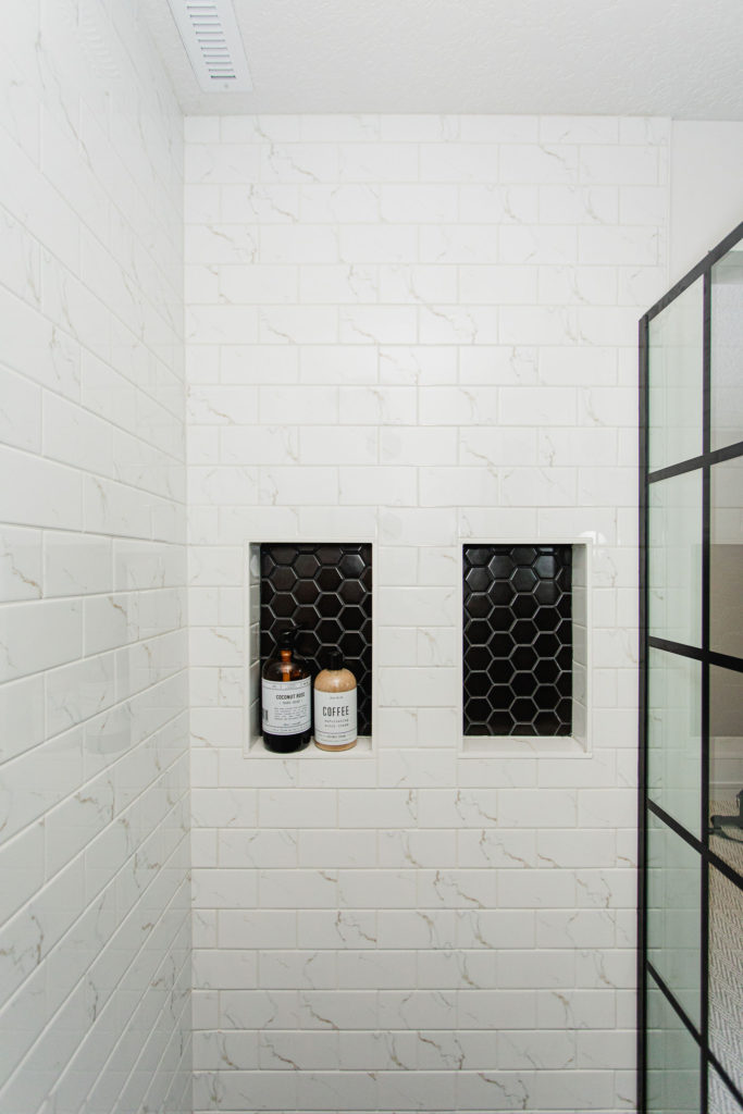
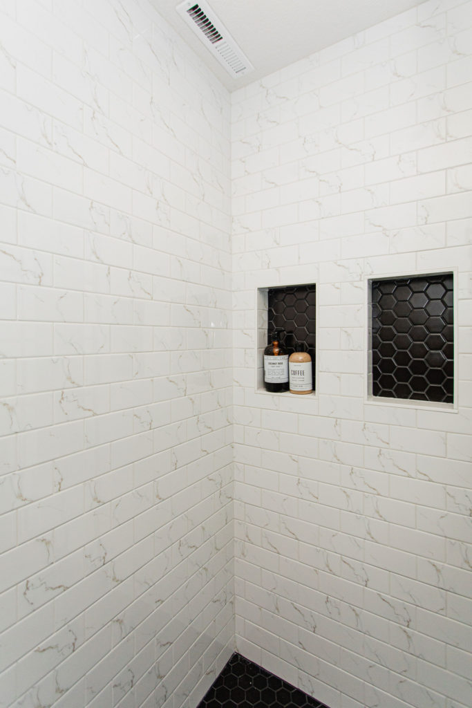
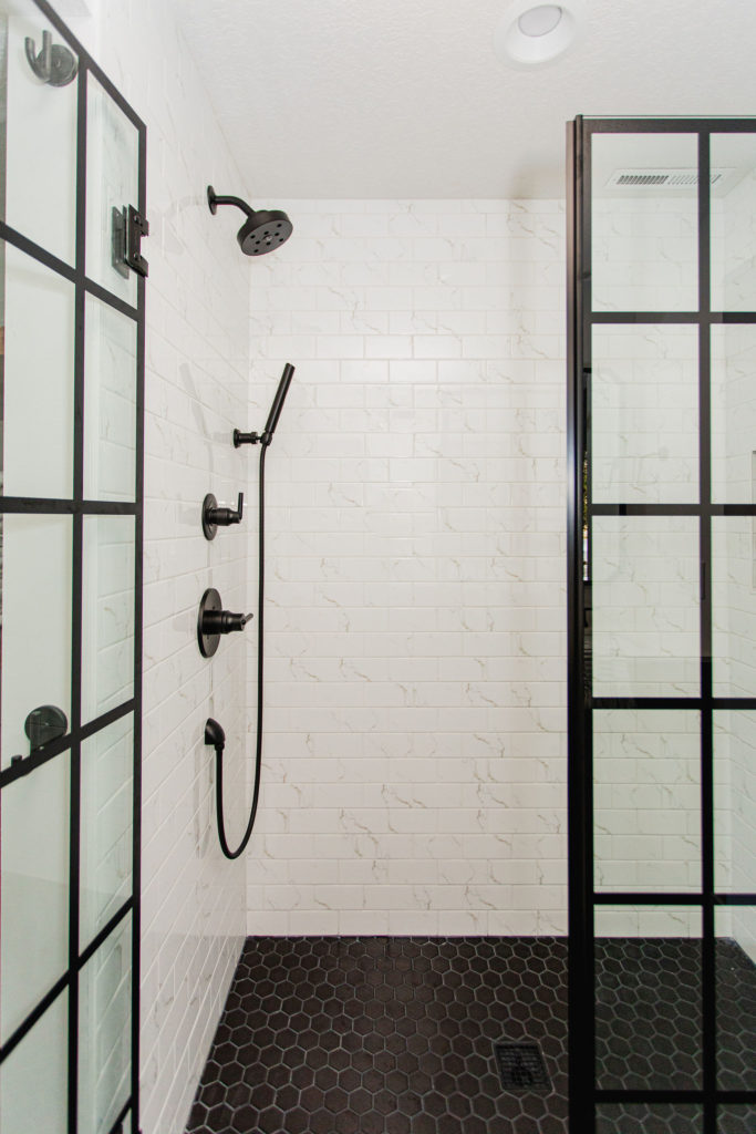
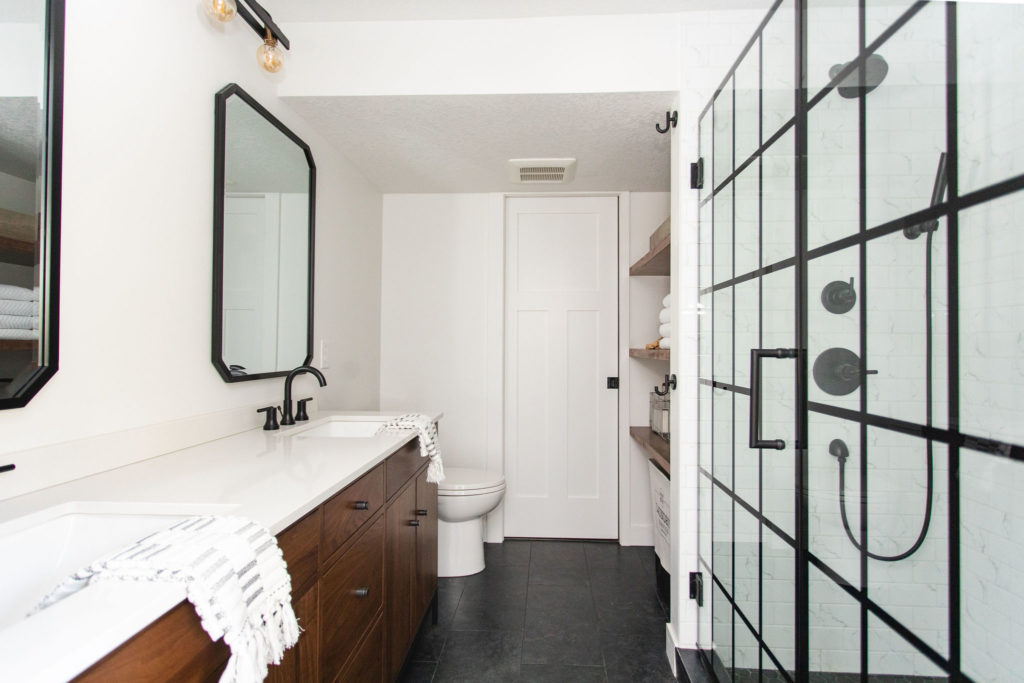
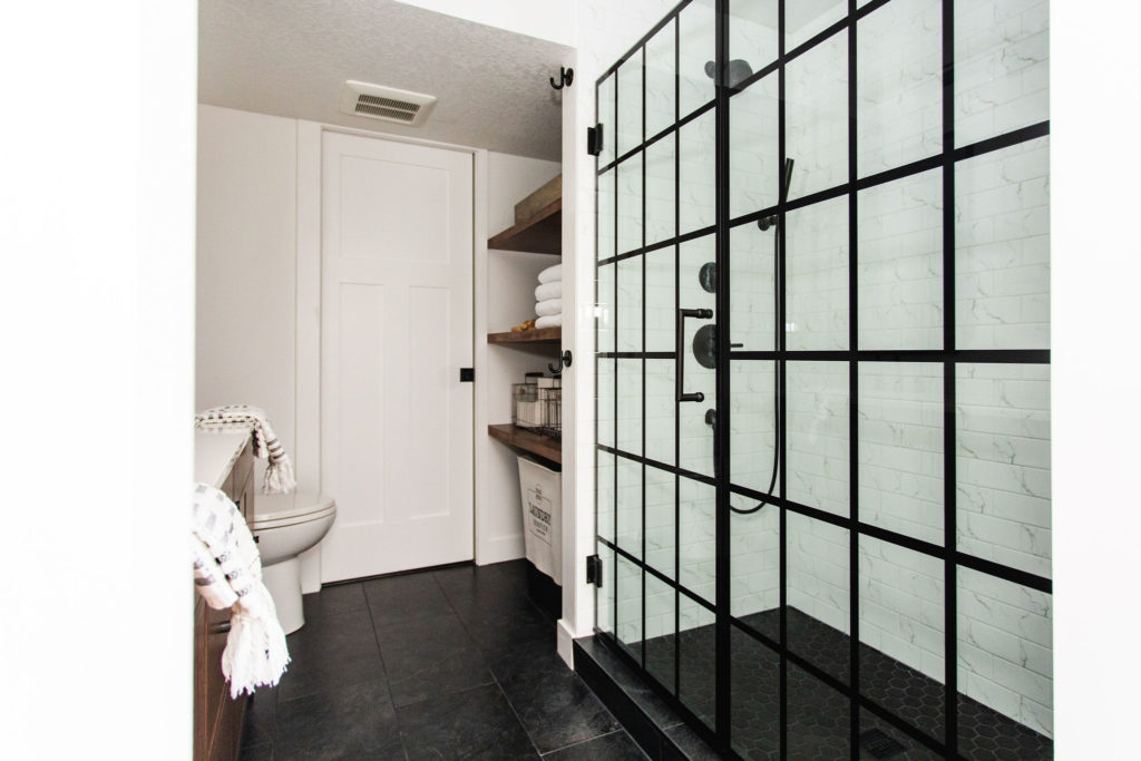
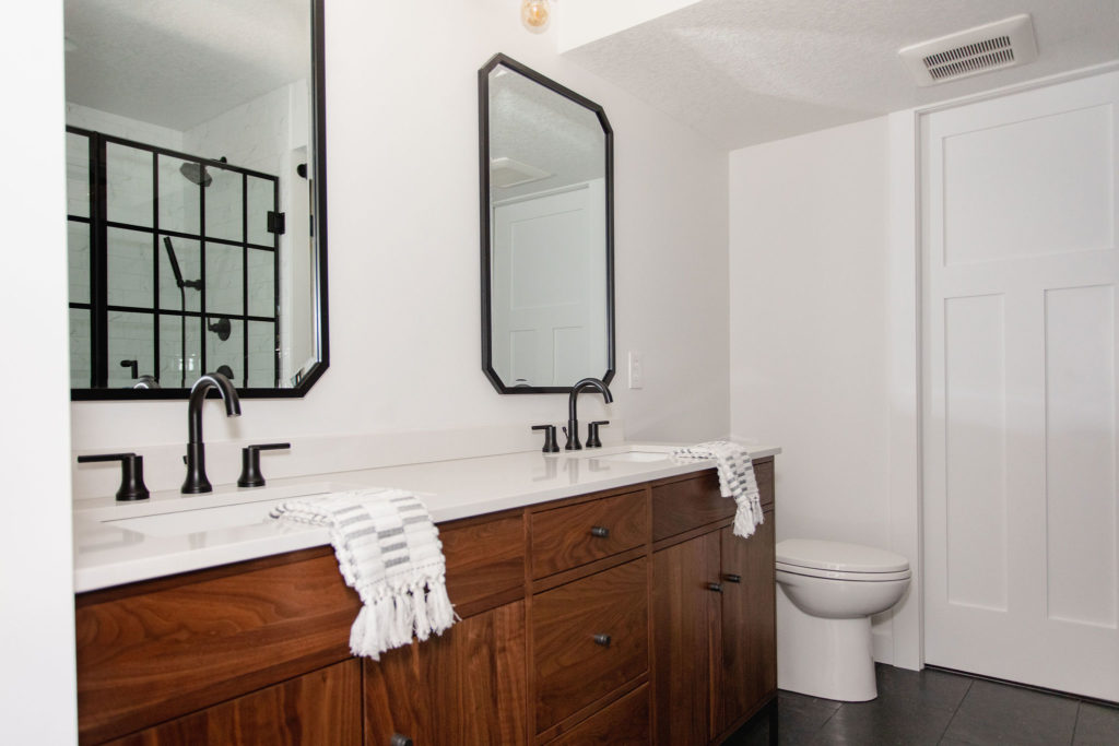
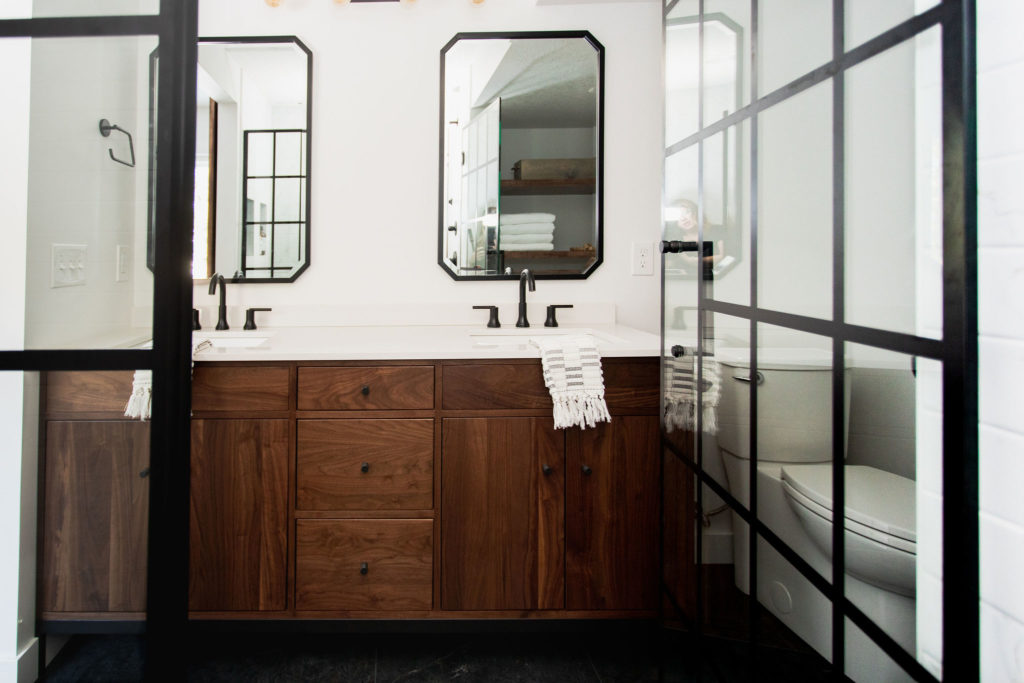
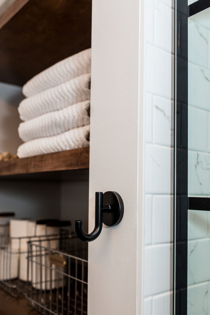
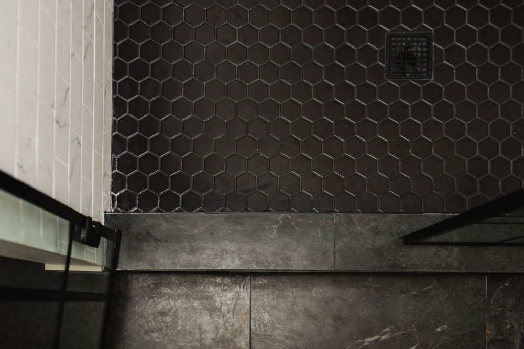
And let’s chat about this bathroom! I loved how our clients wanted to go with a black and white feel and bring in the warm wood elements throughout. All selections are linked at the bottom of this blog post.
Selections
Main Level + Bar
Flooring | Wall Paint Color | Wallpaper | Countertop | Cabinetry | Hardware | Metal Shelving
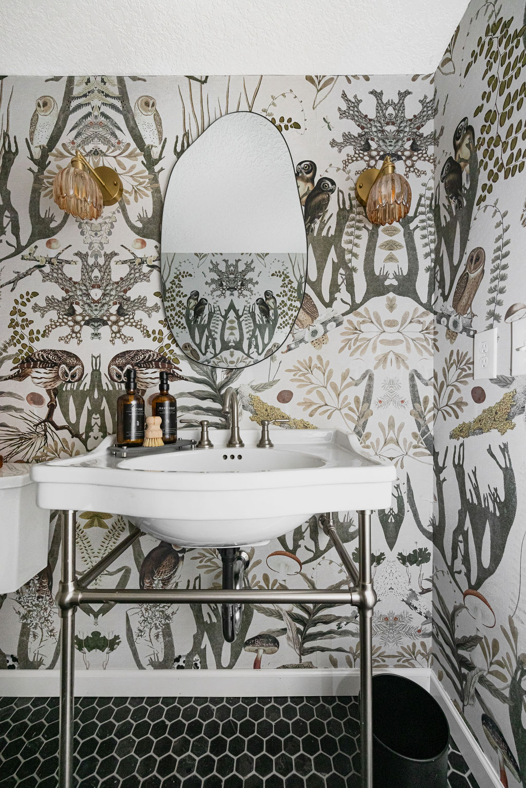
Guest Bathroom
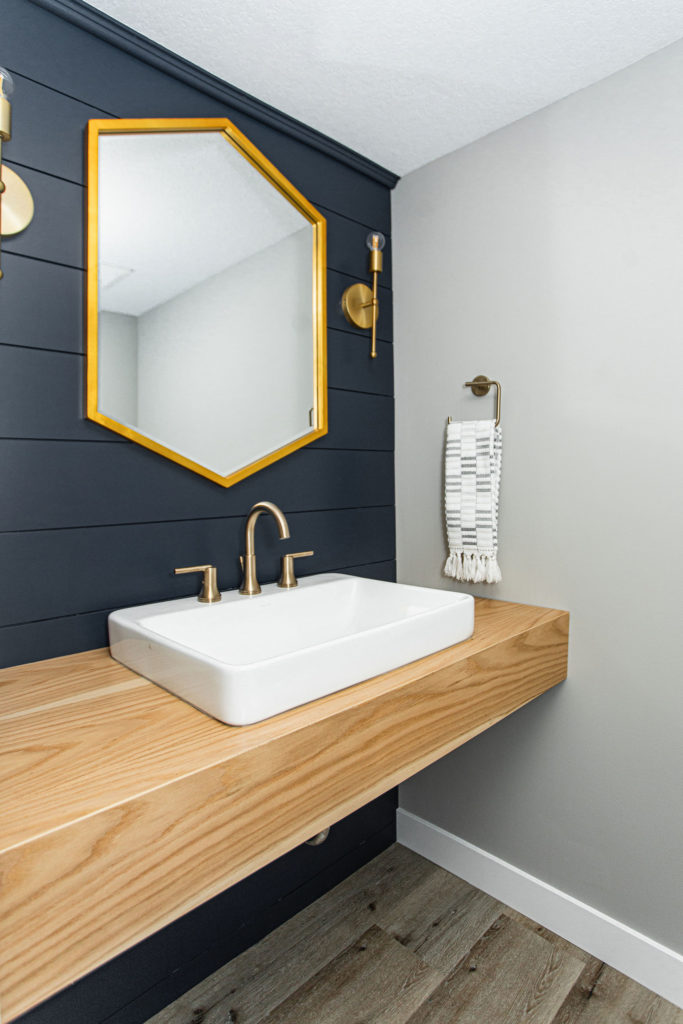
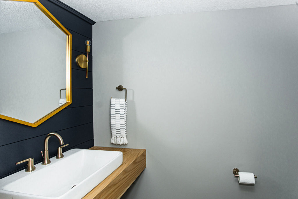
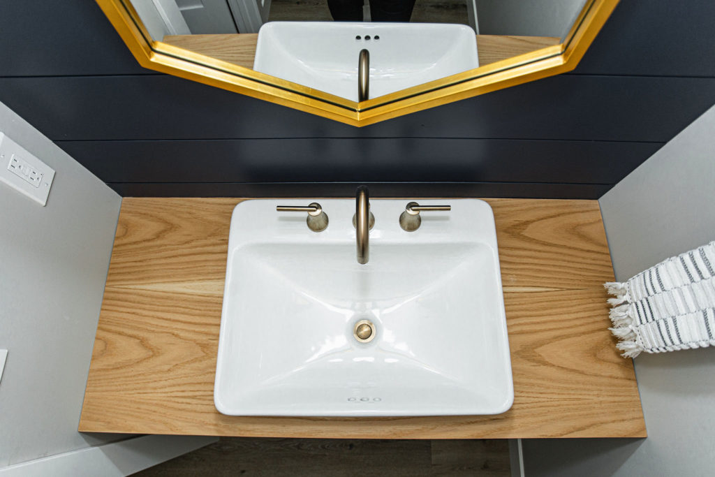
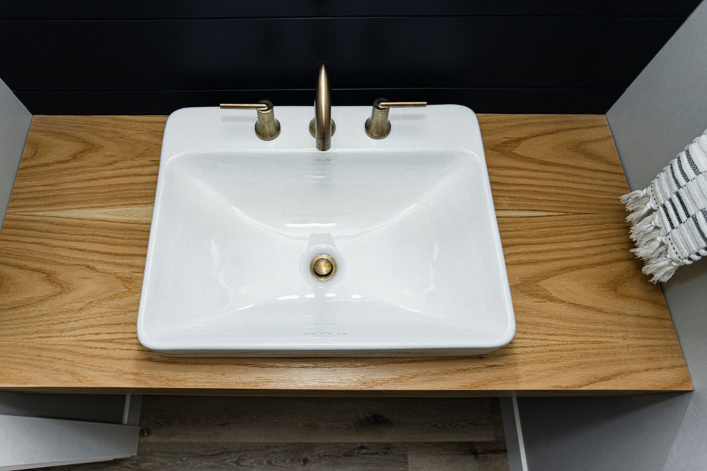
Sink | Faucet | Mirror | Accent Shiplap Paint Color | Lighting | Custom Vanity built by c2s
Owner’s Suite
Carpet | Accent Wall Paint Color | Wall Paint Color | Sconce Bedroom Lighting | Main Floor Tile | Shower Wall Surround | Shower Floor & Niche Tile | Shower Door | Faucet | Vanity | Mirrors | Lights | Hooks | Custom Barn Door built by c2s
We hope you all get a few takeaways for inspiration for your own home! Let us know in the comments below what was your favorite element about the space?
https://construction2style.com/web-stories/parkview-lower-level-reveal/
