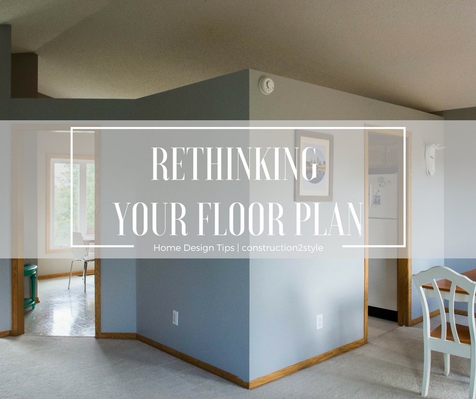
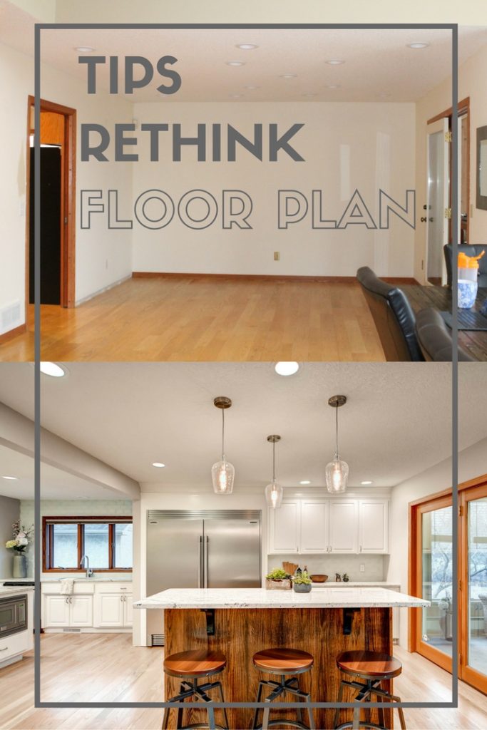
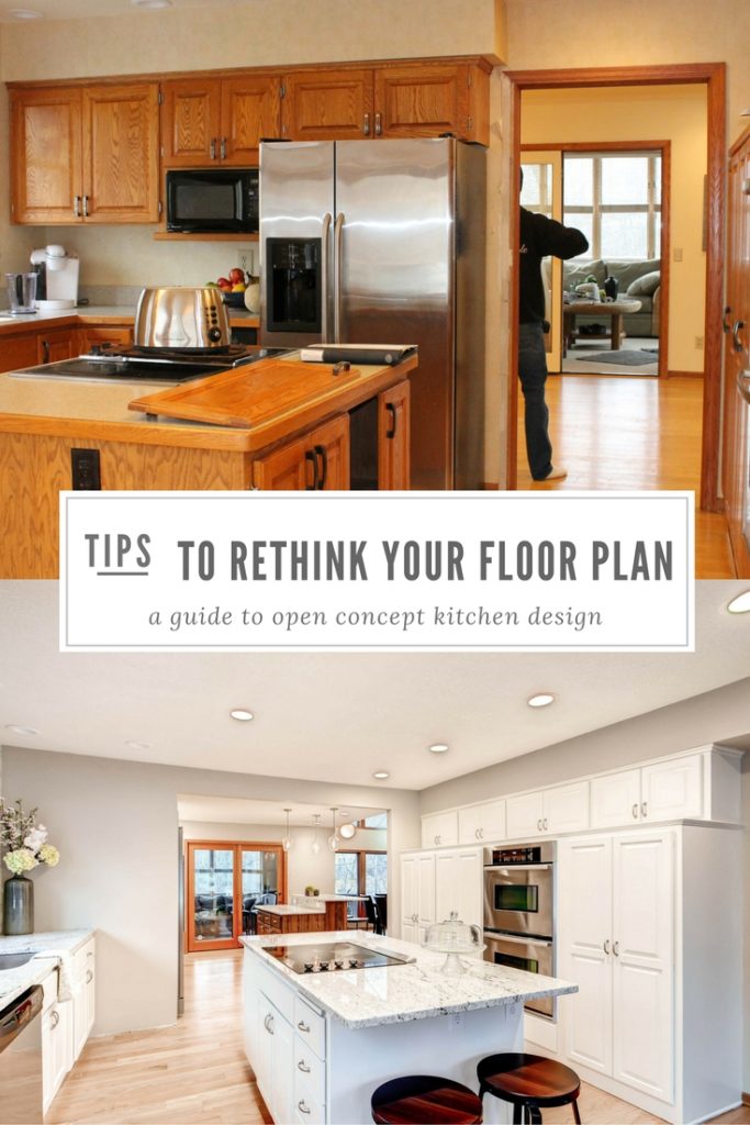
Rethinking the floor plan is my favorite! The first step to working with any of our clients is checking out their space.
That’s our time to dream BIG together. When we dream big we always rethink the floor plan, whether they had that idea or not.
Whether it’s removing a wall or adding a wall, we want to think of every way we can exhaust all of our options. We want to make sure that if we’re coming in to do a remodel, they have thought about all the cool options they have for their space.
We might incorporate all of the top design trends, things on their wish list, and top-notch finishing selections, but if the layout doesn’t cater to our homeowner’s style, it’s pointless.
So today we want to share how we work with our clients to effectively rethink and design their floor plan, along with some tips for you if you’re working with another contractor.
Our client who we’re actually doing a kitchen remodel for right now told us to write this post after having worked with us because she loved the process and thought you guys might too!
Dream It Up
Time to get your creative juices flowing! Dream it up! Go big or go home!
That’s what we tell our clients when we start thinking about what we want to do with their space. What walls can we take down, and which ones can we put up?
What do you love and hate about your room now? What needs to stay and what needs to go?
What do your friends have that you’re dying to have? This is the fun part.
Don’t think about money or if it’s a load-bearing wall or not, just dream about all the things you want. Once you’ve got all your wishes out…then we can be realistic.
We use a couple of different design platforms, iHome Registry and Chief Architect.
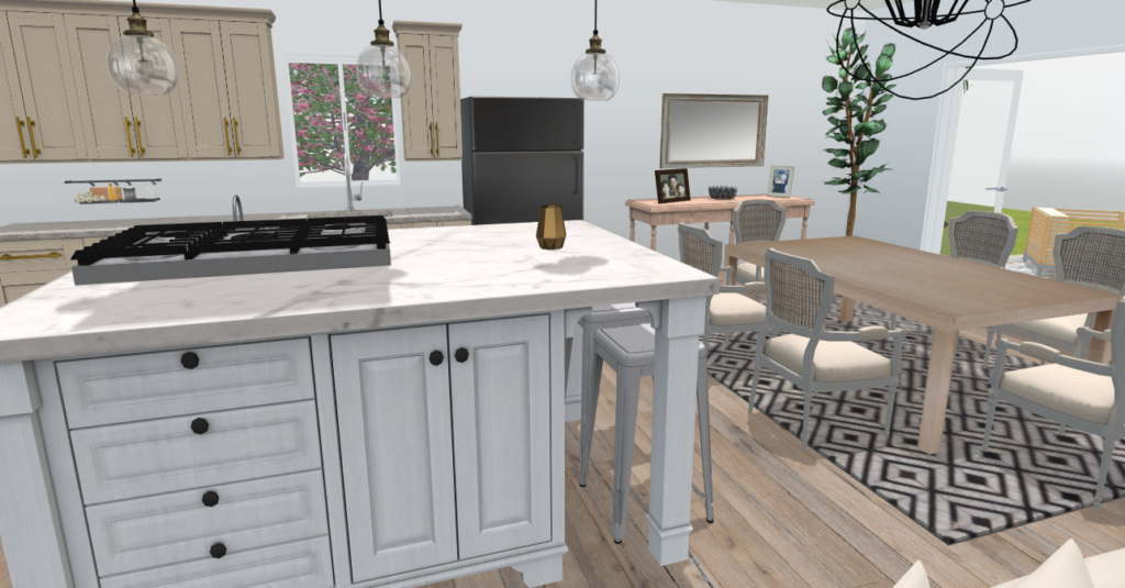
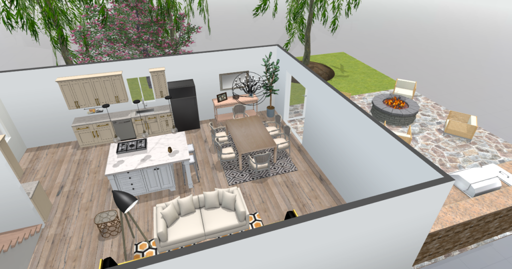
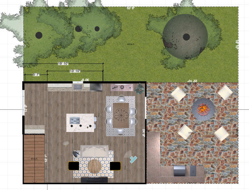
For the fun design layouts, we show to our clients we use iHome Registry (pictured above). Here we’re able to really play around and rethink the floor plan.
iHome has a lot of products in their software, from places like West Elm and Pottery Barn, that we love to use. It’s SO much more fun to show our clients the layout with the exact imagery we will pull into their designs, versus the plain layouts that we put together to pull permits and such.
When we know exactly where we want everything, we use a program called Chief Architect to pull our permits and for us to remodel off of for accurate measurements and placement. Unlike iHome, Chief Architect has similar products to display in the designs, but not the real deal.
That’s why we like to use iHome for more design fun! Chief gives us more accurate measurements laid into the drawings for codes and regulations that we like to read and our clients could care less about. They are both amazing programs though and we’d highly recommend both.
iHome is also catered to homeowners to use and is a web application that is pretty cool where Chief you have to download the software to your computer.
Be Realistic
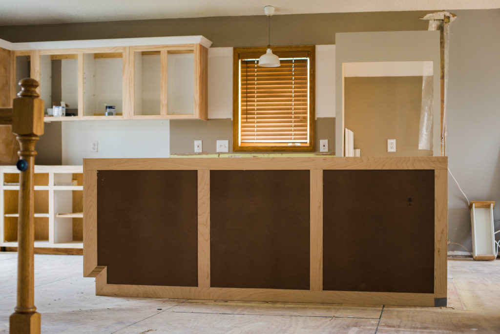
List Requirements, Follow Codes & Guidelines
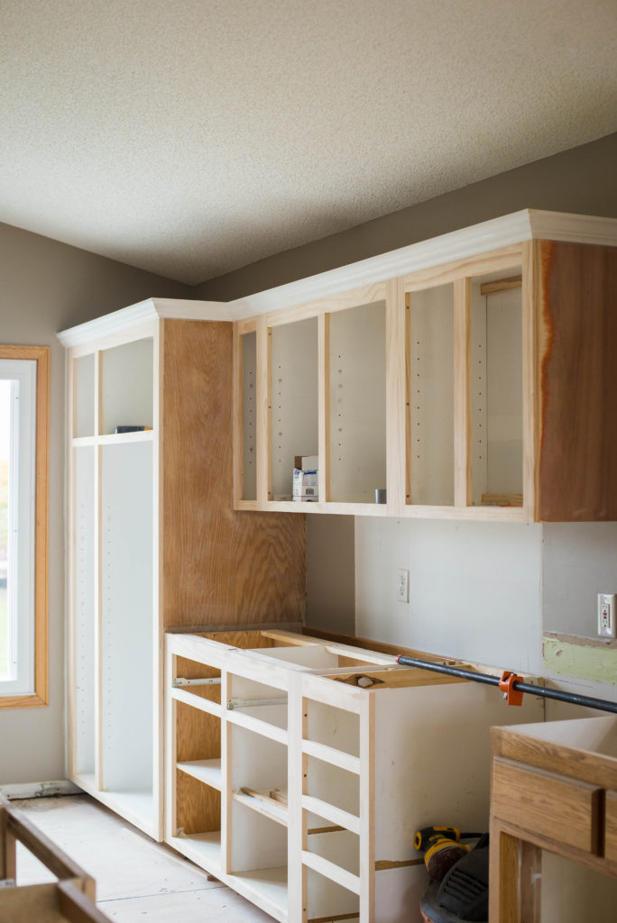
Measure & Scale
You obviously always want to ensure you are measuring the space correctly. Either measure twice or grab another set of eyes to measure out the space with you, or do both.
You’ll want to measure the outside walls or footprints of your space, the windows, door frames, etc. Interior walls from side to side and ceiling to floor.
If there are permanent fixtures, you’ll want to make sure to measure those. Make sure to get the overall dimensions of the entire space, so when you go to think of different design layouts and floor plans, you know exactly how much space you have to work in.
Once you have your measurements, use a program to scale such as iHome Registry or Chief Architect. Which means reducing the size of your entire space to fit on the screen.
A common scale is 1/4 inch = 1 foot. This should be applied to your area plus your furniture, etc.
Think Different Design Layouts
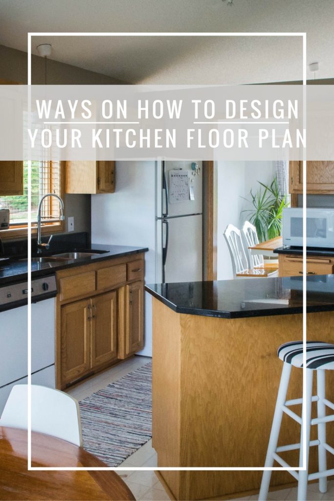
The triangular design plan is always a good go-to. As you can probably tell by the title, the stove, sink, and refrigerator are placed at points of a triangle for efficient movement in the kitchen.
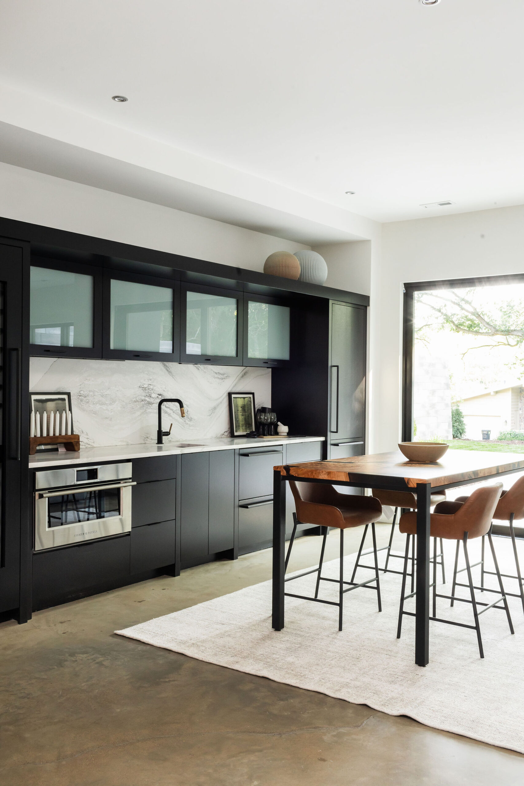
While this is one of the most popular design layouts, there’s a better design for bigger and busier kitchens, the work stations design, which is what we did in this kitchen design.
With this design plan, each area of tasks has its own little station, i.e. prepping, cooking, cleaning, and storage. These areas are centered around their major appliance and its landing area of at least 15 inches from the adjacent countertop.
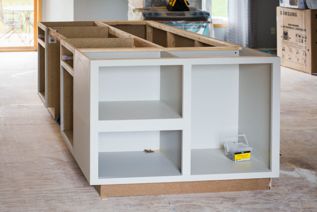
Islands are another key design piece. Islands are the new must-have and the bigger the better.
Share & Collaborate
The fun part! Once you’ve rendered your designs, share your ideas.
Collaborate and have someone else give you some feedback on what you’re about to do with your space. Sometimes having another set of eyes on your design helps to think of other things you may not have.
We always work together on design plans, and after we’ve gone back and forth a few times, we present them to our clients and work together to come to an agreement before we start the demo!
Sometimes the designs can take the longest, but it’s always worth having a concrete plan to follow for guidelines as you’re going through the reno process.
Happy Renovating,
J + M

One thought on “6 Important Tips on Rethinking Floor Plan Remodels”
Comments are closed.