Disclosure: This post was sponsored by HANDy Paint Products. Although we were compensated to write this post, all opinions and content are our own, and we stand behind and use all brands and products we endorse on our site.
This past December we talked about the upcoming colors of the year for 2019 and how excited we were to start incorporating the new color schemes into our client projects, as well as our own home.
HANDy Paint is one of our favorite brands and one we’ve partnered with year over year again talking all things color trends. If anyone knows colors, it’s HANDy paint brand!
Are you guys like me…? Spring time means deep cleaning, donating, rummage sales, antiquing and painting time! Whether we’re saying goodbye with the old or hello to the new, it’s one of my favorite seasons.
And one of my favorite things is that with paint you can make all things new, no matter how many years old it is!
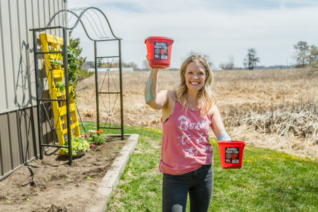
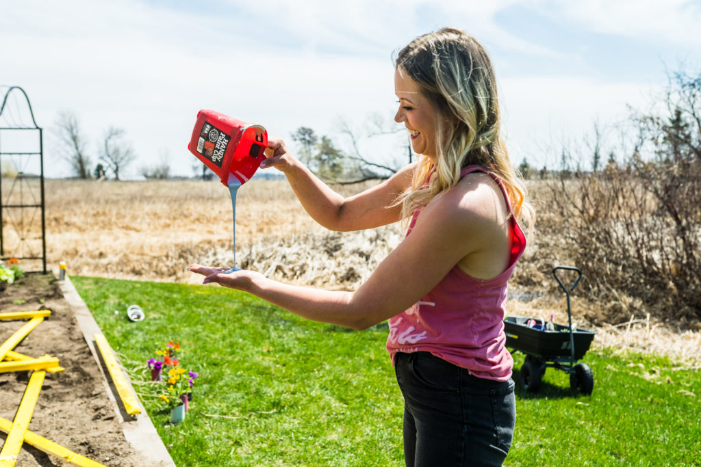
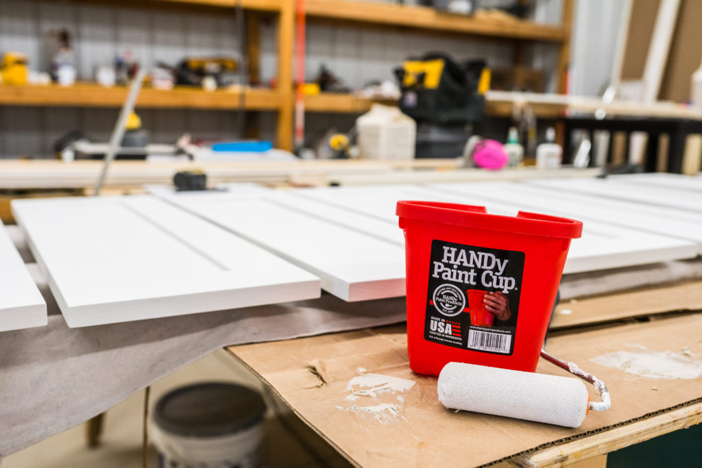
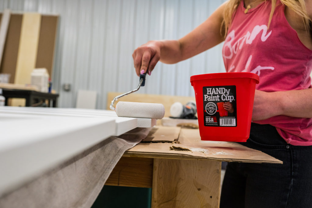
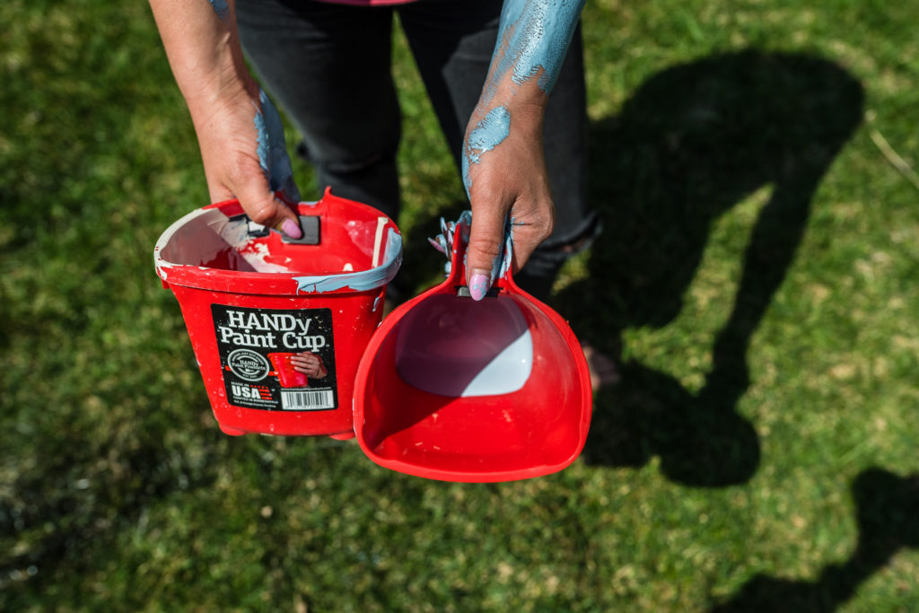
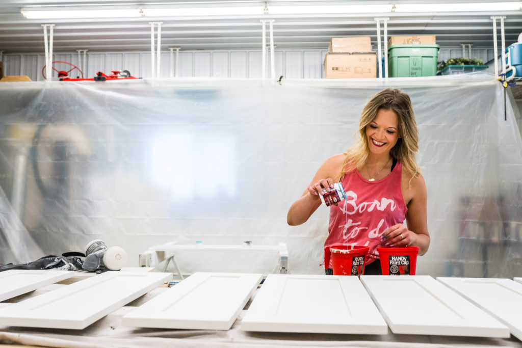
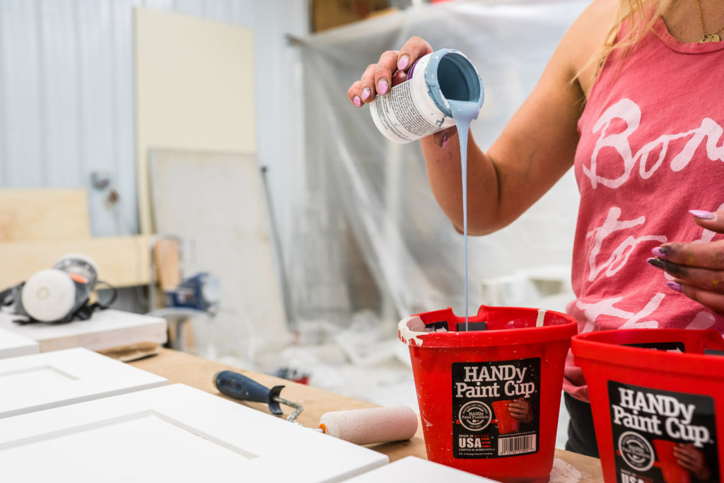
When it comes to painting new pieces of furniture, walls within new builds, remodeling new homes, or using as drink, cleaning, or puke bucket (with 2 sick kids all.the.time) our HANDy Paint Cup is our saving grace. #reallife
And this baby costs less than $3 and you’ll have it for a lifetime!
Now that it’s spring and summer I’m praying the sickness is over and we can get back to being happy outside!
I know we’re just a few weeks away and it’s just around the corner, so we wanted to feature and share some of our favorite color trends for the warmer seasons!
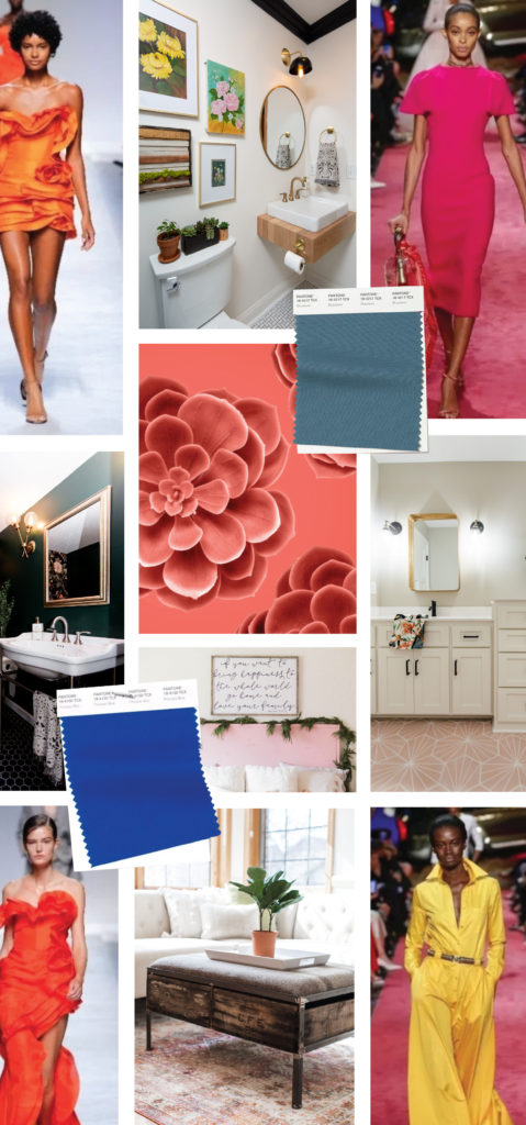
According to Pantone, the spring colors, right from New York fashion week are more colorful and warmer hues! We said goodbye to the stark white and went to creamer whites. Then from a festive orange reds, to Pink Peacock, to Princess Blue, there will be no shortage of fun colors this spring.
Behr announced their 2019 color as Blueprint S470-5, which in my opinion is the perfect summer color! You know me and how I love a good blue and this selection gives a good color, yet it’s calming and relaxing.
From the paint on your walls to cabinetry, to tile, and decor style… you’re going to have some fun this summer with new colors.
Warmer Whites
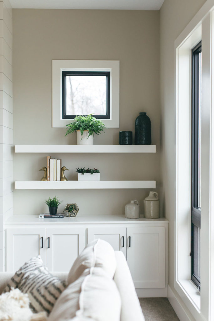
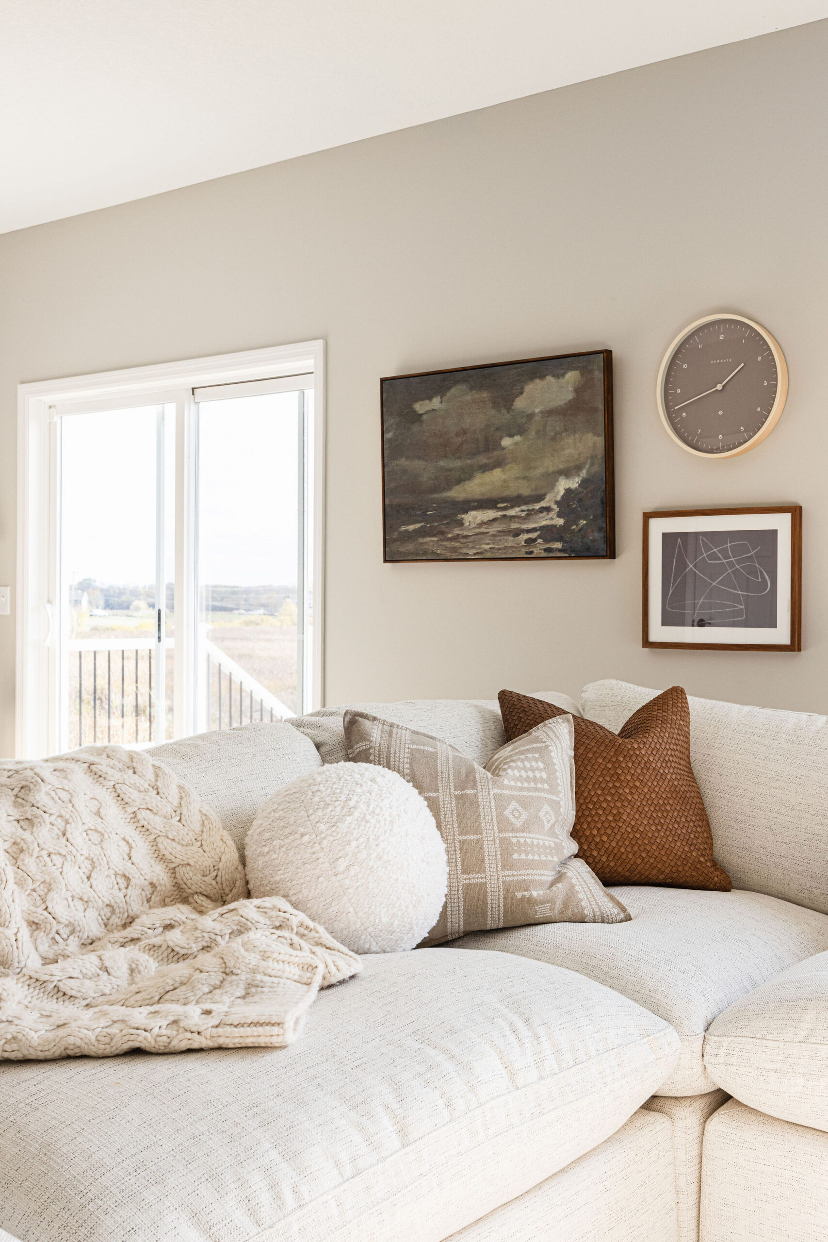
White will always be a classic for paint colors, but we’re seeing a shift from stark whites to softer whites that make your home feel more cozy. Whether it’s for trim, shiplap, walls or built-ins, you can see how we’ve been shifting to warmer whites.
In 2018, you saw white trim with white walls and now people are starting to go bring back warmth in color on their walls. Revere Pewter, by Benjamin Moore, is a favorite and go-to of ours to bring in a neutral tone. It’s a light gray with warm undertones that is perfect for a transitional color.
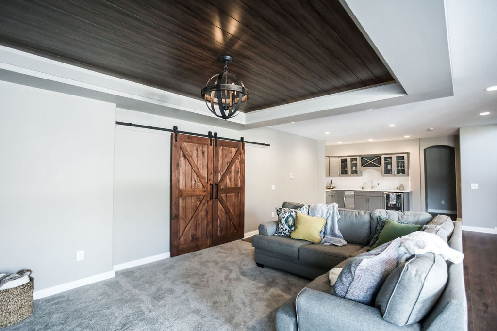
Warmer whites also compliment wood tones and create an overall cozier vibe than stark whites. In this basement finish, again we used a warmer white that provides a simple and classic neutral base for the wood barn doors and ceiling paneling. Warmer whites and grays work well together since they are both timeless and versatile.
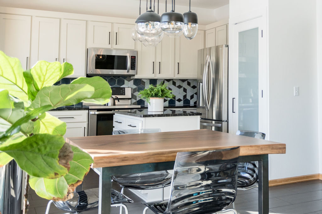
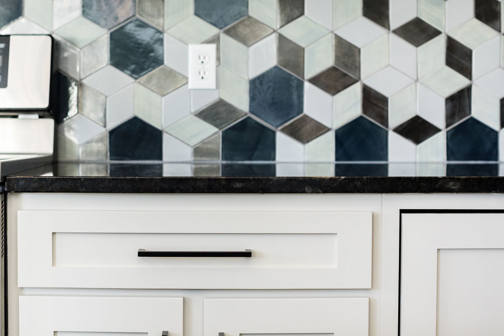
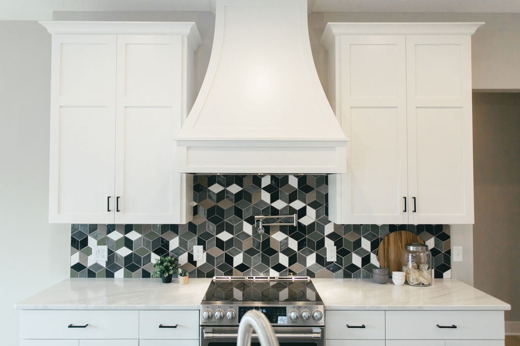
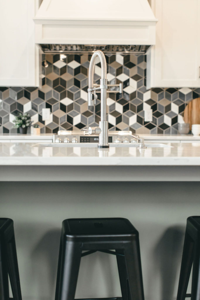
Using warm neutrals for cabinets is one way paint colors are moving away from the bright white in the kitchen as well. Incorporating these warmer whites makes the kitchen feel softer and pairs well with a colorful tile and a variety of countertops.
In this kitchen, the cabinets were painted Revere Pewter by Benjamin Moore, which ties into the handmade tile and makes the kitchen feel welcoming and warm.
Muted Pastels
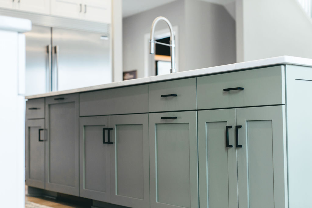
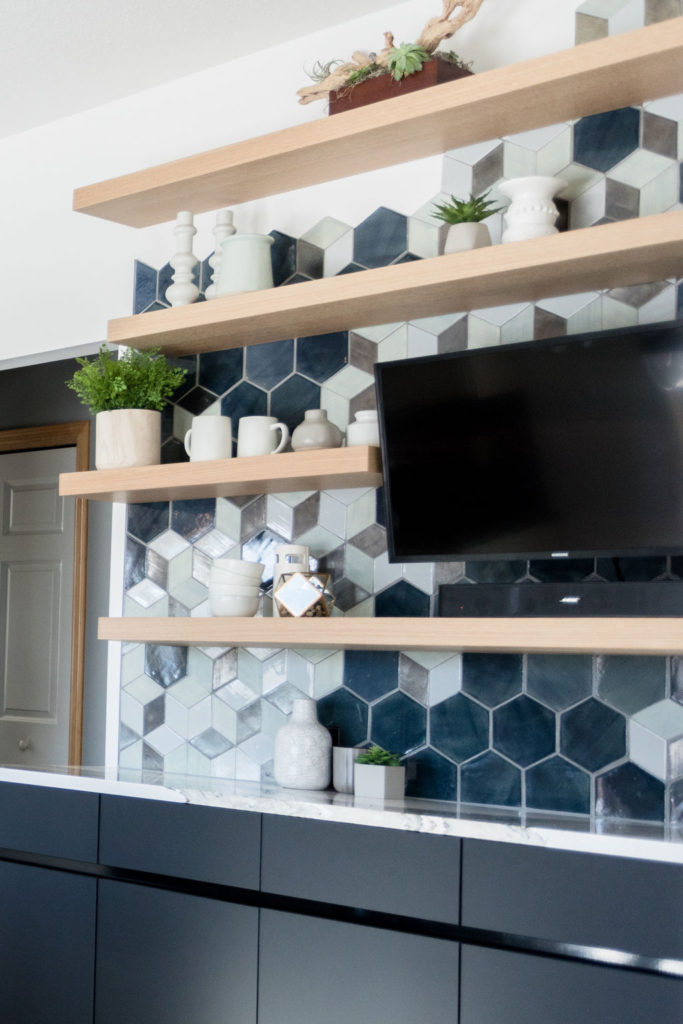
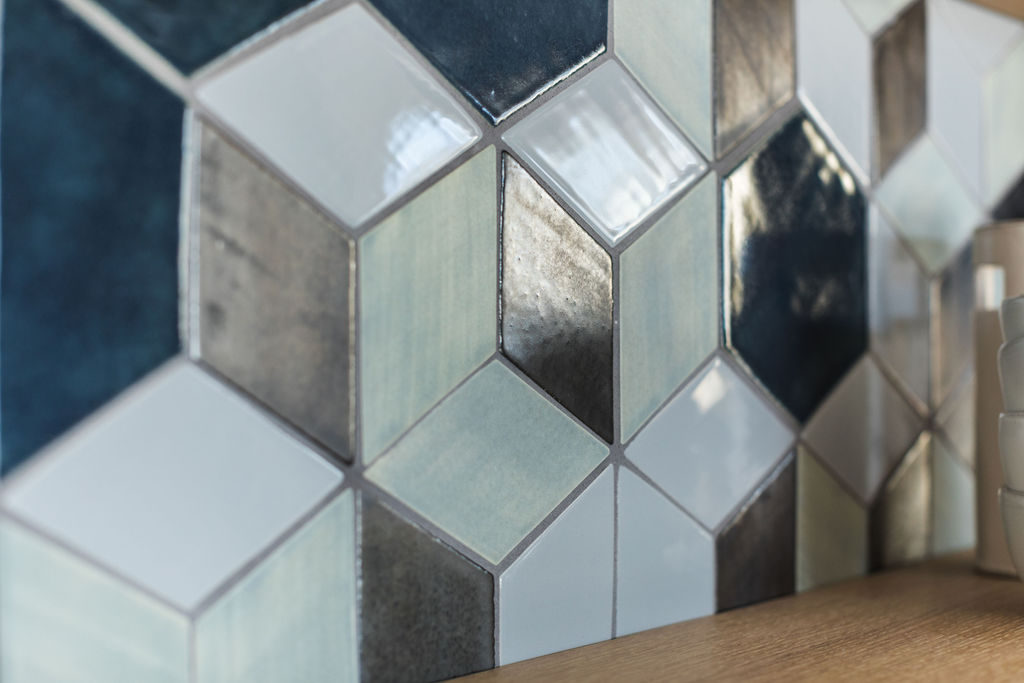
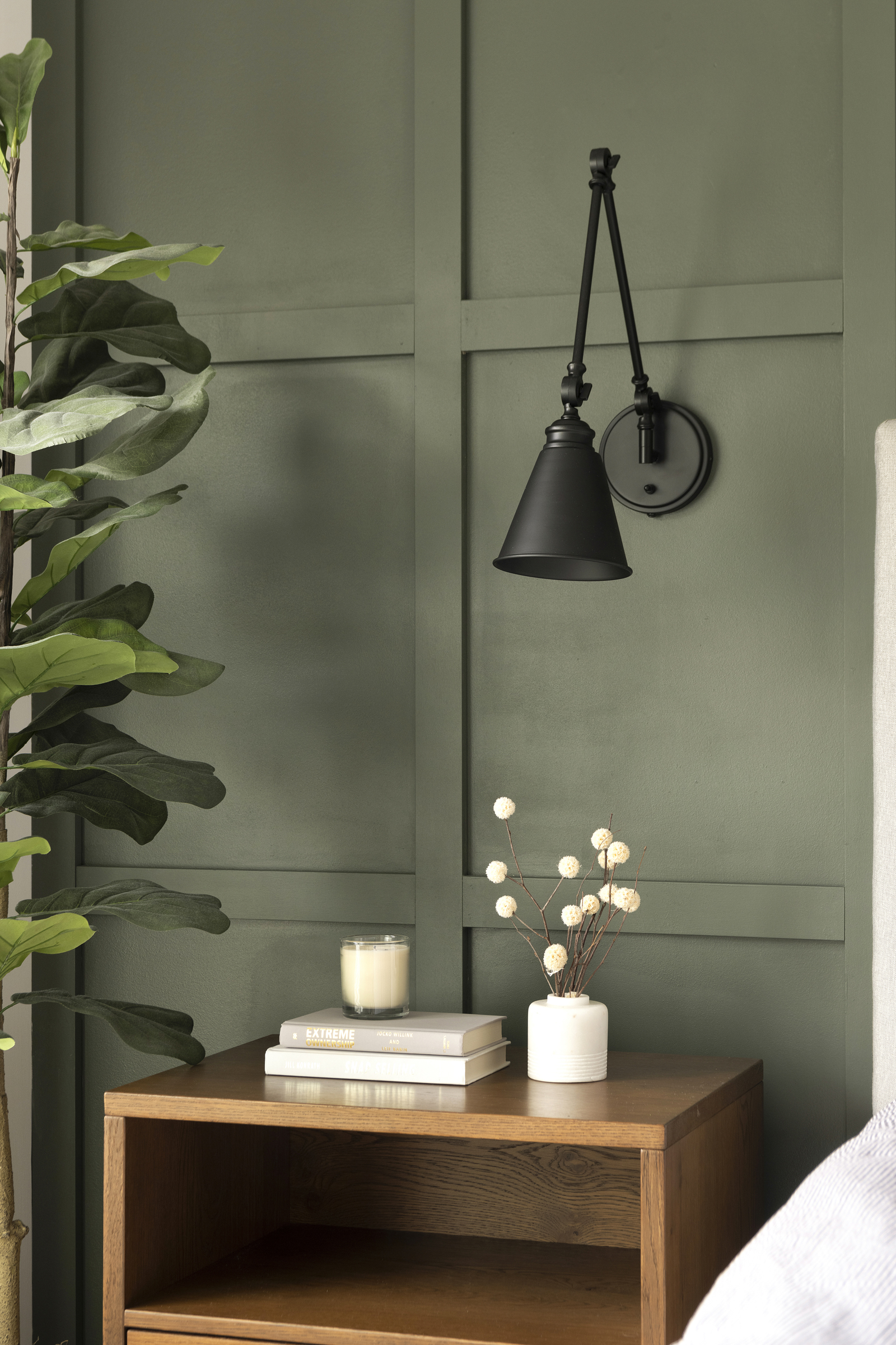
Another shift we’re seeing, especially in the kitchen, are muted pastel colors. Clients are wanting to bring in more color into their kitchen, but not wanting to go super bold. Olive green islands, muted navy cabinets, and pastel backsplashes are just some of the new design trends coming to the kitchen this year. Muted pastels make a statement in the kitchen, while still remaining neutral enough that the colors tie into the rest of the home.
New Blues
Blue was and still is hitting the scene big time in 2019 and we love it! From light slate blue to deep moody navy, blue is becoming a staple in the kitchen and bath world. Blues with hints of green are perfect for summer and add an element of coastal style. We love bringing in these new blues into bathroom vanities and kitchen backsplashes as well as paint colors.
Pops of Pink
Pink is popping up everywhere from fashion to home decor.
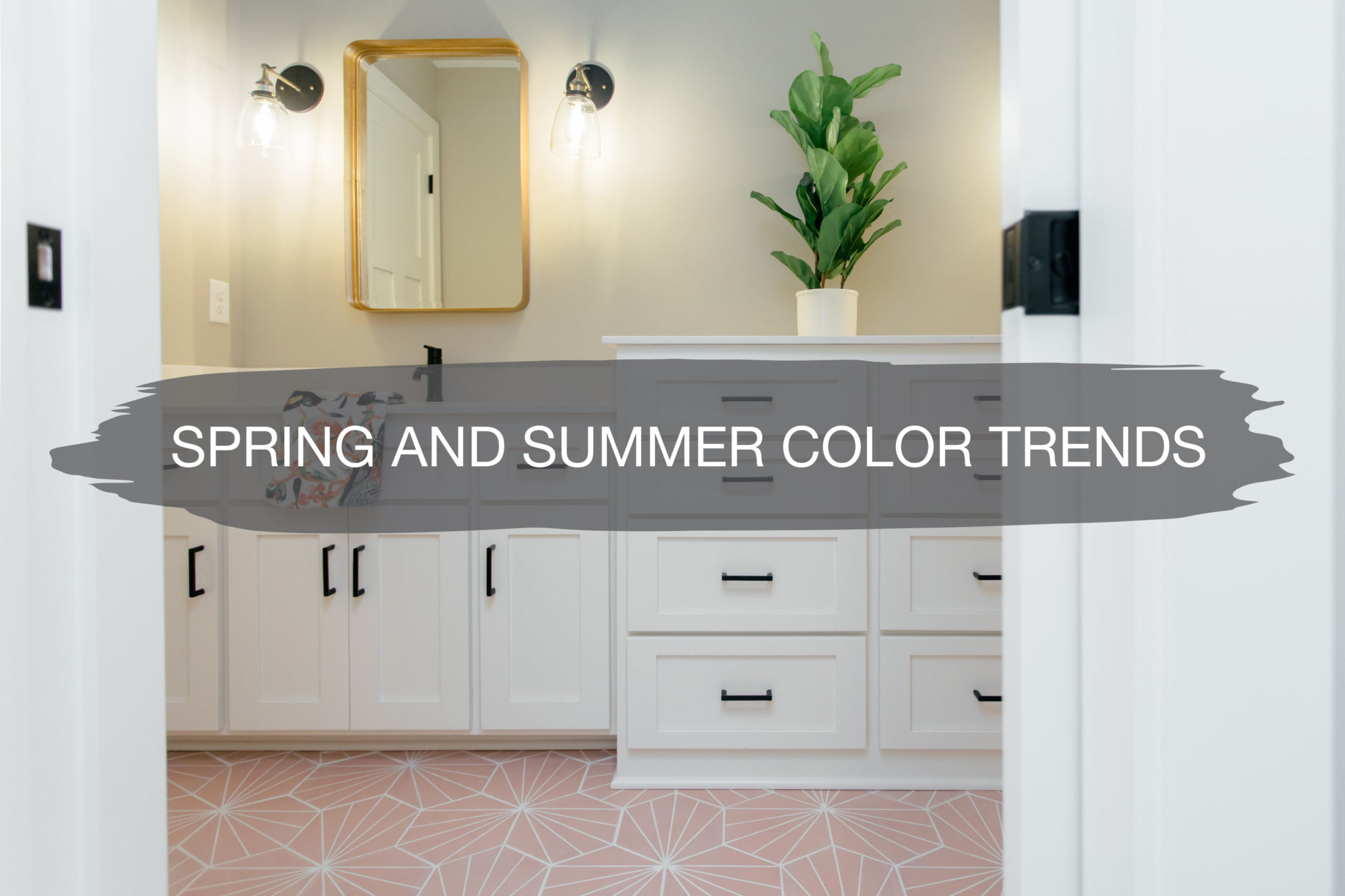
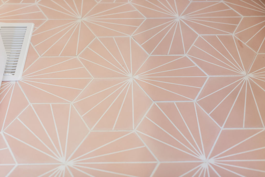
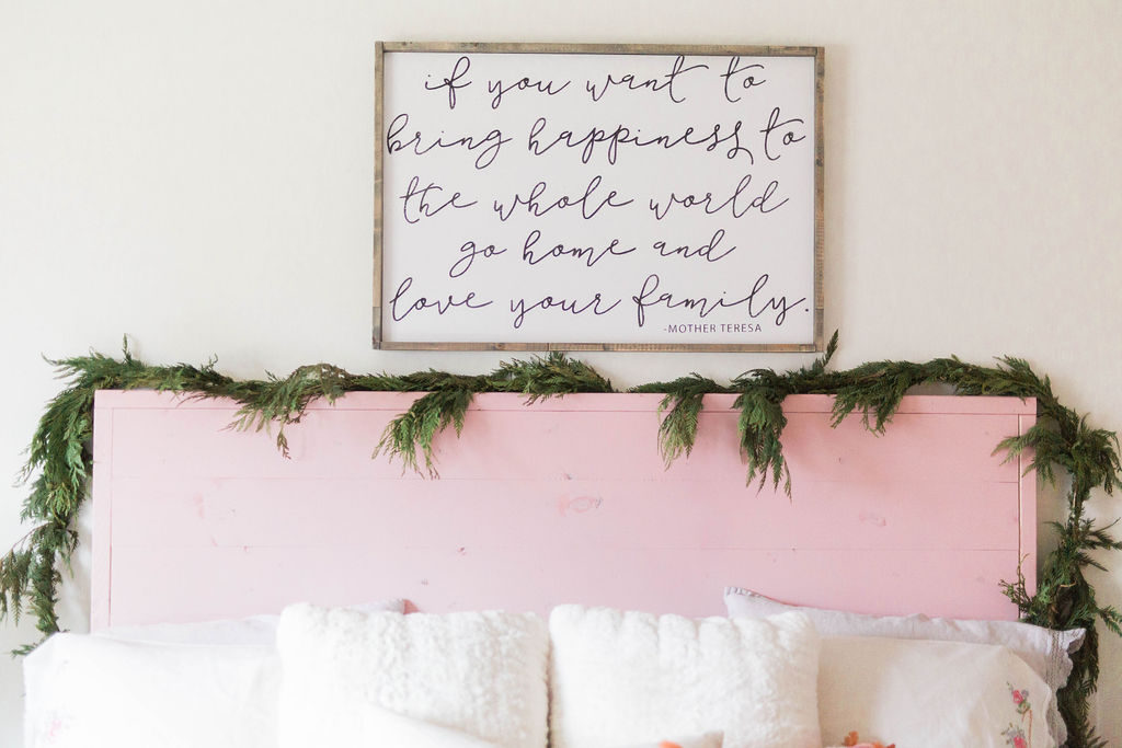
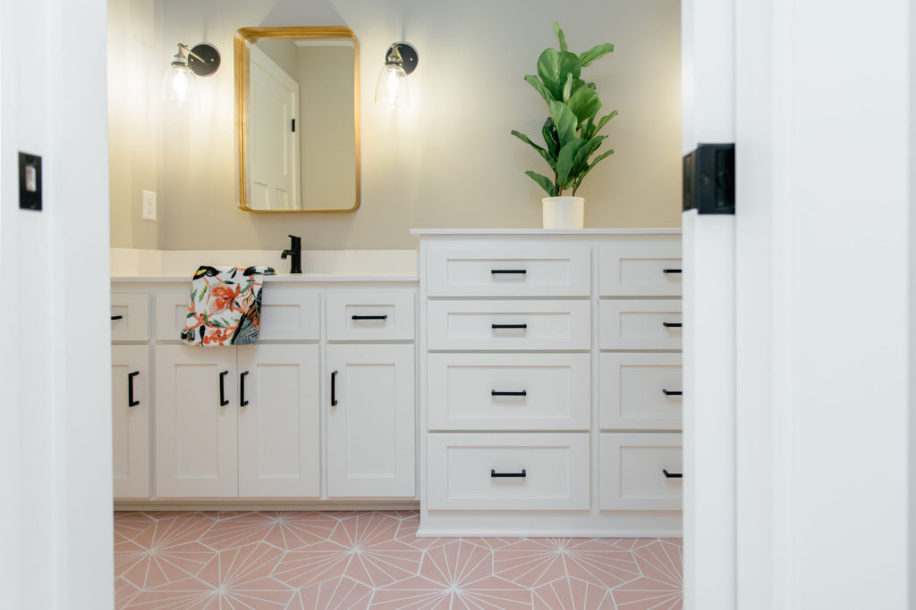
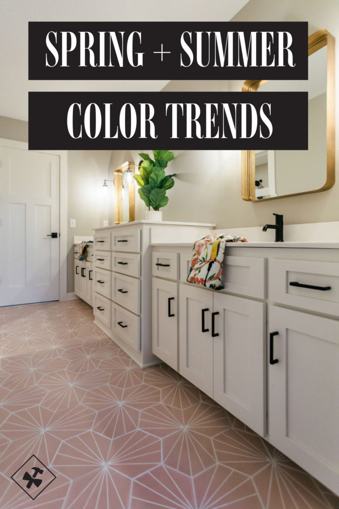
It’s the perfect accent for spring and summer, since it’s light, bright, and fun. Since it can be intimidating to paint an entire wall pink, think about adding pink accents through painting furniture, like the headboard we spray painted Pink Blush below. Accenting with pink with floor tile is another way to bring in the fun color, without it taking over the whole room.
Black and Gold Accents
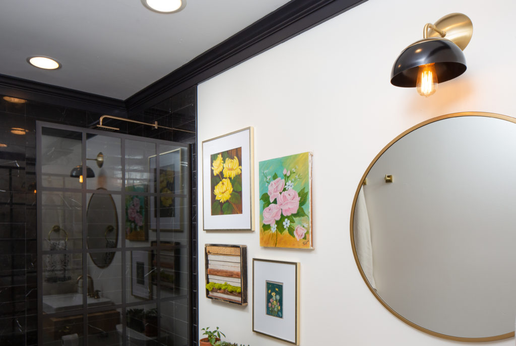
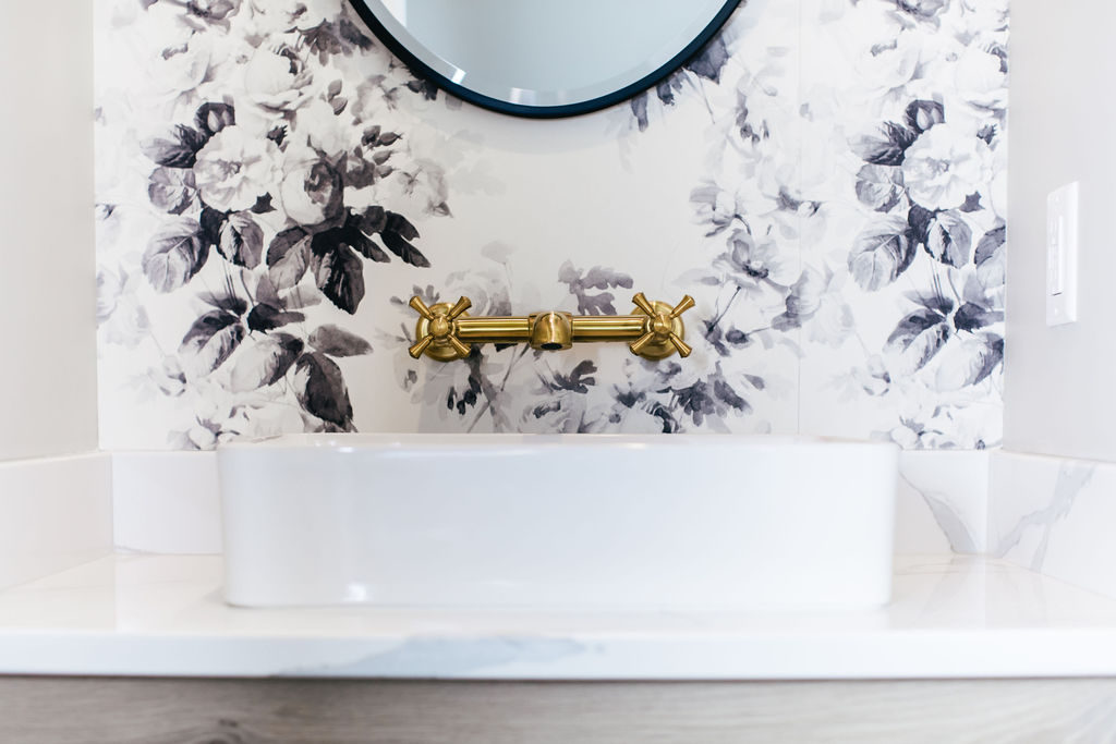
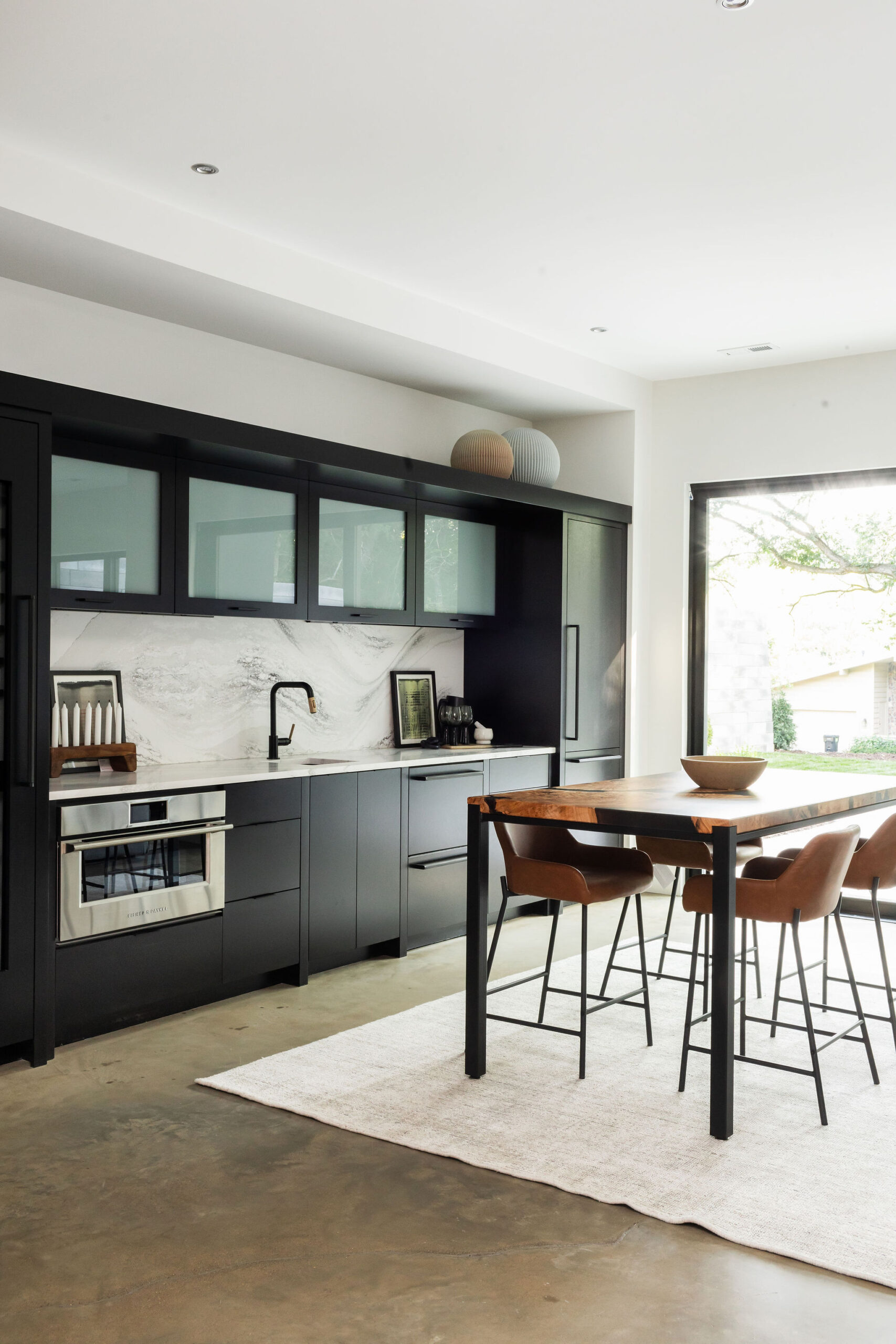
Black and gold are the perfect combo and we’re seeing it everywhere this year. Adding black crown molding, like in our guest bathroom, can actually make smaller rooms feel taller and larger. Gold accents add an element of luxury and sparkle to your space. Keeping black and gold as accents allows them to shine, rather than becoming too much in smaller rooms.
One thought on “Spring and Summer Color Trends 2019”
Comments are closed.