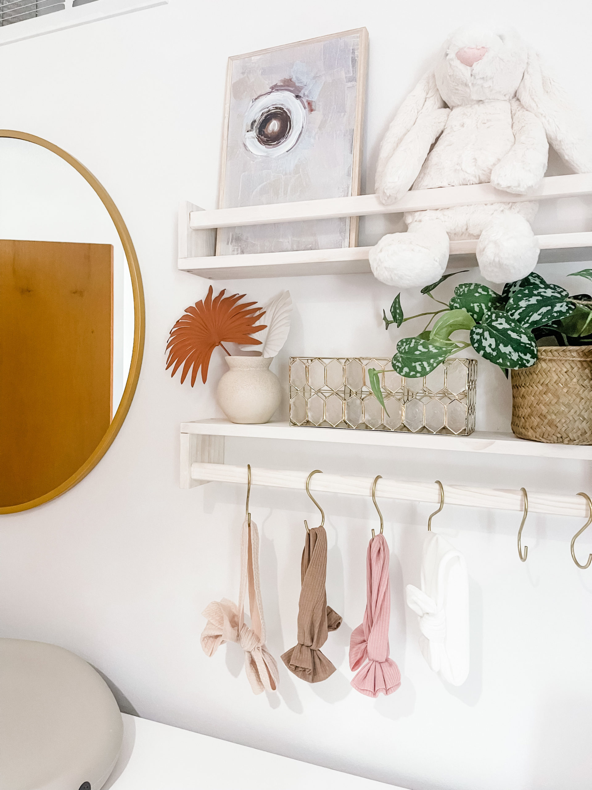
Our first kiddo means that we’re creating a nursery from scratch. When we purchased our new home last year and walked around for the showing, we knew immediately which room would be the one to transform into the nursery.
Little did anyone know – we found out just a few weeks later we were expecting our baby girl.
And, after putting together our registry must-haves and receiving some of the bigger items like the crib & glider, we’re ready to rock and roll and get this nursery into shape.
We’ll be tackling a few projects including adding in a closet system, removing popcorn ceilings and adding knockdown texture, a wood accent wall, and at some point, adding in decorations to make it truly hers.
Nursery Design
Oh, there are so many things that have warmed my heart during pregnancy, and one was dreaming about the day I’d be able to design out a space for our sweet little one.
It’s funny – before we knew the gender of our babe, I was ALL about doing something more gender-neutral in some shade of green. But, when the pink powder flew out of those cannons at our gender reveal party – I thought to myself, hey – pink could be fun…
Thinking about the space, I did want to make it simple, and also… we are hoping for more babies to join our family in the future – so wanted to make it something that could be switched out easily with just a few changes.
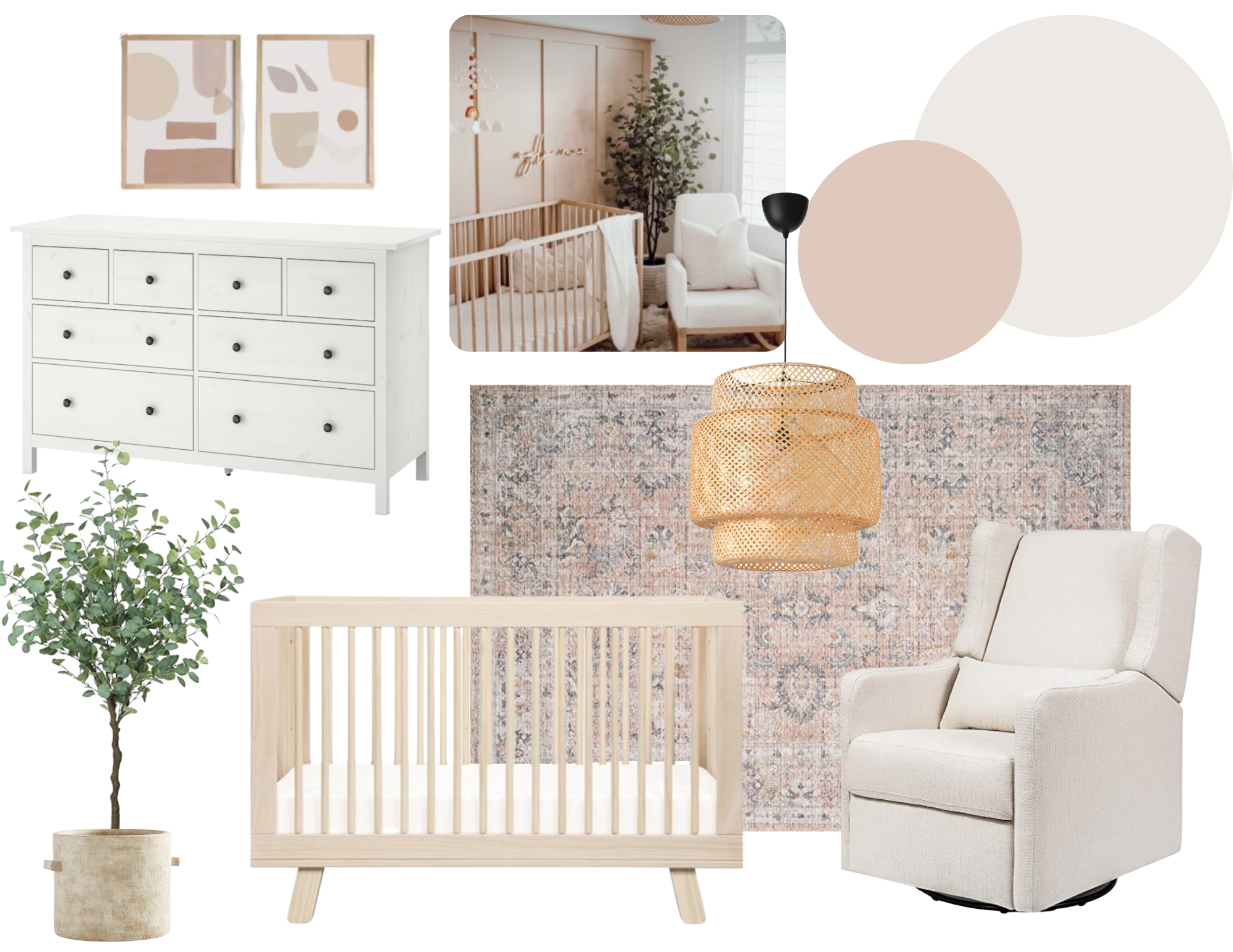
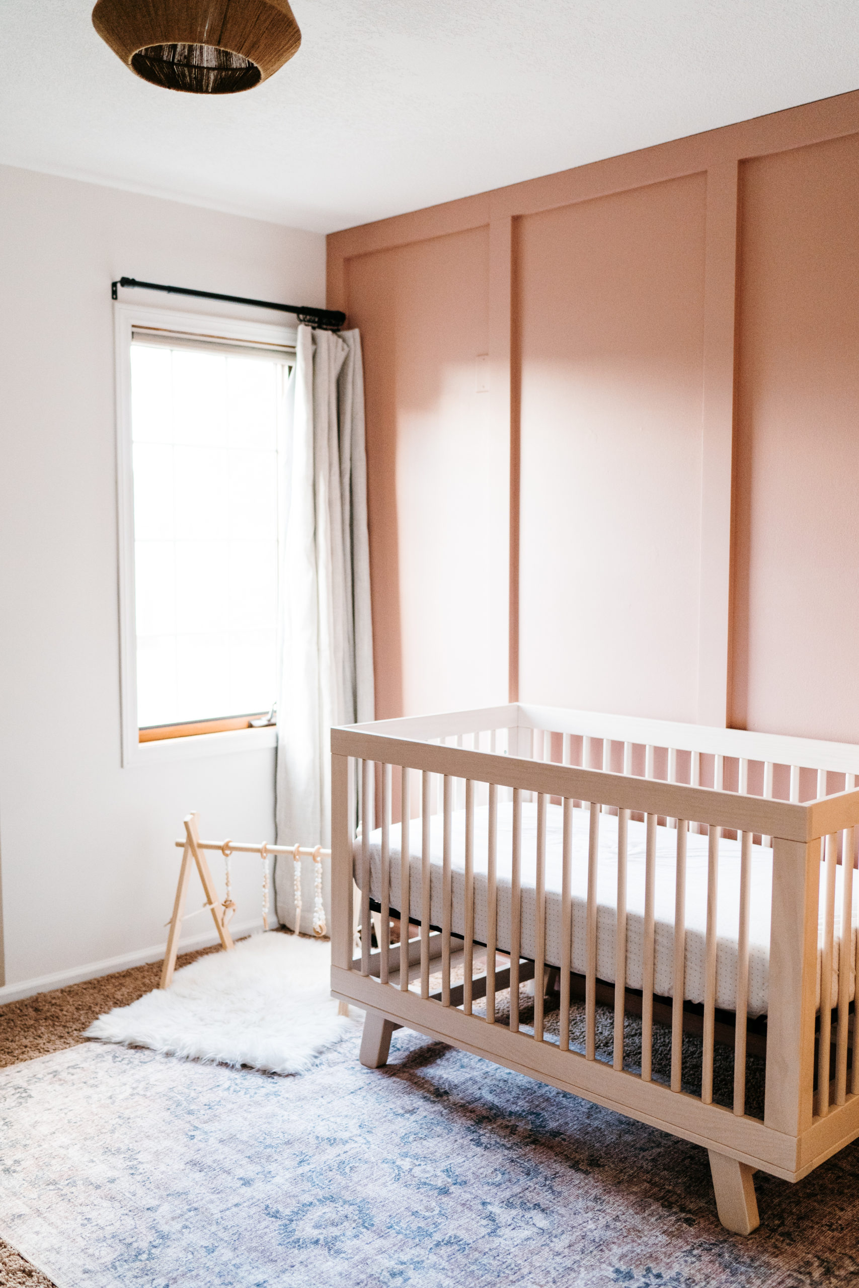
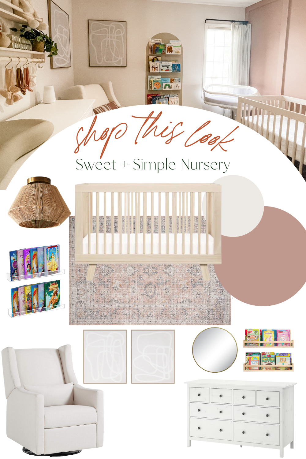
With that being said, I landed on neutral, Snowbound walls for the main walls, an accent board and batten wall in a pop of pink (that I could later paint over if needed), a wooden crib + neutral glider.
We had a beautiful IKEA Hemnes 8-Drawer Dresser from our previous home that we are repurposing as a changing table to avoid purchasing more furniture.
- Rug | 2. Crib | 3. Wall Paint | 4. Accent Wall Paint | 5. Dresser | 6. Light Fixture | 7. Glider
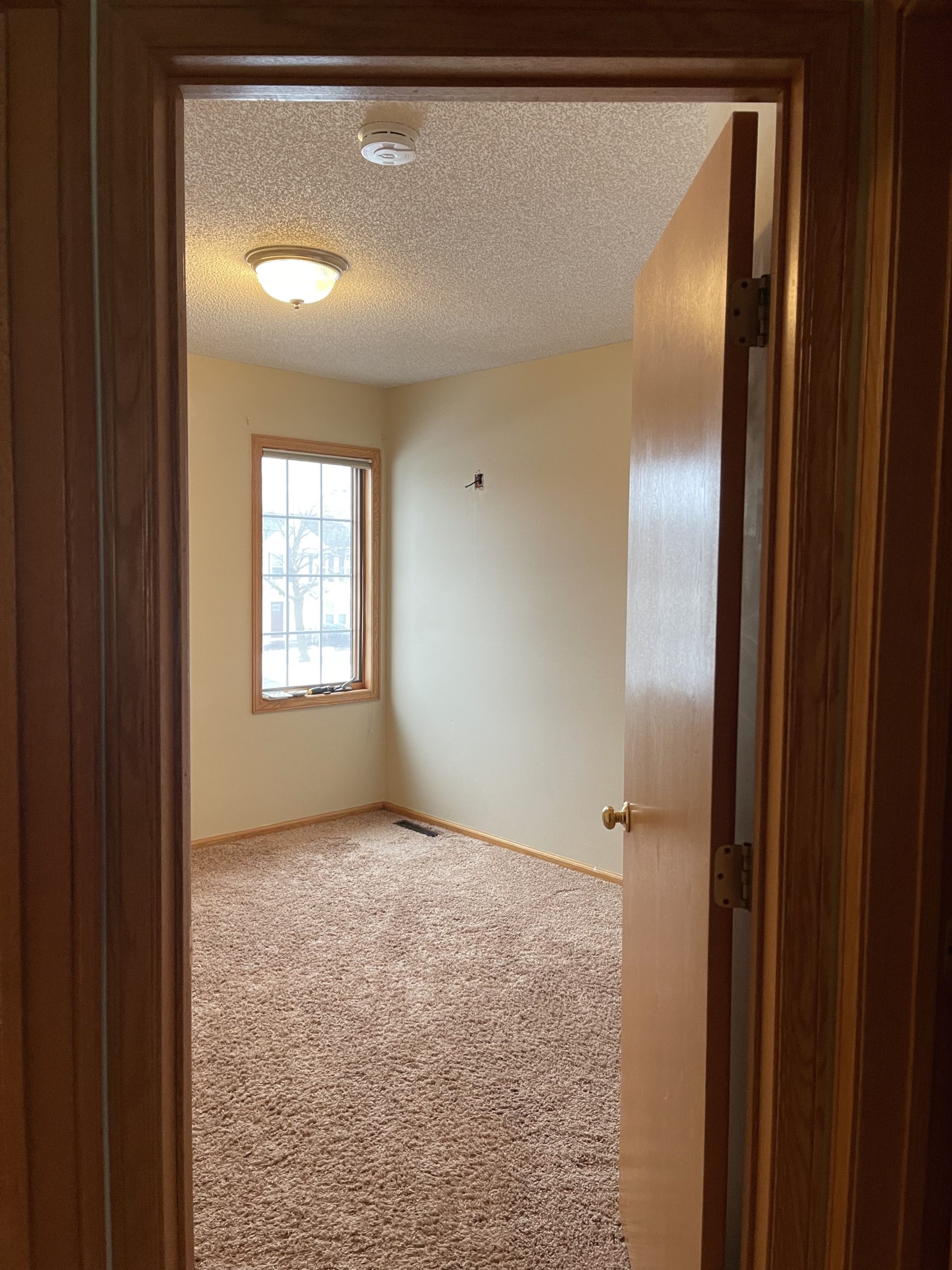
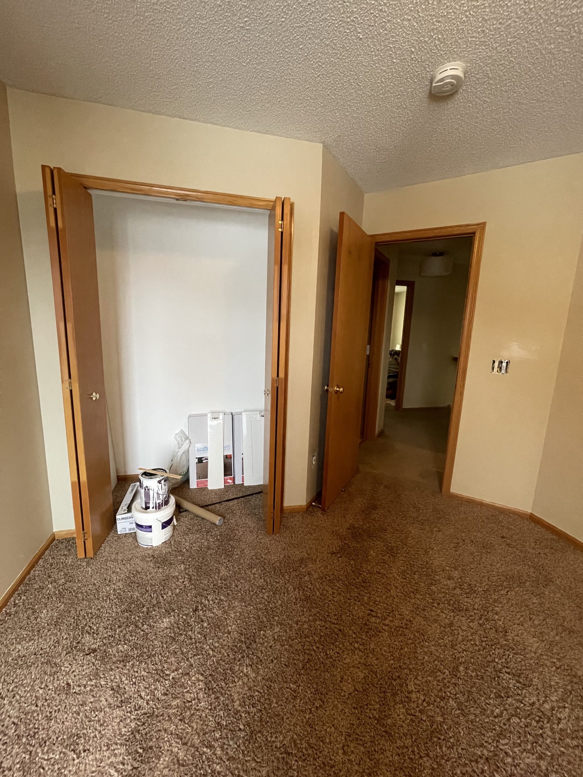
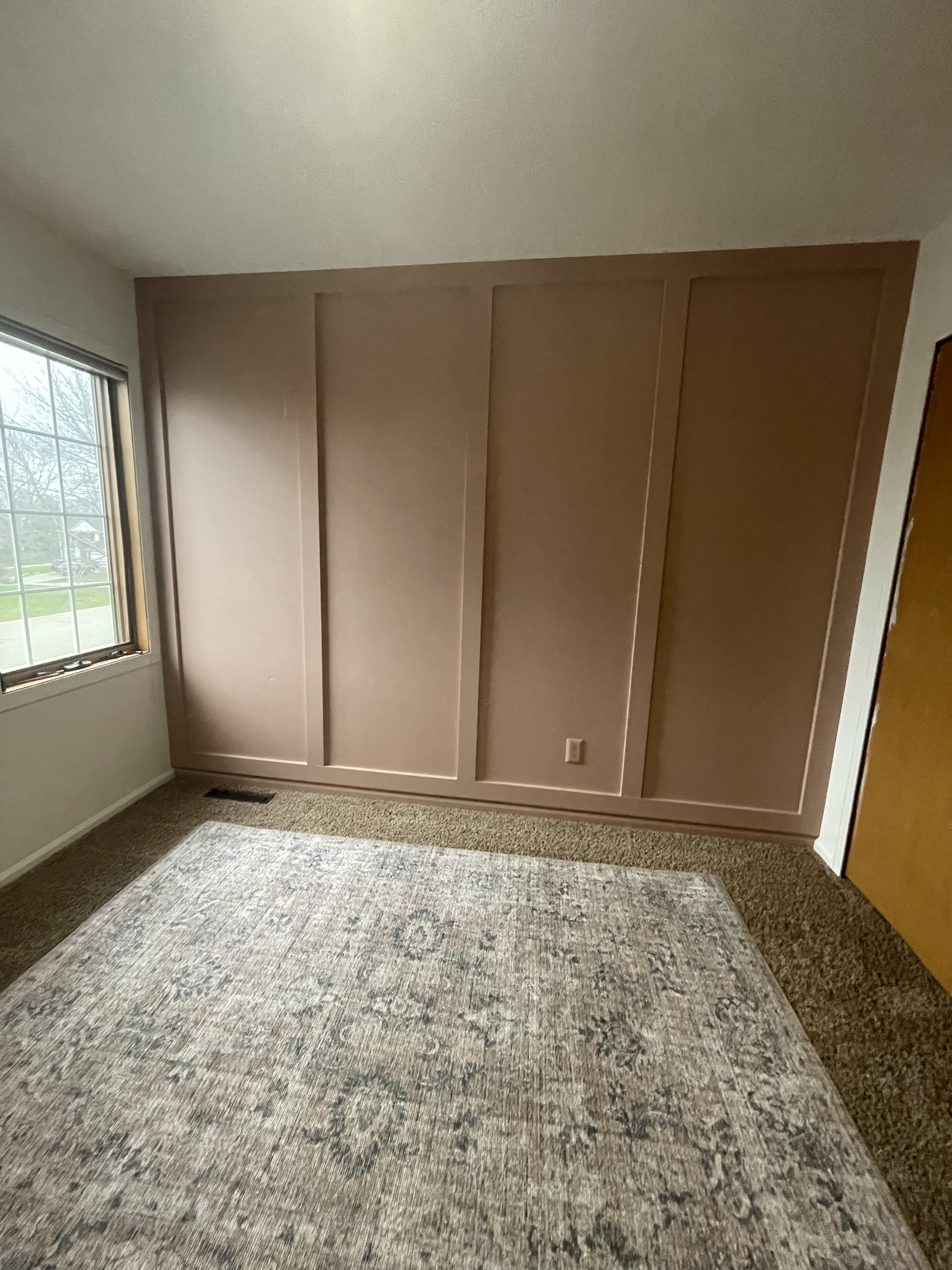
Before
This room had been functioning as a temporary in-home-office space for myself right when we moved in, knowing that my office would move downstairs eventually.
We cleared out my desk + the IKEA dresser and just like that, it was a blank slate for us to get to work!
Closet System
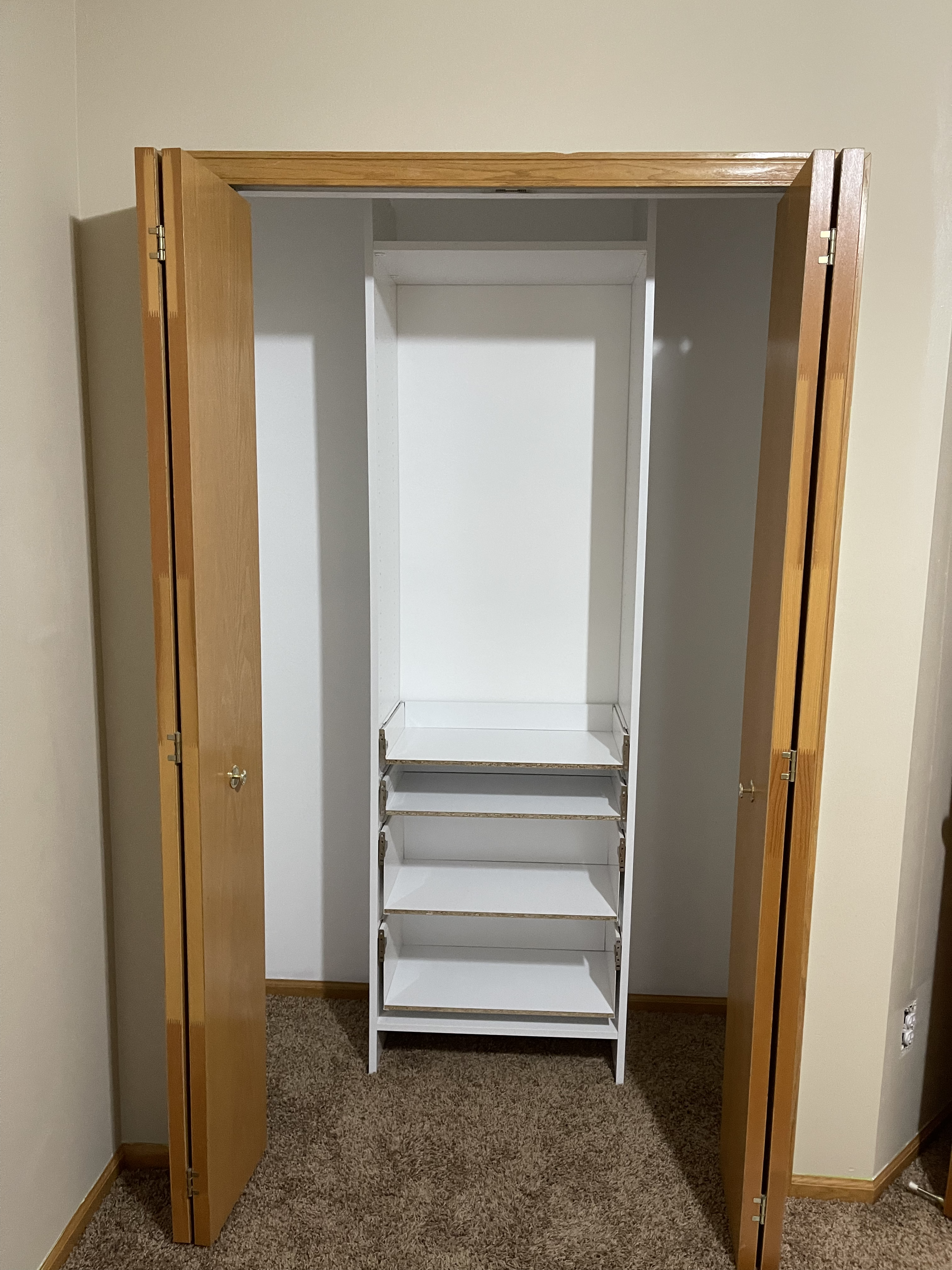
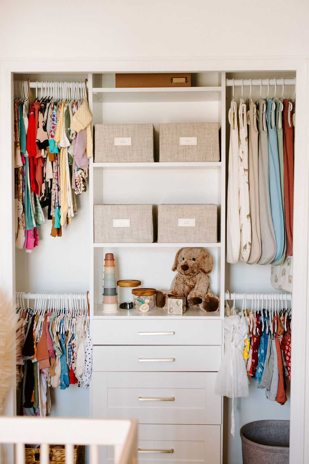
First up, we tackled the closet! Another thing we knew when purchasing this home was that we plan to be here for a while, and want to invest in it to make it ours. We had talked about adding in a closet system to our owner’s bedroom first, but priorities changed once we found out the baby was on the way.
We took out the wire shelving units and rods that were pre-existing. Then, with some patchwork and a fresh coat of paint on the walls and ceiling, we were ready to add in the closet system.
Based on inventory and lead time issues with many of the popular closet systems out there, we ended up with the Dakota Closet System from Menards. We thought about doing something more custom-built, but after pricing it out with current lumber costs it was about the same – plus less work to assemble.
Once we had all the pieces together, the installation process was very seamless. Here’s a view right after we began the project.
Scraping Ceilings
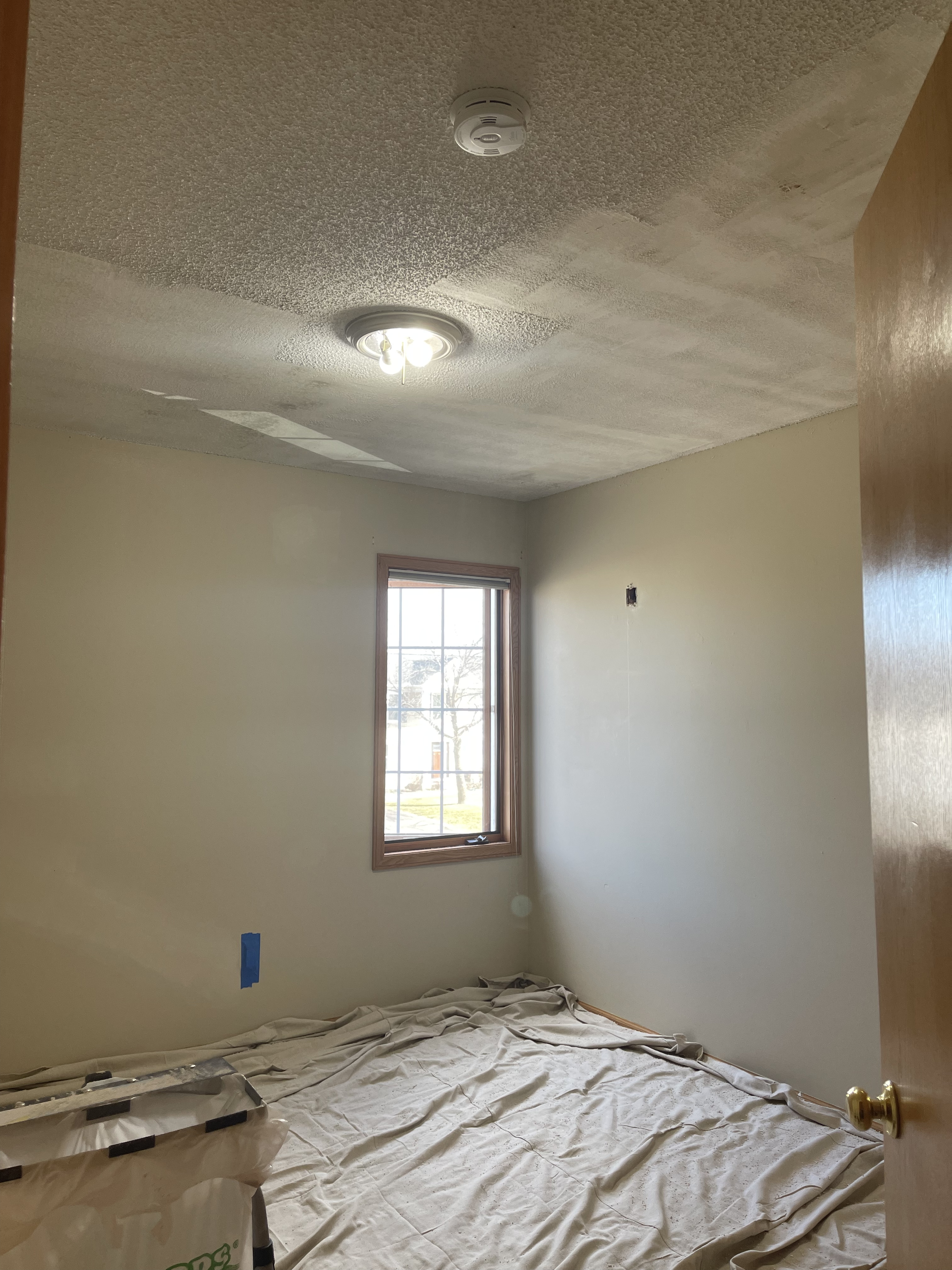
Next up, we prepped the room to take down the popcorn ceilings. If you’ve been a follower of c2s for a while, you know that the prep work for removing popcorn ceilings is half of the battle, haha.
We used the How to Remove Popcorn Ceiling c2s blog as a guide to get the ceilings scraped down. This was Anthony and I’s first time scraping ceilings, so we were true DIY beginners.
We started by gathering materials and eventually took the popcorn down! We were so thankful we had that guide to follow.
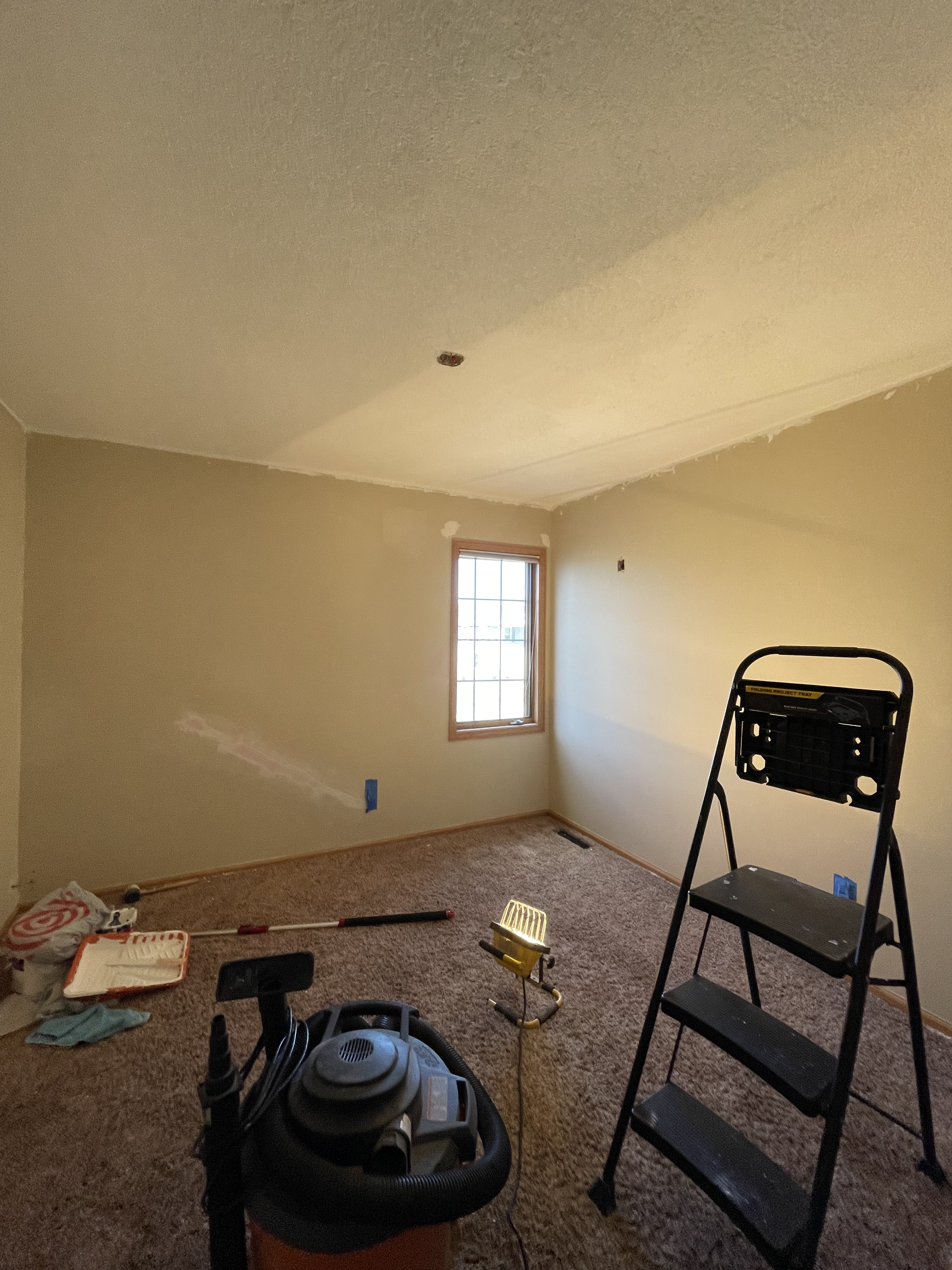
Add in Knockdown Texture
And, to follow suit… we wanted to attempt and add in a knockdown ceiling texture on our own! I am glad to report we were successful! Hard to tell by the picture due to the lack of lighting, but Anthony figured it out and did a great job. And Jamie was gracious to answer all the random questions we had during the process!
Accent Wall
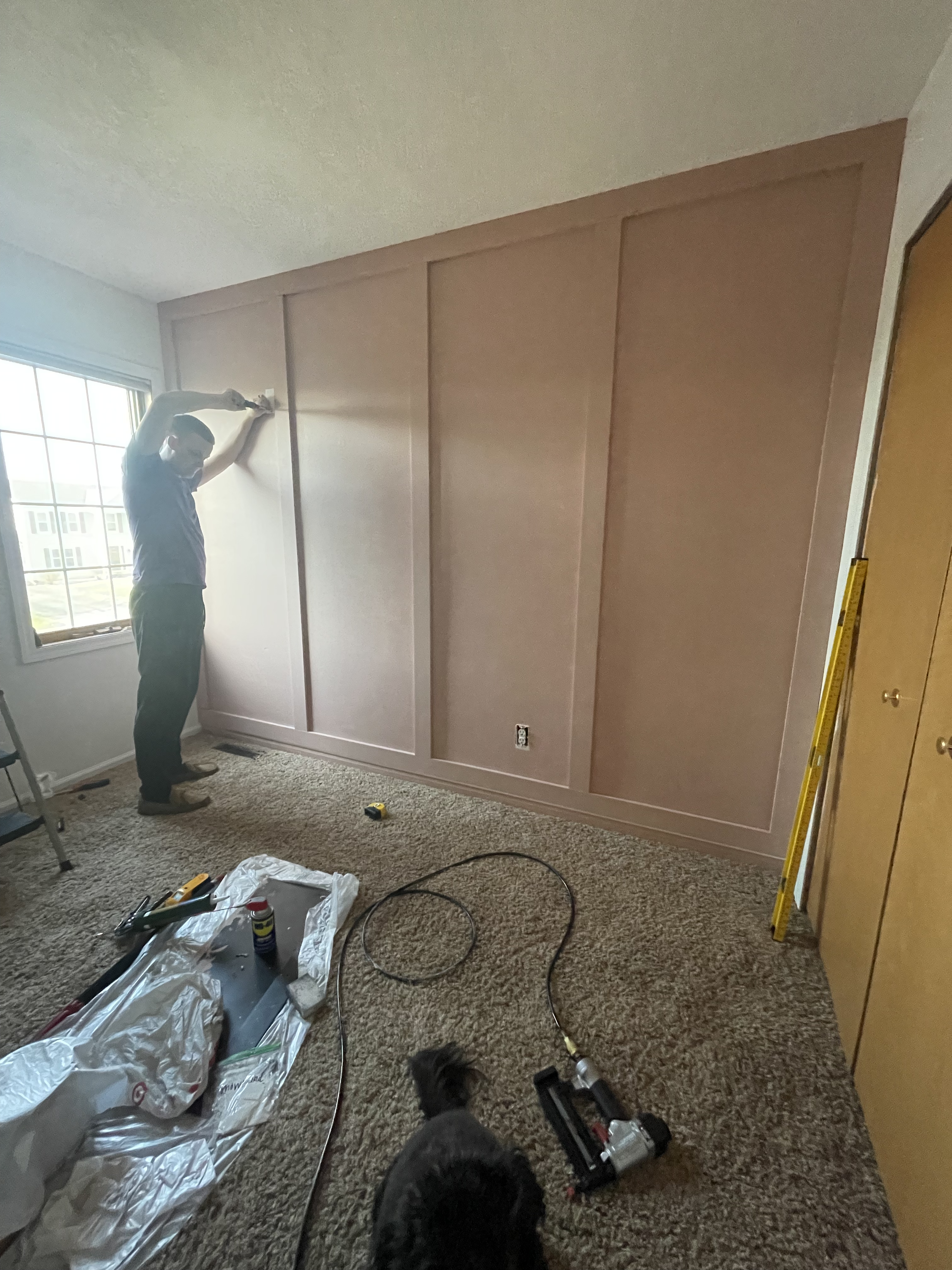
Next up, we tackled the board and batten accent wall. Again, we’ve never done anything like this – only doing a shiplap accent wall in our first home.
I knew that some sort of wood-paneled wall was a perfect fit for this nursery in case I ever wanted to switch out the color down the road for another baby. And for how indecisive I can be on selections for my own home, I saw an inspiration picture from a nursery and rolled with it!
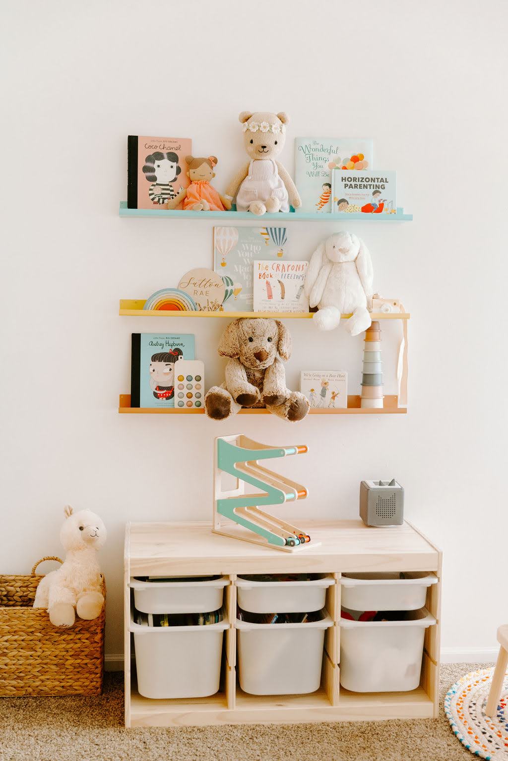
And then… it was time to furnish! We are so grateful to the many people who have showered us with so much love & gifts from our registry, that we were able to furnish this space pretty quickly.
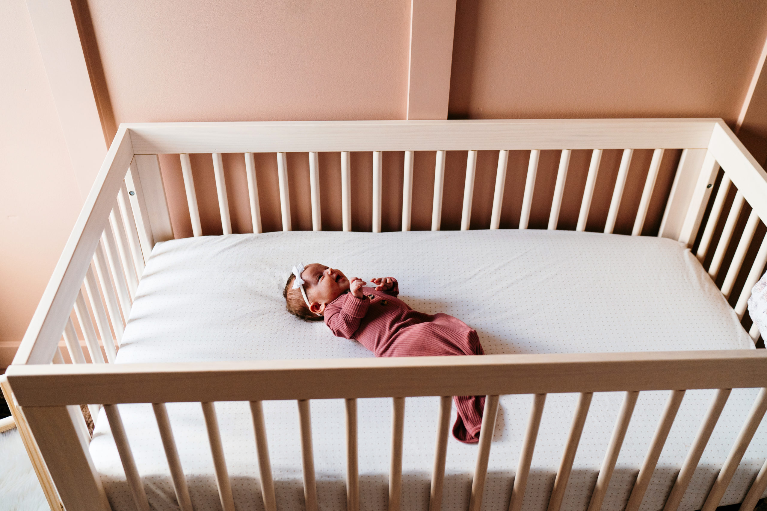
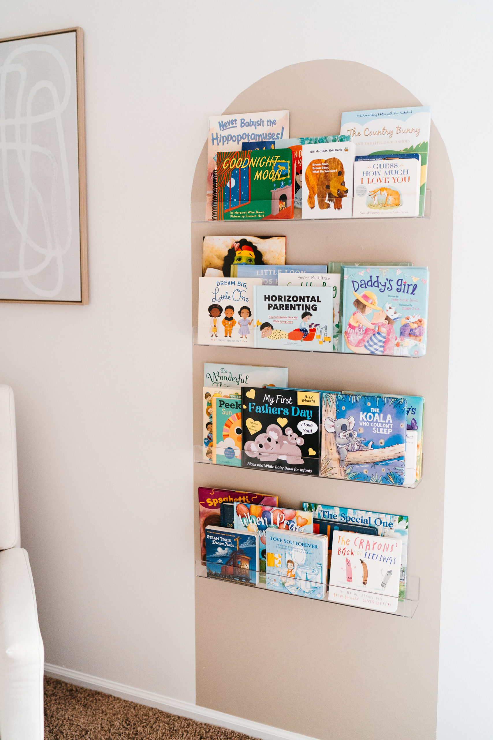
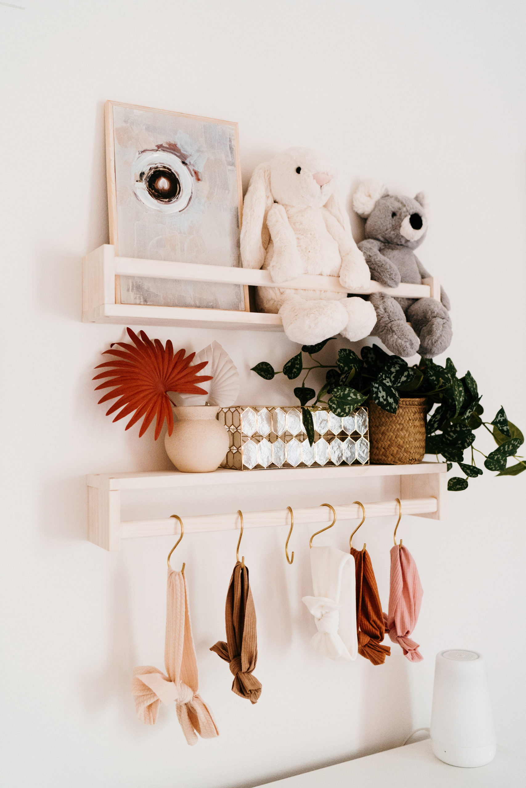
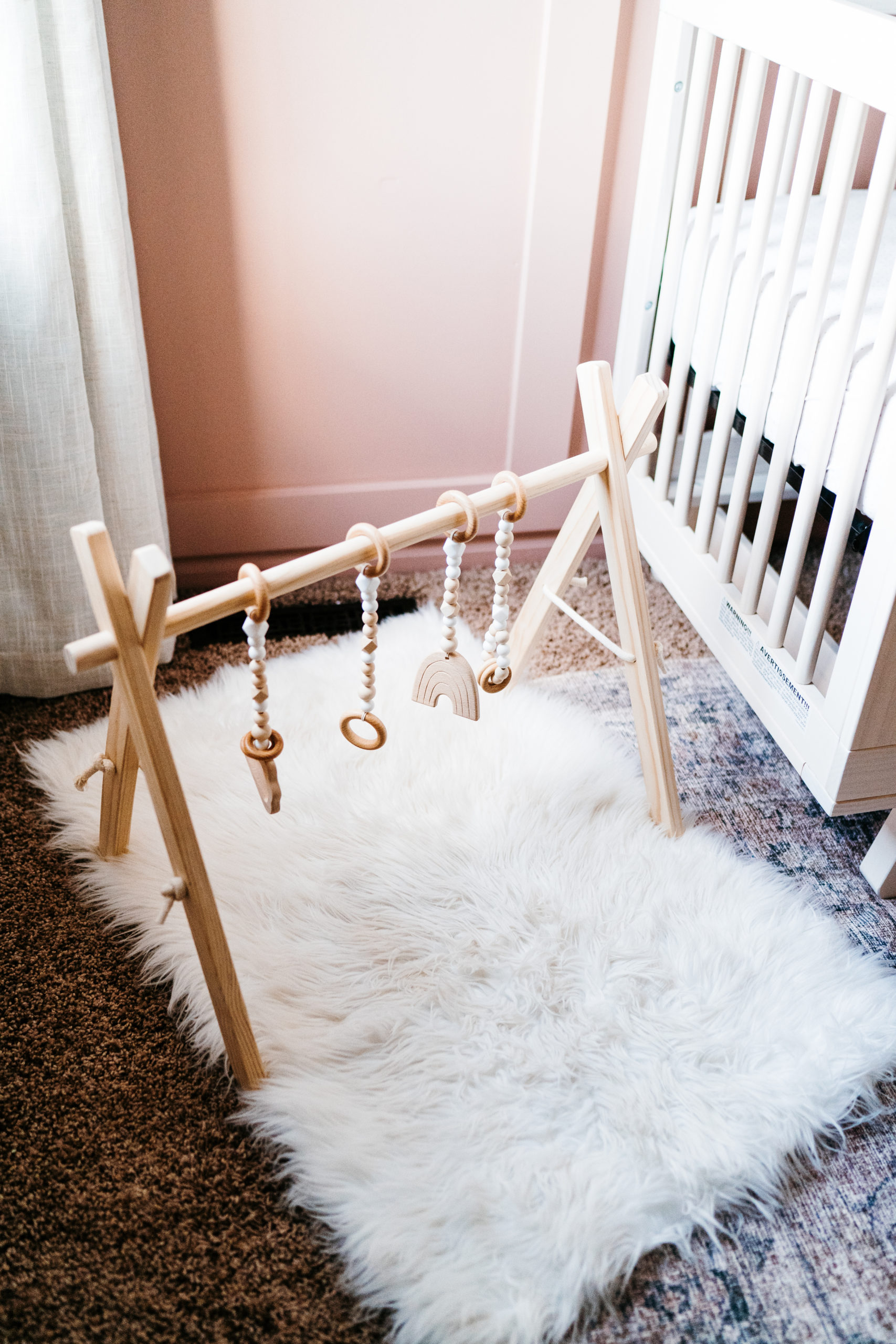
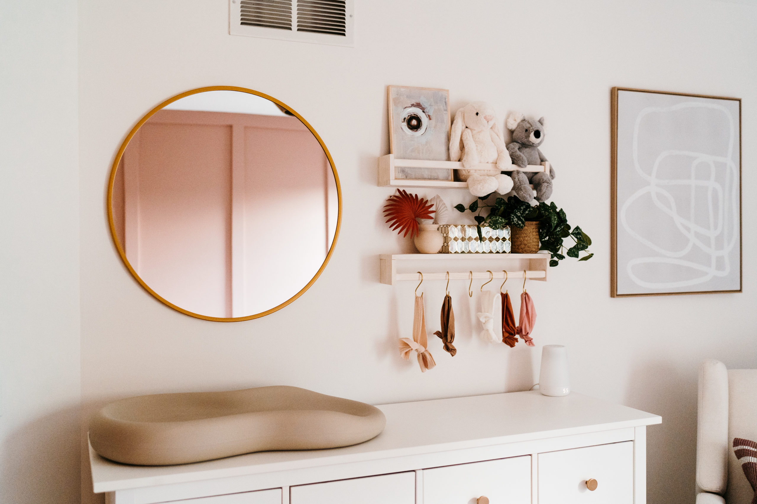
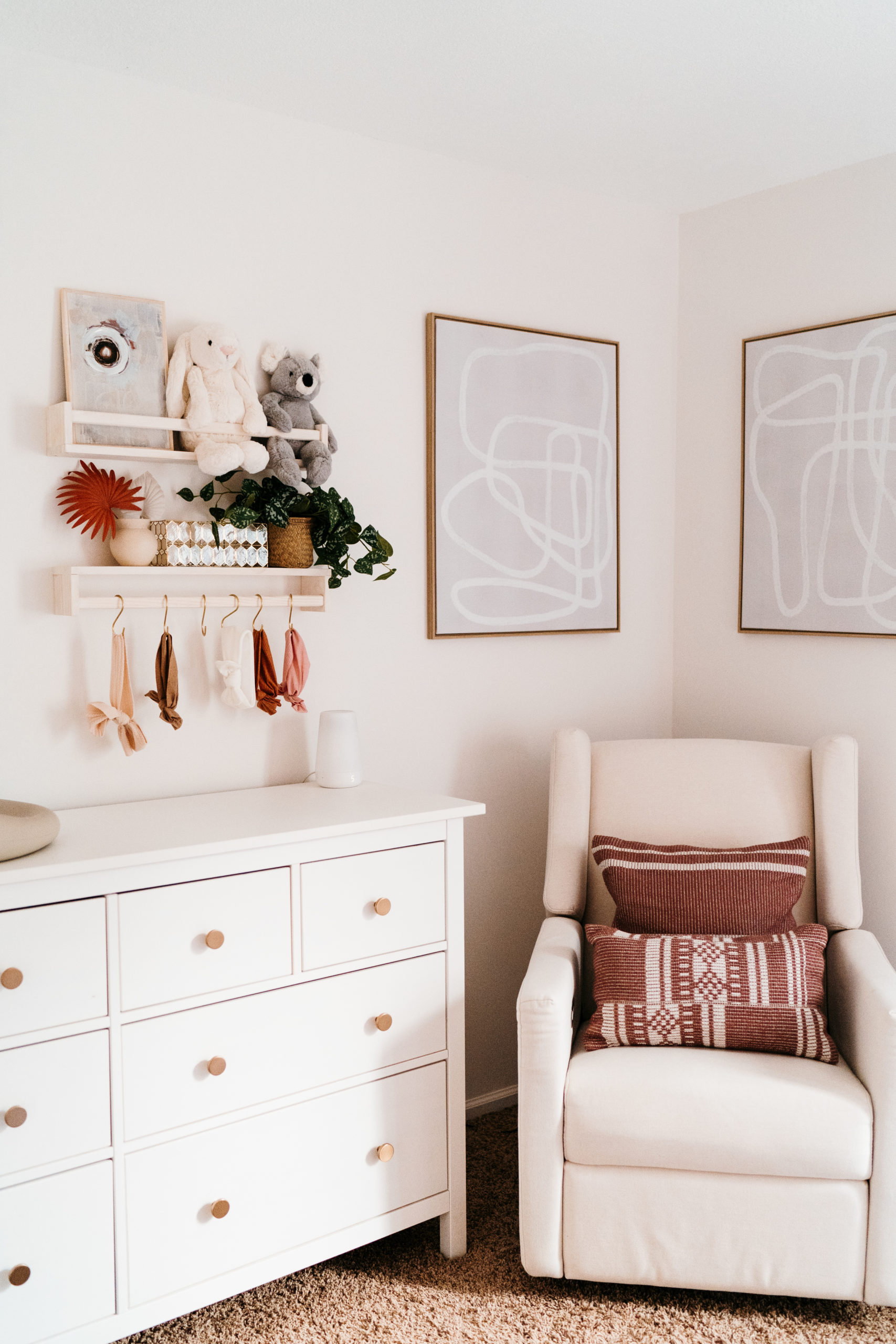
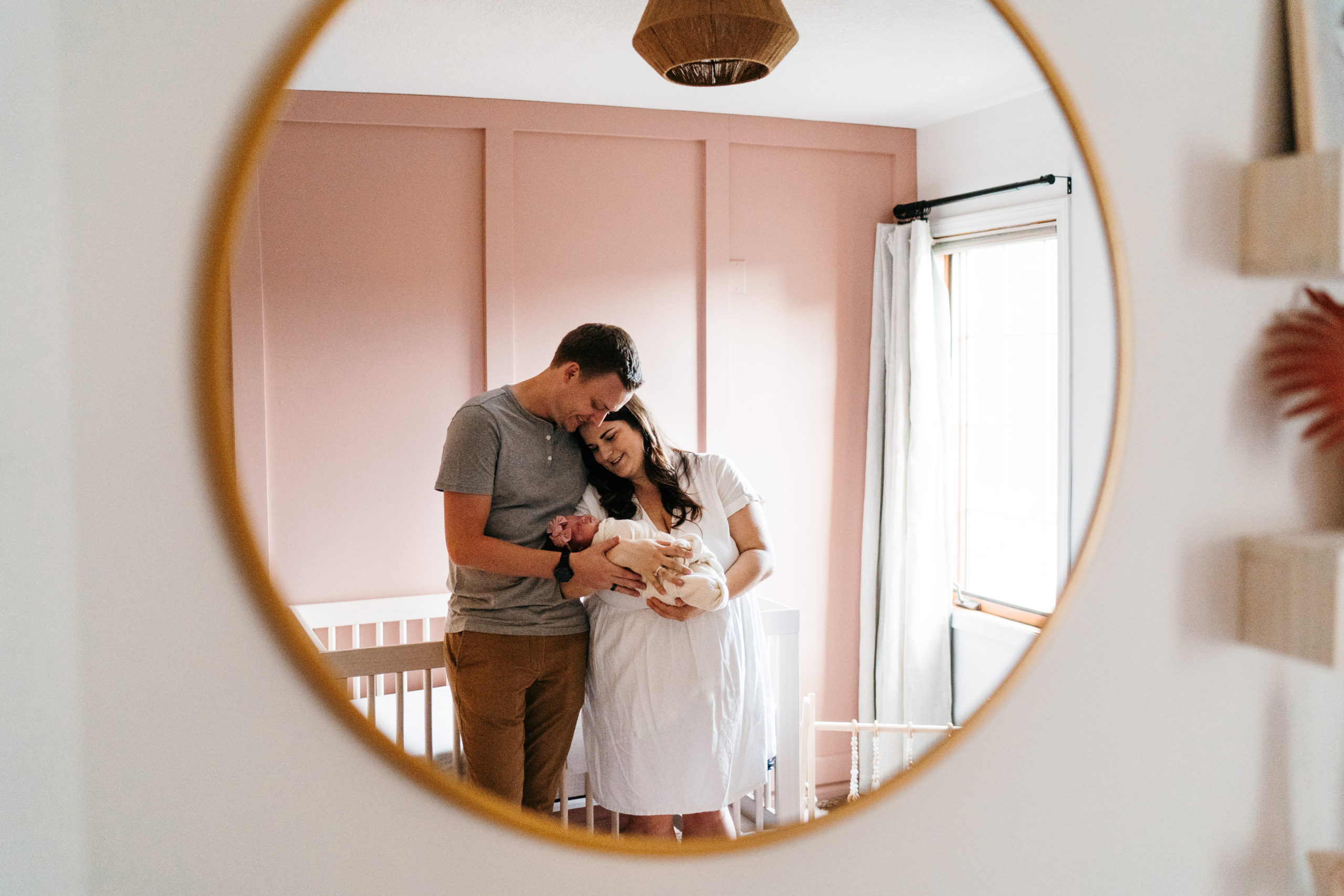
After
A few details yet to finish… but we’re so happy she is here now with us to enjoy it!
The Final Selections
1. Rug | 2. Crib | 3. Wall Paint | 4. Accent Wall Paint | 5. Dresser | 6. Dresser Knobs | 7. Light Fixture – Similar Option | 8. Glider | 9. Acrylic Shelves | 10. Wooden Shelves | 11. Closet System | 12. Closet System Pulls | 13. Abstract Artwork | 14. Mirror | 15. Changing Pad




3 thoughts on “Simple + Sweet Nursery Design | Baby Girl Sutton”
Comments are closed.