It’s that time again when we’re kicking off new project designs. And, this one is special because it’s a repeat client of ours! We’re calling this project The Antler Point. Designs have been sent off for approval and the next steps will be finalizing selections and getting all of the materials ordered. And if you know anything about this industry right now, you know that working ahead to avoid delays is imperative to a smooth construction process.
Main Level Living
On the main level, we’ll be tackling a few things.
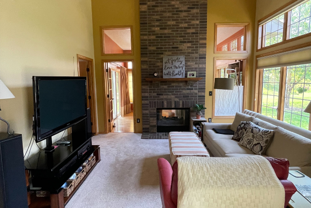
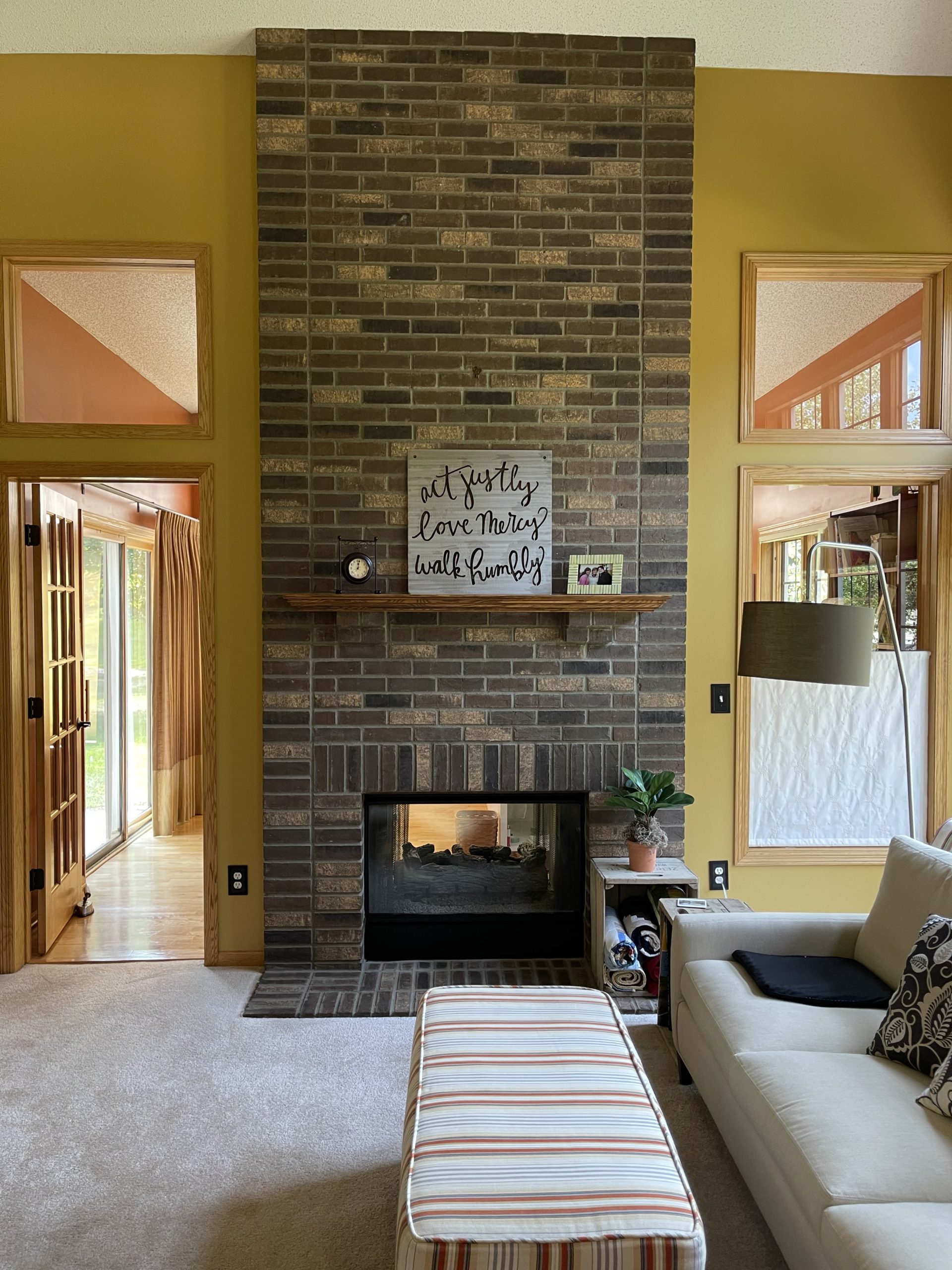
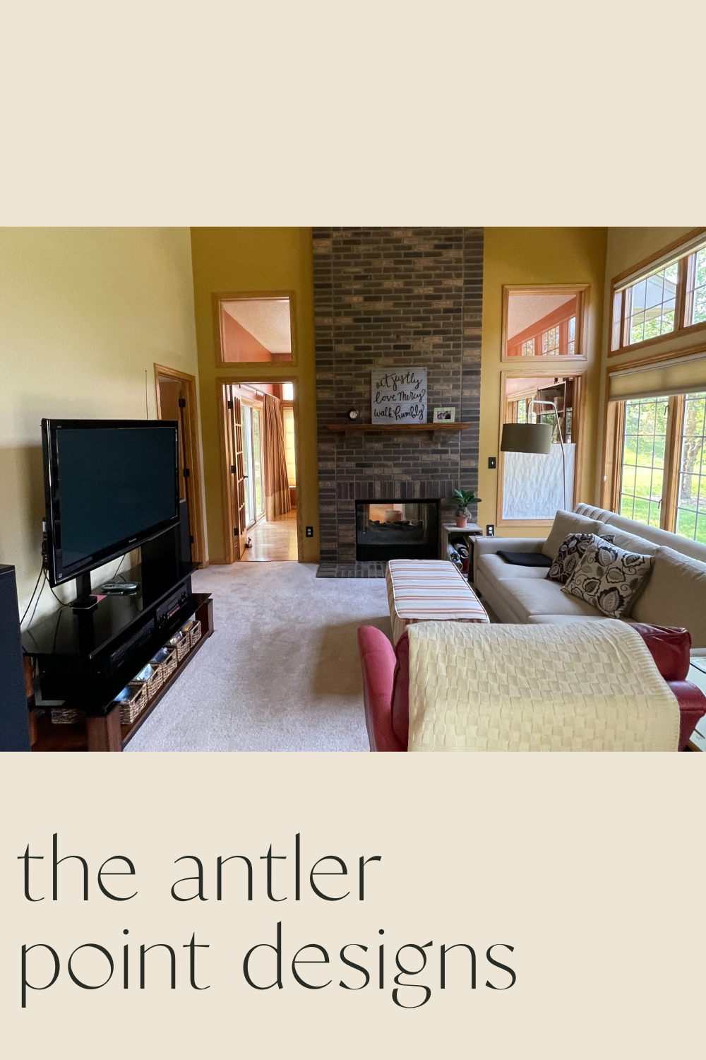
First up, this fireplace. While we recommended painting the brick, our client wanted a sleek & modern design. So, we went to brainstorming and have a few ideas. We’ll also be updating the refinishing the current flooring, adding wood flooring where the carpet currently is, and Jamie will be working on another custom staircase.
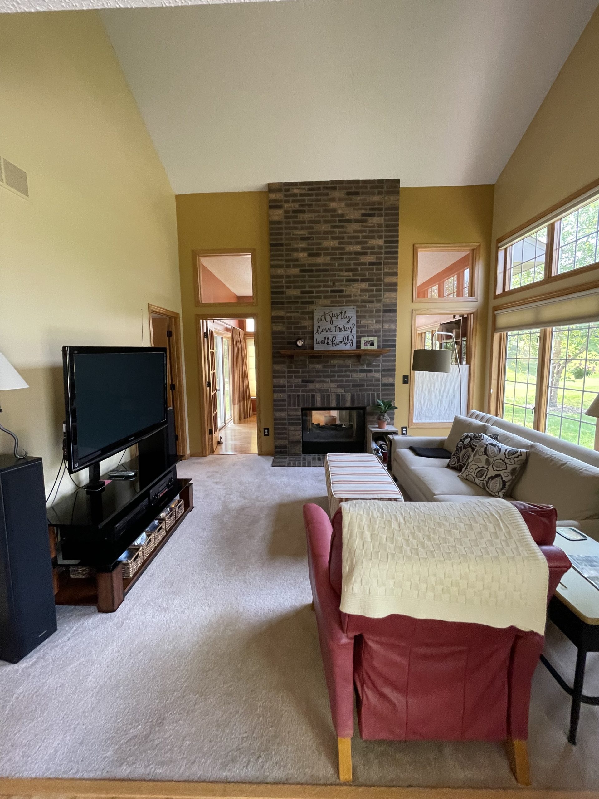
We’ll also be refreshing the paint which will make the space feel more open and inviting just by brightening it up.
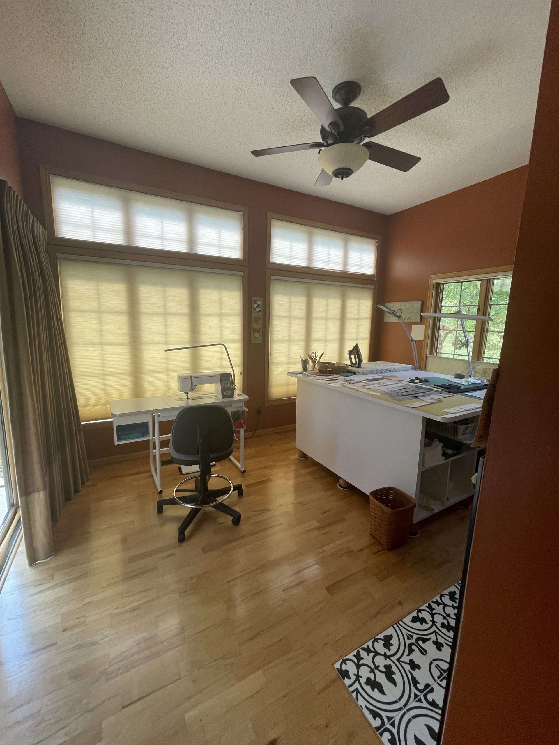
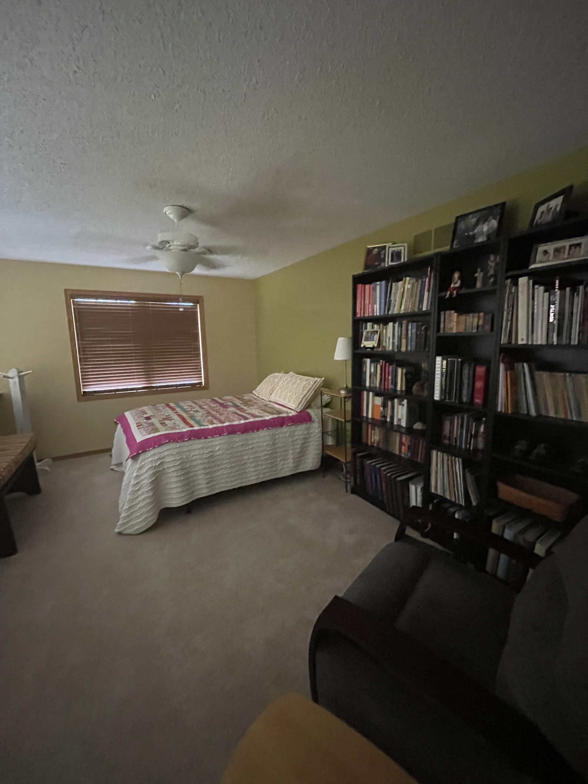
Here’s a view into the current state of the main level. We’ll also be helping source some updated furniture for this space, including a rug to go over the newly added flooring in the space.
Dining Space
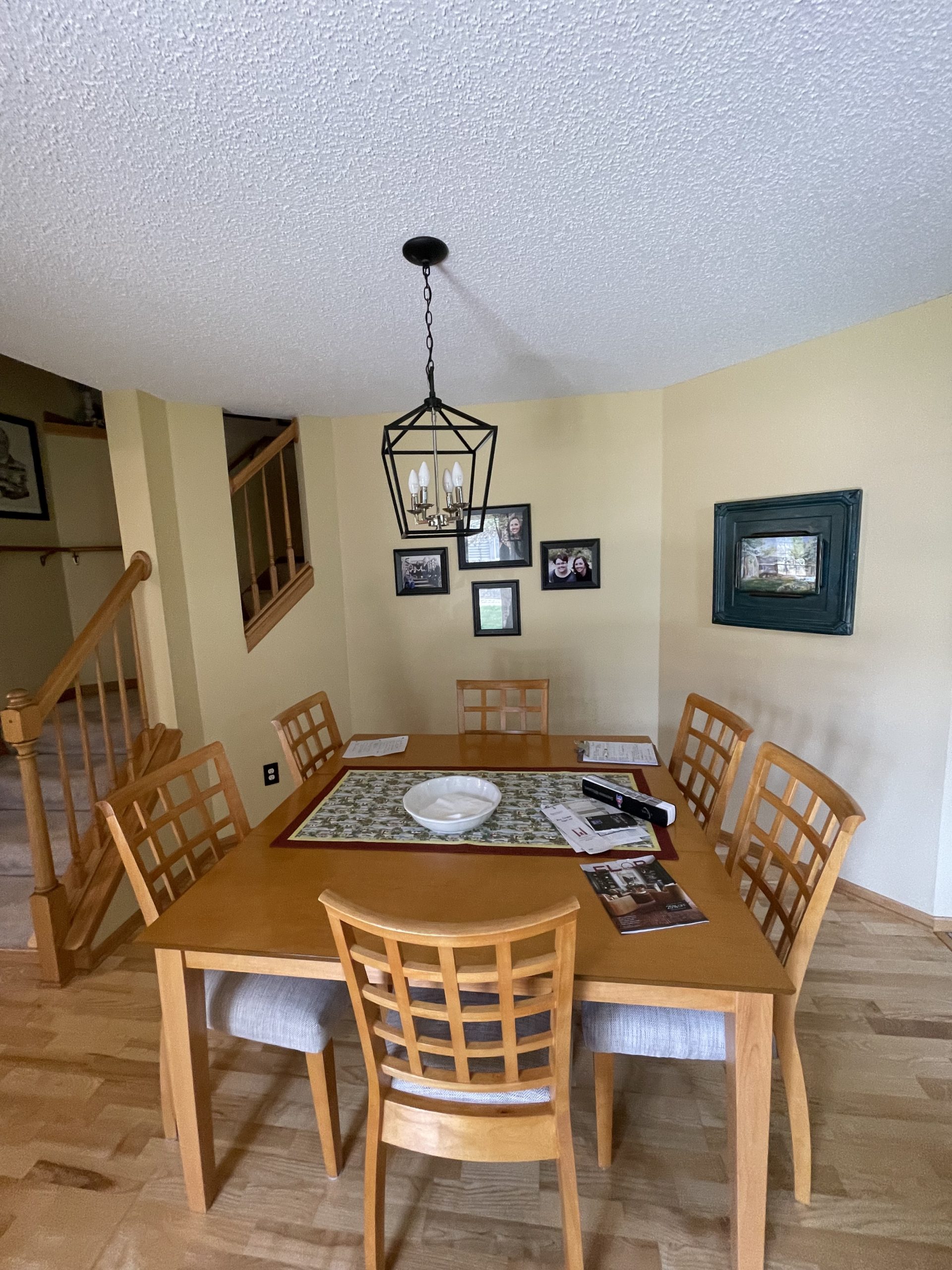
In this space, there were a few things that this client wanted to make more functional. The first request was ensuring there would continue to be space for 6-8 people to sit around the table. She also had envisioned the potential to do bench seating across the back wall for even more sitting areas.
We’ll also be doing the staircase and refinishing the floors in this area as well. Up next – sourcing new dining table & chairs to go with this custom bench idea… our wheels have been turning since we left. This space leads into the kitchen, which we helped refresh a few years back.
Sewing Room
Continuing the flooring, we’ll refinish this space as well. We’ll also be updating this outdated fan light fixture into something more sleek and clean.
Design
Here is the vibe we’re shooting for in the main living space and what’s been presented as options to our client.
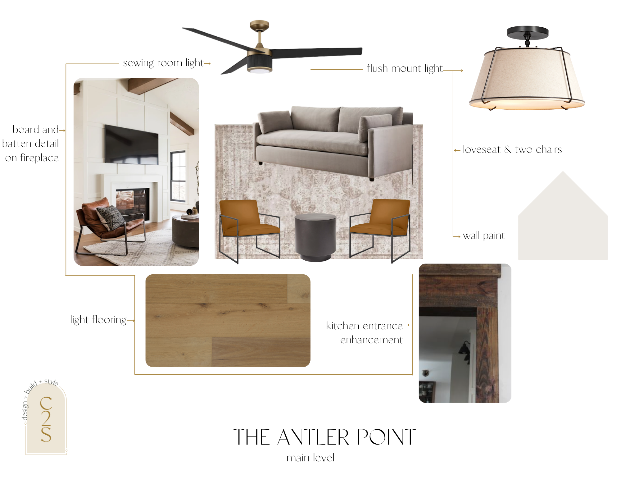
Option 1 – Main Level Living
wall color | flush mount lighting | oversized loveseat | accent chair | end table | rug | dining room chairs |sewing room fan light
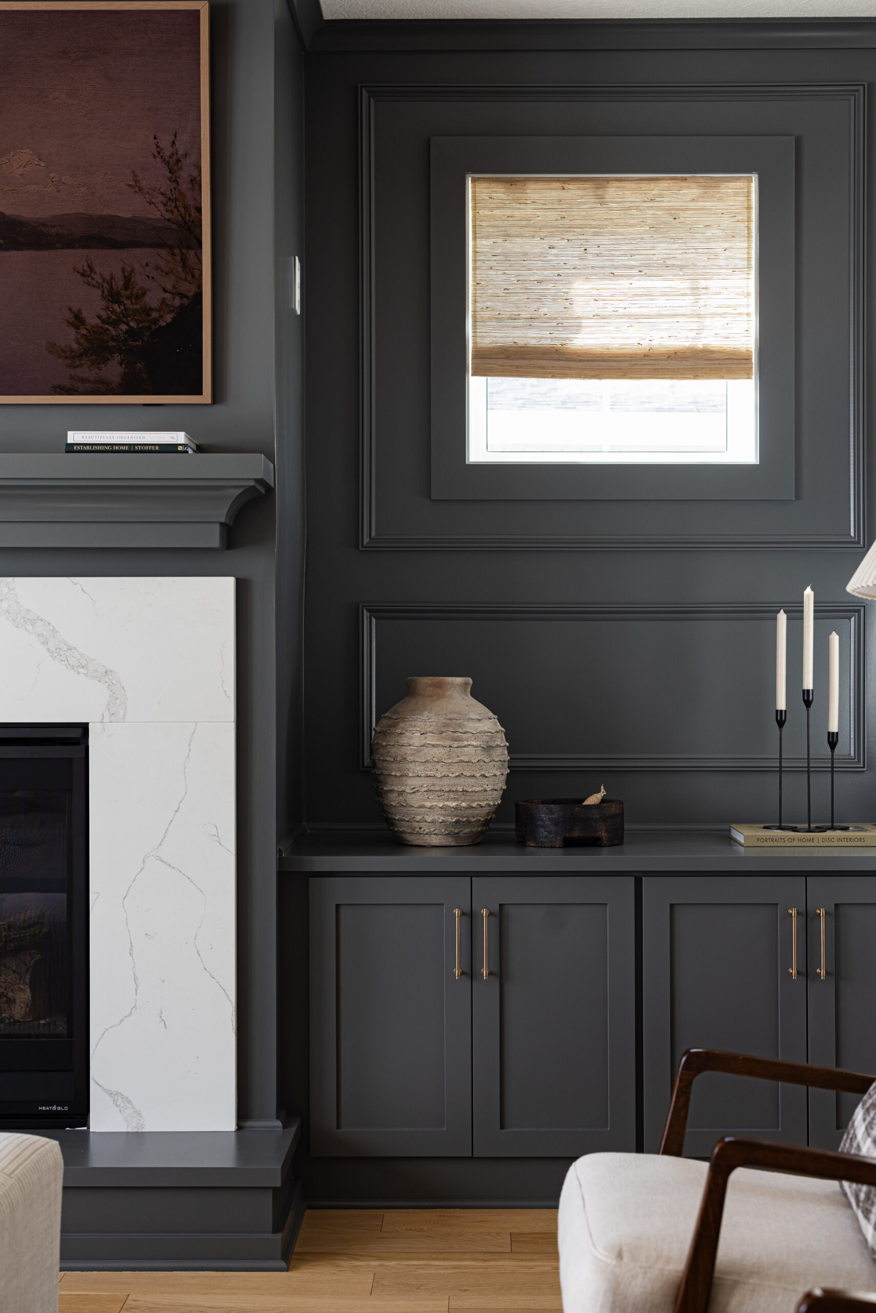
As you can see in the pictures of the current space, the biggest change will be the fireplace. It goes from floor to ceiling and makes a huge statement and we want to continue that with the new look. With option one, we’re recommending drywalling over the brick and doing a board and batten detail to the fireplace in a white paint color to keep it monochromatic with the walls, but give off that statement texture.
For the sewing room fan light, we wanted it to pull into the rest of the refreshed spaces, so we recommended a mixed metal fan.
We suggested a loveseat from West Elm with a fun and modern twist with the leather accent chairs with a simple black side table.
The rug will add color to the space and bring it all together.
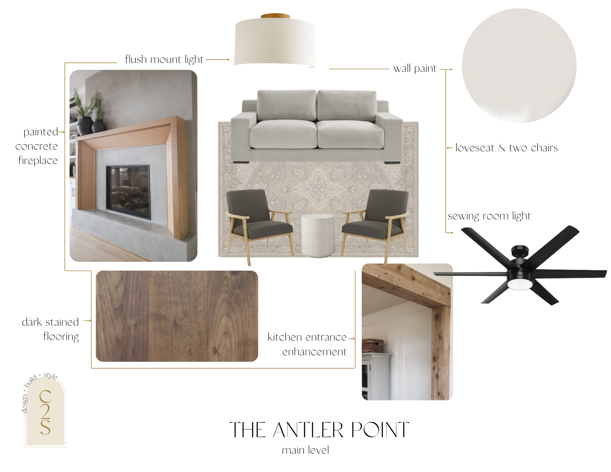
Option 2 – Main Level Living
wall color | flush mount lighting | oversized loveseat | accent chair | end table | rug | dining room table | dining room chairs | sewing room fan light
For option two on the main level, we’re keeping it similar to option one, but adding a few twists. Since we already know this client’s style from our previous projects here, it’s easier for us to come up with things we know they’ll love!
Option two brings in darker stained wood floor & accents throughout, sticking with a grey oversized loveseat , adding in a more muted rug & accent chair options.
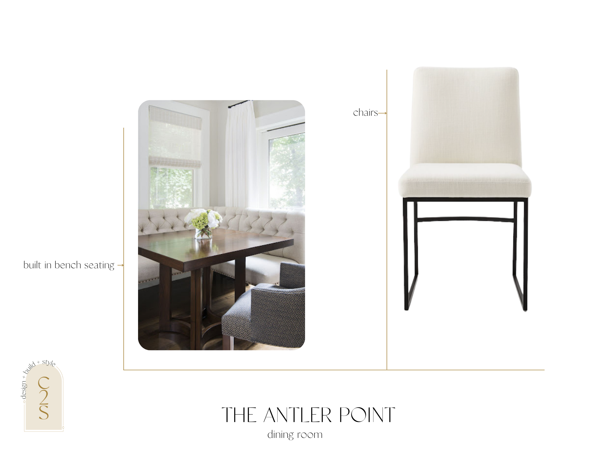
Option 1 – Dining Room
As we touched on earlier, the vision for this space is a custom bench seat and table to fit the space, and some dining room chairs to go along with it.
Option 2 – Dining Room
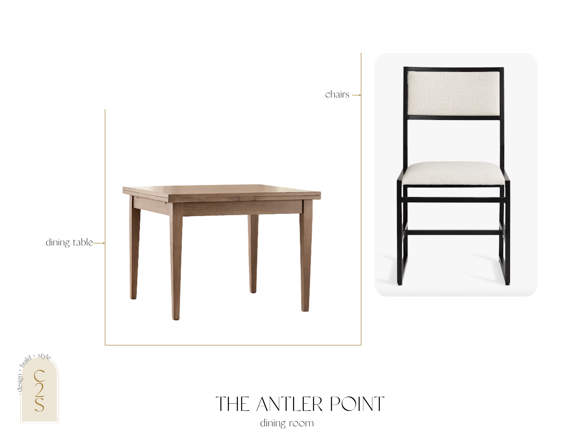
For option two for the dining room, we went with a square dining table that could expand to make room for the dinner parties these clients like to have. We stuck to the neutral feel of the dining chairs and went with these beautiful ones from Pottery Barn.
Option 1 – Staircase
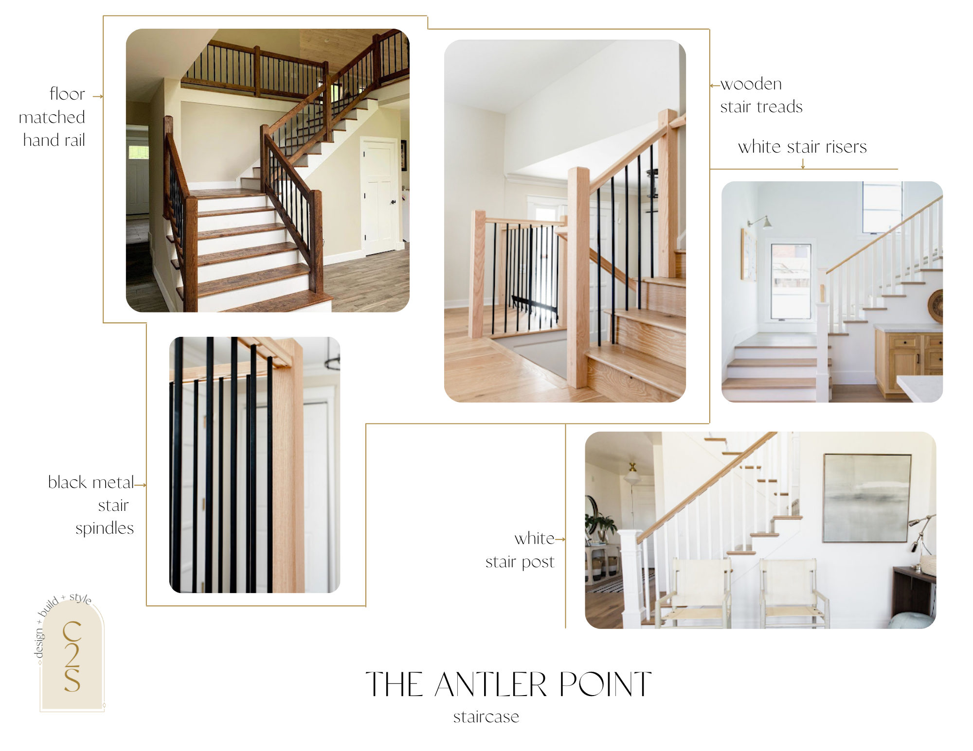
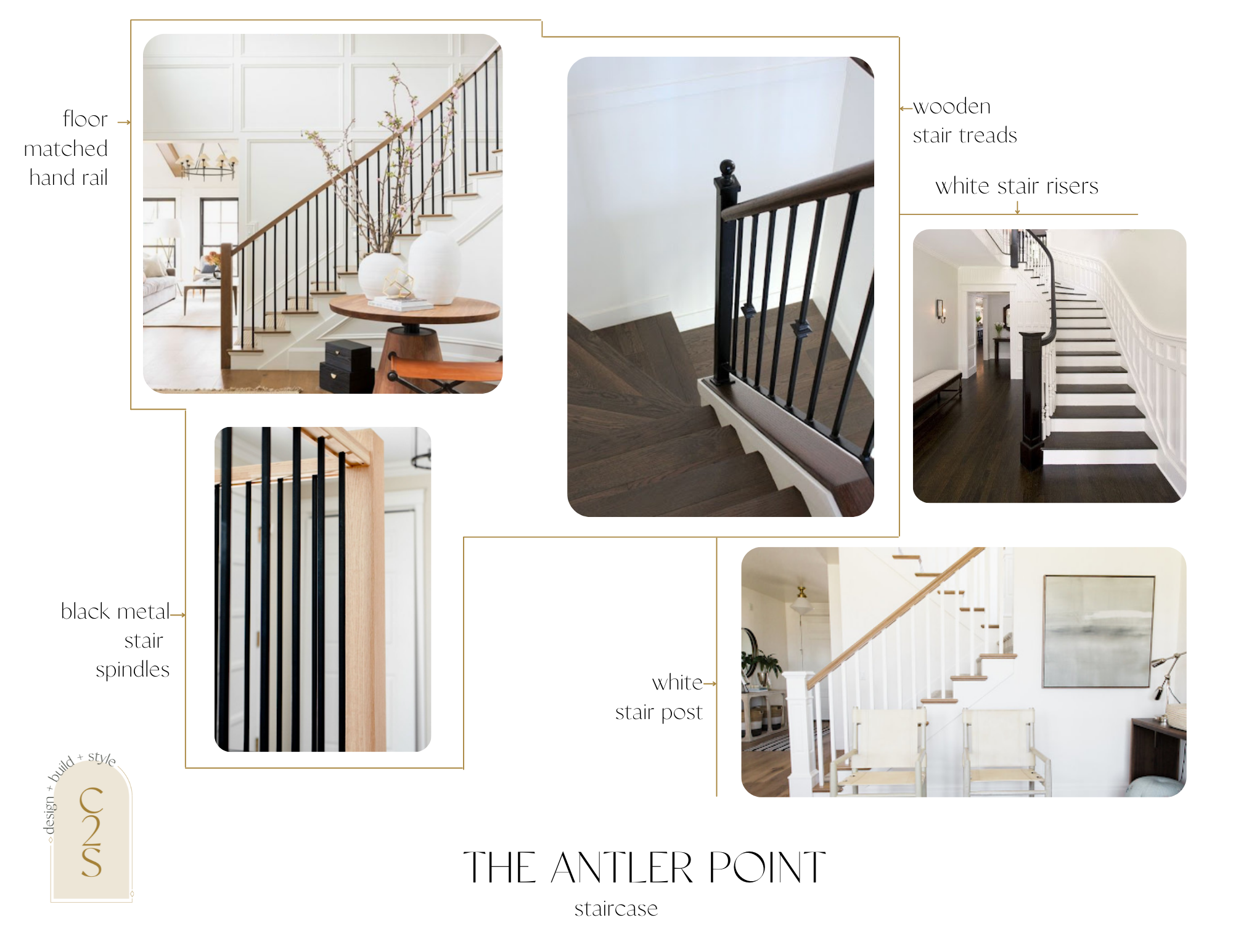
For the stairs, Jamie will work on creating a new modern look to fit with the overall vibe of this space. The staircase will tie into the rest of the flooring, so pending which direction we take in the floor stain, we’ll recommend wood tones stay consistent with the floor. Otherwise, we’re recommending that across both options, we would do wooden handrails, stair treads, white stair risers & posts, and black metal spindles.
Option 2 – Staircase
Which option do you gravitate towards? Which one do you think the clients are going to choose?
Upper Level
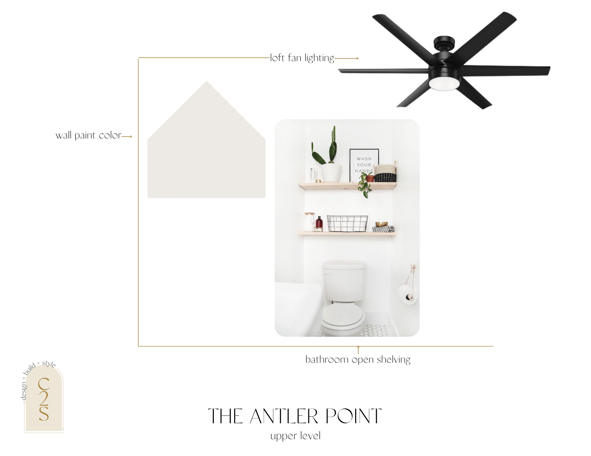
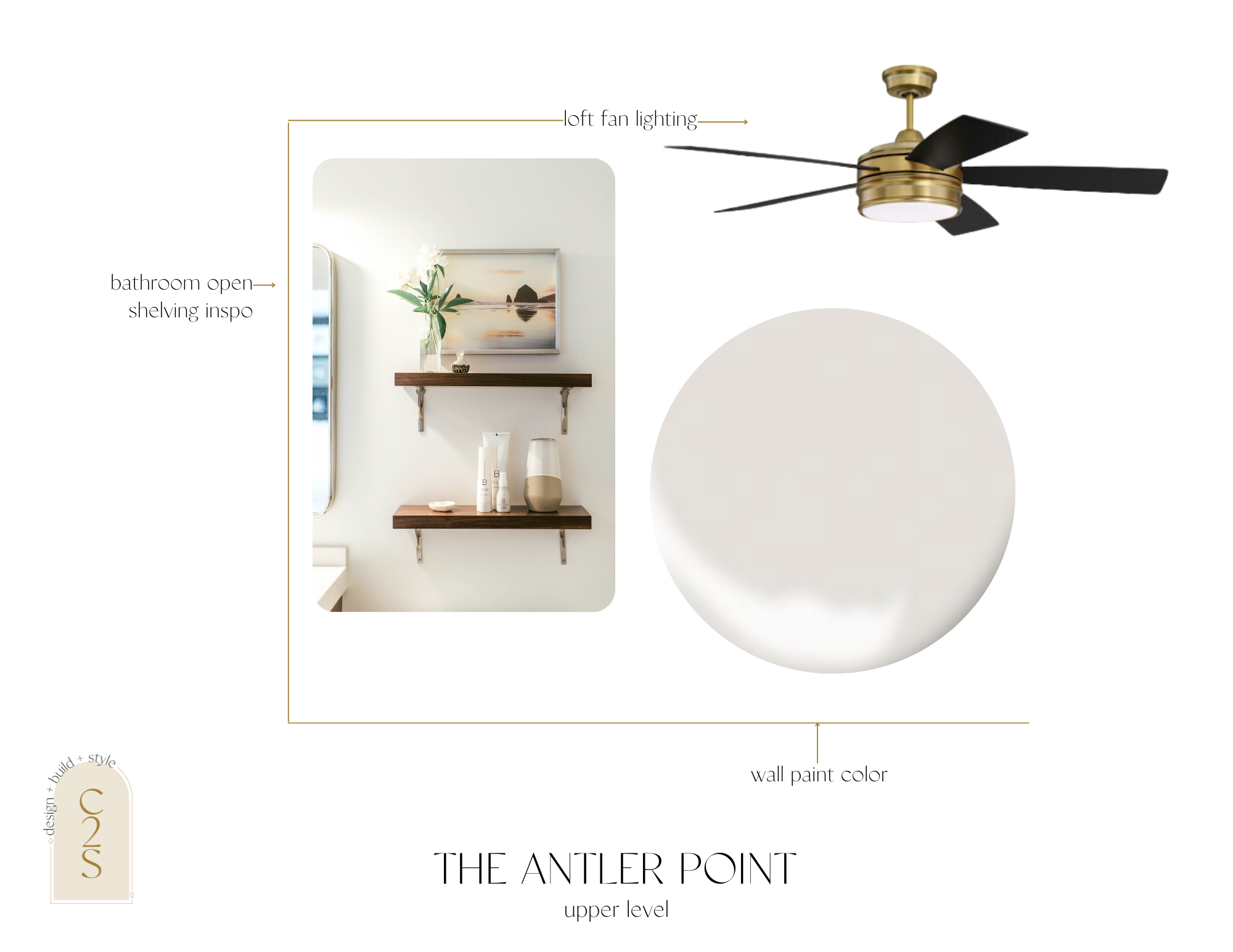
The upper level is just getting a few cosmetic updates. New paint throughout, updating the fan lighting in the bedroom, and adding floating shelves in the bathroom.
Small cosmetic changes can really make a huge impact in a space.
Here is the option one for the upstairs area. We are keeping it simple and muted and would keep the paint consistent with the main level and the upper level.
wall paint color | loft fan lighting | bathroom shelving
Here is option two. Again keeping it simple and muted.
wall paint color | loft fan lighting | bathroom shelving
Stay tuned for updates as we cruise through designs, ordering materials, and the beginning stages of construction!

One thought on “The Antler Point Design”
Comments are closed.