As the guys are cruising on this round of construction projects, the girls have been working on designs for the next wave of projects that will come this fall/winter. With all of the industry delays we are seeing right now, we’ve been doing our best to plan further ahead in our design process to avoid waiting for materials down the road.
These sweet clients of ours recently moved into a townhouse and while they love certain parts of it, like the hidden snack chute (hence, the hashtag for this project #tonkasnackchute) from the kitchen to the lower level play area, there are other aspects that they can’t seem to wrap their minds around.
We went out to check out the townhome and scope out their wishlist of items they’re hoping to have done, and instantly our wheels started. There are three bathrooms that we will be tackling, including the owner’s suite, their daughter’s/guest bathroom, and the main powder bath.
We will also be helping them on a few miscellaneous projects throughout, like changing out their lighting in the living room which currently lacks functional lighting, as well as new light fixtures in the kitchen to make the space feel more open and inviting.
This is a unique project because one of the clients is in the army and will be deployed for the next year and will not see the progress that is made on his home in person while we are under construction. Our goal is to have designs wrapped up before he leaves, and finished spaces by the time he comes home. Think we can do it?!
Owner’s Bath
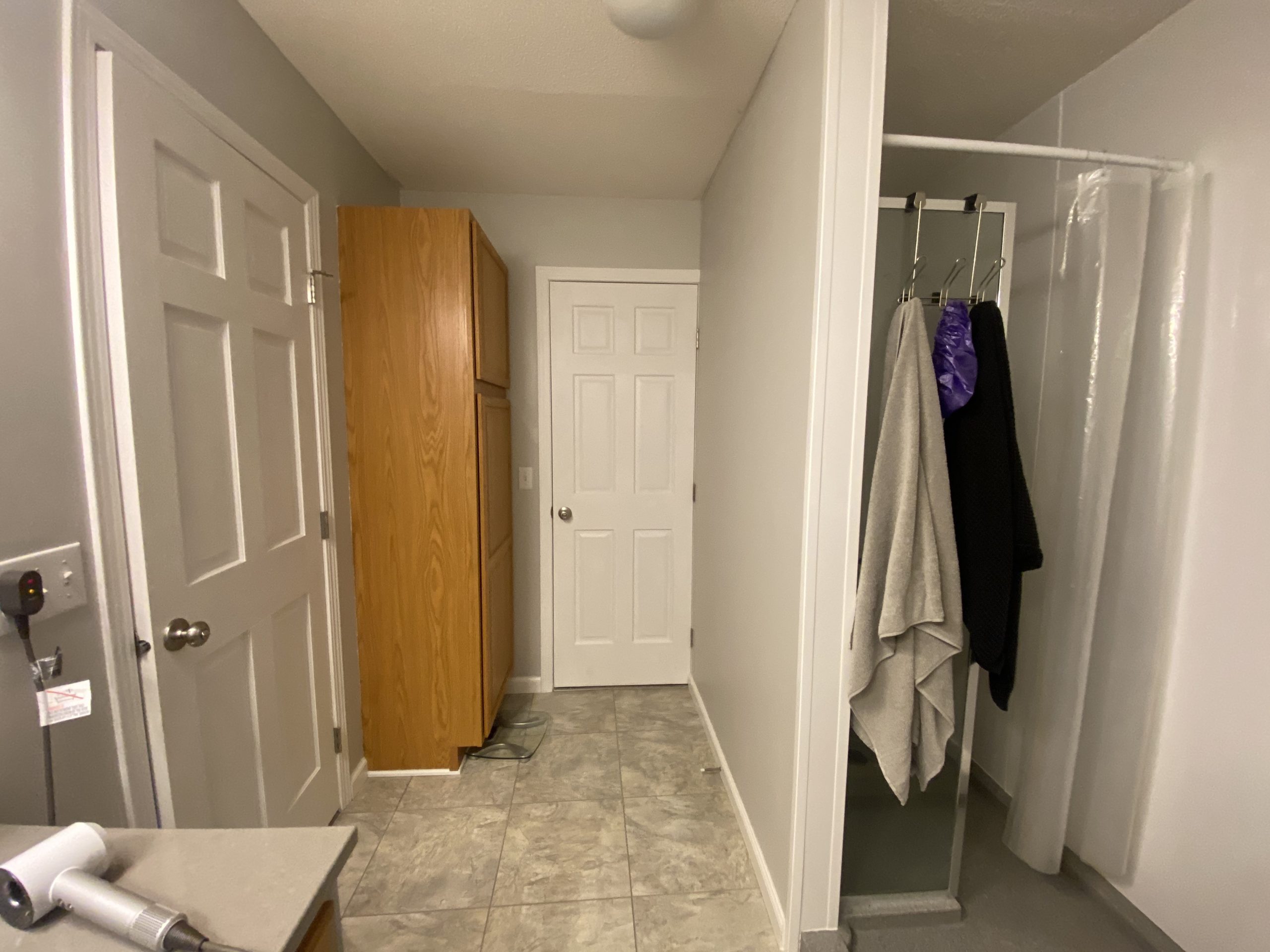
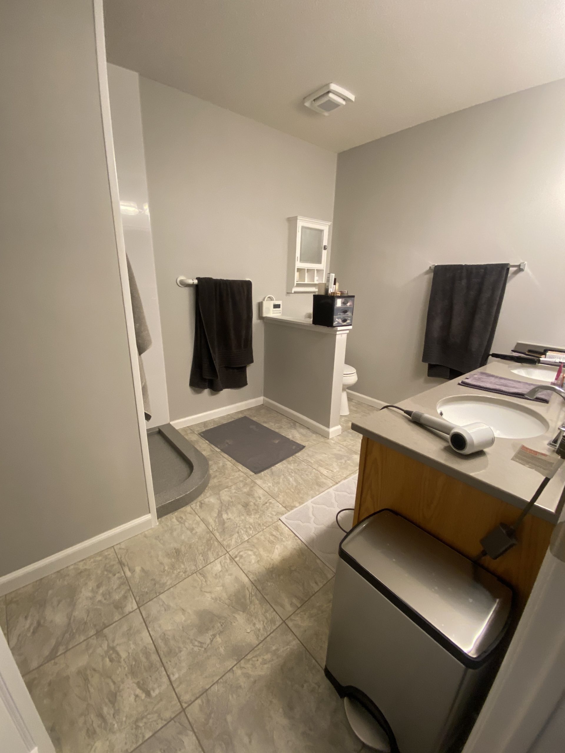
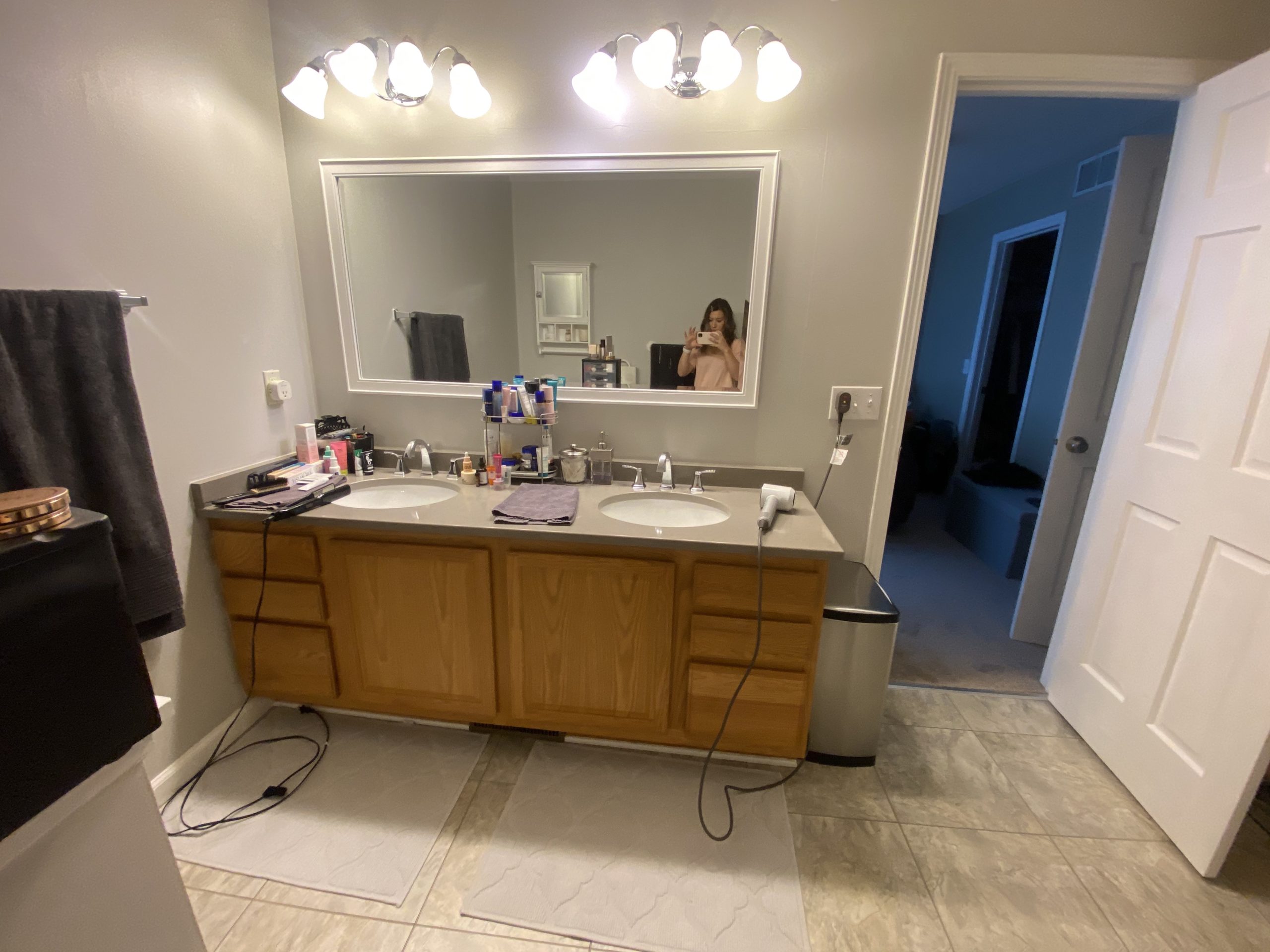
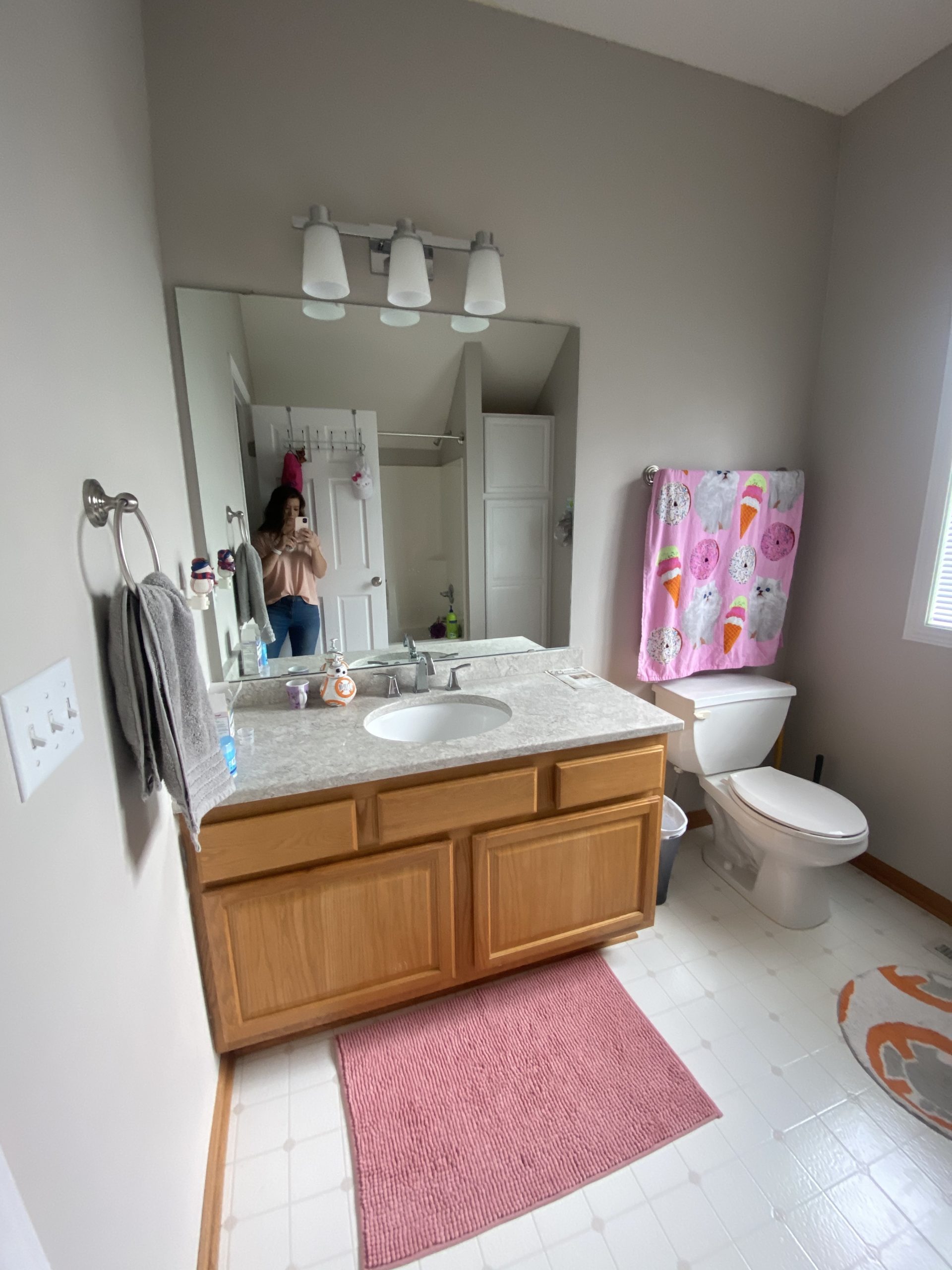
When asked what they wanted to change out in the owner’s bath, the response we got was change everything. There was not much that was liked in the current bathroom. The layout, the space, the open shower door, the weird half wall by the toilet were specific points made that these clients want to get rid of.
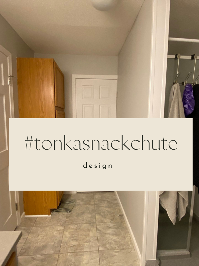
The door you see on the left-hand side leads into the owner’s bedroom while the door straight ahead leads to the hallway. One idea we have is closing off that door and increasing the space in the shower as well as creating more storage. There really is no need for this door as no guests use this bathroom, so that door does not really serve a purpose and takes up valuable space.
This bathroom is a full gut and remodel. Everything you see here will be taken out, changed, moved around, and updated.
When asked the vibe they were going for, we were told that in this household, there’s a slight obsession with Lululemon. So, that’s the vibe we’re going for.
Cool tones throughout with pops of black & gold to bring in a bit of warmth and industrial into the space.
Again, everything will be ripped out and changed on this side of the bathroom. We will be adding in a new double vanity and we’re thinking double, arched or round mirrors over the vanity.
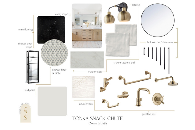
Here is the overall vibe of the new owner’s bathroom.
As you know from our past design blogs, we always give our clients two options to choose from, with option one being the vibe c2s recommends.
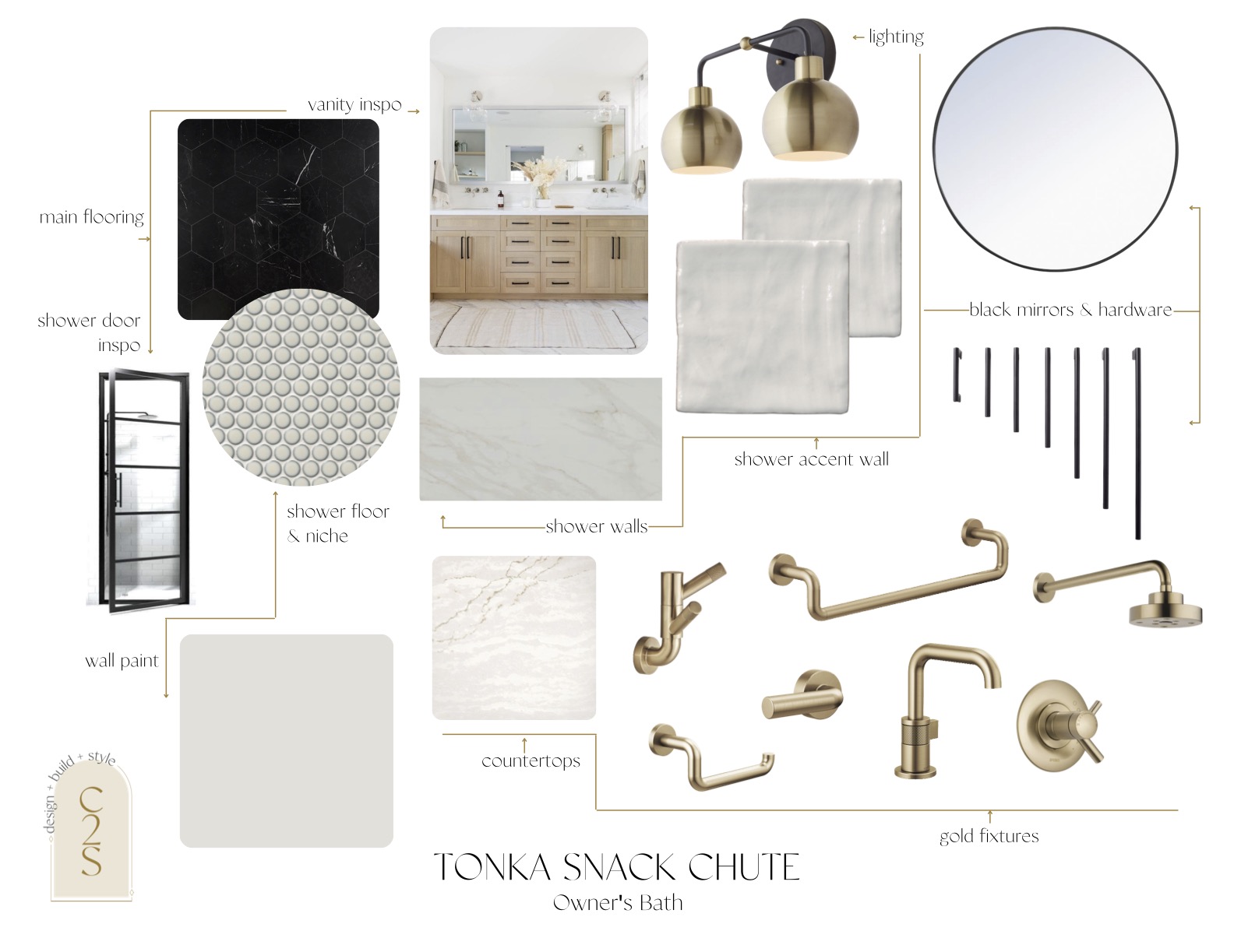
Here is option one that we shared with our clients.
Also – peep our new design boards! Since we completed our brand refresh with the amazing Sara Schultz, we’ve been inspired to make all of our design docs updated & refreshed as well.
Keeping the Lululemon vibe in mind, we went with a dark tile flooring with a marble design.
Since the flooring will be dark, we wanted to bring in warmer tones with the vanity, so we suggested a white oak double vanity, with black hardware.
We love mixing metals and suggest it to all of our clients. It’s a way to ensure that your space doesn’t go out of style and make you want to redo your space in 10 years.
In this bathroom, we mixed black and gold tones throughout with the vanity hardware, mirror, black shower door, while having the bath accessories and the lighting in gold.
We wanted to go for an overall sleek design in the bathroom, so we recommended going with the Brizo Lizte collection, complete with the sleek design of the faucet.
We are loving this penny tile from the Tile Shop and we thought it would be the perfect spa-like addition for the owner’s bath shower floor. To match the spa vibe, we suggested going for textured tile as an accent wall in the shower and then completing the shower with the larger slab of white marble-like tile that we used in the owner’s bath in our flip house, the #blacklakeplace.
Here is the complete list of all selections for this option one of their owner’s bath:
wall color | main flooring | hardware | countertops | sink | lighting | faucet | shower floor tile | shower surround tile | shower surround accent wall tile | shower fixtures | mirror | tank lever | towel bar | tissue holder | robe hooks
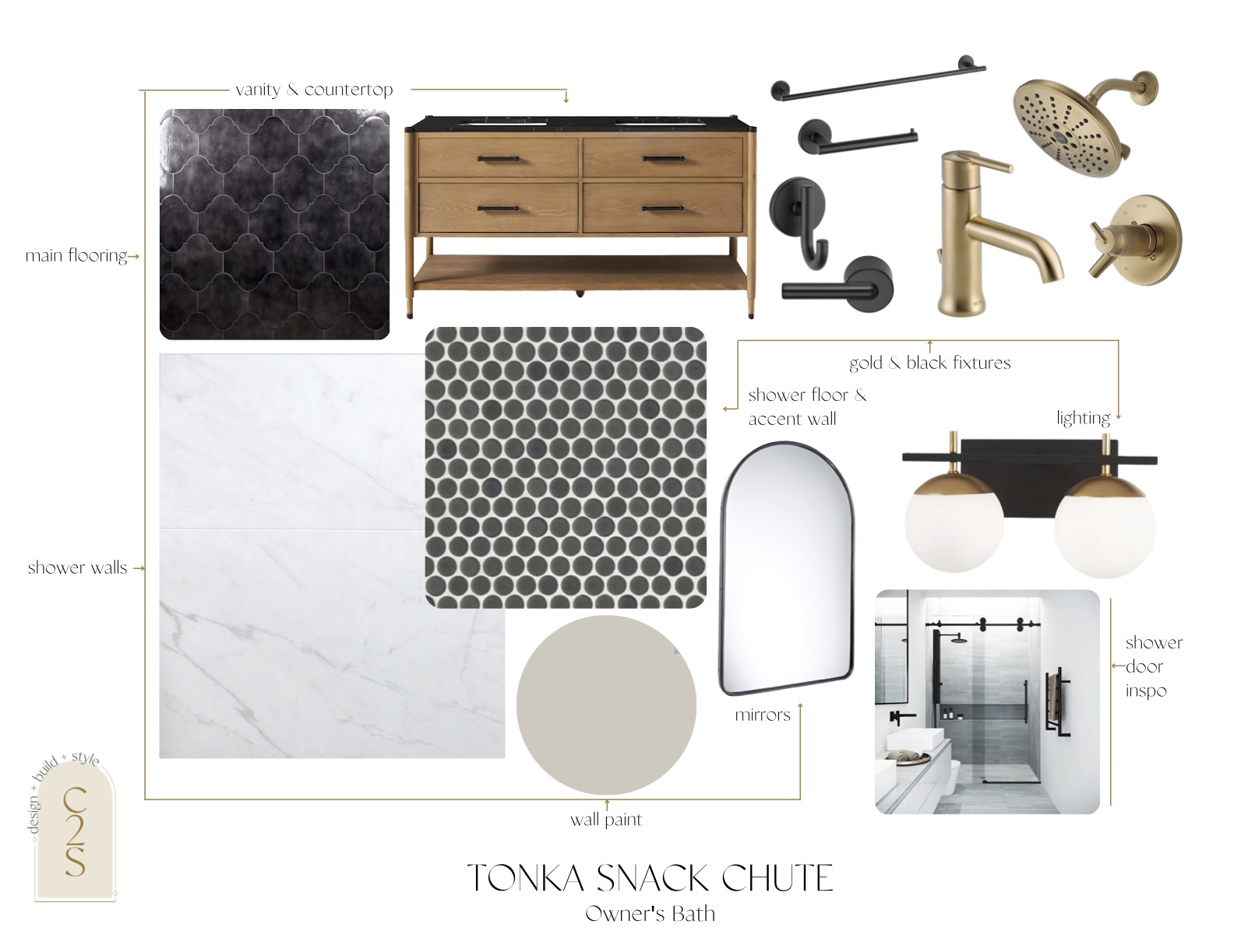
While we kept the overall vibe of option two similar to option one, we changed a couple things around.
We changed the flooring to be a unique design instead of a more simple larger rectangular tile. We went with this arabesque tile but kept the flooring black – similar to option one.
We also changed the vanity inspiration and went with a prefab vanity from Anthropologie that comes with a sink, black countertops, and black hardware. Again, sticking with the Lululemon vibe and bringing in more black accents.
This option is definitely more moody and cool compared to option one. We have more black accents and the darker tone of the wood for the vanity also brings out the darker feel to the room.
For the shower floor, we went with the similar style of the penny tile, but we added in a darker floor that we suggest continuing up one wall and use as the accent wall in the shower as well. To brighten up the shower, we recommended a lighter marble-type tile that would contrast with the darker flooring and accent wall in the shower.
To match the vanity hardware, we went with black Delta Trinsic bath accessories and gold shower fixtures, and the gold Delta Trinsic faucet to add more contrast to the shower and the vanity.
Here is the complete list of all selections for this option two of their owner’s bath:
wall color | main flooring | vanity | lighting | faucet | shower floor + accent wall tile | shower surround tile | shower fixtures | mirror | tank lever | towel bar | tissue holder | robe hooks
Which option do you gravitate towards? Which one do you think the clients are going to choose?
Stay tuned for the renderings of this bathroom and make sure to tag us if you end up using this design or parts of it for your remodel!
Guest/Girl’s Bathroom
We love when we get to design out a space for the kiddos. And this one is no exception!
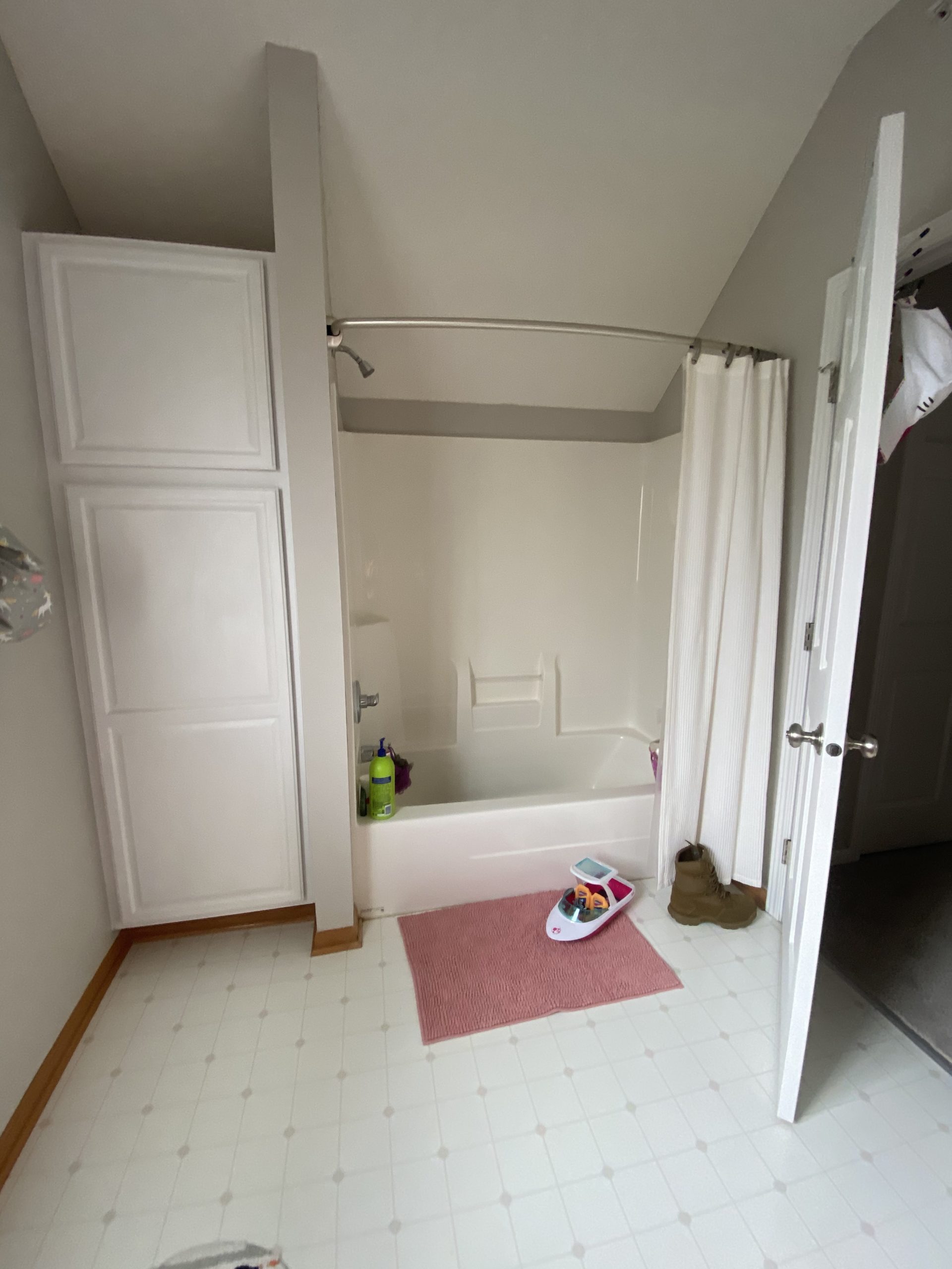
This bathroom will function as the girl’s bathroom and the guest bathroom. She’s got the best room in the house! A whole floor to herself with the bathroom in the bedroom.
The main change to this bathroom will be the flooring. We will be ripping out the laminate and adding in a fun tile floor.
One request from the client was for consistency throughout the bathrooms, so we will be changing the toilets in each bathroom to keep the consistency throughout.
We will be adding in a new tub and shower surround to add to the overall vibe of this bathroom.
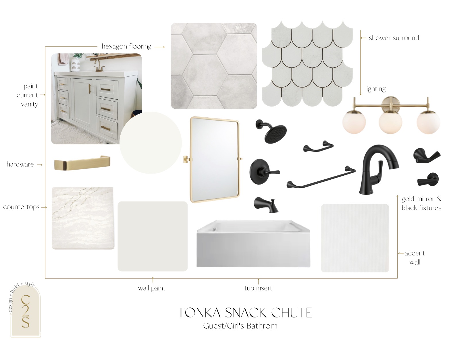
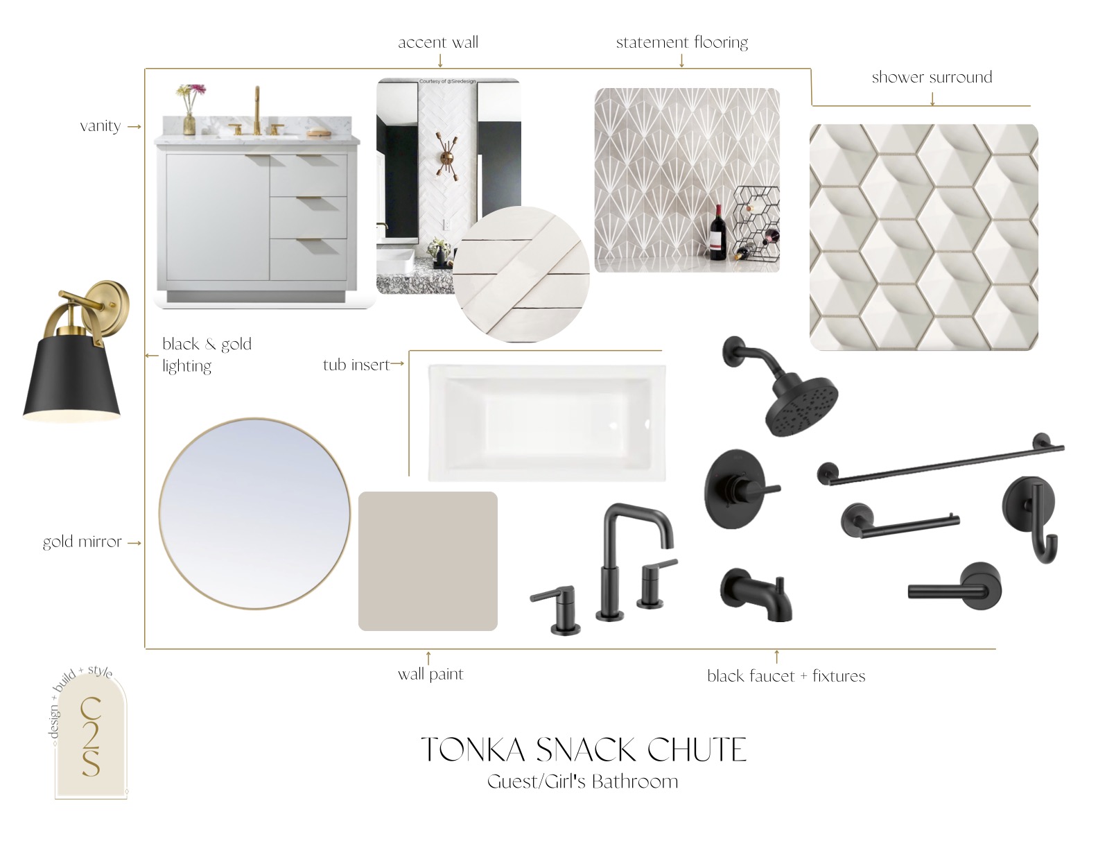
Here is our option one design for this guest/girl’s bathroom.
We want it to feel bright and airy and more neutral for the guests to enjoy while also bringing in that more feminine vibe for the daughter.
For this option, we recommend keeping the current vanity because it’s in great shape, and just painting it white and adding in new countertops and gold hardware.
We love the flooring and the statement it could bring to this bathroom. It also vibes with the overall neutral and feminine vibe of this bathroom.
To contrast, we brought in black accessories throughout to keep it timeless. You know we love to mix metals, so we added in a gold light and mirror to add to the neutral and femininity of the bathroom.
We also wanted to add an accent wall to this bathroom as an added design element. We love this simple wallpaper from Anthropologie which adds texture and isn’t too out of the box for these clients.
This client is a bit skeptical when it comes to wallpaper, so we wanted to make sure we kept it more muted.
Here is the complete list of all selections for this option one of the guest/girl’s bath:
wall color | main flooring | vanity paint color | countertops | hardware | accent wall | lighting | faucet | shower surround tile | tub insert | shower fixtures | mirror | tank lever | towel bar | tissue holder | robe hooks
We kept the vibes pretty similar for the second option of the guest/girl’s bathroom, but we added in more statement options like this flooring from the Tile Bar that we love. We used a similar tile from the Tile Shop in our #blacklakeplace laundry room and we love how many different ways you can lay this tile, so we thought it could be so fun addition to this bathroom.
Another change we made to this option was bringing in a new vanity. We would keep it white and have gold hardware on it, but wanted to suggest a new vanity in case that’s what they were leaning towards.
We still wanted to have an accent wall in this bathroom, but if the wallpaper was too much to get these clients on board, we recommended going for a simple white subway tile to then lay in a herringbone pattern to add behind the vanity.
We also changed the accessories and kept it black throughout with the Delta Nicoli and Trinsic series, with a simple gold mirror to add a bit of contrast.
We also added in this super fun 3d tile for the shower surround that we thought could be a really fun addition.
Here is the complete list of all selections for this option two of the guest/girl’s bath:
wall color | main flooring | vanity | accent wall | lighting | faucet | shower surround tile | tub insert | shower fixtures | mirror | tank lever | towel bar | tissue holder | robe hooks
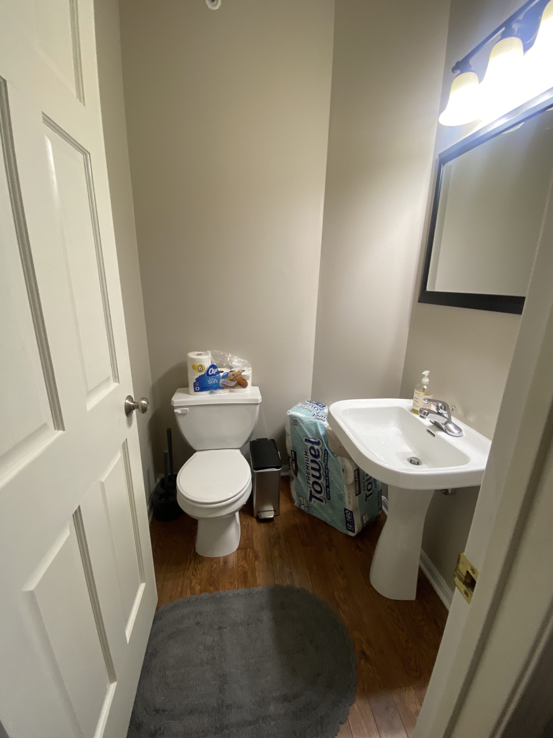
Main Powder Bath
We’re keeping the design in the main bath pretty simple.
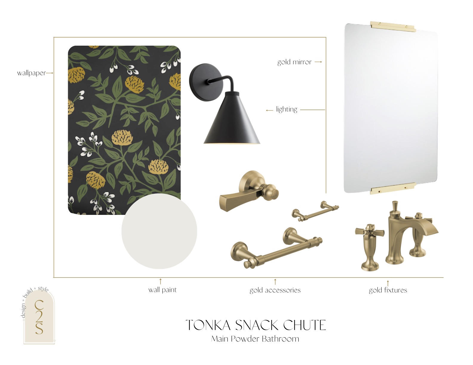
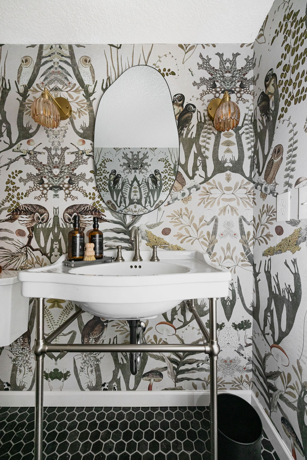
We convinced our clients to add in a pop for an accent wall and add in a dramatic wallpaper, so that was our main focal point when designing out this new powder bath.
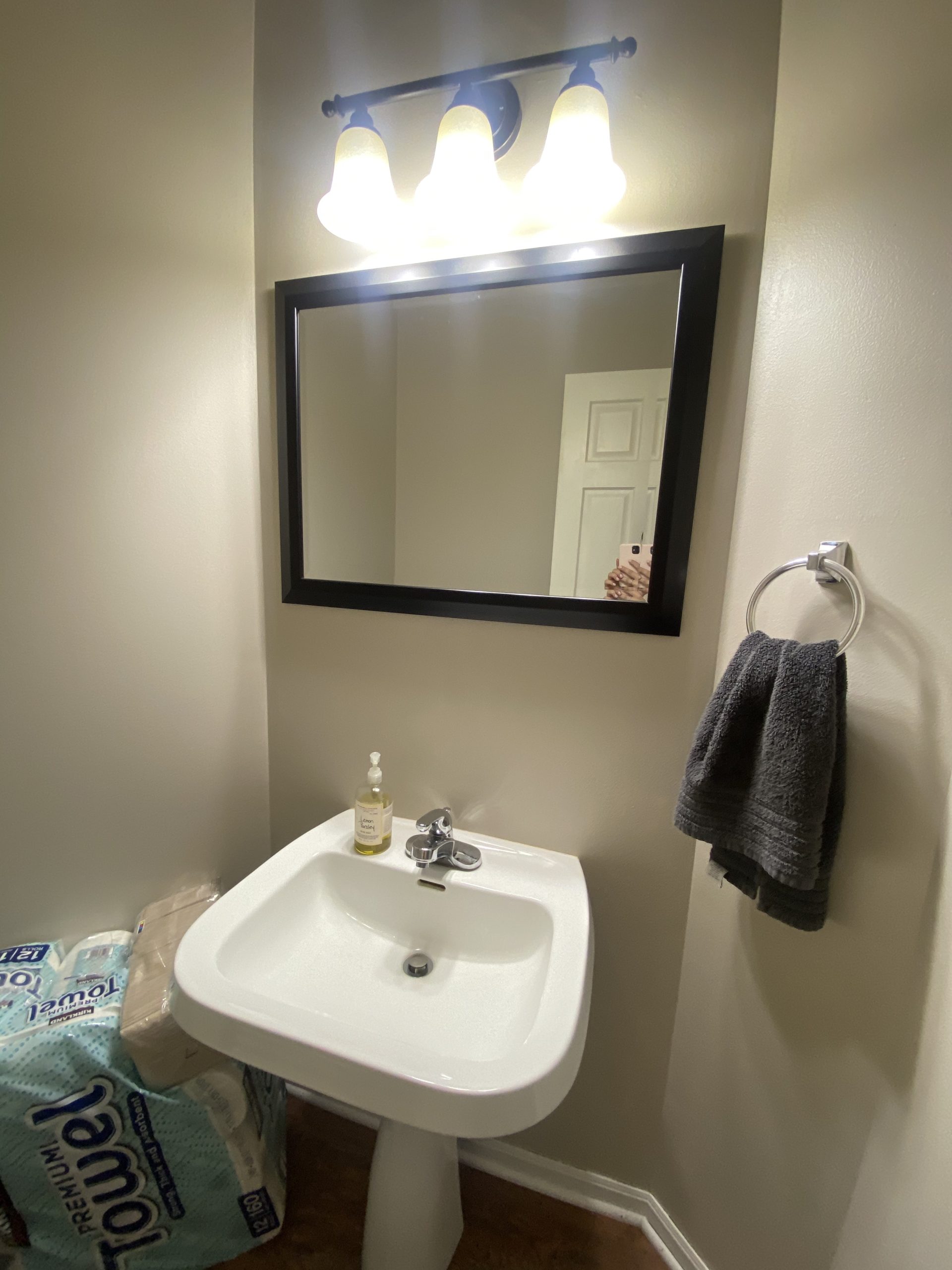
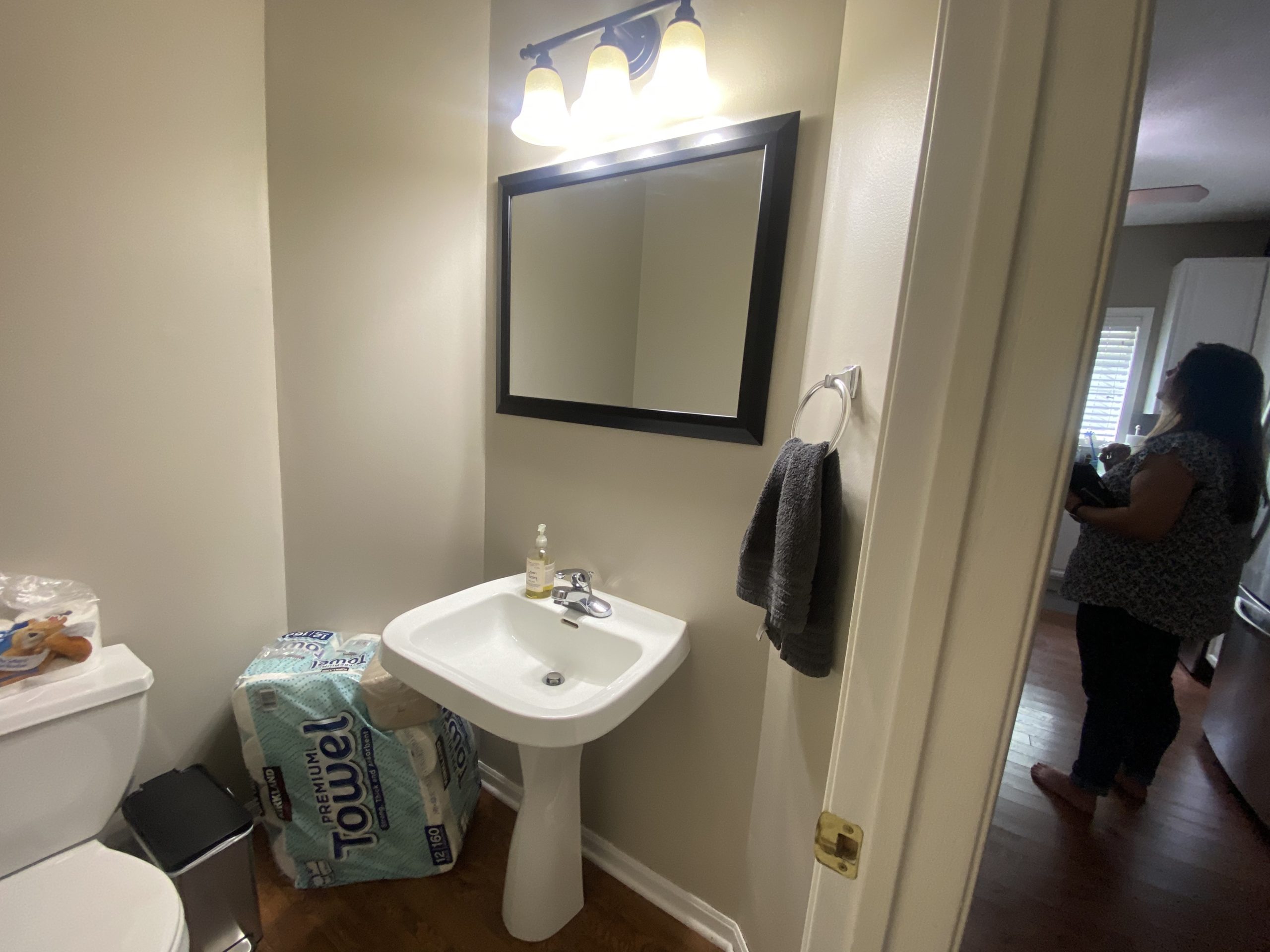
To keep the consistency, we will be keeping the wood flooring which is throughout the main level, and add in a new toilet to match the ones from the other bathrooms.
We’ll be replacing the lighting and the mirror in both options.
For option one, we are keeping the current vanity, but switching out the faucet and adding new gold accessories throughout.
Plus a new mirror and new lighting with a fresh coat of paint and a bold wallpaper.
Here is the complete list of all selections for this option one of the powder bath:
wall color | accent wall | lighting | faucet | mirror | tank lever | towel bar | tissue holder
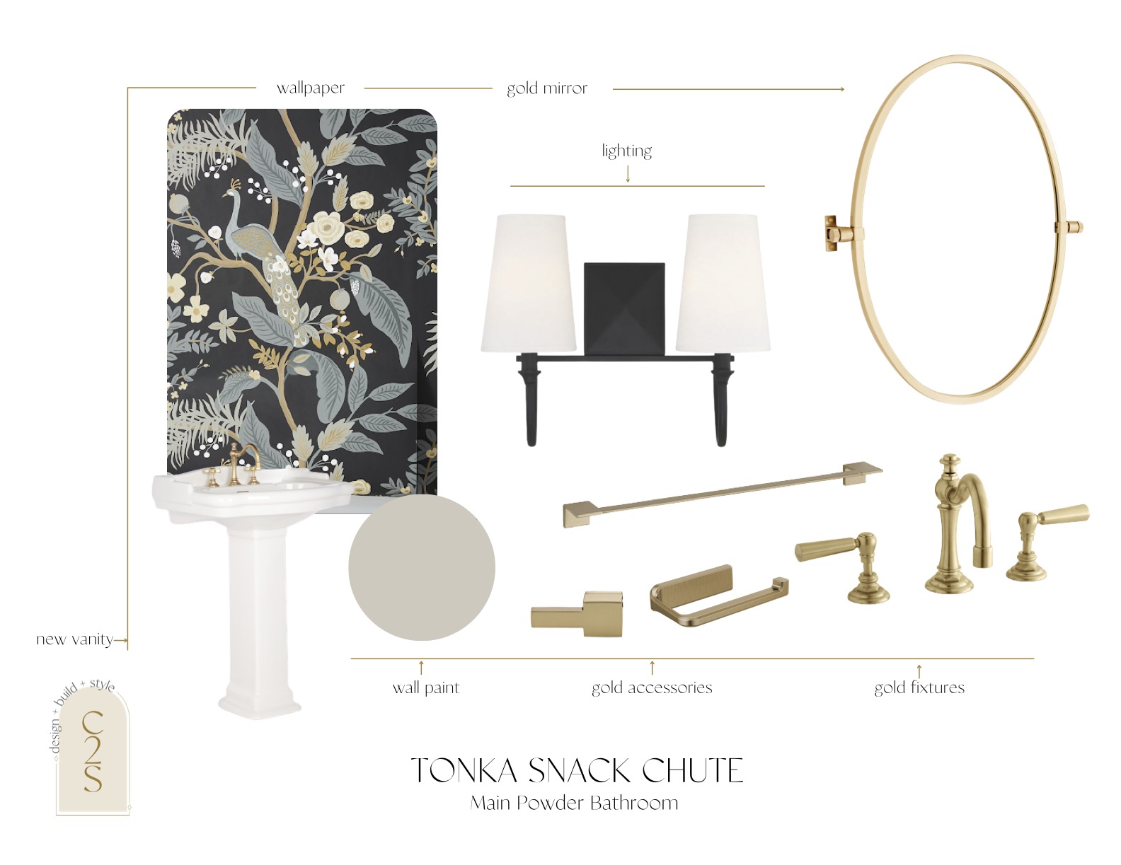
The main difference in option two is we added in a new vanity but kept the same pedestal style because we think that’s the perfect addition for this powder bath.
Other than the vanity, the other changes are minor, with a slightly different accent wallpaper, a different style of light and mirror, and a different series of delta accessories with the faucet that is recommended with the vanity we chose.
Here is the complete list of all selections for this option one of the powder bath:
wall color | accent wall | vanity | lighting | faucet | mirror | tank lever | towel bar | tissue holder
And that’s all for our #tonkasnackchute design! What options do you think our client will pick?!
Make sure to follow us on Instagram for updates on the design along the way! So much more goodness to come…
