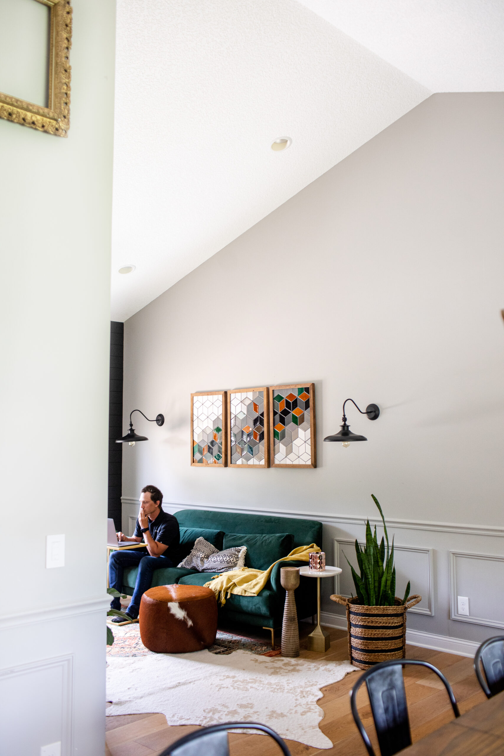
Ever get stuck staring at a wall of paint swatches wondering what interior paint colors to actually pick? Yeah, us too. One of the questions we get asked the most is, “What are your go-to paint colors?” So we figured… why not round up a few of our tried-and-true favorites?
Interior Paint Colors
We’ve tested a lot (like, a lot) of paint over the years, and while we always tailor our choices to the project, there are definitely some shades we keep coming back to. These are the most popular interior paint colors that work in all kinds of spaces, with all kinds of lighting, and give off those just right vibes.
And if you’ve ever painted a wall and thought, “Wait… why does this look totally different than the sample?” you’re not alone. Paint can shift depending on light, texture, and what’s around it. So our biggest tip? Test it on the actual wall before committing to 5 gallons.
Here are our favorite interior paint colors for 2025, ones we’ve used in real projects and still love. Hopefully this gives you a little inspo for whatever space you’re dreaming up next.
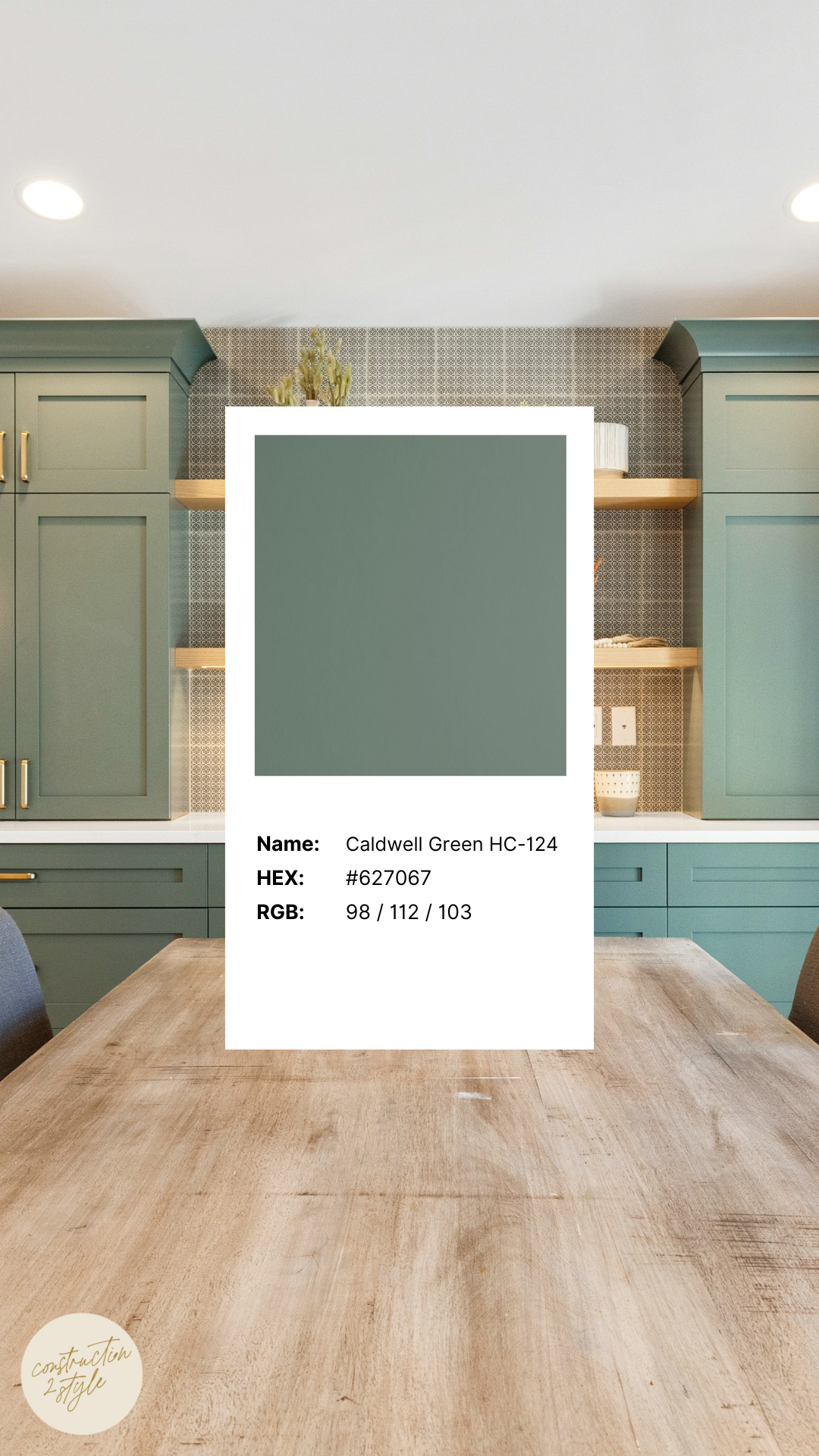
1. Caldwell Green by Benjamin Moore
We used Caldwell Green for the dry bar in our Seattle Sunset project, and honestly… it might be one of our favorite decisions in the whole house. This muted green has a cozy, calming vibe with just the right touch of gray to tone it down. It’s often described as a sophisticated hunter green, but there’s something extra about it – almost slate-like – that gives it depth without being overpowering.
It brings a richness to the space without screaming for attention, which we love. It pairs beautifully with warm woods, brass accents, or even matte black finishes if you want a little contrast. If you’re looking for a green that’s earthy but elevated, Caldwell Green’s a great one to test.
Caldwell Green is actually part of Benjamin Moore’s Historical Color Collection, inspired by American landmarks, which makes total sense because it feels both timeless and super versatile. It leans traditional but can work just as well in a modern setting, which is why it fit so seamlessly into the dry bar at our Seattle Sunset project.
The muted tone brings this calm, serene energy that’s exactly what you want in a space meant for unwinding. Whether you’re pouring a drink or just pausing for a minute, it sets the tone without being too loud. We love that it works for both interior and exterior spaces, but in this spot, it brought just the right amount of depth and warmth to pull the whole vibe together.
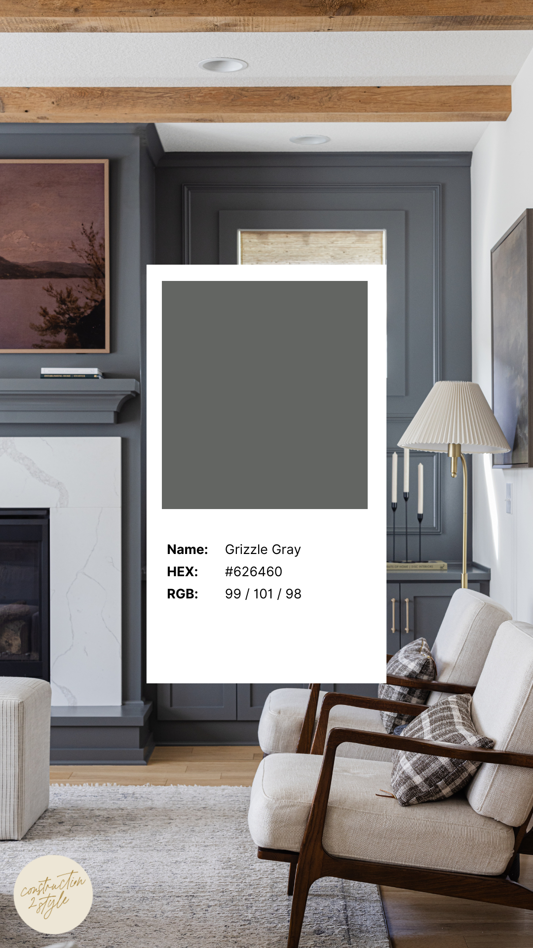
2. Grizzle Gray by Sherwin Williams
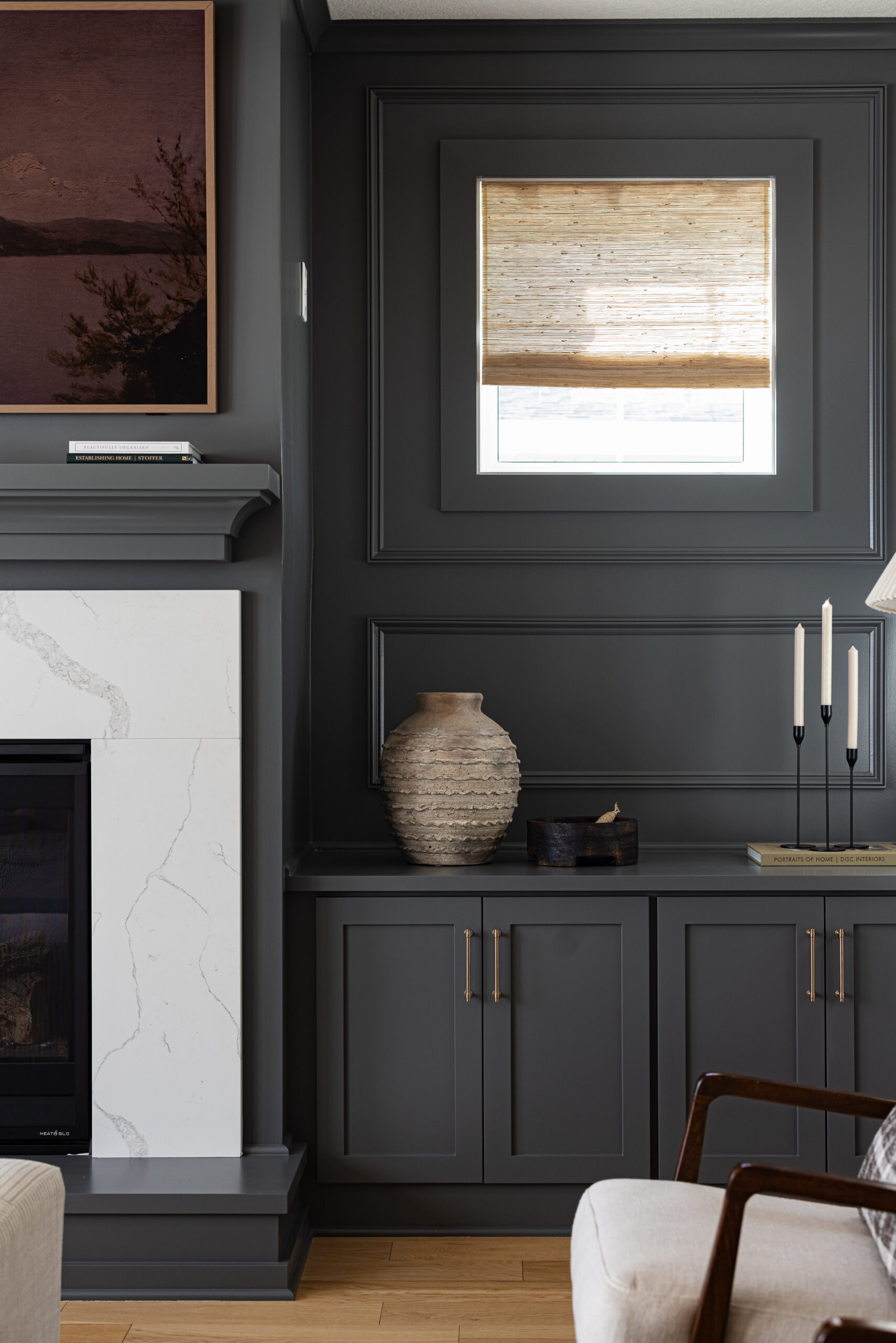
If you’ve ever searched for that perfect moody gray that doesn’t feel too cold or too warm — this might be it, it’s a trending interior paint colors. Grizzle Gray is a deep, saturated charcoal that leans cool, with subtle green undertones that give it an edge without making it feel harsh. It’s definitely a bold choice, but in all the best ways.
We used it on the accent walls flanking the fireplace in the great room at our Styled Press project, and it completely grounded the space. It added contrast without stealing the show, especially paired with the reclaimed wood box beams on the ceiling. Honestly, it made the whole room feel elevated but still cozy. Which is kind of the dream, right?
If you’re thinking about going darker with paint but don’t want something that feels trendy or too dramatic, this is a great interior design and paint color to sample. It’s modern, timeless, and just moody enough to make a statement without overwhelming the room. Don’t be afraid to go bold because sometimes those are the decisions that end up being your favorite.
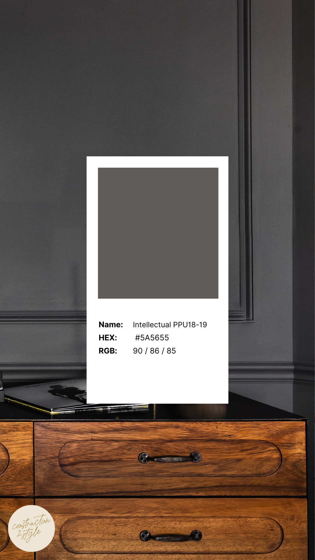
3. Intellectual by BEHR
Okay, let’s talk about a color that doesn’t get nearly enough love – Intellectual by BEHR. It’s a deep, rich gray that instantly makes a space feel grounded, cozy, and kind of like you have your life together (even if you’re still drinking cold coffee at 3 p.m.).
What makes it extra special is the hint of warmth it brings. There’s this leathery brown undertone that gives it just enough softness so it doesn’t feel too stark or industrial. We’ve used it in home offices to inspire a little focus and creativity, and it’s amazing on built-ins too – adds depth without taking over the whole room.
If you want something moody but still approachable, this one’s a solid bet. It plays well with warm wood tones, creamy whites, and even brass or matte black finishes. We always recommend grabbing a sample first, but Intellectual is one of those shades that surprises you in the best way.
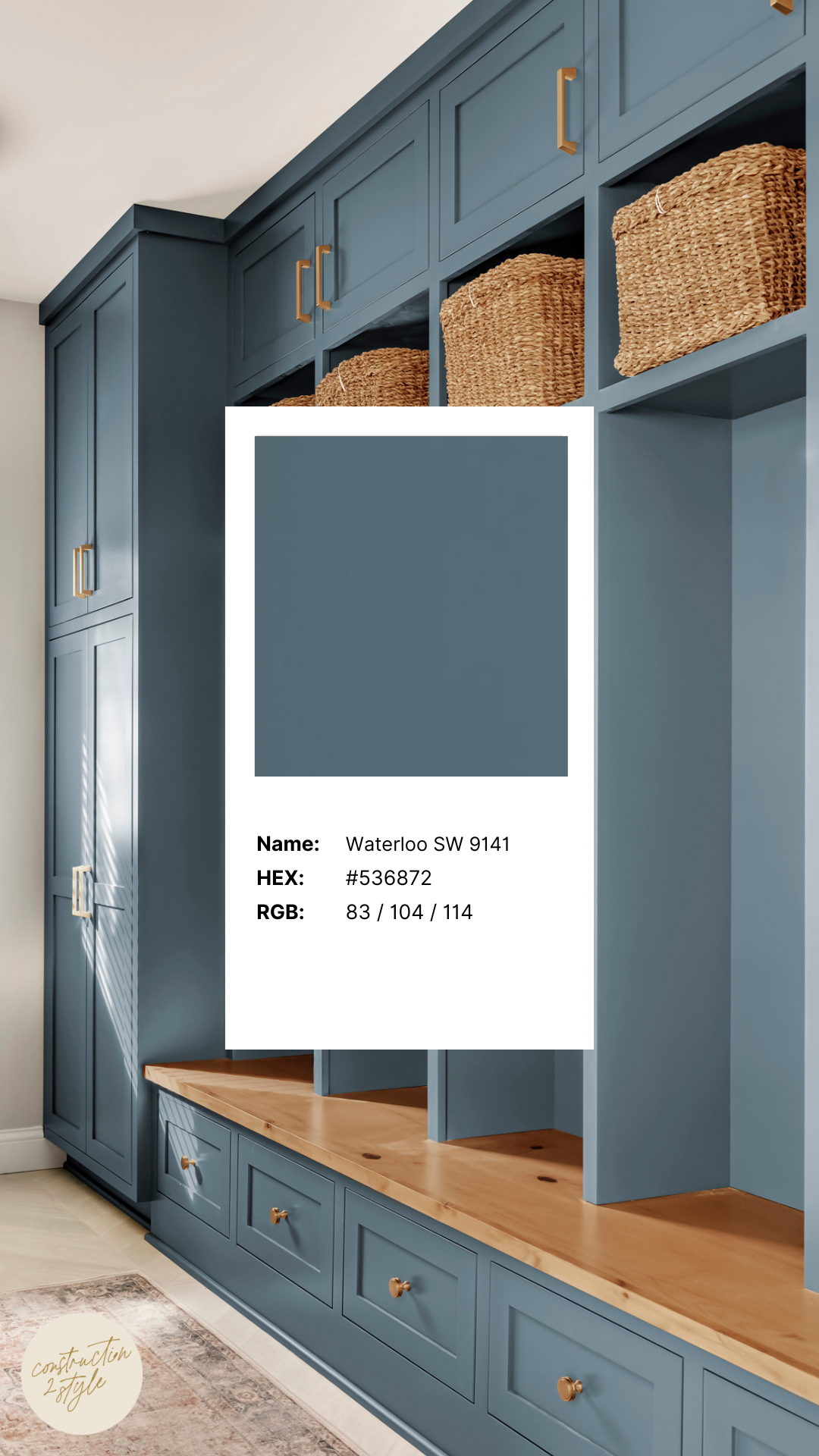
4. Waterloo by Sherwin Williams
If you’ve been craving a moody blue that still feels calm and timeless, Waterloo might be your color. It’s a great interior paint color that is rich mid-tone blue with a soft gray undertone, which makes it super versatile. Depending on the lighting, it can read like a classic navy or lean into a smoky, more muted blue, both equally beautiful.
We used Waterloo on the mudroom cabinetry in our Millstreet project and fell in love with how it turned out. It brought just the right amount of boldness to a hardworking space, and paired so well with the white oak, light tile, and all the natural light coming in.
Whether you’re thinking about painting cabinetry or want a moody accent wall, Waterloo adds character without being over-the-top. It’s the kind of shade that makes a space feel thoughtful and put together, but still cozy and approachable.
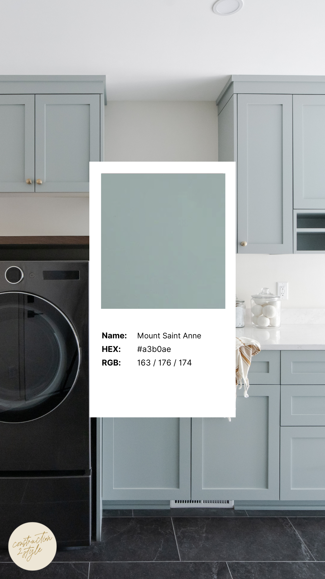
5. Mount Saint Anne by Benjamin Moore
Mount Saint Anne is one of those colors that just feels good. It’s soft, easygoing, and brings this kind of casual elegance that fits into almost any room without trying too hard. It’s a blue-gray with a little more depth and personality, and it’s a shade we’ve used in a lot of our interior design projects over the years.
What we love most is how versatile it is. We’ve used it in mudrooms, bedrooms, laundry rooms, and even bathrooms — basically anywhere you want a calm, elevated feel. It plays so well with black accents, warm wood tones, and soft whites, which makes it easy to layer in texture and personality. For example, this could be a perfect pick if you’re dreaming up a laundry room makeover or want something with character but not too bold.
While it leans a bit cool, there’s just a whisper of green in this one that gives off a touch of warmth. That combo makes it feel fresh and grounded at the same time. It’s also a great color to tie together open concept layouts where you want some cohesion between rooms without everything looking exactly the same.
If you’re creating a peaceful bedroom retreat, with this one it gives a polished workspace, or just looking for a color that makes your walls look like you hired a designer, Mount Saint Anne is one to try and it’s a tried and true paint colors interior design. It’s quiet, confident, and just the right amount of “done.”
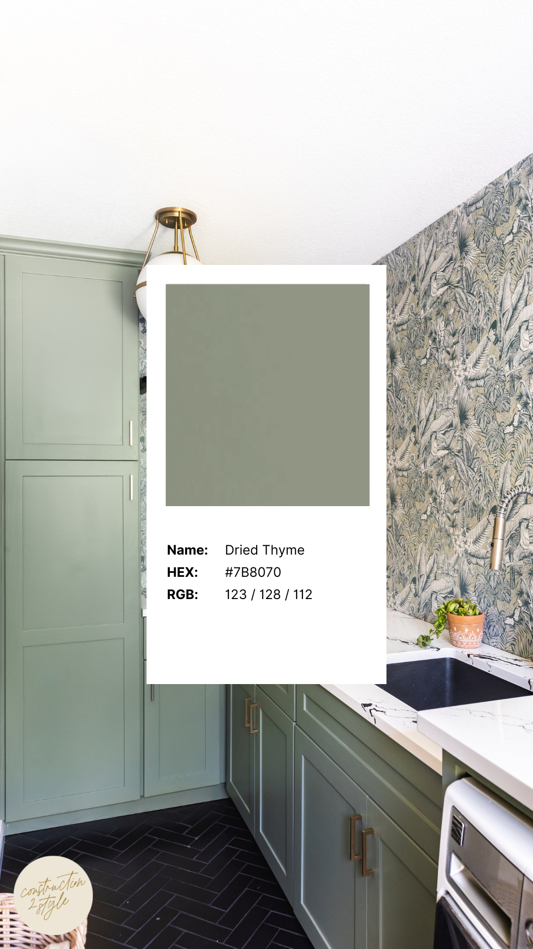
6. Dried Thyme by Sherwin Williams
One of my absolute interior paint colors is Dried Thyme by Sherwin Williams. We’ve used it in our personal home and time and time again in clients homes. It is one of those colors that instantly makes a space feel calm, cozy, and pulled together. It’s a beautiful mid-toned green with an earthy, organic vibe that feels super grounded, kind of like the herb it’s named after. It’s fresh without being flashy, and peaceful without feeling too muted.
We actually used this color in our own home for a mudroom remodel, and it still makes us happy every time we walk through the door. We paired it with a Rebel Walls wallpaper and it turned that space into something really special. What could’ve been just a drop zone became a spot with style and intention, one that’s still totally functional but also feels finished.
Dried Thyme fits in so well with that organic modern design we love. It works on cabinetry, walls, even furniture pieces, and always brings in a little warmth and personality without overwhelming the room. We’ve also used it in other kitchen cabinet projects and love how it plays with natural textures like wood, tile, and stone.
If you’re after a paint color that adds a little color but still feels timeless, this one’s a favorite for a reason. It’s one of those shades you’ll love just as much years from now – and trust us, we live with it every day.
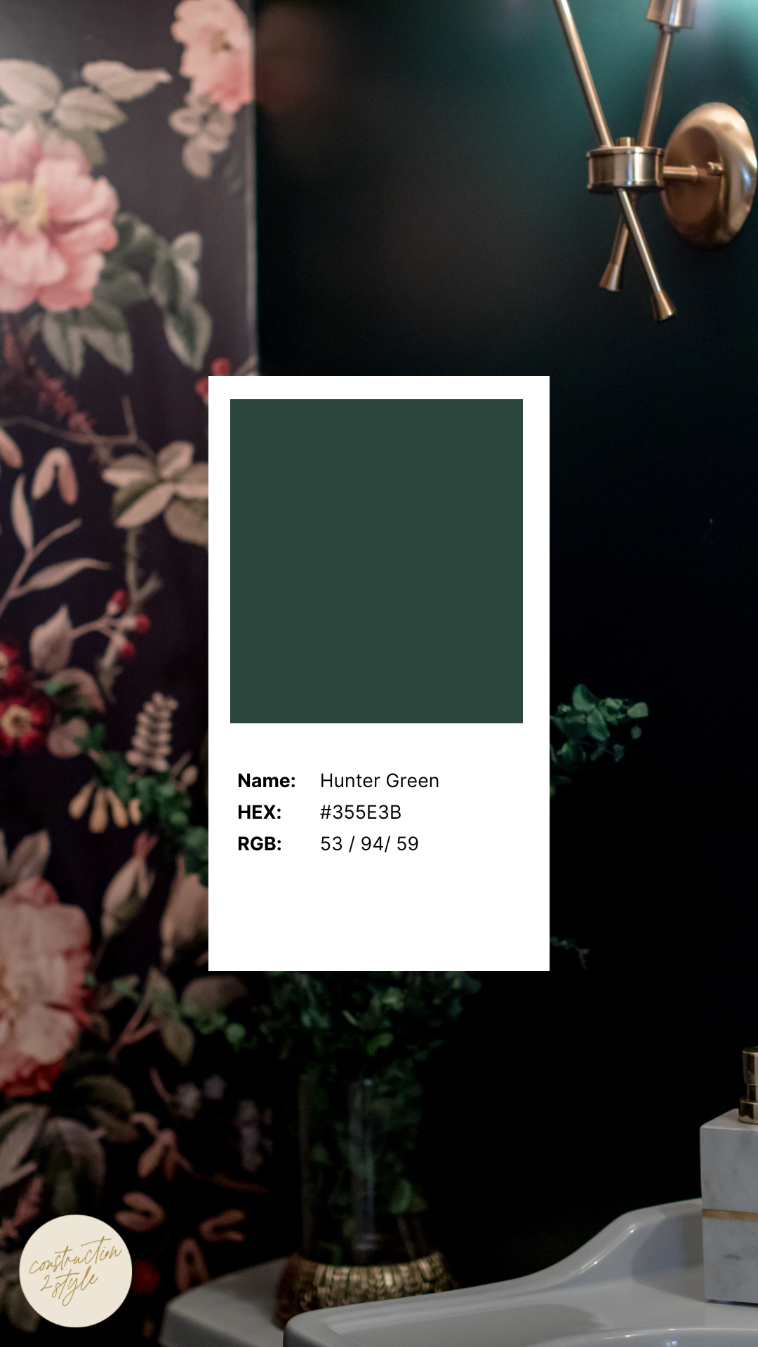
7. Hunter Green by Benjamin Moore
Let’s talk about Hunter Green – the kind of color that brings a room to life with depth, richness, and a hint of drama. This deep, luxurious green from Benjamin Moore has a jewel-tone quality that somehow manages to feel bold and timeless all at once. It leans slightly cool with subtle blue undertones, but still carries enough earthiness to feel grounded and cozy.
We love this shade for its versatility. It’s darker than your typical forest green, which gives it a more elevated, intentional feel. Whether you’re creating a moody home office, dramatic cabinetry, or even a statement front door, Hunter Green adds that wow factor without being flashy. In our experience, it plays beautifully in both traditional and modern spaces, and can totally transform a room.
Pair it with warm woods, brass or gold accents, or even soft leather pieces for a high-end feel that’s still approachable. Or go more modern with black hardware and crisp white walls for contrast. We’ve even used green tones like this in bathroom design to bring in a sense of calm while still keeping things fresh and interesting.
If you’re thinking about adding color but don’t want to commit to something that’ll feel dated down the line, Hunter Green is a solid choice. It’s the kind of color that feels intentional, layered, and lived-in. Whether you’re painting a built-in, a kitchen island, or a whole room, this one always makes an impression – in the most effortless way.
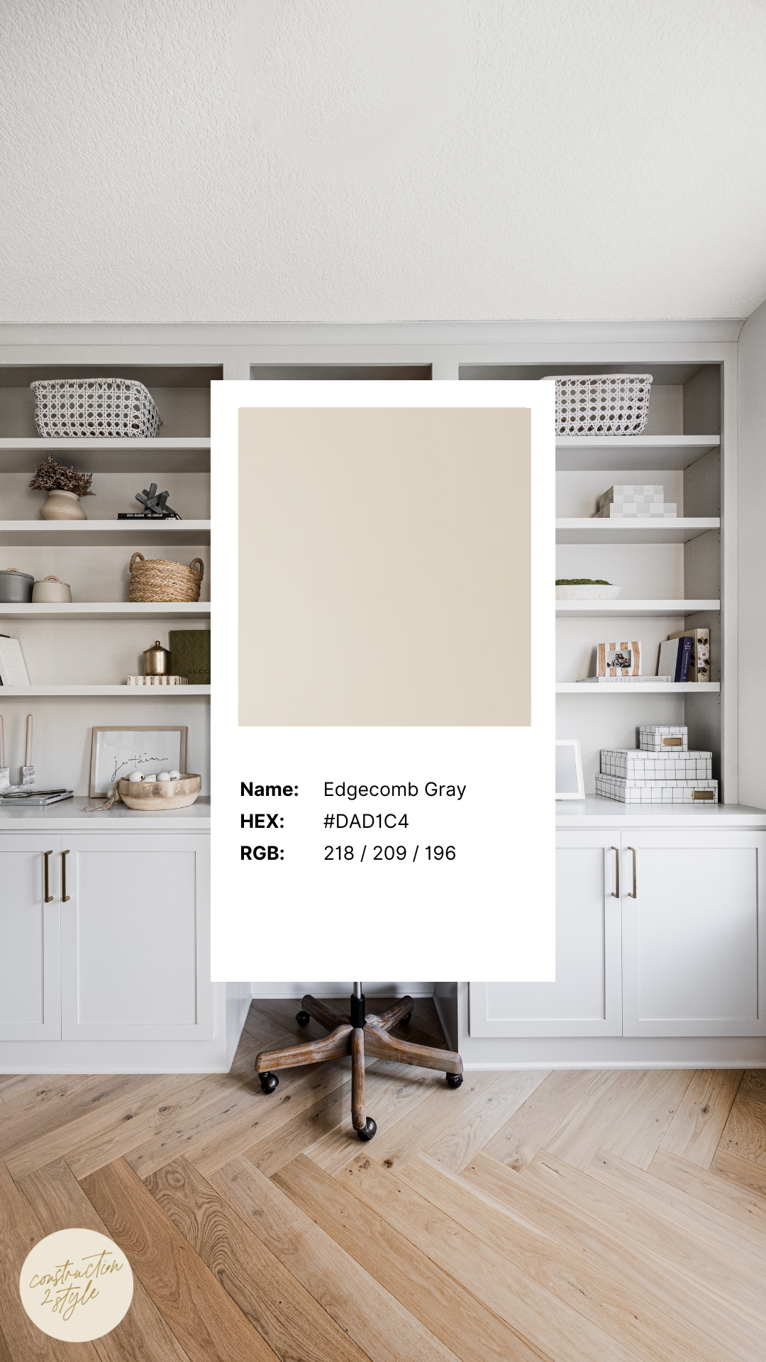
8. Edgecomb Gray by Benjamin Moore
Goodbye stark white, and hello to the new white paint colors interior such as this! If you’re thinking about giving your space a little refresh but aren’t sure where to start, one of our favorite interior paint colors is Edgecomb Gray. Trust us when we say – it might become your new best friend. It’s one of our favorite neutral paint colors, a soft greige that lives right between gray and beige. It has a warm, organic feel to it, and it’s just muted enough to work with almost any design style.
What we really love about Edgecomb Gray is how adaptable it is. Depending on the lighting and surrounding finishes, it can lean a little warmer or cooler, which makes it a great choice if you’re working with mixed materials or natural wood tones. It’s subtle, clean, and adds just enough contrast without ever feeling stark or cold.
We used it in a custom home office on cabinetry, and the warmth it brought into the space completely changed the vibe. It made the room feel inviting and lived-in, while still polished and elevated. Whether you’re pairing it with brass hardware, white oak flooring, or more traditional finishes, this shade blends in effortlessly.
If you’re on the hunt for a no-fail neutral that won’t go out of style, Edgecomb Gray is a color you’ll come back to again and again. It’s cozy without being heavy, clean without feeling cold – a true go-to greige that just works.
When it comes to choosing neutral paint colors like Edgecomb Gray, always test samples on your walls first. Paint can shift a lot depending on your lighting, time of day, and even the direction your home faces. A little extra time sampling can save you from a full repaint later – trust us, we’ve learned that one the hard way.
We hope this roundup, which focuses on interior paint colors, gave you some inspiration, whether you’re leaning into bold, moody tones or sticking with something soft and neutral. Paint is such a powerful tool — it adds personality, sets the tone, and can totally transform a space with just a few brush strokes.
At construction2style, our mission is to help you design a home that feels like YOU. One that’s beautiful, balanced, functional, and fun. If you’re looking for a contractor or design team in the Twin Cities, we’d love to connect and see how we can bring your vision to life.
And if you’re not quite ready for a full remodel but still want help choosing finishes or picking paint colors, check out our interior design services or download our free paint guide to get started.
