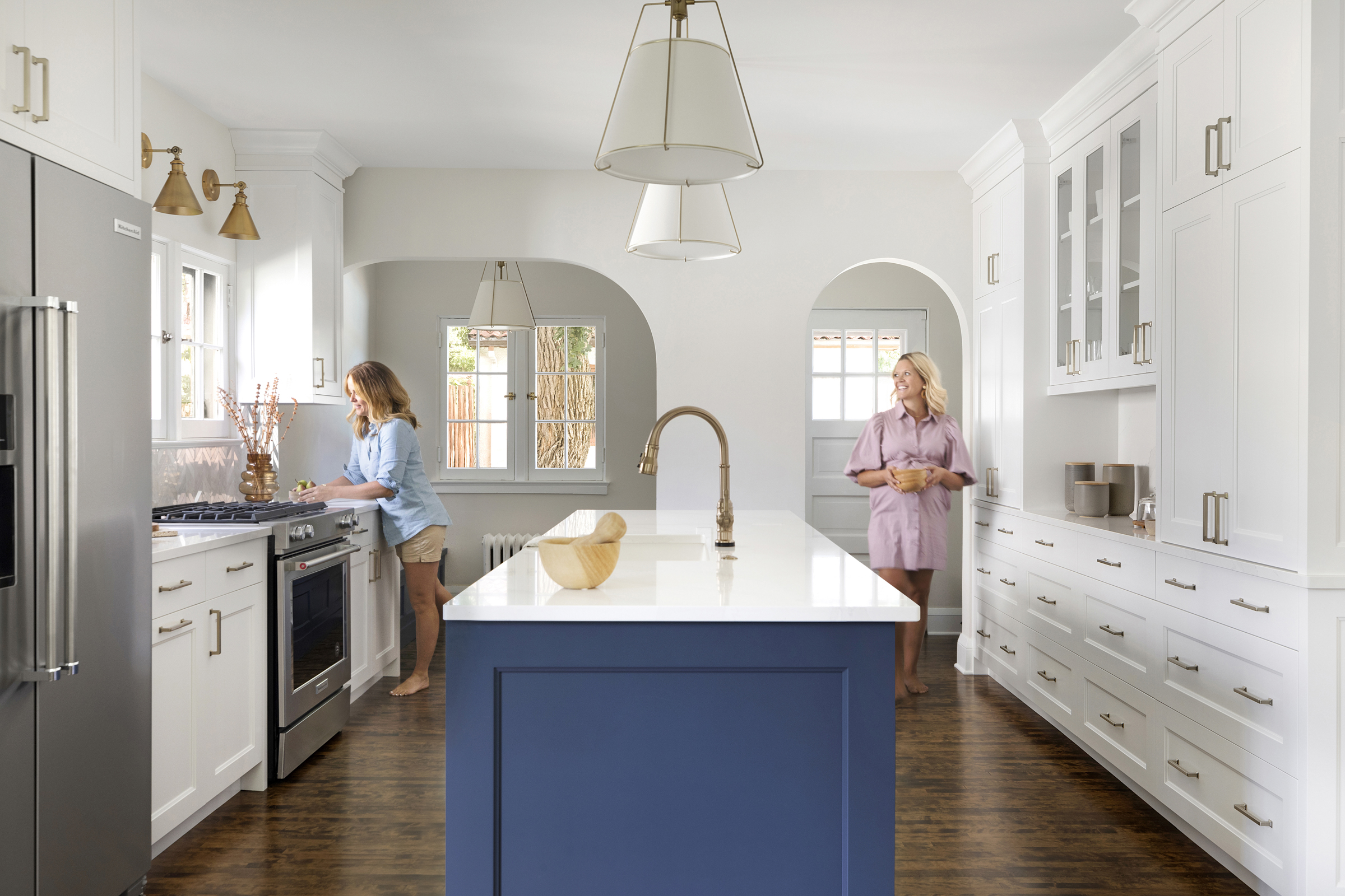
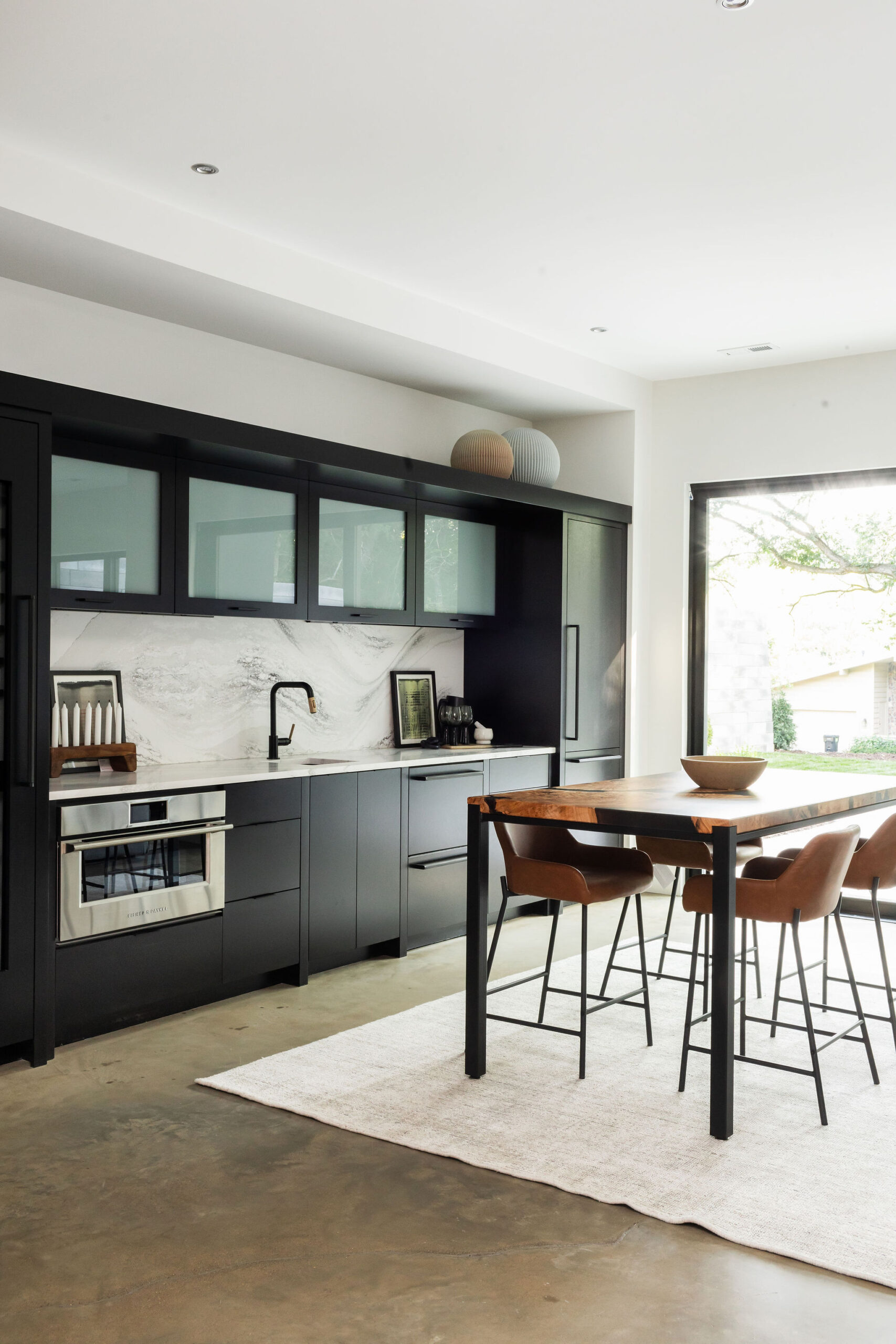
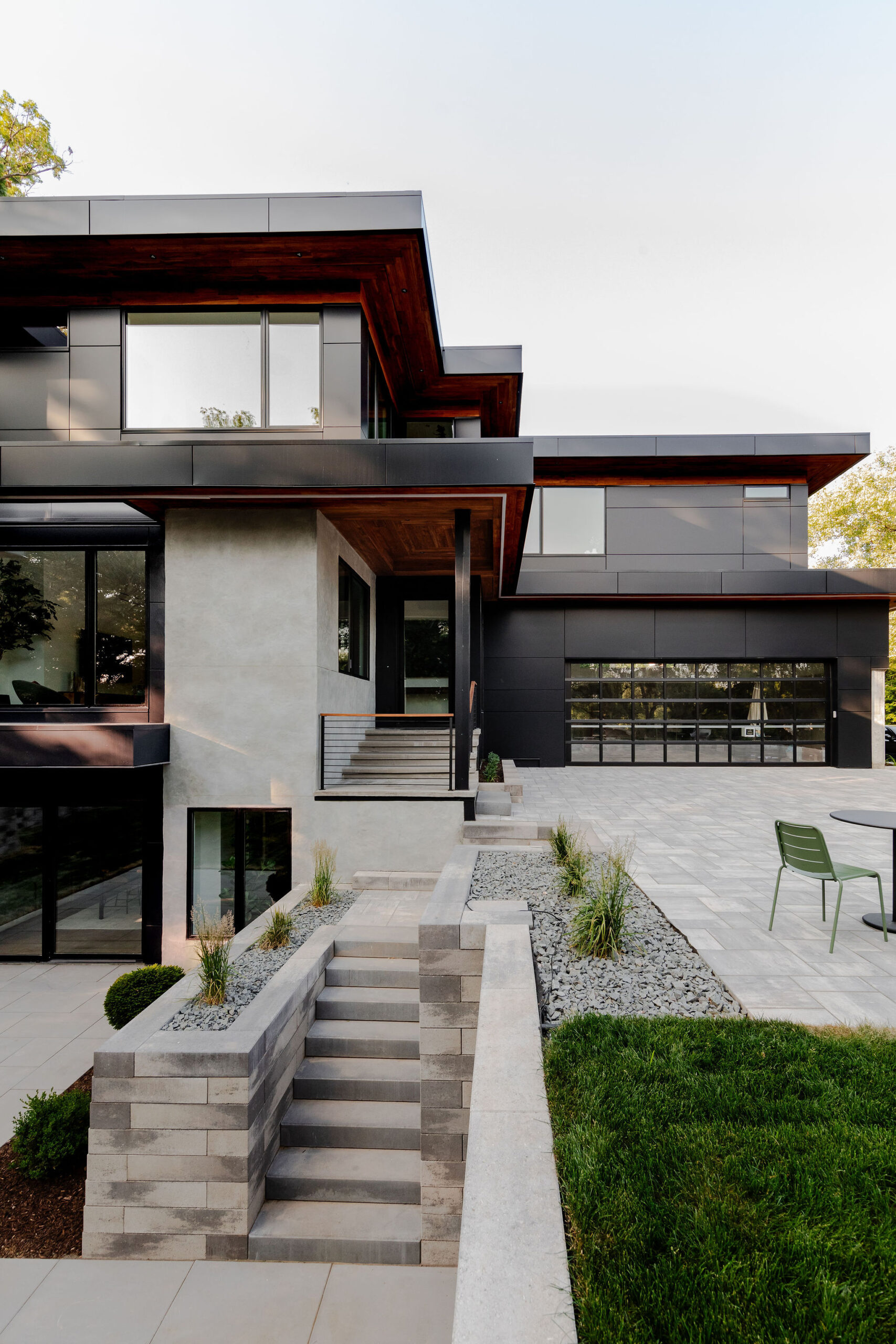
You may remember our project, the #uptonmodernchateau where we worked through a kitchen design with our clients in their home right off of the lakes in Uptown.
Who was here for this project?! You can rewind back to the before, details, and after here.
Now, they’re bringing us back to add on an addition! A project that we’ve been helping dream up ever since we started in on the kitchen. We worked closely with our architect to draw up these plans at the same time as the kitchen remodel so being our clients were smart and thinking a step ahead, after selections and a few tweaks to the layout, we’ll be ready to rock and roll.
We worked with these incredible clients of ours on their kitchen back with the pandemic first hit, and they were such troopers – dealing with shutdowns, delays, having no kitchen while being locked up, and navigating the world of unknowns.
For this phase two of the Upton Modern Chateau, we will be designing out and adding onto their owner’s bedroom to create a new, owner’s ensuite. In the owner’s bedroom, we’ll be helping spec out new furniture, lighting, and fresh fixtures and paint throughout. And, while we are there… we’ll also be giving their kid’s bathroom upstairs a refresh.
And now as our clients have lived in their new and improved kitchen space, they are ready for some equally beautiful new furniture for the attached living area from the kitchen, so we’ll helping source and looping that into this project as well.
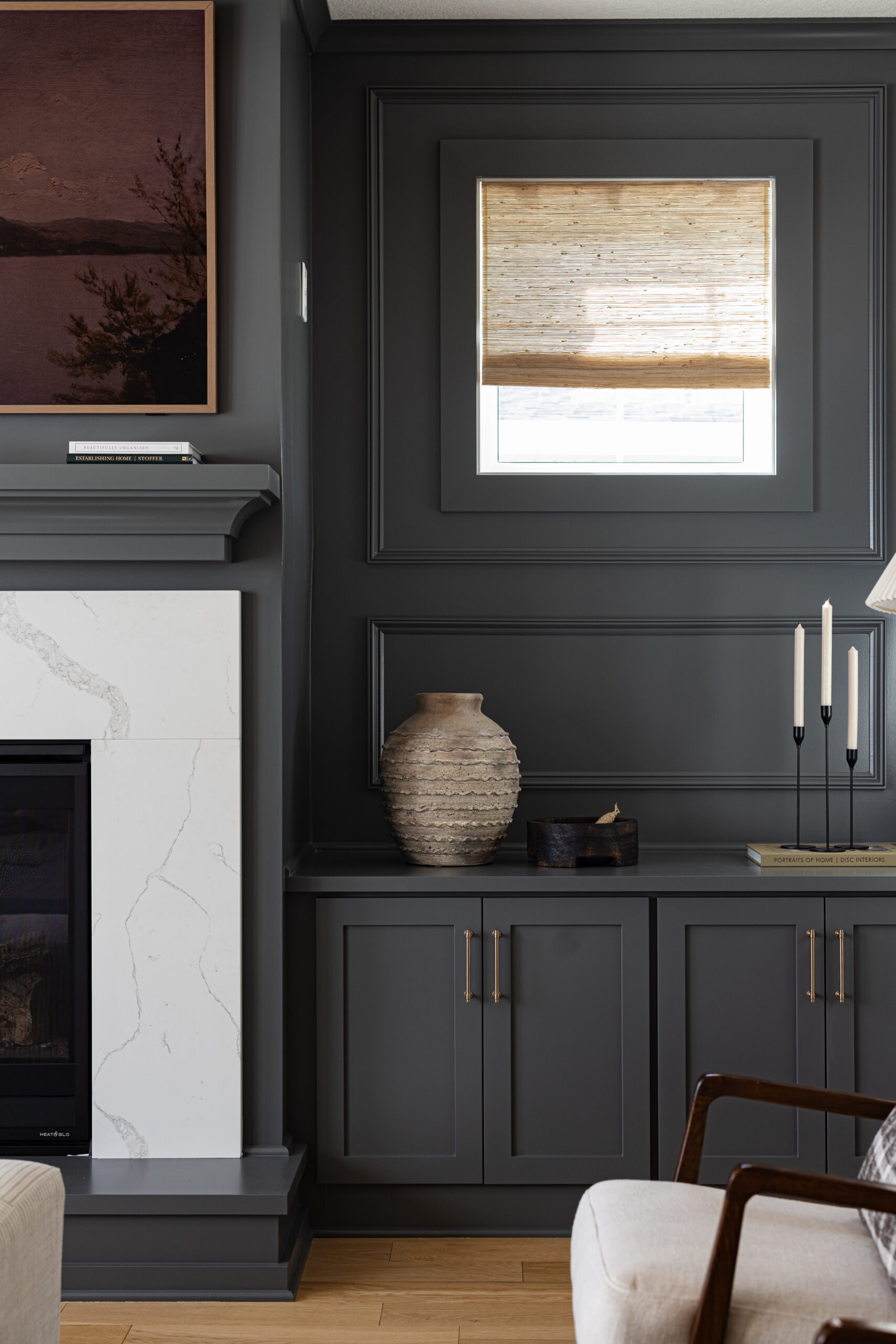
They have a great mantle space that was there when they moved into the home, and we can’t wait to bring some of our c2s shop goodies in there to style with.
Kid’s Bath
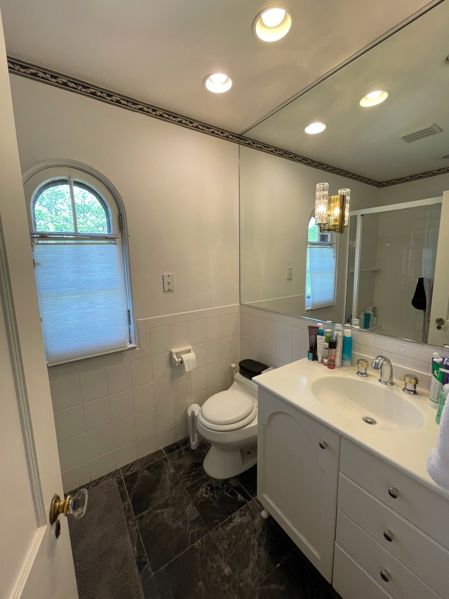
Here is the current kid’s bath. The plan here is to replace pretty much everything. The one thing they want to keep if possible would be the sconces on the mirror as well as the original door handles. I don’t remember if it was more them or us, but we all love the originality of these finishes and it also plays into the character of the rest of the home.
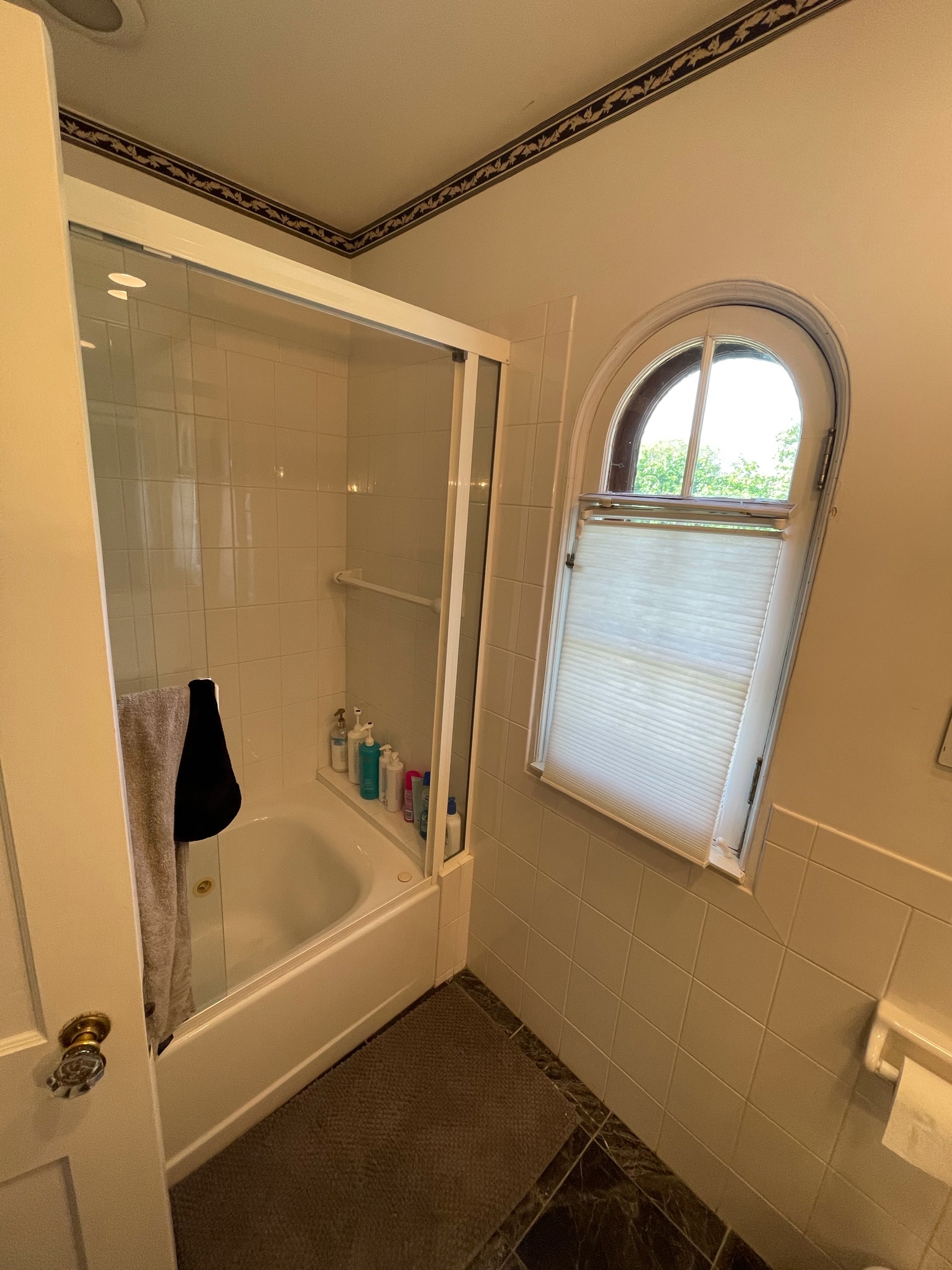
Otherwise say goodbye to the vanity, flooring, fixtures, tub, wall tile, fixtures, and toilet. And get ready for some bold tile with a potential herringbone pattern, and gold accessories.
The current upstairs bathroom, aka the kid’s bath, will function as the secondary bathroom once the addition is completed. For this bathroom, we wanted to keep the true sophistication of the rest of the home, but also go with a touch of bold as it will be used for mainly the kids and the potential guest here and there.
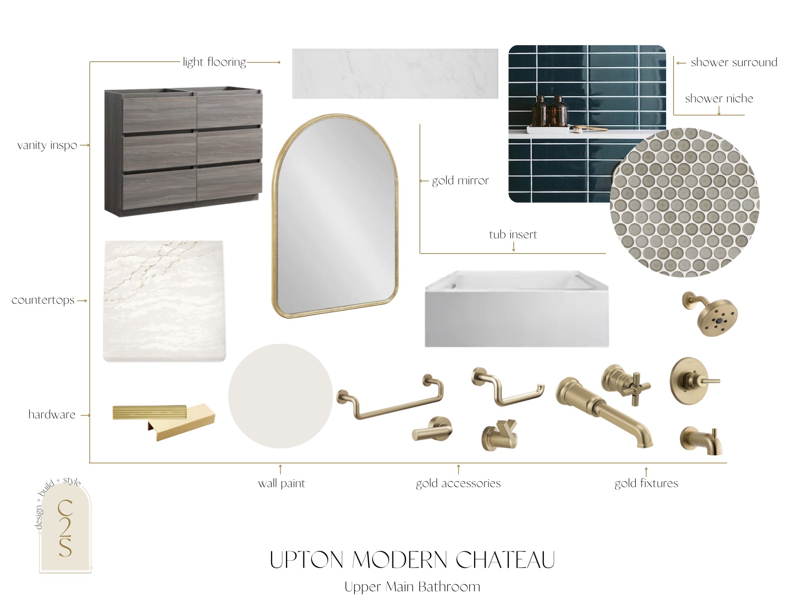
We fell in love with this dark blue tile for the shower surround and it played a huge catalyst for this design. We love when one finish speaks to us and helps us to develop the whole space.
We will be adding in a brand new tub and then using the blue tile as the shower surround. And feeding off of our obsession with arched details in this home, we optioned out adding in an arched niche using this stunning neutral-toned penny tile to create an accent in the shower. Using gold shower fixtures will also really make the shower surround pop.
Gold tones will be used throughout the bathroom with gold fixtures and the wall-mounted faucet was a must-have for these clients of ours.
Keeping the theme of arches, we suggested going for this gold arched mirror to play off of the arch in the shower as well as the shape of the windows in this bathroom.
The gold flecks in the countertops also keep the gold in the mix and would play off well with gold hardware on the vanity. We wanted the focal point of this bathroom to be the shower, so we’re keeping the flooring simple and going with a white subway tile, and playing around with the idea of laying it in a pattern such as a chevron, to also play off of the tile in the owner’s bathroom.
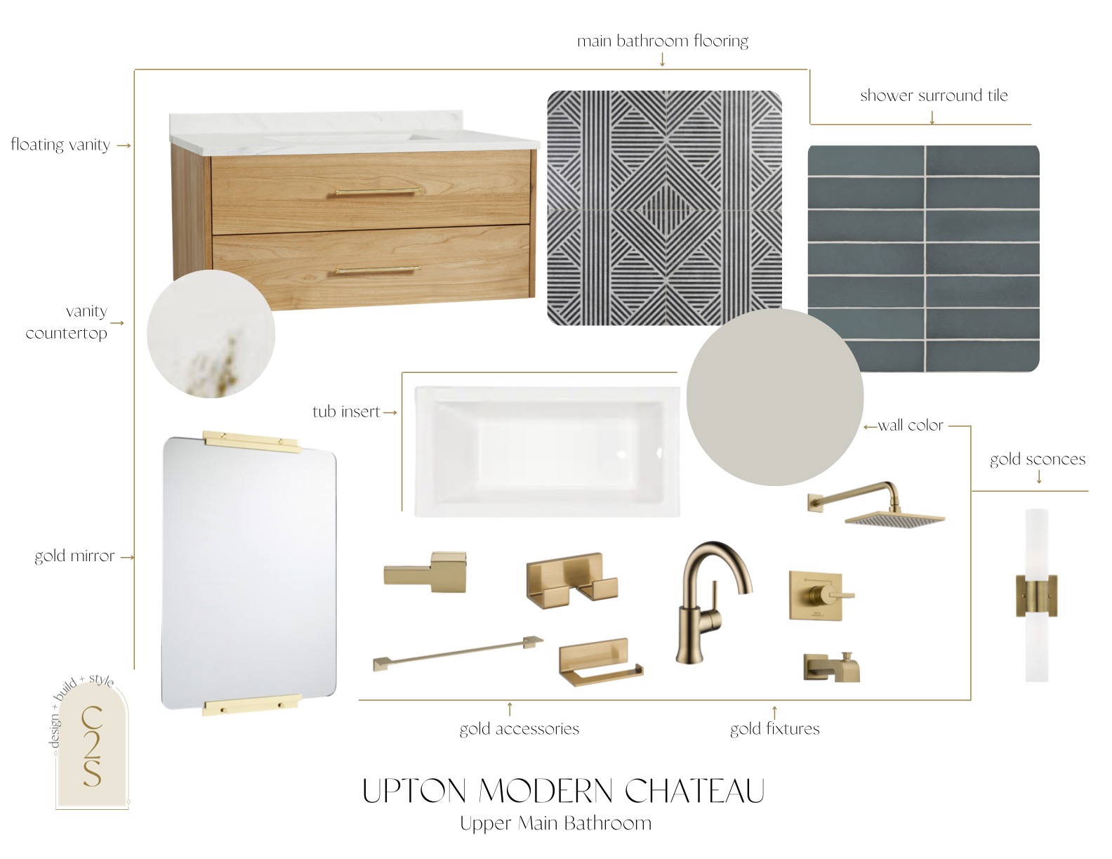
For this option, we decided to keep the original sconces that are on either side of the vanity to keep the originality of the space.
We were still loving the idea of a dark blue/green tile for the shower surround, so we found this tile from Bedrosian’s tile as our second option. We went with a more bold flooring and pattern to play off of the shower surround tile, but then kept everything else pretty minimal and muted.
We suggested going with a white oak floating vanity, so then that way the flooring is the true focal point.
In option two, we would be getting rid of the current sconces and bringing in these simple gold and white sconces. We would also stick with the gold fixtures throughout, just a different style than the ones we dropped into option one.
Owner’s Bedroom
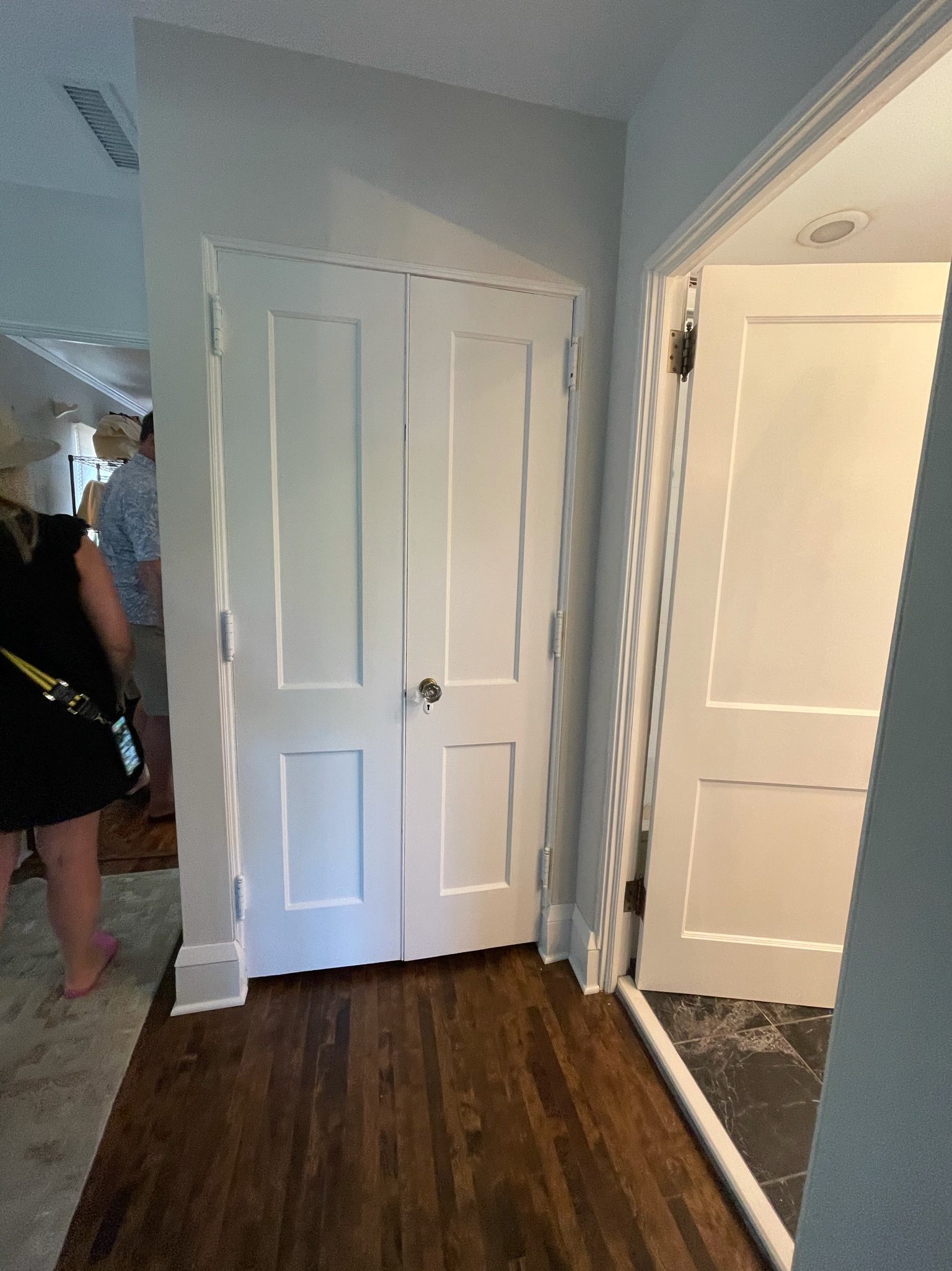
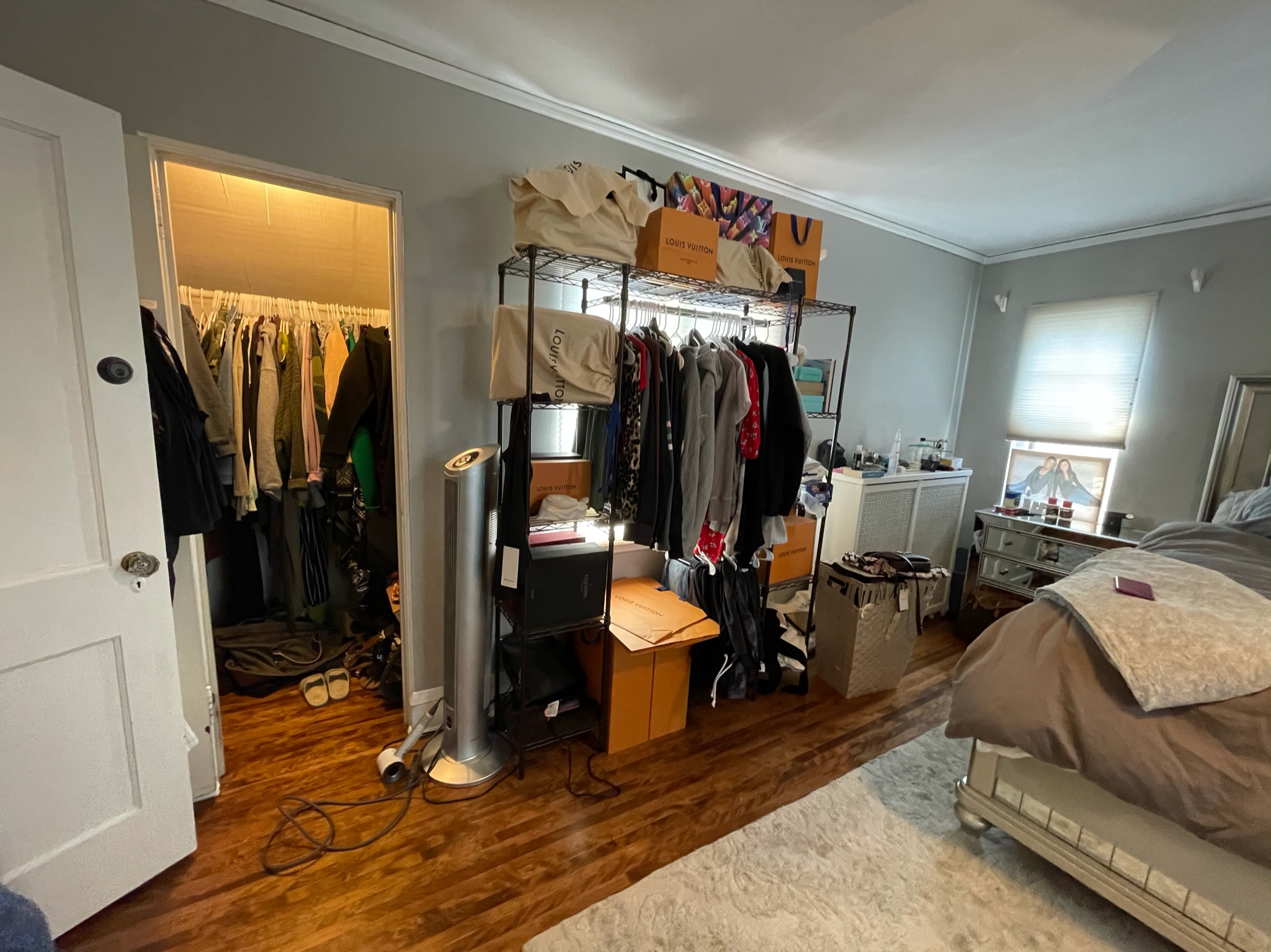
Next up, the owner’s bedroom, where the addition will be going. This closet will be opened up on the other end in the owner’s suite to create a dreamy walk-in closet. One thing that was super important for this portion of the remodel was additional closet space in their bedroom, and this closet will help us give the clients the walk-in close they’ve been dreaming of.
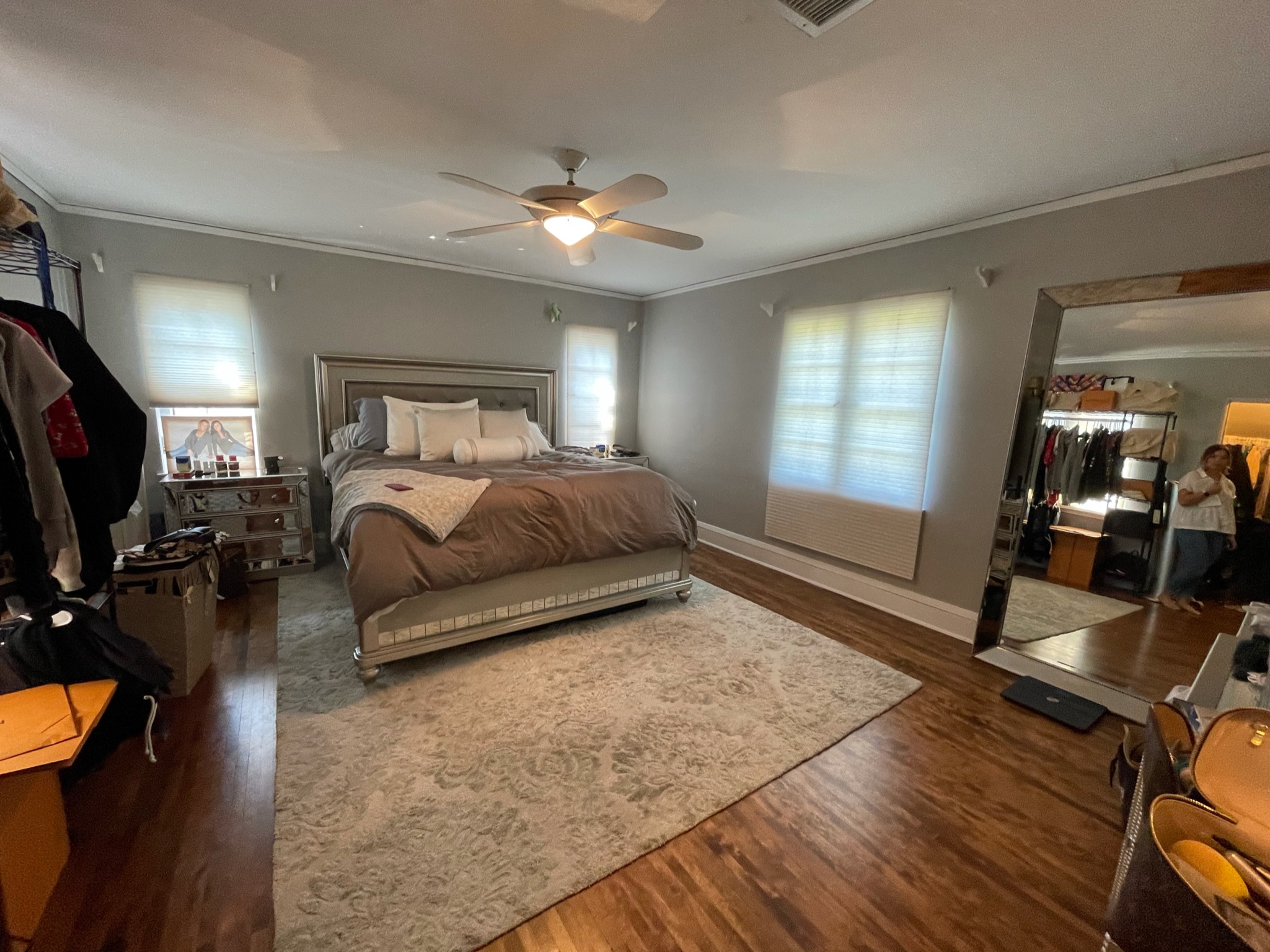
In the bedroom, we’ll be tackling new paint, updated light fixtures, the addition of lighting above the bedside tables, and adding in that walk-in closet mentioned above. The thought is to have the closet extend to where the rug begins in the photo below, and it will go from the right of the door and extend to where the mirror currently stands.
Their room will also get a refresh of furniture, trim work, and a few wallpaper moments throughout the space.
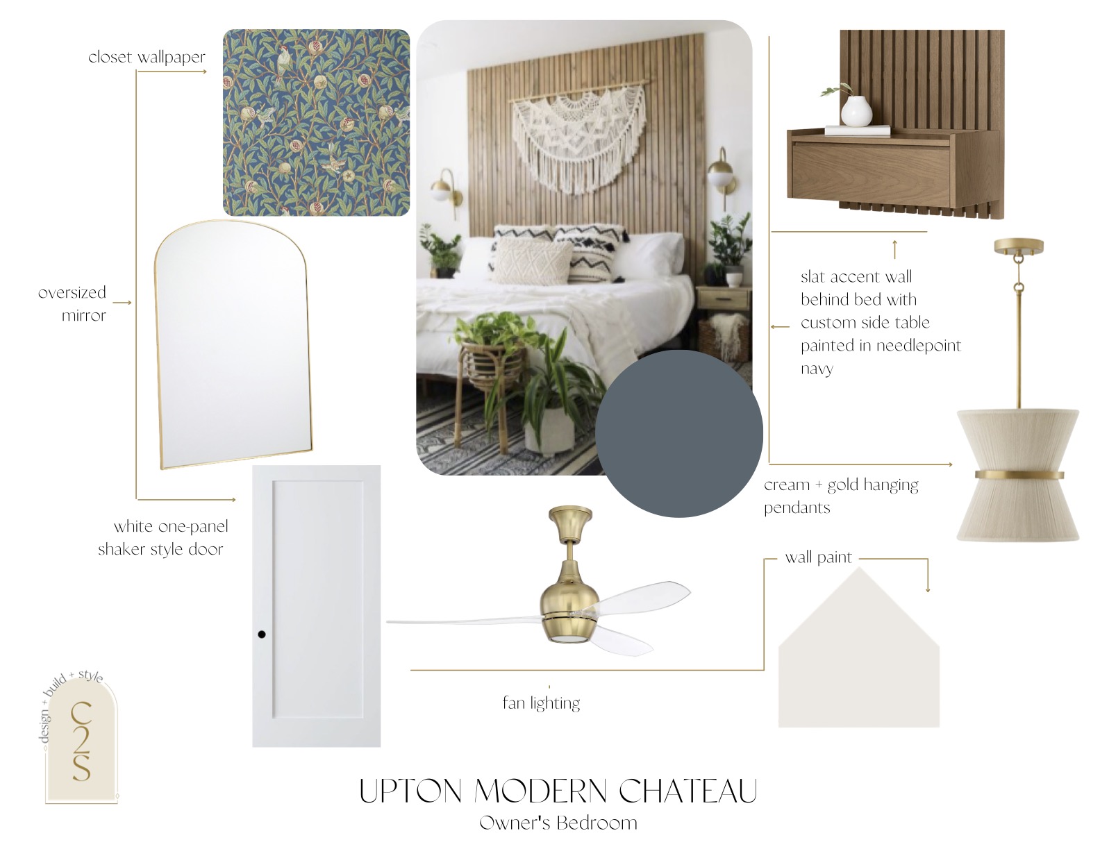
Since their bathroom is staying in the muted and natural realm, we all decided that we would have some fun with the design for the owner’s bedroom.
Since the layout will be changing and the bedroom space will become slightly smaller to make room for the new walk-in closet, we wanted to add elements that would make the space still feel grand and inviting.
Currently, there is a large mirror in their bedroom where the closet will be, but it’s important to still have a large mirror for our client. Since we’re updating the space to include more gold throughout, we wanted to find a gold mirror to match the new aesthetic.
We also wanted there to be a statement when you first walk into the room, which is where the bed is, so we came up with this idea of a wood slat wall as an accent wall/headboard combo painted in this beautiful navy tone. A unique twist on this accent wall is continuing the slat wall down on either side of the bed to create a custom, floating nightstand and hanging pendant lighting over the nightstands.
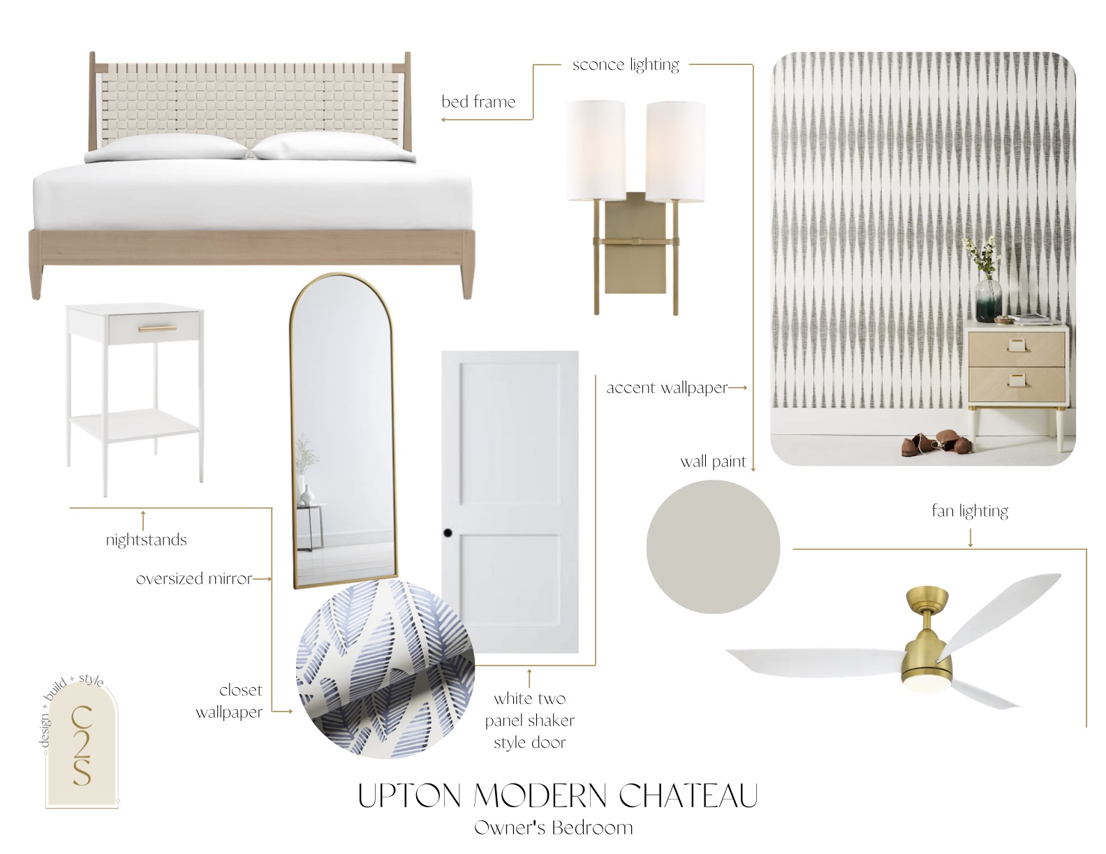
Since we’re keeping the bathroom more muted, we wanted to bring in a statement into the bedroom. For option two, we brought in this wallpaper from Anthropologie that we recommend going behind the bed, and adding this fun and boho-chic headboard to match the aesthetic.
From day one, blue tones have been requested, and after visiting with our client they were open to adding wallpaper into their new walk-in closet, like this one from Serena & Lily
Keeping the golden and neutral tone throughout, we suggested gold sconces to go on either side of the nightstands, which would tie in with the gold fan light as well as keep that original feel of the home.
Which option do you gravitate more towards?!
Owner’s Bathroom
This current closet will not be moving, and the brand new addition of the owner’s bathroom will extend from here. One of our favorite parts of adding onto existing homes is being able to bring our design ideas into play into an otherwise blank space while taking the needs of our clients into careful consideration.
If you’re investing in adding on, we want to ensure it’s the most functional space for long-term living. We worked with our friend Jennifer from American Praire Architects who helped us with the architectural plans of their phase one remodel come back out to help update the plans for phase two.
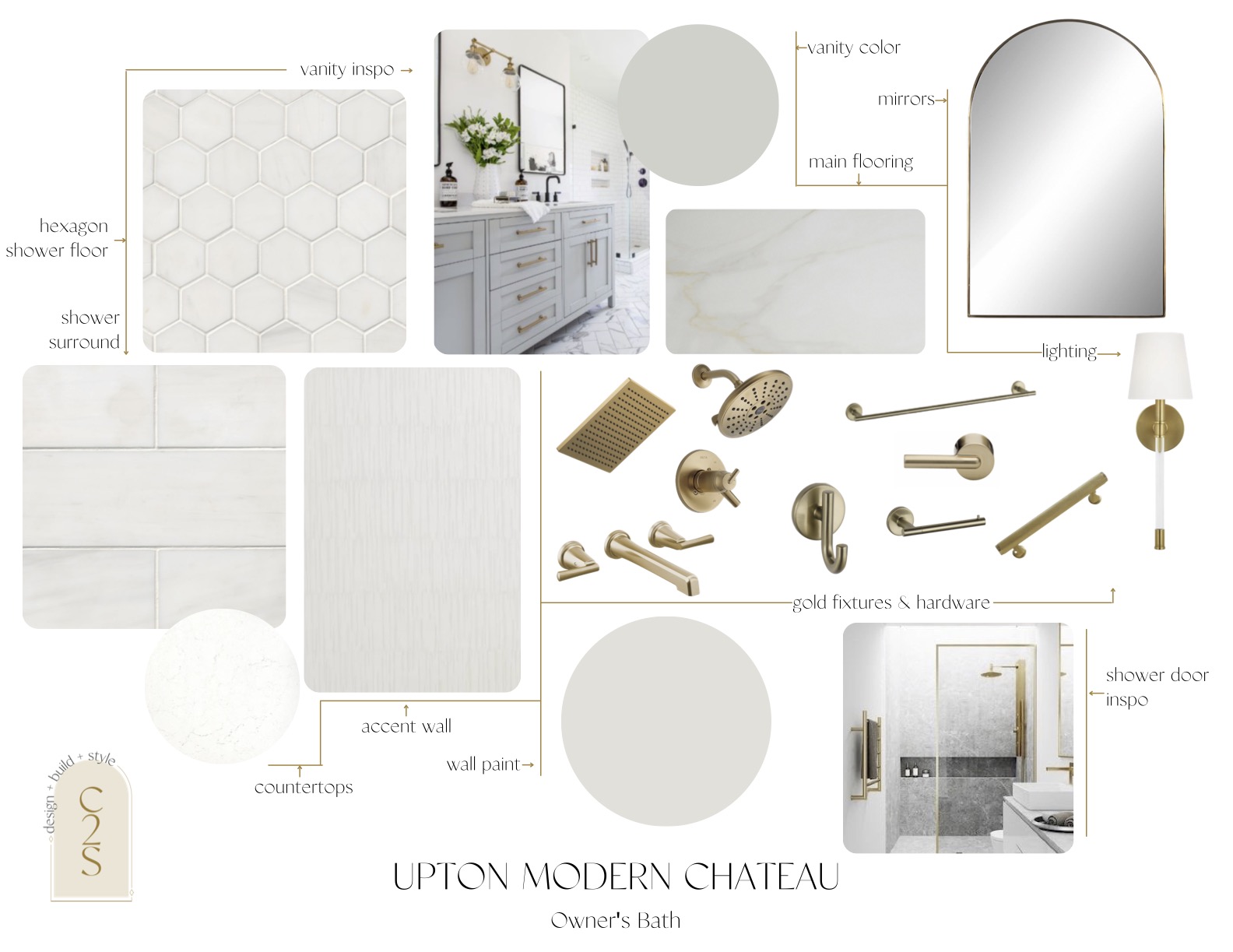
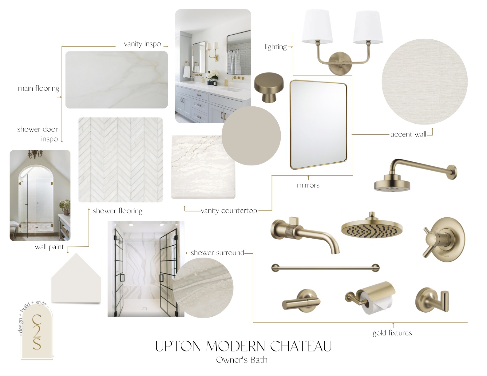
The new bathroom will extend from the opening of the current closet to the end of the wall. Complete with a double vanity, and a walk-in shower. Our clients asked for neutral, light & bright, and that’s exactly what we’ve been planning on our designs for them.
We’re obsessing over the option of having a full Cambria slab as the shower surround. To match the originality of the house, we’re hoping to add in a few arched details in the bathroom as they have them throughout the rest of the home.
For each new design project we start, we give our clients two options to choose from in their selection sheets. They can choose to mix and match elements from both options, but we always put each option on separate design boards for our clients to see how each fixture/finish vibes together. This is a great way for us to also learn their style and continue to source items we know that they’ll love!
For our option one of the owner’s bathroom, we took what our clients said about keeping this area light and bright and brought in some unique elements to make this bathroom stand apart from the others.
One design idea we are loving is mixing up the shower by creating an arched entrance with a glass shower door with gold elements to match with the gold fixtures.
To make a statement in the bathroom while also staying in the light, bright & neutral realm, we’re hoping to add in a large Cambria slab in either Brittanica Warm or Portrush as the shower surround.

We kept the same vibe in option two with the white, light, and bright tones, but kept it more simple. We’re going with the same vibe of the accent wall that we did in option one. It’ll give the space texture, but keeping it neutral.
To make the shower stand out a bit, we would add in a subway tile shower surround and then use small hexagon tiles as the shower flooring to create a separation.
Main Living
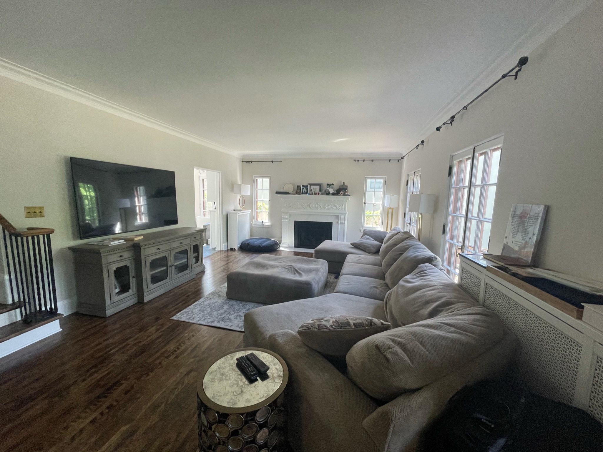
Then this is their current living room, which is right off of their newly remodeled kitchen. They are are wanting to warm up the space with a new couch and sitting area. We’ll also be adding window treatments and bringing in some c2s shop items throughout!
For the main living area, our clients requested a refresh on their furniture, noting it was a piece they have had forever that they wanted to upgrade. This family has two sweet pups, so a darker couch with removable and washable cushions was very important to them.
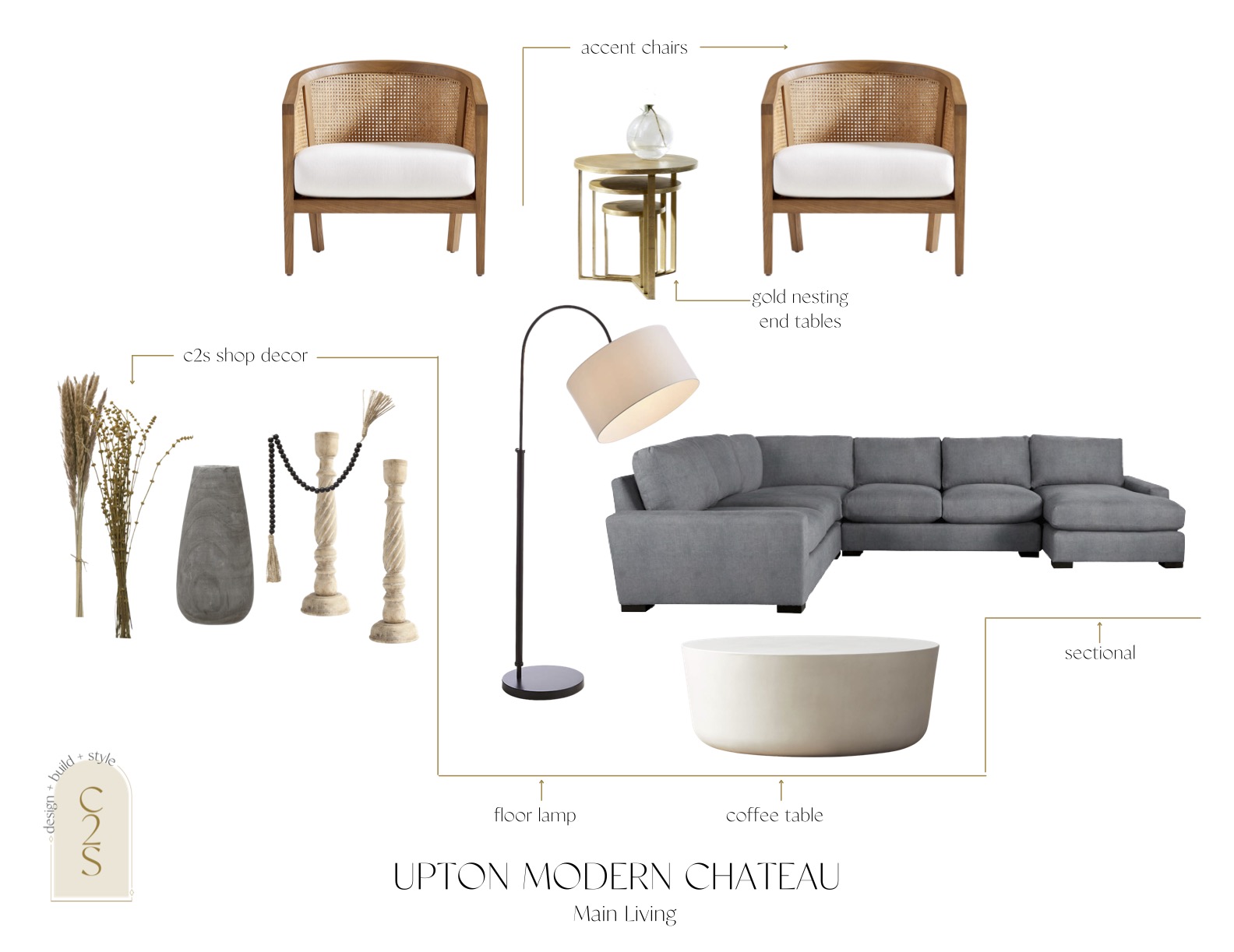
For option one, we recommended going with this grey sectional from Arhaus after confirming the covers can be removed and washed. We wanted to stay within the realm of the modern chic vibe with a touch of boho, so we found these chairs from Crate and Barrel that will warm up the space a little to make it feel cozy.
The gold nesting tables bring in the more modern chic vibe and the wooden coffee table also mixes in the elements and textures we are going for.
We are going to be incorporating our c2s shop items into their decor for the mantle – being simple & thoughtful with our placement of items, as simplicity is key!
Lighting was another must-have on their list, so we recommended this option from Crate and Barrel to fit with the overall vibe of the space while also giving off enough light since there is no overhead lighting in that space.
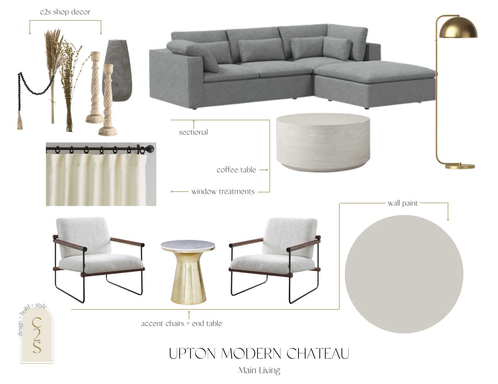
Option two is very similar to option one, just with different accent colors throughout.
We thought these chairs would be perfect for these clients and their modern chic vibe. This option brings in more of the modern chic vibe versus option one which had a few more warm boho elements involved.
The chairs and gold end table from West Elm make the perfect seating area and we added in the gold lamp to play off of the end table.
We kept the vibe of the couch and coffee table the same, just with a different style of the couch from West Elm that still has removable couch cushions.
We have been working on the selection sheets and design boards and looking to finalize these designs soon to get to ordering materials. Stay tuned over the next few months for a construction update and progress pictures of #uptonmodernchateau phase 2!
Make sure to follow us on Instagram for updates on the design along the way! So much more goodness to come…
One thought on “Upton Modern Chateau Addition & Bathroom Design”
Comments are closed.