
Upton Modern Chateau
Who has been with us since the beginning of the Upton Modern Chateau project?! We started working on designs at the beginning of this year and started construction right as the Coronavirus pandemic was hitting!
To say our clients are saints to be in quarantine in their homes without a kitchen is an understatement.
Yet again, we scored the most incredible clients, and that shows through the work that was completed. From the beginning, they trusted our team, vision, and recommendations, which made for not only a seamless process but an awesome final product.
So sit back and buckle up; this is a long blog post because we’re walking you through the full details that went into this project. Say hello to the Upton Modern Chateau final reveal!

Before
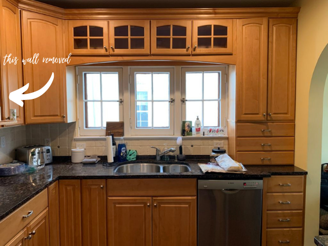
Let’s begin with the before, the best part. The goal of this chateau kitchen was to open it up a bit, creating more room and also giving it a light and bright feel.
This is a 100-year-old home, so maintaining some of that character was also important to the clients, we loved these windows in every way, so we knew they had to stay.
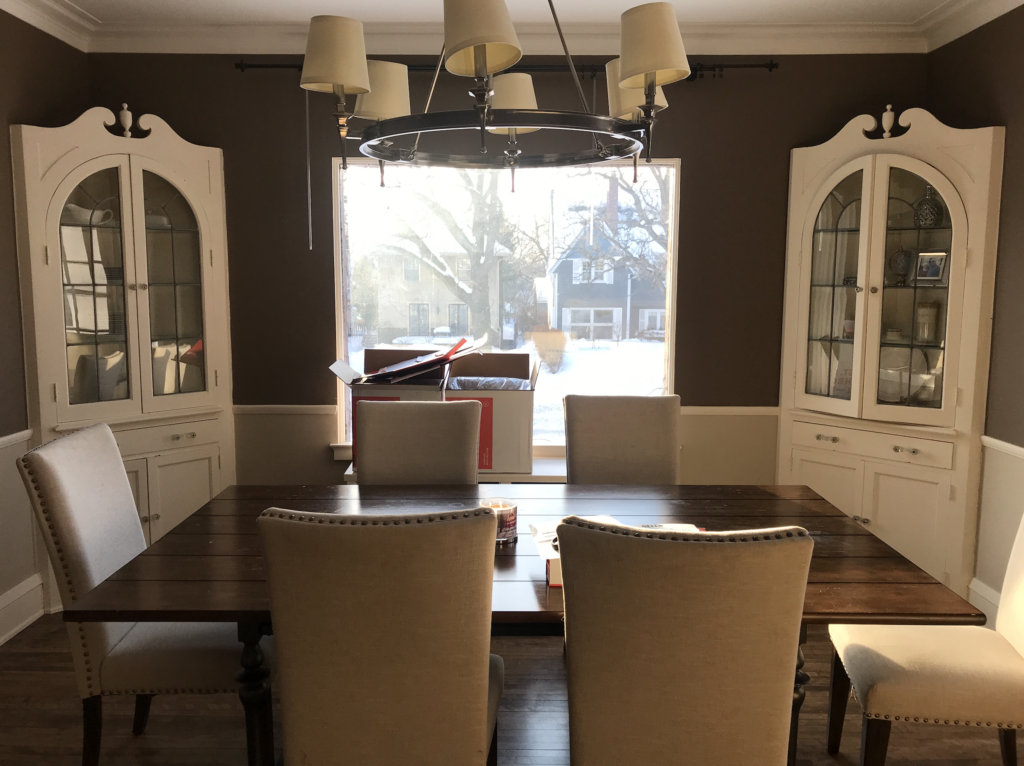
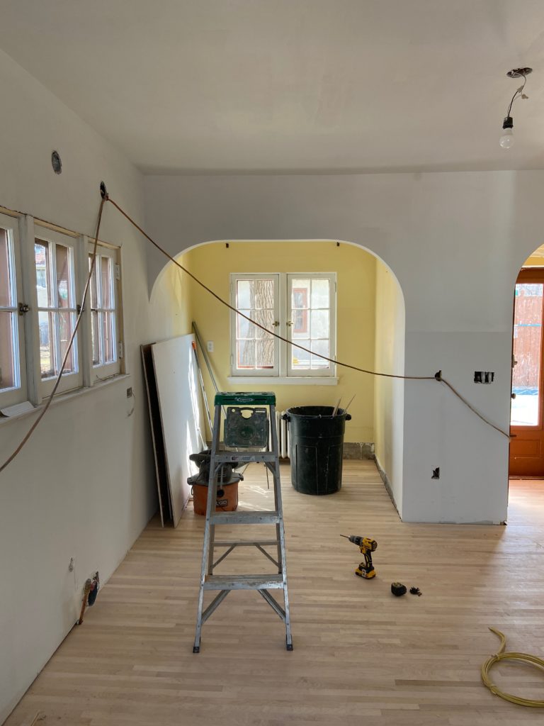
We didn’t get the best shot of the wall here on the left, but there is a wall there that separates the kitchen from the dining room. We took that wall out and opened it up, and where the sink was, we flopped with the cooktop.
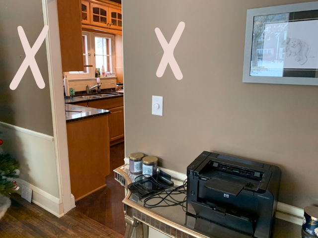
Here’s a better view of this wall from the dining room side. And then they had a doorway that you entered in from the dining room to the kitchen. We took out both the left and right walls and added an island into the center of this room.
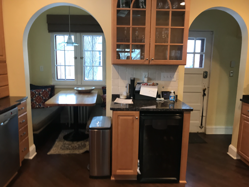
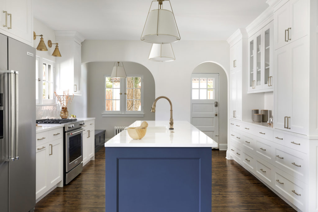
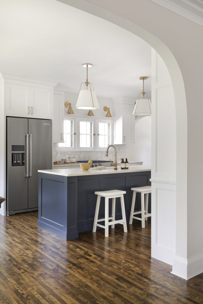
We loved these arches that were original throughout the home, and that adorable cozy breakfast nook, both of which stayed. All of the cabinetry and countertop right there in-between the arches, however, were removed.
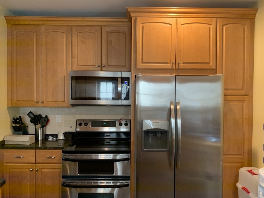
This view is just opposite of the sink wall, which we completely revamped too. By moving the fridge and cooktop to the other side and the microwave into the island, we were able to utilize this area to be one big wall of cabinetry and additional countertop serving space.
Behold the seamless flow into the dining room, a transformation that removed the dividing wall that once separated it from the kitchen. On the left, where another doorway once stood, providing a glimpse into the living room and the inviting front entryway, a change occurred that we, unfortunately, missed capturing in its original state.
A delightful touch was the addition of an arch in place of the small doorway, harmonizing with the kitchen’s original arches, a feature you’ll witness more of in the under-construction phase depicted below. As if that weren’t enough, the large front window underwent a stylish upgrade. To enhance the room’s sense of spaciousness and grandeur, a full wall of elegant cabinetry was seamlessly integrated along the back, encircling the window. This thoughtful addition not only enhanced the room’s functionality but also amplified its overall sense of expansiveness and sophistication. The result? A harmonious blend of openness, architectural charm, and modern elegance, creates a space where every detail speaks volumes. Welcome to a dining experience where design and functionality effortlessly converge!
Design Planning
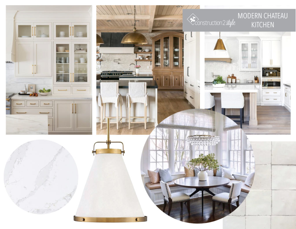
In crafting the design, our primary objective was to infuse the space with a sense of luminosity. To achieve this, we opted for pristine white cabinetry, which not only brightened the room but also served as a canvas for the artistic play of light. Delicate gold accents were strategically placed, adding a touch of opulence and warmth. The pièce de résistance came in the form of the bright quartz countertops, their smooth surface reflecting light, amplifying the room’s radiance.
We drew inspiration from the timeless allure of chateaus, infusing a modern twist to create a contemporary chateau ambiance. Glamorous lighting fixtures cast a soft glow, adding a touch of elegance to every corner. The crowning glory, however, was the meticulous craftsmanship of the custom cabinetry. Tailored to perfection, these cabinets not only enhanced the room’s functionality but also added an element of bespoke sophistication.
In essence, the design aimed not just for visual appeal, but to craft an experience—a space where modern aesthetics met classic elegance, and where every detail was thoughtfully curated to elevate the ambiance. Welcome to a home where the fusion of style and substance creates a truly enchanting atmosphere!
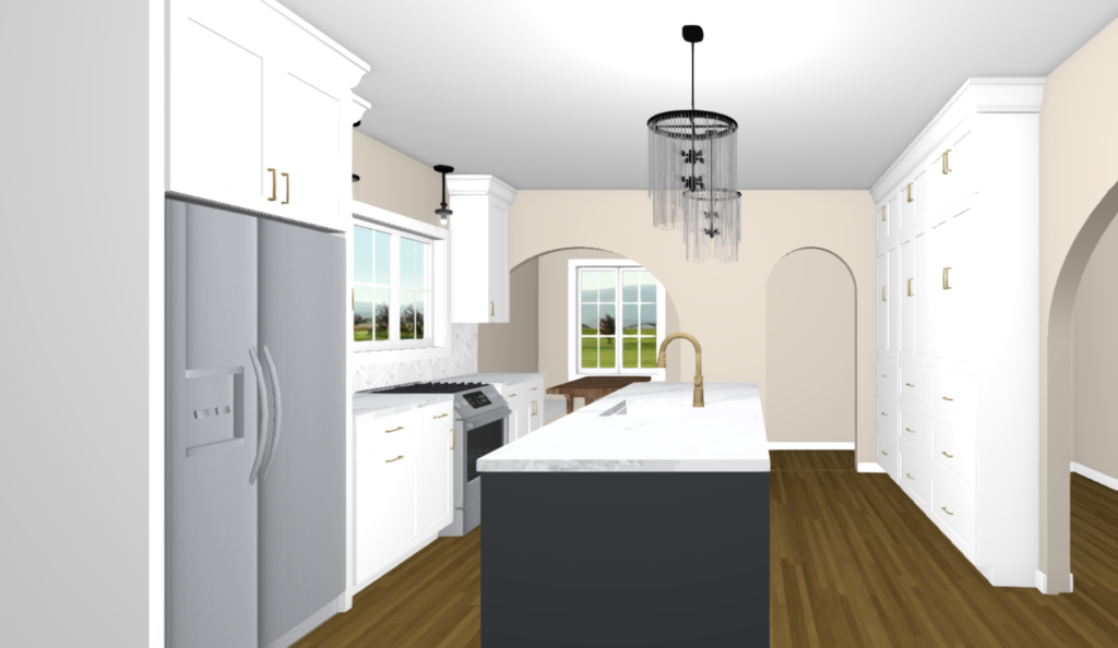
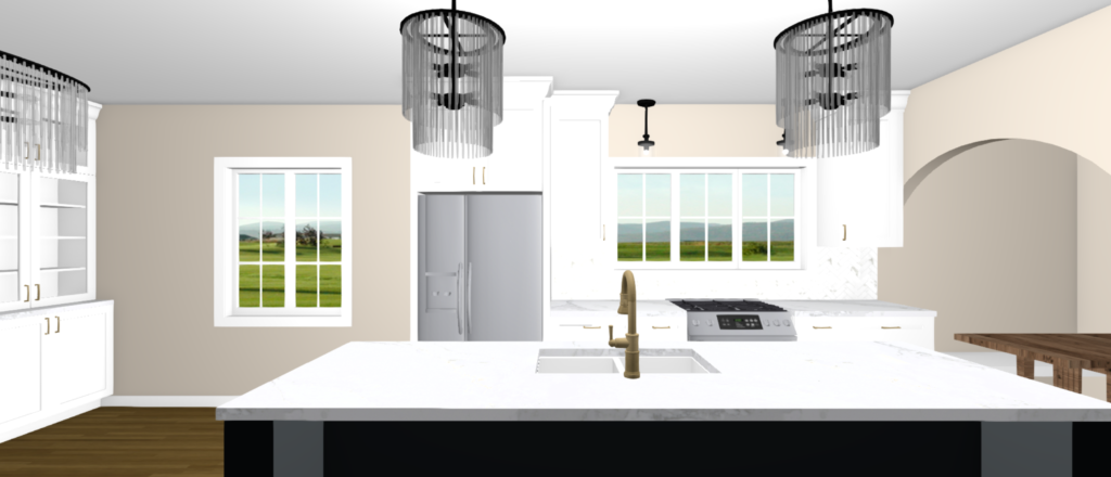
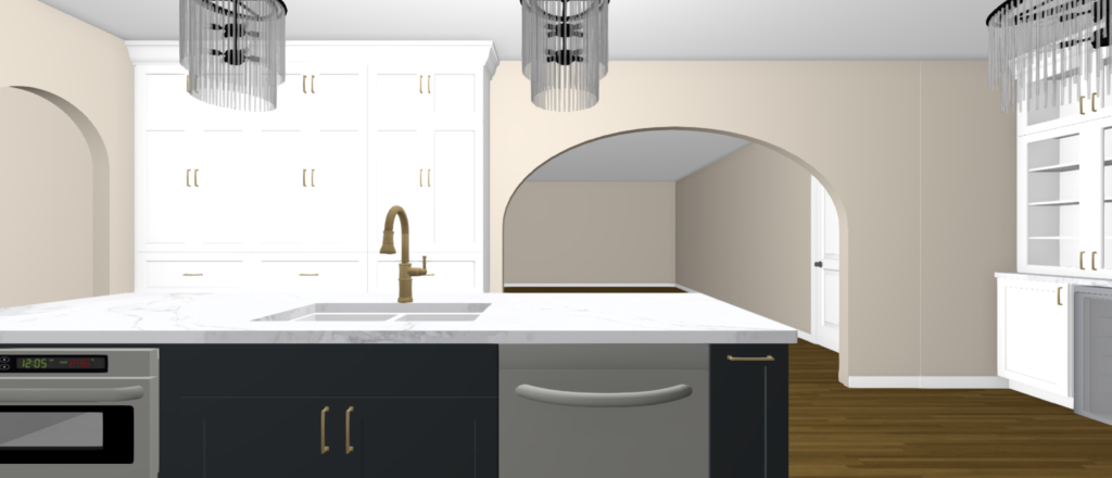
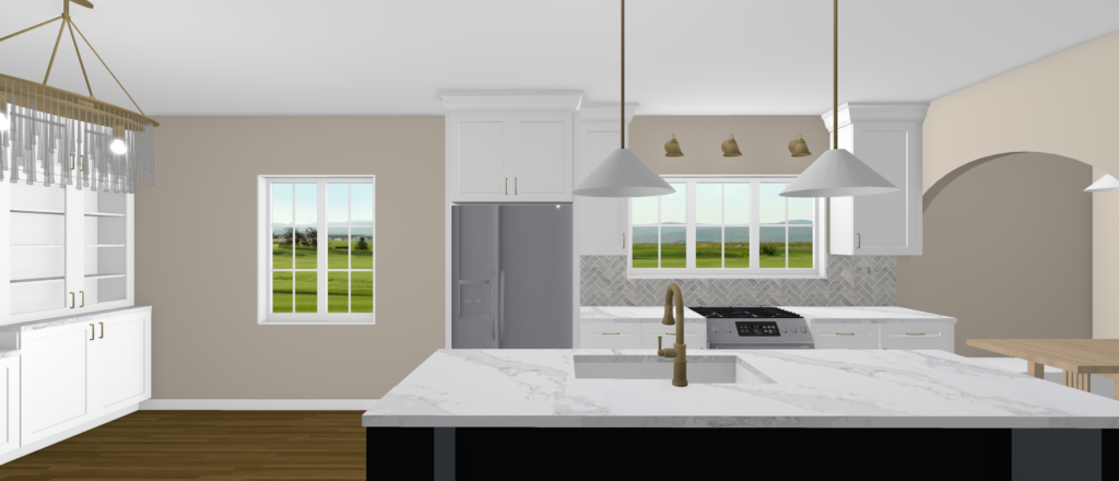
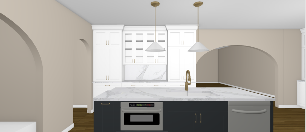
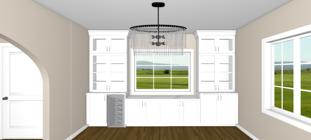
Here’s an exciting peek at a few of the renderings that truly captivated our team—our favorite part of the entire process: witnessing the design planning come to life in vivid detail!
Once we meticulously specified all the selections for our clients, the real magic happened when we could illustrate exactly how every finishing touch would transform their space. This, right here, represents the first iteration of our design journey—a snapshot of the careful thought and creativity that went into every detail. It’s not just about visualizing; it’s about crafting a tangible experience, and these renderings are a testament to the meticulous planning and artistry that fuels our projects. Stay tuned for more glimpses into this incredible transformation!
And in the end, we went through a few different lighting options and didn’t end up going with the above and went more with this next style…
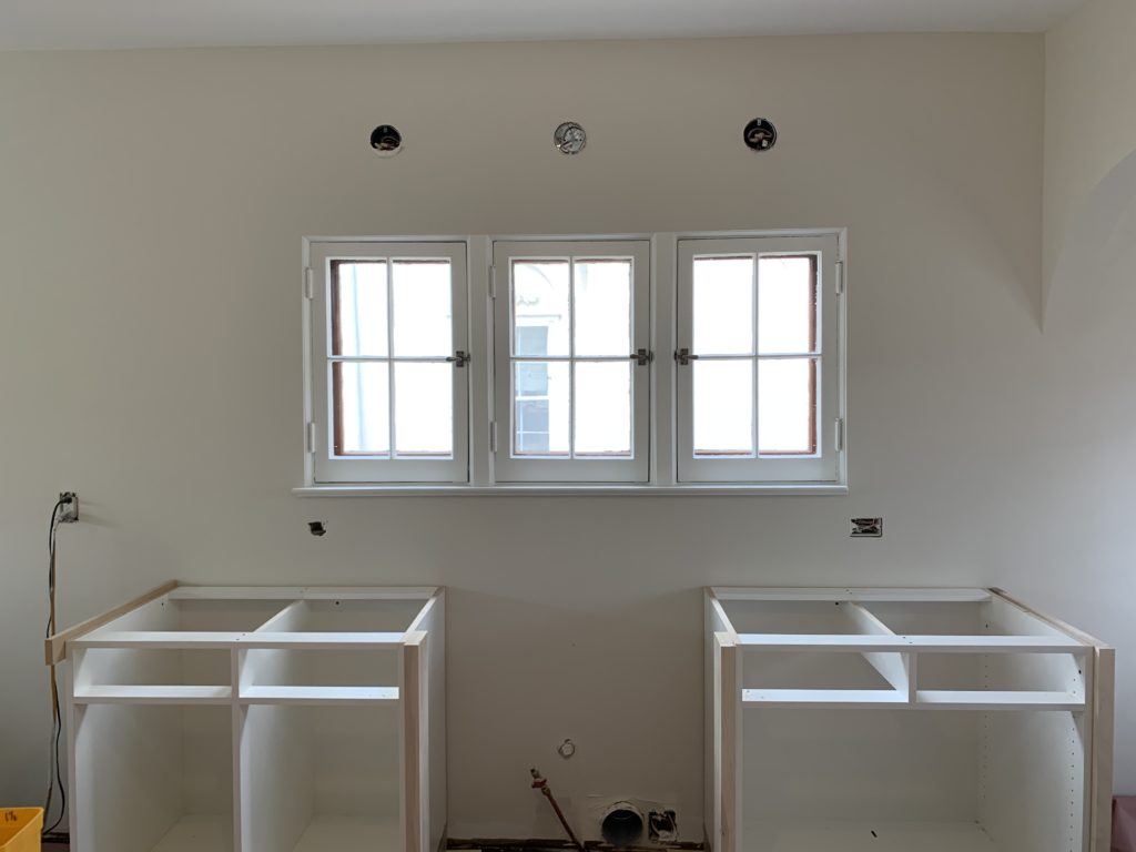
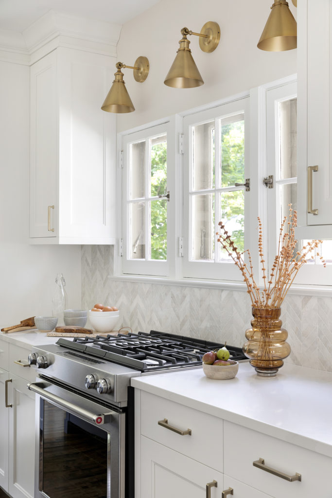
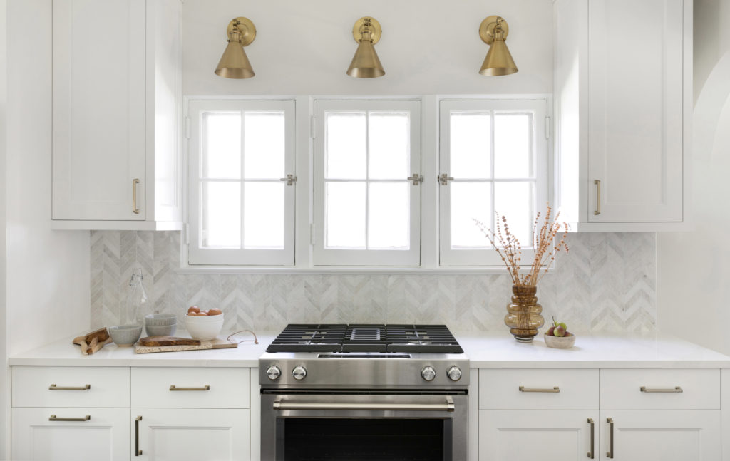
And to maintain the original look of the house, the original window in the kitchen stayed, and since we moved the cooktop there, we went with a downdraft on the back wall.
We also went back and forth on the cabinetry just here beyond the island and sink. Instead of having all cabinets, our clients wanted to open it up a bit and have a little serving station with a full countertop backsplash, which I couldn’t get enough of. I’m so glad they went this route!
And here is a shot of the arch we put in that faced into the living room. This was formerly a small and narrow walkway.
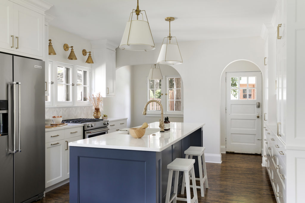
The large curved arch between the living room and kitchen helps maintain the character of the home while creating more of a flow between the two rooms. Being able to see into the kitchen from the front entry was a priority for our clients, and this wide opening did just that.
Tearing down the wall between the kitchen and dining room made the entire space more open and more functional for entertaining and hosting.
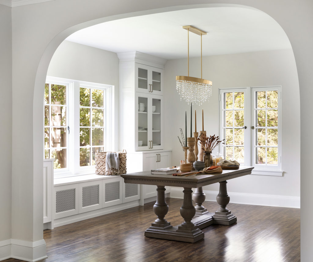
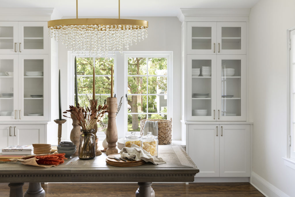
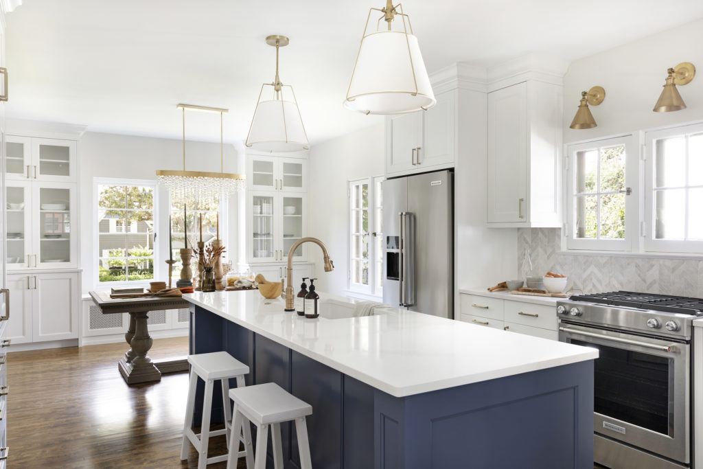
Over on the dining room side, glass upper cabinets provide storage for special dishes and glassware. Having a longer stretch of countertop will provide space for laying out food.
The lower cabinets allow for additional hidden storage for everyday items as well. The wine fridge there also didn’t end up staying.
Under Construction
Once the designs were done, finalized, and signed off, we got to work on construction!
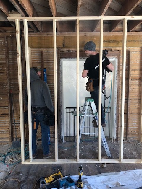
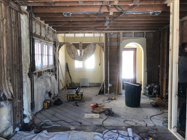
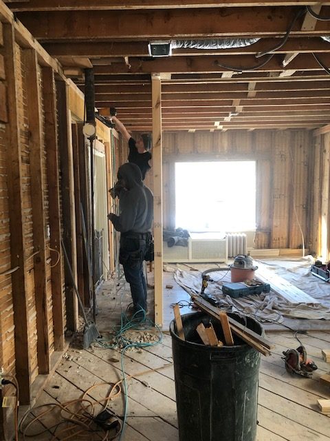
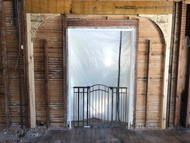
And as you can see, these guys took this home right down to the studs! Here’s a view of that walkway from the dining room into the living room.
Not the full before, but you can see how this was a narrow walkway, and the guys opened this up and created a beautiful arch to complement the rest of the home.
To take this space down to the studs, remove walls, put in arches, and replace windows, we worked closely with our wonderful architect Jennifer at American Prairie Architects to ensure everything was planned perfectly and precisely within this space so that there was no room for error.
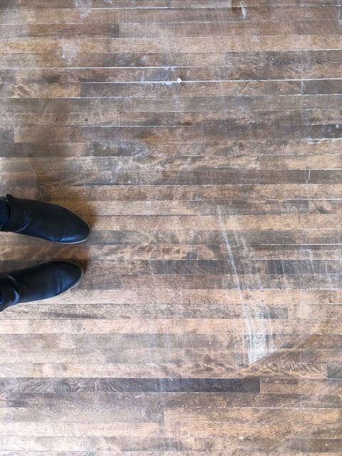
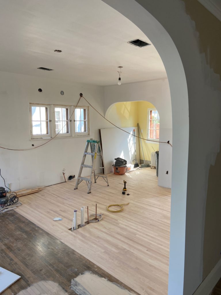
Another important detail that we wanted to maintain was the 100-year-old original flooring. As you can kind of see here, the dining room had the original flooring as well as everywhere else throughout the home.
However, the kitchen had a different style of floor, which is removed in the photo below. The goal was to patch in the kitchen and then sand down and refinish all of the flooring throughout to make sure it tied into one another. And we were able to do just that!
How beautiful are these babies?!
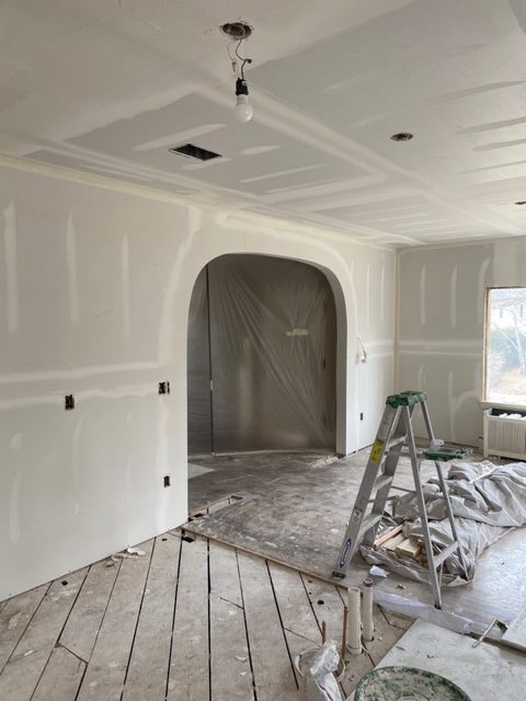
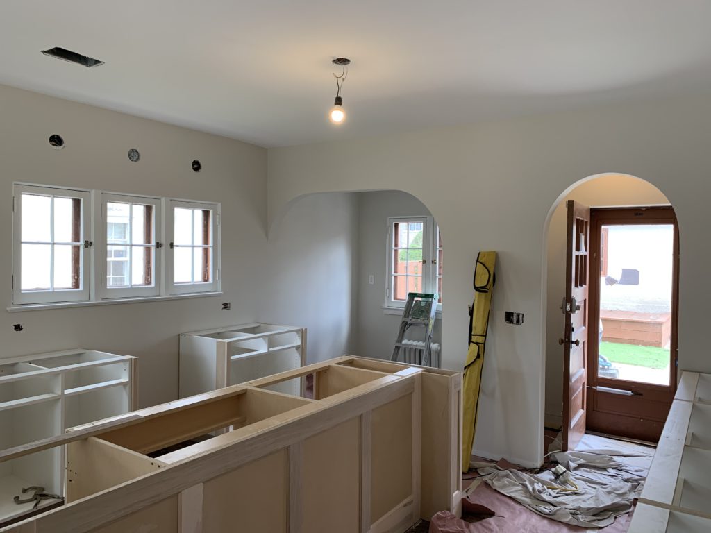
The guys got the new arch framed in and prepped to demo out the remaining wall.
And looking just like the original arches in the home, all drywalled, taped, and ready for paint.
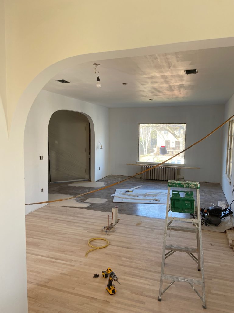
Floors got patched in; here you can visually see the old meeting up with the new – ready for a good sanding and staining to tie it all together.
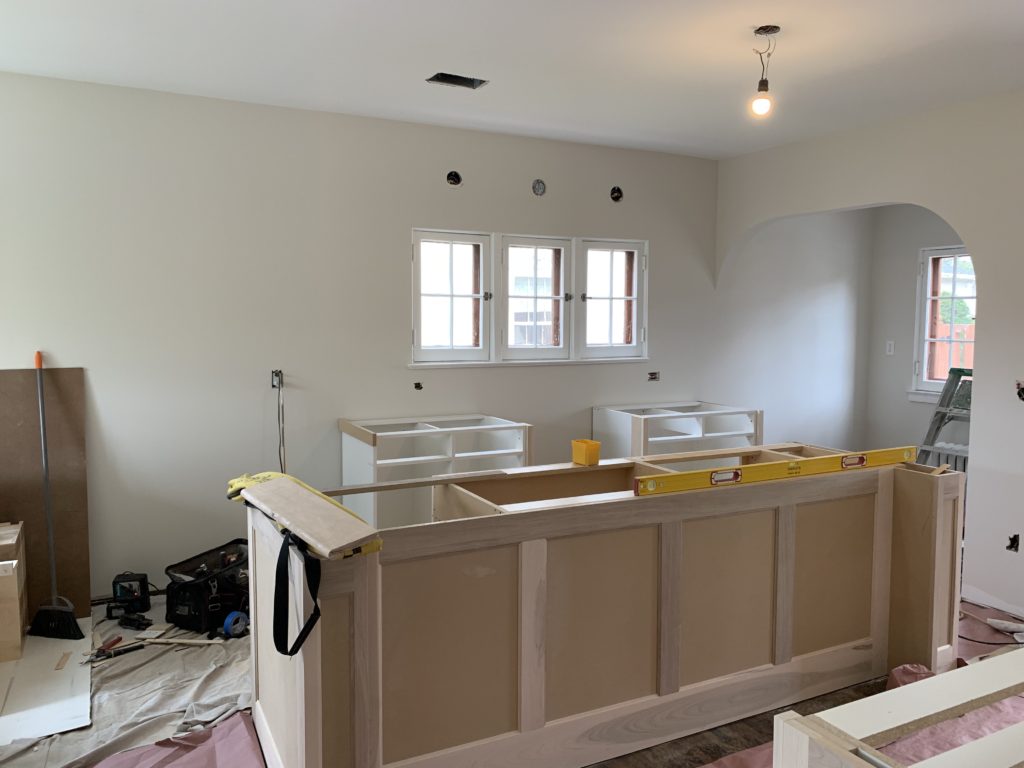
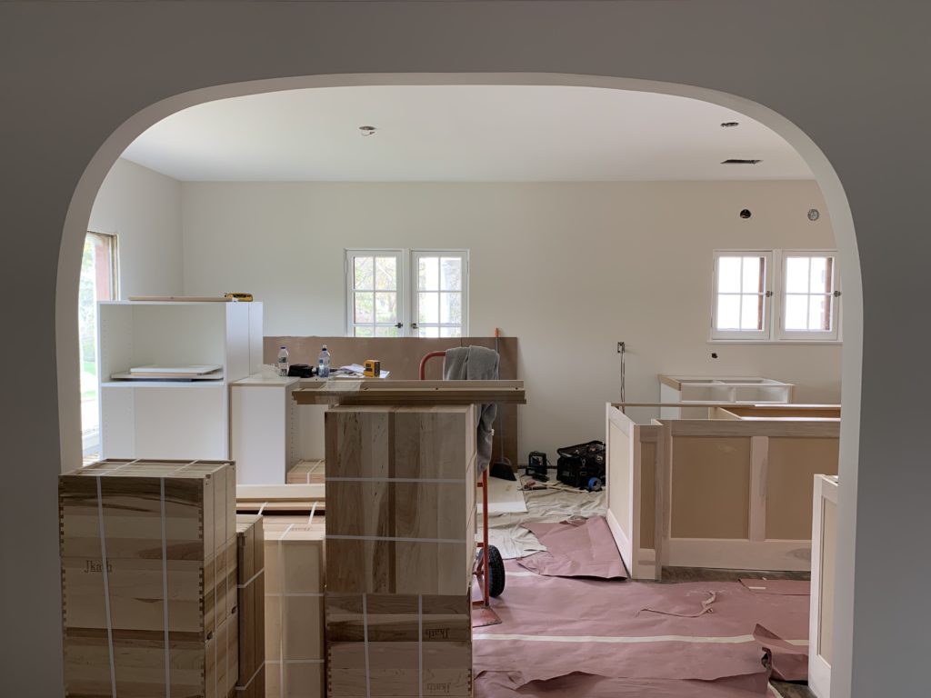
Things always start to get good when the cabinets arrive! We hired the talented Jkath custom cabinet shop to build all of the cabinets, and as always, we were blown away.
Every detail is always perfect, and our clients are never disappointed. Investing in custom cabinetry is worth every penny.
We wrote a full blog post on cabinetry here – What is the Difference Between Prefab, Semi-Custom and Custom Cabinetry?
Another great shot of that arch and walkway into the dining room and kitchen from the living room and front entry…
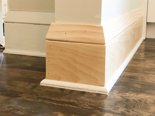
Another cool feature that you might not always think about, but it is very important for the overall look and feel of your design, is the millwork.
And according to Jamie, sometimes the hardest part of our job is blending the new space with the old.
As you can see here below on the left is the original base trim in the living room—a room we weren’t remodeling. And front and center is the new base trim that we had to recreate somehow.
Being this home is 100-years-old, we knew we weren’t finding that original trim anywhere, so, as always, Jamie put his carpentry skills to work and came up with what I like to think is a perfect match. It was truly fascinating watching him in the shop sawing down and molding pieces together to give the new trim the same look like the old.
A lot of detail and time put into this key element and something that is often overlooked.
After
Dun, dun, dun….and the AFTER!
Okay, let’s talk FINISHES!
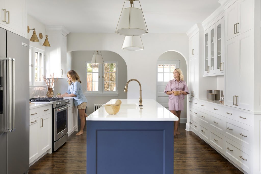
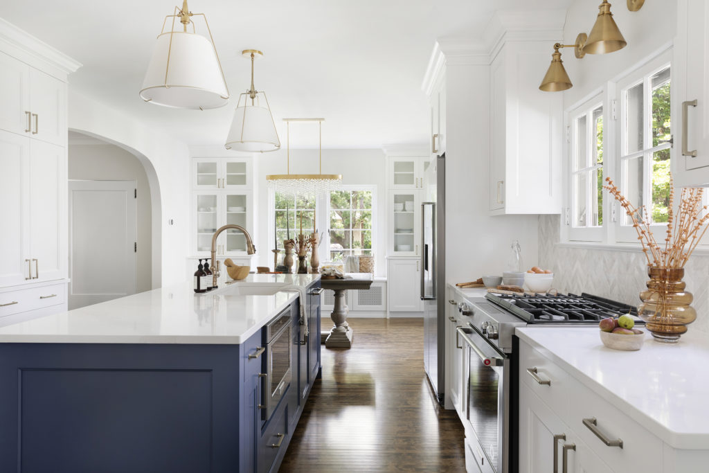
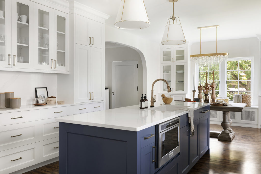
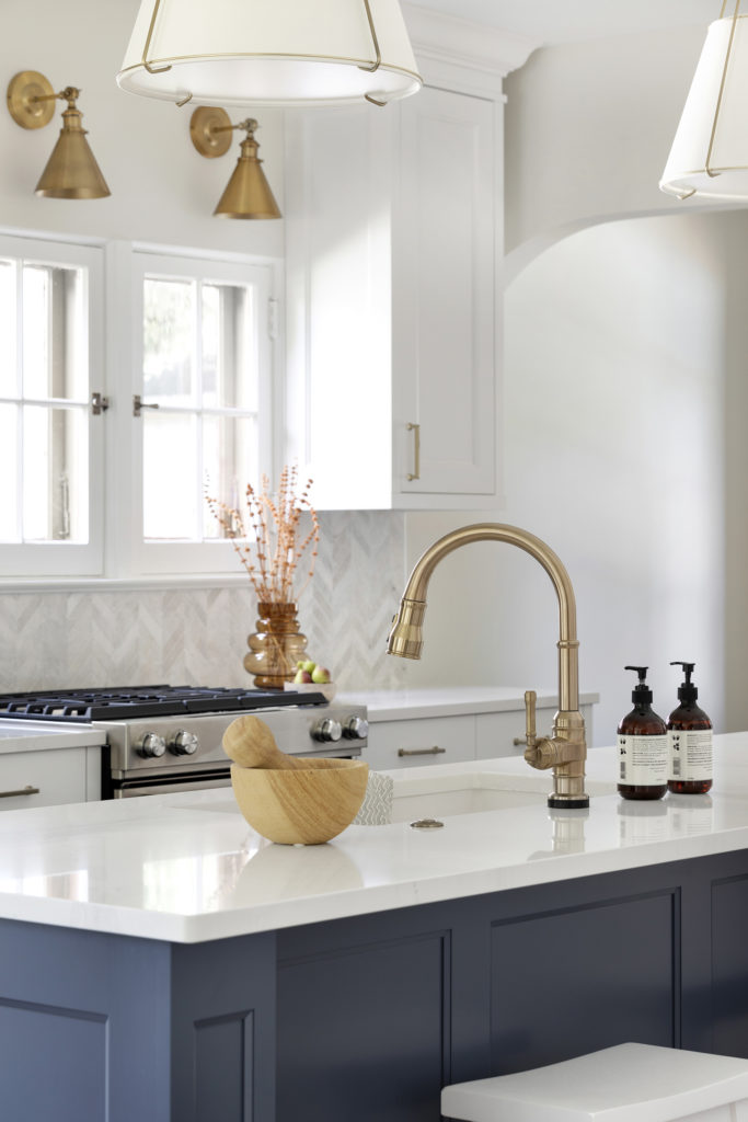
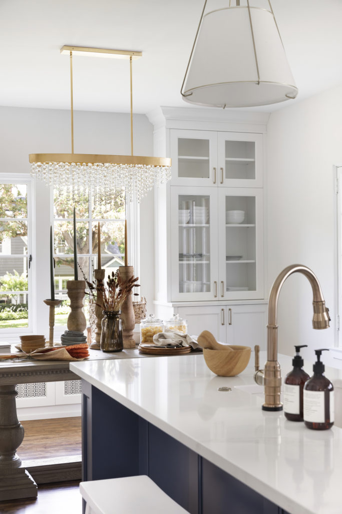
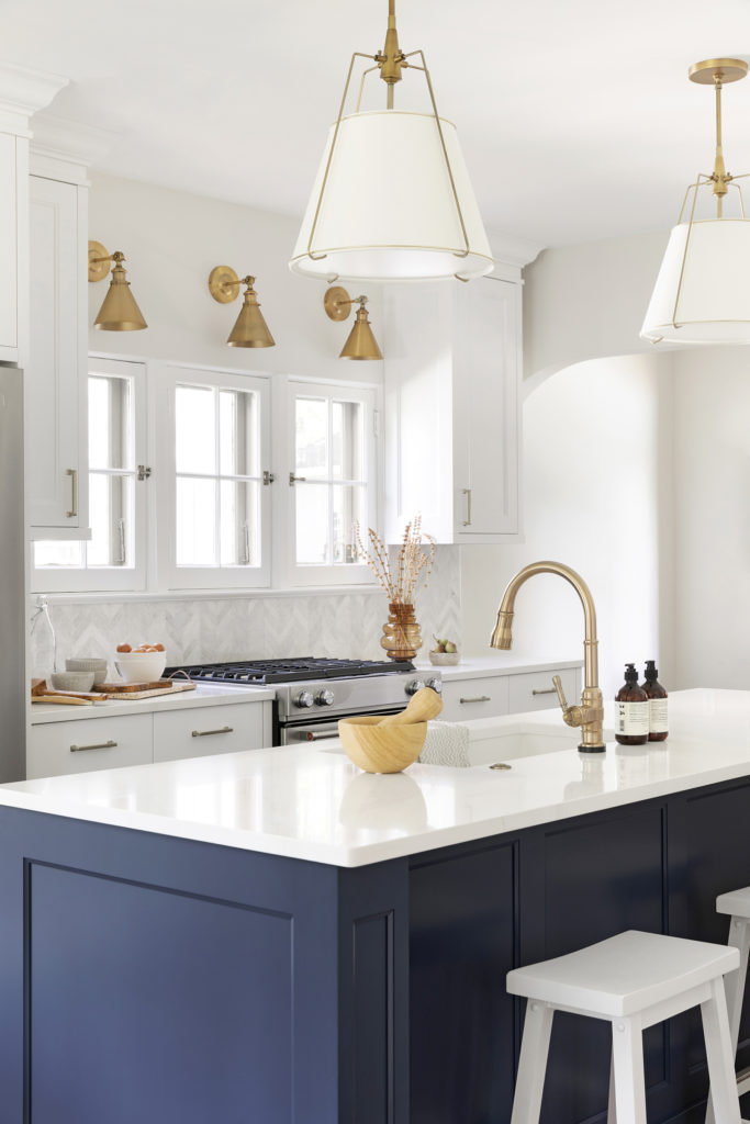
We are a sucker for subtle touches of gold, not too overpowering but just enough to make that little sparkle shine throughout the space. From the 5″ and 12″ hardware pulls to the island pendants to the dining room chandelier and wall sconces, we love how it tied the kitchen all together without it being so overpowering.
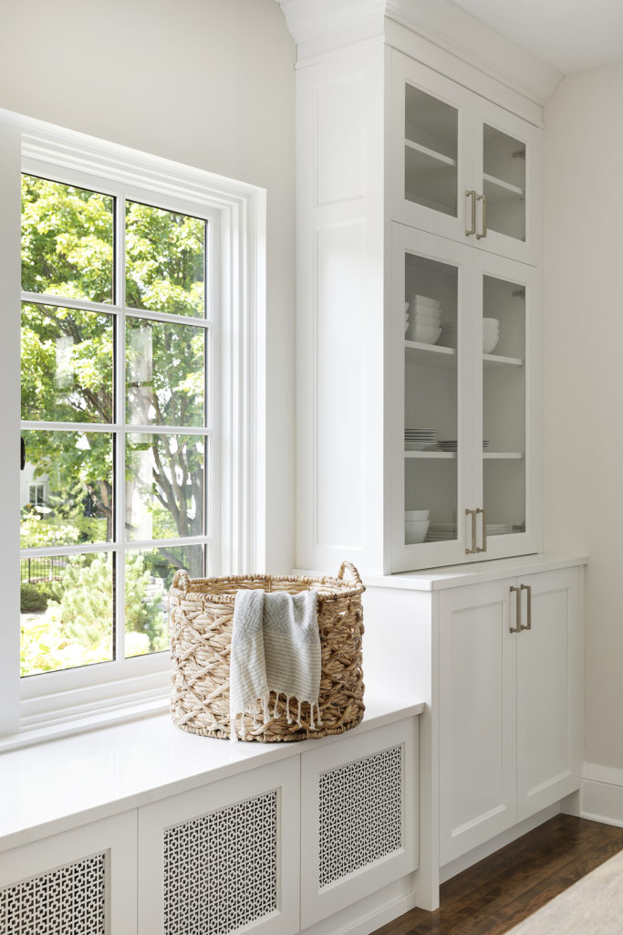
And I don’t know if you remember the old radiator under this window that had to stay; we used Jkath cabinetry to hide it away to give a little cozy bench seating.
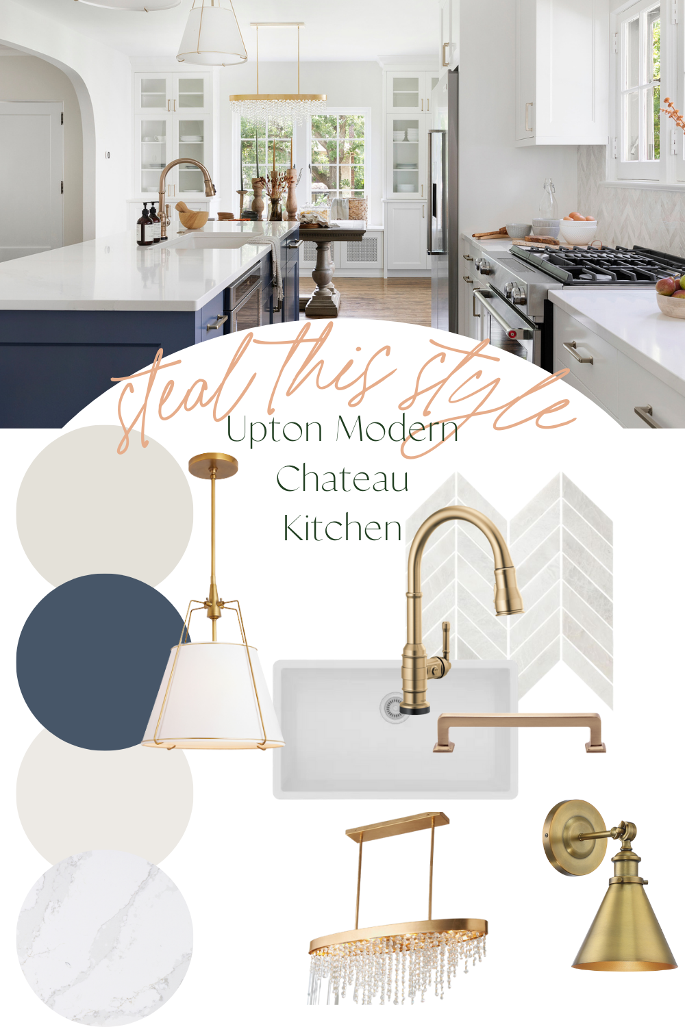
Paint colors? The wall color was a light and subtle grey called Classic Grey by Benjamin Moore, and for the white cabinets, we, of course, used our favorite, Snowbound by Sherwin Williams. There was a lot of light and bright tones going on, and our clients wanted to bring in a pop of color, so the island was finished off in Newburyport Blue by Benjamin Moore.
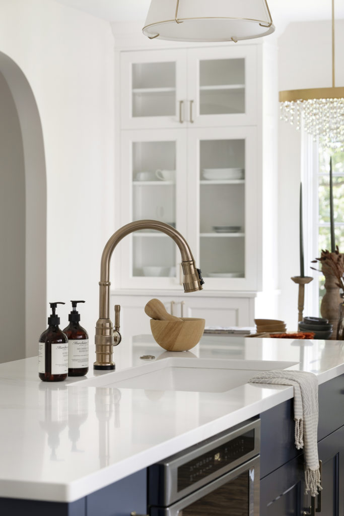
We are all about those white and bright, clean countertop designs in a kitchen remodel, so we went with Silestone Calacatta Gold. And with the subtle veining, it complemented everything perfectly without being too white and bright.
One of our favorite features, and our clients too, was the Touch2O Delta Faucet. We knew our clients especially loved it when they sent us home videos of how they had been using it, turning it on and off a 100x.
It gave our team a good laugh! And we were glad they enjoyed their touch technology just as much as we do in our home. It is a game-changer in the kitchen and worth every penny!
And the sink area couldn’t be complete without complementing it with our favorite, the Elkay undermount single basin quartz composite white sink.
If you’re contemplating putting your sink within the island, I wanted to share this awesome blog post of Emily Henderson’s I read a while back about her mountain lake house and why putting her kitchen sink in the island was the best thing she ever did.
The dishes are always done. I really liked her perspective and take on this design feature; you can read that post here.
For the backsplash, we went with The Tile Shop design in the Carrara polished chevron marble tile. We loved how this tile brought in old word style with the new modern twist.
This tile design was perfect for the rest of the space as it has a nice white backdrop and complemented with grey veining, just like the countertops.
So there you have it, the full reveal of the Upton Modern Chateau kitchen remodel! What do you think? What was your favorite part of the process or your favorite design element? Have any questions? Leave them below, and we’ll be sure to answer. I hope this post inspires you in your home in one form or another whether you’re remodeling, updating some fixtures, or just looking for some inspo to uplift your day!
After Photography Credit: Space Crafting
Selections
Wall Color | Cabinet Paint Color | Island Paint Color | Countertop | Custom Cabinetry | Backsplash | Sink | Faucet | 5″ Hardware | 12″ Hardware | Island Pendants | Dining Room Chandelier | Sconces
YES, that would look gorgeous!! Of course, I’m sure you can tell – they’re all not exactly perfection but we also don’t think that they have to be matchy – matchy. We love a good subtle difference, but obviously not to have it completely not compliment one another. Honey bronze from top knobs are so delicious!
Would you say the top knobs honey bronze matches the Delta faucet? I will have aged brass (rejuvenation) pendant lights pretty close to the faucet ( looking at the one you have) and looking at honey bronze top nobs. Just don’t want to me close but different sheens.
Thank you so much! And I am way late to the game on replying to you. We used a walnut stain.
Is there a hidden dishwasher next to the sink? I think it’s great not seeing it. Nice job.
Absolutely STUNNING and perfect in every way!! Thank you so much for sharing these gorgeous photos and all of the sources!! I am doing a very similar kitchen in my home next week! Thank you for the inspiration! I am also refinishing my existing hardwood floors…would you mind sharing the stain(s) color(s) you used here? I am searching high and low for a lighter medium brown that is classic and timeless!
Thank you so much! Means a lot. It is 46″
So beautiful!! Just curious- how much space is between the island and the floor to ceiling built ins?