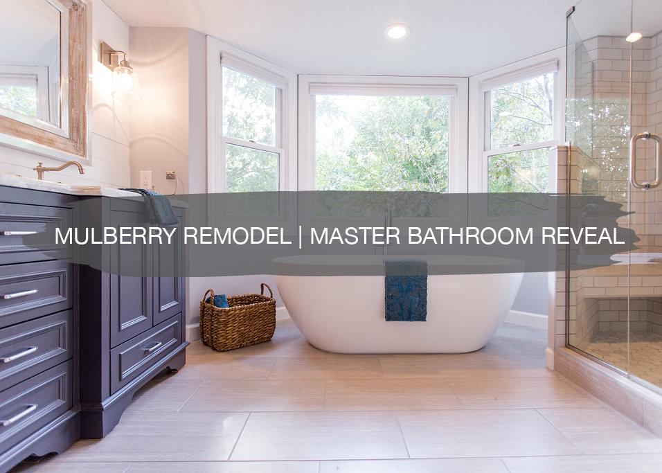
Remember the shiplap tutorial we just did for you guys HERE? Well, it’s time to share all the details and the before and after’s of that project.
We recently just wrapped up this bathroom design and remodel, and it’s time to share it all. We were awful at showing you guys the progress of this remodel. We took on a lot of projects this summer and with the new baby in our life documenting all of our projects for you guys throughout the process didn’t happen as much as we had hoped.
I was going to say we’re a little sad to say goodbye to these clients but they have us moving into their bedroom and mudroom. We’re in the works of making some custom pieces for those spaces. We also tackled this client’s laundry room at the same time as their bathroom. So we’ll save that for a later post too.
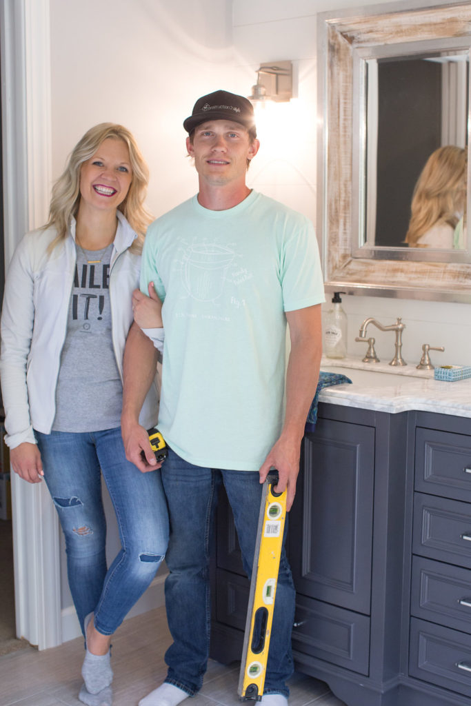
But seriously, yet again, best clients ever. One of the nicest couples we’ve had the pleasure of working with. This couple worked from home a lot and their two little girls were at home with a nanny all day so we really got to know them well. They had such a contagious energy. We never left their home without a big smile on our face. Living through a remodel can be rough. Lots of dust, dirt, and noise. And when you’re home during the day it can even be worse. But somehow these guys made it feel easy. We can’t thank you enough for trusting and hiring us to help create a space for you guys to create a lifetime of memories within. So let’s get to it! The before and afters….
BEFORE & AFTER
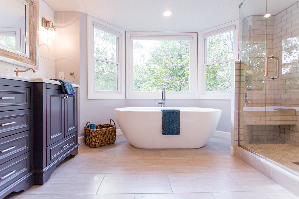
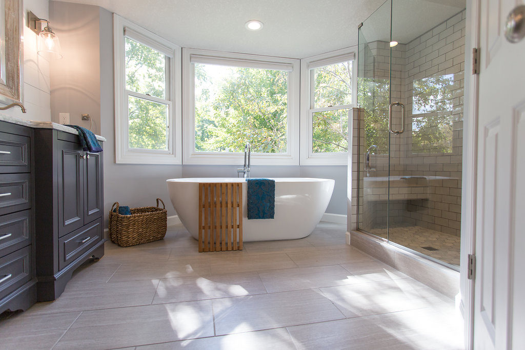
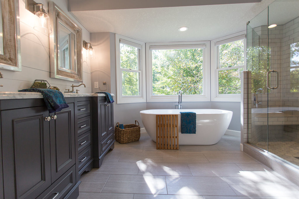
This project was so much fun! Our clients told us they loved one of our recent projects and wanted a similar light and bright space. A large soaking tub was a must and if possible they wanted to enlarge the shower a bit. From picking out all of the finishing selections to styling the space, we helped them every step of the way.
We completely demo’d the space and got to work. Everything we suggested they were onboard. The only thing that changed from the original designs was that I was super excited to do a large chandelier over the tub. But I guess you can’t do that per code. Go figure. Ha!
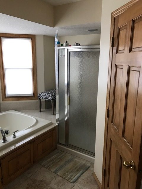
As you can see, there was a lot of wasted space around this jetted tub. So we were able to take that area there where the chair is sitting and blow it out and extend the shower and add in a seat.
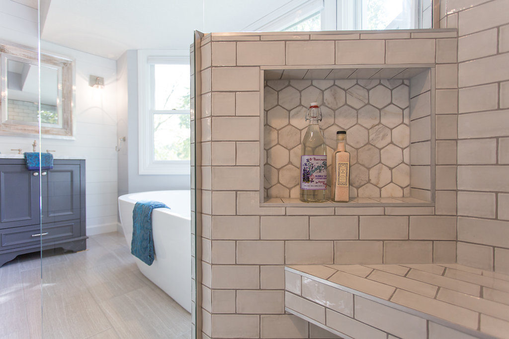
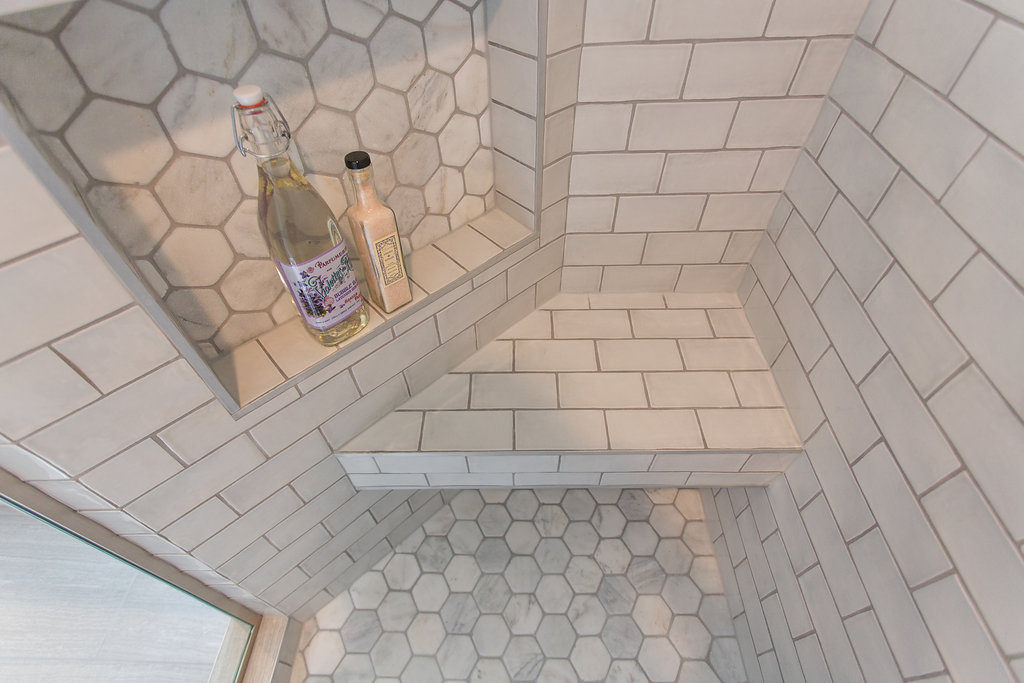
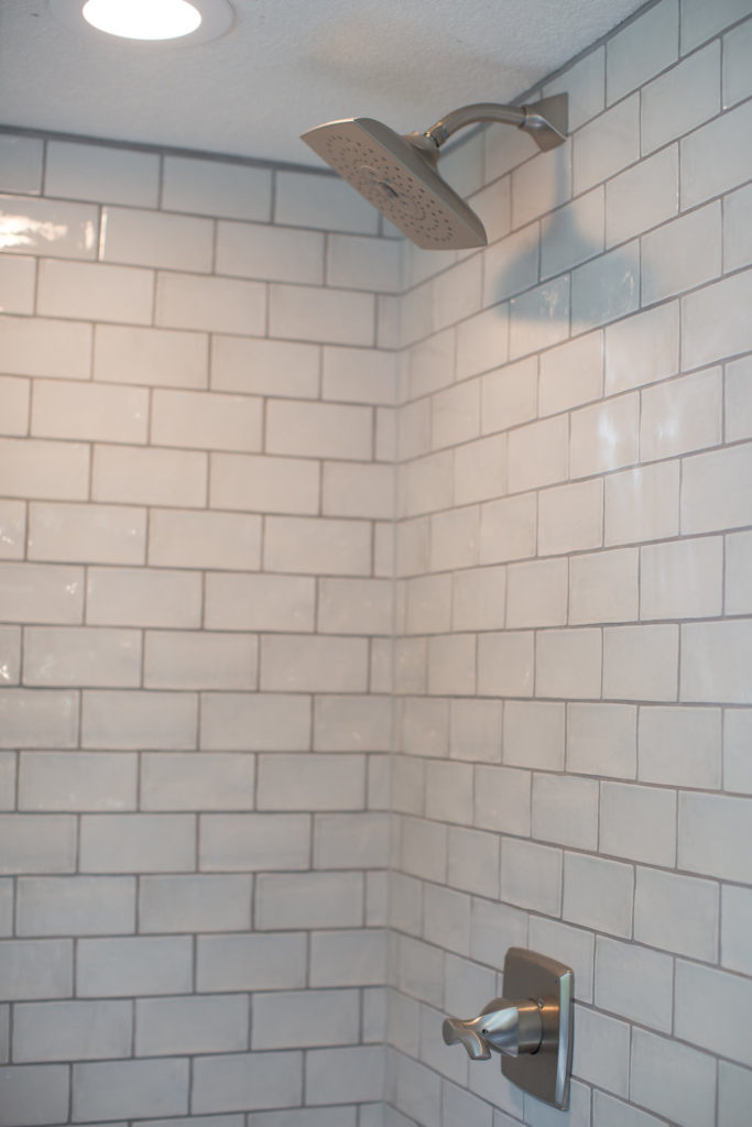
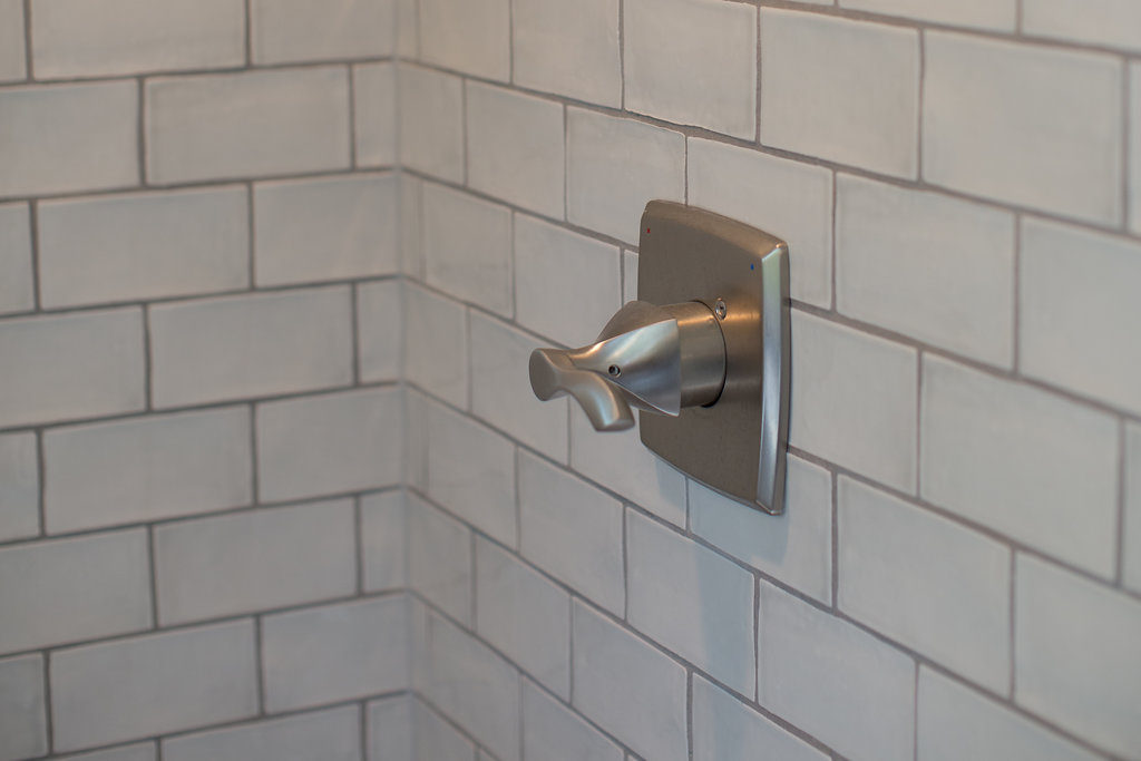
It ended up being such a cute area in the shower. A little ledge with a niche right there for their soaps. We chose Catalina Gris 3 in. x 6 in. x 8 mm Ceramic and Wall Subway Tile from Home Depot for the shower surround tile and Hampton Carrara Tumbled Hex Marble Mosaic Tile 3 in. x 3 in. from The Tile Shop for the niche and shower floor.
Funny story, I saw a cute inspo post on Pinterest with this tile and wanted to incorporate it into this design. After I had ordered and paid for the tile, Jamie went to pick it up immediately called me and was like, “babe, we cannot put this into this bathroom. It is way too wavy and people are going to think we don’t know how to tile.” Ha! I knew it was going to look great and told him to go with it and once we got it up, he agreed that it looked pretty bomb.
I’m not gonna lie, we get a little bored with the traditional subway tile. So anytime we have a client that wants to incorporate it, we’re always pushing them spice it up a little bit with either a new subway design or color. And lucky for us, our clients usually go for it.
For the floor tile we chose Leonia Silver Porcelain Floor and Wall Tile from Lowes and have used a ton. It such a classic tile that we feel will last awhile. We put this same tile but in a darker color into a clients mudroom over five years ago and still looks timeless. And best of all, it’s only $1.79 a sq ft.
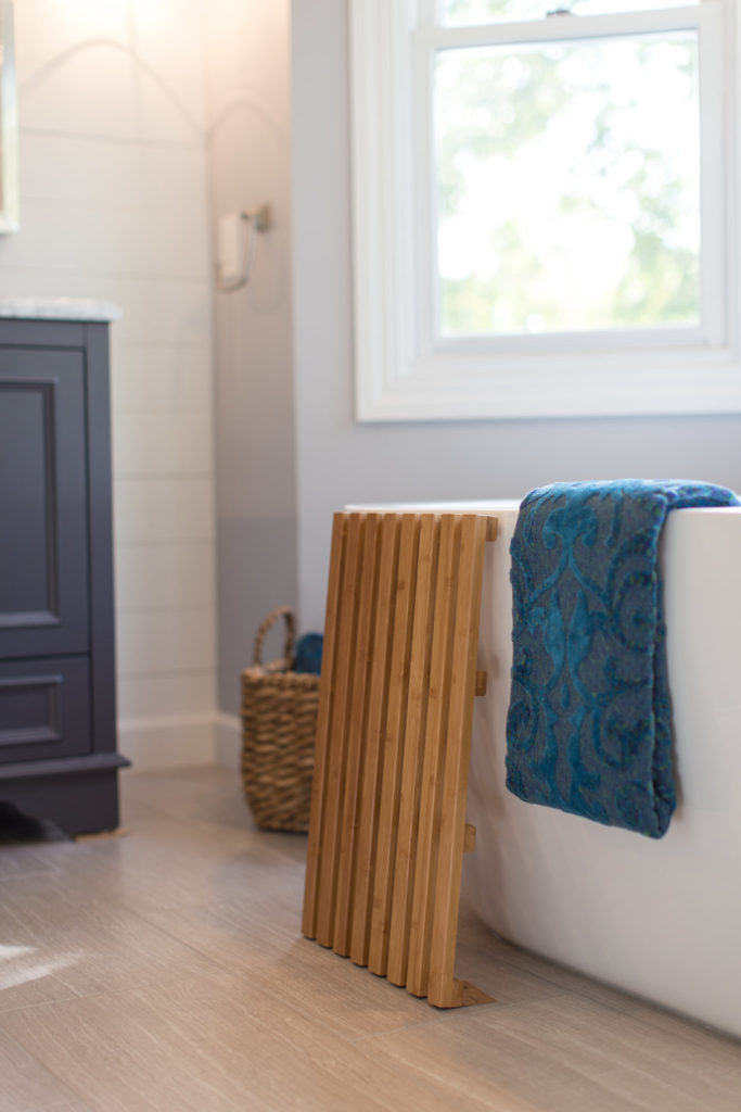
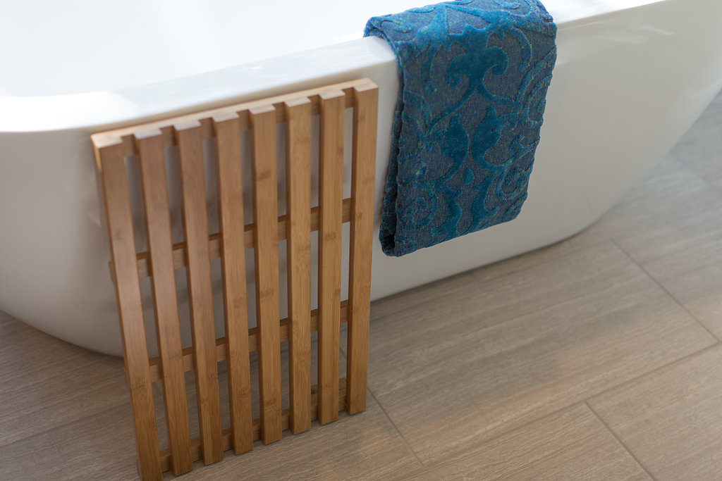
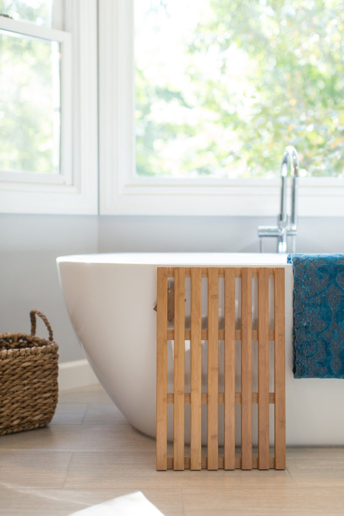
The soaking tub was a must for our clients. We went with Soho 68″ x 31″ Soaking Bathtub from Wayfair. This tub is one of our favorites and have used multiple times in our projects. All of our clients that have incorporated it, let us know how much they enjoy it.
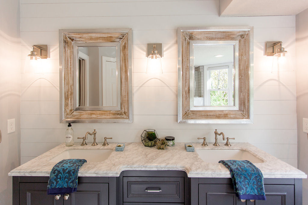
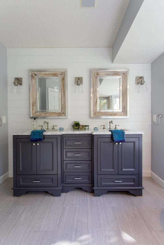
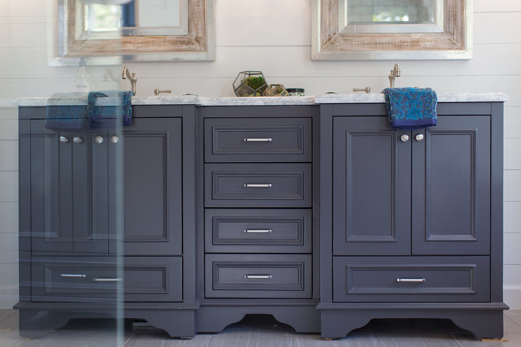
This client wanted likes a lot of neutrals and wanted to have a very classic look. However, they also like a little subtle farmhouse, but not too much. So we recommended adding in a little shiplap accent wall behind the vanity and bringing in the farmhouse with some mirrors and decor. And they were all about it!
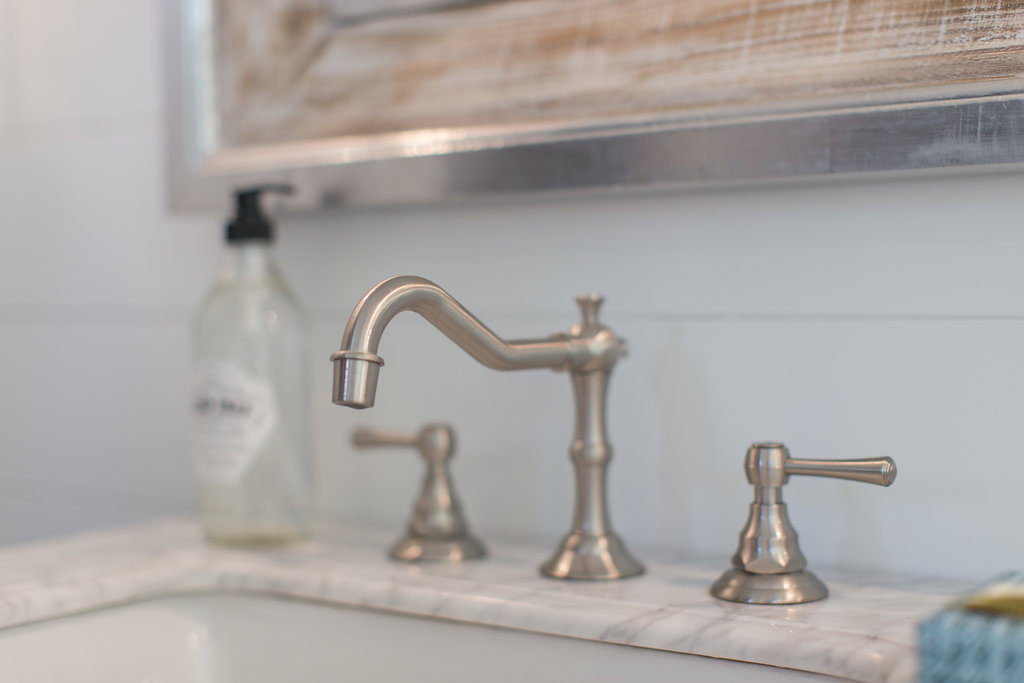
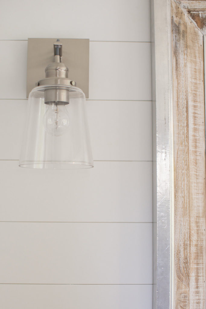
Wall scones is also something I’m crushing on right now! I mean, how much better do this lights look offset to the sides of the mirrors than overhead?! For the lighting we went with Bellacor’s Brushed Nickel One-Light Wall Sconce with Clear Glass.
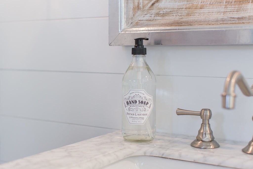
Mirrors came from Home Goods, vanity from Signature Hardware and all of the decor from Cost Plus World Market.
And how cute is this little guy! We can’t believe he is already 5 months old. He started daycare last week so he won’t be coming to work with mommy and daddy anymore. We’re a little sad but let me tell you, trying to get any work done with this guy was nearly impossible.
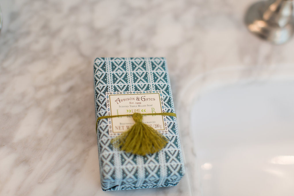
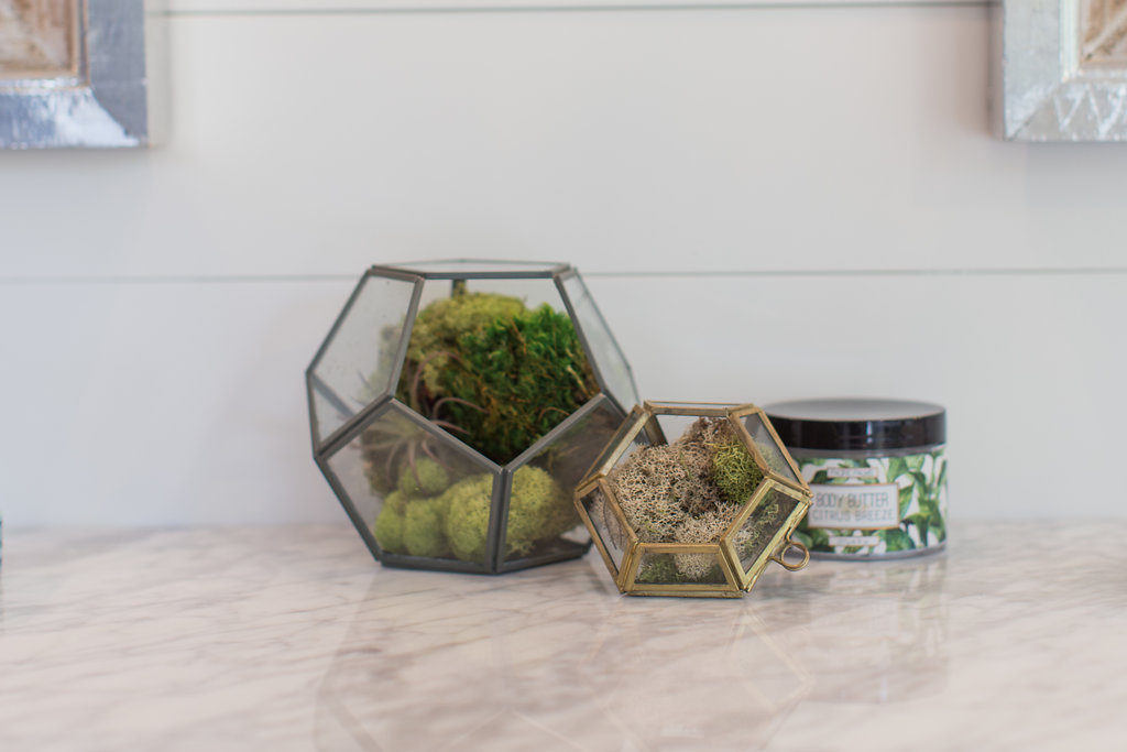
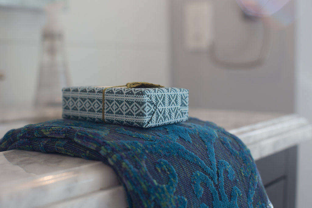
And lastly, the styling. My favorite part. We got all the decor from Cost Plus World Market and the client kept it all.
And there it is! Our latest bathroom remodel project. We had so much fun on this one and can’t wait to share with you guys what we did to their laundry room and what we’re working on within their closet and mudroom.
Photo and video credit to our girl Chelsie.


Thanks to you gf!! So grateful for your made photography and video skills. 🙂 XOXO
GAHHHH I just love this bathroom so much!!! Down to every last detail!