
We hope you have been enjoying the daily reveals of Black Lake Place! Now we’re ready to share another bathroom!
First, the kitchen + living room, then the owner’s suite, and today we’re taking you on the journey of the lower level bathroom.
One of our favorite parts about designing our first c2s custom flip was having the design freedom to be bold and creative in each space. Although we were designing for resale we knew we would attract the perfect buyer who appreciated these design elements and we did just that.
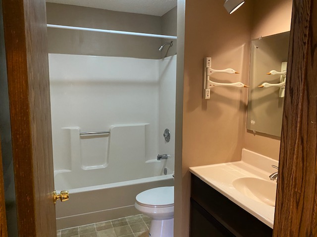
Before & After
Do you remember this bathroom before?!
We did a poll on our Instagram if we should keep the duck towel bar – it was a tight race!
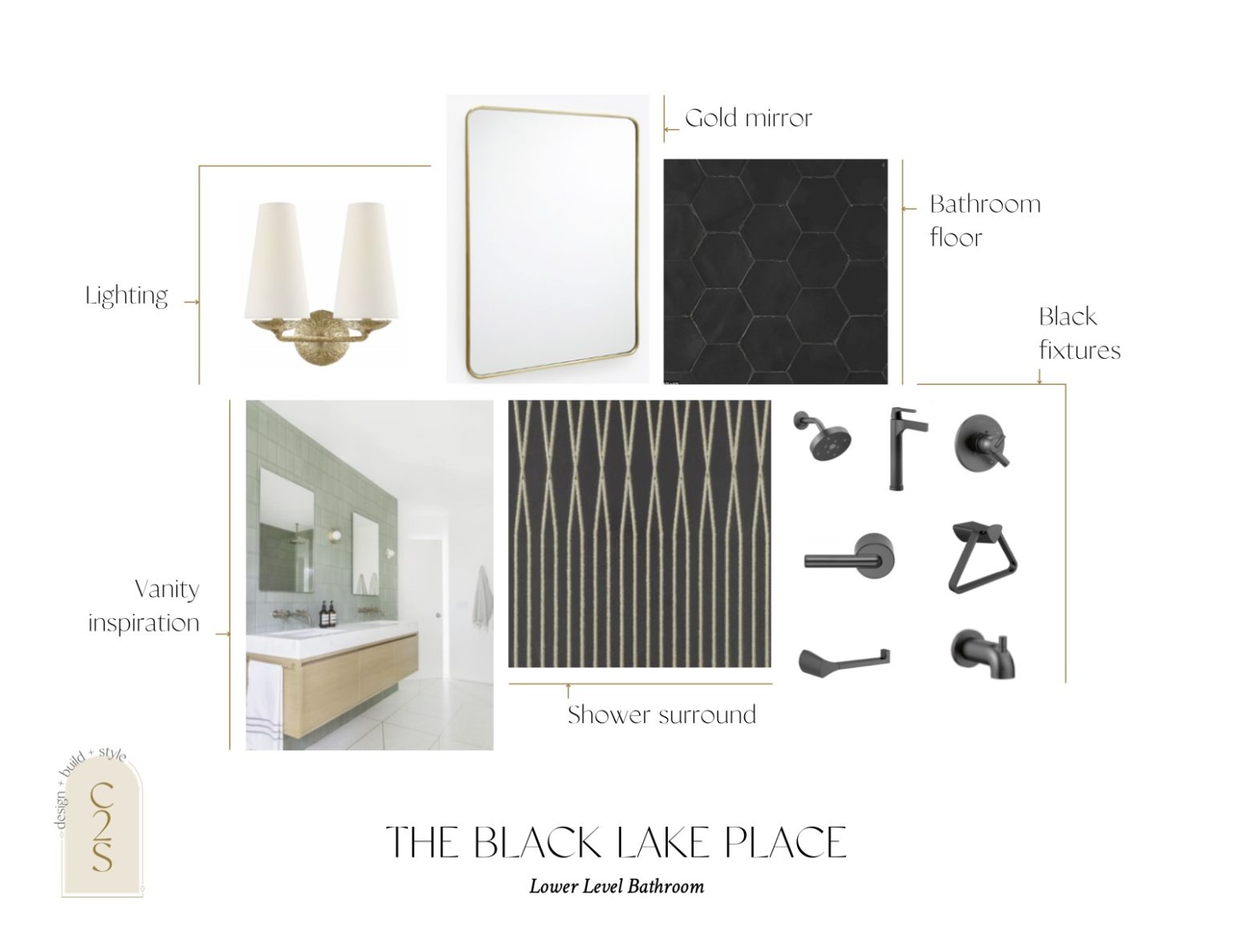
The Mood
As you can see above in our mood board, our original idea was similar to the owner suite, to go black and white, dark and moody yet light and bright. We fell in love with this black + metallic for the shower surround and as most of you know we love a good black hexagon, which we were going to do for the floor tile.
But then I kept thinking it was all too similar to the owner’s suite and I wanted a totally different vibe down here. I can’t even count how many times I went back to The Tile Shop and walked the floor and pulled new tiles.
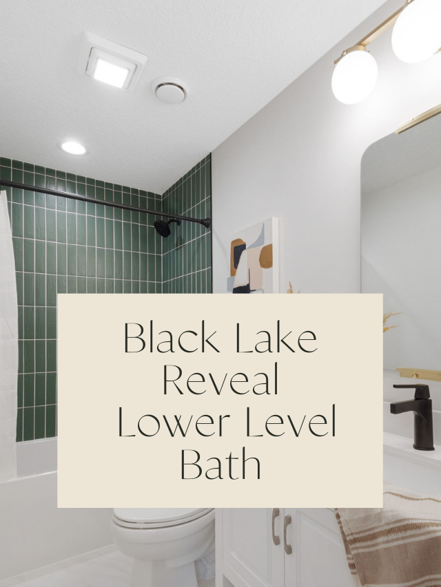
Then, as we were walking the floor one day, this green subway tile jumped out at me. I kept staring at it and telling myself, don’t do it…don’t do it! haha!
Being I thought maybe that would be way too much for a resale home. And then I did it…haha…and so happy I did.
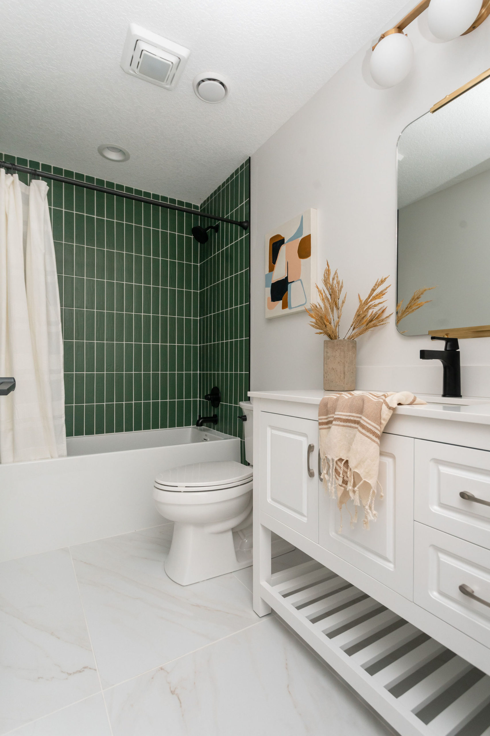
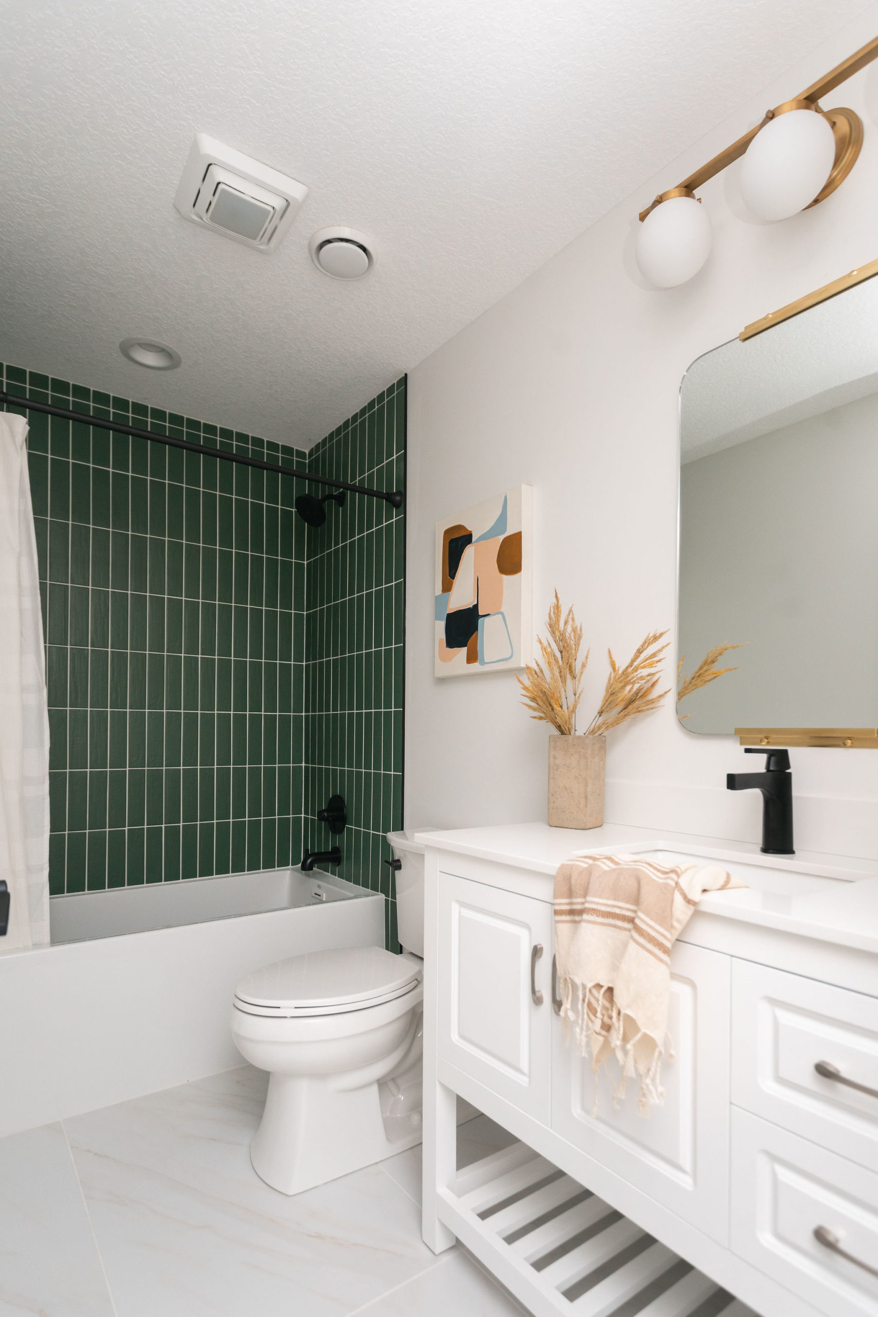
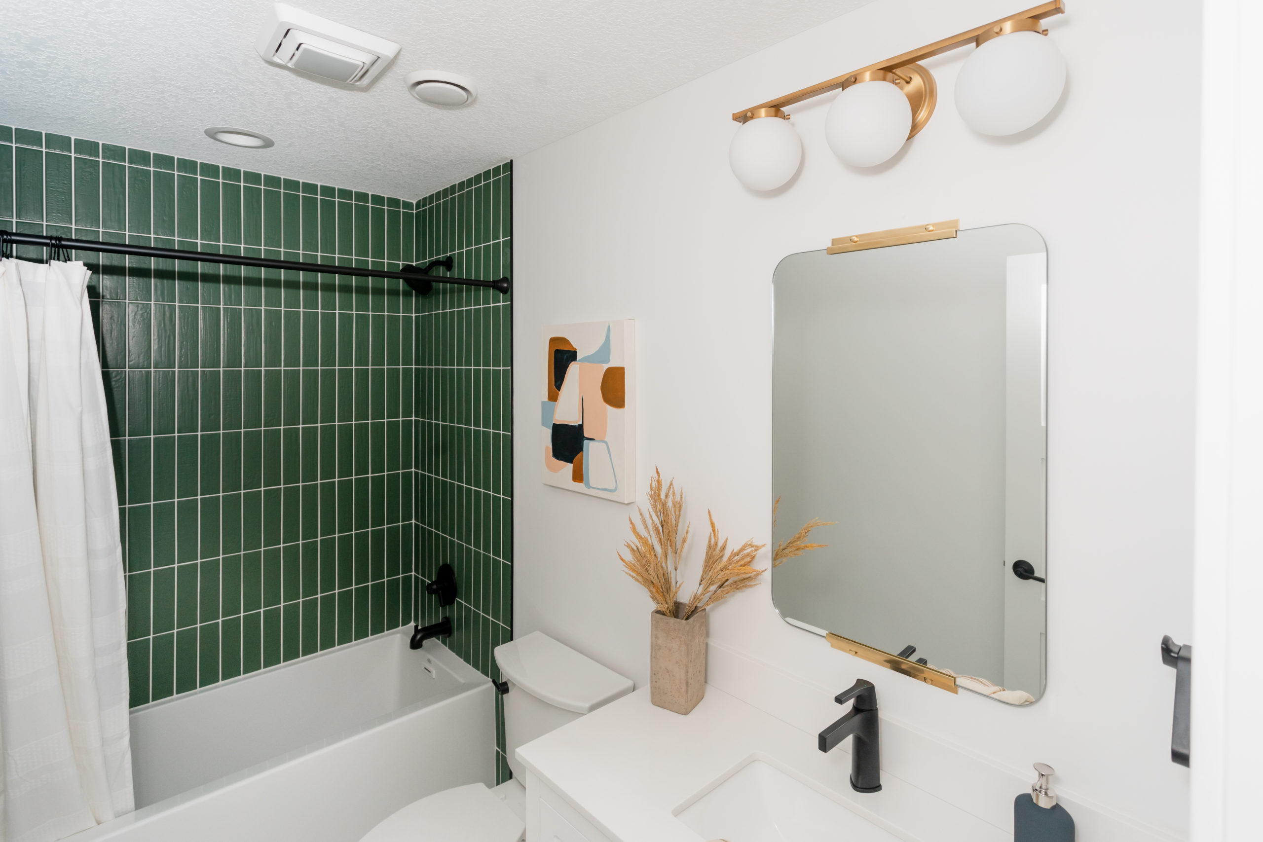
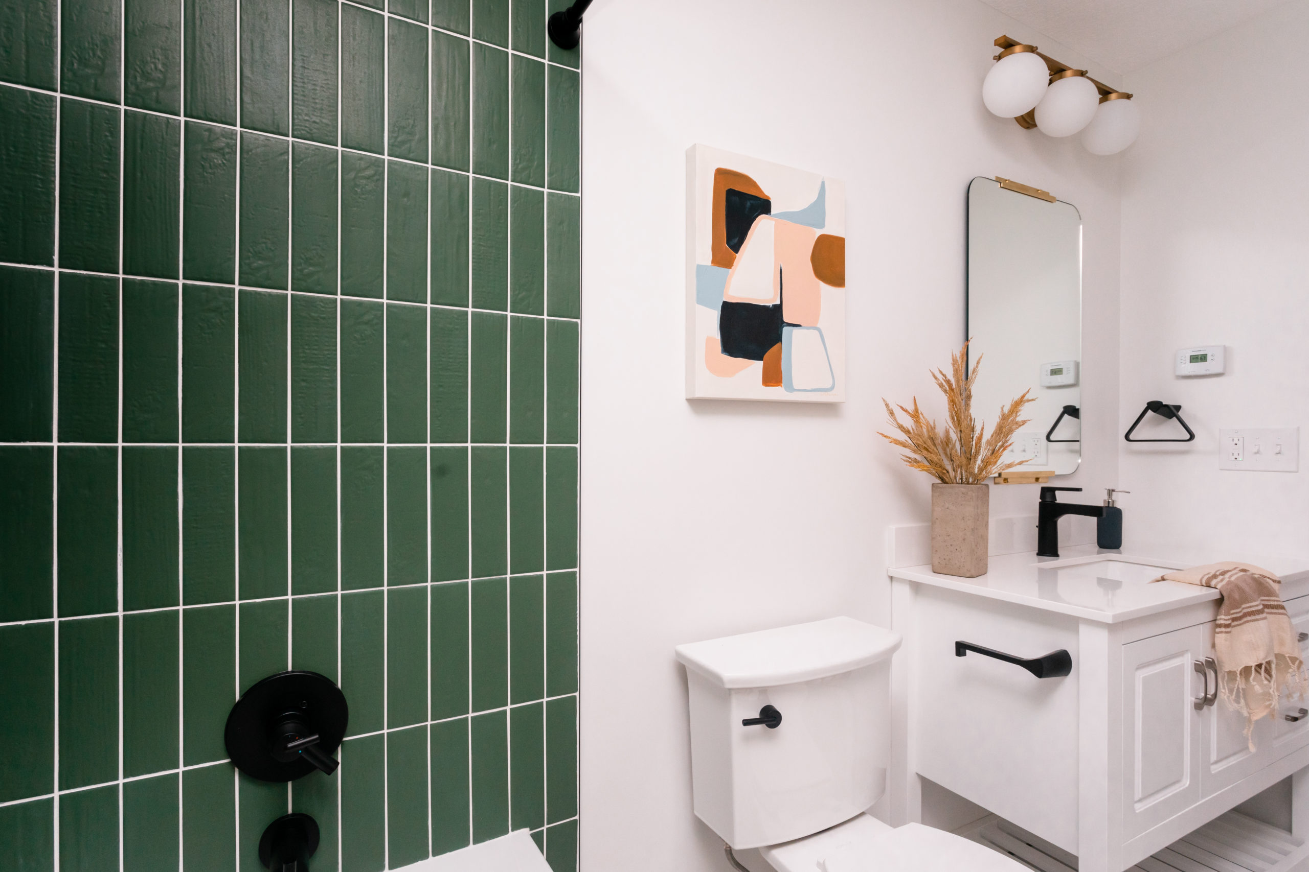
I knew then if we were going that bold in the shower surround that everything else should stay more classic and neutral. So white on white we went with the tile floor, tub, paint, and vanity, and then to tie it all together, we used black fixtures in the shower and for the bathroom accessories.
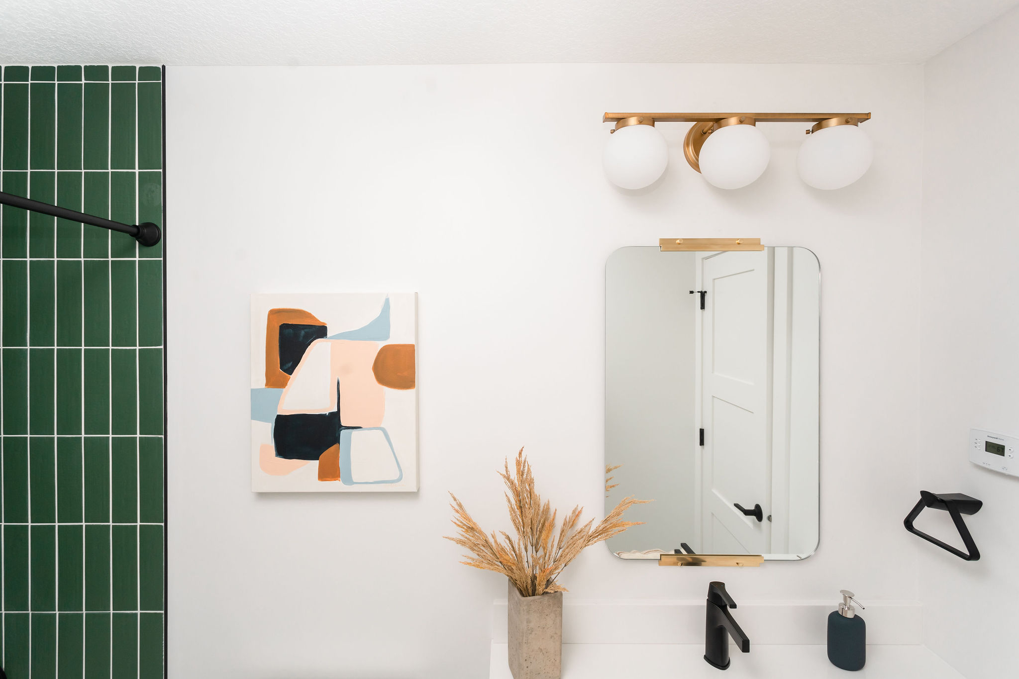
We also brought in gold for the lighting and the mirror to pop with the green tile.
Bathroom Tile
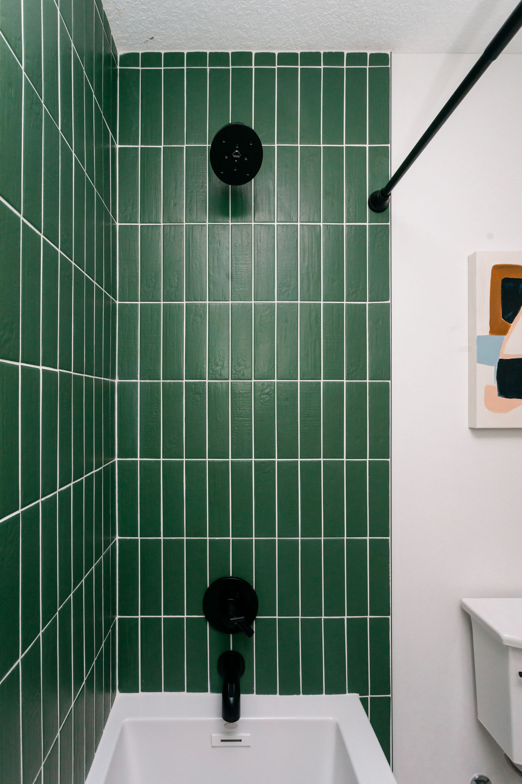
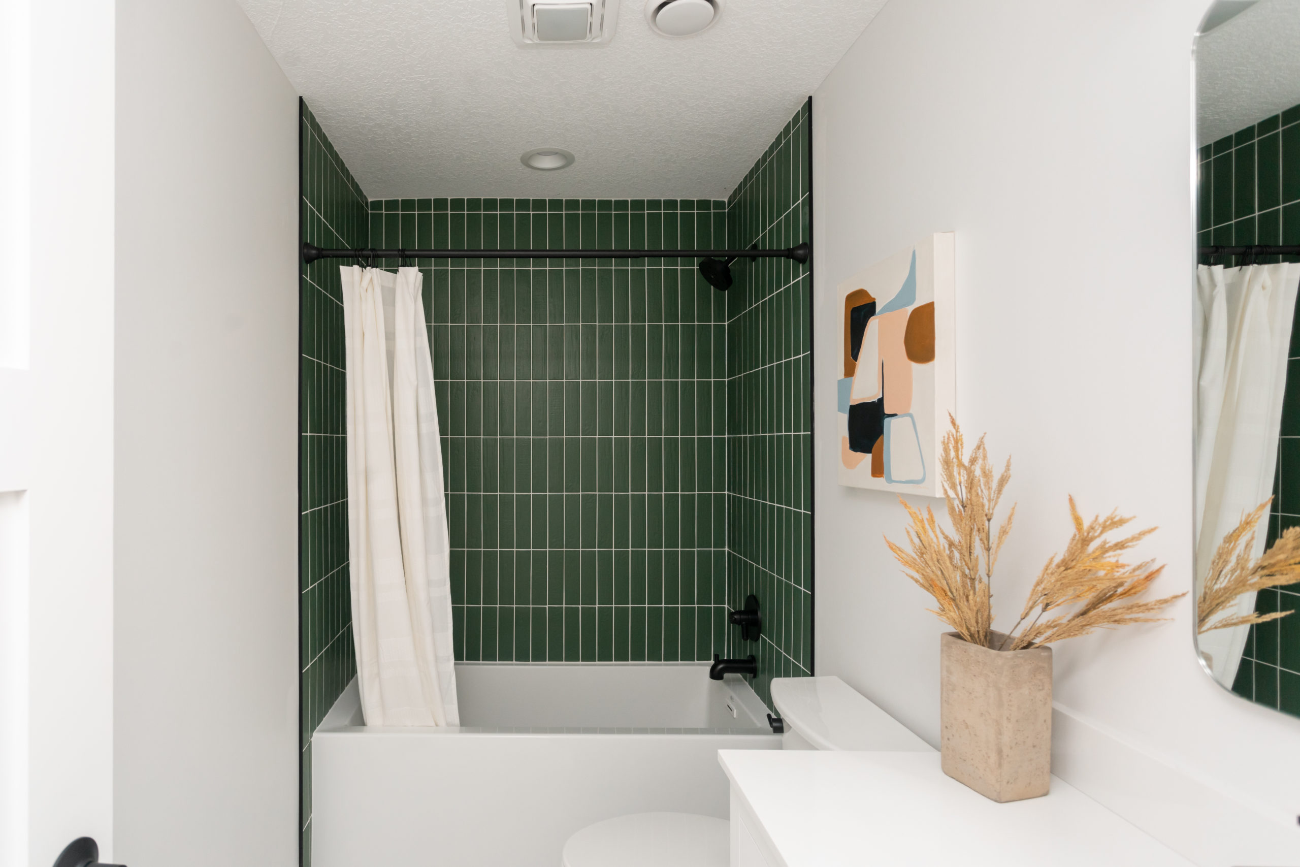
We also wanted to do a different layout than your traditional standard subway tile design. So we did vertical stacked, which is one of our favorite 12 ways to lay subway tile.
This green tile from the Tile Shop is truly even more stunning in real life. It has a textured element to it as well that is hard to see until you get up close and makes me want to touch it every time.
We also wanted the tiles to pop so we did a standard white grout to make them stand out more.
Everyone thought we were a bit crazy for adding this in the bathroom being we were flipping the house and to be honest, we were a bit nervous ourselves…but we absolutely loved the way it turned out.
It makes such a statement in the space and we know the new homeowners will be using this bathroom a lot as it’s right off of the back doors in from the lake.
With the statement green tile, we went light and neutral throughout the rest of the space. We opted for mixing gold and black fixures.
And this floor tile is another favorite of ours! We’ve used this one before and will continue to again and again.
Another goodie from our friends at The Tile Shop. It’s 24 X48 slabs and again, we weren’t sure if it was going to work out being they were so oversized and in such a small bathroom. But being the shower walls were so busy I really wanted a look for the floor that was the total opposite.
So Jamie worked his magic and got them placed perfectly! I love the subtle warm veining throughout these tiles. I always think it goes so perfectly when you have accents of gold in a space as we did with the lighting and mirror.
Bathtub
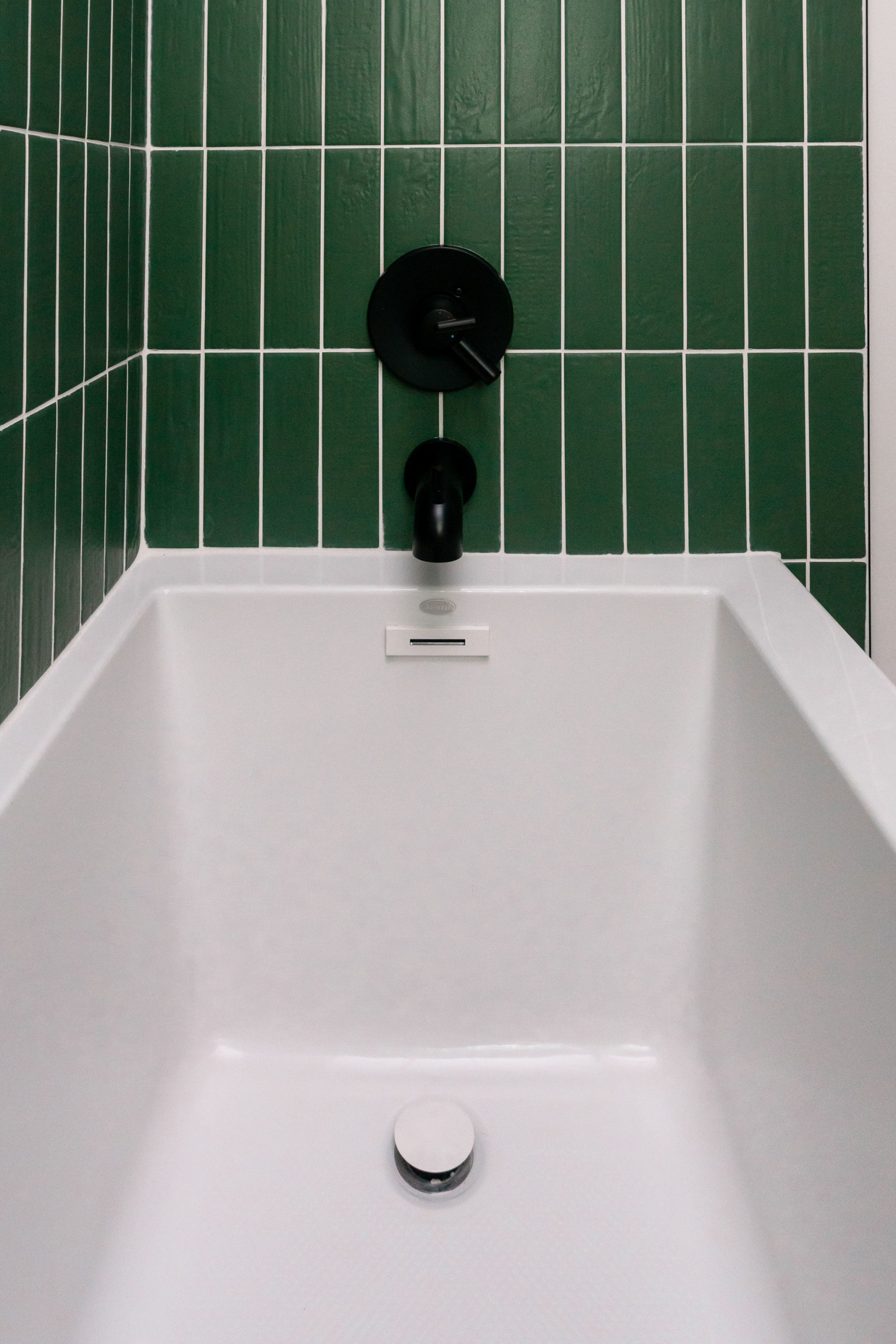
The bathtub is another great product that is fairly new to the market from JACUZZI®. I absolutely love the clean, sleek design of this tub insert.
It’s unlike most others as it doesn’t take up more space and it gives so much comfy room inside. It’s the Linea® 60 x 30 in. Soaker Alcove Bathtub with Right Drain in White.
I don’t know about you but any other tub, I’m not sure how anyone can bathe in it besides kids and these are made for so much more – an adult can actually fit into it and make you feel like you’re in a freestanding tub.
Lighting & Mirror
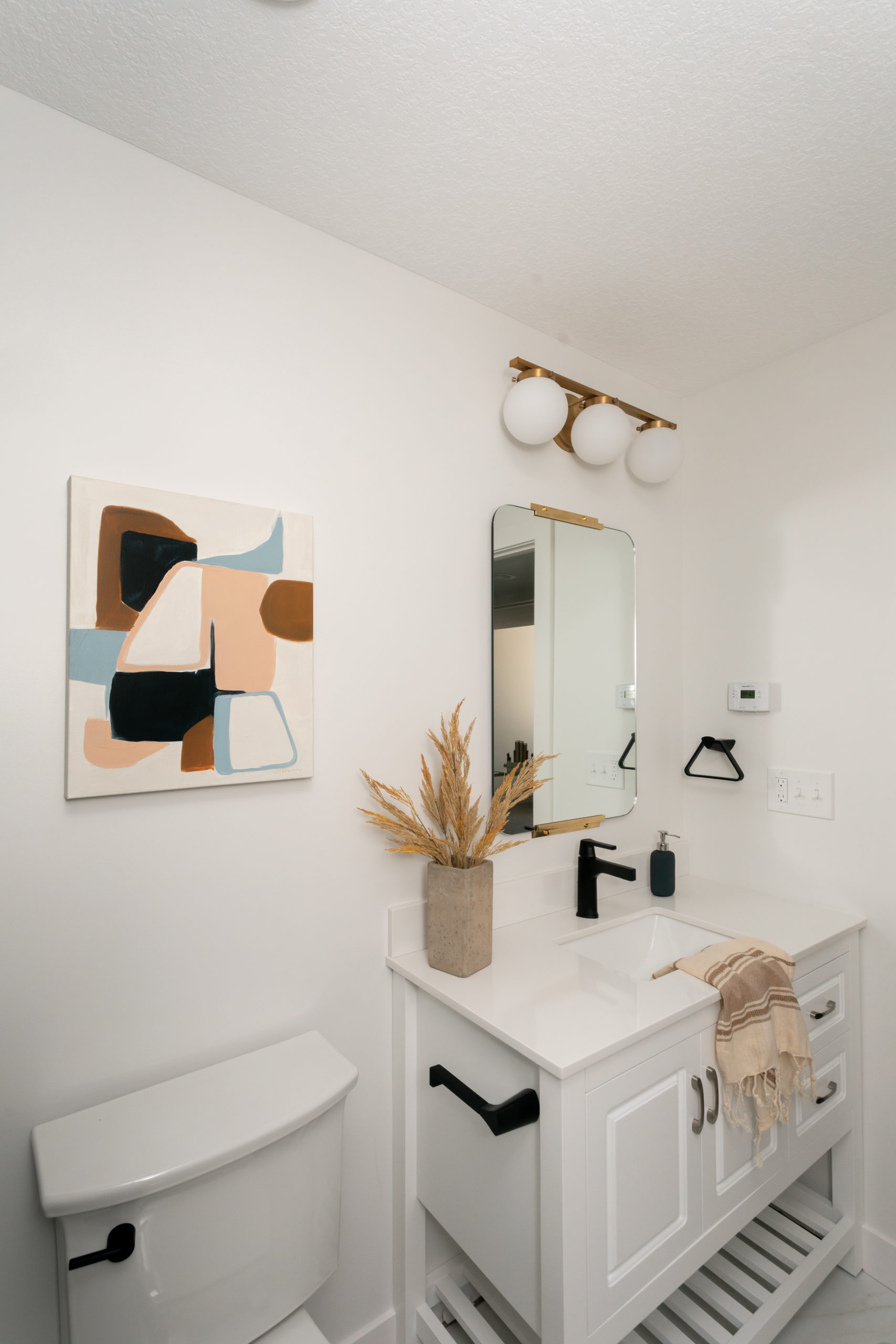
This Bellacor light fixture is another one of our favorite bathroom options. We had initially planned for a different light in here, but as you know if you follow us around here, things always change in the field!
We love how it turned out, even though the vision changed a hundred times along the way. But I guess that’s what you sometimes do when it’s your own space!
The rounded, rectangle mirror is another affordable goodie we picked from Rejuvenation. We love the simplicity of it… just enough pop without being overbearing and was a perfect fit for this bathroom.
Faucets & Hardware
We went with the TRINSIC® Delta Collection for the entire space, when it came to the sink faucet, shower faucet, toilet lever, toilet paper holder, and towel bars. This is one of our favorite Delta collections out there.
A clean, sleek, and modern look that fits the whole vibe of this bathroom. Our favorite thing about this collection is that it has an H2Okinetic Shower technology that sculpts water into a unique wave pattern, forming a powerful drench spray.
It also gives you a feeling of more water, without having to actually use more water.
Artwork
The artwork throughout the entire home as well as pictured here above the toilet was from a local artist named, Cait Courneya. Her Instagram was our original inspiration for the color pallet throughout the home, so we thought it was only fitting to use her art to stage the place once we were done!
And of course, every print fits so perfectly.
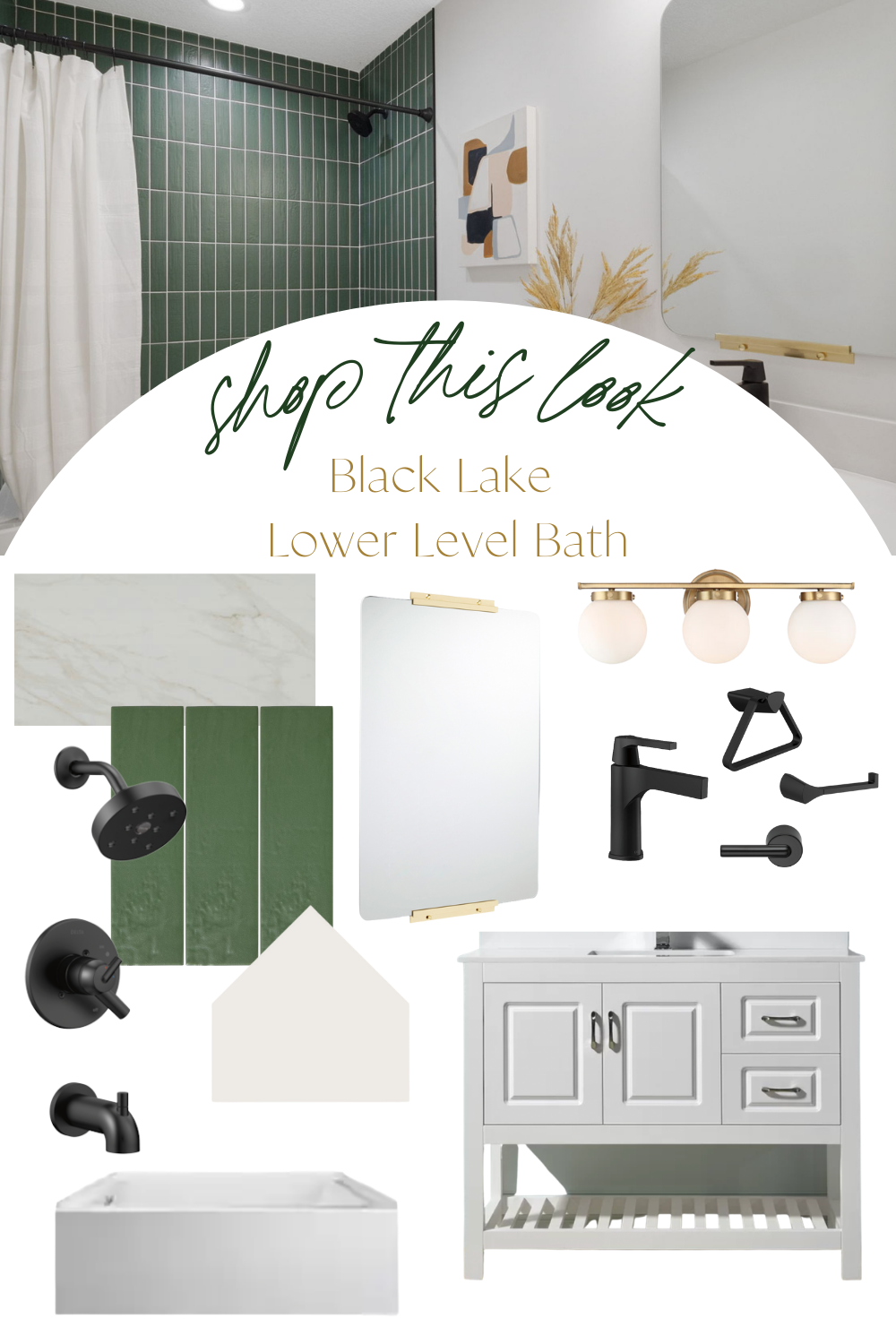
Shop This Look
1. Sink | 2. Mirror | 3. Lighting | 4. Shower Surround Tile | 5. Tub Insert | 6. Floor Tile 7. Sink Faucet | 8. Shower Faucet | 9. Artwork |
Disclosure: There are affiliate links throughout the post. This means we make a small commission and does no harm to you. Thank you for supporting construction2style!

One thought on “Black Lake Reveal | Lower Level Bathroom”
Comments are closed.