Another one of our favorite transformations at Black Lake Place was the owner’s suite.
Since this space is like its own “wing” of the home, we knew that whoever bought the home was going to use the space as a retreat.
Before & After
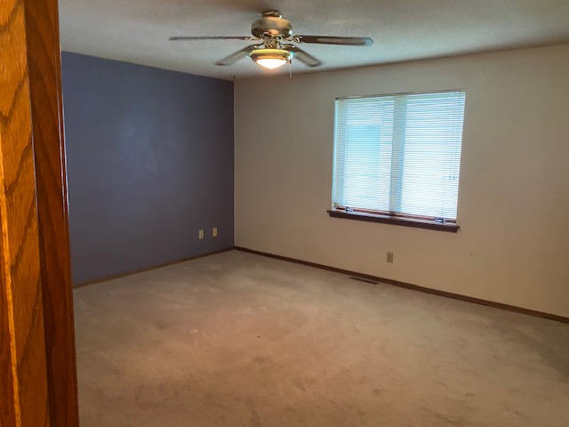
The biggest change made in this space was taking space from the bedroom and using it to transform it into the owner’s bathroom. Previously, the owner’s shared a bathroom with the other bedroom on the main level. So we took some space from in here, to the right-hand side not pictured, to create its own bathroom and walk-in closet. Originally it had two separate closets with a long hallway into the shared bathroom so we knew there was under utilized space where we could come up with a new floor plan.
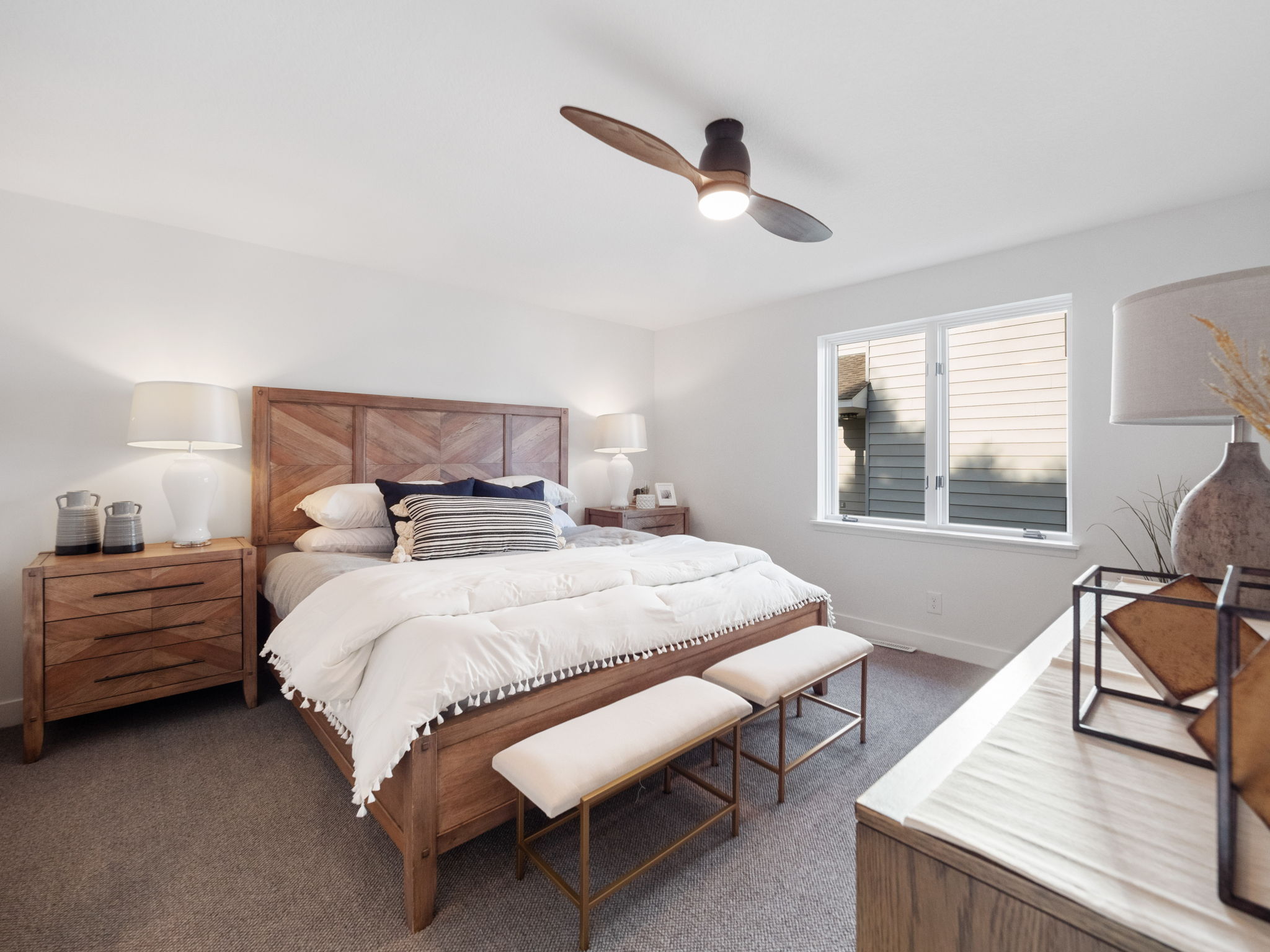
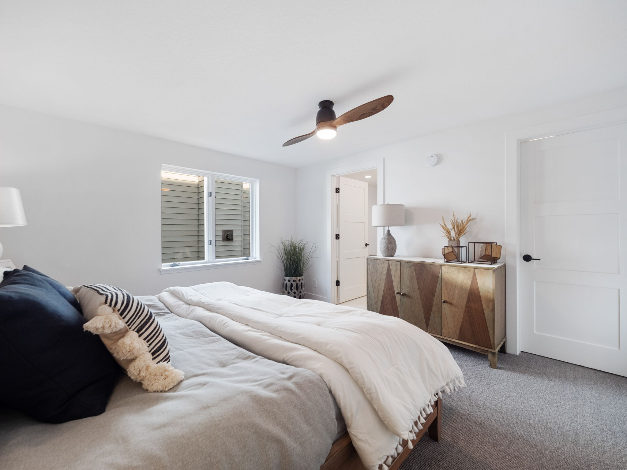
In the bedroom area, besides removing one closet, most of the upgrades were cosmetic which included new flooring, trim, paint, and scraping the ceiling. We also upgraded the fan/light to a sleeker, more modern option.
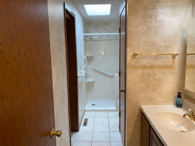
Our goal with this bathroom is to divide it and make it into two separate bathrooms, one for the owner’s bedroom ensuite and one for the guest bathroom.
See where the closet is on the right-hand side and the door is on the left? We put a wall up right there to create two separate bathrooms, one for the main level bathroom and one for the owner’s ensuite. Now, where you see the shower just past the closet is where the new owner’s ensuite bathroom is. And where the closet is, is now where the new shower/tub area is for the main level.
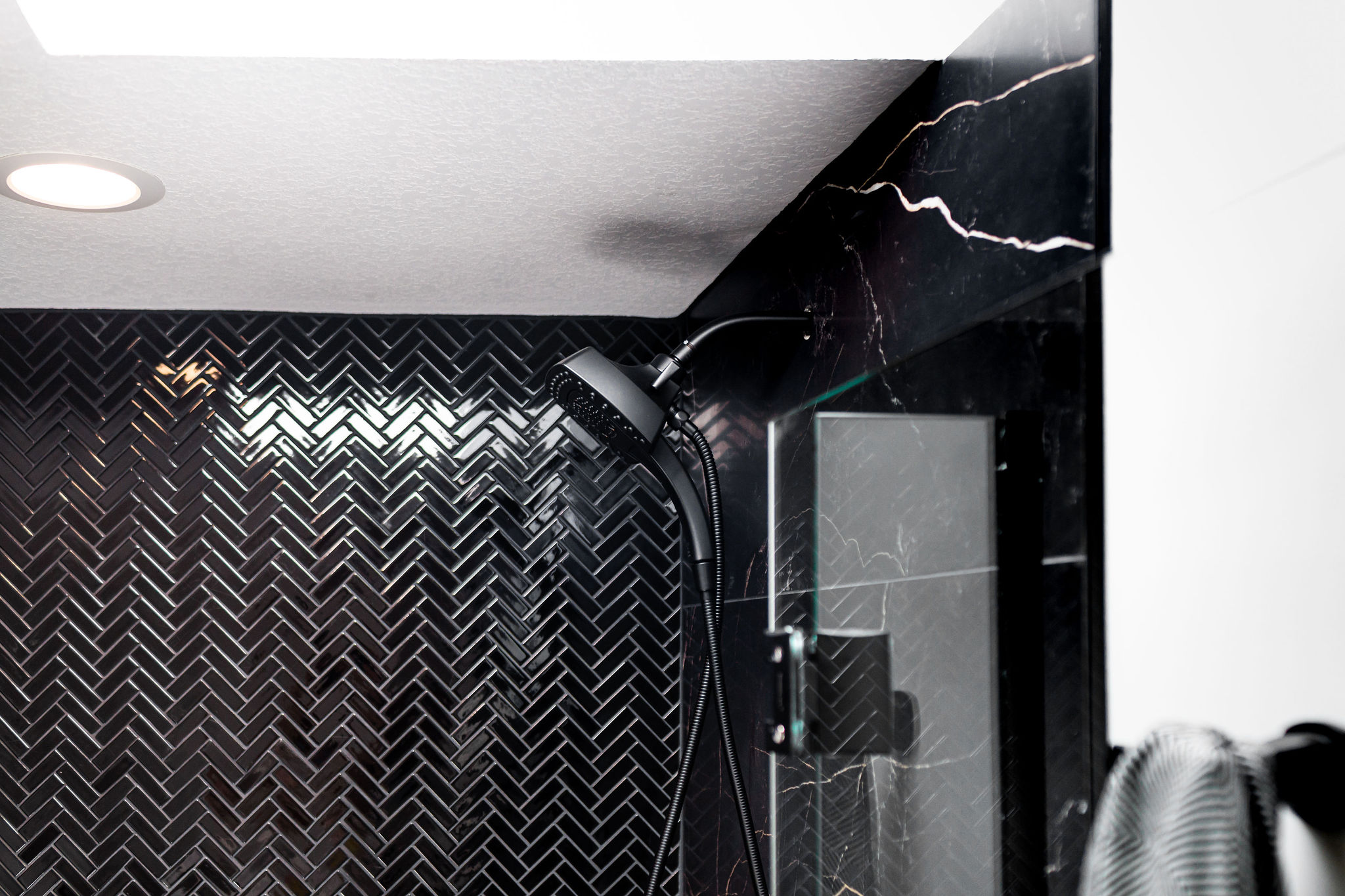
If you notice the skylight, that never changed. So you can kinda follow the new layout there. The shower area remained in the same location. We’re just now coming at the “after” angle from a different view. Where the showerhead is below, that is where we put up a wall to divide the bathrooms. So beyond that wall is the main level bath.
The Mood
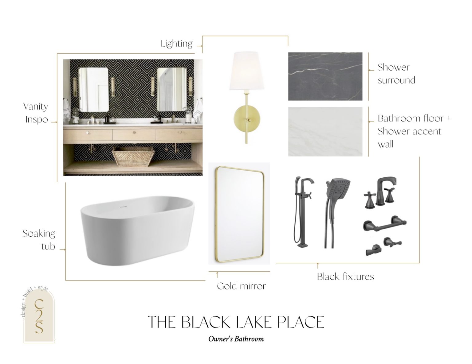
For this bathroom, we knew we wanted it to feel like a moody spa and also go more classic, but make a statement. We automatically knew we wanted to incorporate our favorite large slab tiles from Tile Shop! This is hands down one of our favorite tiles of theirs. However, I knew we didn’t want this to be utilized for all of the wall or shower floor tiles. I can’t even count how many times I went back to Tile Shop as I kept second-guessing my selections. But in the end, when I came across this herringbone tile, I fell in love and knew it was the perfect fit. And of course, complement it with gold and black fixtures throughout to play off of one another.
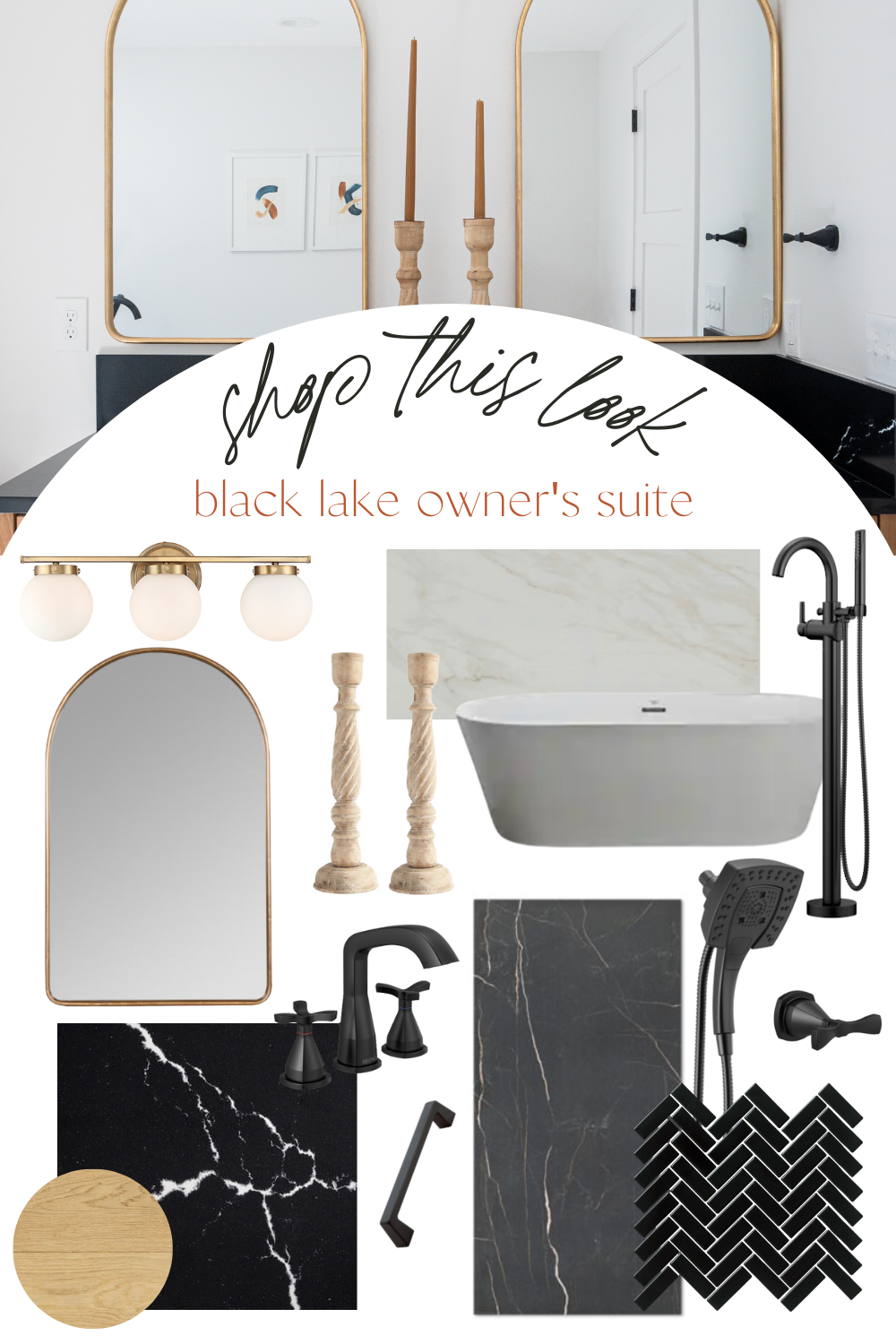
This was our mood board for the space, and we weren’t too far off when it came to the end result.
Under Construction
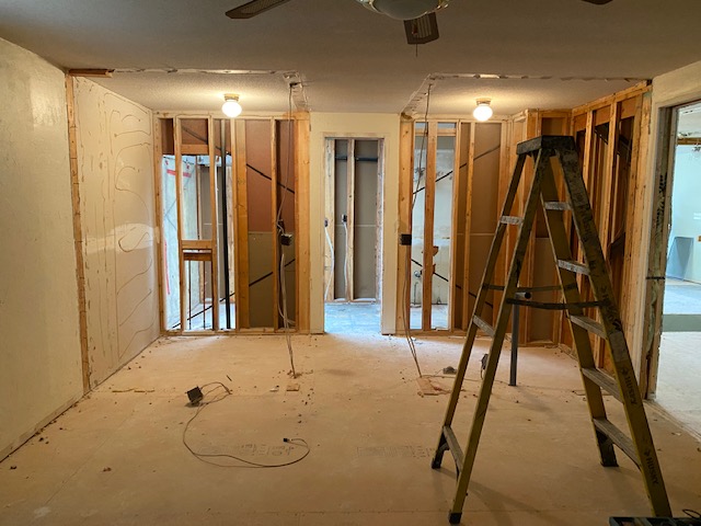
Walls came down, and we moved this floor plan around! Here you can see right in the middle below, that was formerly the entrance to the shared bathroom. Where the lights are, and as you can see the former walls in the ceiling, that was his/her closets. The left closet is where we created the new bathroom and then we opened up that wall even more and put the shower behind it, where the original shower was.
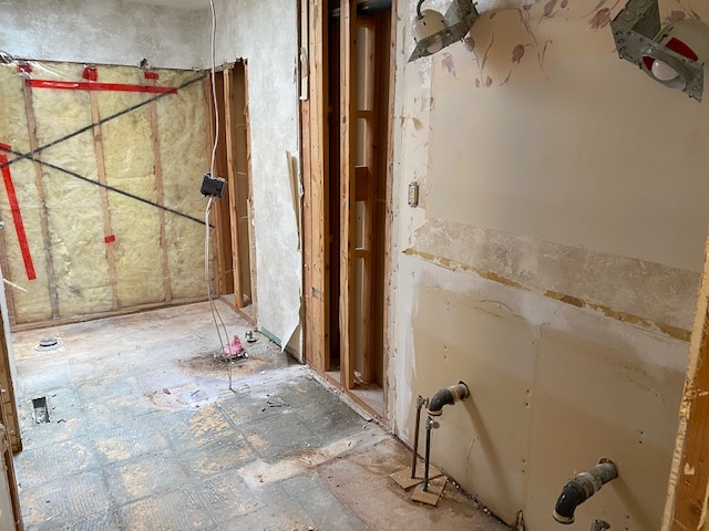
And this was the main level + owner bath all gutted out. Where the red tape is, is where the shower remained from the original to the new shower within the owner’s suite.
Owner’s Bedroom
The bedroom felt so much bigger, brighter, despite closing it off. And even though we lost space, there was still more than enough room. In the below picture, you can see the two doors: the left one leading to the bathroom and the right one leading to a walk-in closet.
For the paint color, we went with our tried and true white paint, Snowbound by Sherwin Williams to lighten up the space
We also replaced the carpet with Decorative Concepts – Boucle in Ivory, which is our new favorite wool blend carpet.
Lighting & Mirror
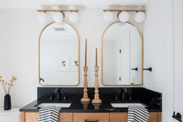
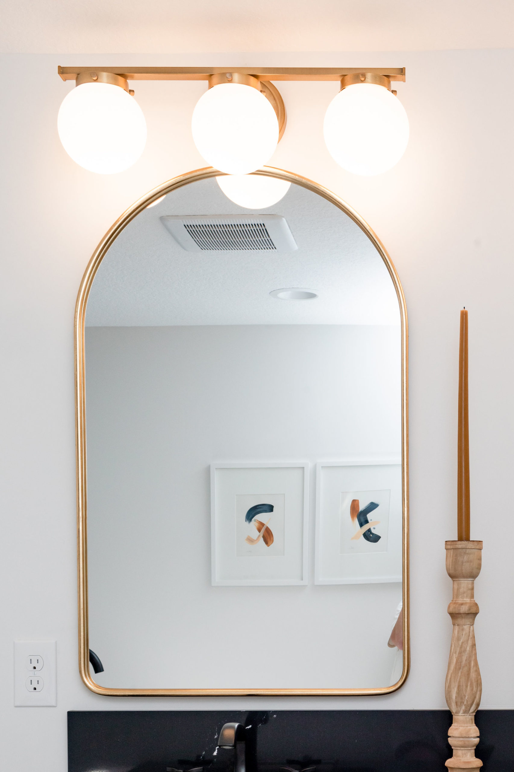
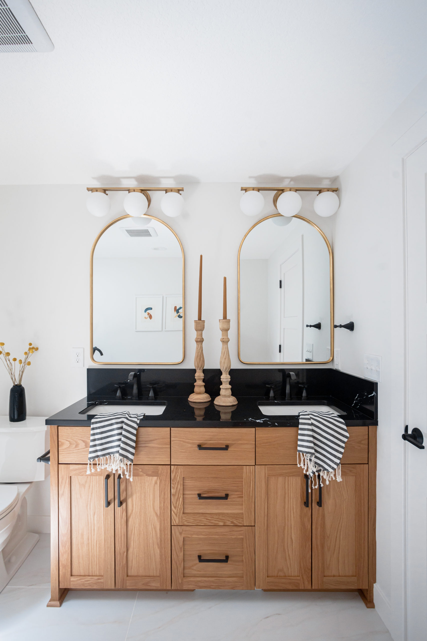
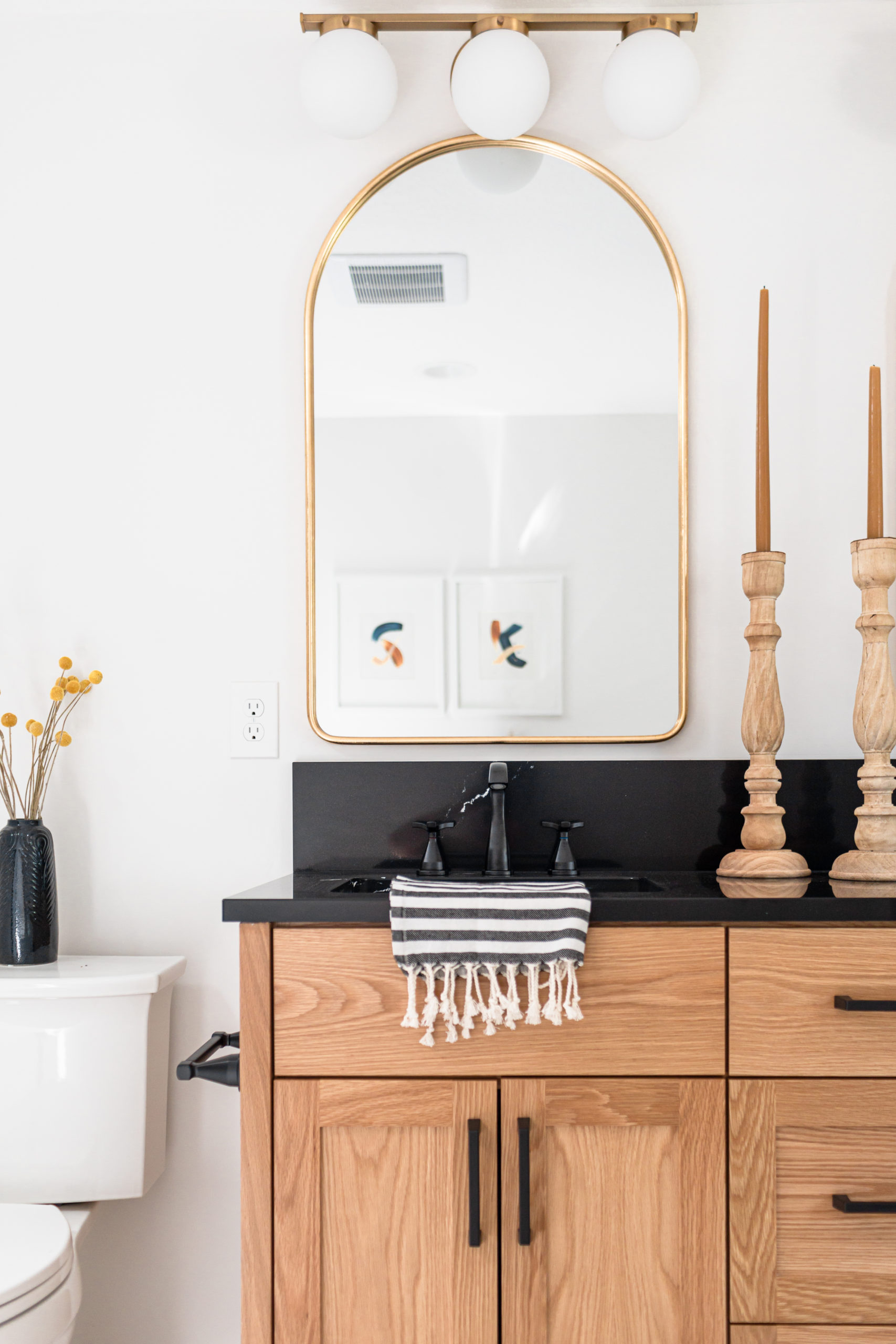
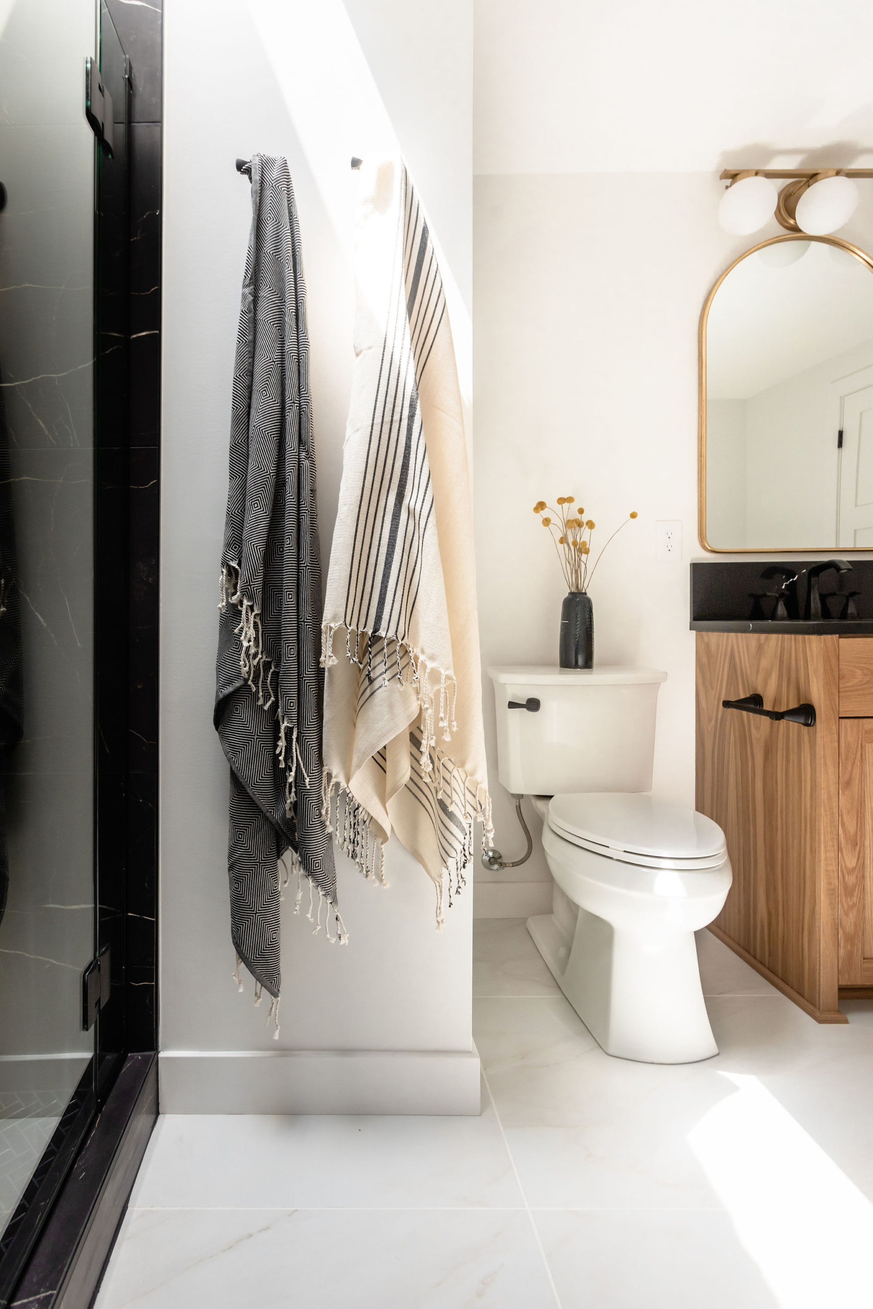
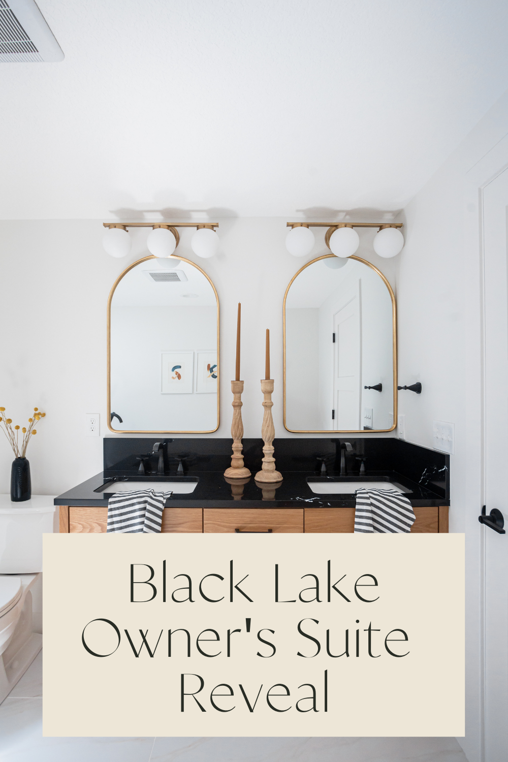
These lights are officially my new favorite for over the mirror bathroom lighting. All of the lighting within the home was from Bellacor, although national, they are a local company right here in Minnesota.
And how perfect did they complement the mirror, which we also got from Bellacor. One of our favorite places to source mirrors.
Cabinetry
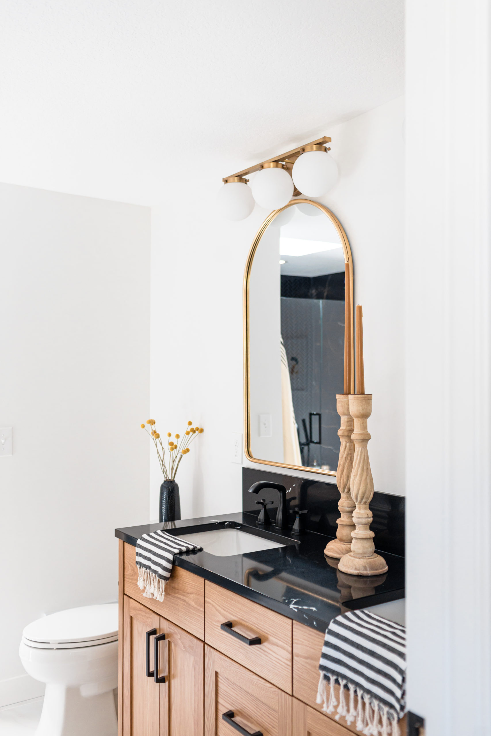
For the vanity, we worked with Regalwood cabinetry and again went for a soft, white oak. This is the exact same as the kitchen cabinetry and we couldn’t have loved them more!
Countertop
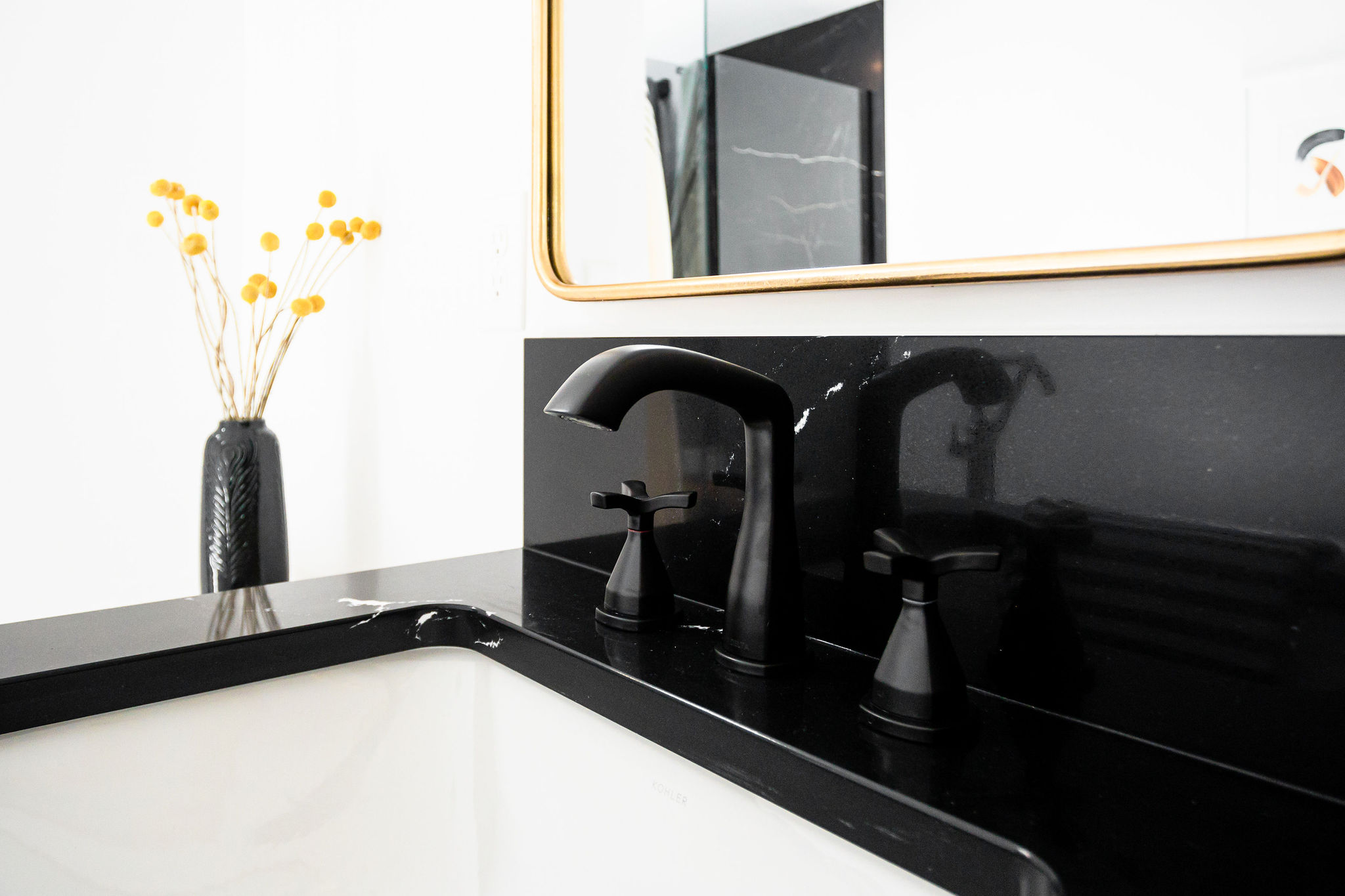
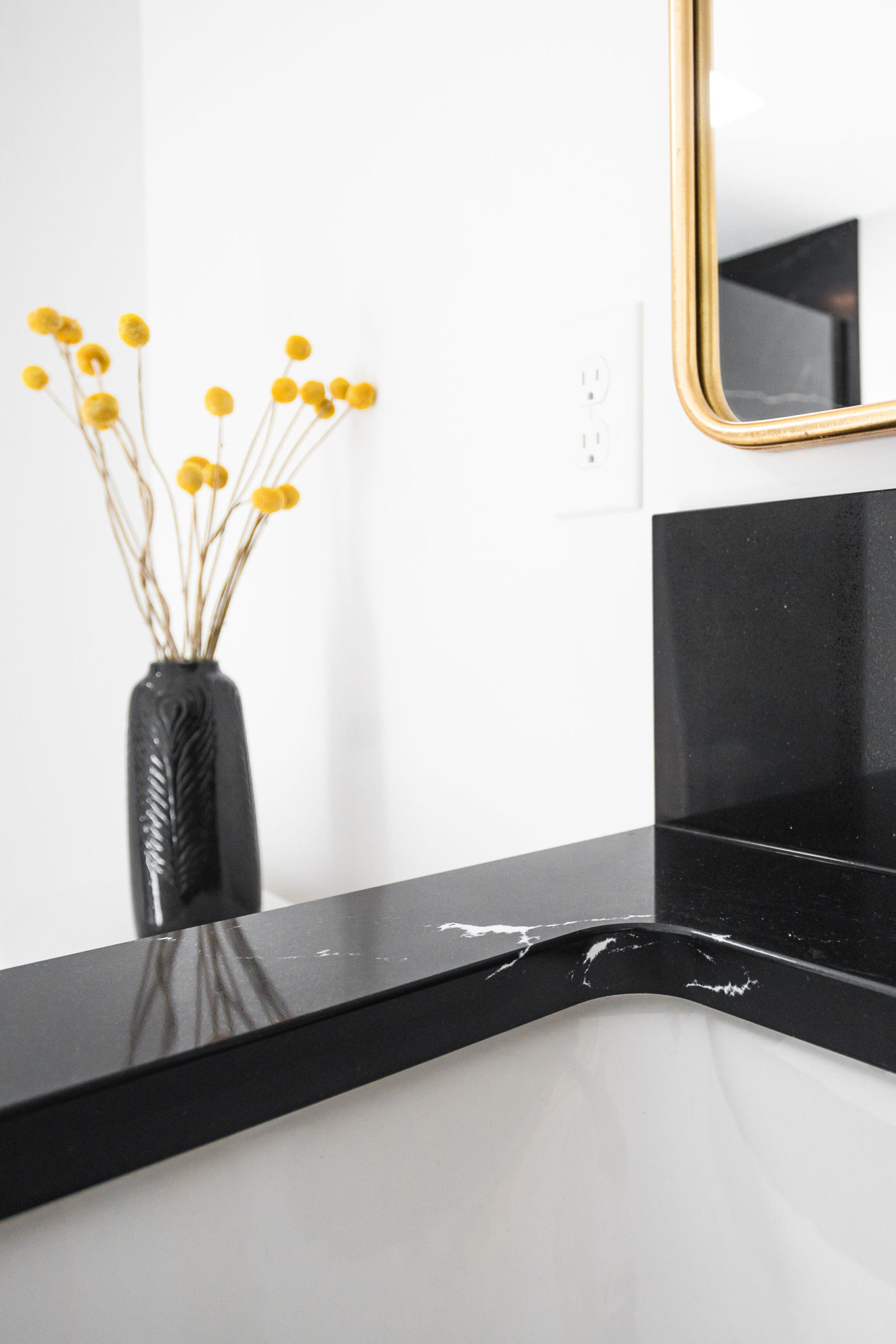
We paired the white oak vanity with another new design of Cambria’s, Blackbrook. This is definitely a new favorite of ours! As you know, if you’ve been here awhile you know we are obsessed with all things black.
White lighting dramatizes a smooth black background. Stark and chic, this high-contrast design is powerfully modern and elegantly simple.
We also got to see Select Surfaces install this and holy wow, do they have that process nailed down. Both of these companies are local, Minnesota-made, family-owned companies and that is why we love supporting them even more. However, despite that, they have the best lead times right now. Stay tuned on Instagram for some videos of c2s + the Select team walking you through the install and why we love and support these guys.
Tile
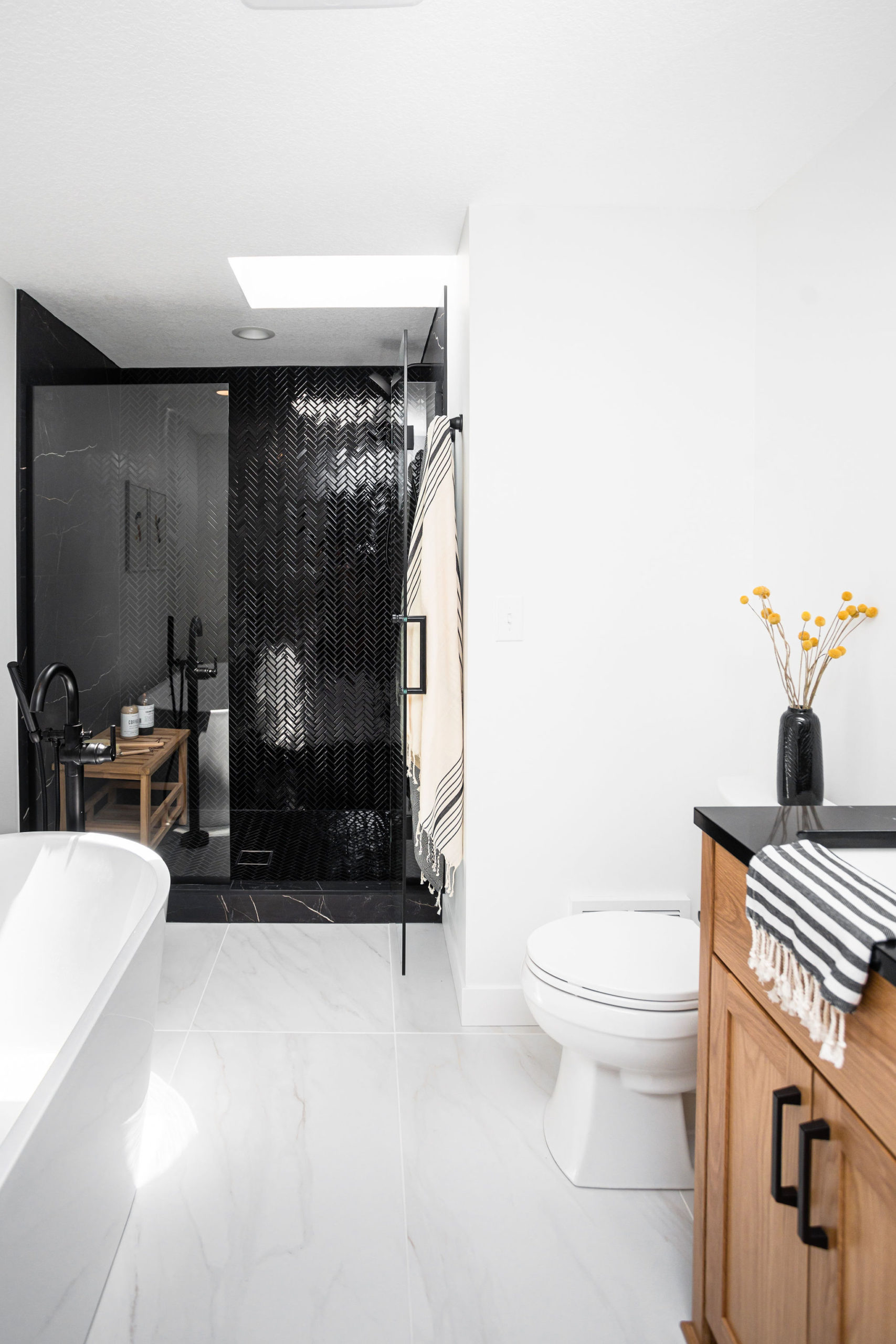
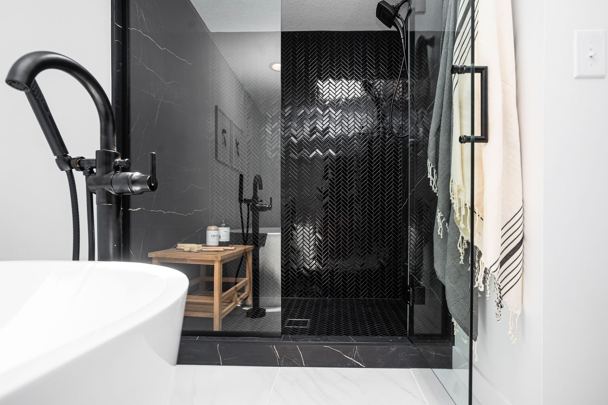
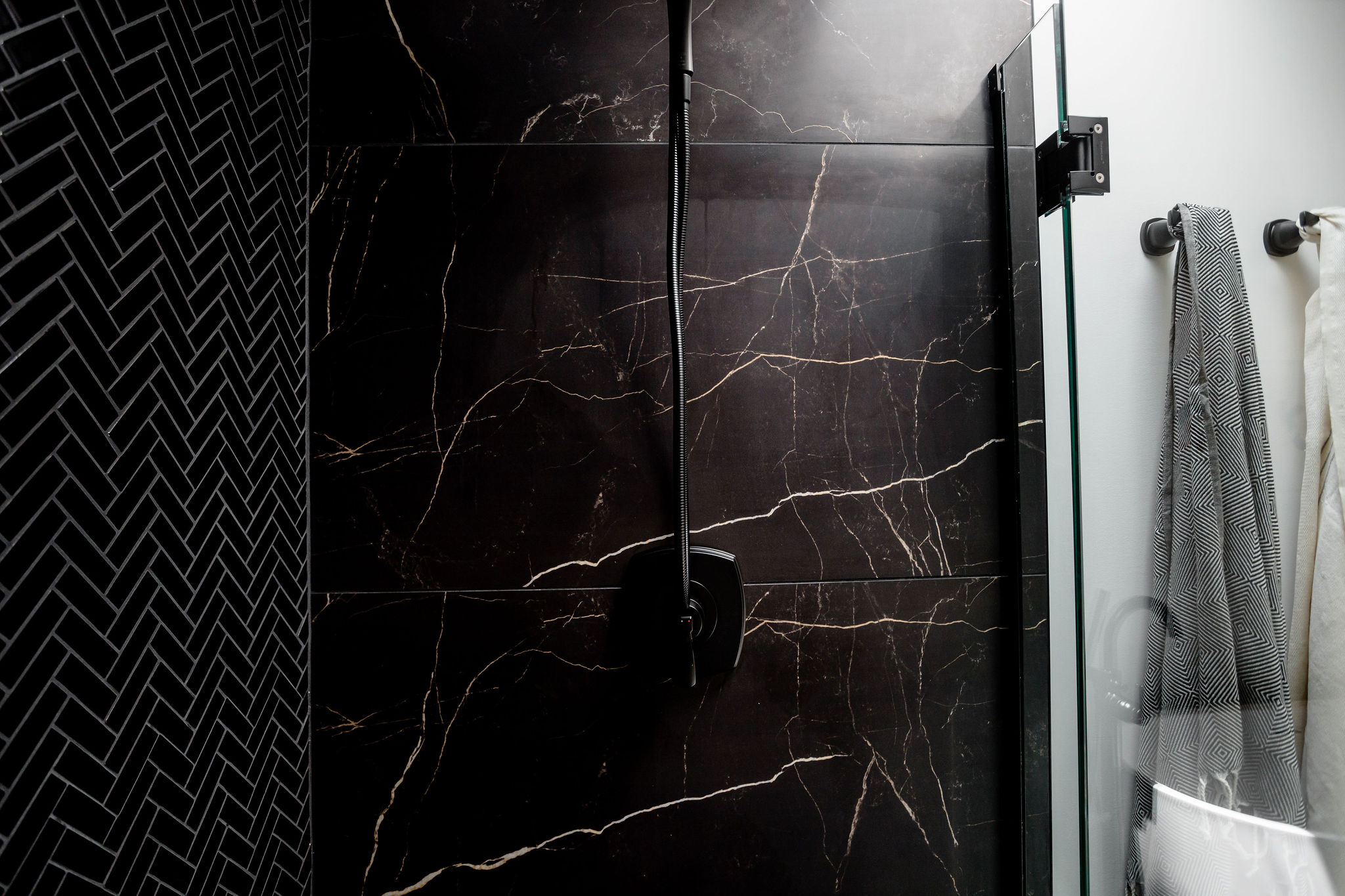
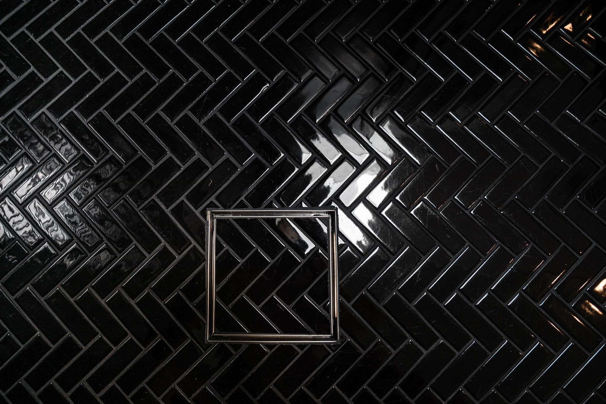
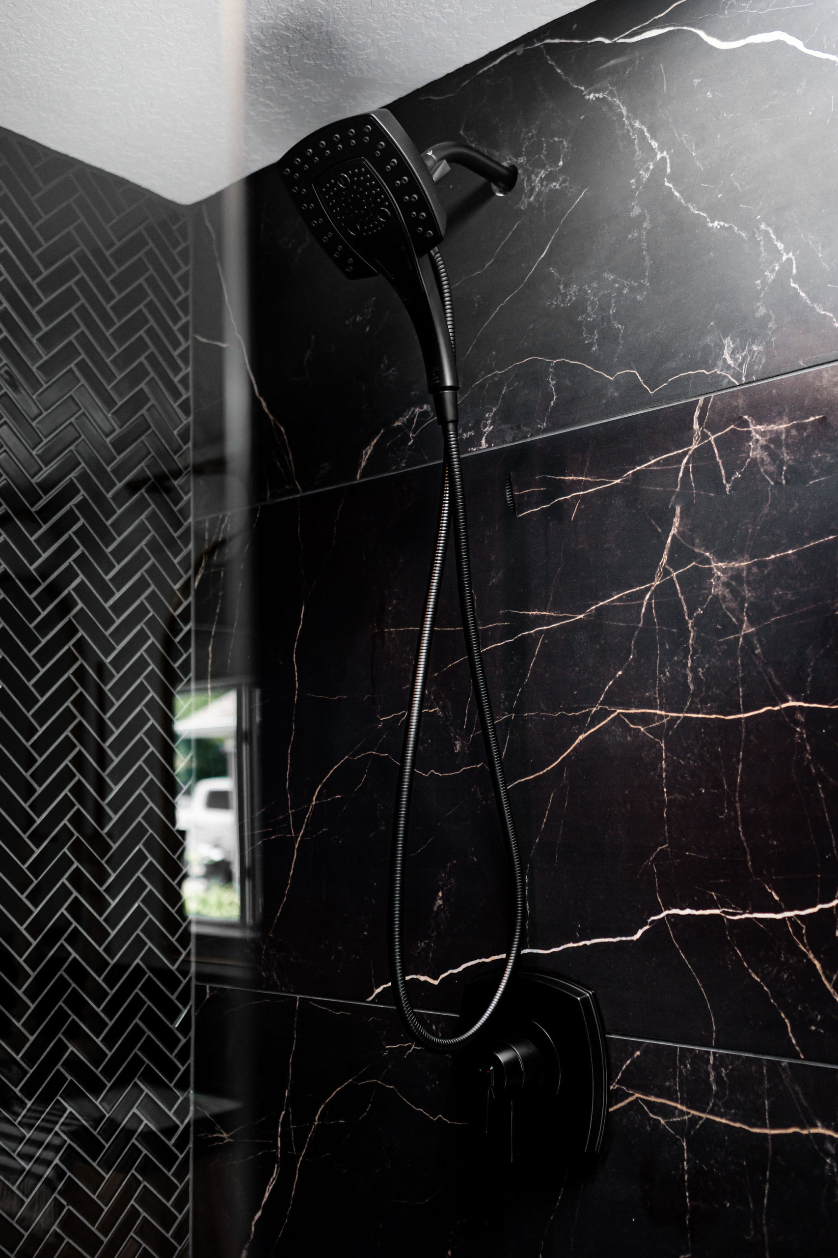
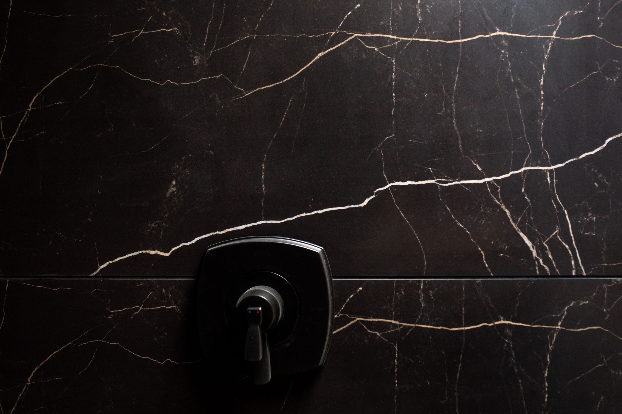
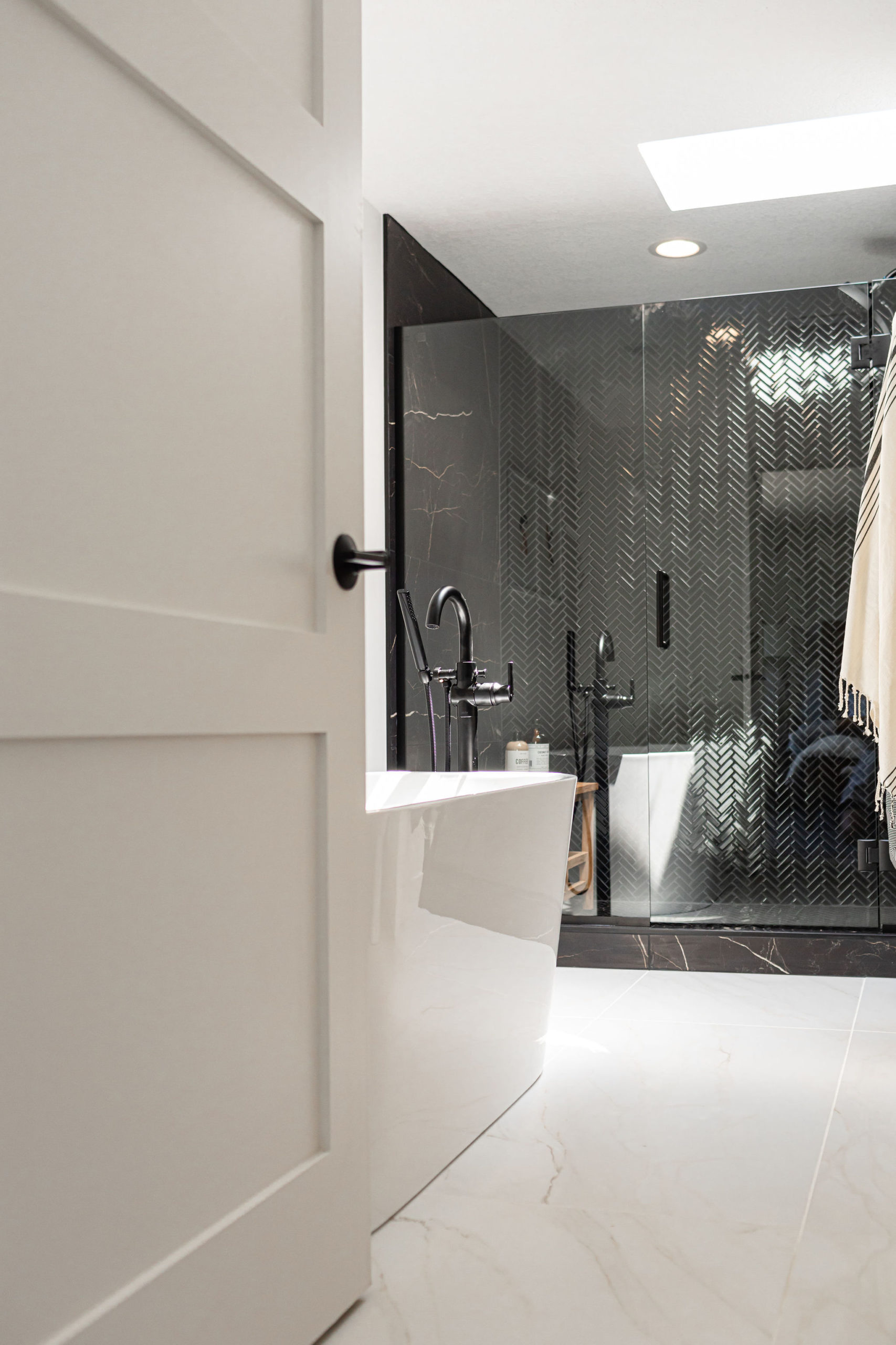
This shower is one for the books – we combined our longtime favorite large, slab tiles for the floor and shower and then wanted to go for a bold accent wall in the shower. We worked on one of Tile Shop’s new tiles, the Gloss Black Herringbone. We did this from the wall onto the floor and used the large black tiles for the curb.
Herringbone, Shower Surround | Large Black, Shower Surround Tile | Main Floor Tile
Plumbing Fixtures
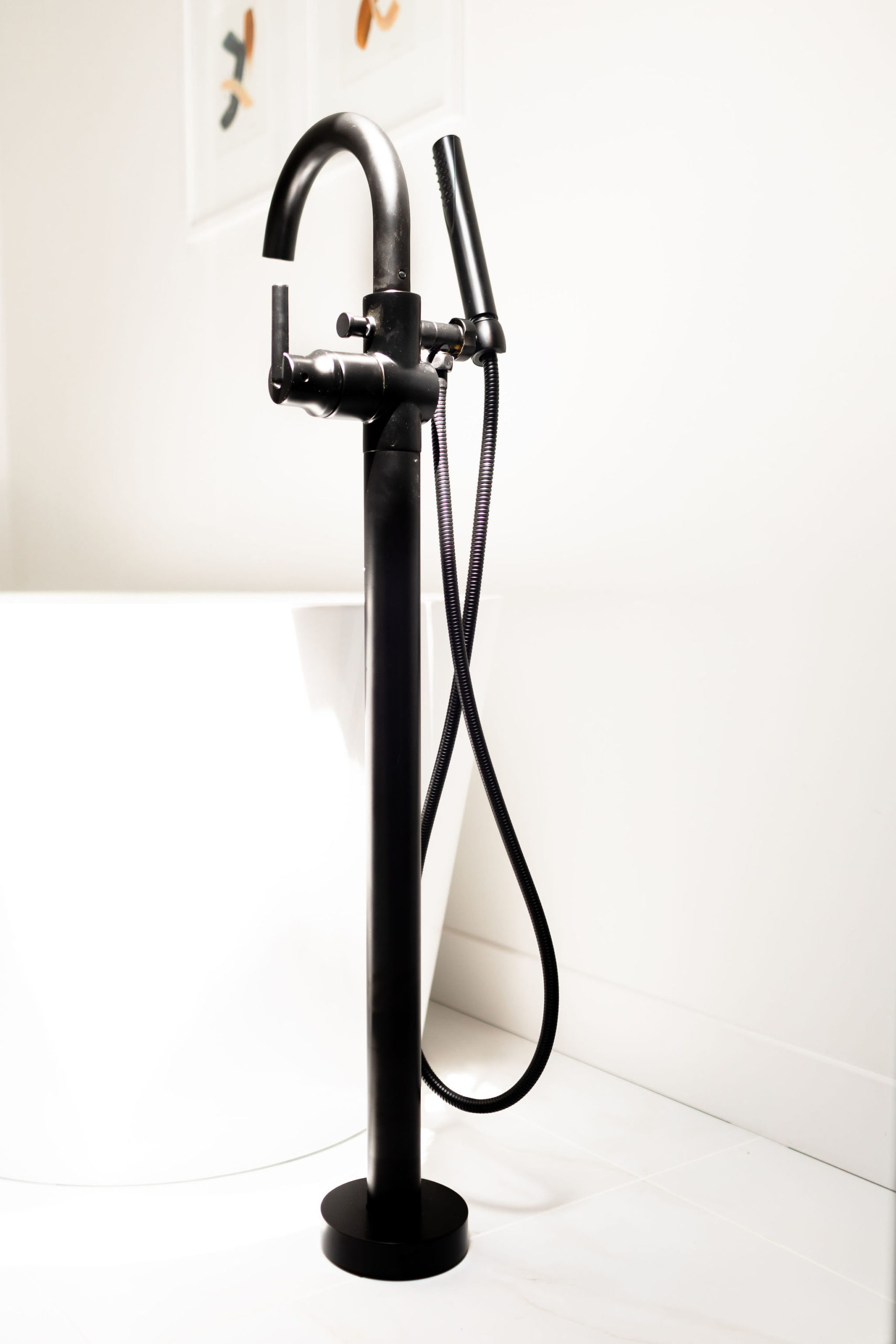
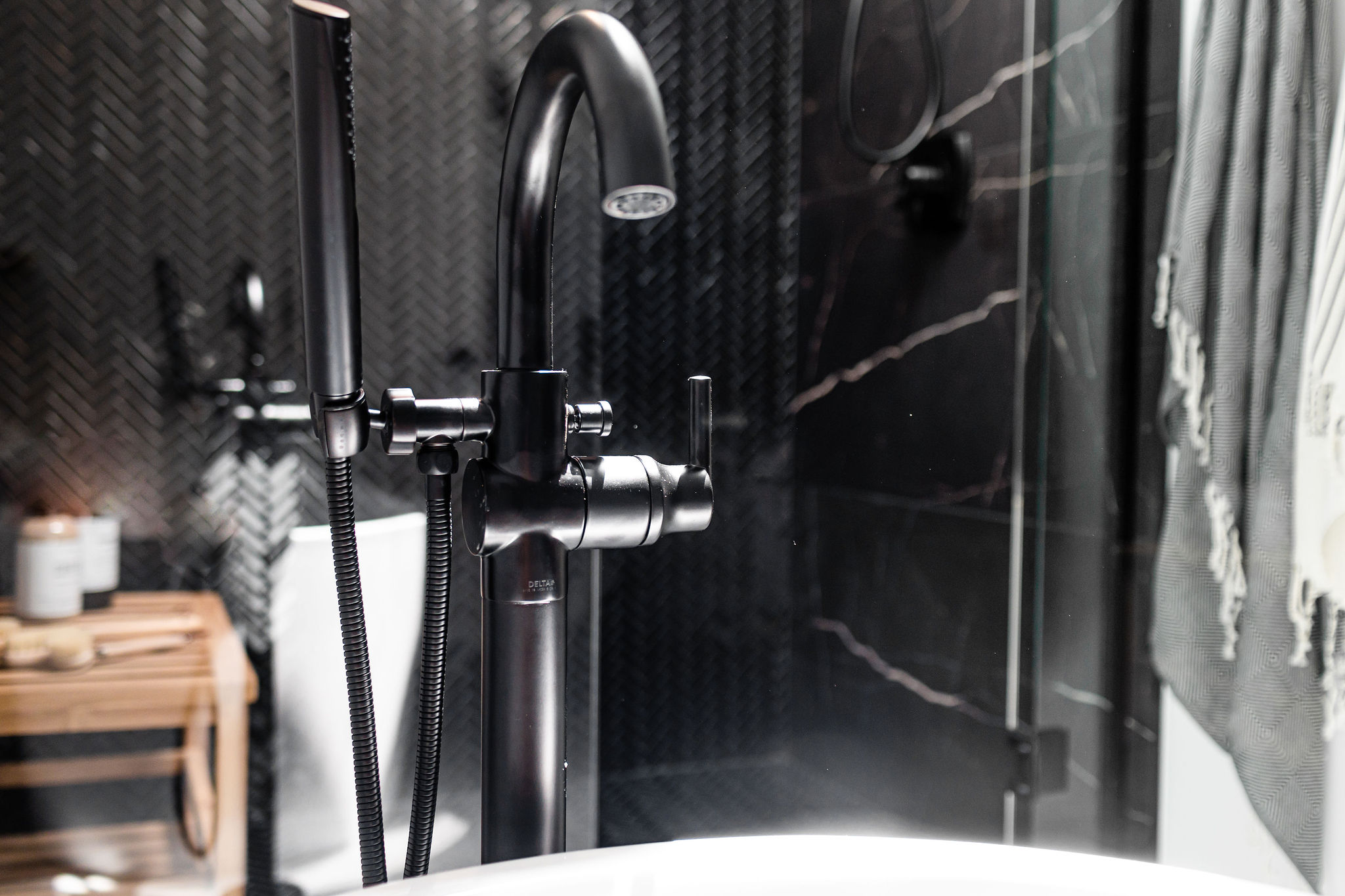
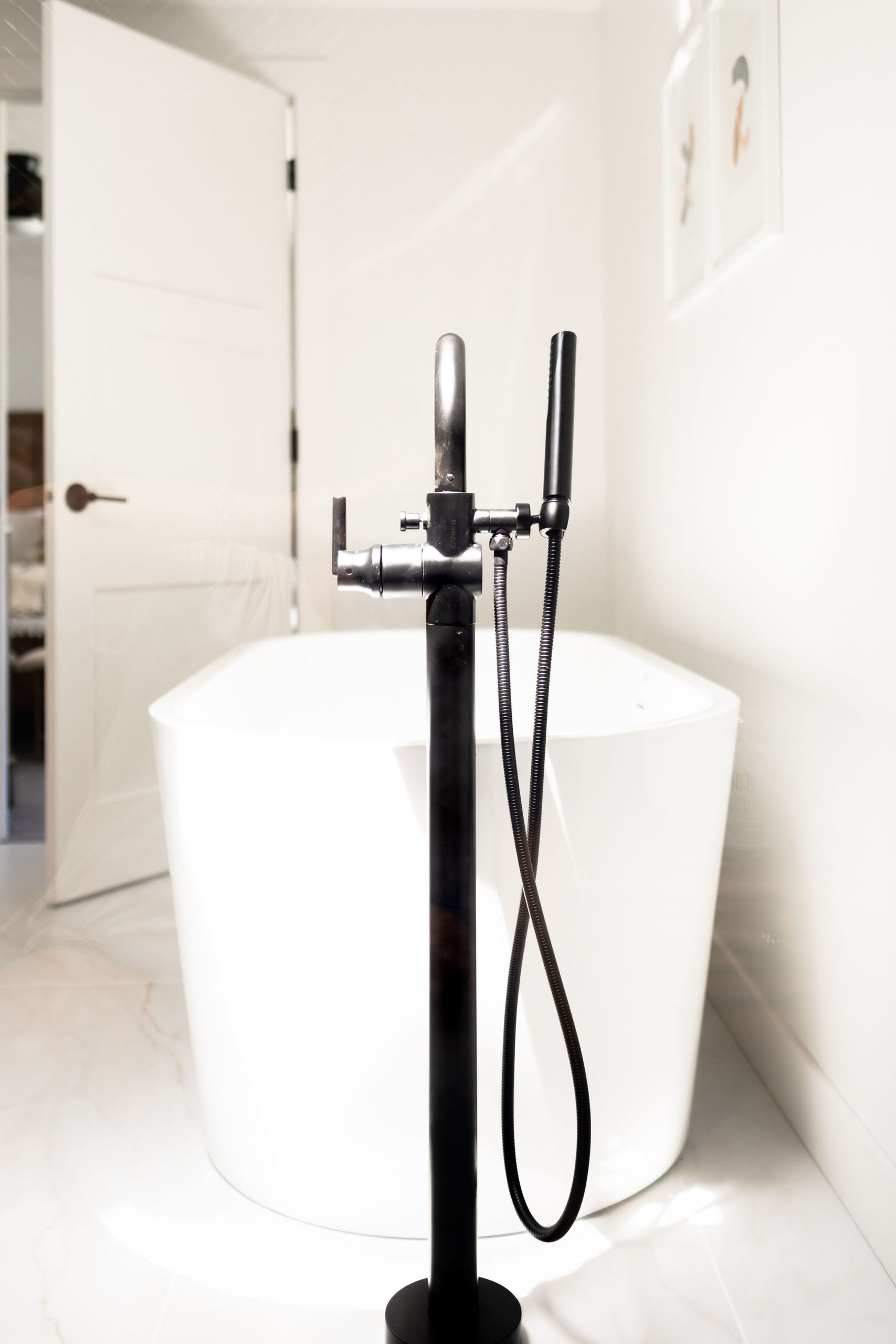
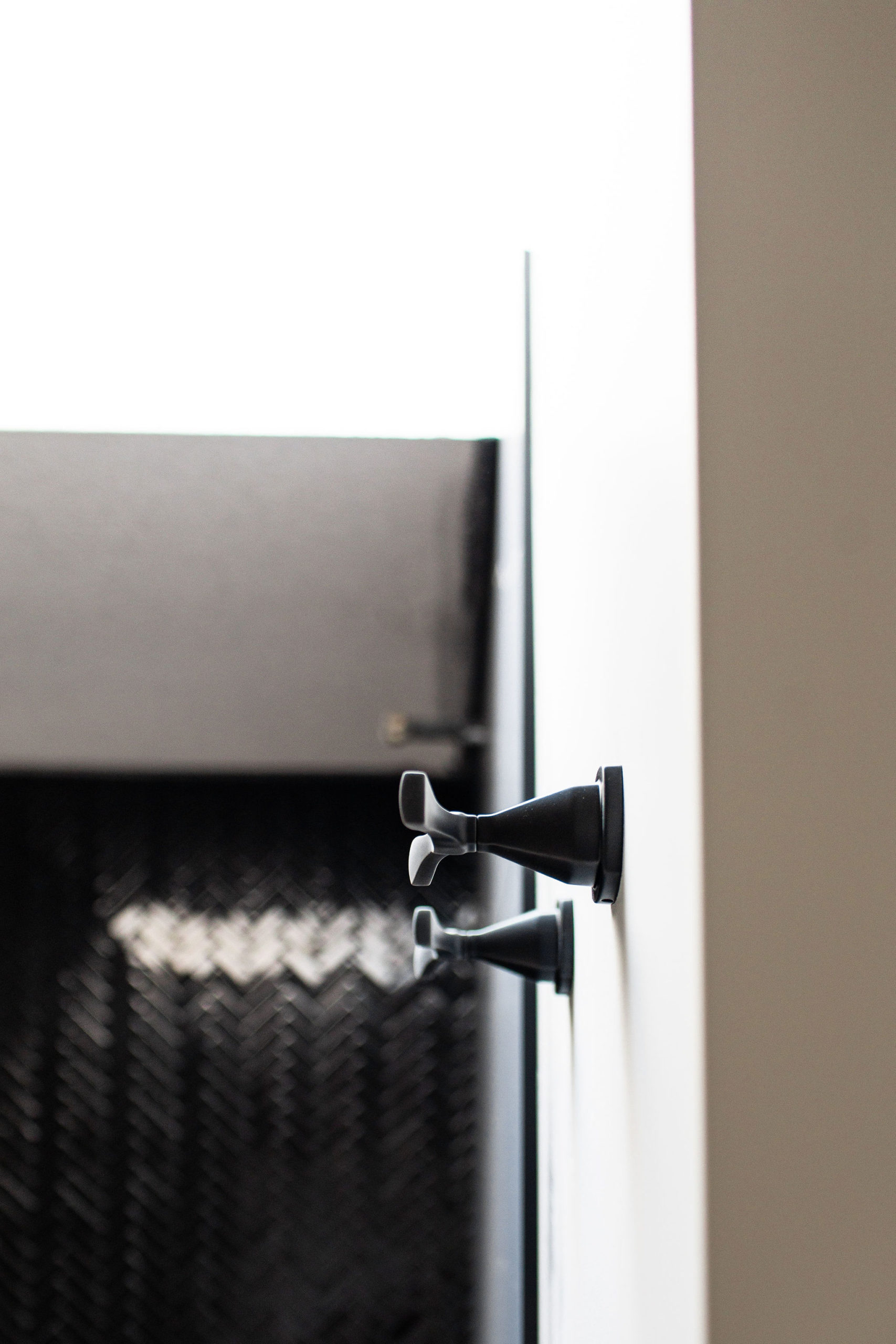
We went with the Styrke collection from Delta for the owner’s suite, one of my new favorite collections! We also went with a matte black finish.
Faucet | Tank Lever | Tub Filler | Showerhead | Towel Hook | Toilet Paper Holder |Free Standing Tub
I love the faucet hardware; with subtly upturned spout and handles, the Stryke™ Bath Collection radiates confidence and composure with an assured stature and ascending contours.
The H2Okinetic® In2ition® 5-Setting Two-In-One Showerhead is pretty cool too! This is new to the market and features a detachable hand shower, which can be used separately from or simultaneously with the showerhead.
The Jacuzzi soaker tub was another show-stopping piece in the bathroom we couldn’t get enough of, and we hope the new owners enjoy it to its full extent!
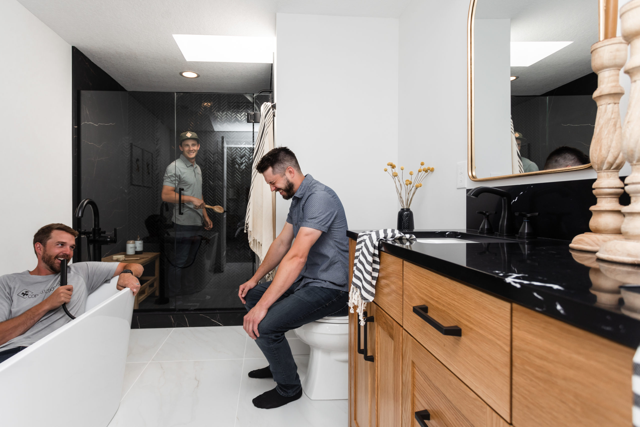
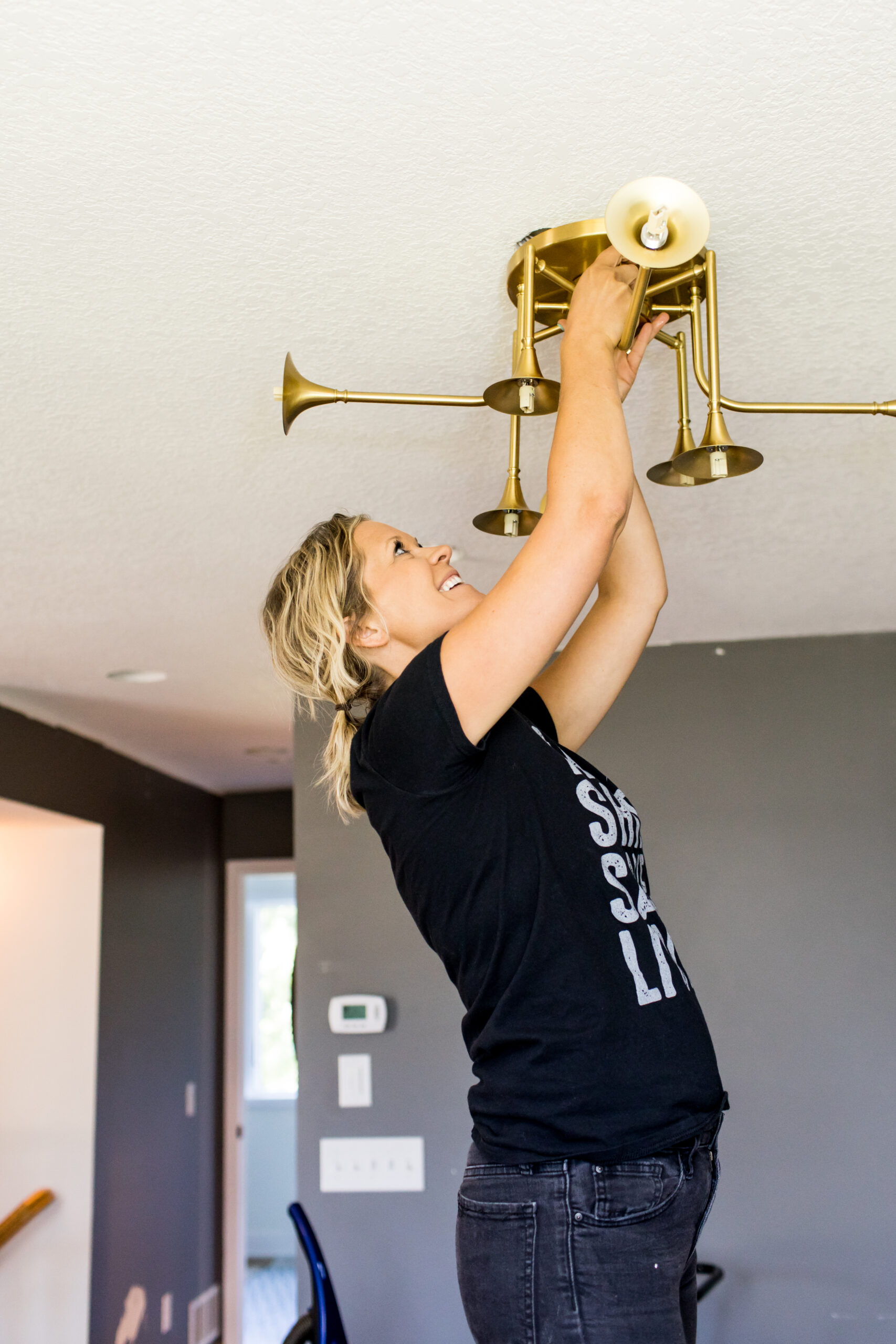
We HAD to add in this one of the guys because this is what we’re all about at c2s. We work hard but we make sure we have fun along the way, and they surely know how to have fun.
Hardware
We were all about the black hardware in this space for both the cabinetry and the interior door. For the cabinetry, we went with one of our favorites, Amerock Blackrock which is a 5-1/16 inch center to center pull. One of my biggest things with bathroom cabinetry hardware is to ensure the ends are enclosed in the cabinets. Speaking from experience with our owner suite where this is not the case and I can’t count how many times I get my blow dryer or curling iron cords hooked on them!
For the main entrance interior door, we did this hardware, which was a nice black, sleek, and clean modern design. It’s a door handle we have in our home that we use often.
Shop This Look
1. Hardware | 2. Mirror | 3. Lighting | 3. Sink | 4. Herringbone, Shower Surround | 5. Shower Surround Tile | 6. Main Floor Tile | 7. Sink Faucet | 8. Shower Faucet | 9. Freestanding Tub | 10. Tub Filler | 11. Towel Hooks | 12. Toilet Paper Holder | 13. Candlesticks | 14. Black Vase | 15. Yellow Craspedia Bunch | 16. Striped Hand Towels 17. Main Interior Door Hardware 18. Countertop | 19. Kisa Towels


5 thoughts on “Black Lake Reveal | Owner’s Suite”
Comments are closed.