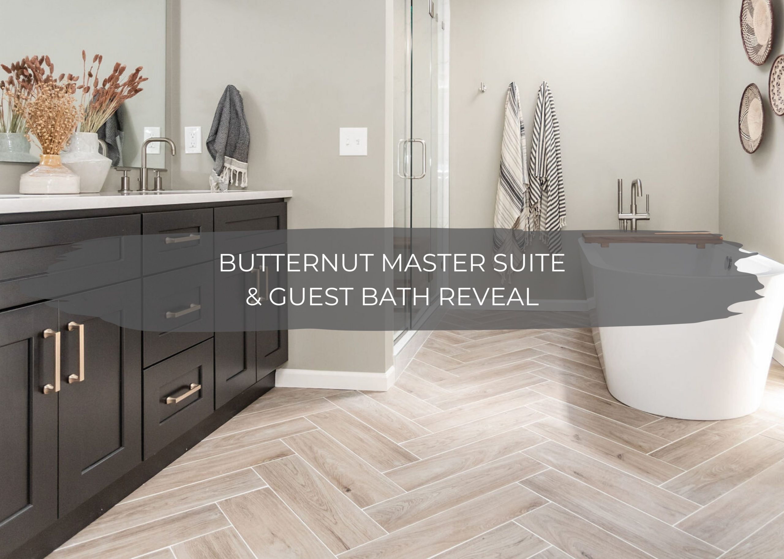
Today is the day for the reveal of the Butternut Master Suite & Guest Bath Reveal!
Our client-first reached out to us last summer wanting to simply refresh multiple rooms in her home with fresh paint colors and furnishings. After that design project was complete, we started talking more about some major construction within the master bathroom and guest bathroom. We got to planning out these spaces right away and shared the designs for this project back in December. Once construction was complete, our client also hired us to do all of the styling.
We finished construction on this project right before COVID hit, but because of the coronavirus we had to put the styling on hold on now just this past month, it’s finally all complete!
And now, the best part about any project, it’s time to reveal the before & afters!
Master Bathroom
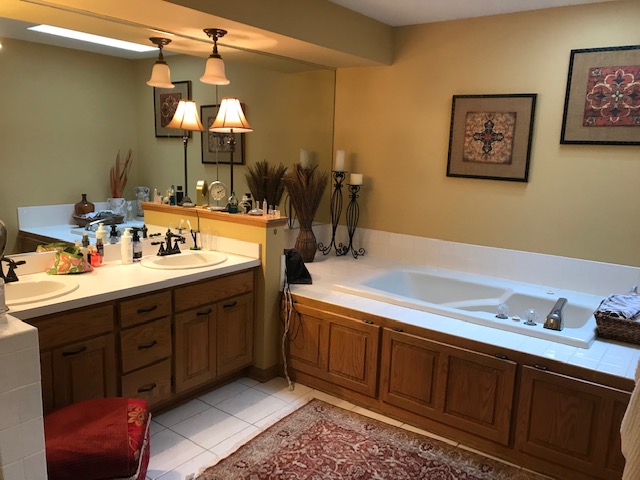
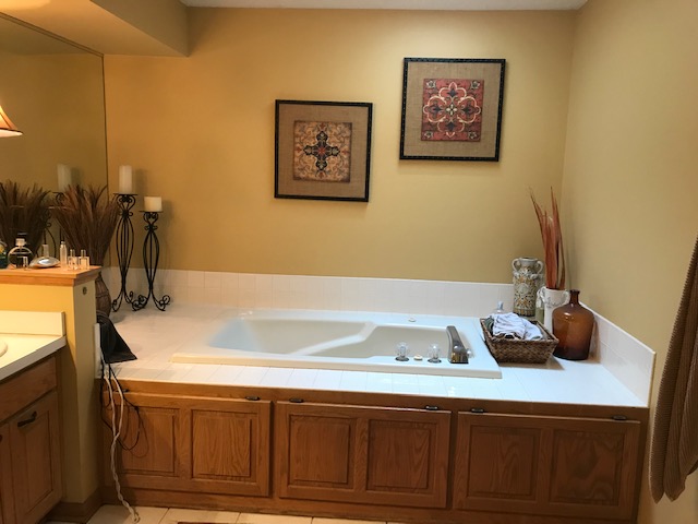
Before with Jacuzzi Tub
In the master bathroom, our client had a large tub and surround that took up so much space in the bathroom and was rarely used. Even though there were two vanities, they were cramped and there was a lot of unnecessary waste. The half-wall and soffit made the space feel very divided.
After Tub Removal
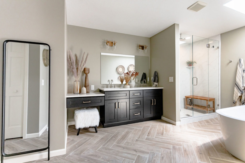
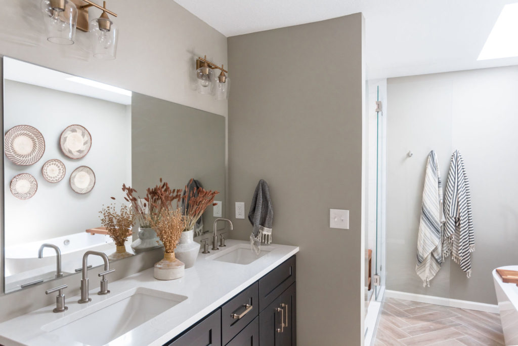
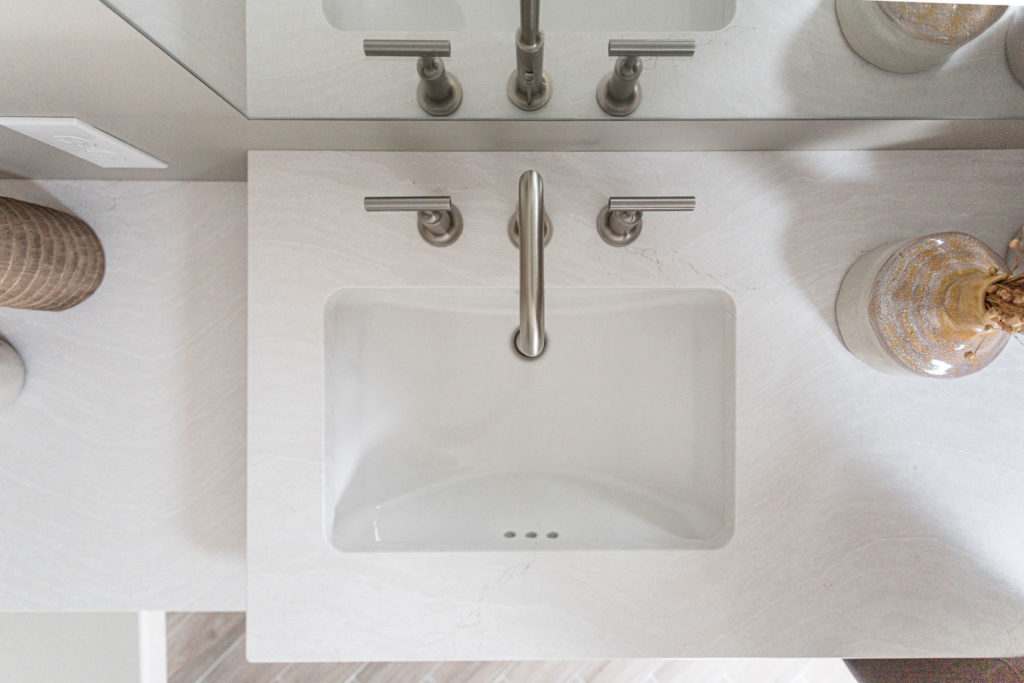
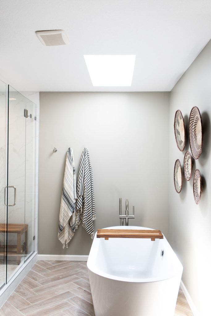
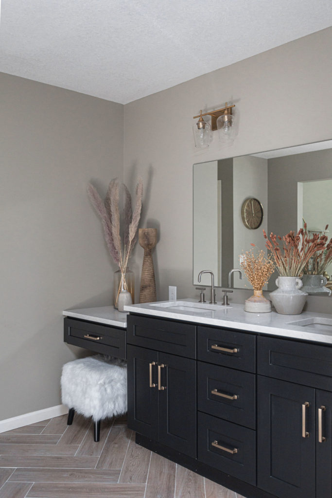
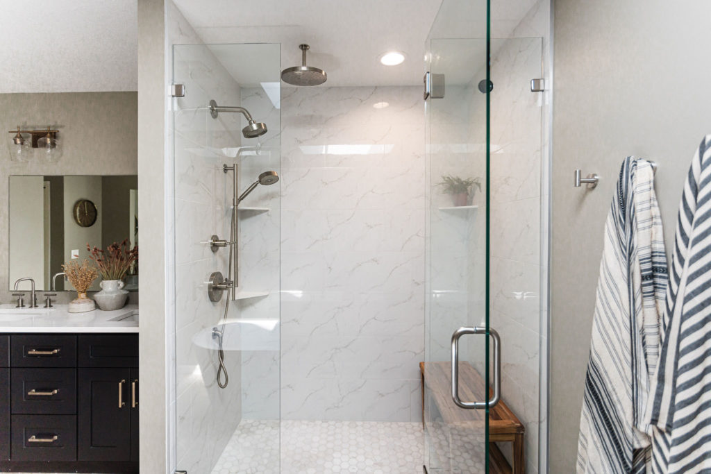
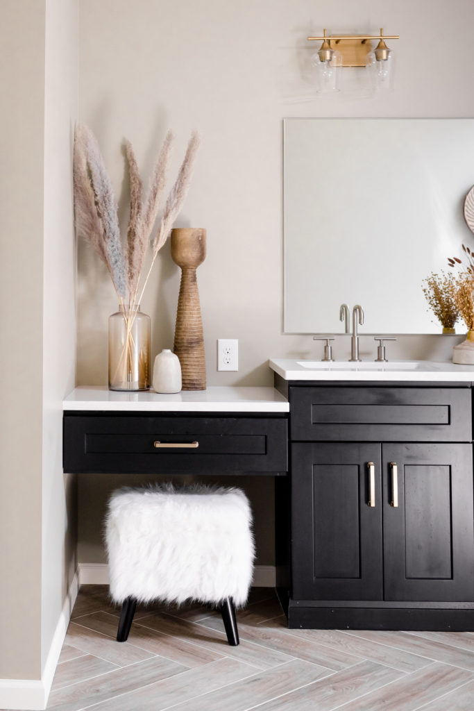
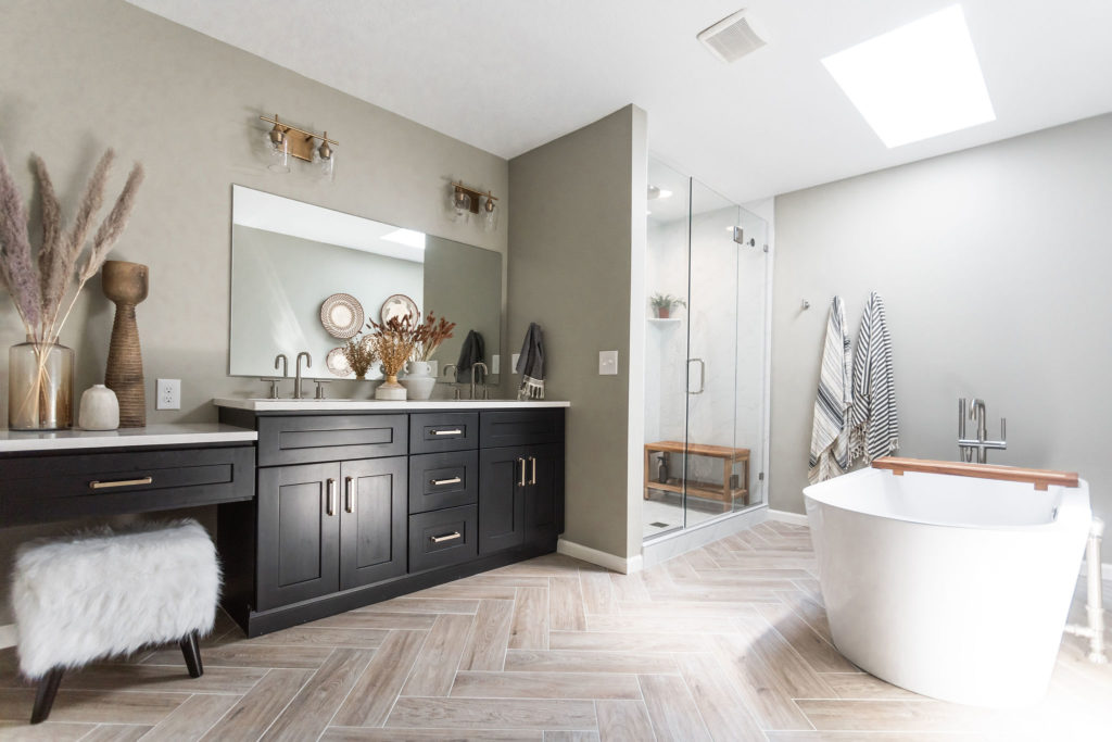
By removing the jacuzzi tub, soffit, and half walls, this bathroom got a new layout that is much more functional for our client and her lifestyle. Instead of a small shower and built-in tub, the new space has a large walk-in shower and freestanding tub. The space between the shower wall and toilet room has a double vanity with quartz countertops, under-mount sinks, and Kohler sink faucets, which provides storage and a space for a makeup vanity.
Getting rid of the large tub and surround immediately made this side of the bathroom feel so much bigger.
Before…
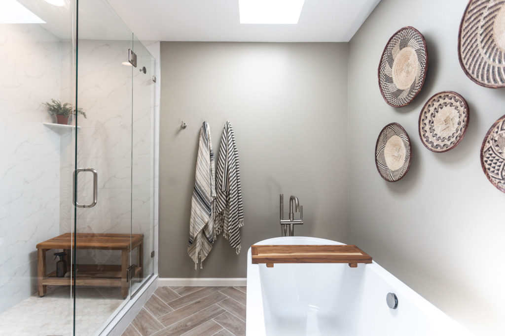
After…
A freestanding tub with a freestanding tub filler makes the tub truly a show stopper in this bathroom. We love it when our clients want to incorporate their style into their spaces and these baskets are such fun! Our client loves to travel the world and wanted to incorporate pieces that remind her of those travels, so she found these basket weavings from Africa on Etsy and they’re the perfect complement to the design. Towel hooks provide a spot for hanging towels for either the tub or shower.
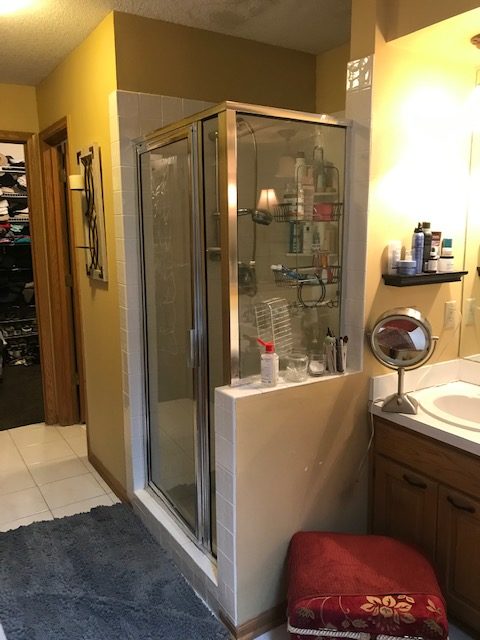
Before Shower
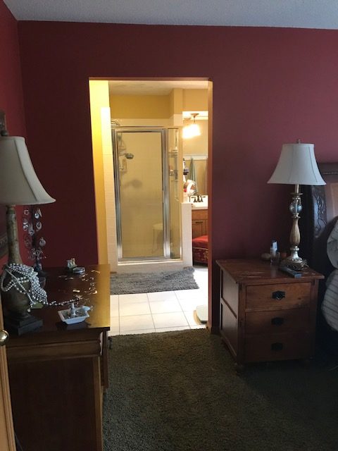
The previous shower was small, again, making it feel cramped and dark. It was also visible from the master bedroom as there is an open doorway from the bedroom into the bathroom, instead of a door. Our client likes having the open concept from the master bedroom to the bathroom but wanted to make the view more appealing.
After Removal of Shower
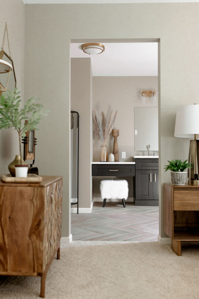
Now, the view from the bedroom is of the makeup vanity. This space provides more countertop space and storage for getting ready and allows for a fun view when entering the bathroom. The makeup vanity was a must on our client’s want list and when we went back to the style she said it was one of her favorite things about her new bathroom space, she could sit there for hours and relax.
Shower Details
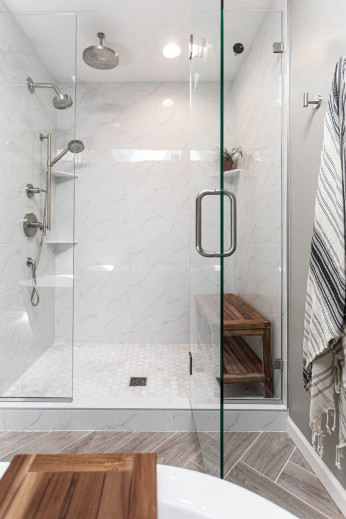
The shower was placed where the jacuzzi tub was once. And in the shower, a porcelain marble look tile not only has a lower price point than actual marble and it gives that luxurious look, without needing to worry about maintenance. The shower floor is a marble hexagon tile that has greys and tans to compliment the shower walls and tile floor. We love incorporating benches into showers and this teak bench fits the space perfectly. You can find more teak options for your bathroom here!
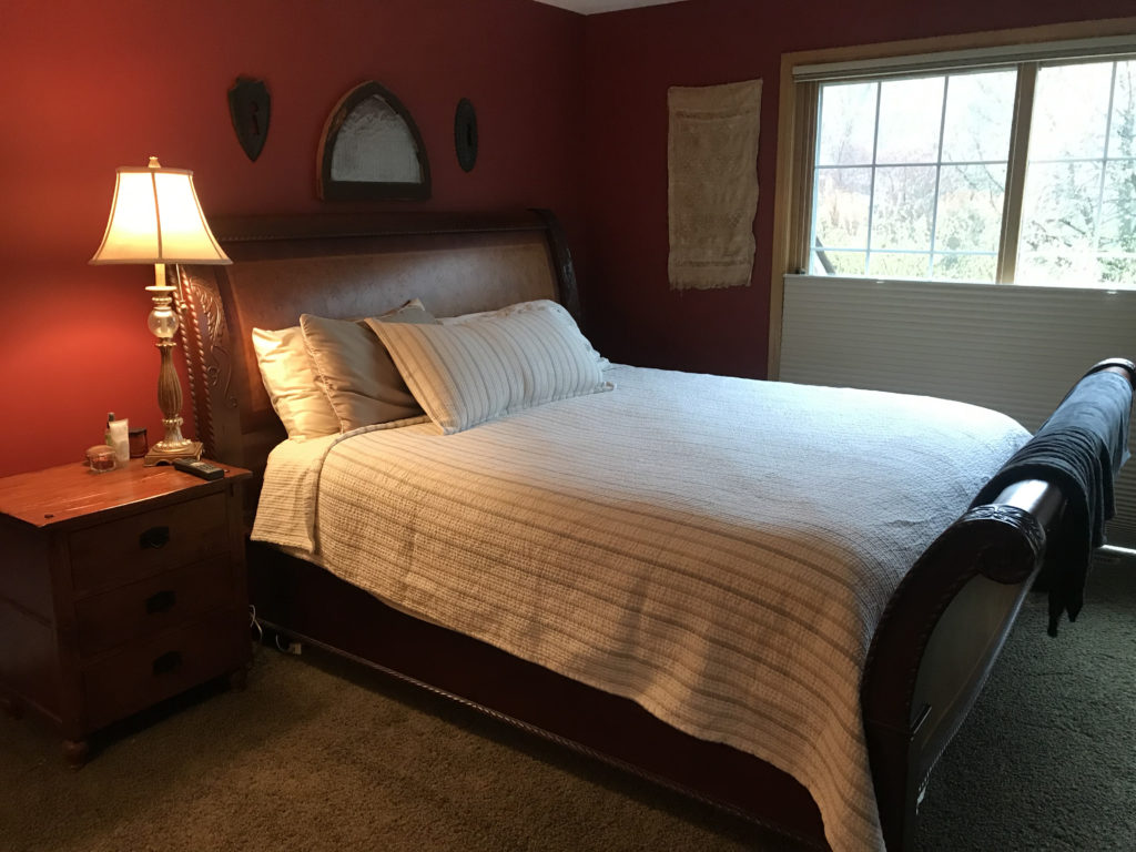
Before Bedroom View into Bath
The previous bedroom had green carpet and red walls that had to go. Below you can see how the view from the doorway was of the shower and made the bathroom feel much smaller than it is.
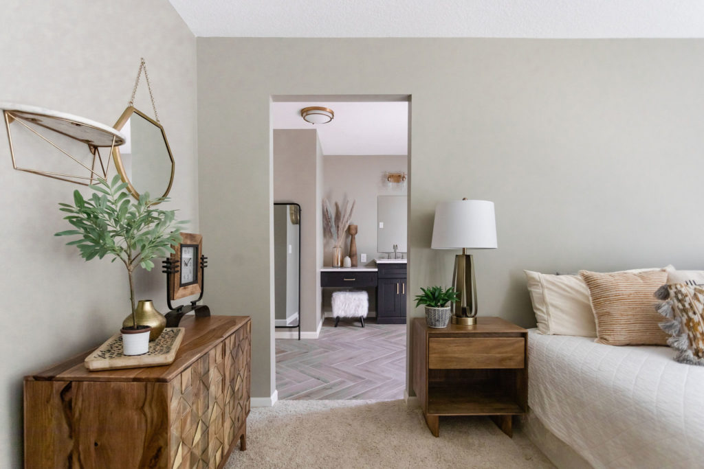
After Bedroom View into Bath
Now, with a fresh coat of paint and updated carpet, the bedroom looks brand new. The view from the doorway also got a major upgrade with the makeup vanity. Plus, how cute is the little stool in there?! We love how the bedroom and bathroom styles flow together and make this master suite feel like one large space.
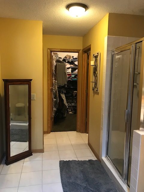
Before Closet View
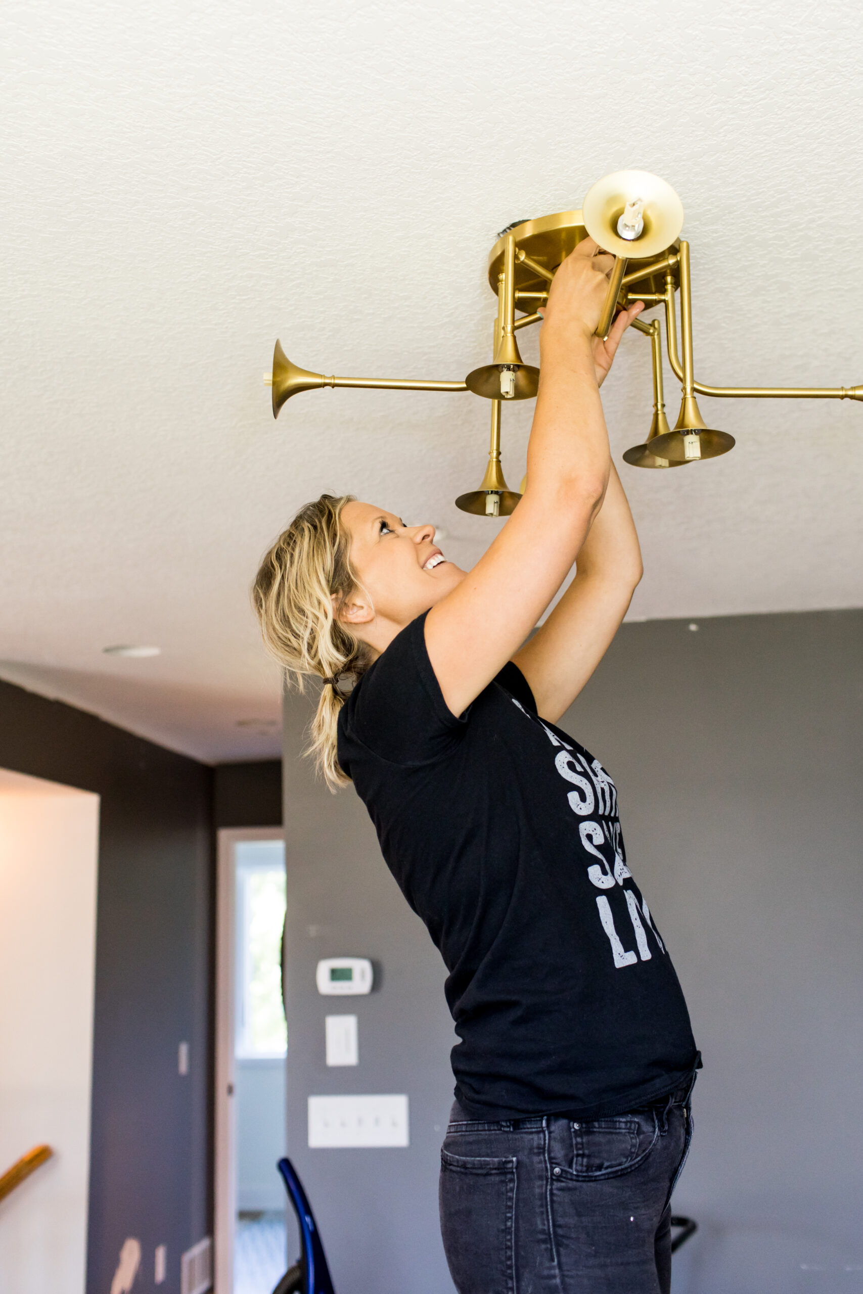
Other updates in the bathroom included removing the popcorn ceiling, all new lighting, new trim, and painted doors.
And can we talk about that boob light? You all caught our blog post on how much we love to update those, right?!
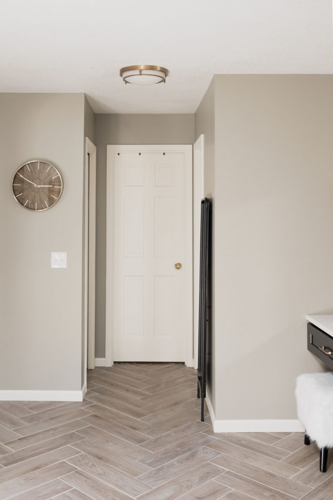
After
This view looks so fresh! The wood-look herringbone floor tile draws attention to the floor and makes the space feel bigger as well. A new gold flush mount light ties into the gold sconces above the mirror. For more flush mount options, you can find our favorites here!
Master Bedroom
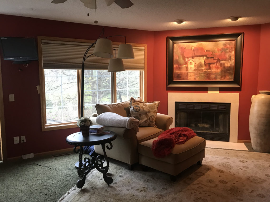
Before Fireplace
The master bedroom was very dark with the green carpet and red walls and our client was looking to give this space a fresh feel. We included some new furniture pieces and use furniture she already loved to give this room a new look.
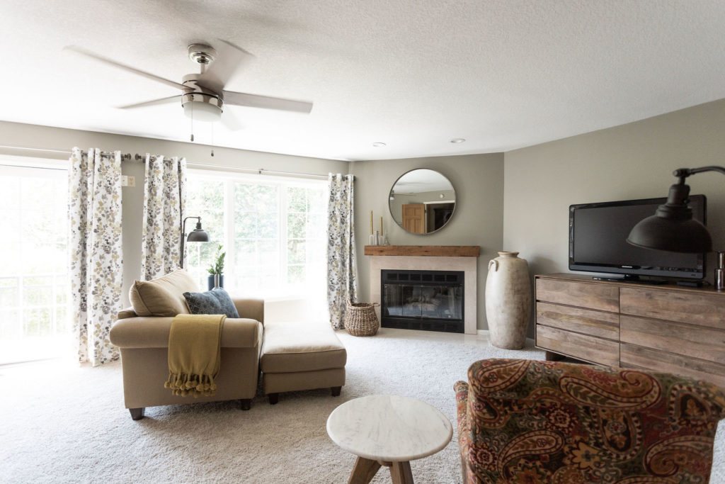
After Fireplace
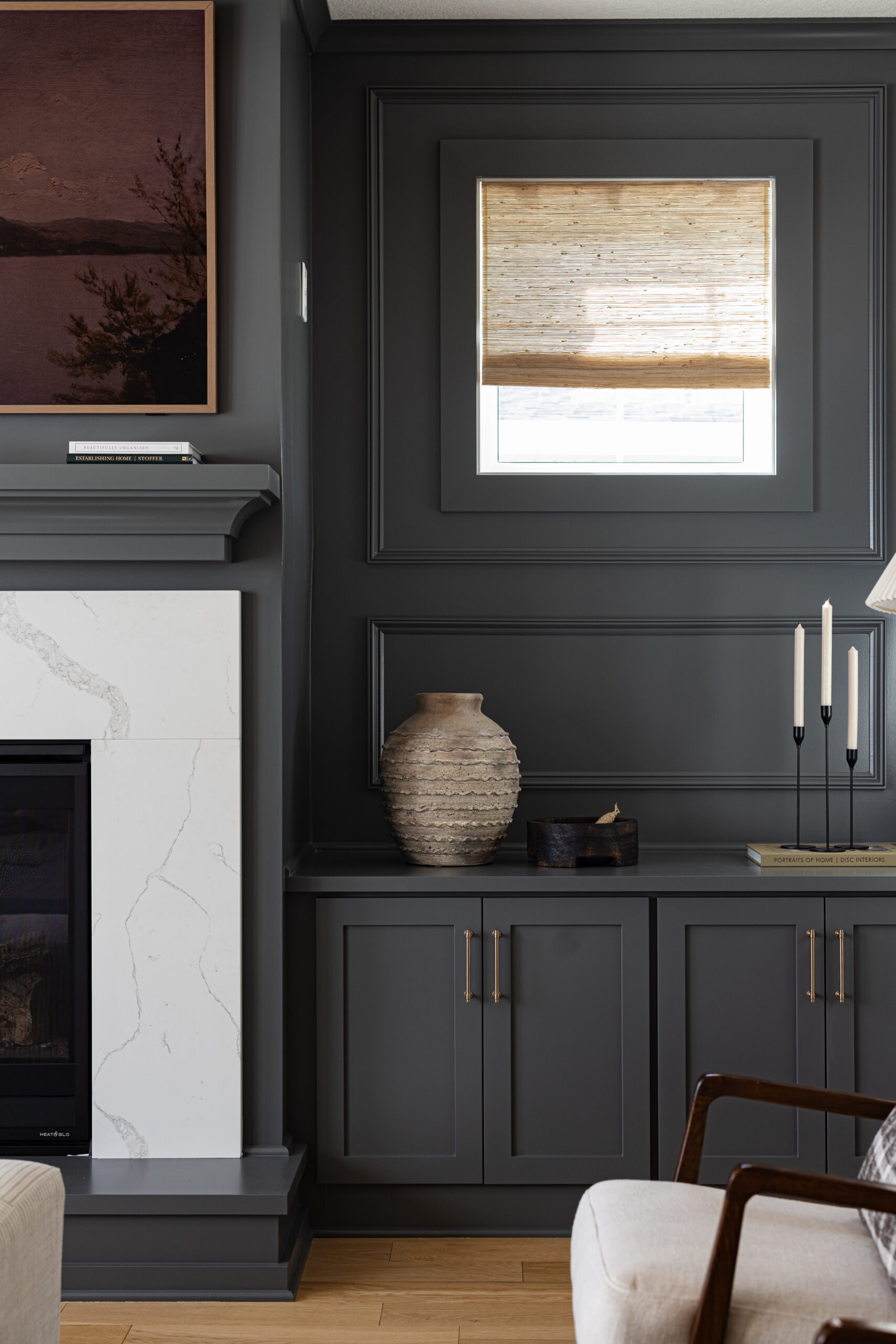
With a new ceiling fan, mantle above the fireplace, a dresser that works also as a TV console, and fresh paint and carpet, this bedroom feel completely different.
Before
After
We also ordered new nightstands, and a bed set that didn’t make its way in time for the shoot due to COVID.
Guest Bathroom
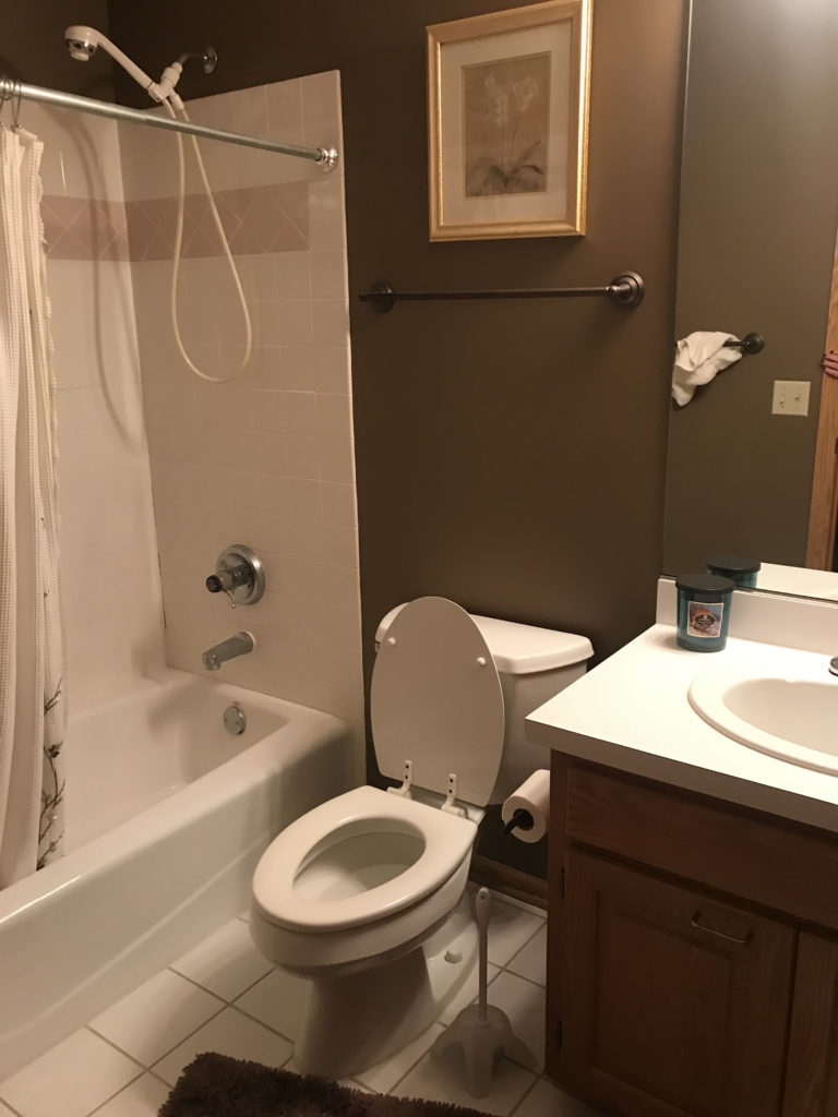
Before
This guest bathroom was lacking personality and our client was looking to bring some fun into this space.
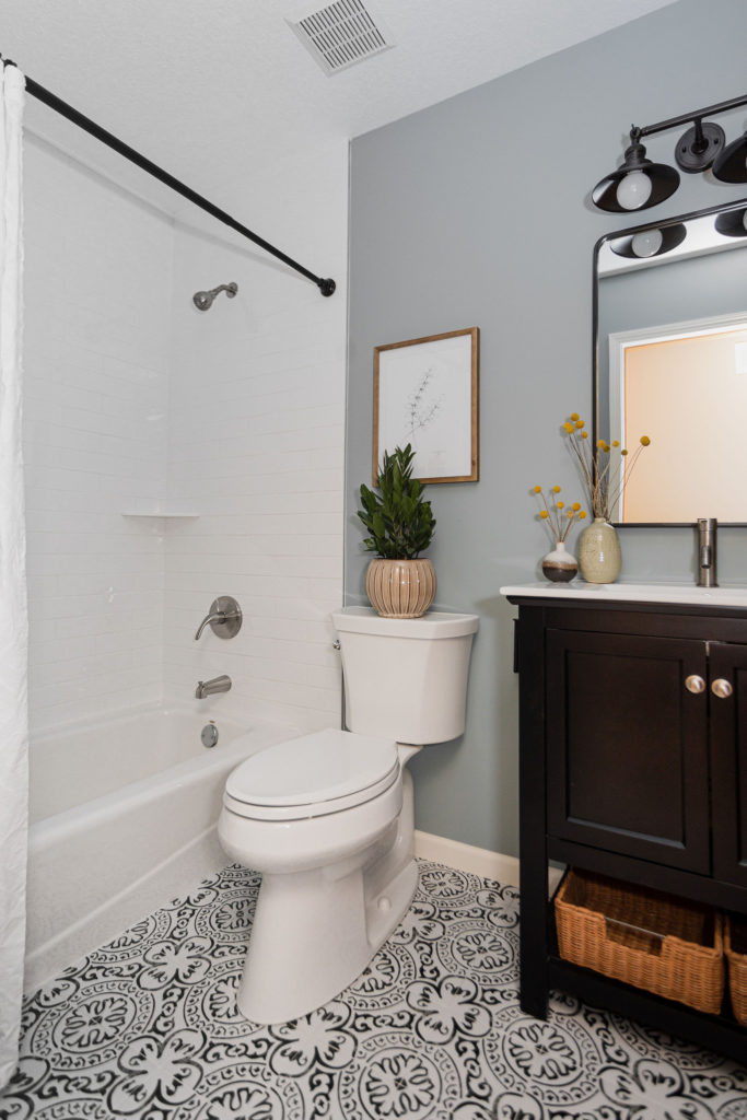
After
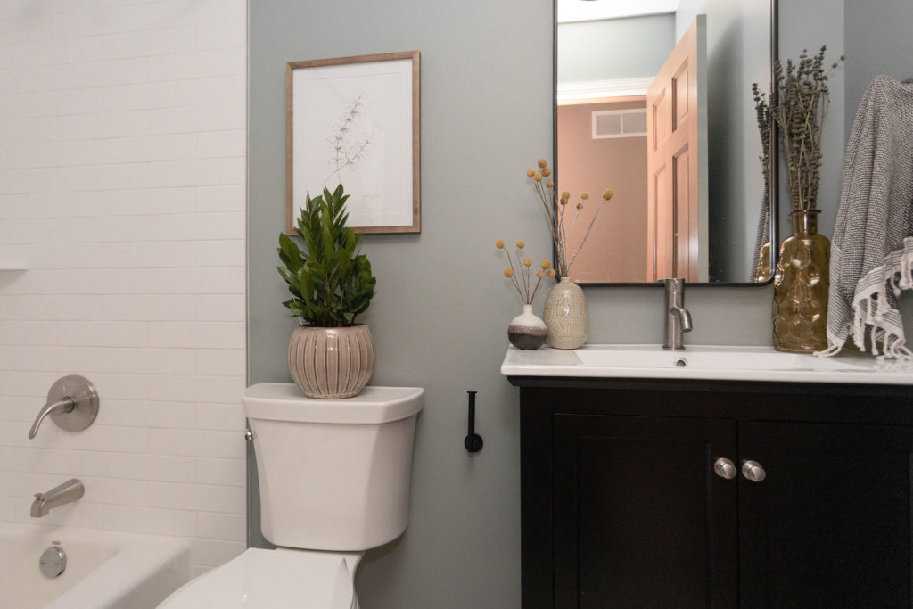
The walls in the bathroom are painted Kentucky Haze by Benjamin Moore and provide a beautiful base to the rest of this space. A black vanity compliments the pattern black & white floor tile. A new mirror, sconce, and single hole faucet give the vanity a finished look. The shower got a refresh with a new shower faucet and subway tile that now goes to the ceiling, making this bathroom feel bigger.
Shop This Space
Master Bathroom
Countertop | Herringbone Floor Tile | Shower Floor Tile | Shower Surround | Sinks | Faucets | Shower Fixture | Tub Filler | Tub | Mirror | Sconces | Flush Mount | Paint
Master Bedroom
Freestanding Mirror | Nightstands | Dresser | Mantle | Fan with Light | Paint
Guest Bathroom
Floor Tile | Vanity | Faucet | Shower Faucet | Shower Tile Surround | Sconce | Mirror | Paint
