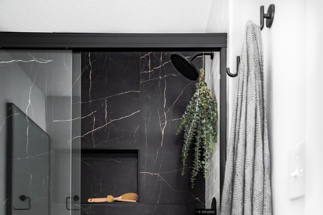
The #commercecove condo project we’ve been working on for the past year is complete! And finally here to share the reveal with you.
These clients got to enjoy summer in their finished condo on Lake Minnetonka and were able to host their sisters and friends, all the while gearing up with us to kickoff their second unit, what we’re calling #thelakecove project.
Our clients spend most of the year in Texas and summers here in Minnesota enjoying the lake. We kicked this project off last summer, while they were in Minnesota and right before Ellie was about to pop. Then once they headed south, we got to work on construction and wrapped this baby up longer than anticipated due to some major product delays, but right in time for them to return back this summer.
While we were under construction they bought another unit in this same condo building and have hired us to embark on another design + build journey with them. You can learn all about their second unit design here.
Kitchen
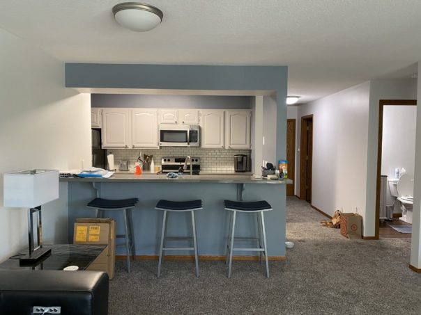
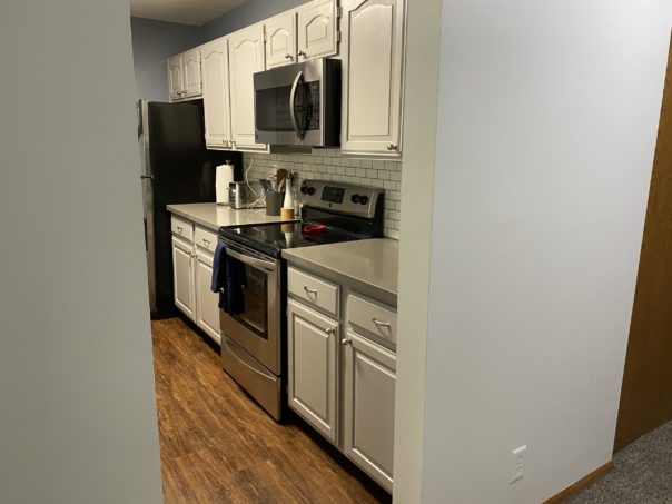
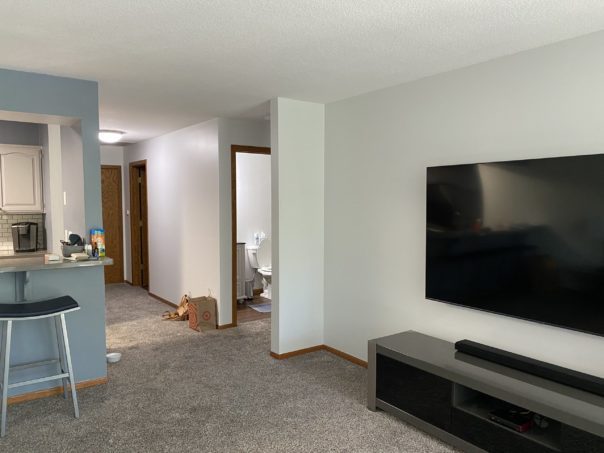
Before
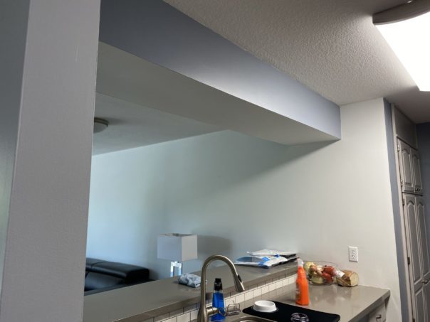
Coming at you with the before shots of the space. Our clients love to cook and entertain their family and friends so a gathering space in the kitchen and living room was a must on their list for those happy hours. The partial wall to the right drove them crazy (and us too) so we worked to figure out a solution to open up the entire space as well as taking out the soffit above.
Working in condo buildings bring their own set of challenges and removing walls and headers isn’t as always as easy as it looks. But we worked through it and got what we all wanted in the end.
When it came to finishes, we took out the entire kitchen and started from scratch. All cabinets, backsplash, countertops hardware etc. were gutted. These clients of ours have more of a classic modern taste, so we took that and designed out a kitchen to match.
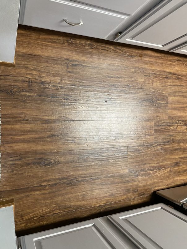
The dark, rustic flooring in the unit was another piece that they didn’t love, so we looked to replace it with something more muted and modern.
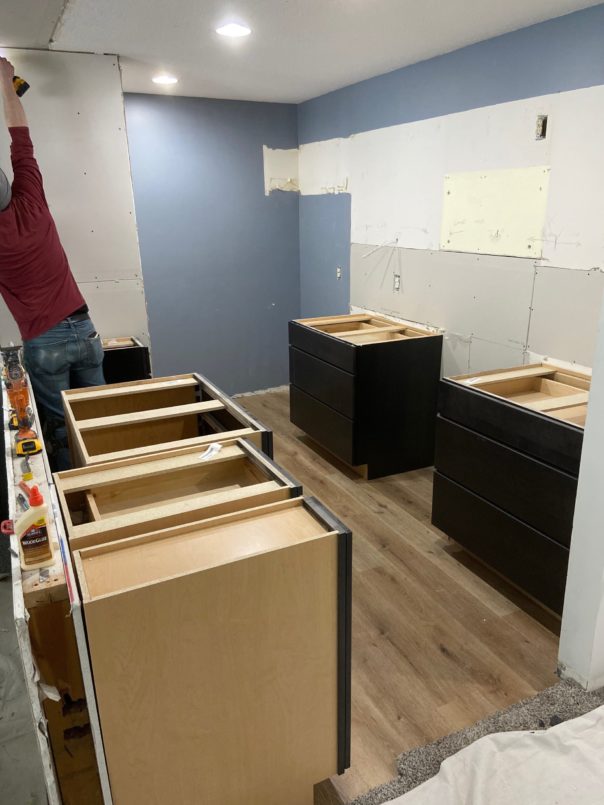
Under Construction
After understanding their vision for the space, we got to work on finishing selections, cabinetry, and layout. One of the things our client didn’t need to see, as they were trusting everything we wanted to do, was to have renderings completed. As renderings are an added cost to our design services, it’s a point where some people trust the process and save some money.
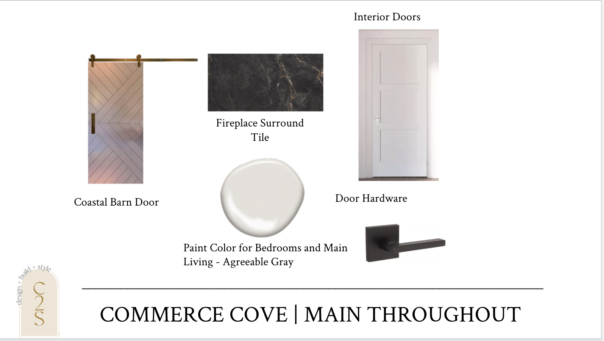
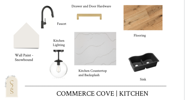
After a few rounds of selection edits, here’s where we landed in each space as far as final selections.
Main Throughout
Coastal Barn Door | Door Hardware | Fireplace Tile Surround | Wall Paint
Kitchen
Wall Paint | Sink | Faucet | Countertop & Backsplash | Drawer & Door Hardware | Lighting | Flooring
And out went the kitchen! It’s so fun being able to watch and document the progress of a space. Our clients also loved seeing pictures of the progress along the way, especially as they were so far away.
The Reveal
After a few minor delays along the way… the kitchen is complete!
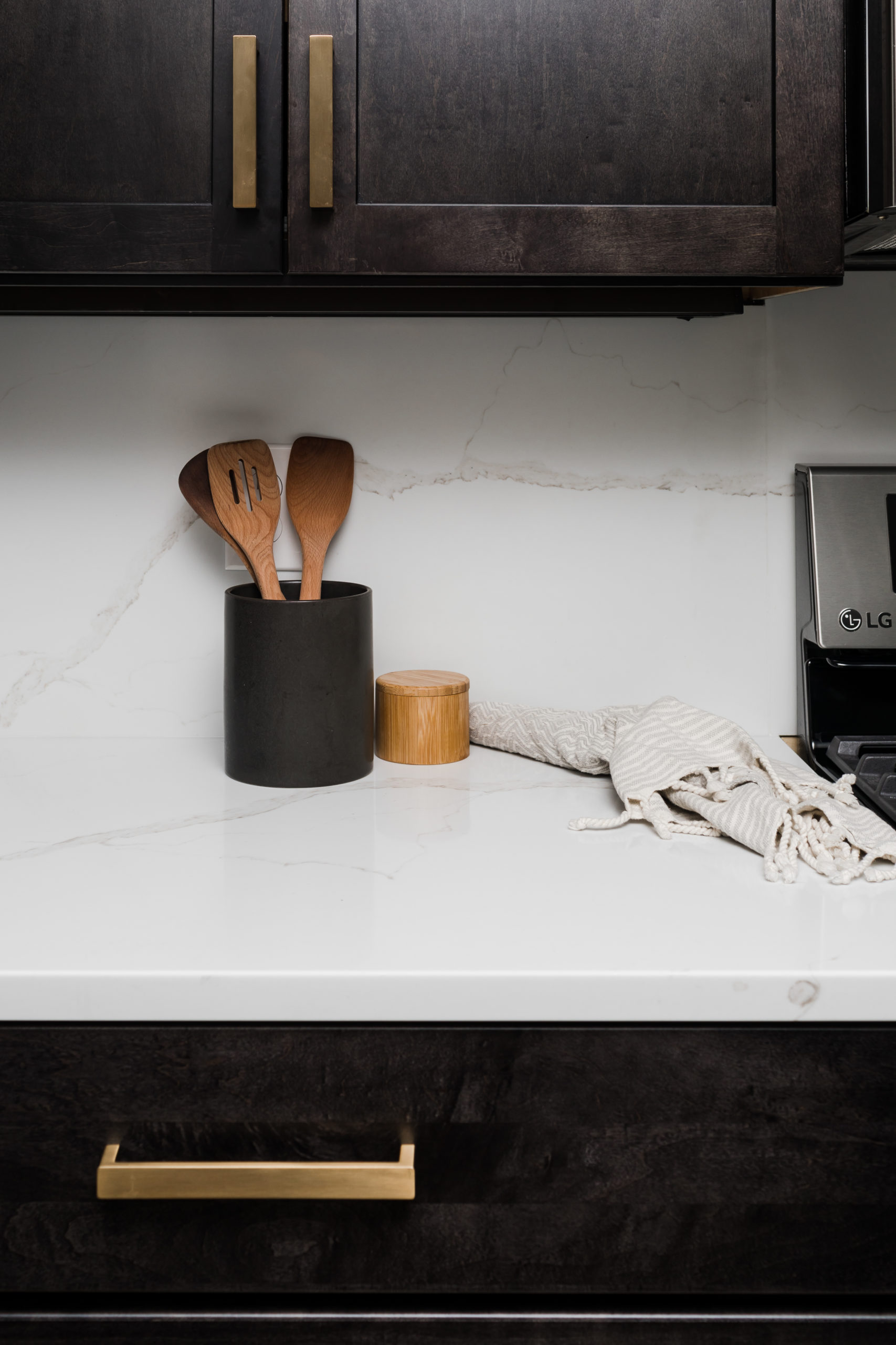
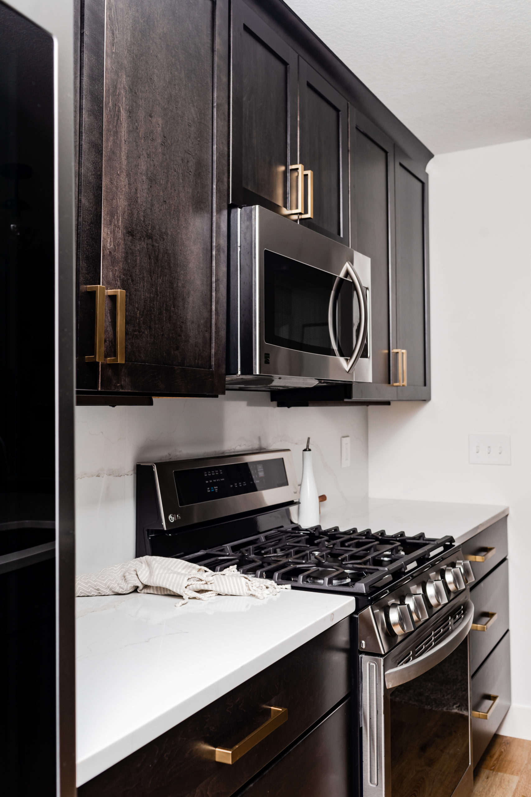
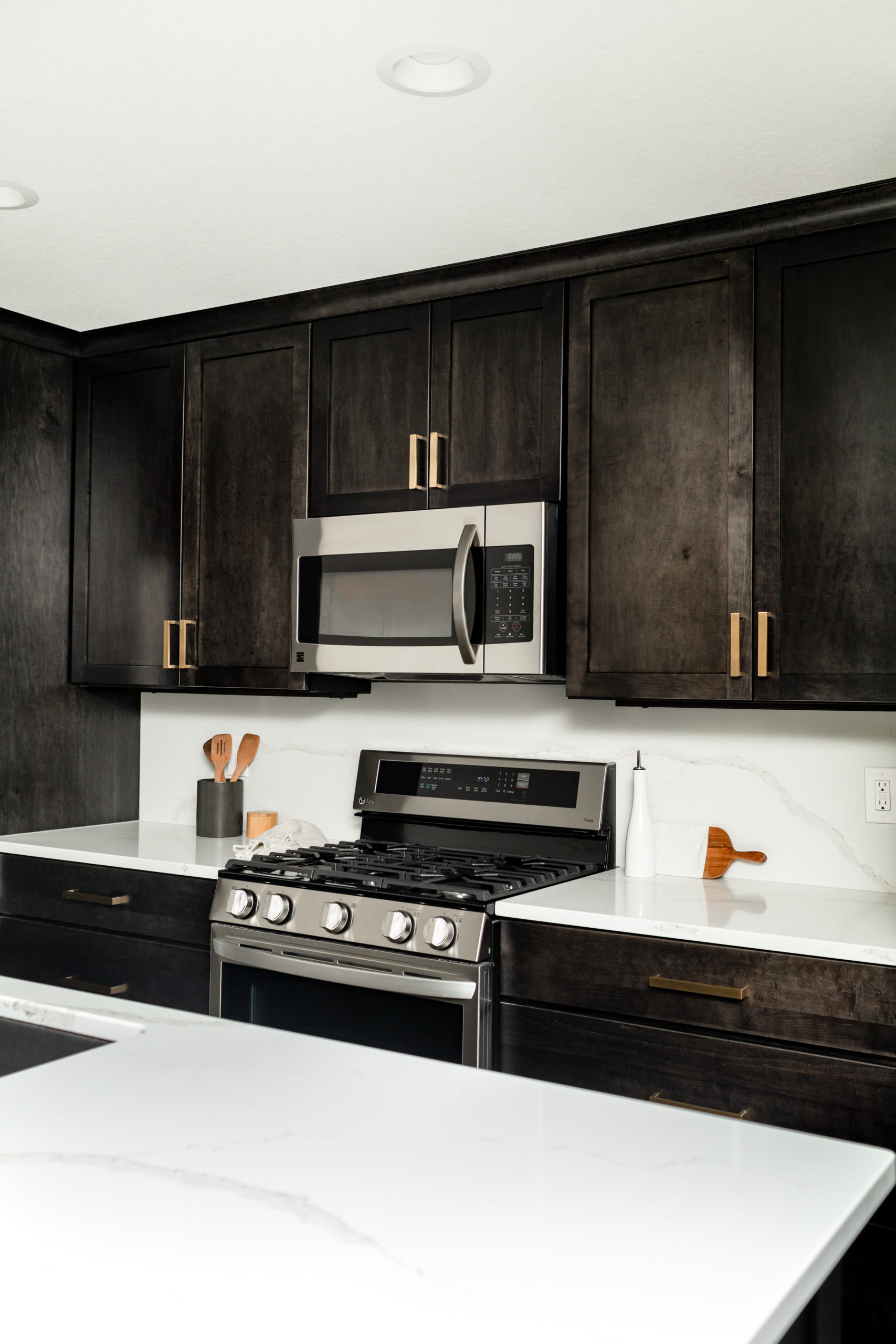
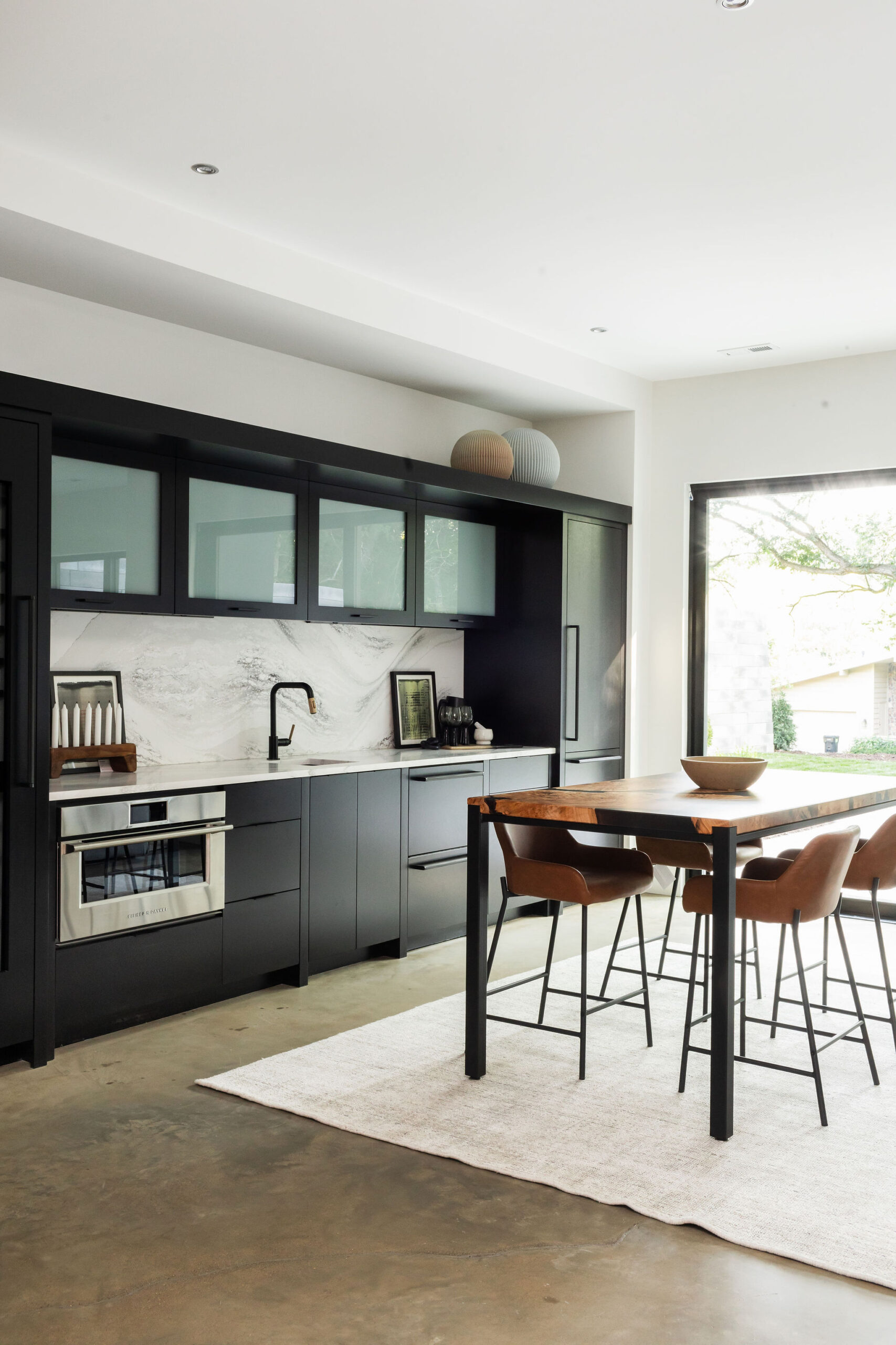
For this design, we wanted to tie in the countertop to the backsplash – and what better way to do this than to run them together. We went with Hanstone’s Calacatta Gold to tie in the warmth of the dark cabinetry, while also making it’s own statement with it’s sweeping veins.
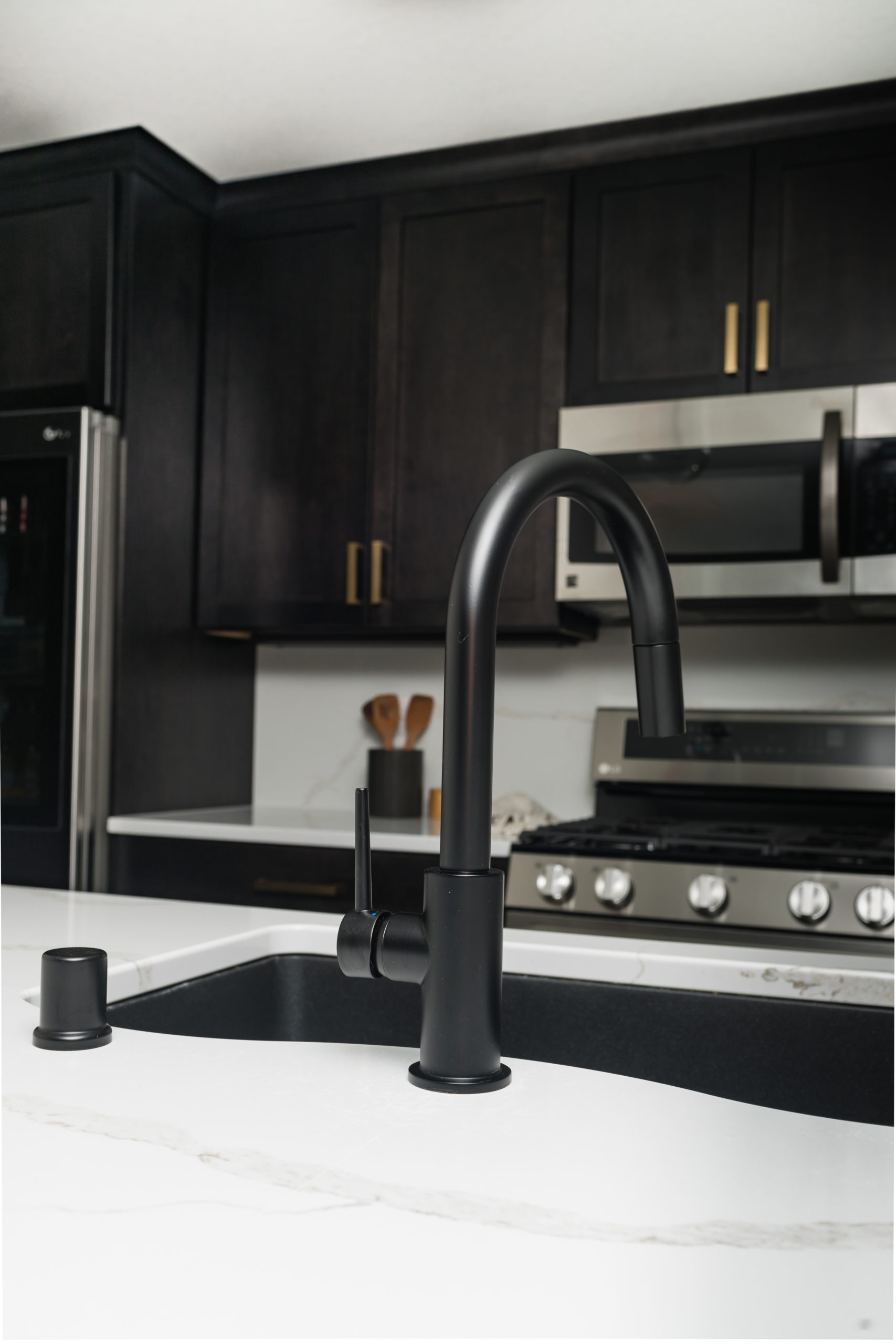
One of our sleek & clean favorites for any modern kitchen is the Delta Trinsic Kitchen Faucet, so we knew this would be the perfect fit to vibe in with the rest of the space.
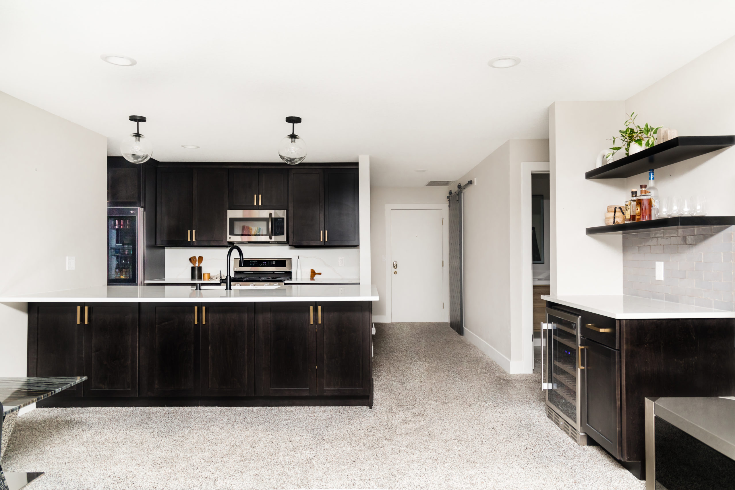
This view is one of our favorite transformations – remember how closed off it was with the partial wall & header to the right? Opening those up made the space feel so much bigger.
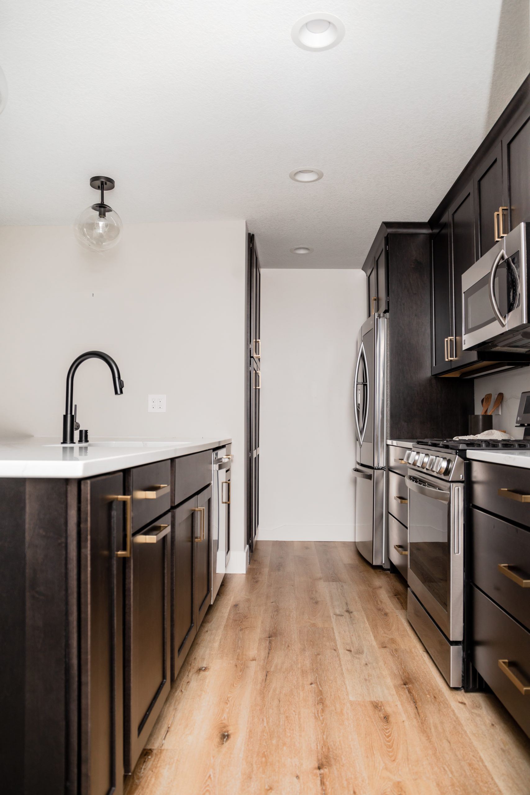
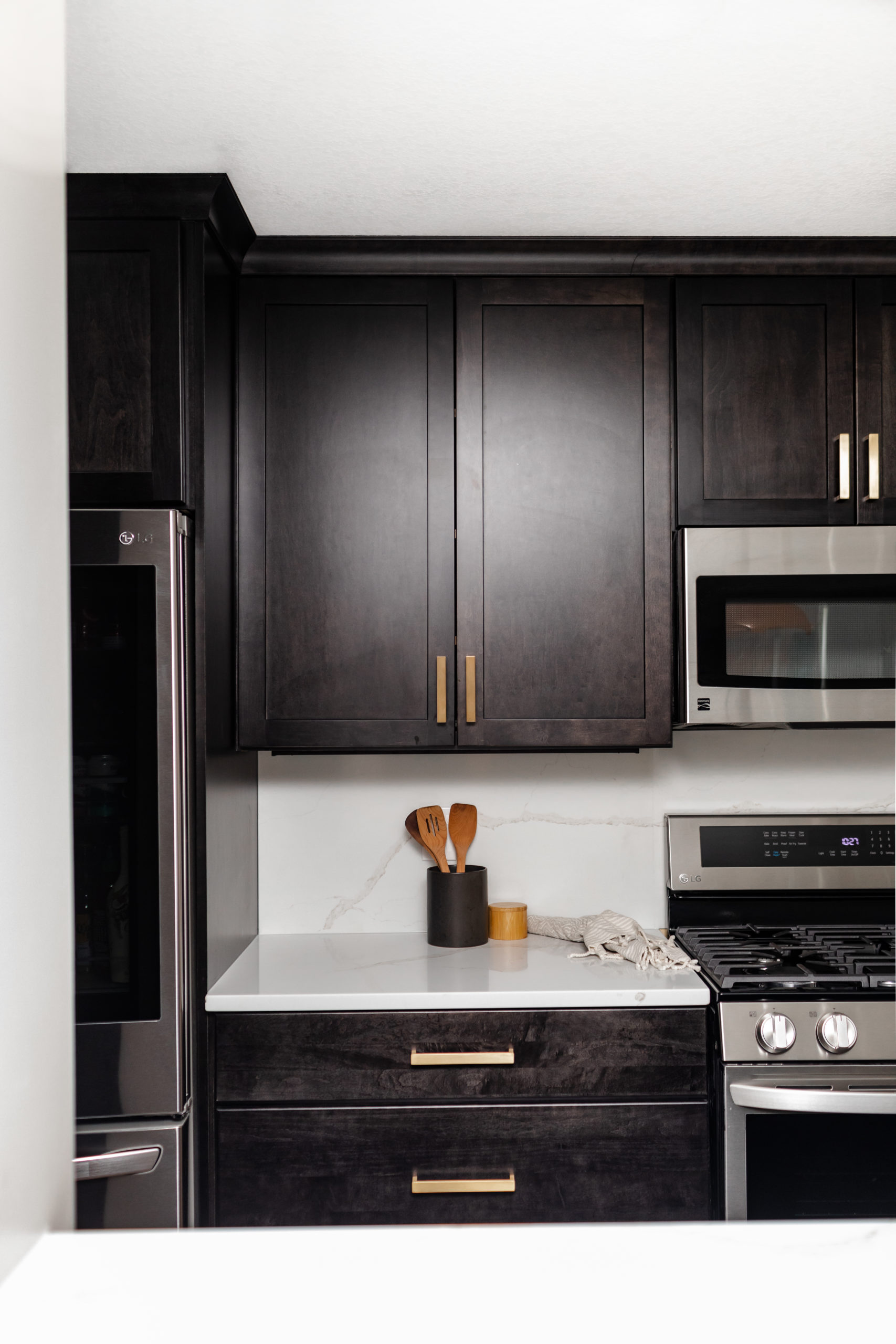
Another angle of the finished space. You can see that we went with a much lighter flooring as the cabinetry was a few dark wood tone, and we wanted to make sure they meshed well together. Because of some restrictions in the condo building, we installed Toccoa, an SPC from Urban Floors to make sure the sound barrier between this unit and the one under would be all good to go.
Initially we had spec’d black hardware for this space, but after seeing the cabinets in the space, we swapped out for gold. Sometimes, it’s little swaps like that that can make all the difference in a space.
And just like that, a kitchen any chef would love to cook in. We’ve already been planning their reveal party, which we’ll do next summer when #thelakecove is complete so we can showcase both units!
Bar & Living Area
Before
After hearing more about how these ladies love to entertain, and how many friends they have that live in the same building/come to visit them in the Minnesota summers, we knew adding in a bar space was a must.
From our initial walkthrough of the space, our mind was turning as to where to incorporate this, but after seeing this empty space to the left of the TV and it’s proximity to the kitchen, figured this would be the perfect spot.
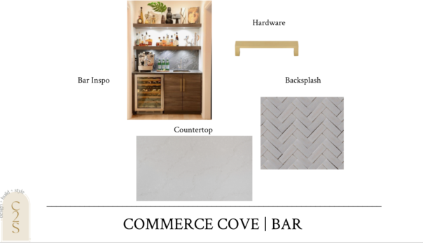
Here are the selections and designs we came up with. We matched the bar cabinetry and open shelving with the cabinets from the kitchen and added in this fun cement-style backsplash with a grey countertop to play off of the backsplash.
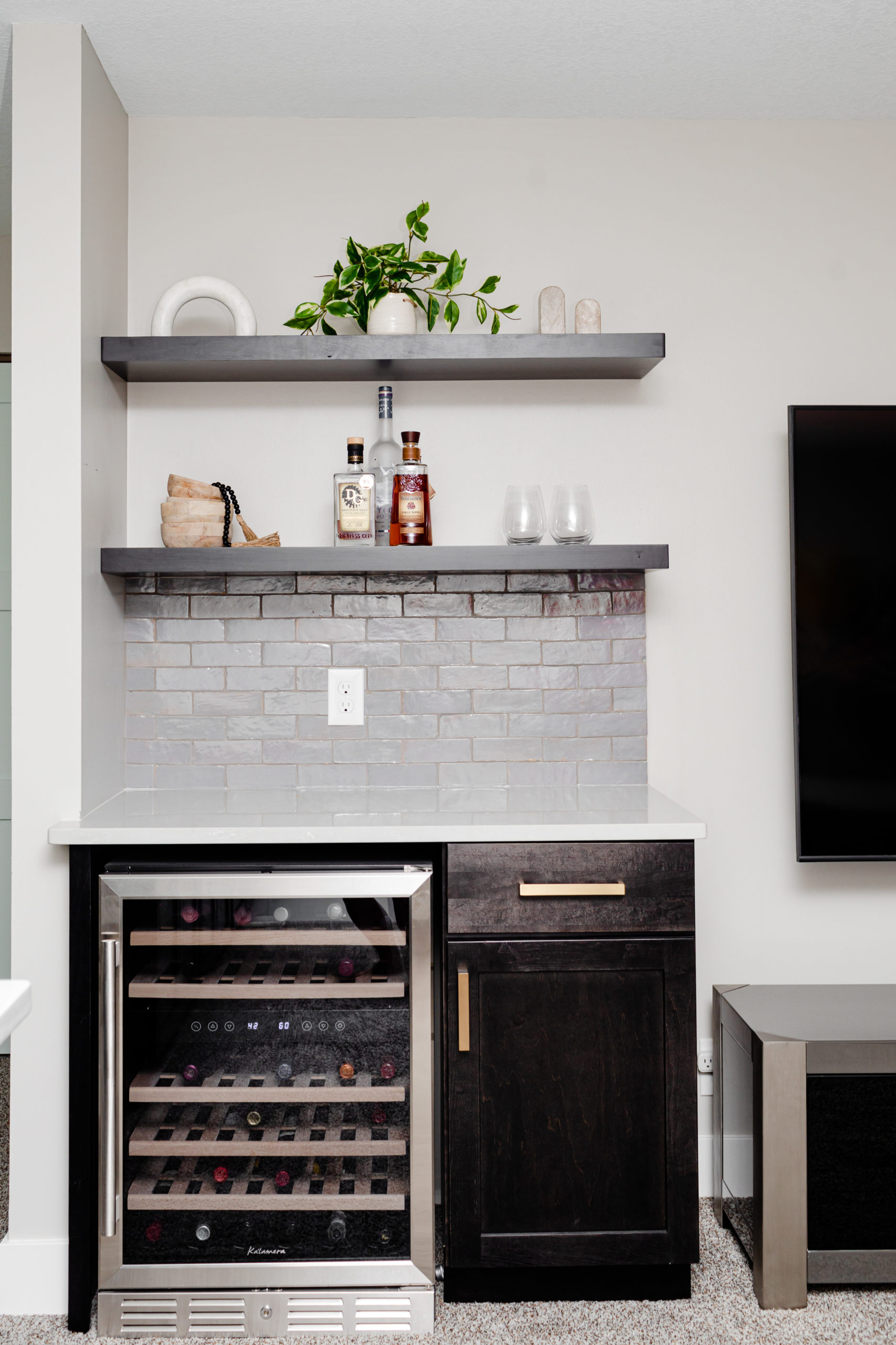
For the design of the bar space, we knew we wanted to bring in the same cabinetry as the kitchen to keep the space cohesive, but wanted to tie in a few different elements to make it stand out. We opted for a more gray-toned countertop, paired with a textured, pearlescent gray backsplash tile.
Bar
Bar Backsplash | Countertop | Hardware | Beverage Cooler
After
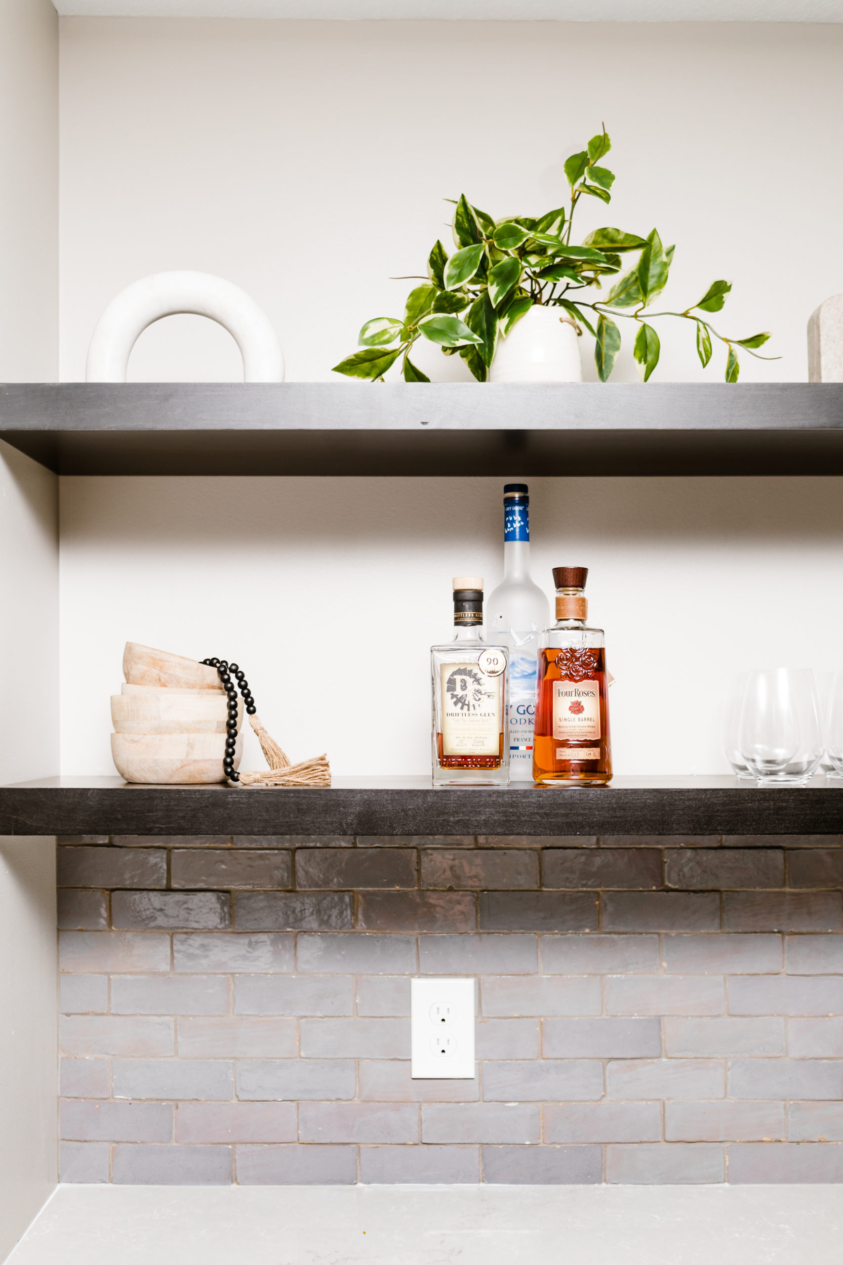
And the after – a transformation of a space that was previously wasted, and now is the perfect spot to prep drinks for happy hours!
We love bringing in our shop items to style as the products roll in, especially with how neutral and versatile we find each piece to be. We offer styling services and can help you with projects just like these floating shelving units.
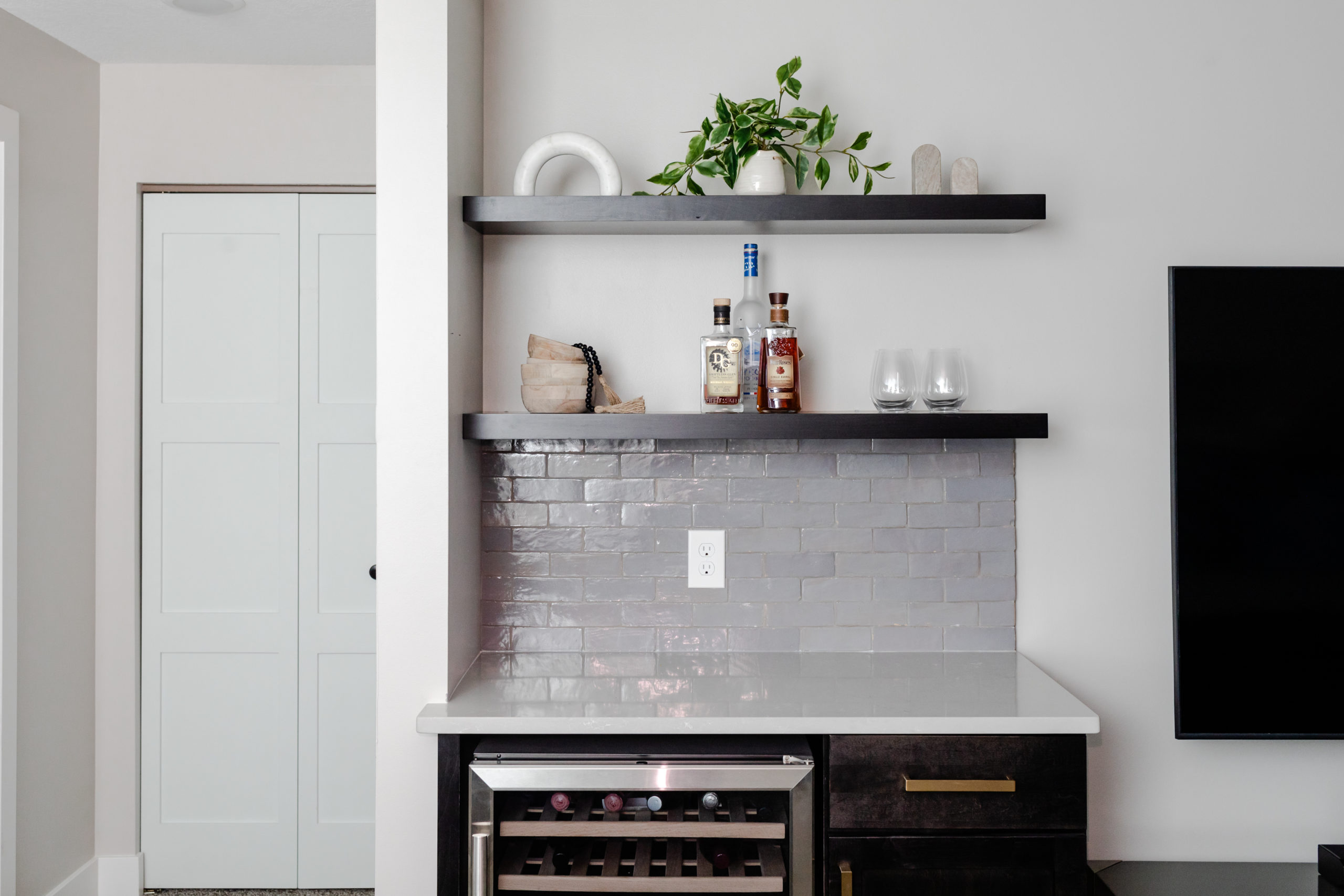
A view from a step back so you can see where the TV stands now. They can also use this additional counter space to serve for gatherings as well!
Shop the Style: Marble Arch | Wooden Bowls | Black Beaded Garland | Marble Bookends
Bathroom
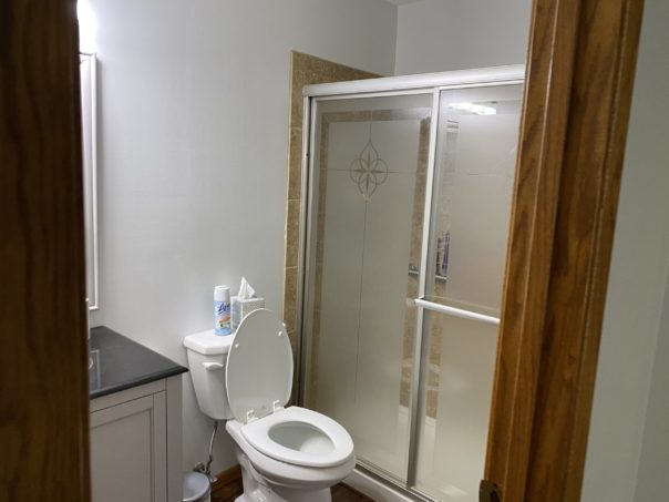
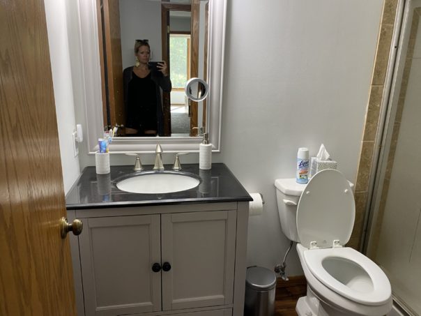
Before
The bathroom was also something that they wanted to completely demo and transform. It was stuck in a past decade and ready for an upgrade.
Again – another space where we pulled a full gut and remodel. New shower, tile, flooring, vanity, mirror, lights, fixtures, and the full works! Bye, bye…
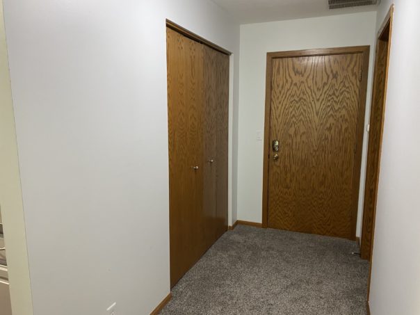
Paint, doors, trim, and all the millwork throughout the entire unit was also high on their list. It was all old, hollow doors that were ready for a little upgrade.
Under Construction
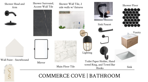
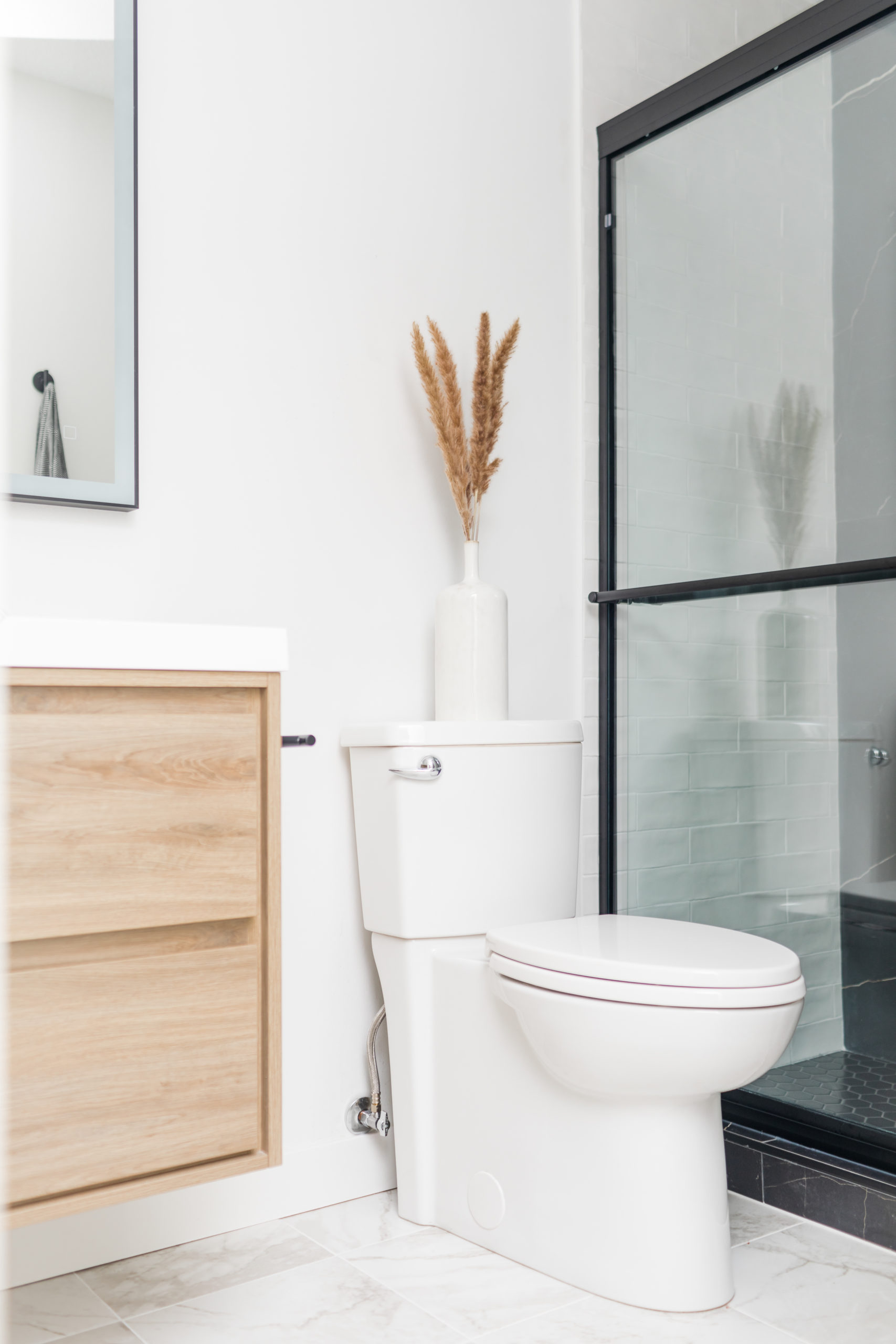
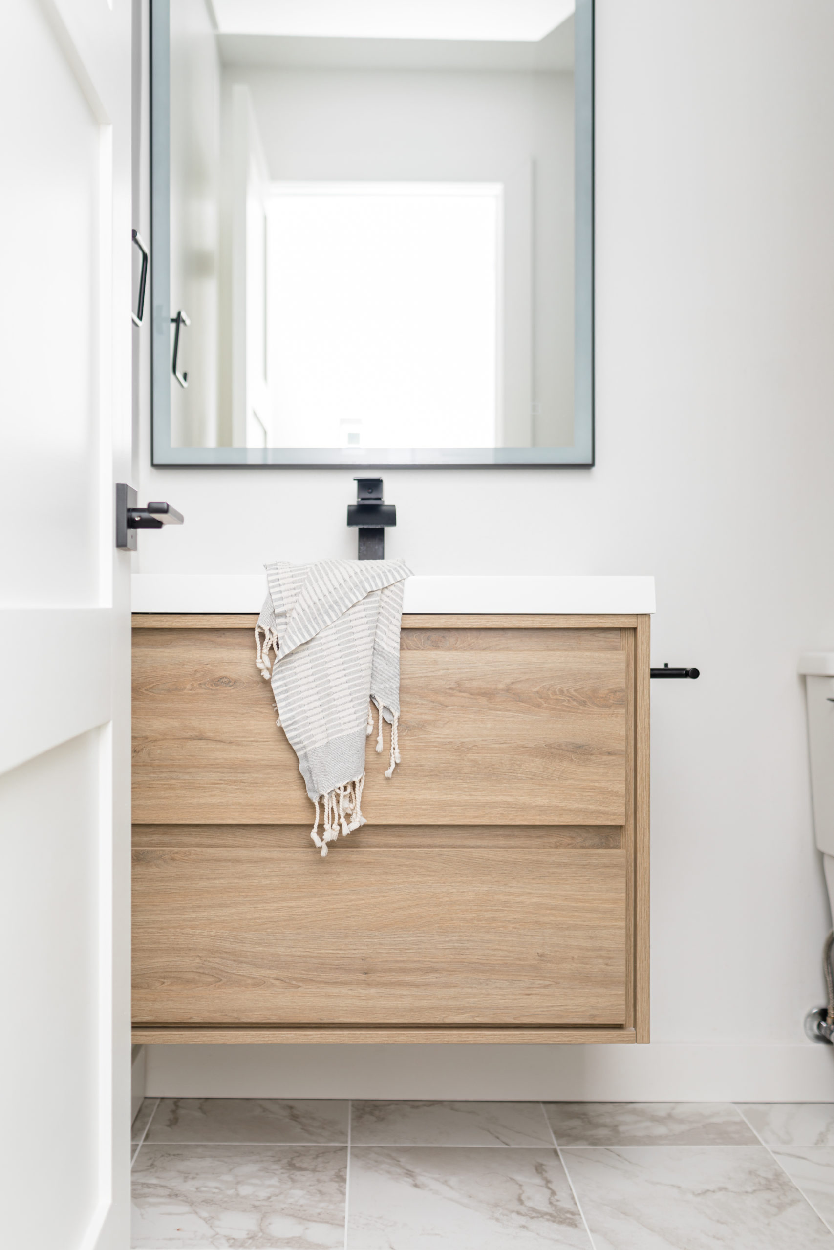
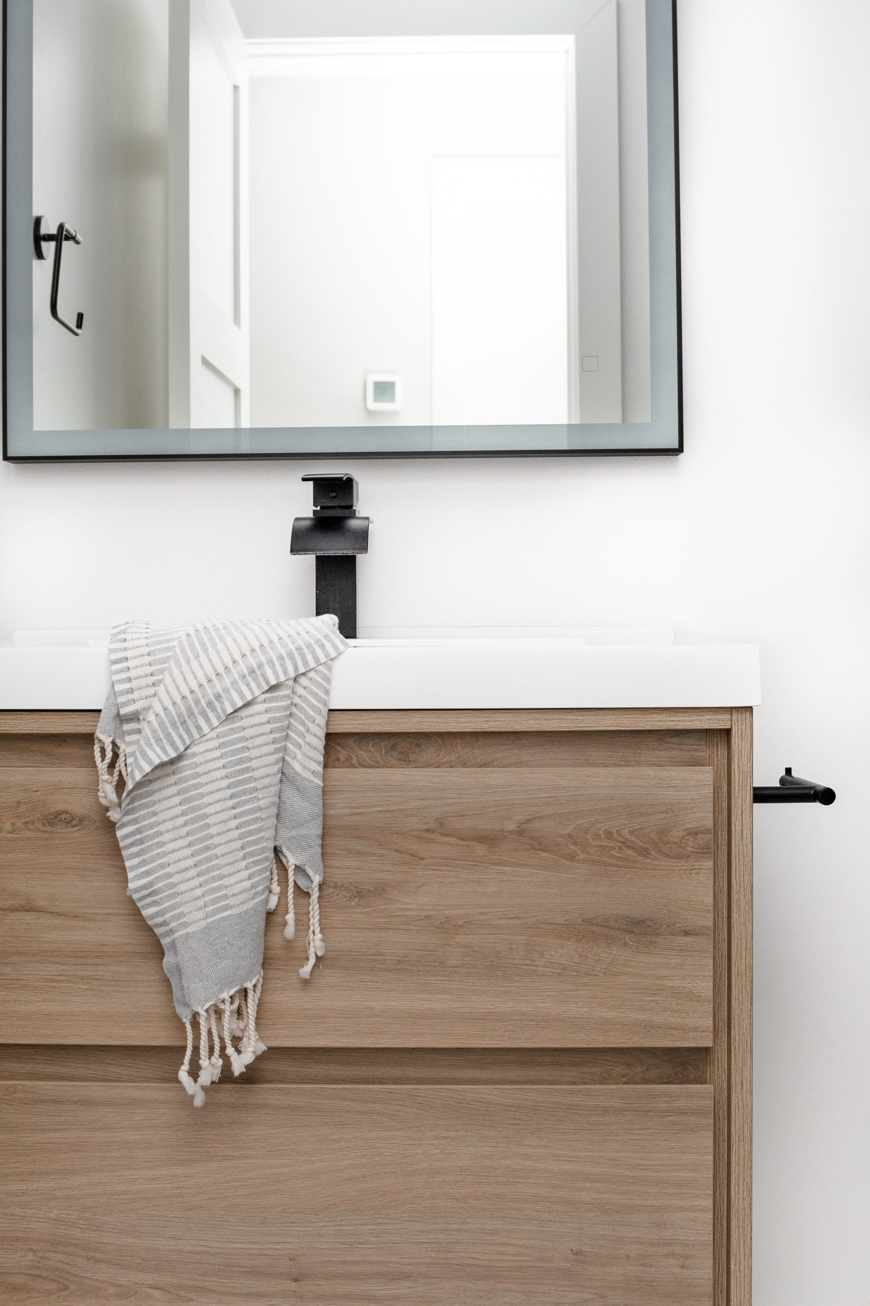
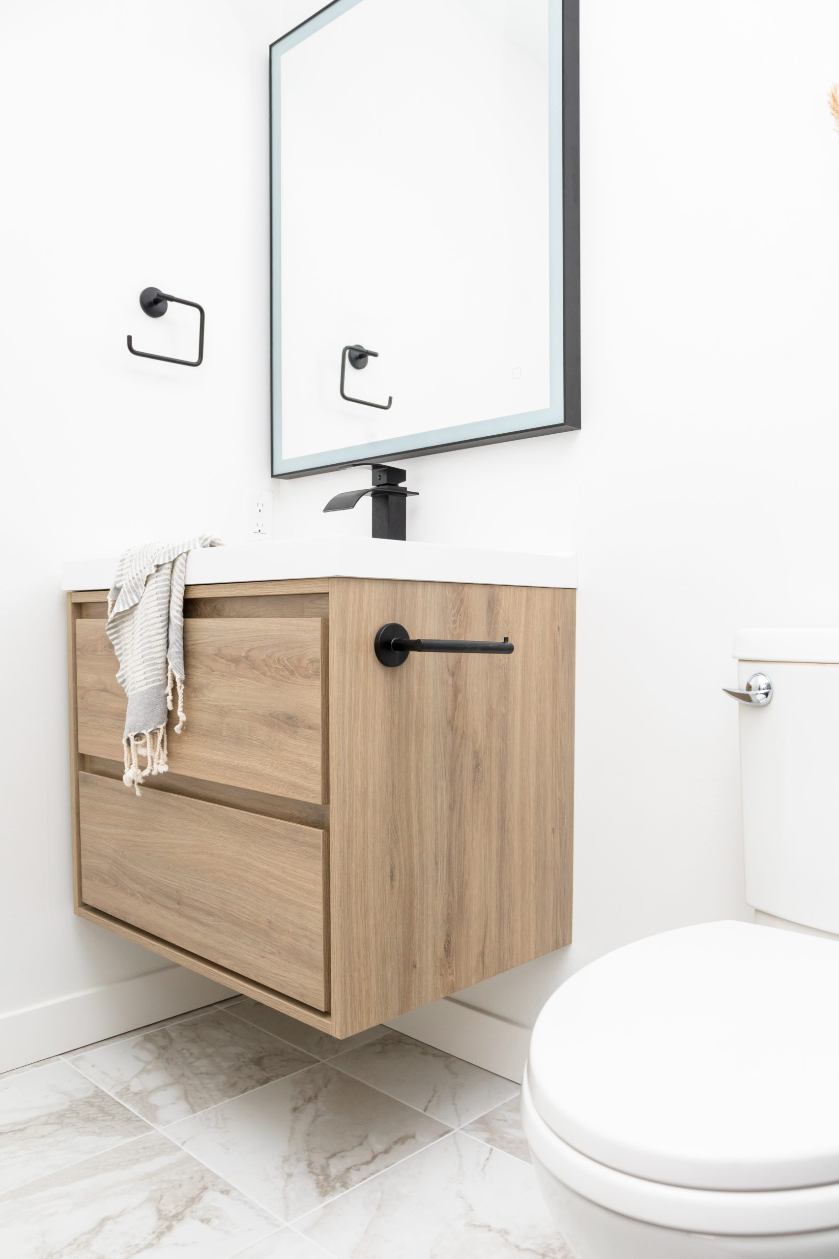
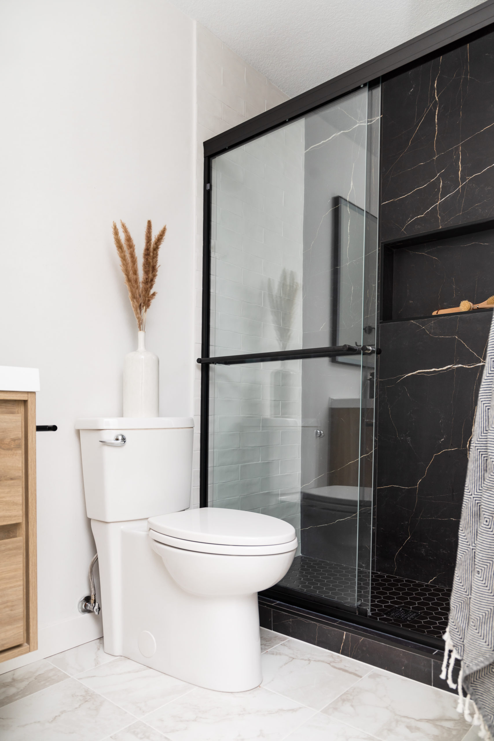
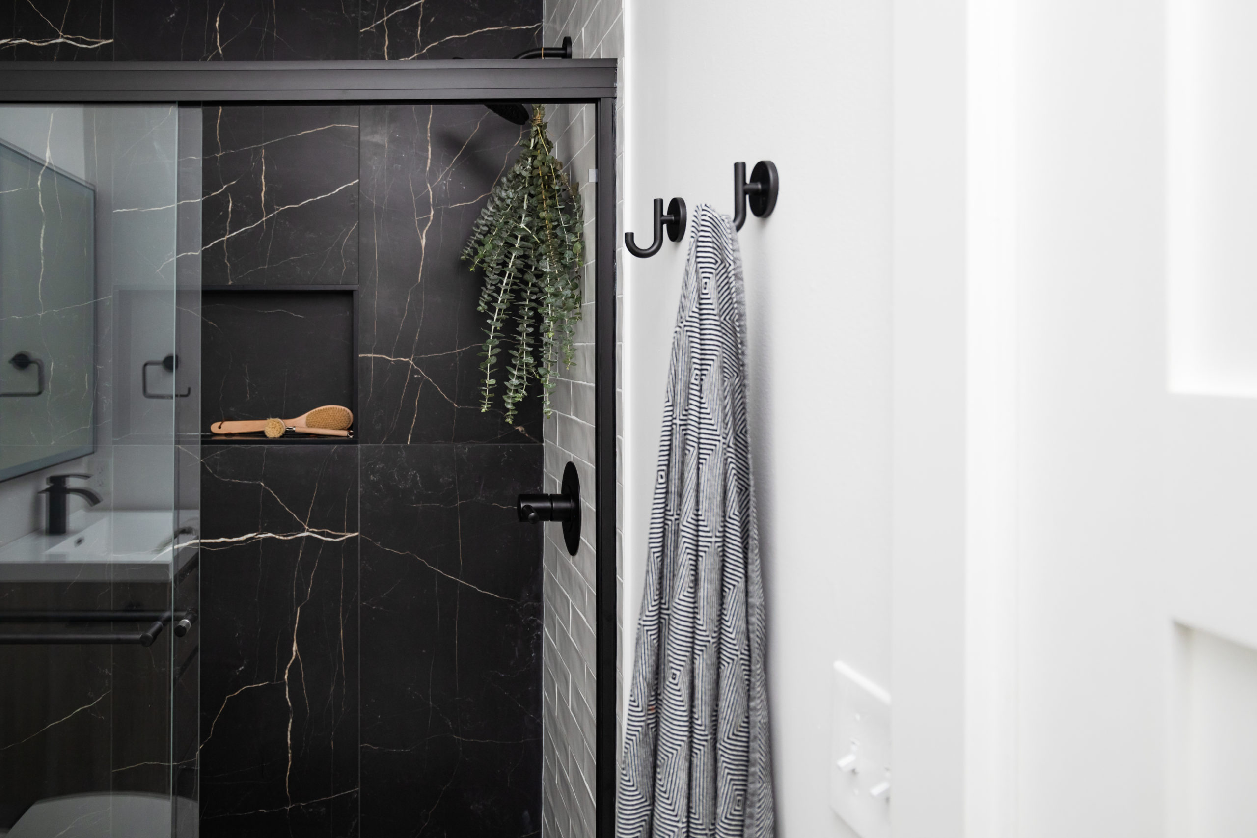
And the design for the bathroom. Vibing off of the modern feeling of the rest of the unit, we went with blacks & neutrals in this space to give it a clean and sleek look. We wanted to bring in some warmth with a lighter, wood toned vanity and light flooring.
We also had a few issues with the light fixtures and faucet, so ended up going with a few different selections for the finished space.
Bathroom
Wall Paint | Shower Surround & Accent Wall | Shower Floor | Shower Wall Tile | Faucet | Shower Arm | Shower Head | Mirror | Vanity | Toilet Paper Holder | Hand Towel Ring | Towel Bar Hooks
After
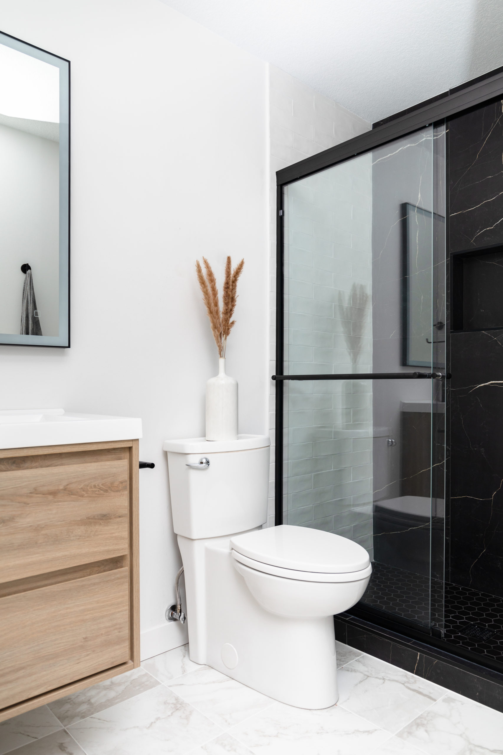
This bathroom after continues to blow our minds! The boys worked their butts off to make this vision come to life. And after a few issues with the lighting & mirror, the finished views were worth the last minute changes.
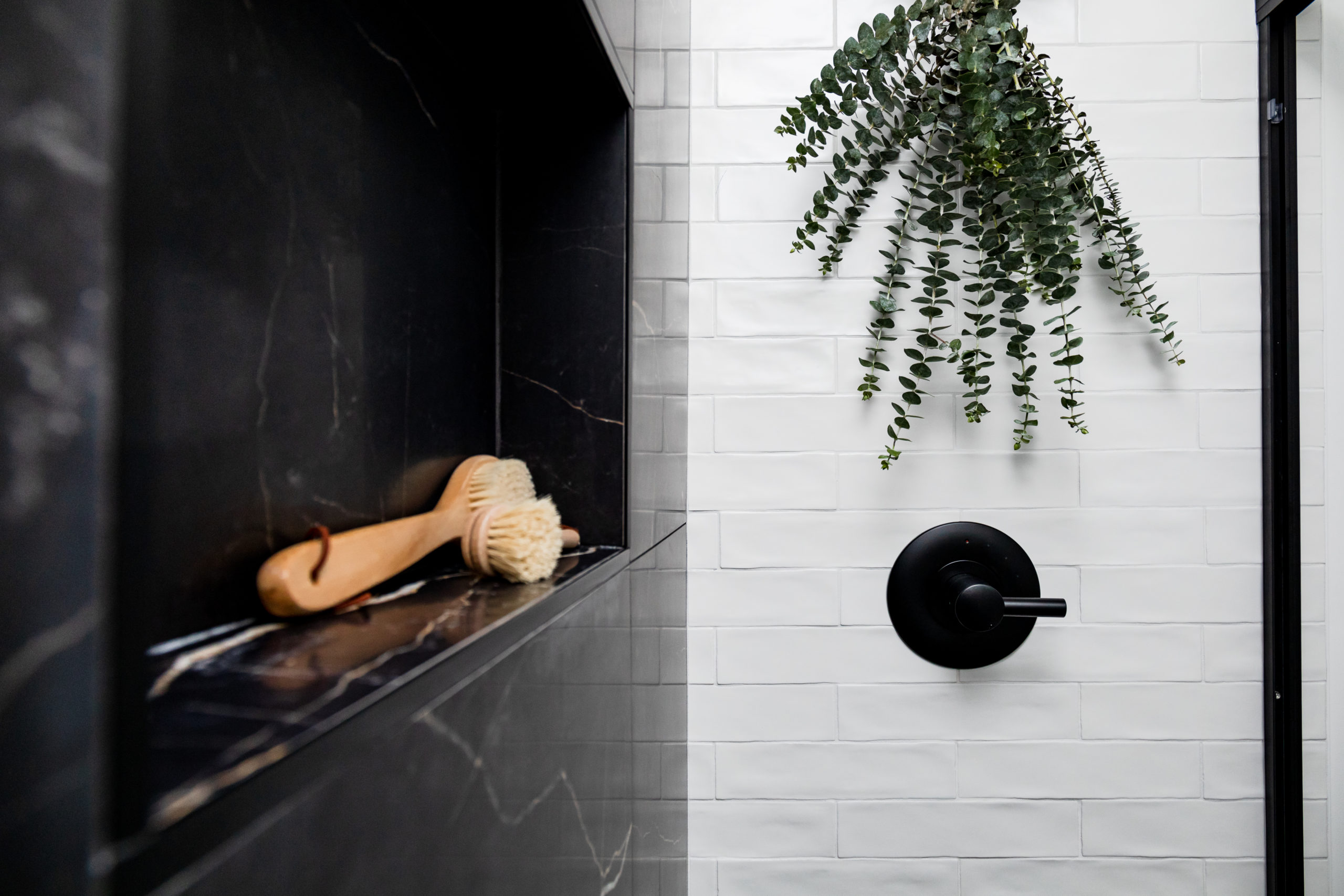
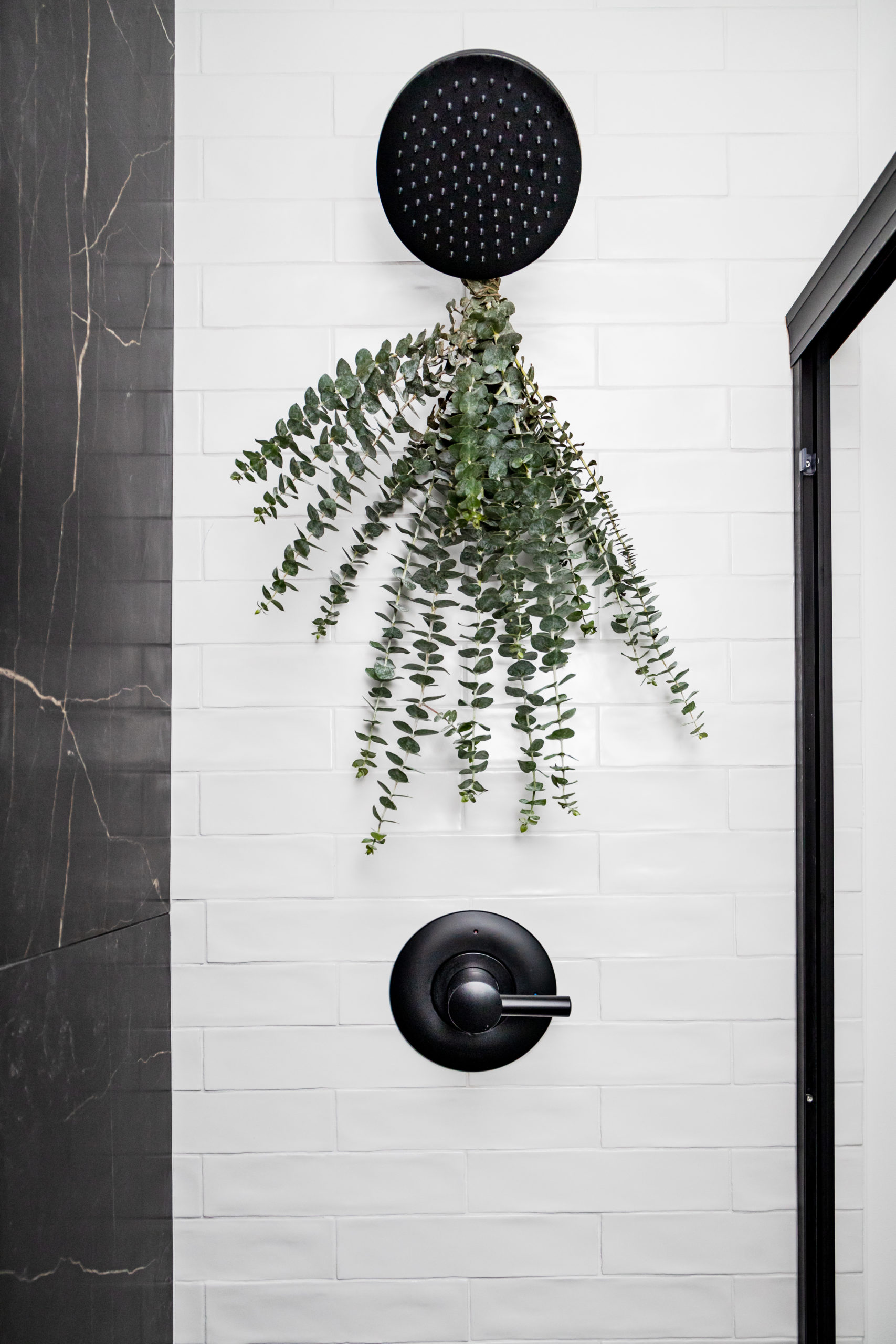
We went with a lighter wall color and flooring, and two shower walls of white textured subway tile to brighten up the small bathroom.
For the vanity, we wanted to bring in that warmth while also keeping it clean and functional, so went with a prefab option.
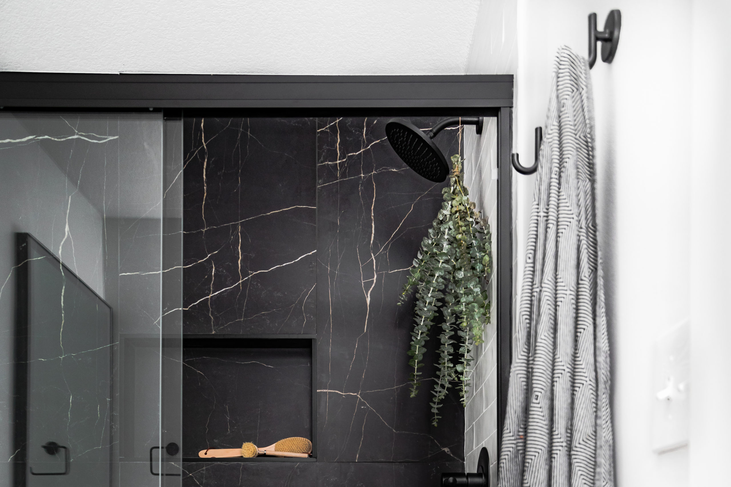
The tile in the shower brings out such a luxurious feel to the space and plays off of the black shower door and fixtures throughout the space.
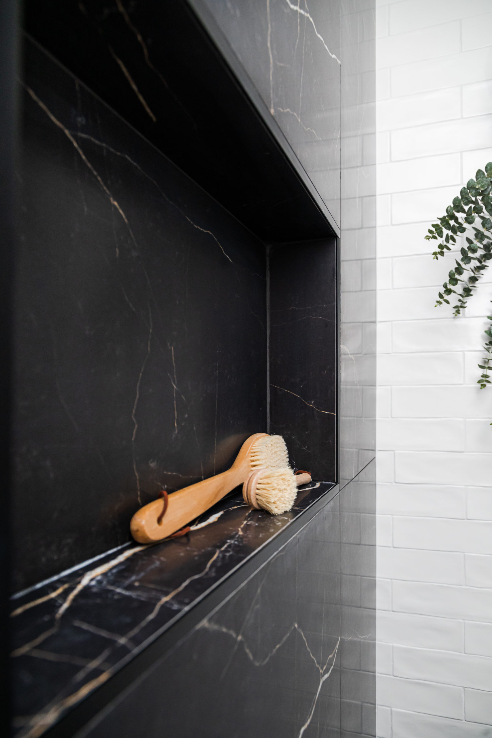
We wanted the space to feel like a boutique hotel bathroom, as it’s the only one in the unit. We also wanted to make sure it wasn’t too dark since it’s a smaller space, but wanted the moody feel of black tile. So, we went with an accent wall of the black tile and an oversize niche to pair.
And while we love this black accent wall tile from Tile Shop so much – they’ve recently discontinued this tile. We’ve used it now in many projects including our Black Lake owner’s bathroom, and will miss the large format and warm veining. But as we know in this industry – with discontinuations comes new and improved products, and for that, we can’t wait.
This black large format tile has since been discontinued but here’s a similar look.
Shop the Style: White Vase | Natural Brown Pampas
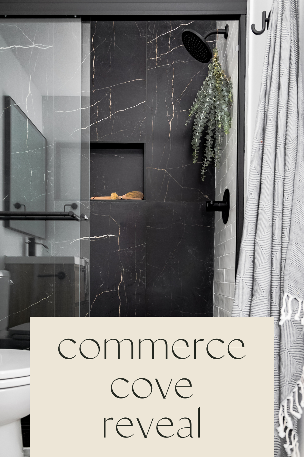
And that’s the Commerce Cove Reveal!
These clients have said many of times how much they’ve been enjoying their completed unit, and that they’re looking forward to round 2. Now, off to work on finalizing designs for The Lake Cove so the guys can get cruising… stay tuned for updates along the way.
Disclosure: This post contains affiliate links. We make a small commission from the sale at no additional cost to you. Thank you for supporting our small business.
I think we chatted on IG but here’s a similar look – https://www.tileshop.com/products/tresana-blanco-polished-porcelain-wall-and-floor-tile—12-x-24-in.-681116
This one is discontinued. 🙁
All the tile was from the Tile Shop.
Hi Morgan!
LOVE your floor tile in this bathroom…I couldn’t find a link to that in your post. Can you please share what tile that is also? It’s perfect with that black and white shower! Bravo!
Thank you!
Ugh, YES! They did discontinue it. However, they now have a similar and it’s just as good if not better. Here’s a link. And I’ll update the blog post. Thank you for bringing it to my attention. We use this all the time and clients LOVE IT!
And I’ll
Your link doesn’t work for the discontinued accent wall black tile. So maybe can you at least share the name of the tile so we can find something similar out there. I don’t even know where to start. Is it a stone tile or porcelain? Any information at all?