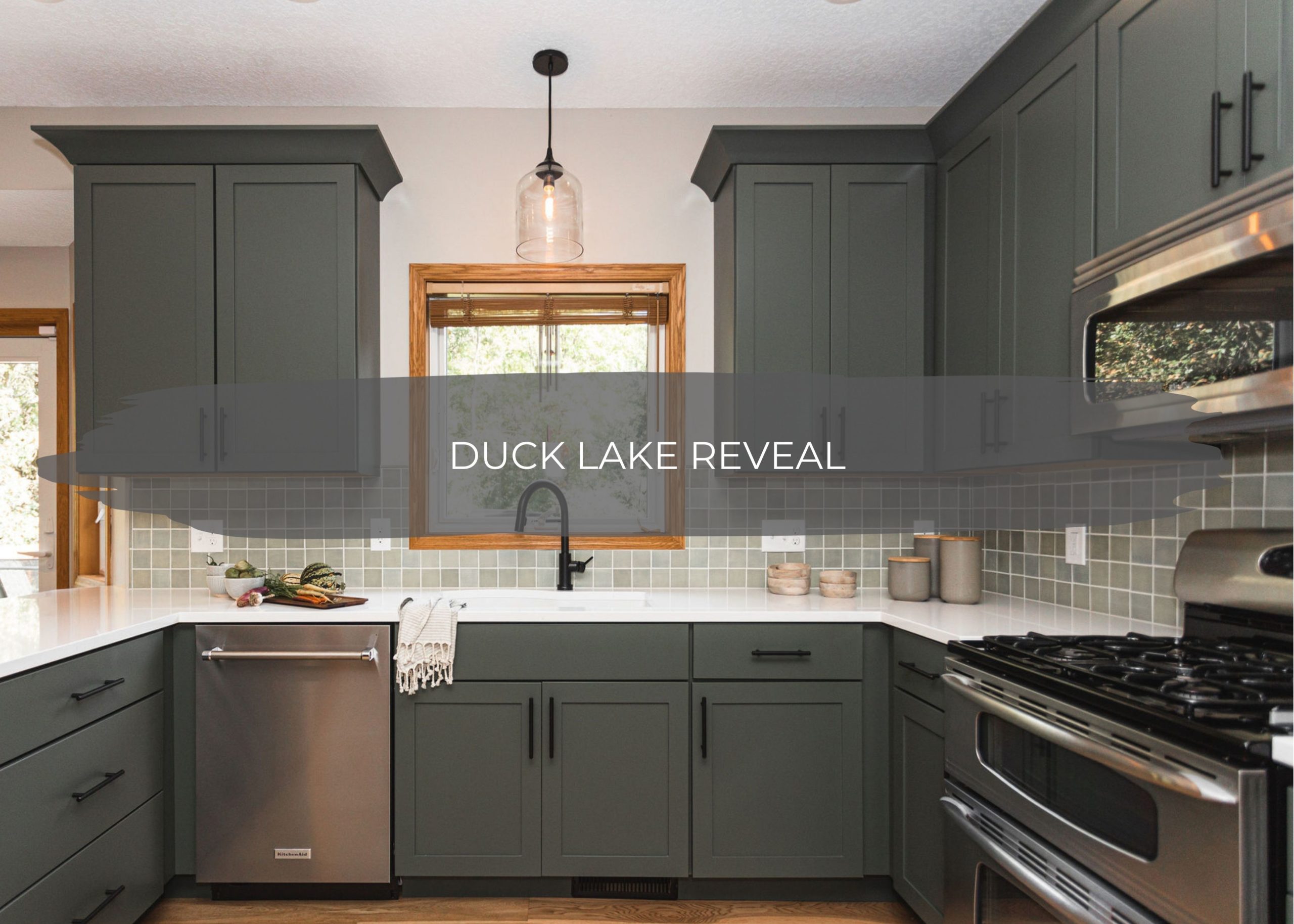
Earlier this summer, we chatted through the Duck Lake Main Level designs, and we’re back today sharing the full reveal with all the details.
And I am EXCITED! Who’s been on this journey with us on Instagram?! This has been such a fun project to complete and, yet again, another dream client to work with.
Before we get into all of the details, I wanted to share how our clients found us.
Some of our favorite clients are ones that come referred to us from past clients, and this story reminds us yet again about the power of connection, trust, influence, and community right here in the Twin Cities.
Our clients had started planning out their kitchen design and were struggling to find the perfect fit in a design + build team.
While they were experiencing these frustrations, it was around the same time we were remodeling the DeRusha lower level bathroom. Our clients were big fans of Jason (who isn’t?!) and had followed him for some time. They also had the same love for fine food, wine, and local makers.
While we were renovating the DeRusha home, Jason was sharing about his experience on social media. He was talking about the products he and his wife were incorporating into their home and why and about the journey of working with construction2style.
Long story short – because of this experience and the trust that our clients had from Jason because of the previous great advice he has shared and continues to share, they reached out to c2s and hired us for the job.
We went to their home, walked through the space, and because we understand their vision – we were hired and got to work! And from the beginning to the end of the project, we had a fun and stress-free partnership with this lovely family, and we were honored to help create their dream space alongside them.
Before
Alright, now let’s dive into the details. First up, the most fun part – the before!
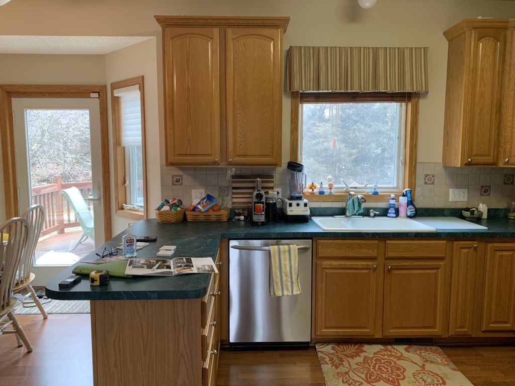
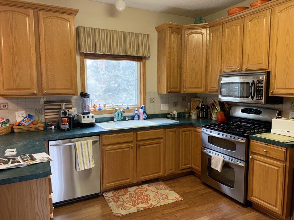
There wasn’t anything wrong with the layout of our client’s main level. However, they had golden oak everywhere throughout their home, and they wanted to tone it down. From the kitchen cabinetry to the millwork to the flooring to the beige walls, they wanted some, if not most, of it to go.
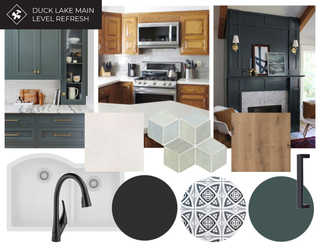
And the one thing they knew they wanted was green cabinetry, Mercury Mosaics tile backsplash, and Cambria quartz countertops, and of course, you all know how much we love all of those things! From there, the rest was easy. We worked within their budget to bring their dreams to life.
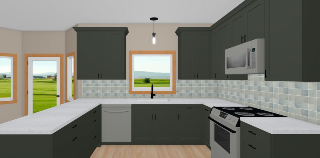
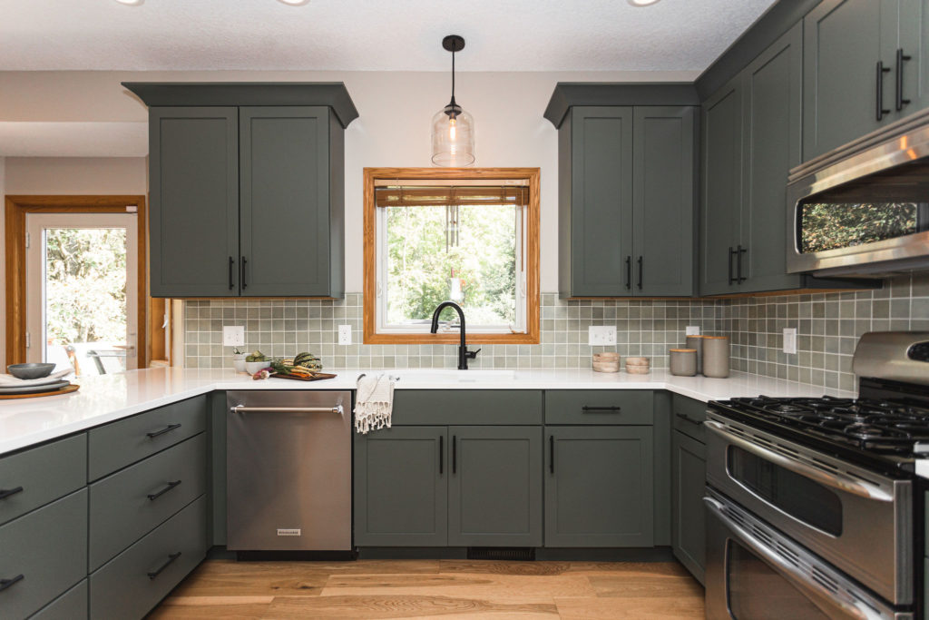
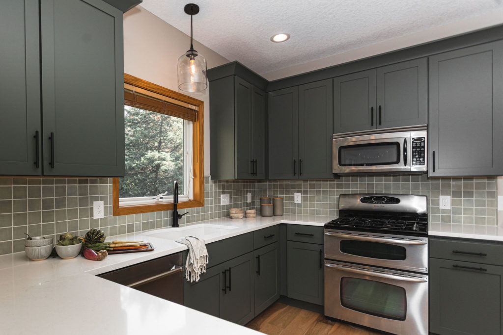
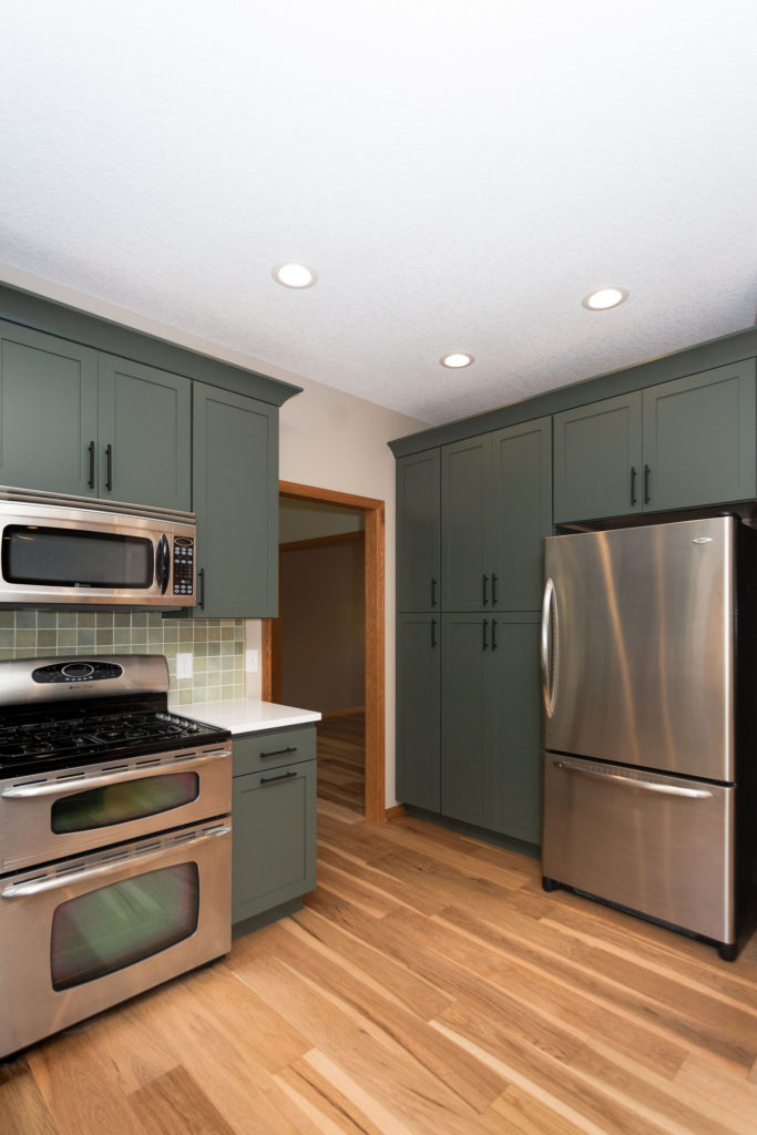
Because the layout was already great and their appliances were in good condition, the sink remained under the window, and the appliances remained in the same locations.
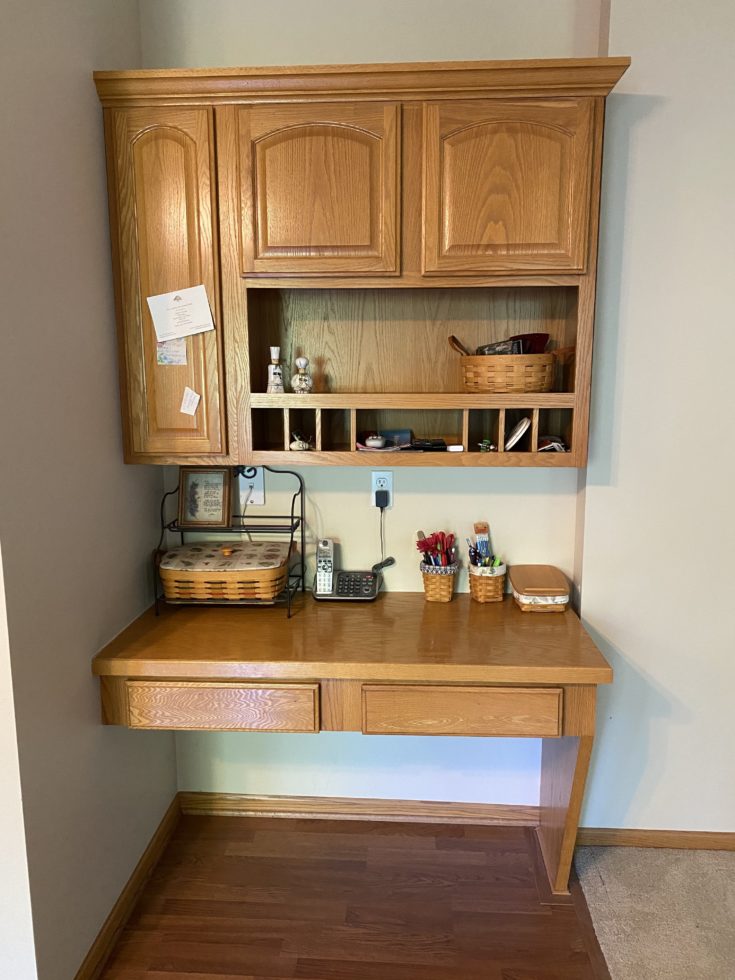
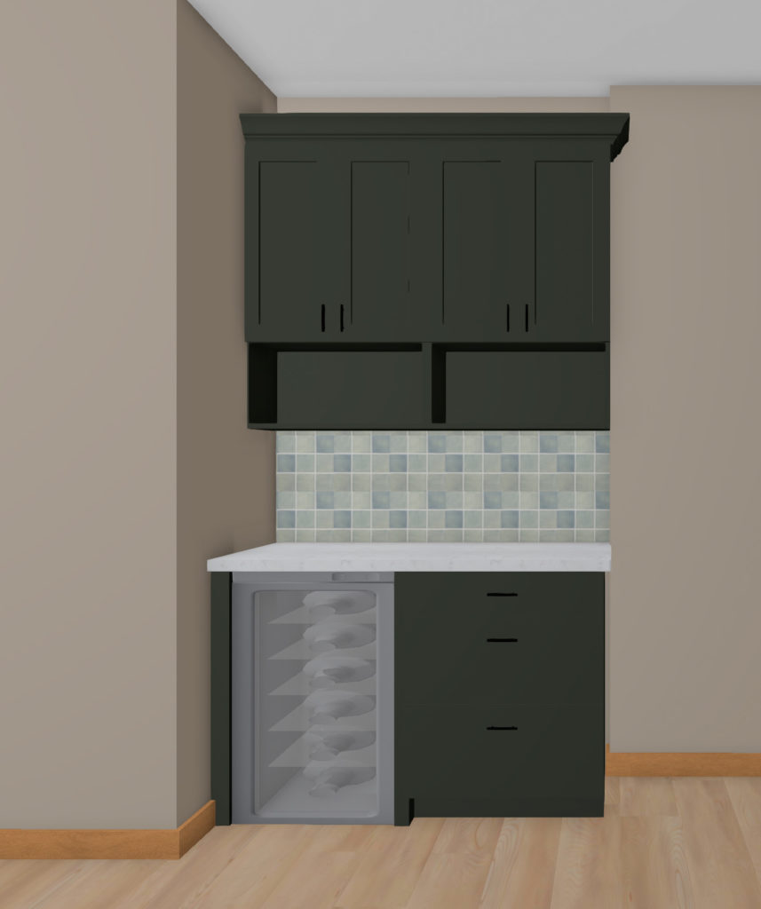
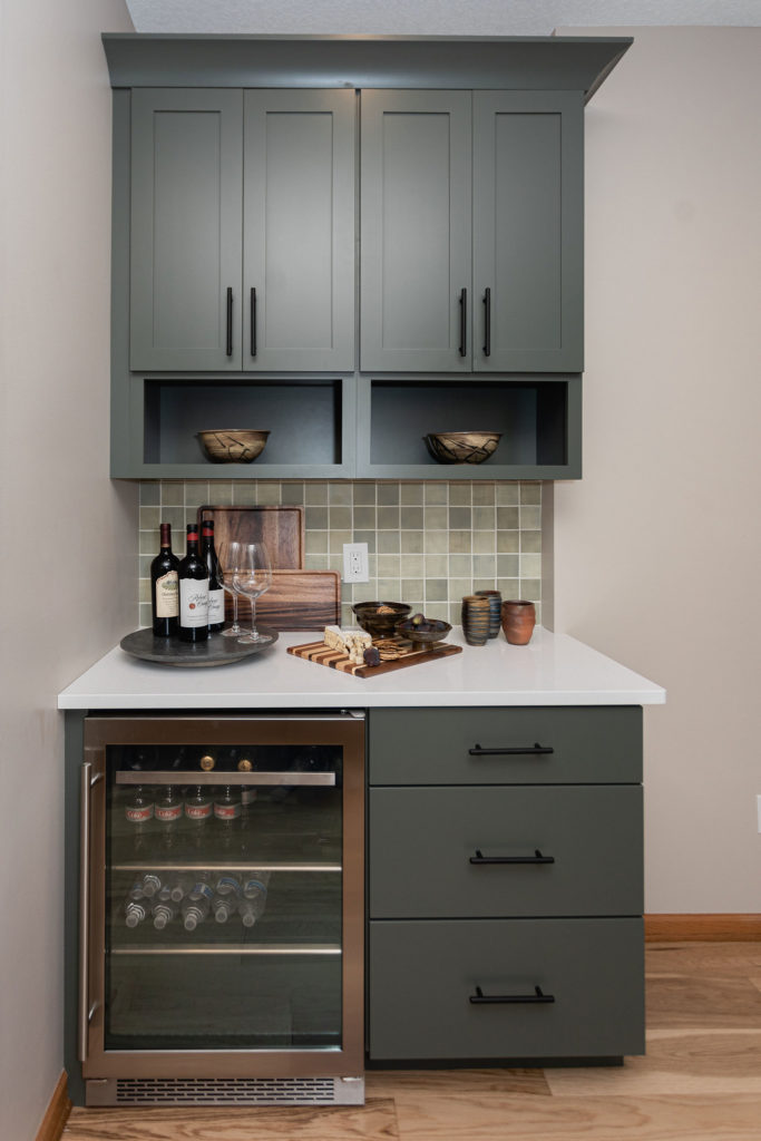
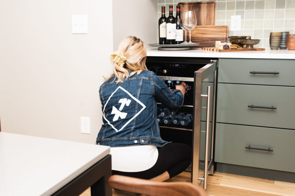
This was another area in their home they wanted to update. Who else has a desk area in their kitchen?! We did in our own home, and it’s something that we’re changing up in most homes built in the 90s that we renovate. This area we made into a beverage station, which worked perfectly!
The flooring throughout the entire main level was all completely removed as well. I wish I had a good before photo as our clients had more than a few different materials throughout the main level, from hardwood to carpet to tile to linoleum. We took it all out and put in one new cohesive flooring throughout.
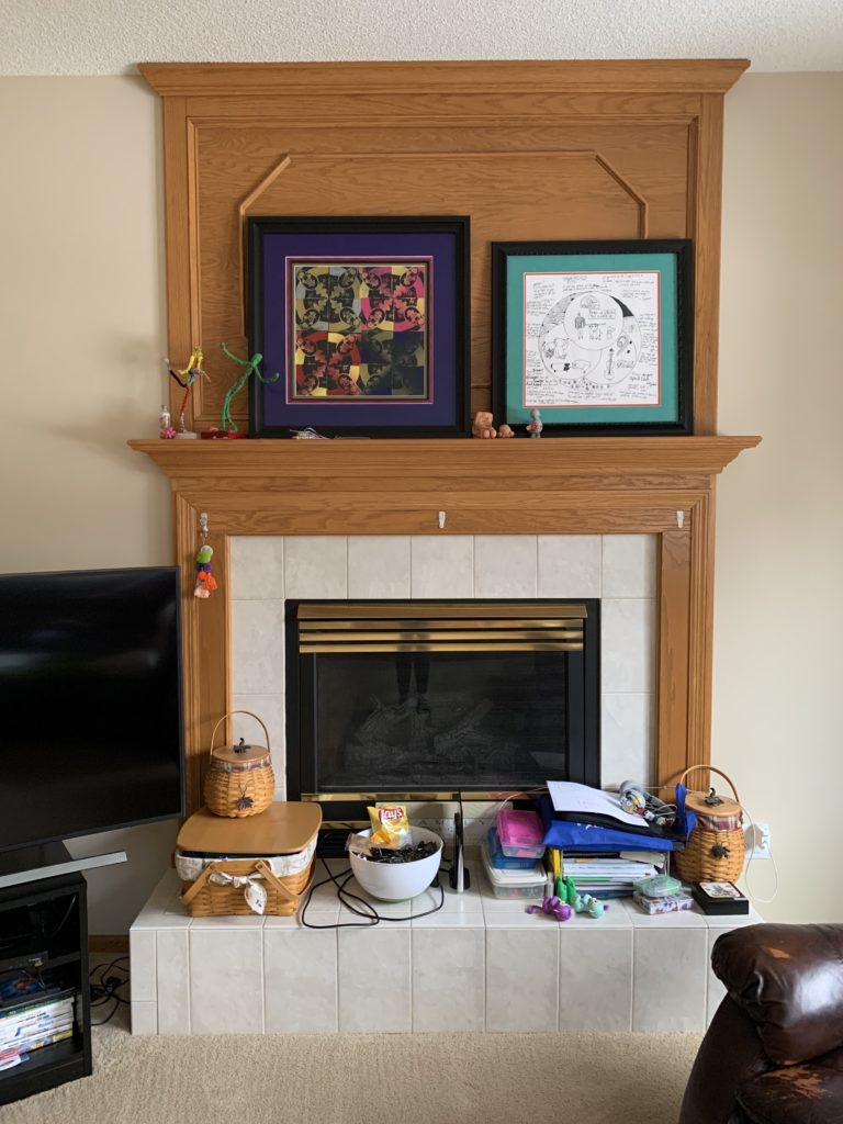
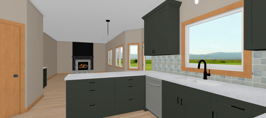
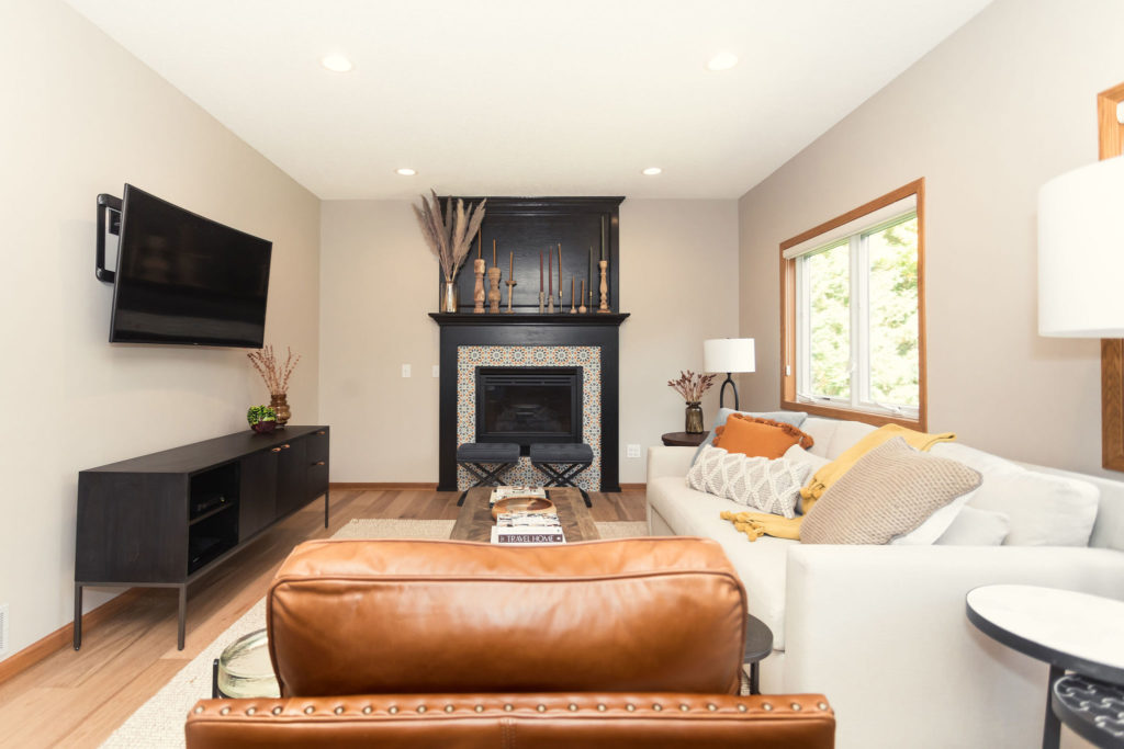
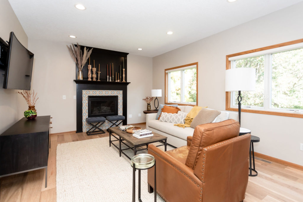
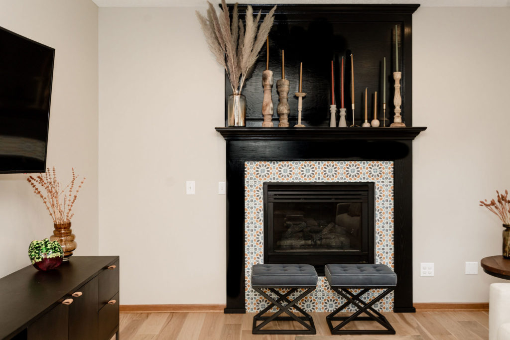
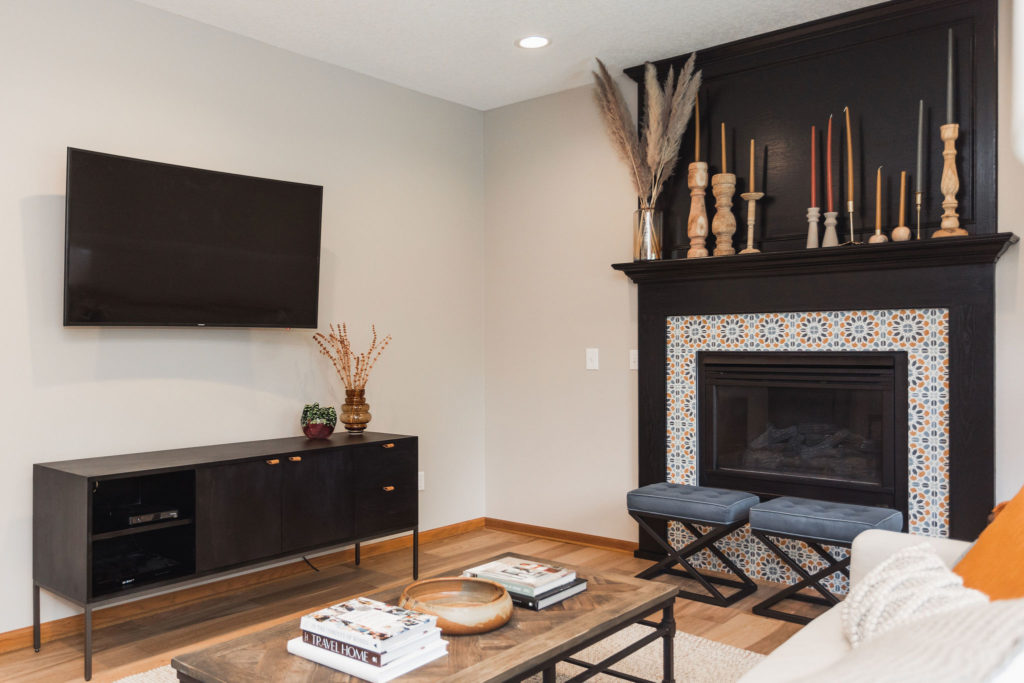
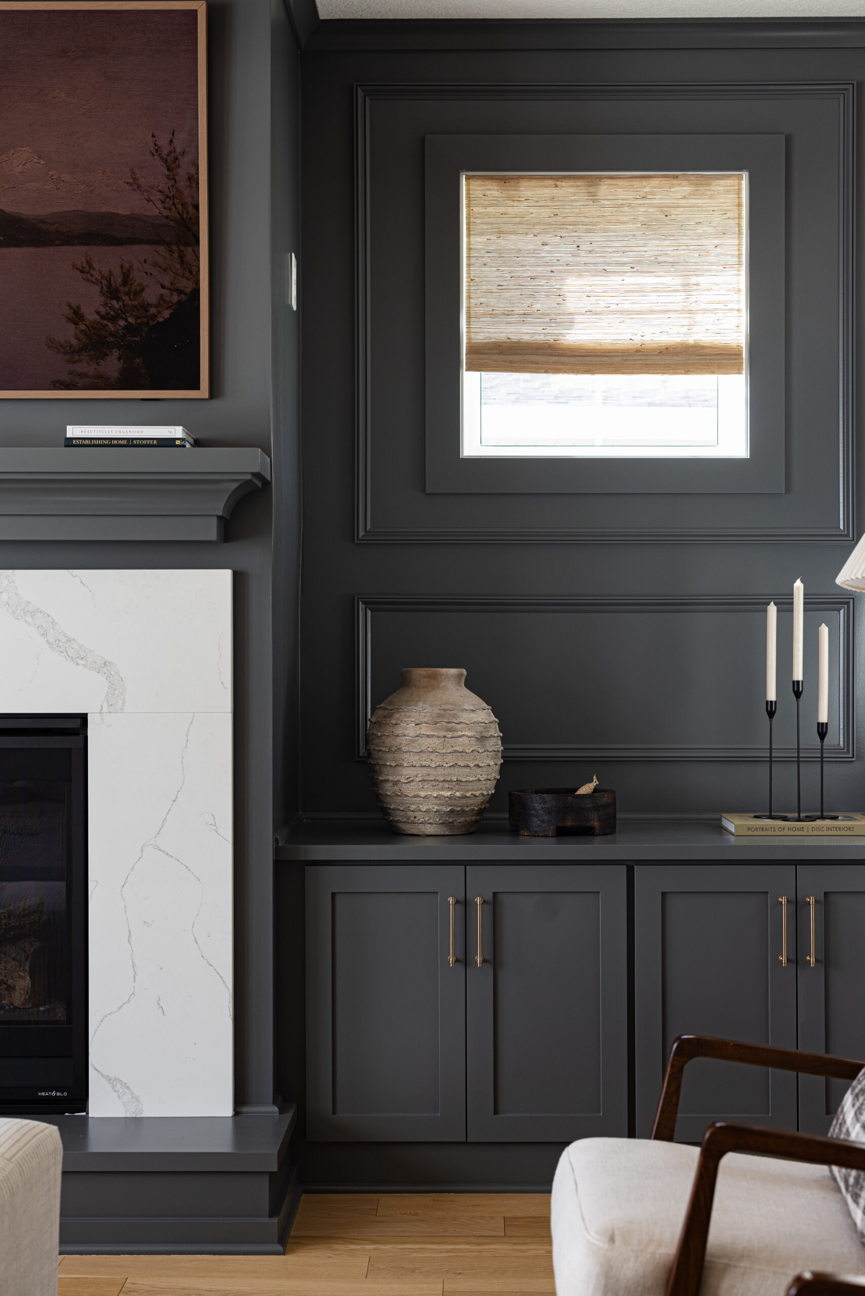
The fireplace was another focal point that they wanted to update without completely revamping it as they wanted to put more of the costs into their kitchen. We recommended removing the hearth, being we were replacing the floor anyway, added new paint, and updating the tile.
Designs
As I mentioned, the one thing our clients knew they wanted was green cabinetry, and we were all about it!
Initially, we were chatting about just doing accents of green cabinetry. But then, after discussions and seeing the real-life renderings and walking through the cost of all new cabinets, our clients decided it was worth it.
Since this is a larger refresh, most of the main level will be updated, and they wanted the cabinets to reflect that change as well. After seeing the renderings with all-new deep green cabinets, our clients were in LOVE and knew they needed to go for it. All new cabinets also allowed us to rework some of the trouble spots with the current layout. When moving appliances and plumbing around in a kitchen design, the costs can quickly add up, so we kept the appliances and sink in the same location.
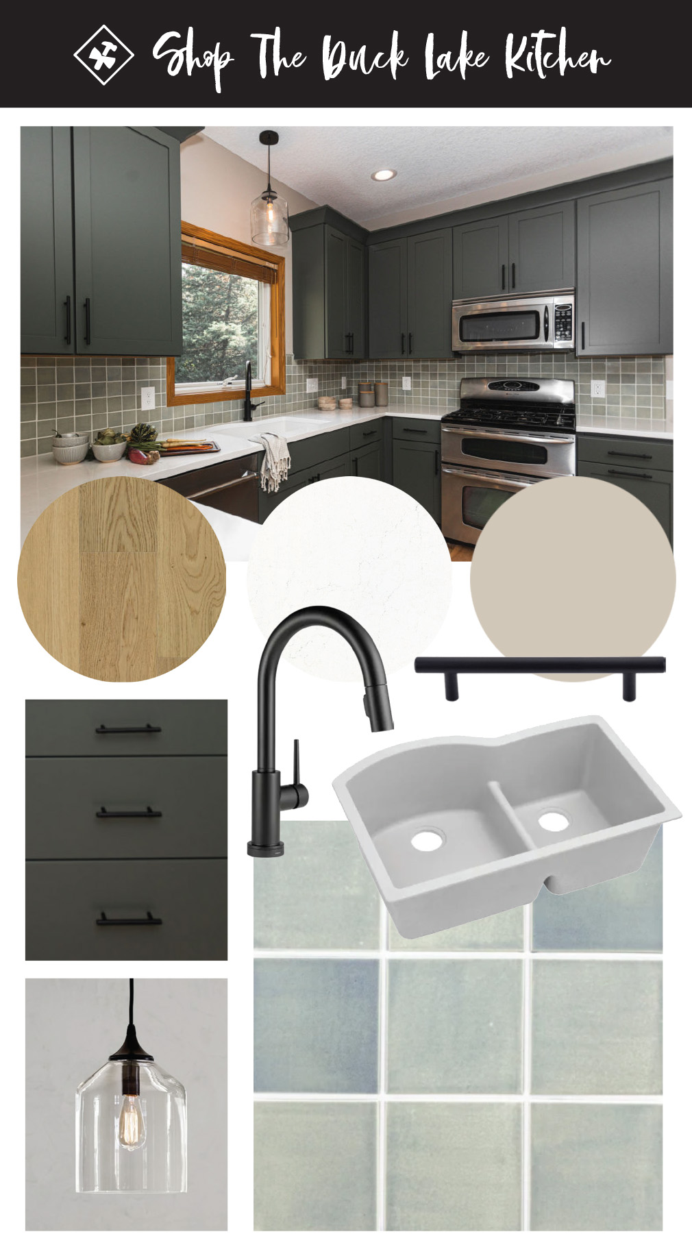
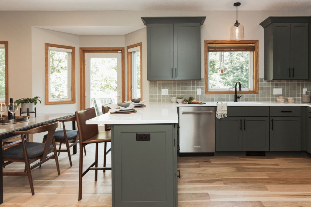
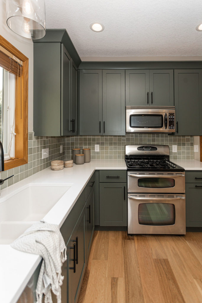
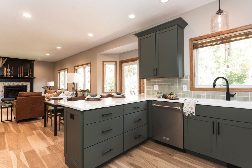
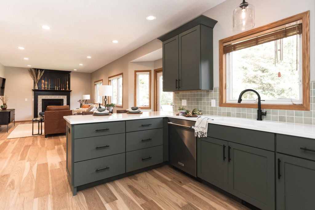
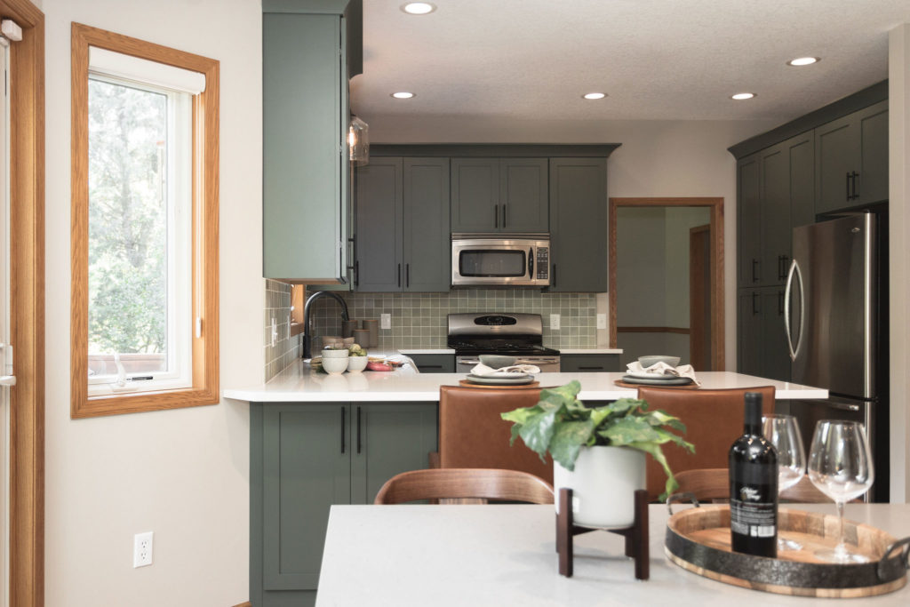
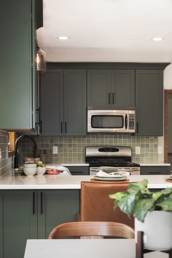
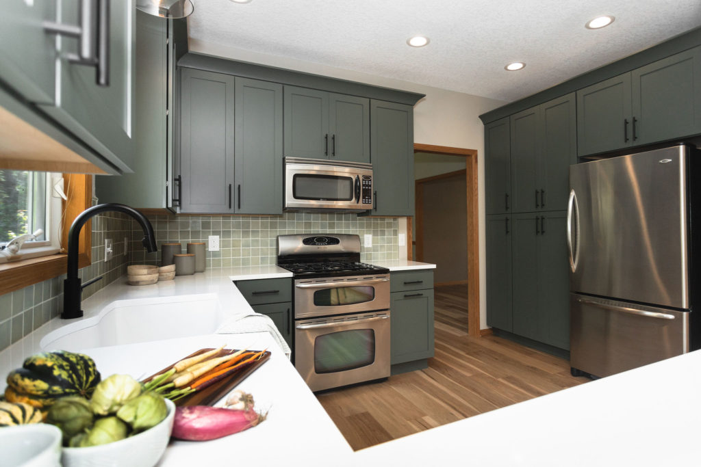
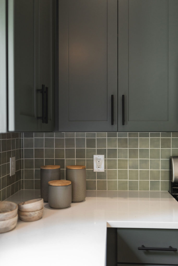
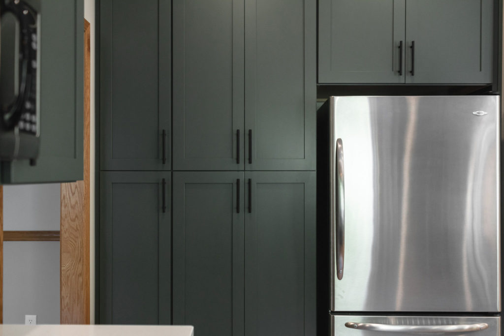
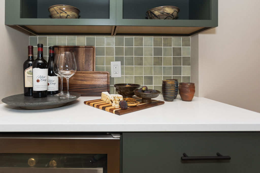
Cabinets painted in Pewter Green paint provide a beautiful base for the rest of the kitchen, while Cambria quartz countertops lighten up the space. For a black accent, the sink and hardware are both in a matte black finish.
After
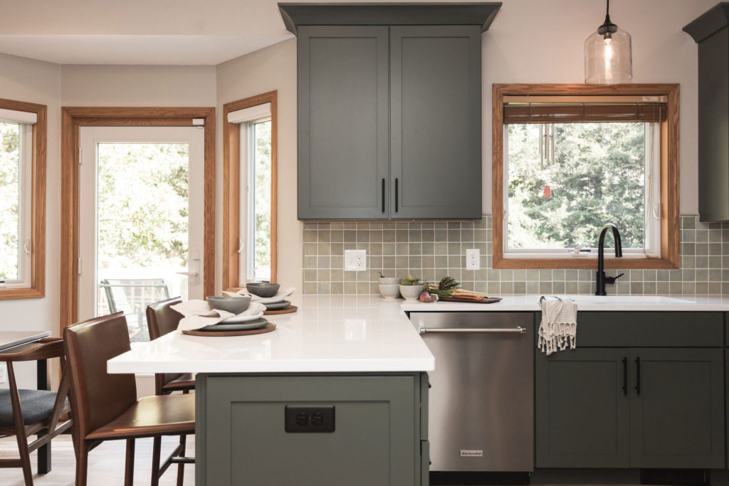
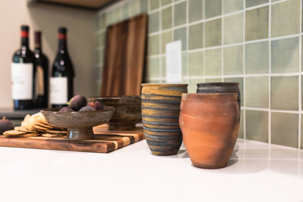
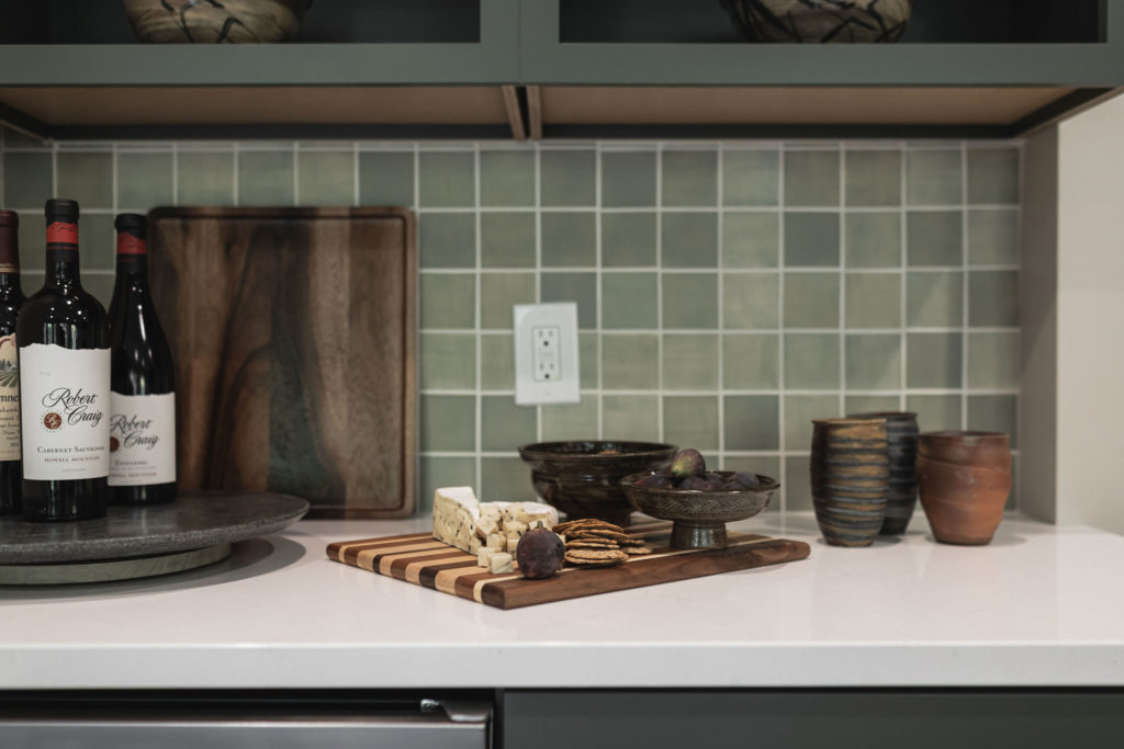
And the after! The pewter green cabinets from Woodland were my favorite! Complemented with that beautiful handmade Mercury Mosaic tile, it was just what our clients had envisioned.
After removing the golden oak cabinetry and toning down the flooring to one cohesive light wood in the kitchen, I think all of the millwork looked great!
It even changed its color in a way, don’t you think?! And I’m all about the warm tones, so I think it tied into all of the elements seamlessly.
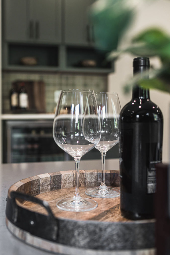
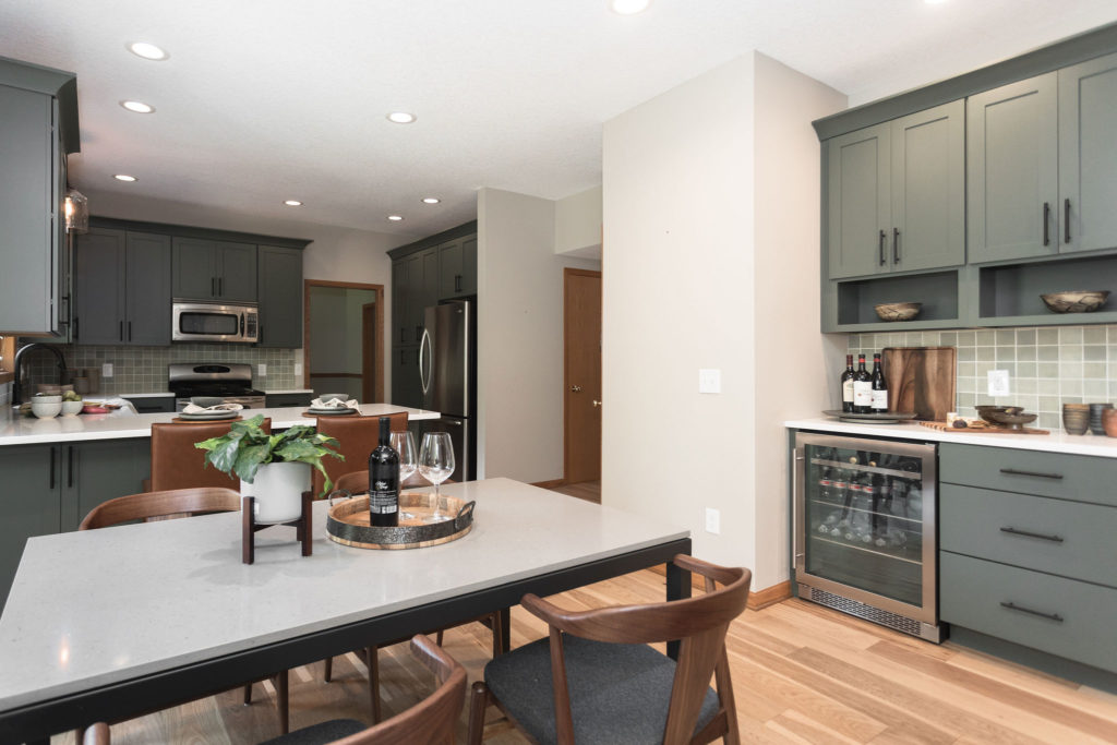
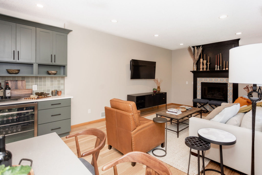
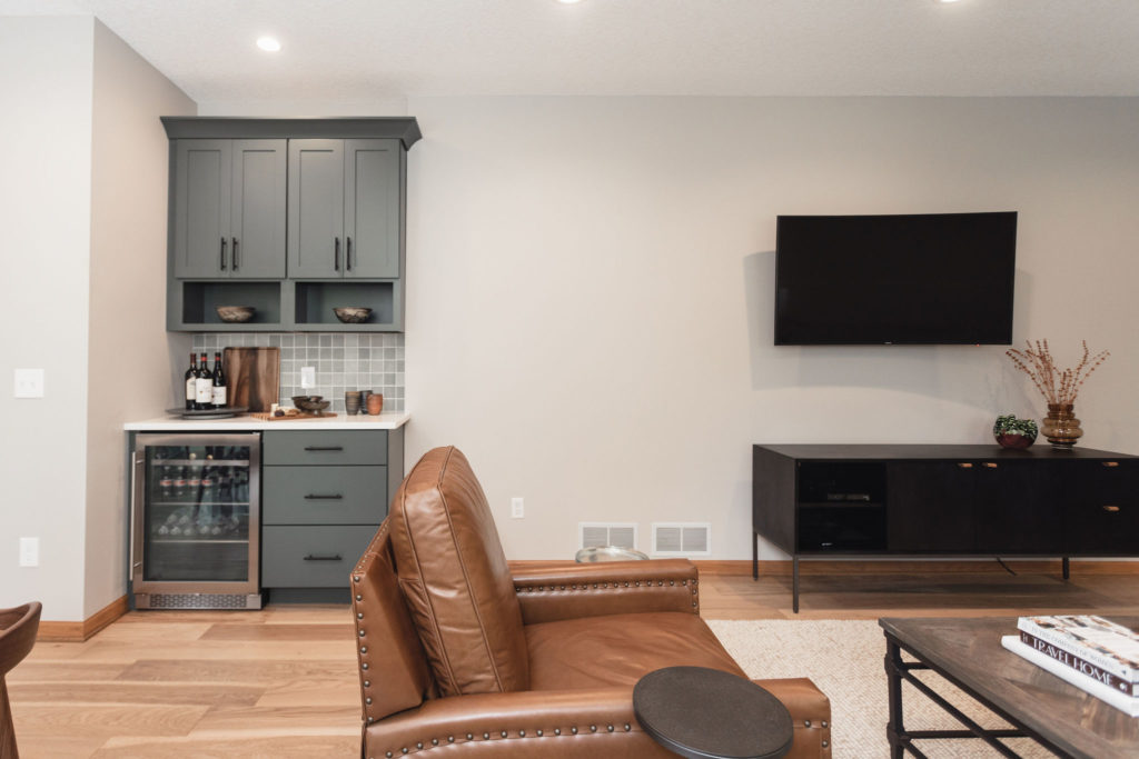
And being the wine connoisseur that they are, we took the 90’s desk area that we all have whose houses were built then, and converted it into a wine-tasting area.
Which flowed perfectly from their kitchen into their living room area when entertaining!
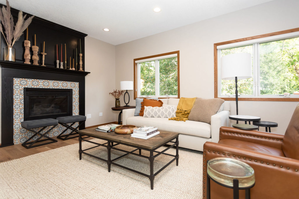
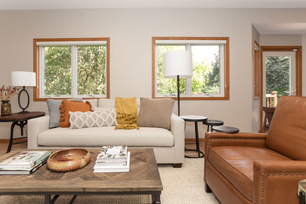
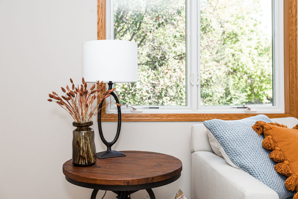
Our clients ended up getting all new furniture as well, and I couldn’t get enough of it! As you can see, our clients had great taste, and everything they chose worked so perfectly within their newly remodeled space.
And I loved how we added in a fun splash of tile with Zia Tile! And with a little black paint, it made it look like a whole new fireplace.
Jamie was also able to work his custom cabinetry magic. Because the hearth was removed, he made it look like the wood panel siding always flowed to the ground from the beginning, when in reality, it stopped right under the actual fireplace.
What do you guys think?! What’s your favorite part about this space?
Selections + Shop this Space
Kitchen
Countertops | Cabinets | Backsplash | Sink | Faucet | Hardware | Flooring | Lighting over Sink | Eat- In Kitchen Light | Cabinet Paint Color | Wall Paint Color
Living Room + Main
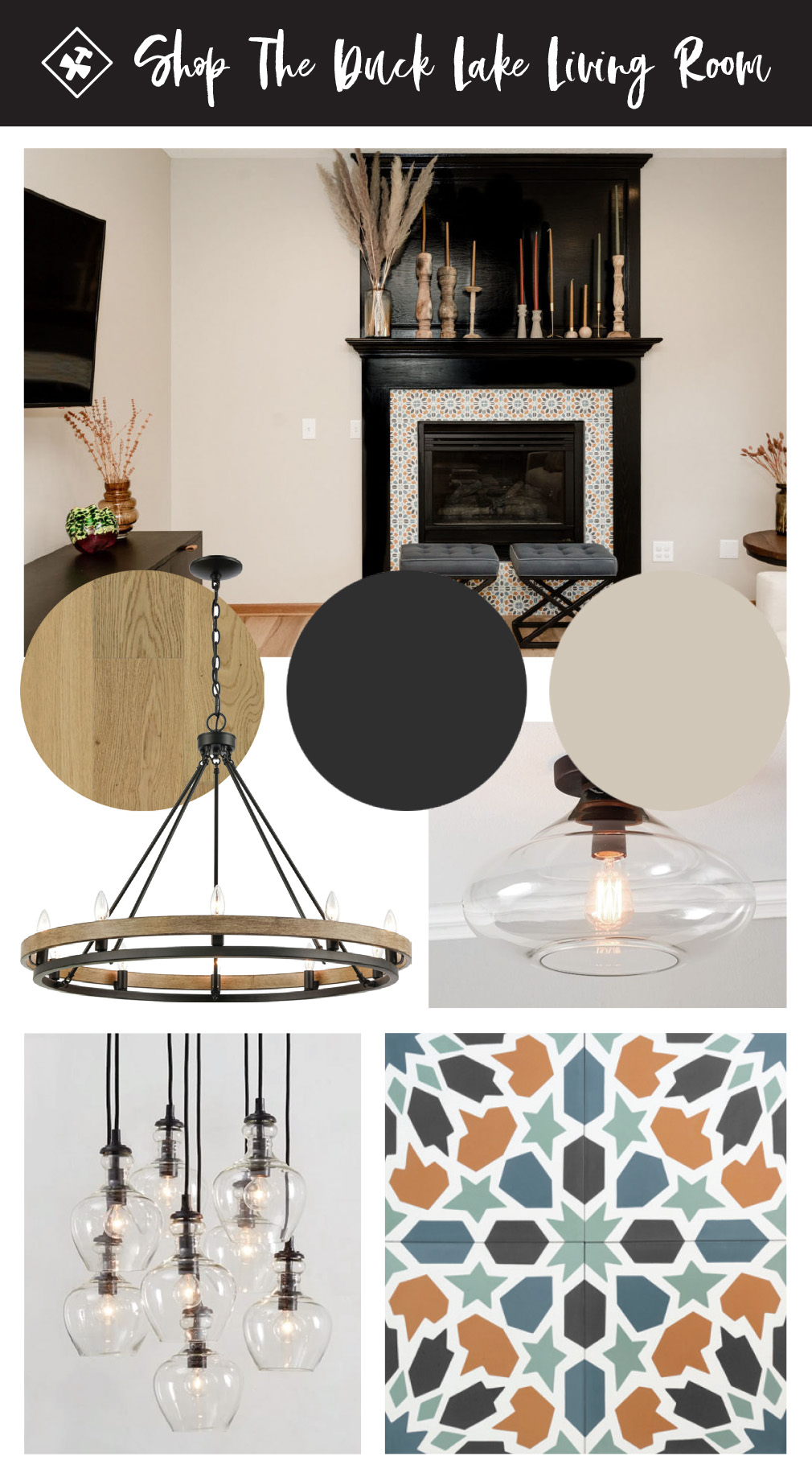
Fireplace Tile | Fireplace Paint Color | Flooring | Formal Dining + Entry Light | Eat- In Kitchen Light | Laundry & Pantry Light | Wall Paint Color
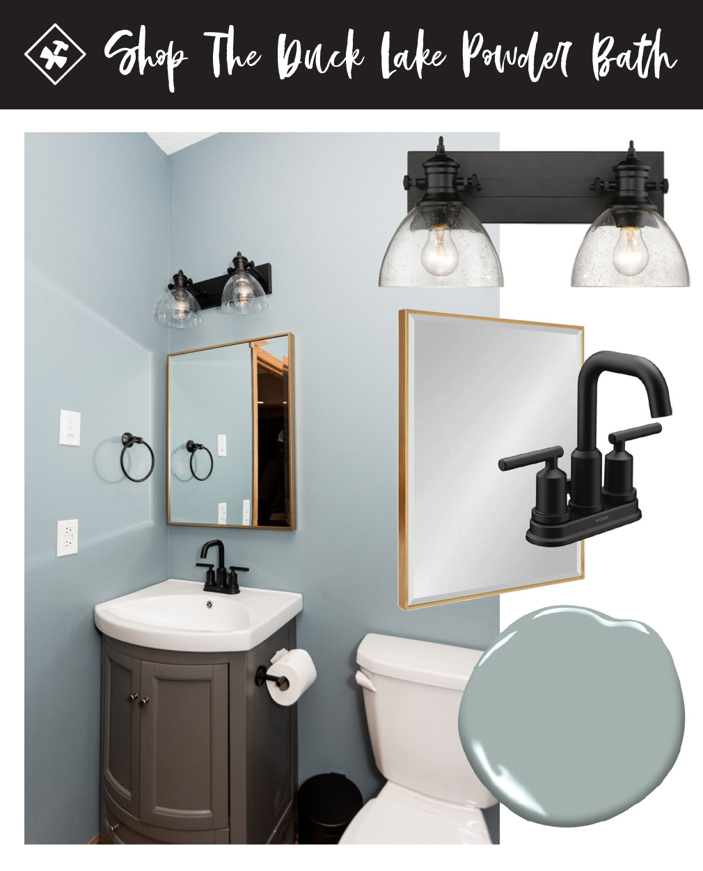
Powder Bath
Vanity | Faucet | Mirror | Lighting

4 thoughts on “Duck Lake Main Level Reveal”
Comments are closed.