It’s hard to believe that it’s been almost a year since we started working with our clients over at the #heritagevalleyhome project! Back when we started this project we were ready to kick off into construction and then the pandemic came into high gear. We decided to put construction on hold but now are back at it and cruising to the finish line.
Entryway
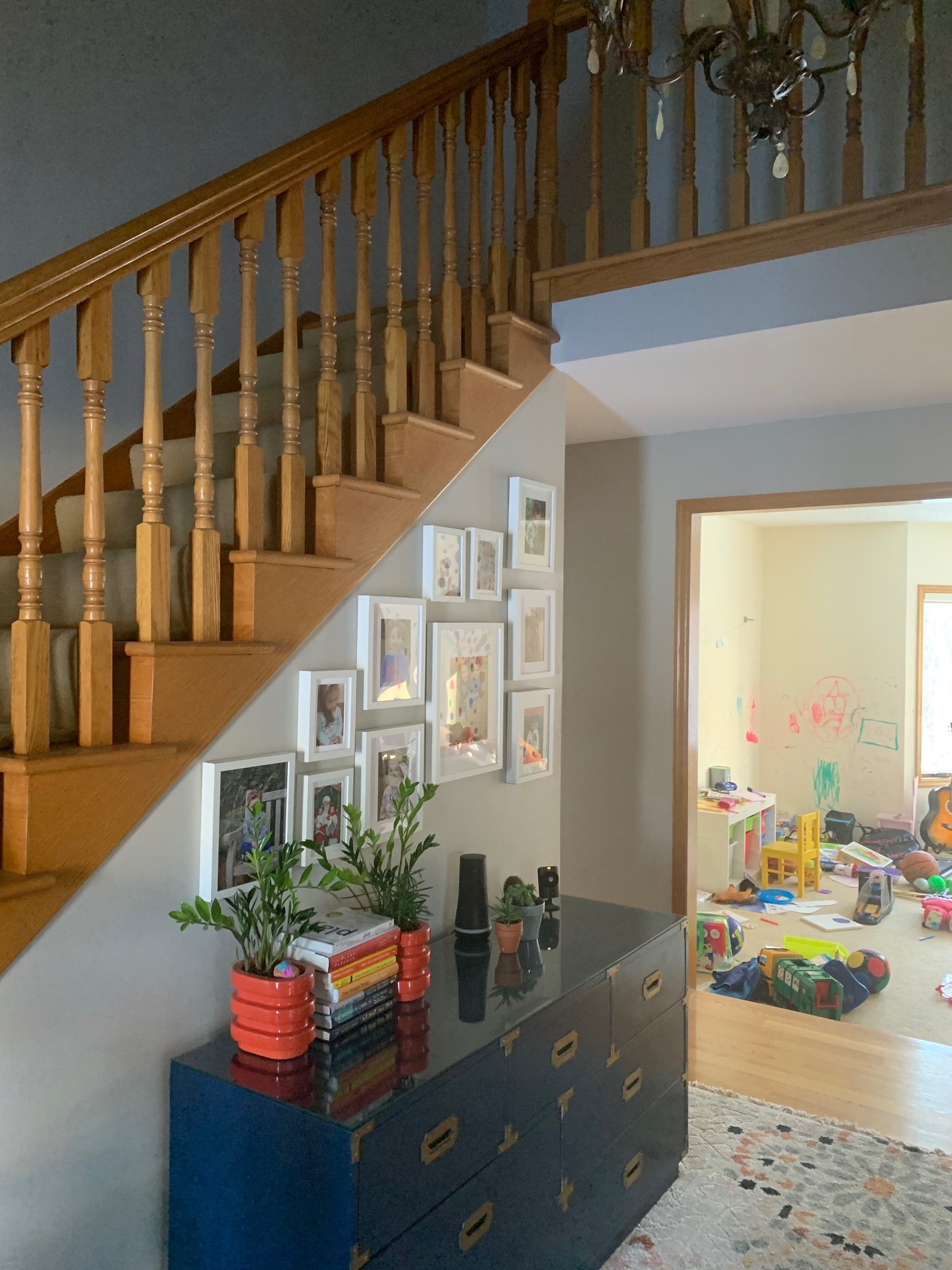
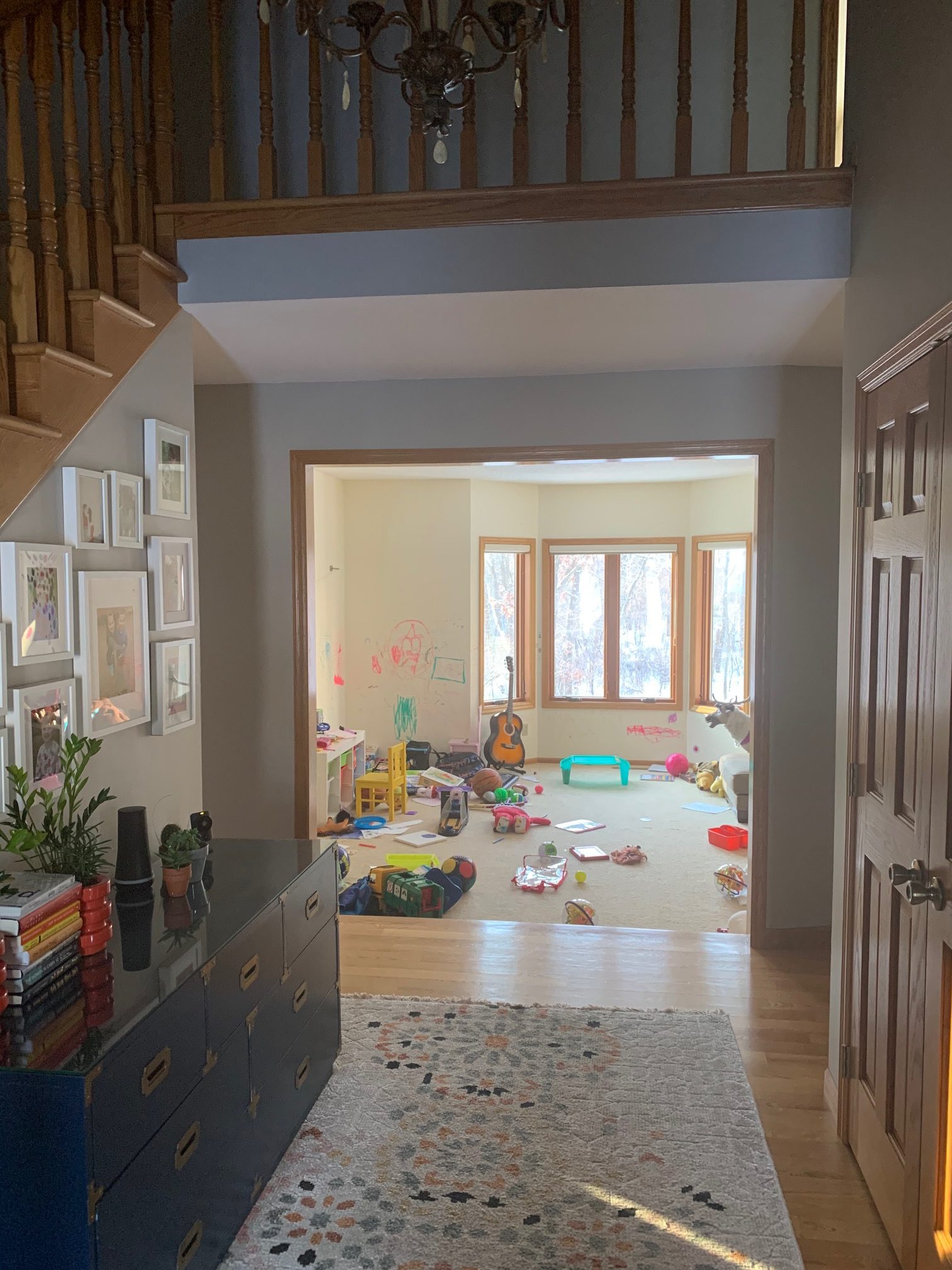
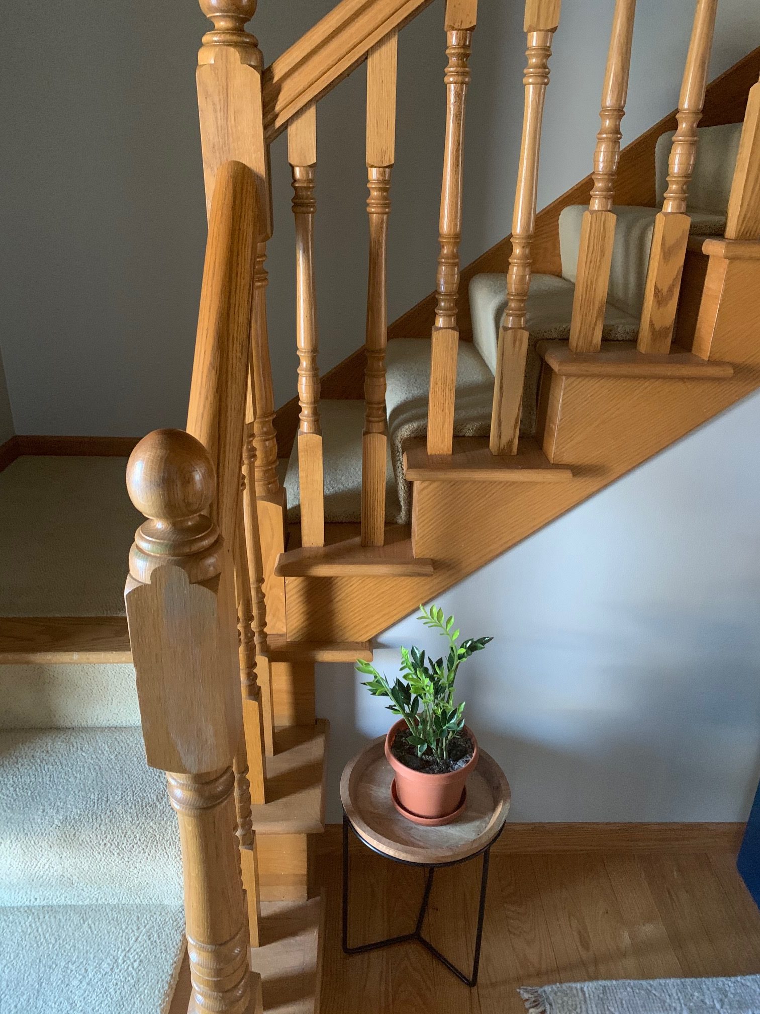
Before
We’re starting off in front of the house. This is what the entryway and the old kid’s playroom used to look like. This is the first thing you see when you walk through the front door of this house, are our clients wanted this to become a statement area. While we do love the one of a kind artwork hand drawn by the kiddos on the wall, it was a space that as their kids grew older they were growing out of.
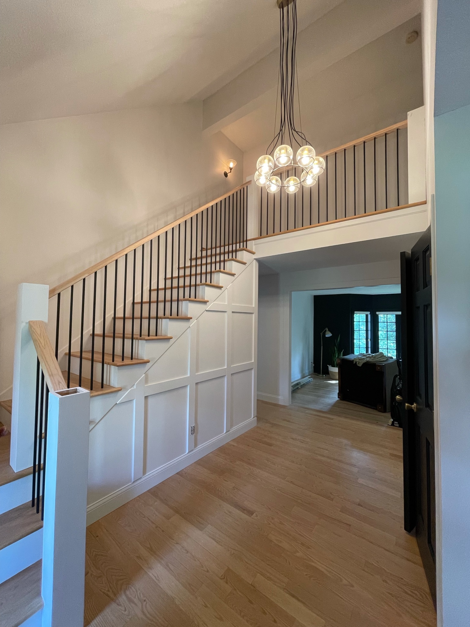
Jamie created a custom staircase to replace this builder-grade staircase to add in a bit of flair to this entryway.
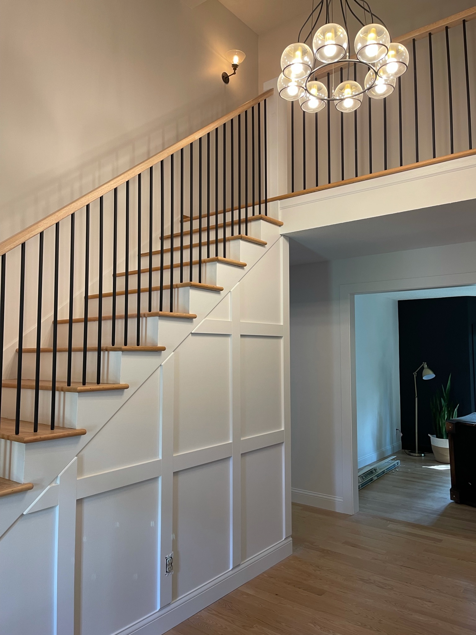
They also replaced the entryway light to match the new vibe throughout.
As these rooms started to transform, our clients asked us if we could create a custom board and batten wall against the stairs to create more dimension & pair well with their board and batten wall in their new dining space.
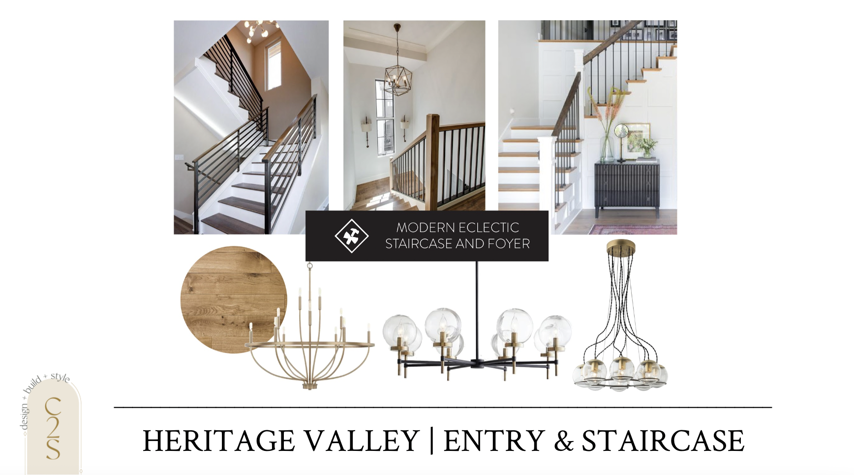
This is the vibe we were going for when we first designed out this home. Light & bright with a touch of moody throughout.
main level paint color | entry light | door & trim paint color
We also went forward with updating millwork on the main level, up the staircase. We went with white base trim & window trim, and black window casing & interior door paint. We added in some new interior door hardware to the freshly painted doors and it felt like an entire new space.
We also found a bench and a rug to place against this board and batten wall as a “drop zone” and to add an extra element to the entryway.
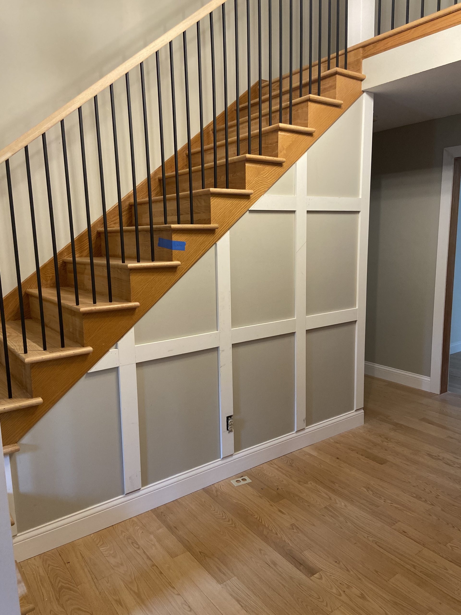
Under Construction
Here’s an update of what the entryway is looking like now.
Jamie cranked out this custom stair rail while Topher worked on the board and batten wall that was added on.
If you’re looking for a way to spruce up your builder-grade staircase or entryway, we have tutorials on both the stair rail and the DIY board and batten wall that the guys have been working on over at the #hertiagevalleyhome.
Adult living room & dining room
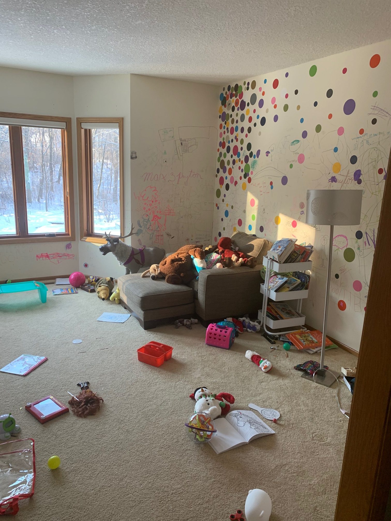
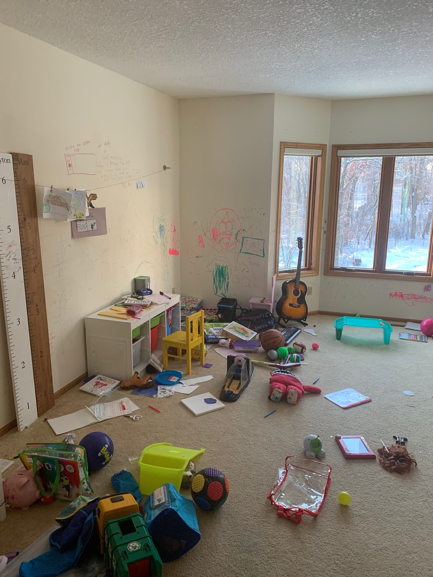
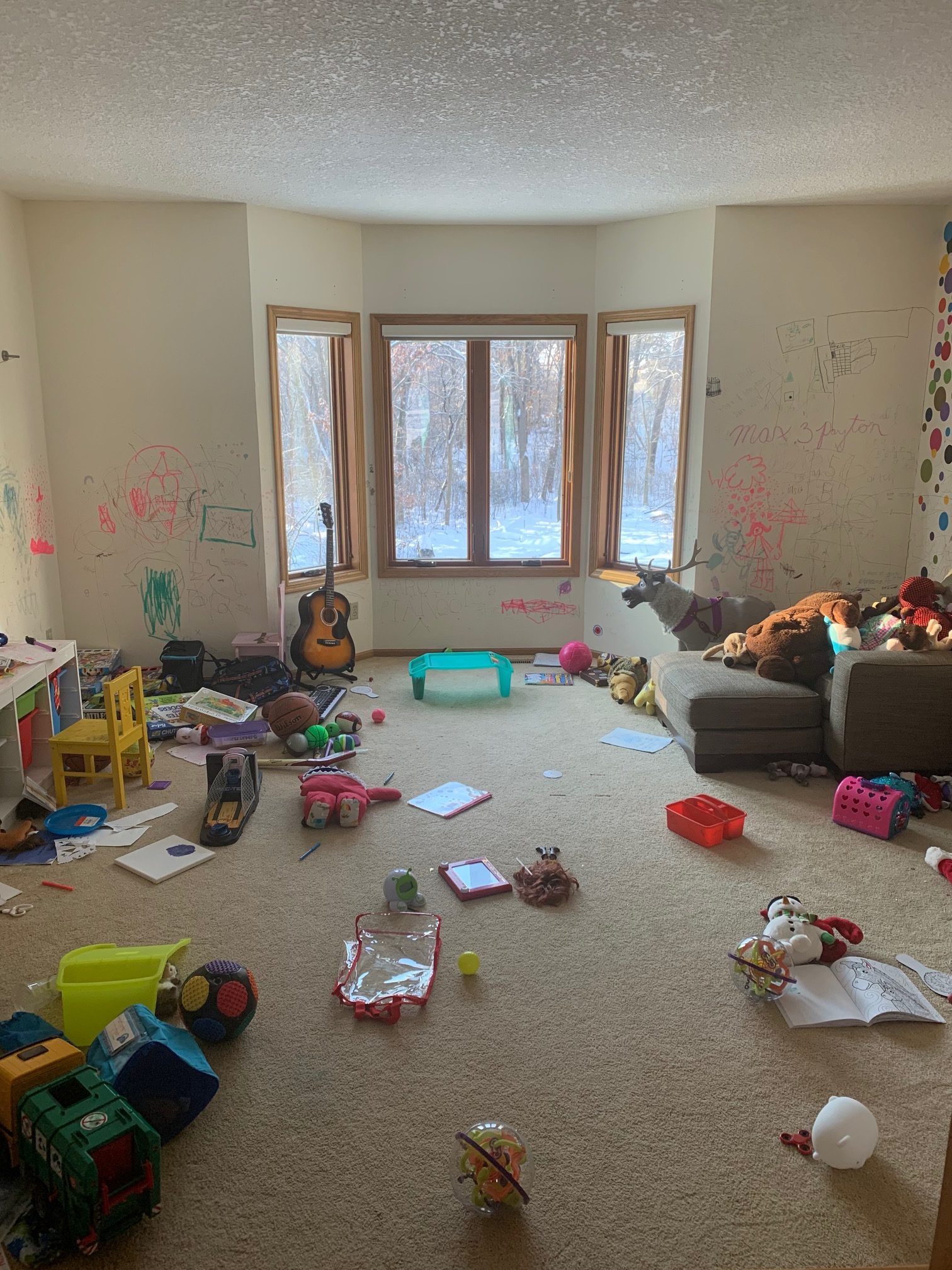
Before
What used to be the kids’ playroom, with markers on the walls and all, is being turned into the adult living room.
The living room will have a dry bar space, a reading nook, and plenty of storage for books and music.
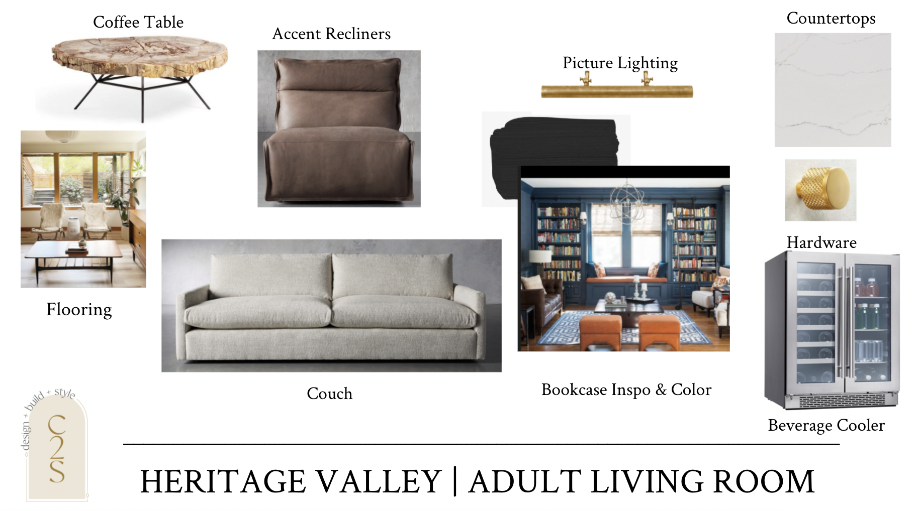
Design
countertops | cabinetry paint color | hardware | picture lighting above bookcases | beverage cooler
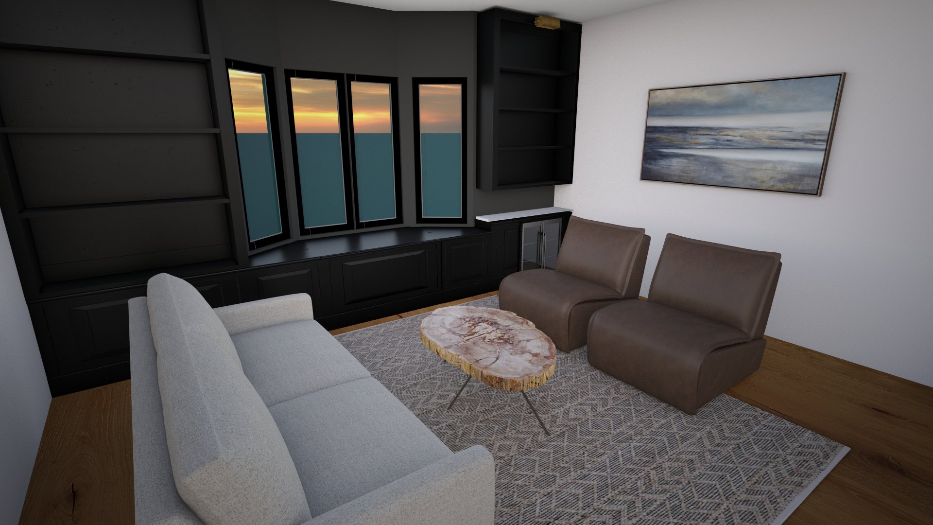
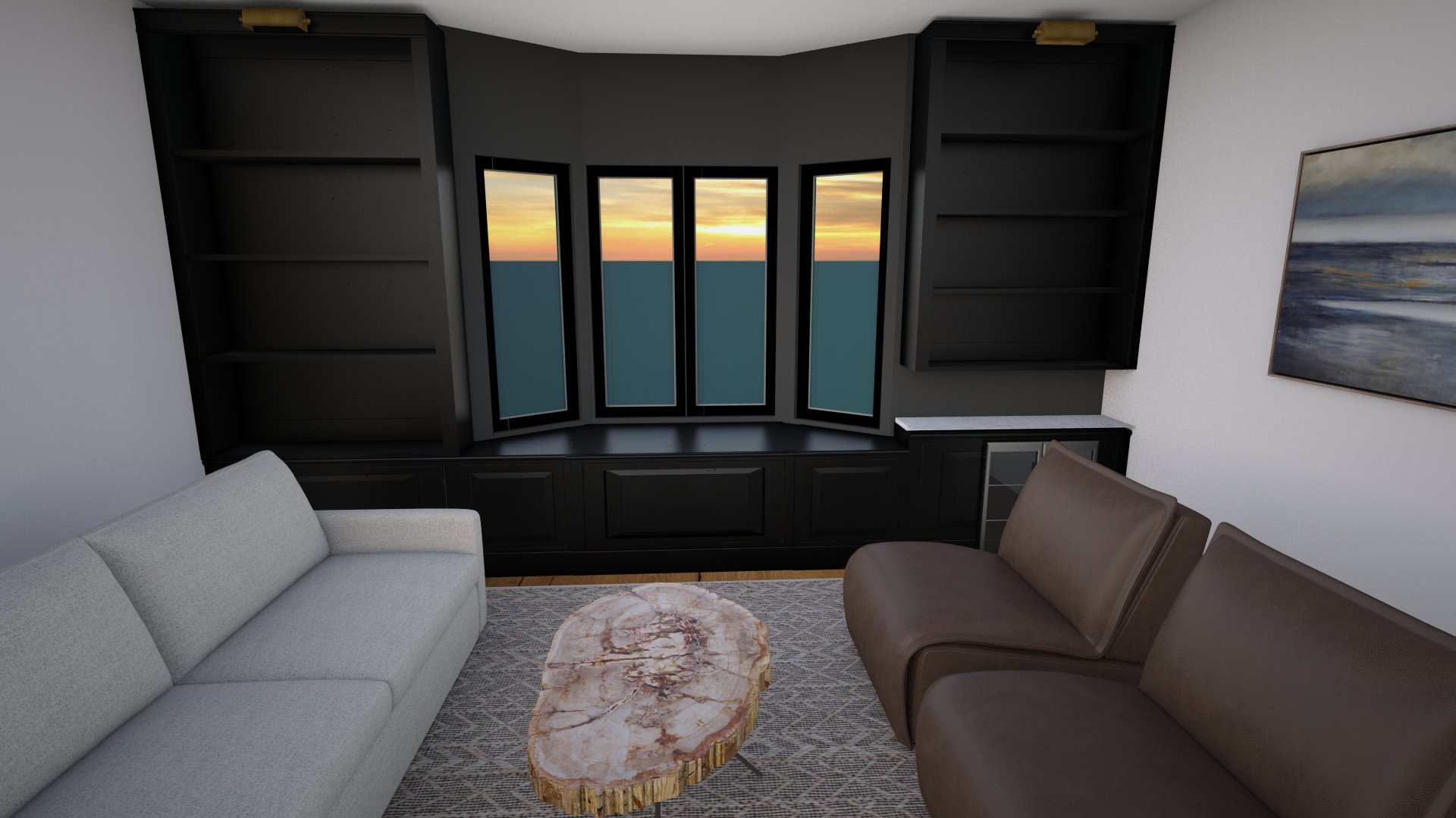
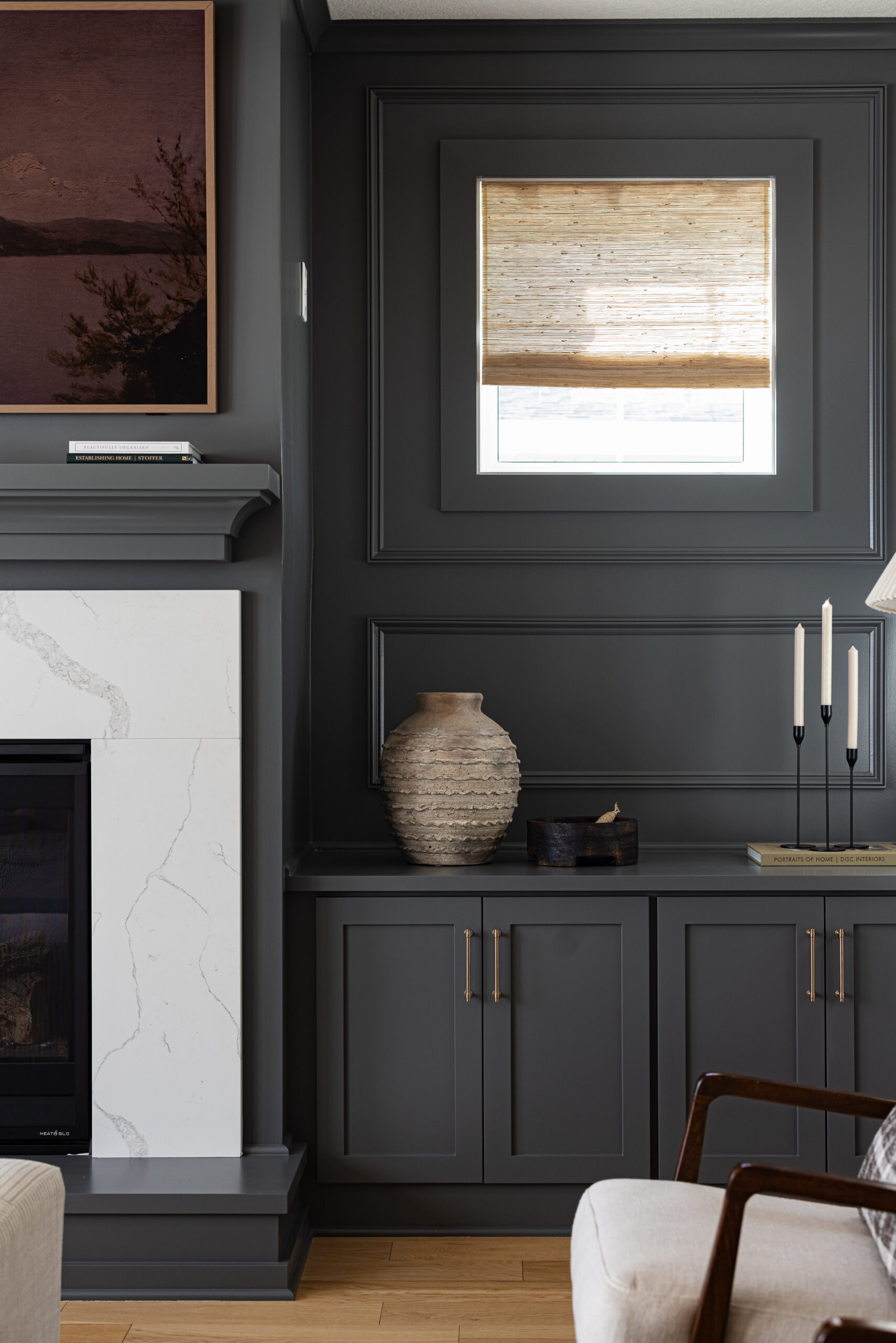
The main goal of our clients was to draw in people’s attention to this space right when they walk through the front door. We went with a dark & moody accent wall that will automatically pop against the white wall color.
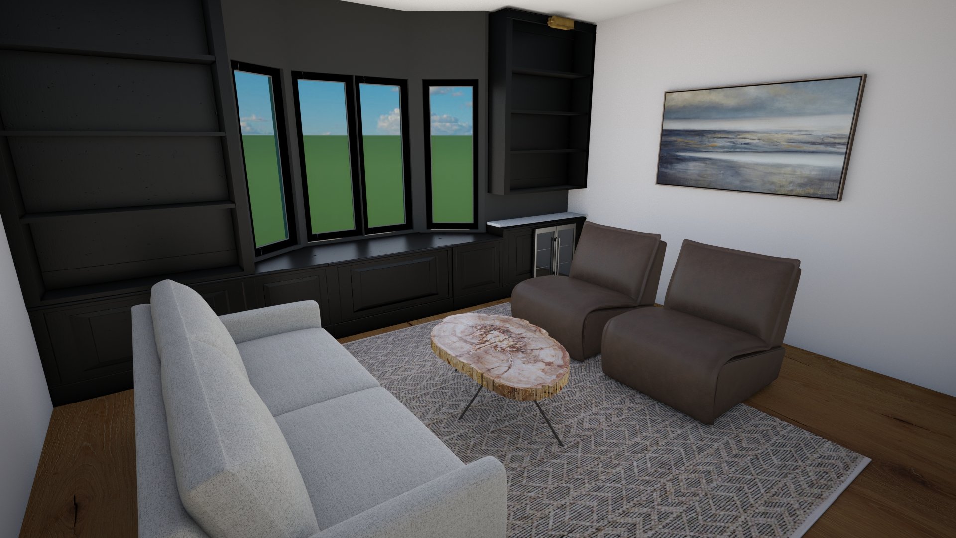
We’ll be adding custom built ins on both sides of the wall, along with a bench seat across the window area, keeping it all monochromatic with our favorite black paint color. On one side of the cabinetry, we’ll have space for a beverage cooler and small, Cambria cutting board to give it a built-in bar station feel. We’ll also be adding in wine bottle cubbies & a stemware holder for the wine glasses.
To enhance the moody feel of the room, we had initially thought about doing a leather couch. After our visit at Arhaus, we all fell in love with these leather recliner chairs that were made for a space like this.
We had our friends and Timber and Tulip design a one-of-a-kind table for this adult living room and it pulls the masculine vibes out with the dark walls.
Here are the renderings to remind you of the space before the work began. We’ve reworked the design a few times and are so excited for the finished product!
couch | chairs | coffee Table
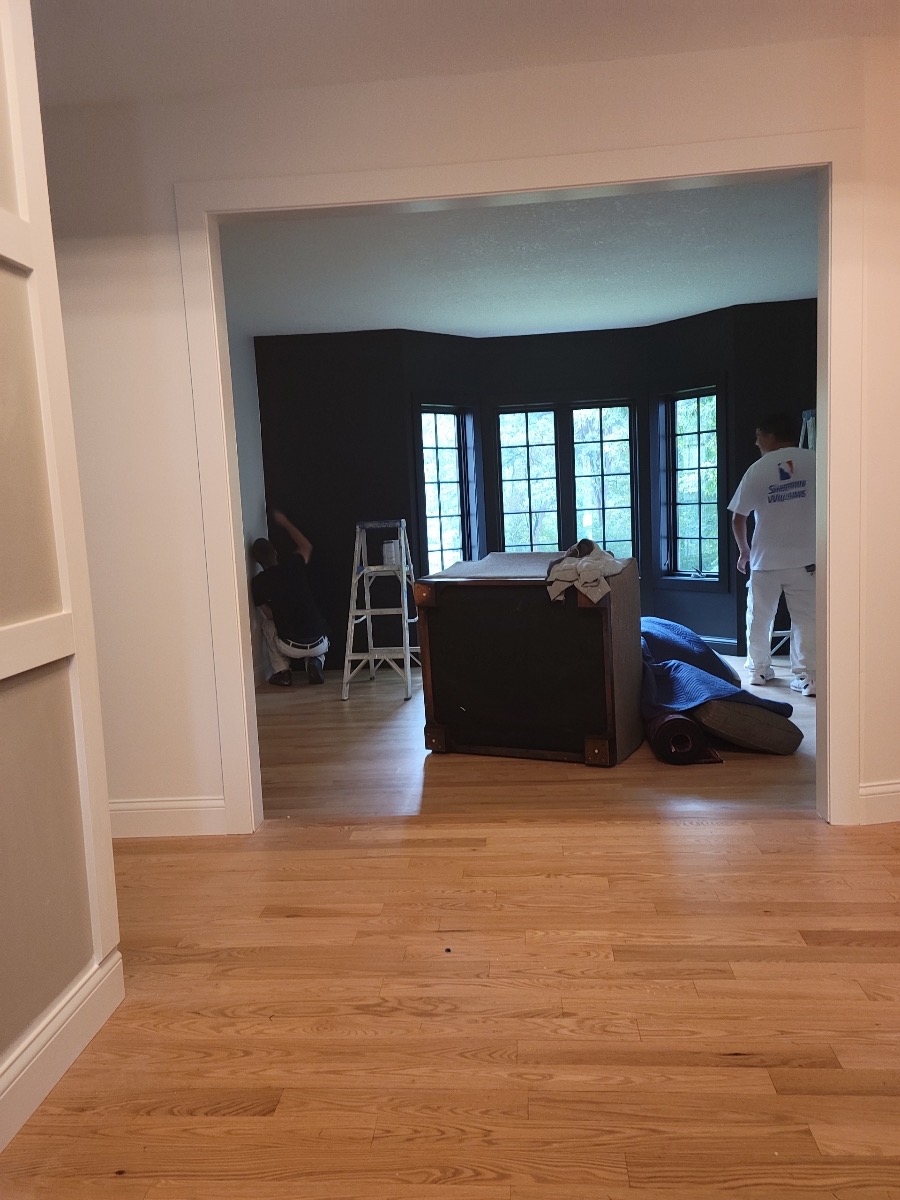
Under Construction
And… current status.
The adult living room wall makes such a statement as you walk in the front door.
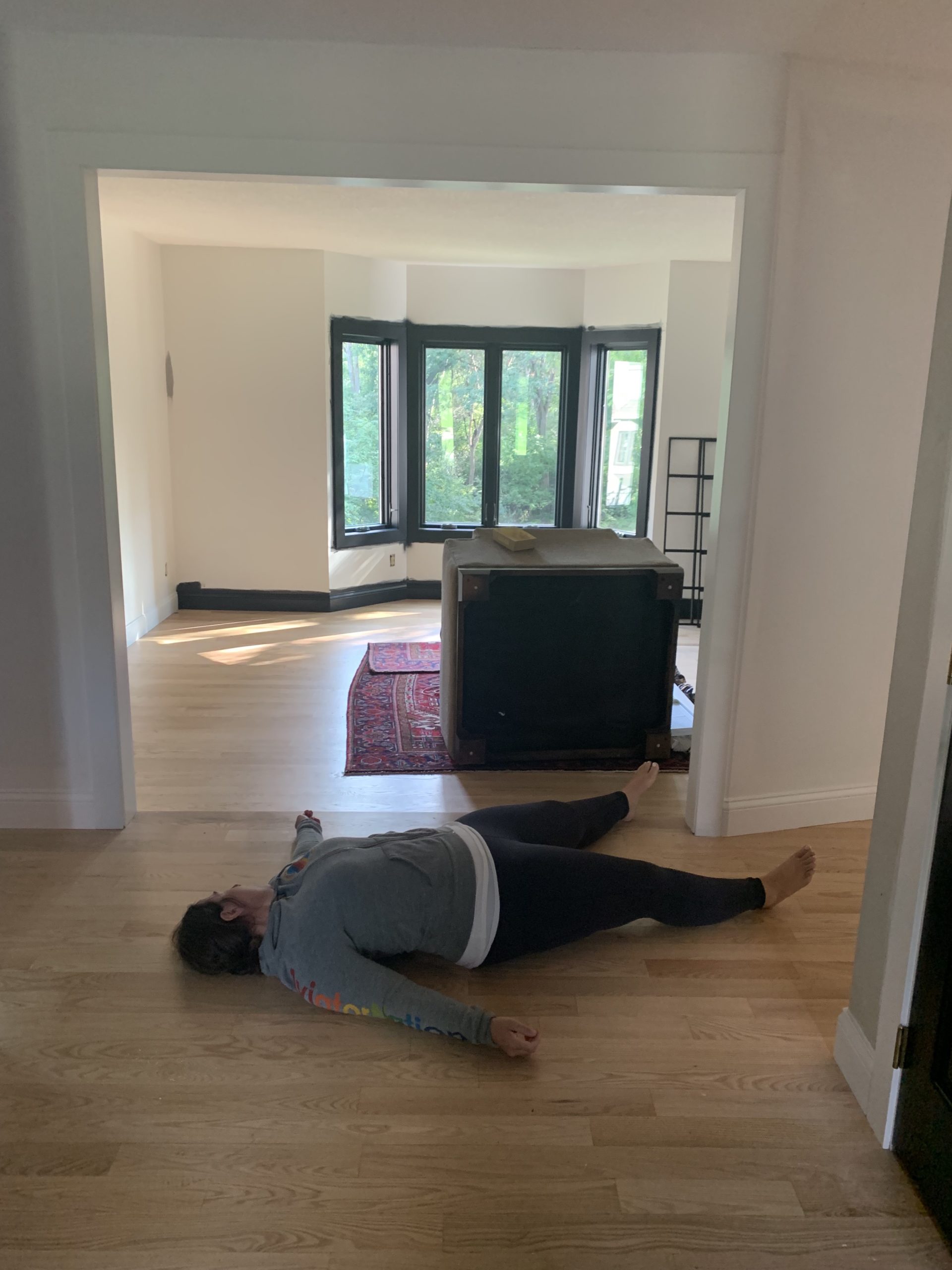
We love receiving messages from our clients during the progress, especially when they look like this, haha! Our client sent us a picture with the caption “dead” because she loved the way it was turning out. We agree with her quote “it looks like a completely different house”!
This house also had the standard golden colored wood floors, so we worked through refinishing those to be a lighter, natural finish. And, the dining room was all carpeted, so we matched the wood flooring in that space to keep it cohesive.
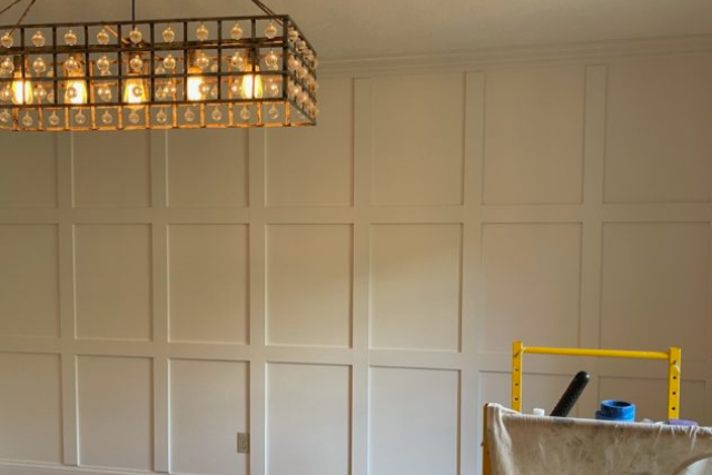
These clients also wanted to incorporate an accent board and batten wall in their dining room to bring in the wall from the entryway and create cohesion as well as jazz up this room a bit.
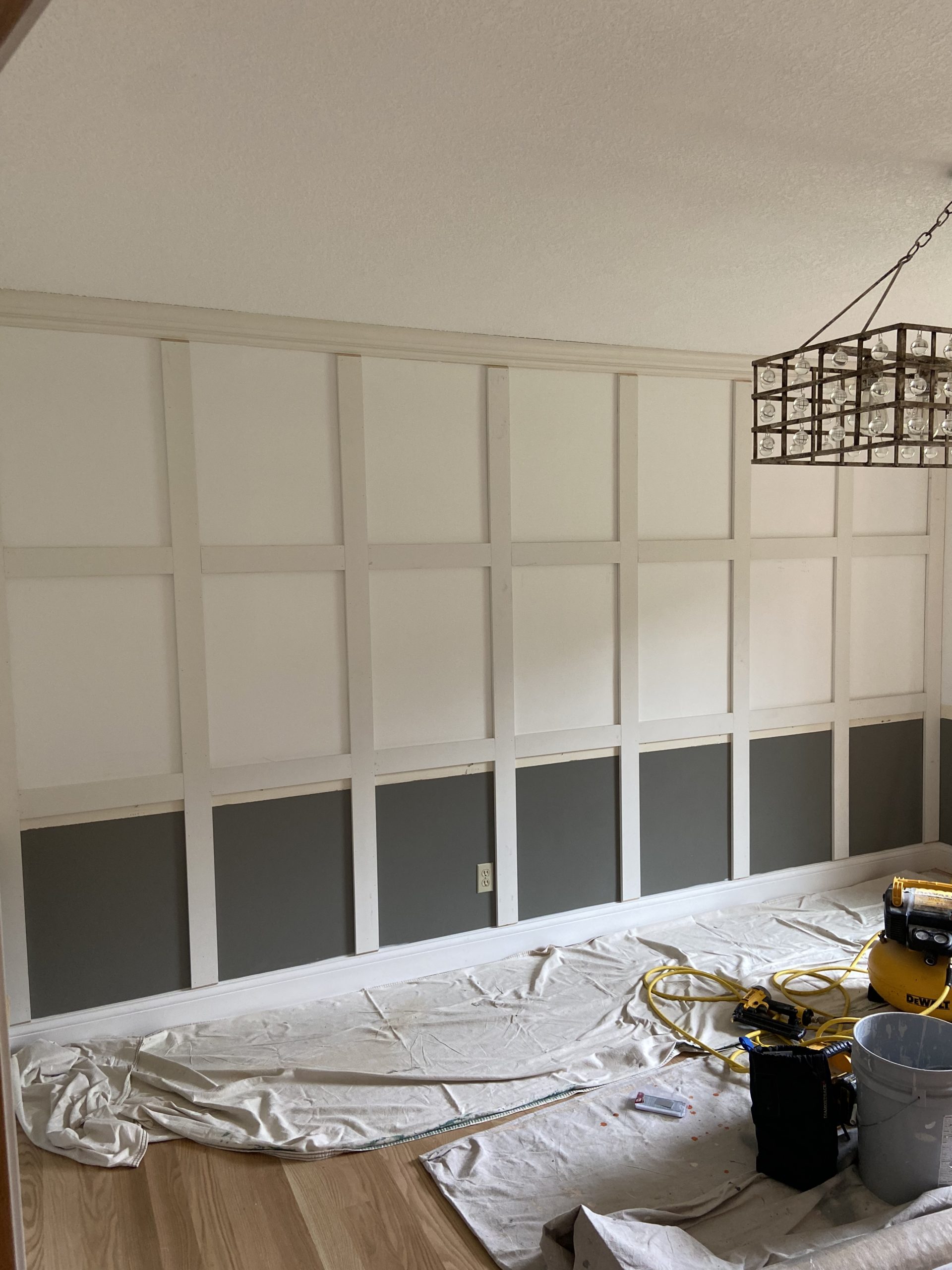
Here is the board and batten wall in the dining room as it was getting painted. We had talked about doing the wall black at first, but after a few back and forth conversations with the client, landed on keeping it monochromatic.
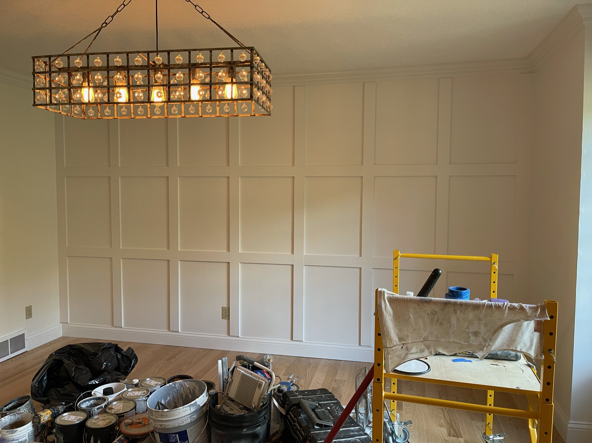
And just like that, another accent wall completed.
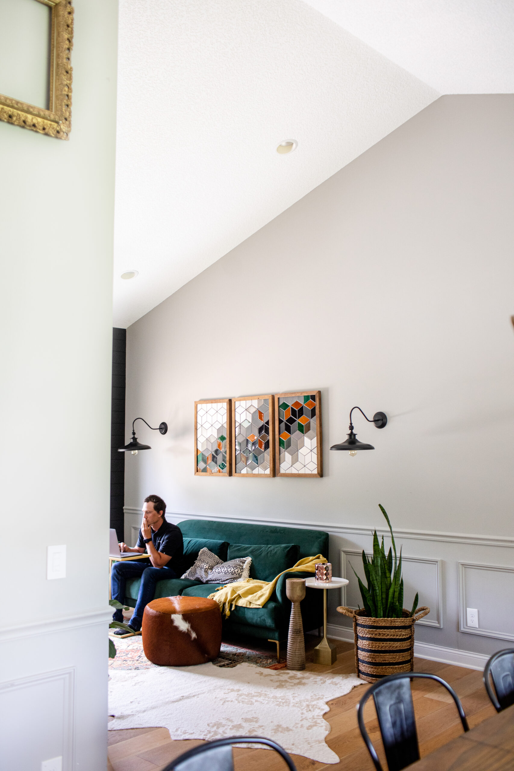
One element we love incorporating into a home is painting the trim to elevate the space. We painted all of the window casing throughout the main level in black to enhance the space and match the vibe throughout, while keeping window trim and base trim white to balance the light and bright feel.
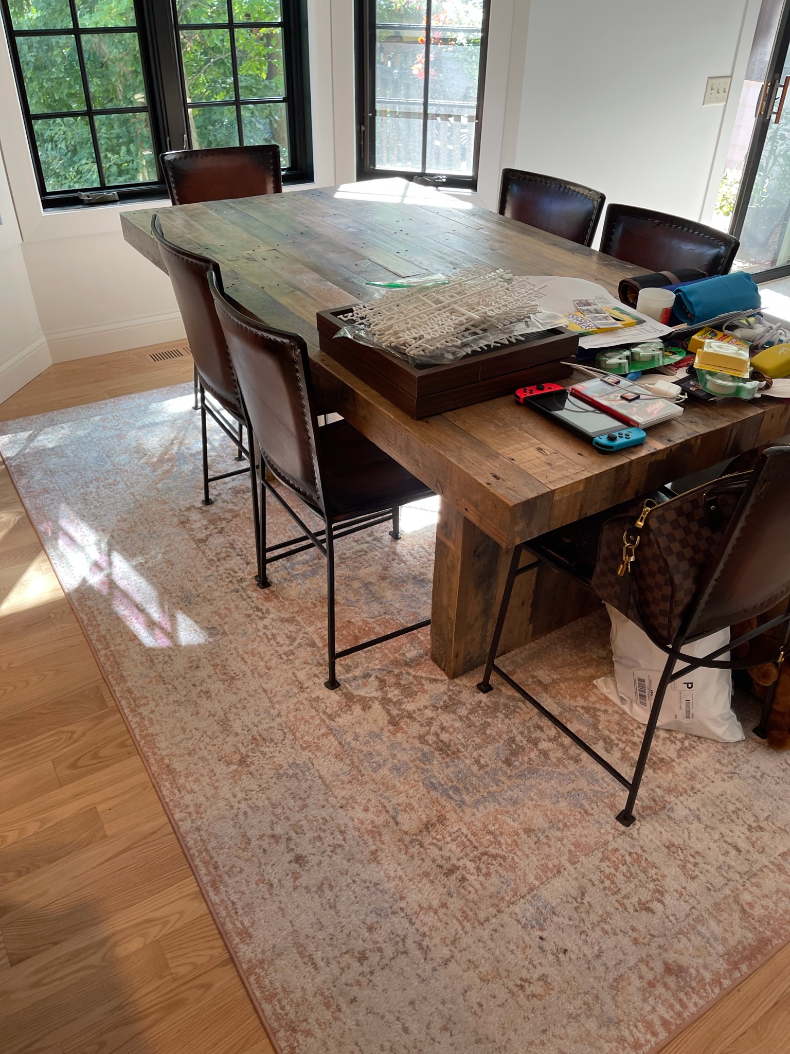
Soon, we’ll be adding in a sideboard and other little decor pieces into the dining space. They have received their rugs (hello, jute rug layering…) and we’ll be repurposing their previous dining room furniture to make this space as grand as it can be.
Kitchen
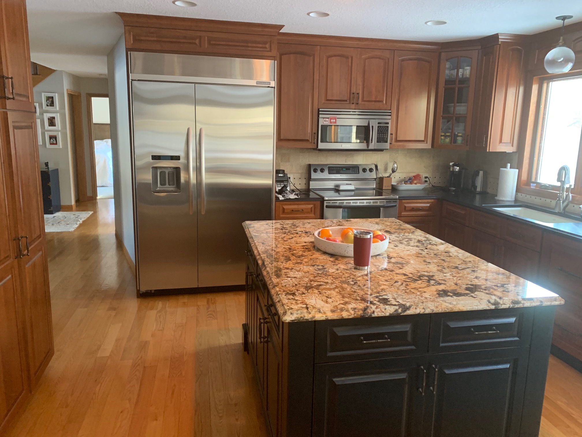
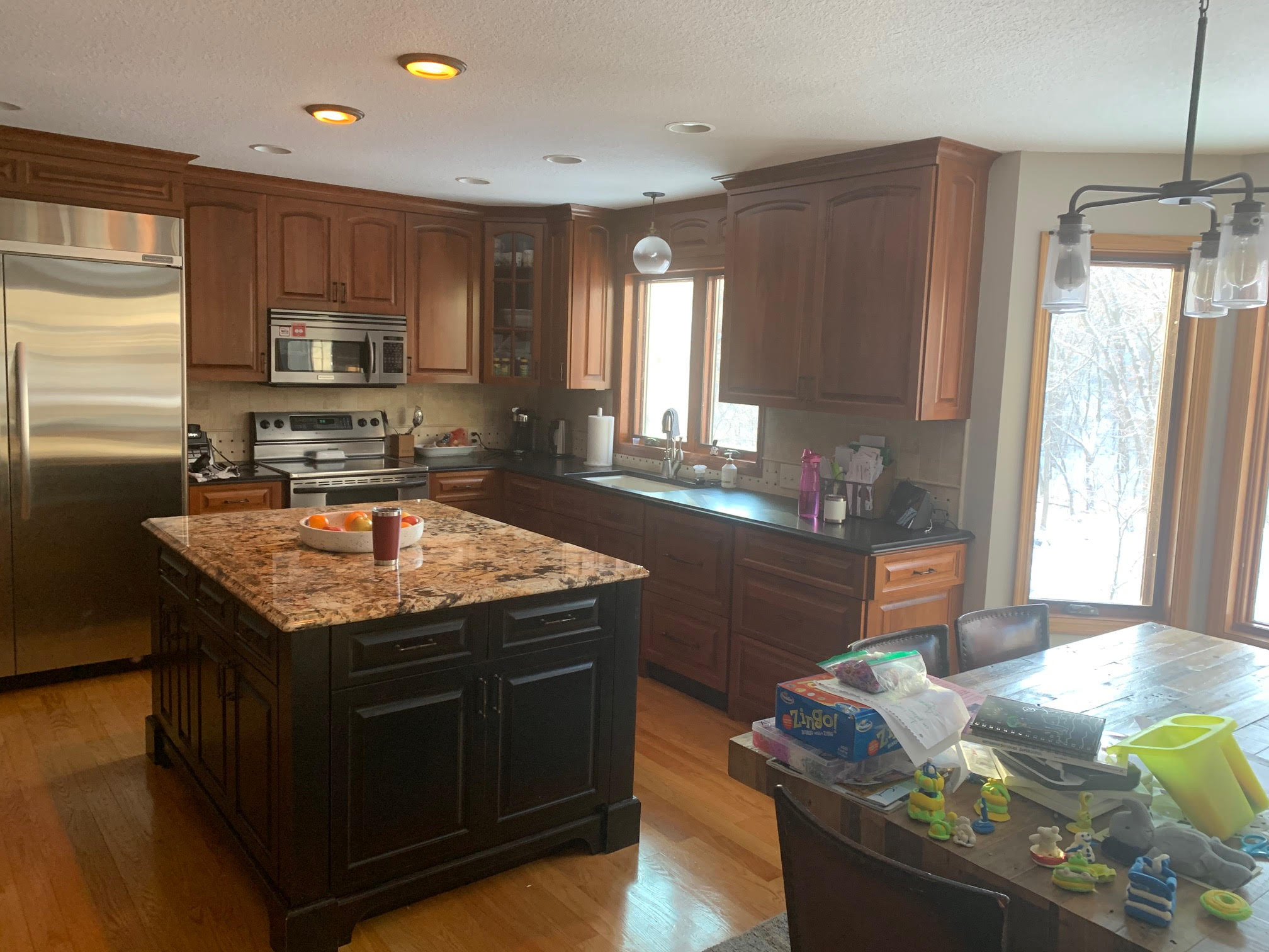
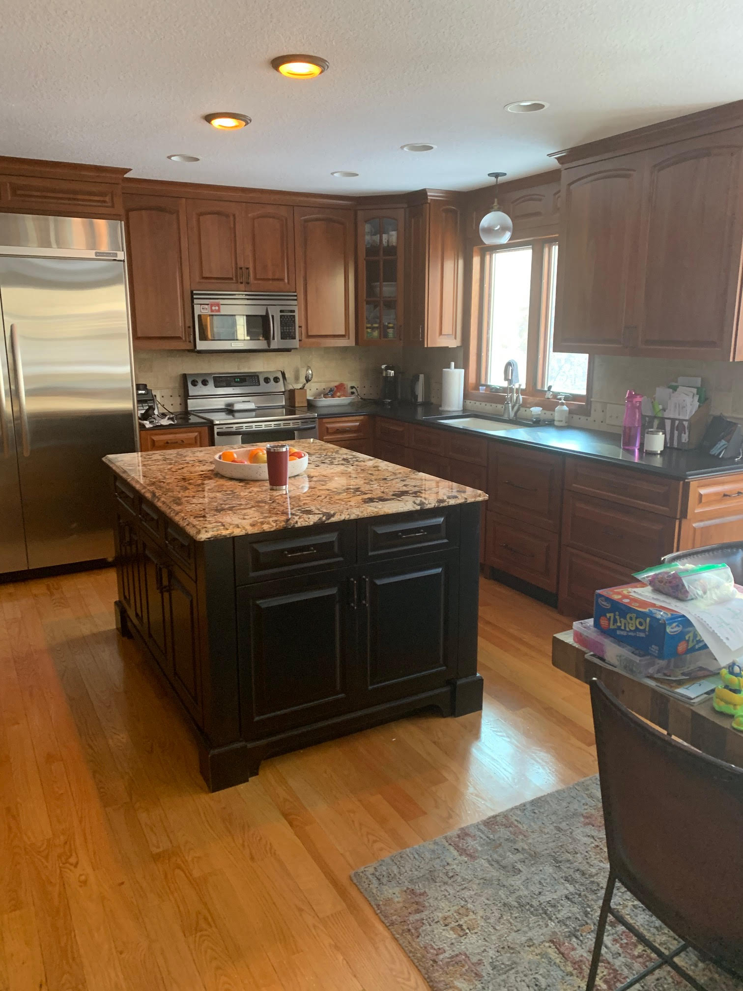
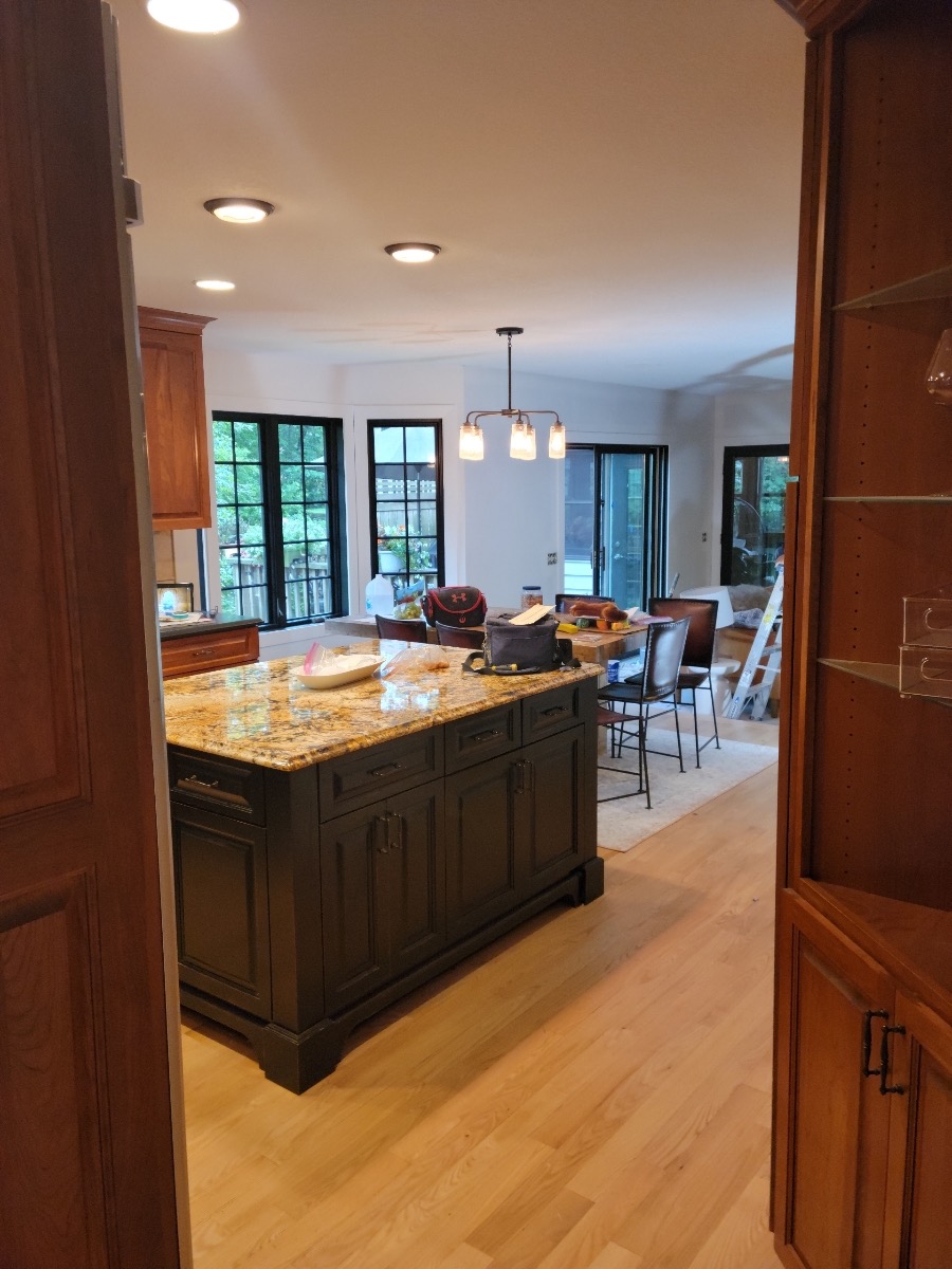
Before
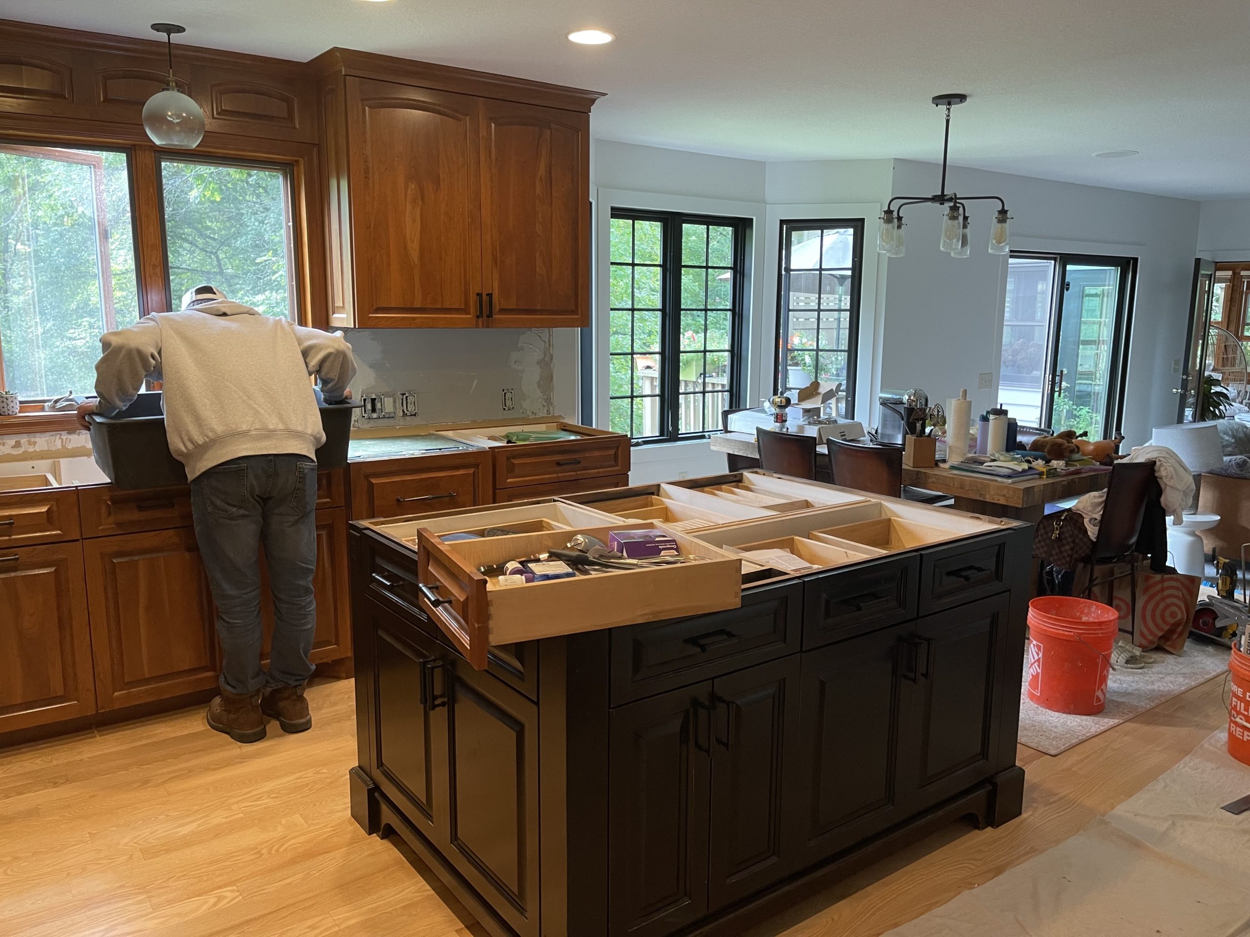
Cosmetic changes are being made throughout, with new countertops, backsplash, lighting, new range, and another custom hood design by Jamie.
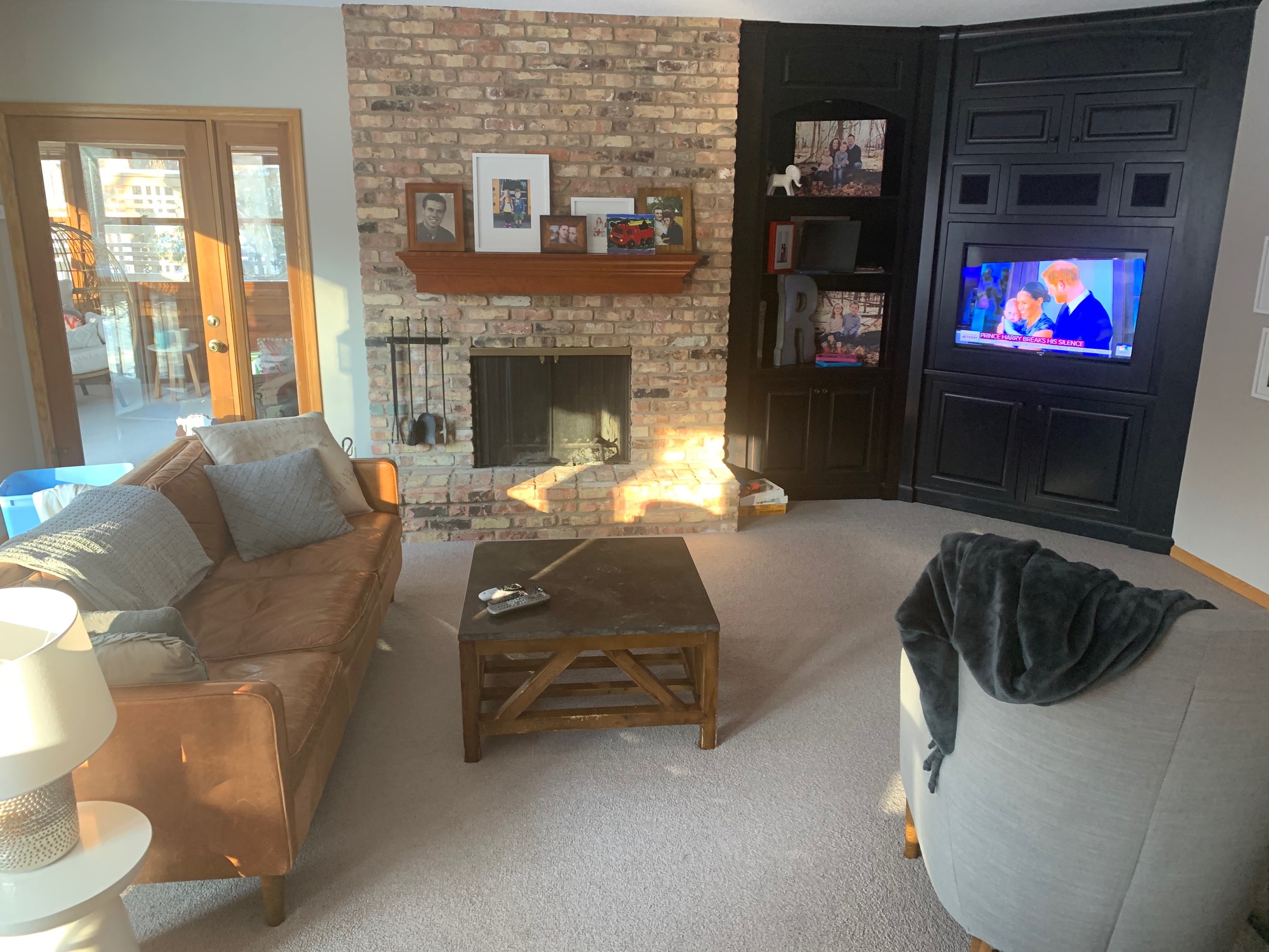
We’ll also be adding on a new mantel to the fireplace to tie in more with their freshly refinished floors.
Design
Here is the design we’re going for. This client loves bright walls with moody black accents, so that’s the vibe we went with right from the start. We’re thinking out of the box with the hood design due to some restrictions for space & venting with the current cabinetry. Dreaming of slat in this space… who votes for a slat hood?
wall paint | above sink light | kitchen island pendants | countertops | hardware | sink | faucet | backsplash
Under Construction
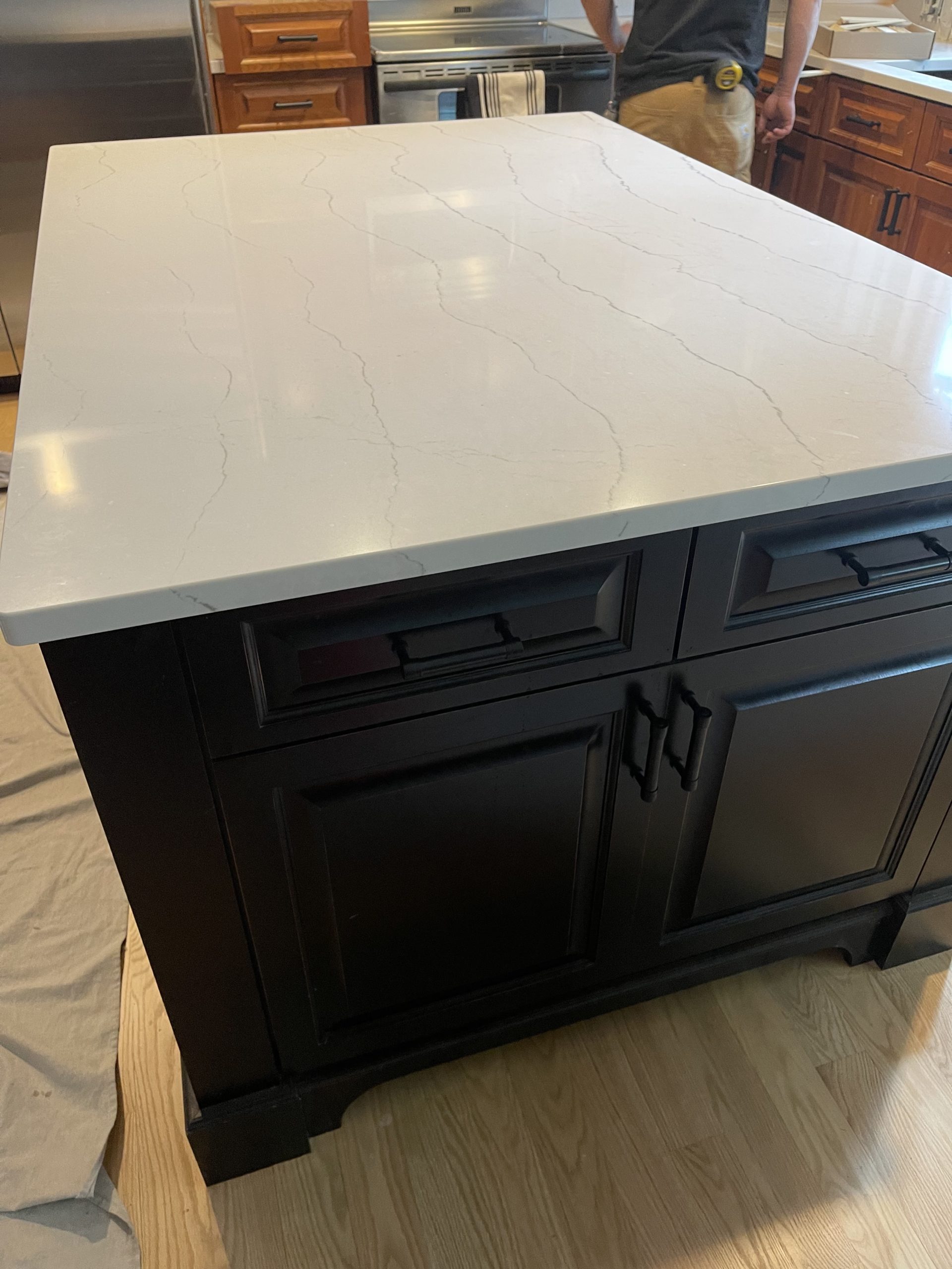
The countertops are in, hardware has been refreshed, trim has been painted and now everything will cruise on this kitchen. Next steps are adding in the backsplash, lighting, and that custom hood.
Here is a little view of the trim in the kitchen and main living area. It’s such a simple way to update your space without going for a remodel. If you’re looking for a little upgrade, this is one that you can do yourself and it doesn’t cost much.
That’s where we’re at at the #heritagevalleyhome project. Next time you see this space (unless you’re following our progress on Instagram which we always recommend) it will be completed. Get ready for that coming at you soon.
Disclosure: construction2style has used affiliate links throughout this post. Although we are compensated for these links when purchases are made, we stand behind and use all brands and products we endorse on our site.

One thought on “Heritage Valley Home Construction Update”
Comments are closed.