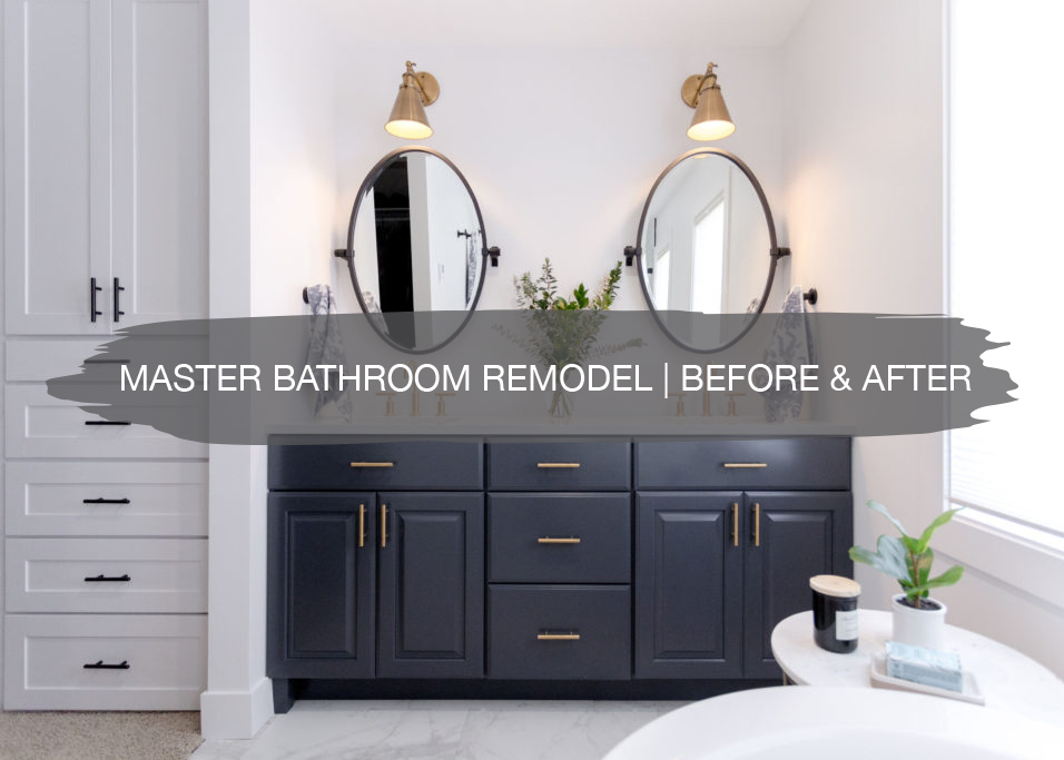
Another master bathroom remodel project is in the books! We recently wrapped up this bathroom, and it was quite the transformation with walls getting moved, rearranging the vanity and tub, and incorporating some fun accent finishes.
First, let’s check out how this space was before the remodel…
Before
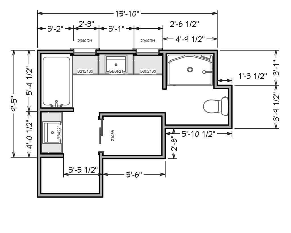
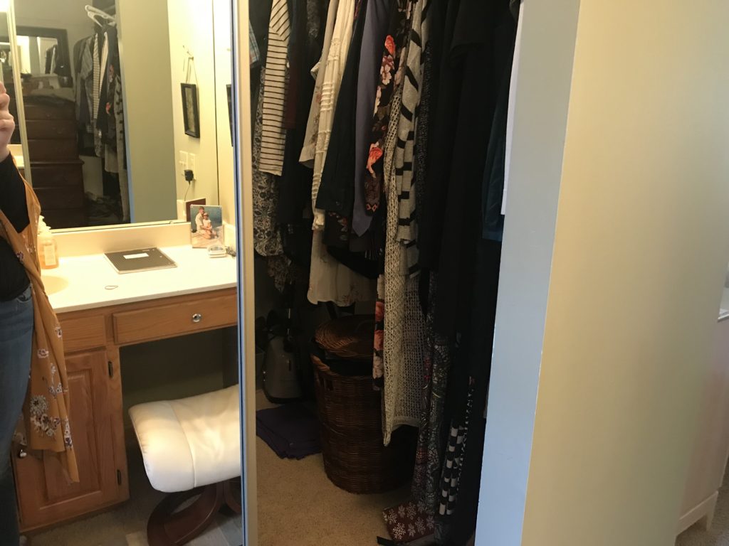
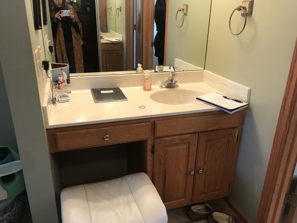
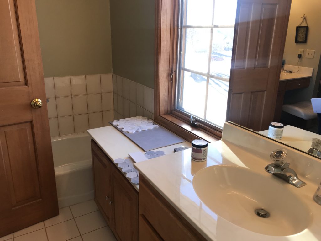
With this master bathroom, the layout was not working for our clients. When you first walked into the space, there was a shorter vanity/make-up area that included a sink, but was not functional for their lifestyle.
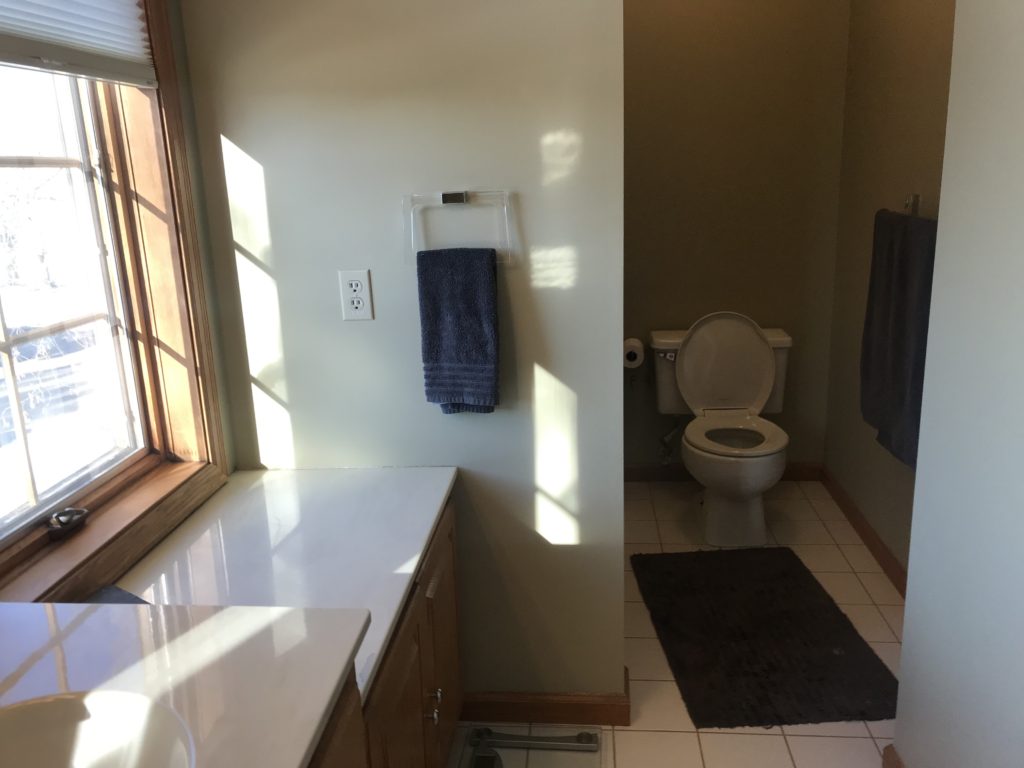
As you continued into the bathroom, there was a small built-in tub behind the door. The other sink was between two windows with shorter cabinets on either side that created some storage, but were not working well with the shorter height.
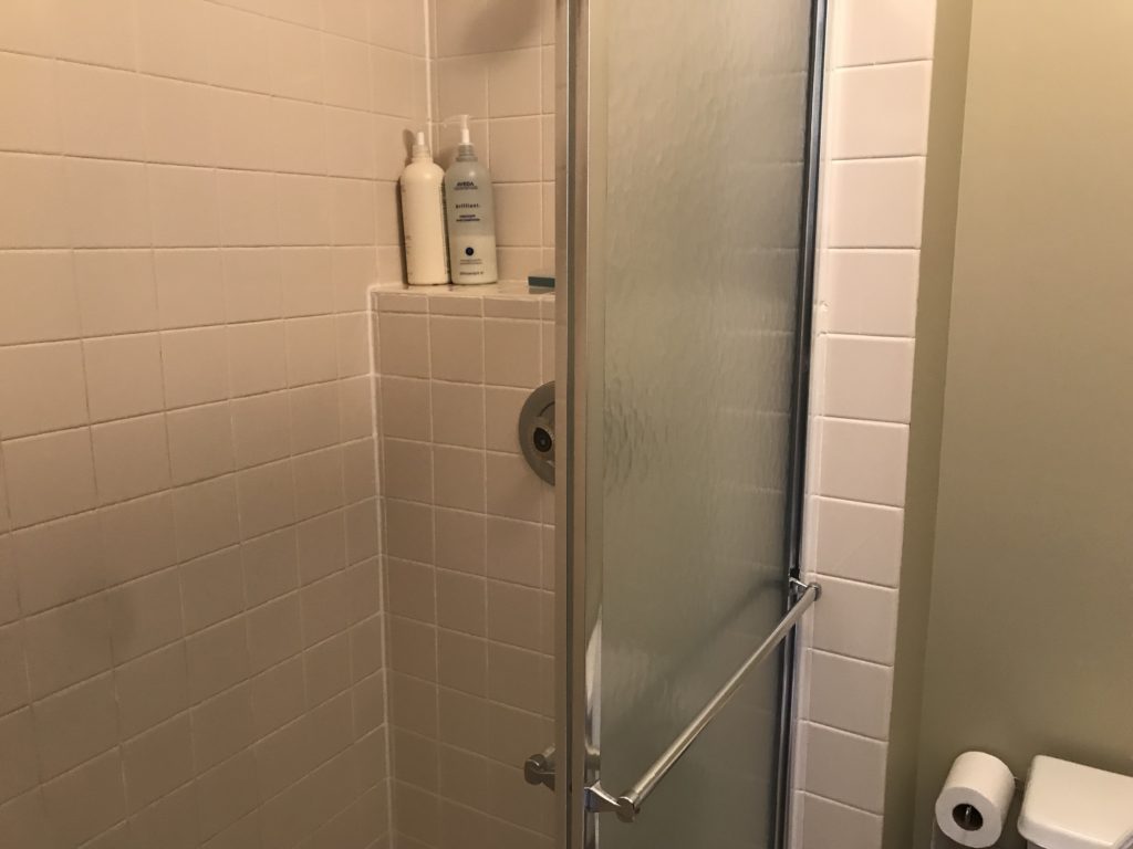
In addition, the shower was very closed off and dark in the corner. It was also hard to enter because of the tight space between the shower entrance and the toilet. Between the vanity and the closet wall was a narrow walkway, making the flow of the bathroom not work very well.
Inspiration
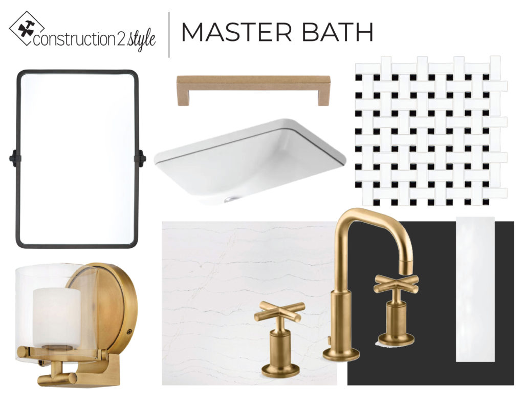
The inspiration for this bathroom included gold hardware and fixtures, black accents through the mirrors, classic quartz and sink options, and neutral, yet beautiful tiles.
And now for the exciting reveal…the after!
After
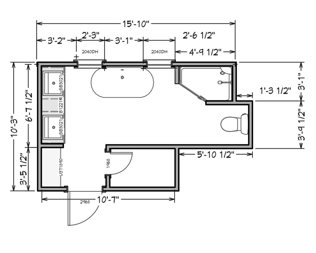
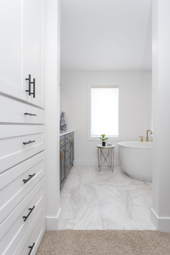
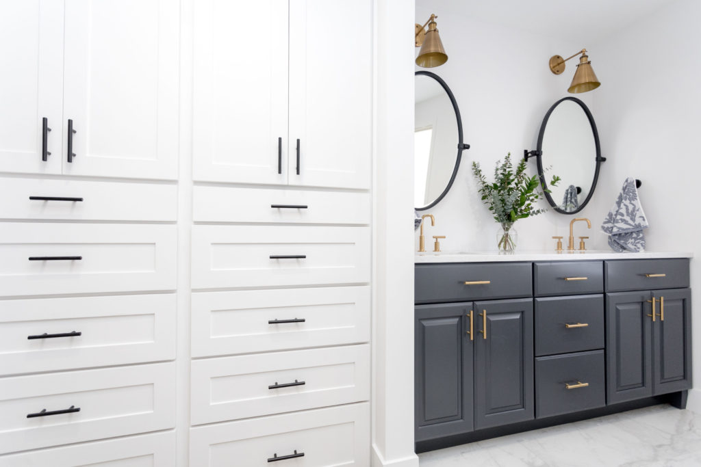
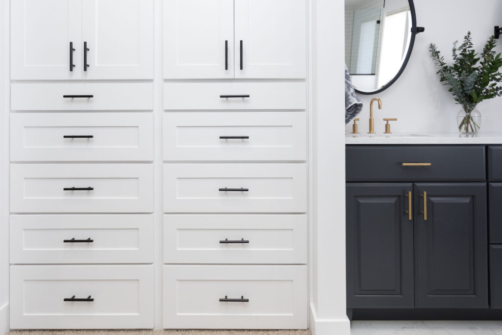
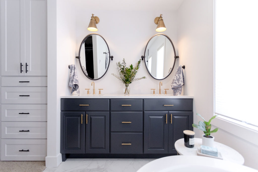
Now when you walk into this bathroom, where the makeup vanity once was, is now a custom built-in closet that goes all the way to the ceiling, allowing for lots of extra storage. This closet has a combination of drawers on the bottom and doors with shelving inside on the top, making it perfect for storing linens, jewelry in the smallest drawer, and larger clothing items below. Opposite this custom built-in is the closet, which became smaller after moving the wall back to make it flush with the toilet wall. Even though the closet got a little smaller, the new custom layout of the closet makes it more organized and functional.
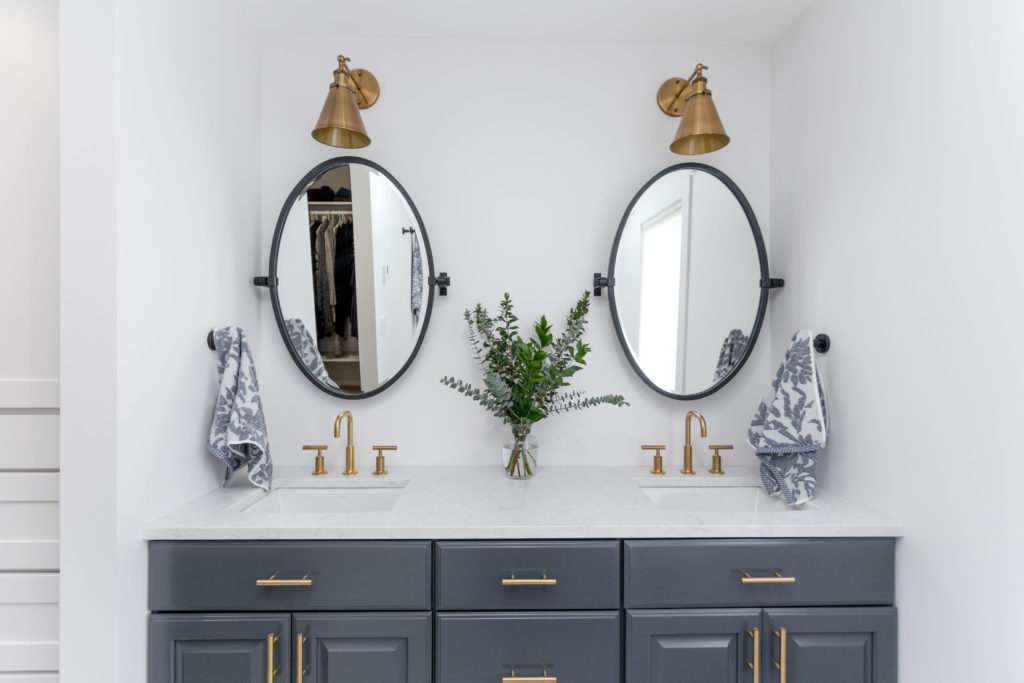
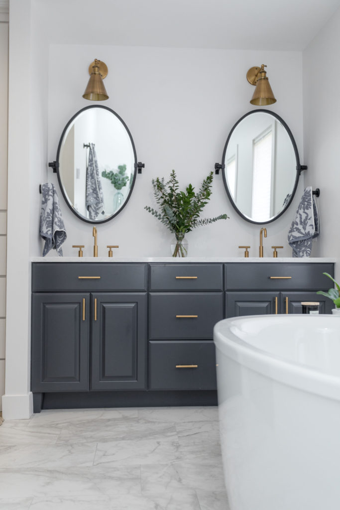
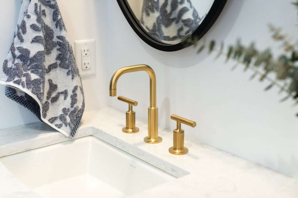
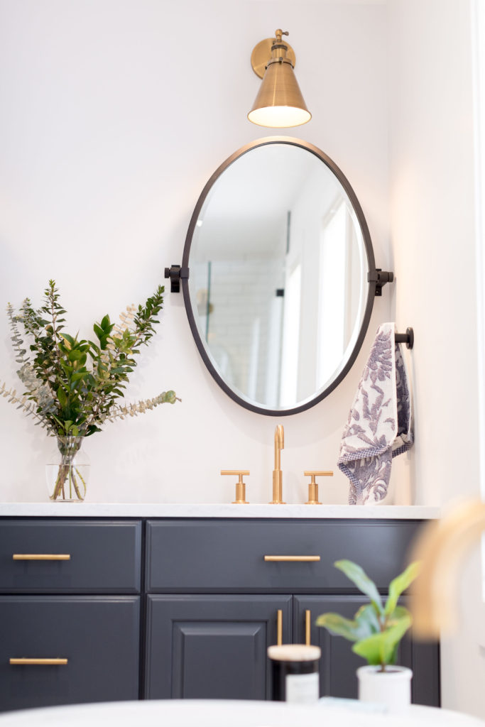
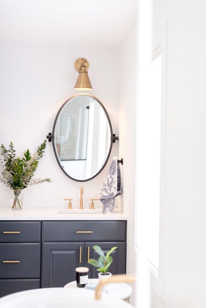
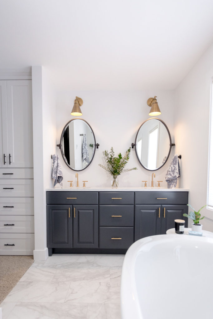
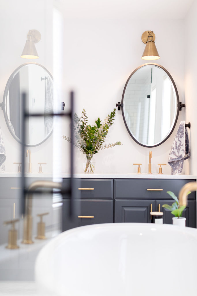
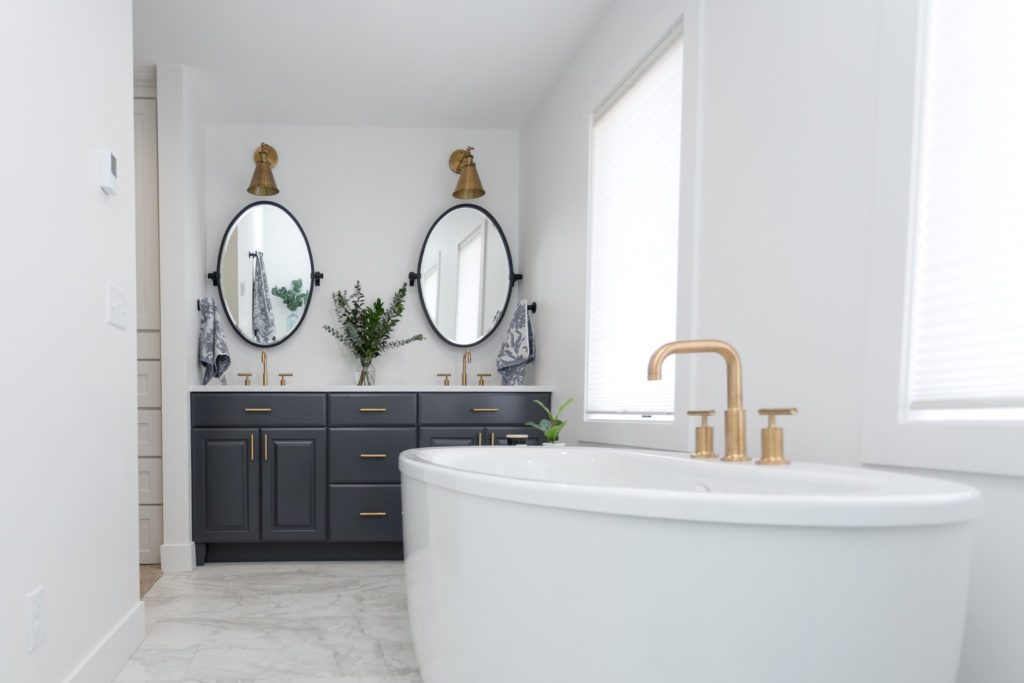
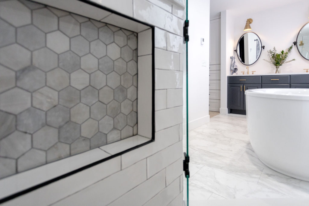
As you walk into the space, the vanity is now where the tub used to be and the door has been removed. This creates a much more open feel to the room and having the sinks together is much more functional for our clients. A slate blue vanity is a beautiful color that is accented with gold hardware, gold faucets, gold sconces, and black pivot mirrors. In addition, under-mount sinks and a neutral quartz countertop complete the vanity. Having drawers in the middle allow for more storage as well.
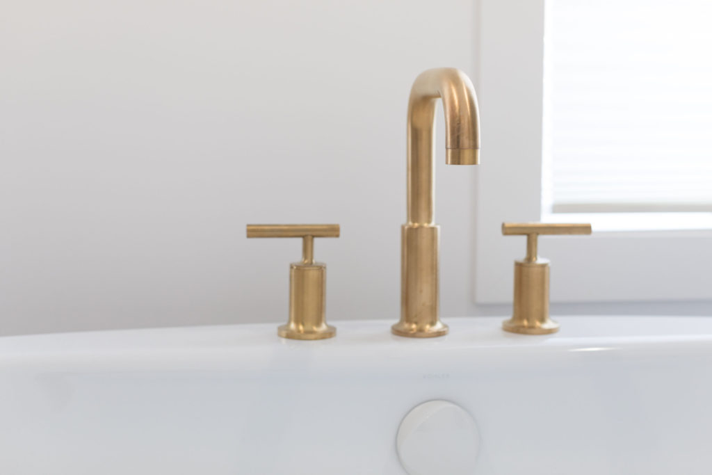
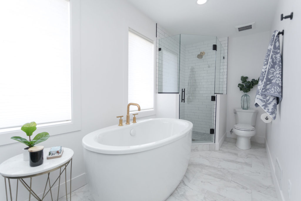
Where the previous sink and shorter vanity cabinets were is now the spot for the tub. A large free standing tub is below the windows, which allows for lots of natural light to flow into the space and the tub is now the focal point of the room. For the tub filler, going with a gold faucet that matches the sink faucets ties the space together. By making the wall to the right of the closet one wall, rather than a bump out from the closet into the bathroom like before, it makes the space feel much more open and creates a functional flow to the room.
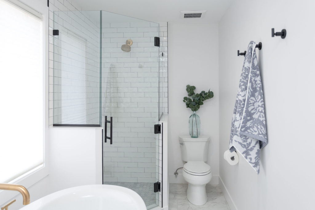
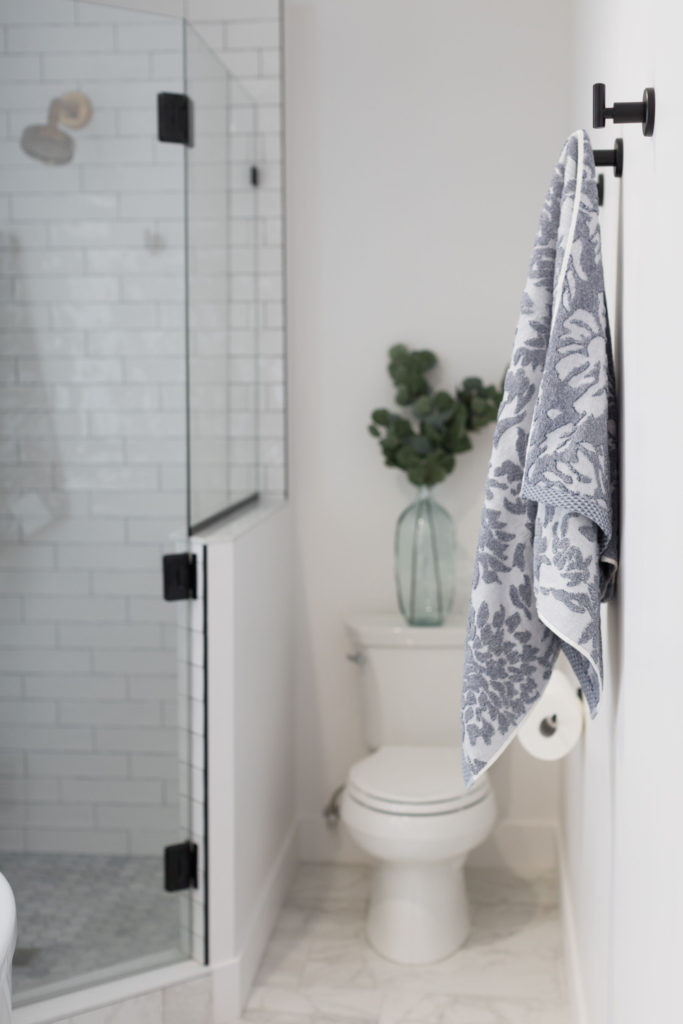
Marble-looking porcelain tile for the floor, complete with in-floor heat, makes the tile warmer and is also much easier to maintain than actual marble. It creates a luxurious look, without the high price tag and won’t stain or show water marks like real marble. Making the walls for the shower half glass really opens up the space, allowing the natural light to flow through the entire room. Adding an angled door provides more space by the toilet and makes it easier to enter the shower as well. Continuing the black accents from the mirror for the towel hooks, shower door handle, and tile edging brings the look together.
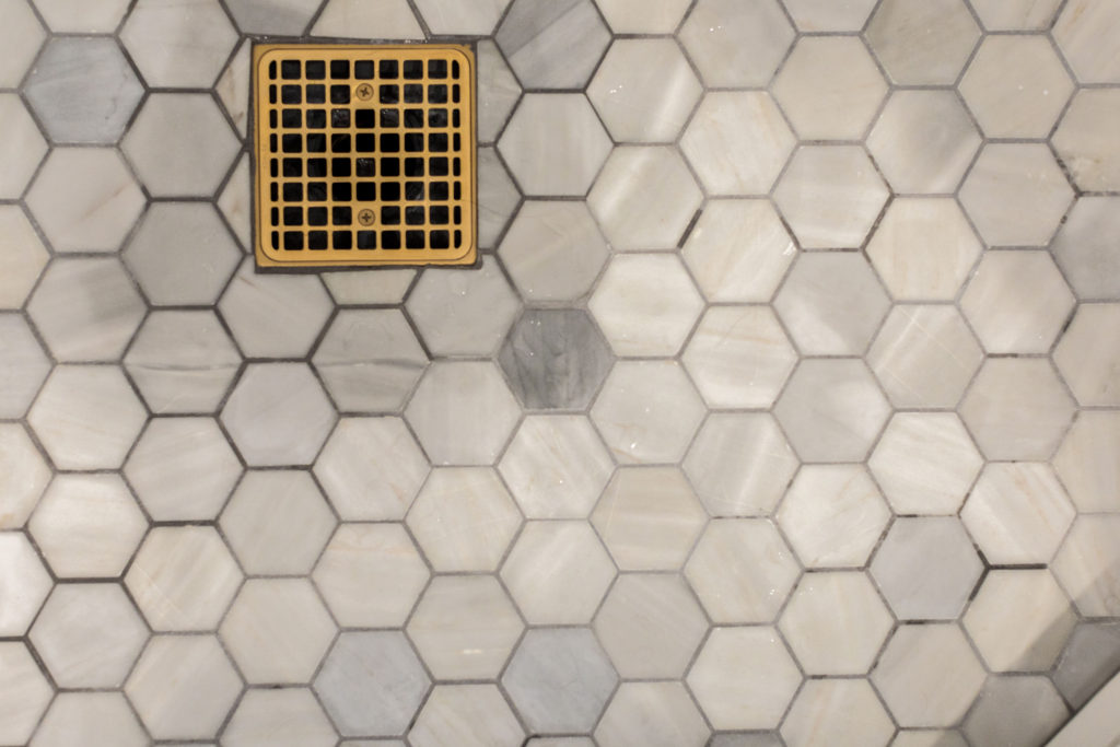
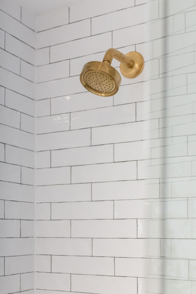
Handmade looking subway tile is a twist to cookie cutter subway tile, giving a custom look to the shower surround. Combining the white surround tile with gray marble hexagon tile for the shower floor and niche adds a wow factor to the shower. The niche provides a space for storing shampoo and conditioner and by placing it in the half wall, it’s allows the bottles to be hidden from view when looking into the shower.
What a fun project! It turned out beautifully and our clients love how it works much better functionally for their lifestyle and also created the wow factor they were wanting in their master bathroom.
Shop This Bathroom
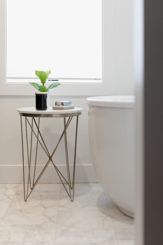
Sink | Shower Surround Tile | Sconces | Shower Faucet | Faucet | Tub Filler | Gold Pulls | Gold Side Table | Shower Floor Tile | Main Floor Tile | Black Pivot Mirror | Towels
Disclosure: construction2style has used affiliate links throughout this post. Although we are compensated for these links when purchases are made, we stand behind and use all brands and products we endorse on our site.

Yes, it is from Woodland in the Harbor color!
Is the vanity cabinet from Woodland and what color is it?