Oxbow Master Bathroom
Another bathroom in the books! Back in March, we shared the designs of this bathroom with you, and today, it’s time for the bathroom reveal.
Our clients are excited to be back in this space, especially after making it through a remodel during quarantine! Now, let’s rewind to what this space looks like before.
Before
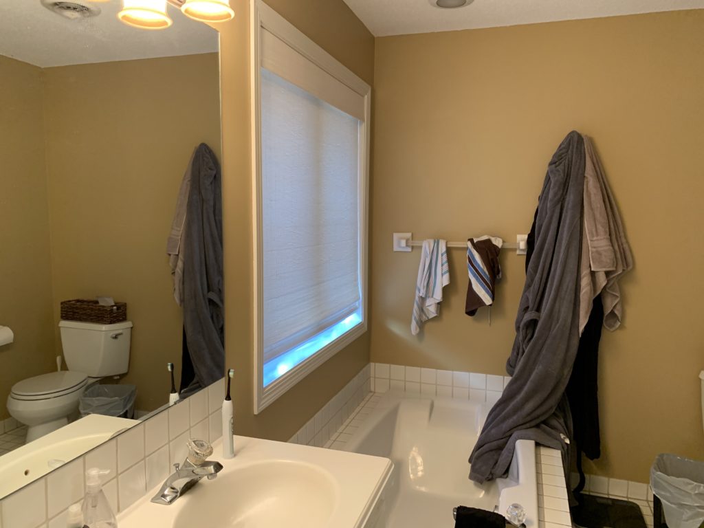
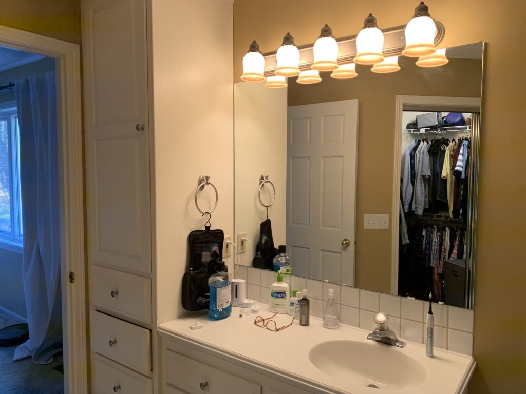
The main priority in this bathroom was to create a more functional layout, gain more storage, and improve the closet space. Prior to the remodel, our clients had a shallow tub under the window that they rarely used.
Tubs like these are common in bathrooms our clients are wanting to update and we’re all for making this space more practical.
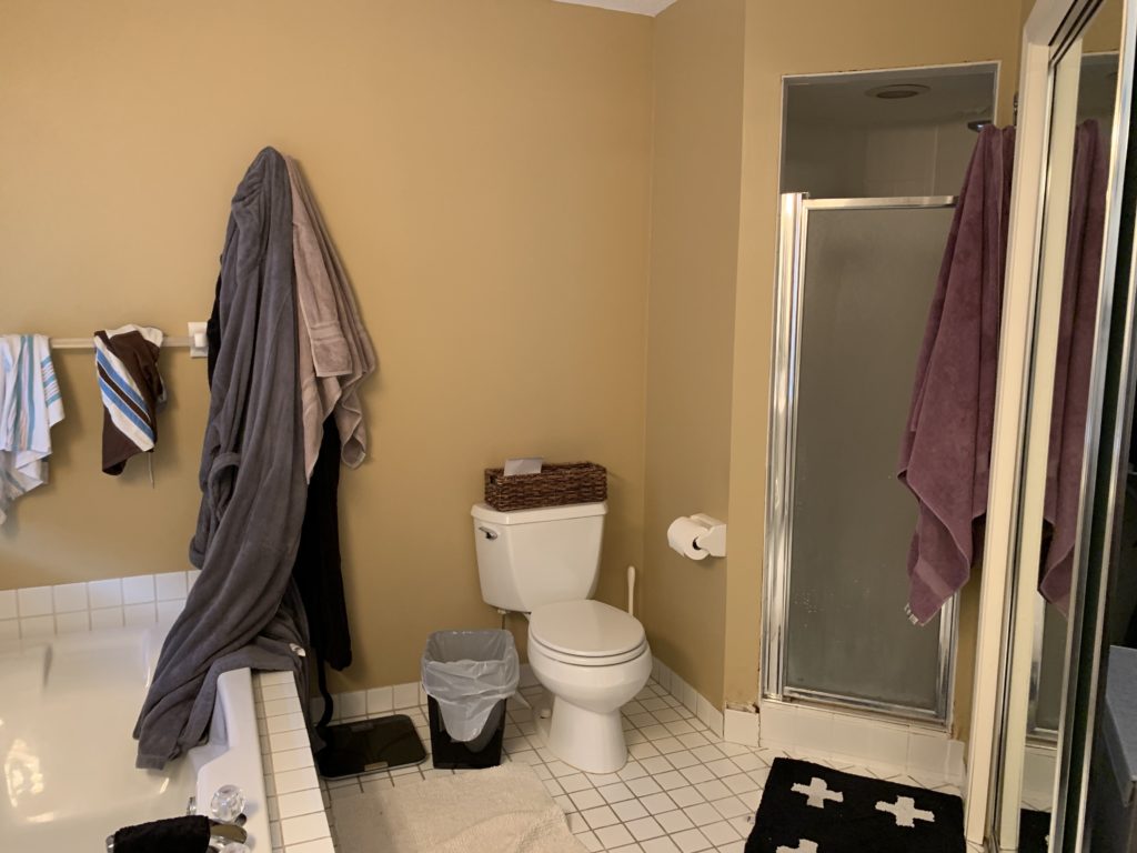
Opposite the tub was a small shower that felt closed in and cramped due to the shorter ceiling and small door. The goal was to open up this space to allow for more light in the shower and make it the focal point of this space.
Next to the shower was the closet, which had various angled walls, making the space not very functional. To enter the closet, there were sliding mirrored doors that had to go.
The vanity space had a good amount of storage, but our clients were looking for double sinks and to create unique storage for toothbrushes and other items that sit on the counter.
Before the demo begins, we always start with designs so that we can help you envision your space and make it come to life. Let’s check out the design of this bathroom below…
Designs
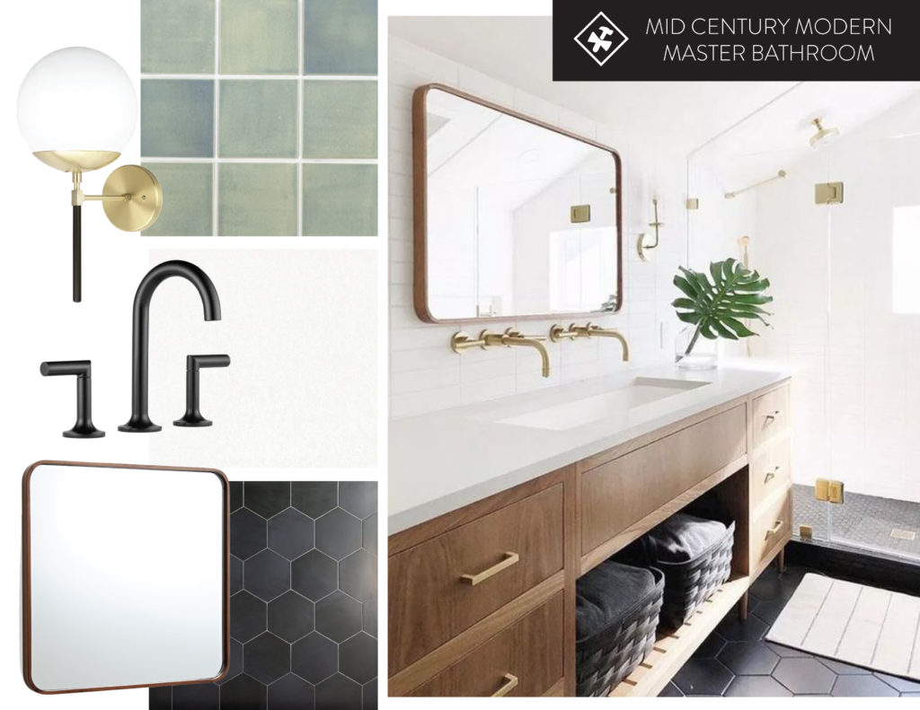
The inspiration for this bathroom included a mid-century modern vibe. Black hexagon tile with black fixtures was at the top of the wish list, along with a beautiful wood vanity.
Handmade tile and accents of gold were also part of the inspiration.
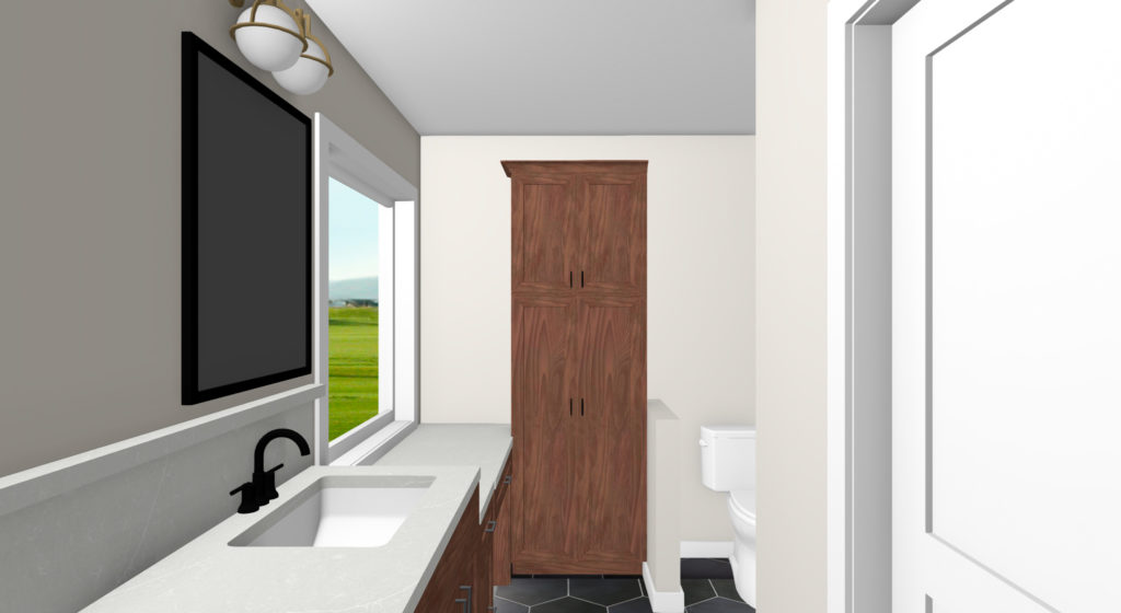
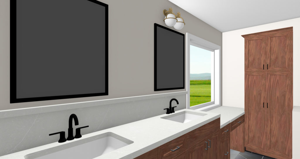
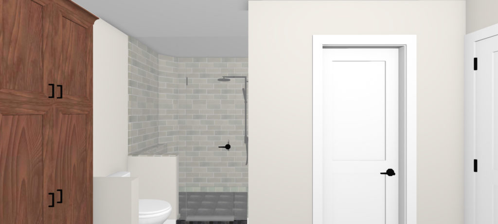
We brought our clients selections into the design program to see what this space would look like in 3D. This is where we decided on details like the taller backsplash behind the vanity, storage for linens, and how the makeup vanity would look.
To increase the storage in this space, double sinks with a makeup vanity in place of the tub provides a lot of storage. Having the makeup vanity under the sink brings the light in and gives the space a more practical use.
By squaring off the closet, it allowed for a larger shower and more useable space in the closet too.
After
And now for the after! Look at this space…we love it and so do our clients!
Niche with Shelving
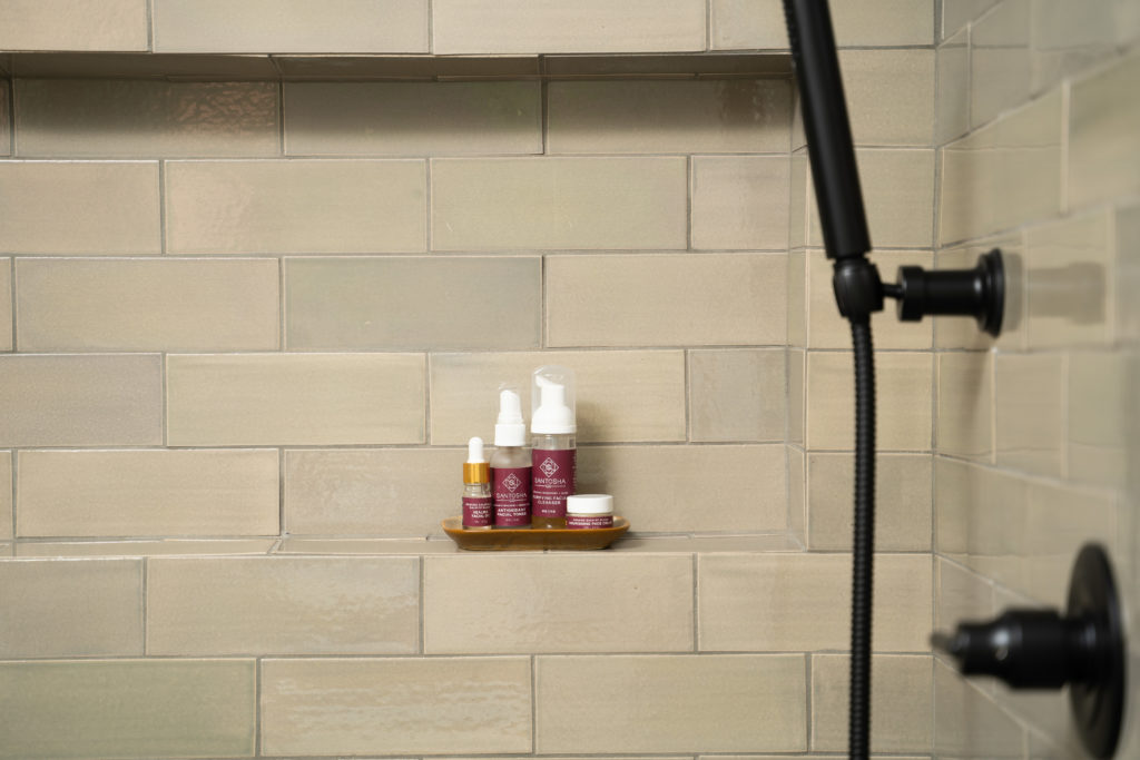
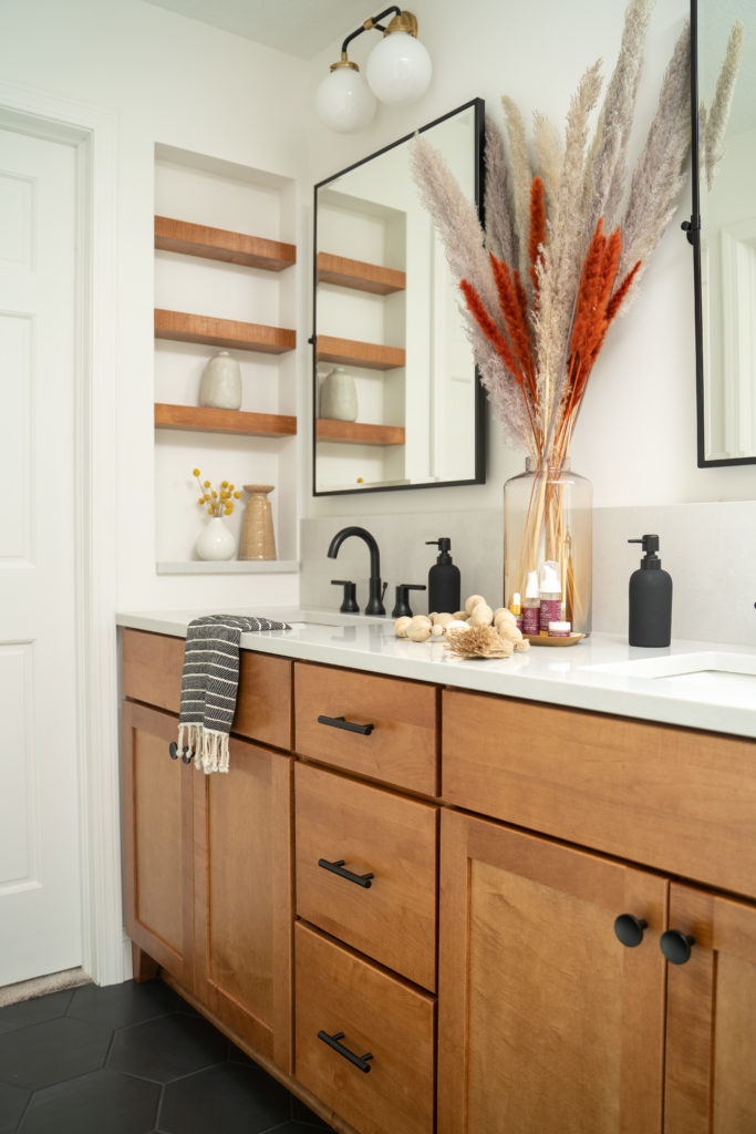
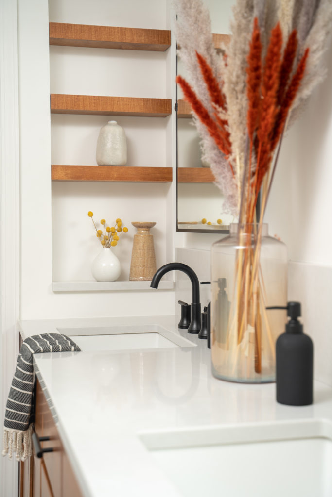
The shelving on the left wall has a hidden outlet where toothbrushes can be stored and charged. Jamie built the shelves in the niche to match the vanity and they look incredible.
Handmade Shower Tile
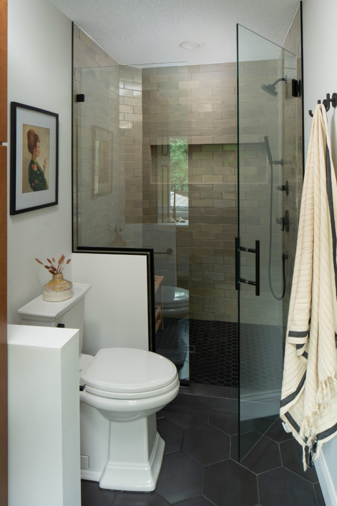
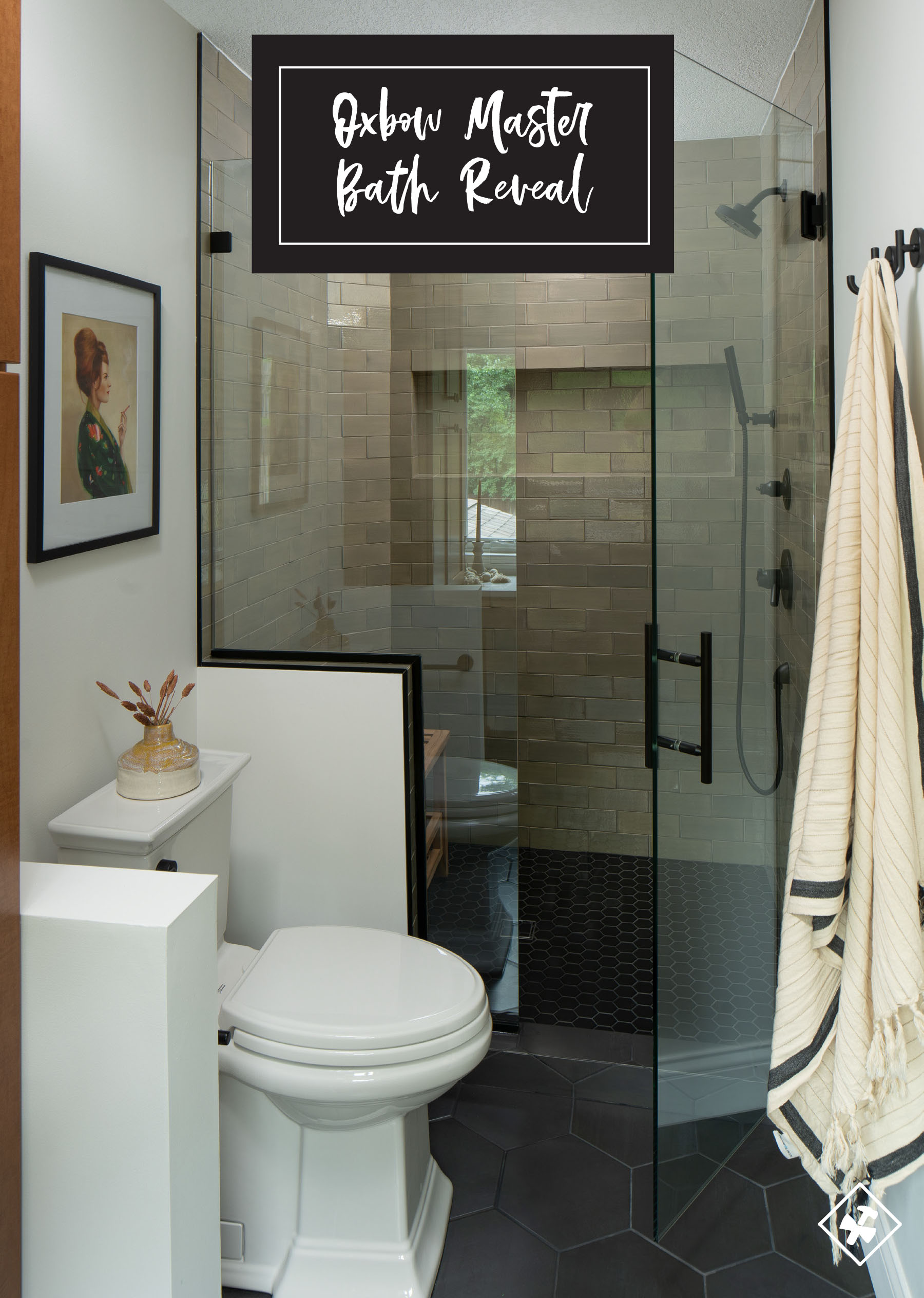
After looking at various tile samples at Mercury Mosaics, our clients decided on a classic subway tile shape in the Light Grey color.
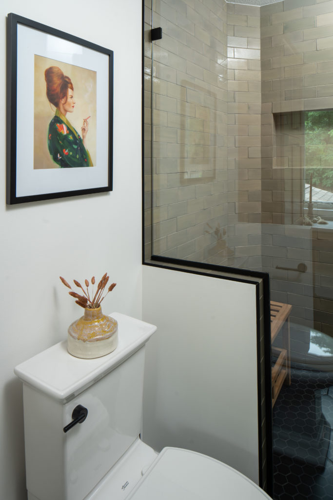
The handmade tile gives the tile variation and movement and makes this shower truly the focal point of the bathroom. A custom glass shower door with black trim and handle compliment the Delta robe hooks and shower system.
The toilet now has half walls on either side, giving it more privacy, without having to take up space for a completely separate toilet room.
Makeup Vanity
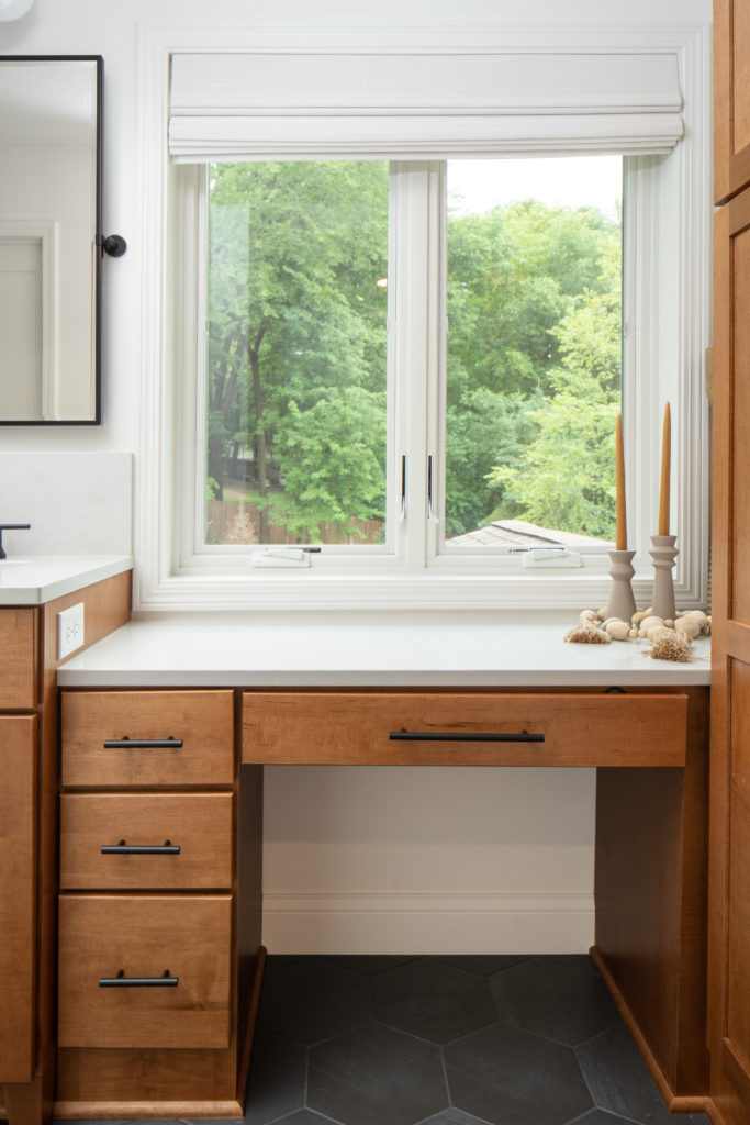
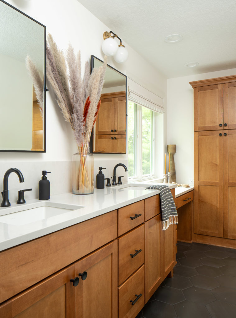
This makeup vanity adds storage and function to this spot under the window where the tub used to be. And with it being under the window, the natural light floods the space, making it the perfect place for getting ready in the mornings.
On the other side of the makeup vanity is a tall cabinet for linen storage. The goal was to utilize this space for optimal storage and this cabinet provides a lot of it.
Cabinetry
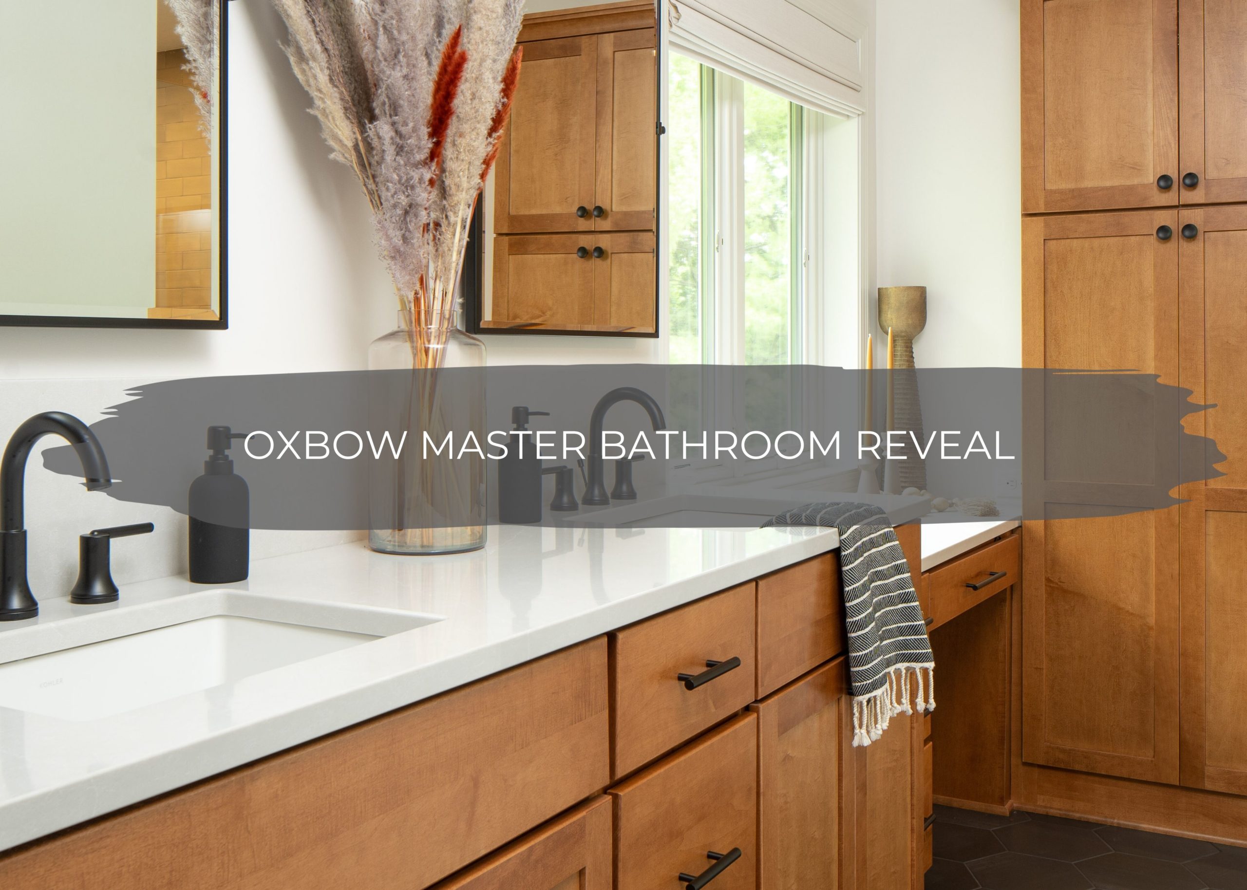
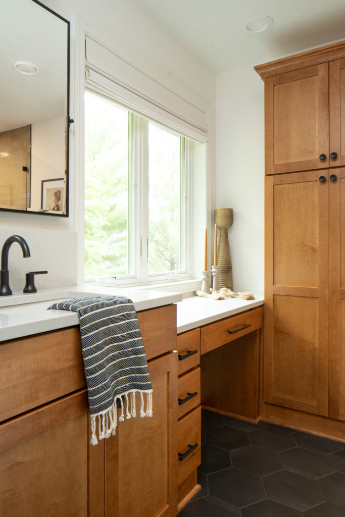
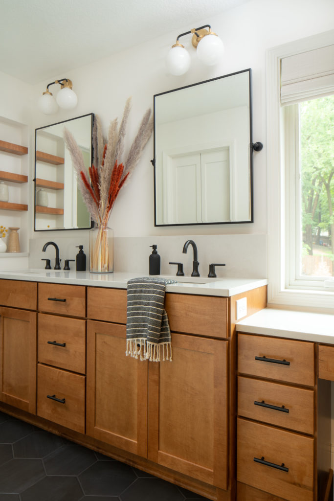
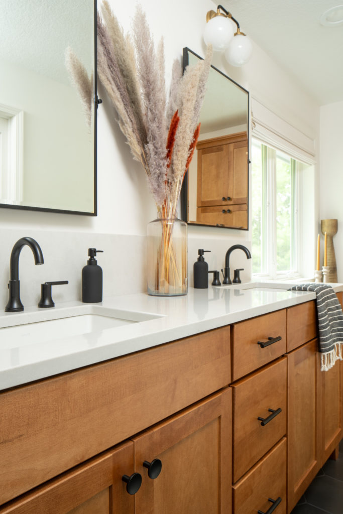
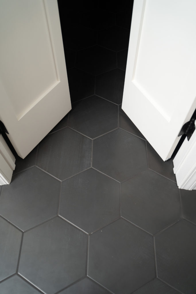
The Medallion cabinetry in the Lancaster door style with a Chestnut stain is truly stunning, especially when paired with the black hexagon floor tile. The floor tile has a black grout, matching the tile and giving it a seamless look.
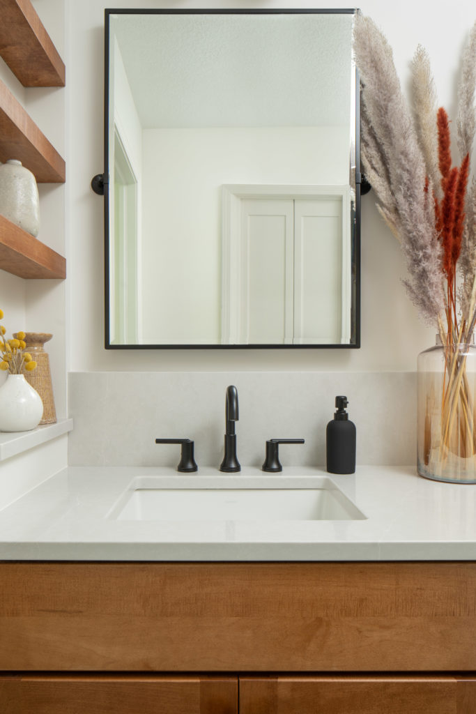
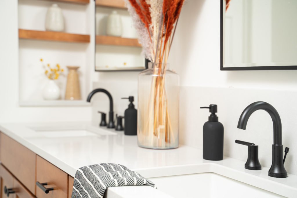
Black Delta Trinsic faucets tie into the pivot mirrors from Bellacor.
To complete the vanity look, black & gold sconces from Shades of Light add a pop of shine.
Quartz backsplash & countertop
We love it when our clients want to do something different and this taller backsplash is one of our favorites. By continuing the Silestone Desert Silver quartz from the countertop to a 10″ backsplash behind the faucets, it adds continuity and also protects the wall behind the faucets too.
A thicker and taller backsplash draws the eye upward and gives weight and dimension to this vanity.
Closet
The hexagon floor tile continues into the closet and with new small french doors and an upgraded closet system, this space feels brand new.
Shop This Bathroom
Cabinets | Countertops | Sinks | Faucets | Shower System | Black Hex Floor Tile | Shower Surround Tile | Black Hex Shower Floor | Mirrors | Sconces | Cabinet Pulls | Cabinet Knobs

One thought on “Oxbow Master Bathroom Reveal”
Comments are closed.