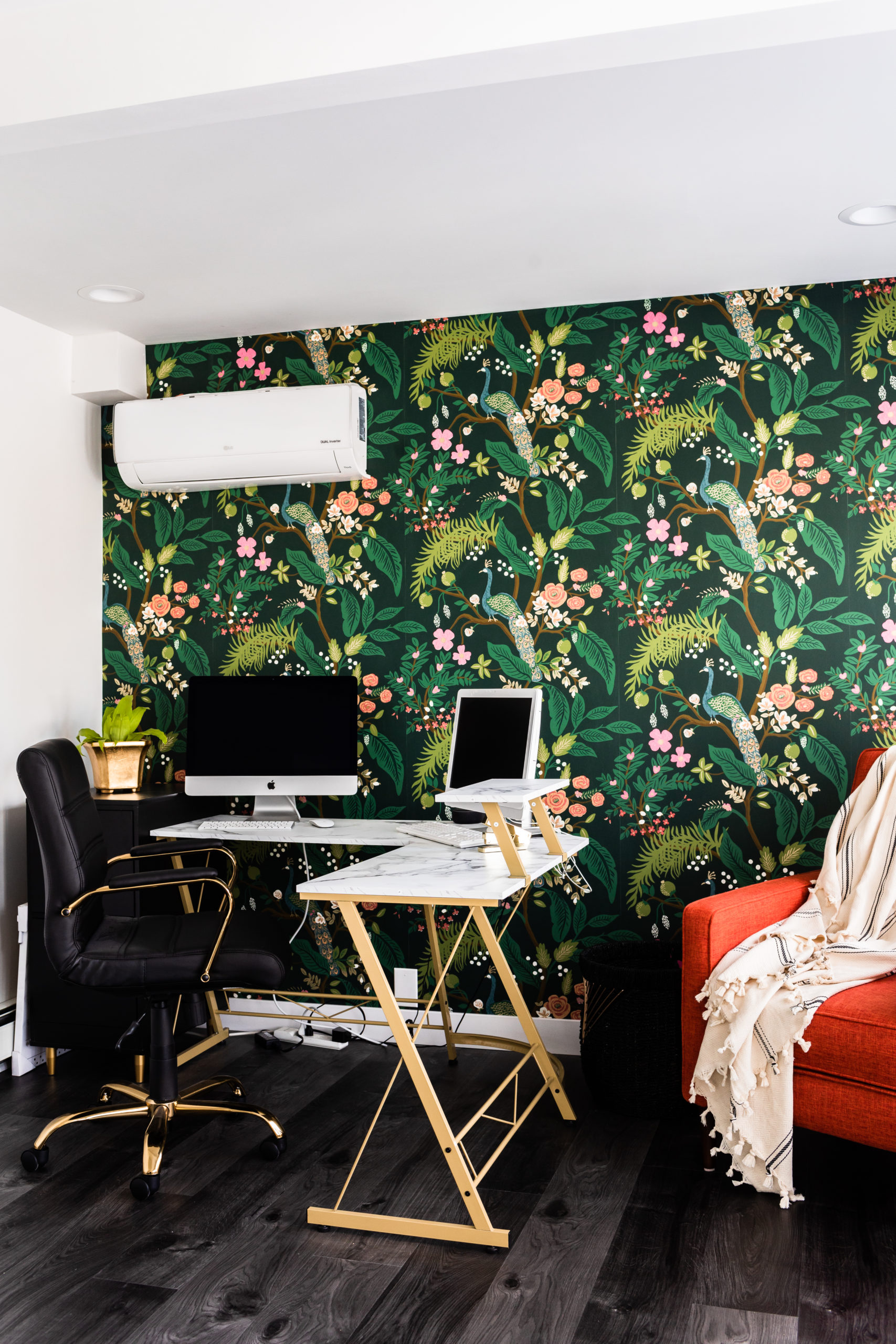
We are back with our last couple room reveals behind #TheBradfordRiverHome. We’ve shared all the details behind the powder bathroom, owner suite, girls bathroom, kitchen, dining, and living room, and today we’re taking you on the journey of the office and laundry room remodel.
This was a home that we took down to the studs, rearranged the layout, removed and added rooms and spaces within.
As I’ve mentioned many times throughout the previous reveal blog posts, this client had such a fun design style – and similar style to mine so it was a blast to design out together and work on her office and laundry room.
No two rooms are the same throughout this home. Different tiles and patterns, colors, and textures, new and unique fabrications, detailing, accents – and we combined them all!
If you love a good eclectic style and colorful home, this project is going to be one of your favorites!
Office
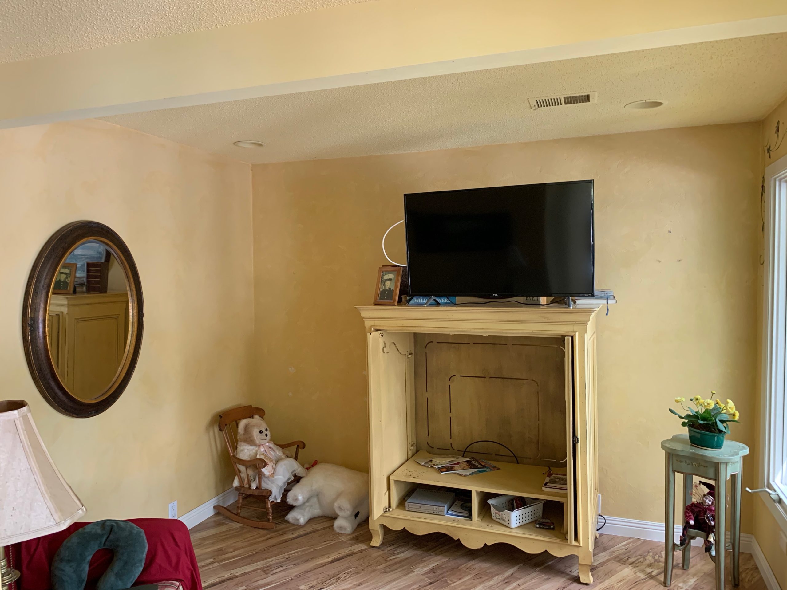
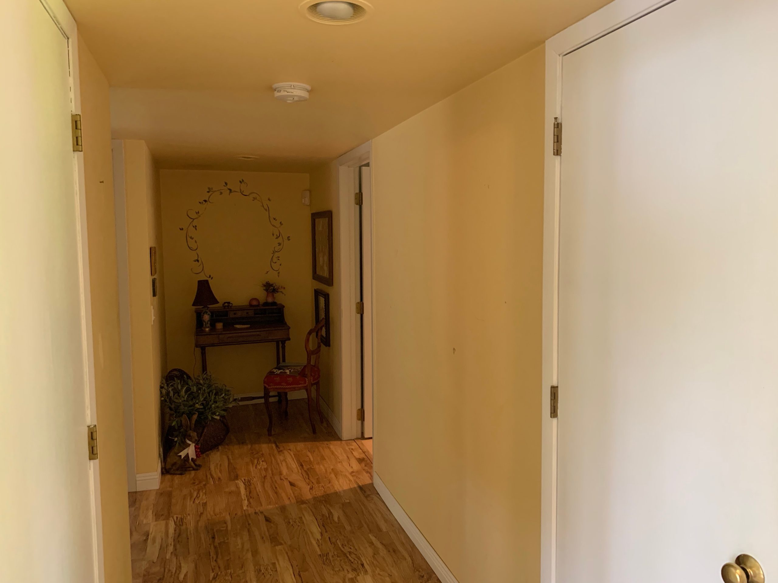
First up, the office. This layout remained the same from what the before shows. Except for it wasn’t an office – it was a cozy sitting room.
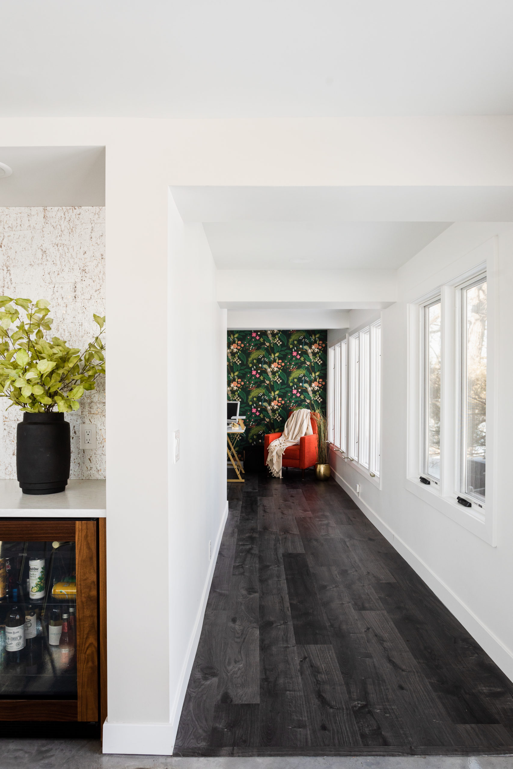
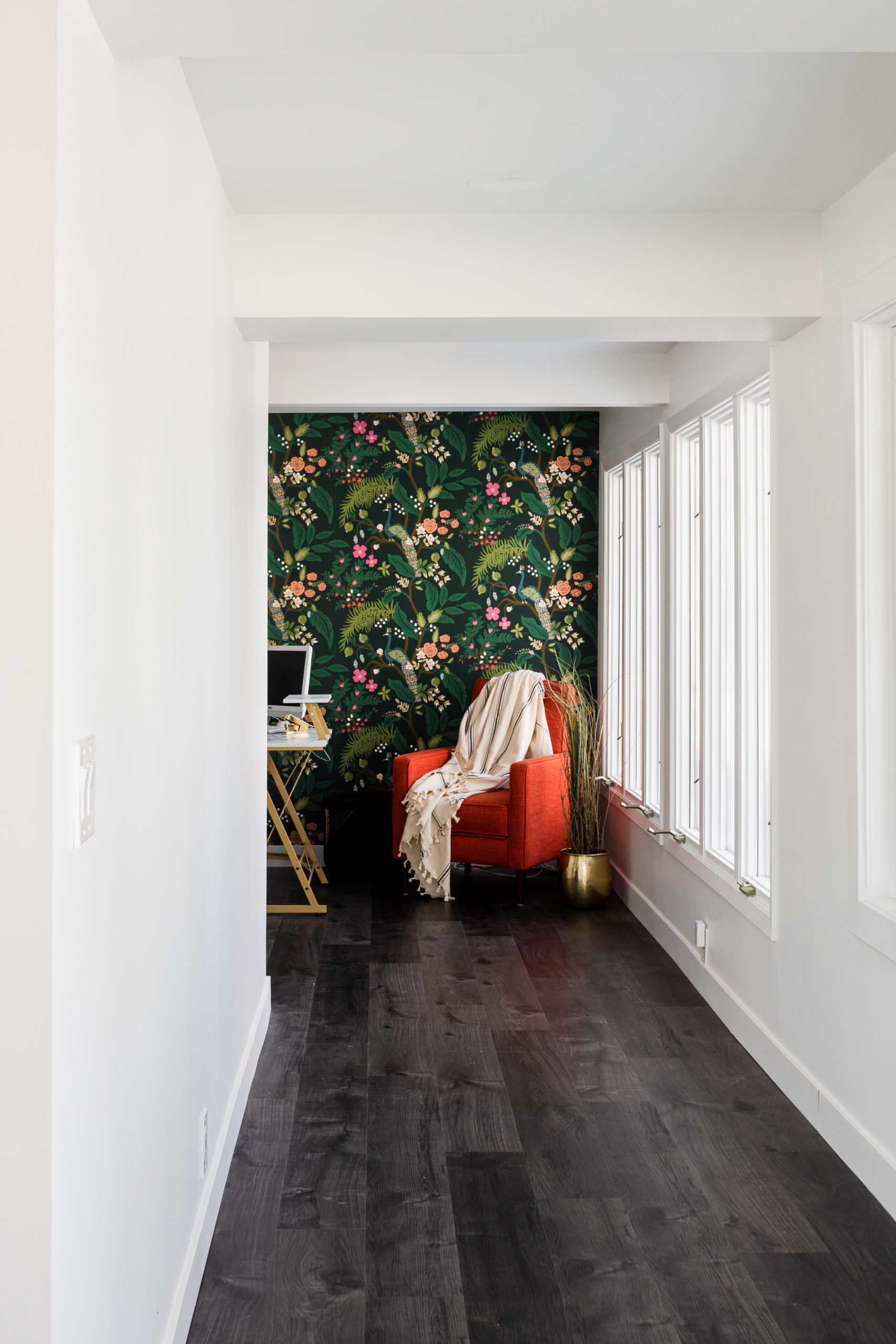
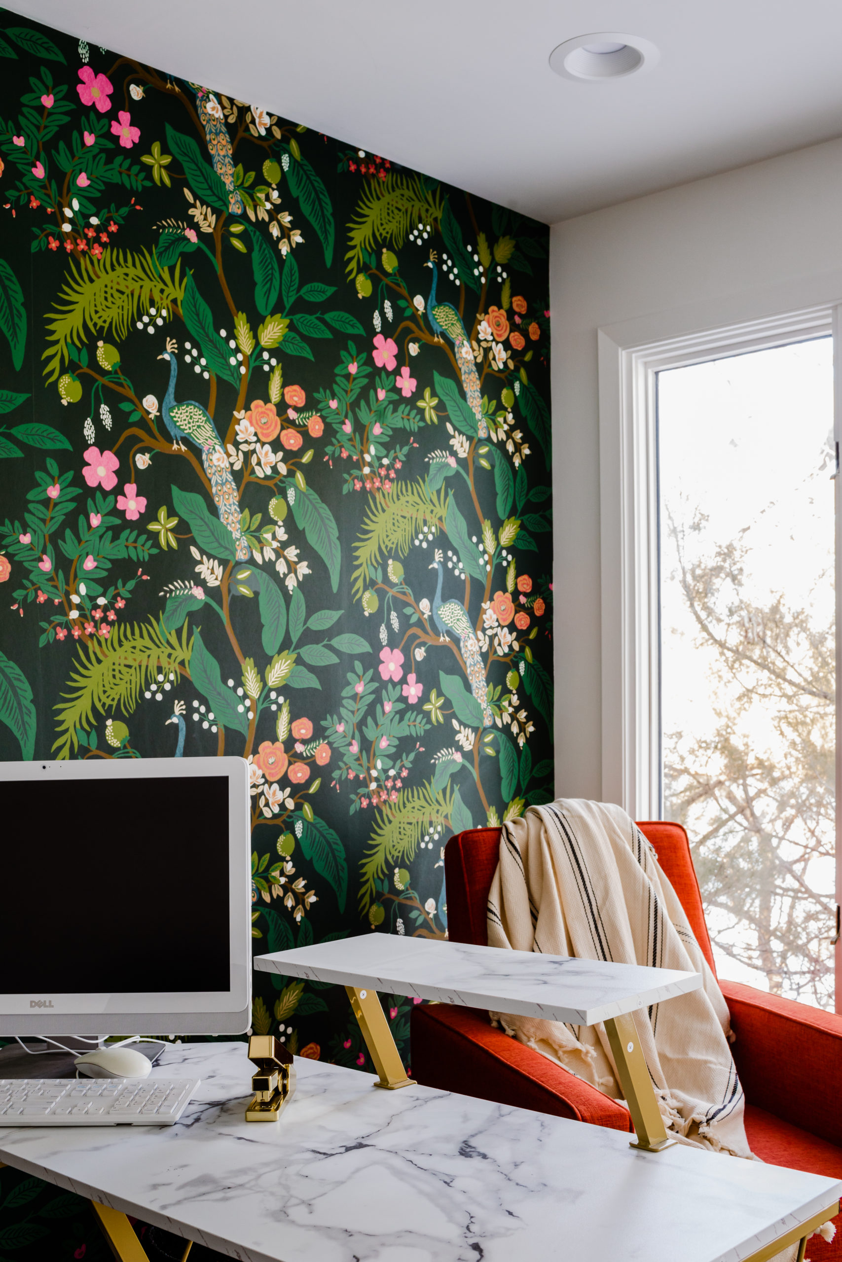
As you can see in the after, it has many windows and being this home is placed on the Mississippi River, it had one heck of a view. Perfect area to sit, work, and stare out to the water in.
Before
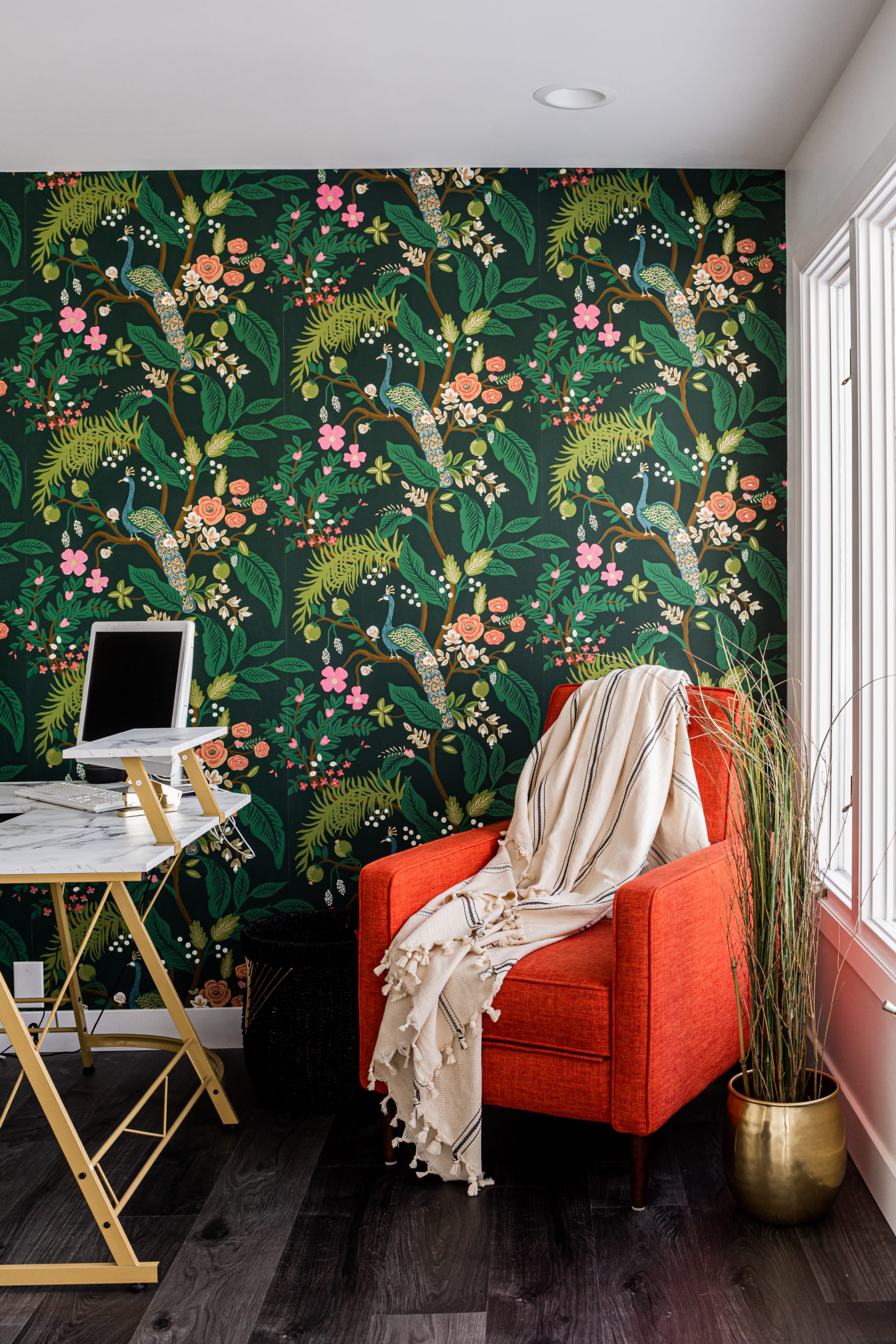
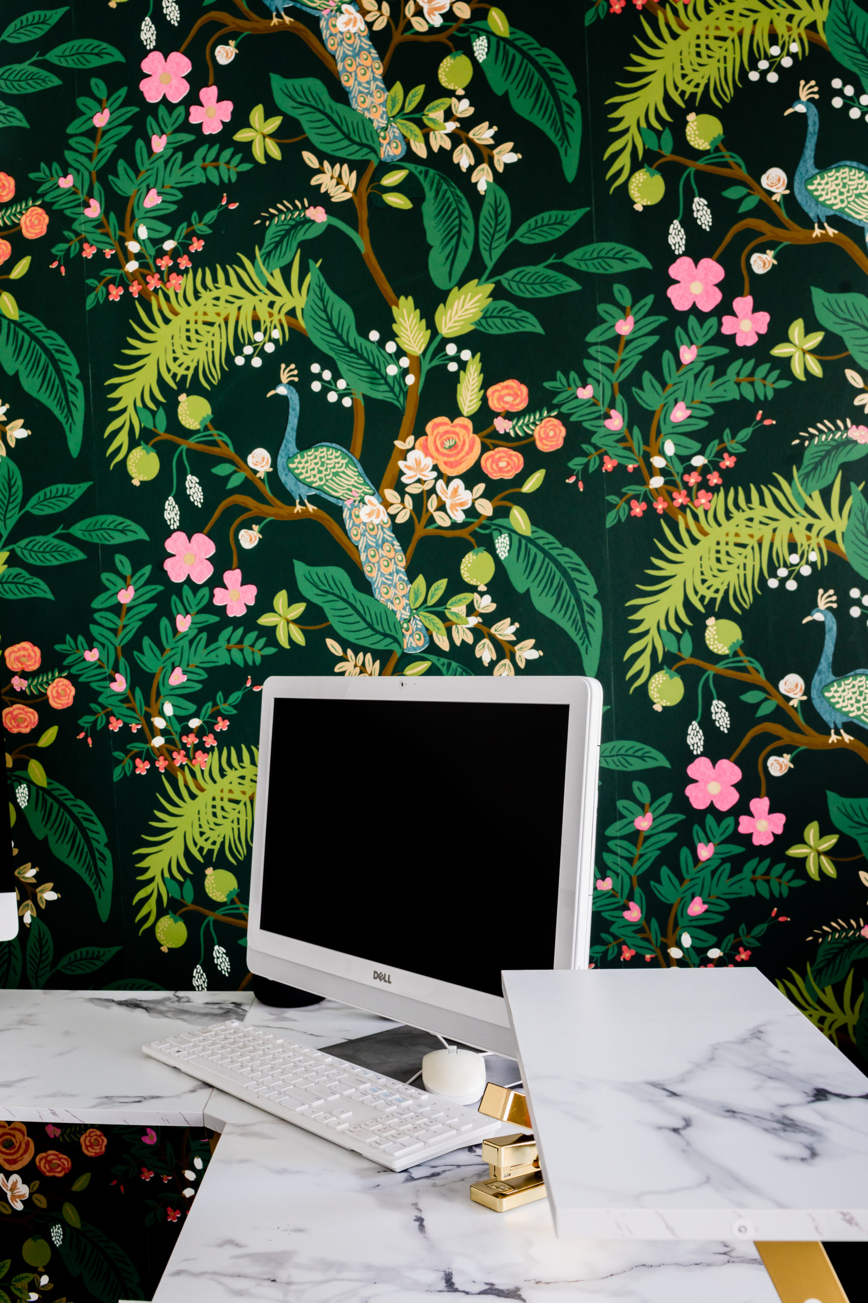
After
The office is tucked back, a walkway from the dining and living room area.
Once again, we incorporated some fun wallpaper details! Who couldn’t feel inspired in this space?
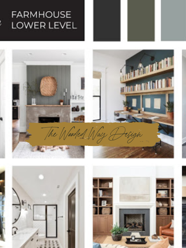
Design Selections
Laundry Room
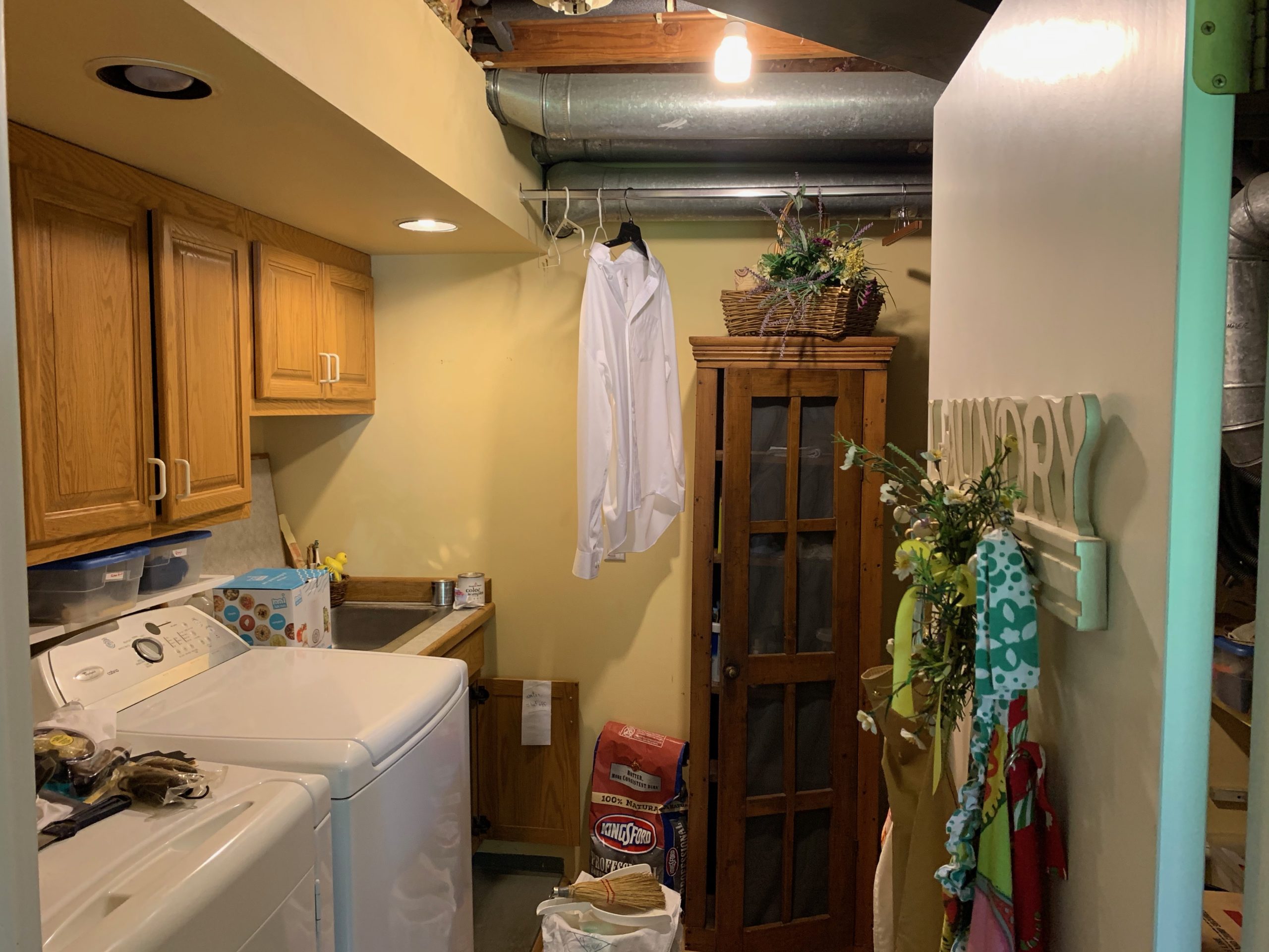
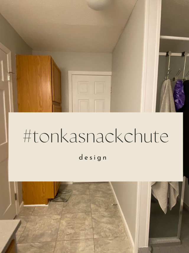
And then the laundry room. This was a hard “before” photo to find because where the room is now, it didn’t exist. Where you see the white door below we turned into a short hallway, with the powder bath and then the laundry room.
Before
This however was what the laundry room looked like before, it was just on the opposite end of the house. It was placed in the middle of the house, so there wasn’t any natural light.
And we need all the natural light we can get in a laundry room, because I’m not sure I know one person who enjoys this time – so have to help enhance that energy!
After
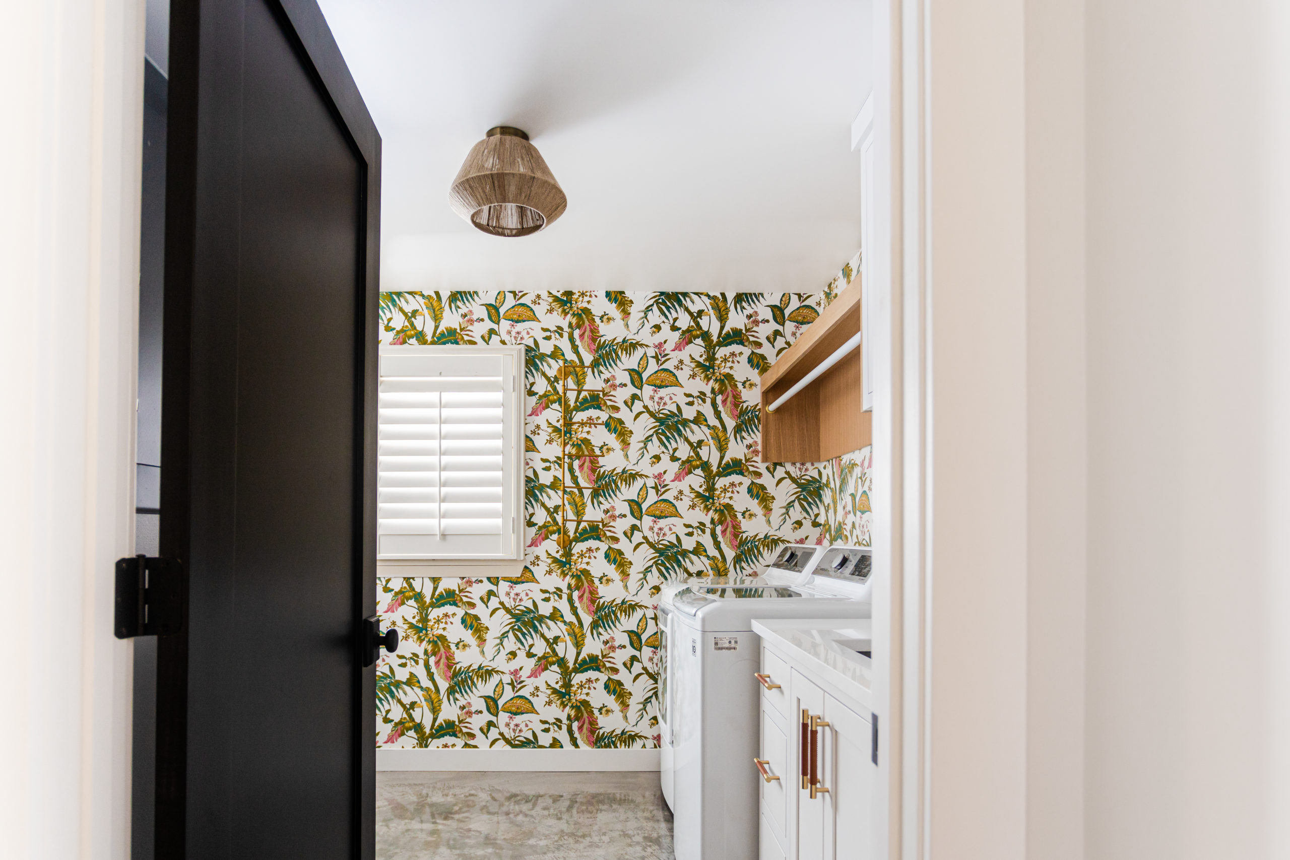
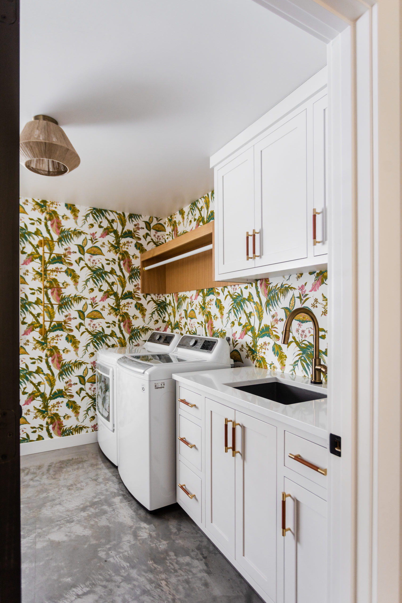
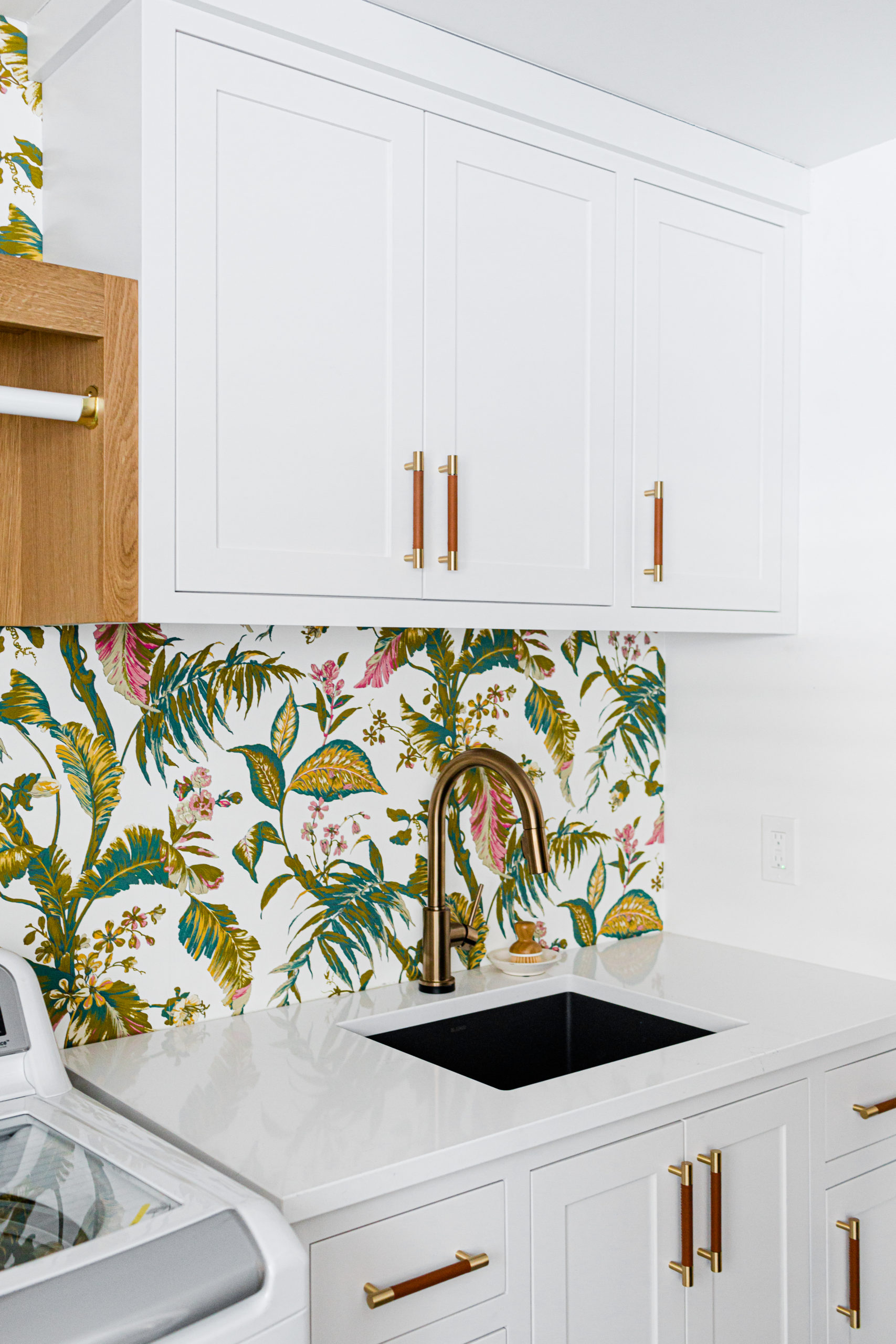
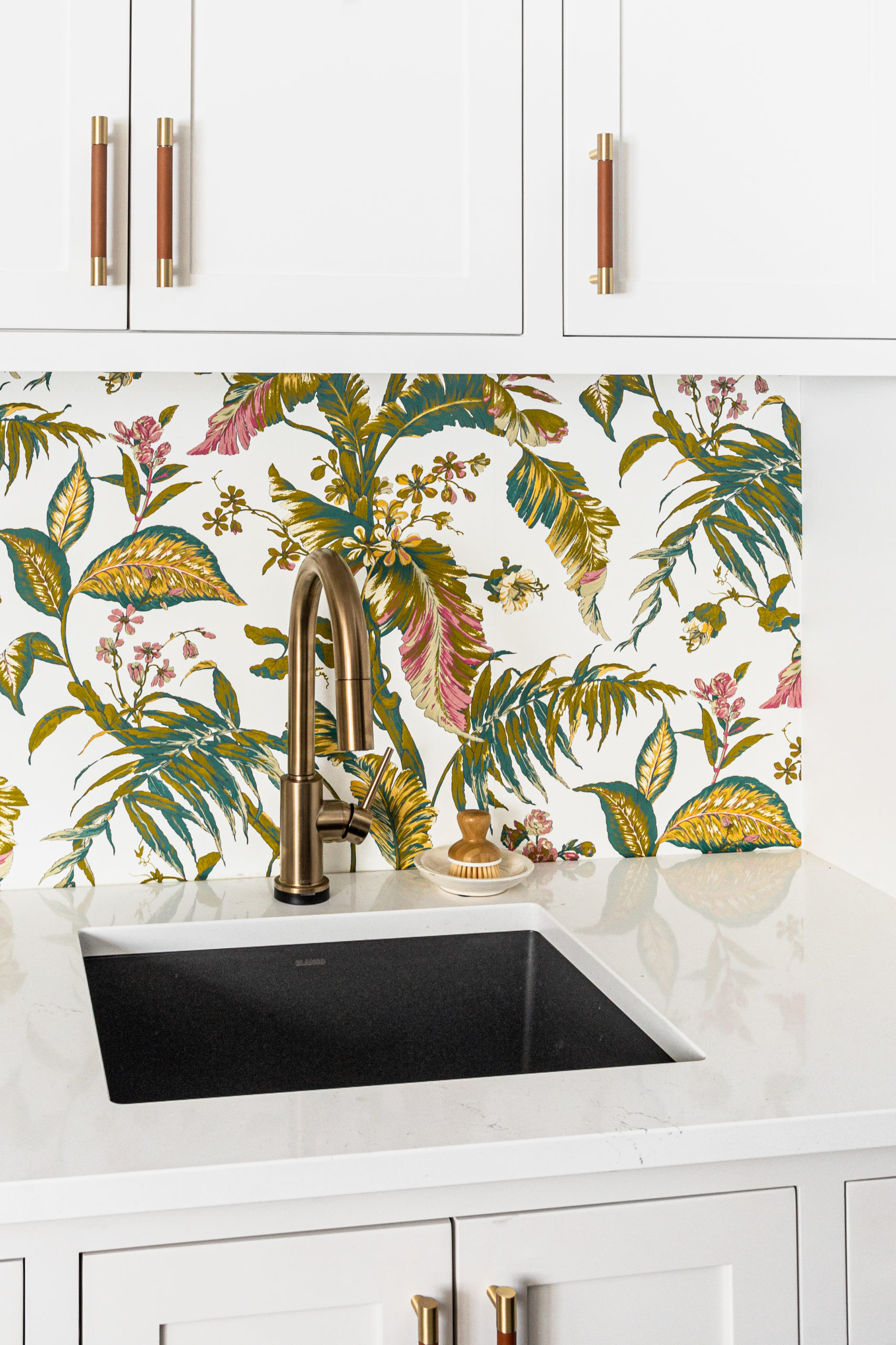
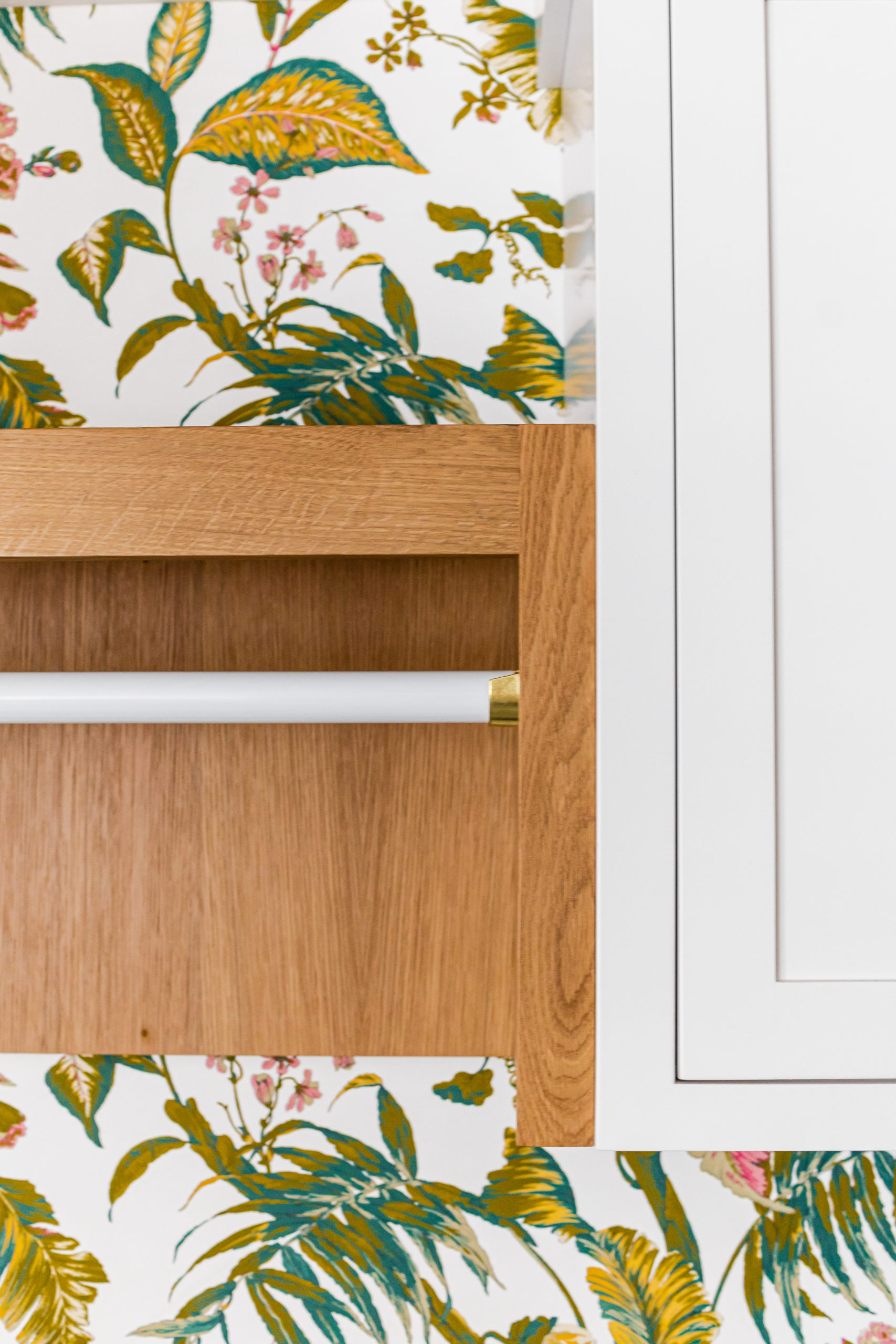
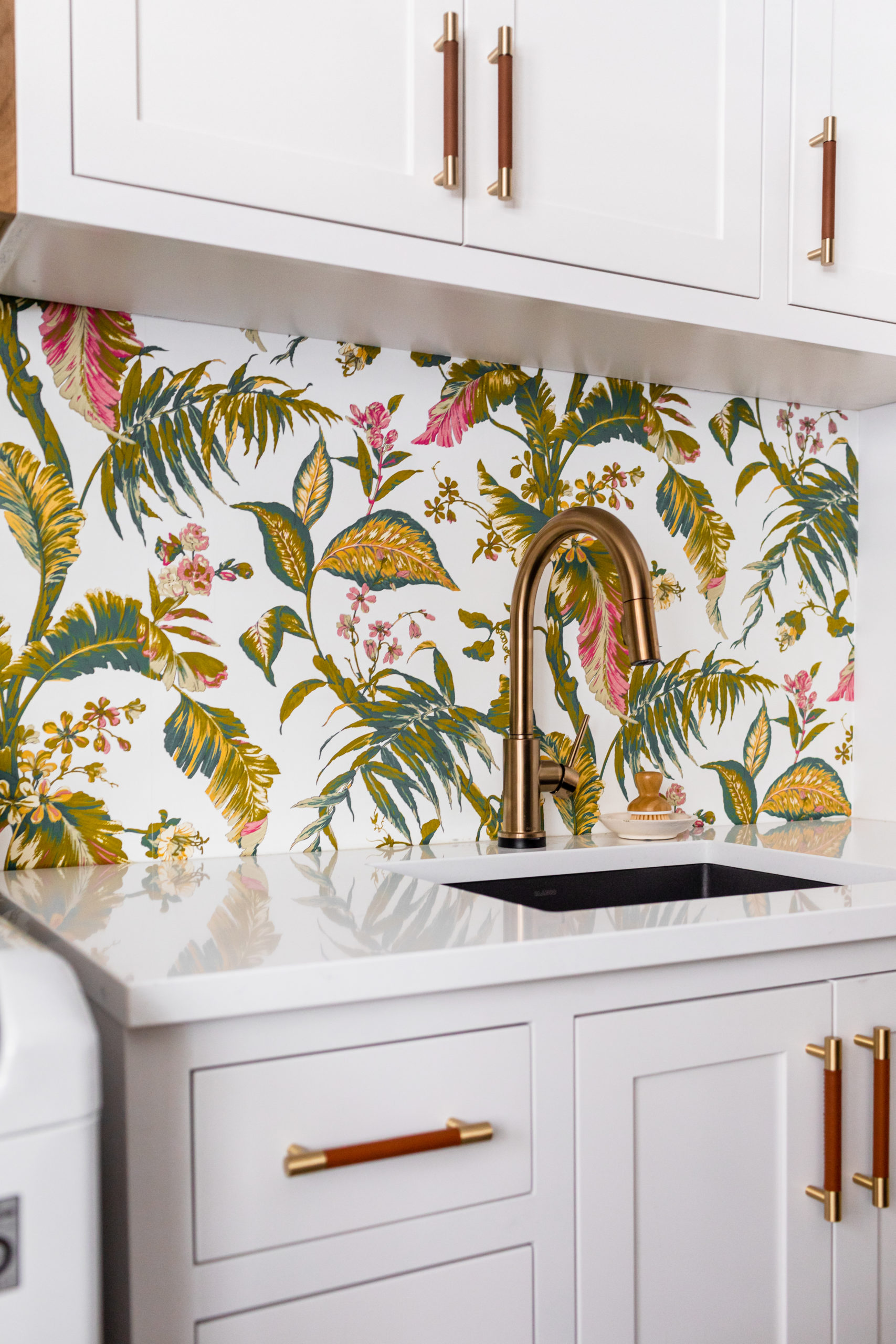
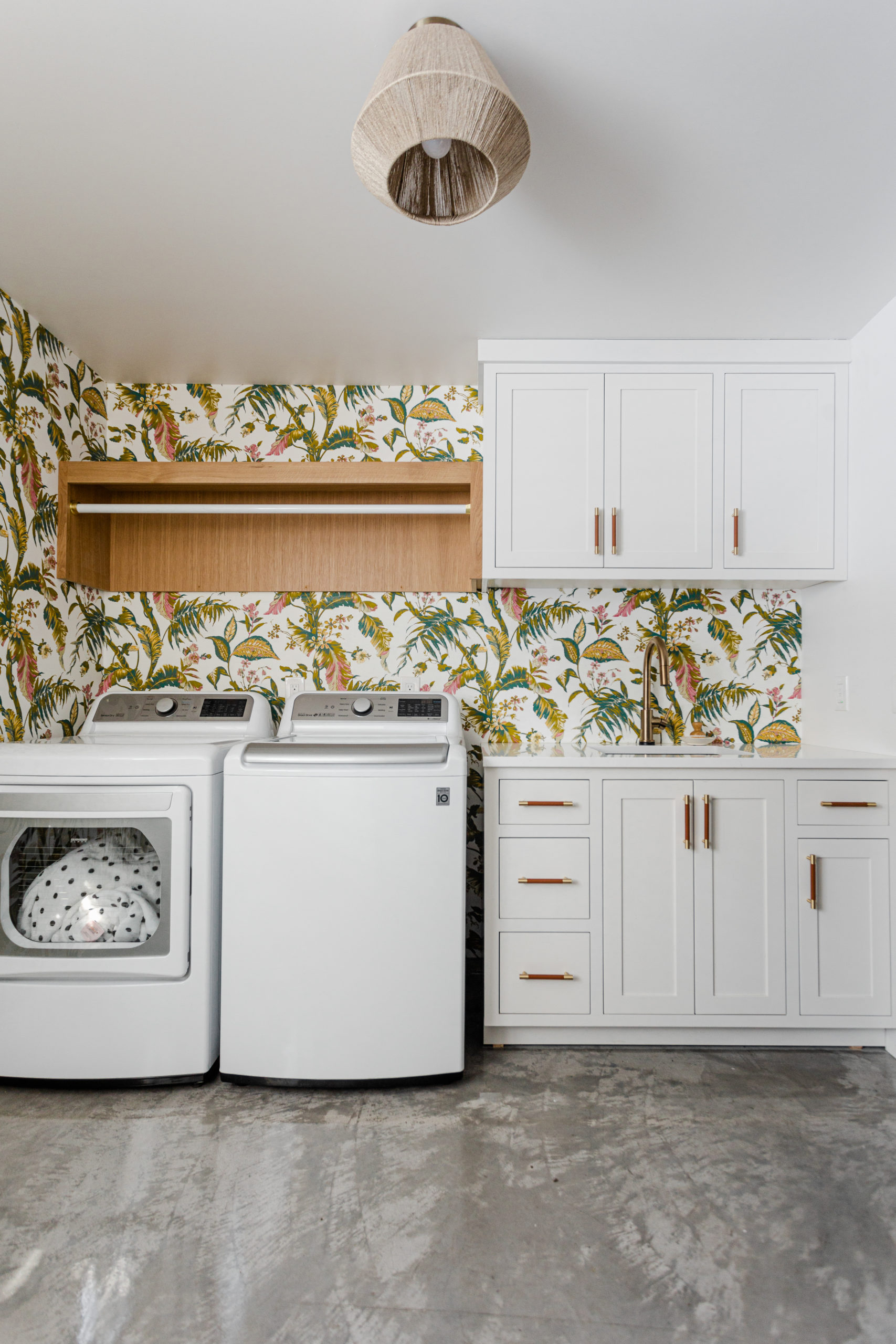
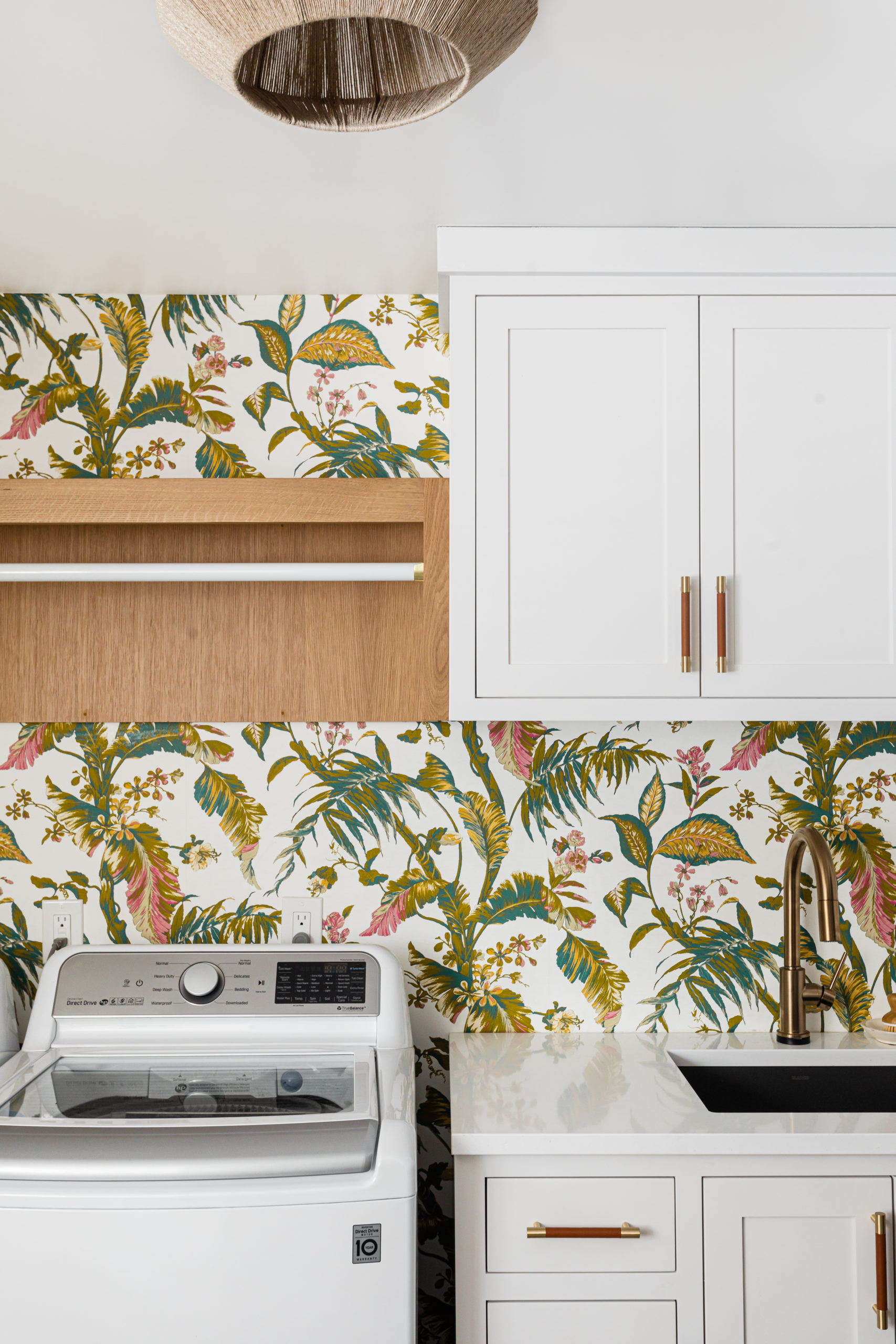
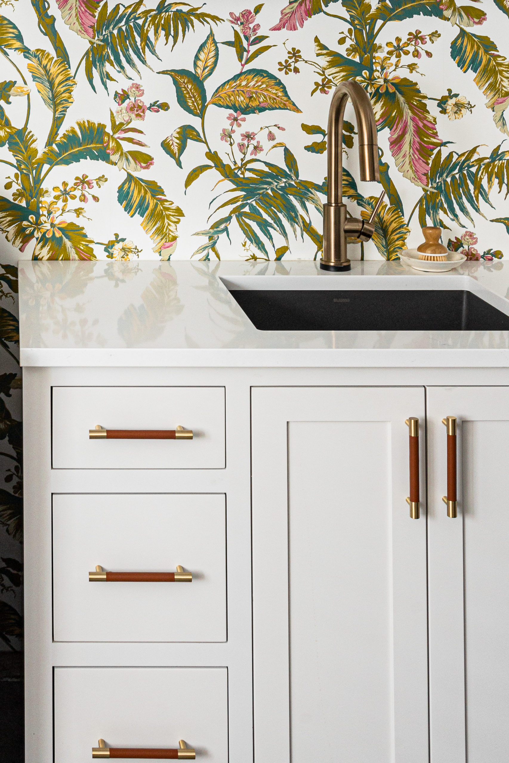
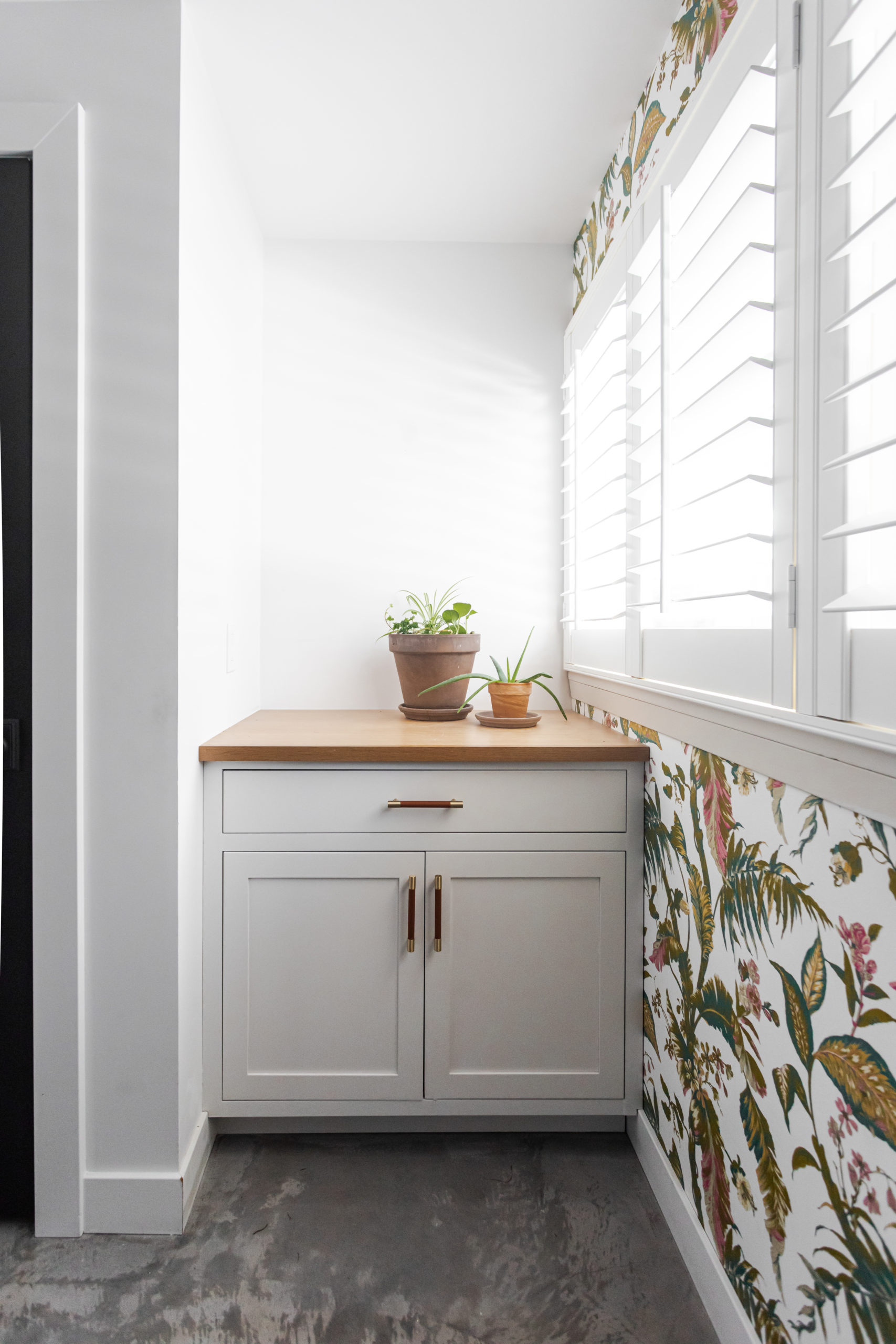
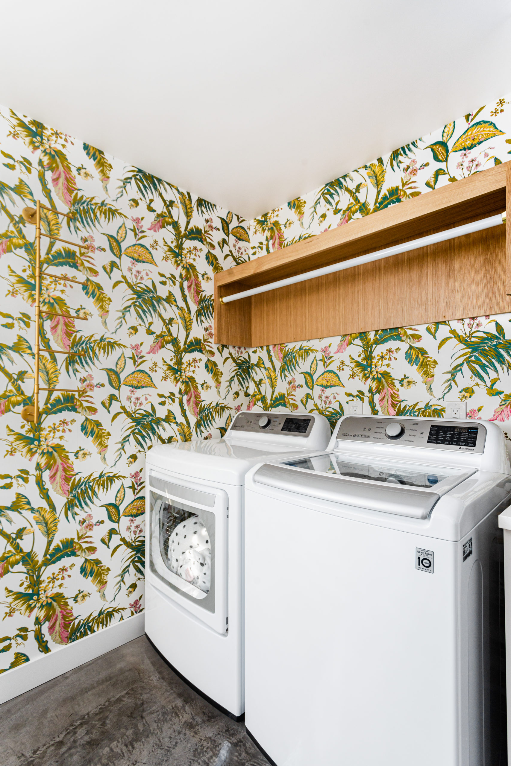
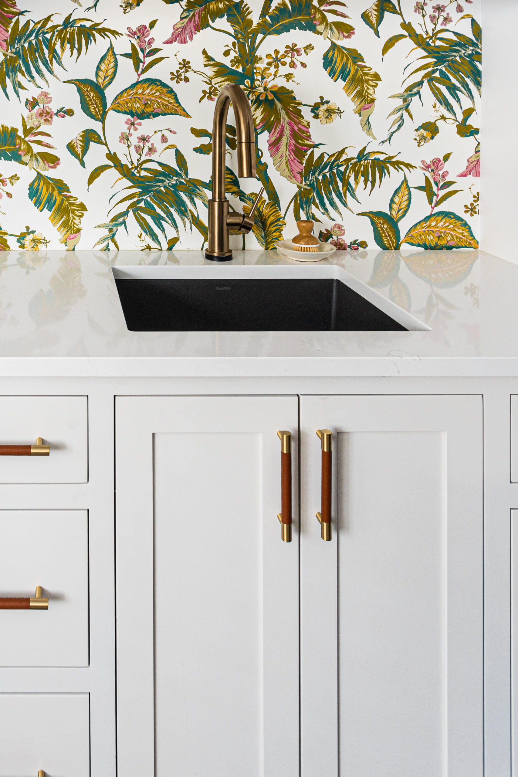
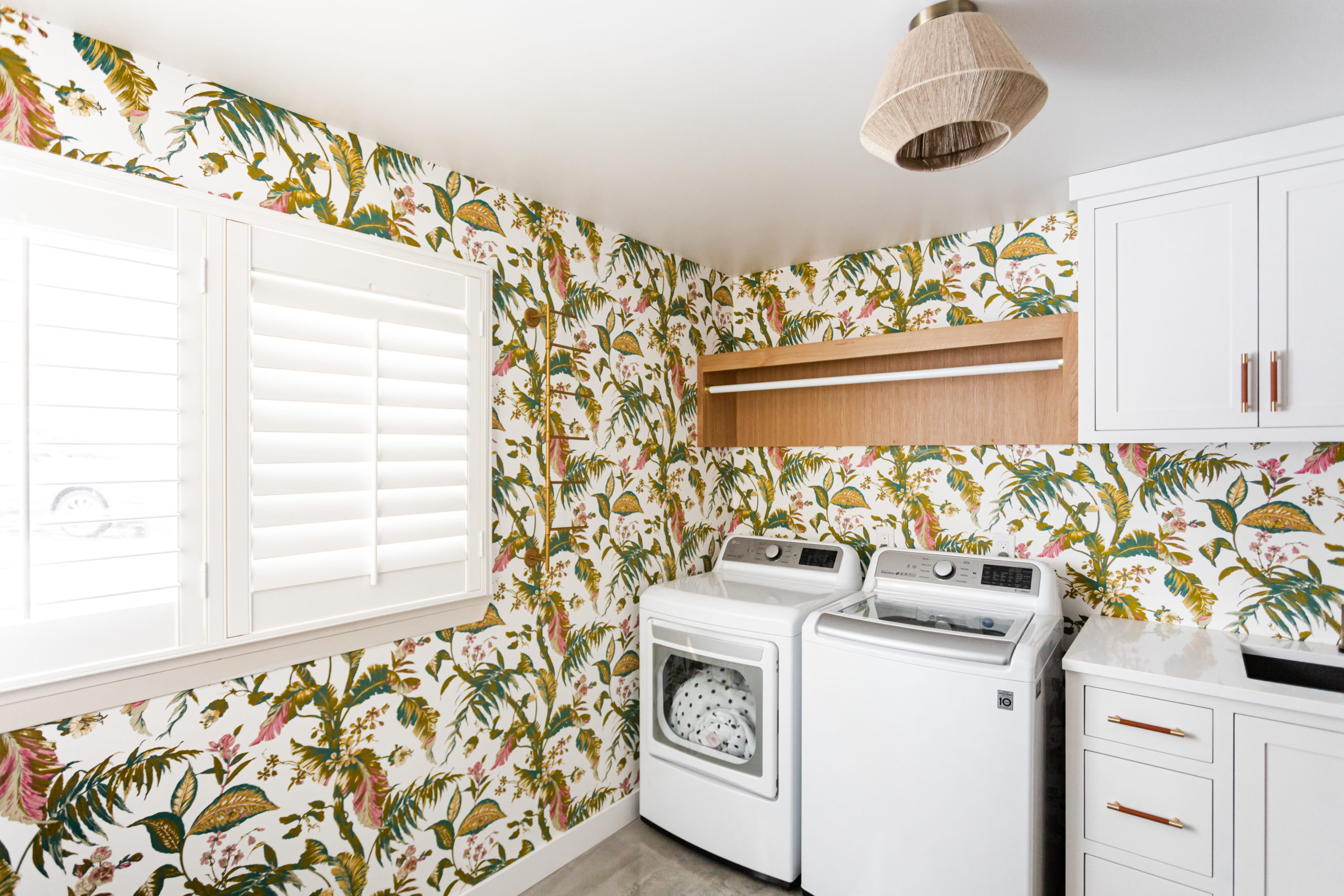
And the after! We doubled the space, brought in the natural light, again – another fun, bold and colorful wallpaper.
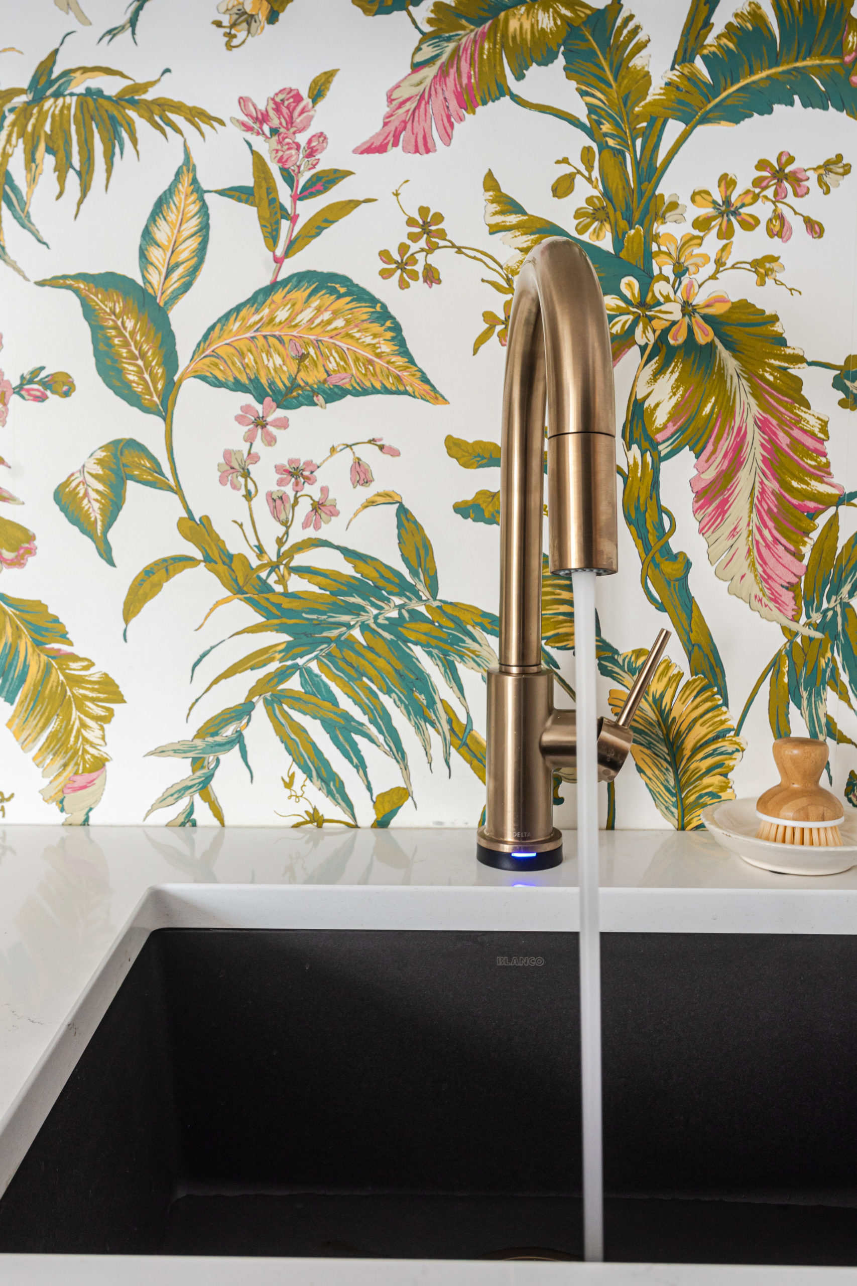
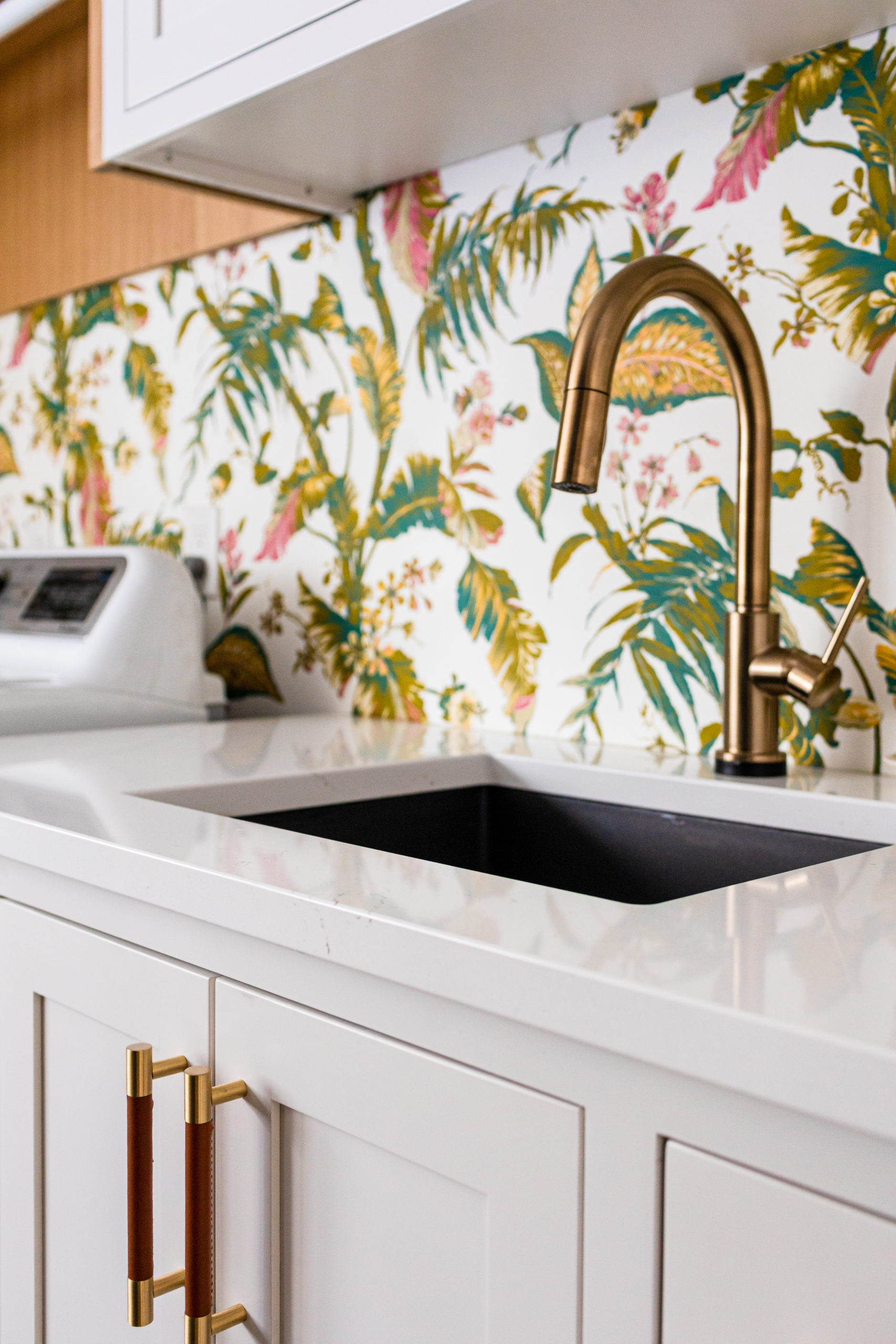
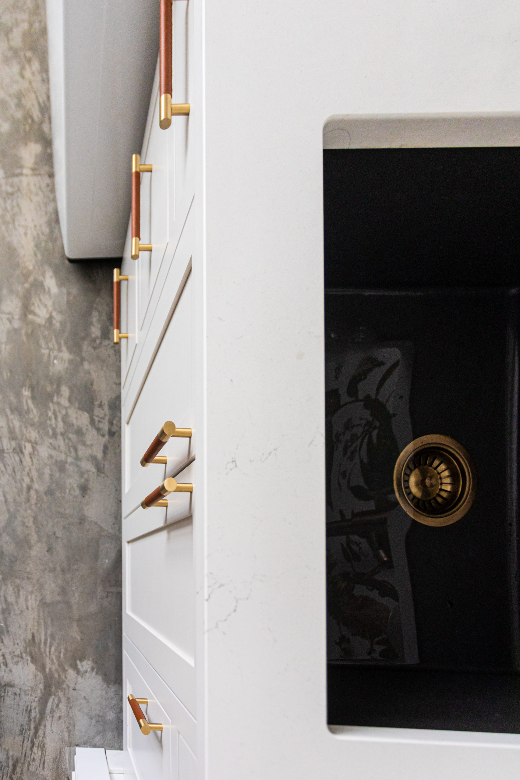
The combination of the white quartz countertops, gold and leather cabinetry hardware, gold touch faucet, black quartz sink, and statement wallpaper – it’s all a favorite of ours.
And we forgot to take the clothes out of the dryer when we shot this space – ha! But then again – that’s real life!
Hope you’ve enjoyed this project as much as we have! I would say it’s a wrap – but we still have to get a screen on our clients bi fold patio door so we’ll be back.
Design Selections
Countertops | Cabinetry Color | Cabinetry Supplier | Cabinetry Hardware | Faucet | Sink | Wallpaper | Lighting – Ceiling Light | Flooring – Concrete | Washer | Dryer
Disclosure: This post contains affiliate links. This means we get paid a small commission when you click through our links but are no extra costs to you.
