The Styled Press Design Project
Say hello to #thestyledpress design project! We couldn’t be more excited to be working alongside the beautiful Taylor from The Styled Press to design out the lower level within her home.
I first met Taylor through Instagram and fell in love with not only her style but sweet personality. I officially met her in person when I invited her to our blogger brunch kitchen reveal party followed by our Galentine’s party this past year. My favorite thing about Taylor is that she always shows up, no questions asked, always supporting c2s in anyway she can. And she’s even sweeter in real life than online. And more drop dead gorgeous too!
Shortly after our Galentine’s party Taylor reached out saying how they wanted to add in a bar and bring some functionality, character, style and cohesiveness to their space. Make it their own!
Her and her husband just recently built their dream home and although they technically “finished” their lower level space, they didn’t add in all of the bells and whistles that they wanted. Taylor said, at the time, it was one of the things they “trimmed out” to help stay within budget. “We added plumbing knowing we we would want to take the project on soon. But we also loved the idea of having a more customized and unique space since you can only do so much with what materials are available from the builder.”
And we couldn’t be more honored that they contacted construction2style to help bring their vision to life!
So after she contacted us, we got to work on designing everything out… and then… the COVID-19 hit, and we put a bit of a pause on everything. But now we are back to work and ready to bring these designs to life!
Before
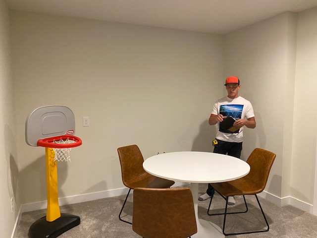
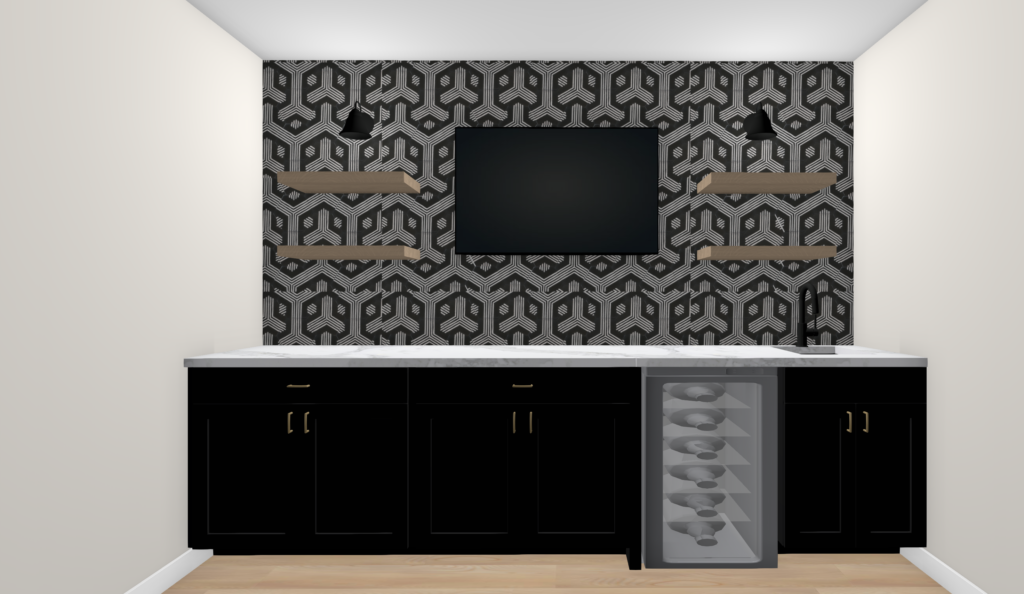
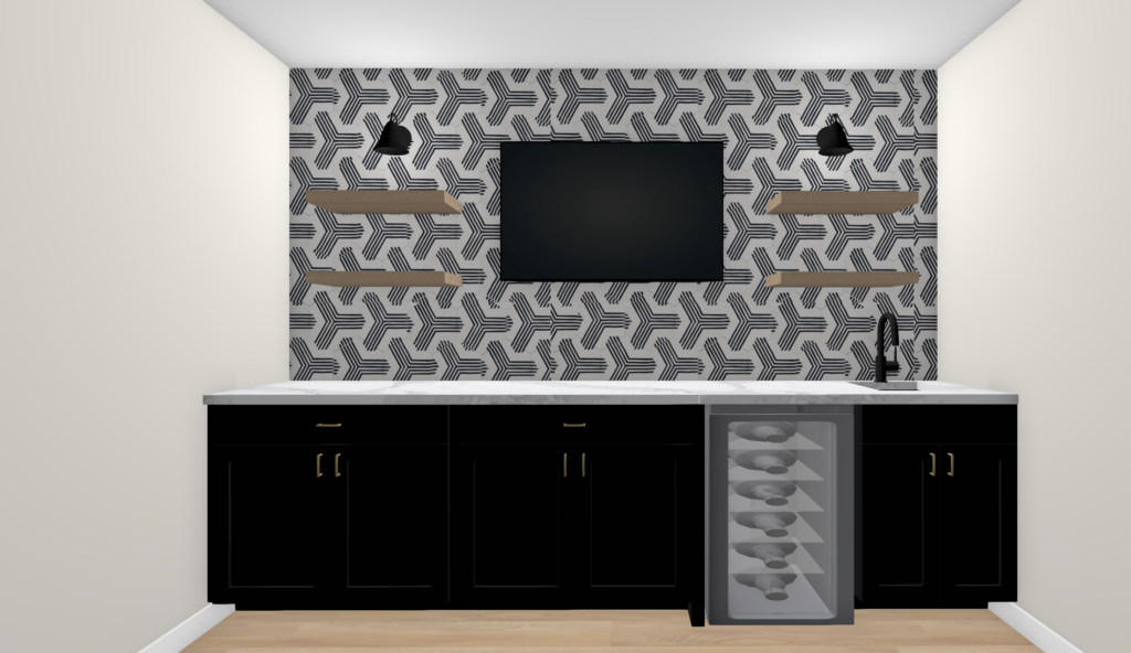
But first, let’s check out the before. This area below, is where the bar is going. Plumbing is already roughed in which is a huge time and cost saver. Cabinetry from wall to wall, statement tile design, sink, faucet, mini fridge, floating shelves and TV.
A perfect cozy space to gather the crew, turn on the game, crack a brew and hang!
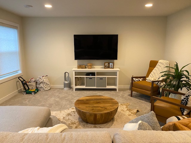
And here is their living room space that they wanted to bring a bit more character to! Taylor wasn’t exactly sure what they wanted to do, but the second I saw this wall, all I could see what a blank slate for a whole lot of fun options.
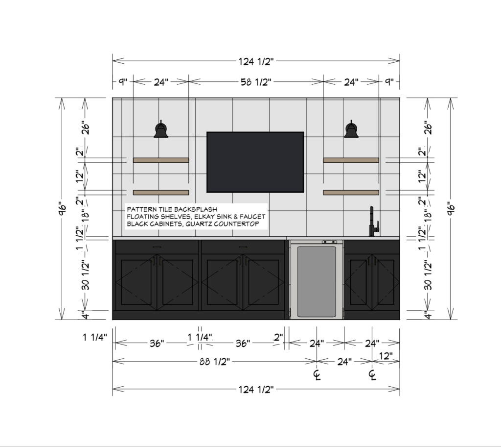
Elevations & Selections
After we talked through their visions, wants, needs, we got to work on sourcing selections and elevations to determine the overall design and layout. We knew we wanted to take out part of the carpet in the bar area and replace with SPC from Urban Floor. We landed on Yellowstone, which is part of the Cascade collection, that we love!
We love how the neutral tan tone complements any design style. Embossed grain gives this luxury rigid core SPC floor an authentic feel under your feet. The best part is that it is scratch resistance and 100% waterproof.
Then we knew we were going to recommend the Zephyr Presrv™ 24 Inch Wide mini-fridge. This is the same wine fridge we have in our lower level and we love it! It fits 21 bottles of wine and 64 cans with Active Cooling and PreciseTemp.
And of course complimented with the Elkay quartz Bar Sink in black and Elkay single hole Faucet, in stainless.
For the cabinetry and countertop, we’re still exploring brands and options but one thing we know is that it’ll be a perfect contrast to add a segment yet make the spaces feel warm and also clean. Shaker style cabinetry in black, with light and bright countertop with some nice veining.
And of course, complementing both of the spaces with some Shelfology shelves. We love Shelfology for a number of reasons but because most importantly the quality is top notch and they make it all so easy to install and support whatever you are wanting to hang on their shelves.
Bar Flooring | Wine Fridge | Bar Sink | Bar Faucet |Cabinetry – TBD | Countertop- TBD | Bar Cabinetry Hardware | Living Room Cabinetry Hardware | Floating Shelves | Bar Lighting
Renderings
Once the elevations were done and most of the finishing selections were finalized, it was time for the renderings! This is where you can really see your visions come to life.
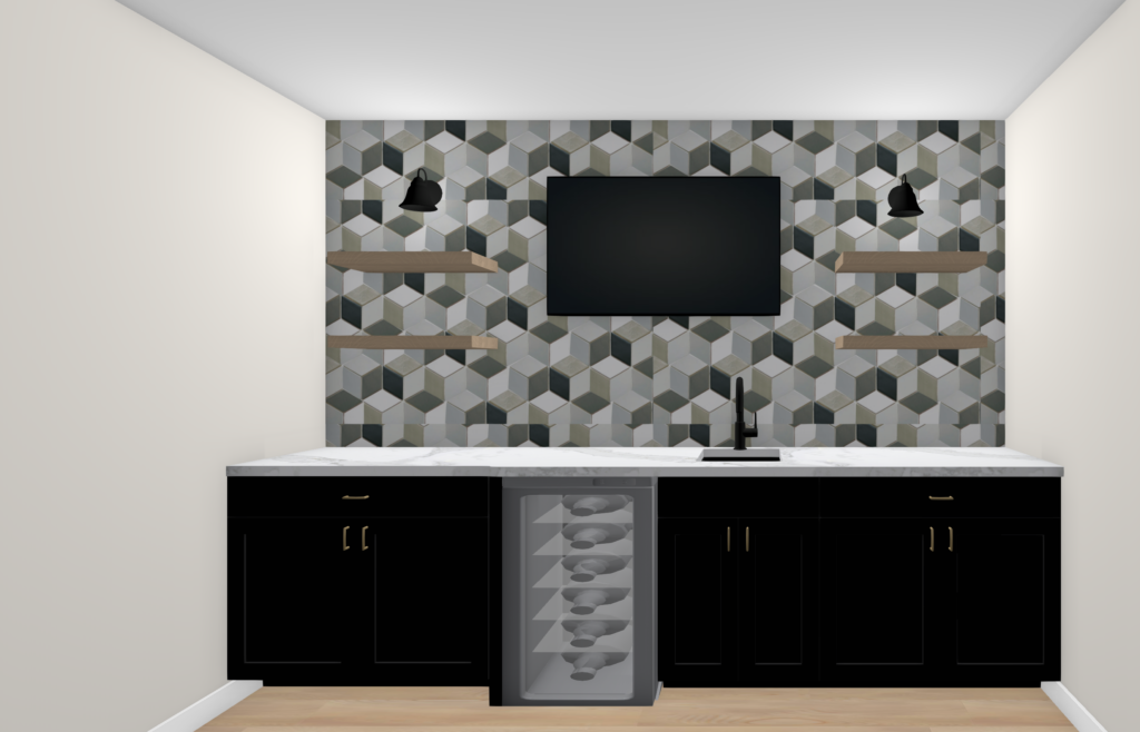
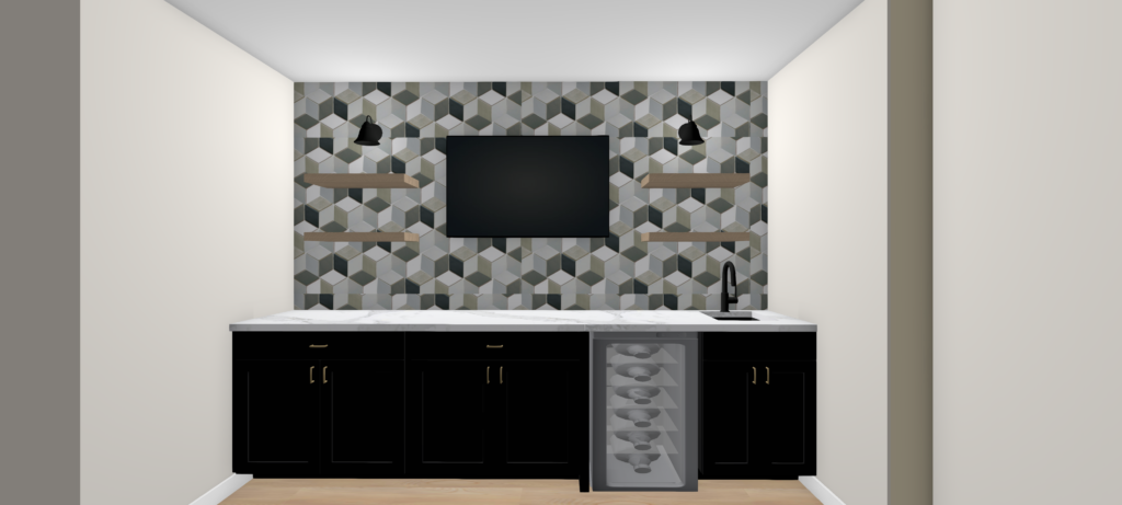
Although the water is roughed in within the bar area, being we’re putting the TV in the center we didn’t want the sink right under the TV, so we’re going to have to open up the wall a bit and move the plumbing over to the right hand side to offset the sink.
Design Option One:
This is what it would have looked like if we would have kept the plumbing as is…
Design Option Two:
So much better moved over to the right hand side, don’t you think?
Design Option Four:
After we got the revision of the layout set, it was time to figure out the tile selection! There are so many good options out there to choose from it’s hard to narrow it all down.
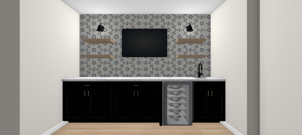
Design Option Five:
We’ve recently been working with, using and loving Zia Tile. The cool thing about them is that their cement tiles are handmade by artisans on 3 continents with generations of experience in producing encaustic cement tiles with lasting quality and beauty.
After scouring their website we came up with a list for Taylor to choose from such as their Echo Charcoal, Echo White-Black, Echo Juniper Pink, and Clay designs. All of which we thought was a prefect representation of Taylor’s fashion style vibes.
Design Option Six:
Which one do you think Taylor chose? 1, 2, 3, 4, 5, or 6?!
The tiles have shipped and we’ll be sharing on our Instagram which was the lucky winner.
Any of these tile choices complemented with dark cabinetry, light countertops, black fixtures, and oak floating shelving is going to tie so perfectly in with the rest of her home and we can’t wait to show you how we’re brining this space to life!
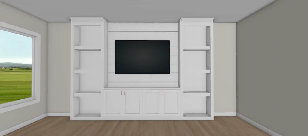
And the living room area… Taylor and her husband again, wanted to add some functionality yet style to this are of their living room space. Cozy it up a bit!
Design Option One:
Taylor loved what we did with the Running Brook Road project, so this is that same vibe…
Design Option Two:
But then I couldn’t help but want to do something different and Taylor and her family were open to whatever we had in mind!
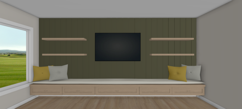
The challenge was the window and how narrow the space from the window to the wall was. This meant, we couldn’t have something built-in wall to wall and ceiling to ceiling if we wanted any kind of depth to storage, shelving, etc.
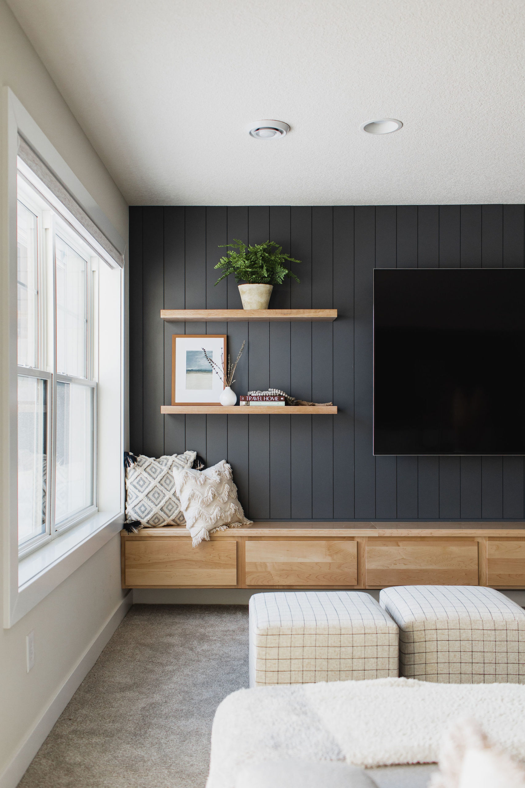
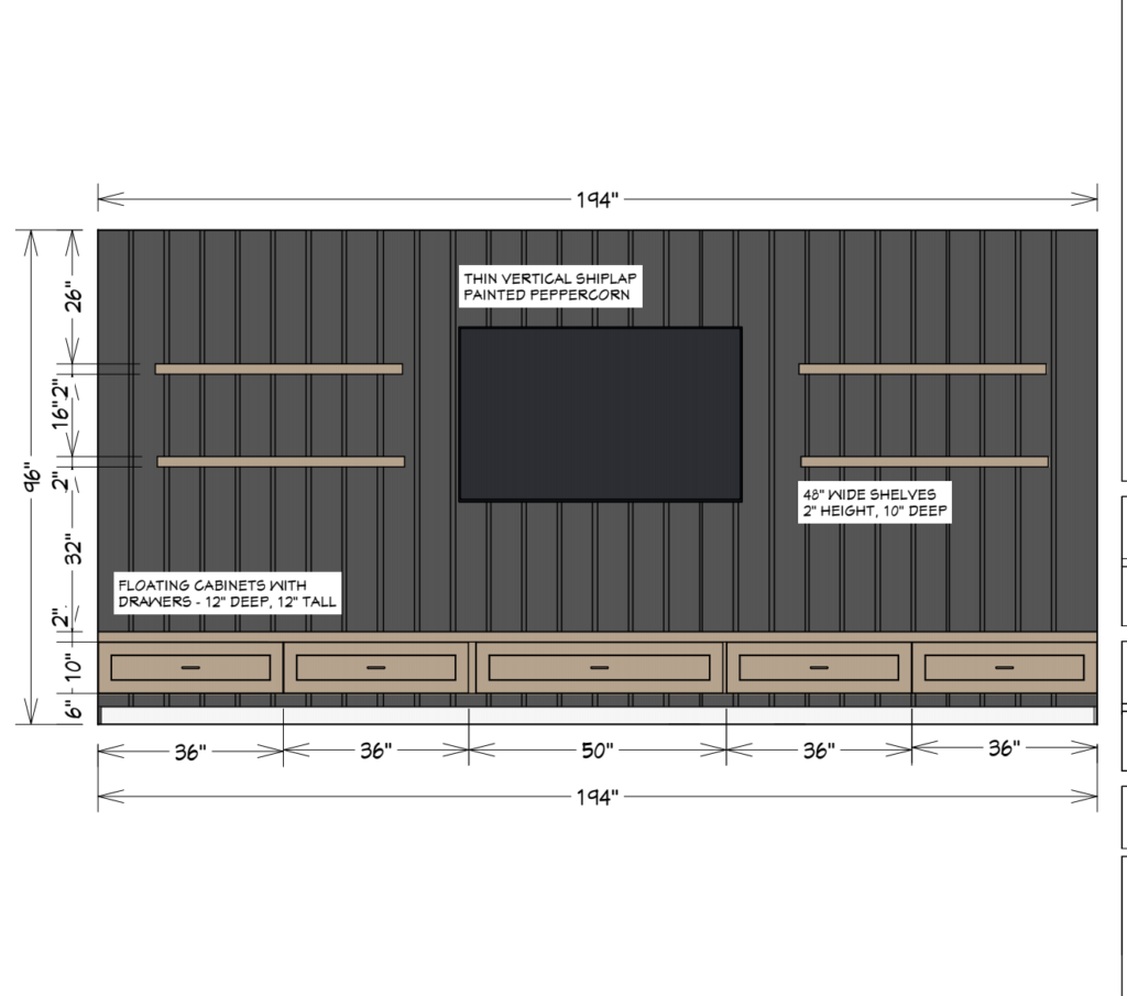
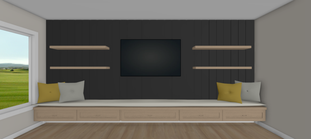
So we came up with this design… a bench seating, plus storage that was shallow enough to come right under the window.
We recently also did cabinetry in our personal living room and one of the things Jamie wanted to do and feature and we both really loved is how we made it floating. So we thought, why not make this floating too?!
Complimented with vertical shiplap, painted green with some floating shelves.
Design Option Three:
This option we switch up the paint color as Taylor has Sherwin Williams Peppercorn for her master bathroom cabinetry and loves it, so we thought we’d match the same tone
So, which do you guys think was the lucky winner?!
Materials are on order and we can’t wait to show you how we bring these designs to life!
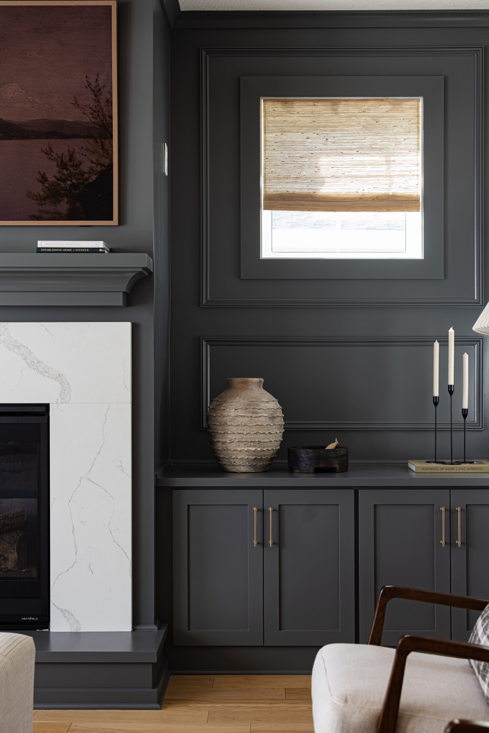

I love it. Cabinets are from Pro Source in Plymouth, MN.
I know this post is from a while ago, but I love the look! I was just wondering – where are the floating cabinets from? This looks amazing!