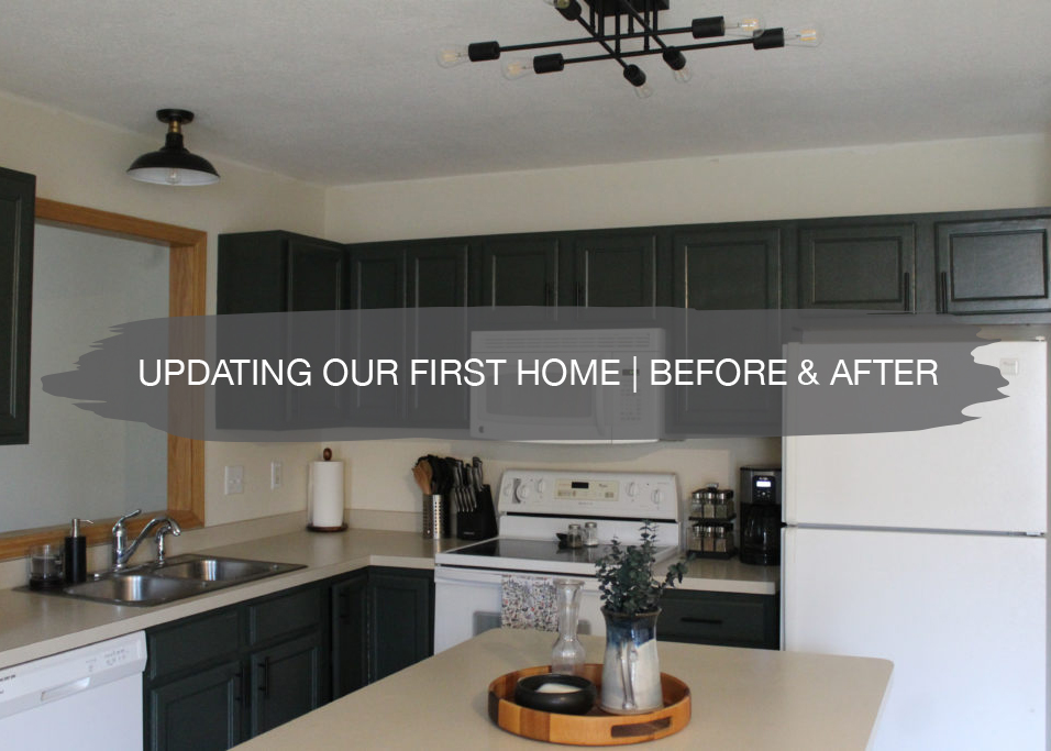
We’ve been in our new home for a couple of weeks now and we love it so much! To recap, Matt and I bought our first home this summer, closed July 31, and moved in on August 31. During that month, we scraped popcorn ceilings, applied knockdown, painted walls, painted cabinetry, and updated light fixtures. It was a crazy month, but we are so happy to have it all done and be enjoying our home. We shared our week one, week two, week three, and week four progress on the blog as we updated the space for you too!
Below, we’re sharing the before and afters from each room, plus what updates were made in each space.
Kitchen
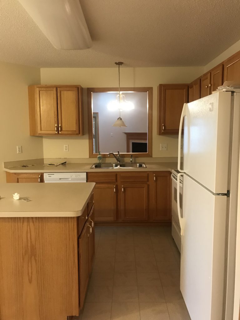
Before
The kitchen layout was actually really functional and good, which we were happy about! We knew that some cosmetic upgrades in this space would make such a difference.
After
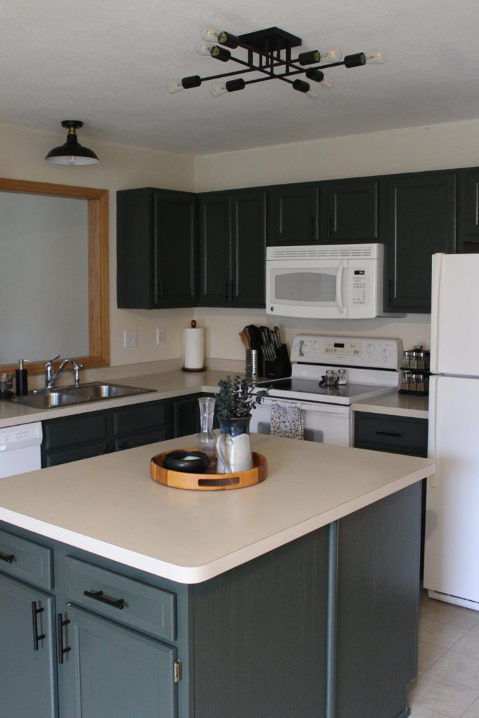
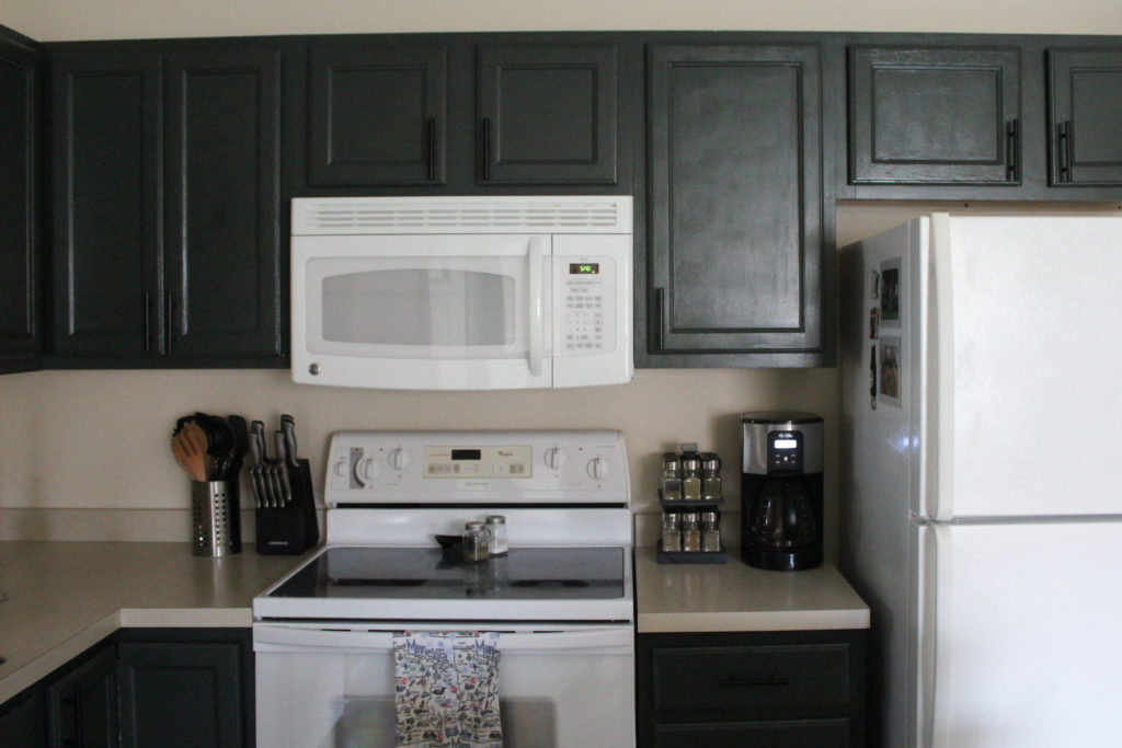
In the kitchen, we painted the cabinetry North Woods by Behr, which turned out beautifully. Our original plan was to paint the lowers black and the uppers white, but changed our minds once we were in the space. The green works really well with our cream countertops and white appliances, since there is more of a contrast than if we would have painted them white.
Eventually, we plan to replace the sink (right now it’s so shallow and hard to wash anything!!) and get a black faucet to tie into the light fixtures and pulls.
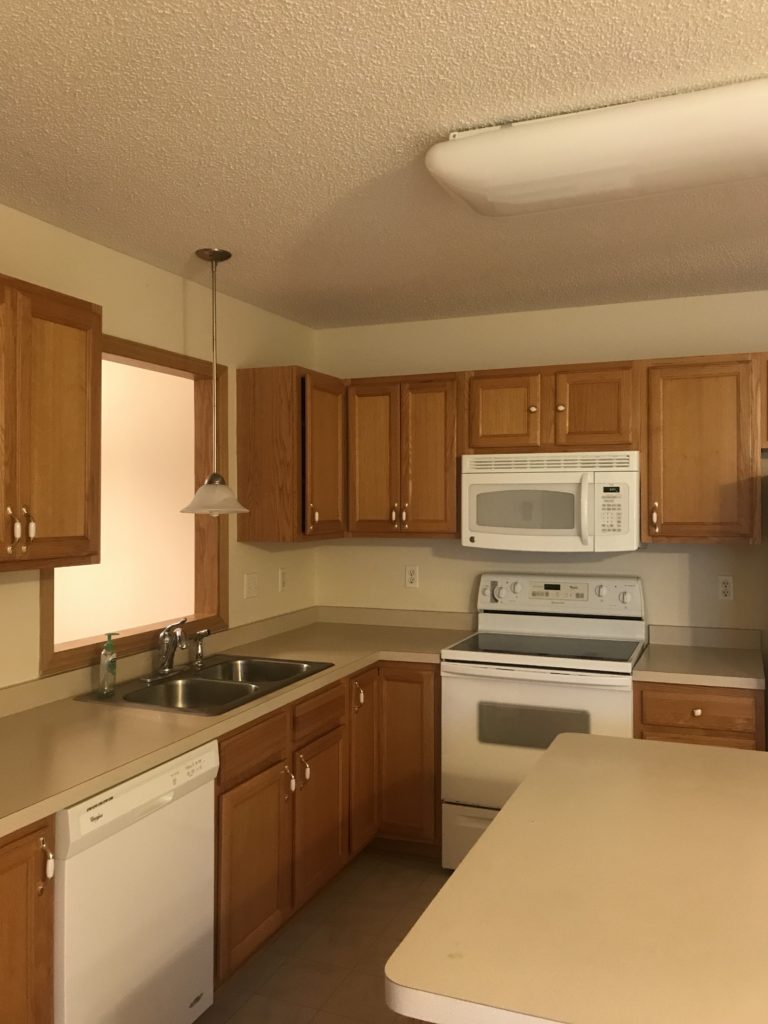
Before
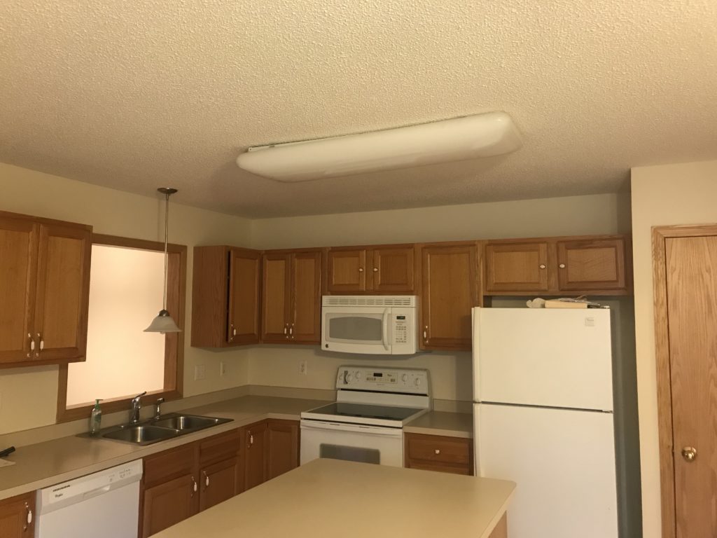
We knew the big florescent light HAD to go, since it totally dated the space and gave off such harsh light. In addition, we got rid of the pendant over the sink because it blocked the view into the living room and was right at eye level.
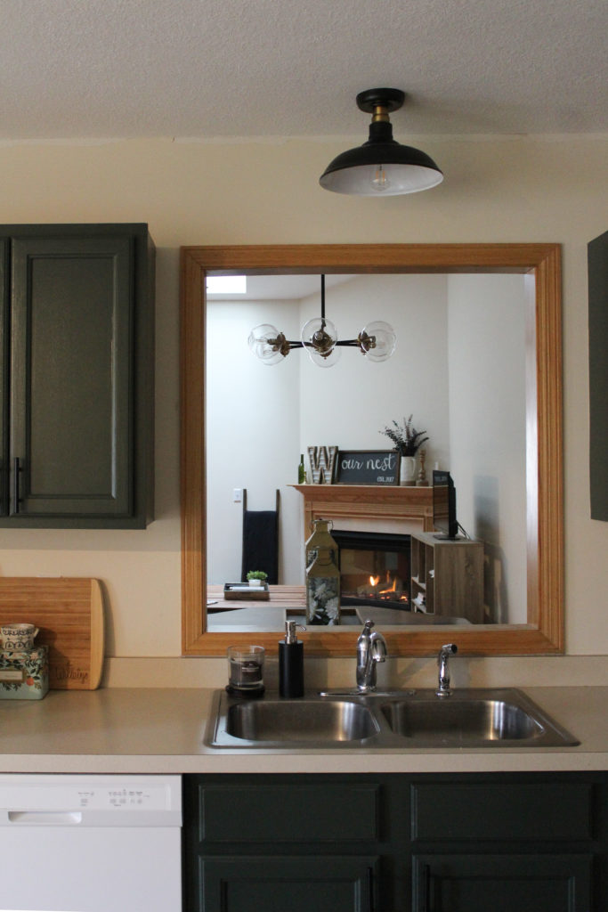
After
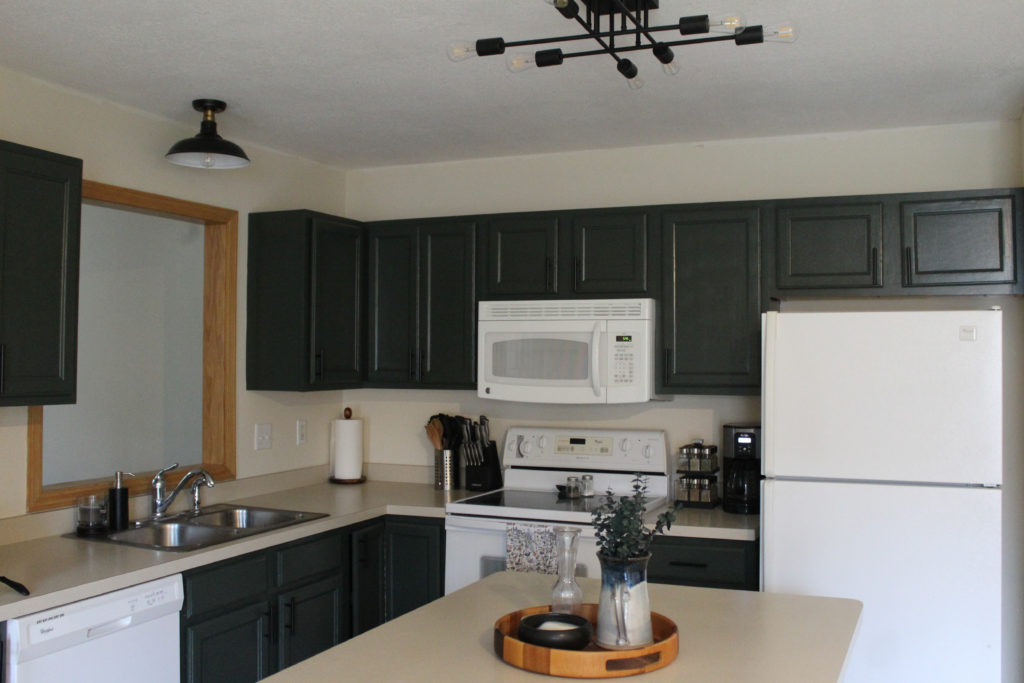
New lighting makes SUCH a difference! Taking out the big light and replacing it with a semi-flush mount instantly updated the space. Since the light socket is slightly off center from the island, this light was the perfect option since the different angles and lengths of lights minimizes the placement of it not being completely centered. The flush mount over the sink works well for task lighting while doing dishes and doesn’t block the window anymore.
Before
Another big change in the kitchen was scraping the popcorn ceilings and applying knockdown texture.
After
The knockdown gives it an updated look and fresh white paint on the ceilings made a big difference as well.
Before
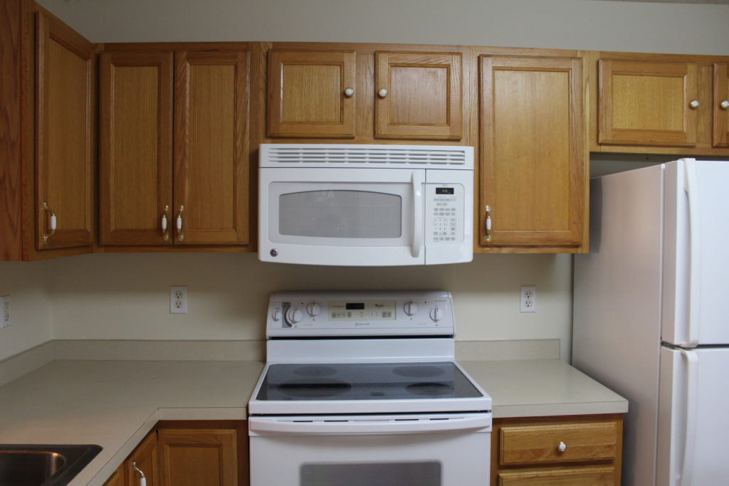
Since the old hardware was a mix of knobs and pulls, we had to fill in the holes for the drawers and smaller doors, and drill new ones.
After
Updating the hardware made the cabinets look much more modern and clean, which we LOVE! Plus, we scored these pulls on Amazon for 10 for $15.
Living Room
Before
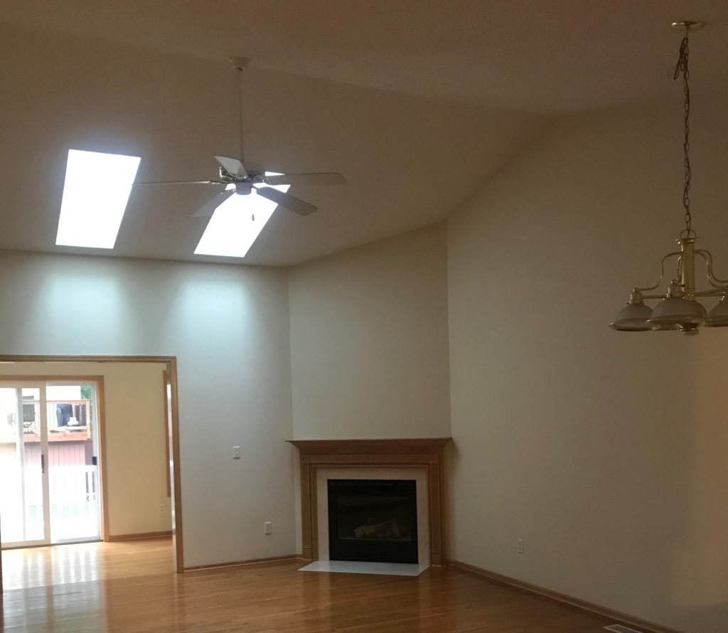
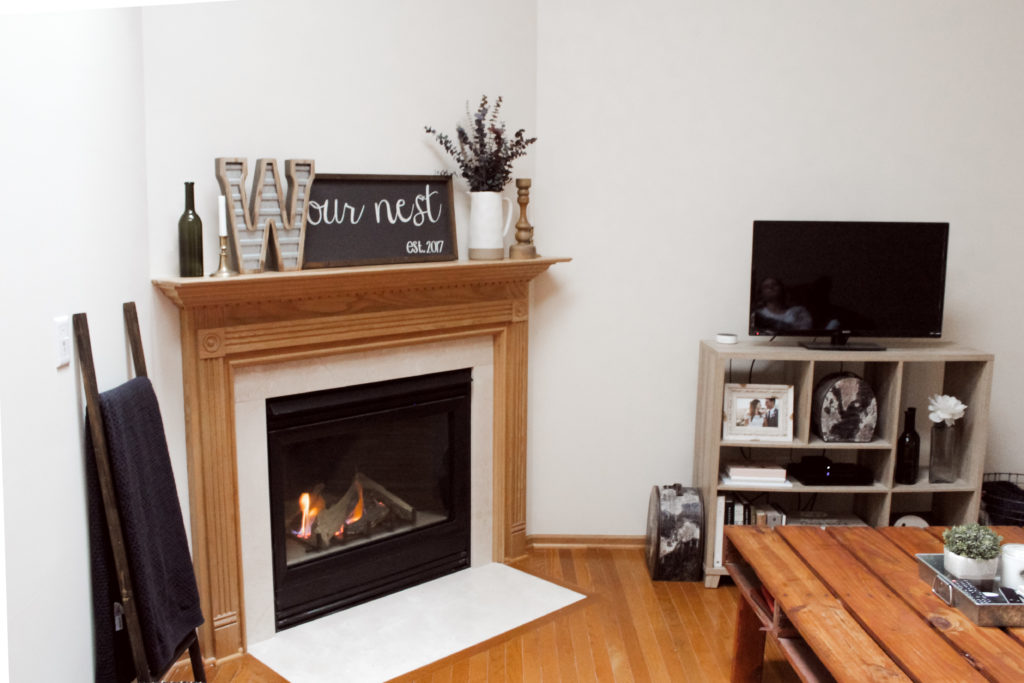
One of the biggest aspects we loved about this house were the skylights and the vaulted ceilings in the living room. The hardwood floors were also in really good shape, so we knew this room would be more cosmetic updates.
After
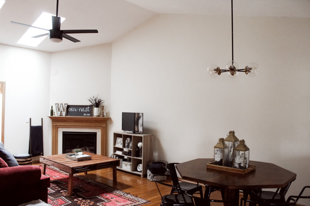
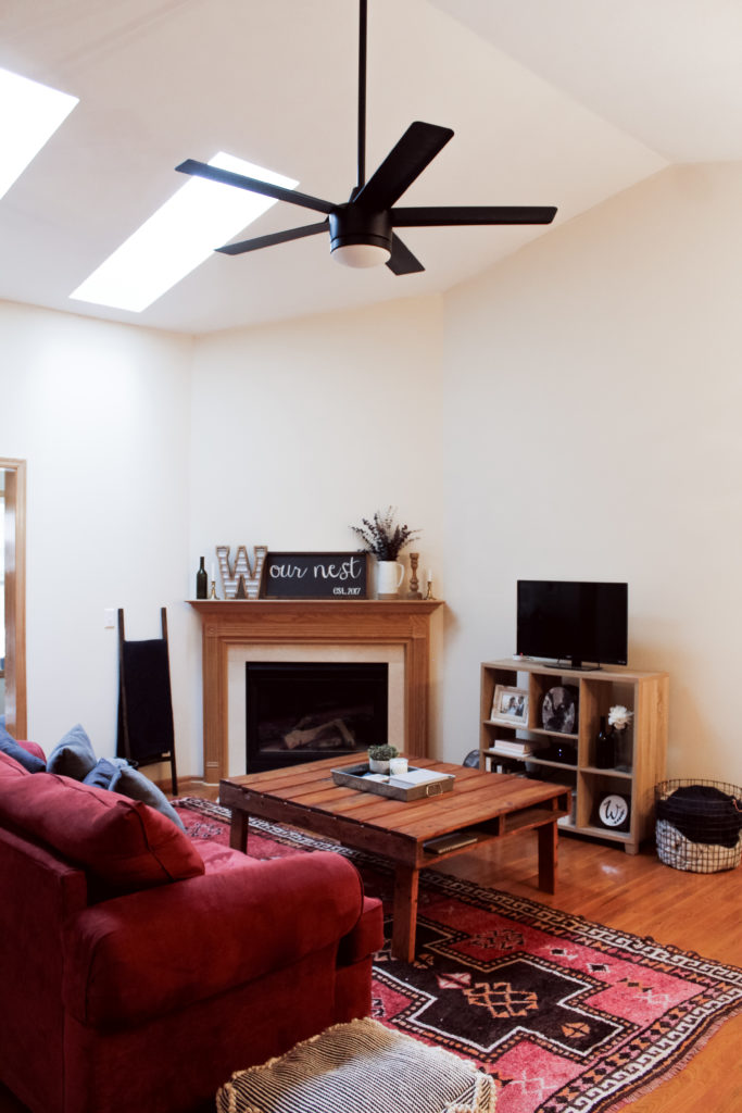
Changing out the fan and the light fixture over the dining room table really changed the look of this room! We also scraped the popcorn ceilings in here and applied knockdown and new ceiling paint.
We got this black fan from Home Depot and we love the size of it! Adding an additional downrod for the vaulted ceilings made it the perfect height for this room.
Dining Room
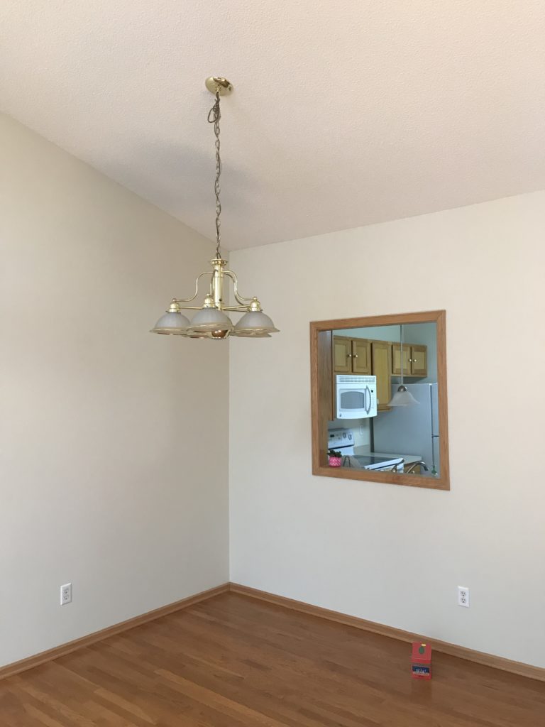
Before
The main changes in the dining room were replacing this light and updating the ceilings.
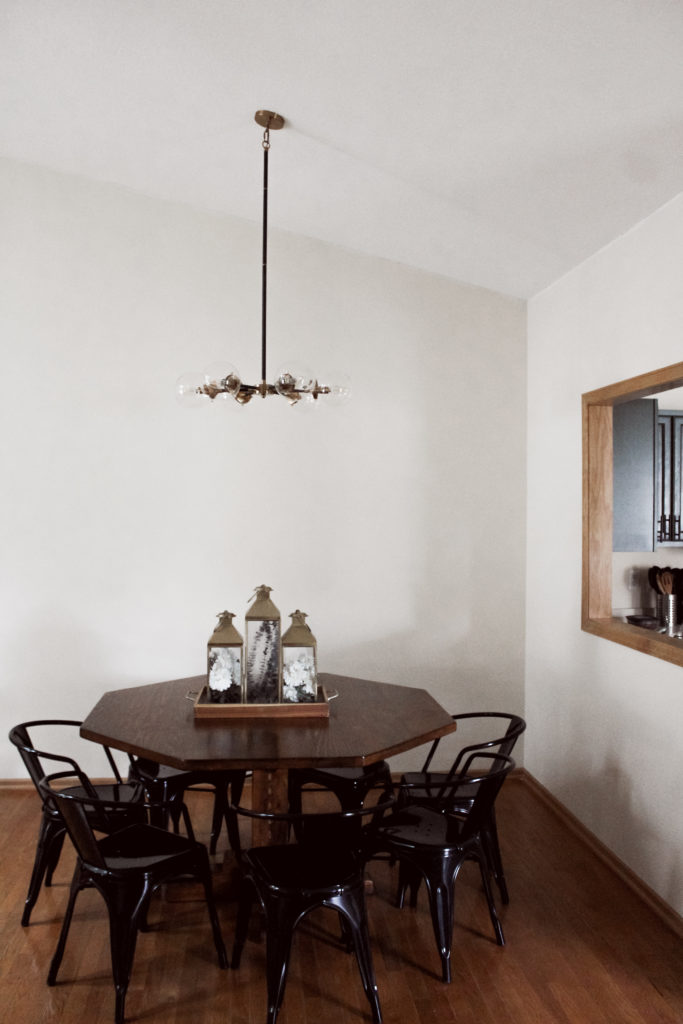
After
This six light black and gold chandelier is our favorite light in the house! I scored it at Morgan and Jamie’s garage sale and it works perfectly over this octagon table we got at a Habitat for Humanity Restore and refinished.
Guest Bathroom
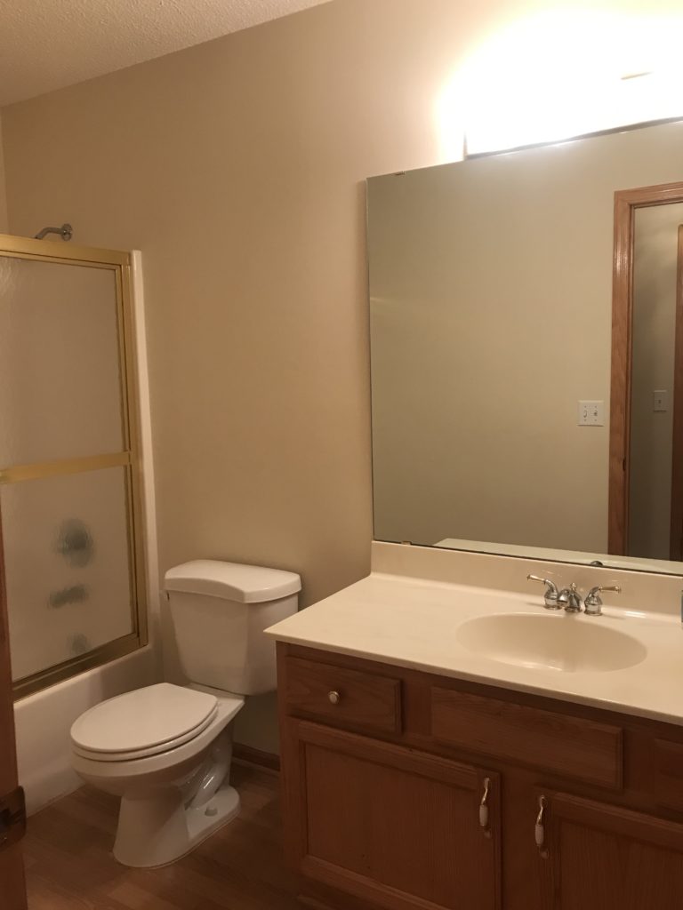
Before
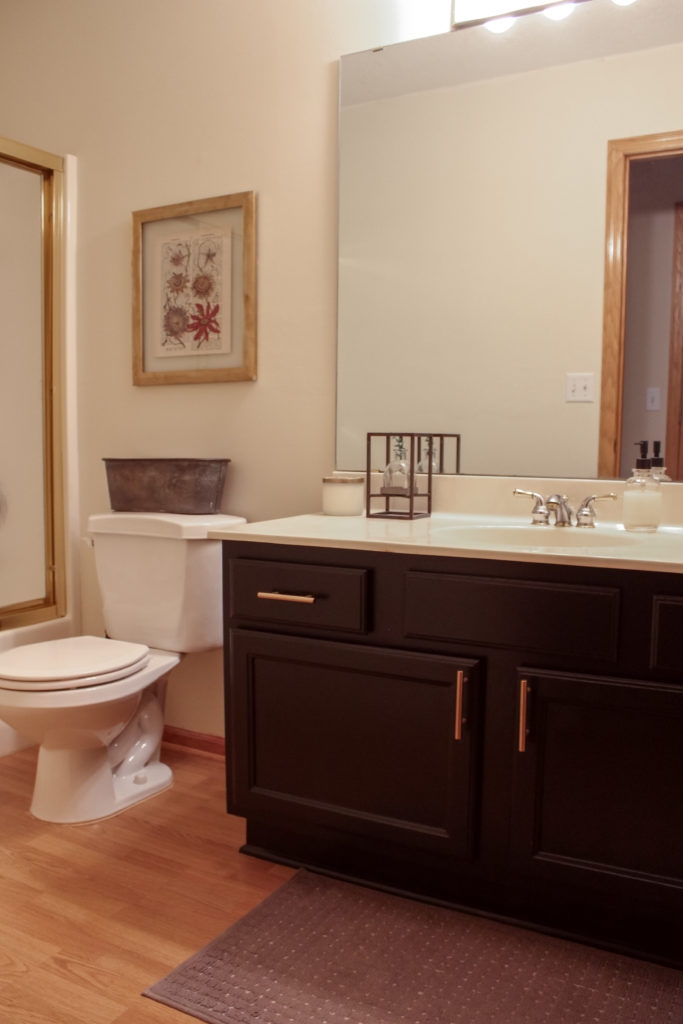
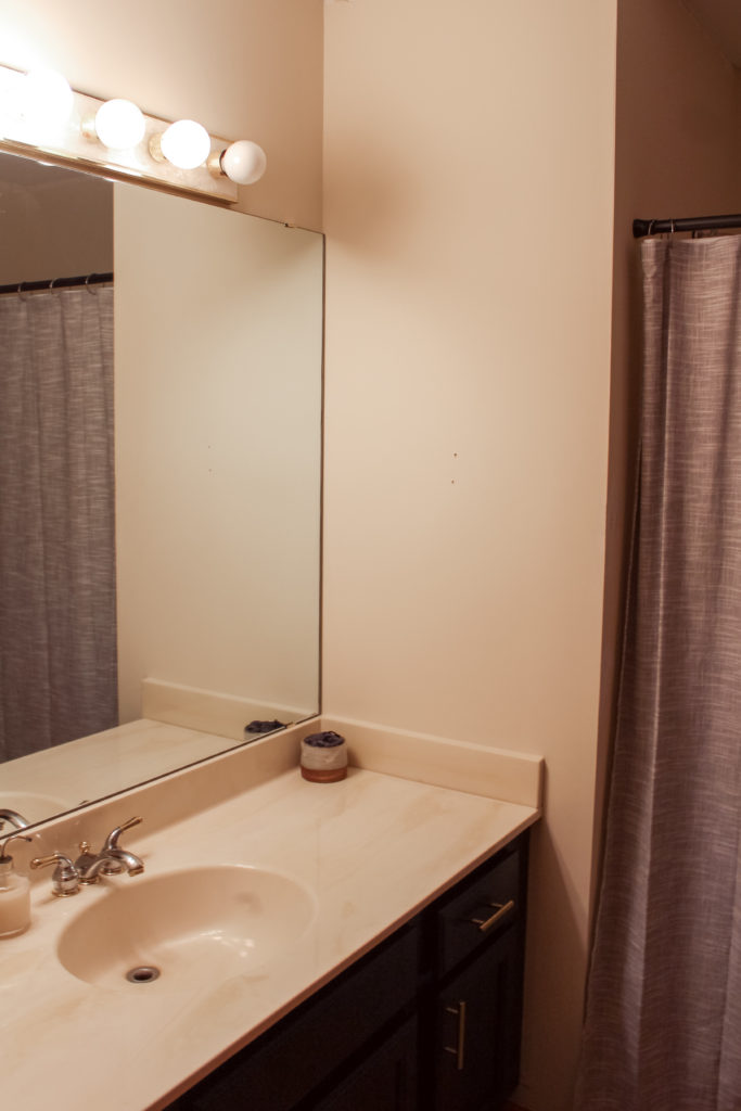
Having a bathroom just for guests on the main level was a big bonus of this house! The main updates in this room were to paint the cabinetry, replace the hardware, and update the ceilings.
After
For the cabinets, we went with Pure Black by Behr and they turned out beautifully! New gold pulls also made the cabinets really shine. Eventually, we’ll replace the faucet and get a new light fixture.
Guest Bedroom
Before
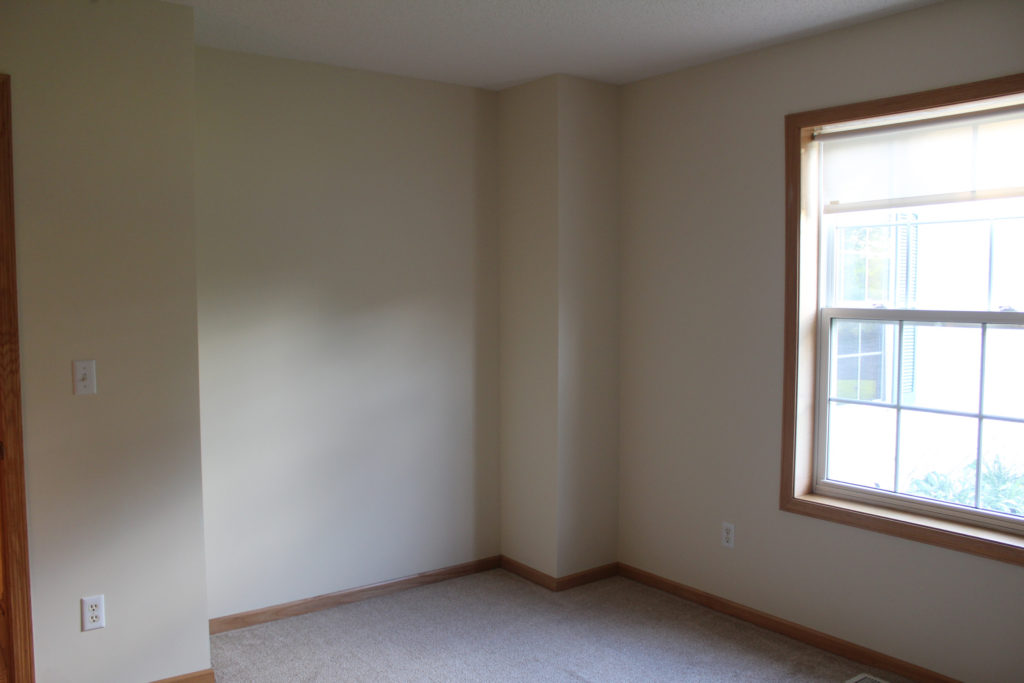
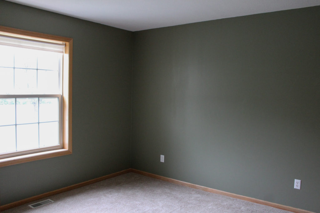
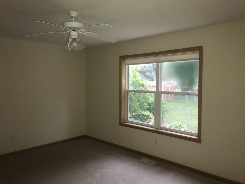
All this room needed for now was a fresh coat of paint and some updated ceilings.
After
We love this Muted Sage by Behr color for the guest bedroom! It goes well with the wood trim that we are keeping and gave this space a fresh look.
Master Bathroom
Before
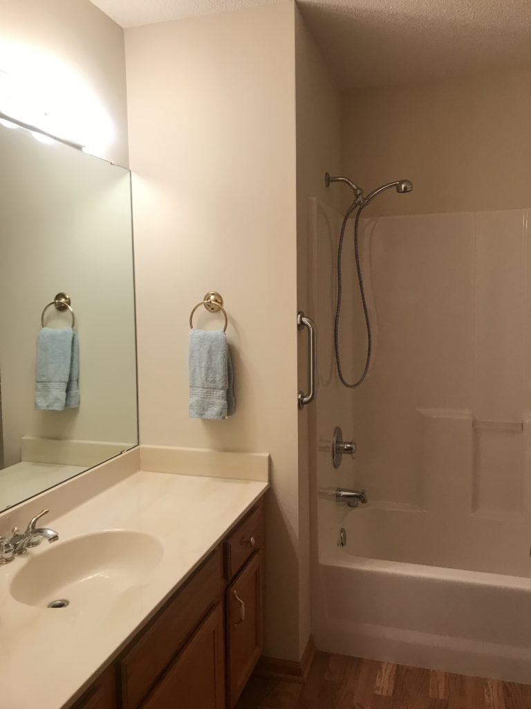
The master bathroom updates were similar to the guest bathroom with painted cabinetry, new hardware, and updated ceilings.
After
We plan to get a new light fixture and faucet in this room as well, which will complete the space!
Master Bedroom
Before
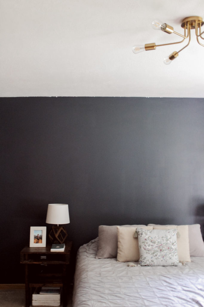
For our master bedroom, we wanted to a cozier color for the walls and knew that we didn’t need a fan. This room got some simple updates that really changed the look of it.
Midnight Blue by Behr was the perfect color for this room. It’s cozy, deep, and really pretty with the newly updated and painted ceilings. Plus, the gold semi-flush mount added some shine to this room.
Sunroom
Before
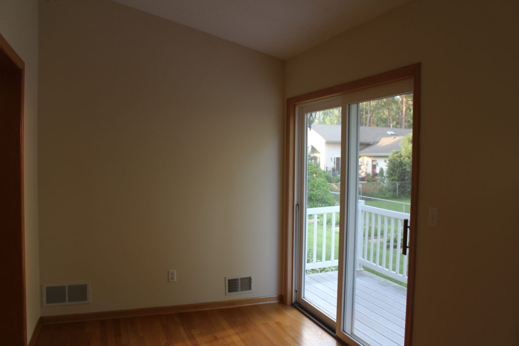
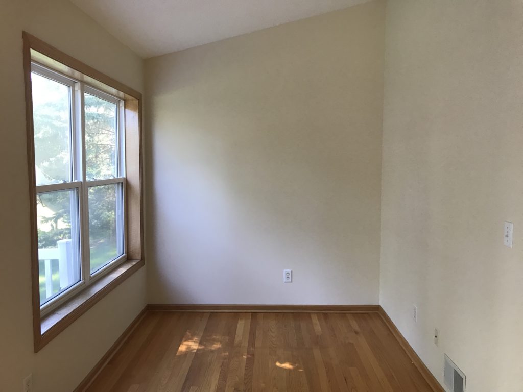
This little sunroom off the living room is another thing that sold us on this house! It just needed updated ceilings and some furniture to make it ours.
After
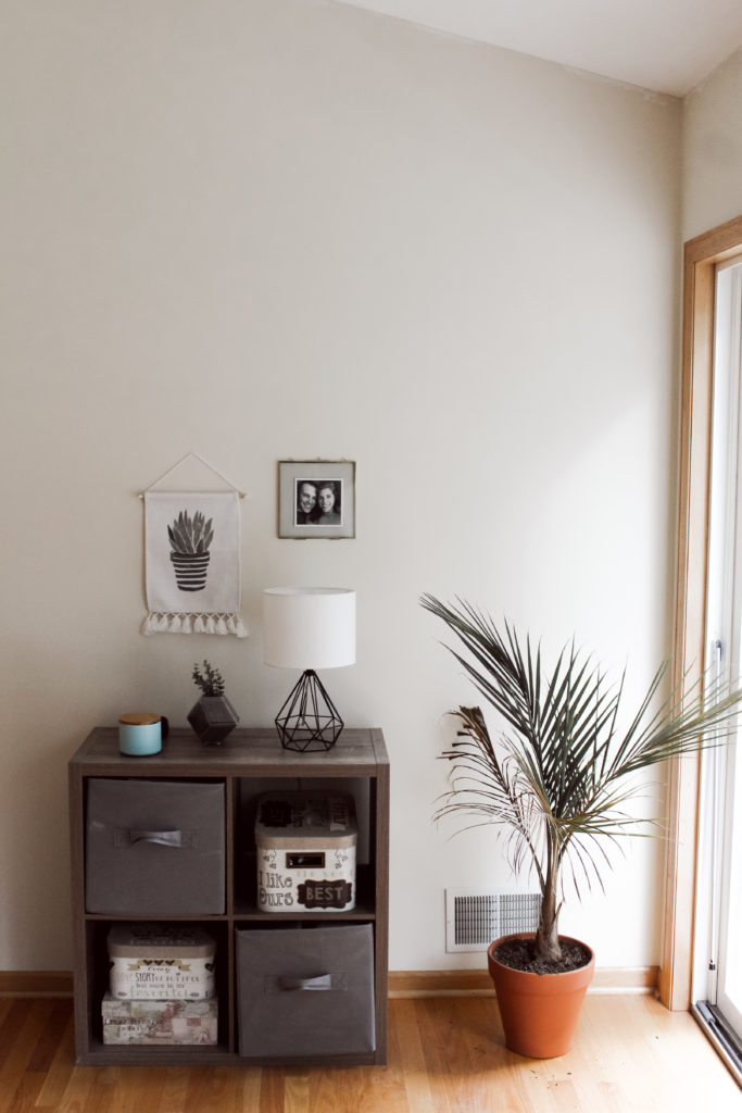
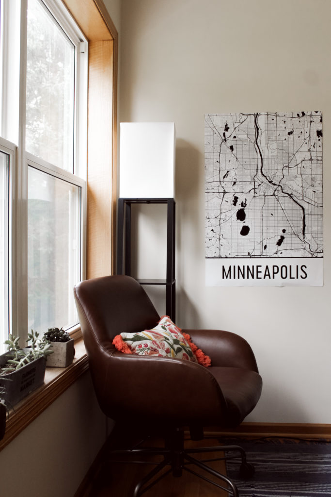
We love this room that gets so much LIGHT! It will be the perfect office for me when I work from home and a cute little reading nook too.
Before
After
Basement
Before
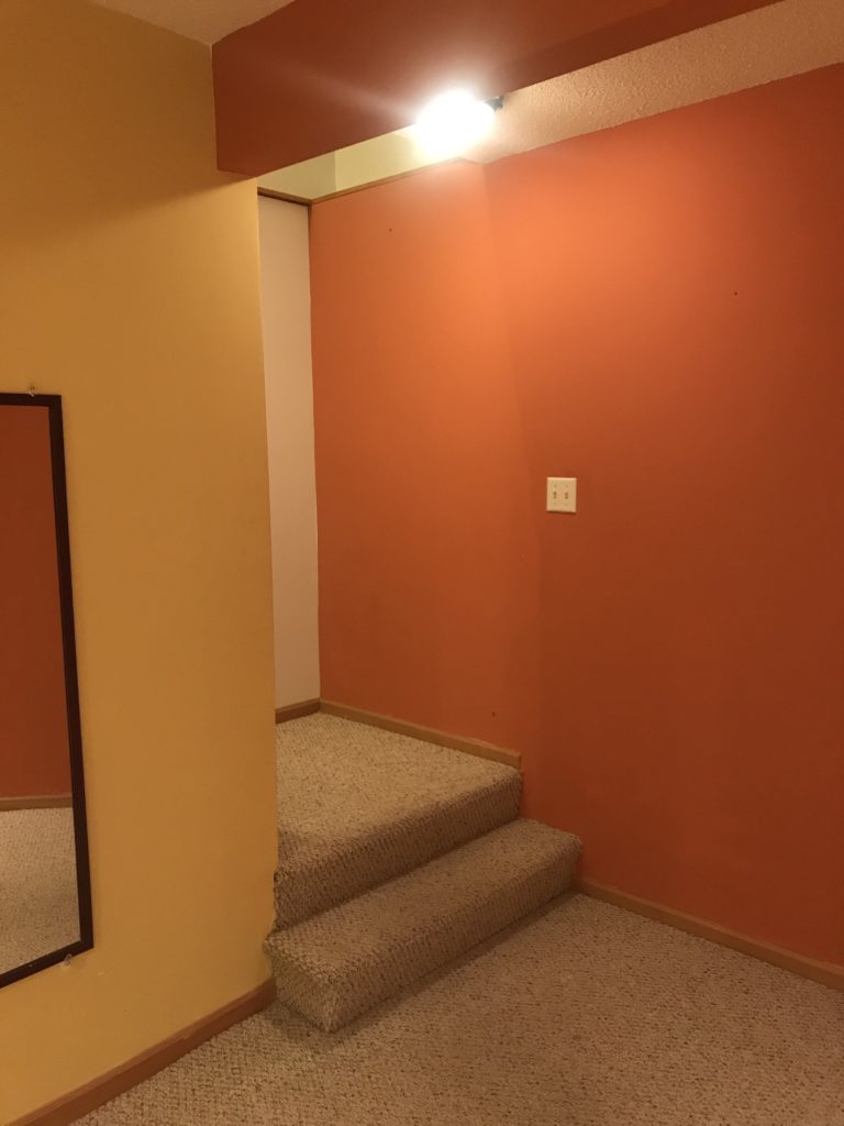
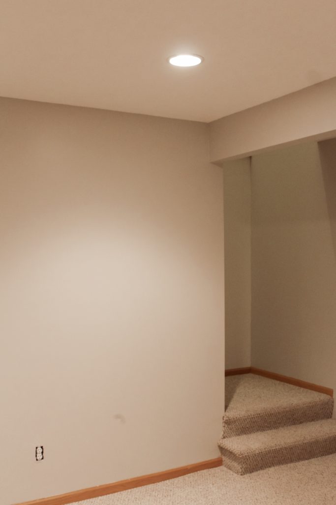
When we were touring this home, we didn’t even realize there was a basement until we walked through the whole upstairs. Matt was completely sold when we went into the basement because there is so much space! We love having friends over, playing games, and hanging out, so this will be the perfect spot for that.
After
A fresh coat of paint in Cotton Grey by Behr and updated ceilings finished off this space! We can’t wait for many memories to be made hanging out down here.
Thanks for following along with our first home updates! Can’t wait to share more as we continue to make this house our home.

8 thoughts on “Updating Our First Home | Before & After”
Comments are closed.