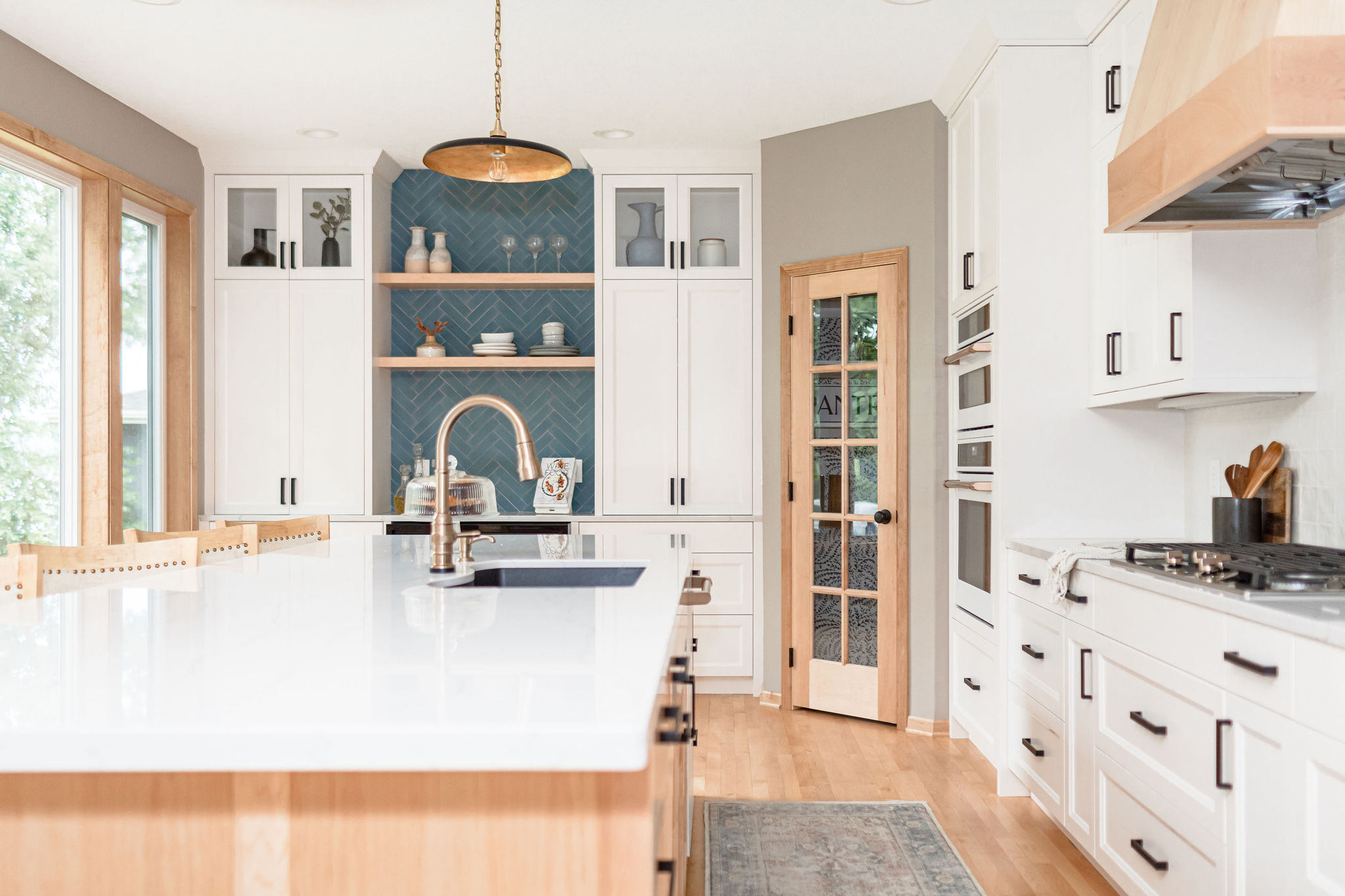
We recently wrapped up our Breezy Point project which was a full kitchen, dining room, and living room design and remodel on Prior Lake. And we’re here today to share the full reveal.
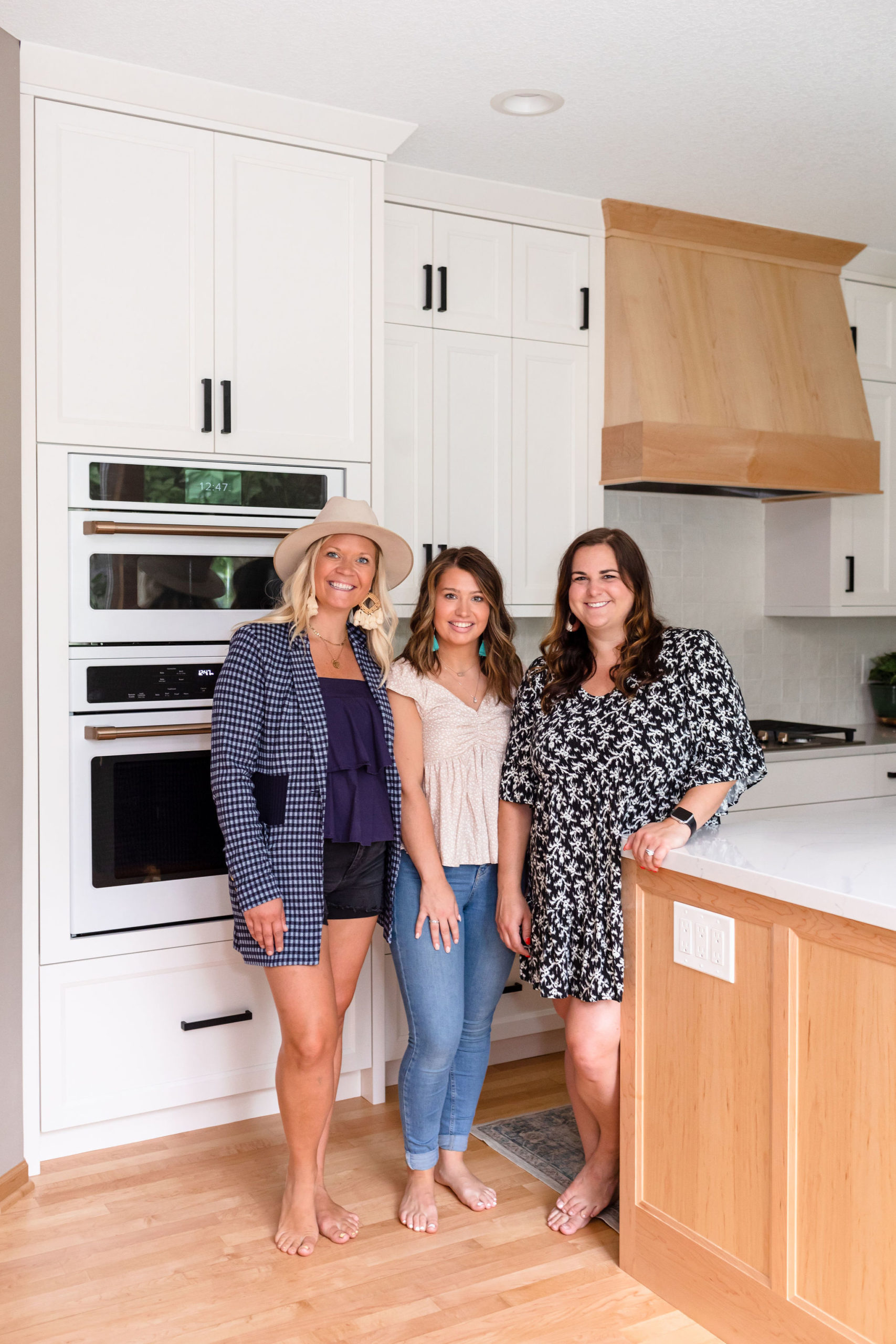
We even got to enjoy the newly remodeled space ourselves and wine and dine this family and their friends with, an intimate dinner party, that Kyle prepared and Kayla served. Something that we have now started to treat and thank our clients with post kitchen remodels. It was such a treat to get to know our clients and their friends and family even more. We were honored to help make their house a home and we know we’ll be friends with this family for a lifetime.
Before
It’s hard even to imagine this space of the before, being we started designing this project out well over a year ago.
Our clients have the best spot on Prior Lake, as they are circled by water and live in a bay. They bought this home as it has low boat traffic, so it’s pretty serene, but interior updates were on their list.
Kitchen
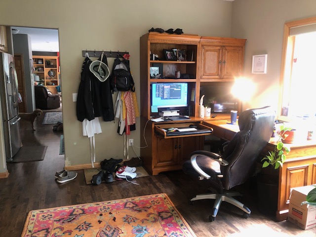
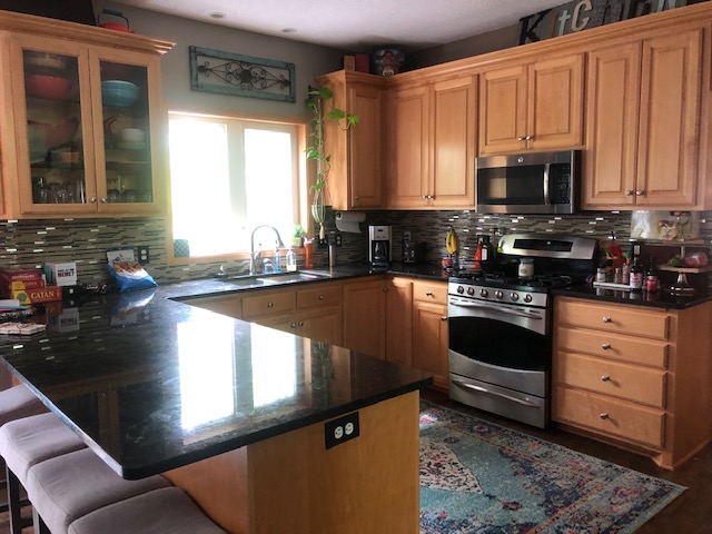
Just beyond this wall with the microwave was another open room that we were guessing was probably to be used as a formal dining room, but our clients were using it as an office. We took this entire wall down and pushed the kitchen back into that area, opening up the floor plan. We also closed off this window that you see and put in one big large oversized window that spanned across the walls within the two rooms. Being they have some incredible views of the water they wanted to add in larger oversized windows and open up the home.
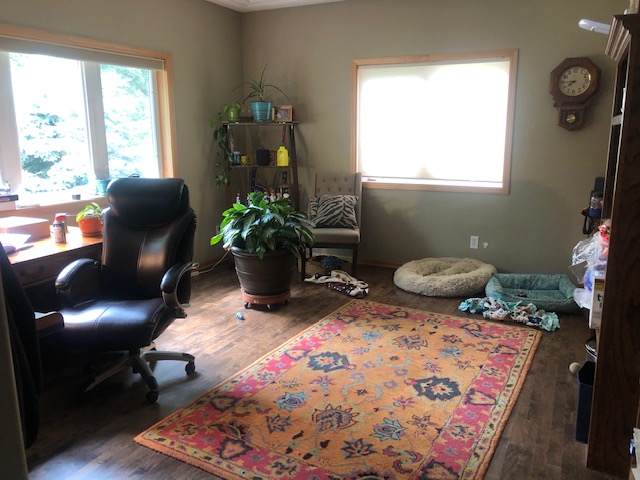
Below is a photo of the space that was beyond that wall above with the microwave and range, and where the kitchen is now. The window on the left is where we swapped out for a much larger one.
The window on the right we closed off and that area is now where the bar area is. Where you see the clock is where the pantry was placed, and on the right-hand wall side is where the range, double oven, and fridge went. Where you see the rug is currently where the oversized island is, with a sink and faucet within the island.
Another great before, where the wall was blown out and the oversized island is now. And if you peek through that doorway you can see the living room, which we also remodeled.
Living Room
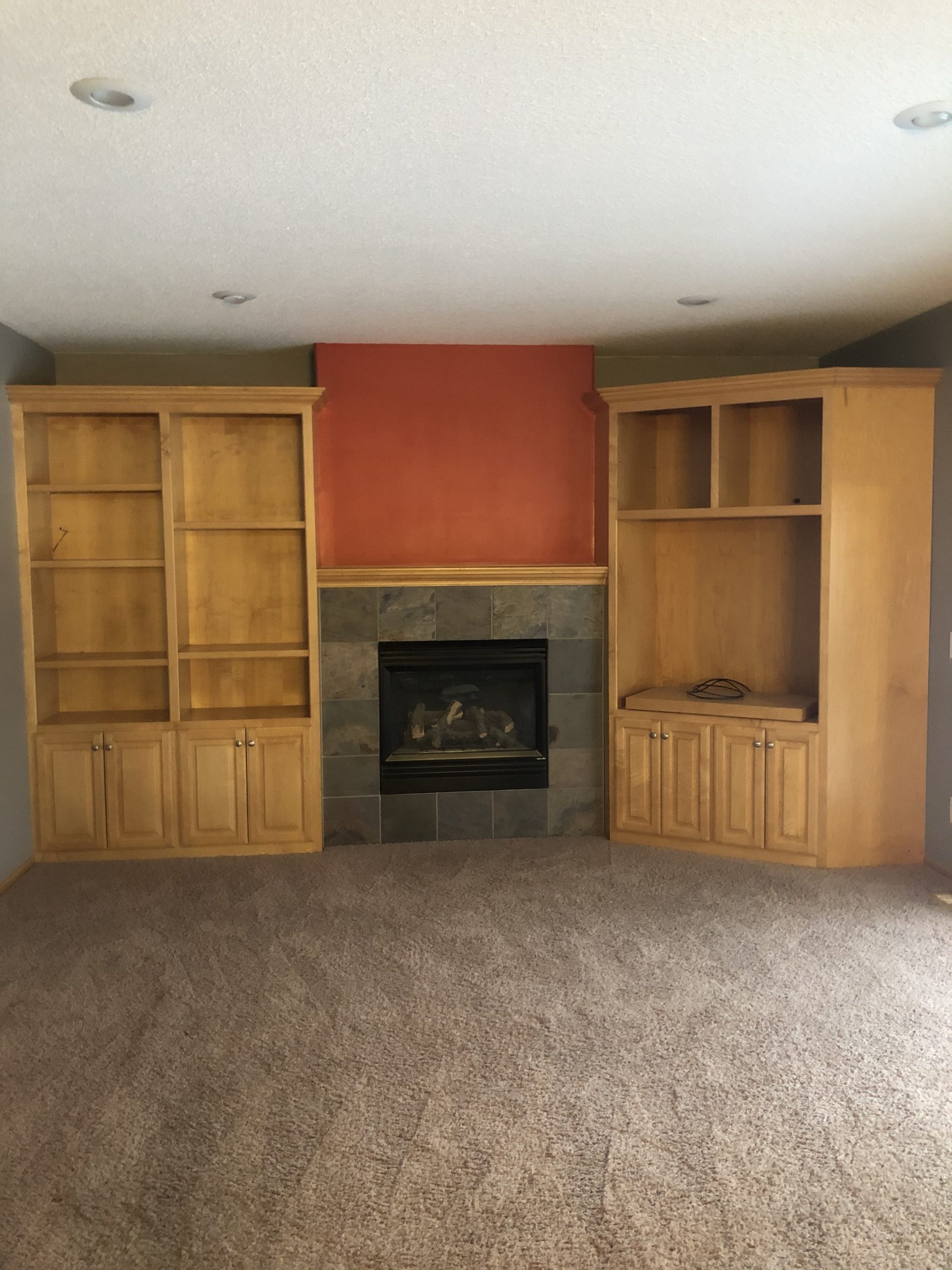
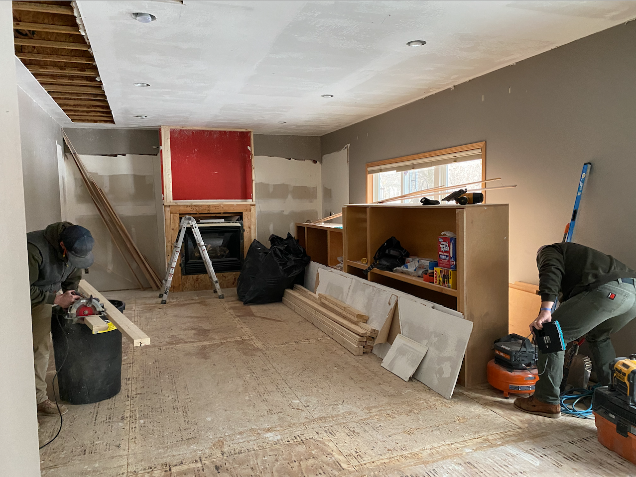
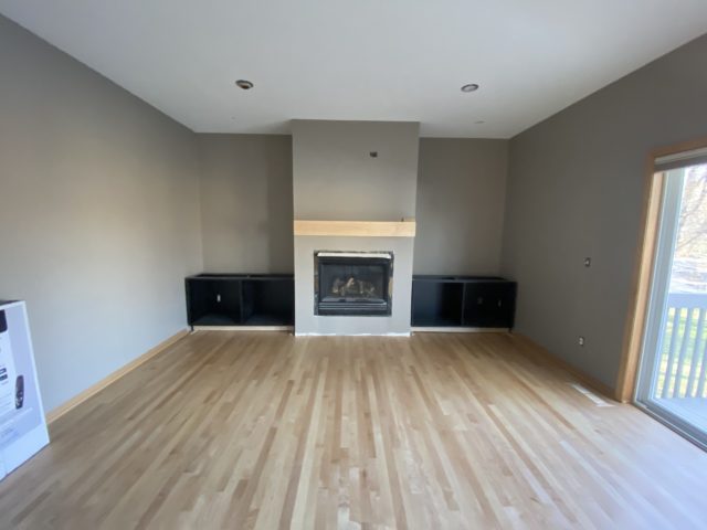
And here’s a closeup of the living room area and what we demo’d out. Originally, we were thinking of ways to salvage, paint and shape this area while keeping existing. But in the end, we all decided that it would look better if it went and we completely redesigned out this area.
Designs
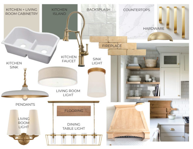
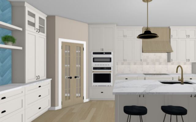
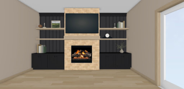
With our clients, we always start with a mood board then move on to selection sheets, concept boards, and renderings. And we ensure all are finalized and materials are ordered and in hand before we swing any sort of hammer.
Here is the vibe of what we started with for a mood board. Neutral colors with pops of gold. As always, as the progress went on, we ended up switching things around and changing colors. For example, instead of a green island, we opted to go with a blue accent bar backsplash. And instead of the white pendants and gold hardware, in the end, we went black.
You can rewind back to the design blog post to see the rest of our design process as well as more of these beautiful renderings and how we brought this space to life, here.
Under Construction
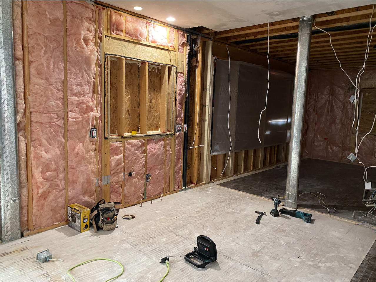
Once selections were done, permits were pulled and everything was cleared out… it was time for demo day! And as you can see below we cleared this place out and took the kitchen area down to the studs.
This was where the former kitchen was, where the window was above the sink that we closed off. And where the ducting is was where the wall once was.
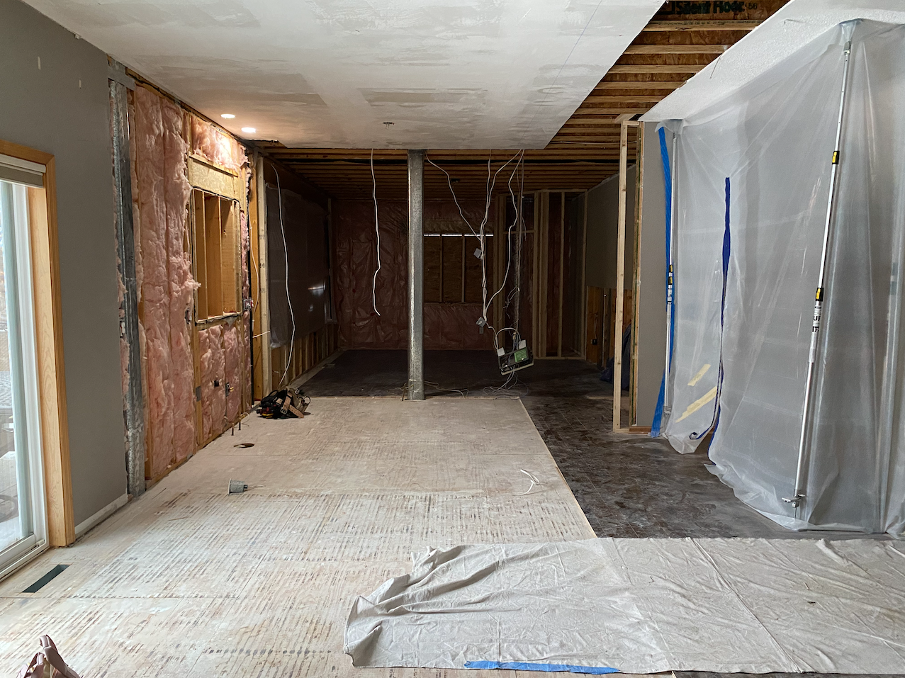
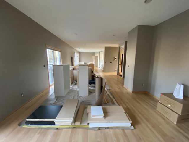
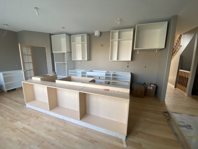
Here’s a shot of the rooms now opened up so you can see how we pushed the entire kitchen back.
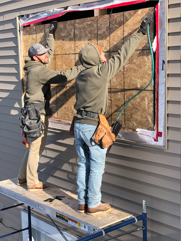
The guys getting prepped to get the new, larger window in.
One of the things we went back on forth on was to replace all of the flooring or to patch in where carpet once was, and match the existing hardwood and then sand down. We oped to salvage what they had and matched, patched, and sanded down to get a lighter look and loved that we went with this option.
All new ceilings, electrical, plumbing, drywall, paint, and more. When the cabinets go in is really when you can feel like there’s an end in sight. We went with Jkath custom cabinets for the kitchen, our favorite custom cabinet shop. We went back and forth with our clients on semi-custom vs. custom and they are so happy that in the end, they went with custom. Custom cabinets are worth every penny if you ask us!
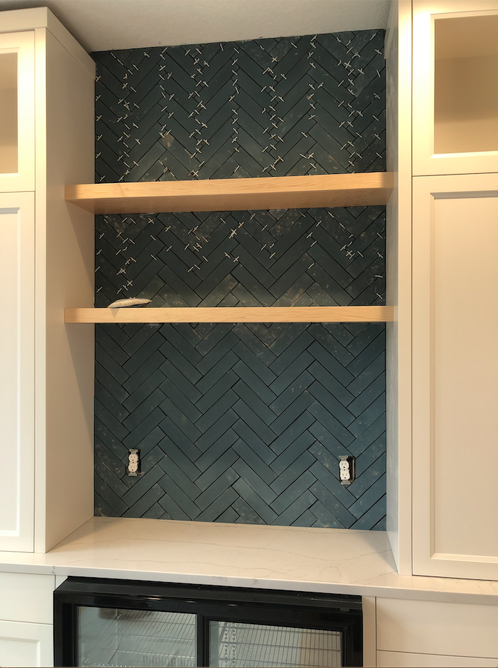
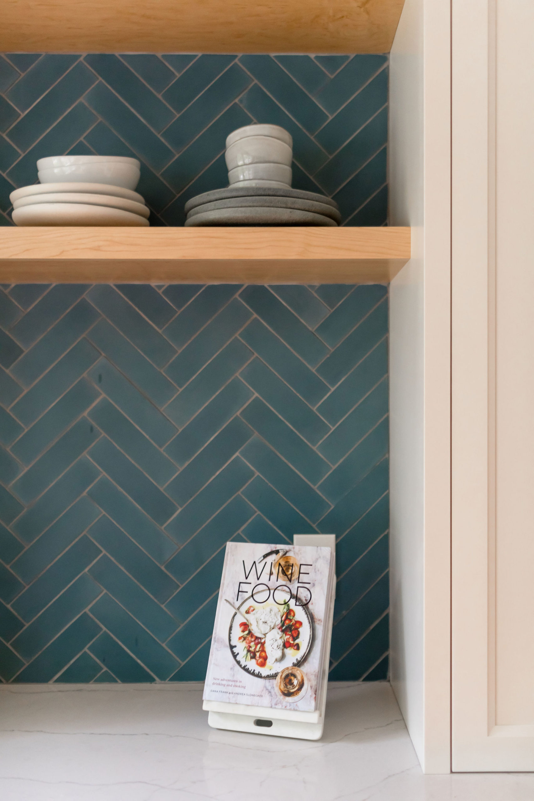
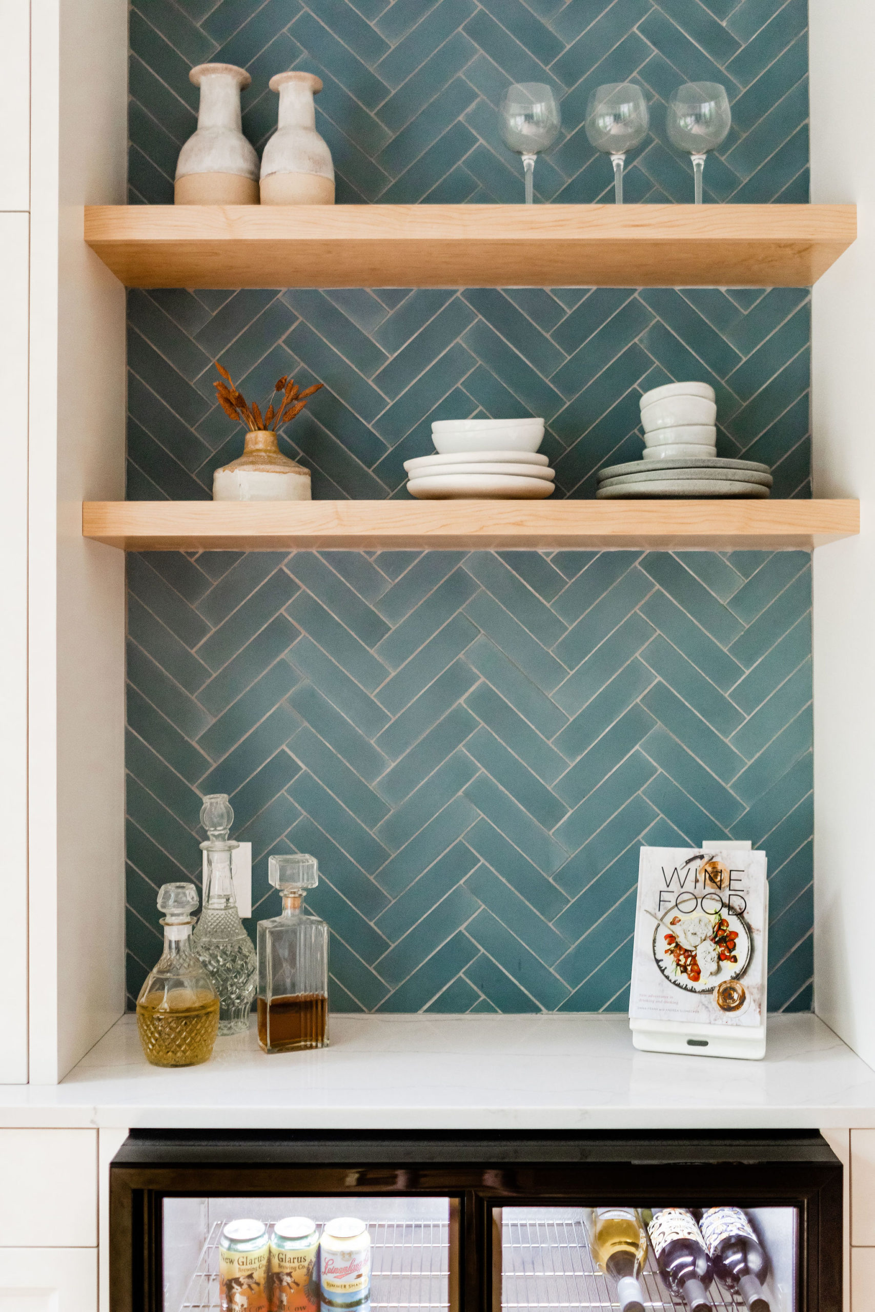
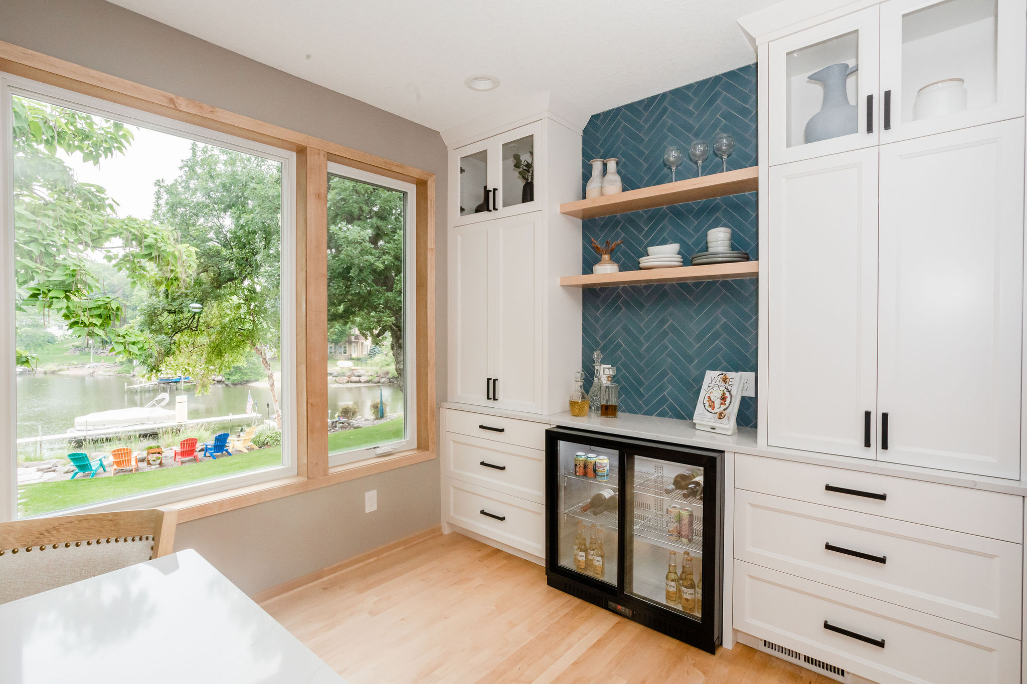
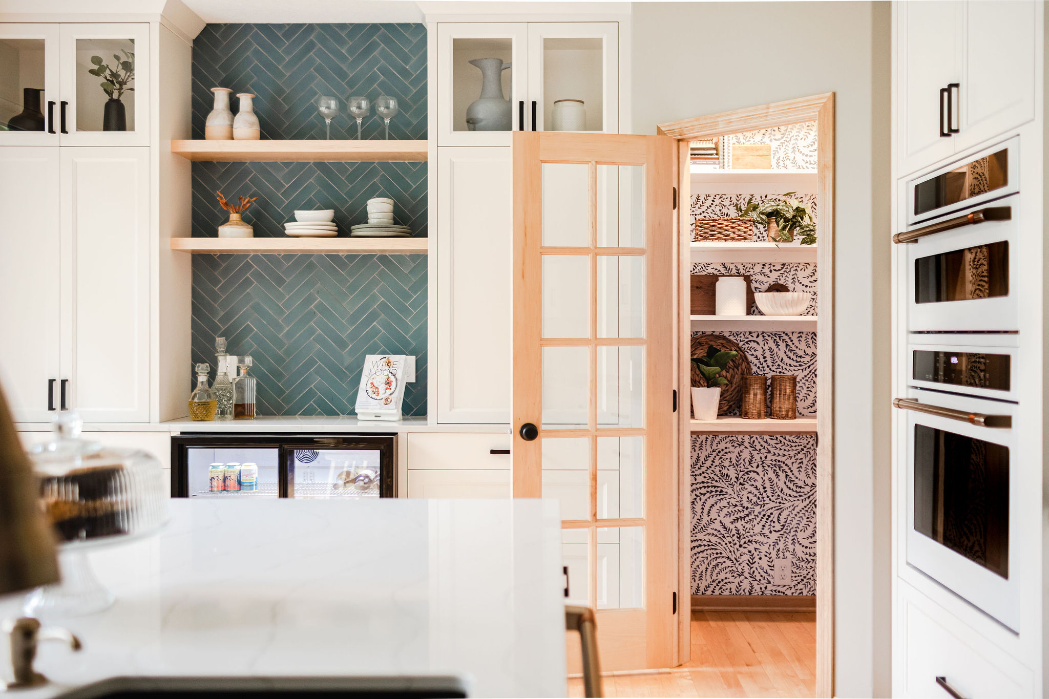
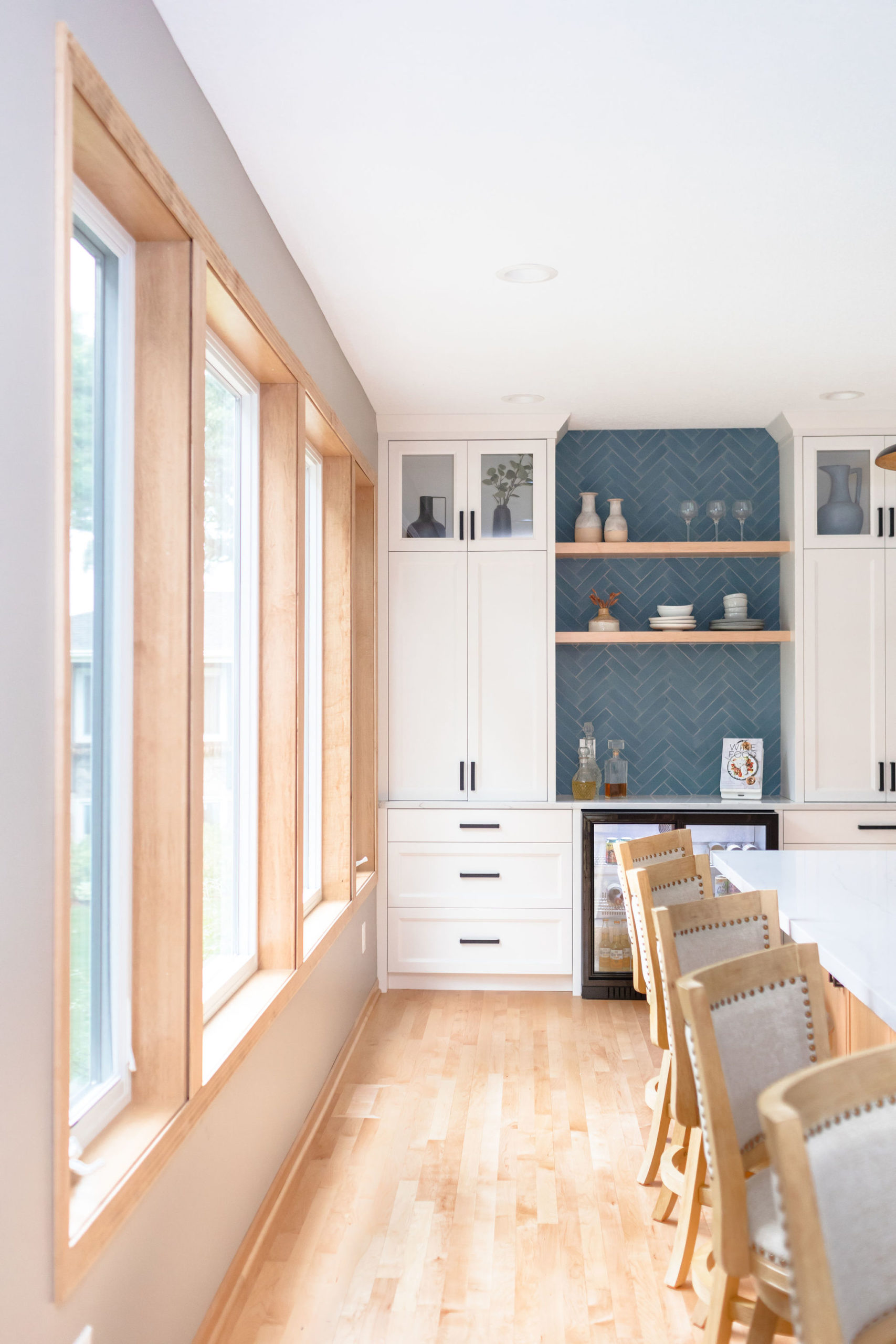
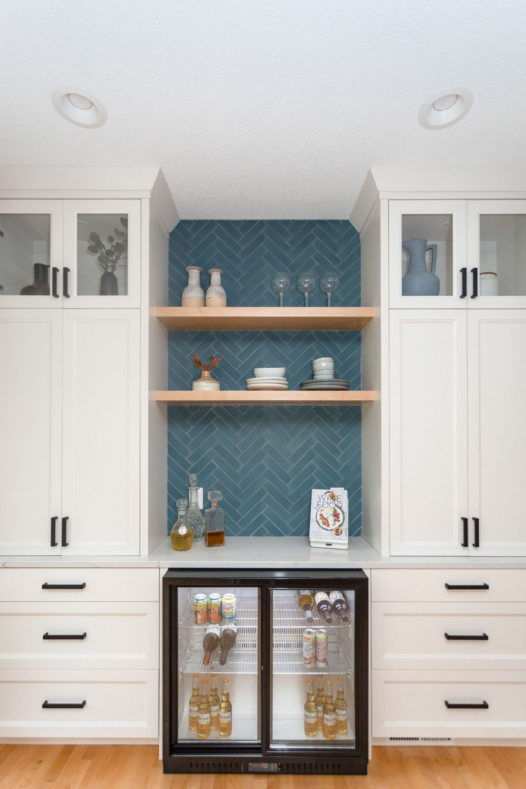
Once cabinets were set, countertops were measured and installed, it was tiling time! Another design element we kept going back and forth on was the overall pattern of this bar area and if we should do herringbone or stacked. Herringbone is a lot more tedious to install and it also costs more in labor but in the end, we all decided it was the best route being the backsplash throughout the kitchen was stacked and we wanted this area to be its own statement wall and different.
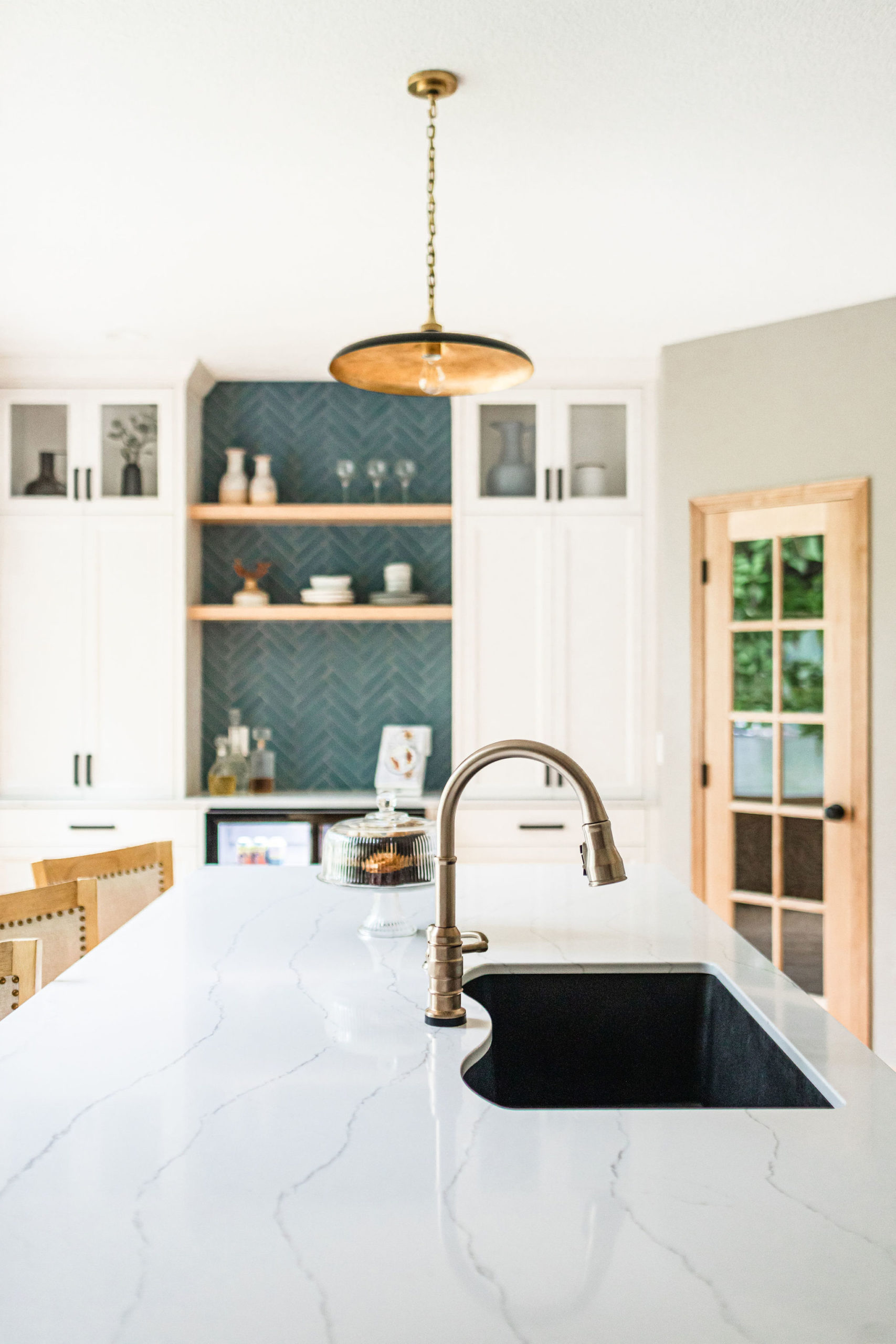
Our clients wanted to keep their kitchen and main level pretty neutral throughout but still wanted to add in pops of color. We went back and forth on if we paint the island or do fun tile in this area and in the end, we decided tile was the way to go. This bold blue backsplash was perfect for those water vibes and we decided to lay it in a herringbone design to create more dimension in the space.
Which we have a full blog post here on 12 different ways to lay subway tiles if you’re looking to shake things up in your home.
After
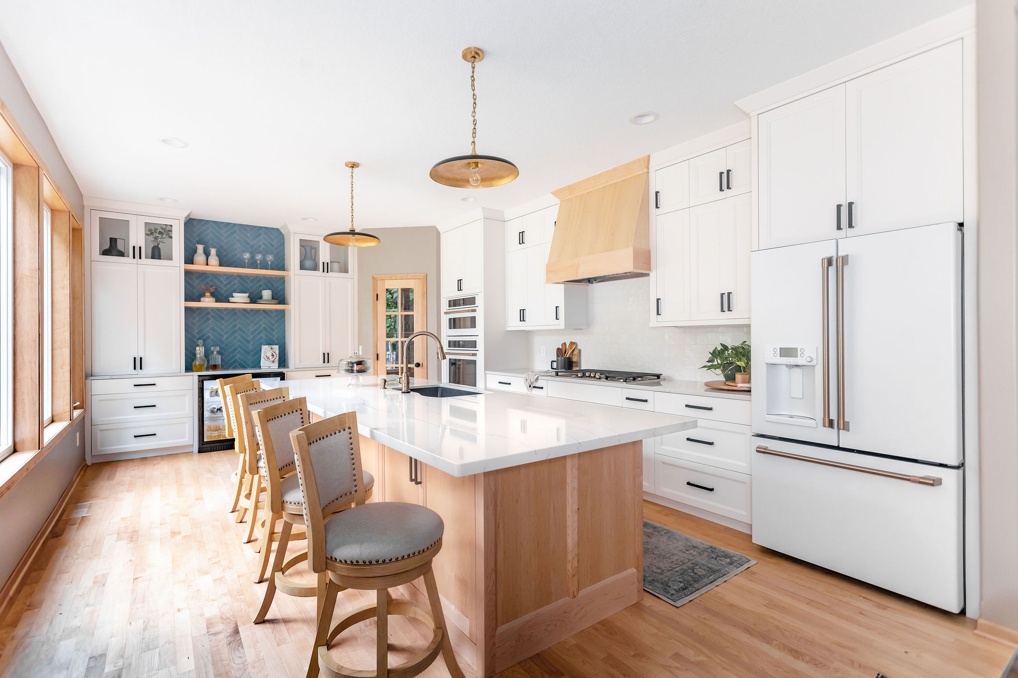
Dun, dun, dun… and the after! A new and forever favorite project of ours.
Kitchen
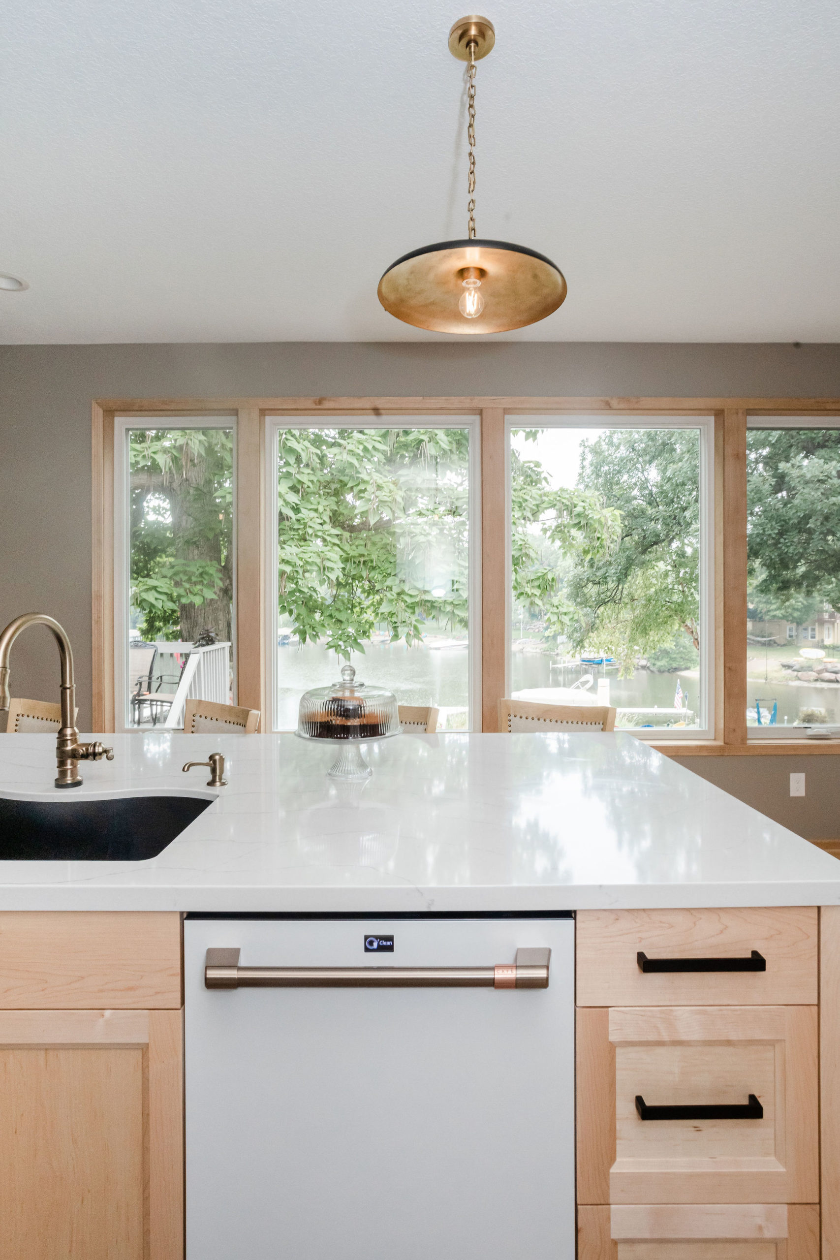
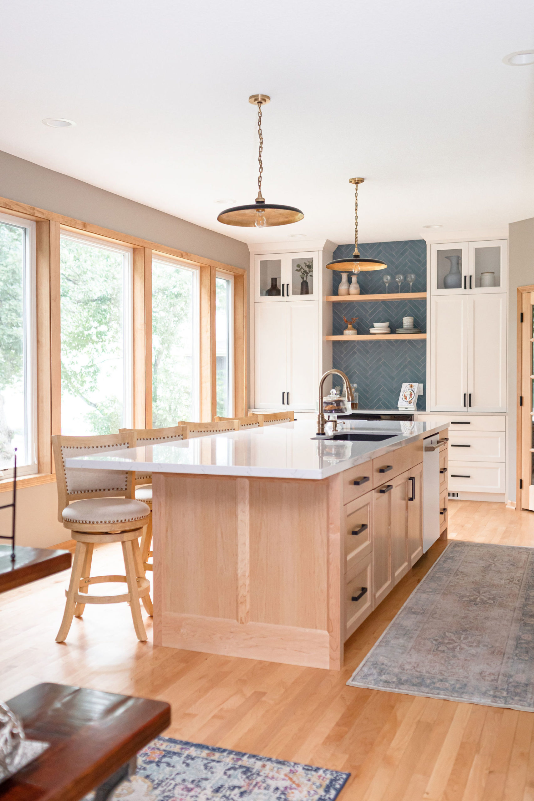
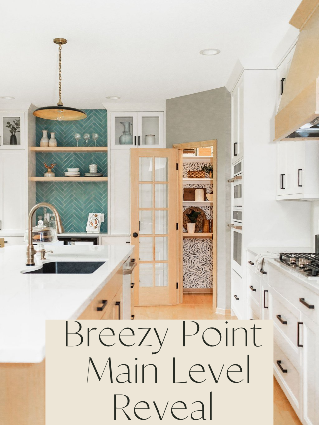
As you can see we removed the three separate windows to get that one large oversized window, which made this space so much lighter and brighter! Can you believe this was the former office area?
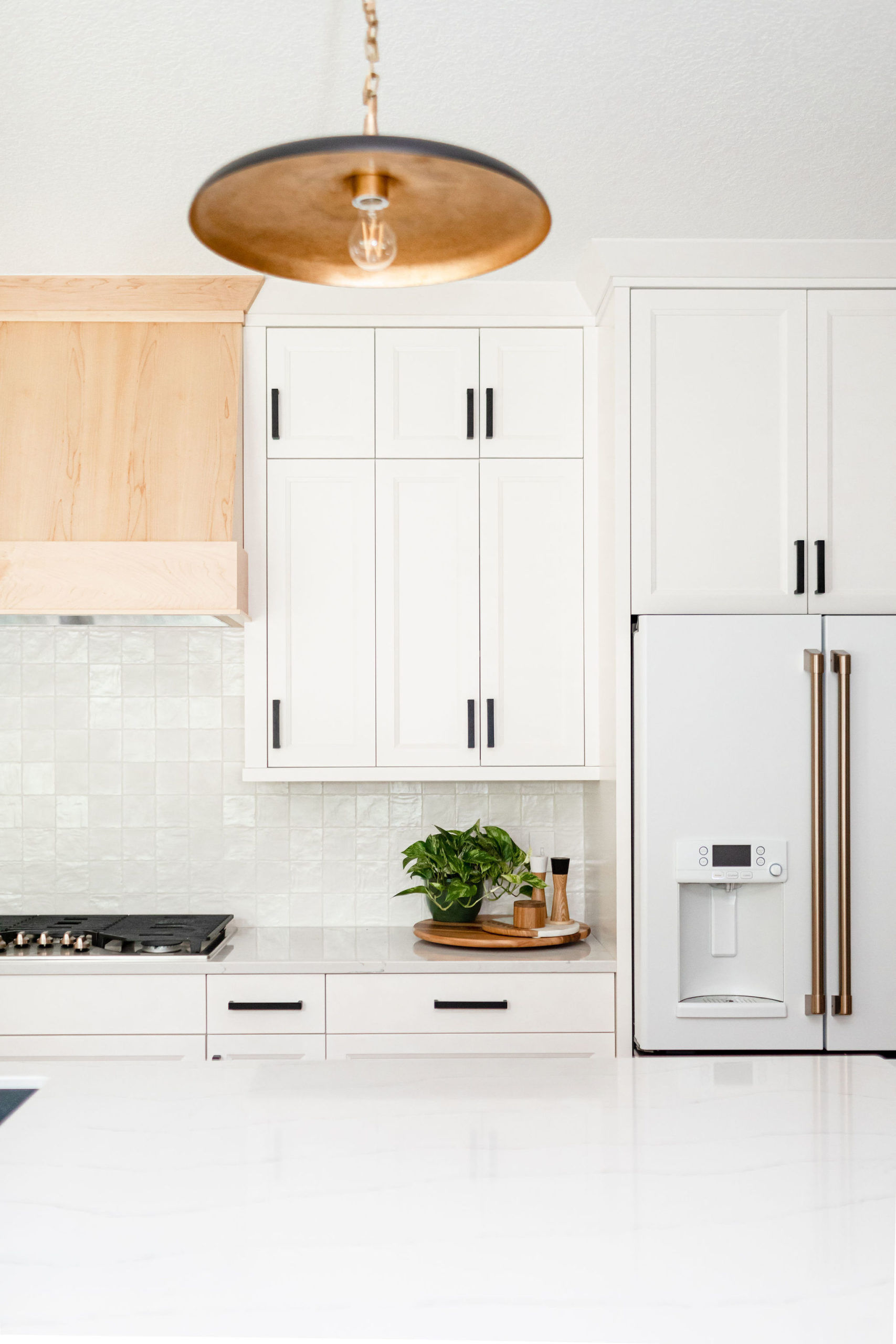
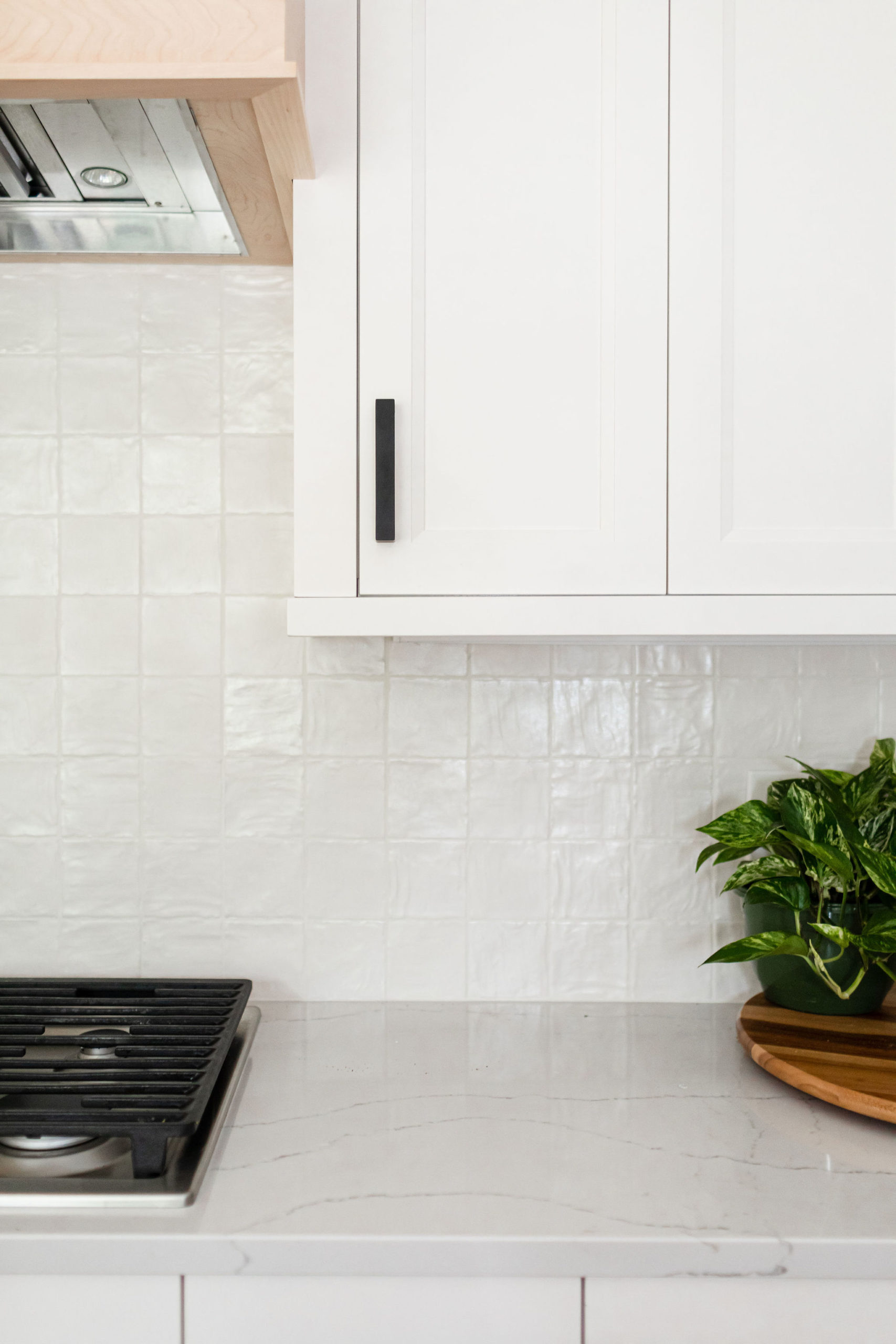
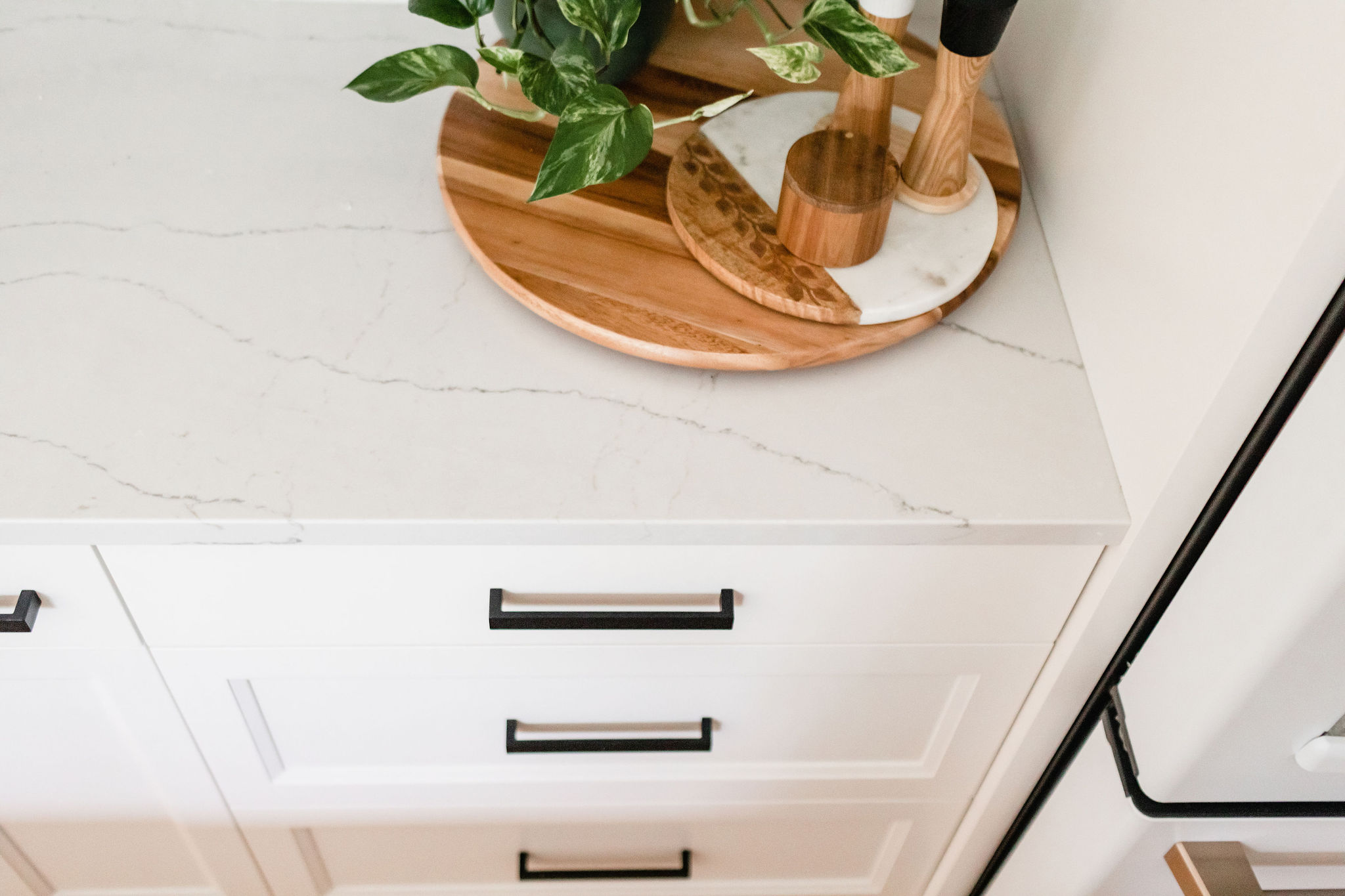
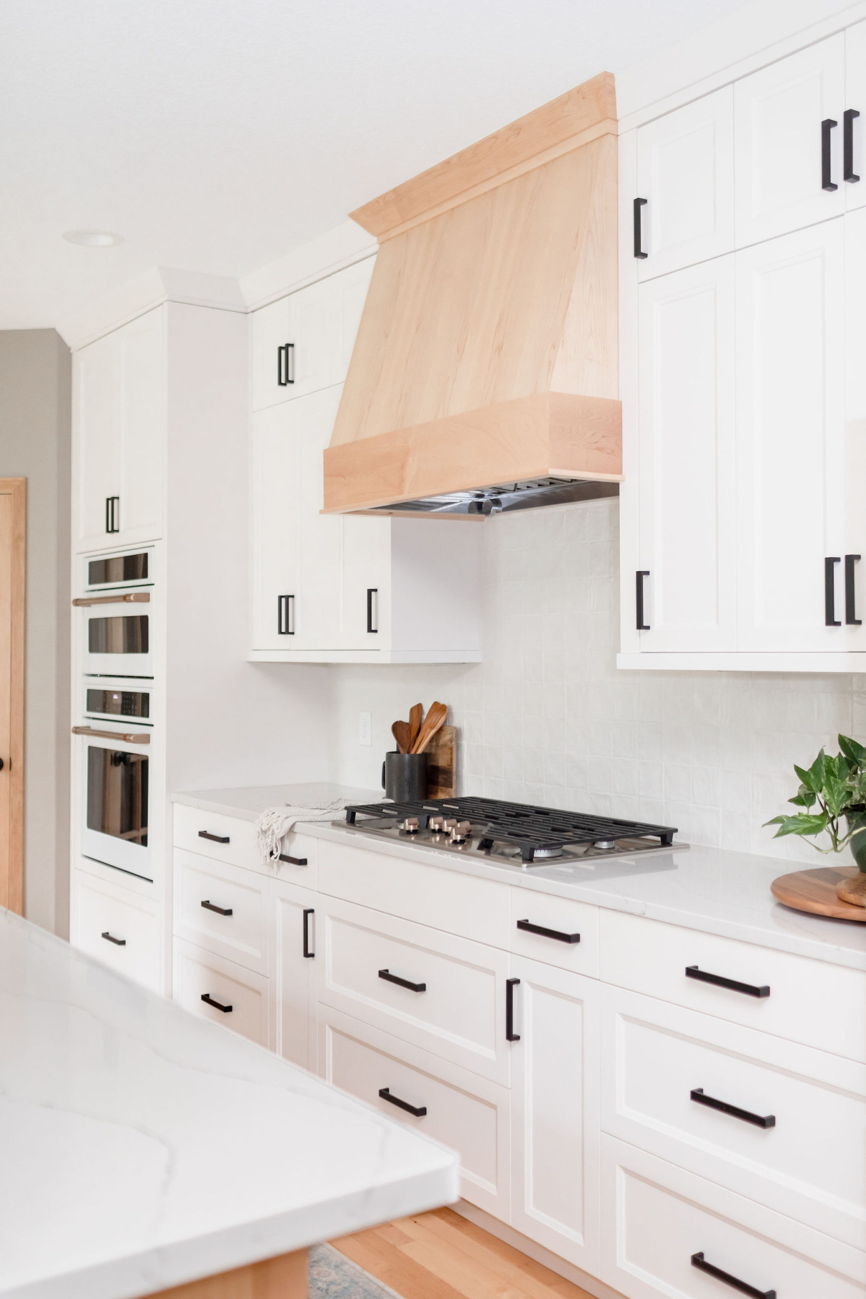
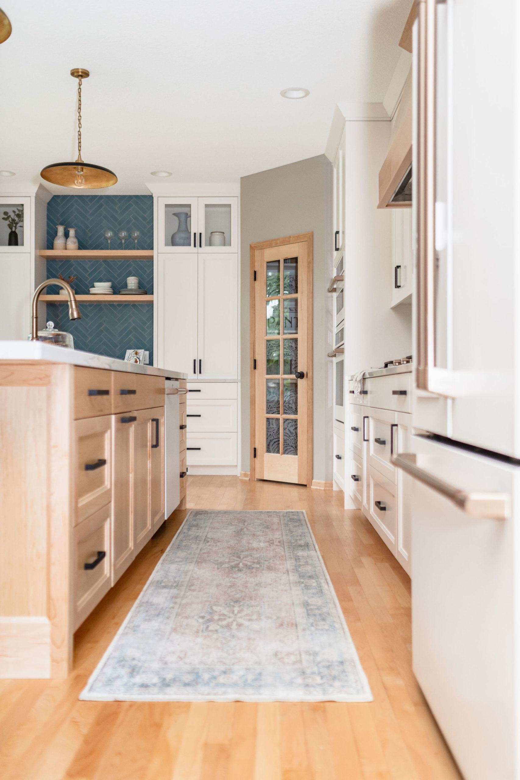
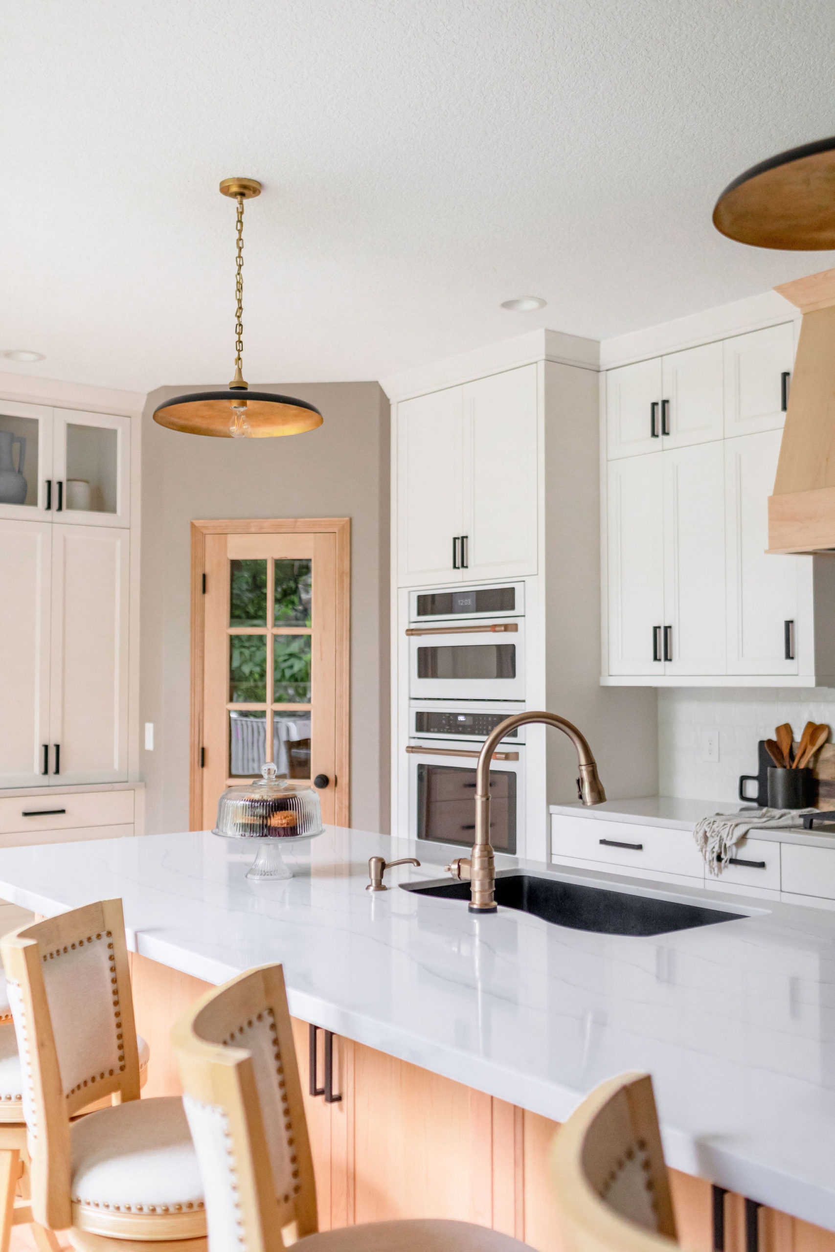
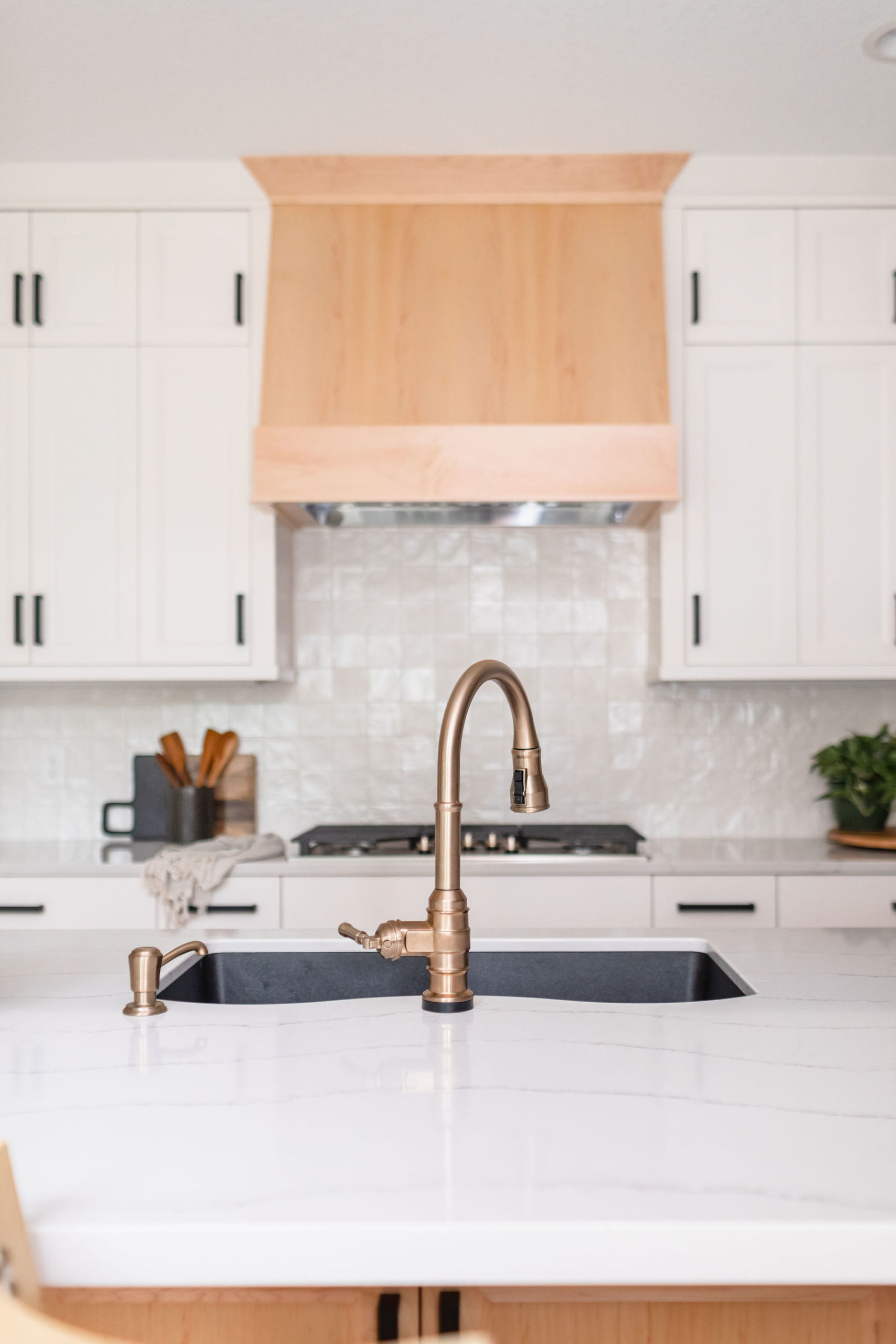
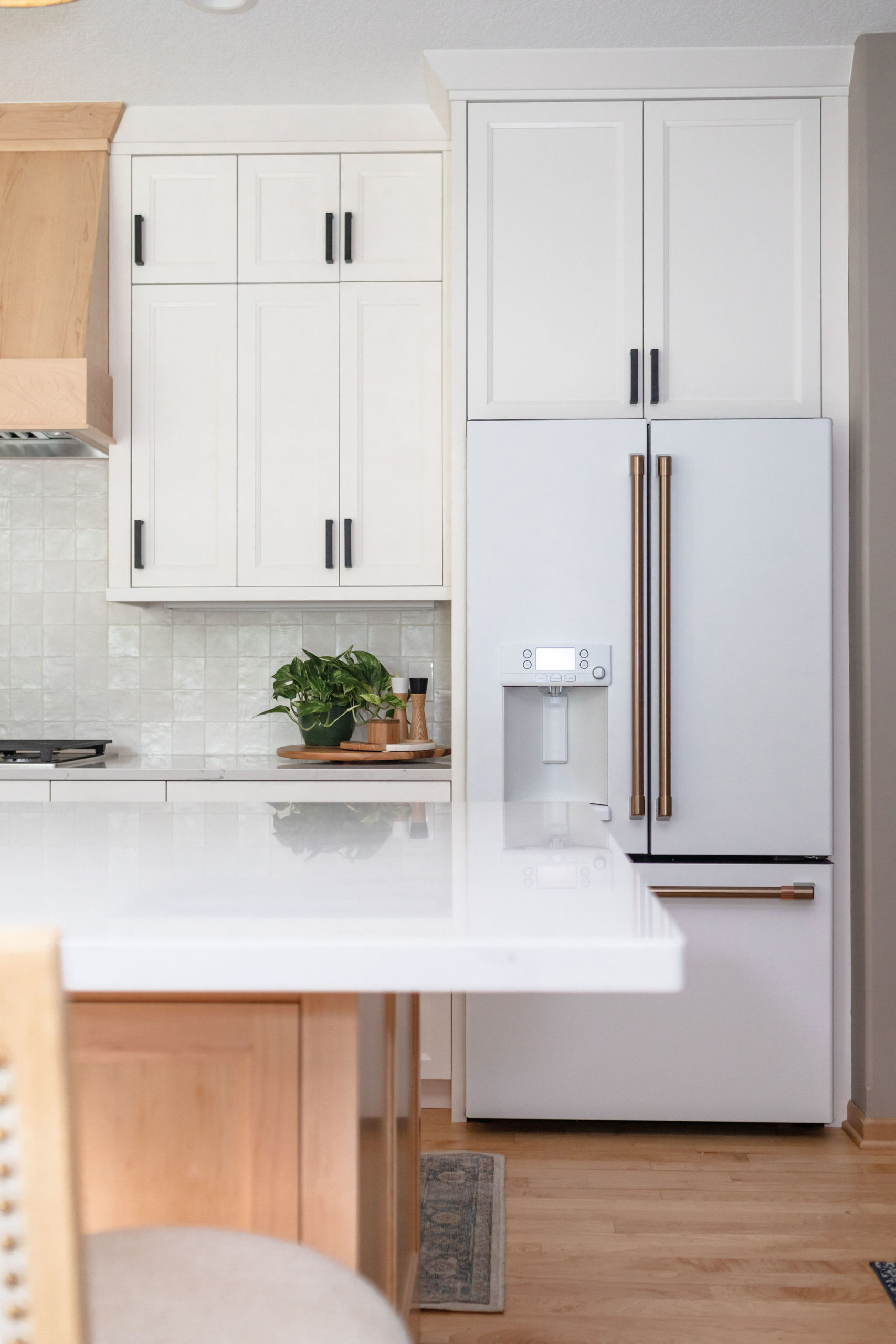
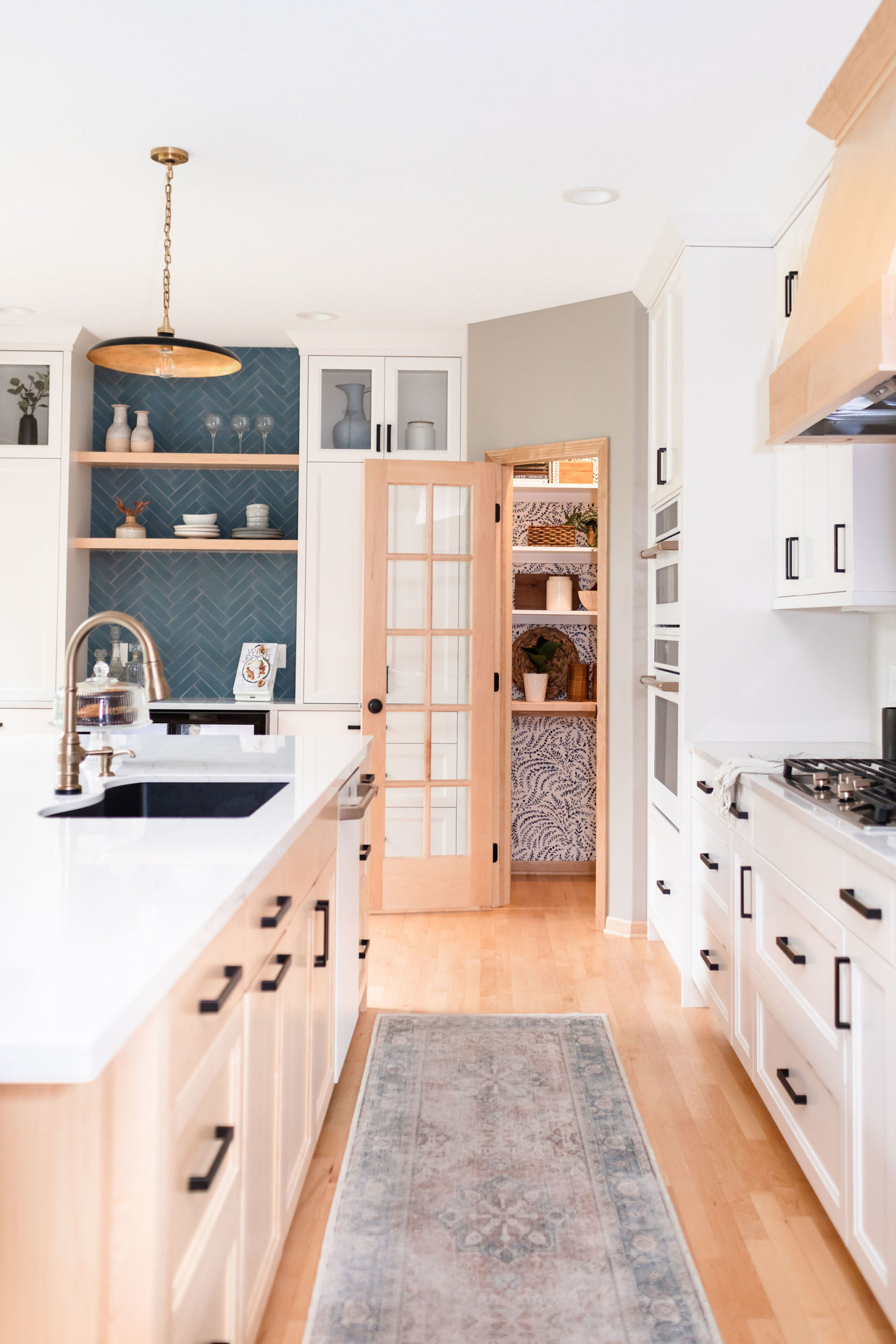
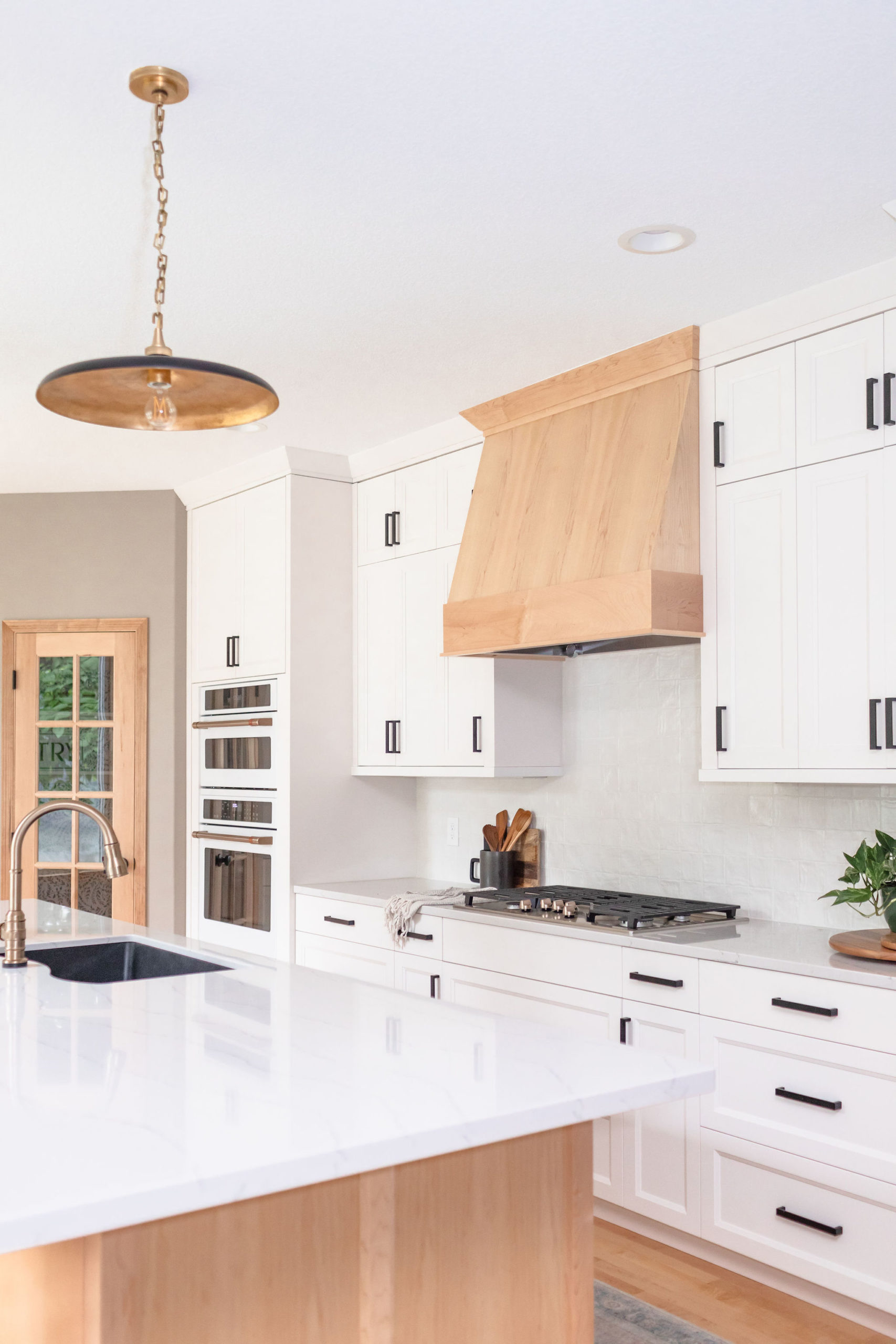
While we kept the kitchen pretty neutral overall with white cabinets and countertops, natural wood island, flooring, and hood, we added texture and colorful elements with the backsplash, wallpaper within the pantry, and the offset accents of black and gold fixtures and hardware throughout. It was still white, but the tiles had movement and texture, which made it stand out against the white cabinets.
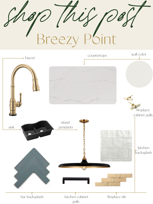
This blue cement tile from Zia Tile is a new favorite of ours. First time using this color, but not the first time using this same cement tile.
To make the kitchen stand out, even more, we went with a custom wood hood to match the island, flooring and millwork.
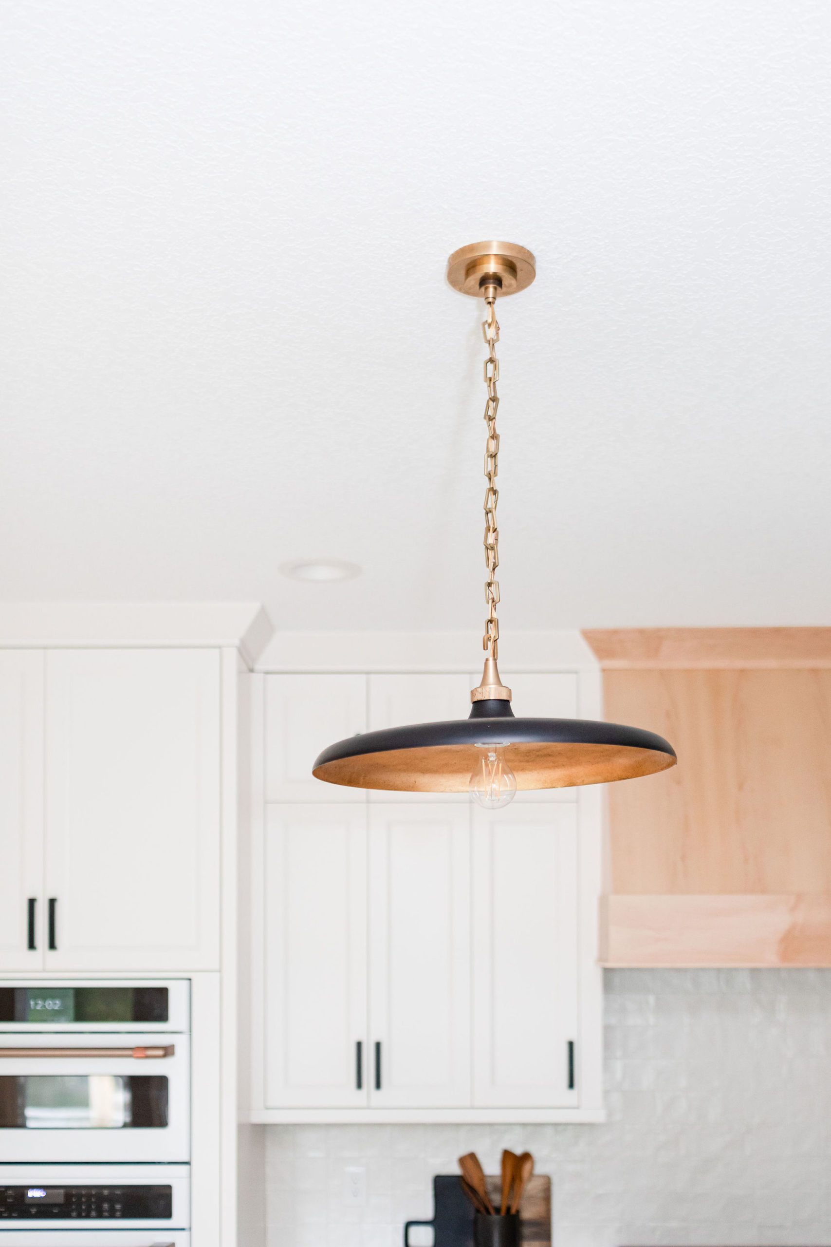
We also went with these stunning island pendants that really make a statement in the kitchen. Originally, we were thinking white but swapped it out for black to tie in more of the hardware.
When designing out any space, we always suggest mixing metals throughout the space. Our favorite metals to mix are gold and black, and we did just that in this kitchen.
Black is the main metal we used with the black cabinet pulls and the island pendants are black on the outside.
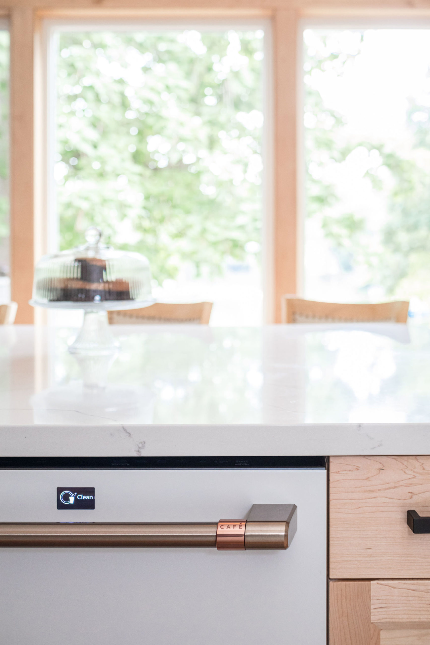
We then used gold in the inside of the pendants and faucet to tie the handles on the cafe appliances.
We helped source rugs for the kitchen, living, and dining room and looovvee our friends at Ruggable. The washable rugs make it so easy to keep the house clean and smelling fresh, especially when having pets.
Delta products are a c2s favorite, especially the Brockerick series, which is what we used here. We incorporate the Touch2O® Technology faucet for this project and always recommend going with the touch option in kitchens to make it easy for you when it comes to cooking and cleaning.
You can read all about why we love the Delta touch faucet in a full blog post explaining why here.
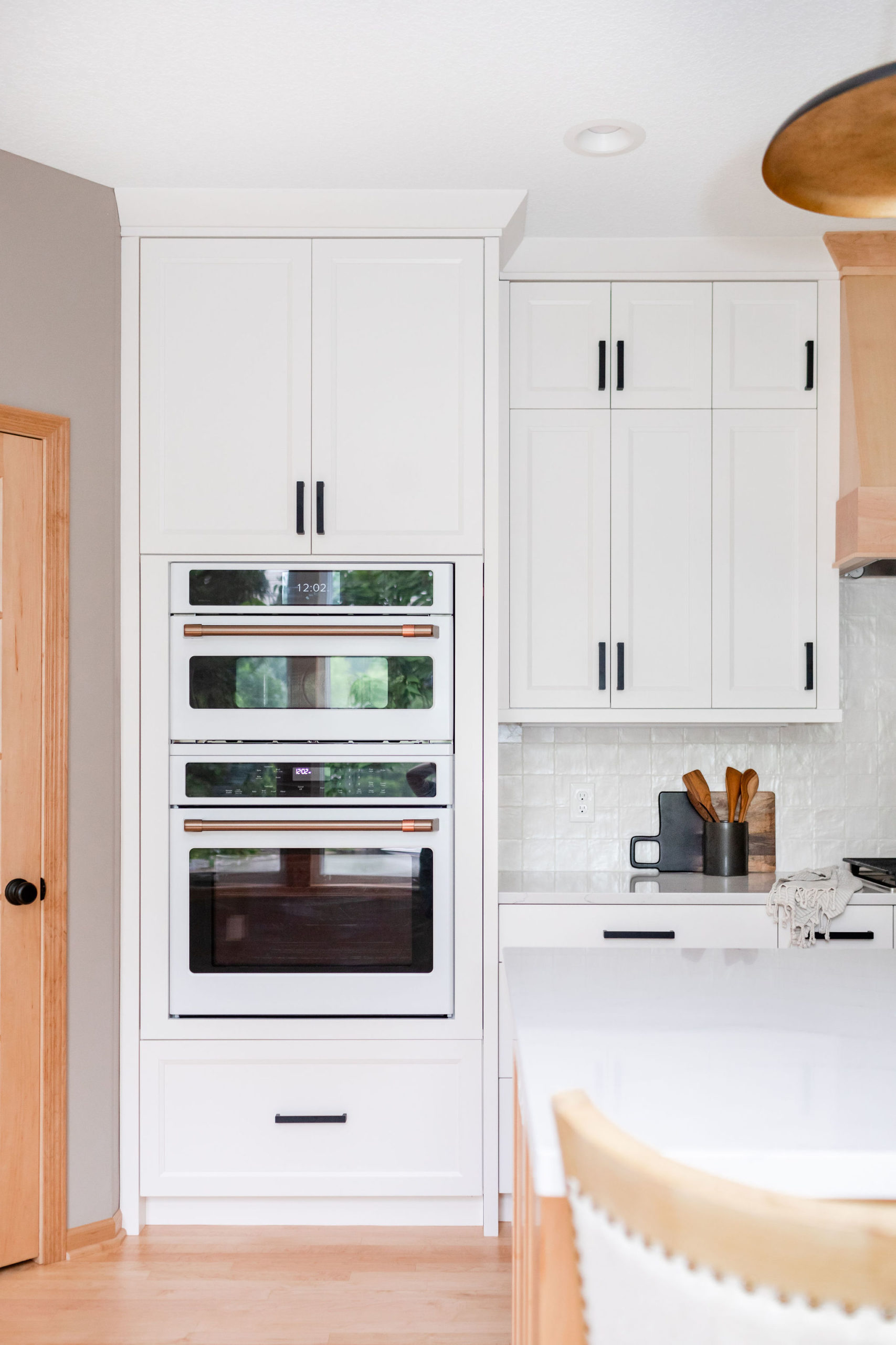
The cafe appliances, in the matte white collection and bronze finish, are another favorite of ours! The only bummer is they are on major backorder right now. If you’re going this route, I’d give yourself at least 6 – 8 months to get them in your hand. But it’s well worth the wait! We weren’t sure our client was even going to get them, but eventually, they showed up.
Another favorite and last-minute addition was the wallpaper within the pantry. This was all of our client’s idea and when she asked if we could install Priano Wallpaper, we jumped at the chance. This pantry is a favorite of ours. It is such a fun element to add wallpaper into a pantry for an added element of surprise and design into the space and kitchen.
Living Room
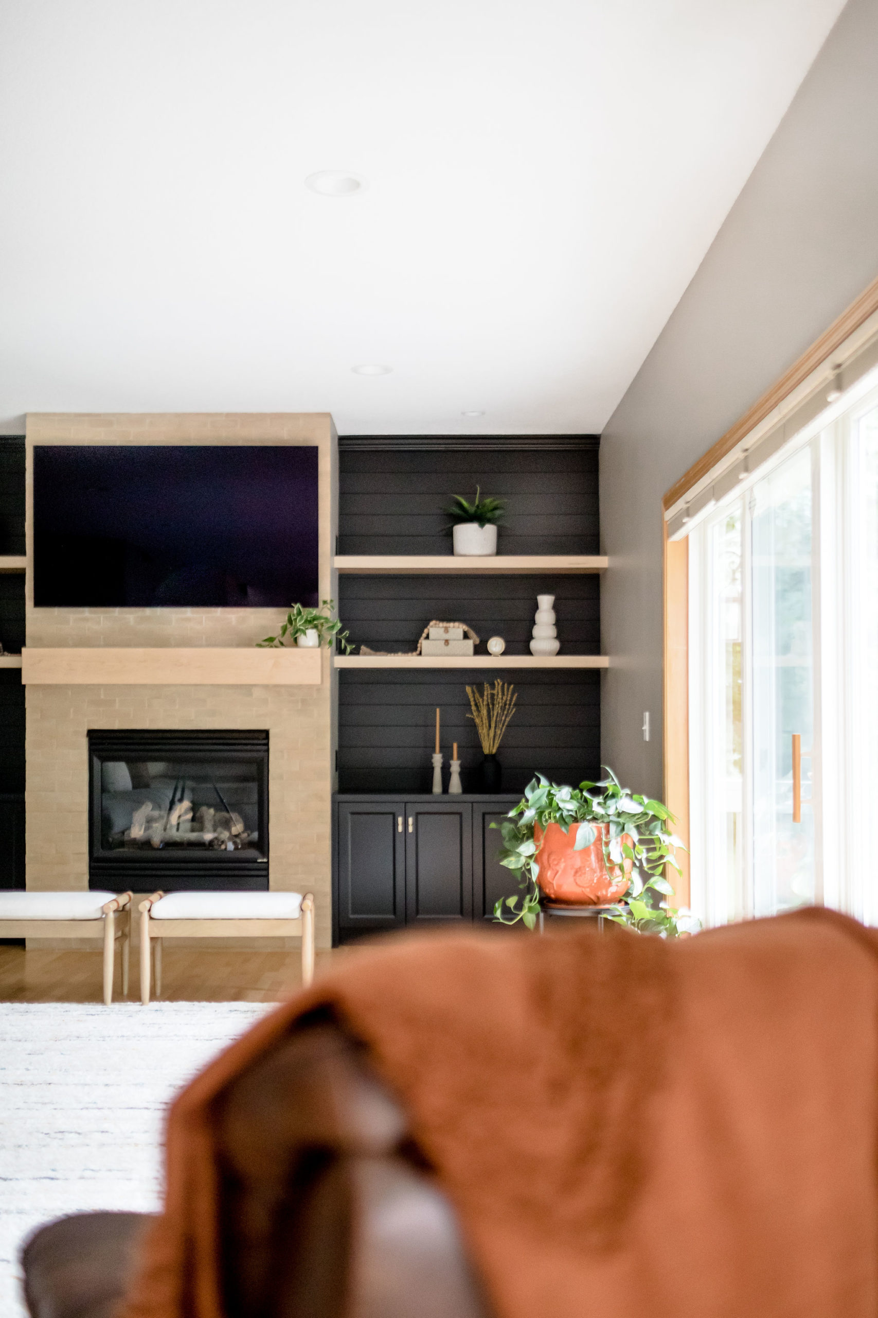
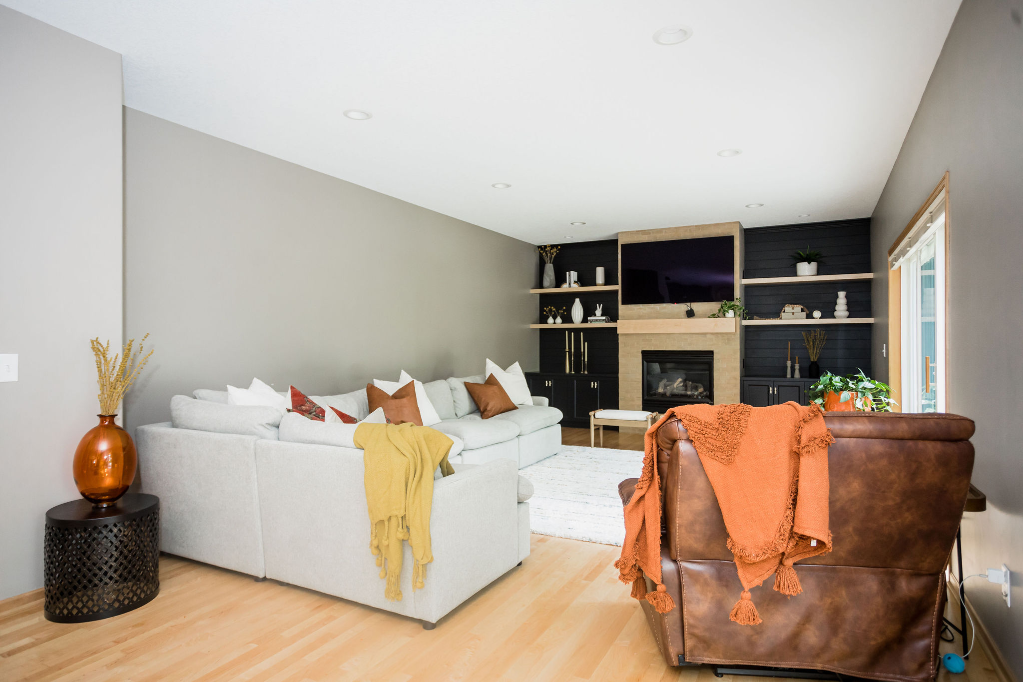
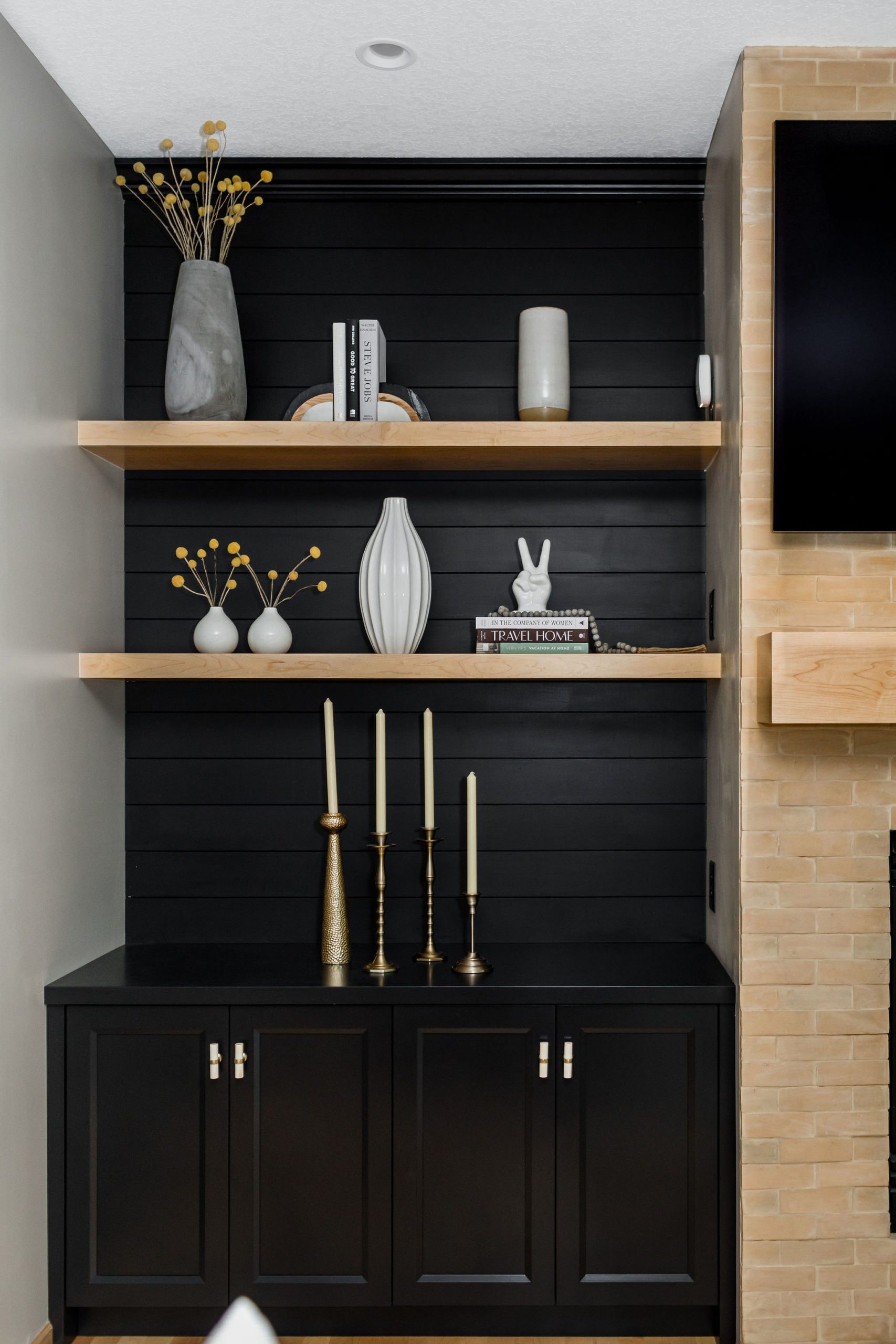
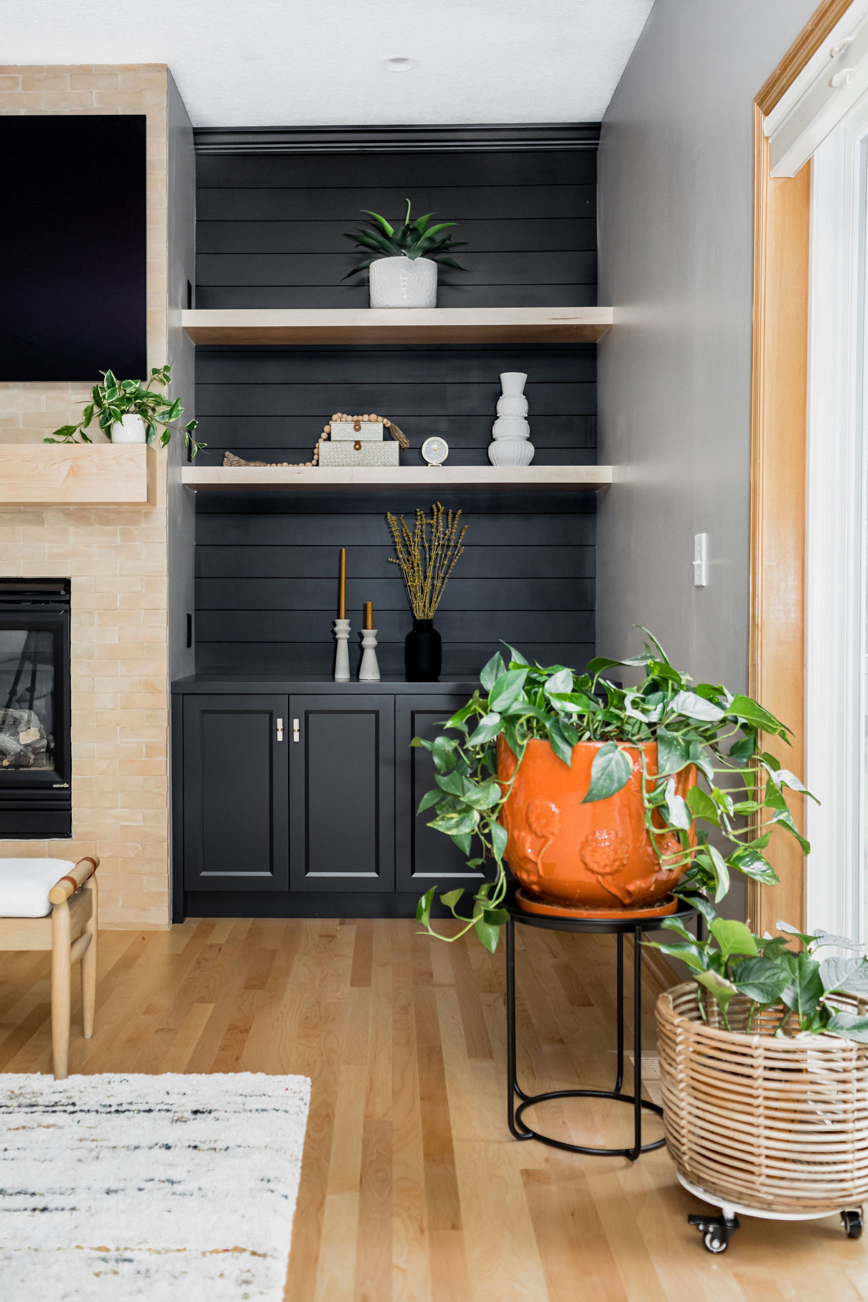
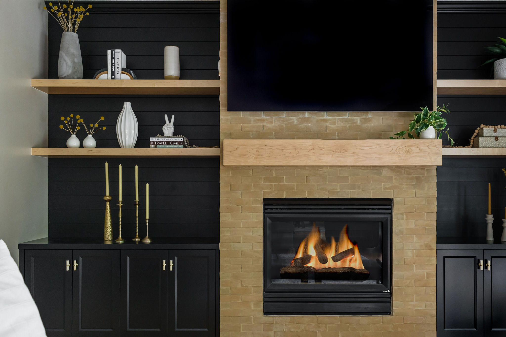
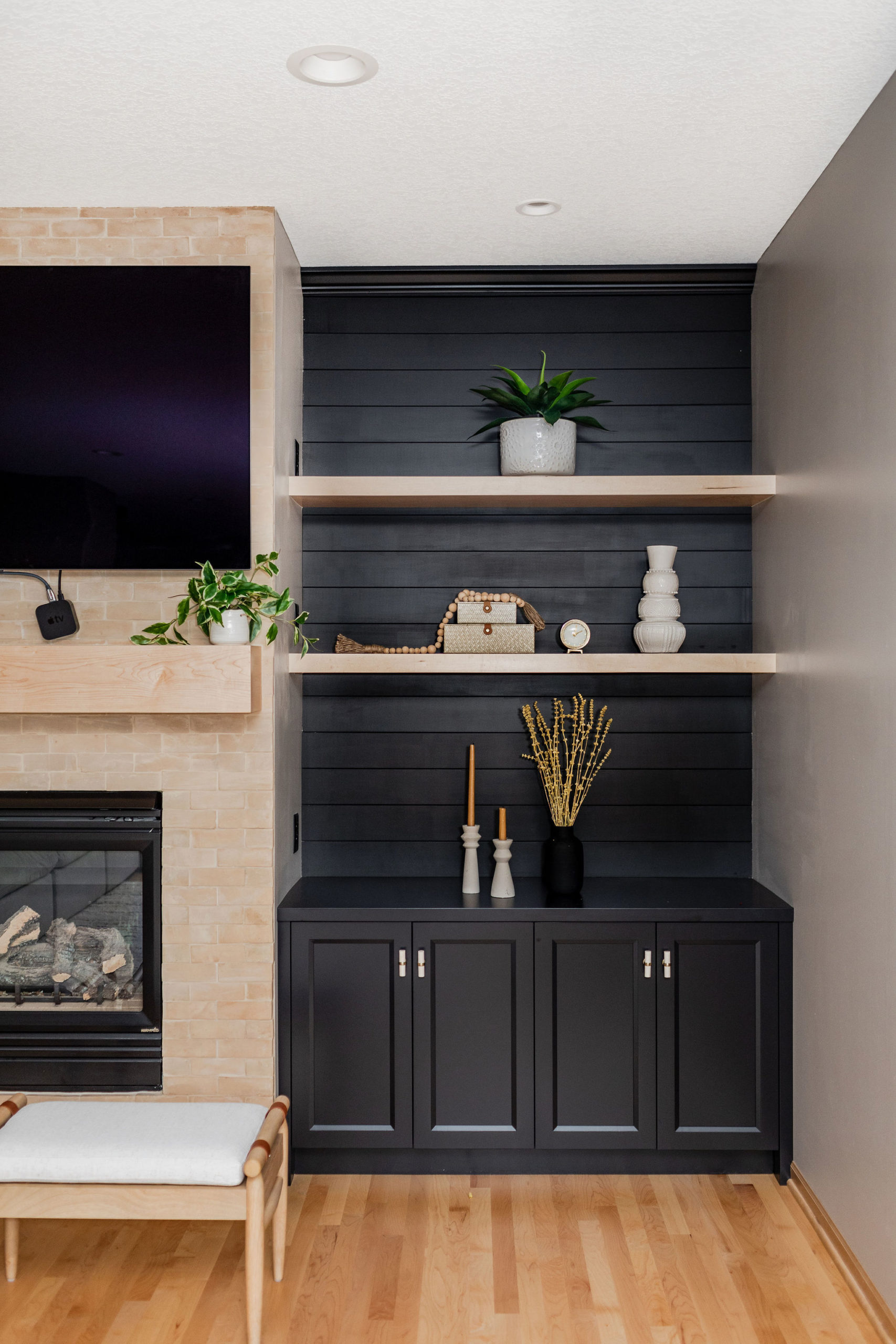
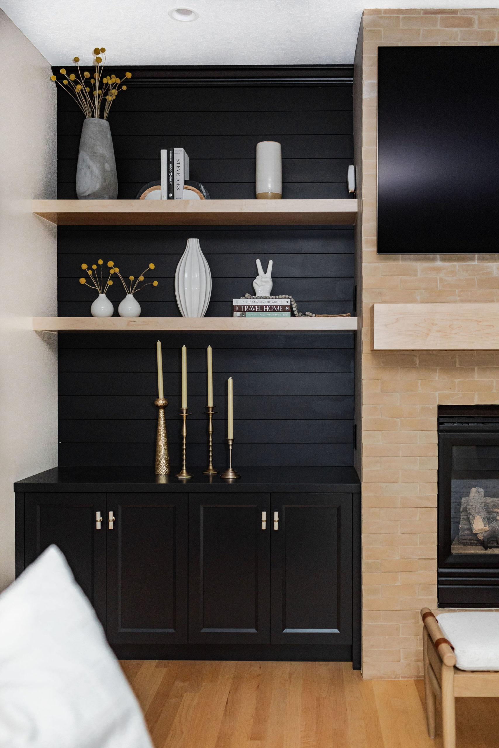
Another area where we added dimension and created an accent wall was the entertainment wall in their main living room.
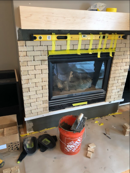
The plan was to create a horizontal shiplap wall and paint it in black. To offset the dark accent wall, we went with a light brick for the fireplace, from floor to ceiling, and then compliment with a custom mantle.
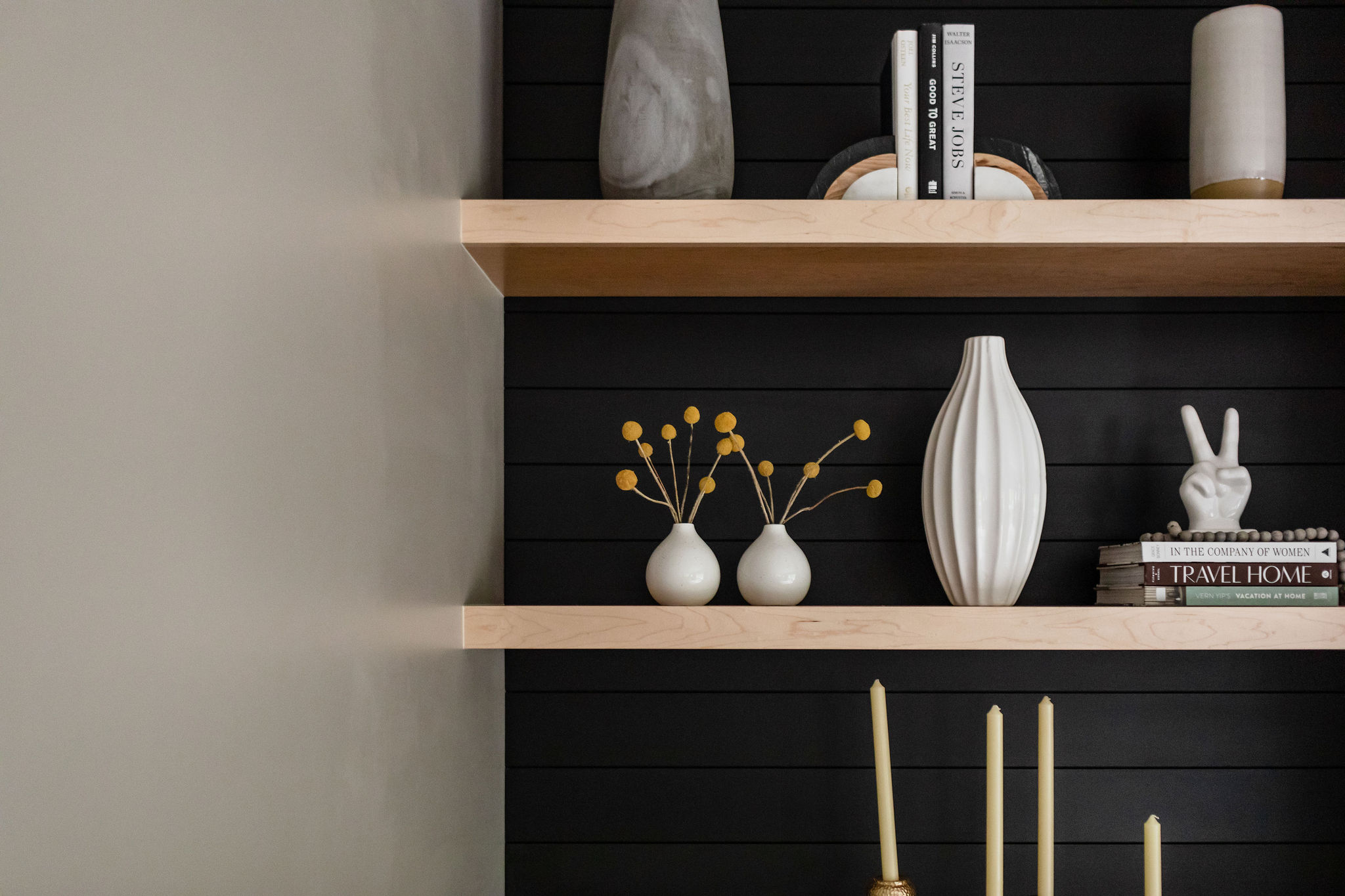
Did you know we offer styling services and furniture services?! Something that these clients wanted our help with was choosing their furniture, decor, and helping with styling their shelves.
When we come into style someone’s home, we will use the items they already have and we also typically bring items from the c2s shop, and our favorite stores like Target, Foxwell, West Elm, and so many more places.
These clients have had this leather recliner for many years and did not want to get rid of it, so we needed to make sure when we were shopping for other furniture pieces and decor that they would all compliment each other.
We also help with floor plans and layouts of furniture to ensure that the space is functional, yet all areas can be seen and appreciated.
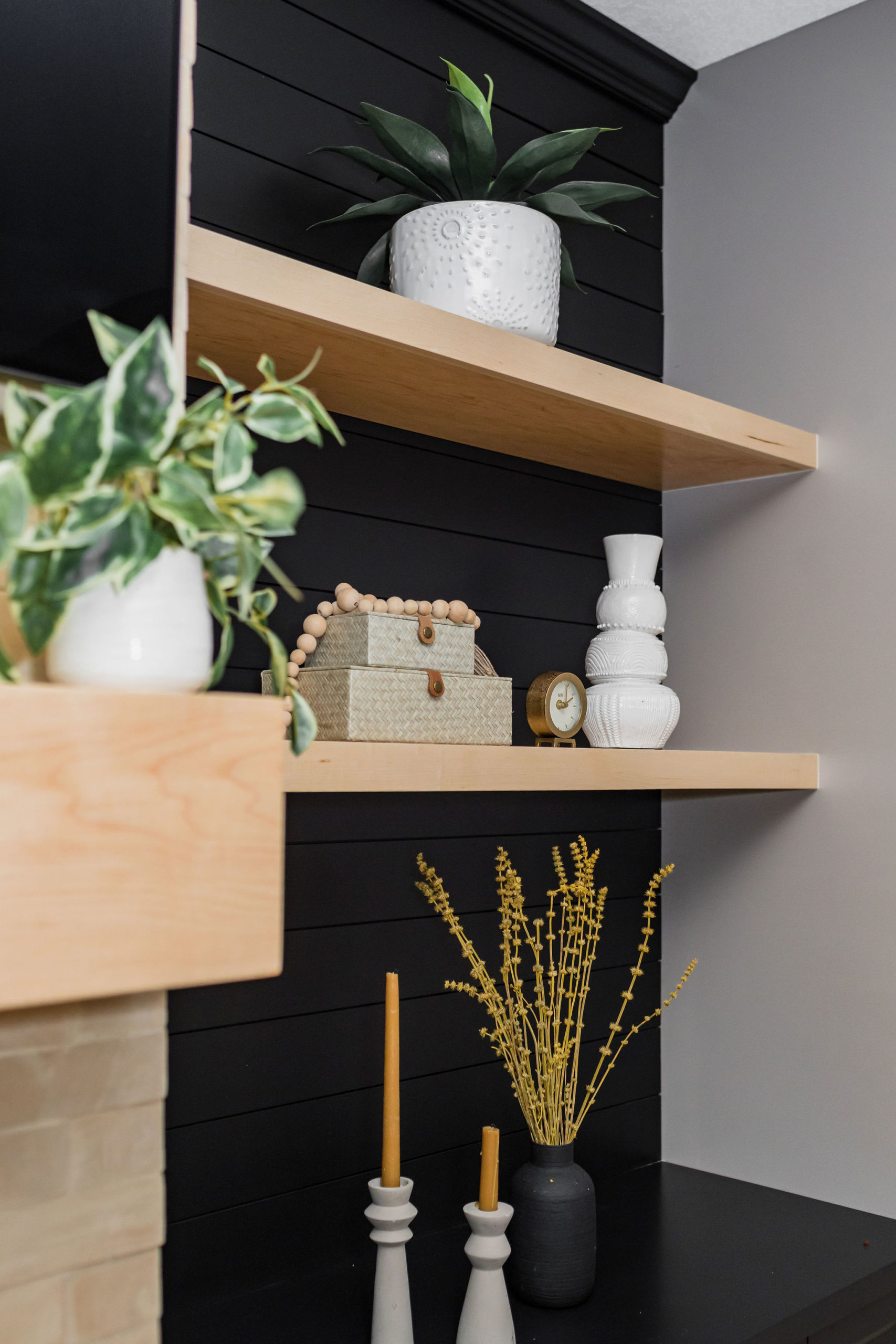
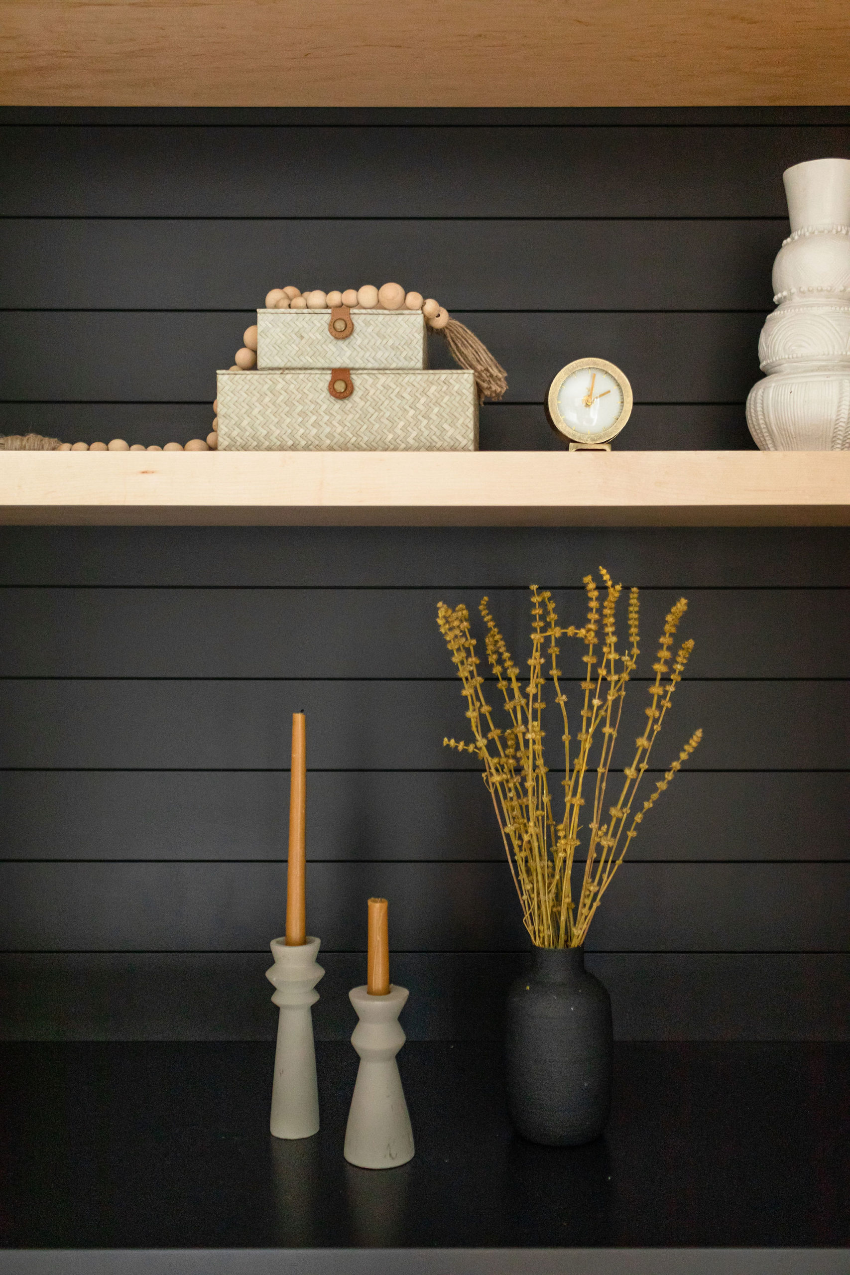
We love styling open shelving and always recommend having items with differing heights and textures throughout the shelves to give the shelves and the area dimension.
We used c2s shop items for the styling and our clients ended up keeping most of the items.
Adding plants throughout also helps to add dimension as well as add more color in the space as well.
Adding poufs or ottomans in front of a fireplace or having another seating area to complete the space is what we recommend to bring everything together and have a comfortable and inviting living room. We found this upholstered natural wood and white accent bench here.
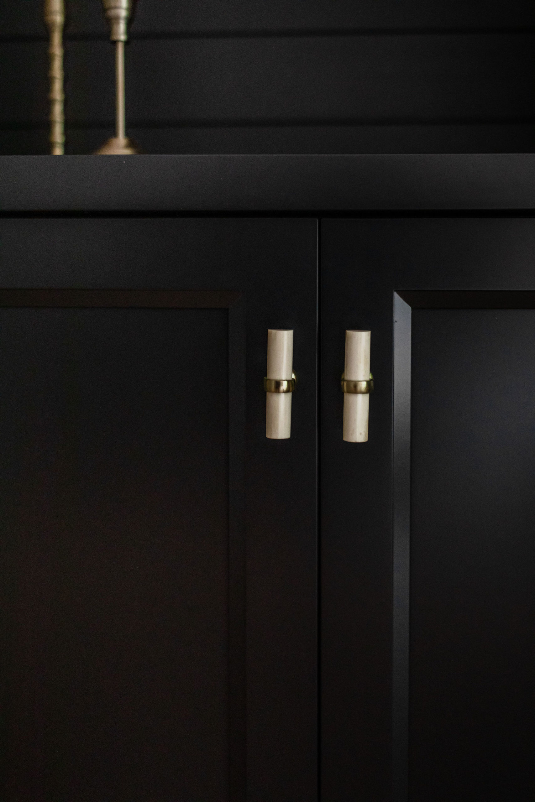
We love these Antler knobs from Anthropologie and they add such a fun design to the room. This was also a last-minute change due to product delays, and so glad we swapped them out from the original.
And that’s a wrap and all the details behind our Breezy Point remodel! Another favorite client of ours. But we know it won’t be the last time we’ll be seeing this client as the homeowner is my new Cabi rep and… it’s always such a crazy small world … post remodels we realized their niece was my childhood best friend who I had lost in touch with. It’s crazy where life takes you sometimes!
Shop this Post + Selections
Shop this look by clicking the links below!
Wall Paint | Sink | Faucet | Countertops | Backsplash Tile | Serving Station Backsplash Tile | Pendant Lights Over Island | Drawer and Door Hardware | Pantry Door | Fireplace Tile | Fireplace Wall Hardware | Pantry Wallpaper
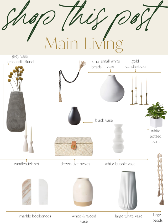
You can shop these items by clicking this link or by clicking on the individual links below.
Grey Vase | Craspedia Bunch | Bookends | White and Wood Vase | Small White Vase | Large White Vase | Small Beads | Gold Candlesticks | White Potted Plant | Large Beads | Stacked Boxes | Bubble Vase | Candlestick Set | Black Vase | Dried Leonurus Bunch | Upholstered Natural Wood Bench
Disclosure: This post contains affiliate links. We make a small commission from the sale at no additional cost to you. Thank you for supporting our small business.

One thought on “Breezy Point Main Level Reveal”
Comments are closed.