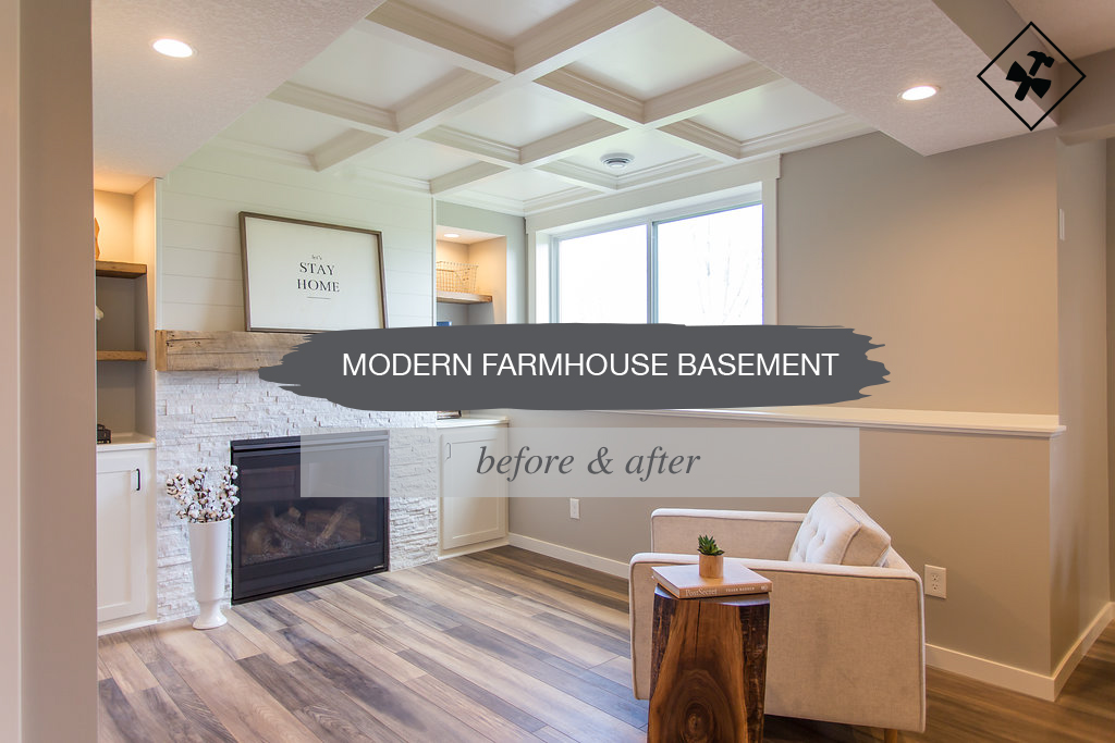
We are so excited to finally share with you one of our latest projects we just completed, a full modern farmhouse basement design and finish.
We’ve been sharing the progress with you over the last few months. Finally, we are sharing the full before and after with all the nitty gritty details with you today.
Dream Clients
I know we say this about all of our clients, but yet again…dream clients! These guys came to us through a referral from a project we completed last summer.
Those were also our absolute favorite people, so we knew if these guys were friends of theirs, we were in good hands.
This family had gotten bids from a number of contractors by the time they found us, so we weren’t entirely sure if we were going to win the project.
After our first consultation and sending over our numbers, they decided to move forward with us, and we couldn’t have been more honored and excited! They wanted assistance from the design layout to full project execution, and we had them covered.
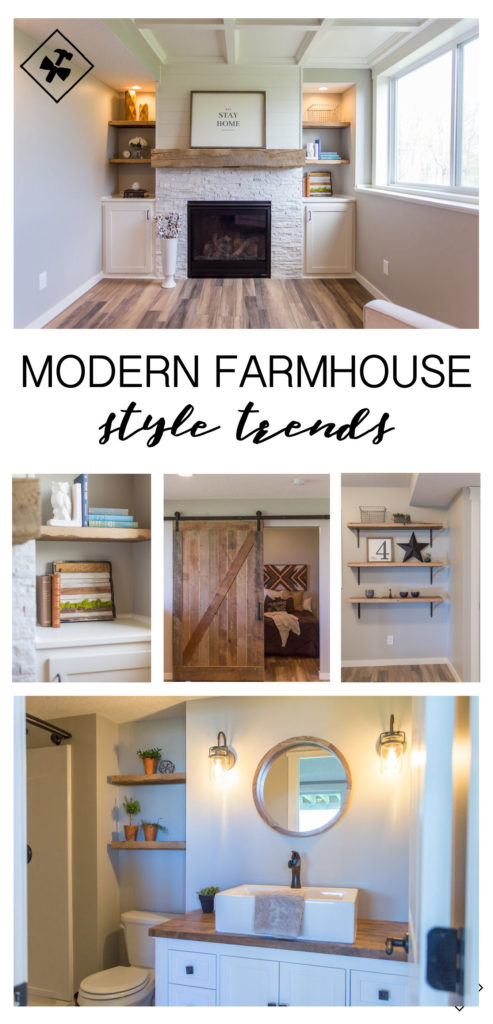
Modern Farmhouse Style Trends
The modern farmhouse style is what everyone seems to love right now, including us. As a result, when these clients said that was the look they were going for we couldn’t wait to get started.
That is what’s so fun about working with different people all the time, they all have different styles. We hadn’t entirely been able to incorporate the full look of a modern farmhouse feel in such a large space as this one.
It seems more and more clients are asking for the look of a modern farmhouse feel in little ways, but not entirely wanting the farmhouse look to take over their space. There are always fun little ways to tie this look in, so throughout this post, we’ll be sharing ways for you to incorporate this look into your space.
If you’re looking for some modern farmhouse ideas, head HERE.
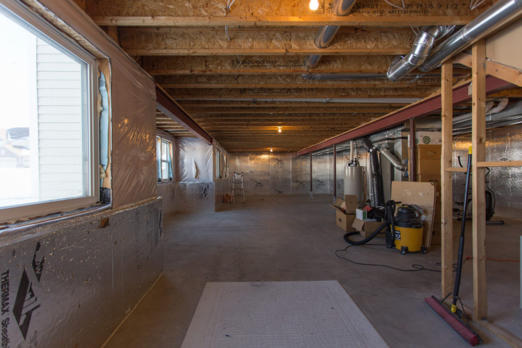
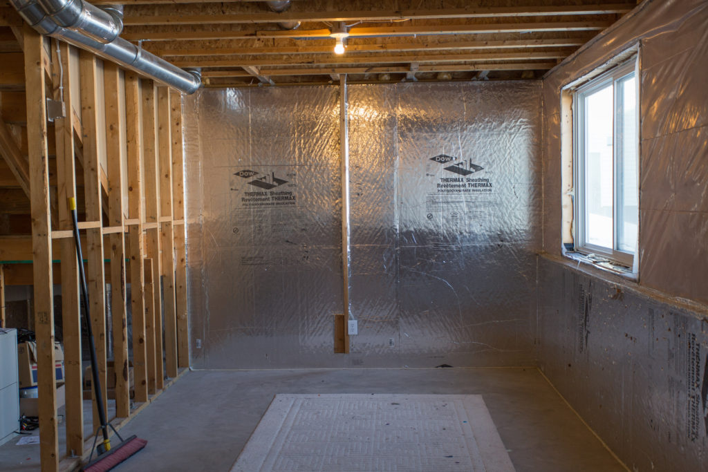
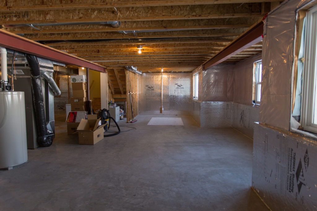
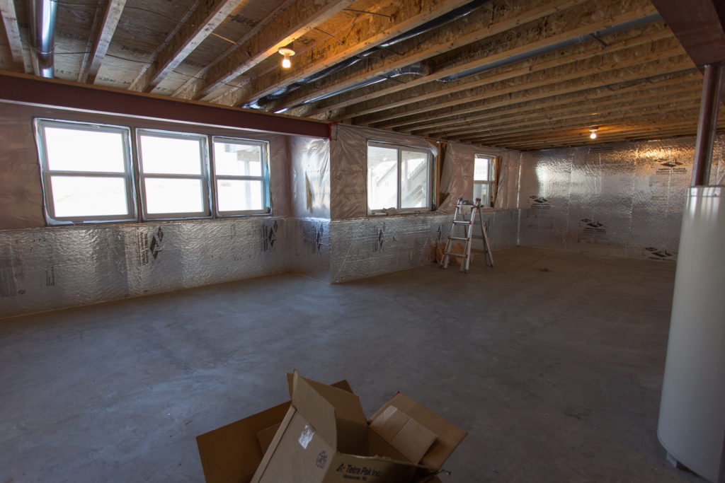
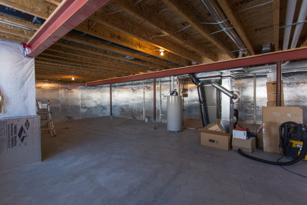
First, let’s take you back to the before…
Before
A huge thank you to our fabulous photographer Chelsie for capturing all the stages for us; you’re our favorite.
After
Drum roll please…dun, dun, dun…and here’s what we put together…
Into the Details
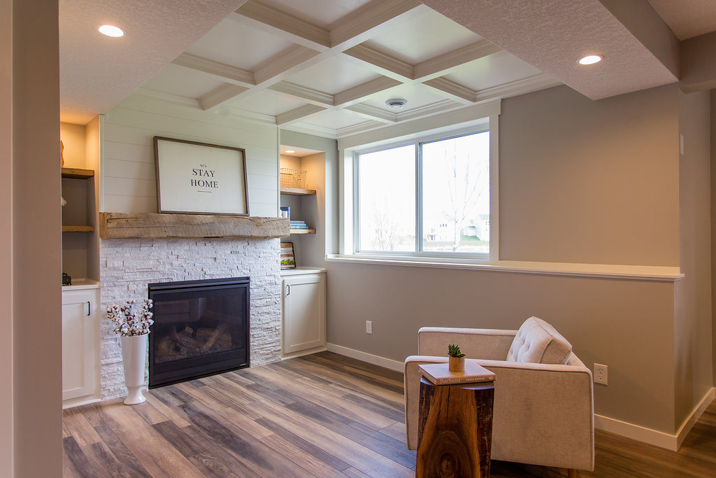
Now, let’s get into the details! Let’s start with our favorite room, the cozy reading nook.
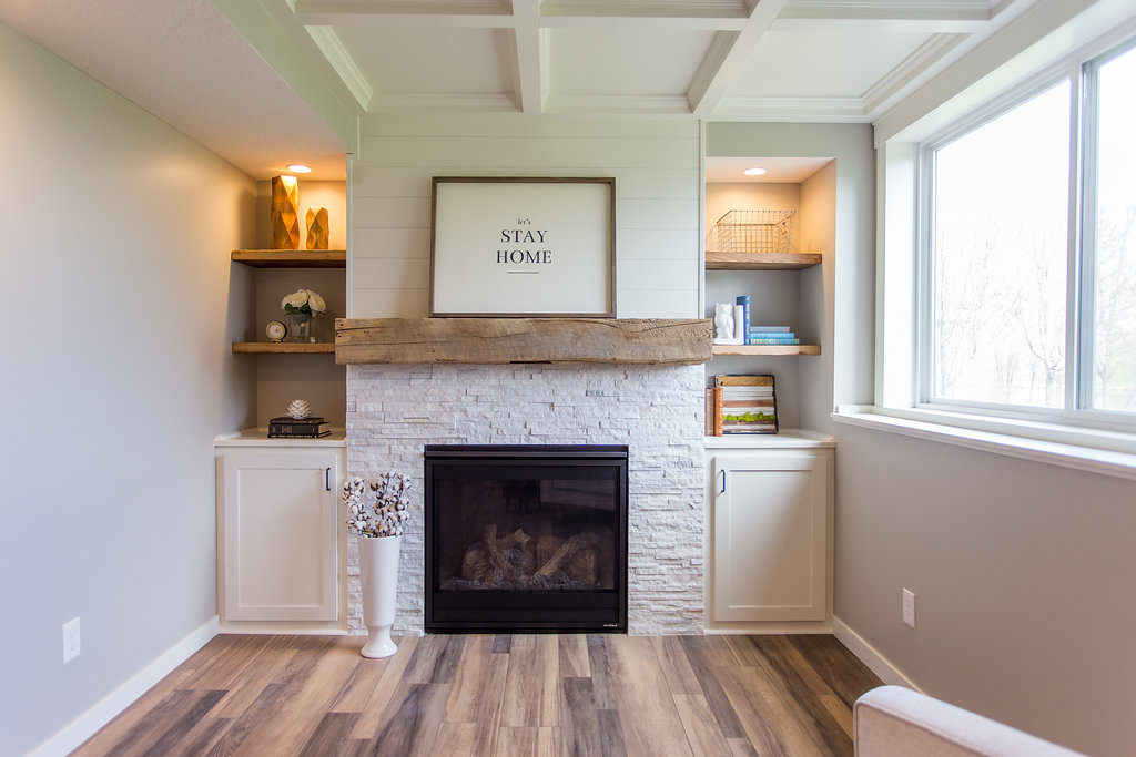
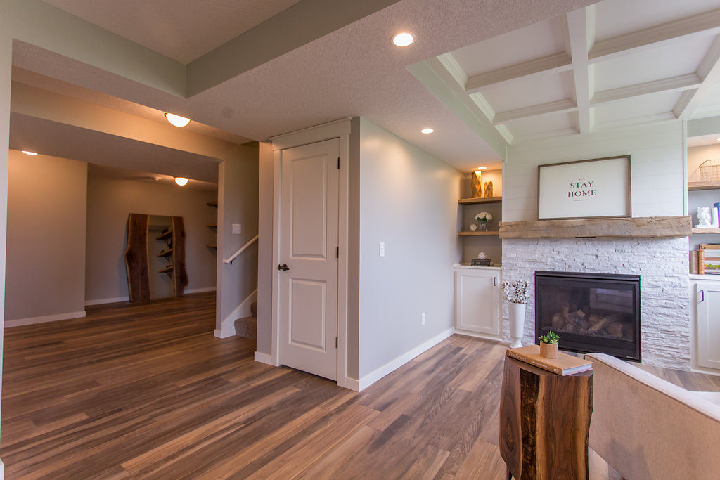
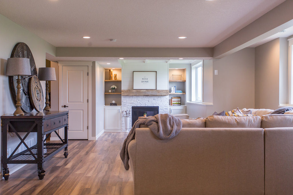
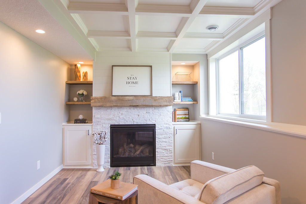
Immediately, we knew what we wanted to do with this nook as soon as we saw this little offset space. Our idea was to create it as it’s own little room, adding a fireplace with built-ins.
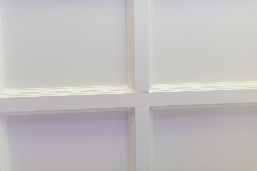
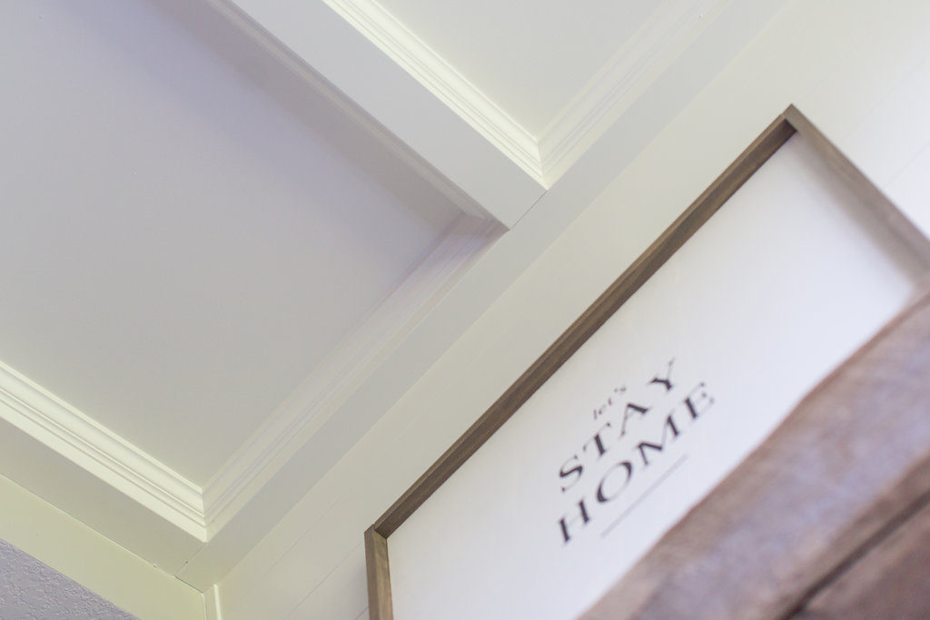
Jamie has been super eager to incorporate a custom coffered ceiling in one of our client’s homes and we thought maybe this would make the perfect touch for this little space.
We weren’t entirely sure if it would work because the ceilings weren’t very high, the room is pretty small, and we had to place a soffit on the left-hand side so it wouldn’t be perfectly square with the fireplace and built-in. Even though we weren’t sure, we thought, let’s go for it!
In the end, we were so glad we did because it actually made the room feel a lot larger and added so much warmth and personality to the space.
I know I rave about Jamie all the time, but seriously, for his first time…GAH! He killed it!
He is so crazy talented! I just can’t rave about him enough.
I officially now want to put up coffered ceilings in our entire home, hehe.
Paint Color
Throughout the whole space, we painted all of the walls Revere Pewter by Benjamin Moore. This paint has quickly become one of our go-to paint colors for clients.
It’s so great because it’s light and it pairs well with either brown or grey tones. When you look at it in the store, you might think it’s beige, but then when you get it on the walls and pair it with other colors, it gives the look of a light grey.
This paint color is one we suggest to clients that are afraid to go all-out grey that want to get away from the beige tones.
Bringing In the Shiplap
To get the modern farmhouse basement feel, we knew we had to go with an all-white space and incorporate some reclaimed wood. When channeling my inner Joanna Gaines (ha!) we knew, of course, that we had to incorporate some shiplap.
So what better place than above the fireplace mantle?! We used MDF and painted the shiplap and the cabinetry White Dove by Benjamin Moore.
White Dove is another one of our go-to white paint colors and has been for a while. Whites can be tricky, and again, when you look at this one in the store it looks more like a cream, but when you get it up on the walls, it’s the perfect white.
This paint is not too bright and not too dark and it complimented the wall color perfectly.
Style Tip: Add shiplap or wood plank walls
Reclaimed Wood
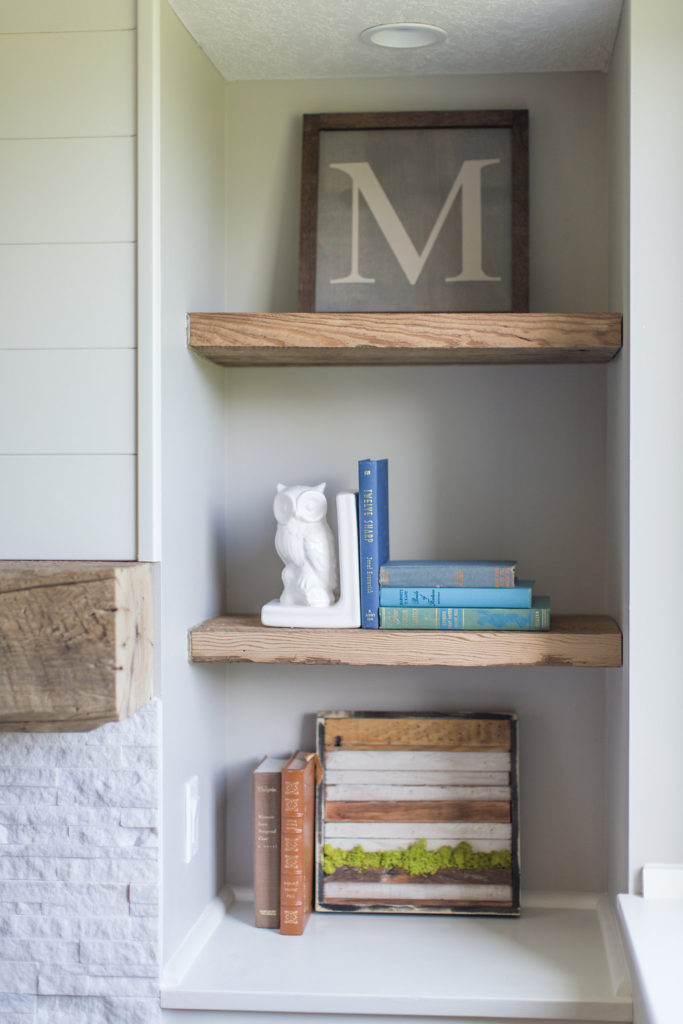
The reclaimed shelving and mantle that we incorporated into the space were from Manomin Resawn Timbers right here out of Hugo, MN. We love going to their showroom and seeing the endless piles of reclaimed materials.
It always gets our minds flowing with new ideas. As soon as we showed our clients these pieces that we’d picked out she literally almost cried. Haha!
So we think it’s safe to say she was in loooove! It was the perfect touch to bring in that farmhouse feel without doing it too much.
Style Tip: Use a lot of white and wood
We also knew we needed to incorporate some sort of white stone-looking tile for around the fireplace. These Claros Silver Architectural Travertine tiles are from The Tile Shop, and we knew they would work perfectly.
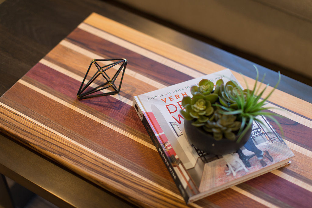
As far as the staging pieces in this nook, we used a handful of local MN makers work to style the space. There are so many incredibly talented designers out there that we decided we’re going to start using their work to not only support our community, but they are a heck of a lot cuter than what everyone else has from Home Goods.
Don’t get us wrong; we love our Home Goods.
Style Tip: Black is the new modern farmhouse accent
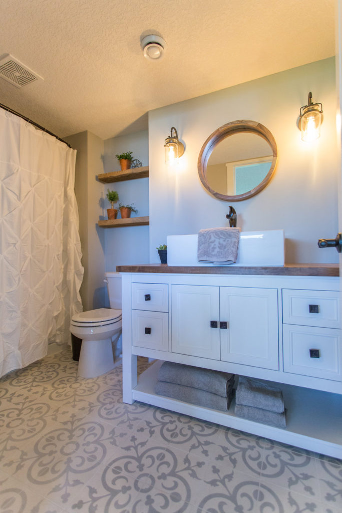
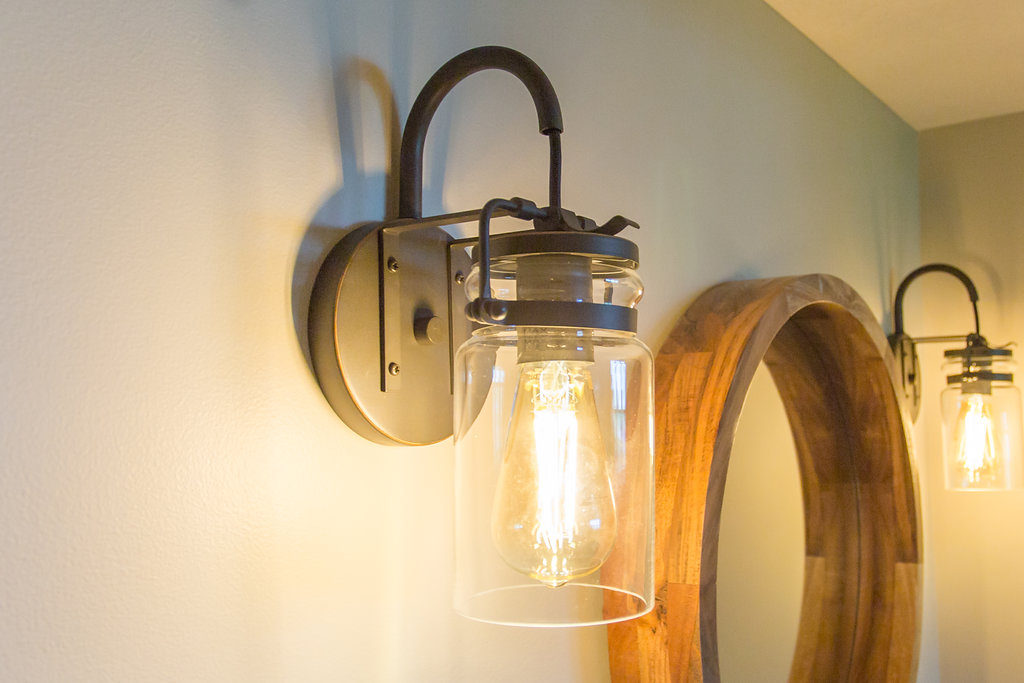
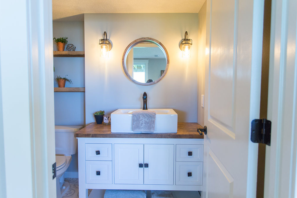
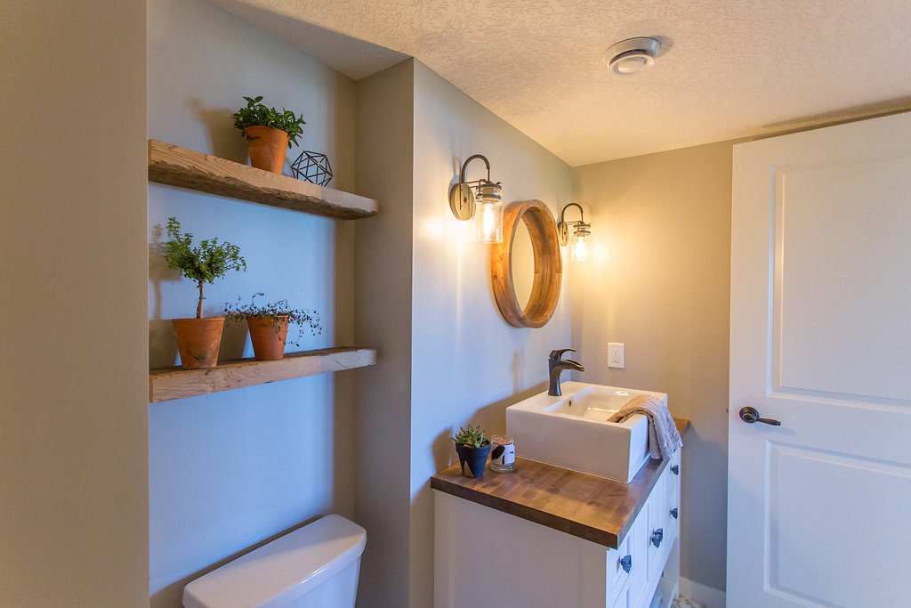
In the bathroom, we got these adorable wall sconces from Bellacor and knew the black metal would be the perfect touch for the bathroom space. They had so many cool wall sconce options to choose from, but as soon as we spotted these almost mason jar-looking ones, we knew they’d be perfect.
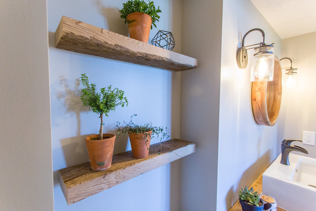
The floating shelves are also from Manomin Reclaimed Timbers. The planters are from our local hardware store and we planted some simple greens in each of the terra-cotta pots.
We picked up the vanity from Home Depot and just placed a butcher block on top. For the vessel sink, we scored it from Signature Hardware. Lastly, the mirror we found at Home Goods for under $20.
Style Tip: Use lots of plants
Adding life to your space with lots of plants is another way to create that farmhouse feel. Keeping them alive for me is key, haha!
Style Tip: Throw bold, geometric shapes and patterns into the design
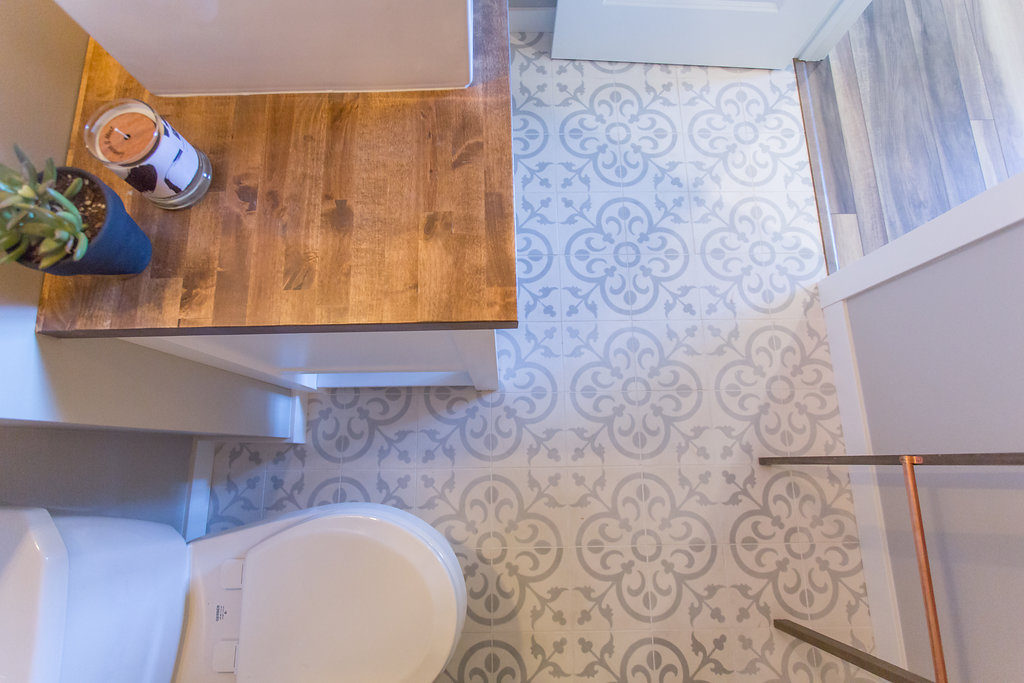
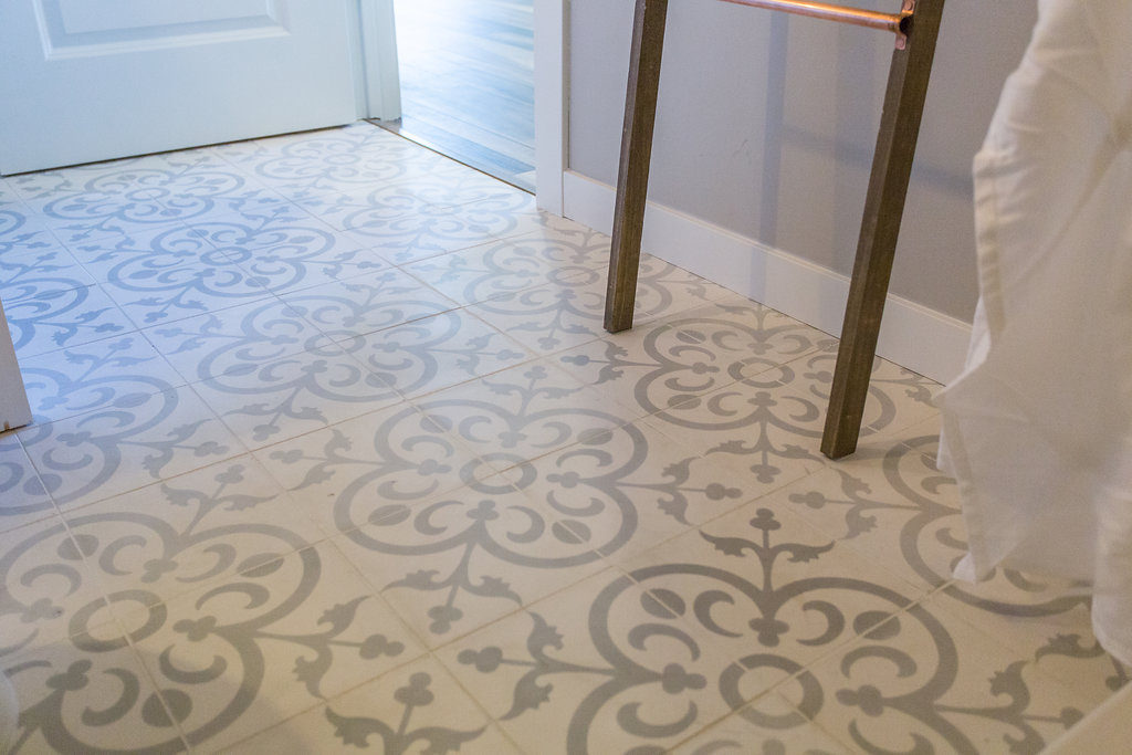
Using subtle statement pieces in your designs is another perfect way to incorporate the modern farmhouse feel, so we did this through the use of tiles in the bathroom. Sometimes using patterned tiles can be a bit risky and I think at first our clients weren’t entirely sold.
Ok, the wifey was, but the hubby I think was a little nervous. Haha!
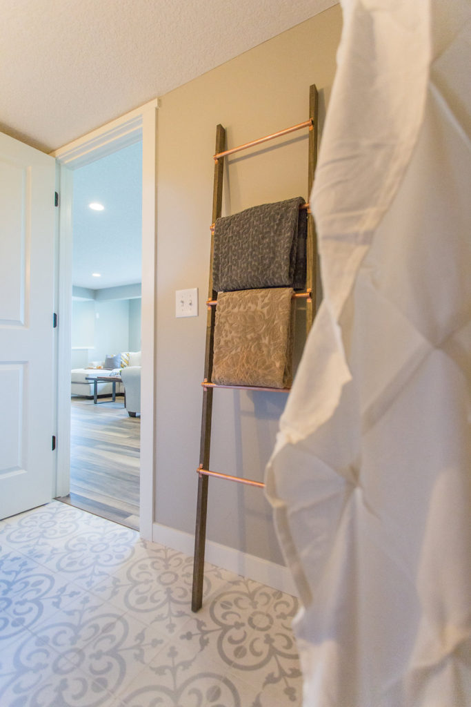
With a small space, such as a guest bathroom, it’s the perfect space to have a little fun and take a little risk. We picked up these cement tiles from Riad Tile and I loved the subtle grey and white pattern too.
It was the perfect touch to complement the space.
The adorable ladder we picked up from Projects in Person. If you’re a Minnesotan, you guys have to check them out.
You can’t buy any of their products, but you can go to their studio and DIY! This ladder and the incredible print we placed above the fireplace are only a couple of the fun pieces you can make in her studio.
You can find more about them HERE.
There are a lot of fun ways to incorporate a ladder into your home decor to make it not only stylish but functional. Hanging your blankets in your living room or towels in your bathroom are just a couple of fun ideas.
Style Tip: Add modern elements within the lighting fixtures
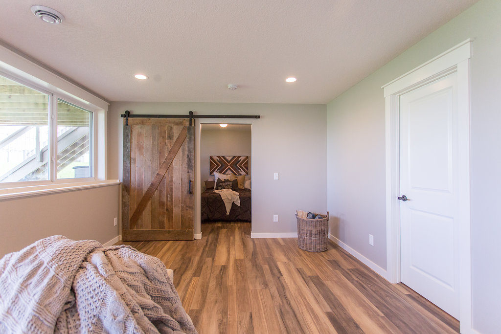
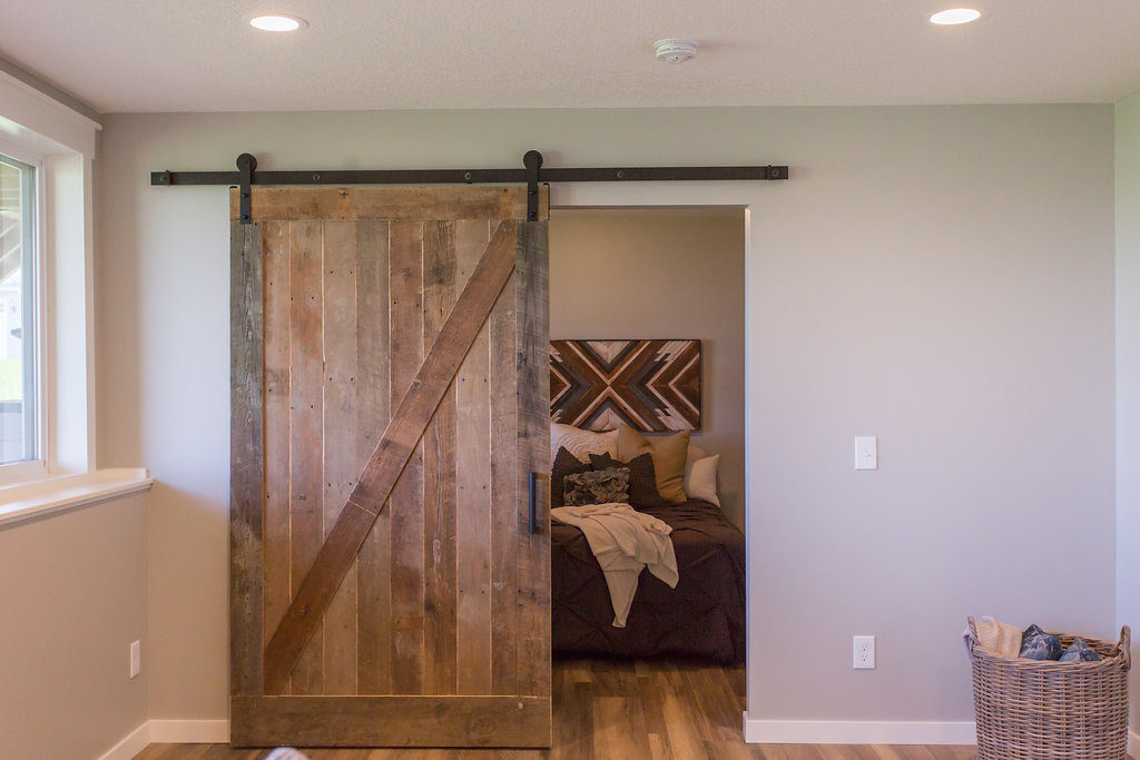
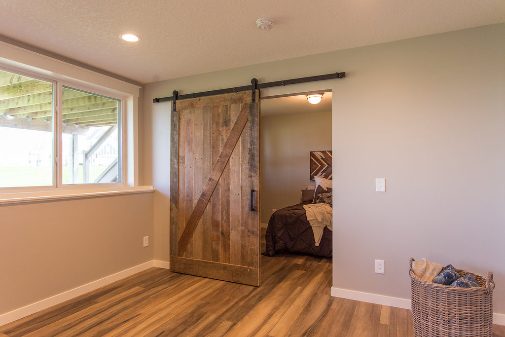
EEEK! Our favorite is the fabulous barn wood door.
Another thing we have been eagerly awaiting to incorporate into one of our remodels. Having a sliding barn door was one of the things our client was really hoping that we could do within budget, and of course, we made it happen!
After all, you can’t have a farmhouse space without an incredible barn door! We got this piece from Manomin, where we got the rest of the reclaimed wood in the project.
Style Tip: Use reclaimed wood
The barn door was the door to the guest bedroom and that beautiful piece peeking through the doorway, which we used as the headboard accent, is an Anna Bailey piece.
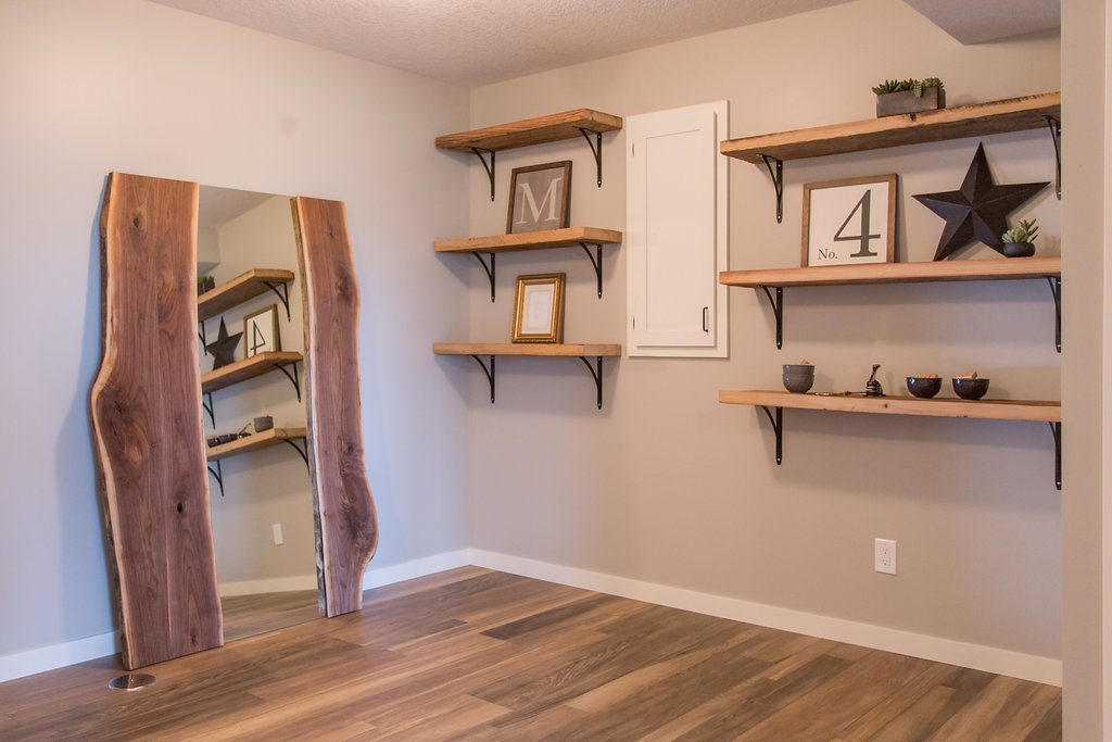
Next is the craft room. Every space we create we want to pack with style but most importantly, we want to add function.
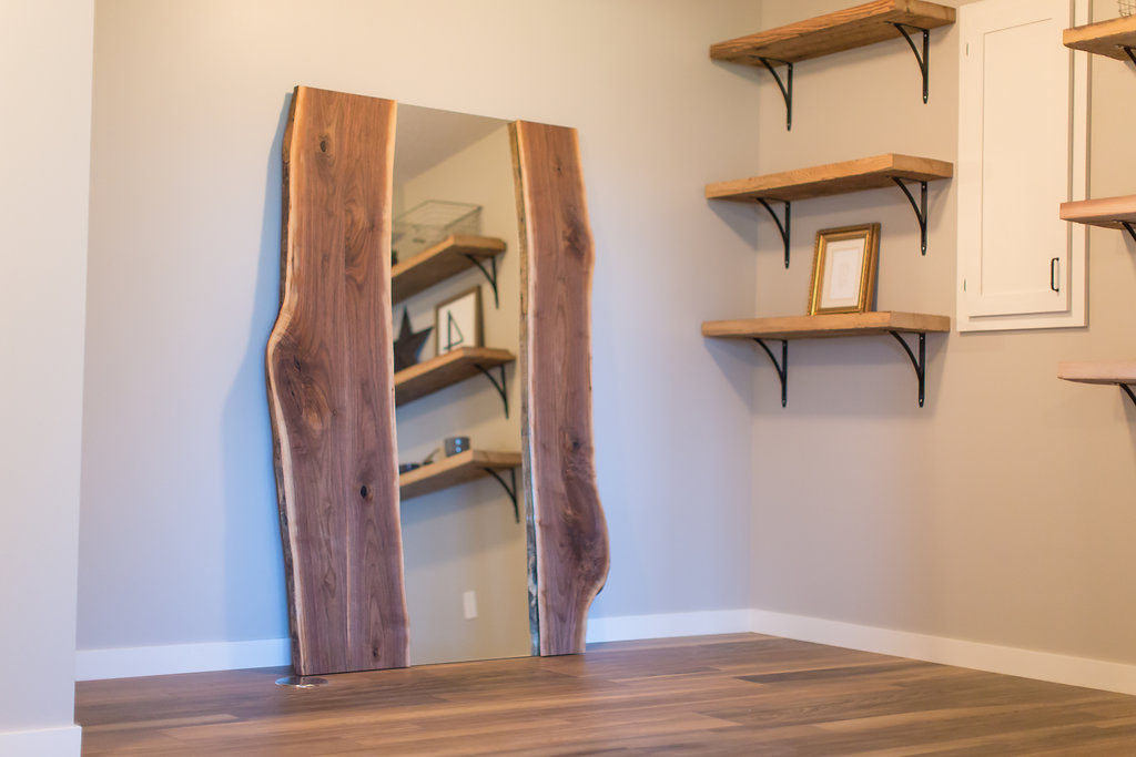
This client is a big crafter and the one thing on her must-have list was a craft room. Since she’s such a crafter, we created a little craft room area.
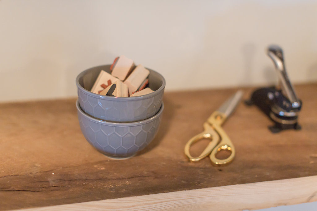
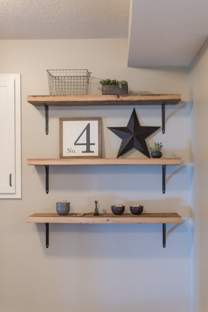
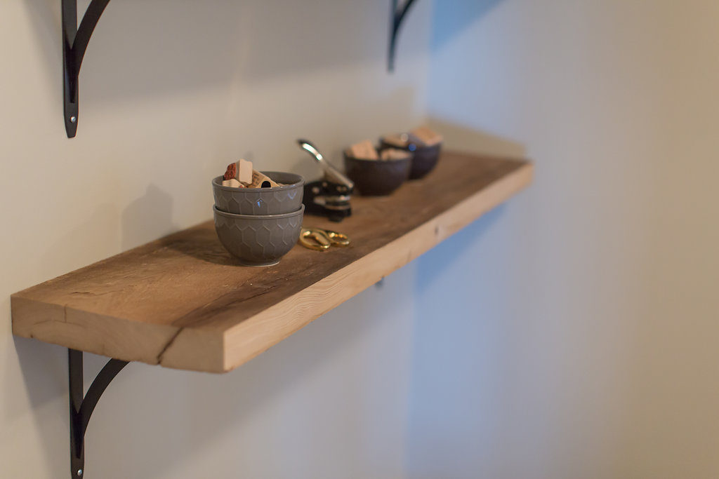
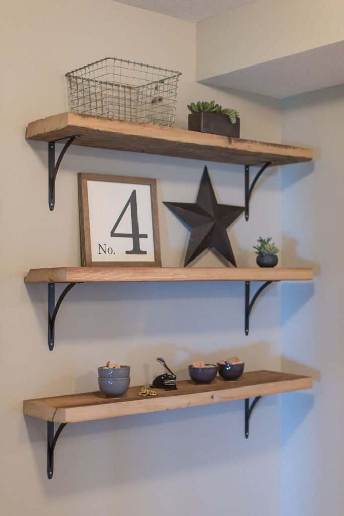
Of course, we had to have some more reclaimed floating shelves in the space with some black brackets.
This fabulous mirror we used to style the space was from the MN maker, Timber & Tulip.
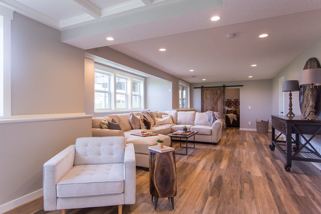
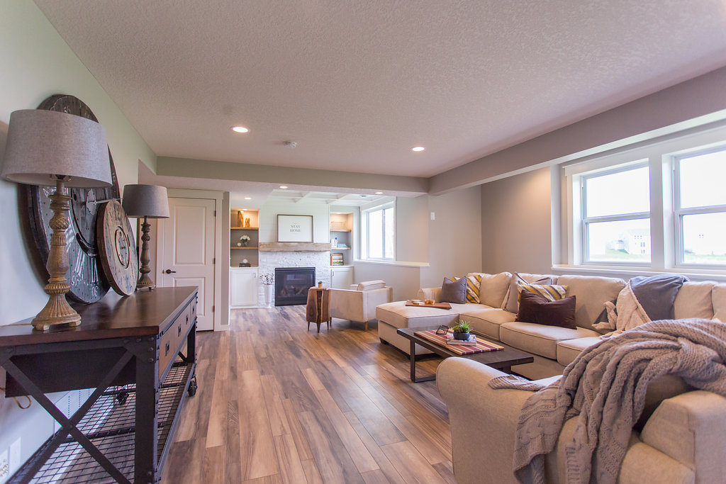
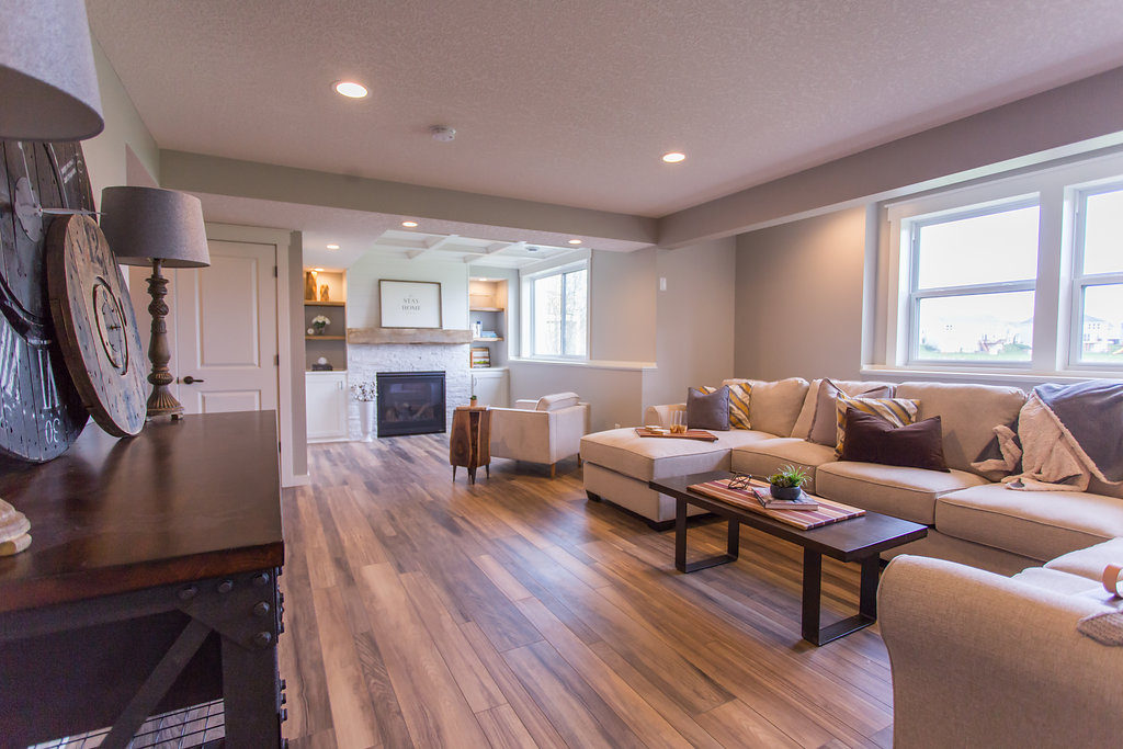
Lastly, we have the living room area. The creation of an additional living room/hang-out area was the main reason for finishing off this basement.
Our client cracked us up because she said they wanted to create it for their kids to go and hang out. Once we were done, she said the kids weren’t going to be allowed down there and that she was moving down, haha!
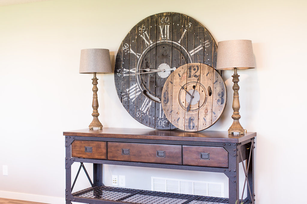
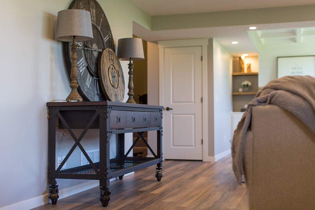
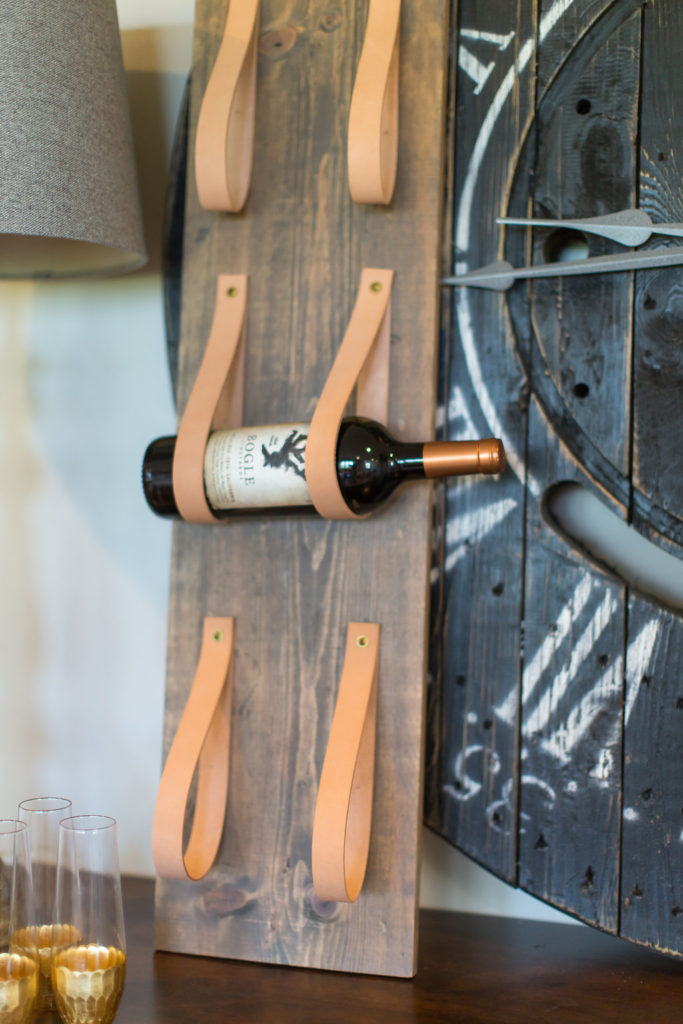
These incredible clocks were from another fabulous MN maker, Rusty Nails. Our client actually picked up the work bench from Costco, which I couldn’t believe.
The workbench was super durable too since it was meant to be a work bench in a garage, but we both thought it was way too cute to put into a garage.
So there ya have it! Our full basement reveal!
Hope you can take a tip or two and incorporate the modern farmhouse style into your home. All the links to the resources are below.
Make sure to check them all out and give them some love because not only are they ridiculously talented they are all awesome human beings.
Flooring: Shaw, Luxury Vinyl, Campania Jatoba
Reclaimed Shelving, Mantle, Barn Door: Manomin Resawn Timbers
Fireplace Tile: Claros Silver Architectural Travertine tiles, The Tile Shop
Cabinetry Paint Color: White Dove by Benjamin Moore
Wall Paint: Revere Pewter by Benjamin Moore
Decor: Projects in Person
Decor: Timber & Tulip
Decor: Gather Table Co.
Furniture: Perch Furniture
Decor: Anna Bailey
Decor, Clocks: Rusty Nails
Cement Tiles: Riad Tile

Jamie actually made it out of angle iron. He carved the wood out in the back and mounted it in.
Looks great! Can you tell me what hardware was used to mount the mantel? Do you happen to remember the height and depth of the beam that was used? Thanks!